Final final final banner
7
My Final Channel Four Banner Advertisement (Ancillary Task)
-
Upload
heatherunderwood -
Category
Art & Photos
-
view
33 -
download
3
Transcript of Final final final banner
My Final Channel Four Banner Advertisement
(Ancillary Task)
Heather Underwood
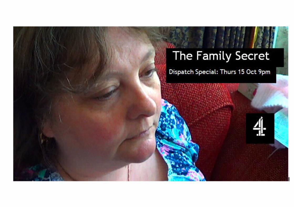
The location of the channel four logo conforms to channel fours logos on their advertisement banner. Channel fours style identity is determined by their colour pallet used to advertise their programme’s as well as the placement of their channel four logo which is distinctively located in the centre right of the page.
My Channel four banner conforms to the representation of Channel fours style identity. As I have used colour. However I have chosen to use black and white for the text as I feel that it represents the difference between the present and the past which is continually referenced throughout the documentary. The colours black and white also represents the defining generations which are established in the documentary and how different they are and it could be argued the two generations of my mum and nan are like binary opposites.
The angle of the image is looking down at my mum from an Ariel shot this signifies to an audience we are looking into my mum’s life throughout the documentary. The audience have an omnipotent position in which they are able to judge my mum about what she says throughout the documentary. My mum’s expression is content however it is obvious that she is in deep thought or that she is reflecting on the documentary.
I have chosen to advertise the documentary in January as I believe that there is a gap in the programme schedule as most programmes have just finished due to Christmas and the new series haven’t started yet. Furthermore according to my audience data
research I have looked into in past posts my targeted demographic; working class women, aged 25-50 are conventionally watching programmes at 9pm therefore the schedule of the programme would appeal to them.
TO IMPROVE:
To improve the banner I could try and block print the title to determine whether it is more effective I could also try and remove the box surrounding the channel four logo. Conventionally the channel four logo doesn’t have a banner surrounding it therefore I could have tried to manipulate the image further by removing the white box.
I could also add a key quote on the banner however Channel four don’t conventionally add quotes however for my documentary it may have made it appeal to the audience further. If I were to make this task again I could also make sure that the image was longer as I found it difficult to place the text in the frame without interfering with the banner’s image. Conventionally in Channel fours banner advertisements there is more space between the focus the image and the text. The text is also normally placed at the bottom of the banner however I chose to place the Title and subtitle at the header of the banner as I felt if I placed it at the bottom of the banner it would interfere with the image in particular it would shadow my mums chin.
I also experiment with colour schemes in my banner development post; I made the banner photo darker to establish whether the banner looked more effective in black or white or in colour. I believe the banner does look more effective in colour. I also choose to experiment with the text and logo in the image by making the text predominantly black in comparison to the logo being predominantly white. However I felt this style was unsuitable as the logo didn’t correspond with the text.