Final digipac design explanation
5
Sophie Cook FINAL DIGIPAC DESIGN EXPLANATION
-
Upload
sophiejanemedia2015 -
Category
Education
-
view
27 -
download
3
Transcript of Final digipac design explanation
Sophie Cook
FINAL DIGIPAC DESIGN EXPLANATION
Towards the end of my digipac designing, I changed a lot of things
as I finally started to understand how to make my digipac provide
more generic codes such as colouring and image choice to
represent ‘RnB’ and ‘Pop’.
LAST CHANGES
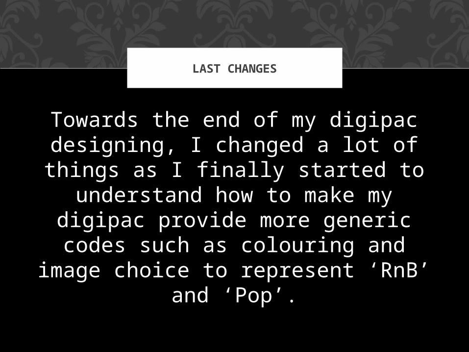
FIRST ROUND OF CHANGES
I firstly changed the CD. I felt that the background on the previous designs where too complicated and so instead changed it to a more simpler design that I made by using ‘artistic’ design filters on Photoshop.
SECOND ROUND OF CHANGES
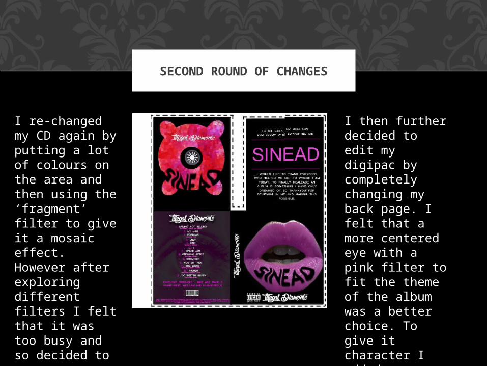
I then further decided to edit my digipac by completely changing my back page. I felt that a more centered eye with a pink filter to fit the theme of the album was a better choice. To give it character I added a watermark to it. I Also centered the text to make it easier to read.
I re-changed my CD again by putting a lot of colours on the area and then using the ‘fragment’ filter to give it a mosaic effect. However after exploring different filters I felt that it was too busy and so decided to carry on working on the CD.
THIRD ROUND OF CHANGES
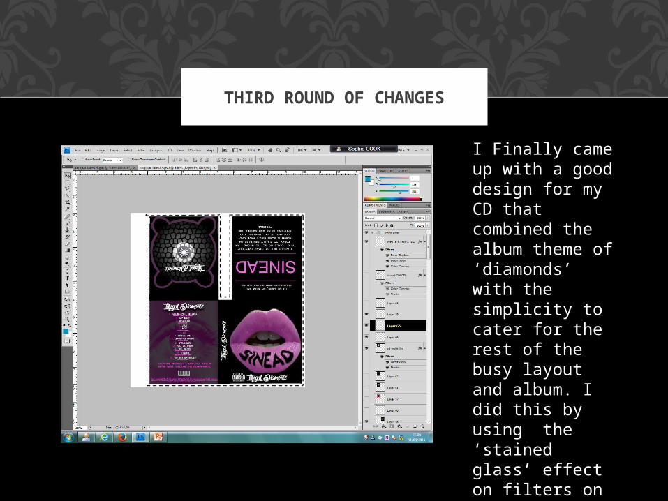
I Finally came up with a good design for my CD that combined the album theme of ‘diamonds’ with the simplicity to cater for the rest of the busy layout and album. I did this by using the ‘stained glass’ effect on filters on photo shop and then added a light pink outer glow.