
Fewd week7 slides
42
FEWD - WEEK 7 WILL MYERS Freelance Front End Developer SLIDES http://www.slideshare.net/wilkom/fewd-week7-slides
-
Upload
william-myers -
Category
Internet
-
view
348 -
download
0
Transcript of Fewd week7 slides

FEWD - WEEK 7WILL MYERS
Freelance Front End Developer
SLIDES
http://www.slideshare.net/wilkom/fewd-week7-slides

FINAL PROJECT MILESTONE 2By week 7, you should have submitted pseudo code and adraft of the HTML/CSS for your application. This week, you'llfocus on drafting the JavaScript and jQuery you'll need foryour application.
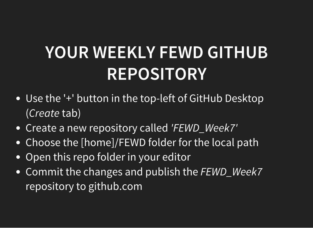
YOUR WEEKLY FEWD GITHUBREPOSITORY
Use the '+' button in the top-left of GitHub Desktop(Create tab)Create a new repository called 'FEWD_Week7'Choose the [home]/FEWD folder for the local pathOpen this repo folder in your editorCommit the changes and publish the FEWD_Week7repository to github.com

YOUR WEEKLY WORKING FILESFROM ME
To get the week7_working_files you should just be able toselect the ga-fewd-files repository in GitHub Desktop andpress 'Sync'. This should pull in this weeks folder fromgithub.com.
If you any difficulties you should just re-clone the ga-fewd-files repository.
Copy the whole week7_working_files into your FEWD_Week7repository and commit and publish to github.com

REVIEW OF LAST WEEK'SASSIGNMENT

DEBUGGINGWhy isn't this working?
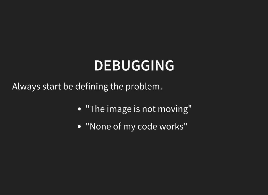
DEBUGGINGAlways start be defining the problem.
"The image is not moving"
"None of my code works"

DEBUGGINGThis will tell you where to start your hunt
Image not moving
find the code that makes the image move
None of my code works
Syntax error, check console

DEBUGGING: LEVEL 1Check for errors (red text, aligned right) in console To accessdebugging console
PC: CTRL+SHIFT+J Mac: COMMAND+OPTION+J
Click the error
The location may not be correct but is a good place to startEx: Unbalanced brackets or parentheses

DEBUGGING: LEVEL 2So no red errors but not getting the right answer? Tryconsole.log
Ex:var stringOfNames=""; ["Bob","Joe"].forEach(function(element){ stringOfNames-=element+","; console.log(stringOfNames); });

DEBUGGING: LEVEL 3Use the debugger in ChromeSet a breakpointRun the codeStep through the code until you get to the errorVariable values display on the rightYou can switch to the console to run code or check valueof variable

DEBUGGING: LEVEL 4Get help!
1. Try "Your preferred search engine" search2. Be ready to clearly articulate the problem (Write out what
your problem is)3. If nothing, ask instructor

DEBUGOpen week6_working_files/debug

AGENDAThis week we are bringing HTML/CSS back into theequation. Let's return to responsive layouts and units asdiscussed in Week 3.
Responsive LayoutsREM/EMMedia Queries

Let's read through the refresher notes for Week 3 again. Goto:
https://gist.github.com/wmyers/d2fedd6f2a52d272ad9e

A BIT MORE ON EMS VS REMSem: a sized based on the width of the letter "m"
rem: a "root" em
Some browsers have issues with fonts sized in percents, emis better for fonts.

LAYOUTS - STATIC VS LIQUID VS ADAPTIVE VSRESPONSIVE
Did anyone read this web page?
http://blog.teamtreehouse.com/which-page-layout

LAYOUTS - ELASTICOne other layout options is to use em for layout widths aswell as for font-sizes. This means that the page will resizeaccording to the end user's preferred text size.
This blog post from 2009 is still useful for explaining fixedversus fluid versus elastic layouts (though most of theexample links are no longer correct):https://www.smashingmagazine.com/2009/06/fixed-vs-fluid-vs-elastic-layout-whats-the-right-one-for-you/
But remember Flexbox is slowing making these older waysof doing responsive websites obsolete.

BOXES EXERCISELet's start building a layout using boxes. We will eventuallymake this layout responsive. Openweek7_working_files/responsive_boxes/readme.pdf in yourbrowser. You can use float or display:inline-block or Flexbox, for columns.
Recreate Boxing 1 using html and css. You can use theweek3_working_files/layout_challenge/5.magazine files as astarting point if using Flexbox. Otherwise use one of the1.two-column layouts. Copy the files intoweek7_working_files/responsive_boxes folder.
Note that you need to have a hidden element.

RESPONSIVE DESIGN IS MORE DESIGN THAN CODE.
Go to this website Open Chrome Dev Tools (CTRL + Alt + I)Set the Dock Side to the right and then click on the mobileicon
http://www.anderssonwise.com/
Also look at the site on your phone browser. Discuss what ismaking the site responsive.

FIXED VS RESPONSIVELooking for comparisons of fixed versus responsive layouts.
Checkout these Fixed sites
UPS.comGoogle.com
Checkout these Responsive Sites
Generalassemb.lyDesignmodo examples

MOBILE BOXESContinuing with our boxing exercise. Keeping the sameHTML, add/overwrite classes in your CSS, below yourexisting code, to make the boxes look like Boxing 2.

FIXED LAYOUTWe have used fixed layouts in our designs up to this point- e.g in Relaxr pagesRelies on a container of fixed width - usually 960px or980pxHas margin:0 auto (or similar) to center the container

RESPONSIVE LAYOUTDifferent styles for different screen widthsUses an elastic/fluid layoutFluid - Sized in percentagesElastic - Sized in ems

MEDIA QUERIES - USAGEPlease read the first part of regarding syntax.this page
For a list of @media types:https://developer.mozilla.org/en-US/docs/Web/CSS/@media#Media_types
For building responsive web pages you will use the followingsyntax:
@media only screen and (max-width: Npx) (min-width: Npx) (max-device-width:Npx) (min-device-
For tablets(orientation: portrait) (orientation: landscape)

MEDIA QUERIES - USAGESeparate multiple clauses with "and"
@media only screen and (max-width: 769px) and (orientation: landscape) { ... }
Standard media queries sizes
Small: up to 768pxMedium: 769-991pxLarge: 992px+

MOBILE DISPLAY - VIEWPORTThe viewport meta tag (placed in the <head>) lets thebrowser know that it has to scale your webpageresponsively on every device.
Combining the viewport meta tag with responsive CSS willmake your web page work across different mobile browsers.
Otherwise the mobile browser will assume a fixed layout ofbetween 800px to 1024px, and the user will have to zoom into different sections of the page.
<meta name="viewport" content="width=device-width, initial-scale=1">

VIEWPORT - DIFFERENT PIXELSSee this page to understand how device independent pixelsare required to enable the viewport meta tag to scale amobile browser page correctly:
https://developers.google.com/speed/docs/insights/ConfigureViewport?hl=en

VIEWPORT - USER SCALINGThere is an additional attribute for the viewport meta tag:user-scalable=none
<meta name="viewport" content="width=device-width, initial-scale=1 user-scalable=none">
This prevents the user from using default browser zoomfunctionality (including pinch-zooming) - the implication isthat responsive CSS and the standard use of the viewportmeta tag should make zooming unnecessary.
However this is essentially anti-accessibility:http://codepen.io/absolutholz/post/user-scalable-no-evil-or-slightly-not-evil

VIEWPORT - 300MS TAP IN ANDROIDOn the flip-side of the argument against using user-scalable=none, a couple of years ago, if you did use itthen (in Android) you would remove a mandatory 300millisecond delay caused by waiting to detect a user double-tap.
https://developers.google.com/web/updates/2013/12/300ms-tap-delay-gone-away
Following more recent changes, Chrome and Firefox nowremove the 300ms tap delay if your web page contains thecontent="width=device-width" attribute instead.This means you can retain pinch zooming.

MOBILE DISPLAY - 300MS TAP IN IOSMobile Safari has a more complicated approach to solvingthe 300ms delay by detecting for fast taps and slow taps:
http://developer.telerik.com/featured/300-ms-click-delay-ios-8/
However there is a JavaScript library called FastClick whichcan be included which can be used to remove the 300msclick delay across all mobile browsers:
https://github.com/ftlabs/fastclick

MEDIA QUERY USAGE/*inline boxes into columns*/ .box{ display:inline-block; } @media only screen and (max-width:768px){ /*insert responsive css here eg: stack inline boxes*/ .box{ display:block; } }
If I put the media query before.box{ display:inline-block; }
will this work as expected? See .this link

RESPONSIVE BOXESReturning to our boxing layout, use media-queries to makeyour boxing web page responsive so that it changes fromBoxing 1 to Boxing 2 when the browser window width isreduced.

TRANSITIONS TO MAKE MEDIA QUERYCHANGES SMOOTHER
We will look more at CSS animations and transitions in Week9 and Week 10.
Feel free to research this further in the meantime.

LAYOUTS - GRIDSGrids are ways of creating complex fixed or fluid layouts,involving nested rows and columns. Many grids have up to12 columns and unlimited rows. NB Grids tend to usefloats for creating columns.
This article shows you how to create a responsive fluid gridlayout that uses media-queries to change to a single columnlayout when the page gets too small.
http://www.sitepoint.com/understanding-css-grid-systems/
http://codepen.io/SitePoint/pen/dPqqvN

GRIDS - BOOTSTRAPGrids are often implemented using popular third party CSSlibraries, that provide tested cross-browser complex layoutsthat developers can use out of the box.
The Bootstrap CSS library has grid layout classes (availablewhen you include and link bootstrap.css in your <head>):
http://www.sitepoint.com/understanding-bootstrap-grid-system/
The Bootstrap grid system is also responsive. You applydifferent styles to your column <div>s and the relevant onewill be automatically used as your window resizes.

GRIDSIt is not actually that hard to build your own grid. In fact wehave already been doing so with things like the magazinelayout in Week 3.
A simple column layout is still a grid, more complex gridlayouts can still utilize simple CSS layout techniques:https://css-tricks.com/dont-overthink-it-grids/
(NB: this layout uses floats. We could usedisplay:inline-block or Flexbox instead.)

LAYOUTS - THE NEW GRID DISPLAYPROPERTY
There is also a new display:grid property, which is arecent CSS addition like display:flex. At this time it isstill better to use Flexbox (display:flex).

AGENDAHow to make a website responsive.

LEVEL ONEConvert widths to percentagesSize fonts in emsIdentify columns that can be stacked

LEVEL TWODetermine what content is extra
Does that h1 need an h2 under it?Will that one liner get the visitor to understand my siteor is it extra?
Determine what content needs to be visible
Is it necessary to show my entire nav if there are otherways of getting to navigation?
Identify extra styling
Do my columns need a border if they're stacked?

STARTUP MATCHMAKER