Fabian Meli Portfolio
44
FABIAN MELI PORTFOLIO / graphic designer
description
Â
Transcript of Fabian Meli Portfolio

FABIAN MELI
PORTFOLIO/ graphic
designer

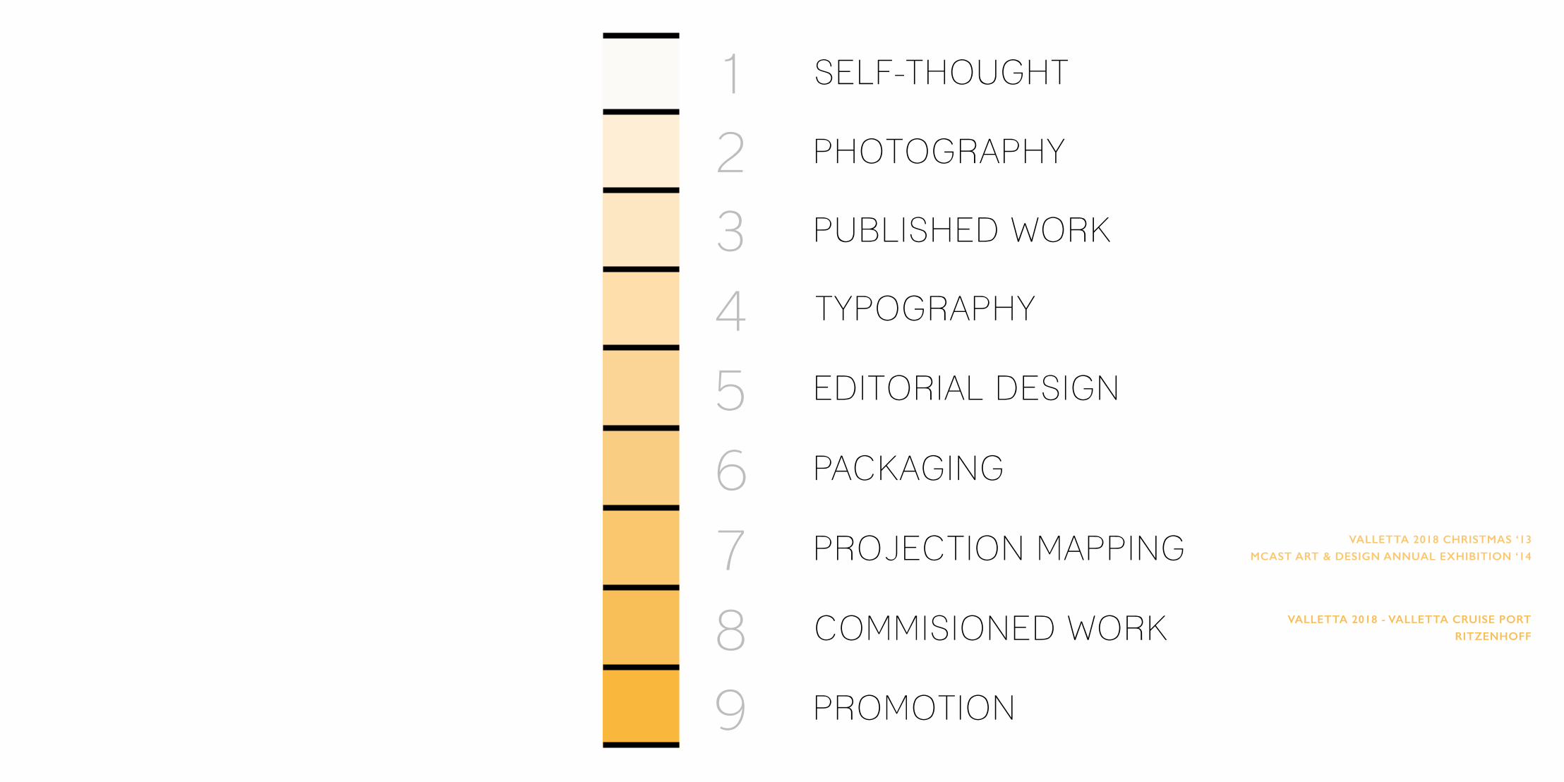
SELF-THOUGHT
PHOTOGRAPHY
PUBLISHED WORK
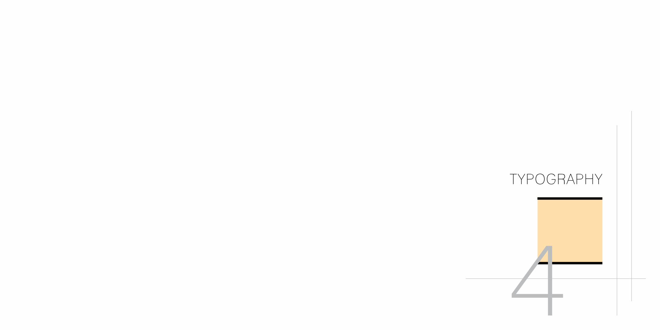
TYPOGRAPHY
EDITORIAL DESIGN
PACKAGING
PROJECTION MAPPING VALLETTA 2018 CHRISTMAS ‘13
MCAST ART & DESIGN ANNUAL EXHIBITION ‘14
COMMISIONED WORK VALLETTA 2018 - VALLETTA CRUISE PORT
RITZENHOFF
PROMOTION
123456789

SELF-THOUGHT
1

I express myself as being a committed learner with a great passion for the work I do, and also for experimenting with new ideas in the near future, such as that of motion technique. This being said, the result has always been that of a successful one. On the whole, I describe my work as creative, innovative and engaging. My main focus is to differ from other artists, so as the viewer/ client would identify my work as being unique.
My main skills reside in general editorial design, manipulation and most of all in illustration. I am capable of doing my own style as previously mentioned above. Besides this, I would like to continue in this line of work. Considering that I am fond of fine art, mainly Art Nouveau, most of my work is inspired, the female figure and the organic forms. Detailing is something I take serious in my work; the small finishing touches can really bring out the final experience. As a result, my aim is to continuously produce brilliant and effective solutions.

PHOTOGRAPHY
2

By taking self-portrait photos, from the original ones I altered them by creating a different version of how they look in reality. This was done by changing their facial features, adding stuff and giving them specific effects.


PUBLISHED WORK
3

In collaboration with the Commissioner for Children in raising awareness amongst children about the importance of a healthy lifestyle, my particular role in this campaign was to create a Comic book A (age 8-11) and an Activity book B (age 5-8) that were chosen to be published and given to primary school students. The main message was to reinforce health education messages by outlining the essential health concepts and enhancing skills.

TYPOGRAPHY
4

Part of a literally work from “The Divina Commedia” by Dante Alighieri, acted as the content that was expressed typographically. Experimentation was mainly used with Perpetua and Bebas Nue font in order to achieve a good understanding of them particularly in typographic, type anatomy, style, size and space.


EDITORIAL DESIGN
5

In these contacts that were taken from various booklets such as double page spreads and outer covers, one can see the basic principles and elements of editorial design as they focused on developing the main skills and understanding in constructing editorial designs for graphic design guidelines. Using traditional skills to complement and inform digital editorial design, the outcome was to develop solutions by creating design projects for the digital environment that as an outcome gave practice in applying the fundamental principles of managing text material and image.
Front and back outer of the Toly Showcase catalogue 2012 displaying a female model using one of their products to apply make-up.
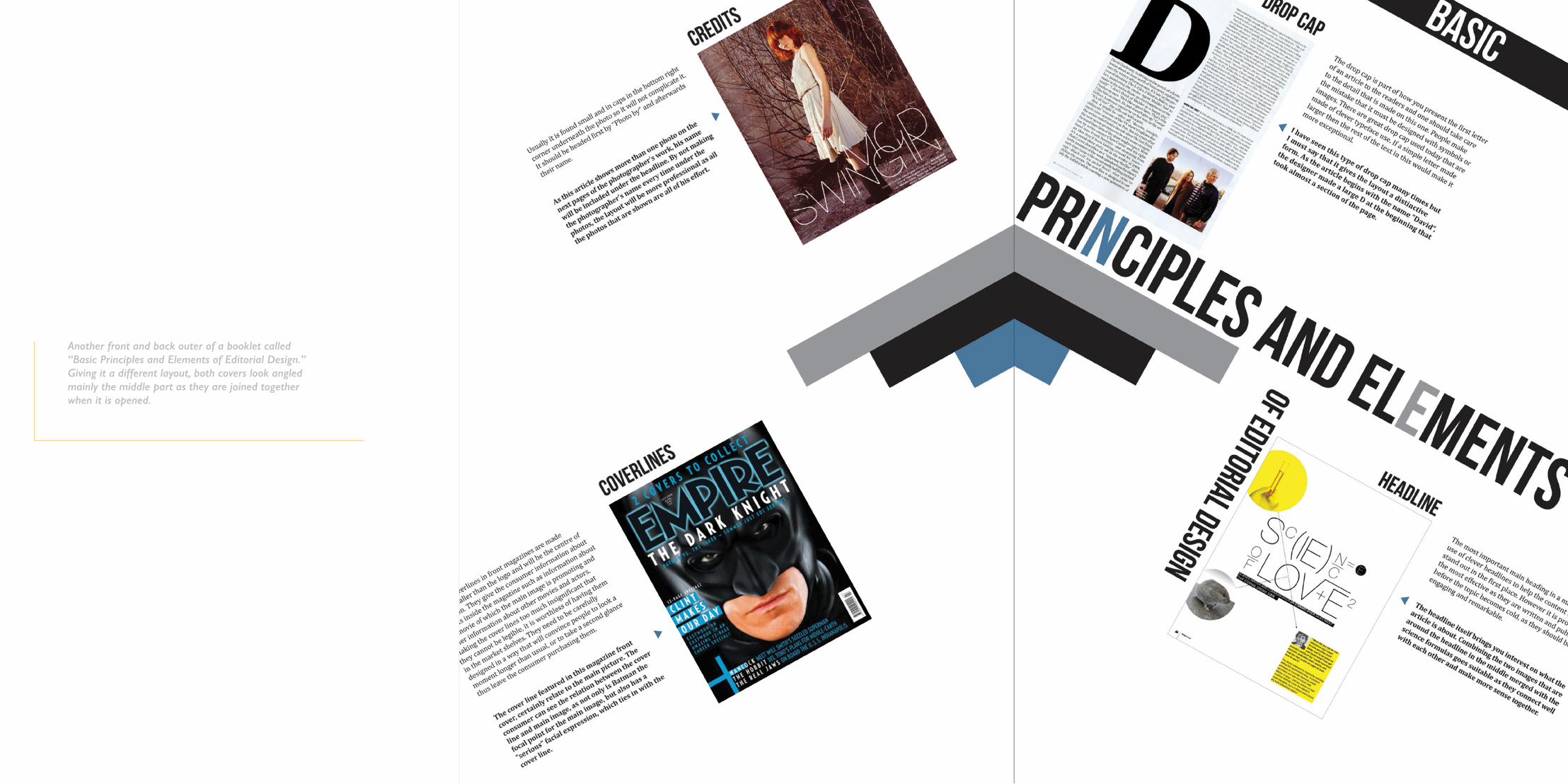
Another front and back outer of a booklet called “Basic Principles and Elements of Editorial Design.” Giving it a different layout, both covers look angled mainly the middle part as they are joined together when it is opened.

Taken from the booklet mentioned above, this centre spread has the basic elements of editorial design incorporated in it. One can notice how the second page has an image only as the idea was that one could use it as a poster after finishing reading the article.
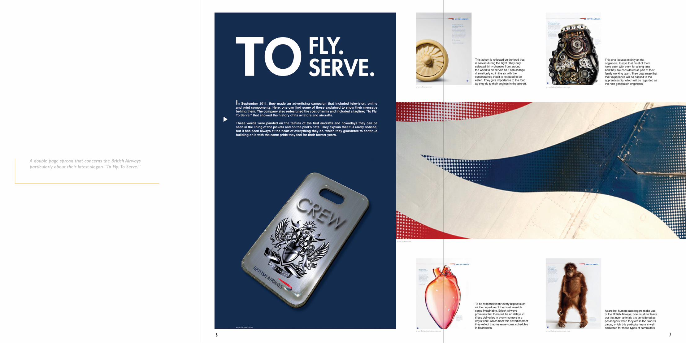
A double page spread that concerns the British Airways particularly about their latest slogan “To Fly. To Serve.”

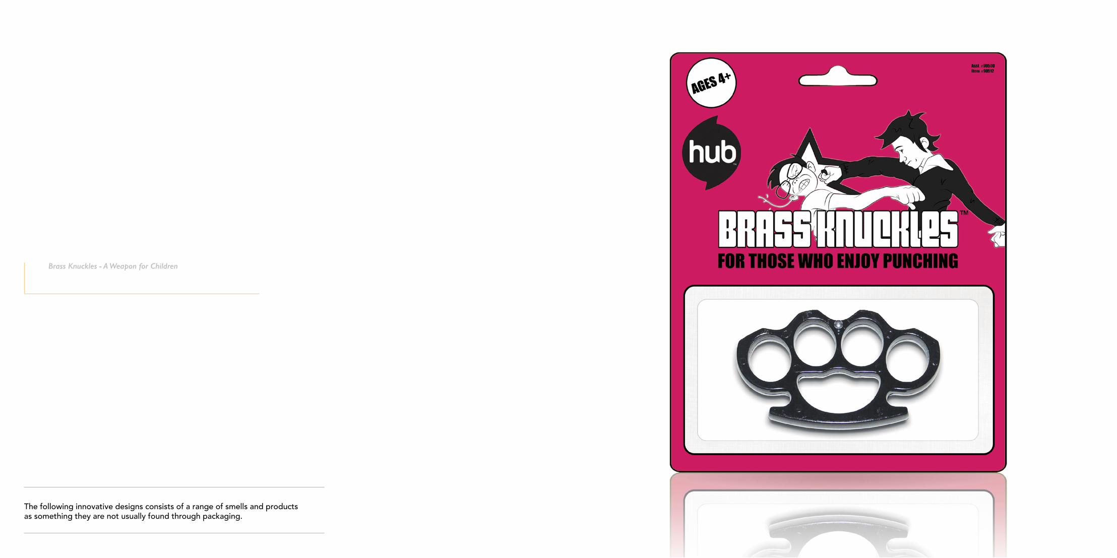
PACKAGING
6
The following innovative designs consists of a range of smells and products as something they are not usually found through packaging.
Brass Knuckles - A Weapon for Children

Smoking Pipe - A traditional male product as something desirable to smoke

Floral - Perfume for WomenMusky - Perfume for Men

PROJECTION MAPPINGVALLETTA 2018 CHRISTMAS ‘13
MCAST ART & DESIGN ANNUAL EXHIBITION ‘14
7

The task that was assigned to do concerning the projection mapping that was displayed last December on the Palace Façade at St. George Square, Valletta, was to make particular illustrations shown in the end credits part. From the start, the intention was to combine the Christmas theme with Valletta‘s culture and the technique used consisted of bold outlines with the use of red, green and white colours in them symbolizing the Christmas concept.
Grand Master La Vallette observing and a Christmas hat falling down on his head
VALLETTA 2018 CHRISTMAS ‘13

Landscape of Valletta and a Christmas star passing through the skies

Angel playing trumpet while trying to wake up the statue of Queen Victoria

Knights playing a sack race but instead of sacks, they are Christmas socks
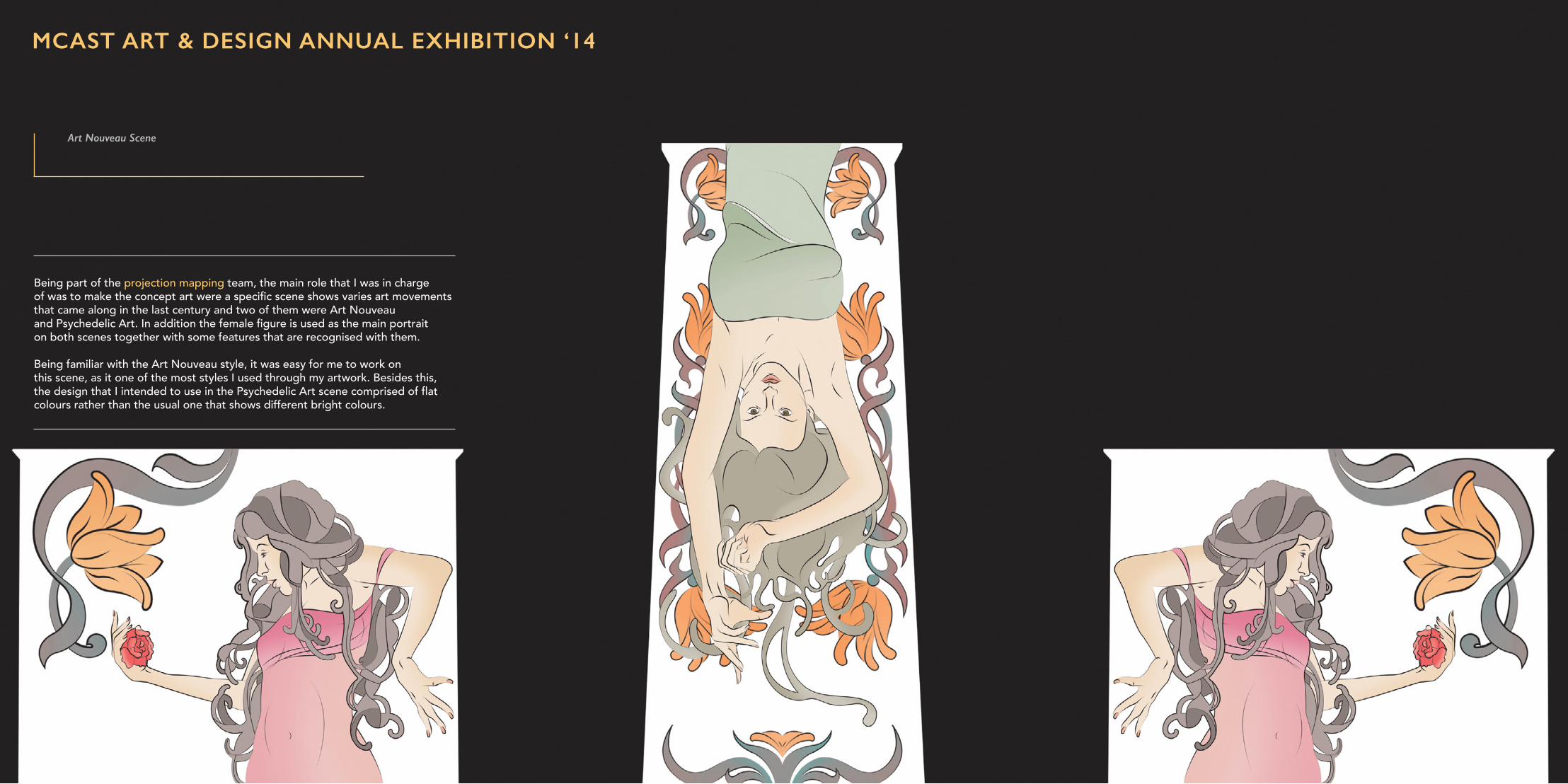
Being part of the projection mapping team, the main role that I was in charge of was to make the concept art were a specific scene shows varies art movements that came along in the last century and two of them were Art Nouveau and Psychedelic Art. In addition the female figure is used as the main portrait on both scenes together with some features that are recognised with them.
Being familiar with the Art Nouveau style, it was easy for me to work on this scene, as it one of the most styles I used through my artwork. Besides this, the design that I intended to use in the Psychedelic Art scene comprised of flat colours rather than the usual one that shows different bright colours.
Art Nouveau Scene
MCAST ART & DESIGN ANNUAL EXHIBITION ‘14
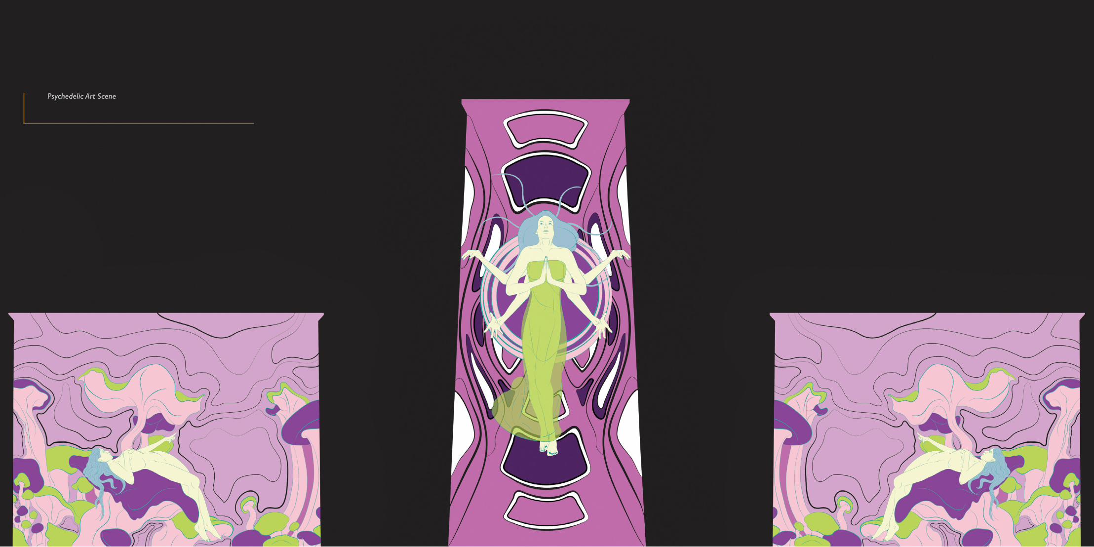
Psychedelic Art Scene
COMMISIONED WORKVALLETTA 2018 - VALLETTA CRUISE PORT
RITZENHOFF
8

Middle Part - The chosen Saints that appear in this particular section of the tunnel are Saint Paul and Saint Mary whom their feast is celebrated out nationally through out the Maltese Islands. Adding an element to represent both of them were a snake is found in one of Saint Paul’s hands and roses beside the other Saint that symbolize her as the patron as the Queen of Heaven. To give it more that surreal touch, both Saints are sitting on the clouds with other ones scattered around.
The client gave emphasis to focus on the Maltese culture and the idea was inspired by the old coins of the Maltese currency, which featured animals and nature. Furthermore, as our population is considered as one of the most faithful countries in Europe regarding religious beliefs, including an aspect of two renowned feasts in our concept made a good sense.
Additionally, it was decided to contain scenery of the Maltese islands and including the Maltese heritage such as the traditional clothes. One can see the pieces that I was assigned to do and the tunnel concept that was named “Identita’ Kulturali” consisted of watercolour splashes combined with line art, photomontage and contemporary abstract designs.
VALLETTA 2018 - VALLETTA CRUISE PORT
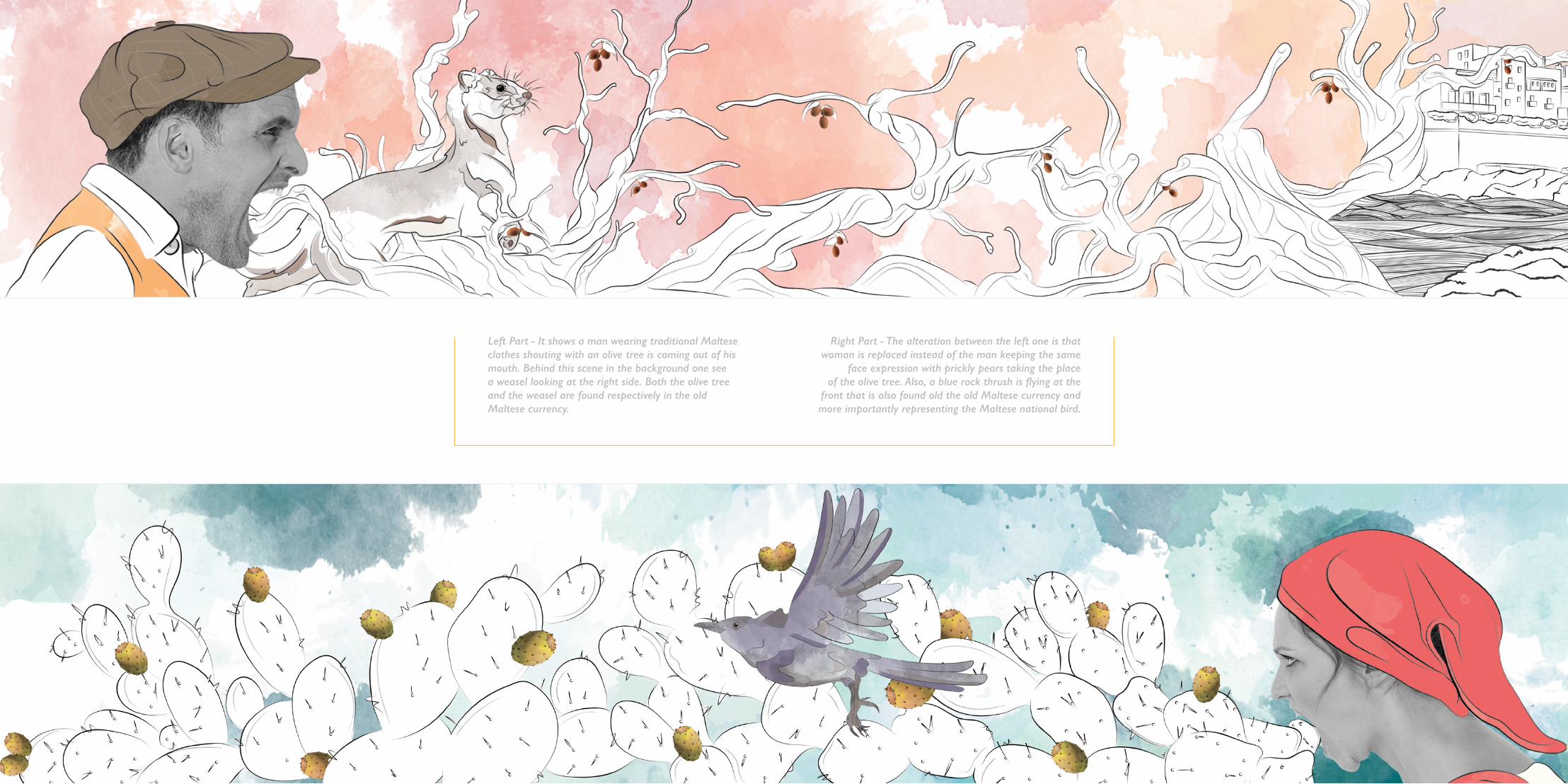
Left Part - It shows a man wearing traditional Maltese clothes shouting with an olive tree is coming out of his mouth. Behind this scene in the background one see a weasel looking at the right side. Both the olive tree and the weasel are found respectively in the old Maltese currency.
Right Part - The alteration between the left one is that woman is replaced instead of the man keeping the same
face expression with prickly pears taking the place of the olive tree. Also, a blue rock thrush is flying at the
front that is also found old the old Maltese currency and more importantly representing the Maltese national bird.

A very ambitious live case was to design the Schnapps collection. Working on the design did not mean creating the actual product but rather the graphics that appeared on the surface and its packaging. It was requested to embark on the creation of something new, creative, dynamic and fresh. As an outcome, the inspiration to design the set came from the English Pattern playing cards.
King of Spades
RITZENHOFF

Queen of Hearts
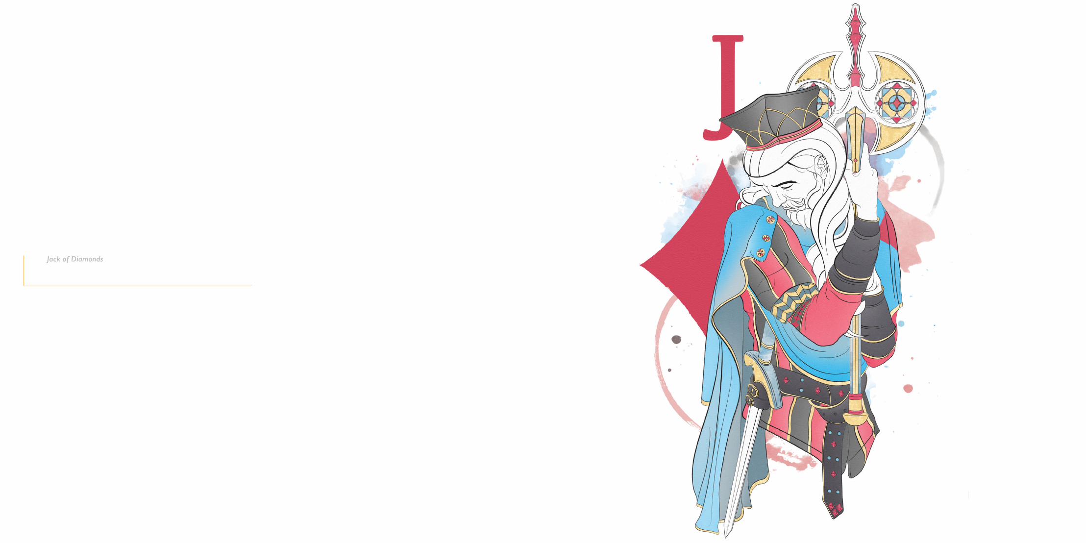
Jack of Diamonds


PROMOTION
9
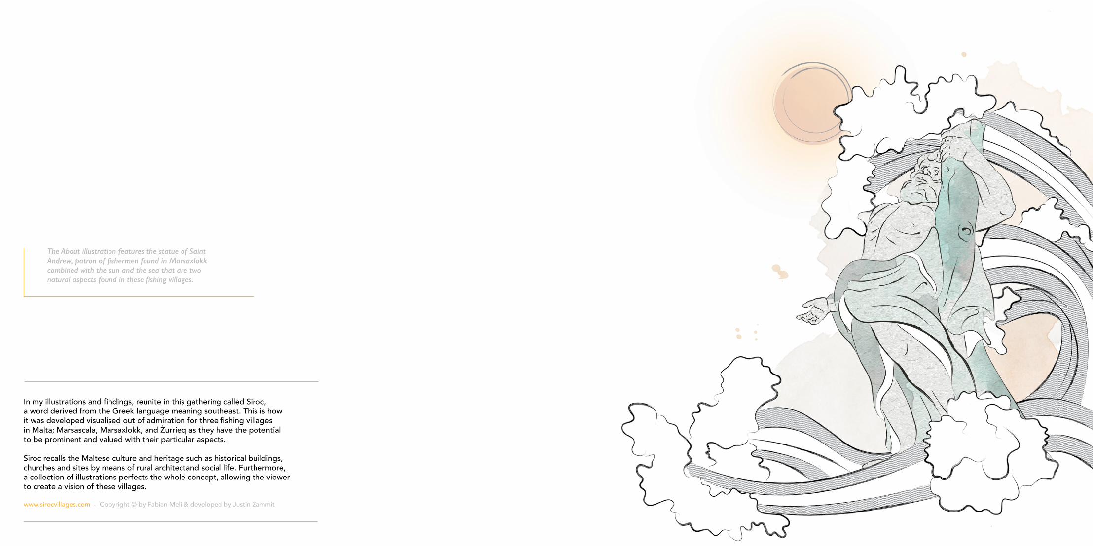
In my illustrations and findings, reunite in this gathering called Siroc, a word derived from the Greek language meaning southeast. This is how it was developed visualised out of admiration for three fishing villages in Malta; Marsascala, Marsaxlokk, and Żurrieq as they have the potential to be prominent and valued with their particular aspects.
Siroc recalls the Maltese culture and heritage such as historical buildings, churches and sites by means of rural architectand social life. Furthermore, a collection of illustrations perfects the whole concept, allowing the viewer to create a vision of these villages.
www.sirocvillages.com - Copyright © by Fabian Meli & developed by Justin Zammit
The About illustration features the statue of Saint Andrew, patron of fishermen found in Marsaxlokk combined with the sun and the sea that are two natural aspects found in these fishing villages.
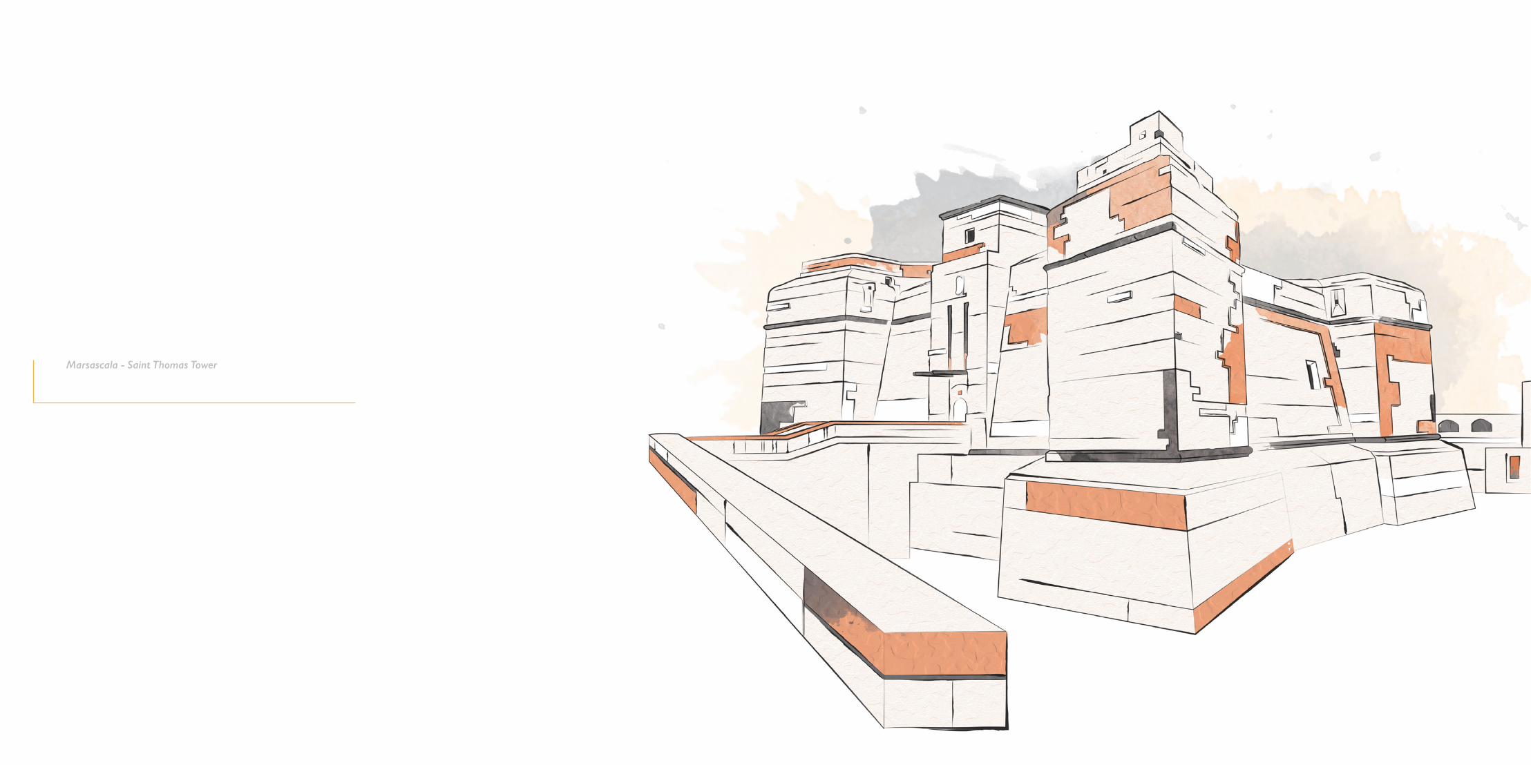
Marsascala - Saint Thomas Tower
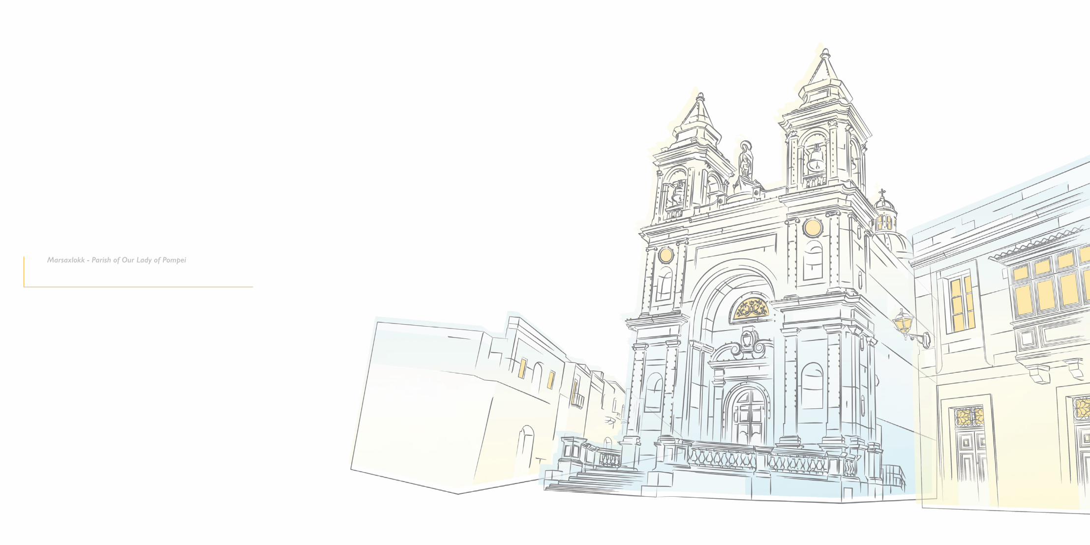
Marsaxlokk - Parish of Our Lady of Pompei

Zurrieq - Hal Millieri-.