F29-01ad-9780750645522 FIGURE S15.1 Tropical Atlantic interannual climate modes.(a, b) Atlantic...
21
f29-01ad-9780750645522 FIGURE S15.1 Tropical Atlantic interannual climate modes.(a, b) Atlantic Meridional Mode: SST correlation with the AMM index for 1948–2007, all months and monthly time series (light) of the AMM index, with a one-year running mean (heavy). (Data and graphical interface from NOAAESRL, 2009b). (c, d) Atlantic “Niño” (zonal equatorial mode): SST anomalies and time series of temperature averaged in the cold-tongue region 3°S–3°N, 20°W–0° (“ATL3 index”). High values correspond to the Niño state (weak or absent cold tongue). © American Meteorological Society. Reprinted with permission. Source: From Wang (2002). (e) Feedbacks for AMM decadal variability. Arrowheads mean an upward trend in the cause results in an upward trend in the result, circles indicate upward trend resulting in negative trend. (Based on Chang et al., 1997; Kushnir et al., 2002). TALLEY Copyright © 2011 Elsevier Inc. All rights reserved
-
Upload
cecil-arnold -
Category
Documents
-
view
214 -
download
0
Transcript of F29-01ad-9780750645522 FIGURE S15.1 Tropical Atlantic interannual climate modes.(a, b) Atlantic...

f29-01ad-9780750645522
FIGURE S15.1
Tropical Atlantic interannual climate modes.(a, b) Atlantic Meridional Mode: SST correlation with the AMM index for 1948–2007, all months and monthly time series (light) of the AMM index, with a one-year running mean (heavy). (Data and graphical interface from NOAAESRL, 2009b). (c, d) Atlantic “Niño” (zonal equatorial mode): SST anomalies andtime series of temperature averaged in the cold-tongue region 3°S–3°N, 20°W–0°(“ATL3 index”). High values correspond to the Niño state (weak or absent cold tongue). © American Meteorological Society. Reprinted with permission. Source: From Wang (2002). (e) Feedbacks for AMM decadal variability. Arrowheads mean an upward trend in the cause results in an upward trend in the result, circles indicate upward trend resulting in negative trend. (Based on Chang et al., 1997; Kushnir et al., 2002).
TALLEY Copyright © 2011 Elsevier Inc. All rights reserved

FIGURE S15.2
Atlantic decadal to multidecadal climate modes. (a) North Atlantic Oscillation (NAO), (b) East AtlanticPattern (EAP), and (c) Atlantic Multidecadal Oscillation (AMO). Maps of SST correlation with each index: positive is warm and negative is cold. (Data and graphical interface from NOAA ESRL, 2009b.) (d) NAO index (Hurrell, 1995, 2009): difference of sea level pressure between Lisbon, Portugal and Stykkisholmur, Iceland. Source: Updated by Hurrell (personal communication, 2011). (e) EAP index: amplitude of second EOF. Source: From NOAA ESRL (2009b). (f) AMO: amplitude of the principal component of proxy temperature records. Source: From Delworth and Mann (2000). (g) Time series, each with a 10-year running mean and “normalized” by its maximum amplitude. NAO and EAP as above. The AMO is the Enfield et al. (2001) SST-based index.
TALLEY Copyright © 2011 Elsevier Inc. All rights reserved

FIGURE S15.3
North Atlantic surface salinity variability.Salinity anomalies relative to long-term mean along 60°N. Source:From
Reverdin et al. (2002). (b) Great Salinity Anomaly: timing in years for the 1990s GSA. Source: From Belkin (2004).
TALLEY Copyright © 2011 Elsevier Inc. All rights reserved

FIGURE S15.4
Salinity at the density of LSW in two different decades: (a) 1960s and (b) 1990s. Source: From Yashayaev (2007).
TALLEY Copyright © 2011 Elsevier Inc. All rights reserved
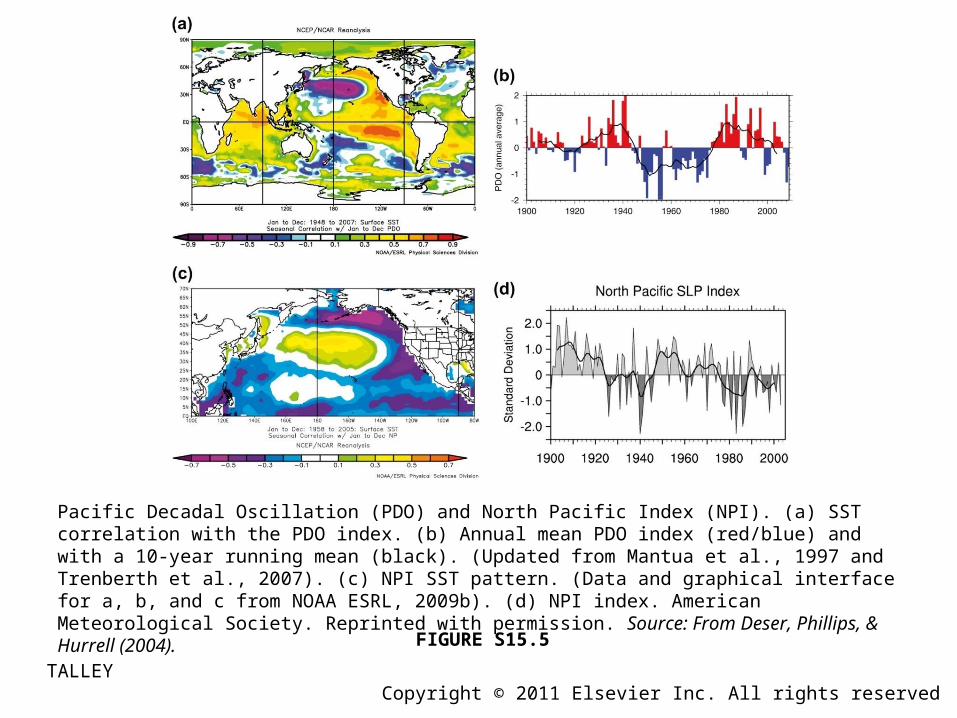
FIGURE S15.5
Pacific Decadal Oscillation (PDO) and North Pacific Index (NPI). (a) SST correlation with the PDO index. (b) Annual mean PDO index (red/blue) and with a 10-year running mean (black). (Updated from Mantua et al., 1997 and Trenberth et al., 2007). (c) NPI SST pattern. (Data and graphical interface for a, b, and c from NOAA ESRL, 2009b). (d) NPI index. American Meteorological Society. Reprinted with permission. Source: From Deser, Phillips, & Hurrell (2004).
TALLEY Copyright © 2011 Elsevier Inc. All rights reserved

FIGURE S15.6
(a) Pacific Decadal Oscillation (PDO) and (b) North Pacific Gyre Oscillation (NPGO) patterns of sea level pressure (color) and surface wind stress (vectors). The PDO/NPGO are correlated well with upwelling in the red-circled/blue-circled region off Oregon/California. Source: From Di Lorenzo et al. (2008).
TALLEY Copyright © 2011 Elsevier Inc. All rights reserved

FIGURE S15.7
Correlation of SST anomalies with the ENSO index for 1982–1992, at (a) 0 month lag and (b) 4 month lag.© American Meteorological Society. Reprinted with permission. Source: From Klein, Soden, and Lau (1999).
TALLEY Copyright © 2011 Elsevier Inc. All rights reserved

FIGURE S15.8
Indian Ocean. Changes in (a) rice production and (b) rainfall in India with El Niño and La Niña events indicated. The long-term trend in production is due to improved agricultural practices. (Adapted by WCRP, 1998 from Webster et al., 1998.)
TALLEY Copyright © 2011 Elsevier Inc. All rights reserved

FIGURE S15.9
Indian Ocean Dipole mode. (a) Anomalies of SST (shading) and wind velocity (arrows) during a composite positive IOD event. These are accompanied by higher precipitation in the warm SST region and lower precipitation in the cool SST region. (b) IOD index (blue: difference in SST anomaly between the western and eastern tropical Indian Ocean), plotted with the anomaly of zonal equatorial wind (red) and the Nino3 index from the Pacific (black line). Source: From Saji et al., (1999).
TALLEY Copyright © 2011 Elsevier Inc. All rights reserved

FIGURE S15.10
Arctic Oscillation (AO). (a) Schematics of (left) the positive phase and (right) the negative phase (NSIDC, 2009b). (b) Correlation of surface pressure (20–90°N) with the AO index for 1958 to 2007. (Data and graphical interface from NOAA ESRL, 2009b.) (c) Arctic Oscillation index 1899e2002. Source: From JISAO (2004).
TALLEY Copyright © 2011 Elsevier Inc. All rights reserved

FIGURE S15.11
Arctic Ocean. (a) Sea ice extent 9/25/2007. Pink indicates the average extent for years 1979–2000. Source: From NSIDC (2007). (b) Sea ice concentration anomaly (%) for September 1998–2003 minus 1979–1997. Source: From Shimada et al. (2006). (c) Arctic sea ice extent in September (1978–2008), based on satellite microwave data. Source: From NSIDC (2008b); after Serreze et al. (2007).
TALLEY Copyright © 2011 Elsevier Inc. All rights reserved

FIGURE S15.12
Salinity in the Norwegian Sea, at Ocean Weather Station Mike offshore of the Norwegian Atlantic Current (66°N, 2°E).Source: From Dickson, Curry, and Yashayaev (2003, Recent changes in the North Atlantic, Phil. Trans. Roy. Soc. A, 361, p. 1922, Fig. 2).
TALLEY Copyright © 2011 Elsevier Inc. All rights reserved
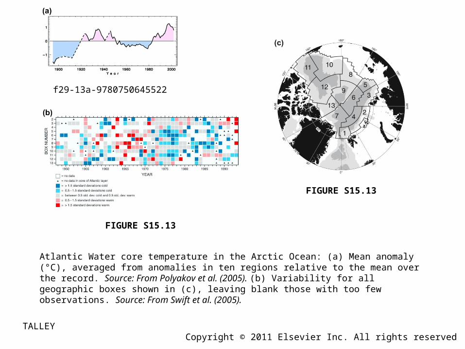
f29-13a-9780750645522
FIGURE S15.13
FIGURE S15.13
Atlantic Water core temperature in the Arctic Ocean: (a) Mean anomaly (°C), averaged from anomalies in ten regions relative to the mean over the record. Source: From Polyakov et al. (2005). (b) Variability for all geographic boxes shown in (c), leaving blank those with too few observations. Source: From Swift et al. (2005).
TALLEY Copyright © 2011 Elsevier Inc. All rights reserved

FIGURE S15.14
Arctic Ocean. Sections of potential temperature (°C) for 2003–2008, and a time series of temperature northeast of Svalbard. (I. Polyakov, personal communication, 2009.)
TALLEY Copyright © 2011 Elsevier Inc. All rights reserved

FIGURE S15.15
FIGURE S15.15 (Continued).
Southern Ocean. Correlation of the Southern Annular Mode index (from Thompson and Wallace, 2000), for all months from 1979 to 2005, with (a, b) sea level pressure and (c) SST. (Data and graphical interface from NOAA ESRL,2009b.) (d) Time series of SAM index. Source: From the IPCC AR4, Trenberth et al., 2007; Climate Change 2007: The Physical Science Basis. Working Group I Contribution to the Fourth Assessment Report of the Intergovernmental Panel on Climate Change, Figure 3.32. Cambridge University Press.)
TALLEY Copyright © 2011 Elsevier Inc. All rights reserved
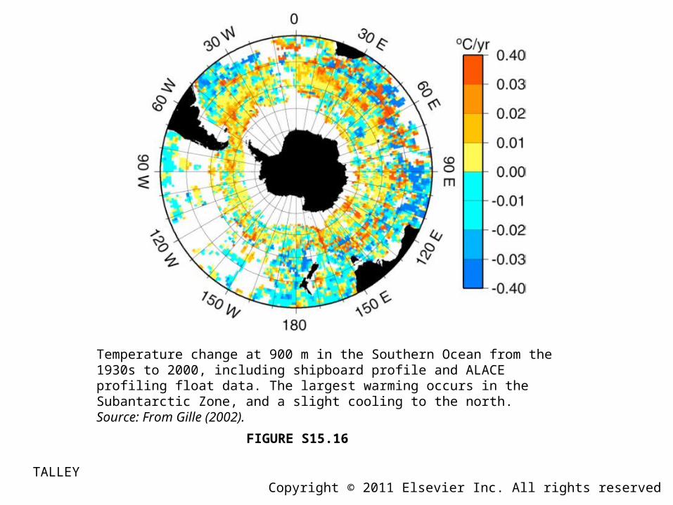
FIGURE S15.16
Temperature change at 900 m in the Southern Ocean from the 1930s to 2000, including shipboard profile and ALACE profiling float data. The largest warming occurs in the Subantarctic Zone, and a slight cooling to the north. Source: From Gille (2002).
TALLEY Copyright © 2011 Elsevier Inc. All rights reserved

FIGURE S15.17
Global ocean heat content change (×1022 J) for the upper 0–700 m (black), 0–100 m (red), and SST change (blue). One standard deviation of error is indicated in gray (for 0–700 m) and thin red lines (for 0–100 m). The optical thickness of the stratosphere is indicated at the bottom,with three major volcanoes labeled.Source: From Domingues et al. (2008).
TALLEY Copyright © 2011 Elsevier Inc. All rights reserved

FIGURE S15.18
(a) Correlation of SST for 1970–2007 with a linear trend, based on the NCEP/NCAR reanalysis. Positive correlation means warming and negative correlation means cooling. (Data and graphical interface fromNOAA ESRL, 2009b.) (b) Linear trend of change in ocean heat content per unit surface area (W m–2) for the 0 to 700 m layer from 1955 to 2003, based on Levitus et al. (2005). Red shading is values above 0.25 W m–2 and blue shading is below –0.25 W m–2. Source: From the IPCC AR4, Bindoff et al., 2007; Climate Change 2007: The Physical Science Basis. Working Group I Contribution to the Fourth Assessment Report of the Intergovernmental Panel on Climate Change, Figure 5.2. Cambridge University Press.
TALLEY Copyright © 2011 Elsevier Inc. All rights reserved
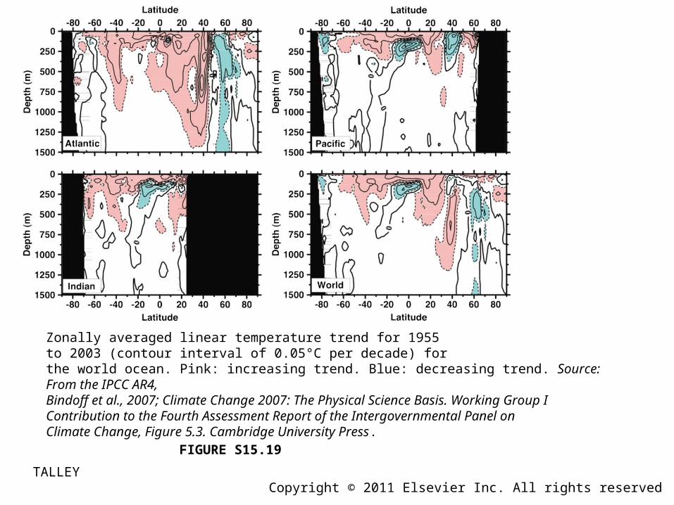
FIGURE S15.19
Zonally averaged linear temperature trend for 1955to 2003 (contour interval of 0.05°C per decade) forthe world ocean. Pink: increasing trend. Blue: decreasing trend. Source: From the IPCC AR4, Bindoff et al., 2007; Climate Change 2007: The Physical Science Basis. Working Group I Contribution to the Fourth Assessment Report of the Intergovernmental Panel onClimate Change, Figure 5.3. Cambridge University Press.
TALLEY Copyright © 2011 Elsevier Inc. All rights reserved

FIGURE S15.20
Zonally averaged linear salinity trend for 1955 to 2003 (contour interval of 0.01 psu per decade) for the world ocean.Pink: increasing trend.Blue: decreasing trend.Source: From the IPCC AR4, Bindoff et al., 2007; Climate Change 2007: The Physical Science Basis. Working Group I Contribution to the Fourth Assessment Report of the Intergovernmental Panel onClimate Change, Figure 5.5. Cambridge University Press.
TALLEY Copyright © 2011 Elsevier Inc. All rights reserved

FIGURE S15.21
Global mean sea level (mm) relative to the 1961–1990 average, with 90% confidence intervals, based on sparse tide gauges (red), coastal tide gauges (blue),and satellite altimetry (black solid). Source: From the IPCC AR4, Bindoff et al., 2007; Climate Change 2007: The Physical Science Basis. Working Group I Contribution to the Fourth Assessment Report of the Intergovernmental Panel on Climate Change, Figure 5.13. Cambridge University Press.
TALLEY Copyright © 2011 Elsevier Inc. All rights reserved