Exploring various layouts
4
Exploring various layouts I will be exploring the layouts from Q, NME and Kerrang’s front cover, contents page and double page spread.
-
Upload
kenyal -
Category
Data & Analytics
-
view
103 -
download
2
Transcript of Exploring various layouts

Exploring various layouts
I will be exploring the layouts from Q, NME and Kerrang’s front cover, contents page and double page spread.

Front cover pageIt is crucial for all magazines in the magazine industry to have a masthead. All 3 of these magazines have a masthead which is placed at the top of the page either in the centre or top left. The masthead for all 3 magazines have enough space to have large font which makes it instantly visible for viewers/ readers. In terms of the main image it appears to be in the centre of all magazines. I believe the main image on all magazines have been placed in the centre to gains viewers attention instantly. The main headline for Kerrang and Q are similar to each other since they are located slightly centre middle of the main image. However, NME’s main headline appears to be at the bottom of the page. Perhaps this may be because the shot used for the main image since it is a close up shot which didn't want to be interfered with text overlapping the face. It appears that the subheadings on all magazines are located on either side of the page which doesn't interfere with the main image and main headline.
Kerrang
Q
NME
MAIN HEADLINE
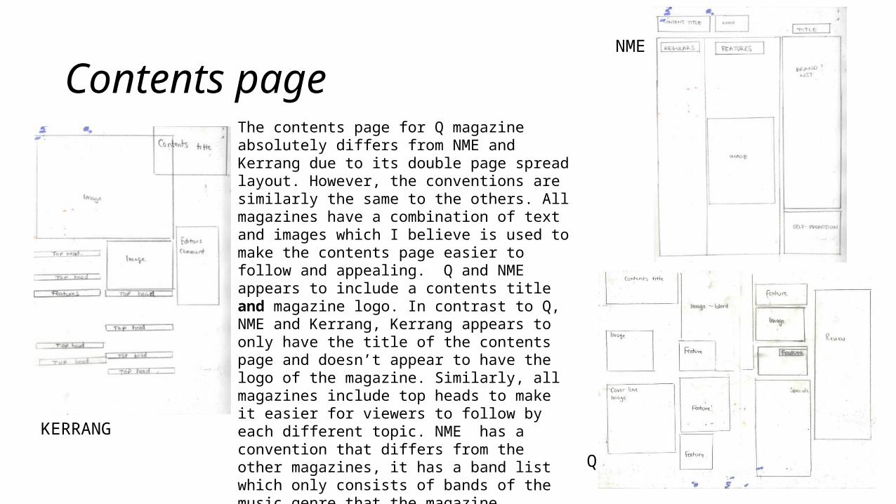
Contents page The contents page for Q magazine absolutely differs from NME and Kerrang due to its double page spread layout. However, the conventions are similarly the same to the others. All magazines have a combination of text and images which I believe is used to make the contents page easier to follow and appealing. Q and NME appears to include a contents title and magazine logo. In contrast to Q, NME and Kerrang, Kerrang appears to only have the title of the contents page and doesn’t appear to have the logo of the magazine. Similarly, all magazines include top heads to make it easier for viewers to follow by each different topic. NME has a convention that differs from the other magazines, it has a band list which only consists of bands of the music genre that the magazine consists of. All magazines also have page numbers. This is crucial for all contents pages of magazines to have to direct readers to specific pages.
NME
Q
KERRANG

Double page spread
QNME
KERRANGThe main image bleeds though to the recto to have the opportunity of spreading across both pages to be part of them both. A pull quote has been used to complement the main image too. At the bottom, there is a top head which escorts readers to additional information relating to the article – images too. I mentioned that the main image on kerrang is similar to Q since they are located on the left side however Q differs from kerrang because it bleeds though to the recto. The picture bleeding though to the other makes the DPS more appealing because it extends the basic layout. For this DPS there is a small area which consists of the body. I personally believe that the image dominates the body which doesn’t make readers want to read the purpose of the DPS.
Each magazine’s double page spread extremely differs from each other. Kerrang: The layout is fairly basic but rather appealing to read. On the recto of the double page spread contains text whilst the left side of the spread contains an image. The image is similar to Q in terms of the side of where the main image is placed. I absolutely adore the layout of the pull quote because it interferes with the body of both grids of text. Even though it obstructs the body, it plays an important part of the purpose of the factual DPS. The title of the page is in large expressive text (capital locks) which instantly demands attention to readers. Q and NME magazine differs in style and aspects which is rarely the same to Kerrang. There is a slight balance of text and images to ensure that the article is not boring for readers.