


Exploring fractals in CSS, @fronttrends, Warsaw, 2015
72
dzie ń dobry
-
Upload
pixelass -
Category
Technology
-
view
2.274 -
download
1
Transcript of Exploring fractals in CSS, @fronttrends, Warsaw, 2015

dzień dobry

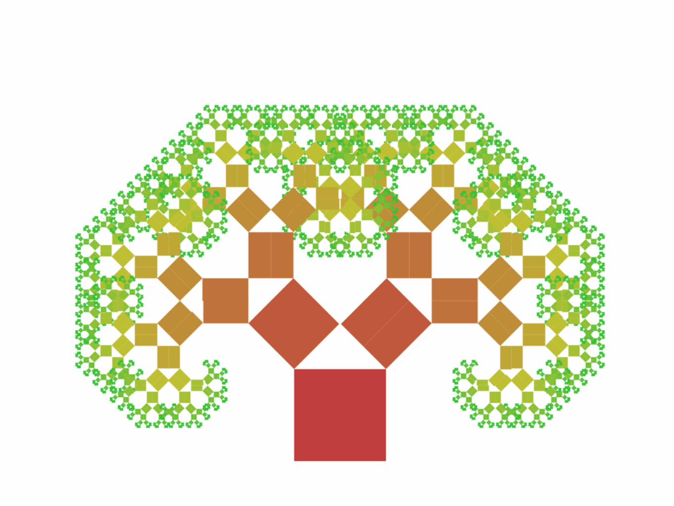
Romanesco

Frost

Snowflake

Sea urchin

Tree

Lightning

Gregor Adamsweb developer / front-end architect
SINNERSCHRADER
Hamburg, Germany

Exploring fractals in CSS


- Wikipedia
“A fractal is a natural phenomenon or a mathematical set that exhibits a repeating pattern that displays at every scale. If the replication is exactly the same at every scale, it is called a self-similar pattern.”

- Wikipedia
“A fractal is a natural phenomenon or a mathematical set that exhibits a repeating pattern that displays at every scale. If the replication is exactly the same at every scale, it is called a self-similar pattern.”

Mandelbrot Set


Zn + 1 = Zn² + C
Xn + 1 = Xn * Xn - Yn * Yn + X and Yn + 1 = 2 * Xn * Yn + Y
http://rosettacode.org/wiki/Mandelbrot_set
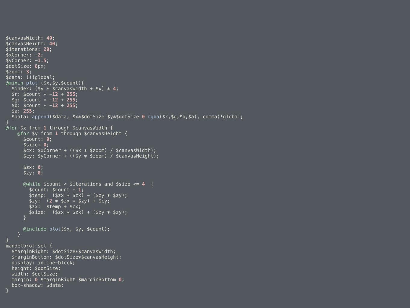
$canvasWidth: 40; $canvasHeight: 40; $iterations: 20; $xCorner: -2; $yCorner: -1.5; $dotSize: 8px; $zoom: 3; $data: ()!global; @mixin plot ($x,$y,$count){ $index: ($y * $canvasWidth + $x) * 4; $r: $count * -12 + 255; $g: $count * -12 + 255; $b: $count * -12 + 255; $a: 255; $data: append($data, $x*$dotSize $y*$dotSize 0 rgba($r,$g,$b,$a), comma)!global; } @for $x from 1 through $canvasWidth { @for $y from 1 through $canvasHeight { $count: 0; $size: 0; $cx: $xCorner + (($x * $zoom) / $canvasWidth); $cy: $yCorner + (($y * $zoom) / $canvasHeight);
$zx: 0; $zy: 0;
@while $count < $iterations and $size <= 4 { $count: $count + 1; $temp: ($zx * $zx) - ($zy * $zy); $zy: (2 * $zx * $zy) + $cy; $zx: $temp + $cx; $size: ($zx * $zx) + ($zy * $zy); }
@include plot($x, $y, $count); } } mandelbrot-set { $marginRight: $dotSize*$canvasWidth; $marginBottom: $dotSize*$canvasHeight; display: inline-block; height: $dotSize; width: $dotSize; margin: 0 $marginRight $marginBottom 0; box-shadow: $data; }
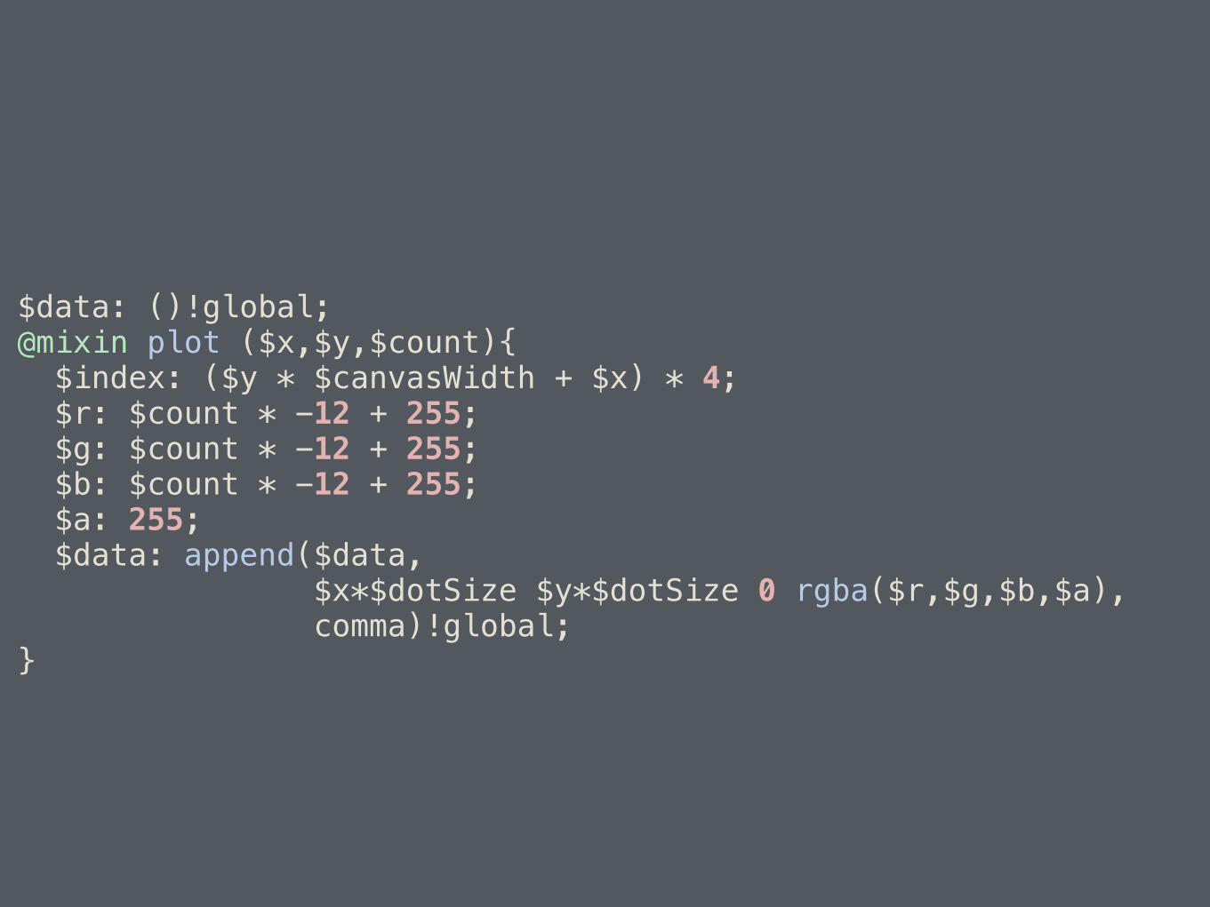
$data: ()!global; @mixin plot ($x,$y,$count){ $index: ($y * $canvasWidth + $x) * 4; $r: $count * -12 + 255; $g: $count * -12 + 255; $b: $count * -12 + 255; $a: 255; $data: append($data, $x*$dotSize $y*$dotSize 0 rgba($r,$g,$b,$a), comma)!global; }

$data: ()!global; @mixin plot ($x,$y,$count){ $index: ($y * $canvasWidth + $x) * 4; $r: $count * -12 + 255; $g: $count * -12 + 255; $b: $count * -12 + 255; $a: 255; $data: append($data, $x*$dotSize $y*$dotSize 0 rgba($r,$g,$b,$a), comma)!global; }

@for $x from 1 through $canvasWidth { @for $y from 1 through $canvasHeight { $count: 0; $size: 0; $cx: $xCorner + (($x * $zoom) / $canvasWidth); $cy: $yCorner + (($y * $zoom) / $canvasHeight);
$zx: 0; $zy: 0;
@while $count < $iterations and $size <= 4 { $count: $count + 1; $temp: ($zx * $zx) - ($zy * $zy); $zy: (2 * $zx * $zy) + $cy; $zx: $temp + $cx; $size: ($zx * $zx) + ($zy * $zy); }
@include plot($x, $y, $count); } }

mandelbrot-set { $marginRight: $dotSize*$canvasWidth; $marginBottom: $dotSize*$canvasHeight; display: inline-block; height: $dotSize; width: $dotSize; margin: 0 $marginRight $marginBottom 0; box-shadow: $data; }

mandelbrot-set { $marginRight: $dotSize*$canvasWidth; $marginBottom: $dotSize*$canvasHeight; display: inline-block; height: $dotSize; width: $dotSize; margin: 0 $marginRight $marginBottom 0; box-shadow: $data; }
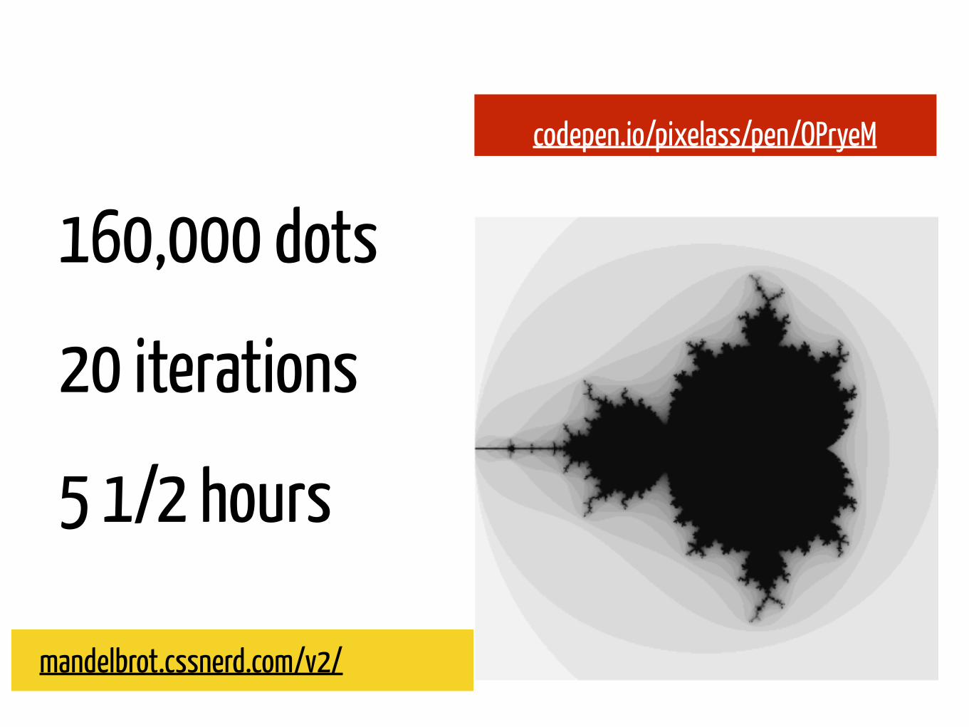
160,000 dots
20 iterations
5 1/2 hours
mandelbrot.cssnerd.com/v2/
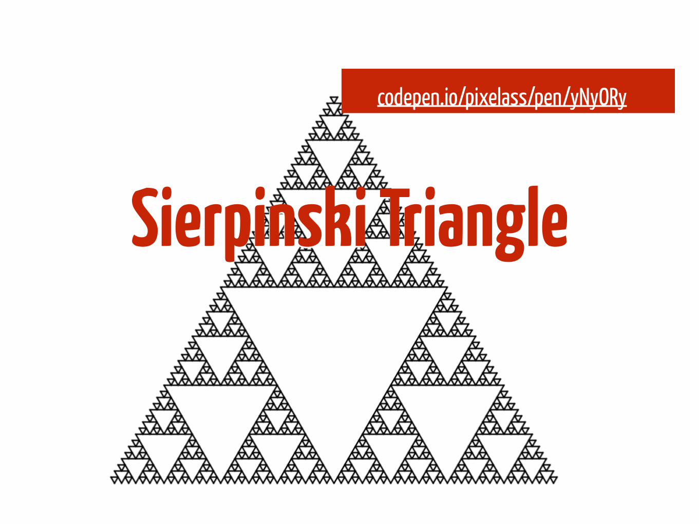
codepen.io/pixelass/pen/OPryeM
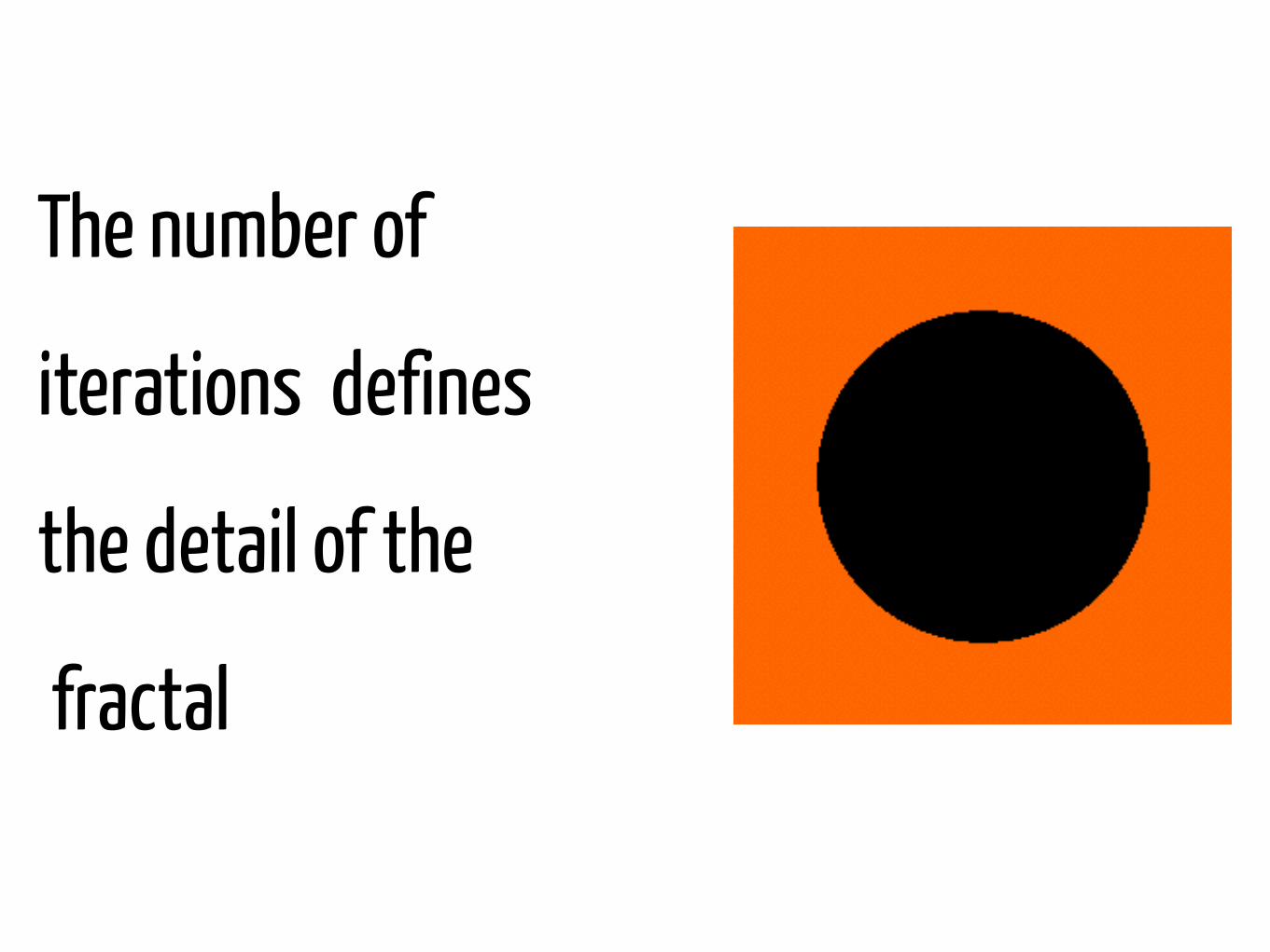
The number of
iterations defines
the detail of the
fractal

160,000 dots
70 iterations
3 1/2 hours
codepen.io/pixelass/pen/HbnCv
mandelbrot.cssnerd.com/detail/

100.000
iterations
2 hours
codepen.io/pixelass/pen/NqWEmd
barnsley.cssnerd.com/
Barnsley fern

Chaos game
| x | | r*cos(a) -s*sin(b) | | x | | h | w1 | | = | | | | + | | | y | | r*sin(a) s*cos(b) | | y | | k |
Translation Rotation Scaling h,k a,b r,s
w1 0,0 0,0 0,0.16 w2 0,1.6 -2.5,-2.5 0.85,0.85 w3 0,1.6 49,49 0.3,0.3 w4 0,0.44 120,-50 0.3,0.37

Chaos & Sass
are not friends

different systems to draw fractals
Iterated Function System (IFS) Lindenmayer-System (L-System)

.side { position: absolute; top: 0; height: 0; width: 1em; box-shadow: 0 0 0 1px black; font-size: 0.5em; } .side:nth-child(1) { left: 50%; transform-origin: 0% 50%; transform: rotate(240deg); } .side:nth-child(2) { right: 50%; transform-origin: 100% 50%; transform: rotate(-240deg); } .side:nth-child(3) { left: 25%; transform: translateY(-0.86603em); } .base { position: absolute; top: 50%; left: 50%; font-size: 40em; margin-top: -0.1em; } .base > .side { top: 50%; left: 50%; margin: 0 -0.5em; transform-origin: 50% 50%; } .base > .side:nth-child(1) { transform: rotate(0deg) translateY(0.28868em) rotate(180deg); } .base > .side:nth-child(2) { transform: rotate(120deg) translateY(0.28868em) rotate(180deg); } .base > .side:nth-child(3) { transform: rotate(240deg) translateY(0.28868em) rotate(180deg); }

<div class="base"> <div class="side"> <div class="side"> <div class="side"> <div class="side"> <div class="side"> <div class="side"> </div> <div class="side"> </div> <div class="side"> </div> </div> <div class="side"> <div class="side"> </div> <div class="side"> </div> <div class="side"> </div> </div> <div class="side"> <div class="side"> </div> <div class="side"> </div> <div class="side"> </div> </div> </div> ...

.square { height: 10em; width: 10em; display: flex; flex-flow: row wrap; font-size: 0.33333em; background: white; box-shadow: 0 0 0 3.33333em black inset; transform-origin: 0 0; } .square:nth-child(5) { visibility: hidden; }

.cube { font-size: 7em; height: 1em; width: 1em; position: absolute; top: 50%; left: 50%; margin: -0.5em; } .cube .cube { font-size: 0.34em; } .cube .cube:nth-child(1) { transform: translate3d(-1em, -1em, -1em); } ... ... ... ... .cube .cube:nth-child(27) { transform: translate3d(1em, 1em, 1em); } .cube .sides { visibility: visible; transform: translate3d(0, 0, 0.5em); background: #3d3d3d; } .cube .sides, .cube .sides:before, .cube .sides:after { height: 100%; width: 100%; position: absolute; top: 0; left: 0; box-shadow: inset 0 0 0 1px rgba(178, 178, 178, 0.3); } .cube .sides:before, .cube .sides:after { content: ''; } .cube .sides:before { transform-origin: 100% 50%; transform: rotateY(-90deg); background: #666; } .cube .sides:after { transform-origin: 50% 0%; transform: rotateX(-90deg); background: #848484; }

a b
c
a² + b² = c²Pythagorean Theorem

a b
c
c / sqrt(2) = a = bRight Isosceles Triangle

$nested-size: 100%/sqrt(2);// ~70.71% div { height: $nested-size; width: $nested-size; }

$nested-size: 100%/sqrt(2); div { height: $nested-size; width: $nested-size; position: absolute; bottom: 100%; left: 0; transform-origin: 0% 100%; transform: rotate(-45deg); background: black; }

I have an idea

Simplify the tree to the half of one branch

-webkit-box-reflect

$nested-size: 100%/sqrt(2); div { position: absolute; bottom: 100%; left: 0; height: $nested-size; width: $nested-size; transform-origin: 0% 100%; transform: rotate(-45deg); background: black; // fractal magic -webkit-box-reflect: right; }


Confused?
Let’s code this live

@GregorAdams
@pixelass
@pixelass

… one more thing

dziękuję