Executive Dashboards: Elements of Success - Novell · Executive Dashboards: Elements of Success. p....
12
www.novell.com White Paper Executive Dashboards: Elements of Success April 2009
Transcript of Executive Dashboards: Elements of Success - Novell · Executive Dashboards: Elements of Success. p....

www.novell.com White Paper
Executive Dashboards: Elements of Success April 2009

p. 2
Dashboards: the Complete Picture for Business and IT..........................................................................................3
Dashboards: Lessons Learned................................................................................................................................3
Characteristics of a Successful Dashboard .............................................................................................................4
Implementing a Successful Dashboard Project .......................................................................................................8
A Dashboard Case Study: Online E-Card Retailing ................................................................................................9
Leveraging Novell for a Successful Dashboard Project.........................................................................................11

p. 3
D a s h b o a r d s : t h e C o m p l e t e P i c t u r e f o r B u s i n e s s a n d I T Management dashboards have risen to the top of business and IT priority lists in recent months—and for good
reason. Dashboards have become an essential enabler in sustaining a highly competitive business. Why? Quite
simply, by consolidating essential IT service quality metrics, key performance indicators (KPIs), and business
process health into one interactive view, dashboards provide a real-time and historical window into overall
business performance. What’s more, because dashboards can also provide actionable information, business and
IT managers can more effectively manage the areas of business for which they are responsible.
This is especially necessary in today’s post-Enron business environment where business and IT managers
are being held to higher levels of accountability. In response, top executives are mandating dashboard projects
to deliver meaningful visibility not only into business performance, but also into government regulatory
compliance.
For companies rushing to outsource business processes or entire IT operations, dashboards provide an
effective means to monitor, measure and report on the quality of services provided by an outsourcer. For many
IT organizations, communicating the level of IT service quality delivered to the business has become a means of
survival—if IT can demonstrate that it’s providing a high quality service, there’s no need to consider outsourcing
as an alternative. For these companies, dashboards provide a mechanism to communicate the business value
provided by IT.
In all cases, dashboards provide an effective means to empower business and IT management with
accurate, real-time and historical information necessary to running a successful and competitive business.
However, many dashboard projects falter when they fail to link critical business metrics with IT performance
results and are unable to present a “complete picture” of a business process or service. Without an actionable,
relevant, end-to-end view of the complete business service based on real-time information, IT and business
managers are simply flying blind.
In this white paper, we’ll investigate the characteristics and metrics of successful dashboards as well as
successful dashboard projects within today’s business-centric enterprise. We’ll also discuss how Novell can help
today’s companies design, develop, and deploy successful dashboard projects.
D a s h b o a r d s : L e s s o n s L e a r n e d Dashboards are not a new concept; in fact, they’ve been around for nearly twenty years. According to Forrester
Research, dashboards are in their third incarnation, having evolved from executive information systems (EIS) of
the 1980s and dashboards/cockpits of the 1990s. EIS mechanisms were intended to be extensions of the
reporting systems in use at the time, targeted at executives who had little time to peruse the large volumes of
printed operational reports being generated by the IT organization.
Scorecards (sometimes referred to as Balanced Scorecards) played an important role in the evolution of
dashboards, according to Forrester. Although scorecards tend to be more rigorous than the average corporation
can accomplish, many practices established by scorecards have found their way into the less rigorous practices
of dashboards. In particular, poor dashboards are shallow representations of data out of context, whereas
scorecard methods taught us that data must be seen in its appropriate business context. Relationships learned

p. 4
from scorecards reveal that measures roll up into metrics, which roll up into KPIs, which (in some
implementations) role up into Norton/Kaplan-like perspectives.
So what have we learned from over twenty years of experience in building dashboards for executives and IT
managers? First, dashboards are needed across all areas of the business—from IT operations and IT
management—to virtually all lines of business. In fact, according to Glenn O’Donnell from Forrester Research,
“Business leaders demand quantifiable, objective evidence that their IT investment is bringing business value.”
Obviously, the business executive has little interest in looking at the technology-centric world of IT
management or IT operations. Executive dashboards today must present a more balanced view of business and
IT. Executives want to know how IT is affecting their business—not whether a Web server in the data center is
having a disk problem again. The opposite is true for IT operations and IT management staff who need a much
more technology-focused view. Figure 1 shows not only the pervasiveness of dashboard usage, but also
demonstrates what role business and IT information has for each end user within the enterprise.
Dashboards of the past have failed because they were too IT-centric, too static, too hard to use, or because
they lacked a role-based view. Today’s dashboards not only provide more balanced content, they’re also more
intuitive and interactive—and, just as importantly, they visualize business success or failure in real time. Gone
are the days of the weekly or monthly report. Executives want “real-time reporting of IT’s business impact…and
must be presented in business language,” according to O’Donnell.
C h a r a c t e r i s t i c s o f a S u c c e s s f u l D a s h b o a r d Today, dashboards are used for a variety of applications. From real-time and historical monitoring of critical
business KPIs to monitoring of essential business processes, dashboards are used in all phases of business and
IT service processes. Key examples include supply chain, order processing, inventory tracking, online trading
operations, even monitoring of IT outsourcers themselves.
In virtually all cases, effective dashboards incorporate the right balance of technical and business
information integrating relevant data extracted from existing systems and data bases. When building a
dashboard from scratch, it’s important to start with a few relevant metrics, establish a successful dashboard
Figure 1: The Pervasive Use of Dashboards

p. 5
prototype, and then build from there. It’s important to get actionable information into a “single pane of glass”
format. Actionable dashboards have the following characteristics:
• The end user can interact with the dashboard to drill down into more detailed information
• The end user can issue commands to remediate problems or notify appropriate parties
• The end user can discover root case or impact analysis
• The end user can reallocate resources when needed
When deciding upon which business metrics to incorporate, teams should choose those metrics that link
back to strategic initiatives within the company. In fact, in a recent survey conducted by Forrester Research of 22
early-adopter, billion dollar firms, C-level sponsors clearly echoed this sentiment and listed the following metrics
as most closely aligned to their business strategy and therefore, most important to their dashboard environment.
Not surprisingly, the list included:
• Sales
• Orders
• Profit
• Call volumes
• Expenses
• Forecasts
• Inventory
• Customer satisfaction
• Average order size
• Lost sales
• Project milestones
• Shipments
• Profit
However, business metrics alone provide only half of the equation. What’s missing is the health of IT and
how it is affecting the state of the business. Without this side of the equation, executives don’t have a clear
picture of business health. What’s needed is the integration of critical IT service factors that have an impact or
influence upon dashboarded business KPIs. In fact, among Global 2000 businesses today, IT services have
more impact on business performance than any other business factor, fraudulent behavior aside. In large part,
because IT services have become so interwoven into our daily lives, as business agents, that high quality IT
service quality is directly proportional to successful business performance. For example, just six years ago,
Fidelity Investments processed about 90 percent of its online trades over the phone, while a meager 10 percent
were conducted via the Internet. Today, these numbers are completely reversed, and system outages for Fidelity
translate to substantial amounts of lost revenue.
By adding in the right mix of IT service metrics, business and IT executives have an effective means to
instantly gauge business success. IT metrics that are meaningful to both IT and business; assimilate well with
established business organizations; and clearly supplement the business metrics previously mentioned include:
• System availability
• End-user response time
• Transaction volumes

p. 6
• Mean-time-to-repair
• SLA compliance
There are several ways that today’s dashboard projects will be dramatically different than the previous two
incarnations and why they will achieve a far greater level of adoption throughout the enterprise. One way is
linking all of these metrics back to their business owners and action takers to formulate dashboards that are
customized to individual roles within the business.
One other difference between today’s dashboards and those of even five years ago is the amount of
actionable data that is presented on the dashboard itself. According to Forrester Research, a key facet of
successful dashboards today lies in their inherent interactive nature. The capability to drill down from summary
data to detailed data offers executives and IT managers alike a powerful mechanism to perform root cause
analysis of problems that have surfaced within the business. That’s not to say that executive managers will need,
or want, to drill down into specific application or device alarms to determine the specific cause for poor
performance or system unavailability. However, it’s perfectly reasonable for an executive to drill down into a
geographical depiction of business applications running across the country to find out exactly which application is
impacting the business and whether it’s because of availability or performance. This will become clearer as we
illustrate some examples.
Let’s start with the customer dashboard depicted in Figure 2, which shows a consolidated view of
telecommunications services provided by Verizon Business to its outsourcing customers.
This dashboard view
integrates information
essential for a number of
different end users, from IT
management and operations
to Verizon Business end users
themselves. Dashboards,
such as in this case, usually
begin with some sort of
geographic representation of
the organization. Shown here
are six different payment
centers across the country—
and judging by its color, there
appears to be a problem in
Chicago.
Moving to the pane to the left, the business manager has an effective view of critical accounts receivable
business metrics—in this case, taken in real time from an existing ERP system. And to the left of that, other
business metrics show the health of payment center “business” from key perspectives important to the business,
such as volumes and suspect accounts. Finally, the bottom pane shows detailed health of the accounts
receivables process itself, integrating both business process and IT service metrics. The IT metrics themselves
Figure 2: Verizon Business Customer Dashboard

p. 7
were integrated from a Business Service Management (BSM) software solution that provides real-time
performance and availability information to the dashboard environment.
In this way, it’s easy for the business manager to see that there’s a problem with the approval security
system—a problem that is, in turn, causing a bottleneck that prevents information on receivables to flow through
the remaining process steps in the cycle.
Today, IT managers and operations personnel are also using dashboards to get an accurate real-time
perspective of IT service health. Take the case of an IT manager responsible for ensuring high availability for a
number of critical applications within a global financial institution—applications that include, among others, an
online trading application.
The dashboard in Figure 3 shows a view of service level health for each major IT and business process
component of this critical application. These process components include Internet access, service providers,
authentication and data center processes. It’s easy to see from this view that there’s trouble in a CICS region
located within the data center. Real-time alarms at the bottom of the screen provide more detailed analysis
information.
By drilling down into the CICS region problem, the IT manager can get an even more detailed view of
exactly where outage, availability, and SLA compliance problems have occurred over the past week. In this case
(see Figure 4), we’ve isolated the problem down to the Siebel application running in this CICS region. It’s clear
that we’ve had problems with SLA compliance on four separate days this week and judging from the indicators
from the central site data center it looks like there’s a problem in the Web server farm. Further drilldown and
analysis will allow us to confirm this finding.
In summary, there are essentially six key characteristics of any successful dashboard:
• It must include a balanced view of both business and IT metrics customized for the role of the end user using the dashboard. This may include a business executive, an IT manager or IT operations personnel.
• The metrics integrated into any dashboard view must include business metrics that link to strategic business measurement KPIs—whether for an application or a business process itself.
Figure 3: IT Management View of Business Process
Figure 4: IT Management View of Application Status

p. 8
• Any successful dashboard must also include relevant, real-time IT metrics that show the impact to the business KPIs being monitored. This is the only way the dashboard user will have a complete understanding of how IT services are impacting business KPIs.
• Dashboards must not only have real-time information, they must also incorporate an intuitive and interactive interface allowing the end user to drill down into relevant and important root cause information.
• Dashboard design and development tools must support fully customizable dashboard views that are tailored to individual end-user roles.
• At the IT manager and IT operations level, dashboards should also include real-time actionable information that allows users to issue relevant commands to the systems and applications being monitored.
I m p l e m e n t i n g a S u c c e s s f u l D a s h b o a r d P r o j e c t Virtually all successful dashboard projects rely upon a series of essential characteristics, without which,
fundamental dashboard usefulness is lost. These characteristics begin with the information upon which the
dashboards are based. Without an integrated, real-time view of applicable IT and business metrics—such as
those provided by a BSM solution from Novell—it’s impossible to put together the balanced view that we’ve
discussed in previous sections. Without real-time access to both the business and the IT metrics already
mentioned, executives and IT managers are missing essential knowledge necessary to make accurate, timely,
and proactive business or IT decisions. We’ll see in a later section, through a real-life example, just how
important an integrated real-time view of IT and business really is.
Are there other technologies besides BSM from Novell that can provide the same integrated view that
executives need? Of course, but when you consider the amount of time, effort, and resources required to pull
together the necessary information—business KPIs, IT systems management, asset and configuration data—it’s
clear why more companies are turning to Novell for BSM today. Not only does Novell® technology provide a
more effective and efficient means to integrate both IT and business metrics, it also visualizes this information in
a consolidated view as a business service. This allows executives and IT managers to see exactly how IT
services are affecting the business.
Once critical integration technology is in place, a successful dashboard project begins with a prototype that
is developed from a vision or evolved from examples of existing dashboards. Dashboard projects will then evolve
in an iterative fashion, changing frequently (in some cases, every 30 to 60 days), to keep pace with changes in
business rules and new sources of data.
Leveraging the vast experience of Novell will accelerate the prototyping process because we’ve had practice
in implementing many dashboard projects for both business and IT organization all over the world. In addition,
Novell can act as a catalyst to further accelerate the dashboard development process even beyond the
prototyping phase, in large part, due to the faster turnaround times we can provide when changes are needed.
Does this mean Novell professional services are necessary for all dashboard projects? The obvious answer
is no; however, most companies will look to software vendors, like Novell, to help with at least initial dashboard
prototypes simply to leverage key expertise and ensure that projects get off to the right start.
According to Forrester Research, dashboard projects should be launched by a line-of-business process
owner like a vice president of customer service or sales. This is because many early dashboard initiatives were
so heavily focused on data and how to report the results of queries interactively that the idea of aligning the
metrics with business processes—and specifically, the owner of the metric—was not even considered.

p. 9
To ensure the needs of the business are properly met, dashboard projects should have a business
executive project head. Just as importantly, dashboard project teams should be limited in size, but should include
representation from the business lines as well as from the IT organization. No matter who ultimately implements
the dashboards defined by the project, it’s essential that there is key representation from both the end users as
well as the information providers (this is usually the IT organization).
A D a s h b o a r d C a s e S t u d y : O n l i n e E - C a r d R e t a i l i n g For any online retail business, high performance and 24X7availability are critical factors to success—both for the
IT service organization as well as for the lines of business who are ultimately responsible for the business bottom
line. How many times have we read in the newspaper about an e-tailer whose Web site went down during peak
business traffic, costing the company millions of dollars in lost revenue opportunity?
On February 14, 2005, the list of companies grew by one more: a major greeting card manufacturer trying to
capture a part of the fast-growing online greeting card market. According to Reuters, “users seeking to pick up or
send…electronic cards… were turned away from the company’s site, which was offline for a large part of the
day.1 “We thought we were ready to handle a huge amount of traffic on Valentine’s Day, we thought wrong,” this
company wrote to its clients saying the Web was flooded by double the expected traffic.
Had this company leveraged an integrated BSM solution featuring IT and executive dashboard visualization,
many of the problems it experienced that day might have been avoided. To see why, let’s start by taking a look at
some of the critical factors that probably came into play.
Let’s assume, for the sake of argument, that Web server capacity was an issue; there simply wasn’t
sufficient IT infrastructure to handle the peak loads of that day. However, adding more Web server capacity
doesn’t completely solve the problem. Going forward, what’s to prevent this company from reliving the same
situation because traffic grew beyond expectations, yet again? Next time, the blame shouldn’t rest with IT; it
should reside squarely on the shoulders of business management who, on February 15, 2005, should have
demanded better visibility into IT services and its impact on the business.
One thing remains perfectly clear: The only things separating future success from failure will be sufficient IT
infrastructure capacity, combined with more effective IT service management controls, and coupled with
comprehensive visibility into IT services via executive and IT management dashboards. Let’s walk through a
scenario much like what this company experienced on February 14. We’ll assume a more robust infrastructure
and we’ll further assume essential processes are in place to balance workloads, given sufficient lead-time
through real-time visibility into IT service quality.
For simplicity’s sake, we’ll call this company MyCard.com.
MyCard.com—Online E-Card Retailing: A Fresh View It’s 11 o’clock in the morning on Valentine’s Day. The vice president of sales for MyCard.com arrives in his New
York corner office and turns on his laptop to get a better picture of online business. Opening his executive
dashboard view of the online shopping system he sees the following:
1. Reuters, February 16, 2005

p. 10
The business indicators depicted in the geographic map of the three major data centers across the country
tell a disturbing story: Revenue is off substantially for the East Coast. At the bottom of the screen it’s easy to get
the business story behind the fall in revenue. The login rate of users trying to gain access to online shopping is
down. Login rate is considered a leading indicator because, in this case, it portends lower order rates. The next
indicator is the cart abandonment rate—the rate at which potential customers are abandoning the items they’ve
selected to purchase before completing their online transactions. An executive in this position would certainly
want to find out why customers are abandoning carts at an abnormally high rate. He doesn’t need to look far—
the online order rate is lower than expected, and the online customer satisfaction rate (the most lagging of these
indicators) is only marginally acceptable.
The culprits for these problems are easy to spot, especially in this integrated view of business metrics and IT
services. By looking at the IT service indicators depicted on the right window pane, it’s easy to see why this
online system is experiencing problems. The first
indication is system availability, which is down from
where it normally should be. The next indicator is
more telling: Transaction volume is way up from
where it normally is, as shown by the “red” pre-set
indicator. This is to be expected on Valentine’s Day,
but given current levels and the time of the day,
there will surely be capacity issues before this day is
through. Problems are especially likely, especially
because the third indicator represented here, system
response time, is running far below acceptable
levels.
Sensing an impending re-occurrence of historical
events, the sales executive calls the lead analyst of IT
operations to discuss the situation. The analyst listens
to the problems sales has encountered and
immediately pulls up her view of IT services— an IT
management dashboard, which looks something like
figure 6.
With one glance at her management dashboard,
it’s evident to the analyst that this problem is not going
to get better unless immediate action is taken. The
business views in the upper half of the dashboard
depict a business process scenario that puts the
bottleneck in the area of the East Coast Web servers. Without re-balancing the load from East-Coast to West-
Coast servers, Web capacity will soon be exhausted. Alerts at the bottom of the screen confirm the bottleneck
and the analyst initiates the commands necessary to “swing” Web site traffic from East Coast to West Coast
servers, thereby removing capacity issues and bringing response times back into line.
Figure 5: Executive Dashboard – MyCard.com
Figure 6: IT Managers Dashboard MyCard.com
p. 11
L e v e r a g i n g N o v e l l f o r a S u c c e s s f u l D a s h b o a r d P r o j e c t For years, Novell has provided the technology and professional services necessary to global organizations to
execute successful dashboard projects. During this time, Novell implemented many dashboard projects across a
wide array of vertical industries for both lines of business and IT organizations alike. In fact, all of the dashboard
examples presented in this white paper were modeled after actual customer implementations.
Each of the dashboards represented here rely upon a complex integration of network, systems, or
application management; and asset or configuration data; combined with some form of business information to
provide a complete picture of business health. One of the fundamental core competencies that Novell brings to
the table is a robust suite of integration capabilities. Through BSM technology from Novell, integrating your BMC,
IBM, HP, CA, Mercury, Micromuse, NetIQ, CiscoWorks or other management system environment into one
centralized dashboard view is fast, easy and maintainable. Further, with our BSM technology, integrating
business metrics from virtually any flat file or relational data source gives executives and IT managers alike a
clear and concise view of their business in the context of exactly how IT services are impacting business
success.
Having the right integration technology without a complimentary visualization capability is like having an
instrument panel on an airplane but no window to see outside. The instruments provide instant understanding of
position and will get the pilot to the runway, but without a clear view of the final goal, a successful landing is not
possible. Having dashboard visibility into IT services as they relate to the business is only useful if executives
can intuitively and instantly understand the metrics in the context of their larger goal—achievement of KPIs for
instance. This often requires a complex blend of customized views tailored to individual end users. Novell
integrated dashboard capabilities allow users to implement complex and customized dashboard solutions
through simple point-and-click operations—no scripting is required. Our professional services team has the skill
and knowledge needed to assemble exactly the right components and content to build custom-tailored views
around specific, role-based configurations.
Combining Novell technology with our industry-leading services provides the needed assurance of a
successful dashboard project. Not only has Novell Services established a long track record of successful
implementations, but, in doing
so, we have built an extensive
knowledgebase that can be
leveraged to accelerate
virtually any dashboard
project while lowering risk and
improving the chances of a
successful rollout and
adoption among end users.
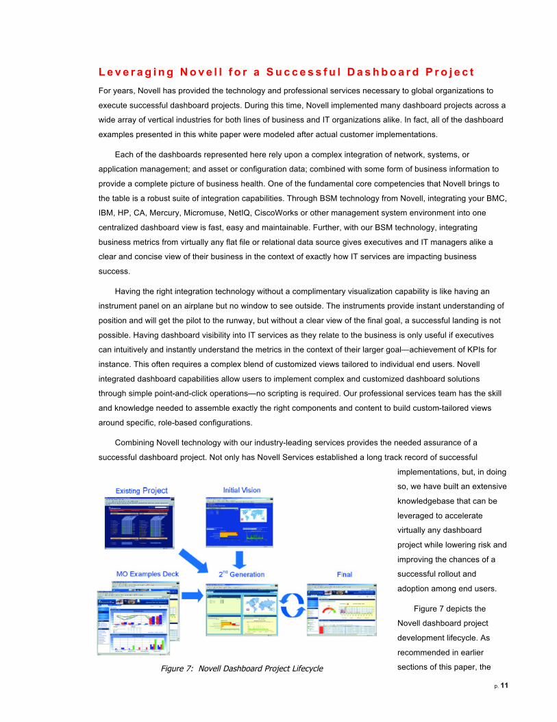
Figure 7 depicts the
Novell dashboard project
development lifecycle. As
recommended in earlier
sections of this paper, the Figure 7: Novell Dashboard Project Lifecycle

p. 12
lifecycle begins with a prototype—one developed from an existing project, an initial vision, or borrowed from the
wide variety of dashboards implemented by Novell. In this phase, interviews with end users are conducted to
understand how dashboards will be used and which relevant metrics are required for successful business or IT
management. The initial design phase is possibly the most critical phase of any dashboard project. It is here that
early designs can either succeed with early adopters or fall by the wayside like so many other failed projects. It is
critical to have the experience and understanding to know how and why end users use dashboards, as well as to
understand exactly what content they need to see for their particular role in the company.
With a clear vision defined for the initial prototype, developing it is usually accomplished in a short period.
Novell facilitates all phases of project development, from design, to implementation of critical metrics, to crafting
customized role-based views for end users. We work closely with you throughout the dashboard development
lifecycle to ensure that your project is tailored to your specific needs, and that your dashboards are effective and
efficient.
For those companies looking for an experienced vendor capable of providing the technology, services and
experience necessary to deploy a successful dashboard project, Novell is a perfect one-stop source.
Copyright © 2009 Novell, Inc. All Rights Reserved. Novell, the Novell logo and the N logo are registered trademarks of Novell, Inc. in the United States and other countries. *All third-party trademarks are the property of their respective owners. 462-002115-001