Example: Suppose these data are recorded for the temper- ature (in ºF) of fifty cities in Luzon in...
21
Example: Suppose these data are recorded for the temper-ature (in ºF) of fifty cities in Luzon in September 2014. 112 100 127 120 134 118 105 110 109 112 110 118 117 116 118 122 114 114 105 109 107 112 114 115 118 117 118 122 106 110 116 108 110 121 113 120 119 111 104 111 120 113 120 117 105 110 118 112 114 114 Make a frequency distribution with 7 classes and with 100 as the initial lower class limit.
-
Upload
may-simpson -
Category
Documents
-
view
214 -
download
1
Transcript of Example: Suppose these data are recorded for the temper- ature (in ºF) of fifty cities in Luzon in...

Example: Suppose these data are recorded for the temper-ature (in ºF) of fifty cities in Luzon in September 2014.
112 100 127 120 134 118 105 110 109 112
110 118 117 116 118 122 114 114 105 109
107 112 114 115 118 117 118 122 106 110
116 108 110 121 113 120 119 111 104 111
120 113 120 117 105 110 118 112 114 114
Make a frequency distribution with 7 classes and with 100 as the initial lower class limit.

How again?1st, compute the range: range = 134 – 100 =
342nd, compute the class width:
c.w. = 34/7 = 4.9
® 5
3rd, Add the class width to the initial lower limit as many times as the number of classes. These will give us all the lower class limits of the freq. dist. (The tally column is optional.)
Class limits Class Boundaries Frequency
100 -
105 -
110 -
115 -
120 -
125 -
130 -

4th, to find the upper class limit paired to a lower class limit, just subtract one from the next lower class limit.
Class limits Class Boundaries Frequency
100 – 104
105 – 109
110 – 114
115 – 119
120 – 124
125 – 129
130 - 134

5th, find the class boundaries, and count the tallies in the frequency column
Class limits Class Boundaries Frequency
100 – 104 99.5 – 104.5 2
105 – 109 104.5 – 109.5 8
110 – 114 109.5 – 114.5 18
115 – 119 114.5 – 119.5 13
120 – 124 119.5 – 124.5 7
125 – 129 124.5 – 129.5 1
130 - 134 129.5 – 134.5 1
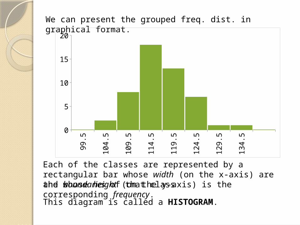
We can present the grouped freq. dist. in graphical format.
99.5
104.5
109.5
114.5
119.5
124.5
129.5
134.5
02468
101214161820
Each of the classes are represented by a rectangular bar whose width (on the x-axis) are the boundaries of that classand whose height (on the y-axis) is the corresponding frequency.This diagram is called a HISTOGRAM.

RELATIVE FREQUENCY HISTOGRAMS
The relative frequencies represents the (tally) frequencies as percentages (%) of the total number of raw data.
Class limitsClass
Boundaries FrequencyRelative
Frequency
100 – 104 99.5 – 104.5 2
105 – 109 104.5 – 109.5
8
110 – 114 109.5 – 114.5
18
115 – 119 114.5 – 119.5
13
120 – 124 119.5 – 124.5
7
125 – 129 124.5 – 129.5
1
130 - 134 129.5 – 134.5
1
0.40
0.16
0.36
0.26
0.14
0.02
0.02
Example: Previously, we had:
We use rela-tive frequencies (and its histogram) when the total number of raw data is too large.

99.5
104.5
109.5
114.5
119.5
124.5
129.5
134.5
0
0.05
0.1
0.15
0.2
0.25
0.3
0.35
0.4
Nevertheless, the two histograms for a grouped frequency distribution look exactly the same.
The only difference in this kind of histogram is that the rela-tive frequencies are placed on the y-axis instead of the tally frequencies.

DISTRIBUTION SHAPES
The histogram is the most important diagram in Statistics.
The histogram is drawn on an xy-plane. The data values (grouped within class boundaries) are placed on the x-axis; and the freq-uencies on the y-axis.
DATA VALUES
low values
high values
FR
EQ
UEN
CIE
S
few
many

Histograms assume peculiar shapes. The most common ones are:
Classes Freq.
60.00 – 61.85 2
61.85 – 63.70 6
63.70 – 65.55 10
65.55 – 67.40 14
67.40 – 69.25 9
69.25 – 71.10 7
71.10 – 72.95 26
0
61
.85
63
.7
65
.55
67
.4
69
.25
71
.1
72
.95
0
2
4
6
8
10
12
14
16
Heights of 50 18-y.o. males (in inches)
BELL-SHAPED
Here, the data appears equally distributed on both sides of the middle (or “average”) values. The tallies increase as data approach the middle values, and then decrease from there on.

Classes Freq.
1 95
2 107
3 102
4 99
5 94
6 103
Outcomes of a die toss (600 times)
UNIFORM
Here, the data appears equally distributed throughout. The tallies appear constant throughout.
1 2 3 4 5 60
20
40
60
80
100
120

Final grades (%) of 100 students in Math 1
60 65 70 75 80 85 90 95 1000
5
10
15
20
25
30
RIGHT-SKEWED
Here, the tallies accumulate on the lower data values and decrease as the values get higher.
Classes Freq.
60.00 – 65.00 18
65.00 – 70.00 24
70.00 – 75.00 22
75.00 – 80.00 15
80.00 – 85.00 11
85.00 – 95.00 6
95.00 – 100.00 3

Final grades (%) of 100 students in P.E.
LEFT-SKEWED
Here, the tallies accumulate on the higher data values and decrease as the values get lower.
60 65 70 75 80 85 90 95 1000
5
10
15
20
25
30
(The direction of skewness is on the side of the longer “tail.”)
Classes Freq.
60.00 – 65.00 2
65.00 – 70.00 3
70.00 – 75.00 5
75.00 – 80.00 9
80.00 – 85.00 16
85.00 – 95.00 22
95.00 – 100.00 25

Weights (kgs) of 200 18-y.o. males and females
Classes Freq.
50.00 – 53.00 5
53.00 – 56.00 9
56.00 – 59.00 18
59.00 – 62.00 26
62.00 – 65.00 25
65.00 – 68.00 13
68.00 – 71.00 10
71.00 – 74.00 14
74.00 – 77.00 20
77.00 – 80.00 24
80.00 – 81.00 18
81.00 – 84.00 10
84.00 – 87.00 5
87.00 – 90.00 353 56 59 62 65 68 71 74 77 80 81 84 87 90
0
5
10
15
20
25
30
MULTIMODALHere, the tallies accumulate on more than one data class.

FREQUENCY POLYGONS
We can also use the middle point (or midpoint or class mark) of a class to represent that class.
Class limitsClass
Boundaries Midpoint Frequency
100 – 104 99.5 – 104.5 2
105 – 109 104.5 – 109.5
8
110 – 114 109.5 – 114.5
18
115 – 119 114.5 – 119.5
13
120 – 124 119.5 – 124.5
7
125 – 129 124.5 – 129.5
1
130 - 134 129.5 – 134.5
1
Example:
102
107
112
117
122
127
132
lower class bdary upper class bdarymidpoint
2

We can present the frequency distribution in graphical form where each class is represented by its midpoint.
This diagram is called a FREQUENCY POLYGON.
102 105 112 117 122 127 1320
2
4
6
8
10
12
14
16
18
20
Each of the classes is represented by its midpoint on the x-axis, with its frequency as the y-coordinate. The points are then connected by line segments.

BAR GRAPHS
When the data are qualitative or categorical, bar graphs and pie graphs can be used for presentation.
Type of Operation Number of Cases
Thoracic 20
Bones and joints 45
Eye, ear, nose and throat 58
General 98
Abdominal 115
Urologic 74
Proctologic 65
Neurosurgery 23
Example: Operations performed at PGH (2010)

Thor
acic
Bones
and
join
ts
Eye,
ear
, nos
e an
d th
roat
Gener
al
Abdom
inal
Urolo
gic
Proc
tolo
gic
Neuro
surg
ery
0
20
40
60
80
100
120
140

Thoracic
Bones and joints
Eye, ear, nose and throat
General
Abdominal
Urologic
Proctologic
Neurosurgery
0 20 40 60 80 100 120 140
Each of the categorical classes is represented by a vertical or horizontal bar, whose length is its corresponding frequency.This diagram is called a BAR GRAPH. Histograms are bar graphs for quantitative data.

PIE GRAPHS
Qualitative data can also be presented as sections or sectors of a circle, especially if partitions of a whole has to be emphasized.Example: Operations performed at PGH (2010)
Type of Operation Number of Cases
Thoracic 20
Bones and joints 45
Eye, ear, nose and throat 58
General 98
Abdominal 115
Urologic 74
Proctologic 65
Neurosurgery 23

Type of Operation
Number of Cases
Relative Frequenc
y
Sector Angle
(º)
Thoracic 20 0.04
Bones and joints 45 0.09
Eye, ear, nose and throat 58 0.12
General 98 0.20
Abdominal 115 0.23
Urologic 74 0.15
Proctologic 65 0.13
Neurosurgery 23 0.05
In making pie graphs, the sector angle for each of the classes must be computed.
sector angle ( ) rel. f req. 360
14º
33º
42º
71º
83º
53º
47º
17º

4%
9%
12%
20%
23%
15%
13%
5%
Thoracic Bones and joints Eye, ear, nose and throat General Abdominal Urologic Proctologic Neurosurgery
Each of the categorical classes is represented by a sector whose central angle is the sector angle corresponding to its frequency.
This diagram is called a PIE GRAPH.


![FireResistanceInvestigationofSimpleSupportedRC ...concrete beams subjected to fire load. Kang et al. [10] in-vestigated the effect of thickness and moisture on temper-ature distributions](https://static.fdocuments.net/doc/165x107/6100ce868f4a4529bf080886/fireresistanceinvestigationofsimplesupportedrc-concrete-beams-subjected-to-ire.jpg)