Evaluation question 1
17
-
Upload
catherinetansey -
Category
Documents
-
view
280 -
download
0
Transcript of Evaluation question 1

Social Realism
Soap Forms
and
Conventions
Multiple Main
Characters so that
the audience has a
character who they
feel they can relate
to.
Multiple storylines
running at the
same time in
each episode
Minimal makeup
and ‘regular’
costumes to
make it seem
more realistic
Variety of camera angles including
P.O.V shots, reverse angle shots and
using the camera as a fourth wall to
make the audience feel as if they
are involved in current story
Different set
types and
locations such as
a living room
and other rooms
generally found
in a house, also
outdoor sets and
public places
such as cafes,
bars, pubs and
shops.
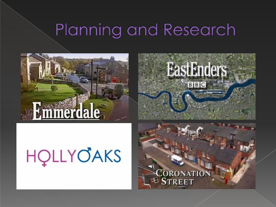
I made notes on the
Hollyoaks trailer and
highlighted the key
words for the
different types of
conventions:
Red for cameraOrange for mise
en scene
Green for musicBlue for editing
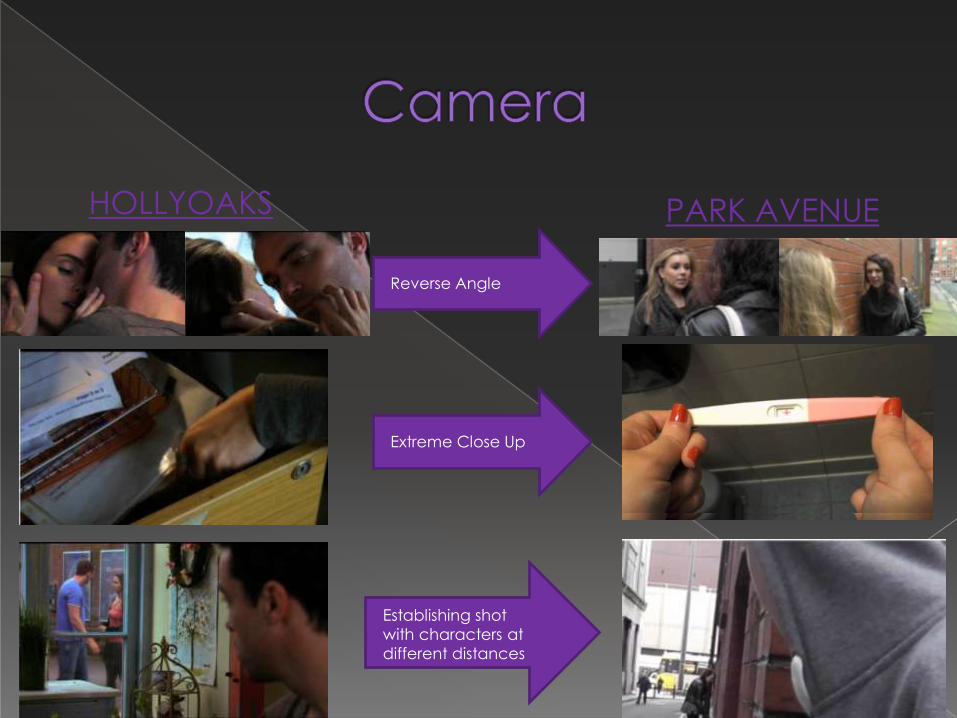
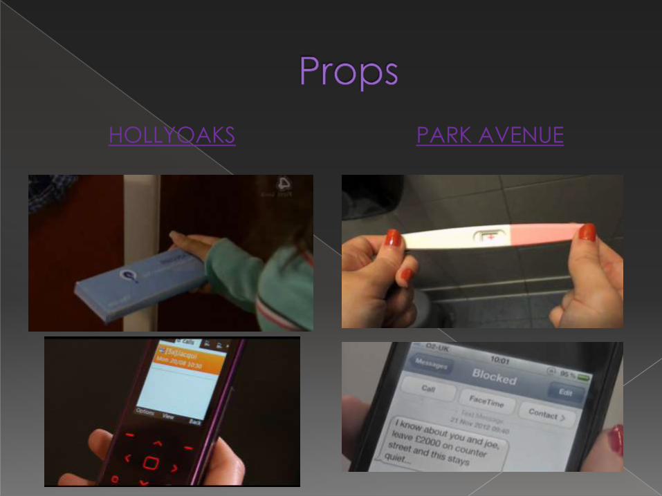
HOLLYOAKS PARK AVENUE
Reverse Angle
Extreme Close Up
Establishing shot
with characters at
different distances

High Angle Shot
Close up
Low Angle Shot
MCU 2 Shot
http://www.youtube.com/watch?v=pFS4zYWxzNA
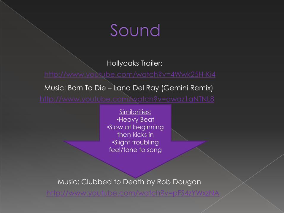
Music: Clubbed to Death by Rob Dougan
http://www.youtube.com/watch?v=awaz1aNTNL8
http://www.youtube.com/watch?v=4Wwk25H-Ki4
Hollyoaks Trailer:
Music: Born To Die – Lana Del Ray (Gemini Remix)
Similarities:
•Heavy Beat
•Slow at beginning
then kicks in
•Slight troubling
feel/tone to song

Inside a Home
(e.g. Living room)
Public place (e.g.
Cafe)
Outside (e.g. Park)
HOLLYOAKS PARK AVENUE

One convention of a Social Realism soap is that it
has multiple storylines running in each episode. In
my product ‘Park Avenue’ there is only one
storyline running. Although all of the characters are
involved in the story and have their own roles, it
may seem like there is more than one storyline but
in fact it is all part of the same plot.


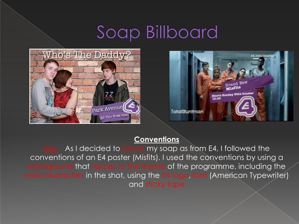
Conventions
Use - When creating my Front Cover, I used TV & Satellite Week as an
example to base it on. I used the conventions by: Including a strap, the
date of issue, highlighting the ‘New’ feature, using he same 4 colour colour
scheme, sticking to the rule of thirds, including an extra feature in a
coloured box putting the features at the side and bolding the subtitle,
putting the magazine title in large bold letters and including a website and
price.
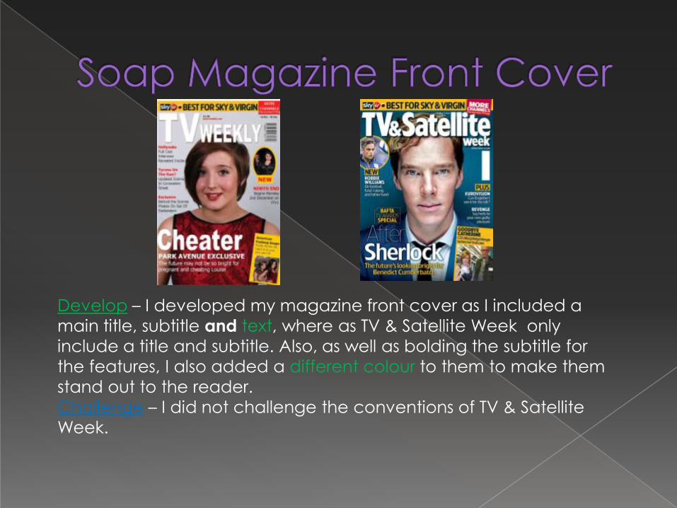
Develop – I developed my magazine front cover as I included a
main title, subtitle and text, where as TV & Satellite Week only
include a title and subtitle. Also, as well as bolding the subtitle for
the features, I also added a different colour to them to make them
stand out to the reader.
Challenge – I did not challenge the conventions of TV & Satellite
Week.
Conventions
Use - As I decided to brand my soap as from E4, I followed the
conventions of an E4 poster (Misfits). I used the conventions by using a
background that relates to the theme of the programme, including the
main characters in the shot, using the E4 logo, font (American Typewriter)
and sticky tape
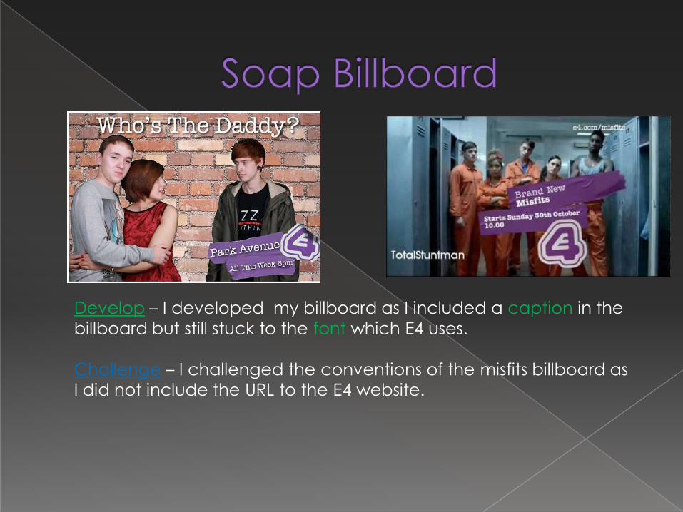
Develop – I developed my billboard as I included a caption in the
billboard but still stuck to the font which E4 uses.
Challenge – I challenged the conventions of the misfits billboard as
I did not include the URL to the E4 website.