Evaluation q5
11
How did you attract/address your audience?
-
Upload
ewanmiller -
Category
Education
-
view
14 -
download
0
Transcript of Evaluation q5
How did you attract/address your audience?
• There are different features of my magazine I used to attract my audience.
Masthead
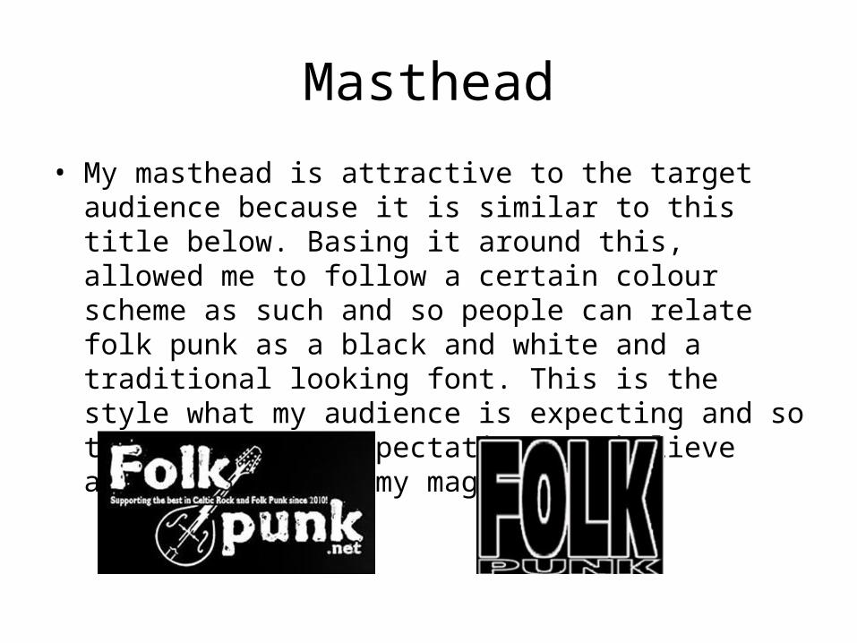
• My masthead is attractive to the target audience because it is similar to this title below. Basing it around this, allowed me to follow a certain colour scheme as such and so people can relate folk punk as a black and white and a traditional looking font. This is the style what my audience is expecting and so to match their expectations, I believe attracts them to my magazine.
Photograph(s)
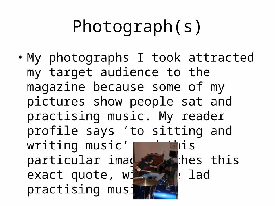
• My photographs I took attracted my target audience to the magazine because some of my pictures show people sat and practising music. My reader profile says ‘to sitting and writing music’ and this particular image matches this exact quote, with the lad practising music.
Colours
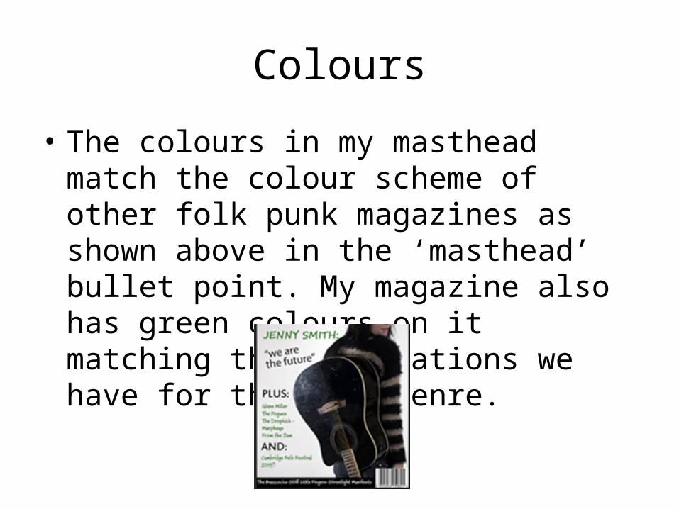
• The colours in my masthead match the colour scheme of other folk punk magazines as shown above in the ‘masthead’ bullet point. My magazine also has green colours on it matching the connotations we have for the folk genre.
Layout
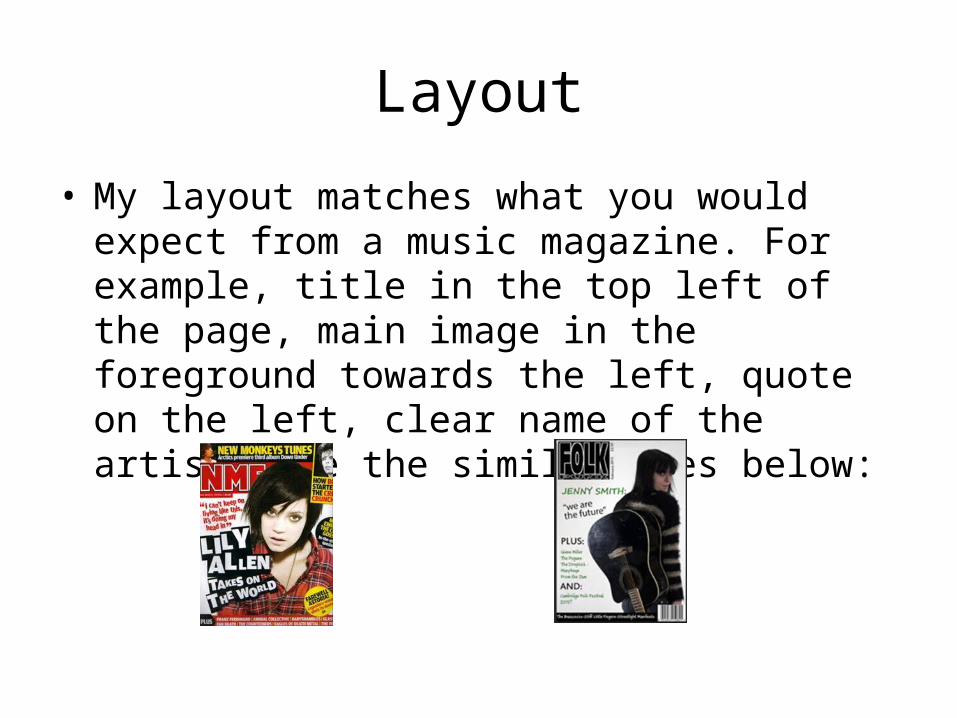
• My layout matches what you would expect from a music magazine. For example, title in the top left of the page, main image in the foreground towards the left, quote on the left, clear name of the artist… See the similarities below:
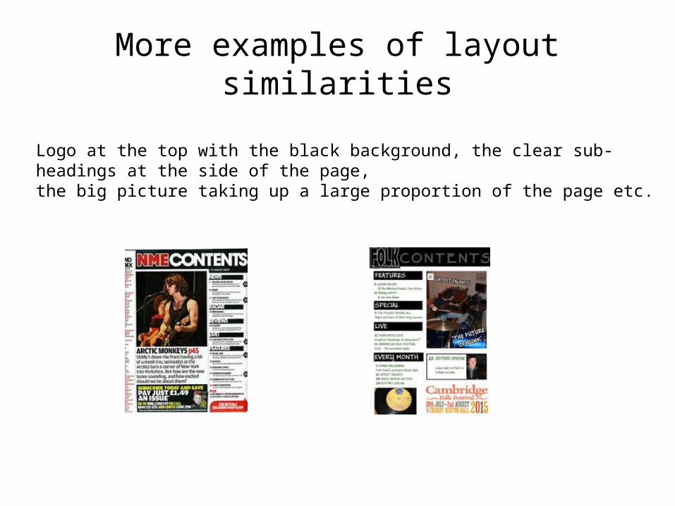
More examples of layout similarities
Logo at the top with the black background, the clear sub-headings at the side of the page, the big picture taking up a large proportion of the page etc.
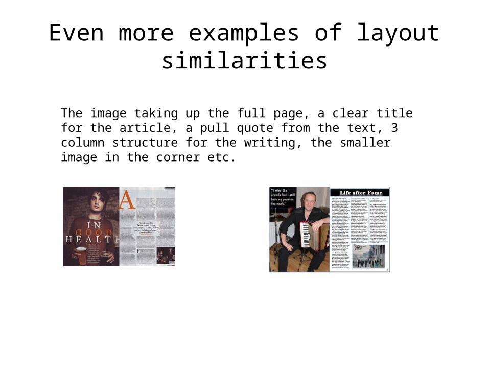
Even more examples of layout similarities
The image taking up the full page, a clear title for the article, a pull quote from the text, 3 column structure for the writing, the smaller image in the corner etc.
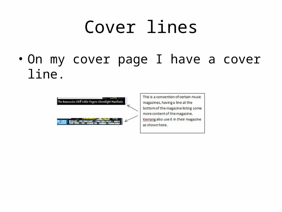
Cover lines
• On my cover page I have a cover line.
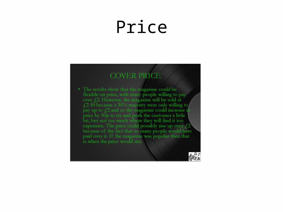
Price
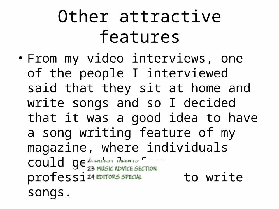
Other attractive features
• From my video interviews, one of the people I interviewed said that they sit at home and write songs and so I decided that it was a good idea to have a song writing feature of my magazine, where individuals could get help from professionals on how to write songs.