Evaluation Q1 - In What Ways does your media product use, develop or challenge forms & conventions...
8
product use, develop or challenge forms & conventions of real media products? By Josephine
Transcript of Evaluation Q1 - In What Ways does your media product use, develop or challenge forms & conventions...
In What Ways does your media product use, develop or challenge forms & conventions of real media products?By Josephine

Firstly the title of the film ‘Mirage’ hints or helps to explain what the overall storyline of the film is about. The word ‘Mirage’ links or is connected with an understanding of a person’s hallucination. This relates to the plot of the film. This is a common convention that movies or horror films do as the Title of the film usually has a link with the film or helps to give out an idea to what the film will be about. The one worded title is also conforms to many horror films for example Annabelle, the Conjuring & Oculus. This helps the audience to remember the title easier as it is last thing they see in the trailer before the billing block.
The production logo ‘Shattered Glass Productions’ was also made to help establish the genre this is a common the convention also in horror films.
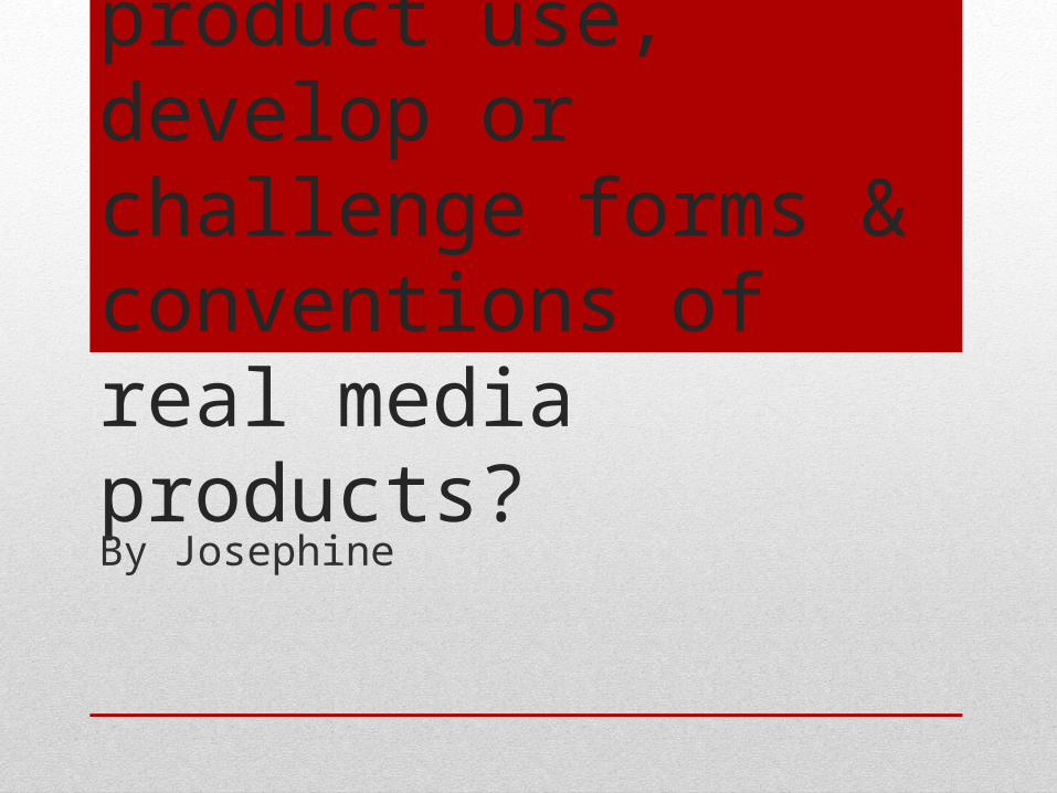
Locations
Our media product has shots in which conform to the typical locations shown in horror film trailers. For example we chose to have a scene in the middle of a field because from our research a lot of shots are surrounded by nature or isolated looking areas. For example in ‘Friday 13th’ trailer the first few shots are shown in outdoor locations in which look harmless e.g. a lake and bright forest. This is because it can be seen as a setting in which is dangerous and negative events occur in, because the victims are often shown to be defenceless or unprotected. We tried to do this similarly in our media product by having the victim in our story stood alone in the middle of a field looking powerless and also showed this when we had her run from something the audience cannot see also in what looks like a field. These locations help to build suspense which is an important aspect when making a horror film trailer in order to capture the audiences attention. This is because it helps to build tension and make the audience want to go see the film because of the cliff hangers at the end.

Opening Scene
Most trailers would start with a peaceful looking environment or with a happy looking atmosphere (equilibrium) and then there is some sort of problem (disruption of equilibrium) and ends by having a restoration of the equilibrium. We have similarly done this in our trailer however do not show the problem resolved (restoration) in the end as we would want the audience to go out and watch the film instead. In our media product it starts with a birthday scene, which is a happy occasion for the main character shown however gradually throughout the trailer we see a change in the overall atmosphere. Again we looked into many different horror trailers in order to help us create a storyline in the trailer for example The Women in Black.

Mis En Scene
The props in which we decided to use also conform to the usual horror film trailers. Close ups of the weapons are shown in our trailer this is a also a typical convention in horror film trailers as they help to convey the genre to the audience for example in our trailer there is a knife shown on the kitchen counter and also chose to have Lilly hold a baseball bat looking like she is ready to attack.
The characters in which we chose to play in our trailer subvert to the usual stereotypical teenage girl we see in horror films. Our main character as seen in the trailer has short red hair which is not usual for the main character have in teenage horror films, it contrasts to normal female teenager in horror. For example in ‘The Amityville horror’ & ‘Annabelle’ they contained the usual looking victims shown in teen horror films. The reason why we decided to challenge the convention was because we thought it would have given a wider audience because it was not the stereotypical looking girl in which are seen in the previous products. It would not just have the mainstream audience but out product is also aimed at a psychographic audience and the explorers.
Even though our main character was not conventional looking however the characters age was not unusual as it was conforming to the genre of teenage horror films.

‘Loft Scene’
The scene in the loft is a typical scene shown in horror film trailers. For example in Oculus there is a similar scene in the beginning of the trailer wear the female character seems to be exploring in the basement/loft and then hears/sees a movement in the background very quickly. We also chose to have a similar scene shown in the middle of our trailer to help convey the genre.

Poster We conformed to the usual looking horror film posters. Firstly with the colour scheme – red, black and white. Also the poster of ‘The Purge’ helped us decide the facial expression of the character on our poster. In addition the existing poster of ‘Scream’ helped us to also want our poster to contain a close up viewed photograph of our main characters face with a faded background.

Magazine
Similarly to our magazine poster we also chose to conform with the codes and conventions of horror film magazine covers. As shown we have stuck to the usual colour scheme of our branding. Also the actor has direct mode address into the camera which is a typical film magazine convention. We additionally created cover lines on the sides if the page which again is conforming to the convention of a film magazine cover. And lastly the other small details such as the barcode, price layout, strapline image etc. are all conformed to what a real horror film magazine would look like.