Evaluation of photos
7
Photo Shoot Review (you are creative visual people… make this power point look more interesting! Unit 57: Photography and Photographic Practice Task 4 Selection of final images & review
-
Upload
alex-clare -
Category
Art & Photos
-
view
45 -
download
0
Transcript of Evaluation of photos

Photo Shoot Review(you are creative visual
people… make this power point look more
interesting!Unit 57: Photography and
Photographic Practice
Task 4 Selection of final images & review
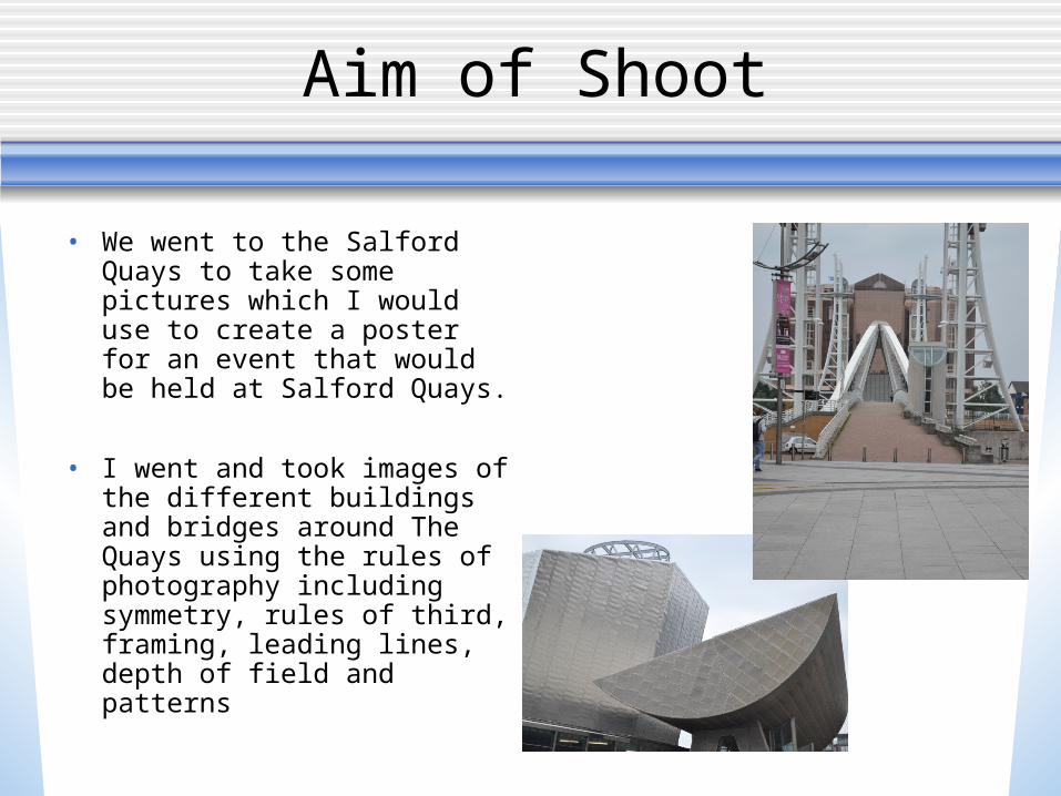
Aim of Shoot
• We went to the Salford Quays to take some pictures which I would use to create a poster for an event that would be held at Salford Quays.
• I went and took images of the different buildings and bridges around The Quays using the rules of photography including symmetry, rules of third, framing, leading lines, depth of field and patterns

Aim of shoot

Description of shoot
• This photo on the right is my favourite picture that I took, I took this photo near lots of different statues. I like this photo because it looks like it is framed. I managed to get it too look like this by taking a photo between two boxes that were on top of each other. I used the normal sutter speed on the camera, I feel this photo is unique because of the angle of it and how I is framed.

Editing effects
I thought this was the best image for me to edit out of my shoot. I started off by making the whole photo black and white, and then too give the picture abit of colour I used the history brush tool to bring back the colour in the trees, I think this looks really good because the rest of the picture is in black and white, but the main focus of the picture is the trees, because of the colour and the fact that they are in the middle of the pictures aswell.
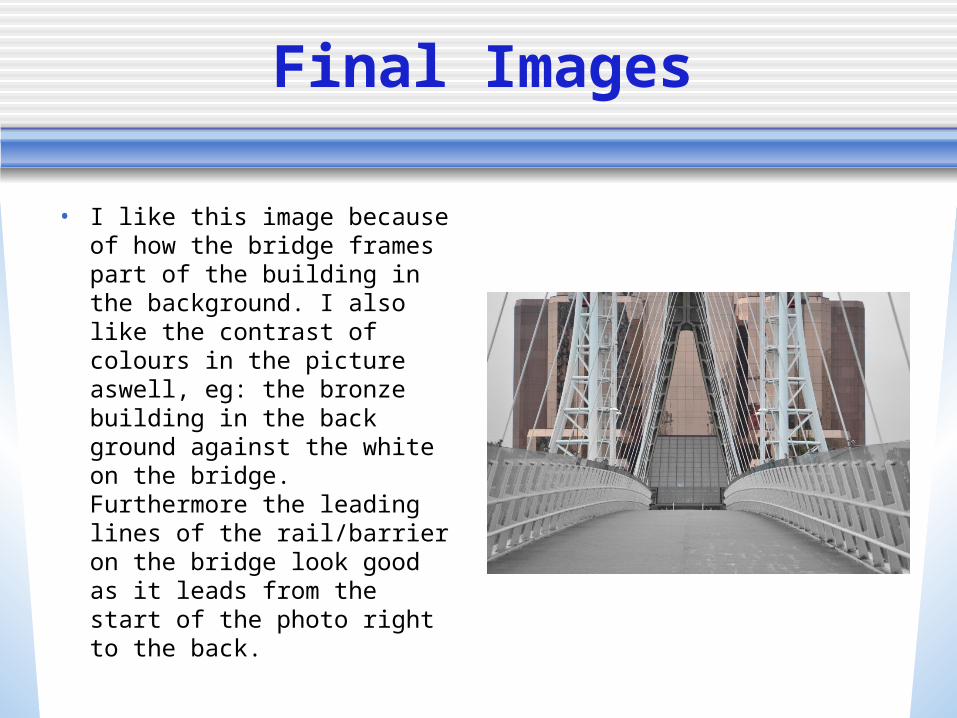
Final Images
• I like this image because of how the bridge frames part of the building in the background. I also like the contrast of colours in the picture aswell, eg: the bronze building in the back ground against the white on the bridge. Furthermore the leading lines of the rail/barrier on the bridge look good as it leads from the start of the photo right to the back.

Media City Poster
I chose this picture to make my poster on because it is a good picture of media city and shows off all the new building, and by editing and making it black and white and then using the history brush tool on certain places I brought the colour back In the signs, making them stand out more.