Evaluation
20
Caitlin Chandra AS MEDIA STUDIES EVALUATION G321
Transcript of Evaluation

Caitlin Chandra
AS MEDIA STUDIES EVALUATION
G321

Question 1.In what ways does your media product use develop or challenge forms and conventions of real media products?
In the process of creating my magazine I looked at various different magazine and analysed each of the typical conventions of a music magazine. This tasks shows the analysis of conventions used:
http://caitlinchandraxx.blogspot.co.uk/2013/09/conventions-of-magazine.html
I then used the knowledge I gained in the generic conventions task to make a series of my own covers which contained all of the conventions:
http://caitlinchandraxx.blogspot.co.uk/2013/10/codes-and-conventions-task.html

Question 1.
As shown here my magazine has been influenced by other magazines such as ‘SPIN’. Similarities between both magazines include the main headline being in a seperate colour to the subheadlines which is a typical convention of music magazines. ‘SPIN’ magazine has a very clear colour scheme shown through the consistent sub headlines and their positions. I feel that my magazine has incorporated this also.
In addition to this I can see the similarities within the typography used. Both magazines have got quite simplistic serif fonts in bold.
Question 1. ?

Question 1.
Looking at all the magazines which I used for inspiration I think it becomes quite obvious where my influences came from. This is due to the similar layouts and typography used. Cover lines are spread evenly across the page in ‘BLENDER’ and ‘SPIN’ magazine and this is what I have tried to achieve on my cover. All of the cover lines frame the cover star and fit around her. Direct address is also used in all three magazines which would instantly involve the audience as a connection is created.
Question 1. ?
Question 1.
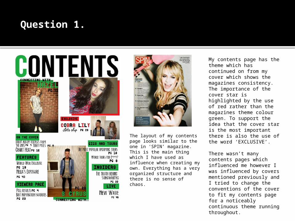
My contents page has the theme which has continued on from my cover which shows the magazines consistency. The importance of the cover star is highlighted by the use of red rather than the magazines theme colour green. To support the idea that the cover star is the most important there is also the use of the word ‘EXCLUSIVE’.
There wasn’t many contents pages which influenced me however I was influenced by covers mentioned previously and I tried to change the conventions of the cover to fit my contents page for a noticeably continuous theme running throughout.
The layout of my contents page looks similar to the one in ‘SPIN’ magazine. This is the main thing which I have used as influence when creating my own. Everything has a very organized structure and there is no sense of chaos.
Question 1. ?

Question 1.
Inital influences for my double page spread stemmed from the analysis of a Kerrang! Magazine double page spread:http://caitlinchandraxx.blogspot.co.uk/2013/10/magazine-research-double-page-spread.html
My double page spread however changed drastically from the idea’s I had originally. The colours featured on my double page spread are not the same as the cover and contents page however follow ‘Cobra Lily’s’ colour scheme on the cover. The use of red and black on the cover and contents when mentioning Cobra lily make it consistent right up until the double page spread.
The picture I have chose to use is not put on exactly half of the double page spread, which is typically what is done in music magazines. Instead of doing this my main picture overlaps and the text is put into columns on less that half of the page. I feel like this gives the magazine individuality as it not part of magazine conventions to do this however I still feel that it looks effective and was succesful.
I have used a large quote to keep the dps interesting and I gives an instant idea as to what the interview is going to be talking about. This is typical convention which I have used in my work.
Question 1. ?

Question 2. How does your media represent particular social groups??
I feel that my magazine on a whole is very youthful and that is why I have aimed it at teens in the age range 15-19. My magazine is also an alternative pop/rock magazine which features quite strong and independent artists such as Cobra Lily. I took Miley Cyrus as inspiration when thinking about the persona of my cover star. I wanted them to be individual and to stand out completely. I feel that Cobra Lily portrays some of the attitude that Miley Cyrus has. By using artists like this I hoped to achieve a magazine which contained people who the audience I am targeting would idolise. Cobra Lily has been created to look very carefree and this is what teenagers would be interested in as they like to look up to people who are independent.
I chose my main cover star to be female as it challenges the stereotypical idea of females being dependent on a man. It also goes against the idea that men are domination as I have featured more female artists rather than male.

Question 2. ?
The supporting acts I used are styled in a similar carefree and rebellious fashion to that of my cover star. Although all of the artists I have used are very individual they all have their similarities which means that they will still appeal to the audience I am targeting. I have tried to style the artists to be looked at in hope of simulating their looks. They are all very stylish and could easily be looked at for inspiration.

Question 3.What kind of media institution might distribute your product and why??
The instituion I think would most likely distribute my media is: http://www.frontlinedistribution.co.uk

Question 3. ?
When researching other magazine distributors I came across some such as Development hell ltd which publish mix mag. I felt that this was a little to commercial and mainstream for my magazine as I aimed for mine to be slightly more edgy and different instead of going for simply pop as my genre.
http://www.developmenthell.co.uk/
I also looked at the Uptown media group however they publish magazines such as vibe which are focused a lot more on RnB, hip hop and rap music whereas my magazine is alternative pop/rock. I didn’t think that this media institution would be compatibly with the style of magazine I have created.
http://uptownmagazine.com/
The reason why I have chosen Frontline as the distributor of my magazine is because they also distribute magazines such as Q and Kerrang! Which are both alternative magazine alike to mine.
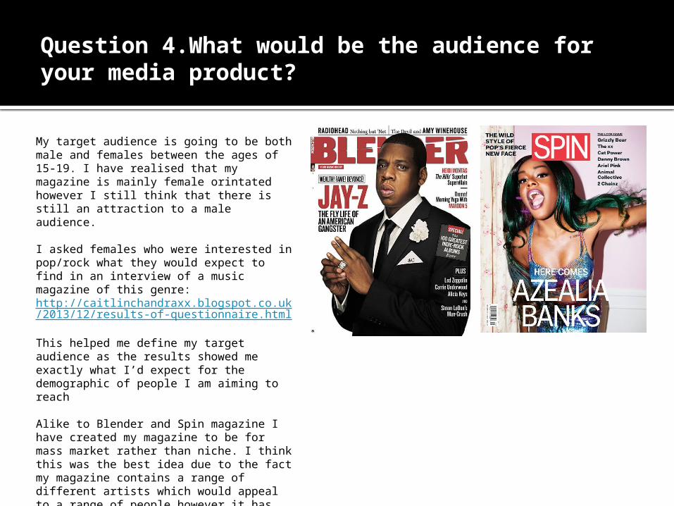
Question 4.What would be the audience for your media product?
My target audience is going to be both male and females between the ages of 15-19. I have realised that my magazine is mainly female orintated however I still think that there is still an attraction to a male audience.
I asked females who were interested in pop/rock what they would expect to find in an interview of a music magazine of this genre:http://caitlinchandraxx.blogspot.co.uk/2013/12/results-of-questionnaire.html
This helped me define my target audience as the results showed me exactly what I’d expect for the demographic of people I am aiming to reach
Alike to Blender and Spin magazine I have created my magazine to be for mass market rather than niche. I think this was the best idea due to the fact my magazine contains a range of different artists which would appeal to a range of people however it has been kept within the alternative pop genre.

Question 5. How did you attract/address your audience??
MastheadI chose ‘Connect’ as I felt it was reflective of the young audience I am aiming to target. Also when thinking about different magazine names I completed word association task which left me with the word connect:http://caitlinchandraxx.blogspot.co.uk/2013/11/research-into-magazine-names.html
Colour SchemeI think that I attracted the audience through the use of colour in my magazine. The colour scheme throughout meant that my magazine has a clear house style which makes my product a lot more interesting and real. The colour green is very fresh and young which kept the magazine very bright and eye opening. The red was used as the colour for the main star Cobra Lily and this has connotations of danger and rebellion which is what I was aiming to achieve. The colour red also connotes passion which could show how passionate the artist is about music, keeping the magazine interesting.The black is used as the font colour to stay very bold and to make sure it is easily readable making it a lot more appealing to an audience.
Main Headline When thinking of a headline which would address my audience I came up with a few however Cobra Lily’s Links seemed to be the most appropriate due to the fact it ties in with the Masthead ‘Connect’. The word association gives the audience the idea that they are linking/connecting with the artist. There is also alliteration used with Lily’s and Links.

Question 5. ?
I have also attracted the audience by the use of enticing headlines on my cover. By using ‘To Win’ would entice the audience due to the fact there is something for them to get out of the magazine other than entertainment. ‘Guess Who’s Back?’ Is a simple headline whoever it is a unanswered question addressing the audience making them question the answer.
The use of photo’s of the artists inside gives the audience an insight as to what is inside which would hopefully excite them and attract them to the magazine.

Question 6.What have you learnt about technologies from the process of constructing a product??
Paint.Net Page Plus Microsoft Publisher
Good cropping and editing tools
Useful tools used to cut out backgrounds of images
Files don’t need to be exported as they can be saved as a JPEG easily
Shapes and text can be added easily
A wide range of effects
Spell check is helpful
Not very complicated
Templates can be created for cover, contents and dps
It is very simple to use
Strengths of each programme...

Paint.Net Page Plus Microsoft Publisher
There is not a wide range of shapes or text
The text tool provided isn’t very useful
No filters or effects for photographs
Complications with layers
Some photo’s do not crop very well
Can’t position text and images exactly where you want
When exported as a JPEG images aren’t of a very high quality
Not very good quality images after exporting
Weaknesses of each programme...
Question 6. ?
Question 6. ?
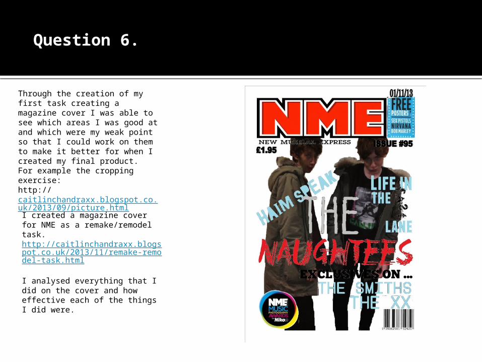
Through the creation of my first task creating a magazine cover I was able to see which areas I was good at and which were my weak point so that I could work on them to make it better for when I created my final product. For example the cropping exercise: http://caitlinchandraxx.blogspot.co.uk/2013/09/picture.html
I created a magazine cover for NME as a remake/remodel task. http://caitlinchandraxx.blogspot.co.uk/2013/11/remake-remodel-task.html
I analysed everything that I did on the cover and how effective each of the things I did were.

Question 6. ?
I found blogger very useful as it always keeps work in order and organized. Blogger is very simple to use and makes work easily accessible. It also allows blog posts to be edited, uploaded and deleted at ease making it really efficient.
My blog address:http://caitlinchandraxx.blogspot.co.uk/

Question7. Looking back to the preliminary task what do you feel you have learnt in the progression from it to the full product?
PRELIMINARY TASK FINAL PRODUCT (MAIN TASK)The preliminary task
lacks use of codes and conventions which makes it very unprofessional. The masthead takes over the cover and the main picture. There is no main cover line and not a sufficient amount of additional cover lines. It lacks interest.

Question 7. ?
PRELIMINARY TASK FINAL PRODUCT (MAIN TASK)
My contents preliminary task is very boring and uses serif fonts throughout. There is no running theme from the cover to the contents page making it inconsistent. It also contains errors such as there being only 6 pages in the magazine. However my final product has a clear house style and it is a lot more interesting due to the use of fonts and the intuitive layout. Whilst working on my final product I made sure there was no unecessary errors such as lack of page numbers.
Question 8. How successful do you feel your end product is in fulfilling the task? How well does it fit the brief?
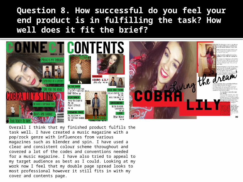
Overall I think that my finished product fulfils the task well. I have created a music magazine with a pop/rock genre with influences from various magazines such as blender and spin. I have used a clear and consistent colour scheme throughout and covered a lot of the codes and conventions needed for a music magazine. I have also tried to appeal to my target audience as best as I could. Looking at my work now I feel that my double page spread looks to most professional however it still fits in with my cover and contents page.