Evaluation
12
Transcript of Evaluation


Front Cover
From researching different magazines I managed to understand the different and most common forms and conventions of teenage music magazines and I was able to use those forms and conventions on my magazine.The central image of the magazine has a direct mode of address towards the reader; it looks eye catchy and overall a dominant image for the centre of the magazine, this enables the reader to feel directly engaged with the artist on the cover. The main colours used were white, blue and black which do a great job with contrasting with each
other and making the front cover more appealing to its target audience (young male adults). The title block is placed behind the central image because they would be expected to recognise the title block from previous edition of the magazine. There is only one other image on the magazine which is a picture of “Lily and Amy” I only added one image because I wanted the main focus of people looking at the magazine to be on the central image and on the anchorage text. The colour scheme used in my front cover does not always reflect those throughout the magazine, however the style, layout and fonts are kept the same or similar so you look at different parts of the magazine you would still be
able to tell that it’s from the same magazine. By looking at this front cover I can tell that this is a music magazine, this is mainly due to the music related buzzwords and the anchorage text which are “Gabriel’s Music Revolution” and “exclusive interview...” I can also tell that the target audience would be young adults due to the pictures on the front cover being of young people. This is because teenagers tend to go for magazines with people their own age or at a similar age on the front cover. I also added a website under the title block so that people could go on the webpage and find more about the magazine.
The title block was designed to represent a volume interface, this means that just by looking at the title block people would know that the magazine is music related.

Contents Page
The types of images used on the contents page are very similar to the front cover; however the font styles has changed because they no longer need to stand out like they do on the front cover. The first image on the contents page is showing the reader where the main article is and a brief description of what it is about. The main photo was edited with the super man logo on his top this is to show that he is currently seen by his fans a as a super hero. On the second page there are pictures of different artists that the reader would expect to see throughout the magazine with page
numbers for quick reference; this reflects conventions which I have seen in other music magazines. The most predominant colour in the contents page is blue, which reflects the colour scheme of the front cover; most of the fonts are black to contrast with the background and facilitate reading.The information is well organised and separated into sections with page numbers and description of the reader will see in that page. The logo is placed on top of the second page as well and what month in which the magazine came out, the logo is very dominant and matches the colour scheme of the pages. I also used columns to organise the contents page and make it easier for the reader to find out
what page they want to go to. The website address has been placed on the bottom of the page to highlight to the readers that the magazine also has an online edition.
23 52 67

Article
My magazine has displayed a consistent house style throughout, some of the fonts in the titles have varied, however the fonts used have similar style and the layout of the magazine as well as colours are kept similar so that the audience are able to recognise the magazine simply by looking at any page.The central image of the article has an indirect mode of address, this is because the same person has been
seen a couple of times in the magazine looking into the audience and I wanted to change this a little, this also shows that the person doesn’t need to be looking at the audience to be recognised or admired by them.In many other parts of my magazine I have tried to challenge the conventions of popular music magazine; however with the article I tried to follow and develop the main conventions of articles. To do this in a complex and professional way, researching different
articles was paramount. By doing this I gained different techniques that I could use on my own work. Some of the conventions that I followed include having the text written in columns, having page numbers and highlighted quotes.The background image is of a graffiti wall this is done to reflect the artist’s rap and hip hop style of music.The reason why only one image was used was to make sure the main focus would be on the article itself.

Through the clothing that most of the artists are wearing you are able to see what type of social group they fit into; hoodies and graphic printed tops represent urban teenagers. Colloquial quotes from the artist show the artists idiolect as well as adding to the representation of the urban teenage social group “its gonna be a long day”. I tried to concentrate it’s representations on music and the life of artists, this can be
seen by the pictures used throughout the magazine as well as the language most of the people displayed on my magazine were artists and the language was professional but not formal to ensure that it was still representing a younger generation. For example the graffiti on the main article was used to represent the grime and hip hop style of the magazine, this is not kept consistent through out because the genres portrait
on my magazine do vary so it can be aimed at a wider audience.Because the article is of a young person who was in the same position as most of the audience is likely to be in (ordinary boy in education) yet he was able to make it as a big star, this may encourage the audience to aspire to be just like him and feel as if they can actually achieve this goal.

I believe Immediate Media would be a perfect media institution to distribute my magazine this is because they work with similar styles of magazine aimed at a very similar target audience as mine. They also already distribute music magazine such as “Top of the Pops”. Immediate Media have a wide range of target audiences
and although they have magazines with similar genres already being published I feel as if there is a gap in their target audience for teenagers. “Top of the pops” is the only magazine that they publish aimed at a teenage audience, and this audience is mainly female, my magazine will fill the teenage male gap in their audience

By looking at the front cover, the colours scheme used as well as the central image would straight away suggest that the target audience are based mainly around teenage boys aged from 14 to 18 years old who enjoy any of the genres of music present in my magazine. The age group is portrayed by the use of people of a similar age being displayed on the magazine as well as the colour scheme would be suitable for this particular age and social group. The pictures used in the magazine were of teenagers, and the language used is also aimed at a teenage audience.
The common interest of this group of people is music and celebrities, this is both of these interests are displayed throughout my magazine, from what is happening around the music industry to how a famous person got to the top. I did not aim my magazine at a specific ethnic race since the picture of the people on the magazine are very multi ethnic.

I addressed my audience in a variety of ways, from the way that the people featured in my magazine dress. That being the “dress code” of the younger generation, in other words people featured in my magazine would wear things that my target audience would too.
The language used throughout my magazine would appeal to people of the younger generation.
Pictures used in the front cover and contents page are all of people of a similar age to my target audience. The main article is about someone that everyone of that age would up to. I am not targeting a specific race or ethnicity as the people featured in my magazine are of different races and cultures.
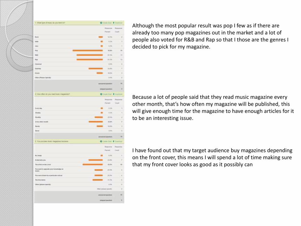
Although the most popular result was pop I few as if there are already too many pop magazines out in the market and a lot of people also voted for R&B and Rap so that I those are the genres I decided to pick for my magazine.
Because a lot of people said that they read music magazine every other month, that’s how often my magazine will be published, this will give enough time for the magazine to have enough articles for it to be an interesting issue.
I have found out that my target audience buy magazines depending on the front cover, this means I will spend a lot of time making sure that my front cover looks as good as it possibly can

I used Adobe Photoshop to create most of my magazine, from this I have learnt many skills such as how to change the background of a picture and how to experiment with different background colours and how different colours, contrast with each other. I also learnt how to change the exposure of an image, and I was able to experiment
with an images contrast and brightness to see what looked best for my images. I also improved on some of the skills that I already had such as blurring images and adding a shadow to a picture which had its background removed.All of the pictures used in my magazine where taken using a digital camera. I was able to get many shots out of one
position of my model (long shot, medium shot and a close-up) with the cameras zoom settings. I experimented with different angles of lighting which at first were not working but eventually I was able to have the perfect lighting in my pictures.

To present my work I used blogger where I was able to organise my work and put it in order as well as adding text and titles to my work. I was able to upload original images and final products to be compared and analysed.
To have audience feedback, I created surveys, using SurveyMonkey. This enabled me to devise several surveys without any difficulty. SurveyMonkey is user friendly and is easy to use for the audience taking my survey this helped me make
many important decisions such us what title block to pick.
Looking back at some of my first projects and my final one I can see how much I learned along the way in terms of manipulating my images and overall editing. There is a clear improvement in terms of professionalism of my last magazine draft; this is because after experimenting with different editing techniques I learned how to make my magazine look better by smoothing images and sharpening others as well as
having a background that goes well with everything else on the page.