Energy in 2017: two steps forward, one step back · Those factors were unlikely to persist. Indeed,...
34
Energy in 2017: two steps forward, one step back Spencer Dale Group chief economist London 13 June 2018
Transcript of Energy in 2017: two steps forward, one step back · Those factors were unlikely to persist. Indeed,...
Energy in 2017: two steps forward, one step back Spencer Dale Group chief economist
London 13 June 2018

Spencer Dale, London, 13 June 2018
Page | 1
1. Introduction
Our aim when producing the Statistical Review is that it should be the one-
stop shop of choice for all your statistical needs.
Customers can come back year-after-year safe in the knowledge that their
regular staples will be available: updated and fresh, impeccably sourced,
cleaned and ready for consumption, neatly ordered in familiar rows. Some
may even have an Ikea-moment and end up using data they didn’t even
know they wanted.
But even though we have been in the marketplace for 67 years, we can’t
rest on our laurels. The energy world is changing, and we need to keep up
with evolving tastes and needs. This year, we are offering new data on the
fuel mix within the power sector and on key materials, such as cobalt and
lithium, which are playing an increasing role in the energy transition.
I am afraid to say that – unlike BP’s retail outlets – we don’t offer customer
loyalty cards. But we do have the advantage that everything in our one-stop
shop is free!
Before taking you through some of the highlights of this year’s produce, let
me thank everyone who has been hard at work collecting, cleaning and
stacking the data shelves over the past couple of months ready for your
convenience.
Spencer Dale, London, 13 June 2018
Page | 2
That work was led by the rest of the Economics team, supported as always
by the tireless efforts of the team from Heriot-Watt University. A huge
thanks to all of them, this is very much a team effort.
At first blush, some of last year’s data might seem a little disappointing.
Growth in overall energy demand is up; gains in energy intensity are down.
Coal consumption grew for the first time in four years. And, perhaps most
striking of all, carbon emissions are up after three consecutive years of little
or no growth.
What does this tell us about the energy transition? Is it progressing less
rapidly than we thought? Has it gone into reverse?
I would caution against being too alarmed by the recent data. We always
knew that some of the exceptional outcomes seen in recent years reflected
the impact of short-run cyclical factors, as well as longer-term structural
forces shaping the energy transition. Global GDP was growing at below
average rates, weighed down by weakness in the energy-intensive
industrial sector. Output from some of China’s most energy-intensive
sectors was falling in outright terms. Those factors were unlikely to persist.
Indeed, last year’s Stats Review presentation had the very snappy title of
“short-run adjustments and long-run transition”.
And sure enough, some of those short-run adjustments came to an end last
year. But many of the structural forces shaping the energy transition
continued, particularly robust growth in renewables and natural gas.
Spencer Dale, London, 13 June 2018
Page | 3
Last year’s energy data is perhaps best seen as a case of “two steps
forward, one step back”.
2. Key features of 2017
Let’s start by looking at some of the headline numbers.
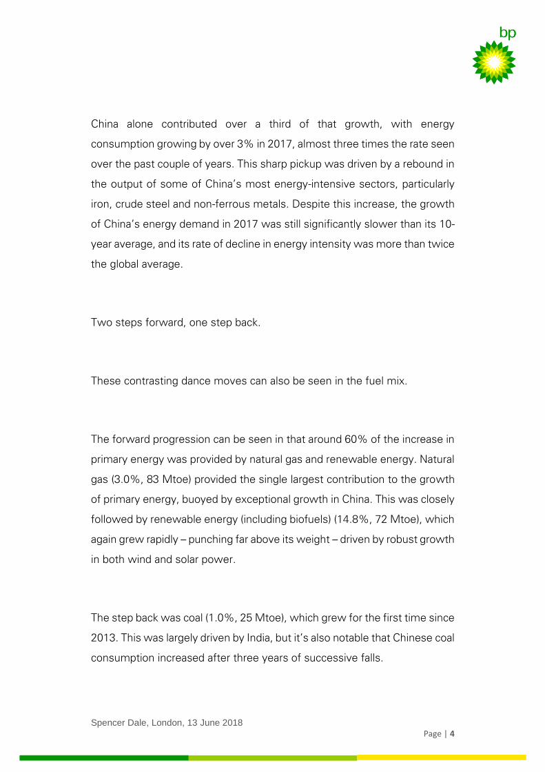
Global energy demand grew by 2.2% in 2017, up from 1.2% last year and
above its 10-year average of 1.7%. This above-trend growth was driven by
the OECD, particularly the EU. Much of this strength can be directly related
to the pickup in economic growth. But it also reflected a slight slowing in
the pace of improvement in energy intensity (or energy productivity): the
amount of energy needed to produce a unit of output.
Despite the unusually strong growth in the OECD, the vast majority of the
increase in global energy consumption came from the developing world,
accounting for nearly 80% of the expansion.
Spencer Dale, London, 13 June 2018
Page | 4
China alone contributed over a third of that growth, with energy
consumption growing by over 3% in 2017, almost three times the rate seen
over the past couple of years. This sharp pickup was driven by a rebound in
the output of some of China’s most energy-intensive sectors, particularly
iron, crude steel and non-ferrous metals. Despite this increase, the growth
of China’s energy demand in 2017 was still significantly slower than its 10-
year average, and its rate of decline in energy intensity was more than twice
the global average.
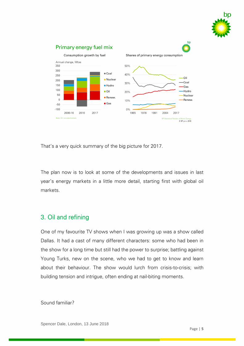
Two steps forward, one step back.
These contrasting dance moves can also be seen in the fuel mix.
The forward progression can be seen in that around 60% of the increase in
primary energy was provided by natural gas and renewable energy. Natural
gas (3.0%, 83 Mtoe) provided the single largest contribution to the growth
of primary energy, buoyed by exceptional growth in China. This was closely
followed by renewable energy (including biofuels) (14.8%, 72 Mtoe), which
again grew rapidly – punching far above its weight – driven by robust growth
in both wind and solar power.
The step back was coal (1.0%, 25 Mtoe), which grew for the first time since
2013. This was largely driven by India, but it’s also notable that Chinese coal
consumption increased after three years of successive falls.
Spencer Dale, London, 13 June 2018
Page | 5
That’s a very quick summary of the big picture for 2017.
The plan now is to look at some of the developments and issues in last
year’s energy markets in a little more detail, starting first with global oil
markets.
3. Oil and refining
One of my favourite TV shows when I was growing up was a show called
Dallas. It had a cast of many different characters: some who had been in
the show for a long time but still had the power to surprise; battling against
Young Turks, new on the scene, who we had to get to know and learn
about their behaviour. The show would lurch from crisis-to-crisis; with
building tension and intrigue, often ending at nail-biting moments.
Sound familiar?
Spencer Dale, London, 13 June 2018
Page | 6
The good thing about Dallas was that you only needed to wait a week for
the next episode. We have had to wait a year until the next instalment of
the Stats Review to see how the drama of real-life oil markets has
developed.
To remind you where we left off at the time of last year’s Statistical Review:
flows of oil production and consumption had come back broadly into
balance, but inventories remained at record-high levels; OPEC, together
with 10 non-OPEC countries led by Russia – sometimes known as the
Vienna group – had begun to implement their promised cuts in oil
production in order to accelerate the adjustment in inventories; but US tight
oil had started to pick up, threatening to offset the impact of the production
cuts.
Like all good cliff-hangers, this begged a number of questions:
- would the production cuts by OPEC and other members of the
Vienna group work;
- how much and how quickly would US tight oil respond; and
- what would all this mean for oil prices?
So what happened next?
Soap operas need an element of continuity against which the more
unpredictable elements of the show can unfold. Dallas – for those of you
old enough to remember – had JR Ewing’s constant nastiness and Sue
Spencer Dale, London, 13 June 2018
Page | 7
Ellen’s constant drinking. The constant in oil market in recent years has
been the strength of demand growth.
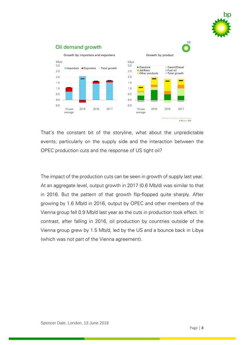
And that continued in 2017, with oil demand growing by 1.7 Mb/d, similar
to that seen in 2016, and significantly greater than the 10-year average of
around 1.1 Mb/d. To put the recent strength of oil demand in context,
average growth over the past five years is at its highest level since the
height of the commodity super-cycle in 2006/7. This despite all the talk of
peak oil demand, increasing car efficiency and growth of electrical vehicles.
All of those factors are real and are happening, but persistently low oil prices
can have a very powerful offsetting effect.
Not surprisingly, oil demand in 2017 continued to be driven by oil importers
benefitting from the windfall of low prices, with both Europe (0.3 Mb/d) and
the US (0.2 Mb/d) posting notable increases, compared with average
declines over the previous 10 years. Growth in China (0.5 Mb/d) was closer
to its 10-year average.
But there were some signs in the product mix that the boost from low oil
prices may be beginning to wane. Growth in consumer-led fuels most
exposed to oil price movements – especially gasoline – slowed in 2017. In
contrast, diesel demand bounced back, buoyed by the acceleration in
industrial activity.
Spencer Dale, London, 13 June 2018
Page | 8
That’s the constant bit of the storyline, what about the unpredictable
events; particularly on the supply side and the interaction between the
OPEC production cuts and the response of US tight oil?
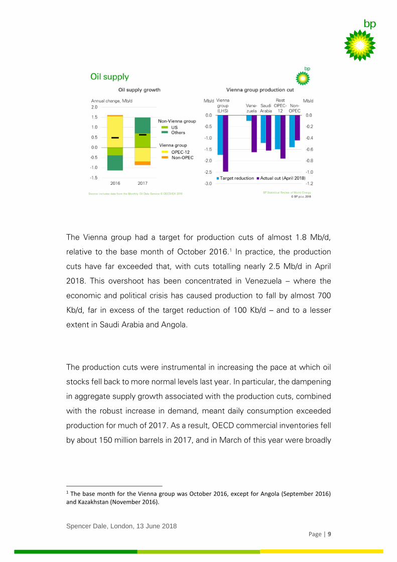
The impact of the production cuts can be seen in growth of supply last year.
At an aggregate level, output growth in 2017 (0.6 Mb/d) was similar to that
in 2016. But the pattern of that growth flip-flopped quite sharply. After
growing by 1.6 Mb/d in 2016, output by OPEC and other members of the
Vienna group fell 0.9 Mb/d last year as the cuts in production took effect. In
contrast, after falling in 2016, oil production by countries outside of the
Vienna group grew by 1.5 Mb/d, led by the US and a bounce back in Libya
(which was not part of the Vienna agreement).
Spencer Dale, London, 13 June 2018
Page | 9
The Vienna group had a target for production cuts of almost 1.8 Mb/d,
relative to the base month of October 2016.1 In practice, the production
cuts have far exceeded that, with cuts totalling nearly 2.5 Mb/d in April
2018. This overshoot has been concentrated in Venezuela – where the
economic and political crisis has caused production to fall by almost 700
Kb/d, far in excess of the target reduction of 100 Kb/d – and to a lesser
extent in Saudi Arabia and Angola.
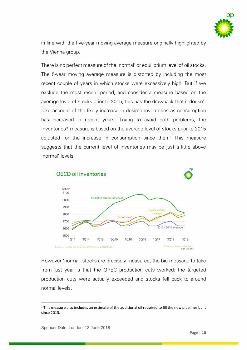
The production cuts were instrumental in increasing the pace at which oil
stocks fell back to more normal levels last year. In particular, the dampening
in aggregate supply growth associated with the production cuts, combined
with the robust increase in demand, meant daily consumption exceeded
production for much of 2017. As a result, OECD commercial inventories fell
by about 150 million barrels in 2017, and in March of this year were broadly
1 The base month for the Vienna group was October 2016, except for Angola (September 2016) and Kazakhstan (November 2016).
Spencer Dale, London, 13 June 2018
Page | 10
in line with the five-year moving average measure originally highlighted by
the Vienna group.
There is no perfect measure of the ‘normal’ or equilibrium level of oil stocks.
The 5-year moving average measure is distorted by including the most
recent couple of years in which stocks were excessively high. But if we
exclude the most recent period, and consider a measure based on the
average level of stocks prior to 2015, this has the drawback that it doesn’t
take account of the likely increase in desired inventories as consumption
has increased in recent years. Trying to avoid both problems, the
Inventories* measure is based on the average level of stocks prior to 2015
adjusted for the increase in consumption since then.2 This measure
suggests that the current level of inventories may be just a little above
‘normal’ levels.
However ‘normal’ stocks are precisely measured, the big message to take
from last year is that the OPEC production cuts worked: the targeted
production cuts were actually exceeded and stocks fell back to around
normal levels.
2 This measure also includes an estimate of the additional oil required to fill the new pipelines built since 2015.
Spencer Dale, London, 13 June 2018
Page | 11
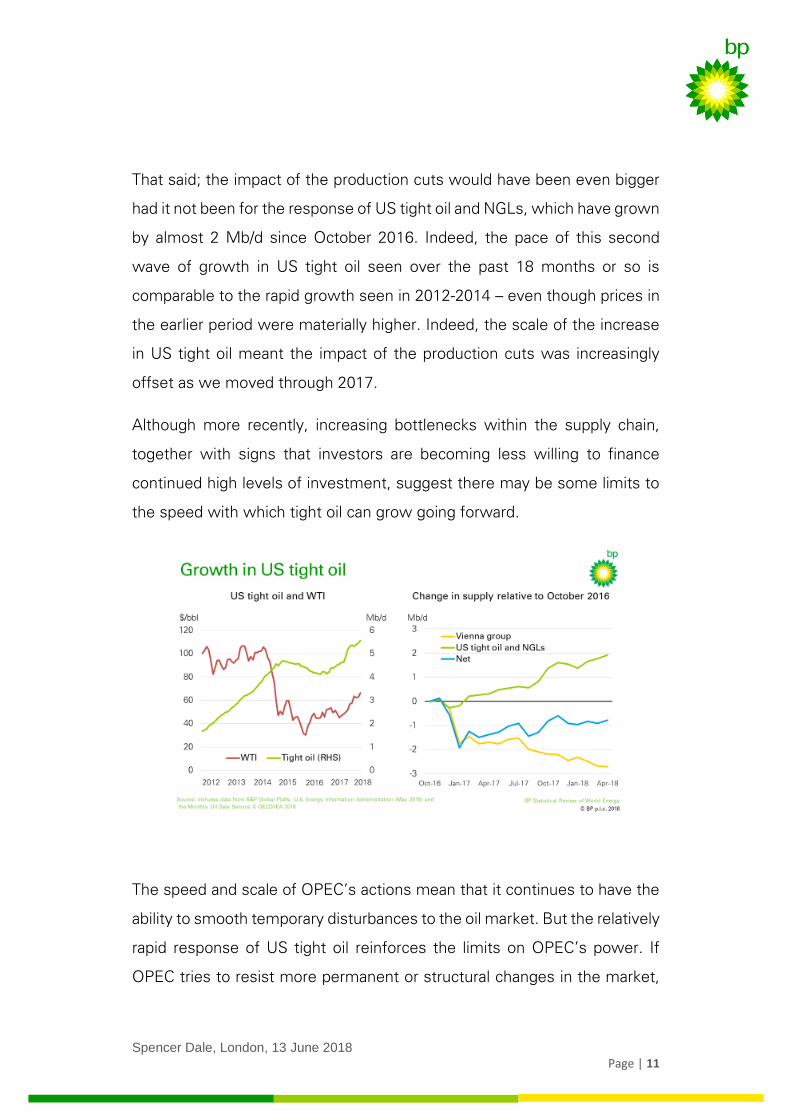
That said; the impact of the production cuts would have been even bigger
had it not been for the response of US tight oil and NGLs, which have grown
by almost 2 Mb/d since October 2016. Indeed, the pace of this second
wave of growth in US tight oil seen over the past 18 months or so is
comparable to the rapid growth seen in 2012-2014 – even though prices in
the earlier period were materially higher. Indeed, the scale of the increase
in US tight oil meant the impact of the production cuts was increasingly
offset as we moved through 2017.
Although more recently, increasing bottlenecks within the supply chain,
together with signs that investors are becoming less willing to finance
continued high levels of investment, suggest there may be some limits to
the speed with which tight oil can grow going forward.
The speed and scale of OPEC’s actions mean that it continues to have the
ability to smooth temporary disturbances to the oil market. But the relatively
rapid response of US tight oil reinforces the limits on OPEC’s power. If
OPEC tries to resist more permanent or structural changes in the market,
Spencer Dale, London, 13 June 2018
Page | 12
there is an increasing risk that these actions will quickly be cancelled out by
the responsiveness of US tight oil.
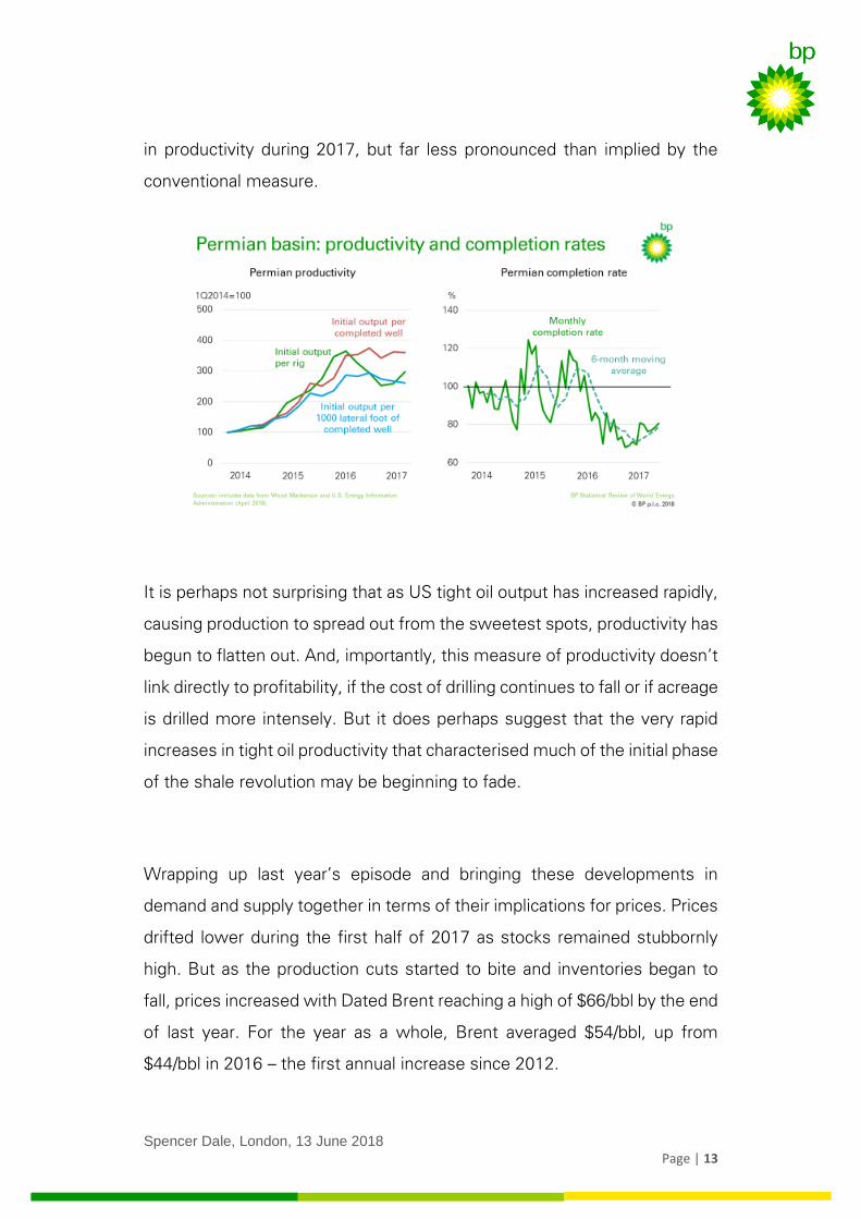
Focussing on tight oil for a moment: a central part of its success over the
past 5 or 6 years has been the strong and continuous gains in productivity,
as technology and know-how have improved.
However, the most recent data for the Permian which has accounted for
around two-thirds of the increase in US tight oil since 2017, paint a sharply
different picture. In particular, using conventional measures based on ‘initial
output per rig’, measured productivity fell sharply in the second half of 2016
and the first half of 2017, before recovering somewhat in the second half
of last year.
But much of the fall in this conventional measure of productivity was driven
by a sharp decline in the rate at which drilled wells were subsequently
fracked and completed – as the supply chain within the Permian tightened
and drilling processes became more complex – rather than by a fall in the
underlying productivity of the wells drilled.
If we control for these changes in the completion rate by considering a
measure of productivity based on ‘initial output per completed well’, this
points to a gradual flattening off in productivity last year, rather than a sharp
decline. This measure can be further refined to control for the increasing
length of drilled wells, by considering a measure of ‘initial output per lateral
foot of each completed well’. This third measure points to a slight decline
Spencer Dale, London, 13 June 2018
Page | 13
in productivity during 2017, but far less pronounced than implied by the
conventional measure.
It is perhaps not surprising that as US tight oil output has increased rapidly,
causing production to spread out from the sweetest spots, productivity has
begun to flatten out. And, importantly, this measure of productivity doesn’t
link directly to profitability, if the cost of drilling continues to fall or if acreage
is drilled more intensely. But it does perhaps suggest that the very rapid
increases in tight oil productivity that characterised much of the initial phase
of the shale revolution may be beginning to fade.
Wrapping up last year’s episode and bringing these developments in
demand and supply together in terms of their implications for prices. Prices
drifted lower during the first half of 2017 as stocks remained stubbornly
high. But as the production cuts started to bite and inventories began to
fall, prices increased with Dated Brent reaching a high of $66/bbl by the end
of last year. For the year as a whole, Brent averaged $54/bbl, up from
$44/bbl in 2016 – the first annual increase since 2012.
Spencer Dale, London, 13 June 2018
Page | 14
Oil prices have obviously increased significantly further since then, raising
the question of what happens next.
This will depend, amongst other things:
- on the behaviour of OPEC and the other members of the Vienna
group – how will they respond to the overshoot of the production
cuts, and when and how will they begin to exit from the cuts; and
- on the behaviour of US tight oil – will productivity keep declining; and
are the recent issues with credit availability and supply-chain
bottlenecks simply short-term growing pains or could they act as
more persistent constraints on growth?
To find out the answer to these and other key developments tune in to the
next exciting instalment of the Stats Review.
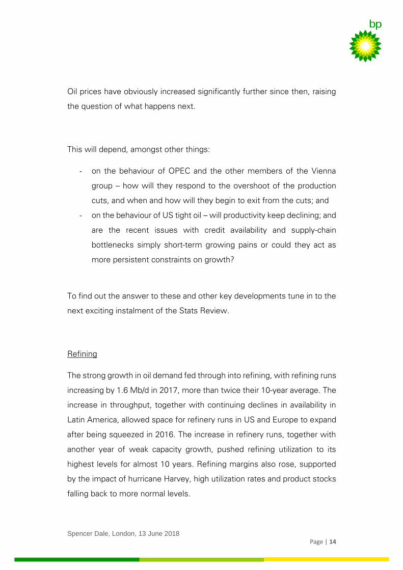
Refining
The strong growth in oil demand fed through into refining, with refining runs
increasing by 1.6 Mb/d in 2017, more than twice their 10-year average. The
increase in throughput, together with continuing declines in availability in
Latin America, allowed space for refinery runs in US and Europe to expand
after being squeezed in 2016. The increase in refinery runs, together with
another year of weak capacity growth, pushed refining utilization to its
highest levels for almost 10 years. Refining margins also rose, supported
by the impact of hurricane Harvey, high utilization rates and product stocks
falling back to more normal levels.
Spencer Dale, London, 13 June 2018
Page | 15
The Brent-WTI differential widened sharply in the second half of 2017,
averaging $5/bbl in the second half of 2017. This widening largely stemmed
from the speed and scale of the ramp-up in Permian production, which led
to increasing bottlenecks (and hence costs) in transporting crude to the Gulf
coast. These bottlenecks persist today.
4. Natural gas
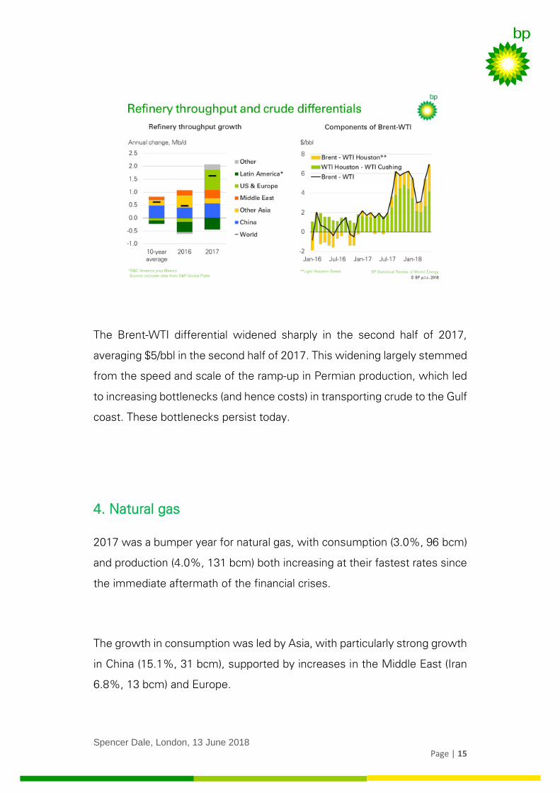
2017 was a bumper year for natural gas, with consumption (3.0%, 96 bcm)
and production (4.0%, 131 bcm) both increasing at their fastest rates since
the immediate aftermath of the financial crises.
The growth in consumption was led by Asia, with particularly strong growth
in China (15.1%, 31 bcm), supported by increases in the Middle East (Iran
6.8%, 13 bcm) and Europe.
Spencer Dale, London, 13 June 2018
Page | 16
The growth is consumption was more than matched by increasing
production, particularly in Russia (8.2%, 46 bcm), supported by Iran (10.5%,
21 bcm), Australia (18%, 17 bcm) and China (8.5%, 11 bcm).
Surge in China’s gas demand
The single biggest factor driving global gas consumption last year was the
surge in Chinese gas demand, where consumption increased by over 15%,
accounting for around a third of the global increase.
Much of this rapid expansion can be traced back to the Environmental
Action Plan announced in 2013, which set targets for improvements in air
quality over the subsequent five years. With that five-year deadline looming,
the Chinese authorities in the spring of last year announced an enhanced
set of measures for Beijing, Tiajing and 26 other cities in the North-East
provinces of China, designed to meet the environmental objectives.
Spencer Dale, London, 13 June 2018
Page | 17
These measures, which were further reinforced in the autumn of last year,
were focussed on the use of coal outside of the power sector. In particular,
a combination of very sizeable carrots and sticks were used to encourage
industrial and residential users to switch away from coal to either gas or
electricity, with the vast majority opting for gas. Although most attention
has focused on the 3 million households affected by this policy, the biggest
factor driving the expansion in gas demand was switching within the
industrial sector. The resulting increase in gas demand was greatly
compounded by the switch into gas reaching a peak just as winter heating
demand was ramping up.
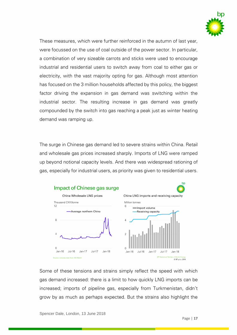
The surge in Chinese gas demand led to severe strains within China. Retail
and wholesale gas prices increased sharply. Imports of LNG were ramped
up beyond notional capacity levels. And there was widespread rationing of
gas, especially for industrial users, as priority was given to residential users.
Some of these tensions and strains simply reflect the speed with which
gas demand increased: there is a limit to how quickly LNG imports can be
increased; imports of pipeline gas, especially from Turkmenistan, didn’t
grow by as much as perhaps expected. But the strains also highlight the
Spencer Dale, London, 13 June 2018
Page | 18
underlying weakness of gas infrastructure in China. The network of
pipelines across China is incomplete, leading to significant distributional
issues. More importantly, gas storage capacity in China is inadequate to
match the seasonal fluctuations in demand – effective storage capacity in
China is around 3% of consumption, compared with close to 20% in the
US and Europe. These types of structural issues can’t be fixed overnight
and are likely to constrain the extent to which Chinese gas demand outside
of the power sector can grow in the near term.
These constraints are reflected in more recent policy announcements
which have identified a wider range of options to improve local air quality,
including the use of ‘scrubbed’ coal in utility-scale boilers and combined
heat-and-power plants. Chinese gas demand looks set to continue to
increase strongly this year, not least because the surge in gas demand
continued into the first part of this year and some of the rationing that held
back demand in the final part of last year is likely to ease. But it seems
unlikely that the extent of the surge in gas demand seen in China last year
will be repeated in 2019 and beyond.
Growth in LNG trade
The other central factor supporting the strength of global gas markets last
year was the continued expansion of liquified natural gas (LNG), which
increased by over 10% in 2017, its strongest growth since 2010, aided by
the start-up of new LNG trains in Australia and the US.
Spencer Dale, London, 13 June 2018
Page | 19
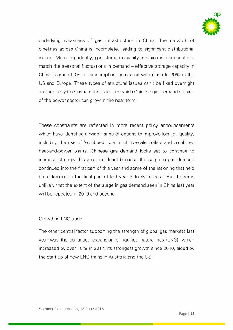
China’s increased need for LNG accounted for almost half of the global
expansion, with China overtaking Korea to be the world’s second largest
importer of LNG after Japan.
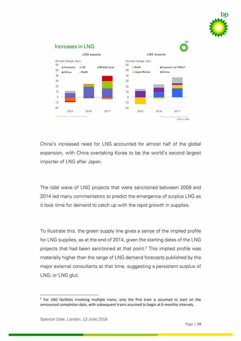
The tidal wave of LNG projects that were sanctioned between 2009 and
2014 led many commentators to predict the emergence of surplus LNG as
it took time for demand to catch up with the rapid growth in supplies.
To illustrate this, the green supply line gives a sense of the implied profile
for LNG supplies, as at the end of 2014, given the starting dates of the LNG
projects that had been sanctioned at that point.3 This implied profile was
materially higher than the range of LNG demand forecasts published by the
major external consultants at that time, suggesting a persistent surplus of
LNG; or LNG glut.
3 For LNG facilities involving multiple trains, only the first train is assumed to start on the announced completion date, with subsequent trains assumed to begin at 6 monthly intervals.
Spencer Dale, London, 13 June 2018
Page | 20
But many observers have so far been surprised by the apparent absence of
such a glut. There is certainly little evidence of LNG facilities standing idle
due to a lack of demand.
This absence partly reflects that, due to a variety of technical issues, actual
LNG supplies - shown by the yellow line - have come on stream less quickly
than originally planned, moving supply more into line with the original
demand profiles.
However, the apparent absence of a glut also reflects the fact that the
surplus LNG supplies which did emerge resulted in bouts of unsustainably
low prices rather than a build-up of idle capacity.
Spencer Dale, London, 13 June 2018
Page | 21
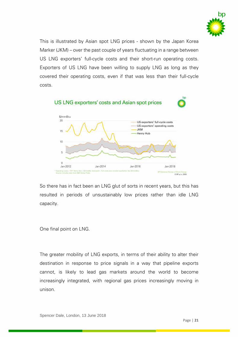
This is illustrated by Asian spot LNG prices - shown by the Japan Korea
Marker (JKM) – over the past couple of years fluctuating in a range between
US LNG exporters’ full-cycle costs and their short-run operating costs.
Exporters of US LNG have been willing to supply LNG as long as they
covered their operating costs, even if that was less than their full-cycle
costs.
So there has in fact been an LNG glut of sorts in recent years, but this has
resulted in periods of unsustainably low prices rather than idle LNG
capacity.
One final point on LNG.
The greater mobility of LNG exports, in terms of their ability to alter their
destination in response to price signals in a way that pipeline exports
cannot, is likely to lead gas markets around the world to become
increasingly integrated, with regional gas prices increasingly moving in
unison.
Spencer Dale, London, 13 June 2018
Page | 22
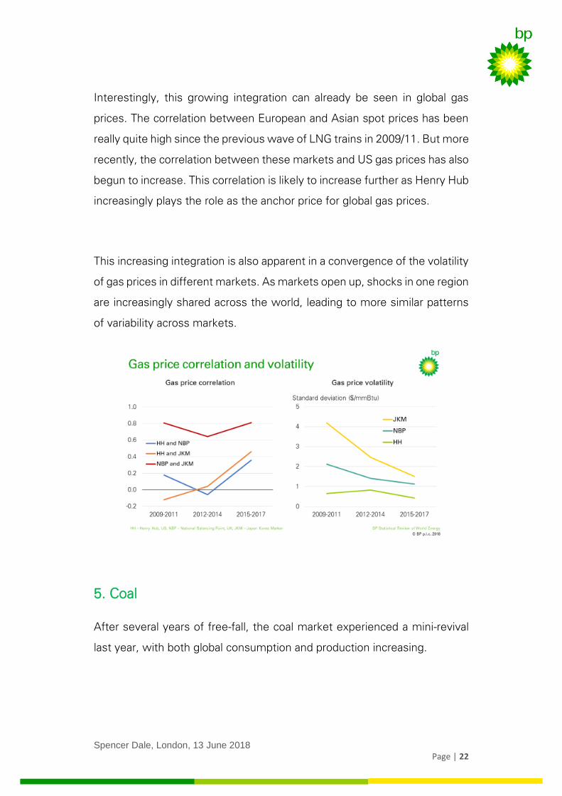
Interestingly, this growing integration can already be seen in global gas
prices. The correlation between European and Asian spot prices has been
really quite high since the previous wave of LNG trains in 2009/11. But more
recently, the correlation between these markets and US gas prices has also
begun to increase. This correlation is likely to increase further as Henry Hub
increasingly plays the role as the anchor price for global gas prices.
This increasing integration is also apparent in a convergence of the volatility
of gas prices in different markets. As markets open up, shocks in one region
are increasingly shared across the world, leading to more similar patterns
of variability across markets.
5. Coal
After several years of free-fall, the coal market experienced a mini-revival
last year, with both global consumption and production increasing.
Spencer Dale, London, 13 June 2018
Page | 23
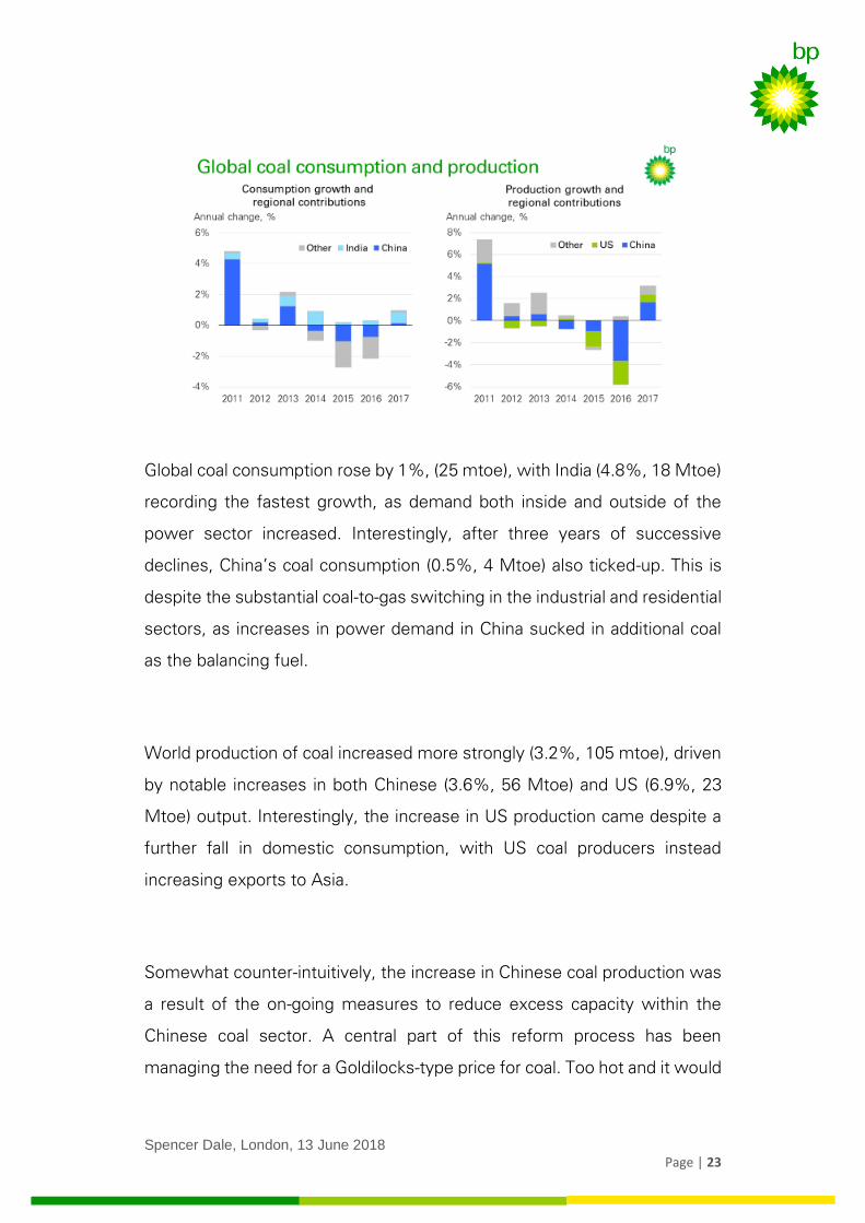
Global coal consumption rose by 1%, (25 mtoe), with India (4.8%, 18 Mtoe)
recording the fastest growth, as demand both inside and outside of the
power sector increased. Interestingly, after three years of successive
declines, China’s coal consumption (0.5%, 4 Mtoe) also ticked-up. This is
despite the substantial coal-to-gas switching in the industrial and residential
sectors, as increases in power demand in China sucked in additional coal
as the balancing fuel.
World production of coal increased more strongly (3.2%, 105 mtoe), driven
by notable increases in both Chinese (3.6%, 56 Mtoe) and US (6.9%, 23
Mtoe) output. Interestingly, the increase in US production came despite a
further fall in domestic consumption, with US coal producers instead
increasing exports to Asia.
Somewhat counter-intuitively, the increase in Chinese coal production was
a result of the on-going measures to reduce excess capacity within the
Chinese coal sector. A central part of this reform process has been
managing the need for a Goldilocks-type price for coal. Too hot and it would
Spencer Dale, London, 13 June 2018
Page | 24
reduce the pressure for inefficient mines to close or merge, as well as
raising general energy costs. Too cold and it would threaten the underlying
viability of a sector that still provides around 60% of China’s energy.
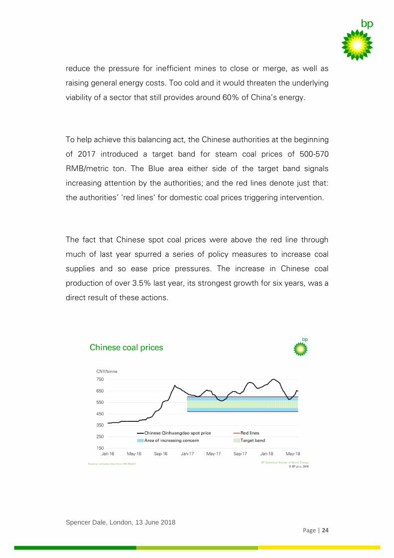
To help achieve this balancing act, the Chinese authorities at the beginning
of 2017 introduced a target band for steam coal prices of 500-570
RMB/metric ton. The Blue area either side of the target band signals
increasing attention by the authorities; and the red lines denote just that:
the authorities’ ‘red lines’ for domestic coal prices triggering intervention.
The fact that Chinese spot coal prices were above the red line through
much of last year spurred a series of policy measures to increase coal
supplies and so ease price pressures. The increase in Chinese coal
production of over 3.5% last year, its strongest growth for six years, was a
direct result of these actions.
Spencer Dale, London, 13 June 2018
Page | 25
6. Power sector
The power sector really matters. It’s by far the single biggest market for
energy: absorbing over 40% of primary energy last year. And it is at the
leading edge of the energy transition, as renewables grow and energy
efficiency improves. As I mentioned, this year’s Stats Review for the first
time includes comprehensive data on the fuel mix within the power sector,
aiding our understanding of this key sector.
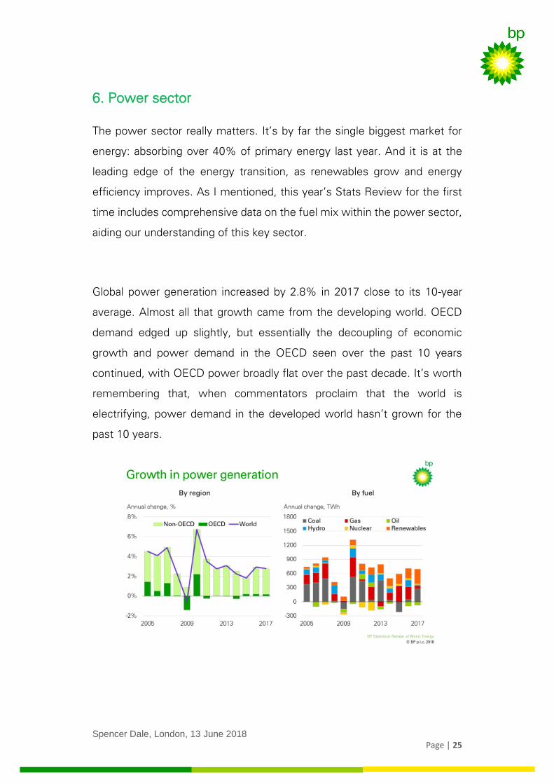
Global power generation increased by 2.8% in 2017 close to its 10-year
average. Almost all that growth came from the developing world. OECD
demand edged up slightly, but essentially the decoupling of economic
growth and power demand in the OECD seen over the past 10 years
continued, with OECD power broadly flat over the past decade. It’s worth
remembering that, when commentators proclaim that the world is
electrifying, power demand in the developed world hasn’t grown for the
past 10 years.
Spencer Dale, London, 13 June 2018
Page | 26
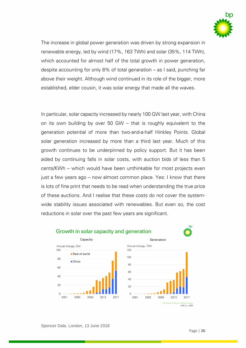
The increase in global power generation was driven by strong expansion in
renewable energy, led by wind (17%, 163 TWh) and solar (35%, 114 TWh),
which accounted for almost half of the total growth in power generation,
despite accounting for only 8% of total generation – as I said, punching far
above their weight. Although wind continued in its role of the bigger, more
established, elder cousin, it was solar energy that made all the waves.
In particular, solar capacity increased by nearly 100 GW last year, with China
on its own building by over 50 GW – that is roughly equivalent to the
generation potential of more than two-and-a-half Hinkley Points. Global
solar generation increased by more than a third last year. Much of this
growth continues to be underpinned by policy support. But it has been
aided by continuing falls in solar costs, with auction bids of less than 5
cents/KWh – which would have been unthinkable for most projects even
just a few years ago – now almost common place. Yes: I know that there
is lots of fine print that needs to be read when understanding the true price
of these auctions. And I realise that these costs do not cover the system-
wide stability issues associated with renewables. But even so, the cost
reductions in solar over the past few years are significant.
Spencer Dale, London, 13 June 2018
Page | 27
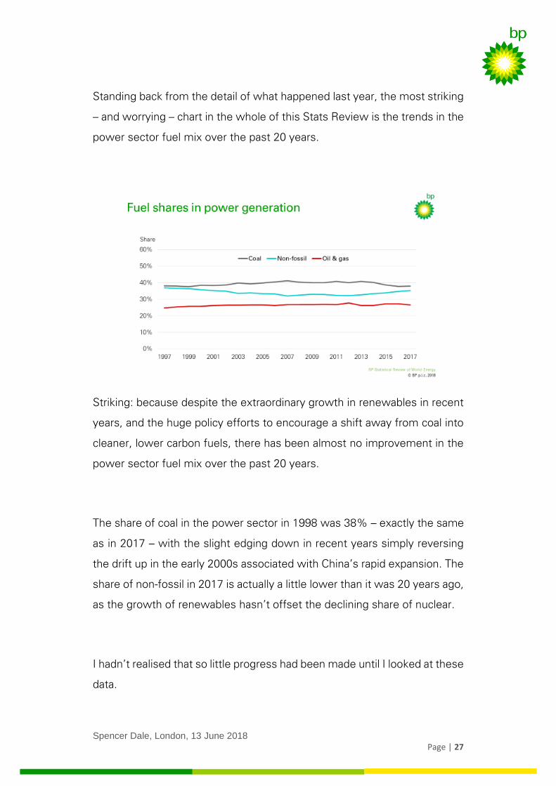
Standing back from the detail of what happened last year, the most striking
– and worrying – chart in the whole of this Stats Review is the trends in the
power sector fuel mix over the past 20 years.
Striking: because despite the extraordinary growth in renewables in recent
years, and the huge policy efforts to encourage a shift away from coal into
cleaner, lower carbon fuels, there has been almost no improvement in the
power sector fuel mix over the past 20 years.
The share of coal in the power sector in 1998 was 38% – exactly the same
as in 2017 – with the slight edging down in recent years simply reversing
the drift up in the early 2000s associated with China’s rapid expansion. The
share of non-fossil in 2017 is actually a little lower than it was 20 years ago,
as the growth of renewables hasn’t offset the declining share of nuclear.
I hadn’t realised that so little progress had been made until I looked at these
data.
Spencer Dale, London, 13 June 2018
Page | 28
Worrying: because the power sector is the single most important source of
carbon emissions from energy consumption, accounting for over a third of
those emissions in 2017. To have any chance of getting on a path
consistent with meeting the Paris climate goals there will need to be
significant improvements in the power sector. As I bored many of you
during the Energy Outlook, the answer to almost any policy question on
how best to reduce carbon emissions from the energy sector over the
coming decades is: start with the power sector; then focus on the power
sector; and then, if you have any spare policy capacity, push harder in the
power sector.
But this is one area where at the global level we haven’t even taken one
step forward, we have stood still: perfectly still for the past 20 years. This
chart should serve as a wake-up call for all of us.
7. Carbon emissions from energy consumption
The backward step in last year’s data is most stark in carbon emissions
from energy consumption, which are estimated to have increased by 1.6%
in 2017. That follows three consecutive years of little or no growth in carbon
emissions. So, on the face of it, a pretty big backward step.
The factors driving the pick-up in carbon emissions are of course the same
factors that we have just been discussing. Global GDP growth picked up to
above trend rates. Much of that growth was driven by industrial activity,

Spencer Dale, London, 13 June 2018
Page | 29
which is more energy hungry, causing gains in energy intensity to slow.
And the turnaround in coal consumption, from the substantial falls seen in
the previous three years to a small rise last year, meant the improvement
in carbon intensity was more muted.
How worried should we be?
Last year when we discussed the exceptional performance seen over the
previous three years, I suggested that some of that improvement was likely
to be structural and would persist, but that the degree of improvement was
probably exaggerated by several cyclical factors, particularly in China. Given
that, as those short-run factors unwind – like they have done this year – its’
not surprising that carbon emissions increased to some extent.
But the extent of that pickup has probably also been exaggerated by some
short-run factors working in the opposite direction. The unusually strong
Spencer Dale, London, 13 June 2018
Page | 30
economic and industrial growth in the OECD, and the extent of the bounce
back in power demand in China, which sucked in coal as the balancing fuel.
My guess is that some of the deterioration in 2017 relative to the previous
three years will persist, but not all of it.
So a bit worried, but not overly so. Personally, I am more worried by the
lack of progress in the power sector over the past 20 years, than by the
pickup in carbon emissions last year.
8. Cobalt and lithium
Finally, as I mentioned at the outset, a key challenge for the Stats Review
is that it needs to adapt to the changing needs of you, our customers.
One of the questions I am most often asked is whether the available
supplies of raw materials used to produce batteries for electric cars could
act as a constraint on the speed with which they grow. That question was
one of the reasons why we included a new section in this year’s Stats
Review on ‘Key Materials for the Changing Energy System’, including data
on cobalt and lithium which are used in the production of batteries for
electric cars.
In terms of the basic facts.
Spencer Dale, London, 13 June 2018
Page | 31
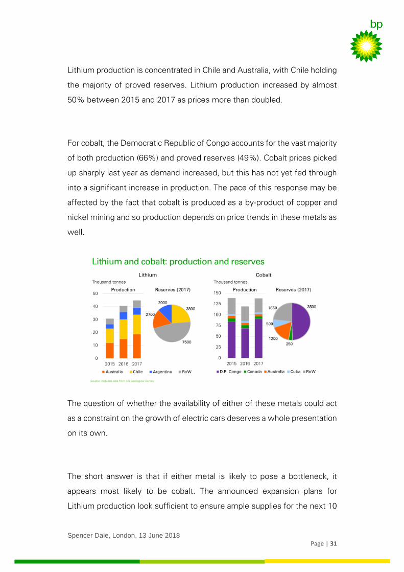
Lithium production is concentrated in Chile and Australia, with Chile holding
the majority of proved reserves. Lithium production increased by almost
50% between 2015 and 2017 as prices more than doubled.
For cobalt, the Democratic Republic of Congo accounts for the vast majority
of both production (66%) and proved reserves (49%). Cobalt prices picked
up sharply last year as demand increased, but this has not yet fed through
into a significant increase in production. The pace of this response may be
affected by the fact that cobalt is produced as a by-product of copper and
nickel mining and so production depends on price trends in these metals as
well.
The question of whether the availability of either of these metals could act
as a constraint on the growth of electric cars deserves a whole presentation
on its own.
The short answer is that if either metal is likely to pose a bottleneck, it
appears most likely to be cobalt. The announced expansion plans for
Lithium production look sufficient to ensure ample supplies for the next 10
Spencer Dale, London, 13 June 2018
Page | 32
or 15 years. In contrast, the geographical concentration of reserves,
together with the nature of its production process, means this is less clear
for cobalt. But the new wave of battery technologies now being developed
requires less cobalt. So rather than act as a constraint on the growth of
electric vehicles, the availability of cobalt could simply provide further
momentum to this technological change. Watch this space.
9. Conclusion
Global energy markets in 2017 took a backward step in terms of the
transition to a lower carbon energy system: growth in energy demand, coal
consumption and carbon emissions all increased. But that should be seen
in the context of the exceptional outcomes recorded in the previous three
years. Some backsliding was almost inevitable.
The road to meeting the Paris climate goals is likely to be long and
challenging, with many twists and turns, forward lurches and backward
stumbles. To navigate our progress will require timely, comprehensive and
relevant data.
That’s the role of BP’s Statistical Review.
We have been welcoming customers into our one-stop statistical shop for
the past 67 years.

Spencer Dale, London, 13 June 2018
Page | 33
But the retail sector is littered with failed household names that didn’t adapt
and change with the times.
We will continue to provide all the data that you have come to rely on,
together with updating our wares for the changing world.
So more John Lewis than Woolworths