
Easy Way Responsive Web Design Technology
15
nexgenfmpl.com 311, Somdutt Chambers – I, Bhikaji Cama Place, New Delhi – 110029
-
Upload
nexgen-fmpl -
Category
Services
-
view
27 -
download
0
Transcript of Easy Way Responsive Web Design Technology

nexgenfmpl.com311, Somdutt Chambers – I, Bhikaji Cama Place,
New Delhi – 110029

What is Responsive Web Design?
Responsive Web Design is a technology by which you can minimize page scrolling, paining and resizing. If you want to be good responsive web designer then you can adjust it on the basis of mobile device and various sorts of screen resolution.


Fonts
Ems Percentages Rems
The best way to implement a responsive font size is to use:
Is relative to parent's font size, eg. 2em = 28px if parent element's font-size is 14px.
percentages are resizable units for font size, and their CSS declarations can be inherited
is relative to the html element's font-size.
Typography is one of the most important aspects of responsive web design

img { max-width: 100%; height: auto; }
Fluid Images One way around this is to size images in relative units, rather than absolute pixel dimensions.
The most common relative solution is to set the max-width at the image at 100%and the data-fullsrc attribute

Fluid Grids
Regardless of what the device or screen size is, components in fluid designs are going to flow and adapt to the user environment.

Media Queries
<link rel="stylesheet" media="screen and (max-width: 640px)" href="smallscreen.css" type="text/css" />
Target specific screen sizes with Different styles
You can change styles depending on :
Height and width of the browser
Screen resolution
Orientation of the device
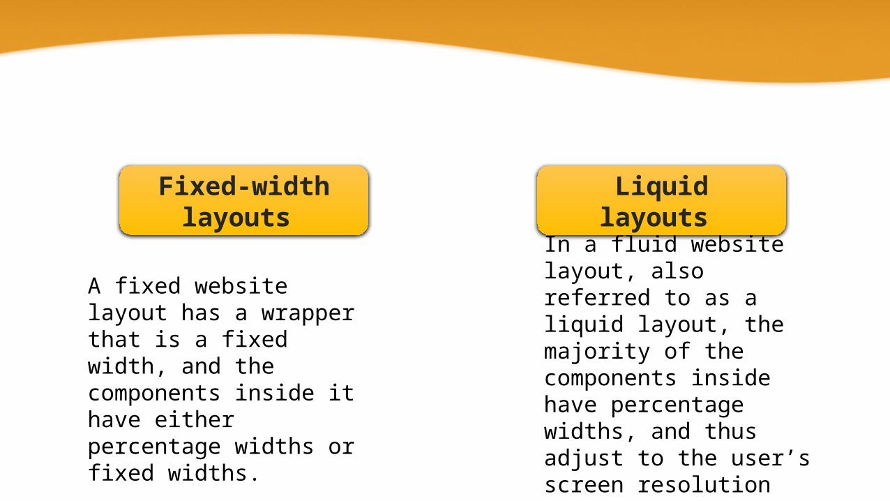
In a fluid website layout, also referred to as a liquid layout, the majority of the components inside have percentage widths, and thus adjust to the user’s screen resolution
Fixed-width layouts
Liquid layouts
A fixed website layout has a wrapper that is a fixed width, and the components inside it have either percentage widths or fixed widths.
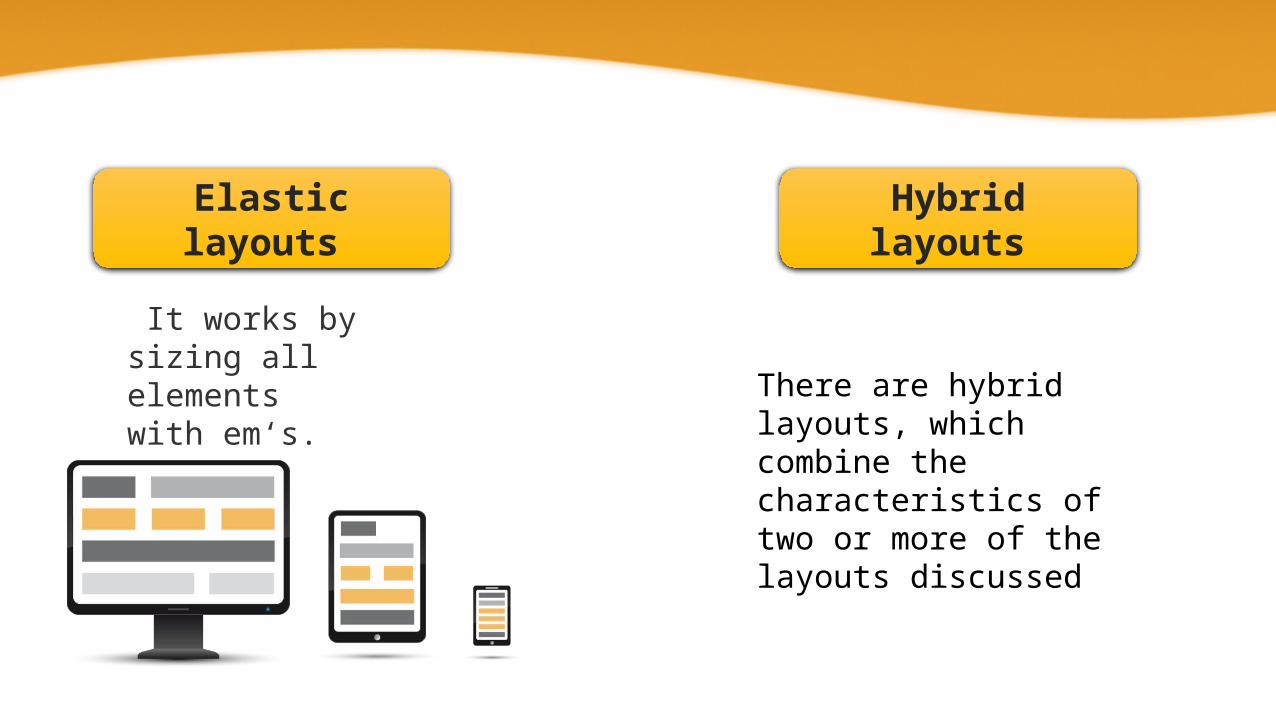
Elastic layouts Hybrid layouts
There are hybrid layouts, which combine the characteristics of two or more of the layouts discussed
It works by sizing all elements with em‘s.

The advantages of grid layouts are numerous :• Gives order, originality, and harmony to the presentation of content;
• Allows users to predict where to find the information they need
• Makes it easier to add new content without having it looking disjointed or marginalized.
Custom Grid Layouts

<div id="wrapper"> <div id="header">Header</div> <div id="content">Content</div> <div id="sidebar">Sidebar</div> <div id="footer">Footer</div></div>
Code Example:
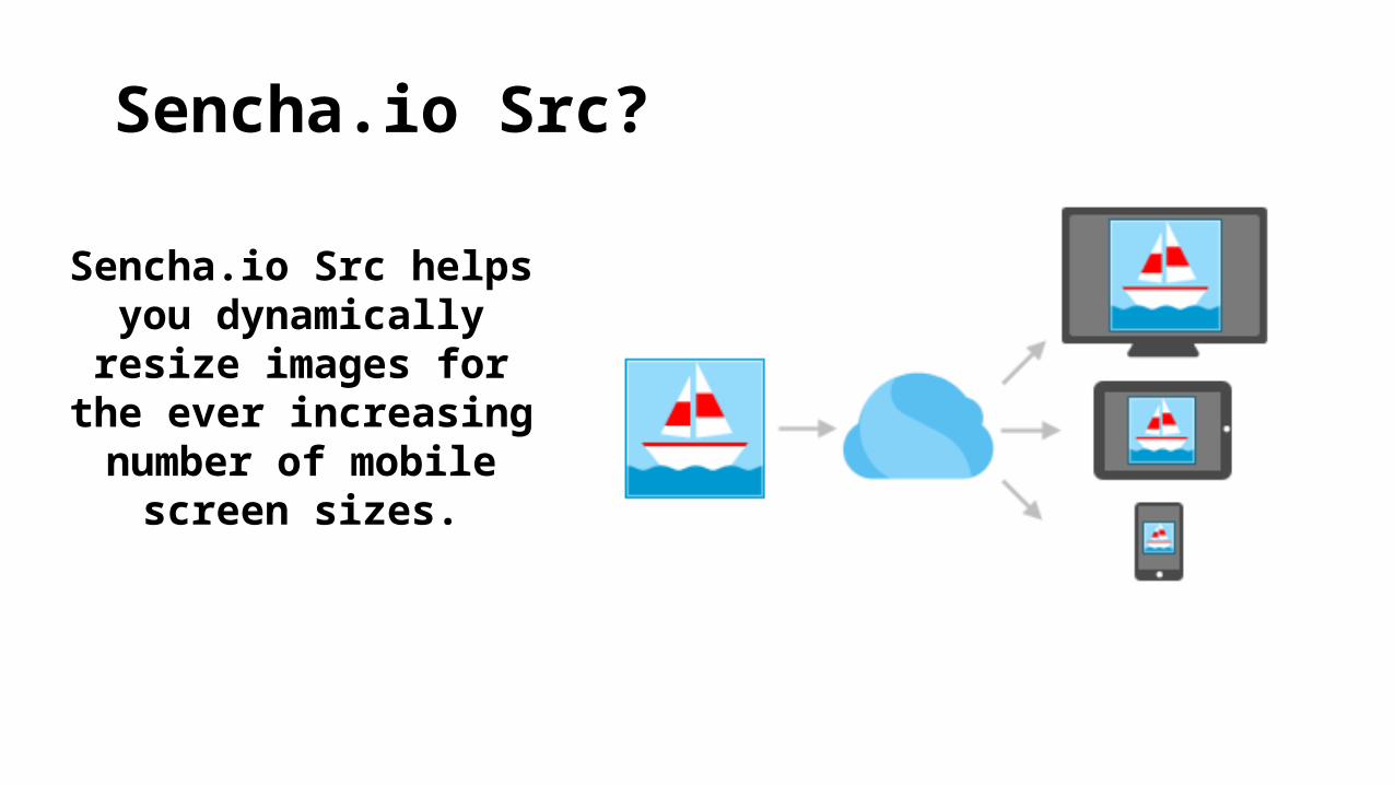
Sencha.io Src?
Sencha.io Src helps you dynamically resize images for
the ever increasing number of mobile
screen sizes.

Here are three JavaScript solutions that can help us serve responsive websites to older browsers lacking CSS3 support:
JavaScript Solutions
Respond.js Modernizr Adaptive.960.js

• 311, Somdutt Chambers – I, Bhikaji Cama Place, New Delhi – 110029
• Phone: +91 9971 955 204• E-Mail Address:
[email protected]• Web Site:
www.nexgenfmpl.com
Contact Us

Thank you