Dtc 355 #1
20
Multimodal Design Concept By: Denver VanderYacht
-
Upload
denyacht1232 -
Category
Design
-
view
185 -
download
3
Transcript of Dtc 355 #1

Multimodal Design ConceptBy: Denver VanderYacht

Emphasis• Emphasis means putting stress on a word or group of words to
give it more importance.

Emphasis
I chose this picture for emphasis because this picture emphasizes recycling. The RE is bold emphasize the words REuse, REduce, REcycle. This pictures as a whole is apart of the go green movement and we get a clear picture of what the creators are wanting us to get out of it.
I found a Newspaper article that captures your attention right away. How it does this is by enlarging the title to direct are attention to it. Putting emphasis on that title makes it more noticeable and captures our attention.
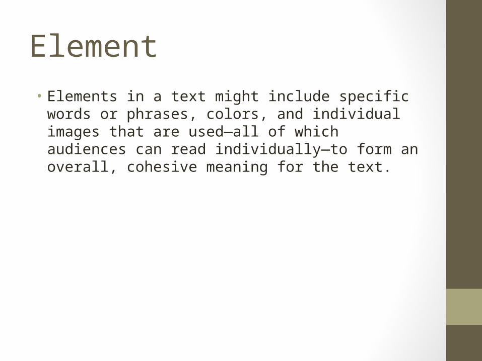
Element• Elements in a text might include specific words or phrases,
colors, and individual images that are used—all of which audiences can read individually—to form an overall, cohesive meaning for the text.

This picture shows multiple elements because it is showing the different kinds of transportation we are using around the world today. Each image in this picture has its own meaning. And by placing these separate images over the picture of the earth it is assumed that these are the main ways of transportation and delivery
What better picture can have so many elements with multiple meanings. A picture of a construction zone is just that. There is a sign designed to inform the audience that there is roadwork ahead. The orange cones are to block off the designated construction zone. And The heavy machinery in the background to prove that there is work being done. Each one of the objects has their own meaning, and if altering or taking one out can change your perspective.

Organization• Is the way in which elements are arranged to form a coherent
unit or functioning whole.
This picture is organization because it shows students raising their hands. We were taught to raise our hands if we had a question, or the answer to a question. This is perfect because the students are doing just that. They are taught to raise their hands if they have a question or answer. They are an organized classroom.
This pictures shows a closet organized by color. They are going from red to blue by the looks of it. Organization can come in many forms and this picture is designed to show the organization by color.
Contrast• Is the difference between elements, where the combination
of those elements makes one element stand out from another.

This picture shows contrast because it is of a women with her hand on her chin and a thought bubble to the side of her. We instantly think she is thinking of something that can help her out somehow. But if there was a picture in that thought bubble we would assume that it would be about that image.
This picture is of contrast because we all know what the leaning tower of Pisa is, and that it is much larger than the man that appears to be holding it up. If he backed up a bit and stood up straight you would be able to tell that he is not holding it up. But he wants it to appear that he is holding the tower up.

Alignment• How things line up. Basically means how the alignment of the
items effects the meaning of the image. If our eyes and our attention is grasped by it.
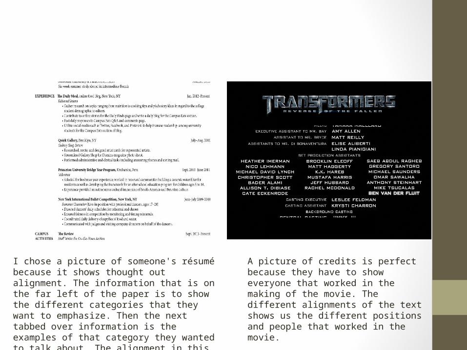
I chose a picture of someone's résumé because it shows thought out alignment. The information that is on the far left of the paper is to show the different categories that they want to emphasize. Then the next tabbed over information is the examples of that category they wanted to talk about. The alignment in this example shows the different categories they would like to talk about and shows organization as well.
A picture of credits is perfect because they have to show everyone that worked in the making of the movie. The different alignments of the text shows us the different positions and people that worked in the movie.

Proximity• The closeness in space. If you are looking at a visual text it
refers to how close the elements are placed to each other and the relationship they have being so close to each other.

Each of these pictures has its own unique way of presenting their information. What stands out is the closeness of the information. The website to the left has everything aligned and spread out to make it more readable and easy to track. The picture to the right has a lot of information but everything is all jumbled together and has a lot of word traffic happening. Each website is designed in its own way but the proximity are opposite. Ones very jam packed and ones more spread out. These two pictures are great examples of proximity

Framing• Framing offers a way to describe how a visual text is presented
—both its literal frame, like a window or picture frame (the lines around what we see) and the sight lines within it that draw our focus. Individual frames or series of frames can be divided to achieve a particular purpose

This picture shows framing because it has multiple vertical splits and a couple horizontal splits. The three vertical splits are designed to separate the information form one another (three different section). The horizontal splits are shown by adding pictures or a title to define the meaning of the words.
This advertisement has a couple horizontal splits to point out the titles and the picture up top. The picture is to show where the ingredients are coming from, the middle part is the name of their brand, and the bottom portion is there slogan that they chose to use.
Color• Color of the image or video can have a huge affect of the
emphasis of the meaning. If it is more vibrant colors it can mean happy, more darken colors it could mean sadness.
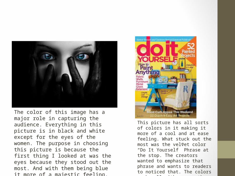
The color of this image has a major role in capturing the audience. Everything in this picture is in black and white except for the eyes of the women. The purpose in choosing this picture is because the first thing I looked at was the eyes because they stood out the most. And with them being blue it more of a majestic feeling. If they were the color red we would instantly think of hatred, or evil.
This picture has all sorts of colors in it making it more of a cool and at ease feeling. What stuck out the most was the velvet color “Do It Yourself” Phrase at the stop. The creators wanted to emphasize that phrase and wants to readers to noticed that. The colors mesh well with one another and if the picture was black and white it would have a whole other meaning to it.

Sequence• refers to the order in which a series of actions, events, words,
or images occurs or is shown.

I chose this picture because it is a sequence of pictures that shows the different formations that a frog goes through. It starts from a simple egg and periodically forms a frog at the end. If the pictures were arranged in a different order they would not make any sense
A picture of an action picture is a perfect example. It shows a series of pictures of a skateboarder doing a skateboard trick in order. If these pictures were randomized the reader/audience would have idea what this picture means

• The main mode that I used for this project was visual, spatial, Linguistic, and gestural. The reason being is because it is all pictures of the elements. And these are the types of modes that you can physically see. Aural was not used because I did not post anything with sound, but you can assume by looking at the picture of what kind of sound it could be making.


![DTC[1] agreement between Azerbaijan and United Kingdom](https://static.fdocuments.net/doc/165x107/577d24141a28ab4e1e9b9326/dtc1-agreement-between-azerbaijan-and-united-kingdom.jpg)

