Double page spreads
5
DOUBLE PAGE SPREADS
Transcript of Double page spreads

DOUBLE PAGE
SPREADS
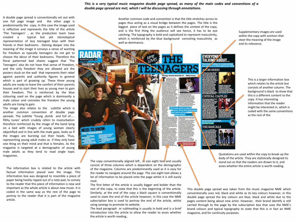
This double page spread was taken from the music magazine NME whichconventionally uses red, black and white as its key colours however, in thisdouble page spread the key colours are blue, black and white due to thepages content being about new artist. However, their brand identify is stillcarried through to the page by the subscription box that uses the NME’sbrand colours and typical typography to state that this is in fact an NMEmagazine, and for continuity purposes.
This is a very typical music magazine double page spread, as many of the main codes and conventions of adouble page spread are met, which I will be discussing through annotations.
A double page spread is conventionally set out withone full page image and the other page ispredominantly the copy. In this case the image usedis reflective and represents the title of the article‘The Teenagers’ , as the production team havecreated a typical but yet stereotypicalrepresentation of lazy teenaged boys with theirfriends in their bedrooms . Delving deeper into themeaning of the image it conveys a sense of wantingfor freedom as typically teenagers do not get tochoose the décor of their bedrooms. Therefore thefloral patterned bed sheets suggest that ‘TheTeenagers’ also do not have that sense of freedom,and the only freedom they are allowed are theposters stuck on the wall that represents their rebelagainst parents and authority figures in generalwhich is part of growing up. These three youngadults are ready to leave the comfort of their parentshouses and to start their lives as young men to gaintheir freedom. This is reinforced by the bluecolouring used on the page which is dominantly amale colour and connotes the freedom the youngadults are trying to gain.The image also relates to the subtitle which isanother common convention of double pagespreads. The subtitle ‘Young ,dumb and full of…..filthy tunes’ which crudely refers to masturbationtherefore reinforced by the image of the band lyingon a bed with images of young women clearlyobjectified and in line with the male gaze, looks as ifthe images are bursting out their heads. Thus,representing young adult males as if they only haveone thing on their mind and that is females. As themagazine is targeted at a demographic of youngmale adults as they tend to read single topicmagazines.
Another common code and convention is that the title stretches across topages thus acting as a visual bridge between the pages. The title is thebiggest piece of text on the pages as it defines the context of the copy,and is the first thing the audience will see hence, it has to be eyecatching. The typography is bold and capitalised to represent masculinity,which is reinforced by the blue background connoting masculinity aswell as dominance.
The information box is related to the article withfactual information placed over the image. Thisinformation box was designed to resemble a piece ofpaper being hastily ripped out of a note pad, to conveyto the reader that this piece of information is new andimportant as the whole article is about new music. It iscoded in the same way as the rest of the page toportray to the reader that it is part of the magazinearticle.
The copy conventionally aligned left , in size eight text and usuallyconsist of three columns which is dependent on the demographicof the magazine. Columns are predominantly used as it is easy forthe reader to navigate around the page. The size eight text allows alot of information to be placed onto the page whilst it is still easilyread.The first letter of the article is usually bigger and bolder than therest of the copy, to state that this is the beginning of the article.Similarly, at the end of the copy a black square is conventionallyused to state the end of the article however, in this case the NMEsubscription box is used to portray the end of the article, whilstusing synergy to promote its website.The lead paragraph or subheading is usually in bold and is a briefintroduction into the article to allow the reader to asses whetherthe article is worth reading,.
Quotations are used within the copy to break up the body of the article. They are stylistically designed to stand out so that the readers are drawn to it, and asses whether the entire article is worth reading.
Supplementary images are used within the copy with anchors that steer the meaning of the image and its relevance.
This is a larger information box which relates to the article but consists of another column. The background is black to show that this is a different content to the copy. It has interesting information that the reader might be interested in, which is coded with the same conventions as the rest of the

The typography of the title resembles the punk rock era and fanzines which catered for this genre of music such as Sniffing Glue. As the typography resembles and is iconic of someone cutting and pasting lettering it represents the model Lily Allen as rebellious and edgy and therefore codified to create a mode of address for a demographic of punk listeners. The bold and capitalised typography represents a male dominance thus subverting the idealised male gaze stating that women are submissive and subservient to men. The title of a double page spread can be a quotation said by the artist or whoever the article is about and normally stretches across both of the pages thus acting as a visual bridge. The title is the biggest piece of text on the pages as it defines the context of the copy, and is the first thing the audience will see hence, it has to be eye catching.
The copy is aligned left, with at least more than three columns in around a size eight typography as this is codified to create a mode of address for a demographic of males between the ages of 16 to 25. The sized eight typography allows a lot o information to be placed on the page whilst it can be read easily. Columns are the used in all magazines as it easy for the reader to navigate the page and allows the editor to write a sufficient amount without it looking messy and unorganised.
The lead paragraph is in a slightly different typography to the rest of the article as it is a brief introduction into the article to allow the reader to asses whether the article is worth reading. Conventionally, the first letter of the article is in a bigger, bolder and capitalised typography than the rest of the copy, to emphasise to the reader that this is the beginning of the article, hence at the end of an copy a black square is used to state the end of the article.
Generally, the double page spread is set out with one full image and one page predominantly the copy.
The main image is of a famous pop singer Lily Allen who is trying to cross into the genre of punk as by looking at the mise en scene and mode of address she is photographed, positioned and dressed within that genre. The business world know that in the terms of Maslow’s hierarchy of needs, self actualisation is unobtainable thus they create a mode of address selling dreams and aspirations to the audience and therefore selling a sense of fulfilment to the reader, as the reader believes that buying the magazine is buying into the dreams and aspirations which is what consumerism is based on.
Therefore an image of Lily Allen evokes this theory as she is a successful women in her career as a artist. The image of the model does not out rightly objectify her as she is not showing too much flesh however, it has been shot at a slight high angle which represents her as vulnerable and submissive hence the camera and audience are in a position of dominance in comparison. Also her body language is canted which reinforces the idea of her submission. However, she is looking directly into the camera known as a direct mode of address which means that she knows she is being positioned into submission and is therefore controlling her vulnerability hence is slightly dominant which is reinforced by her hands on her hips thus asserting her power and appearing appealing to men.
Lily Allen’s costuming is a representative of the punk rock era with her short choppy black hair and checker shirt denoting masculinity and a lumberjack worker. The colour red has connotations of power and anger which ties in with the title of the article, and consequently the colour black has connotations of power and mystery and the mystery is her stepping into a new genre.

The conventions of a double page spread have been slightly subverted as the title is not going across two pages and therefore is not acting as a visual bridge between the two pages. Although, it is still the biggest piece of text on the pages as it defines the context of the copy, and is the first thing the audience will see hence, it has to be eye catching. The typography is in line with the brand identity due to the colour scheme of black, yellow and white with the addition of blue.
The magazine has added an additional factual information box which is consistent with the brand identity and mode of address of the page, so that the audience know that is part of the double page spread although the content of the body is slightly different but relates to the main article. The title ‘Hair today, gone tomorrow’ is similar to the phrase here today, gone tomorrow which is why they have used a very similar language as it creates entertainment for the reader in the terms of the uses and gratification theory, whilst proving information and social interaction.
The images on the information box are shot as a close up at eye level , with the model Rihanna directly looking into the camera thus a direct mode of address.
Again, the conventions of a magazine have be subverted as the copy is only formatted in one fairly large column. This convention may have been subverted due to the intended demographic, as the younger audience tend to like little text as they find it easier to navigate and look less daunting than three or four columns.
Although, it has kept the convention of the copy being aligned left at a typography of eight. The sized eight typography allows a lot o information to be placed on the page whilst it can be read easily.
However they have used the traditional convention that the first letter of the lead paragraph or opening sentence should be bold and capitalised. The different typography is used than the rest of the article as it is a brief introduction into the article thus allowing the reader to asses whether the article is worth reading. It is also used for navigational purposes as it signifies the beginning of the article.
Additional information boxes have been used around the page which relates to the article as it has factual information placed over the main image. It has been codified to create a mode of address for the intended demographic which is entertaining and informative in the terms of the uses and gratification theory, as the reader may be interested in the information provided. The bright yellow stands out against the paler background so that it is eye catching and stands out.
A double page spread consists of two pages, one predominantly the copy and the other page is set out with the full main image. The main image is of the well known artist Rihanna which many young women aspire to be like hence Maslow’s hierarchy of needs have been used to make the audience buy the magazine. This is the theory that everyone wants to gain self actualisation which is there dreams and aspirations however, it is unobtainable and the business world know this hence they use a mode of address which sells their target demographics dreams and aspirations and therefore selling a sense of fulfilment to the audience that buy the magazine as they are buying into their dreams to become famous, successful and glamorous like the artist Rihanna.
The image of Rihanna has been shot at an extreme close up shot at eye level, so that the audience can see her inquisitive and sultry facial expression thus are drawn into the main article. As the image has be cut at a canted angle it can be said that she is being objectified by this and therefore the male gaze is present, as this puts her in a position of vulnerability and therefore submission against the audience who are put into a position of dominance as they are looking in this ideology supports the hegemonic values of society. . However, this is subverted as she is using direct mode of address which is directly looking into the camera as she is purposefully portraying herself as submissive, and is therefore regaining some power. Whilst depicting to women that to be successful in life you have to put on a facade.
Social theorist Jean Baudrillaed explained that the advances in media technology have changed the representations of reality, particularly in the way females are photographed, creating a simulation of idealised reality, rather than the reality itself. As the image of Rihanna has been in some way airbrushed to make her eyes whiter, hair brighter and skin all one colour free from blemishes in order to create a hyper real image.

Double Page Spreads
From analysing three different double page spreads from music magazines I have been able to understand the coded nature of the conventions presents within the double page spreads and how this creates a mode of address for the intended demographics depending on who they are target for.
The mise en scene of the double page spread is very important as it is the fashion in which the magazine speaks to the audience, and if it is geared to the correct target demographic then the audience will not want to read the magazine or even buy it. The typography will depend of the demographic of the magazine but conventionally, the magazine will use a size eight typography as it allows for a lot of information whilst being easily read from a small distance. There will also be around three columns that are aligned left for navigational purposes as it is far easier to read than big chunks of paragraphs whichwill look un organised and hectic.