Digipak mock up
5
Digipak Mock Up Charlotte Tindle
-
Upload
charliebear96 -
Category
Technology
-
view
192 -
download
0
Transcript of Digipak mock up

Digipak Mock Up
Charlotte Tindle
Front Cover
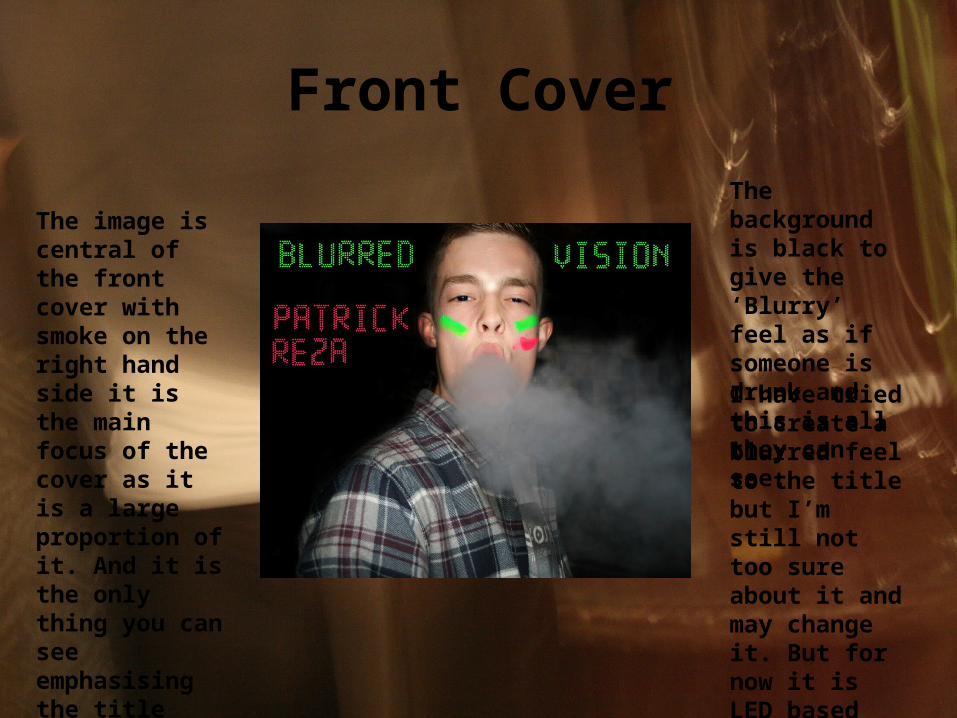
The image is central of the front cover with smoke on the right hand side it is the main focus of the cover as it is a large proportion of it. And it is the only thing you can see emphasising the title ‘Blurred Vision’.
The background is black to give the ‘Blurry’ feel as if someone is drunk and this is all they can see.
I have tried to create a blurred feel to the title but I’m still not too sure about it and may change it. But for now it is LED based making it look quite abstract.
CD
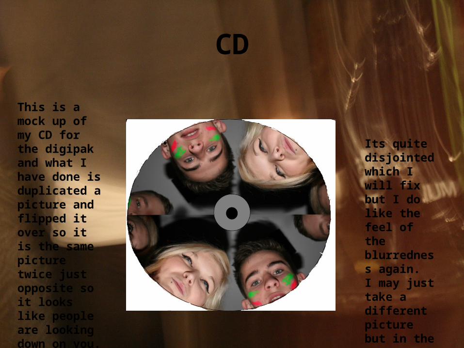
This is a mock up of my CD for the digipak and what I have done is duplicated a picture and flipped it over so it is the same picture twice just opposite so it looks like people are looking down on you.
Its quite disjointed which I will fix but I do like the feel of the blurredness again. I may just take a different picture but in the same style.
The Inside
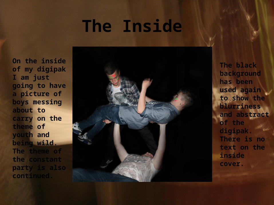
On the inside of my digipak I am just going to have a picture of boys messing about to carry on the theme of youth and being wild. The theme of the constant party is also continued.
The black background has been used again to show the blurriness and abstract of the digipak. There is no text on the inside cover.
Back Cover
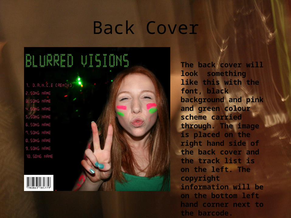
The back cover will look something like this with the font, black background and pink and green colour scheme carried through. The image is placed on the right hand side of the back cover and the track list is on the left. The copyright information will be on the bottom left hand corner next to the barcode.