Designing Pairs of Colormaps
5
EUROVIS 2020/ C. Garth, A. Kerren, and G. E. Marai Short Paper Designing Pairs of Colormaps for Visualizing Bivariate Scalar Fields Colin Ware 1 , Francesca Samsel 2 , David H. Rogers 3 , Paul Navratil 2 , Ayat Mohammed 2 1 Center for Coastal and Ocean Mapping, University of New Hampshire 2 Texas Advanced Computing Center, University of Texas at Austin, TX, USA 3 Data Science at Scale Team, Los Alamos National Laboratory, Los Alamos, NM, USA Abstract In scientific visualization there is sometimes a requirement for two colormaps to be used to represent two co-registered scalar fields. One solution is to represent one of the fields as a continuous colormapped image, and the second field by means of a dense distribution of small glyphs overlaid on the background image and coded using a different colormap. This requires the design of pairs of colormaps which each can be easily read, but which minimally interfere with one another. Colormap pairs separated according to lightness, saturation and hue, were designed and evaluated using both a key accuracy task and a pattern identification task. The saturation separation pair (one colormap having high saturation and the other low saturation) was the best overall. Categories and Subject Descriptors (according to ACM CCS): H.5.2 [Information Systems]: User Interfaces— Evaluation/methodology H.m [User/Machine Systems]: Miscellaneous—Colormapping 1. Introduction The great majority of research into colormap design has targeted problem of visualizing a single scalar field using a single colormap. In scientific data visualization the situation is often more complex. It is a common requirement to view multiple scalar variables si- multaneously and so multiple colormaps much be chosen (or de- signed) which each clearly express variations of one of the fields. Ideally these colormaps should not be confused or interfere with one another. For example, one colormap might cause distortions in values represented in another through simultaneous contrast. In the present study we investigate the design of colormap pairs suitable for the visualization of two co-registered scalar fields where one —designated the background field —is represented as a continu- ous colormapped image and the other —designated the foreground field —is represented by a set of small colormapped glyphs densely distributed over the background. Figure 1 shows an example. An alternative approach to the problem of representing two vari- ables using color is to create a two dimensional (2D) colormap (e.g. [Tru81, RO86]). However, Wainer and Francolini [WF80] found that such 2D colormaps resulted in large errors. In addi- tion, it can be difficult to understand which of the two variables contributes most to a perceived pattern with a 2D colormap solu- tion. Another solution to the multi variable problem is to use what Hagh-Shenas et al. [HSKIH07] called “weaving”. They compared a solution where two (or more) variables were woven in the form of a grid of alternating colored squares, like a checkerboard, with the colors being “blended” creating a 2D blended colormap. They found that the woven design outperformed the blended colormaps on a key-accuracy task. However, Hagh-Shenas et al. studied the case where large map areas (states of the USA) expressed multi- ple variables. Within the area of each state all the displayed values were the same. We are more concerned with scientific data where the variables are continuous, not shown in uniform patches. Never- theless we built on this prior work in the sense that two color coded patterns are used that are interwoven. Our method also differs from that of Hagh-Shenas et. al. in that our displays are constructed so that the two variables have visually distinct patterns, not a regular checkerboard. In addition the colormaps used by [HSKIH07] were simple ramps whereas we used more complex designs. Figure 1: Ocean current streamlines are colored according to flow speed. The background represents sea surface height anomalies. Colormap pairs: L_1/D_1 left and HS_1/LS_1 right. Results show that the solution on the right is better. One guideline for the two colormap problem is offered by [War12] who suggested that where small color coded symbols are c 2020 The Author(s) Eurographics Proceedings c 2020 The Eurographics Association. DOI: 10.2312/evs.20201047 https://diglib.eg.org https://www.eg.org
Transcript of Designing Pairs of Colormaps

EUROVIS 2020/ C. Garth, A. Kerren, and G. E. Marai Short Paper
Designing Pairs of Colormaps for Visualizing Bivariate Scalar Fields
Colin Ware1, Francesca Samsel2, David H. Rogers3, Paul Navratil2, Ayat Mohammed2
1 Center for Coastal and Ocean Mapping, University of New Hampshire2 Texas Advanced Computing Center, University of Texas at Austin, TX, USA
3Data Science at Scale Team, Los Alamos National Laboratory, Los Alamos, NM, USA
AbstractIn scientific visualization there is sometimes a requirement for two colormaps to be used to represent two co-registered scalarfields. One solution is to represent one of the fields as a continuous colormapped image, and the second field by means of adense distribution of small glyphs overlaid on the background image and coded using a different colormap. This requires thedesign of pairs of colormaps which each can be easily read, but which minimally interfere with one another. Colormap pairsseparated according to lightness, saturation and hue, were designed and evaluated using both a key accuracy task and a patternidentification task. The saturation separation pair (one colormap having high saturation and the other low saturation) was thebest overall.
Categories and Subject Descriptors (according to ACM CCS): H.5.2 [Information Systems]: User Interfaces—Evaluation/methodology H.m [User/Machine Systems]: Miscellaneous—Colormapping
1. Introduction
The great majority of research into colormap design has targetedproblem of visualizing a single scalar field using a single colormap.In scientific data visualization the situation is often more complex.It is a common requirement to view multiple scalar variables si-multaneously and so multiple colormaps much be chosen (or de-signed) which each clearly express variations of one of the fields.Ideally these colormaps should not be confused or interfere withone another. For example, one colormap might cause distortions invalues represented in another through simultaneous contrast. In thepresent study we investigate the design of colormap pairs suitablefor the visualization of two co-registered scalar fields where one—designated the background field —is represented as a continu-ous colormapped image and the other —designated the foregroundfield —is represented by a set of small colormapped glyphs denselydistributed over the background. Figure 1 shows an example.
An alternative approach to the problem of representing two vari-ables using color is to create a two dimensional (2D) colormap(e.g. [Tru81, RO86]). However, Wainer and Francolini [WF80]found that such 2D colormaps resulted in large errors. In addi-tion, it can be difficult to understand which of the two variablescontributes most to a perceived pattern with a 2D colormap solu-tion. Another solution to the multi variable problem is to use whatHagh-Shenas et al. [HSKIH07] called “weaving”. They compareda solution where two (or more) variables were woven in the formof a grid of alternating colored squares, like a checkerboard, withthe colors being “blended” creating a 2D blended colormap. Theyfound that the woven design outperformed the blended colormaps
on a key-accuracy task. However, Hagh-Shenas et al. studied thecase where large map areas (states of the USA) expressed multi-ple variables. Within the area of each state all the displayed valueswere the same. We are more concerned with scientific data wherethe variables are continuous, not shown in uniform patches. Never-theless we built on this prior work in the sense that two color codedpatterns are used that are interwoven. Our method also differs fromthat of Hagh-Shenas et. al. in that our displays are constructed sothat the two variables have visually distinct patterns, not a regularcheckerboard. In addition the colormaps used by [HSKIH07] weresimple ramps whereas we used more complex designs.
Figure 1: Ocean current streamlines are colored according to flowspeed. The background represents sea surface height anomalies.Colormap pairs: L_1/D_1 left and HS_1/LS_1 right. Results showthat the solution on the right is better.
One guideline for the two colormap problem is offered by[War12] who suggested that where small color coded symbols are
c© 2020 The Author(s)Eurographics Proceedings c© 2020 The Eurographics Association.
DOI: 10.2312/evs.20201047 https://diglib.eg.orghttps://www.eg.org

C. Ware & F. Samsel & D. Rogers & P. Navratil & A. Mohammed / Designing Pairs of Colormaps
to be laid over a color coded thematic map, the symbols should behighly saturated colors, while the backgrounds should be less satu-rated. The need for high saturation (or chromaticity) when symbolsare small is because of our reduced color discrimination for smalltargets. This guideline is implicit in both Tableau and ESRI mapswhich provide low saturation-high value color palettes for back-ground maps and much higher saturation, darker hues for symbols.However, these guidelines were developed for thematic choroplethmaps usually having large uniform areas in the background andthey may not be relevant in the case of the continuous maps used inscientific data visualization.
Two of the tasks commonly used to evaluate colormaps are theability to read values accurately using a key and the ability to per-ceive patterns in data. Both are employed in the following experi-ments.
2. Colormap Pair Design
As discussed, a key requirement for the design of colormap pairsto be used in the same visualization, is that the two colormaps beclearly distinguishable from one another. We determined to inves-tigate principles of separation based on three commonly applieddimensions of of color space, namely: value (lightness), saturationand hue. Two of the authors each created a set of three colormappairs separated, according to the three principles. Both have exten-sive experience with the design of colormaps for scientific visual-ization.
The colormap pairs that were designed are listed below togetherwith some of the design ideas they incorporate, and they are shownin Figure 2.
Figure 2: Colormaps pairs used in the study.
• Light/Dark Separation: Separation in terms of value (dark vslight): All of the colors in the foreground colormaps are lighter(or darker) than all of the colors in the background colormap.The L_1/D_1 and L_2/D_2 colormap pairs were designed so thatone colormap (shown above) consists of light colors while theother (shown below) consists of dark colors. The L_1/D_1 pairwas designed so that both colormaps monotonically increased inluminance. The L_2/D_2 pair was designed so the light color-map consists primarily of warm colors, while the dark colormapconsisted mostly of cool colors.
• Saturation Separation: HS_1/LS_1 and HS_2/LS_2 are color-map pairs designed so that one colormap (shown above) con-sisted of high saturation colors while the other (shown below)was a perceptually uniform grey ramp (low saturation) to pro-vide maximal feature resolution [WTB∗18]. The high saturationcolormap C2 was designed to be an improved version of the(much derided) rainbow colormap. It has the property that light-ness increases linearly to yellow in the center, then decreaseslinearly. HS_2 is a multiple ramp colormap of a type found to beuseful in supporting feature discrimination [SKR18].
• Hue Separation: All the hues in one colormap are clearly dis-tinct from the hues in the other colormap. Both designers gener-ated one sequence which consisted of red hues while the otherconsisted of blues and greens. In both cases the colormaps in-crease monotonically in luminance to provide feature resolution.Both R_2 and G_2 colormaps have a greater lightness range pro-gressing from almost black to almost white.
A note on the term saturation: The terms saturation, chroma, andexcitation purity, all refer to the vividness or purity of colors, buteach has a slightly different meaning (see [WS82]). We use the termsaturation here because it is most familiar. However, these color-maps were designed, rather than being generated mathematicallybased on a color model and no claim is made that all the colors inthe high saturation colormaps had the same saturation.
3. Experiment 1: Key Accuracy
The first experiment employed a key-accuracy task. Participantswere required to estimate the two values represented at a series oflocations indicated by cross hairs.
The experiment was implemented in Amazon Mechanical Turkusing a framework developed by Turton et al. [TBRA17] and de-tails are given in that paper. The only substantive difference fromthat prior work was that color selection of values at the indicatedpoints was done by means of two sliders adjacent to two color keysinstead of a single one.
The stimuli consisted of pairs of randomly generated smoothscalar fields. These were scaled to be between 0 and 1 and displayedas shown in Figure 3 using 500x500 pixel images. The foregroundscalar field was shown as a set of circular glyphs on a 34x34 jitteredgrid. The glyphs each had a diameter of 7.5 pixels. Each image wasinitially rendered at 1000x1000 resolution and this was averageddown to anti-alias. A set of images were created such that for eachcolormap pair (A,B), colormap A was used to color the foregroundand B to color the background and, to look for asymmetries, an-other set was created such that B was used for the foreground andA was used for the background. For example, we hypothesized thatin the case of saturation separation, it would be better to use highsaturation colors in the foreground than in the background. In eachstimulus image, faint cross hairs were shown at a randomly deter-mined position. The cross hairs were transparent and had a gap inthe center to minimize the extent to which they could act as a ref-erence for color judgements.
c© 2020 The Author(s)Eurographics Proceedings c© 2020 The Eurographics Association.
50

C. Ware & F. Samsel & D. Rogers & P. Navratil & A. Mohammed / Designing Pairs of Colormaps
Figure 3: Two examples of test patterns. Above: light dark separa-tion. Below: saturation separation.
Figure 4: Results from Experiment 1. Mean error results are shownfor each of the 3 kinds of separation.
3.1. Results from Experiment 1
We used the mean absolute error of subject’s responses to filterthe data. If any participant had a mean overall error > 0.2 (as aproportion of the full scale) we eliminated this subject’s data fromthe analysis. This reduced the initial 169 subjects to 124 subjects.
The results are summarized in Figure 4. This shows a mean errorsfrom each of the colormap pairs with two designs in each category.There was a highly significant main effect of the type of separation(F(2,124) = 10.3; p < 0.001). Saturation separation gave the low-est overall error (saturation error = 0.072; light dark error = 0.087;hue error = 0.090). However, this error was the combination of er-rors with the high saturation colormaps and the grey colormaps.Separating these out, it can be seen that the saturation colormapsresulted in approximately half of the error compared to the greycolormaps. This difference was also highly significant (p < 0.001).Both the light dark and hue separation colormap combinations pro-duced errors approximately 20% greater than the saturation color-map pair and there was no significant differences between them.An asymmetry occurred with the result for the light dark colormap.In this condition, the dark colormaps gave rise to markedly largererrors when they were shown in the foreground compared to whenthey were shown in the background.
4. Experiment 2: Pattern Perception
The goal of the second experiment was to evaluate how well thecolormap pairs could reveal patterns in both foreground and thebackground scalar fields. For this purpose, artificially generatedpatterns were added to the synthetic scalar fields displayed, as be-fore using dots of color in the foreground and a continuous mapin the background. Evaluation was done using Likert scales to rateperceived pattern clarity.
The participants were 13 undergraduate students paid for takingpart. They were first tested for at least 20/20 vision and for coloranomalies using Ischihara plates.
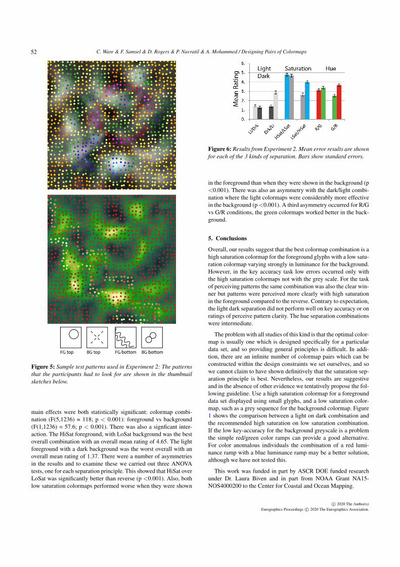
Artificial smooth random fields were generated using the samemethod used for Experiment 1. Different synthetic patterns weresuperimposed on these. These included an X pattern constructedusing 4 Gabor patterns added to the data surface, a circular pattern,a figure of 8 Gabor elements and a double wavy line pattern. Twoexamples are shown in Figure 5. Twelve representations of eachpair of patterns were created using the 6 colormap pairs and alsousing the 6 pairs reversed with respect to which was applied to theforeground and which was applied to the background. The 12 rep-resentations where displayed simultaneously in an image matrix.
Participants were presented with a matrix of 12 versions of thesame pattern pair and first asked to rate the clarity of all the fore-ground patterns on a 7 point Likert scale. In doing this they werefirst asked to find the clearest pattern and give this a rating of 6 andthen to find the least clear pattern and give this a rating of 0. Allother patterns were to be rated according to these endpoints. Nextthey were asked to rate the clarity of the background patterns in thesame way. The procedure was repeated for each of the four sets ofstimuli yielding a total of 48 ratings per study participant.
4.1. Results from Experiment 2
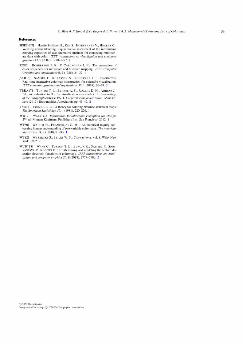
Figure 6 summarizes the results from the second experiment. Atwo way ANOVA was run with the first factor being 6 combi-nations of colormaps, and the second factor being whether theforeground or the background background pattern was rated. The
c© 2020 The Author(s)Eurographics Proceedings c© 2020 The Eurographics Association.
51
C. Ware & F. Samsel & D. Rogers & P. Navratil & A. Mohammed / Designing Pairs of Colormaps
Figure 5: Sample test patterns used in Experiment 2: The patternsthat the participants had to look for are shown in the thumbnailsketches below.
main effects were both statistically significant: colormap combi-nation (F(5,1236) = 118; p < 0.001): foreground vs background(F(1,1236) = 57.6; p < 0.001). There was also a signficant inter-action. The HiSat foreground, with LoSat background was the bestoverall combination with an overall mean rating of 4.65. The lightforeground with a dark background was the worst overall with anoverall mean rating of 1.37. There were a number of asymmetriesin the results and to examine these we carried out three ANOVAtests, one for each separation principle. This showed that HiSat overLoSat was significantly better than reverse (p <0.001). Also, bothlow saturation colormaps performed worse when they were shown
Figure 6: Results from Experiment 2. Mean error results are shownfor each of the 3 kinds of separation. Bars show standard errors.
in the foreground than when they were shown in the background (p<0.001). There was also an asymmetry with the dark/light combi-nation where the light colormaps were considerably more effectivein the background (p <0.001). A third asymmetry occurred for R/Gvs G/R conditions, the green colormaps worked better in the back-ground.
5. Conclusions
Overall, our results suggest that the best colormap combination is ahigh saturation colormap for the foreground glyphs with a low satu-ration colormap varying strongly in luminance for the background.However, in the key accuracy task low errors occurred only withthe high saturation colormaps not with the grey scale. For the taskof perceiving patterns the same combination was also the clear win-ner but patterns were perceived more clearly with high saturationin the foreground compared to the reverse. Contrary to expectation,the light dark separation did not perform well on key accuracy or onratings of perceive pattern clarity. The hue separation combinationswere intermediate.
The problem with all studies of this kind is that the optimal color-map is usually one which is designed specifically for a particulardata set, and so providing general principles is difficult. In addi-tion, there are an infinite number of colormap pairs which can beconstructed within the design constraints we set ourselves, and sowe cannot claim to have shown definitively that the saturation sep-aration principle is best. Nevertheless, our results are suggestiveand in the absence of other evidence we tentatively propose the fol-lowing guideline. Use a high saturation colormap for a foregrounddata set displayed using small glyphs, and a low saturation color-map, such as a grey sequence for the background colormap. Figure1 shows the comparison between a light on dark combination andthe recommended high saturation on low saturation combination.If the low key-accuracy for the background greyscale is a problemthe simple red/green color ramps can provide a good alternative.For color anomalous individuals the combination of a red lumi-nance ramp with a blue luminance ramp may be a better solution,although we have not tested this.
This work was funded in part by ASCR DOE funded researchunder Dr. Laura Biven and in part from NOAA Grant NA15-NOS4000200 to the Center for Coastal and Ocean Mapping.
c© 2020 The Author(s)Eurographics Proceedings c© 2020 The Eurographics Association.
52
C. Ware & F. Samsel & D. Rogers & P. Navratil & A. Mohammed / Designing Pairs of Colormaps
References[HSKIH07] HAGH-SHENAS H., KIM S., INTERRANTE V., HEALEY C.:
Weaving versus blending: a quantitative assessment of the informationcarrying capacities of two alternative methods for conveying multivari-ate data with color. IEEE transactions on visualization and computergraphics 13, 6 (2007), 1270–1277. 1
[RO86] ROBERTSON P. K., O’CALLAGHAN J. F.: The generation ofcolor sequences for univariate and bivariate mapping. IEEE ComputerGraphics and Applications 6, 2 (1986), 24–32. 1
[SKR18] SAMSEL F., KLAASSEN S., ROGERS D. H.: Colormoves:Real-time interactive colormap construction for scientific visualization.IEEE computer graphics and applications 38, 1 (2018), 20–29. 2
[TBRA17] TURTON T. L., BERRES A. S., ROGERS D. H., AHRENS J.:Etk: an evaluation toolkit for visualization user studies. In Proceedingsof the Eurographics/IEEE VGTC Conference on Visualization: Short Pa-pers (2017), Eurographics Association, pp. 43–47. 2
[Tru81] TRUMBO B. E.: A theory for coloring bivariate statistical maps.The American Statistician 35, 4 (1981), 220–226. 1
[War12] WARE C.: Information Visualization: Perception for Design,2nd ed. Morgan Kaufmann Publishers Inc., San Francisco, 2012. 1
[WF80] WAINER H., FRANCOLINI C. M.: An empirical inquiry con-cerning human understanding of two-variable color maps. The AmericanStatistician 34, 2 (1980), 81–93. 1
[WS82] WYSZECKI G., STILES W. S.: Color science, vol. 8. Wiley NewYork, 1982. 2
[WTB∗18] WARE C., TURTON T. L., BUJACK R., SAMSEL F., SHRI-VASTAVA P., ROGERS D. H.: Measuring and modeling the feature de-tection threshold functions of colormaps. IEEE transactions on visual-ization and computer graphics 25, 9 (2018), 2777–2790. 2
c© 2020 The Author(s)Eurographics Proceedings c© 2020 The Eurographics Association.
53


![Interactive Extraction of High-Frequency Aesthetically ...geometry.caltech.edu/pubs/LD03.pdfautomatically finding visual focus points [Miau], that the extraction of these colormaps](https://static.fdocuments.net/doc/165x107/6045b2cf0b7a9b7c116e2b95/interactive-extraction-of-high-frequency-aesthetically-automatically-finding.jpg)