
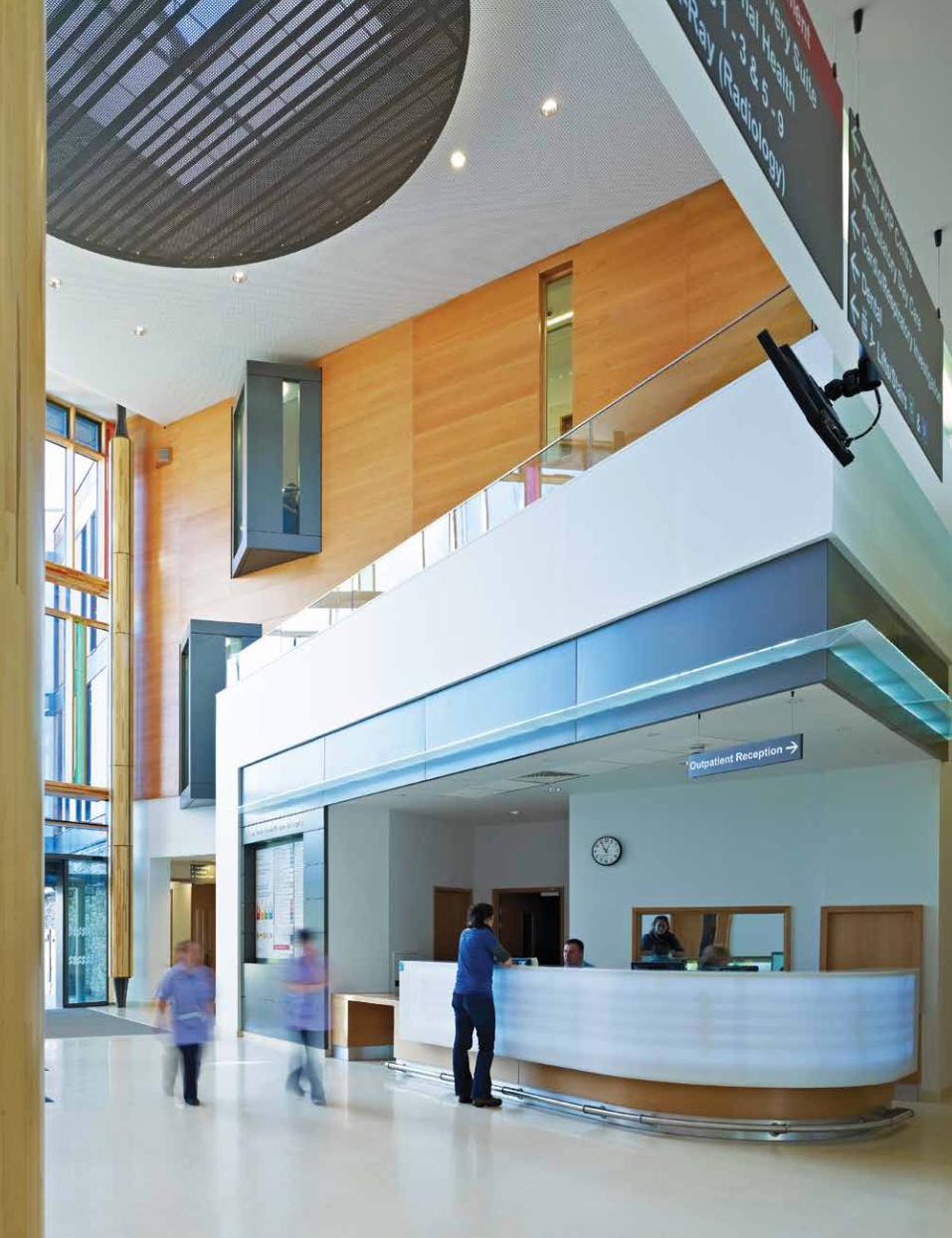
DESIGN - Stantec€¦ · ... Engineering, Landscape Architecture, Interior Design ... The material...
64
DESIGN VOLUME 2
Transcript of DESIGN - Stantec€¦ · ... Engineering, Landscape Architecture, Interior Design ... The material...

DESIGNVOLUME 2

B

WHAT’S INSIDE01 Forward Thinking 1
02 The Five Parameters 2 How we define design excellence through Vision, Responsive Design, Innovation,
Performance and Craft.
03 Exemplary Projects 4 Exemplary projects are defined as those submitted that fully embrace the Five Parameters
and demonstrate leadership in the achievement of design excellence. University of Massachusetts Integrative Learning Center 6 Queen’s University Belfast Centre for Experimental Medicine 10 The Grey Coat Hospital Church of England Comprehensive School 14 Habitat for Humanity Net-Zero Prototype 18 River Valley Authority (RVA) Pedestrian Bridge Concepts 22 Toronto Police Services 11 Division 26 Santa Clara Valley Medical Center Patient Tower & Rehabilitation Center 30 Centrepoint Development 34 Northern Ireland Health Group South West Acute Hospital 38
04 Notable Projects 42 Notable projects are those submitted that demonstrate strong design vision and
contextual response.
University of Mary Washington Dahlgren Center for Education 44 Cleveland Institute of Art 48 Piqqusilirivvik Inuit Cultural Learning Facility 52
05 Selection Committee Members 56

D
FORWARD THINKING

1
We are proud to present Stantec Design Volume 2.
Culture and Design ExcellenceDesign is the value we create for our clients and communities.
Innovation occurs at the convergence of many disciplines: Architecture, Engineering, Landscape Architecture, Interior Design, Environmental Design and Graphic Design, Psychology, Sociology, Ecology, Sustainability and more. We strive to create value through a client centered, responsive process, a process that is collaborative and focused on meeting our client’s business objectives.
Our design culture is built on a shared belief of the value of design, trust, client engagement, and engaged leadership. Collectively we share a commitment to excellence in all aspects of our practice.
The Process of SelectionOur studios worldwide submitted twenty-five projects. Members of the Council on Design reviewed the submissions and ranked the projects by their achievement of the Five Parameters of Design – our collective definition of design excellence. Consideration was given to innovation driven by design, the degree of design integration between disciplines and how well the solutions met client needs.Ten projects achieved the highest rankings by the Council, designated here as Exemplary, by definition, they embrace the Five Parameters and demonstrate leadership in design. Three projects were also designated Notable by achieving a strong design vision and contextual response.
We are incredibly proud of our design ethos at Stantec. This compilation of work gives you an insight of the diversity and vibrancy of our design community.
Sincerely,
Anton Germishuizen + Michael MoxamCo-Chairs Design Excellence Council

2
THE 5 PARAMETERS
3
VISION Every project must be driven by a clear ideaThe Idea captures the essence of the response to site, context, program and client aspirations. This is captured in a concept diagram that serves as the driver of the project development. Supporting the diagram is the project narrative or “story” that ties the various aspects of the idea together and embodies the meaningfulness of the project.
RESPONSIVE DESIGN The human experienceProjects must be responsive at multiple levels including site characteristics, community context, cultural context, impact on public realm and environmental impact. Human experience must guide our thinking relative to intuitive wayfinding, spacial experience, connectedness to landscape, access to natural light, scale and materiality.
INNOVATION Challenge pre-conceptionsA complete and intimate understanding of the unique characteristics of the client, the site, the program and the context will drive solutions that are specific and unique to these influences. This naturally germinated Innovation is firmly rooted through research and exploration and avoids any pre-conceived approaches.
PERFORMANCE Define meaningful objectivesPerformance determines how well the project meets the needs of our client’s and our communities. Criteria include planning efficiency, functionality, energy and environmental response, community connectivity and fulfillment of client objectives. Performance is highly measurable and serves as a barometer of success in the design process.
CRAFT The craft of communication Vision, Responsiveness, innovation and performance are only as good as our ability to communicate the ideas clearly and concisely. All of our communication tools; our writing, our drawings and models must be executed with skill and care focusing on the essence of the idea.
CRAFT The craft of expressionThe material interpretation of the ideas that drive the design process forms the essential expression of the project. The care with which we consider the building mass, the landscape, connection to site, material selection and assembly provide the language through which the idea is clear and legible.

4
EXEMPLARY PROJECTS

5
University of Massachusetts Integrative Learning Center
Queen’s University Belfast Centre for Experimental Medicine
The Grey Coat Hospital Church of England Comprehensive School
Habitat for Humanity Net-Zero Prototype
River Valley Authority (RVA) Pedestrian Bridge Concepts
Toronto Police Services 11 Division
Santa Clara Valley Medical Center Patient Tower & Rehabilitation Center
Centrepoint Development
South West Acute Hospital

6
Location: Amherst, Massachusetts, United States of America
Project Duration: 2011-2015
Size: 173,000 SF / 16,100 SM
Construction Cost: $80 million USD
Stantec Services: Campus Planning, Architecture, Interior Design, Mechanical and Electrical Engineering, Sustainability, Geotechnical, Site / Civil Engineering
Design Team: Jenna Beltram, Diane Bookwalter, Steven Brittan, Daniel Burlingham, Giovanna Chaisson, Nicholas D’Agostino, Michael DeOrsey, Roslyn Dudas, Paul Duquette, Charles Gore, Chris Graham, Carol Harris, Lauren Hertel, Scott Jones, Benjamin Kou, Kristin Kowalik-Grillo, Garry McCarthy, Kevin McCormick, Jasmin McDuffie, Robert Nicoloro, Joel E. Nordberg, Thomas Osborne, Paul Pohold, Kyle Richard, Amarpreet Sethi, Thomas Urtz
UNIVERSITY OF MASSACHUSETTS INTEGRATIVE LEARNING CENTER
The new Integrative Learning Center (ILC) provides state-of-the-art classroom and academic space for the Amherst campus. Its location in the center of campus provides students with convenient access to classrooms, creates a hub of student activity and enhances student-centered space in the adjacent Campus Center and Student Union.
VISION
The transformative potential of the ILC can hardly be overstated. The combined impact of this program and this project’s development enhances learning, student life, department missions, movement through the central campus and the identity of the Institution itself.
Students and faculty have gained an instructional center with classroom types and sizes not previously available on campus. Formal classrooms range from traditional (mid-size) lecture spaces to state-of-the-art interactive team base learning environments. The design process focused on the provision of classroom types and spaces within the building that stimulate collaboration and the exchange of ideas. A culture of collaborative learning and the connectivity to information have fueled student expectations that learning will follow a continuous flow in and outside of the classroom. The dense concentration of classrooms in this central location demanded that the focus be widened to include spaces and a broader environment that stimulates education through the experience of the building and its surroundings.
RESPONSIVE DESIGN
The Campus Center and Student Union serve high concentrations of students but were previously isolated and internally focused. With the creation of the ILC, previously untapped civic energy in now captured and the site actively engages these dynamic nodes.
The lawn is arguably the figurative and actual low point on Campus. Pathways from all quadrants of the campus skirt the area or are precluded by natural or architectural barriers from fully engaging the lawn, contributing to a “backyard” feel that inhibited its use. The ILC has been configured to face the lawn and draw activity into that open environment, with the aim to become a campus crossroad as well as a space for congregation and interaction.
In addition to its many programmatic benefits, the ILC creates public space and works integrally with site circulation to become an internal pathway and universally designed accessible connector between key pedestrian pathways and level changes. The ILC is now the central contributor in the transformation of this area of the campus into a vibrant center of activity.
Located at the heart of campus, the ILC enriches student life on campus by expanding learning opportunities and improving campus connectivity through animated student activity space.

7

8
CRAFT
Materials and FormThe L shaped mass of the ILC creates an opportunity to form an edge along the open space created by its western façade. By doing so, it provides views to the south while concealing an existing service area to the inside of the mass. Linear limestone bricks are utilized on this outer facade. Red brick is used on the inner facades to match the surrounding campus buildings. Metal panel accents highlight group study areas and deep window surrounds. Curtain wall with high performance glass is predominant in public spaces. Integrated internal shading devices and external shades address changing light conditions.
Maintenance and OperationsUMass mandated the life of the ILC at 100 years. The Design Team has worked closely with the facilities staff in order to make sure the ILC is sustainable from a maintenance and operations perspective throughout its entire life. The Life Cycle Cost of several building components was examined to ensure that the materials used in the building met economic, environmental, maintenance, longevity, and aesthetic project goals. The University is also currently writing guidelines for a green cleaning program that the Design Team would like to include in this building as well.
Wind AnalysisWind tunnel testing investigated the existing and future impact of the building location and its surroundings. Air flow from laboratory exhaust stacks from neighboring buildings were also investigated for proximity to air intakes on the new building.
Department SpacesThe benefit of 40,000 NASF of new departmental space on campus reaches beyond the direct benefit of Linguistics and Communication/Journalism whose programs will move into ILC space. With the move, much needed backfill and swing space in existing buildings is now available to make improvements to other programs more logistically feasible.
User Awareness and EducationEven the best designed sustainable buildings will not perform as predicted if the people that occupy them don’t know how to take advantage of their capabilities. As part of the Design Team’s sustainability strategy, we emphasized the need to educate building occupants on the proper use of the building, so that it can reach its optimal performance. This will be achieved through a brochure/manual or website that provides information for regular occupants and maintenance staff on the unique sustainable features of this building and how to use them. Since a large portion of the buildings occupants will be transient, another piece of this sustainable strategy is to educate the campus community to make these temporary users aware of the impact they have on the building’s energy performance. This will be done through a combination of building signage and an energy dashboard system. The energy dashboard system is a series of flat screen monitors that are connected to the building management system that displays the building’s energy usage live. There can also be an online component of this system.
INNOVATION
Natural VentilationThe building utilizes the stack effect to naturally ventilate the West Gallery and cross ventilation to ventilate the Transit Lounge, during the shoulder seasons.
PERFORMANCE
Sustainable Landscaping and Site Development The building, located on a hilly site, uses the site’s topography to its advantage, to minimize its impact. The landscaping includes rain gardens to mitigate surface run-off and uses low-maintenance native plantings. Several existing trees are saved and relocated as part of the project.
Energy Use ReductionThe building’s systems prioritize reduced energy usage. The mechanical system uses a dedicated ventilation system with a heat recovery wheel and a cooling coil to semi-condition the ventilation air. The system then distributes air directly to the densely occupied spaces that are served by two air handling units and also to a third air handling unit that supplies the office areas on the 3rd and 4th floors.
Green RoofAbout 15,000 SF of the building’s roof is planted with hardy native plants, which provide an educational opportunity for the campus community as well as an aesthetically pleasing view for the surrounding buildings. The green roof also helps with storm water mitigation by retaining approximately 1,825 CF of water.

9
How the New Academic Classroom Building exemplifies the 5 Parameters
Vision The simple “L” shape building creates edges and program conditions that allows for a variety of collaborative learning places as well as traditional learning spaces. The building itself is a hub of connectivity both programmatically and at the physical campus scale.
Responsive Design The site planning of the building strengthens the campus network and also clearly defines the public realm edges. The idea of the building creating internal and external connectivity to the campus center is clearly articulated in the planning.
Performance From a programmatic view the variety of learning spaces allows the delivery of a multitude of programs. The building performance has also been carefully designed with the use of natural ventilation and thermal chimneys that capture and re use heat.
Innovation The building performs as a didactic instrument through the use of an energy dashboard which displays energy consumption in real time.
Craft The material choices and the location of transparent glazing carefully adhere to the intention of strengthening the campus connectivity and defining the outdoor quadrangle.
Review TeamRAY WOLFE

10

11
Location: Belfast, Northern Ireland
Project Duration: 2010 - 2015
Size: 80,000 SF / 7,400 SM
Construction Cost: £20 million GBP
Stantec Services: Architecture
Design Team: Stantec in association with Ostick + Williams: Christina Cattelan, Maciej Kajzer, David Martin, Aaron Taylor, James Pooley
QUEEN’S UNIVERSITY BELFAST CENTRE FOR EXPERIMENTAL MEDICINE
The new facilities for the Queens University Centre for Experimental Medicine (CEM) will continue the development of exemplary Research facilities on the Health Sciences Campus, just outside of Belfast’s city centre. The proximity of Clinical Facilities to the variety of research spaces offers a unique dynamic and the new CEM building is hoped to be the next building in a long term development of the site into a world-class Research Centre. Site works commence this year, with completion in 2014.
Providing generic Bio-Medical Science labs, the design focuses on future adaptability to suit the changing requirements and numbers of lab spaces and support areas in the future. The new CEM Building will reach out to the wider campus, encouraging interaction not just through the Research teams but also those working in adjacent faculties. It will attract the best researchers from across the world.
The building is an Exemplar for sustainable and carbon-limiting design, and demonstrates these credentials on its skin, celebrating Queen’s University’s aim to minimise their carbon footprint throughout the campus.
The Health Sciences Campus sits on the outskirts of Queen’s University’s Main student City Campus and an early masterplan study demonstrated that in order to connect the site to the campus as a whole, the campus users ‘route’ or ‘experience’ needed to be considered. The proposal expands upon the journey along the dominant campus axis and continues the experience through the new Health Sciences Campus. This route is defined by events, landmark buildings, landscape, and meeting points that provide direction and clear way-finding moving through campus zones. Our proposal engages this route with a welcoming face and an invitation to experience the ‘collaboration zone’.
Located next to the existing CCRCB laboratory, the Main Entrance is clearly legible with a large glazed section providing transparency to the active Science behind. The footprint is oriented alongside the east west axis, positively presenting itself to the main campus elevation. The building comprises two main bars of lab accommodation organised around a central atrium – or ‘collaboration zone’. Feature circulation provides acoustic and secure separation to the atrium allowing the Main Entrance to become an extension to the public realm, creating a foyer to the building, entrance to the auditorium at lower ground, and a connection to the existing CCRCB building. This space will greatly improve the aspect from these labs, and support the collaborative ethos of the wider master plan proposals.
Space planning has been developed on a laboratory grid of 3.3m x 3.3m for optimum flexibility. The concrete structural system provides a flat slab design for ultimate flexibility and ‘column free space’ in the bulk of the building whilst providing thermal mass to assist with environmental control. The laboratory zone is held within an ‘environment wall’ along the main external façades. This principle has been developed as a ‘plug and play’ concept to simplify adaptation in future layouts for the building, accommodating changes from hi-tech to low tech spaces and vice versa. In order to achieve this, our proposal replaces internal risers which would traditionally be located within the lab floor plate, with services distribution from roof top plant, running externally down the main building envelope entering the lab through the environment wall. Access Gantries are then provided at each floor level, and an architectural mesh veil is draped along the main elevations.
The architecture of the building reflects the needs of discovery through collaboration, and is designed to foster a culture in which there are no barriers with open plan, state of the art research spaces, strong visual connections across the atrium between write-up spaces and PI offices, as well centrally located bridge links and meeting areas promote interaction, spontaneous discussion and shared research.
Flexible and sustainable in its approach, this cutting edge research facility establishes an environment of collaboration necessary to drive innovation.

12
INNOVATION IN BUILDING PERFORMANCE
Following our effort for carbon neutrality and the completion of our Science in the Invisible research project this project was the first to benefit in the UK and we have mainstreamed a number of the developed innovations into the design to set new standards for sustainability, low-energy and reduced carbon emissions.
A double skin façade enhances energy performance, constructability, aesthetics and future adaptability. The double skin acts as a solar collector of warm air which is used for pre-heat, delivering an expected 8% energy savings. A very high air tightness target, 3m3/h/m2 , can be achieved, solar gains reduced and future services easily installed.
On the north elevation, the veil provides an opportunity to present exciting main campus elevation achieved through texture and patterning of materials, all while serving the purpose of veiling the external services, and offering views out from the lab environment.
Key sustainable features include:• Decentralised plant –plant room / support at each level
to reduce fan energy consumption• Atrium supports natural ventilation to 38% of the floor
area• Exposed soffits provide high thermal mass• All materials specified to be BRE Green Guide rating
A+ and B rating within laboratories• Photovoltaic panels at roof level provide a primary
renewable platform• Advanced solar shading screen reduces unwanted
heat gain while allowing maximum natural daylight penetration
This integrated solution results in a BREEAM ‘Excellent’ building with a radically reduced carbon footprint supporting larger University sustainability objectives.

13
How the Centre for Vision + Vascular Science exemplifies the 5 Parameters
Vision A clear idea, approach and understanding of the relationship between the city of Belfast and Queen’s University campus, Bio-Medical Science research, collaboration and sustainable opportunities. The site approach is clearly conveyed through a series of site analysis and concept schematics, demonstrating a positive experience in both the public and campus realms.
Responsive Design Creative alignment with the Campus Master Plan and sited to promote collaborative continuity with both the existing fabric and future buildings, the design envisions a clear identity on campus as well as creating community for research and discovery within the building and as a model for future adjacent buildings.
Innovation Clearly innovation lies primarily in the sustainable design approach of this project, i.e., “the energy zone”, not just as a list of goals but how the design can achieve them as well as engage them with the public i.e. “the veil”. Clear ideas are the core of this well documented concept.
Performance They key ideas of “reaching out and encouraging interaction opportunities” through effectively planned site, building and program adjacencies, visual and real connections through transparency and circulation and thoroughly conveyed sustainable targets make this proposal a clear success.
Craft The planning concept is clearly expressed through city, campus and site schematic sketches. The building organization is clearly diagrammed and elegantly conveyed through building sections. Even at this preliminary concept stage the sustainability agenda is clear and fundamentally engrained in the design through drawings and text.
Review TeamSTEPHEN PHILLIPS

14
Location: London, England
Project Duration: 2007 - 2011
Size: 19,250 SF / 1,787 SM
Construction Cost: £9 million GBP
Stantec Services: Architecture
Design Team: Dean Murphy, James Pooley, Aaron Taylor
THE GREY COAT HOSPITAL CHURCH OF ENGLAND COMPREHENSIVE SCHOOL
CONTEXT
The Grey Coat Hospital is a voluntary aided, Church of England, 11-18 girls’ comprehensive school with a mixed sixth form of around 275. The school is situated by Horseferry Road in Westminster, London.
The main school building is an amalgamation of four different buildings built during the 17th Century, 1910’s, 1950’s and 1970’s. The 17th Century façade is Grade 2 listed.
BRIEF
The main pedestrian entrance into Block A is located in the 17th Century listed building facing Greycoat Place, which allows direct access into the main school reception and Hall. Vehicular access into the site is via Horseferry Road.The existing school suffers from its location on a small site. The existing school buildings do not provide the specific requirements of specialist teaching rooms such as Music, Drama and Art.
Due to the nature of these performing and visual arts environments they are situated within the new building. The existing spaces that are used currently being used can then be freed up to form general teaching facilities as well as creating new departments such as SEN.
THE NEW BUILDING
The new building occupies a space to the east of the Victorian Block B and results in an elevation on Horseferry Road opposite the Channel 4 Building, designed by Richard Rogers.
The building is adjacent to the existing Grenadier House and offers a continuation of the current streetscape.
The building is five floors high, with one floor below ground level. The height of the new building is limited to fall below the height of the adjoining existing school building, and retain views of this building from the street.
A simple approach on a complex site creates a high quality learning environment in which materials and elevation respond to the urban surroundings and heritage architecture.

15

16
CREATING ZONES OF INTERESTCurrently the school site is split between the main teaching building and Block B, however with the majority of the schools area taken from the main building the gravity of the site is very uneven.
The design approach creates a new protected heart to the school, and regenerates what was a largely unused area. The new building bookends the school site and help to bring about a focus within the school. During the design process, the school expressed the importance of the school garden as a green oasis, which many children are not subject to at home.
INTERNAL ARRANGEMENT
The building plan is simple but very effective for the constrained site. Three elements characterize the plan:• A service spine• Circulation and void• Classrooms
The spine is located adjacent to the existing Grenedier House. Because of the lack of daylight this spine houses the toilets, staircase and store rooms.
The classrooms form an expressive box and characterize the new building. They have been positioned in pairs and form the distinctive copper box. This box floats above the ground via the new dining space which is situated on the ground floor, adjacent to the school playground. A full basement has been created to house the drama and activity studios, and provides the school much needed large spaces for special performances.
EXTERNAL APPEARANCE
The external cladding aims to pick up on the vertical strips present throughout the area, in the name of cornice brickwork to the existing school Victorian buildings as well as the vertical structure of the Channel 4 building.
MaterialsThe palette of materials is simple and consists of brickwork to match the existing boundary wall, curtain wall and copper cladding. The copper cladding is designed to reflect the vertical nature of the surrounding buildings, while expressing the multi-functional rooms behind.
The facade is deliberately closed towards Horseferry Road to protect against noise and distraction, while remains open towards the school, acknowledging the other school buildings.

17
How Grey Coat Hospital School exemplifies the 5 Parameters
Vision A clearly articulated idea describing a service core, circulation spine and served program space demonstrates a strong parti that remains visible in the final formal execution.
Responsive Design Project execution has at its core, consideration for the student occupants. Access to daylight is a key consideration in a building that is exposed on only 2 faces. Also central to the design solution is the reinforcement of place-making, providing an interactive building face addressing the existing schoolyard green space – a space of key importance in the lives of central London children in this dense urban context.
Performance High performance is achieved through careful consideration of program requirements and context. Program not well suited to the existing buildings are specifically accommodated in the new building, enhancing the functionality of the broader campus. Program is placed below ground, on the ground level or on the stories above to provide optimal operational effectiveness and to leverage the existing assets of the site.
Innovation Innovation is achieved primarily through a design solution that demonstrates an understanding of:
• the site through sensitive building placement and enhancement of existing site assets
• the context through building articulation that responds to the surrounding urban fabric, such as a height restricted to no more than the adjacent historic building (this is offset by creating a full basement to accommodate suitable program requirements); reduced fenestration facing the busy street, and increased openness to the internal play yard; a material palette that is inspired by the existing campus and surrounding buildings; a focus on expressing the vertical in the execution of the cladding to reflect a reading of the existing buildings in the neighborhood.
Craft The concept diagrams offer a clear understanding of the approach and relationship to site. The ideas are clearly communicated both in text and diagram. The building expression successfully captures the relationship between built form, the existing campus of buildings, and the broader urban context.
Review TeamMARK PENNEY

18
Location: Edmonton, Alberta, Canada
Project Duration: 2010-2013
Size: 7,270 SF / 675 SM
Construction Cost: $1 million CDN
Stantec Services: Architecture and Sustainability Consulting
Design Team: Dean Benvenuto, Matt Roper
HABITAT FOR HUMANITYNET-ZERO PROTOTYPE
Can affordable housing be sustainable? Could a housing prototype be developed that would explore the demands of social, financial, and environmental responsibility? Could this prototype have the flexibility and capacity to be replicated, tuned, and constructed to various site and climatic conditions around the world? Those questions were at the root of the development of the Habitat for Humanity Net Zero Home, a collaborative commission initiated by the Edmonton affiliates of Stantec Architecture Ltd, Habitat for Humanity, and Lafarge.
The conditions for the exploration of an environmental, economical, and socially sustainable housing model grew as Stantec, Lafarge, and Habitat for Humanity collaborated on the development, construction, and assembly of this pioneering project. Our architectural team worked closely with Lafarge precast to develop a home that retained the original plans used by HFH while featuring concrete as the primary building material. This integration of plan and systems was achieved through a careful assembly of panels composed to provide visual relief through colour and texture contrasts, integration of green roof and green wall landscape elements, and a solar cap that provides both formal and functional benefit. The building, as designed, can be replicated as an infill structure in existing neighbourhoods or within the context of a larger community. The building is targeting a LEED for Homes Platinum certification.
Using an existing habitat site as a theoretical test fit, the Habitat Net Zero Prototype was developed to respect existing site constraints, typical habitat floor plans, and city development regulations. Precast concrete panels were developed in a manner that they could be easily fabricated and altered within Lafarge’s standard form liners and pouring beds. Once these structural and dimensional limitations were understood, the moulding and manipulation of existing plans could occur.
While the footprint and orientation of the units were to remain fixed, due to existing permitting, the units were manipulated slightly to provide private covered entrances as well as second floor projections which eroded away at the original symmetrical façade. Each unit is treated as an individual piece forming a whole and allowed each to form their own identity responding to site, solar, and abutting landscape conditions.
The approach to achieving a Net Zero design started with a high performance envelope, R44 walls, and an R88 roof made possible by the precast panel system, that achieved an EnerGuide 86 rating in our development models.
The team then added a geothermal system to provide space heating and cooling, solar thermal panels for domestic hot water loads, and solar photovoltaic panels to generate the electricity used by the occupants. Native landscaping and exterior feature planting walls utilize rainwater collected and drained from the second floor roof. Limited accessibility to the roof restricted the rooftop planted portion to the roof located above the south unit entrance.
While the included systems serve a generous environmental calling for increased efficiency in our current building stock they also provide a service to the owners and occupants of the prototype units. Habitat has established itself as an organization providing affordable housing options for families in need. The month to month savings in energy usage resulting from a net-zero housing option aims to reduce the burden of home ownership on families and individuals with limited financial means.
This prototype housing project leverages sustainable construction, building technology and energy conservation to bring home ownership within reach of families in need.

19

20
The definition of prototype is “an early sample or model built to test a concept or process or to act as a thing to be replicated or learned from”. To verify the buildings performance predicted by our models, researchers from MIT will be collecting data from sensors and utility bills and will compare it to the predicted data and to other HFH homes built through traditional methods. The further involvement of MIT in post-occupation monitoring will become a tremendous resource to green building in Alberta and will extend the period in which this collaborative undertaking will serve as a vehicle for learning in the fields of prefabricated, sustainable construction.
This project was constructed as a pilot project allowing all parties involved in its development a chance to further refine the and reflect upon strategies that were implemented to supply Edmonton’s Habitat for Humanity with their first NetZero home.

21
How Habitat Net-Zero Prototype exemplifies the 5 Parameters
Vision The pursuit of one of the most basic human necessities in an affordable and environmentally conscious manner was the obvious focus of this collaborative partnership
Responsive Design Sustainable features are effectively yet sensitively incorporated and expressed without creating visual conflicts with a more traditional housing community. These expressions of sustainability also work to heighten awareness for the rest of the community.
Performance Application of energy efficient strategies is just the first step in achieving this vision but engaging MIT for performance monitoring validates the team’s commitment to advance this prototype towards the ultimate Net-Zero goal.
Innovation Articulation of the traditional space organization combined with proven sustainable technologies has created an efficient solution which is able to express the unique aesthetic of modular construction.
Craft The descriptions along with the photographs and illustrations clearly communicate the evolution of the concepts and demonstrate the thoroughness with which the final solutions were developed.
Review TeamPAUL POHLOD
22

23
The River Valley Alliance (RVA) is tasked with protecting the natural environment and enhancing the experience of the River Valley from the Town of Devon, through to the City of Fort Saskatchewan, Alberta. Its primary goal is to promote connectivity, awareness and collaboration in order to create a thriving green space network for the City of Edmonton and nearby municipalities.
When the RVA approached Stantec Architecture, it was to provide a design report for creating four new pedestrian bridges along the North Saskatchewan River. These four locations were the first of several proposed pedestrian bridges to traverse the river. To respond to the changing conditions presented throughout the River Valley, the design team proposed a variety of typologies rather than a single encompassing solution.
These solutions represented a cumulative response, addressing constructability, durability, cost, life cycle, sustainable development and the haptic experience. Each solution represents a unique approach to a similar question: how can we negotiate the River Valley’s network of trails while creating site sensitive and innovative design solutions.
Beyond the design of the individual bridges, what made for a highly innovative and contextual response was the logic of creating typologies that could be adapted and transformed to varying site conditions. Ideas such as: touching down to the water, raking the side of a cliff, floating above the water with unobstructed views and creating unobstructed clear spans through innovative structural solutions, are among the many options addressed and challenged throughout the design process.
These four concepts speak to the “what if” condition, which is always prevalent throughout the River Valley. The flexibility in form and function allows for an adaptive, elegant and genuine design response that enhances the River Valley itself and the surrounding cities.
Location: Edmonton, Alberta, Canada
Project Duration: 2011 Study / 2014-2016 Terwillegar Bridge Design
Size: ± 2690 SF / 250 SM across
Construction Cost: N/A Study
Stantec Services: Architecture
Design Team: Corrado Agnello, Dean Benvenuto, Frederic Brisson, Hardy Huang, Matt Roper
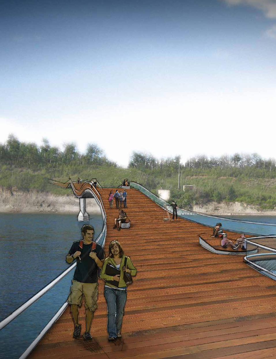
RIVER VALLEY ALLIANCE PEDESTRIAN BRIDGE CONCEPTS
Four highly creative and responsive design concepts transform and adapt to varying site conditions to create a unique and thriving green corridor along the North Saskatchewan River.

24
SKIPPING STONE
The Skipping Stone concept takes its inspiration from the dynamic movement of a stone bouncing over the water. The form of the bridge follows a combination of two sets of arches: one that carries users over the water, another that touches the water to become the structure.
The organic form of the structure celebrates natural forms, departing from the industrial aesthetic of existing pedestrian bridges crossing the North Saskatchewan River. At the extremities, two piers anchor the bridge in solid ground, while the middle pier is left open to lighten the structure and reduce visual obstruction to the river and its surrounding environment. The middle pier also acts as another point of access to the bridge from the river bed when water levels permit.
WRAPPED HELIX
For the Wrapped Helix concept an interwoven support structure was developed as a method to lightly lift and cradle the pedestrian path over the North Saskatchewan River. The wrapped helix works under similar principles as a suspension bridge, but it is advanced by using the methodology of a bicycle tension hub. This intertwined network of cables and compression rings performs as a singular system.
This structural mesh envelopes the pedestrian as they pass over the span. It creates a continuously changing volume and a sense of enclosure based on the convergence or spreading on the cable network. The pathway, which lightly spans between compression rings, can expand and contract through this defined volume adding to the experience of the structure while providing unique vantage points over the river crossing.
FLOATING PATH
In the Floating Path concept, a thin, ribbon-like “floating” plane takes pedestrians and bikers across the river. This concept aims to complement River Valley’s natural setting with its elegance and simplicity, while providing its users a unique experience of floating across the river with its transparency and lightness.
The cost-effective stress ribbon structure, allows the bridge deck to be as thin as 16 inches in depth. Wooden deck and benches make soft and friendly surfaces, and a glass guard rail provides maximum visibility and transparency. The sculptural bridge also features a staircase down to the beach/ river. A walking surface-focused lighting scheme further imbues the sense of lightness. Designed with its surrounding and users in mind, this bridge complements the Valley experience, both visually and functionally.
RECLAMATION
The Reclamation concept takes the experiences of navigating nature’s trails and integrates the tradition of box truss bridges seen throughout the River Valley. By analyzing and quantifying the experiences produced in nature, the bridge concept aims to extend these influences into the built environment, while addressing the tectonics of a box truss.
In order to understand the reclamation process, one must first understand the deconstruction of the built form, as these processes are interconnected. As nature forces itself on the existing structure, the structure responds. This back and forth tension results in a path that no longer feels disconnected from nature, but rather, can been experienced as a hybrid between nature and structure.

25
How RVA Pedestrian Bridge Concepts exemplifies the 5 Parameters
Vision A clearly articulated idea for conceptual solutions that represented a unique approach to a similar question, how to negotiate the River Valley’s network of trails while creating site sensitive and innovative design solutions.
Responsive Design Creative solutions that responded well to community context, site conditions, and innovation while providing a unique and individual experience while traversing the river.
Performance All four options express the design concepts in an elegant yet functional way and include sustainable design approaches
Innovation The individual bridges are all innovative in their design as they have been conceived to adapt to varying site conditions. As was stated in the submission they achieve this in a number of unique ways; “ideas such as: touching down to the water, raking the side of a cliff, floating above the water with unobstructed views and creating unobstructed clear spans through innovative structural solutions, are among the many typologies that were being addressed and challenged throughout the design process.”
Craft The submission renderings and diagrams provide clear understanding and communicate well the approach and relationship of the bridges to the site and contextual surroundings. The diagrams and the accompanying text in particular provide strong support for the bridge renderings and designs.
Review TeamJOE GELLER

26
Location: Toronto, Ontario, Canada
Project Duration: 2009-2011
Size: 65,000 SF / 6,040 SM
Construction Cost: $22 million CDN
Stantec Services: Architecture, Interior Design, Programming, Structural Engineering, Civil Engineering
Design Team: Frank Alfonso, Jens Boehme, John Castro, Krista Choi, Janet Gasparotto, Pedro Guevara, Jeff Kingston, Karine Kupers, Tom Kyle, Christopher Laasen, Tim Lee, Angelo Ligotti, Ruth Mora, Michael Moxam, Dieter Neitsch, Helen Nguyen, Ricky Papa, Emanuel Resendes, Rob Robinson, David Sauve
TORONTO POLICE SERVICES11 DIVISION
PROGRAM
The 65,000 SF program calls for a full service police facility including a crime response unit, crime investigation, secure detention facilities, parade room, training facilities and administrative offices. A secure parking area for 160 cars is required as well as secure vehicle access to the detention area. Staff support includes locker rooms, a fitness room and a café with terrace. Community accessible elements include the entrance lobby with exhibit display, a generous community room and a community park.
SITE
Located at the intersection of Davenport Road and Osler Street, in the heart of the “Junction”, the 3.5 acre site is surrounded by single family residential to the north, east and west, and the industrial/retail traditions along Davenport Road. The site is home to the recently abandoned Carelton Village Public School. Originally built in 1913, the site has seen a number of additions with the most recent being built in the sixties. Embedded in the heart of the community, the school has seen generations of local residents pass through its doors.
CONTEXT
Urban police facilities have the opportunity and responsibility to participate in the essential idea of “city building”, setting the standard for urban regeneration and re-definition of the public realm. Public safety buildings serve a very vital role in this urban evolution. When well-designed, they are potent civic landmarks within our communities and they support city building much the same way policing activities support the growth of our communities.
11 Division is located in Toronto’s Junction neighbourhood. Originally known as Carlton Village, the area was transformed and industrialized into the “Junction” when railways and stockyards arrived at the end of the 19th century. During the transformation, public education was central to the aspirations of the working-class neighborhood.
A dialogue is established between a community landmark and contemporary architecture to create a modern police facility where residents can feel at home.

27

28
IDEA
Working closely with the Toronto Police Service and community members, a strategy was achieved to retain the iconic “heart” of the historic school while balancing the contemporary needs of a modern police force. Retaining the majority of the original 1913 building which anchors the corner of Davenport Road and Osler Street satisfied the community that the iconic presence of the building remained intact. Slipped in behind the existing 3 storey brick and stone structure, a contemporary intervention accommodates the functional needs and long term flexibility of the Police Service. The 62,000 SF addition accommodates all of the secure functional components. The 1913 building offers publicly accessible functions at the main level such as the community room which is accommodated in the school’s original library. Fitness facilities are located in the lower level of the existing building while administrative functions, staff lounge and expansion space are provided in the second and third floor. A highly transparent link between the preserved historic building and the new addition serves as the main public entrance and reception space. Exhibits within this space describe the history and importance of the school in the community.
A new civic plaza is established along Davenport Road providing access to the main entry. The secure parking area to the north of the new addition provides space for 180 cars and is screened from the community through the introduction of a “living fence” composed of birch hedgerows and a concealed metal screen. An existing parkette in the northwest corner of the site, long dilapidated and unmaintained, is completely restored and given back to the community for use.
The project is LEED Silver certified and employs strategies such as an extensive green roof, a geothermal energy system, grey water reuse, rain water harvesting, water efficient landscape, light pollution reduction and storage and collection of recyclables among others. The geothermal HVAC system avoids extensive rooftop HVAC equipment and minimizes new ductwork running through the older portion of the building.
Existing Retention Dialogue Landscape

29
How 11 Division exemplifies the 5 Parameters
Vision The idea is clear and meaningful. It provides a community with a modern police station that builds on the history of the community and site while sensitively weaving in the necessary components of a secure policing facility.
Responsive Design The response is smart, sensitive, and authentic; retain the iconic heart of the historic school on the site, giving back to the community a piece of architecture with significant sentimental value, restore its community function, and provide a civic plaza to underpin its new use while restoring a parkette on the North West corner and securing the site with a birch hedge row concealing the secure metal screen.
Performance The performance of this project is simultaneously paramount for both the community and the function of the policing facility, while also employing and exhibiting a host sustainable features including a green roof, geothermal heating and cooling, grey water reuse, and rainwater harvesting; the project is targeting LEED Silver.
Innovation This innovative project begins with the history of the site and its significance to the community, the historic school and its grounds, building on this it challenges what a modern community policing facility could and should be, a place that supports the community in a meaningful way.
Craft This project maintains a discipline to craft commencing with the idea for the project through its communication from writing and diagramming to macro planning, siting, and massing, to detail, scale, and experience.
Review TeamMICHAEL BANMAN

30

31
Location: San Jose, California, United States of America
Project Duration: 2007-2016
Size: Bed Building One: 370,000 SF / 34,385 SM | Bed Building Two: 175,000 SF / 16,265 SM (Combined: 545,000 SF / 50,650 SM)
Construction Cost: $370 million USD (Bed Building One Only)
Stantec Services: Architecture, Interior Design
Design Team: Shelley Anixter, Steven Bruneel, Un-Hui Chang, Alan Codd, Marcela Cortes, Paul Cruz, Conor Dunn, Hilary Esposto, Pallavi Gandhi, Monika Gassner, Tim Gerson, Al Lee, Mary Lee, Adam Rendek, Peter Schlosser, John Woolston
SANTA CLARA VALLEY MEDICAL CENTER PATIENT TOWER & REHABILITATION CENTER
RENEWAL FOR REHABILITATION
Located in San Jose, the Santa Clara Valley Medical Center (SC VMC ) serves as the main public hospital for the County of Santa Clara, California. To uphold their mission of remaining a nationally-ranked rehabilitation center, the administration at SC VMC sought to create a new patient tower to accomplish two primary objectives:
• Better serve the growing population of Santa Clara County by replacing and expanding existing obsolete patient care facilities.
• Establish a home for the Center of Excellence for Rehabilitation in Spinal Cord and Traumatic Brain Injuries.
A longtime client, SC VMC selected Stantec to provide full architectural and interiors services for the new state-of-the-art Patient Tower and Rehabilitation Center. The client’s vision for the facility is to advance the Medical Center’s long-standing excellence in rehab services by providing innovative patient units for multiple patient populations. Other project goals include:
• Integrate two new phases into a busy, existing medical center on a tight site.
• Provide a unified aesthetic between old and new buildings, appeal to diverse local cultures and blend with the high-tech environment of Silicon Valley.
• Create a patient-centered healthy environment to accelerate the healing process within and achieve a minimum of LEED Gold rating.
MIND - BODY - SPIRIT CONNECTION
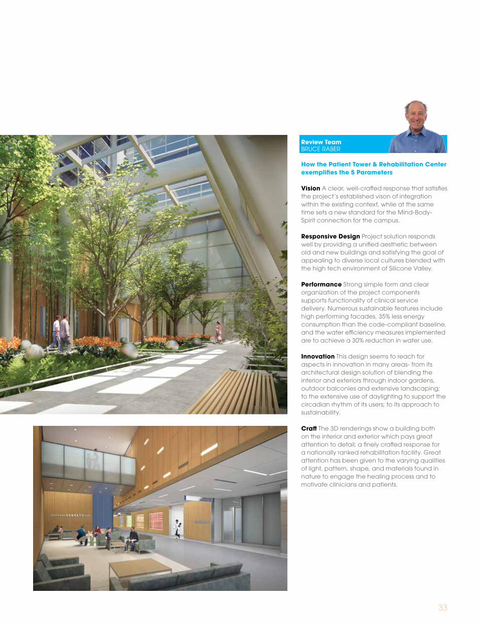
The design of the interior environment relies on a visual and visceral connection to the exterior landscape gardens planned directly adjacent to departmental and public spaces.
• Interiors emulate the varying qualities of light, pattern, shape, and materials from nature, to engage patients in the healing process and to motivate hospital staff as they move through the day and night hours.
• Picture window allows for access to daylight, which supports circadian health and wellbeing while rooftop gardens enhance the patient’s connection to the natural world.
• Recycled, non-toxic and rapidly-renewable materials combine with a variety of colors, patterns and textural finishes to stimulate the senses and create an atmosphere that renews body and spirit.
Rehabilitation of mind, body and spirit are achieved at this new Center of Excellence through connection to light, view and sustainable design strategies.

32
CAMPUS GREEN
Renewing the Heart of the Medical Center To breathe new life into the medical center, the site design completes the campus green by placing the new patient tower on its edge and by creating new connections between buildings and through the site. Phase One includes a new patient tower, therapy pool building, and associated site work. Phase Two includes a second patient tower and replaces an existing institutional cafeteria with an open, airy café connected to a garden and conference center. The goal of the two phases, combined, is to complete the campus heart and replace outdated facilities with innovative models that set a new standard for rehabilitative patient care.
Some of the key features of the project include:
• Exterior forms of the new Patient Tower pay homage to the high-tech campus aesthetic and meet SC VMC ’s concerns that the new campus is a place where all visitors and cultures feel welcome.
• A holistic design approach integrates building systems, the exterior design incorporates a high-performance façade with low-E glazing, exterior sunshades, and a cool roof.
• A two-story landscaped solarium, or Lobby Link, connects ground-level circulation to the new patient tower and provides valuable respite for hospital staff, patients and visitors.
• Accessible roof terraces play a significant role in communicating the patient-centered care within. Rooftop gardens provide a welcome visual connection to nature for the patients in the adjacent rooms.
• Validated through extensive energy modeling, the project is designed to consume 35% less energy than a code-compliant baseline. A 720-kilowatt photovoltaic field, located on an adjacent parking structure, is designed to generate approximately 10% of the SC VMC campus energy needs.
• Water efficiency measures were implemented to achieve a 30% reduction in water use.
33
How the Patient Tower & Rehabilitation Center exemplifies the 5 Parameters
Vision A clear, well-crafted response that satisfies the project’s established vison of integration within the existing context, while at the same time sets a new standard for the Mind-Body- Spirit connection for the campus.
Responsive Design Project solution responds well by providing a unified aesthetic between old and new buildings and satisfying the goal of appealing to diverse local cultures blended with the high tech environment of Silicone Valley.
Performance Strong simple form and clear organization of the project components supports functionality of clinical service delivery. Numerous sustainable features include high performing facades, 35% less energy consumption than the code-compliant baseline, and the water efficiency measures implemented are to achieve a 30% reduction in water use.
Innovation This design seems to reach for aspects in innovation in many areas- from its architectural design solution of blending the interior and exteriors through indoor gardens, outdoor balconies and extensive landscaping; to the extensive use of daylighting to support the circadian rhythm of its users; to its approach to sustainability.
Craft The 3D renderings show a building both on the interior and exterior which pays great attention to detail; a finely crafted response for a nationally ranked rehabilitation facility. Great attention has been given to the varying qualities of light, pattern, shape, and materials found in nature to engage the healing process and to motivate clinicians and patients.
Review TeamBRUCE RABER

34
Location: Winnipeg, Manitoba, Canada
Project Duration: 2009-2015
Size: 370,00 SF / 34,374 SM (+ 410 parking stalls)
Construction Cost: $118 million CDN
Stantec Services: Architecture, Structural, Mechanical, and Electrical Engineering, Sustainability Consulting, Civil Engineering
Design Team: Leif Aarrestad, Andre Aroutiounov, Tyler Babb, Michael Banman, Shannon Biccum, Andrew Craig, Mike De Beer, Monique Fehr, Matt Fleming, Dale Fraess, Blair Fraser, Nick Gilbert, Chris Gilmour, Bruce Haugh, Jacqueline Jasinski, Joe Kalmar, Dustin Karsin, Leo Korenbaum, Todd Littleford, Art Martin, Terry Maunu, Michael Moxam, Pang Ng, Fletcher Noonan, Myron Pasaluko, Joseph Rodriguez, Cindy Rodych, Ian Rossnagal, Ed Sapacz, Jeff Schraud, Tanya Shterenberg, Mohan Tenuwara, Joe Tonge, Crystal Ungarian, Matt Vodrey, Bassam Wahid, Ken Waukonen
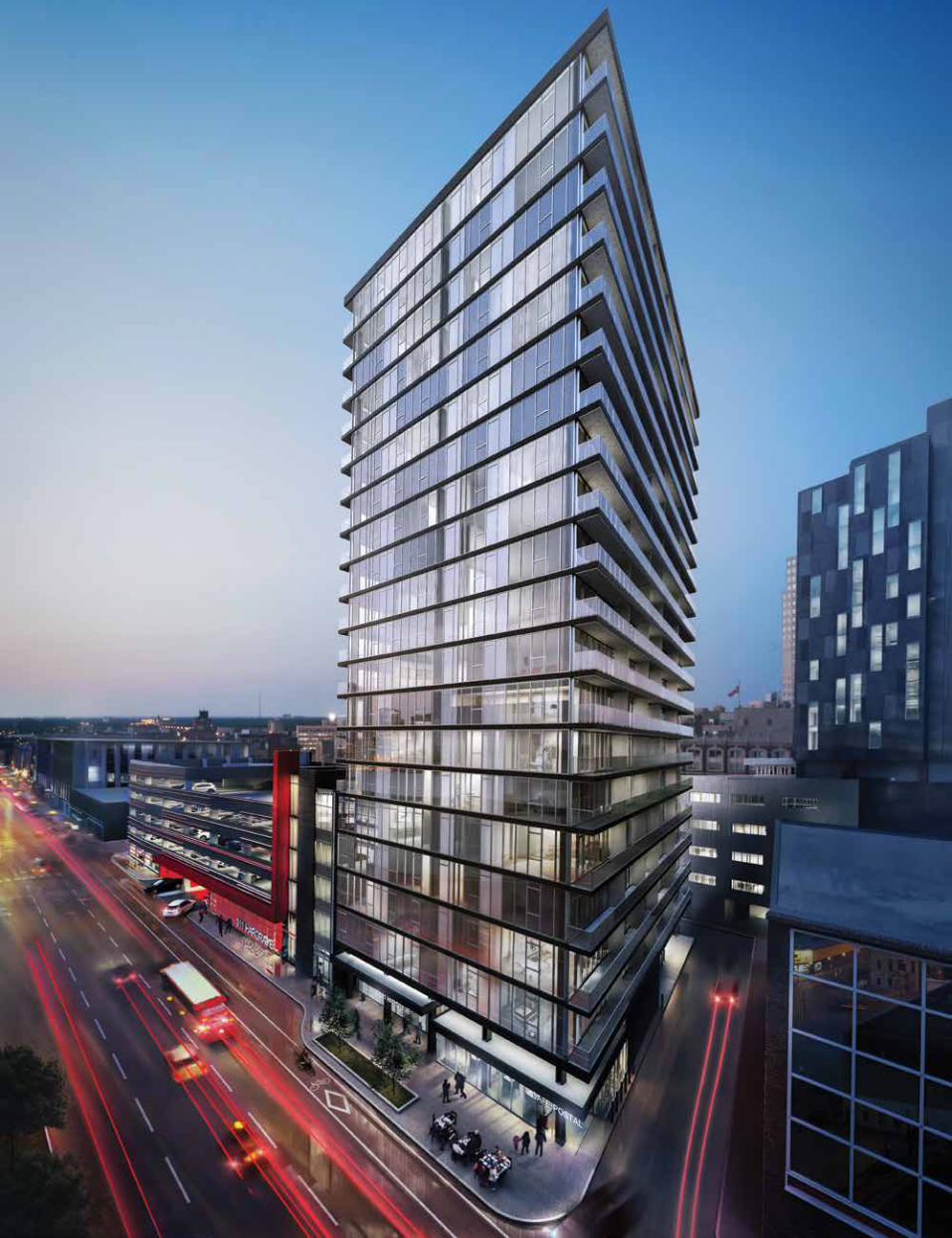
CENTREPOINT DEVELOPMENT
The privately developed 311 Portage + Alt @ Centrepoint is a positive and bold commitment to the urban renewal of Portage Avenue in downtown Winnipeg. This project, at the leading edge of an exciting renewed interest in private investment in the downtown, consists of a 5 storey mixed-use podium and a 13 storey tower. Two restaurants along with office and hotel lobbies will reside at the pedestrian level followed by four floors of offices above. The hotel tower will house a 156 room no-frill-chic hotel and conference rooms.
Located at the corner of Portage Avenue and Donald Street, the original site included the turn-of-the-century Mitchell Copp building. The façade of which will be retained and refurbished, and its intended use as landmark and portal will continue to serve as the primary entrance to patrons of the new offices.
Designed with Winnipeg’s geography and rich history in mind and inspired by the prairie horizon, the podium is a response to the asymmetry of its site, an outcome of differing approaches to land settlement and the resulting city grid. At the ground level, the building is transparent, recessed and Cartesian, opening up a wedge shaped plaza and café area off of Portage Avenue. Raised from the ground, the upper fl oors extend to meet the edge of the side walk. Similarly the hotel tower is raised from the podium. The transparency of the public zone extends the full height of the south face behind the Mitchell Copp façade to reveal the comings and goings of its patrons, framed by a large golden ‘proscenium’.
Daylighting, a critical ingredient, is brought deep into the heart of the building via two multistory light-wells. Large expanses of horizontal glass on the east façade further contribute to daylighting and offer panoramic views to those working in the building.
Soaring above the podium, the tower is made dynamic by an array of striated windows, brought to life by a series of fins, intended to reflect the light of the prairie sky and nightlife of the city. The tower will be connected to pedestrian life at the public zone by a thin golden fin folded at street level to support the hotel canopy, marking the main entrance to its lobby.
By utilizing high environment standards, 311 Portage is targeting LEED® Silver Core & Shell; the sustainable goals for the project include increased occupant health, energy and water conservation, resource efficiency, reduced construction costs and flexibility of space. The sustainable provisions will include access to views and daylight, low energy lighting, low-flow plumbing fixtures, energy efficient heat pumps in conjunction with geothermal heating and cooling, and recycled and low VOC materials, all predicated on a building module designed to reduce construction waste. Active transportation is supported by the location with immediate access to most city bus routes, and the provision of change rooms, showers and bike lockers.
With its realization, the 311 Portage + Alt @ Centrepoint will be a catalyst for urban renewal, ushering in a new era of sustainability and private investment in downtown Winnipeg. By providing new amenities and offering a high quality work environment, 311 Portage + Alt @ Centrepoint will bring new life to the downtown, populating and enlivening the area, while contributing its success.
At the epicenter of urban renewal in Winnipeg, Centrepoint’s mixed-use podium and tower is an iconic symbol of a community dedicated to revitalizing its downtown.
35

36
àà
à
à
à
à
à
à
à+311 PORTAGE AVE
British Cartesian/Cardinal GridFrench River Lot System
+
Winnipeg Hybrid Grid Site of 311 Centrepoint
100o
+
Site + Artifact Reverence Urban Room3 Parcels + Back Lane Site Plan
Extend Urban Room Heavy V. LightRegister Hybrid GridHistoric Reconciliation Ground Floor Plan

37
How 311 portage+Alt Centerpoint exemplifies the 5 Parameters
Vision Clear massing strategy informed by a rigorous contextual analysis and program. The architectural expression is informed by the program elements and is supported by a refined materials palette.
Responsive Design Composition is highly responsive to context and program, with a strong approach to urban integration, successfully addressing the pedestrian scale at street level and the urban context at the massing scale. The architectural expression and fenestration strategies respond well to program, allowing programmatic masses to communicate their functions. Project has a strong civic and commercial presence and attitude.
Performance Simple volumetric massing drives efficient floor plans and provides access to daylighting. Attention to energy efficiency in the design of systems and in the approach to fenestration advances the sustainable agenda of this design.
Innovation The reuse of the Mitchell Copp façade and the refined integration of program elements and requisite circulation into a single complex. The atria introduced to the podium, present an innovative daylighting strategy and drive visual connection between floors.
Craft The Portage Avenue facade and floating podium mass create scale and transparency at the building base enhancing the pedestrian experience. The podium and tower material and scale are adjusted to address the city and the entire composition is well integrated.
A strong project, simple in its massing but a complex in the way it weaves itself into the urban fabric. The value this design brings to the client is the connection it creates through the visual and contextual engagement of the mixed use program at the pedestrian and city scale.
Review TeamANTON GERMISHUIZEN
Section à Skin à Core à Interior
Typical Office Core Internalized
Section Cut
Core Externalized
‘Proscenium’ Core
Arrival/Departure Celebrated
à à
à à
38

39
The £267 million South West Acute Hospital was designed by Stantec’s London studio for the Northern Ireland Health Group (NIHG). On 26 June 2012, Her Majesty The Queen and the Duke of Edinburgh officially opened the new South West Acute Hospital, UK. The hospital, run by Western Health and Social Care Trust, admitted its first patients on 21 June 2012.
CONTEXT ON SITE
The 69,000 m2 acute hospital is located on a 52-acre greenfield site one mile north of Enniskillen and is surrounded by rolling countryside and lakes. Its buildings are organic in form and sit naturally in their landscape. The hospital is broken up into a number of smaller blocks that allow patients to experience the hospital on a human scale. A palette of predominantly natural materials – locally-sourced stone, slate, timber and glass – further ground the building in its landscape. A series of internal linear gardens running the length of the hospital have the dual purpose of bringing rich landscape into the heart of the hospital and providing the main organizational feature of the hospital.
The building has been carefully designed in this beautiful Fermanagh setting to complement and take advantage of the fantastic views. The design of the new hospital is all about openness and community values, as well as providing excellent clinical care.
INTERIOR DESIGN & ART
The design successfully uses natural light and integration of landscape with clinical functionality and way-finding brings a “light and airy” feel to the circulation spaces.
Artwork forms a significant means of integration of the hospital functions with the community, with specially commissioned art pieces from Irish artist and furniture integrated with the overall architectural design. The atrium, with its multi-colored glazed panels within curtain walls is complimented by neutral , natural colours and textures with accents through natural materials of timber, cooper, terrazzo. The copper finish integrates the design from external facade at entrance, to the cladding within the atrium cafe, culminating in the multi-faith centre within the linear garden that forms the feature architectural piece within the overall design.
From arriving at the triple height atrium entrance to walking along the linear garden hospital street, the visitor, patient and staff alike, are taken through a series of evocative thematic experiences.
• The reference to wildflowers gives identity to the individual departments and supports the intuitive way-finding while “crossing the meadow”.
• The metaphoric spectrum of the “rainbow” theme children’s wing represents bringing together different children from different backgrounds and different needs. It embodies the full range of the child’s emotions through a mosaic of many colors
• The theme of “water” flows through all of the Maternity, and related departments to create a calming and healing environment for the patients.
• The cafe at the heart of the atrium overlooking the Wolf Lough behind forms a focal congregation point for the community as an “agora”.
Location: Enniskillen, Northern Ireland
Project Duration: 2006-2011
Size: 742,440 SF / 69,000 SM
Construction Cost: £200 million GBP
Stantec Services: Architecture, Interior Design, Clinical Planning
Design Team: Ileana Alexandratos, David Bennett, Brett Blackburn, Cheyenne Chong, Carol Chue, Annie Coull, Velimira Drummer, Laurel Harrison, Dorian Holzapfel, Natalia Kubica, Jane McElroy, Burkhard Musselmann, Hester Paul, Anuradha Sabherwal, Alex Sargeson, Bahman Tavacoli, Peter Wilkins, Jonathan Wilson, Catherine Zeliotis
SOUTH WEST ACUTE HOSPITAL
To achieve a human scale, the large program is embedded within the beautiful rolling landscape - creating an environment of wellness and healing for all.

40
INTEGRATED BIM & COLLABORATION
The project was designed and delivered using Building Information Modelling (BIM) from concept design to completion. Use of BIM enabled a more effective utilization of resources and time within the project programme and costs. This enabled us to reducing site errors by providing accurate, real-time information and co-ordination of information on site.A collaborative approach between the clients NIHG, Stantec and the overall design team, and Western Health and Social Care Trust, meant that the hospital was completed on time and within budget.
The project’s successful completion on time and on budget which was possible through the very detailed and comprehensive design brief provided based on the Trust’s exemplar design, the high degree of co-operation between the design team, led by Stantec, and the Western Health and Social Care Trust during the competitive dialogue procedure, as well as the very professional collaboration between the project team members during the detailed design and construction phase.
MEDICAL PLANNING
The new hospital is the first NHS hospital in Northern Ireland to have 100% single patient bedrooms. All 312 bedrooms benefit from their own en-suite bathrooms, as well as expansive views of countryside and landscape.
The design of the bedrooms and en-suites are informed by evidence-based design research – same handed design and zoned clinical/patient areas help to minimize errors, improve infection control and enhance the patient experience.
MASTER PLANNING, LANDSCAPE & SUSTAINABILITY
South West Acute Hospital is designed to provide an environmentally sensitive and sustainable solution. It incorporates sustainable features and technologies including, renewable energy, passive heating and ventilation features and site sensitive design. Stantec worked closely with landscape architect, Land Use Consultants, to create a fully integrated and sustainable landscape for the hospital.
One of the most successful aspects of the design is its sensitivity in site planning and placement of the building form with minimum cut and fill to a beautiful greenfield site. Particular emphasis was to develop a master plan that preserves and enhances the site drainage patterns and surrounding ecosystems. Use of intensive and extensive green roofs brings opportunities for ecological niches to flourish.
The hospital was designed with patient and staff wellbeing in mind. Its interior areas are well-organized, light and airy, spacious, and have high quality natural finishes throughout. The design maximizes natural light and views.

41
How South West Acute exemplifies the 5 Parameters
Vision A clearly articulated idea relating to linear gardens drawing landscape into the health care environment and serving as key organizing elements.
Responsive Design Careful site planning and building form minimizes cut and fill to retain the natural beauty of the site. The design maximizes access to natural light and views of the community landscape.
Performance Clinical functionality is delivered within the clear organization of the project components. Sustainable features include use of renewable energy, passive heating and ventilation and site sensitive design.
Innovation The use of fundamental geographic and landscape features of the site as the key drivers of the scheme results in a naturally generated innovation.
Craft The concept diagrams offer a clear understanding of the approach and relationship to site. The ideas are clearly communicated both in text and diagram. The building expression successfully captures the relationship between built form and landscape, allowing the natural topography of the site to remain.
Review TeamMICHAEL MOXAM

42
NOTABLE PROJECTS
43
University of Mary Washington Dahlgren Center for Education
Cleveland Institute of Art
Piqqusilirivvik Inuit Cultural Learning Facility

44
Location: King George, Virginia, United States of America
Project Duration: 2008-2011
Size: 40,000 SF / 3,700 SM
Construction Cost: $16.85 million USD
Stantec Services: Architecture, Interior Design, Mechanical and Electrical Engineering, Landscape Architecture, Planning, Visioning Brands Experiences
Design Team: David Capelli, Loretta Cummings, Chris L. Graham, Ben Keeney, John Knickmeyer, Peter Kim, Kevin McCormick, Jerome Marinzel Jr., Paul Nabti, Wayne Nickles, Natalia Sanchez, Natalia Zeman
UNIVERSITY OF MARY WASHINGTON DAHLGREN CENTER FOR EDUCATION AND RESEARCH
The Dahlgren Center for Education and Research is the first building on the University of Mary Washington’s new Dahlgren Campus. It centralizes distance learning programs delivered from universities throughout Virginia to the Naval Support Facility – Dahlgren. Twenty classrooms, all equipped with advanced audio-video systems, facilitate both receiving and delivering distance learning. A computer lab, group study spaces, offices for staff and visiting faculty, and a large divisible multi-purpose room are included to support the primary teaching purpose and create an engaging educational environment.
VISION
The site for UMW’s new campus is a forested peninsula projecting into the tidal wetlands of Williams Creek, a tributary of the Potomac River. The building and site are designed to maintain the connection between the users and the natural surroundings. This direct engagement with the environment activates the interior of the building and promotes interaction between students, which is particularly critical given that the faculty will largely not be physically present.
RESPONSIVE DESIGN
The connection to the environment is emphasized by the relationship between the two primary elements to the building’s form – the program modules and the media center. The modules contain the primary program elements in solid masses.
Five of these forms contain the common elements of classrooms and faculty offices. They are arranged in a rectilinear pattern and are architecturally expressed on the inside and outside of the facility. Three rotated masses house the unique program elements and service spaces. They are rotated off of the orthogonal grid in plan and have unique exterior expressions.
A large open media center connects the modules and provides primary circulation which weaves through the spaces, drawing people to all parts of the facility. The media center is the activity hub of the building and houses group study areas, breakout areas and quiet study spaces. It engages the exterior via fully glazed openings between modules, creating broad visual links to the surrounding environment. On the south side of the building, these spaces extend to the outside, projecting into natural bio-retention basins.
Designed to consolidate distance learning programs, the facility uses a modular strategy to arrange formal and informal learning spaces so that students can connect to each other and create a collegial atmosphere.

45

46
INNOVATION
The Dahlgren campus is unique among UMW’s buildings in that the primary educational mission is not achieved through instruction provided by the university, but by providing a home for distance learning from many other institutions. Thus, the unique challenge was to create an engaging environment for students that is largely absent of faculty. By using the module design concept, we were able to create a space with interspersed functions that encourage interaction among the building’s occupants.
PERFORMANCE
This is a satellite campus with one building; therefore ease of maintenance was a priority for the University. The design for a ground-source geothermal heat pump system provides the ease of maintainability that the client demanded while achieving exceptional levels of energy efficiency. The central geothermal loop has very few moving parts, thus focusing the majority of the maintenance needs on air handlers and fan coil units that are relatively simple to operate. This allows the university to use contract maintenance workers, minimizing the need for dedicated personnel to make the hour-long trip from the main campus.
CRAFT
UMW’s main campus has a unified character of red-brick federalist architecture. For the new campus, the University wanted a new aesthetic expression that would speak to its primary function as a place for advanced engineering study. Brick and zinc were chosen as the primary materials due to their durability and long history of use. Yet, by cladding the lower portion of the masses in zinc and keeping the brick above, it is clear that these are not traditional structures – instead the means and methods of contemporary construction are emphasized.

47
How the Dahlgren Center for Education and Research exemplifies the 5 Parameters
Vision The educational spaces of the building are arranged around the periphery of the building and along an internal communal space and circulation concourse. It’s as if the building floor plan is inviting the smaller pockets of study to join the larger conversation happening in the larger community– a direct reflection of distance learning ideals.
Responsive Design The presence of the site is omnipresent in the floor plan layout of the facility. The guided placements of vista to the adjacent landscape continually remind, refocus, and orient the occupants to their surroundings.
Performance This facility was designed to operate long-term with little to no maintenance staff. The design team chose building systems that were simple to operate, with as few moving parts as possible, so a full time maintenance staff was not necessary. This approach allowed the satellite campus to operate efficiently and cost effectively.
Innovation This facility is the first building for the Dahlgren campus. Not only does the building seek to establish the benchmark for campus educational environments, it begins to question the configuration of ‘the classroom’ for an online community of students. The building aspires to create spaces that engage students through not traditional media.
Craft The building components of the Dahlgren Center were selected and assembled to create an exterior envelope that establishes the notion of longevity and history while looking to the future. Brick elements arranged in non-standard configurations create a sense of permanence, while expressing a new methodology is at play; the building is simultaneously familiar and refreshingly different.
Review TeamRAYMOND MAGGI

48

49
Location: Cleveland, Ohio, United States of America
Project Duration: 2005-2015
Size: 89,000 SF / 8,270 SM
Construction Cost: $34 million USD
Stantec Services: Architecture, Interior Design, Mechanical and Electrical Engineering
Design Team: Katherine Antarikso, Elizabeth Behmer, Benjamin Bleicher, Michael Carter, Arman Chowdhury, Jason DeMarco, Barbara Forestall, Anton Germishuizen, David Hornicak, Gregory Jarold, Janeen Jaworski, Richard Karcher, John Kosar, Jr., Thomas Krejci, Katharine Land, Keith Lutz, Rocco Magrino, Mary McGrellis, Scott Mitchell Taylor, Rebecca Mizikar, Ivan Nemecek, Christopher Panichi, Florence Petrus, Lawrence Pol, Amie Rini, Marcella Robertson, Jennifer Rogers, Matthew Rooke, Lois Roth, Renee Shirey, Jennifer Storey, Evaine Sing, David Spehar
CLEVELAND INSTITUTE OF ART
CONTEXT
The Cleveland Institute of Art is an independent college of art and design committed to leadership and vision in all forms of visual arts education advanced through a progress, interdisciplinary curriculum.
The Institute is located on Euclid Avenue, east of the Cleveland’s downtown core, in the vibrant University Circle neighborhood.
The school consolidated in to a “one building” campus in 2011, after renovating a former industrial structure originally built as a manufacturing facility for the Ford Motor Company in 1914. The building was added to the National Register of Historic Places in 1976. Cleveland Institute of Art named the building the Joseph McCullough Center for Visual Arts following its remodeling.
BRIEF
The project’s primary objective is to consolidate the Institute into a “one building” campus, allowing for community engagement while providing a state-of-the-art learning environment for CIA faculty and students. The two primary projects elements are the renovation of the existing McCullough Building to accommodate workshops and studios and a new 80,000 sf addition to the southwest to accommodate new administrative offices, student and faculty galleries, flexible studios for technology and a cinematheque.
Given the urban context, a key consideration of the planning was to create a safe and secure student environment while offering a welcoming face to the
community. A communal mixing space on the second floor is added as an atrium between the existing structure and the new addition. With access to ample daylight and visual connections through the building, this venue serves as the defacto heart and center of the campus. Defensible campus open space is provided through the atrium and a green roof element over the cinematheque.
The program and diversity of learning environments are aligned with the building: robust spaces in the existing industrial building accommodate the studio functions for ceramics, sculpture and some of the workshop oriented instructional spaces while the new addition is designed around technology-driven clean studios for the fine and digital arts. Applying strategies from our corporate workplace practice we developed a flexible universal learning workstation concept for the digital arts that optimized the space, drove efficiency into the planning and provided the client with maximum flexibility as programs changed or grew during the academic cycles.
THE NEW BUILDING
The new addition is designed as a simple bar building containing the academic program, lifted off the ground to reinforce visual connectivity to the program at the pedestrian level. This expression is in contrast to the existing masonry and terracotta accents of the historic building, the proportions of the Euclid Avenue façade are literally derived from the historic structure. The public realm response and community engagement strategies included a clear storefront at the pedestrian level leading to the primary entry and providing visual access into the building, the integration of a digital media mesh to the south façade allowing the Institute to project media from its program to the public realm and the design of a separately expressed mass to the east accommodating a publically accessed cinamatheque. Community engagement was a priority of the Institute in the siting and expression of the addition which adds to the richness of the urban experience in this vibrant renewal district.
The addition pays homage to the historic McCullough Building while projecting a dynamic and varied facade reflective the state-of-the-art learning occurring within.

50

51
How the Cleveland Institute of Art exemplifies the 5 Parameters
Vision The addition is designed as a counter point to the existing structure while being contextually responsive and respectful. The mass, a simple solid volume expressed as a floating box containing the program rests on a transparent first floor that accommodated public program. The central atrium located on the first floor is discovered by moving through a compressed entry sequence – delivering an unexpected and expansive volume. Occurring at the intersection between the existing structure and the new wing this atrium anchors the public functions and becomes the defensible campus open space of the One Building Campus, appropriate for the urban context.
Responsive Design Program distribution across the existing structure and new addition is highly responsive to students and faculty needs. Traditional workshop based programs are located in the industrial building while technology and digital based programs are accommodated in the new addition. The building function and the development of flexible, visually accessible learning environments speak to the collaborative values, integrated curriculum and transparency of the institution. Studio spaces can be reconfigured and deployment of a universal workstation concept allows administration to respond rapidly to changing program demands and enrollment driven by market conditions. The building is designed to adapt to the client’s business model.
Performance Performance is driven a multiple levels. Consolidation into one location combined with clear planning has driven efficiency into the institutions use of space. Flexibility optimizes the institutions ability to respond to program demands and changes and to scale up to support academic programs that are in demand, enhancing financial performance.
Innovation The use of natural yet controlled daylight accessed through the atrium drives vibrancy in to this campus space. The volume supports a passive ventilation strategy and promotes visual connectivity between academic programs and studios.
Craft Material and formal expression intentionally counters the language of the existing historic structure and expresses a progressive identity for the Institute in its new home. The south façade while formal, static and contextual contrasts the western façade’s unique fractal pattern, achieved utilizing different glazing colors and ceramic frit densities. A band of orange glass completes the façade and leads to the integrated digital media mesh that literally brings life to the elevation. The mass is rich and layered despite its simplicity of form.
Review TeamANTON GERMISHUIZEN

52
Location: Clyde River, Nunavut, Canada
Project Duration: 2008-2013
Size: 22,000 SF / 2,000 SM
Construction Cost: $22 million CDN
Stantec Services: Architecture, Interior Design, Mechanical & Electrical Engineering and Civil Engineering
Design Team: Ross Aburaham, Josh Armstrong, Rene Artacho, Harriet Burdett-Moulton, Terry Gray, Melanie Green, Paul Hardy, Kevin Hodgins, Rodney Kirkwood, Warren McLeod, Roger Tulk
PIQQUSILIRIVVIK INUITCULTURAL LEARNING FACILITY
Piqqusilirivvik, Inuktitut for “a place that has those things important to us“, is the first and only Cultural Learning Facility in North America specifically designed and built for the Inuit. Located outside of Kangiqtugaapik (Clyde River), Nunavut, one of the most remote places in the world, the facility is subject to environmental conditions of snow, wind, and temperature that are extreme even in relation to other arctic communities. The project represents an embodied manifestation of the mandate of the Inuit of Nunavut; to pursue the continued advancement of their traditional lifestyle in a contemporary world. This project pursued a totally collaborative and integrated design process including Government, Elders, Youth, Designers, Scientists and the community of 820.
The concept of way-finding, as it is understood by the Inuit, is driver for the design at a number of levels; using practical understanding of the natural patterns of snow to shape the flowing design of the building form to improve performance, while blending the traditional knowledge of the Elders with modern science to form a building design that lives in harmony with the wind. Way-Finding is at the core of this facility. It guides the Inuit people from the past to the future in a way that is related to, but distinct from, the public education system.
The form of the building emerged from a collaborative workshop process and consists of two residential wings forming “open arms” to the approach road and affording views to the north uplands and Patricia Bay to the south. The entry, also facing the road, is sheltered from the
prevailing northwest winds by the administrative bay. Within this configuration, the office area can monitor the entry and is positioned so that it faces the interior reception area.
Simple way-finding brings clarity to the interior layout. The entry opens directly into a Reception Foyer with direct access to the offices and acts as a crossroads with the residential wings right and left and the Gathering Hall directly ahead. The Library and the Wood Shop flank the entry into the Gathering Hall. In accordance with our educational goals, these spaces are transparent so students and visitors can quickly perceive the activities in each educational space. The other educational spaces: Learning Studios, Skin Preparation and Sewing workshops, and the Kitchen all face the Gathering Hall. The Gathering Hall thus becomes the place where everybody must go to attend the school, a true gathering place.
As the core of the school is open and public, the residential wings transition to a more quiet and private realm. The corridors are double loaded and offer small “tea” lounges and meeting spaces.
A sculptural object within a barren landscape that is simple in its gesture to achieve a human scale - a comfortable place to live and learn.

53

54

55
How Piqqusilirivvik exemplifies the 5 Parameters
Vision The project has a strong narrative vision relating the building form and massing approach to the site, landscape and cultural context. The planning concept and program organization embody the importance of community and collaboration.
Responsive Design The building form is highly responsive to the site, floating gently above the ground plain, minimizing the physical impact to the site. By contrast, the earth ramp grounds the building and provides a modest yet civic procession. Modest in its overall response the design is consistently appropriate at many levels.
Performance The rich yet simple floor plan meets the program requirements with great efficiency while balancing individual needs with community function. The plan form, fenestration strategy and massing all serve as sustainably sensitive design.
Innovation The form, hierarchy and structure of the public circulation space creatively challenge convention and afford the occupants choice and flexibility in how space is occupied. The rich yet simple interior space and use of wood as a primary material stand in contrast to the barren exterior context.
Craft The floating linear mass, expressed in wood, resting on the light steel structure is expressive of an architecture of contrast. The exposed structure and timber rafters, the built in seats and shelves all add a tactile texture, human scale and warmth to the interior spaces.
A rich project, simple in its gesture with a highly humanistic character and feel, a comfortable place to live and learn in.
Review TeamANTON GERMISHUIZEN

56
SELECTION COMMITTEE MEMBERS

57
Daniel Aizenman Boulder, Colorado, USA
Michael Banman Winnipeg, Manitoba, Canada
Annie Coull San Francisco, California, USA
Joe Geller Boston, Massachusetts, USA
Anton Germishuizen Philadelphia, Pennsylvania, USA
David Martin London, United Kingdom
Michael Moxam Toronto, Ontario, Canada
Simon O’Byrne Edmonton, Alberta, Canada
Mark Penney St. John’s, Newfoundland, Canada
Stephen Phillips Toronto, Ontario, Canada
Paul Pohlod Butler, Pennsylvania, USA
Bruce Raber Vancouver, British Columbia, Canada
Gary Sorge New Haven, Connecticut, USA
Ray Wolfe Vancouver, British Columbia, Canada

58

59


