Design for advertising!
34
Design For Advertising Resubmission
-
Upload
alansmith96 -
Category
Education
-
view
73 -
download
0
Transcript of Design for advertising!

Design For Advertising Resubmission

Initial ideas
1) qWake Up-
Using the idea of both waking up and the natural disaster of an earthquake. (That being the theme of something bad happening if this is not purchased. Include an image of a bike in the air, jumping over the cracks in the ground from the earthquake.Have the ‘Up’ in the title raised to imply that the drink gives you that lift.(The Natural disaster aspect of the Drink may cause offense or be harmful viewing so there may have to be adjustments to the design)
‘Breaking the bounds of Energy’ is an idea for a slogan as it can reflect both the bike’s parts (For the extreme sport aspect) and the cracks appearing in the ground. The idea of using a bike in the promotion side would be to appeal to males who are into extreme sports and need that extra boost of energy to see them improve their level and try to be at their best.
2) Improvise-
This second idea is based upon a healthier alternative to the energy drinks and is targeting the nutritious, health conscious audience.The name is part of the idea that the drink is not the usual drink and it offers a slight alternative to what else is there in the market and is not pre planned that contains all the unhealthy sugars and content that one ‘normal’ energy drink contains, Something that is made through natural produce.
The design of the can would be clean and slick with the colour Green featured to help enhance the natural aspect of the drink. The use of symbols on the can will also help bring this idea forward, such as a leaf of sorts.The name can help interact with the audience due it being fun, unordinary and peculiar. This therefore means that the demographic aimed towards would be females of a young age.
3) Limitless-
This idea is based upon the idea of an energy drink designed towards top athletes and those who take part in very hard sports.The title can help bring the audience in from the start, the idea of consuming a product that gives you an endless supply of energy and your limits are whatever you want them to be. Therefore you being in control, which the energy drinks, are designed to be.
Giving you that feeling that you for some reason have an edge by drinking that particular can. The design of the can will be bright and colourful to interact with the audience. The demographic will be those of both genders who aim to play sports to the best of their ability. This however will be of a younger age group to Idea 1.The promotion of this will be using people drinking the can and somehow it having a better affect than the other alternatives.
4) Limbo-
The idea of this name is that people who do not purchase it are to forever stay in the same place or not move on whereas people that drink the Can will then move to the afterlife or to a better place.This drink will be targeting the dark, hardcore music fans that are seen as aggressive and passionate towards their interests. It will be aimed more towards males but of a wide age range. Ages between 18 and 30 as the drink does not rule out certain generations. The can will be designed in a black shade with silver text written in a custom manner.
5) Life Line-
The idea behind this is that after consuming the product you are handed that extra boost you did not have and needed to perform your activity.
This is aimed towards the sports community and similar to that of Lucazade. It will not be gender specific however will be in relation to a younger audience. Having images of other athletes picking you up and offering you the beverage will promote the can.
Mind Maps in relation to the initial ideas
Here are basic mind maps on all the ideas surrounding the design for my can. It includes Names, Theme’s, target audiences, colours, the composition and aesthetical features on the designs and the purpose for the energy drinks in the idea process.
This looks to merge many of the ideas together and bring forth more inspiration to a final piece. Using this mind map can help me understand what the theme is and more importantly who the people it is aimed towards are and if they will purchase it.
Going into more depth helps me further understand the audience. Linking two ideas together of Natural disasters and extreme sports can help raise awareness and provide energy when needed.
I have also created a more detailed mind map into just one of the ideas I came up with. This has many of the aspects in the more general mind map, however goes into more depth to the target market and explores the theme of the name and brand that has been designed.
After considering all the ideas and theme’s I felt that this particular name was the one without any major flaws.
This was a unique idea that used both the idea of an earthquake and waking up. The mind map explores what extreme sports the audience view or take part in, to give me an idea where I can advertise the product.


qWake (Idea 1) mood board.

Improvise (Idea 2) Moodboard

The improvise energy drink is all about offering a healthier and more organic alternative to what else is out there. It takes inspiration from Scheckter’s endeavors.
Scheckter Energy drinks have been very successful and sold large amounts of cans to those who want the energy that comes with the drinks, but without the Toxic chemicals, artificial flavorings and colours.
The moodboard looks into the happiness that can come with a healthy alternative. This is an idea I can explore further as it is unique, holds something which can be taken very far and has the chance to be very successful.
The moodboard explores other healthy drinks as well as other sources of energy.
The use of green is what will be used on the packaging and marketing behind it as it reflects the natural side to the product.
This is a good angle to take because other people will not have explored this and therefore it will stand out and by unique.

Limitless (idea 3) mood board.

Limitless will focus more on sports that need a quick supply of energy and will not carry a large amount of extra nutrition. The drink will focus on the brand name of limitless. The idea that with this drink the possibilities you can do have no end and using Nike’s slogan for their advertising campaign ‘There is no finish line’ in the mood board helps demonstrate what the drink can offer you.
Limitless will be softer than the designs for qWake and will look towards more the Lucazade market rather than Red Bull and monster. They both share the same idea of being for sports, however Limitless will target males who take part in less extreme activities such as Football.
Incorporating this idea would help give the drink an identity. And something to base itself around.
Research into existing drinks was a good way to see what was already used in terms of promotional slogans and how I might go about targeting this drink and to who.

Copy/Script development-
Possible Slogan or Sub-headings
Ground breaking contentOff Balance training methodsTime to flyNeed a lift?Shaky footingMind the GapThat perfectly timed boost!Extra Energy for those Extreme MomentsA can a day keeps the boredom awayBring on the excitementWake up properly with a drink to cure the slowEnergy when you just can’t see a way outCan you imagine the consequences of not drinking it?We cure that Shattered feelingYou will definitely see the affects to it
Using a slogan that relates to the theme is a great way to bring the point across.
Not over complicating the text underneath the name is important as it could put the audience off.
Mentioning both the Energy you receive as well as natural disaster that could or will happen if you don’t purchase the drink is a great way of promotion.
Making the audience think that not drinking the product will lead to something disturbing happening almost makes them feel obliged to buy the energy drink.
The use of the word ‘Boredom’ is a good way of reflecting the theme and imagery used on the packaging.
Also the way the slogans are used make the earthquake theme exciting and this ultimately has a positive impression on the drink itself.
Using the so called ‘natural disaster’ as a positive is somewhat controversial, however for this audience it is exactly what is needed to grab their attention.
These are young Males, who the majority are rebellious and have a strong interest on dangerous sports, these will feel that they can take on the challenge of the drink and jump over the obstacles.
This can be represented by a bike hopping over the cracks
in the earth surface on the promotional piece.

A person will be failing at sporting activity and on the floor catching their breath. Then an alarm starts to ring, the camera starts to shake and a ‘qWake UP’ can falls from the sky.
They then take a drink and suddenly get a huge boost of energy which they then say ‘Perfect Timing’
With a voice over saying.. ‘qWake Up provides you with that extra boost of energy when you need it most. Having a can a day will defiantly keep the boredom away.
The person then sprints past the camera man and shouts.. ‘Bring on the Excitement’
Another idea would be of someone falling off their bike, having a hard time then a person giving them ‘life Line’ and they suddenly get back on the bike, starting going really fast then later skipping to a clip of them winning a race which is when they say.. ‘Life Line! I Needed that’
For ‘Limitless’ the script could involve a person climbing a building and then believing that they do not have the will power to carry on. Until a Limitless can falls from a window and they catch it. Which the voice over then says.. ‘Your Limits are the ones you set now’ Then the actor climbing has burst of energy and starts climbing right to the top.
The Actor will then get on top of the building and say.. ‘For Endless Energy doing those Extreme stunts you love, why not try ‘Limitless’.

Ideas for possible product names could be of shortening it to qWake or using the ‘q’ as a trademark or house style. It could even be used on advertising such as ‘q up for the drink now’. Using it as a symbol can a great way to get the brand across.
Names of drinks under the brand could be that of a set of natural disasters. With ‘Volcano’ being a red styled can that uses strawberries for example. Or Using a Tsunami to express that refreshing effect or relate it to the surfing extreme sport activity.
For Life Line, they could have an alterative ‘Life Line Light’ which can be very catchy if used in promotional stunts or Television ads.
This would be a less sugary type product that is an alterative for the less extreme sport lovers.
For Limitless there could be a set of different names under each product with still keeping the Limitless branding somewhere on the product.
For example having ‘Believer’ as one name of a product by the brand. Then this would include a different flavour to others however still keeping the font and style the same even if the colour is altered.

Created through Photoshop, using the style and adjustment tools I created the two colour merge affect.
I first grabbed the ‘T’ tool to make the text, I later changed the font to ‘Silom’ to reflect the theme of Extremeness. This also relates to the targeted demographic of Young Males due to its bold nature.
The next stage of development was to use puppet warp and create my own custom font. This was so it would relate to the target audience and be much more unique.
Having a more exciting font can reflect the theme and who it is trying to get it across to.Having the ‘UP’ raised higher is implying that the drink brings you from the depths of despair and gives you that lift which you desired.
Using a custom font can also help tie in with a slogan that both match the theme in hand of an extreme and aggressive way of advertising to correspond with the audience who are believed to play in such dangerous sports or activities.
For all the high sporting energy drinks I will need to use a clear and bold approach for the font. This is so the audience will understand what the drink is trying to get across, using a loud style helps interact with their interests, of extreme sports and unusual types of music.
The colours used for the sports drinks will be of dark shades. Keeping the drink in relation to the audience is important. As the target audience are Males, they are less interested in look and more into the content of the drink and what it can do to their performance in sports.
The colour of the fonts will be having two colours merged to show some individuality in the brand. This as well as the unique styled custom font that will be made will help entice the potential buyer.
Font/Colour Scheme development

Limitless
LimitlessLimitlessLimitless
This colour will be suitable to the target audience as it is not too loud, however will bring the title name out more.
Using a custom font for qWake UP will help get the theme across to the audience.
The 3rd Font here is the better out of the set due to its relation to the sporting theme and that of runners. It has a much softer yet polished look to it.
Having a pattern or mix of colours on the branding of the packaging can be a great way to use a house style without the need for unnecessary shapes.
Having dark packaging may prevent the name from being seen as clearly. With the use of a flame or something in relation to danger it can help bring the idea through to the audience.

More possible fonts for Limitless could be.
Limitless
Perhaps having a font that is not over heavy would suggest that it is for both
genders as well as expressing the sports it is used for.
The slight tilt to the font adds to the theme of speed and being able to go anywhere
you feel like by consuming the energy drink.
It is distinctive and catches the eye. (A cuchillada)
Limitless (Stencil)
This offers much more of an impact. This font is bold, strong and powerful. The
power it shows is in order to reflect the power you receive from drinking it. It is very
clear to use and when targeting both genders this can be important.
Possible fonts for Improvise.
Improvise (Ayuthaya)
This is a great font for an organic energy drink as it is soft,
clean and very professional.
Improvise (Noteworthy)
This is a possible font for Improvise because it is unique and
individual like the drink itself. This would reflect it well.
With other drinks, such as qWake, the font is heavy in order
correspond with the extreme sports. This is for those who
conserve the environment and their body.

Possible colour/shades for Improvise.
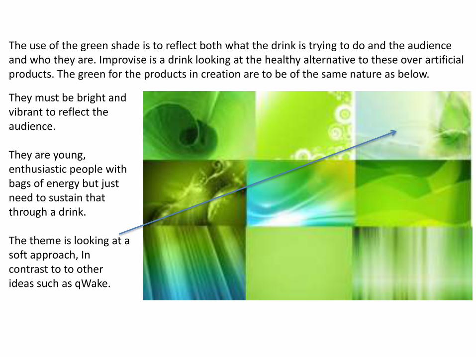
The use of the green shade is to reflect both what the drink is trying to do and the audience and who they are. Improvise is a drink looking at the healthy alternative to these over artificial products. The green for the products in creation are to be of the same nature as below.
They must be bright and vibrant to reflect the audience.
They are young, enthusiastic people with bags of energy but just need to sustain that through a drink.
The theme is looking at a soft approach, In contrast to to other ideas such as qWake.


I feel the can offers large amount of technical value. The layering of the imagery behind is a perfect example.
The pattern similar to the theme kept throughout makes the can look that much more pleasing. The overlay tool was used to create this effect. This was selected and placed over the existing layers once it was imported in.
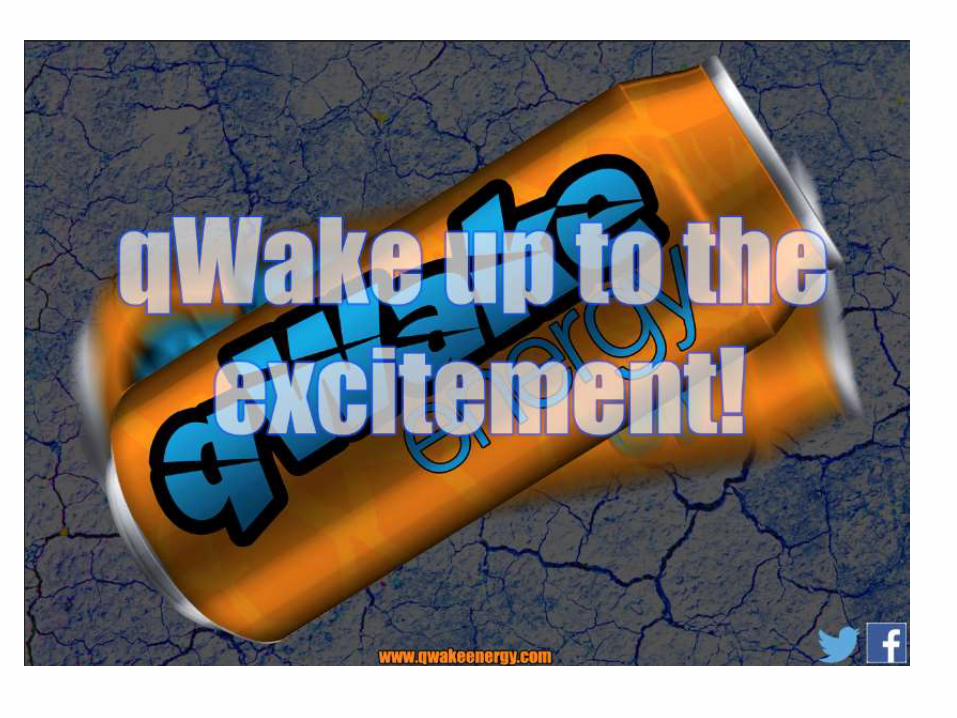
The use of the similar colours to the advert allow for consistency and professionalism. The name ‘qWake’ now stands out from the can whereas other existing attempts this did not work out. It has a colour now that can be used to all products and events ‘qWake’ sponsor. The unique light shade of purple contrasting with the dark orange offers something different and it is from this why it will stand out from the other energy drink cans.
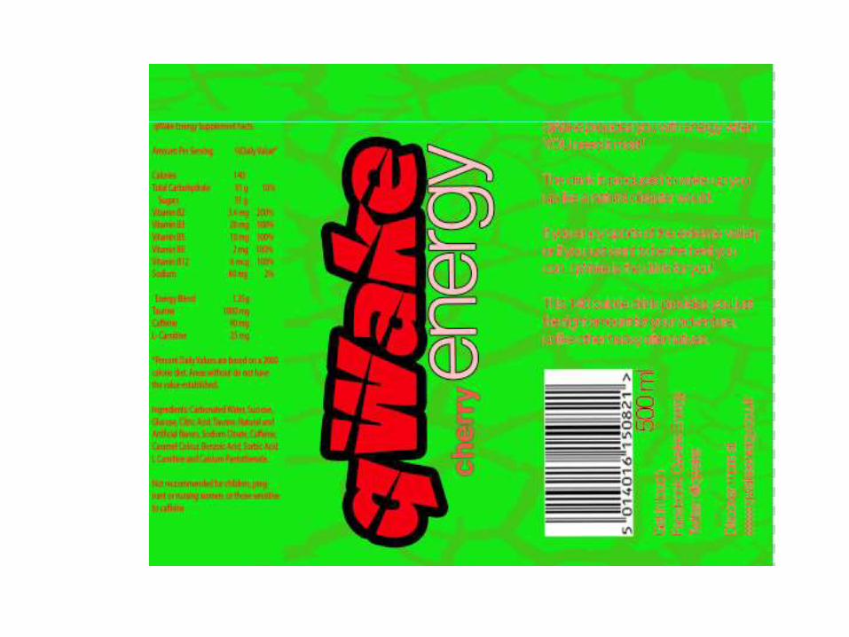
The theme is kept intact throughout production process. Keeping to the earthquake look. The Richter scale which is used to measure how dangerous they are is used on the can design itself. This shows how much research and effort has been put into making this design look great.
The white stroke allows to the can to look much more buyable. The previous designs looked heavy and similar to other competitors products. The choice of colour makes this stand out perfectly.

In order to develop my work further in the future I would need to spend much more time researching and producing multiple copies in order to establish something the audience would like and consume.
Through trial and error, this allows me to produce something the audience would find appealing. It offers a unique drink suitable for the mass market. The purple and orange combination is unusual but it is this that differentiates it from the hundreds of competitors.
The areas I feel are strong are the consistent use of similar colours, as seen the advert and the up and coming web design. Bright colours used not only to stand out from the packaging but to entice the audience to buy the product, which is why it is being developed.
I also feel that the typography was chosen well. Through many experimental stages for both qWake and other can ideas I looked at fonts and how they aim towards different markets. A Cuchillada font is bold, clean and offers a change.
Areas I feel could be improved are the overall features. Perhaps having some shapes or designs in the background as well as the image would have made it look much more desirable. Also perhaps looking at the colours. Purple does stand out with the orange, but would something playing extreme sports use this? Maybe exploring further colours would be better if I was to do this again.