Data Visualization: Modern - Smith College · Data Visualization: Modern Approaches August 2nd,...
39
Smashing Magazine we smash you with the information that will make your life easier. really. Data Visualization: Modern Approaches August 2nd, 2007 in Graphics | 457 Comments Advertisement Data presentation can be beautiful, elegant and descriptive. There is a variety of conventional ways to visualize data - tables, histograms, pie charts and bar graphs are being used every day, in every project and on every possible occasion. However, to convey a message to your readers effectively, sometimes you need more than just a simple pie chart of your results. In fact, there are much better, profound, creative and absolutely fascinating ways to visualize data. Many of them might become ubiquitous in the next few years. So what can we expect? Which innovative ideas are already being used? And what are the most creative approaches to present data in ways we’ve never thought before? Let’s take a look at the most interesting modern approaches to data visualization as well as related articles, resources and tools. 1. Mindmaps Trendmap 2007 Data Visualization: Modern Approaches | Graphics | Smashing Magazine http://www.smashingmagazine.com/2007/08/02/data-visualization-moder... 1 of 39 9/25/2008 9:25 AM
Transcript of Data Visualization: Modern - Smith College · Data Visualization: Modern Approaches August 2nd,...

Smashing Magazine we smash you with the information that willmake your life easier. really.
Data Visualization: Modern ApproachesAugust 2nd, 2007 in Graphics | 457 Comments
Advertisement
Data presentation can be beautiful, elegant and descriptive. There is a variety of conventional ways to visualize data -tables, histograms, pie charts and bar graphs are being used every day, in every project and on every possible occasion.However, to convey a message to your readers effectively, sometimes you need more than just a simple pie chart ofyour results. In fact, there are much better, profound, creative and absolutely fascinating ways to visualize data. Manyof them might become ubiquitous in the next few years.
So what can we expect? Which innovative ideas are already being used? And what are the most creative approaches topresent data in ways we’ve never thought before?
Let’s take a look at the most interesting modern approaches to data visualization as well as related articles,resources and tools.
1. MindmapsTrendmap 2007
Data Visualization: Modern Approaches | Graphics | Smashing Magazine http://www.smashingmagazine.com/2007/08/02/data-visualization-moder...
1 of 39 9/25/2008 9:25 AM

Informationarchitects.jp presents the 200 most successful websites on the web, ordered by category, proximity, success,popularity and perspective in a mindmap. Apparently, web-sites are connected as they’ve never been before. Quitecomprehnsive.
2. Displaying NewsNewsmap is an application that visually reflects the constantly changing landscape of the Google News newsaggregator. The size of data blocks is defined by their popularity at the moment.
Data Visualization: Modern Approaches | Graphics | Smashing Magazine http://www.smashingmagazine.com/2007/08/02/data-visualization-moder...
2 of 39 9/25/2008 9:25 AM

Voyage is an RSS-feader which displays the latest news in the “gravity area”. News can be zoomed in and out. Thenavigation is possible with a timeline.
Digg BigSpy arranges popular stories at the top when people digg them. Bigger stories have more diggs.
Data Visualization: Modern Approaches | Graphics | Smashing Magazine http://www.smashingmagazine.com/2007/08/02/data-visualization-moder...
3 of 39 9/25/2008 9:25 AM

Digg Stack: Digg stories arrange themselves as stack as users digg them. The more diggs a story gets, the larger is thestack.
3. Displaying DataAmaztype, a typographic book search, collects the information from Amazon and presents it in the form of keywordyou’ve provided. To get more information about a given book, simply click on it.
Similar idea is being used by Flickrtime. The tool uses Flickr API to present the uploaded images in real-time. Theimages form the clock which shows the current time.
Data Visualization: Modern Approaches | Graphics | Smashing Magazine http://www.smashingmagazine.com/2007/08/02/data-visualization-moder...
4 of 39 9/25/2008 9:25 AM

Time Magazine uses visual hills (spikes) to emphasize the density of American population in its map.
CrazyEgg lets you explore the behavior of your visitors with a heat map. More popular sections, which are clicked moreoften, are highlighted as “warm” - in red color.
Data Visualization: Modern Approaches | Graphics | Smashing Magazine http://www.smashingmagazine.com/2007/08/02/data-visualization-moder...
5 of 39 9/25/2008 9:25 AM

Hans Rosling TED Talk is a legendary talk of the Swedish professor Hans Rosling, in which he explains a new way ofpresenting statistical data. His Trendalyzer software (recently acquired by Google) turns complex global trends intolively animations, making decades of data pop. Asian countries, as colorful bubbles, float across the grid — towardbetter national health and wealth. Animated bell curves representing national income distribution squish and flatten. InRosling’s hands, global trends — life expectancy, child mortality, poverty rates - become clear, intuitive and evenplayful.
Data Visualization: Modern Approaches | Graphics | Smashing Magazine http://www.smashingmagazine.com/2007/08/02/data-visualization-moder...
6 of 39 9/25/2008 9:25 AM

Three Views shows three views of the earth, in which each country is represented by a circle that shows the amount ofmoney spent on the military (size of circle) and what fraction of the country’s earnings that uses (colour). Compact andbeautiful presentation of data.
We Feel Fine shows human feelings, calculated from a large number of weblogs.
Data Visualization: Modern Approaches | Graphics | Smashing Magazine http://www.smashingmagazine.com/2007/08/02/data-visualization-moder...
7 of 39 9/25/2008 9:25 AM

Visualizing the Power Struggle in Wikipedia displays the most popular articles and the most frequent search queries inthe heatmap.
Data Visualization: Modern Approaches | Graphics | Smashing Magazine http://www.smashingmagazine.com/2007/08/02/data-visualization-moder...
8 of 39 9/25/2008 9:25 AM

Websites as graphs. An HTML DOM Visualizer Applet, which displays sites as graphs depending on the amount oflinks, tables, div tags, images, forms and other tags.
Interactive History Timeline presents the history of Great Britain, divided into interactive data blocks. The density ofevents is displayed on the map.
Data Visualization: Modern Approaches | Graphics | Smashing Magazine http://www.smashingmagazine.com/2007/08/02/data-visualization-moder...
9 of 39 9/25/2008 9:25 AM

Winning Lotto Numbers is supposed to present the frequency of appearance of every number from one year to the nextone. This graph is definitely not one of the most clear ones.
Elastic Lists demonstrates the “elastic list” principle for browsing multi-facetted data structures. You can click anynumber of list entries to query the database for a combination of the selected attributes. The approach visualizesrelative proportions (weights) ofmetadata by size and visuzalizes characteristicness of a metadata weight by brightness.Author’s blog regularly informs about new experiments in the area of data visualization. Nice to observe, useful tobookmark.
Data Visualization: Modern Approaches | Graphics | Smashing Magazine http://www.smashingmagazine.com/2007/08/02/data-visualization-moder...
10 of 39 9/25/2008 9:25 AM

The JFK Assassination TimelineAn Ajax-based approach vor visual presentation of historical events. John F. Kennedyassassination as timeline with numerous presentation options. The related article with further examples.
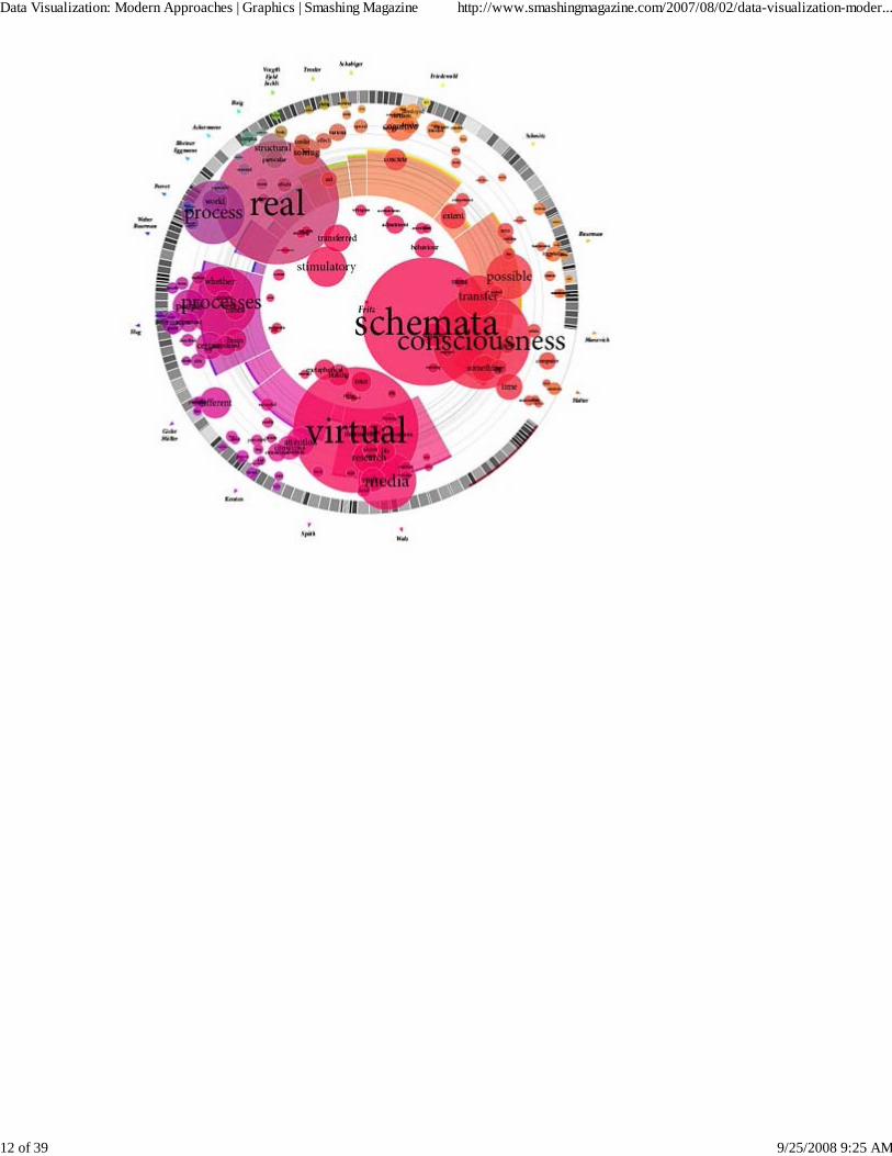
4. Displaying connectionsMunterbund showcases the results of research graphical visualization of text similarities in essays in a book. “Thechallenge is to find forms of graphical and/or typographical representation of the essays that are both appealing andinformative. We have attempted create a system which automatically generates graphics according to predefined rules.”
Data Visualization: Modern Approaches | Graphics | Smashing Magazine http://www.smashingmagazine.com/2007/08/02/data-visualization-moder...
11 of 39 9/25/2008 9:25 AM
Data Visualization: Modern Approaches | Graphics | Smashing Magazine http://www.smashingmagazine.com/2007/08/02/data-visualization-moder...
12 of 39 9/25/2008 9:25 AM

Data Visualization: Modern Approaches | Graphics | Smashing Magazine http://www.smashingmagazine.com/2007/08/02/data-visualization-moder...
13 of 39 9/25/2008 9:25 AM

Burst Labs suggests similar or connected items to your search queries (favourite artists, tv shows, movies, genres etc.)in a bubble. Not really new, but still inspiring.
Data Visualization: Modern Approaches | Graphics | Smashing Magazine http://www.smashingmagazine.com/2007/08/02/data-visualization-moder...
14 of 39 9/25/2008 9:25 AM

Universe DayLife displays events, connections and news as circles which gravitate around the topic they are related to.
Musiclens gives music recommendations and presents your current mood and musical taste as a diagram.
Data Visualization: Modern Approaches | Graphics | Smashing Magazine http://www.smashingmagazine.com/2007/08/02/data-visualization-moder...
15 of 39 9/25/2008 9:25 AM

Figd’t Visualizer allows you to play around with your network. You interface with the Visualizer through Flickr andLastFM tags, using any tag to create a Magnet. Once a Tag Magnet is created, members of the network will gravitatetowards it if they have photos or music with that same Tag. Available for Mac OS X, Windows and Linux. Alpha-version.
What have I been listening to?: Lee Byron describes his approach of creating a histogram about his music listeninghistory.
Data Visualization: Modern Approaches | Graphics | Smashing Magazine http://www.smashingmagazine.com/2007/08/02/data-visualization-moder...
16 of 39 9/25/2008 9:25 AM

Shape Of Song: What does music look like? The Shape of Song is an attempt to answer this seemingly paradoxicalquestion. The custom software in this work draws musical patterns in the form of translucent arches, allowing viewers tosee - literally - the shape of any composition available on the Web.
Musicmap: connections are represented as connected lines; they create a web.
Data Visualization: Modern Approaches | Graphics | Smashing Magazine http://www.smashingmagazine.com/2007/08/02/data-visualization-moder...
17 of 39 9/25/2008 9:25 AM

Musicovery displays music taste connections and lets you listen to the song and browse through similar songs.
Lanuage Poster proves that even simple lines can be descriptive enough. The History of Programming Languages as anoriginal timeline.
Data Visualization: Modern Approaches | Graphics | Smashing Magazine http://www.smashingmagazine.com/2007/08/02/data-visualization-moder...
18 of 39 9/25/2008 9:25 AM

5. Displaying web-sitesSpacetime offers Google, Yahoo, Flickr, eBay and images in 3D. The tool displays all of your search results in an easyto view elegant 3D arrangement. Company promises that the days of mining through pages and pages of tiny thumbnailsin an effort to find the item you are looking for are over.
UBrowser is an open source test mule that renders interactive web pages onto geometry using OpenGL® and anembedded instance of Gecko, the Mozilla rendering engine.
Data Visualization: Modern Approaches | Graphics | Smashing Magazine http://www.smashingmagazine.com/2007/08/02/data-visualization-moder...
19 of 39 9/25/2008 9:25 AM

6. Articles & ResourcesVisualcomplexity.com
The project presents the most beautiful methods of data visualization as well as further references and booksuggestions. The gallery has over 450 entries.
In his article Infosthetics: the beauty of data visualization Andrew Vande Moere, well-known through his blogInfosthetics, discusses the aesthetics of data visualization and modern apparoaches in this area. Creativedesign ideas combine form and content and generate fascinating graphs - is it a new area in the art of next
Data Visualization: Modern Approaches | Graphics | Smashing Magazine http://www.smashingmagazine.com/2007/08/02/data-visualization-moder...
20 of 39 9/25/2008 9:25 AM

generation?
Data Visualization: Modern Approaches | Graphics | Smashing Magazine http://www.smashingmagazine.com/2007/08/02/data-visualization-moder...
21 of 39 9/25/2008 9:25 AM

The article presents 13 newtechniques of data visualization, with examples and further references.
16 Awesome Data Visualization Tools“From navigating the Web in entirely new ways to seeing where in the world twitters are coming from, datavisualization tools are changing the way we view content. We found the following 16 apps both visuallystunning and delightfully useful.” An extensive overview by Mashable.com.
DataestheticsEric Blue provides some references to unusual Data Visualization methods.
infosthetics - information aesthetics
Andrew Vande Moere about data visualization, latest development and design ideas.
Visualizing Delicious RoundupAn overview of Del.icio.us tools you can use to visualize your bookmarks.
Periodic TableA periodic table of visualization methods.
Data Visualization: Modern Approaches | Graphics | Smashing Magazine http://www.smashingmagazine.com/2007/08/02/data-visualization-moder...
22 of 39 9/25/2008 9:25 AM

7. Tools and ServicesYou can create your own timelines with Xtimeline and Circavie.
IBM Many Eyes
This Java-based service visualizes data online and helps to create pie charts, diagrams, tree maps, bar chartsand histograms. Registration is required. Some examples are simply amazing.
prefuse | the prefuse visualization toolkitPresents the beta-version of a Java-based toolkit for programming of application with integrated datavisualization methods
SwivelThis service creates pie charts, diagrams and histograms “on the fly”. It also provides a Swivel API you canuse to improve already existing visualization methods.
You can find even more tools for designing your own diagrams and charts online in our article Charts andDiagrams Tools.
Published in Graphics, August 2nd, 2007
Tags: charts, data, diagrams, map, statistics, tools, visualization
Advertisement
Data Visualization: Modern Approaches | Graphics | Smashing Magazine http://www.smashingmagazine.com/2007/08/02/data-visualization-moder...
23 of 39 9/25/2008 9:25 AM

Comments
Trackbacks/Pings
Starfeeder (August 2nd, 2007, 6:29 am)
Awesome! Whoa, didn’t think math could be so pretty :o
Wonder if any of these are open source and easily applied to other projects….
1.
Michael Blix (August 2nd, 2007, 6:56 am)
Very cool indeed. I’d love to replicate some of them. ‘Experimental’ might be a better word than ‘modern,’ untilthey catch on and show their utility above a more standard (’traditional’) approach.
I don’t know if any are open source but some of the visuals are made with the help of Link [processing.org],which you should check out if you’re interested in doing something similar without a ton of programming.
2.
Jenn Vargas (August 2nd, 2007, 8:07 am)
Wow! That’s a great list! I’d never seen a lot of those before! Thanks for putting it together - can’t wait to lookinto them some more!
3.
Adam (August 2nd, 2007, 8:33 am)
Nice list guys! Great work!This is a pretty cool project to I found a couple weeks back, Link [www.humanbraincloud.com], not quite asextensive as some of the above examples, but cool none the less.
4.
criticalerror (August 2nd, 2007, 9:51 am)
one more time a nice list…
Keep going!
5.
Matty (August 2nd, 2007, 10:00 am)
Holy crap! That flickr clock is wicked and the Ubrowser is tripped out. Nice find on these.
6.
Tim (August 2nd, 2007, 10:03 am)
Until this article I was really unaware of how big “data visualization” was…to be honest…I’d never really heard
7.
Data Visualization: Modern Approaches | Graphics | Smashing Magazine http://www.smashingmagazine.com/2007/08/02/data-visualization-moder...
24 of 39 9/25/2008 9:25 AM

the term. Great work!!
Olga (August 2nd, 2007, 10:55 am)
Amazing! Where to learn some methods of data visualisation?
8.
Angga (August 2nd, 2007, 11:28 am)
i think you have put a wrong screenshot for musiclens ?
9.
mimiqiao (August 2nd, 2007, 11:33 am)
Great!
10.
Maruder (August 2nd, 2007, 2:14 pm)
Another great piece on Smashing :)
11.
Eric Blue (August 2nd, 2007, 2:48 pm)
This is a pretty good list! I wasn’t aware of many of these sites. I also posted a collection of unique data/infovizlinks last year:
Link [eric-blue.com]
12.
Balakumar Muthu (August 2nd, 2007, 3:17 pm)
great!
13.
Darren (August 2nd, 2007, 3:17 pm)
Brilliant list. I had no idea there were such ideas floating around. This isn’t just a smart way of displaying databut I think it is rather inspirational for other mediums.
14.
maniac (August 2nd, 2007, 3:56 pm)
back in 90x - Link [textarc.org]Java applet representing most usable words in book by it’s size. Before tag clouds were invented (discovered).Check it out.
15.
Data Visualization: Modern Approaches | Graphics | Smashing Magazine http://www.smashingmagazine.com/2007/08/02/data-visualization-moder...
25 of 39 9/25/2008 9:25 AM

Dee (August 2nd, 2007, 4:45 pm)
i never knew data visualisation was such a big thing. We are manipulating so much of data daily [more the data,more happy we are :) ] and i never thought about its options…..
wonderful resource. so much to learn and understand. you have been doing a very nice job. its blocked here[theysay you are a 'download' site :P ], sometimes i have to use a proxy site. but its worth.
thanx a lot :)
16.
Vitaly Friedman & Sven Lennartz (August 2nd, 2007, 5:30 pm)
2Angga: thank you, fixed!
17.
Kay (August 2nd, 2007, 5:56 pm)
Absolutely great!
18.
Alberto Tellez (August 2nd, 2007, 6:07 pm)
A really nice list of graphic data models and interactivity.Congrats!
19.
Fraisouille (August 2nd, 2007, 6:40 pm)
It exists a french search engine which corresponds to your article subject:Link [kartoo.com]
KartOO is a metasearch engine with visual display interfaces. When you click on OK, KartOOlaunches the query to a set of search engines, gathers the results, compiles them and representsthem in a series of interactive maps through a proprietary algorithm
20.
Anthony (August 2nd, 2007, 6:58 pm)
Very good article, thanks all
21.
Pedr (August 2nd, 2007, 7:43 pm)
Superb. Your best list yet.
22.
Data Visualization: Modern Approaches | Graphics | Smashing Magazine http://www.smashingmagazine.com/2007/08/02/data-visualization-moder...
26 of 39 9/25/2008 9:25 AM
1 (August 2nd, 2007, 8:15 pm)
Uuuuu, great article..
23.
yaili (August 2nd, 2007, 8:44 pm)
Whenever SmashingMagazine so much as coughs it makes it to the Digg homepage, Deliciouspopular and generates hoards of comments and linkbacks.
Very nice!
24.
Ken Burgin (August 2nd, 2007, 9:20 pm)
Stunning collection - thanks for all the work you put into it…
25.
Scott (August 2nd, 2007, 9:23 pm)
You guys just don’t stop! Nice research, you guys dig like them google folks.
26.
Binny V A (August 2nd, 2007, 9:41 pm)
There was a visualization of the history of Linux distros…Link [www.cyberciti.biz]
And also about the Linux kernel…Link [funhouse.bubble.ro]
27.
Dora Wolf (August 2nd, 2007, 9:55 pm)
I loved this stuff, I think if will be a tremendous resource for K-12 teachers especially for learning disabledstudents, please try to present this material in teachers conventions and teachers publications.
28.
Dak (August 2nd, 2007, 10:09 pm)
Wow! All sorts of ways to render data impossible to read! Fantastic!“As you can see by this picture, Chicago’s got a bigger circle than Boston. How much bigger? I’m not reallysure. Pretty big. That means Chicago’s like 50 billion times betterer than Boston when it comes to widgets in thescuzzypond. Are widgets good or bad? I don’t know, but they’re represented in funny circles with hard-to-readoverlapping text, so it MUST mean something important!”
29.
Data Visualization: Modern Approaches | Graphics | Smashing Magazine http://www.smashingmagazine.com/2007/08/02/data-visualization-moder...
27 of 39 9/25/2008 9:25 AM

The only thing these graphs show is what data looks like when it is completely disorganized. Quit acting like thisis a revolution in data representation.
Lars (August 2nd, 2007, 10:19 pm)
Wonderful post, I love inventions in the field of data visualization. I think I will have to write a post referring toyour post — it’s a great read!
30.
John Pucci (August 2nd, 2007, 11:40 pm)
Excellent article!! I worked on a Hurricane Katrina data-visualization project last year for my agency in NewOrleans. It’s an oral history with compelling, raw video that offers an unedited look at people’s memories of thestorm and the fallout. As each video plays, a simple visual device displays recurring themes by keyword;commonalitites between experiences are presented via lists of names headed by recurring topics. Thought yourreaders might be interested.
31.
John Pucci (August 2nd, 2007, 11:42 pm)
If any are interested in the Hurricane Katrina data-visualization project, here is the url:
Link [livesconnected.com]
32.
Edward (August 3rd, 2007, 12:01 am)
Smashing is the best!
33.
Anon (August 3rd, 2007, 1:39 am)
Thank you, these are grrreat!
34.
Anselm (August 3rd, 2007, 1:41 am)
Good list.Those interested in search visualization could find Link [www.searchcrystal.com] of interest, since it lets yousearch and visually compare multiple engines in one place. You compare, remix and share results from web,image, video, blog, tagging, news engines as well as Flickr images or RSS feeds.
35.
Terinea Weblog (August 3rd, 2007, 2:02 am)
That is a fantastic list, very impressive.
36.
Data Visualization: Modern Approaches | Graphics | Smashing Magazine http://www.smashingmagazine.com/2007/08/02/data-visualization-moder...
28 of 39 9/25/2008 9:25 AM

Darren Hoyt (August 3rd, 2007, 2:41 am)
Kunal Anand also wrote a cool Python script for “Link [www.whatspop.com]“
37.
Mike Robinson (August 3rd, 2007, 2:56 am)
Despite the fact that my head exploded looking at some of these, thanks for the list :D
38.
Igor (August 3rd, 2007, 4:17 am)
Thank you, these are great visualization&(great view point). We”l live and see.
39.
Jorge Camoes (August 3rd, 2007, 5:20 am)
Traditional graphics are dead, because they can’t handle the vast amounts of data we have today and they mustbe replace by a new set of tools.
There are some interesting examples here, but a large majority is more a form of art than useful tools,visualization -wise. We need data density, context, interaction and data integrity. Do they provide that? I am notsure.
40.
Andrey Kostenko (August 3rd, 2007, 6:18 am)
One more cool site for link visualization is a Link [walk2web.com]. It makes cool graphs of incoming andoutgoing links. Every link has screenshots, tags, rating…
41.
Bryan (August 3rd, 2007, 12:59 pm)
fascinating collection. thanks for taking the time to pull it together.
42.
Dennison Uy - Graphic Designer (August 3rd, 2007, 2:15 pm)
This is the first time I’ve been to some of these sites. A lot of them like Newsmap totally blew my mind!
43.
Chris (August 3rd, 2007, 4:44 pm)
I thought by the title that this one would be a bit boring..How wrong I was! Facinating and sometimes beautifulstuff. Cheers
44.
Designer Man (August 3rd, 2007, 5:45 pm)
45.
Data Visualization: Modern Approaches | Graphics | Smashing Magazine http://www.smashingmagazine.com/2007/08/02/data-visualization-moder...
29 of 39 9/25/2008 9:25 AM

Perhaps you most ineresting and compelling post yet.
Felix (August 3rd, 2007, 6:43 pm)
Beautiful stuff! Thanks for your interesting article. I also did datavisualisation as part of my degree in graphicdesign. Take a look at Link [felixheinen.de].
46.
Alexey (August 3rd, 2007, 7:07 pm)
Link [www.formwerkz.com]
47.
Randolph (August 3rd, 2007, 8:00 pm)
I love the Trendmap 2007! Cool! Keep up the good post!
48.
shaz (August 3rd, 2007, 9:49 pm)
great list!
I always thought that Etsy had some cool tools to explore their site Link [www.etsy.com] and Link[www.etsy.com]
49.
°flo (August 4th, 2007, 12:30 am)
wow. absolutely impressing!!!
50.
Engelbert (August 4th, 2007, 4:08 am)
Again a great collection of wonderful “Must see’s” out on the internet. I didn’t know that data can be suchfaszinating. Thank you for your great work, folks - I’m new to this blog but I must say: I really like it :-)
All the best from Salzburg, AustriaEngelbert | Link [www.webdesignetc.de]
51.
Marcus | Culturemaking (August 4th, 2007, 7:21 am)
Love it. Nice one
52.
arne (August 4th, 2007, 9:09 pm)
Too many advertisement on this site. Won’t read it again. Sorry.
53.
Data Visualization: Modern Approaches | Graphics | Smashing Magazine http://www.smashingmagazine.com/2007/08/02/data-visualization-moder...
30 of 39 9/25/2008 9:25 AM

Thomas Crown (August 5th, 2007, 1:38 am)
Wow, I wonder how long did it take to pull that list. Thanks for the resources.
54.
keith (August 5th, 2007, 2:22 am)
interesting as always, but show some fucking restraint.
the outrageous magnitude of content in one article renders the entire thing useless. give us highlights of what youthink is the best, not a list of everything under the sun.
55.
Moriz Gupte (August 5th, 2007, 2:46 am)
Check out a few ‘old visualizations’ dating 1997 (1rst year post grad year …fooling around experimenting withstuff)
Link [irhbt.typepad.com]
some viz look digg big spy
Link [www.youtube.com]
implemented in good old javascript
56.
Saket (August 5th, 2007, 3:15 am)
Outstanding list!
57.
Bannaga (August 5th, 2007, 3:42 am)
Excellent list, The musicovery link is awesome!
58.
stannate (August 5th, 2007, 7:36 am)
Another good site for data visualization is Link [www.radicalcartography.net], which is not so much radical asinformative. Example: mapping income to population of the largest 25 metro areas shows that some cities have“income donuts” of wealthier suburbs surrounding a poorer city core, while others have wedges that radiate outfrom one area:
Link [www.radicalcartography.net]
59.
yana (August 5th, 2007, 12:14 pm)
60.
Data Visualization: Modern Approaches | Graphics | Smashing Magazine http://www.smashingmagazine.com/2007/08/02/data-visualization-moder...
31 of 39 9/25/2008 9:25 AM

thanks a lot! this list is a dream of PR-manager doing a couple of presentations a week)))
pranab (August 5th, 2007, 1:50 pm)
Wow that was brilliant,a good piece of collection.
61.
Stephen (August 5th, 2007, 9:15 pm)
Wow, this is an amazing resource. I have recently become interested in this field, and I am very excited about thedirections that it is going.
62.
Marek (August 6th, 2007, 1:40 am)
rssvoyage is beatiful!
63.
Cristian Ionitoiu (August 6th, 2007, 9:33 pm)
Hi,
I’ve been passioned by data visualization for quite some time. Thanks for putting together this data, it’s quiteuseful to me. I think that you should add the Idea Line of Martin Wattenberg: Link [www.whitney.org]to the list.
This is a very beatiful and concise method to display chronological information.Best Regards,
Cristian
64.
Juan Manuel Lemus (August 7th, 2007, 5:08 am)
Good, this is fantastic for design inspiration and turn-off for convensional design.
65.
awesome (August 7th, 2007, 8:19 am)
Wow!!thanks for this list !!simply fab!
66.
Mathieu (August 7th, 2007, 10:44 pm)
Bravo !!!!
67.
Data Visualization: Modern Approaches | Graphics | Smashing Magazine http://www.smashingmagazine.com/2007/08/02/data-visualization-moder...
32 of 39 9/25/2008 9:25 AM

Charly (August 8th, 2007, 5:53 am)
Pingback : Link [adnxtc.wordpress.com] “Visualisation de données : quelles sont les différentes approchespossible ?”
68.
Erik (August 9th, 2007, 3:41 am)
One I liked very much was this one: mapping all sorts of data to a world map, sizing countries to show the valuesfor each country: Link [www.sasi.group.shef.ac.uk]
69.
Justin (August 9th, 2007, 5:33 pm)
Excellent list - thank you
70.
Robert Christensen (August 9th, 2007, 11:46 pm)
This is an excellent site for visual information. What I don’t see is something like FYI Visual or Fractal Edge.These would make for nice additions.
Along these lines, I have been noting a lone ranger with an axe to grind out in the blogs, who appears to considerhimself keeper of the visual display…
What I mean is FYI Corporation has developed some interesting technology for displays of massive amounts ofinformation. While it’s not an all encompassing visual technology (meaning it requires additional visual supportfor some kinds of information, particularly where proportion is important), it enables anomalies to becomereadily apparent from dense displays.
Seems there is a lone ranger out there with an axe to grind against this company and its product, and has singlehandedly launched a tirade and personal attacks against even its employees. It is unclear why he has such apersonal vendetta against FYI Corporation, but it’s clear that he does.
I contacted FYI Corporation employees and they told me that when challenged, the lone ranger was unable toshow example data they provided in dense form on a display, and instead retreated to the common convention oflow density dashboard configurations. For instance, they said that when asked to show hundreds ofmultidimensional values on a single screen with his approach (as can be done with FYI Visual) he was unable todo it. An FYI Visual representative said that they invited him to participate in a study to compare his approach toshowing 850 generators consisting of 6 metrics to their way he refused to participate. I think I see why…
He relies completely on anecdotes and references to other people’s work because he appears to be ill-equippedto address the problem. He appears to hold himself out to be an expert, but his education is in Religious Studies,which makes sense given his Crusade against FYI Visual.
We have been using FYI Visual for two years and the problem it solves is unparalleled by any other technologieswe have examined for high display density of time-sensitive information -the kind that does not fit onto adashboard or shown with hundreds of lines on a graph.
71.
Data Visualization: Modern Approaches | Graphics | Smashing Magazine http://www.smashingmagazine.com/2007/08/02/data-visualization-moder...
33 of 39 9/25/2008 9:25 AM

When ever I read such personal attacks as that of this lone ranger, I consider the source, and in this case, thesource seems quite dubious.
I enjoy sites like this one that provides examples and let’s consumers pick what works for them.
Manish Vashist (August 10th, 2007, 1:26 pm)
very useful resource.. I am wondering if there are similar input mechnasims as well!
72.
Tobi (August 12th, 2007, 11:54 pm)
Wow, a great collection of stunning visualizations! One of the best blog entries I have ever read!
73.
Reinhold (August 13th, 2007, 7:26 am)
inspired by Digg BigSpy -> Link [www.ainews.org]
74.
Kevin (August 14th, 2007, 2:25 am)
If you digg this, you will also love Link [infosthetics.com]
75.
Kahn (August 16th, 2007, 12:07 am)
In reply to FYI Visual and Robert Christensen:
Yeah, I ran into that flaming rhetoric too (what’s up with that guy? -does anybody take him seriously? What arant without a cause) –what caught me was that the “lone ranger” as you call him wrote in his paper thatdashboards have two important characteristics to situational awareness: 1 Their visual nature, and 2 theirintegration into everything you must keep track of onto a single screen. I looked at the examples he gives and wecannot fit our metrics on a single screen using his suggestions either. His suggestions are obvious to 3rd graders.I will check out your suggestions about FYI Visual and Fractal Edge to see if those help us. The lesson here isthat it’s easy to be a critic, not so easy to produce a solution. There are really great examples on this website toothat we are going to try also. Thanks for the tip!
76.
Lisa (August 16th, 2007, 3:24 am)
I like shape of song (aesthetically) but cannot figure out what that is supposed to represent?
77.
Liam (August 22nd, 2007, 6:04 am)
That’s a fantastic list - thanks.
78.
Data Visualization: Modern Approaches | Graphics | Smashing Magazine http://www.smashingmagazine.com/2007/08/02/data-visualization-moder...
34 of 39 9/25/2008 9:25 AM

infodirect (August 28th, 2007, 8:05 pm)
Looking good but not all of them seem to be convenient.
79.
Matt (August 29th, 2007, 4:58 pm)
Excellent thanks for the list. THe resource section is very valuable as well :)keep up the good work!
80.
Marc Duchesne (August 29th, 2007, 5:26 pm)
Absolutely fantastic. Mind opening. Thanks._Marc
81.
Trojan Warrior (August 29th, 2007, 5:55 pm)
Totally amazing! Thanks for your effort
82.
tom mayo (August 29th, 2007, 8:55 pm)
Interesting list. After spending the last few months studying Edward Tufte’s “The visual display of quantitativeinformation” and related works - I wonder what he would have to say about some of these?
Everybody’s mind works differently, and I suspect that men & women would find different aspects of thesegraphs intriguing,
I must be getting old. I found the websites and bubble-ups/mash-ups too hard to follow.
tom mayogrand rapids, mi
83.
Kapsio (August 30th, 2007, 3:08 am)
See this article on cartograms (another interesting visualization technique) and a related challenge.Link [www.ribbonfarm.com]
84.
NW Guy (August 30th, 2007, 3:31 am)
Go beyond the math and look at the science of visualization. Here is a periodic table of visualization techniques,categorized into different areas of specialization.
Link [www.visual-literacy.org]
85.
Data Visualization: Modern Approaches | Graphics | Smashing Magazine http://www.smashingmagazine.com/2007/08/02/data-visualization-moder...
35 of 39 9/25/2008 9:25 AM

It’s a great reference guide when trying to come up with the right diagram for a doc or presentation!
Patricia (August 30th, 2007, 3:49 am)
It’s really an interesting list! Thanks for your hard work on it.
86.
Shauna Axton (August 30th, 2007, 7:30 am)
Great list. Another interesting visualization tool was created by innovation consulting firm Doblin (nope, don’twork for them) - Link [www.doblin.com]
From the menu, click on Innovation Landscape.
87.
Tom Paper (August 30th, 2007, 11:50 am)
This is a terrific list. Thank you. For finding data and traditional graphs of data, as well as a tool for displayinggraphs of data in slideshow format, we have built Data360.
Link [www.data360.org]
Best regards, Tom Paper
88.
Andrei Zuyeu (September 27th, 2007, 8:44 pm)
I can not believe it ! Even after I’ve look at it ! It’s so amazing ! Wonderful work !
89.
Rhonda (October 27th, 2007, 3:56 pm)
There’s a lot happening in the geosciences too - for example, 3D visualization of raw geological data to show thelocation of faults, seams of ore, mine shafts and vents etc. such as that produced by the FracSIS software fromLink [www.fractaltechnologies.com].
90.
Rhonda (October 27th, 2007, 4:20 pm)
Re: Comment #91: In the interests of full disclosure, I work as a contract technical writer for The Runge Group,the owners of Fractal Technologies and the FracSIS software product.
91.
toxi (November 7th, 2007, 2:37 am)
Two more related projects (by myself):
Link [toxi.co.uk] an interactive 4D visualization of all english four-letter words.
92.
Data Visualization: Modern Approaches | Graphics | Smashing Magazine http://www.smashingmagazine.com/2007/08/02/data-visualization-moder...
36 of 39 9/25/2008 9:25 AM

Link [2006.lateral.net] agency website based on a custom, dynamically resizing treemap layout algorithm.
DarkGrave (December 29th, 2007, 4:32 am)
Heres a Name Wall that I made. Sadly it only works in FF:Link [tnw.animenetworx.net]
93.
Tessa (January 21st, 2008, 4:17 pm)
I agree with Blix. It should be noted that Data Visualization in itself is a Modern invention. But a great collectionof examples none the less.
94.
David (January 25th, 2008, 2:18 pm)
With these techniques, and by combining certain ones of them, we edge closer to bringing to life the Glass BeadGame of Hermann Hesse…
95.
wang (February 19th, 2008, 8:21 am)
excellent posts! I have translate it into Chinese. I post it to Link [www.wangyutang.com].Thank you very much.
96.
D. Baishya (March 13th, 2008, 2:05 am)
(eye)nspiring.
97.
Dima (April 1st, 2008, 10:00 am)
These are great visualization examples! Check out also the following approach to visualization of a 1-weekweather forecast for any location in the United States at Link [www.novospark.com]
98.
seejayjames (April 6th, 2008, 3:39 pm)
Great article. I’m also very interested in these ideas, as they really bring together social science, math, softwareand programming, and art. Interacting with data means a lot more than passively seeing it (like a standard chart)— you start to bring your own ideas and interests into what’s being collected and displayed. With so muchinformation available, having holistic and dynamic ways of showing *your* interests is becoming more and moreinteresting :: Learning 2.0.
If anyone is interested in creating things like this, or if you like to work with sound, video, 3D, or MIDI, doyourself a favor and check out the program Max / MSP / Jitter. Originally designed around music and MIDI, withrecent additions for manipulating video and images, this graphical programming environment deals with all datavery simply and in an abstract fashion. That means one can route, mix, display, and save your data in any form
99.
Data Visualization: Modern Approaches | Graphics | Smashing Magazine http://www.smashingmagazine.com/2007/08/02/data-visualization-moder...
37 of 39 9/25/2008 9:25 AM

you want, leading to all kinds of new understandings.
I used to work with code-based languages but have gladly made this switch — it is a graphical, interface-basedenvironment, with the “programming” created in a flow-chart design for your data and logic “streams”. Since youhave control over the media, the logic, and the interface objects, you quite literally can build just about any kindof application without knowing a line of traditional code. Particularly good at real-time interaction, tinkering ofany parameter you want, and being able to record or generate activity, Max is a must-try for anyone with anyinterest in these wide areas of art, music, data, and math. If that isn’t enough, it also provides integrated supportfor Java, Javascript, and C, so that those things better done by text-based code can be used too — right in themidst of your interface.
The much-anticipated release of Max 5 — called by the company as “Max for the next 20 Years” — is slated forApril 2008!
Link [www.cycling74.com]
Paul (May 20th, 2008, 6:55 am)
this is interesting:
Link [www.visual-io.com]
100.
Geoff (June 18th, 2008, 3:07 am)
Very interesting !!However, even here, I have not yet found what I saw 3-4 years ago - and have been actively hunting for - withoutsuccess.It was (sort-of) similar to the “Musicmap” above, but was displayed on a globe (sphere), and you could click anode and drag it around and explore the ‘mind map”.It was visually quite impressive, definitely rather innovative… I’m looking for something like this to presentsome node linked data from a knowledge structure/database I’ve created.Any comments, hints appreciated.
101.
g (July 2nd, 2008, 2:05 pm)
Anyone know of any data visualization tools that will generate printable (press quality) results?
102.
Tobi (August 30th, 2008, 8:25 am)
I love this article! Especial the graphs which shows connection between things are fascinating. Regarding to thisentry I have created a graph with moowheels and have written about this in my blog (Link [blog.aditu.de]).
Thanks again for this great and inspiring article!Tobi
103.
Data Visualization: Modern Approaches | Graphics | Smashing Magazine http://www.smashingmagazine.com/2007/08/02/data-visualization-moder...
38 of 39 9/25/2008 9:25 AM
ava (September 5th, 2008, 5:15 am)
Hey have you heard the hottest reggae singer Ava Leigh’s new single called mad about the boy? .It’s available onI Tunes and at HMV.
104.
gavin (September 20th, 2008, 11:58 pm)
Thanks for putting together this comprehensive collection of links
105.
by Vitaly Friedman, Sven Lennartz, Smashingmagazine.com, http://www.smashingmagazine.com, 2006-2007
Data Visualization: Modern Approaches | Graphics | Smashing Magazine http://www.smashingmagazine.com/2007/08/02/data-visualization-moder...
39 of 39 9/25/2008 9:25 AM