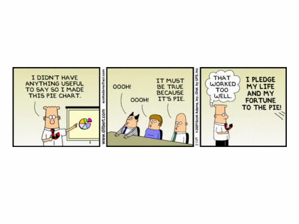
Data Visualization. Lies, Damn Lies, and Bad Graphs.
82
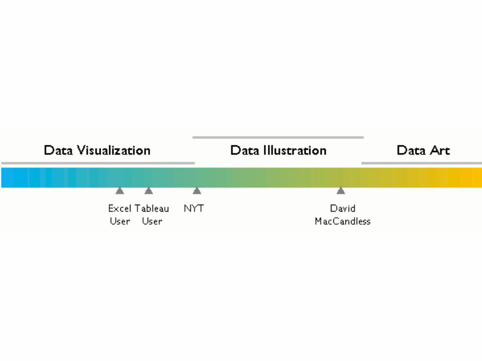
Data Visualization
-
Upload
shanna-rogers -
Category
Documents
-
view
242 -
download
0
Transcript of Data Visualization. Lies, Damn Lies, and Bad Graphs.
Data Visualization
Lies, Damn Lies, and Bad Graphs
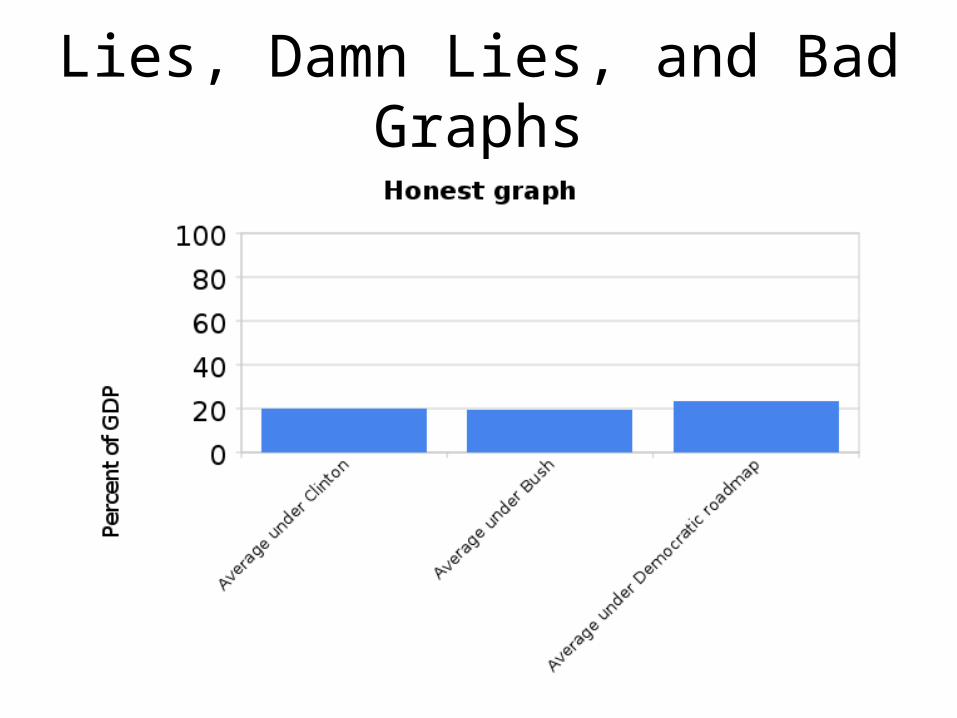
Lies, Damn Lies, and Bad Graphs
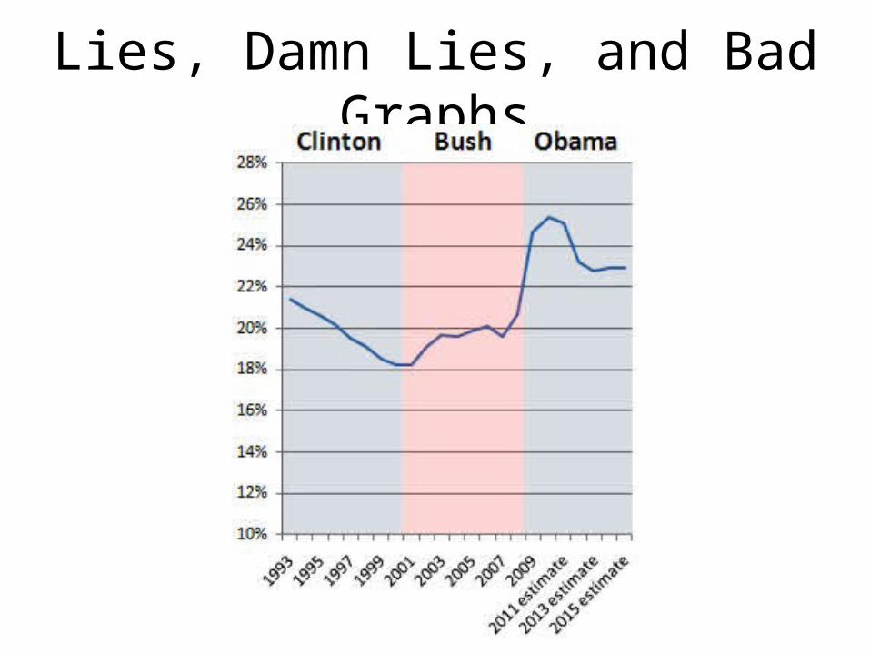
Lies, Damn Lies, and Bad Graphs
Visual Medium
• Reports– Paper (static, with time)– Web (dynamic and interactive)
• Presentations (static and dynamic)
“It’s not just about producing graphics for publication,” Aldhous explains. “It’s about playing around and making a bunch of graphics that help you explore your data. This kind of graphical analysis is a really useful way to help you understand what you’re dealing with, because if you can’t see it, you can’t really understand it. But when you start graphing it out, you can really see what you’ve got.”
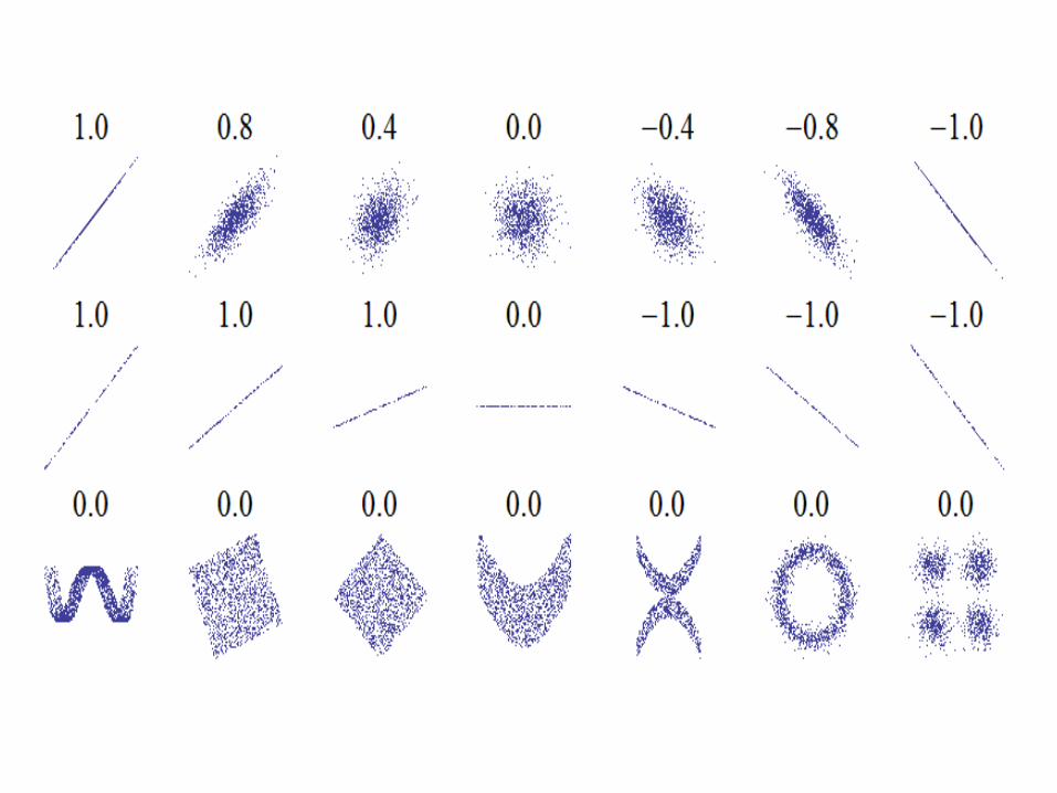
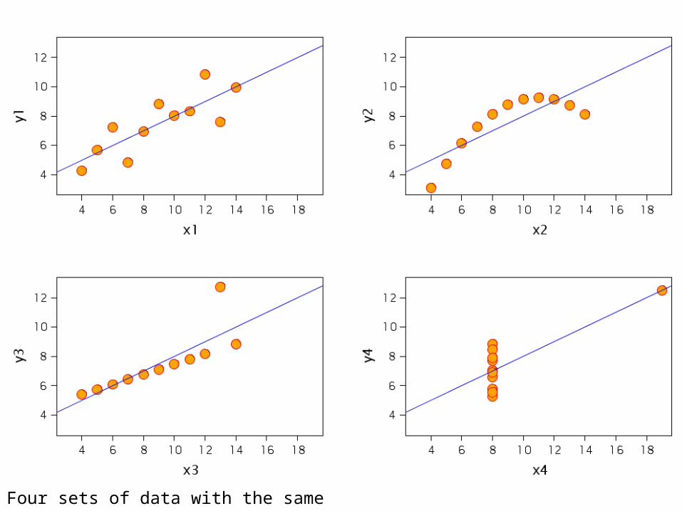
Four sets of data with the same correlation of 0.816
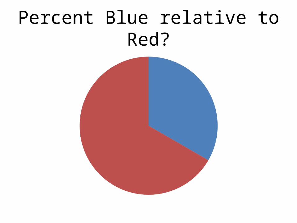
Percent Blue relative to Red?
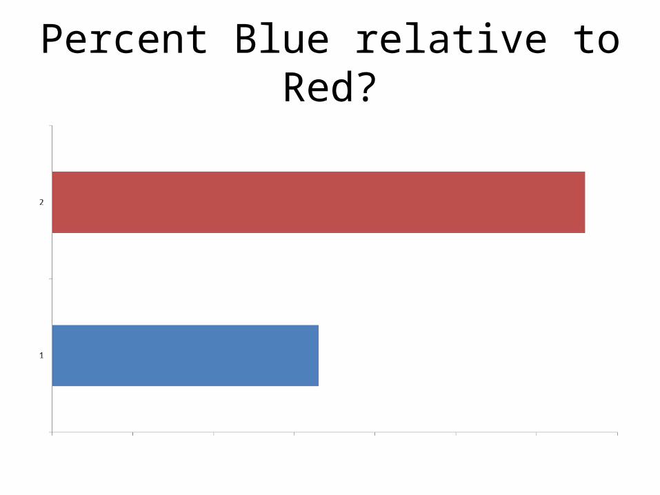
Percent Blue relative to Red?
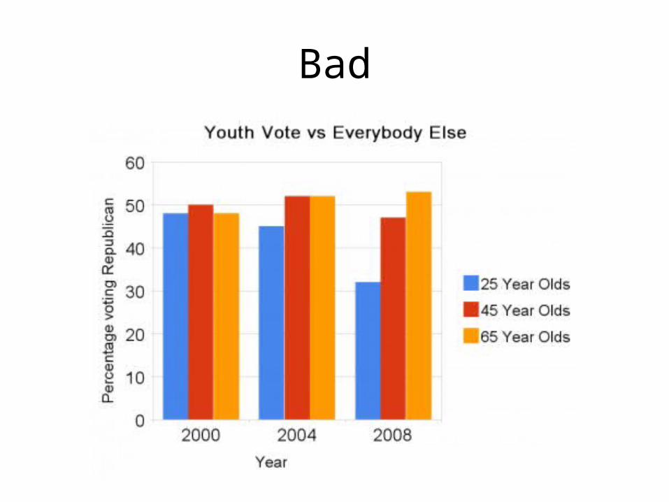
Bad
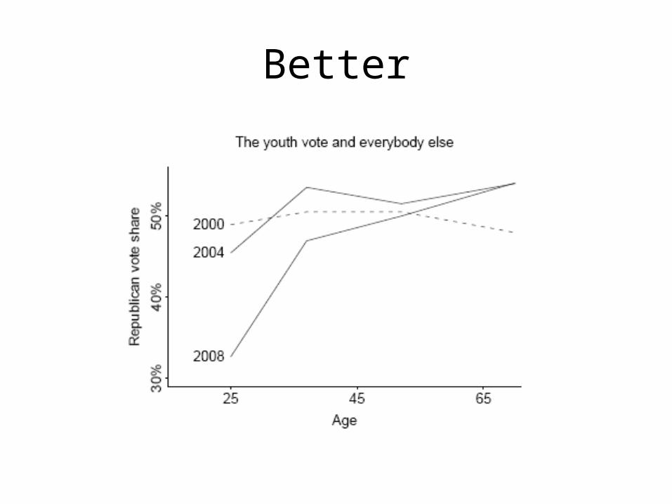
Better

Even Better*
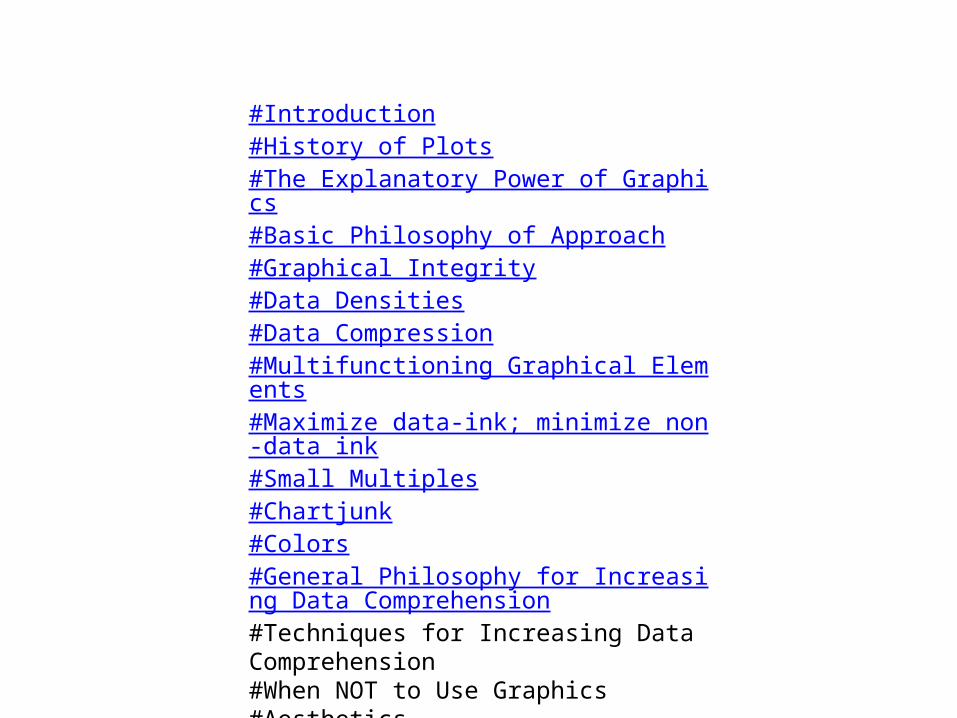
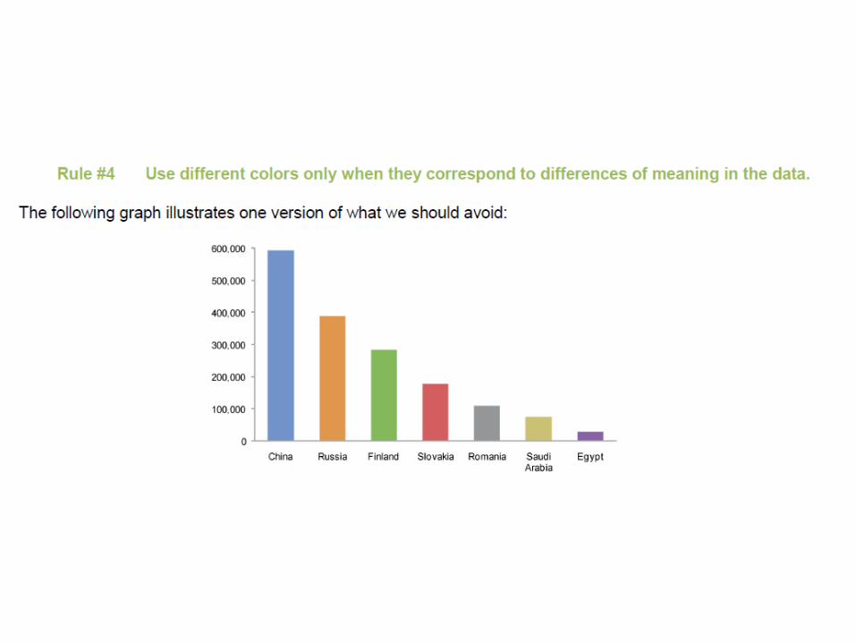
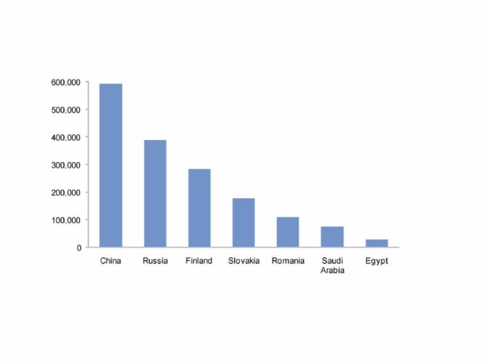
#Introduction#History of Plots #The Explanatory Power of Graphics#Basic Philosophy of Approach#Graphical Integrity#Data Densities#Data Compression#Multifunctioning Graphical Elements#Maximize data-ink; minimize non-data ink#Small Multiples#Chartjunk#Colors#General Philosophy for Increasing Data Comprehension#Techniques for Increasing Data Comprehension#When NOT to Use Graphics#Aesthetics
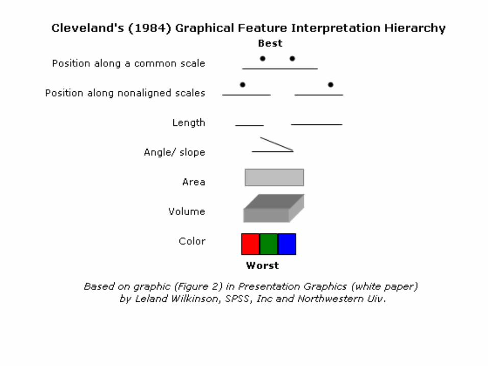
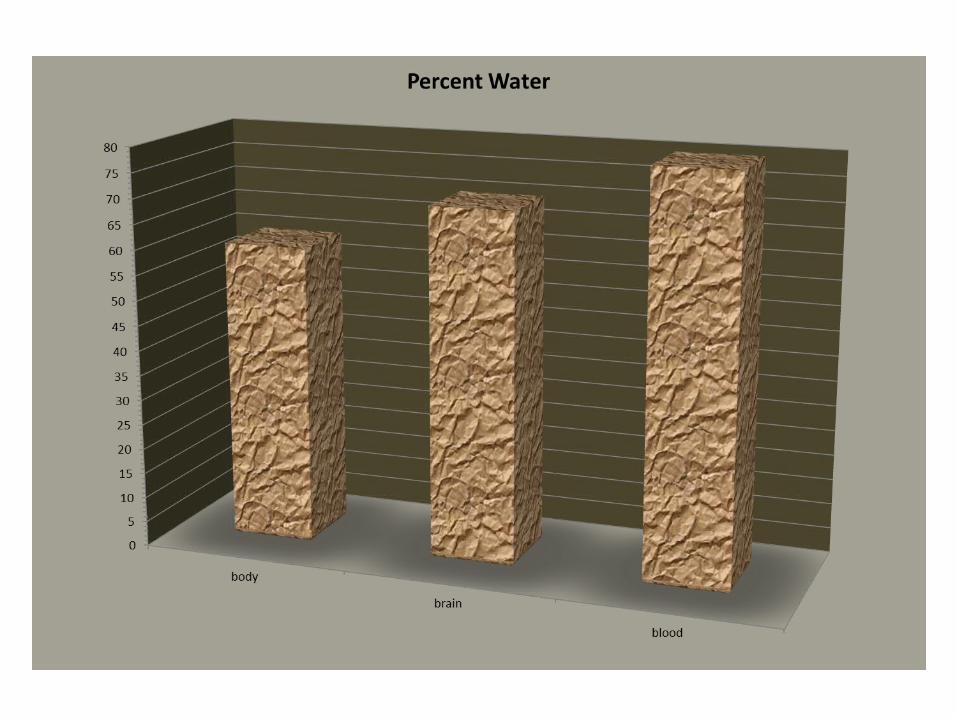
Chartjunk and Graphics Integrity
Types of chartjunk
• Chartjunk are non-data-ink or redundant data-ink decoration
• Unintended Optical Art (Moiré vibration)• The Grid • The Duck: Self-promoting Graphics

Unintended Optical Art
• Mainly rely on moiré effects– Distracting appearance of vibration and
movement – The most common form of graphical clutter

Moiré Vibrations
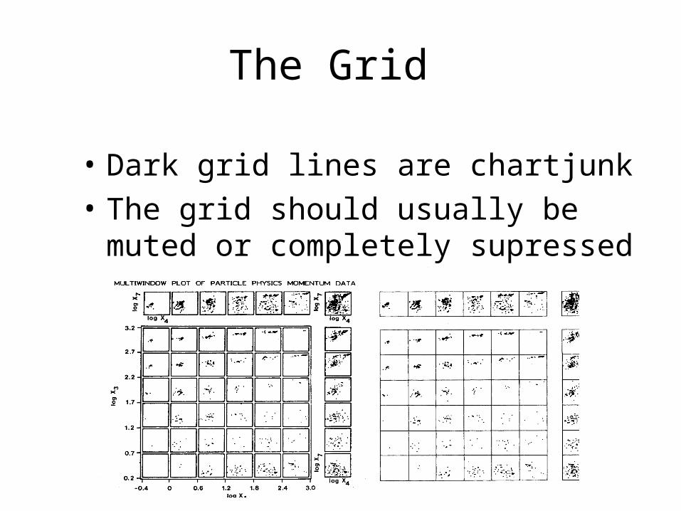
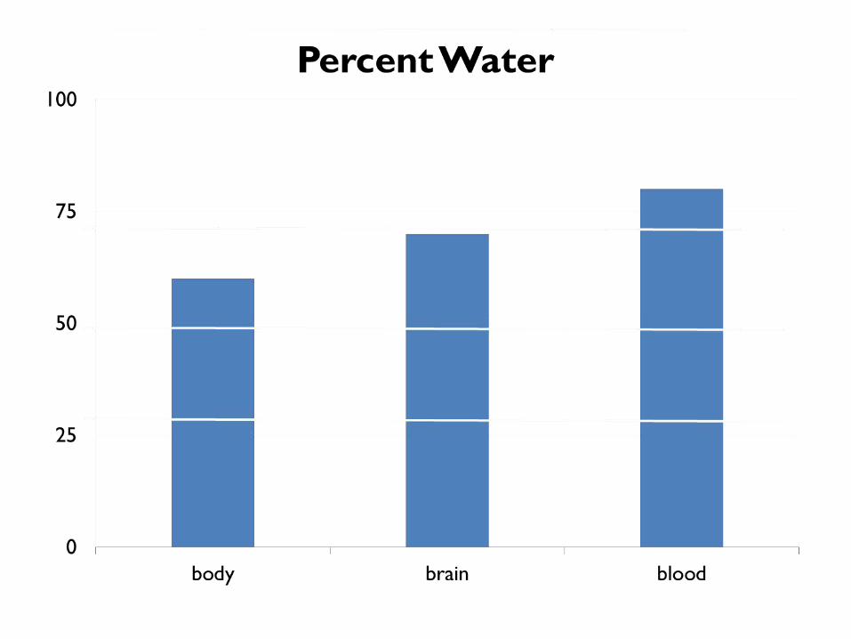
The Grid
• Dark grid lines are chartjunk• The grid should usually be muted or
completely supressed
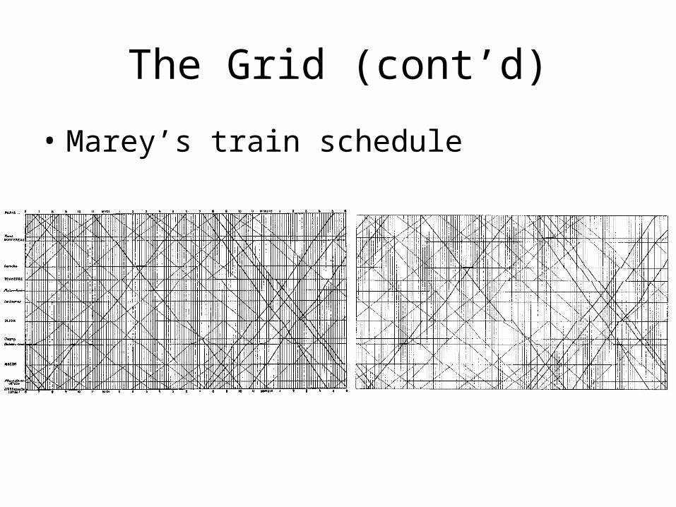
The Grid (cont’d)
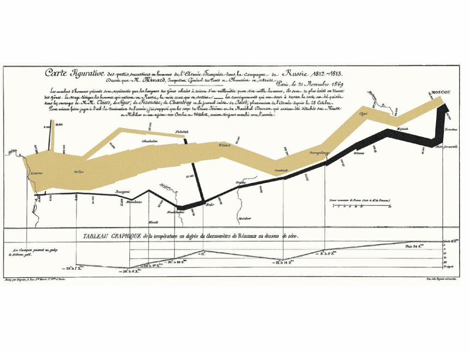
• Marey’s train schedule
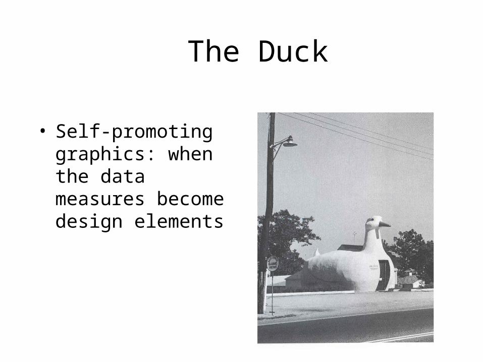
The Duck
• Self-promoting graphics: when the data measures become design elements
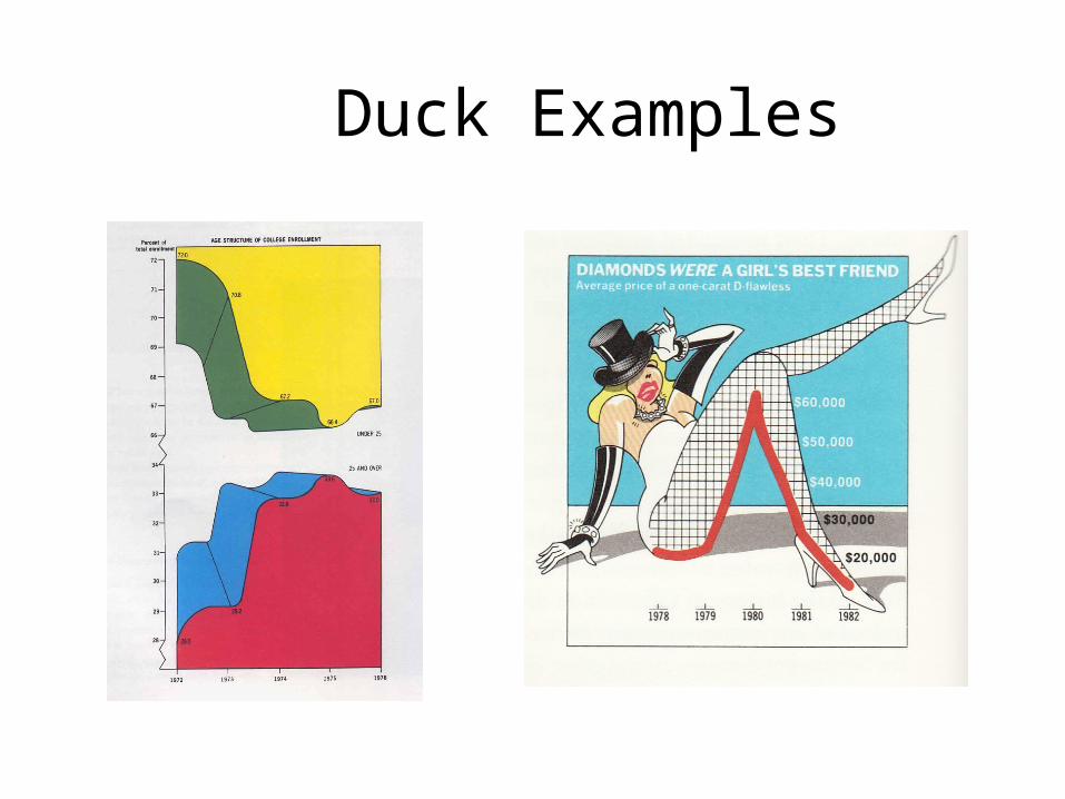
Duck Examples
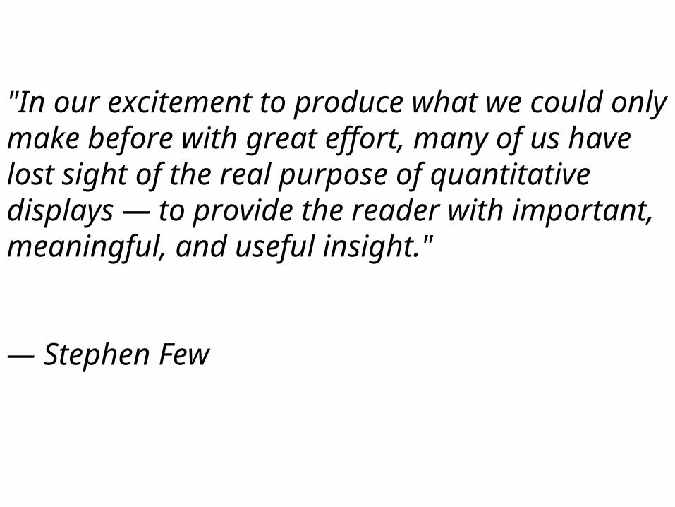
"In our excitement to produce what we could only make before with great effort, many of us have lost sight of the real purpose of quantitative displays — to provide the reader with important, meaningful, and useful insight."
— Stephen Few
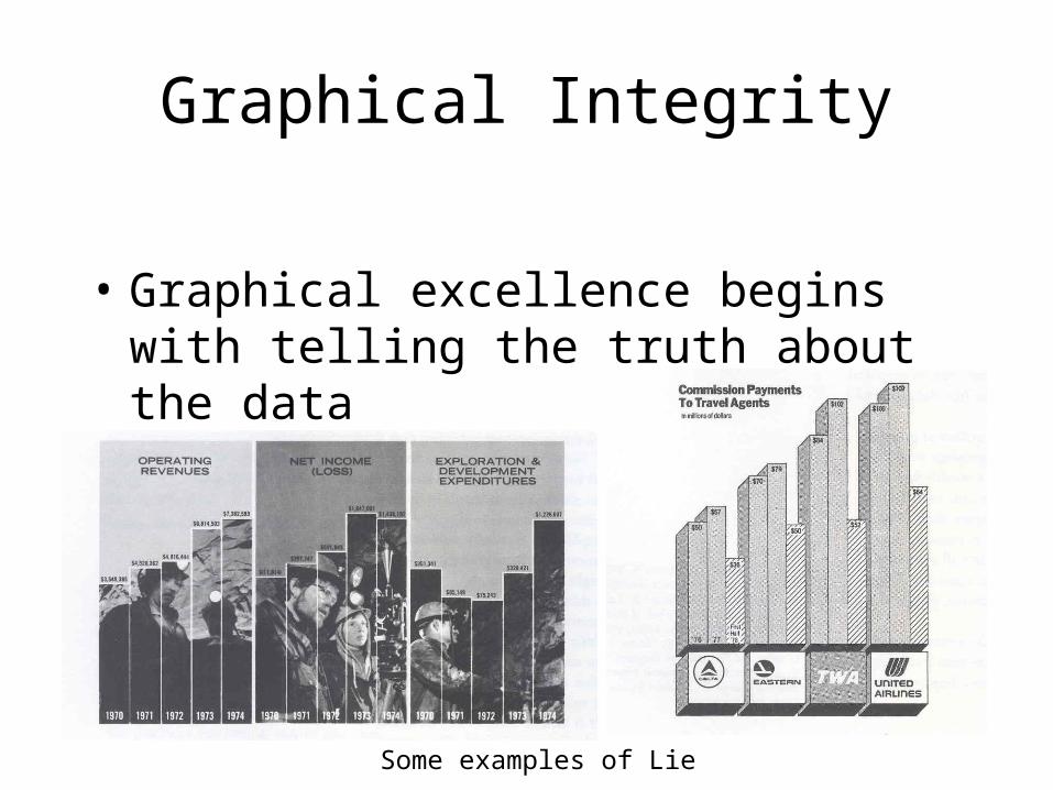
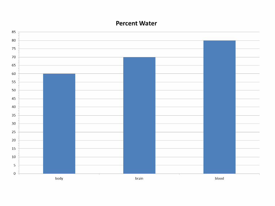
Graphical Integrity
• Graphical excellence begins with telling the truth about the data
Some examples of Lie
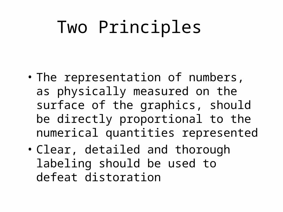
Two Principles
• The representation of numbers, as physically measured on the surface of the graphics, should be directly proportional to the numerical quantities represented
• Clear, detailed and thorough labeling should be used to defeat distoration
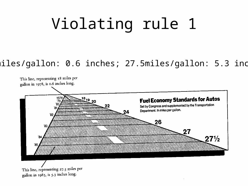
Violating rule 1
18 miles/gallon: 0.6 inches; 27.5miles/gallon: 5.3 inches
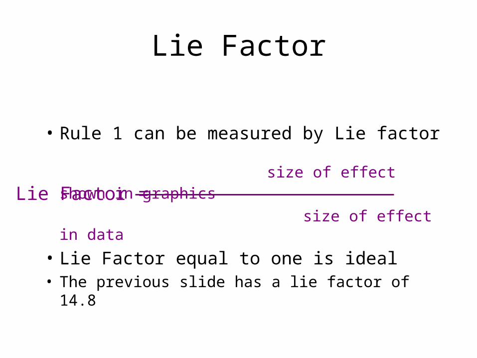
Lie Factor
• Rule 1 can be measured by Lie factor
size of effect shown in graphics size of effect in data
• Lie Factor equal to one is ideal • The previous slide has a lie factor of 14.8
Lie Factor =
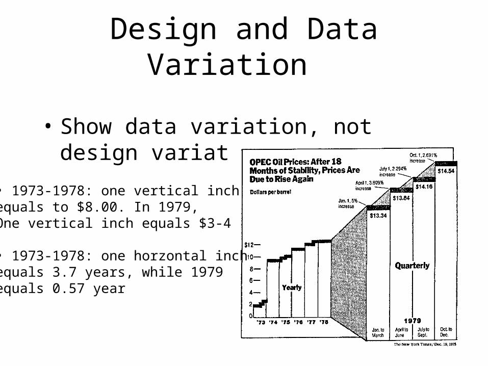
Design and Data Variation
• Show data variation, not design variation
• 1973-1978: one vertical inchequals to $8.00. In 1979, One vertical inch equals $3-4
• 1973-1978: one horzontal inchequals 3.7 years, while 1979 equals 0.57 year
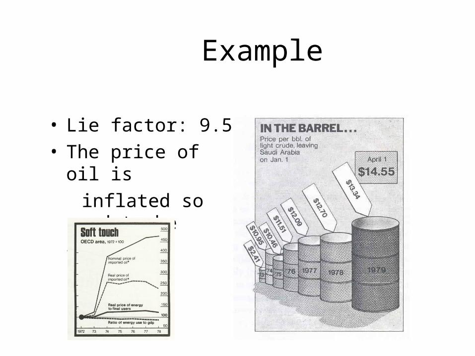
Example
• Lie factor: 9.5• The price of oil is inflated so need to be
repaired.
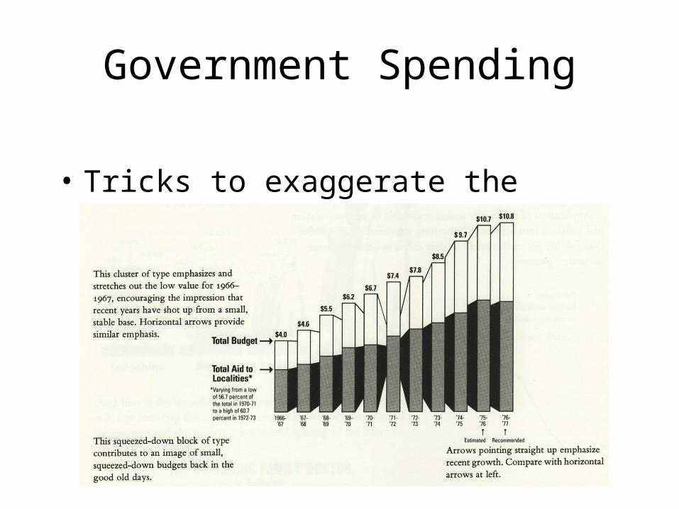
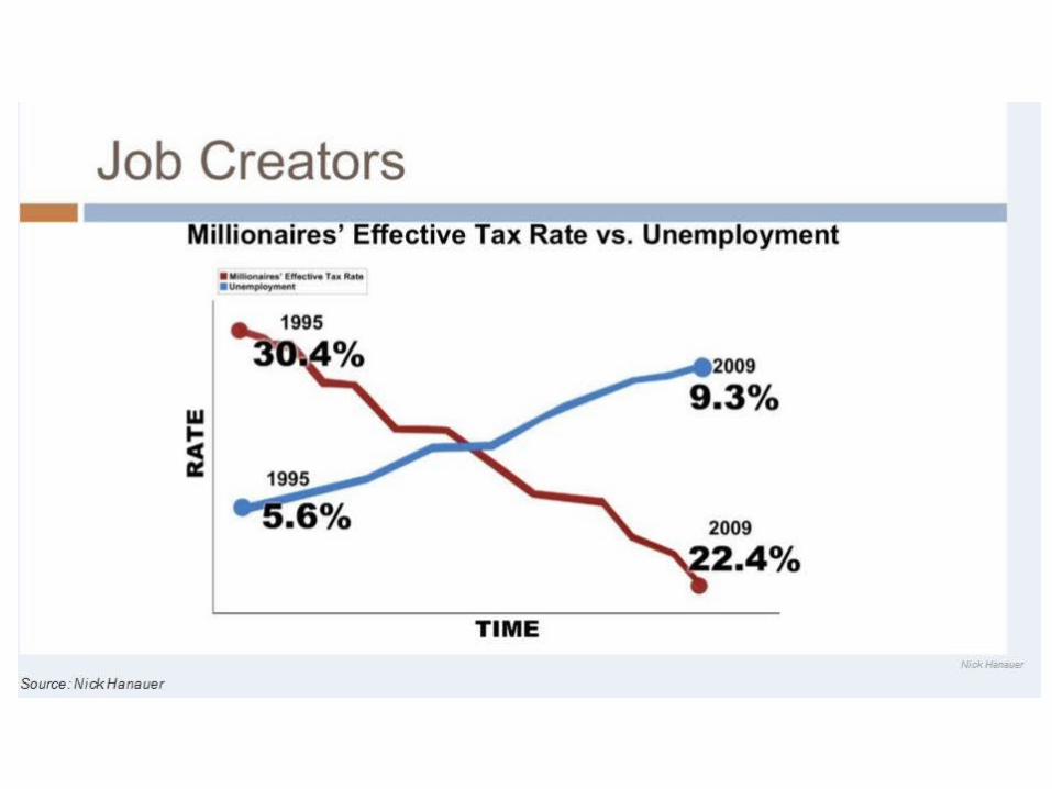
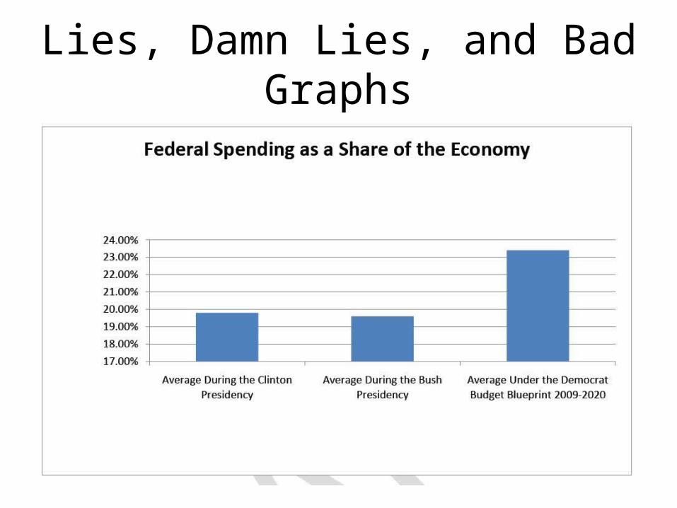
Government Spending
• Tricks to exaggerate the growth of spending
Tricks to exaggerate the growth of spending
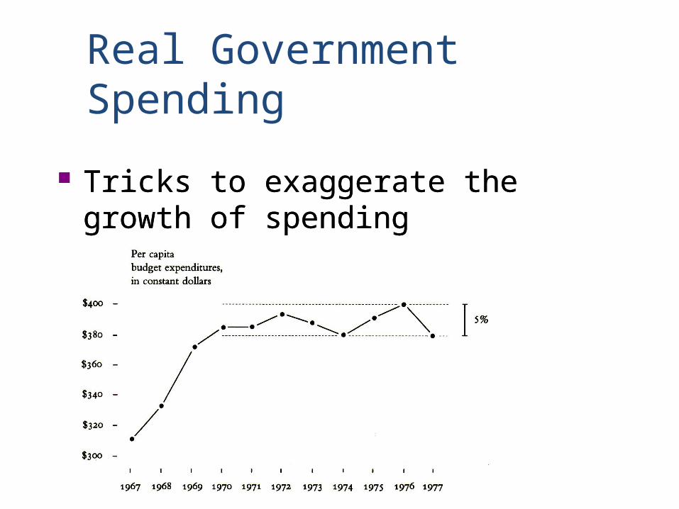
Real Government Spending
Tricks to exaggerate the growth of spending
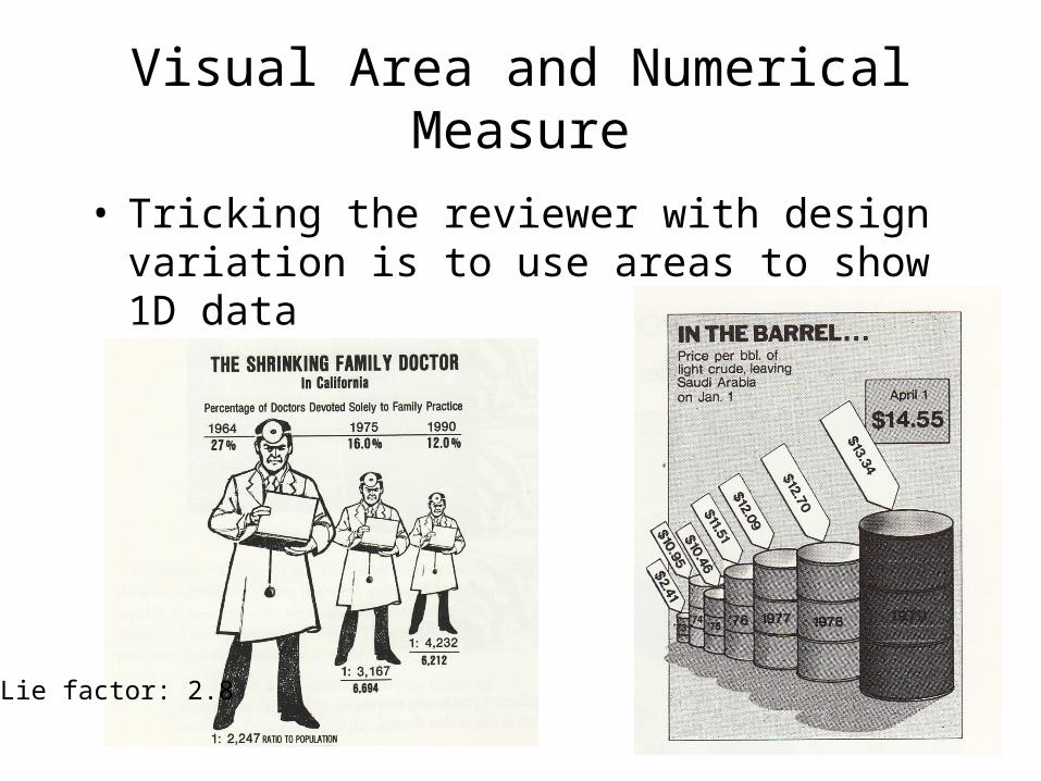
Visual Area and Numerical Measure
• Tricking the reviewer with design variation is to use areas to show 1D data
Lie factor: 2.8
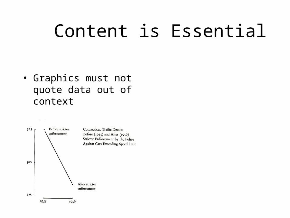
Content is Essential
• Graphics must not quote data out of context
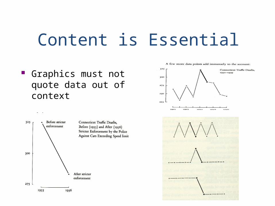
Content is Essential
Graphics must not quote data out of context
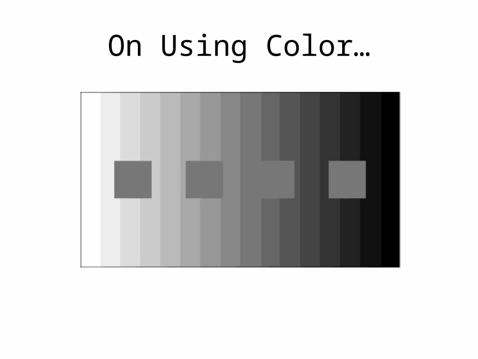
On Using Color…
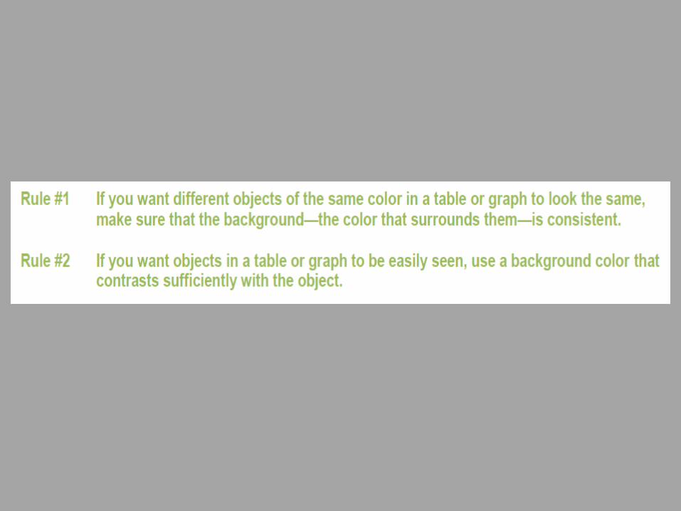
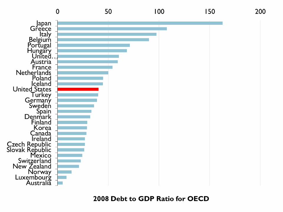
Rule #3: Use color only when needed to serve a particular communication goal.
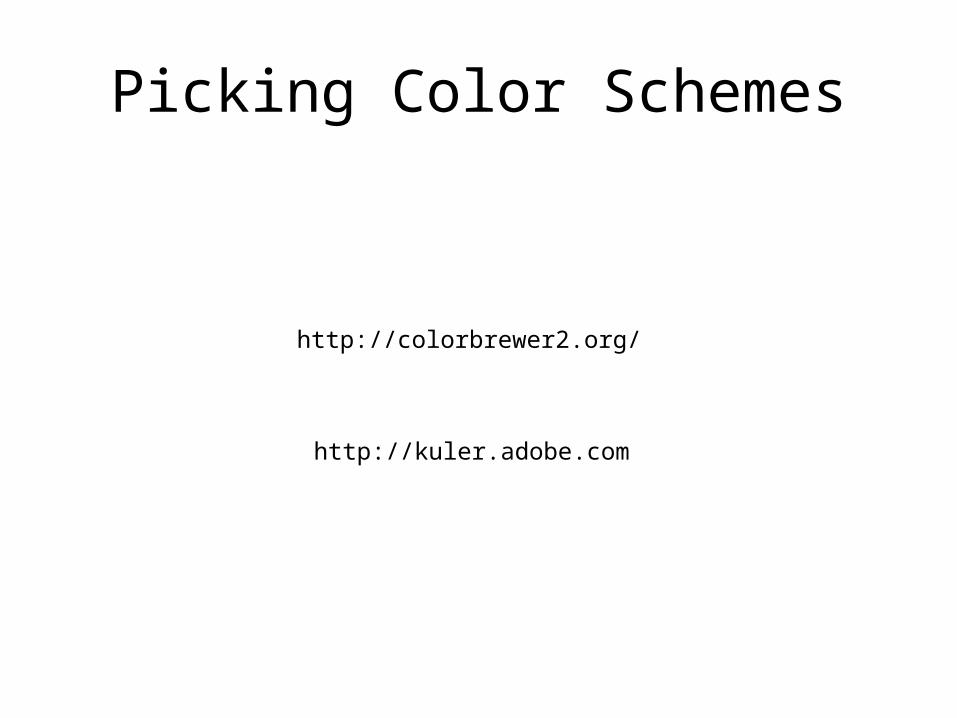
http://colorbrewer2.org/
http://kuler.adobe.com
Picking Color Schemes
Stop Visually Assaulting Me
• http://fosslien.com/rules/
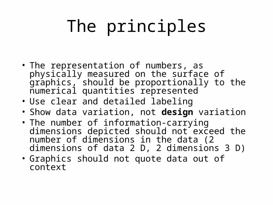
The principles
• The representation of numbers, as physically measured on the surface of graphics, should be proportionally to the numerical quantities represented
• Use clear and detailed labeling • Show data variation, not design variation • The number of information-carrying dimensions
depicted should not exceed the number of dimensions in the data (2 dimensions of data 2 D, 2 dimensions 3 D)
• Graphics should not quote data out of context
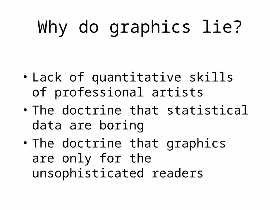
Why do graphics lie?
• Lack of quantitative skills of professional artists
• The doctrine that statistical data are boring • The doctrine that graphics are only for the
unsophisticated readers
Design is choice. The theory of the visual display of quantitative information consists of principles that generate design options and that guide choices among options. The principles should not be applied rigidly or in a peevish spirit; they are not logically or mathematically certain; and it is better to violate any principle than to place graceless or inelegant marks on paper.
— Edward Tufte, The Visual Display of Quantitative Information
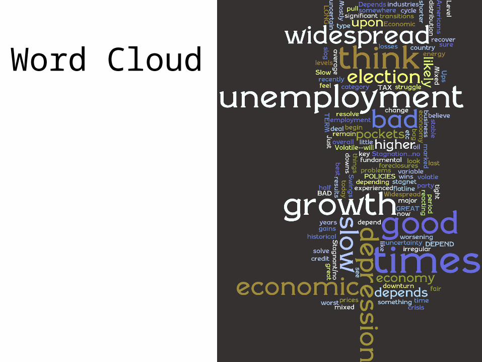
Word Cloud
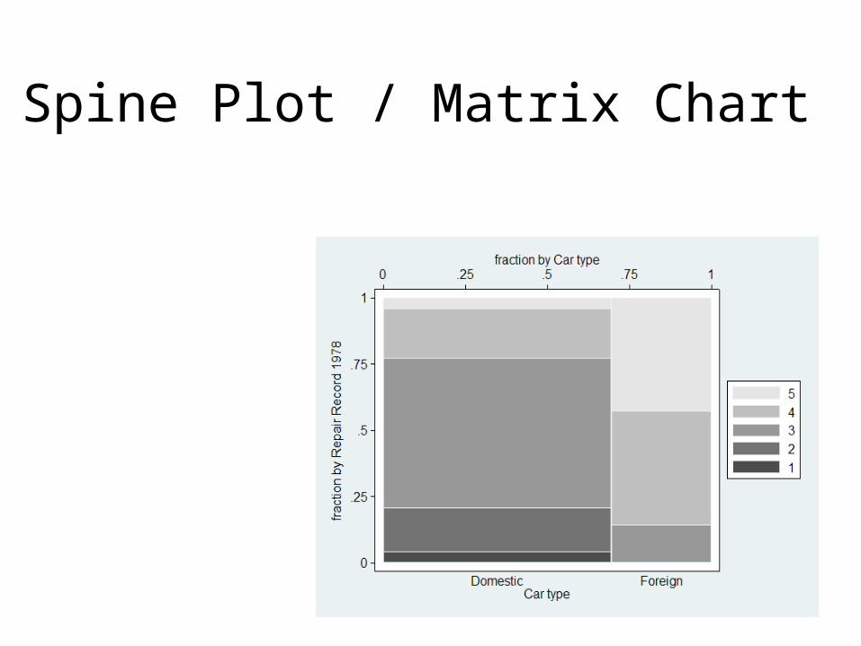
Spine Plot / Matrix Chart
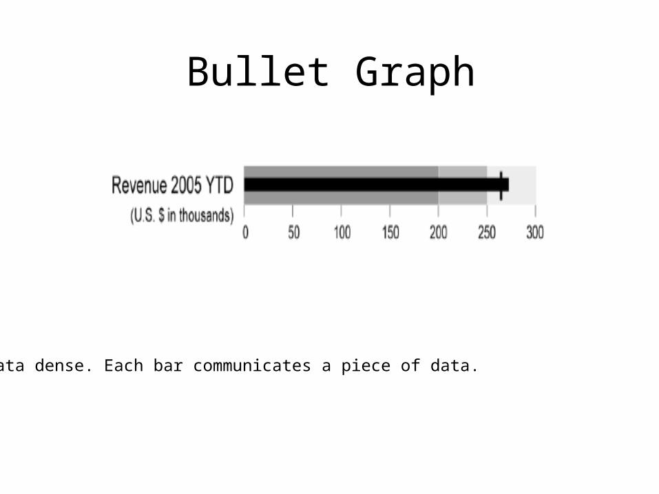
Bullet Graph
Data dense. Each bar communicates a piece of data.
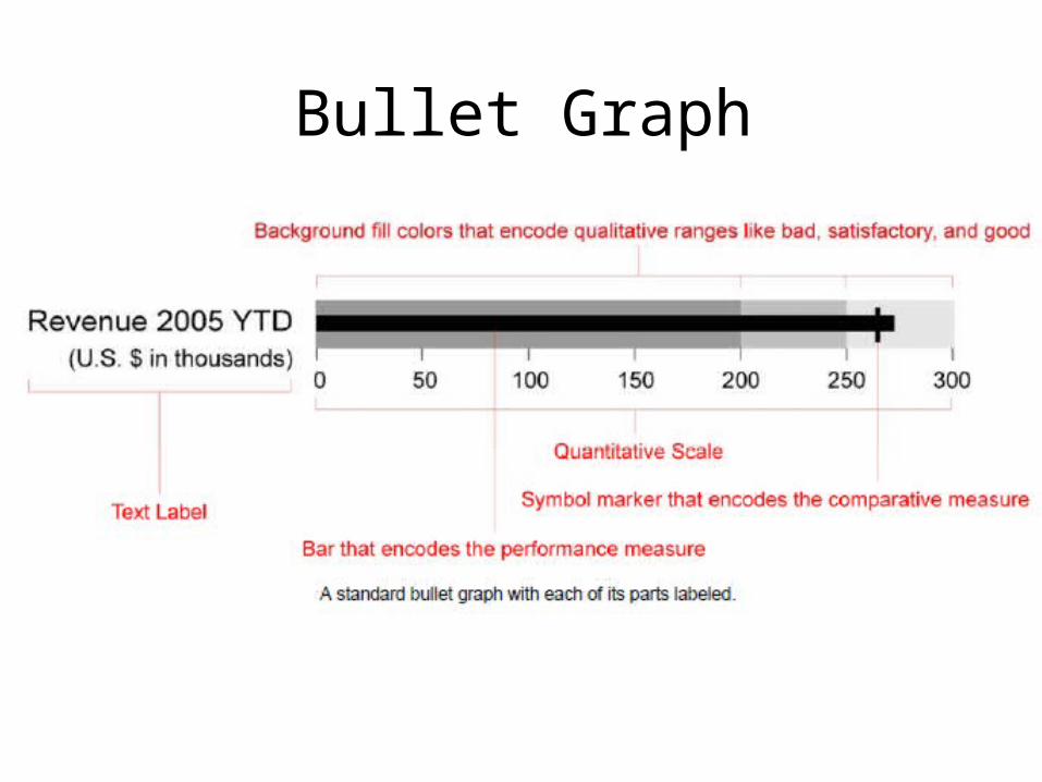
Bullet Graph
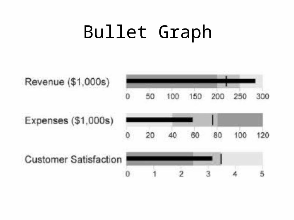
Bullet Graph
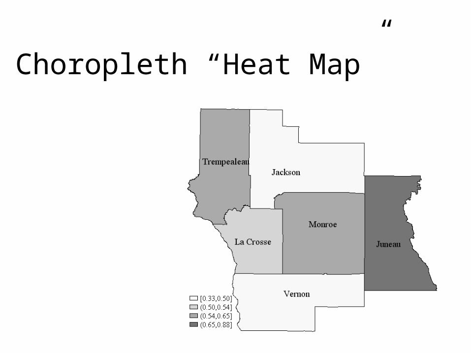
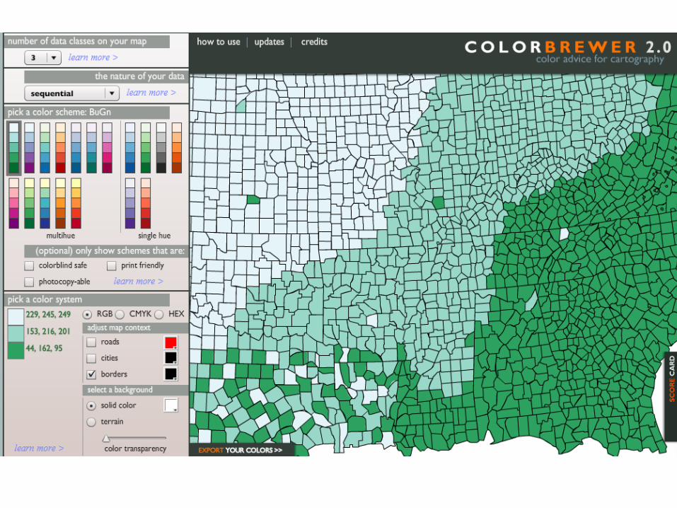
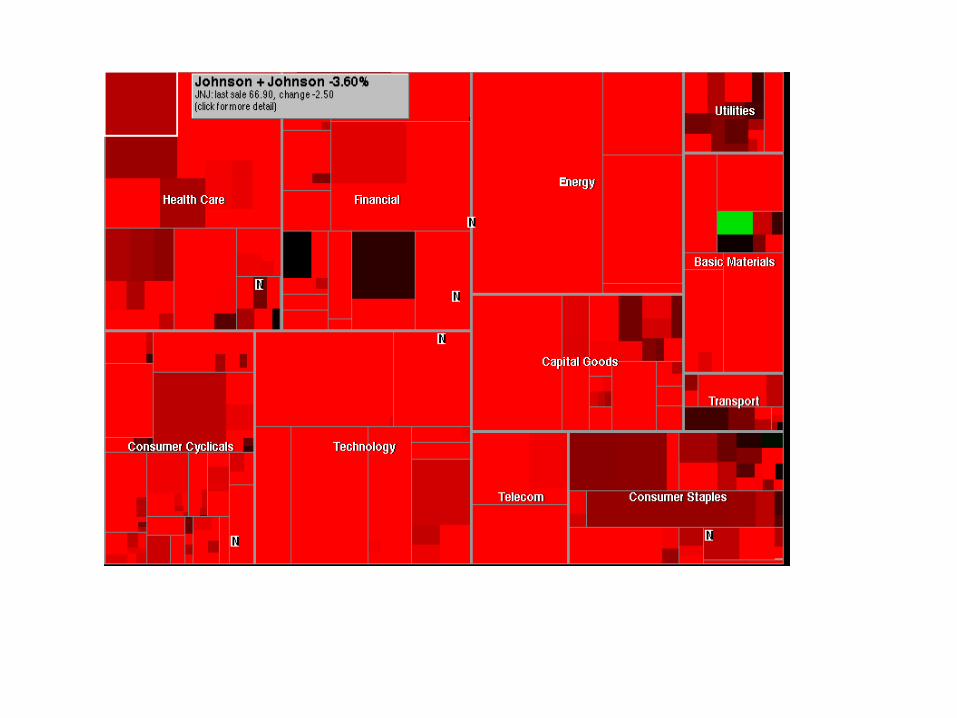
Choropleth “Heat Map”
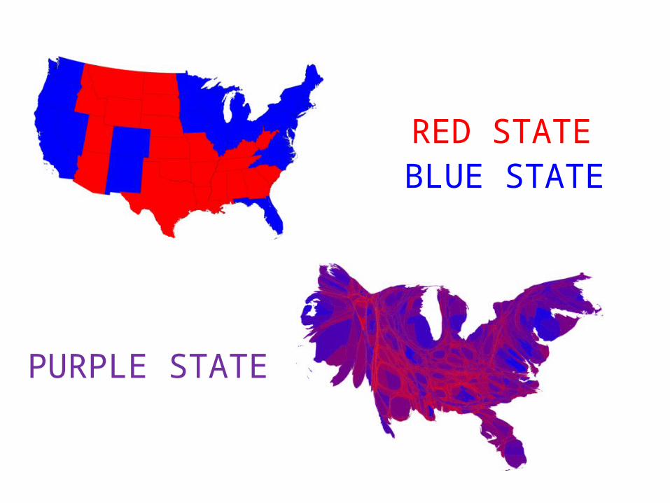
RED STATEBLUE STATE
PURPLE STATE
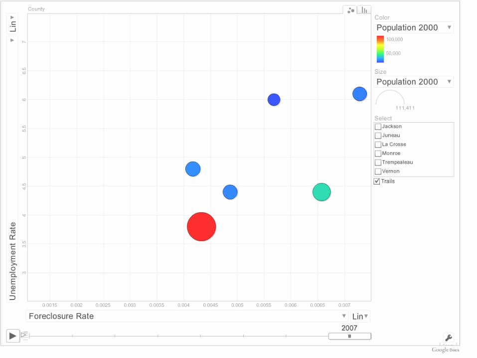
Dynamic Charts

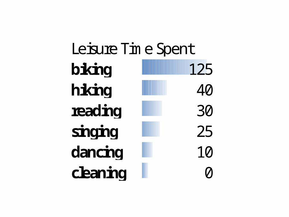
Leisure Time Spentbiking 125hiking 40reading 30singing 25dancing 10cleaning 0
Avoid defaults in Excel
• Show the data• Data dense
Maximize Data Ink Ratio
Minimize Non-Data Ink
Eliminate Chart Junk
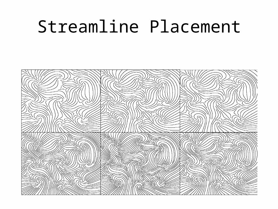
Streamline Placement