Data Visualization in Health Care: Optimizing the Utility...
16
1 Paper 176-2014 Data Visualization in Health Care: Optimizing the Utility of Claims Data through Visual Analysis Krisa D. Tailor, SAS Institute ABSTRACT A revolution is taking place in the US at both the national and state level in the area of health care big data, analytics, and transparency. Large amounts of data on the health of communities, the quality of health care providers, and the cost of health care is being collected and made available by both levels of government, to a variety of stakeholders. The surfacing of these data and consumption by health care decision makers unfolds a new opportunity to view, explore, and analyze health care data in novel ways. Furthermore, these data provide the health care system an opportunity to advance the achievement of the Triple Aim. (see iti.org/tripleaim). The convergence of big data, analytics, and transparency will bring a sea change to the world of health care by necessitating new ways to communicate information to end users, such as payers, providers, researchers, and consumers. This paper examines the information needs of health care organizations, such as Medicare and Medicaid, and discusses the union of health care and data visualization in creating consumable health insights that will aid in achieving cost containment and quality improvement for populations served. Moreover, using claims data and SAS Visual Analytics, it examines how data visualization can help identify the most critical insights necessary to managing population health. If health care payers can analyze large amounts of claims data effectively, they can improve service and care delivery for their recipients. INTRODUCTION The US health care industry is experiencing a sea of change in the areas of cost, quality, and accessibility. Led by the Patient Protection and Affordable Care Act (often referred to as the ACA or Obamacare), stakeholders of the health care system are exploring new initiatives to improve the health of citizens, while managing the escalation of costs. Payers, providers, and policy-makers are collaborating to establish new service and payment models such as Accountable Care Organizations (ACOs) and bundled payments; the Federal and State governments are offering marketplaces for consumers to purchase health care insurance; and researchers are examining novel datasets to advance the field of evidence-based medicine. Lots of unprecedented activity is occurring at all levels of the health ecosystem. Amid these transformations, there is a collective recognition among health care organizations that data is both an essential component of reform and a catalyst for success. The availability, analysis, and actionability of data is what will help create a sustainable and effective health care system that fulfills the goals of the Triple Aim. The three central elements to this systemic value creation are: big data, data analytics, and data transparency. While all three of these initiatives are appearing in various forms and fashions across the US, it is the seamless convergence of these domains that will establish a holistic platform for health care reform by making availability, analysis, and actionability of data possible for the entire system. Thus, as the US continues down the road to reform, organizations and the broader health ecosystem must take an all-encompassing approach to data that considers all three elements for optimal value creation. Figure 1: Big data, data analytics, and data transparency together create systemic value creation for health care
Transcript of Data Visualization in Health Care: Optimizing the Utility...

1
Paper 176-2014
Data Visualization in Health Care: Optimizing the Utility of Claims Data through Visual Analysis
Krisa D. Tailor, SAS Institute
ABSTRACT
A revolution is taking place in the US at both the national and state level in the area of health care big data, analytics, and transparency. Large amounts of data on the health of communities, the quality of health care providers, and the cost of health care is being collected and made available by both levels of government, to a variety of stakeholders. The surfacing of these data and consumption by health care decision makers unfolds a new opportunity to view, explore, and analyze health care data in novel ways. Furthermore, these data provide the health care system an opportunity to advance the achievement of the Triple Aim. (see iti.org/tripleaim).
The convergence of big data, analytics, and transparency will bring a sea change to the world of health care by necessitating new ways to communicate information to end users, such as payers, providers, researchers, and consumers. This paper examines the information needs of health care organizations, such as Medicare and Medicaid, and discusses the union of health care and data visualization in creating consumable health insights that will aid in achieving cost containment and quality improvement for populations served. Moreover, using claims data and SAS Visual Analytics, it examines how data visualization can help identify the most critical insights necessary to managing population health. If health care payers can analyze large amounts of claims data effectively, they can improve service and care delivery for their recipients.
INTRODUCTION
The US health care industry is experiencing a sea of change in the areas of cost, quality, and accessibility. Led by the Patient Protection and Affordable Care Act (often referred to as the ACA or Obamacare), stakeholders of the health care system are exploring new initiatives to improve the health of citizens, while managing the escalation of costs. Payers, providers, and policy-makers are collaborating to establish new service and payment models such as Accountable Care Organizations (ACOs) and bundled payments; the Federal and State governments are offering marketplaces for consumers to purchase health care insurance; and researchers are examining novel datasets to advance the field of evidence-based medicine. Lots of unprecedented activity is occurring at all levels of the health ecosystem.
Amid these transformations, there is a collective recognition among health care organizations that data is both an essential component of reform and a catalyst for success. The availability, analysis, and actionability of data is what will help create a sustainable and effective health care system that fulfills the goals of the Triple Aim. The three central elements to this systemic value creation are: big data, data analytics, and data transparency. While all three of these initiatives are appearing in various forms and fashions across the US, it is the seamless convergence of these domains that will establish a holistic platform for health care reform by making availability, analysis, and actionability of data possible for the entire system. Thus, as the US continues down the road to reform, organizations and the broader health ecosystem must take an all-encompassing approach to data that considers all three elements for optimal value creation.
Figure 1: Big data, data analytics, and data transparency together create systemic value creation for health care
2
BIG DATA
Big data is being generated at all corners of the health care ecosystem and initiatives have been led by a number of stakeholders, including health plans, providers, and the public sector. We are inundated with various types of health information, and a number of data sources are fueling this revolution - including administrative data such as health care claims data, clinical data such as Electronic Health Records (EHRs), patient-reported data such as surveys, and personal data such as that generated through fitness and wellness mobile applications. Organizations are collaborating to bring large amounts of these data together into central repositories; therefore making data more available and more standardized. For example, state governments are establishing all-payer claims databases (APCDs) that consolidate all paid health care claims within a state into a single warehouse. Eleven states already have a statewide APCD, and over half the states are strongly interested in establishing one in the near future. On the private insurance side, health plans are pursuing similar efforts; organizations like Blue Health Intelligence are developing massive health care databases of medical and pharmacy claims. Other groups, like the Health Care Cost Institute (HCCI), are aggregating claims data from many sources to promote independent research on price variation around the nation. Even large pharmaceutical companies like GlaxoSmithKline are joining the movement by contributing anonymized clinical trial data into a globally accessible cloud environment.
We all know the data is big, and it is only going to get bigger. In fact, the total value of data in health care could be as much as $300B by 2020.1 However, the sheer existence of big data is inadequate to reveal this value; value creation requires big analytics.
DATA ANALYTICS
Big data has introduced an enormous opportunity to utilize sophisticated analytic tools to generate insights and foresights. In health care, there are two main categories of analytic capacity: business analytics and clinical analytics. Both of these require a 360-degree of patients and populations, which is now beginning to surface through big data initiatives.
Business analytics address the financial and operational aspects of health care – such as cost and utilization analyses, contract negotiations, and provider reimbursement. Clinical analytics, on the other hand, are focused on the care provided to patients and populations and cover a range of analyses – such as risk stratification, population health, measuring intermediate and long-term outcomes, analyzing provider performance, and more.
While business and clinical analytics have different purposes, they overlap in many ways. For instance, it is impossible to understand the cost to a payer without understanding what level of care was provided, how many providers were involved, and what procedures took place. This interconnectivity is commonly referred to as the Iron Triangle of health care, in which the components of cost, quality, and accessibility are constantly in competition with one another. In other words, it is not possible to affect one aspect without affecting the other two aspects because the three are inextricable. This very reason is why analytics are critical; superior analytic tools are necessary to understand the complex interdependencies that drive medical outcomes and costs. Further, this analysis requires various big data from siloed sources. These various sources must be integrated to complete the full picture of health care.
For example, the linking of claims data and clinical data, while in a nascent stage, has already begun; and emerging dialogs on linking patient-reported data, public health data, personal health statistics, and even non-health data, such as social media insights, will eventually contribute to the evolution of big data analytics.
1 http://www.mckinsey.com/insights/business_technology/big_data_the_next_frontier_for_innovation
3
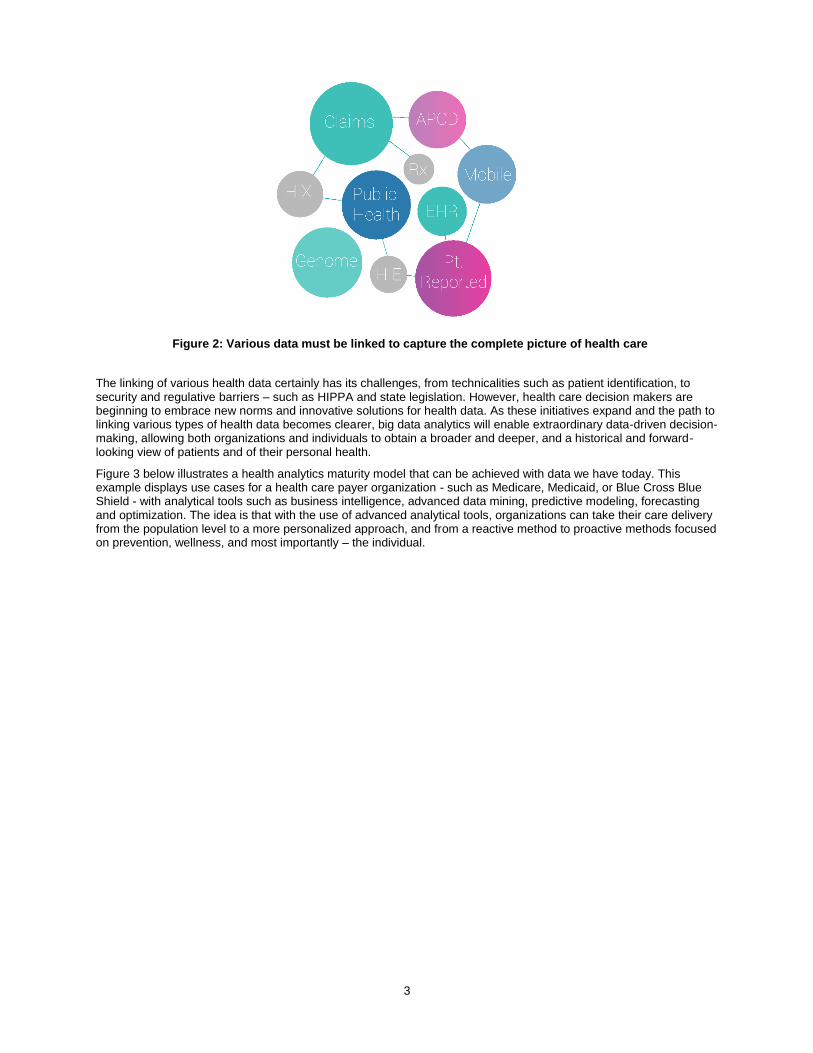
The linking of various health data certainly has its challenges, from technicalities such as patient identification, to security and regulative barriers – such as HIPPA and state legislation. However, health care decision makers are beginning to embrace new norms and innovative solutions for health data. As these initiatives expand and the path to linking various types of health data becomes clearer, big data analytics will enable extraordinary data-driven decision-making, allowing both organizations and individuals to obtain a broader and deeper, and a historical and forward-looking view of patients and of their personal health.
Figure 3 below illustrates a health analytics maturity model that can be achieved with data we have today. This example displays use cases for a health care payer organization - such as Medicare, Medicaid, or Blue Cross Blue Shield - with analytical tools such as business intelligence, advanced data mining, predictive modeling, forecasting and optimization. The idea is that with the use of advanced analytical tools, organizations can take their care delivery from the population level to a more personalized approach, and from a reactive method to proactive methods focused on prevention, wellness, and most importantly – the individual.
Figure 2: Various data must be linked to capture the complete picture of health care

4
While these types of analyses can be done with existing data such as claims and clinical data, the addition of new sources will accelerate the progression towards truly personalized medicine and enhance the analyses each step of the way.
The Future of Health Analytics
Ultimately, we want to be able to optimize our data to make the best decisions at the point of care for each individual. Further, we want patients to be engaged in their own health so that they are making the best decisions regarding their personal health. This evolution, while seemingly complex, is beginning to emerge with the growth of personal health data and the soaring number of mobile health applications. Mobile health has grown exponentially over the last several years and is expected to reach $20.7 billion by 2018, with nearly 96 million users.2 Thousands of applications exist, and many more are being developed, to collect personal health and lifestyle data. Individuals are monitoring and logging everything from calories burned to medications and supplements taken. With these advances in technologies, a new era of analytics will emerge making personalized health more personal than ever imagined; with this, the patient-provider relationship will become stronger and more collaborative. The above analytics maturity model does not end at consumer analytics; it will extend further with areas such as behavior change platforms and real-time feedback. These will help us to solve a variety of cost issues related to personal behavior. For example, according to USA Today, the US spend $258 billion a year in ER and doctor visits because 50% of patients forget to take their medications. The U.S. also spends $50 billion trying to lose weight every year. As analytics and big data
2 http://www.juniperresearch.com/reports/mobile_health_fitness
Figure 3: Health analytics can mature to be personalized and proactive.

5
evolve to become more personalized, these technologies will help solve detrimental behaviors – such as poor pill compliance and obesity – by providing personalized guidance for the consumer.
DATA TRANSPARENCY
The third critical element for system-wide health care reform is data transparency. Recently, lots of unprecedented activity in price transparency has taken place across the industry. The idea that we cannot manage our health care costs without truly understanding where and why they exist is one that is gaining a great deal of support, and the notion is not ill-founded. In 2013, the New York Times published a compelling piece on price variations for common procedures around the world and stated, “In many other countries, price lists of common procedures are publicly available in every clinic and office. Here, it can be nearly impossible to find out."3 In fact, 29 states actually received a failing grade in health care price transparency in a recent study.4
A major step toward improving health care transparency was the Centers for Medicaid and Medicare Services’ (CMS) release of Medicare provider charge data in 2013, which at first comprised Medicare inpatient hospital charges for 100 of the most common inpatient diagnoses. A subsequent data set reflected outpatient charge data for 30 of the most common ambulatory payment codes. Other activities also emerged in parallel, such as $87 million in grant money for states to support rate review and increase price transparency. And the proposed Medicare Data Access for Transparency and Accountability Act may make Medicare claims more transparent through a publicly available database.
Exposing relevant, timely information to stakeholders is critical for a variety of purposes, but recent dialogs suggest that the most relevant area of data transparency is that of consumer decision-making. Consumer choice is vital in any market. When consumers have the information they need, they can make better-informed decisions about the services they receive. This can change incentives across the board, as health care payers and providers are faced with more competition. For example, after New York State began publishing outcomes data for coronary artery bypass grafting (CABG) in 1989, the state’s CABG mortality rates fell by more than 40 percent; furthermore, the hospitals with better outcomes saw growth in their market shares5. Providing transparency changes incentives, promotes consumer choice and also increases accountability and drives performance. With open data, both consumers and other health care stakeholders can identify if a particular hospital has unusual mortality rates or if a Medicaid-managed care entity is providing the required preventive care to its members. Moreover, transparency can improve provider performance as studies have shown that the possible scrutiny by peers is sufficient on its own to incentivize behavioral change.
While transparency has its own challenges, as legislation and privacy regulations play an enormous role in which data can be exposed, if approached in conjunction with big data and analytics, transparency can greatly increase the value of health data.
Thus, big data, analytics, and transparency efforts should constantly work in tandem and should be a framework for every health care organization.
THE MISSING PIECE – DATA VISUALIZATION
While these three areas together provide a strong framework for health data, the question of usability of the data still remains an issue. How are people going to consume and utilize data in every day decision-making? As mentioned earlier, we now have more users than ever of health data, and not only are decision makers expected to use data, but it is perhaps the only way health reform initiatives will be successful. Therefore, ideas around data consumption and usability are those that should be (but often are not) discussed as part of these health IT modernizations. In health care, information usability is perhaps most critical; the fact that we’re making decisions regarding human life is in itself a reason to better use our data. However, usability of data has traditionally been less advanced in health care compared to other fields. Data visualization and visual analytics is changing that.
3 http://www.nytimes.com/2013/06/02/health/colonoscopies-explain-why-us-leads-the-world-in-health-expenditures.html?hp&_r=3& 4 http://www.hci3.org/content/transparency-metrics-transformation 5 http://www.mckinsey.com/~/media/mckinsey/dotcom/client_service/healthcare systems and services/health international/issue 11 new pdfs/hi11_64 transparency_noprint.ashx
6
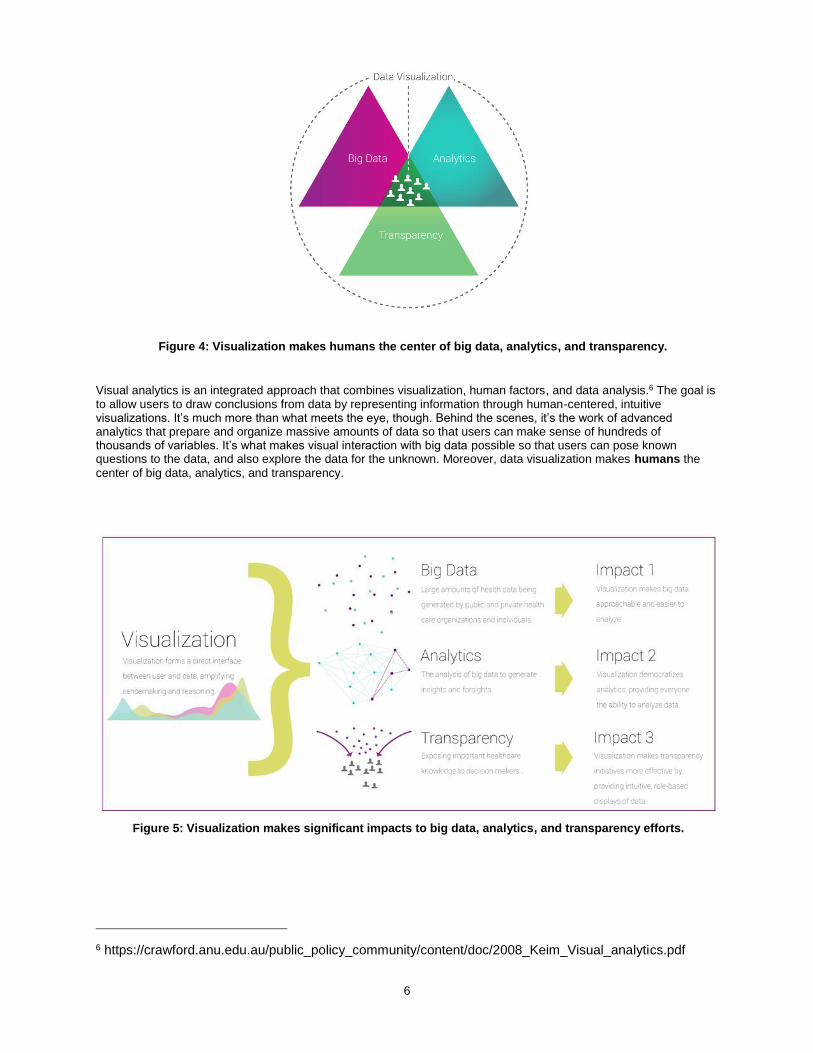
Visual analytics is an integrated approach that combines visualization, human factors, and data analysis.6 The goal is to allow users to draw conclusions from data by representing information through human-centered, intuitive visualizations. It’s much more than what meets the eye, though. Behind the scenes, it’s the work of advanced analytics that prepare and organize massive amounts of data so that users can make sense of hundreds of thousands of variables. It’s what makes visual interaction with big data possible so that users can pose known questions to the data, and also explore the data for the unknown. Moreover, data visualization makes humans the
center of big data, analytics, and transparency.
6 https://crawford.anu.edu.au/public_policy_community/content/doc/2008_Keim_Visual_analytics.pdf
Figure 4: Visualization makes humans the center of big data, analytics, and transparency.
Figure 5: Visualization makes significant impacts to big data, analytics, and transparency efforts.
7
Embracing data visualization can reinvent the way stakeholders of the health care system, including consumers, payers, providers, researchers, and employers, make health care decisions. Two use cases are detailed below.
Service Delivery
New delivery models introduced by the US ACA, such as accountable care and patient-centered medical homes, rely heavily on data and analytics to fulfill the goal of improved, coordinated care. As a result, new users of data such as primary care physicians, specialists, hospital administrators, and care managers, need to access and utilize large databases of claims, EHRs, and more. Unfortunately, for the first crop of Medicare ACOs, a recent survey by NAACOS found that learning to access and process data has been a significant challenge. More specifically, ACOs have been challenged with finding suitable software, building new skill sets to analyze data, and translating data into useful information for care managers and providers.
Visual analytics addresses each of these challenges and completely changes the way ACOs can approach data. It can give these users the unique population health insights they need from data – such as performance measures, trends, costs, and outcomes– across multiple sites of care. Moreover, it provides these insights in a consumable format that can improve decision-making at the patient-level. This is not only a huge advancement for provider efficiency, but a game changer in making the ACO model successful. For example, the state of New Hampshire uses SAS® Visual Analytics in conjunction with the state’s all-payer claims database (APCD) to allow ACOs to dynamically view data and critical measures on their populations’ health. Through a web-based portal, ACOs in NH are able to use visualization and interactive reports to better coordinate care, replacing monthly documents of over 800-pages.
Public Health
As aforementioned, the US federal and state governments, among other organizations, are making huge amounts of health data available. For example, healthdata.gov, data.medicare.gov, and statewide all-payer claims databases are all sources of big data that can help guide policy-making. Moreover, these data will grow expeditiously as more initiatives emerge across the public sector.
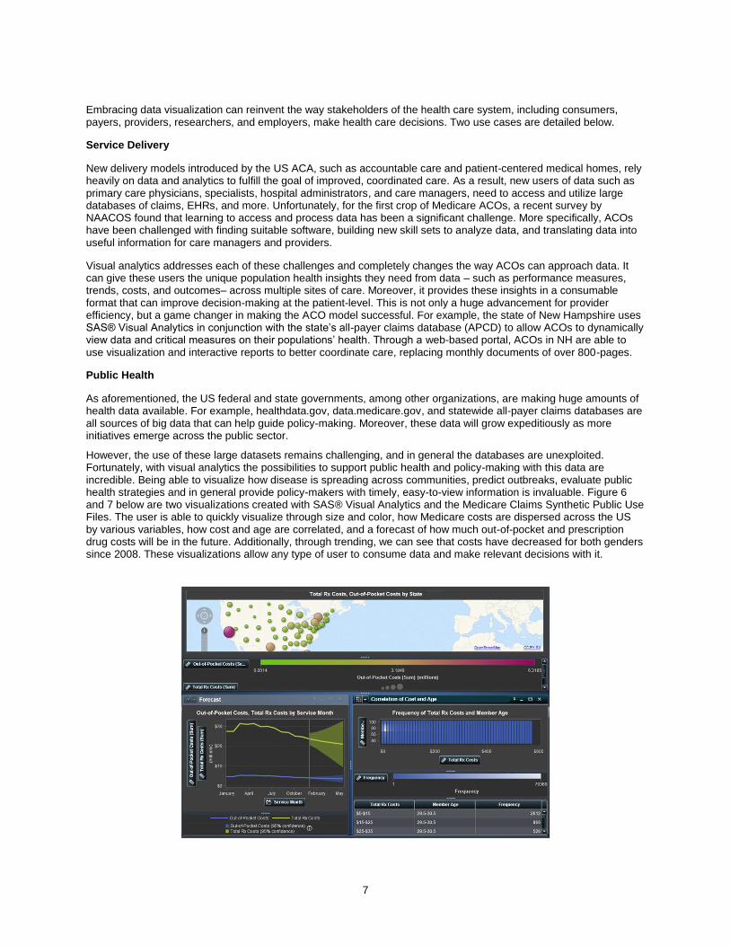
However, the use of these large datasets remains challenging, and in general the databases are unexploited. Fortunately, with visual analytics the possibilities to support public health and policy-making with this data are incredible. Being able to visualize how disease is spreading across communities, predict outbreaks, evaluate public health strategies and in general provide policy-makers with timely, easy-to-view information is invaluable. Figure 6 and 7 below are two visualizations created with SAS® Visual Analytics and the Medicare Claims Synthetic Public Use Files. The user is able to quickly visualize through size and color, how Medicare costs are dispersed across the US by various variables, how cost and age are correlated, and a forecast of how much out-of-pocket and prescription drug costs will be in the future. Additionally, through trending, we can see that costs have decreased for both genders since 2008. These visualizations allow any type of user to consume data and make relevant decisions with it.

8
DATA VISUALIZATION AND CLAIMS DATABASES
Health care claims databases, while not novel in nature, are becoming increasingly important for decision makers. In fact, several reform initiatives, such as ACO models, episodic care, reducing hospital readmissions, and APCDs rely on claims data as the primary fuel for analyses. Traditionally, however, claims data have acted as transactional systems to support billing and eligibility. For instance, State Medicaid programs operate Medicaid Management Information Systems (MMIS) for business processes and billing, and are not typically designed to generate actionable data analysis to help practices or other entities profile patients, understand utilization and spending patterns, target efforts to improve care, or measure performance.7
Now with the convergence of big data, analytics, and transparency, claims data are becoming an opportune platform for analysis and visualization. As mentioned previously, state APCDs, Blue Health Intelligence, and Health Care Cost Institute are all examples of large repositories of claims data. In addition to optimizing the use of these data through advanced analytics, and making the data transparent to stakeholders, these types of databases will benefit greatly from data visualization.
Why Claims Data?
Healthcare claims data is the most accessible, structured type of health data in the US, and offers the broadest view of how health care services were delivered. It includes many elements that are valuable in understanding health care delivery. For example, some of the elements aside from the amounts billed and paid that are particularly useful are:
7 http://kff.org/medicaid/issue-brief/data-analytics-in-medicaid-spotlight-on-colorados-accountable-care-collaborative/
Figure 6: SAS Visual Analytics shows dispersion of Medicare costs by multiple variables
Figure 7: SAS Visual Analytics shows Medicare cost trends by multiple variables

9
- Diagnosis code (ICD-9)
- Procedure code (CPT)
- Site of service
- Date of service
- Length of stay (inpatient)
- Other diagnoses
- Referring physician
- Age of patient
- Gender of patient
- City of patient
- City of provider
Claims data include many other components as well. The combinations of these various elements and the types of analyses that can be done are virtually infinite. Further, because of the structure of claims data, it can be a foundation for linking other health data and developing a more extensive database over time.
Claims + Analytics + Visualization
As discussed earlier in this paper, claims data has become essential to health reform initiatives, thus requiring that more users have the ability to access and analyze this data. Claims data combined with visual analytics offers opportunities to create value that previously did not exist by allowing users to look across populations and patients, through interactive exploration. For payer organizations, like Medicare and Medicaid, this is a game changer. It can change the culture of entire agencies to one in which all users – regardless of their role – can use data in their day to day decision-making. The human-centeredness and intuitiveness of visual analytics makes this possible.
Applications
The below visualizations display the utility of claims data with visual analysis, showing both high-level population views and granular patient level details. These visualizations highlight business and clinical intelligence necessary for health plans like Medicaid and Medicare to achieve success in health care cost, quality, and outcomes.
Beginning at a high-level statewide view, Figure 8 shows us the ability to explore the demographic distribution of claims by variables such as age, gender, and county. We can explore groups of patients such as Females between ages 45-49, and if the data was identified, we could see detailed member information in the right-hand side box.

10
In the next visualization, we are able to explore member details further by visualizing out-of-pocket cost versus the insurer’s cost for each claim, and the related diagnoses and procedures.
Going a level deeper into the claims data, we are able to analyze diseases and conditions. For example, in the tile chart in Figure 10, we can see the breakdown of total costs by the various diagnosed conditions. The larger tiles represent a higher total cost while the darker shades represent a higher number of claims. Therefore, larger but
Figure 7: Figure 8: Exploration of claims by multiple variables
Figure 9: View detailed information about a member and their associated claims.

11
lighter-colored tiles – such as Neoplasms - represent diagnoses with relatively few, but higher cost claims.
The next visualization (Figure 11) shows the drill down two levels further into the diagnosis category “Injury and Poisoning” to “Fractures.” Additionally, we can view the details of Injury and Poisoning by shifting to the Diagnosis Detail tab. (Figure 12)
Figure 10: Breakdown of costs by diagnosis category
Figure 11: Drill down into Injury and Poisoning diagnosis category.

12
Figure 12: Detailed analysis of Fractures.
Figure 13 shows us a site mix and insurance product mix for this set of claims. In other words, what facilities incurred the most claims (i.e. Office visits or ER visits), and what types of insurance was used (i.e. an indemnity plan)?
A particularly useful type of visual analysis that can be conducted with claims data is heat mapping. In Figure 14, the heat map maps diagnoses with procedure categories. The dark shades of blue show that high cost procedures were delivered for that diagnosis. In the case of other and unspecified neoplasm, costly surgical procedures took place.
Figure 13: View cost distribution by site of service and insurance type.

13
Within this exploration, the user can drill down to learn which members, which providers, and what types of insurance relate to the cost of these surgical procedures.
Visual analytics uncovers all of the data points within an infinite number of claims, and lets us see how they relate to each other. It provides health care decision makers the ability to generate and consume critical insights quickly, such as:
How many super utilizers have 3+ chronic conditions? How many have 5+ chronic conditions?
How many super utilizers have a primary care visit each year?
How many ER visits do super-utilizers have?
Comparison of patient populations on utilization of the ER, by age group.
Comparison and calculations for hospital readmissions Additionally, visual analytics can generate many novel and advanced analyses such as quality measures, forecasting and trending of cost and diseases, decision-trees for cohorts of patients, and predictive modeling for hospital admissions. The next few visualizations display the use of SAS Visual Analytics for measuring variation in cost and quality and provider performance. Episodes of care
Recently, payment reforms in health care have led to the use of episode groupers to profile the resource utilization of individual providers, to better understand the total cost of care, and to implement value-based reimbursement models. For instance, payers and provider alike can use episode grouping to understand the total cost of a knee replacement from beginning to end of the event; this would for instance, include all of the events and costs associated with surgery, radiology, physical therapy, etc. The below visualizations show how various providers performed on certain episodes of care, and how prevalent and costly potentially avoidable complications (PACs) were. These analyses were created through SAS Episode Analytics and SAS Visual Analytics.
Figure 14: See correlation between diagnoses and procedure costs

14
Figure 15: The total and average costs per Potentially Avoidable Complications (PACs), by episode.
These visualizations merely scratch the surface of what visual analytics can offer for health care. With these types of visualizations, health plans like Medicaid and Medicare can drive payment reform, reduce waste, and quickly oversee the performance of provider organizations.
CONCLUSION
With US health care reform in full speed, the shift towards personalized health care is essential in achieving the goals of improve quality and reduced cots. The availability of data and the technology needed for analyses are issues of the past, and are no longer limitations to how we approach health. Health care organizations must create systemic value creation through the convergence of big data, analytics, and transparency and augment this convergence through the
Figure 16: Variation in quality and cost by hospital system.

15
use of data visualization. Making humans the center of these efforts with visual analytics will result in the optimization of value and knowledge for health care decision makers.

16
ACKNOWLEDGMENTS
I would like to acknowledge the following individuals for their work on SAS Visual Analytics and claims data:
Riley Benson – Senior User Experience Designer, SAS
Lina Clover – Director of Research & Development, SAS
RECOMMENDED READING
All-Payer Claims Database: A Platform for Transparency and Innovation:
http://www.sas.com/en_us/whitepapers/all-payer-claims-database-106671.html
CONTACT INFORMATION
Your comments and questions are valued and encouraged. Contact the author at:
Krisa Tailor SAS Institute 100 SAS Campus Dr. Cary, NC 27513 919-531-3822 [email protected] http://blogs.sas.com/content/hls/author/krisatailor/
SAS and all other SAS Institute Inc. product or service names are registered trademarks or trademarks of SAS Institute Inc. in the USA and other countries. ® indicates USA registration.
Other brand and product names are trademarks of their respective companies.