Data Visualization and Evaluation - DML Commons · predict future visualization trends and their...
26
Azzam, T., Evergreen, S., Germuth, A. A., & Kistler, S. J. (2013). Data visualization and evaluation. In T. Azzam & S. Evergreen (Eds.), Data visualization, part 1. New Directions for Evaluation, 139, 7–32. Data Visualization and Evaluation Tarek Azzam, Stephanie Evergreen, Amy A. Germuth, Susan J. Kistler Abstract This chapter elaborates on the definition of data visualization, highlights its historical development, and offers examples of how data visualization has been used in evaluations to help aid understanding, collect data and information, conduct analysis, and communicate to a variety of stakeholders. This chapter also outlines future trends in data visualization and their potential influence on evaluation practice. The chapter concludes with some of the main limitations and cautions that are associated with data visualization. © Wiley Periodicals, Inc., and the American Evaluation Association. O ne of the main challenges in writing a chapter on visualization and evaluation is that data visualization is very broad in scope and can encompass anything from qualitatively based phrase nets, such as in Figure 1.1, to quantitatively derived charts, such as in Figure 1.2. There are also various visualizations that fall within this spectrum, some pushing 7 1 NEW DIRECTIONS FOR EVALUATION, no. 139, Fall 2013 © Wiley Periodicals, Inc., and the American Evaluation Association. Published online in Wiley Online Library (wileyonlinelibrary.com) • DOI: 10.1002/ev.20065 Note: The figures presented in this chapter can be viewed in color by accessing www .NDEdataviz.com and selecting Chapter 1.
Transcript of Data Visualization and Evaluation - DML Commons · predict future visualization trends and their...
Azzam, T., Evergreen, S., Germuth, A. A., & Kistler, S. J. (2013). Data visualization and evaluation. In T. Azzam & S. Evergreen (Eds.), Data visualization, part 1. New Directions for Evaluation, 139, 7–32.
Data Visualization and Evaluation
Tarek Azzam, Stephanie Evergreen, Amy A. Germuth, Susan J. Kistler
Abstract
This chapter elaborates on the definition of data visualization, highlights its historical development, and offers examples of how data visualization has been used in evaluations to help aid understanding, collect data and information, conduct analysis, and communicate to a variety of stakeholders. This chapter also outlines future trends in data visualization and their potential influence on evaluation practice. The chapter concludes with some of the main limitations and cautions that are associated with data visualization. © Wiley Periodicals, Inc., and the American Evaluation Association.
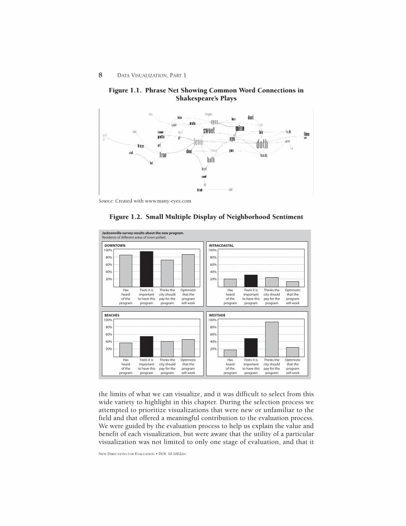
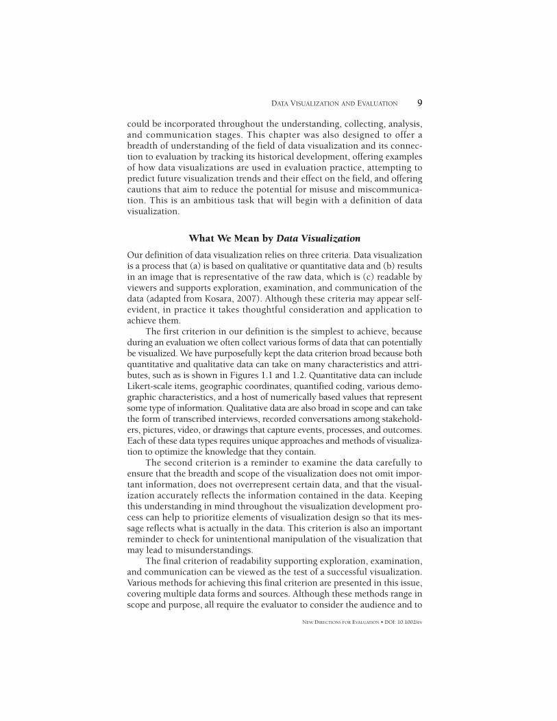
One of the main challenges in writing a chapter on visualization and evaluation is that data visualization is very broad in scope and can encompass anything from qualitatively based phrase nets, such as
in Figure 1.1, to quantitatively derived charts, such as in Figure 1.2. There are also various visualizations that fall within this spectrum, some pushing
7
1
NEW DIRECTIONS FOR EVALUATION, no. 139, Fall 2013 © Wiley Periodicals, Inc., and the American Evaluation Association. Published online in Wiley Online Library (wileyonlinelibrary.com) • DOI: 10.1002/ev.20065
Note: The figures presented in this chapter can be viewed in color by accessing www.NDEdataviz.com and selecting Chapter 1.
8 DATA VISUALIZATION, PART 1
NEW DIRECTIONS FOR EVALUATION • DOI: 10.1002/ev
8
the limits of what we can visualize, and it was difficult to select from this wide variety to highlight in this chapter. During the selection process we attempted to prioritize visualizations that were new or unfamiliar to the field and that offered a meaningful contribution to the evaluation process. We were guided by the evaluation process to help us explain the value and benefit of each visualization, but were aware that the utility of a particular visualization was not limited to only one stage of evaluation, and that it
Figure 1.1. Phrase Net Showing Common Word Connections in Shakespeare’s Plays
Source: Created with www.many-eyes.com
Figure 1.2. Small Multiple Display of Neighborhood Sentiment
100%DOWNTOWN
Jacksonville survey results about the new program.Residents of different areas of town polled.
INTRACOASTAL
BEACHES WESTSIDE
80%
60%
40%
20%
Optimisticthat theprogramwill work
Thinks thecity shouldpay for the
program
Feels it isimportant
to have thisprogram
Hasheardof the
program
100%
80%
60%
40%
20%
Optimisticthat theprogramwill work
Thinks thecity shouldpay for the
program
Feels it isimportant
to have thisprogram
Hasheardof the
program
100%
80%
60%
40%
20%
Optimisticthat theprogramwill work
Thinks thecity shouldpay for the
program
Feels it isimportant
to have thisprogram
Hasheardof the
program
100%
80%
60%
40%
20%
Optimisticthat theprogramwill work
Thinks thecity shouldpay for the
program
Feels it isimportant
to have thisprogram
Hasheardof the
program
9DATA VISUALIZATION AND EVALUATION
NEW DIRECTIONS FOR EVALUATION • DOI: 10.1002/ev
9
could be incorporated throughout the understanding, collecting, analysis, and communication stages. This chapter was also designed to offer a breadth of understanding of the field of data visualization and its connec-tion to evaluation by tracking its historical development, offering examples of how data visualizations are used in evaluation practice, attempting to predict future visualization trends and their effect on the field, and offering cautions that aim to reduce the potential for misuse and miscommunica-tion. This is an ambitious task that will begin with a definition of data visualization.
What We Mean by Data Visualization
Our definition of data visualization relies on three criteria. Data visualization is a process that (a) is based on qualitative or quantitative data and (b) results in an image that is representative of the raw data, which is (c) readable by viewers and supports exploration, examination, and communication of the data (adapted from Kosara, 2007). Although these criteria may appear self-evident, in practice it takes thoughtful consideration and application to achieve them.
The first criterion in our definition is the simplest to achieve, because during an evaluation we often collect various forms of data that can potentially be visualized. We have purposefully kept the data criterion broad because both quantitative and qualitative data can take on many characteristics and attri-butes, such as is shown in Figures 1.1 and 1.2. Quantitative data can include Likert-scale items, geographic coordinates, quantified coding, various demo-graphic characteristics, and a host of numerically based values that represent some type of information. Qualitative data are also broad in scope and can take the form of transcribed interviews, recorded conversations among stakehold-ers, pictures, video, or drawings that capture events, processes, and outcomes. Each of these data types requires unique approaches and methods of visualiza-tion to optimize the knowledge that they contain.
The second criterion is a reminder to examine the data carefully to ensure that the breadth and scope of the visualization does not omit impor-tant information, does not overrepresent certain data, and that the visual-ization accurately reflects the information contained in the data. Keeping this understanding in mind throughout the visualization development pro-cess can help to prioritize elements of visualization design so that its mes-sage reflects what is actually in the data. This criterion is also an important reminder to check for unintentional manipulation of the visualization that may lead to misunderstandings.
The final criterion of readability supporting exploration, examination, and communication can be viewed as the test of a successful visualization. Various methods for achieving this final criterion are presented in this issue, covering multiple data forms and sources. Although these methods range in scope and purpose, all require the evaluator to consider the audience and to
10 DATA VISUALIZATION, PART 1
NEW DIRECTIONS FOR EVALUATION • DOI: 10.1002/ev
use his or her understanding to craft a visualization that is engaging and, more importantly, enlightening. We believe that if a visualization achieves criteria 1 and 2, but fails to achieve criterion 3, then it has failed to accom-plish its primary objective of helping to turn data into knowledge.
History and Current Trends in Data Visualization
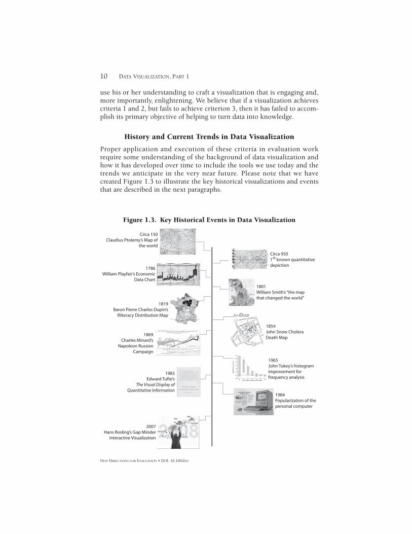
Proper application and execution of these criteria in evaluation work require some understanding of the background of data visualization and how it has developed over time to include the tools we use today and the trends we anticipate in the very near future. Please note that we have created Figure 1.3 to illustrate the key historical visualizations and events that are described in the next paragraphs.
Figure 1.3. Key Historical Events in Data Visualization
Circa 150Claudius Ptolemy’s Map of
the world
1786William Playfair’s Economic
Data Chart
1819Baron Pierre Charles Dupin’s
Illiteracy Distribution Map
1869Charles Minard’s
Napoleon RussianCampaign
1983Edward Tufte’s
The Visual Display ofQuantitative Information
2007Hans Rosling’s Gap Minder
Interactive Visualization
1984Popularization of thepersonal computer
1965John Tukey’s histogramimprovement forfrequency analysis
1854John Snow CholeraDeath Map
1801William Smith’s “the mapthat changed the world”
Circa 9501st known quantitativedepiction
11DATA VISUALIZATION AND EVALUATION
NEW DIRECTIONS FOR EVALUATION • DOI: 10.1002/ev
11
Although data visualization evolved in sister fields like survey design (Dillman, Tortora, Conradt, & Bowker, 1998), applied statistics (Bertin, 1983; Cleveland, 1993; Tukey, 1977), visual thinking, and technology and information design, the earliest seeds of visualization are found in cartog-raphy and astronomy. Early Egyptians used coordinates to lay out towns, and by 200 BC were using a lattice system similar to latitude and longitude to denote the positions of land masses and stars. In the 1st century AD, Claudius Ptolemy developed a spherical map of the earth using latitude and longitude that served as a reference standard until the 14th century (Friendly, 2009).
The first known graphical depiction of quantitative information is a circa 950 anonymous multiple time-series graph showing the changing position of the seven most prominent heavenly bodies over space and time (Friendly, 2009). However, it wasn’t until the 17th century that French philosopher and mathematician Rene Descartes invented the visual repre-sentation of quantitative data in relation to two-dimensional coordinate scales. Despite these graphical innovations, William Playfair is credited as the inventor of the modern chart based on his books Commercial and Polit-ical Atlas (Playfair, 2005) and Statistical Breviary (Playfair, 2003), which displayed line and bar charts (see Figure 1.3) and pie charts, respectively, and which had the unique advantage of being widely distributed because of Gutenberg’s invention of the printing press in 1450.
The early to mid-1800s saw an explosion of new data displays that pushed ideas of data representation and the social issues that they reflected, beginning with geologist William Smith’s (Smith, 1815) geological map of Great Britain. Smith’s representation was not only the first national-scale geological map, it was the most accurate of its time. Perhaps more critically, it depicted each local sequence of rock strata as a subsequence of a single universal sequence of strata that could be distinguished and traced for great distances by means of embedded fossilized organisms. Because this visual-ization provided support to the new theory of evolution and pushed ideas regarding the earth’s age, many cartographers refer to it as “The Map that Changed the World” (Allen, 2010). This map also demonstrated how a visualization could be used to enhance understanding and provide factual support to contested claims.
In the 1820s Baron Charles Dupin used continuous shadings from white to black to show the distribution and degree of illiteracy in France. Titled “Carte de la France obscure et de la France éclairée” (Dupin, 1826), it attracted wide attention and may represent the first application of graph-ics in the social realm. It could be considered a very early attempt at visual representation of community needs. In 1855 Dr. John Snow (Snow, 1855) used a dot map to identify deaths due to cholera clustered around the infested Broad Street pump in London (Friendly, 2009), and Florence Nightingale (Nightingale, 1857) used circular area charts to show that more
12 DATA VISUALIZATION, PART 1
NEW DIRECTIONS FOR EVALUATION • DOI: 10.1002/ev
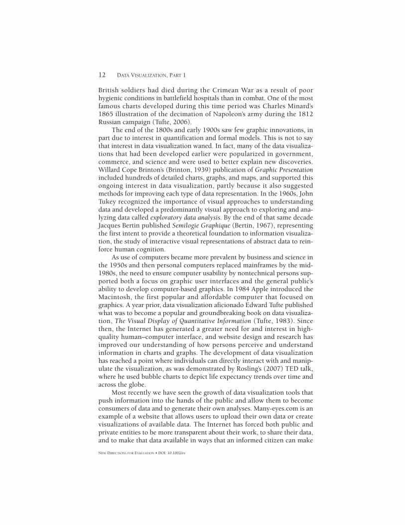
British soldiers had died during the Crimean War as a result of poor hygienic conditions in battlefield hospitals than in combat. One of the most famous charts developed during this time period was Charles Minard’s 1865 illustration of the decimation of Napoleon’s army during the 1812 Russian campaign (Tufte, 2006).
The end of the 1800s and early 1900s saw few graphic innovations, in part due to interest in quantification and formal models. This is not to say that interest in data visualization waned. In fact, many of the data visualiza-tions that had been developed earlier were popularized in government, commerce, and science and were used to better explain new discoveries. Willard Cope Brinton’s (Brinton, 1939) publication of Graphic Presentation included hundreds of detailed charts, graphs, and maps, and supported this ongoing interest in data visualization, partly because it also suggested methods for improving each type of data representation. In the 1960s, John Tukey recognized the importance of visual approaches to understanding data and developed a predominantly visual approach to exploring and ana-lyzing data called exploratory data analysis. By the end of that same decade Jacques Bertin published Semilogie Graphique (Bertin, 1967), representing the first intent to provide a theoretical foundation to information visualiza-tion, the study of interactive visual representations of abstract data to rein-force human cognition.
As use of computers became more prevalent by business and science in the 1950s and then personal computers replaced mainframes by the mid-1980s, the need to ensure computer usability by nontechnical persons sup-ported both a focus on graphic user interfaces and the general public’s ability to develop computer-based graphics. In 1984 Apple introduced the Macintosh, the first popular and affordable computer that focused on graphics. A year prior, data visualization aficionado Edward Tufte published what was to become a popular and groundbreaking book on data visualiza-tion, The Visual Display of Quantitative Information (Tufte, 1983). Since then, the Internet has generated a greater need for and interest in high-quality human–computer interface, and website design and research has improved our understanding of how persons perceive and understand information in charts and graphs. The development of data visualization has reached a point where individuals can directly interact with and manip-ulate the visualization, as was demonstrated by Rosling’s (2007) TED talk, where he used bubble charts to depict life expectancy trends over time and across the globe.
Most recently we have seen the growth of data visualization tools that push information into the hands of the public and allow them to become consumers of data and to generate their own analyses. Many-eyes.com is an example of a website that allows users to upload their own data or create visualizations of available data. The Internet has forced both public and private entities to be more transparent about their work, to share their data, and to make that data available in ways that an informed citizen can make
13DATA VISUALIZATION AND EVALUATION
NEW DIRECTIONS FOR EVALUATION • DOI: 10.1002/ev
sense of it. In the United States, we’ve seen President Obama elevate proj-ects like Data.gov (http://www.data.gov), the public repository of federal data. Citizens can go to County Sin Rankings at http://countysinrankings.org, a winner of the Sunlight Foundation’s data visualization and access challenge, to find out about high school dropout rates, income inequality, violent crime, and other indicators within their county. Parents and educa-tors (and anyone else) can use the Kids Count Data Center at http://datacenter.kidscount.org/ from the Annie E. Casey Foundation to rank, map, and create trend graphs for indicators of child welfare. This trend will con-tinue as more information becomes available and the need to analyze and visualize “big data” becomes more common in society.
Current Uses of Data Visualization in Evaluation
The topic of data visualization has been of interest to the evaluation field for at least a decade and a half with the publication of a previous New Direc-tions for Evaluation issue edited by Henry (1997) titled “Creating Effective Graphs: Solutions for a Variety of Evaluation Data,” and the recent creation of the Data Visualization and Reporting Topical Interest Group (2010) within the American Evaluation Association. Given this interest and the con-tinuing developments in data visualization software technology, processing power, and storage capacity, we believe that data visualization has reached a stage where it has become critical for the evaluation community to improve how it designs and communicates information. This was confirmed in a study by Evergreen (2011), who found that many of the visualizations used in evaluation reports tended to be confusing, potentially leading to misun-derstandings and decision errors on the part of the evaluator and stakehold-ers. Our hope is to provide examples of interesting and effective data visualizations in this chapter and throughout the volume to help inspire and improve the relevance of data visualization in evaluation practice. In our attempt to accomplish this we have selected some innovative visualizations that can be used during different stages of the evaluation process. The fol-lowing sections briefly illustrate how visualizations have been used (a) to increase our understanding of a program, its context, and history; (b) to aid in the collection of data; (c) to conduct analyses of different forms of data; and (d) to communicate to a wide range of stakeholder groups.
Understanding
During the understanding stage an evaluator is concerned with gaining insights about the program, its history, activities, stakeholders, and more generally the context in which the program operates. As evaluators begin to gather this information they can use qualitative visualization techniques, such as graphic recording, to gain insights in an interactive visual manner that encourages discussion amongst stakeholders. The graphic recording
14 DATA VISUALIZATION, PART 1
NEW DIRECTIONS FOR EVALUATION • DOI: 10.1002/ev
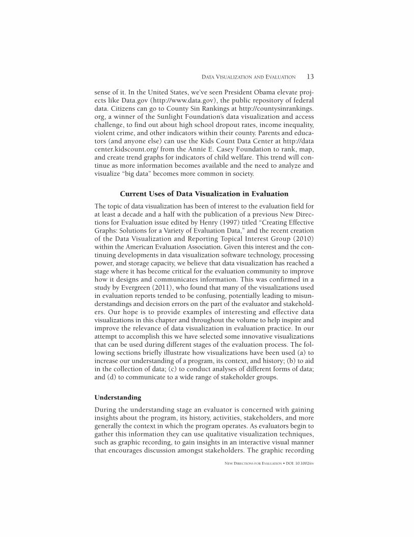
approach is a facilitated group discussion that is visually represented as dif-ferent topics, themes, and ideas emerge from the group (described in more detail in Part 2). Graphic recording enables the visualization of ideas and concepts that solicits stakeholders’ beliefs about how their program func-tions and where it is located within the larger environment and community (Figure 1.4). The actual graphic recording process is as important as the final product because it allows the evaluator to gain a sense of the history and evolution of the ideas behind a program, group dynamics, and stake-holder interests and values. Graphic recording could be described as a less rigid form of program theory development or logic modeling; however, the final product is something that tells a story about a program, where it’s been, where it is, and where it wants to go.
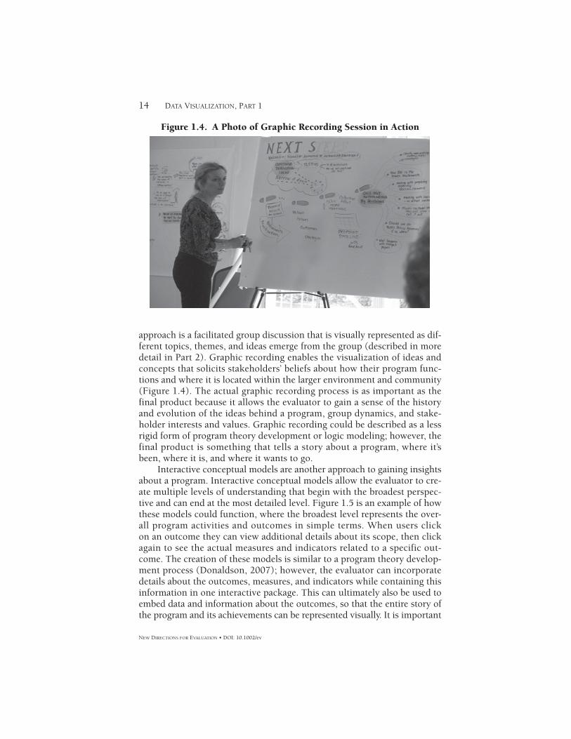
Interactive conceptual models are another approach to gaining insights about a program. Interactive conceptual models allow the evaluator to cre-ate multiple levels of understanding that begin with the broadest perspec-tive and can end at the most detailed level. Figure 1.5 is an example of how these models could function, where the broadest level represents the over-all program activities and outcomes in simple terms. When users click on an outcome they can view additional details about its scope, then click again to see the actual measures and indicators related to a specific out-come. The creation of these models is similar to a program theory develop-ment process (Donaldson, 2007); however, the evaluator can incorporate details about the outcomes, measures, and indicators while containing this information in one interactive package. This can ultimately also be used to embed data and information about the outcomes, so that the entire story of the program and its achievements can be represented visually. It is important
Figure 1.4. A Photo of Graphic Recording Session in Action
Org
aniz
atio
nal
Ass
ets
Com
mun
ityA
sset
s
Fam
ilyA
sset
s
Org
aniz
atio
nal
Effec
tiven
ess
Fam
ily W
ell
bein
g
Opt
imal
Ear
lyCh
ildho
odD
evel
opm
ent
Com
mun
ityW
ell-b
eing
Out
com
e A
reas
Big
Pict
ure
Out
com
e A
reas
Fam
ily W
ell-b
eing
Fam
ily W
ell-b
eing
Shor
t-te
rmO
utco
mes
(1-5
yrs
)
Big
Pict
ure
Fam
ily W
ell-b
eing
Med
ium
-ter
mO
utco
mes
(6-1
0 yr
s)
Key
Out
com
esIn
dica
tors
Med
ium
-ter
mO
utco
mes
(6-1
0 yr
s)
1. S
tren
gthe
ned
pers
onal
and
soc
ial
rela
tions
hip
with
in a
nd b
etw
een
fam
ilies
1. D
ecre
ase
in n
umbe
r of p
aren
ts
who
repo
rt fe
elin
g lo
nely
2. In
crea
se in
num
ber o
f fam
ilies
who
re
port
hav
ing
frie
nds
and
carin
g
rela
tions
hips
with
indi
vidu
als
othe
r tha
n
sup
port
sta
ff an
d fa
mily
mem
bers
3. In
crea
se in
the
num
ber o
f par
ents
w
ho re
ad to
thei
r chi
ld d
aily
2. In
crea
sed
capa
city
of f
amili
es to
fost
er th
e
inte
llect
ual d
evel
opm
ent o
f the
ir ch
ildre
nLo
ng-t
erm
Out
com
es(1
0+ y
rs)
Fam
ilies
are
resi
lient
and
fully
supp
ort t
heir
child
ren'
sop
timal
em
otio
nal,
cogn
itive
and
phys
ical
dev
elop
men
t.
Broa
dest
leve
lM
iddl
e Le
vel
Det
ail L
evel
Sust
aina
bilit
y
Capa
city
Dev
elop
men
t
Ulti
mat
e G
oal
Fig
ure
1.5
. A
n E
xam
ple
of
an I
nte
ract
ive
Pro
gram
Th
eory
16 DATA VISUALIZATION, PART 1
NEW DIRECTIONS FOR EVALUATION • DOI: 10.1002/ev
Figure 1.6. An Example of Using GIS to Conduct a Community Needs Assessment
Source: Created with http://www.healthycity.org/
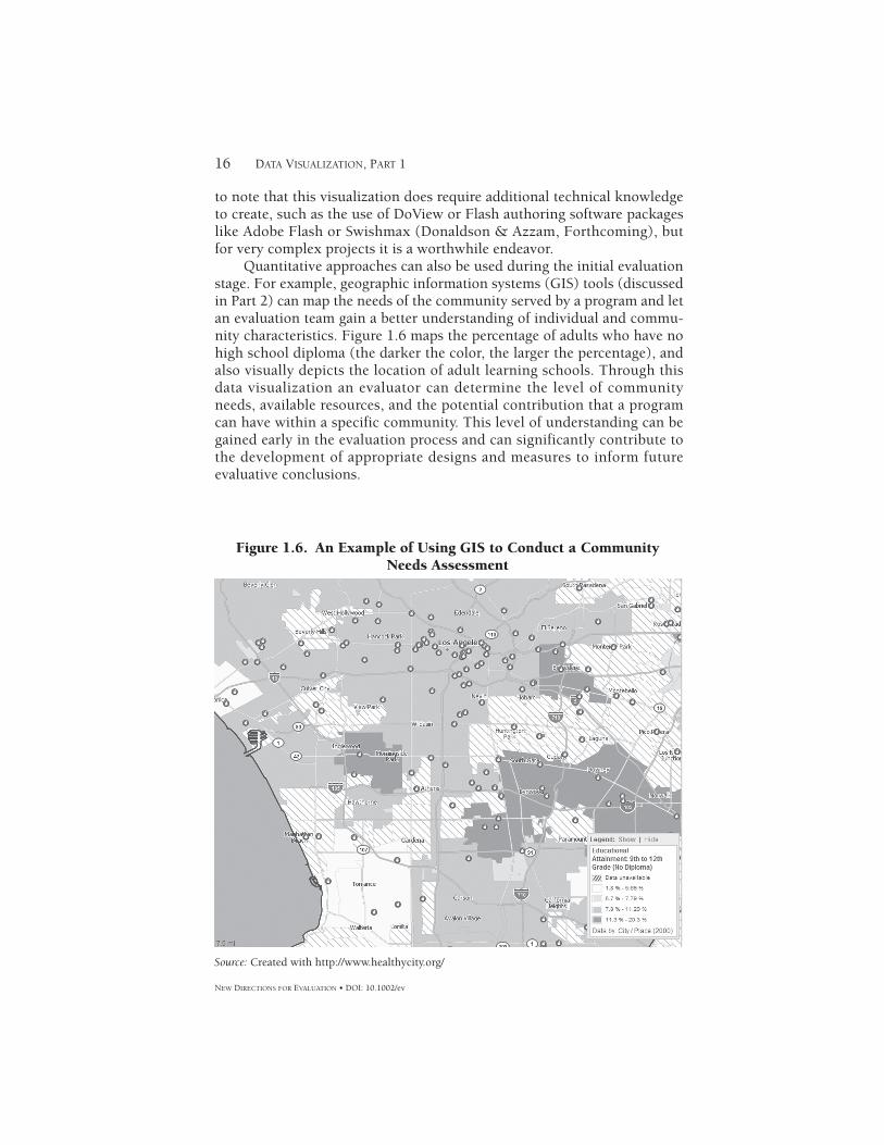
to note that this visualization does require additional technical knowledge to create, such as the use of DoView or Flash authoring software packages like Adobe Flash or Swishmax (Donaldson & Azzam, Forthcoming), but for very complex projects it is a worthwhile endeavor.
Quantitative approaches can also be used during the initial evaluation stage. For example, geographic information systems (GIS) tools (discussed in Part 2) can map the needs of the community served by a program and let an evaluation team gain a better understanding of individual and commu-nity characteristics. Figure 1.6 maps the percentage of adults who have no high school diploma (the darker the color, the larger the percentage), and also visually depicts the location of adult learning schools. Through this data visualization an evaluator can determine the level of community needs, available resources, and the potential contribution that a program can have within a specific community. This level of understanding can be gained early in the evaluation process and can significantly contribute to the development of appropriate designs and measures to inform future evaluative conclusions.
17DATA VISUALIZATION AND EVALUATION
NEW DIRECTIONS FOR EVALUATION • DOI: 10.1002/ev
Collecting
The visual design of data collection tools and the use of collection methods that facilitate visualization have helped improve the quality of the information we gather. For example, graph enhancements like annotation and attentional cues such as arrows have garnered more credibility in evaluation because of the pioneering work of Dillman et al. (1998) in the field of survey design. Christian and Dillman (2004), for example, found that one response option was selected more often, not because it reflected respondent opinions, but because unequal spacing between response options made it stand out from the others. Additionally, they found that large text boxes for open-ended responses led to longer answers and generated more themes during analysis. Thus considerations from graphic design like position, white space, symme-try, and emphasis influence survey data collection for evaluators.
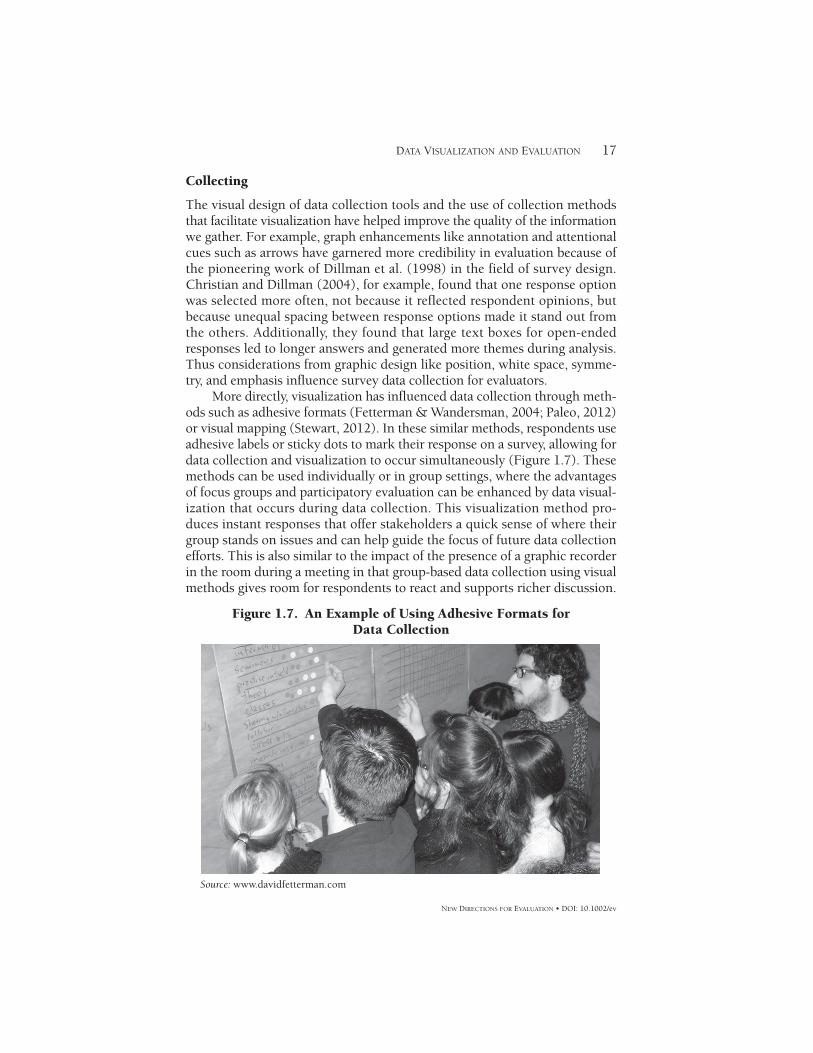
More directly, visualization has influenced data collection through meth-ods such as adhesive formats (Fetterman & Wandersman, 2004; Paleo, 2012) or visual mapping (Stewart, 2012). In these similar methods, respondents use adhesive labels or sticky dots to mark their response on a survey, allowing for data collection and visualization to occur simultaneously (Figure 1.7). These methods can be used individually or in group settings, where the advantages of focus groups and participatory evaluation can be enhanced by data visual-ization that occurs during data collection. This visualization method pro-duces instant responses that offer stakeholders a quick sense of where their group stands on issues and can help guide the focus of future data collection efforts. This is also similar to the impact of the presence of a graphic recorder in the room during a meeting in that group-based data collection using visual methods gives room for respondents to react and supports richer discussion.
Figure 1.7. An Example of Using Adhesive Formats for Data Collection
Source: www.davidfetterman.com
18 DATA VISUALIZATION, PART 1
NEW DIRECTIONS FOR EVALUATION • DOI: 10.1002/ev
Analyzing
Evaluators often collect information from surveys, interviews, focus groups, databases, pictures, videos, and a myriad of other sources. Frequently this information is reduced to a single numerical value, such as a mean score, or to snippets of quotes used to convey conclusions about a program’s effec-tiveness. Whereas these approaches remain relevant and important to our field, during the analysis stage the evaluator needs to access details visually, connect different pieces of information, identify interesting deviations and patterns, and explore information from multiple perspectives or levels. Doing so enhances the evaluator’s grasp of the data, including their strengths and limitations, and allows the evaluator to detect outliers that may warn of inconsistencies in how the data were entered or point to unex-pected effects of the program on a particular subgroup.
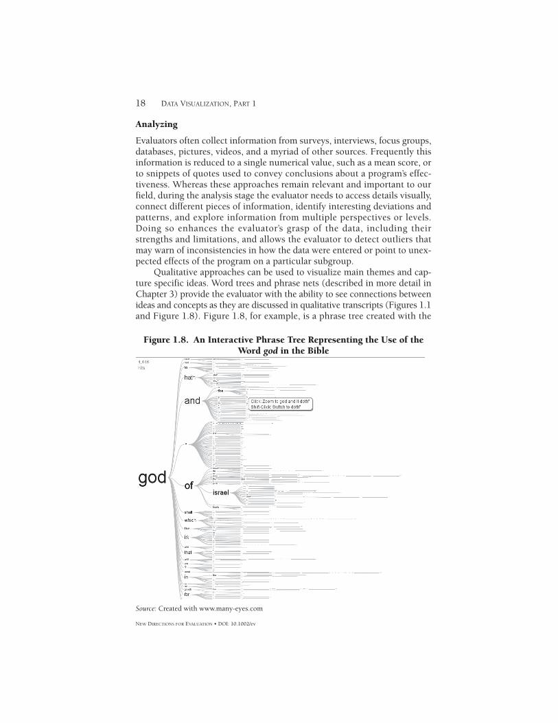
Qualitative approaches can be used to visualize main themes and cap-ture specific ideas. Word trees and phrase nets (described in more detail in Chapter 3) provide the evaluator with the ability to see connections between ideas and concepts as they are discussed in qualitative transcripts (Figures 1.1 and Figure 1.8). Figure 1.8, for example, is a phrase tree created with the
Figure 1.8. An Interactive Phrase Tree Representing the Use of the Word god in the Bible
Source: Created with www.many-eyes.com
19DATA VISUALIZATION AND EVALUATION
NEW DIRECTIONS FOR EVALUATION • DOI: 10.1002/ev
use of IBM’s Many-eyes.com website and depicts the use of the word god within the Bible. As users click on each subsentence they can instantly view the full sentence and its source. This method can be helpful in the analysis of an interview transcript, as an evaluator can type in the name of the pro-gram and get a quick representation of how that program was described throughout the transcripts and the sentences within which the program name appeared. This supports pattern detection and has an added advantage of being visually engaging to stakeholders. As such, it can be used to gener-ate discussion about findings and their potential meaning and implications.
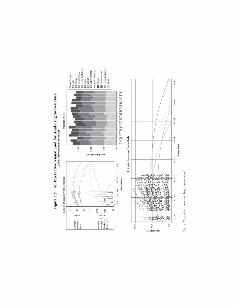
Many of the quantitative visual analysis methods and tools (described in more detail in Chapter 2) share a common strength: the ability to dig deeper into the numbers while retaining access to a bird’s-eye view of the data. The visualization process enables evaluators to detect patterns that may have remained unnoticed through other traditional methods. Many of the visualization analysis tools have been developed to serve the for-profit business sector, but their capabilities are applicable to the data analysis needs of evaluators. Currently there are software packages like Tableau, Spotfire, and SAS’s J.M.P. that provide the evaluator with the power to cre-ate multiple interactive visualizations that can be used to highlight specific variables, drill down into subgroups, change the timeline, embed maps, and a host of other features. Figure 1.9 is an example of a data analysis screen that is created by Tableau that the user can directly interact with by clicking on any of the pieces of information to filter results, highlight trends, select individual cases, and change parameters. These abilities represent an important step in helping us understand the embedded knowledge that is contained in quantitative data.
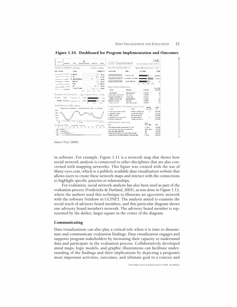
Additionally, quantitative dashboards (described in more detail in Part 2) can be used to create a visual representation of how a program is perform-ing on multiple indicators at once. These dashboards can be viewed as a way to track program performance by centralizing critical performance measures into a single visual structure. Dashboards can be designed to show whether a program is meeting its implementation quality targets, achieving performance outcomes, or is on the correct trajectory to accom-plishing its goals. Figure 1.10 is an example of an operational dashboard that can be used to track implementation of different activities throughout an organization. This dashboard is designed to show trends across time, warnings if things are not working as expected, progress toward achieving goals, and a host of other critical information needed to help understand the operational effectiveness of an organization.
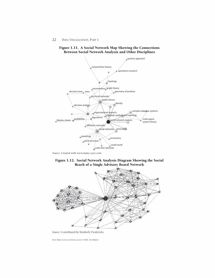
Other visualization methods can help answer questions about the social interactions and dynamics present between individuals and organizations. The study of social networks has been around in the social sciences since the early 1980s (Wasserman & Galaskiewicz, 1994); however, the ability to map social networks to create a visualization has become easier with developments
Cust
omer
Sur
veys
Res
ults
by
Prod
uct
Aver
age
Inte
rest
Leve
l
Mov
ing
Aver
age
ofM
arke
ting
Expe
nse
60 40 20
Value
Avg. Interest Level
Value0
400k
0.0
50.0
100.
0
150.
0
200k 0k
3/1/
08
Sele
ct P
rodu
ct:
(All)
Clou
dCr
owds
ourc
eH
oste
dSol
utio
n
Hig
hlig
ht P
rodu
ct:
Clou
dCr
owds
ourc
eH
oste
dSol
utio
nSA
AS
SAA
SSe
rver
Supe
rDes
ktop
Mar
ketin
g Co
st a
nd P
rodu
ct In
tere
stIn
tere
st b
y St
ate
6/1/
089/
1/08
Surv
ey D
ate
Interest Level
12/1
/08
CAFL
GAIL
LAMAMEMI
NDNENHNVNYOHOKORSDTXVA
WA
100.
0
50.0 0.0
2/1/
084/
1/08
6/1/
088/
1/08
10/1
/08
Surv
ey D
ate
Estim
ated
Dur
atio
n of
Pro
duct
Fad
s
12/1
/08
2/1/
094/
1/09
Fig
ure
1.9
. A
n I
nte
ract
ive
Vis
ual
Too
l fo
r A
nal
yzin
g S
urv
ey D
ata
Sour
ce: C
reat
ed w
ith
ww
w.t
able
auso
ftw
are.
com
/
21DATA VISUALIZATION AND EVALUATION
NEW DIRECTIONS FOR EVALUATION • DOI: 10.1002/ev
in software. For example, Figure 1.11 is a network map that shows how social network analysis is connected to other disciplines that are also con-cerned with mapping networks. This figure was created with the use of Many-eyes.com, which is a publicly available data visualization website that allows users to create these network maps and interact with the connections to highlight specific patterns or relationships.
For evaluation, social network analysis has also been used as part of the evaluation process (Fredericks & Durland, 2005), as was done in Figure 1.12, where the authors used this technique to illustrate an egocentric network with the software Netdraw in UCINET. The analysis aimed to examine the social reach of advisory board members, and this particular diagram shows one advisory board member’s network. The advisory board member is rep-resented by the darker, larger square in the center of the diagram.
Communicating
Data visualizations can also play a critical role when it is time to dissemi-nate and communicate evaluation findings. Data visualization engages and supports program stakeholders by increasing their capacity to understand data and participate in the evaluation process. Collaboratively developed mind maps, logic models, and graphic illustrations can facilitate under-standing of the findings and their implications by depicting a program’s most important activities, outcomes, and ultimate goal in a concise and
Figure 1.10. Dashboard for Program Implementation and Outcomes
Source: Few (2006).
22 DATA VISUALIZATION, PART 1
NEW DIRECTIONS FOR EVALUATION • DOI: 10.1002/ev
Figure 1.12. Social Network Analysis Diagram Showing the Social Reach of a Single Advisory Board Network
Source: Contributed by Kimberly Fredericks.
Figure 1.11. A Social Network Map Showing the Connections Between Social Network Analysis and Other Disciplines
Source: Created with www.many-eyes.com
network flow theory
operations research
topology
enumerativetreesdecision trees
decision analysis
probability
organizational researchalgebraic analysis and topology
algorithms
affiliation networks
graph theorygeometry of position
electrical networksgraph theory
density
systems approach
Markov chains
clustering
social structure
scale-free networkssmall-world
sociometry
social networks innovation
social network analysis
complex adaptive systems
multi-agentsystem theory
23DATA VISUALIZATION AND EVALUATION
NEW DIRECTIONS FOR EVALUATION • DOI: 10.1002/ev
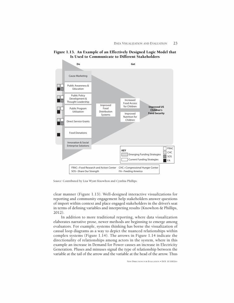
clear manner (Figure 1.13). Well-designed interactive visualizations for reporting and community engagement help stakeholders answer questions of import within context and place engaged stakeholders in the driver’s seat in terms of defining variables and interpreting results (Knowlton & Phillips, 2012).
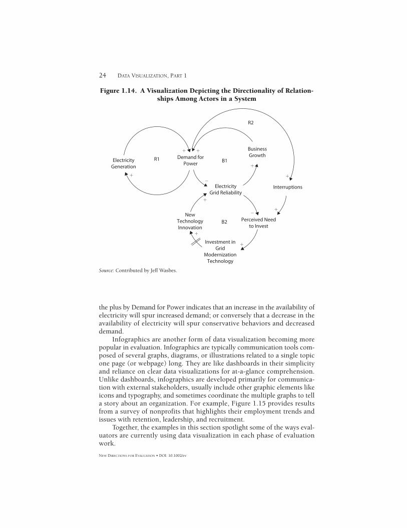
In addition to more traditional reporting, where data visualization elaborates narrative prose, newer methods are beginning to emerge among evaluators. For example, systems thinking has borne the visualization of causal loop diagrams as a way to depict the nuanced relationships within complex systems (Figure 1.14). The arrows in Figure 1.14 indicate the directionality of relationships among actors in the system, where in this example an increase in Demand for Power causes an increase in Electricity Generation. Pluses and minuses signal the type of relationship between the variable at the tail of the arrow and the variable at the head of the arrow. Thus
Cause Marketing
Public Awareness &Education
Public PolicyDevelopment &
Thought Leadership
Public ProgramUtilization
Direct Service Grants
Food Donations
Innovation & SocialEnterprise Solutions
ImprovedFood
DistributionSystems
IncreasedFood Accessfor Children
ImprovedNutrition for
Children
KEY
Improved USChildren’s
Food Security
Do Get
Emerging Funding Strategies
Current Funding Strategies
FRAC
CHC
SOS
FA
FRAC=Food Research and Action CenterSOS=Share Our Strength
CHC=Congressional Hunger CenterFA=Feeding America
Figure 1.13. An Example of an Effectively Designed Logic Model that Is Used to Communicate to Different Stakeholders
Source: Contributed by Lisa Wyatt Knowlton and Cynthia Phillips.
24 DATA VISUALIZATION, PART 1
NEW DIRECTIONS FOR EVALUATION • DOI: 10.1002/ev
the plus by Demand for Power indicates that an increase in the availability of electricity will spur increased demand; or conversely that a decrease in the availability of electricity will spur conservative behaviors and decreased demand.
Infographics are another form of data visualization becoming more popular in evaluation. Infographics are typically communication tools com-posed of several graphs, diagrams, or illustrations related to a single topic one page (or webpage) long. They are like dashboards in their simplicity and reliance on clear data visualizations for at-a-glance comprehension. Unlike dashboards, infographics are developed primarily for communica-tion with external stakeholders, usually include other graphic elements like icons and typography, and sometimes coordinate the multiple graphs to tell a story about an organization. For example, Figure 1.15 provides results from a survey of nonprofits that highlights their employment trends and issues with retention, leadership, and recruitment.
Together, the examples in this section spotlight some of the ways eval-uators are currently using data visualization in each phase of evaluation work.
ElectricityGeneration
Demand forPower
BusinessGrowth
ElectricityGrid Reliability
Interruptions
NewTechnologyInnovation
Perceived Needto Invest
B2
B1R1
R2
+
+ +
+
+
+
+
+
+
−
−
Investment inGrid
ModernizationTechnology
Figure 1.14. A Visualization Depicting the Directionality of Relation-ships Among Actors in a System
Source: Contributed by Jeff Wasbes.
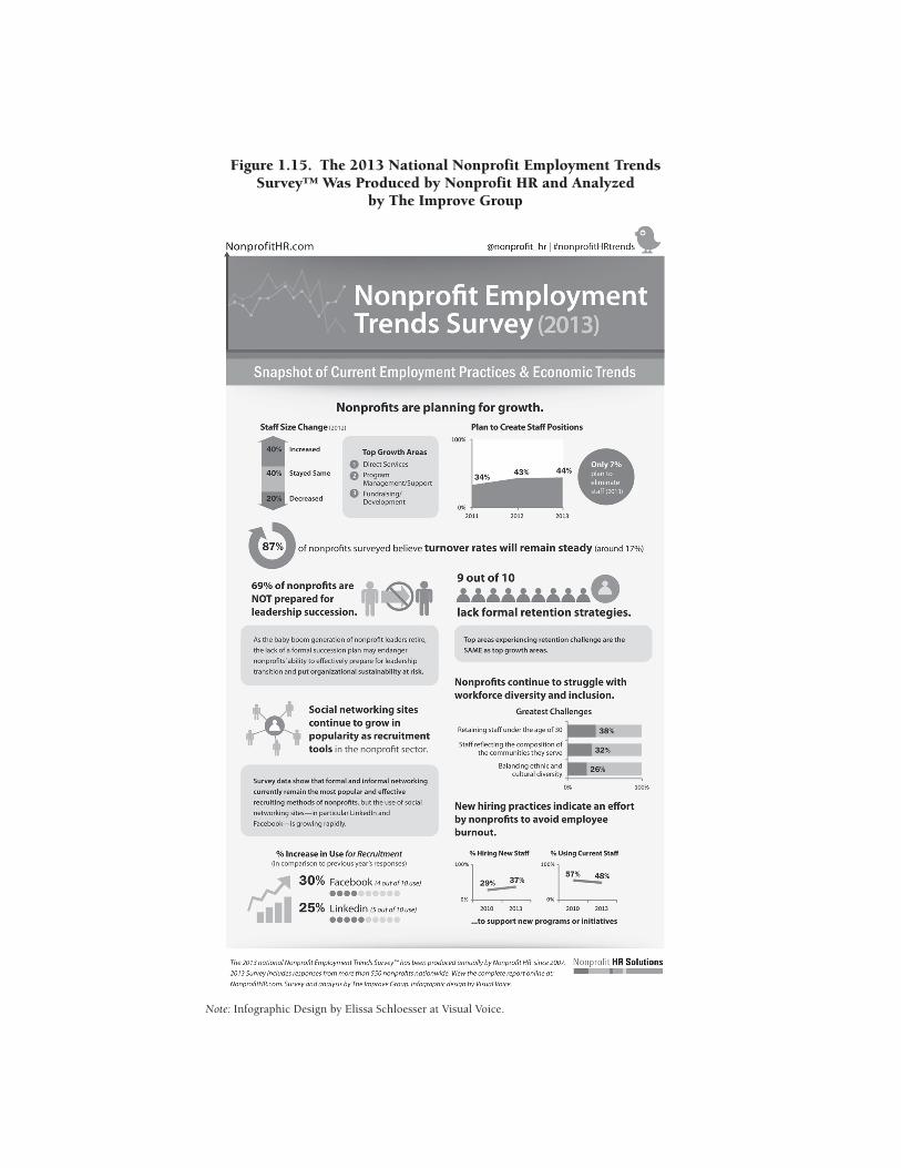
Figure 1.15. The 2013 National Nonprofit Employment Trends Survey™ Was Produced by Nonprofit HR and Analyzed
by The Improve Group
Note: Infographic Design by Elissa Schloesser at Visual Voice.
26 DATA VISUALIZATION, PART 1
NEW DIRECTIONS FOR EVALUATION • DOI: 10.1002/ev
Future Trends and Challenges
Understanding the development of data visualization within and outside the field of evaluation is important for giving us a perspective on its past history and where we might go in the future. We anticipate three future trends and four closely related challenges that will likely shape the way evaluators adopt and use data visualization practices. Because these trends and challenges will likely coalesce to heighten expectations for how evalu-ators analyze and report data, as a community we should strive to remain near or at the cutting edge of these changes.
Development in data visualization has seen exponential growth in the past few years. This is partly due to increased interest in data about our lives and culture, increased availability of online sources for data and visualiza-tion, and increased interactivity that has emerged through the introduction of technology like the iPad and Windows 8. We believe that these develop-ments will continue and that the trend will be toward the active engagement of stakeholders in the visualization process and the need for evaluators to facilitate this engagement. We foresee that stakeholders will become more accustomed to interpreting, creating, and interacting with data visualiza-tions. They may come to expect visualizations containing multiple perspec-tives on their programs and may require evaluators to produce such products as part of the evaluation. Advances in visualization software appli-cations have become available for public consumption and use, often at no financial expense. For example, programs like ManyEyes, Tableau Public, and Gapminder now provide Web-based services that let users upload data for custom visualizations, allowing them to analyze and interact with the information at their own pace and with their own focus.
This trend, when adopted by stakeholders, may require us to be more transparent about the data we collect, as demand for raw data increases. This particular prediction about transparency is already becoming a reality in the government sector, where the United States has funded and estab-lished data.gov, which aims to create a comprehensive repository of data that can be accessed, downloaded, and analyzed by any concerned citizen interested in issues that range from health care to environmental policy. The United Nations has also supported this trend by releasing large data-bases (http://data.un.org/) to help increase access and transparency, driven by their desire to be more open and accountable as well as the need to make sense of large amounts of information. Transparency has become more urgent as funding has tightened and the need for accountability increased. As such, data sharing is viewed as one approach to involve the public and show them the work being done by organizations. The second motivator for this trend is the need to understand what the data are saying. Many organizations collect large quantities of data without the capacity to analyze all of it. The hope is that members of the public will use these data to conduct their own analysis and generate knowledge that would otherwise
27DATA VISUALIZATION AND EVALUATION
NEW DIRECTIONS FOR EVALUATION • DOI: 10.1002/ev
be missed if the data remained cloistered. We believe that this trend will be a strong driver of future data policies and will lead to increased demands on openness of the data we collect.
Interactivity is also part of this trend, and we believe that it will increase in future importance. If data visualizations are designed to draw attention, software will need to incorporate methods to keep that attention. The ability to drill down into data and customize reporting appears to be the next step in data visualization. For example, when a client hovers on a peak data point, he or she should be one click away from seeing that data disaggre-gated by subgroups. Some software programs, Tableau, Spotfire, and SAS’s J.M.P., for example, already allow such visualization. However, the learning curve for manipulating new software programs can be steep and expensive. In the struggle between familiarity and customizability, we believe the most useful data displays will be those that include both characteristics.
Challenges
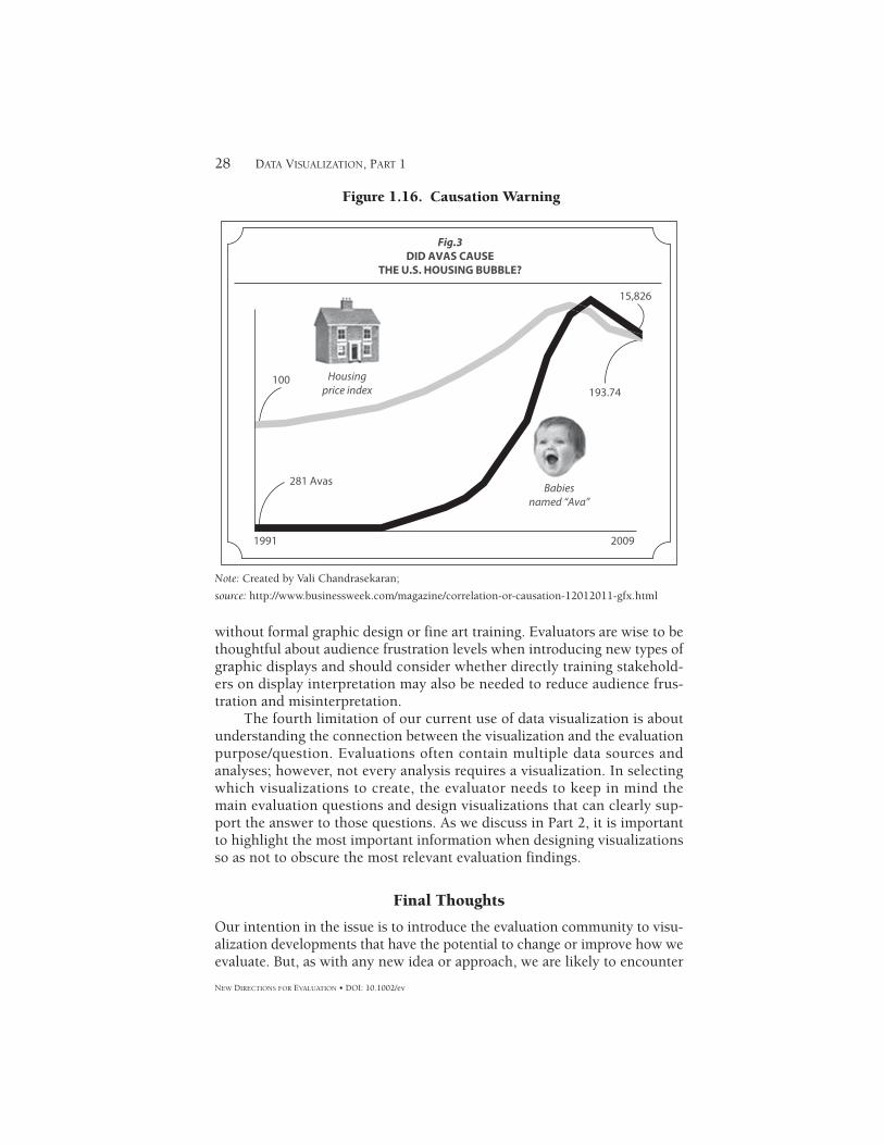
Evaluators and end users of data visualizations should also bear in mind what data visualization cannot do. There are several limitations or cautions to be considered when employing data visualization techniques. The first limitation of data displays concerns issues related to causality. One of the main purposes of data visualization is to illustrate relationships pointedly. However, visualizations can easily mislead readers into thinking that rela-tionships or patterns exist when in reality they do not. If seeing is believ-ing, then visualizing data can exacerbate the fallacies perpetuated by questionable statistics such as spurious correlations (Figure 1.16).
Relatedly, the second caution we heed in developing data displays is the reliability of data and information. The foundation of any visualization is the data used to create it. Visualizations can actually highlight the garbage in–garbage out problem. If data contain issues such as missing values, unrepresen-tative samples, or other problems, then it is the evaluator’s responsibility to acknowledge those limitations clearly through the use of footnotes or other indicators to avoid misleading stakeholders. Although lengthier narrative reporting can more easily integrate caveats, explanations of confidence levels, and declarations of significance levels, such important statements of uncertainty are not as easily rendered in a data visualization. As Ware (2013) noted, “The problem is that once data is [sic] represented as a visual object, it attains a kind of literal concrete quality that makes the viewer think it is accurate” (p. 28).
The third caution of data visualization is related to introducing new or unfamiliar visualizations to stakeholders. Tufte (2006) says that much of the trouble with poor graphics is due to the fact that most professional art-ists have little familiarity or skill with quantitative data, given that their primary study was fine art. The opposite also may be true: most researchers and evaluators have little familiarity or skill with graphic design and art. Technology has made developing visuals more accessible for those of us
28 DATA VISUALIZATION, PART 1
NEW DIRECTIONS FOR EVALUATION • DOI: 10.1002/ev
without formal graphic design or fine art training. Evaluators are wise to be thoughtful about audience frustration levels when introducing new types of graphic displays and should consider whether directly training stakehold-ers on display interpretation may also be needed to reduce audience frus-tration and misinterpretation.
The fourth limitation of our current use of data visualization is about understanding the connection between the visualization and the evaluation purpose/question. Evaluations often contain multiple data sources and analyses; however, not every analysis requires a visualization. In selecting which visualizations to create, the evaluator needs to keep in mind the main evaluation questions and design visualizations that can clearly sup-port the answer to those questions. As we discuss in Part 2, it is important to highlight the most important information when designing visualizations so as not to obscure the most relevant evaluation findings.
Final Thoughts
Our intention in the issue is to introduce the evaluation community to visu-alization developments that have the potential to change or improve how we evaluate. But, as with any new idea or approach, we are likely to encounter
15,826
100193.74
Fig.3DID AVAS CAUSE
THE U.S. HOUSING BUBBLE?
281 Avas
1991 2009
Housingprice index
Babiesnamed “Ava”
Figure 1.16. Causation Warning
Note: Created by Vali Chandrasekaran;
source: http://www.businessweek.com/magazine/correlation-or-causation-12012011-gfx.html
29DATA VISUALIZATION AND EVALUATION
NEW DIRECTIONS FOR EVALUATION • DOI: 10.1002/ev
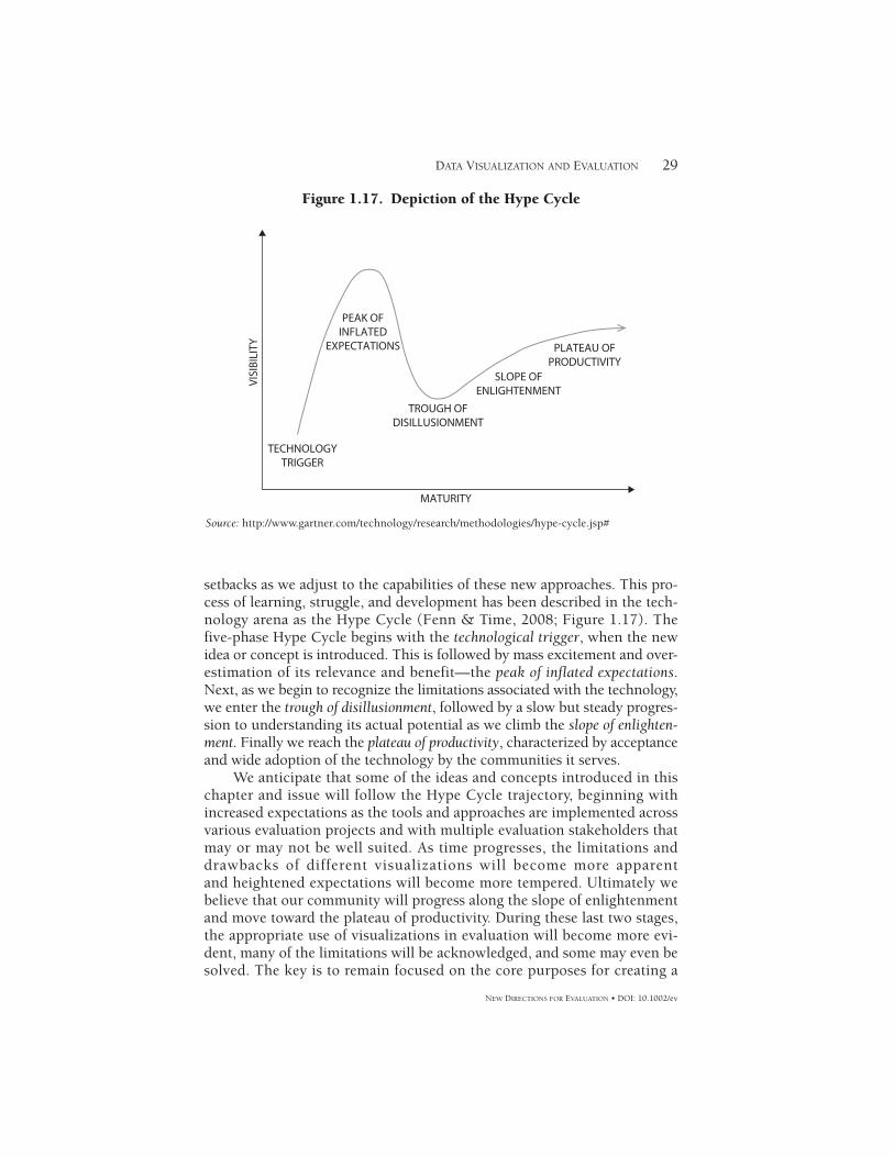
setbacks as we adjust to the capabilities of these new approaches. This pro-cess of learning, struggle, and development has been described in the tech-nology arena as the Hype Cycle (Fenn & Time, 2008; Figure 1.17). The five-phase Hype Cycle begins with the technological trigger, when the new idea or concept is introduced. This is followed by mass excitement and over-estimation of its relevance and benefit—the peak of inflated expectations. Next, as we begin to recognize the limitations associated with the technology, we enter the trough of disillusionment, followed by a slow but steady progres-sion to understanding its actual potential as we climb the slope of enlighten-ment. Finally we reach the plateau of productivity, characterized by acceptance and wide adoption of the technology by the communities it serves.
We anticipate that some of the ideas and concepts introduced in this chapter and issue will follow the Hype Cycle trajectory, beginning with increased expectations as the tools and approaches are implemented across various evaluation projects and with multiple evaluation stakeholders that may or may not be well suited. As time progresses, the limitations and drawbacks of different visualizations will become more apparent and heightened expectations will become more tempered. Ultimately we believe that our community will progress along the slope of enlightenment and move toward the plateau of productivity. During these last two stages, the appropriate use of visualizations in evaluation will become more evi-dent, many of the limitations will be acknowledged, and some may even be solved. The key is to remain focused on the core purposes for creating a
MATURITY
TECHNOLOGYTRIGGER
TROUGH OFDISILLUSIONMENT
SLOPE OFENLIGHTENMENT
PLATEAU OFPRODUCTIVITY
PEAK OFINFLATED
EXPECTATIONS
VISI
BILI
TY
Figure 1.17. Depiction of the Hype Cycle
Source: http://www.gartner.com/technology/research/methodologies/hype-cycle.jsp#
30 DATA VISUALIZATION, PART 1
NEW DIRECTIONS FOR EVALUATION • DOI: 10.1002/ev
visualization, which are to offer stakeholders an opportunity to explore, reflect, and generate knowledge from the data collected during the evalua-tion process.
By the time this manuscript is published, important new data visual-ization software packages and techniques will be on the market and some of the ones we have mentioned here will be out of business or, worse, passé. Regardless of the rise or fall of specific visualization platforms and strate-gies, we believe that data visualization is here to stay. It will continue to evolve and will increasingly play a critical role in the evaluation process.
References
Allen, S. (2010, July 8). Data visualization [Blog]. Retrieved from http://interactiondesign.sva.edu/classes/datavisualization/2010/07/08/introduction/
Bertin, J. (1967). Sémiologie graphique: Les diagrammes, les réseaux, les cartes [Graphic semiology: Diagrams, networks, maps]. Paris, France: Gauthier-Villars.
Bertin, J. (1983). Semiology of graphics: Diagrams, networks, maps. Madison, WI: The University of Wisconsin Press.
Brinton, W. C. (1939). Graphic presentation. New York, NY: Brinton Associates.Christian, L. M., & Dillman, D. A. (2004). The influence of graphical and symbolic
language manipulations on responses to self-administered questions. Public Opinion Quarterly, 68(1), 57–80.
Cleveland, W. S. (1993). A model for studying display methods of statistical graphics. Journal of Computational and Graphical Statistics, 2(4), 323–343.
Dillman, D. A., Tortora, R. D., Conradt, J., & Bowker, D. K. (1998, August). Influence of plain vs. fancy design on response rates for web surveys. Paper presented at the Joint Statistical Meetings, Dallas, TX. Retrieved from http://survey.sesrc.wsu.edu/dillman/papers/1998/influenceofplain.pdf
Donaldson, S. I. (2007). Program theory-driven evaluation science: Strategies and applica-tions. Mahwah, NJ: Erlbaum.
Donaldson, S. I., & Azzam, T. (Forthcoming). Developing complex theories of change: The promise of technology-enhanced interactive conceptual frameworks.
Dupin, C. (1826). Carte figurative de l’instruction populaire de la France, Jobard [Figura-tive map of the population’s level education in Jobard, France]. Paris, France: Biblio-thèque Nationale de France.
Evergreen, S. D. H. (2011). Eval + comm. New Directions for Evaluation, 131, 41–46.Fenn, J., & Time, M. (2008). Mastering the hype cycle: How to choose the right innovation
at the right time. Boston, MA: Harvard Business Press.Fetterman, D. M., & Wandersman, A. (Eds.). (2004). Empowerment evaluation principles
in practice. New York, NY: Guilford Press.Few, S. (2006). Information dashboard design: The effective visual communication of data.
Sebastopol, CA: O’Reilly Media.Fredericks, K. A., & Durland, M. M. (2005). The historical evolution and basic concepts
of social network analysis. New Directions for Evaluation, 107, 15–23.Friendly, M. (2009). Milestones in the history of thematic cartography, statistical graphics,
and data visualization. Retrieved from http://www.math.yorku.ca/SCS/Gallery/milestone/milestone.pdf
Henry, G. (Ed.). (1997). Creating effective graphs: Solutions for a variety of evaluation data. New Directions for Evaluation, 73, 1–6.
Knowlton, L. W., & Phillips, C. C. (2012). The logic model guidebook: Better strategies for great results. Thousand Oaks, CA: Sage.
31DATA VISUALIZATION AND EVALUATION
NEW DIRECTIONS FOR EVALUATION • DOI: 10.1002/ev
Kosara, R. (2007, July). Visualization criticism—The missing link between information visualization and art. Information Visualization, IV’07. 11th International Conference (pp. 631–636). doi: 10.1109/IV.2007.2
Nightingale, F. (1857). Mortality of the British army. London, England: Harrison and Sons.
Paleo, L. (2012, October). Adhesive formats for data collection—Practice and validity of dots, stickers, and labels. Paper presented at the meeting of the American Evaluation Association, Minneapolis, MN.
Playfair, W. (2003). Statistical breviary; shewing, on a principle entirely new, the resources of every state and kingdom in Europe, Wallis, London. In P. H. Rossi, H. E. Freeman, & M. W. Lipsey (Eds.), Evaluation: A systematic approach. Thousand Oaks, CA: Sage. (Original work published 1801)
Playfair, W. (2005). Commercial and political atlas: Representing, by copper-plate charts, the progress of the commerce, revenues, expenditure, and debts of England, during the whole of the eighteenth century. In H. Wainer & I. Spence (Eds.), The commercial and political atlas and statistical breviary. Cambridge, England: Cambridge University Press. (Original work published 1786)
Rosling, H. (2007, March). New insights on poverty [Video file]. Presentation at TED conference. Retrieved from http://www.ted. com/talks/lang/en/hans_rosling_reveals_new_insights_on_poverty.html
Smith, W. (1815). A delineation of the strata of England and Wales, with part of Scotland; exhibiting the collieries and mines, the marshes and fenlands originally overflowed by the sea, and the varieties of soil according to the substrata, illustrated by the most descriptive names. London, England: John Cary.
Snow, J. (1855). On the mode of communication of cholera (2nd ed.). London, England: n.p.
Stewart, B. (2012). Image grouping tool (Coffee Break Demonstration webinar no. 113) [Video file]. Fairhaven, MA: American Evaluation Association. Retrieved from http://comm.eval.org/EVAL/Resources/ViewDocument/?DocumentKey=8840ee00–933c-4624–9bb9–1bad15c03978
Tufte, E. R. (1983). The visual display of quantitative information. Chesire, CT: Graphics Press.
Tufte, E. R. (2006). Beautiful evidence. Cheshire, CT: Graphics Press.Tukey, J. W. (1977). Exploratory data analysis. Reading, MA: Addison-Wesley.Ware, C. (2013). Information visualization: Perception for design (3rd ed.). Waltham, MA:
Morgan Kaufmann.Wasserman, S., & Galaskiewicz, J. (Eds.). (1994). Advances in social network analysis:
Research in the social and behavioral sciences. Thousand Oaks, CA: Sage.

32 DATA VISUALIZATION, PART 1
NEW DIRECTIONS FOR EVALUATION • DOI: 10.1002/ev
TAREK AZZAM is an assistant professor at Claremont Graduate University, and associate director of the Claremont Evaluation Center. His research focuses on developing new methods that attempt to address the logistical, political, and technical challenges that evaluators commonly face in practice, with the aim of improving the rigor and credibility of evaluations and increasing evaluation’s potential impact on programs and policies.
STEPHANIE EVERGREEN is an evaluator who runs Evergreen Data, a data presentation consulting firm.
AMY A. GERMUTH is an independent evaluator and owner of EvalWorks, LLC, an evaluation and survey consulting firm in Durham, NC.
SUSAN J. KISTLER is the executive director of the American Evaluation Association and the owner of iMeasureMedia. She has shepherded AEA’s evolution over the past 10 years through an era of technological evolution to where it is at the forefront of associations its size in terms of the adoption and leveraging of technology and social media in pursuit of its mission and goals.


![WojtekSylwestrzak;JoséBorbinha;ThierryBouche ...DML-CZ [1], DML-PL [37], DML-E [19], DML-PT [3], EDP Sciences’ math journals, Bulgarian and Hellenic DMLs [10,15]), digital library](https://static.fdocuments.net/doc/165x107/6057690d890f902fa9793de0/wojteksylwestrzakjosborbinhathierrybouche-dml-cz-1-dml-pl-37-dml-e.jpg)