Data Storytelling and Visualization - Data Storytelling and... · of structured data (i.e. storing...
51
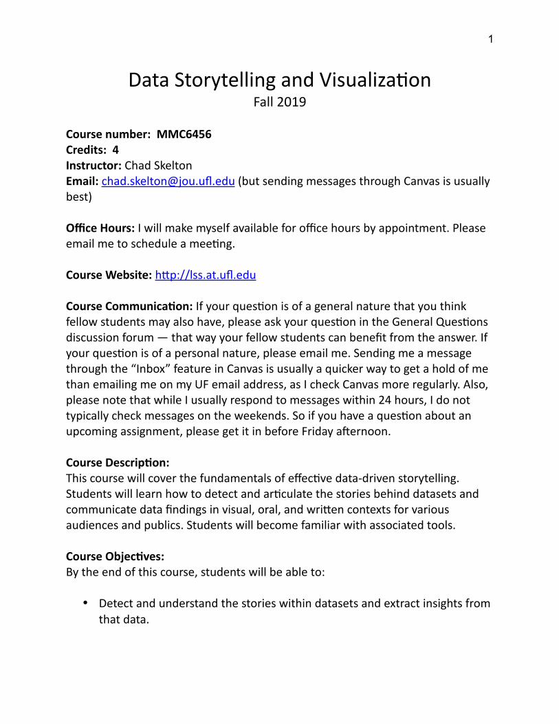
Data Storytelling and Visualizaon Fall 2019 Course number: MMC6456 Credits: 4 Instructor: Chad Skelton Email: [email protected]fl.edu (but sending messages through Canvas is usually best) Office Hours: I will make myself available for office hours by appointment. Please email me to schedule a meeng. Course Website: hp://lss.at.ufl.edu Course Communicaon: If your queson is of a general nature that you think fellow students may also have, please ask your queson in the General Quesons discussion forum — that way your fellow students can benefit from the answer. If your queson is of a personal nature, please email me. Sending me a message through the “Inbox” feature in Canvas is usually a quicker way to get a hold of me than emailing me on my UF email address, as I check Canvas more regularly. Also, please note that while I usually respond to messages within 24 hours, I do not typically check messages on the weekends. So if you have a queson about an upcoming assignment, please get it in before Friday aſternoon. Course Descripon: This course will cover the fundamentals of effecve data-driven storytelling. Students will learn how to detect and arculate the stories behind datasets and communicate data findings in visual, oral, and wrien contexts for various audiences and publics. Students will become familiar with associated tools. Course Objecves: By the end of this course, students will be able to: Detect and understand the stories within datasets and extract insights from that data. 1
Transcript of Data Storytelling and Visualization - Data Storytelling and... · of structured data (i.e. storing...
Data Storytelling and VisualizationFall 2019
Course number: MMC6456Credits: 4Instructor: Chad SkeltonEmail: [email protected] (but sending messages through Canvas is usually best)
Office Hours: I will make myself available for office hours by appointment. Please email me to schedule a meeting.
Course Website: http://lss.at.ufl.edu
Course Communication: If your question is of a general nature that you think fellow students may also have, please ask your question in the General Questions discussion forum — that way your fellow students can benefit from the answer. If your question is of a personal nature, please email me. Sending me a message through the “Inbox” feature in Canvas is usually a quicker way to get a hold of me than emailing me on my UF email address, as I check Canvas more regularly. Also, please note that while I usually respond to messages within 24 hours, I do not typically check messages on the weekends. So if you have a question about an upcoming assignment, please get it in before Friday afternoon.
Course Description: This course will cover the fundamentals of effective data-driven storytelling. Students will learn how to detect and articulate the stories behind datasets and communicate data findings in visual, oral, and written contexts for various audiences and publics. Students will become familiar with associated tools.
Course Objectives:By the end of this course, students will be able to:
Detect and understand the stories within datasets and extract insights from that data.
1
Effectively present data visually to enhance audience comprehension of findings and insights.
Apply data visualization best practices to their work, including choosing the right chart type for the situation and avoiding visualization techniques that can mislead an audience.
Act as a data-driven visual storyteller for optimal presentation of trends, patterns and insights.
Effectively communicate insights about data in various formats, including oral presentations, written reports and interactive visualizations.
Prepare professional business reports and make effective client presentations of their work.
Find and download public data from open data portals such as data.gov anddata.un.org.
Analyze datasets visually using Tableau Desktop. Create static charts, interactive Dashboards and data stories using Tableau
Desktop. Explain the importance of communication skills and competencies for
individuals who serve as data analysts.
Course Goal:
This course teaches students the skills necessary to be effective Data Storytellers. They will learn how to locate and download datasets, extract insights from that data and present their findings in a variety of different formats. Students will learnhow to “connect the dots” in a dataset through visual data analysis and find the narrative thread that both explains what’s going on and engages their audience in a story about the data. Moreover, students will learn how to tell data stories in different ways for different audiences and stakeholders.
Expectations:
Students are expected to complete all assigned readings and recorded lectures, to submit their assignments on time and to participate in class discussions in a professional manner while respecting the instructor and fellow students.
2

Required Texts:
Storytelling with Data: A Data Visualization Guide for Business Professionals by Cole Nussbaumer Knaflic (ISBN: 9781119002253)
Tableau Your Data!: Fast and Easy Visual Analysis with Tableau Software (1st or 2nd Edition) By Daniel Murray (ISBN: 9781119001195)
Selected readings (i.e. chapters from other books) will be made available through the Course Reserves system of the UF Libraries in Canvas. Note: Access to the Course Reserves system (ARES) can be browser-sensitive. If you have Internet Explorer (IE) Edge or later, it may not open. We recommend an older version than Edge, or use Mozilla or Chrome.
Both Storytelling with Data and Tableau Your Data! are available in electronic format for free through the UFL library:http://cms.uflib.ufl.edu/
If you wish to purchase paper copies of either book, you can find them on Amazon.com at:
https://www.amazon.com/Storytelling-Data-Visualization-Business-Professionals/dp/1119002257/
https://www.amazon.com/Tableau-Your-Data-Analysis-Software/dp/1119001196/
Required Software and Hardware:
Tableau Desktop (a free academic license is available to UF students at https://www.tableau.com/academic/students)
PowerPoint A webcam (to record assignments) A computer microphone (to record assignments; a built-in laptop mic is
fine)
Additional Readings:
3
Listed in the course schedule and in each weekly module on Canvas
Prerequisite knowledge and skills:
Students are expected to have a basic familiarity with Excel and with the concept of structured data (i.e. storing data in columns and rows).
Teaching Philosophy:
The instructor believes that hands-on learning is the most effective way to learn data storytelling and visualization skills. While students will be given a strong foundation in data visualization principles through various readings, lectures will be focused on concrete skills that students will then implement in their own work.
Instructional Methods:
Each week, there will be several recorded lectures, readings and video presentations from other sources. I recommend you watch the lectures first. That’s because, in some cases, the readings will reinforce the lessons in the lectures and — depending on how comfortable you feel with what was taught in the lectures – you may be able to skim some sections of the readings. This is particularly true for readings from Tableau Your Data!, which is provided to students primarily as a reference work and whose material will often reinforce similar skills as will be covered in the recorded lectures.
To encourage productive class discussions, it is essential that all students keep up with the recorded lectures, readings and videos assigned in this class each week. With that in mind, each week, you will be required to complete a short online quizthat will be based on those assigned readings, lectures and videos.
All students will be expected to participate each week in the online discussion boards (more details below).
Course Policies:
Attendance Policy:
4
Because this is an online asynchronously delivered course, attendance in the form of calling roll will not occur; however, students are expected to sign onto the course site at least once each day, Monday – Friday, to check for course updates inthe announcements and discussion sections of the site.
Late Work and Make-up Policy:
Deadlines are critical to this class. All work is due on or before the due date. Extensions will only be granted in exceptional circumstances (i.e. serious illness, death of a close family member) and may require proof (like a doctor’s note). Requests for extensions, whenever possible, should be made well in advance of the assigned due date. Minor inconveniences such as family vacation or minor illness are not valid reasons for extensions. With that in mind, there will be penalties for late work:
Less than an hour late 10 percentage points off More than an hour but less than 48 hours late 25 percentage points off More than 48 hours late 50 percentage points off A week or more late Not accepted at all
Please note that all late penalties are in percentage points, not percentages. That means an assignment that would normally get 80% handed in five days late wouldget 30% (80% minus 50 percentage points) not 40% (half of 80%).
Each new lecture week begins on Mondays and ends on Sundays.
Requirements for class attendance and make-up exams, assignments, and other work in this course are consistent with university policies that can be found in the online catalogue at: https://catalog.ufl.edu/ugrad/current/regulations/info/attendance.aspx
Coursework:
Coursework should be submitted through Canvas.
Deadlines:
5
Each week’s module begins on Monday morning. All quizzes and major assignments for that week are due before 11:59pm Eastern Standard Time on the following Sunday.
The one exception is Discussion Posts, which are due on the Thursday of each week, with replies to fellow students’ posts due on Sunday.
Issues with uploading work for a grade is not an excuse. If a student is having technical difficulties with Canvas, there are other means to submit completed work. Student may email .zip files or even links to Dropbox folders to Instructor viaUF email. Students should compensate for technical difficulties by not waiting until the last minute to submit work.
Extensions due to technical issues: Any requests for make-ups due to technical issues MUST be accompanied by the ticket number received from LSS when the problem was reported to them. The ticket number will document the time and date of the problem. You MUST e-mail your instructor within 24 hours of the technical difficulty if you wish to request a make-up. Contact UF helpdesk (352) 392-HELP.
Emergency and extenuating circumstances policy: Students who face emergencies, such as a major personal medical issue, a death in the family, seriousillness of a family member, or other situations beyond their control should notify their instructors immediately.
Students are also advised to contact the Dean of Students Office if they would like more information on the medical withdrawal or drop process: https://www.dso.ufl.edu/care/medical-withdrawal-process/ .
Students MUST inform their academic advisor before dropping a course, whether for medical or non-medical reasons. Your advisor will assist with notifyingprofessors and go over options for how to proceed with their classes. Your academic advisor is Natalie Lee, and she may be reached at [email protected] .
Requirements for class attendance and make-up exams, assignments, and other work in this course are consistent with university policies that can be found in the
6
online catalogue at: https://catalog.ufl.edu/ugrad/current/regulations/info/attendance.aspx
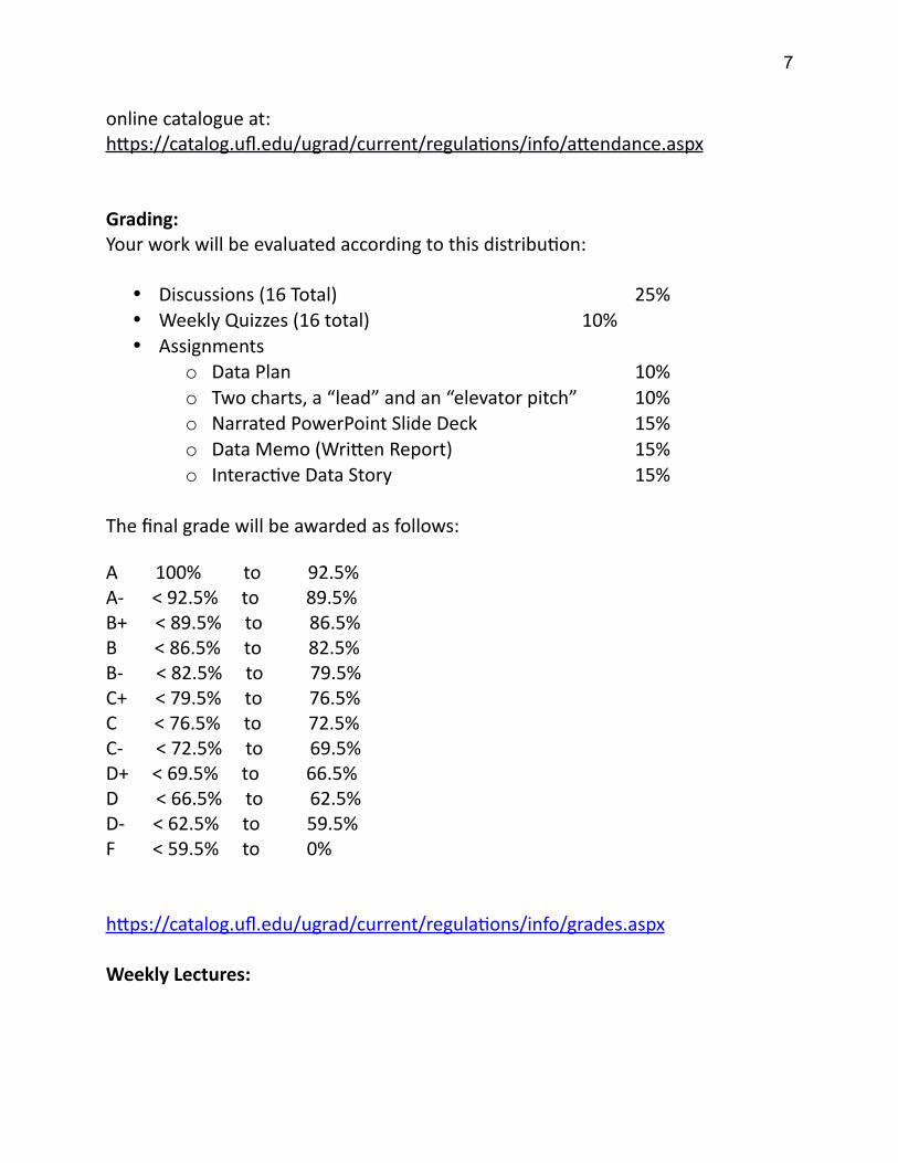
Grading:Your work will be evaluated according to this distribution:
Discussions (16 Total) 25% Weekly Quizzes (16 total) 10% Assignments
o Data Plan 10%o Two charts, a “lead” and an “elevator pitch” 10%o Narrated PowerPoint Slide Deck 15%o Data Memo (Written Report) 15%o Interactive Data Story 15%
The final grade will be awarded as follows:
A 100% to 92.5%A- < 92.5% to 89.5%B+ < 89.5% to 86.5%B < 86.5% to 82.5%B- < 82.5% to 79.5%C+ < 79.5% to 76.5%C < 76.5% to 72.5%C- < 72.5% to 69.5%D+ < 69.5% to 66.5%D < 66.5% to 62.5%D- < 62.5% to 59.5%F < 59.5% to 0%
https://catalog.ufl.edu/ugrad/current/regulations/info/grades.aspx
Weekly Lectures:
7
The Instructor will post lecture videos to Canvas for each of the 16 weeks of the course and two additional videos – one is an introduction to the course and course topic and the other will cover the syllabus. These videos will vary in length depending on the material. It is your responsibility to watch each of the videos.
Assignments:
Weekly Quizzes (10% of Final Grade)
Each week, you will be required to complete a short online quiz that will be based on that week’s assigned lectures and readings.
Each quiz will contain three to five multiple choice and true/false questions and will have a time limit of 10 minutes. The quiz is open book but is recommended you do the quiz only after you have watched all of that week’s lectures and done all of the assigned readings.
The quiz will be due at 11:59pm Eastern time on the Sunday of each weekly module.
Discussions (25% of Final Grade)
All students will be expected to participate each week in the online discussion boards. Each week’s discussion question or topic will be posted on Canvas no laterthan the Monday of each weekly module (often it will be available well before that).
Your initial post responding to that question should be posted in Canvas no later than 11:59pm Eastern time on Thursday. However, any replies to other students’ posts are not due until 11:59 pm Eastern time on Sunday (to allow a bit of extra time for replies).
As a general rule, the instructor will refrain from commenting on a students’ discussion post until at least one other student has done so first. The hope is this will encourage students to think critically about each others’ work rather than waiting to first see what the “right” answer is from the instructor.
8
The discussions will fall into one of the three broad areas:
Answering discussion questions posed by the instructor, inspired by that week’s readings and lectures. You will be required to post an answer to the instructor’s question, in roughly 250 words, as well as respond to at least two of your fellow students’ posts. Your replies should be roughly 150 words each. You are free to contribute more responses if you wish.
Providing feedback on fellow students’ assignments-in-progress. For example, you may be asked to share one of the charts from your Narrated PowerPoint Slide Deck the week before the assignment is due and then comment on at least two of your fellow students’ charts. These comments should be at least 150 words in length.
Mini-assignments, such as finding a chart online and writing a brief critique of it. In the case of mini-assignments, you will be expected to both post your own assignment and respond to at least one of your fellow student’s assignments. Word counts for the mini-assignments will vary and will be included when assigned.
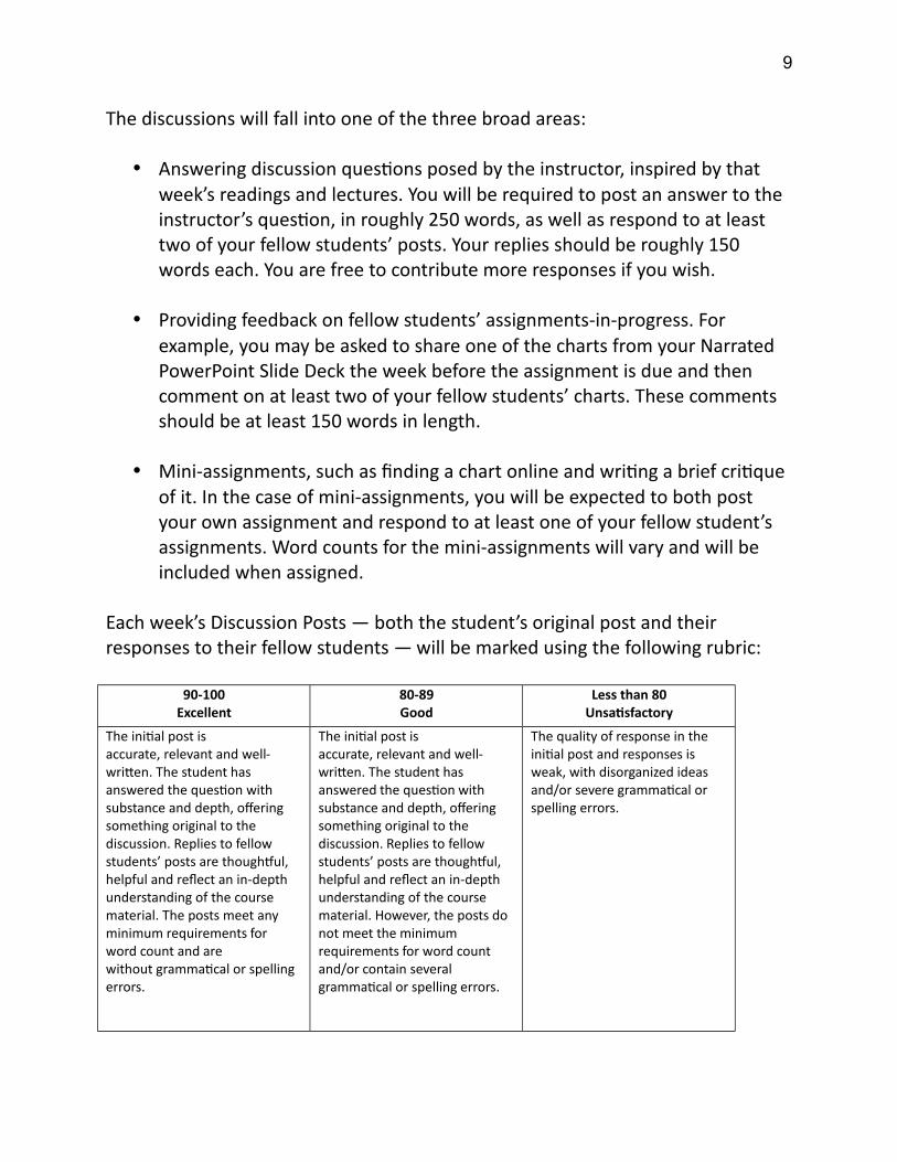
Each week’s Discussion Posts — both the student’s original post and their responses to their fellow students — will be marked using the following rubric:
90-100Excellent
80-89Good
Less than 80Unsatisfactory
The initial post is accurate, relevant and well-written. The student has answered the question with substance and depth, offering something original to the discussion. Replies to fellow students’ posts are thoughtful, helpful and reflect an in-depth understanding of the course material. The posts meet any minimum requirements for word count and are without grammatical or spelling errors.
The initial post is accurate, relevant and well-written. The student has answered the question with substance and depth, offering something original to the discussion. Replies to fellow students’ posts are thoughtful, helpful and reflect an in-depth understanding of the course material. However, the posts do not meet the minimum requirements for word count and/or contain several grammatical or spelling errors.
The quality of response in the initial post and responses is weak, with disorganized ideas and/or severe grammatical or spelling errors.
9
Data Plan (10% of final grade)
Your Data Plan should be submitted through Canvas as a Word document (.doc or.docx).
Find a dataset that will serve as the basis for the other assignments in this course (Narrated PowerPoint Slide Deck, Data Memo and Interactive Data Story). This dataset can be located on an open data portal or can be a dataset that you have access to through your work. The dataset can be on any topic you choose — ideally, pick one that’s about something you’re interested in and/or is about where you live. This will make it a lot more fun to complete the assignments in this course. While your dataset can be from an international source, the column headings must be in English and any website describing the data must be in English as well.
If you're having difficulty finding a dataset that fits the bill, here are a few general suggestions:
Crime Data. Many city open data portals have detailed raw crime data, where each row is a single crime, with details on its date, time, location, offence type and location. This type of data provides various opportunities for analysis and visualization. If the place where you live doesn't have this type of data, try a city you used to live in or like to visit.
Health Data. The U.S. Centers for Disease Control has a number of datasets measuring health and mortality (https://data.cdc.gov/). There are different datasets covering things like obesity rates, physical activity, disease prevalence and cause of death. For most datasets, information is available both for different states and various years, allowing you to both compare regions and look at how things have changed over time.
International Data. The World Bank has a very detailed open data portal (https://data.worldbank.org/indicator) that compares countries on various indicators over time. Much like the CDC data, these datasets allow for interesting regional comparisons as well as looking at how things have changed over time. One nice thing about the World Bank data portal is it
10

even provides some basic visualizations right on the dataset page, so you can get some initial ideas of how you might visualize the data and if the dataset shows any interesting patterns.
Write a brief (500 word maximum) report that includes the following questions, and your answers to them. Write each question in your report, followed by your response:
1. What dataset will you use for your final report? (describe your dataset, and either include a link to where I can find it online or submit it as a spreadsheet along with your report).
2. Describe the dataset. What kind of data does it contain?
3. Is there anything about your data that you don’t understand? (i.e. what a column heading means). How will you find this out?
4. What are some questions you hope to answer with your data? List at least three (you don’t need the answers to the questions at this point).
Some things to keep in mind about this assignment:
Review the requirements for the other assignments in this course carefully to ensure that the dataset you choose is rich enough to allow you to do detailed, in-depth analysis on it for the remainder of this course. Generally speaking, “summary data” that is only a few dozen rows long is probably not sufficient. Raw data (hundreds or thousands of rows) is better.
That said, you should generally try to avoid data that is too big. Most newer versions of Excel can’t open files that are much bigger than a million rows. Tableau technically can open files that are 10 million rows or larger but, in practice, working with files that big will slow down your machine. For that reason, a good rule of thumb is that you should pick a dataset that is less than a million rows.
As you progress through the course, if you find your dataset is not detailed enough to properly complete future assignments, you will have the option to supplement it with additional, related datasets. For example, if your
11
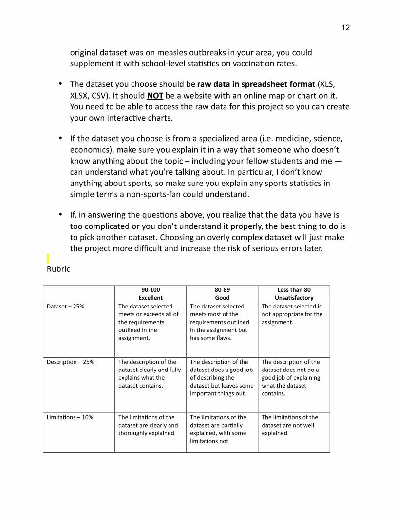
original dataset was on measles outbreaks in your area, you could supplement it with school-level statistics on vaccination rates.
The dataset you choose should be raw data in spreadsheet format (XLS, XLSX, CSV). It should NOT be a website with an online map or chart on it. You need to be able to access the raw data for this project so you can createyour own interactive charts.
If the dataset you choose is from a specialized area (i.e. medicine, science, economics), make sure you explain it in a way that someone who doesn’t know anything about the topic – including your fellow students and me — can understand what you’re talking about. In particular, I don’t know anything about sports, so make sure you explain any sports statistics in simple terms a non-sports-fan could understand.
If, in answering the questions above, you realize that the data you have is too complicated or you don’t understand it properly, the best thing to do is to pick another dataset. Choosing an overly complex dataset will just make the project more difficult and increase the risk of serious errors later.
Rubric
90-100Excellent
80-89Good
Less than 80Unsatisfactory
Dataset – 25% The dataset selected meets or exceeds all of the requirements outlined in the assignment.
The dataset selected meets most of the requirements outlined in the assignment but has some flaws.
The dataset selected is not appropriate for the assignment.
Description – 25% The description of the dataset clearly and fully explains what the dataset contains.
The description of the dataset does a good job of describing the dataset but leaves someimportant things out.
The description of the dataset does not do a good job of explaining what the dataset contains.
Limitations – 10% The limitations of the dataset are clearly and thoroughly explained.
The limitations of the dataset are partially explained, with some limitations not
The limitations of the dataset are not well explained.
12
identified.
Questions – 30% All the questions posed of the dataset are well thought out and answerable from the dataset.
At least two of the questions posed of the dataset are well thoughtout and answerable from the dataset.
One or fewer of the questions posed of the dataset are well thoughtout and answerable from the dataset.
Writing – 10% The assignment is very well-written, with proper grammar, punctuation and spelling.
The assignment is relatively well-written, with a few grammar, punctuation and spelling errors that do not impede overall understanding.
The assignment is not well-written and there are several grammar, punctuation and spelling errors that may disrupt understanding.
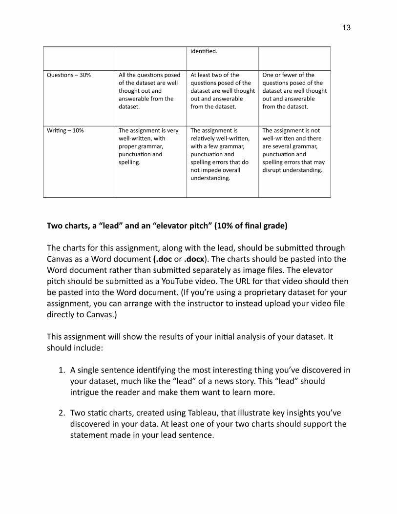
Two charts, a “lead” and an “elevator pitch” (10% of final grade)
The charts for this assignment, along with the lead, should be submitted through Canvas as a Word document (.doc or .docx). The charts should be pasted into the Word document rather than submitted separately as image files. The elevator pitch should be submitted as a YouTube video. The URL for that video should then be pasted into the Word document. (If you’re using a proprietary dataset for your assignment, you can arrange with the instructor to instead upload your video file directly to Canvas.)
This assignment will show the results of your initial analysis of your dataset. It should include:
1. A single sentence identifying the most interesting thing you’ve discovered inyour dataset, much like the “lead” of a news story. This “lead” should intrigue the reader and make them want to learn more.
2. Two static charts, created using Tableau, that illustrate key insights you’ve discovered in your data. At least one of your two charts should support the statement made in your lead sentence.
13
3. To accompany the charts and lead sentence, an “elevator pitch” of 30-45 seconds in which you are seen on camera explaining why the insights you’vediscovered are worth paying attention to. For your elevator pitch, there should be nothing on camera except yourself (i.e. no slides, no charts). You should wear business-appropriate clothing (i.e. no sweatpants, shorts or jeans) and be seated in an office-style setting or standing up (i.e. no lounging on the couch).
Some things to keep in mind:
Make sure your charts have clear, engaging titles that contain the “takeaway” message you want your reader to have rather than a dry, technical description of what the charts are visualizing.
Review the Data Visualization Best Practices discussed in class and make sure your charts are following those guidelines.
Show your charts to someone unfamiliar with the data (like a friend or family member) and see if they can understand what you’re trying to say.
If you’re recording your elevator pitch on your smartphone, hold your phone horizontally rather than the usual vertical orientation, so that your video won’t have black bars on the sides when you upload it to YouTube.
Remember, as you progress through the course, if you find your original dataset is not detailed enough to properly complete future assignments, you have the option to supplement it with additional, related datasets. For example, if your original dataset was on measles outbreaks in your area, you could supplement it with school-level statistics on vaccination rates.
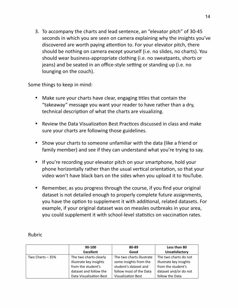
Rubric
90-100Excellent
80-89Good
Less than 80Unsatisfactory
Two Charts – 35% The two charts clearly illustrate key insights from the student’s dataset and follow the Data Visualization Best
The two charts illustratesome insights from the student’s dataset and follow most of the Data Visualization Best
The two charts do not illustrate key insights from the student’s dataset and/or do not follow the Data
14
Practices discussed in class. Charts have clear, engaging titles that contain a strong “takeaway” message and a source credit at the bottom indicating where the data for the charts came from.
Practices discussed in class.
Visualization Best Practices discussed in class.
Lead Sentence – 30% The lead sentence clearly and concisely illustrates the most interesting thing in the student’s dataset in a way that makes the reader want to learn more.
The lead sentence illustrates something interesting in the dataset but is not written as clearly and concisely as it could be.
The lead sentence does not do a good job of identifying something interesting in the dataset and/or does notmake the reader want to know more.
Elevator Pitch – 35% The elevator pitch demonstrates superior oral presentation skills, getting the viewer excited about the dataset and engaged in the topic.
The elevator pitch demonstrates solid oral presentation skills, though there is some room for improvement.
The elevator pitch does not demonstrate good oral presentation skills. The message is unclear and/or hard to follow.
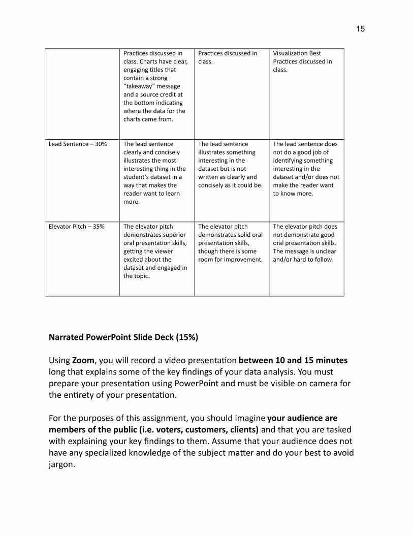
Narrated PowerPoint Slide Deck (15%)
Using Zoom, you will record a video presentation between 10 and 15 minutes long that explains some of the key findings of your data analysis. You must prepare your presentation using PowerPoint and must be visible on camera for the entirety of your presentation.
For the purposes of this assignment, you should imagine your audience are members of the public (i.e. voters, customers, clients) and that you are tasked with explaining your key findings to them. Assume that your audience does not have any specialized knowledge of the subject matter and do your best to avoid jargon.
15
You can login to your UF Zoom account and record your presentation at the following website:
https://ufl.zoom.us
You can find detailed instructions for how to record your presentation — with your PowerPoint slides full screen and your webcam in the corner — in this short YouTube video:
https://www.youtube.com/watch?v=WmMSXOQVQs4&feature=youtu.be&t=23
The YouTube video was prepared by another instructor for another course, so just ignore the bit at the end where it talks about uploading the video file to the course website. Instead, you should upload your video to YouTube as you did with your elevator pitch and then add a single slide to the very beginning of your PowerPoint presentation that contains the link to your video on YouTube.
Then upload the PowerPoint file (.pptx) to Canvas.
Your presentation should include:
Between 10 and 15 slides.
The charts in your slides can include those from the previous assignment. If so, make sure you incorporate any feedback you received — from the instructor and your fellow students — about how to make those charts better.
Your second slide, which will appear after the slide containing the YouTube link, should identify who the specific audience for your presentation is. For example: “Users of National Parks”, “Parents of children in the school system”, “Resident of Miami”. Your audience should be more specific than just “the public”.
Your presentation should include at least four static charts that you’ve created in Tableau based on your data, though you can include more charts if you wish. You should put your charts into a Dashboard in Tableau before exporting them as static charts. This will allow you to size them in the best
16
way possible for your slides rather than just using the default layout on a Tableau Sheet (which, for some charts, may look squished on a PowerPoint slide). Also pay attention to the size of your titles and labels: You may want to make them bigger to make them easier to read.
Your slides should include some visual elements other than static charts that help illustrate your points and maintain viewer interest (i.e. photographs, clip art, etc.)
Some things to keep in mind about this assignment:
You need to appear on video in the corner of the screen for the entirety of the presentation.
For the purposes of this assignment you do not need to use external sources beyond the dataset you’re analyzing. However, if you do rely on external sources for facts you cite in your presentation, you should include alink to that source on the relevant slide.
Please avoid transitions or reveals on your slides (i.e. bullet points appearing one after the other, one image being superimposed on top of another, things sliding in from the side). Each slide should appear on its own, in its entirety, while you’re talking. This is because, when the PPTX file is loaded into Canvas, I will be annotating each slide as a static image so things that are superimposed on each other don’t always show up properly.
Remember that people may be viewing your presentation from the back of a room. Make sure everything is big enough for people to see.
Your presentation should be more than you just reading your slides. Instead, your slides should be relatively minimalist, showing key images, keyideas or key charts that you then enrich with your oral presentation.
You will be evaluated, in part, based on the quality of your performance, including your use of facial expressions, eye contact, gestures and body language to communicate your points effectively. As you will be on camera during your presentation, you should wear business-appropriate clothing (i.e. no sweatpants, shorts or jeans) and be seated in an office-style setting
17
or standing up (i.e. no lounging on the couch).
Remember, as you progress through the course, if you find your original dataset is not detailed enough to properly complete future assignments, you have the option to supplement it with additional, related datasets. For example, if your original dataset was on measles outbreaks in your area, you could supplement it with school-level statistics on vaccination rates.
Rubric
90-100Excellent
80-89Good
Less than 80Unsatisfactory
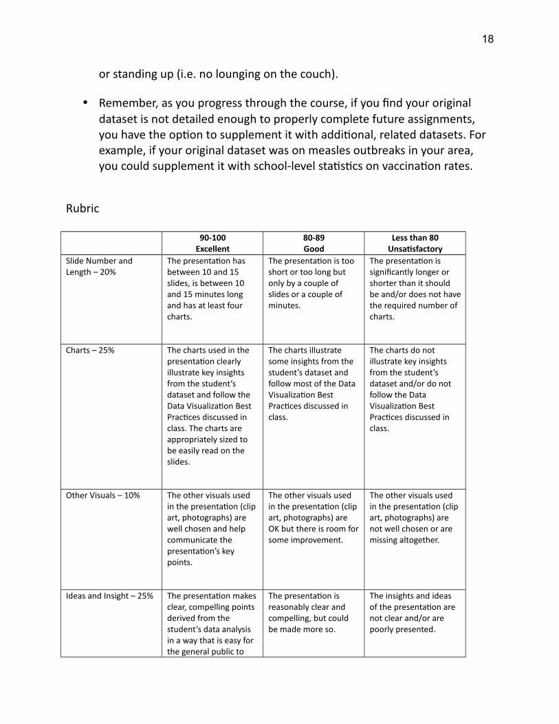
Slide Number and Length – 20%
The presentation has between 10 and 15 slides, is between 10 and 15 minutes long and has at least four charts.
The presentation is too short or too long but only by a couple of slides or a couple of minutes.
The presentation is significantly longer or shorter than it should be and/or does not havethe required number of charts.
Charts – 25% The charts used in the presentation clearly illustrate key insights from the student’s dataset and follow the Data Visualization Best Practices discussed in class. The charts are appropriately sized to be easily read on the slides.
The charts illustrate some insights from the student’s dataset and follow most of the Data Visualization Best Practices discussed in class.
The charts do not illustrate key insights from the student’s dataset and/or do not follow the Data Visualization Best Practices discussed in class.
Other Visuals – 10% The other visuals used in the presentation (clip art, photographs) are well chosen and help communicate the presentation’s key points.
The other visuals used in the presentation (clip art, photographs) are OK but there is room forsome improvement.
The other visuals used in the presentation (clip art, photographs) are not well chosen or are missing altogether.
Ideas and Insight – 25% The presentation makes clear, compelling points derived from the student’s data analysis in a way that is easy for the general public to
The presentation is reasonably clear and compelling, but could be made more so.
The insights and ideas of the presentation are not clear and/or are poorly presented.
18
understand. Jargon is avoided.
Presentation Skills – 20%
The presentation of the material is clear and engaging. The presenterspeaks at a good pace and key points are madeeffectively. The presenter makes good use of eye contact and body language.
The oral presentation ofthe material is reasonably clear and engaging, but there is some room for improvement.
The oral presentation ofthe material is ineffective.
Data Memo (Written Report) (15%)
Your Data Memo will be submitted through Canvas as a Word document (.doc or.docx).
You will write a “Data Memo” outlining the key findings of your data analysis as well as clear recommendations for how your intended audience should respond toyour findings. This assignment will build on the findings in your Narrated PowerPoint Slide Deck, exploring them in greater depth.
For the purposes of this assignment, you should imagine your audience is a decision-maker in an organization you work for (i.e. a CEO, board member of a non-profit, head of a government agency).
Your Data Memo should:
Be between 1,500 and 2,000 words long.
Given its (relatively) short length, your memo does not need to include a table of contents, executive summary or bibliography. You can use headings for different sections to make the organization of your report clear (i.e. write “Recommendations” above the section where you provide your recommendations). But think of this assignment as a (relatively) brief
19
analytical memo rather than a long, detailed report with multiple parts.
Written as if it were addressed to your intended audience (i.e. the CEO or head of the organization). At the top of your first page, include a brief description of who the specific audience for your Data Memo is (i.e. “To: Chief of the Miami Police Department”, “To: Director of the National Park Service”, “To: Superintendent of the Orlando School District”, etc.)
Include at least six (and no more than 10) static charts. The charts in your report can include those from previous assignments. If so, make sure you incorporate any feedback you received — from the instructor and your fellow students — about how to make those charts better. Your charts should be sprinkled throughout your memo, as close as possible to the text they relate to. This makes it easier for the reader to digest than having all the charts at the back, in a “Figures” section. Also, you should pull your charts into a Tableau Dashboard before exporting them as static charts. Thiswill allow you to size them in the best way possible for your report rather than just using the default layout on a Tableau Sheet (which, for some charts, may look squished in a written report). Also pay attention to the sizeof your titles and labels: You may want to make them bigger to make them easier to read.
Reference at least six outside sources (studies, news articles, reports) that put your data into context. For example, if you have data about vaccination rates at local schools, an outside source could be a study examining what rate of vaccination is required for “herd immunity”.
For all outside sources used, you should briefly summarize what the outsidesource says, explain how it’s relevant to your data, and include a hyperlink to where the source can be found online (you can create hyperlinks in Wordby highlighting the text and then pressing CTRL-K/CMD-K). These links should be within the body of your report, at the point where you talk about and summarize the source, rather than a list of sources at the end.
Your report should include a clear recommendation for your audience of what steps they should take in response to your analysis. Base this suggestion on who your intended audience is and what they are in a position to do in response to your analysis. For example, a CEO could hire
20
more staff or rebrand the company. An advocacy group could create a new awareness campaign.
Remember, as you progress through the course, if you find your original dataset is not detailed enough to properly complete future assignments, you have the option to supplement it with additional, related datasets. For example, if your original dataset was on measles outbreaks in your area, you could supplement it with school-level statistics on vaccination rates.
Rubric
90-100Excellent
80-89Good
Less than 80Unsatisfactory
Length Requirements – 20%
The Data Memo is between 1,500 and 2,000 words and has at least six charts.
The Data Memo is too short or too long but only by a few hundred words and/or there are four or five charts in thereport.
The Data Memo is significantly longer or shorter than it should be and/or it falls well short of the number of required charts.
Writing – 20% The assignment is very well-written, with proper grammar, punctuation and spelling.
The assignment is relatively well-written, with a few grammar, punctuation and spelling errors that do not impede overall understanding.
The assignment is not well-written and there are several grammar, punctuation and spelling errors that may disrupt understanding.
Ideas and Insight – 20% The Data Memo makes clear, compelling points derived from the student’s data analysis and makes a clear recommendation appropriate for the intended audience.
The Data Memo is reasonably clear and compelling, but could be made more so.
The insights and ideas of the Data Memo are not clear and/or are poorly presented.
Charts – 20% The charts used in the Data Memo clearly illustrate key insights from the student’s dataset and follow the Data Visualization Best
The charts illustrate some insights from the student’s dataset and follow most of the Data Visualization Best Practices discussed in
The charts do not illustrate key insights from the student’s dataset and/or do not follow the Data Visualization Best
21
Practices discussed in class. The charts are appropriately sized to be easily read within thereport
class. Practices discussed in class.
Outside Sources – 20% The Memo refers to at least six outside sourcesthat are well summarized and effectively put the data into additional context.
The outside sources referenced in the reportare adequately summarized and put thedata in some context but the sources could have been chosen with more care.
The outside sources referenced in the reportdo a poor job of putting the data into additional context and/or there are not enough outside sources cited.
Interactive Data Story (15%)
Using Tableau, you will create a “Data Story” that uses maps and charts — some interactive, some not — to explain the results of your data analysis and anticipatesthe user’s questions about your data.
For the purposes of this assignment, you should imagine your audience is a frontline worker or mid-level manager who needs to use your Data Story to helpmake day-to-day decisions. For example, this could be a police sergeant who needs crime data to help deploy officers effectively, a park warden who needs data on park visitors to help set staffing schedules or a school principal who needsto know how their school is doing on standardized tests.
Your Data Story should be submitted through Canvas as a Tableau Packaged Workbook (.twbx) file NOT a Tableau Workbook (.twb) file.
Your Data Story should:
Include at least six “Story Points” (and no more than 10) that tell a data story in sequence using Tableau’s built-in navigation bar.
While the navigation bar can include some brief explanatory text, your charts should also all include clear titles that contain the main “takeaway
22
message” you want your audience to have.
Your first Story Point should include nothing but a text box that identifies who the specific audience for your presentation is. For example: “Sergeantsof the Miami Police Department”, “Park wardens”, “School principals”.
Each Story Point after the first one should include at least one chart or map, but can also include other elements such as images and text. MultipleStory Points can use the same Dashboard if you want to use Filters or Highlighters to focus on different elements of your data (i.e. highlight different locations on a map, show a breakdown for different categories). However, your Data Story should include at least three unique Dashboards (i.e. the whole Data Story shouldn’t just be one Dashboard with different filters applied).
The charts in your Data Story can include those from previous assignments. If so, make sure you incorporate any feedback you received — from the instructor and your fellow students — about how to make those charts better. Make sure any charts you use in your Data Story are pulled into a Dashboard first, so you have more control over how everything is laid out. Any “static charts” in your Data Story should also include tooltips, so users can learn more about a given data point.
At least one Story Point should include a map or chart that can be altered by the user using a Filter or Highlighter. In situations where the user can choose from many different options, consider using preset filters to draw the user’s attention to the most interesting patterns in your data (i.e. like how in the lecture, bike theft hotspots were highlighted on a series of Story Points using the same Dashboard).
The dimensions of the Data Story should be no larger than 1000 x 800 pixels (the default for “Desktop Browser”), but can be smaller if you wish. NOTE: The default “Story” dimensions (1016 x 964) are larger than this but too big for viewing properly on most laptop screens. Make sure all Dashboards are properly sized for your Data Story (using “Fit to Story”). There should be no scrollbars on your Data Story.
23
Some things to keep in mind:
Don’t overdo it with interactivity. Only one Story Point needs to include an interactive element (i.e. a Filter or Highlighter). And you can use preset filters to show different views of that same interactive Dashboard over multiple Story Points (just like the Bike Theft example).
Re-using the best charts from your Data Memo and PowerPoint presentation can be a useful way to help explain the key findings in your data. Making a chart interactive doesn’t necessarily make it better.
The main message of your Interactive Data Story can be the same as the message in your PowerPoint Presentation and Data Memo. You don’t need to come up with a brand-new topic. You’re just communicating that same message in a different medium, and for a different audience, adding some interactivity to allow your audience to “drill down” into your data to answeradditional questions about the data.
Some datasets lend themselves to more than one interactive Dashboard and some students are more comfortable with Tableau’s interactive features than others. If you want to have more than one interactive feature in your Data Story, that’s great. But you don’t need to. Better to have one well-designed interactive Dashboard in your Data Story than three or four that don’t work properly or don’t reveal anything interesting about your data.
Remember, as you progress through the course, if you find your original dataset is not detailed enough to properly complete future assignments, you have the option to supplement it with additional, related datasets. For example, if your original dataset was on measles outbreaks in your area, you could supplement it with school-level statistics on vaccination rates.
Rubric
90-100Excellent
80-89Good
Less than 80Unsatisfactory
24
Basic Requirements – 15%
The Data Story has at least six Story Points, and there is a chart or map on each one after the first. At least three unique charts/maps are used in the Data Story. The Data Story is no larger than 1000 x 800 pixels and all Dashboards fit properly without scrollbars.
The Data Story is too short or too long but not by much and/or a chart/map is missing from a single Story Point.
The Data Story is significantly longer or shorter than it should be and/or it fails to include charts on several Story Points.
Ideas and Insight – 25% The Data Story makes clear, compelling points derived from the student’s data analysis.
The Data Story is reasonably clear and compelling, but could be made more so.
The insights and ideas of the Data Story are not clear and/or are poorly presented.
Charts – 35% The charts used in the Data Story clearly illustrate key insights from the student’s dataset and follow the Data Visualization Best Practices discussed in class.
The charts illustrate some insights from the student’s dataset and follow most of the Data Visualization Best Practices discussed in class.
The charts do not illustrate key insights from the student’s dataset and/or do not follow the Data Visualization Best Practices discussed in class.
Interactivity – 25% The interactivity used in the Data Story — in particular any Filters or Highlighters — are implemented effectivelyand make it easy for theuser to answer their own questions about the data. Tooltips clearlyexplain the data point being hovered over.
The Data Story has some interactivity that permits the user to answer their own questions but it is not implemented as effectively as it could be.
The Data Story does notpermit the user to answer their own questions through Filtering or Highlighting or it is implemented so poorly as to make it impossible for the user to answer their own questions about the data.
University Policies
University Policy on Accommodating Students with Disabilities:
25
Students requesting accommodation for disabilities must first register with the Dean of Students Office (http://www.dso.ufl.edu/drc/ ). The Dean of Students Office will provide documentation to the student who must then provide this documentation to the instructor when requesting accommodation. You must submit this documentation prior to submitting assignments or taking the quizzes or exams. Accommodations are not retroactive, therefore, students should contact the office as soon as possible in the term for which they are seeking accommodations.
Students with Disabilities who may need accommodations in this class are encouraged to notify the instructor and contact the Disability Resource Center (DRC) so that reasonable accommodations may be implemented. DRC is located inroom 001 in Reid Hall or you can contact them by phone at 352-392-8565.
Netiquette: Communication Courtesy:
All members of the class are expected to follow rules of common courtesy in all email messages, threaded discussions and chats. http://teach.ufl.edu/wp-content/uploads/2012/08/NetiquetteGuideforOnlineCourses.pdf
Class Demeanor:
Mastery in this class requires preparation, passion, and professionalism. Students are expected, within the requirements allowed by university policy, to attend class, be on time, and meet all deadlines. Work assigned in advance of class should be completed as directed. Full participation in online and live discussions, group projects, and small group activities is expected.
My role as instructor is to identify critical issues related to the course, direct you and teach relevant information, assign appropriate learning activities, create opportunities for assessing your performance, and communicate the outcomes of such assessments in a timely, informative, and professional way. Feedback is essential for you to have confidence that you have mastered the material and for me to determine that you are meeting all course requirements.
26
At all times it is expected you will welcome and respond professionally to assessment feedback, that you will treat your fellow students and me with respect, and that you will contribute to the success of the class as best as you can.
Other Resources:
Other are available at http://www.distance.ufl.edu/ getting-help for: Counseling and Wellness resources
o http://www.counseling.ufl.edu/cwc/ 352-392-1575
Disability resources
Resources for handling student concerns and complaints
Library Help Desk support
Should you have any complaints with your experience in this course please contact your program director and/or student support coordinator at [email protected] or visit http://www.distance.ufl.edu/student-complaints to submit a complaint.
Course Evaluation:
Students in this class are participating in a new course evaluation system called GatorEvals. The new evaluation system is designed to be more informative to instructors so that teaching effectiveness is enhanced and to be more seamlessly linked to UF’s Canvas e-learning management system. Students can complete theirevaluations through the email they receive from GatorEvals, or in their Canvas course menu under GatorEvals.
University Policy on Academic Misconduct:
Academic honesty and integrity are fundamental values of the University community. Students should be sure that they understand the UF Student Honor Code at http://www.dso.ufl.edu/students.php
The University of Florida Honor Code was voted on and passed by the Student Body in the fall 1995 semester. The Honor Code reads as follows:
27
Preamble: In adopting this Honor Code, the students of the University of Florida recognize that academic honesty and integrity are fundamental values of the University community. Students who enroll at the University commit to holding themselves and their peers to the high standard of honor required by the Honor Code. Any individual who becomes aware of a violation of the Honor Code is bound by honor to take corrective action. A student-run Honor Court and faculty support are crucial to the success of the Honor Code. The quality of a University ofFlorida education is dependent upon the community acceptance and enforcementof the Honor Code.The Honor Code: “We, the members of the University of Florida community, pledge to hold ourselves and our peers to the highest standards of honesty and integrity.” On all work submitted for credit by students at the University of Florida, the following pledge is either required or implied:"On my honor, I have neither given nor received unauthorized aid in doing this assignment."For more information about academic honesty, contact Student Judicial Affairs, P202 Peabody Hall, 352-392-1261.
Academic Honesty
All graduate students in the College of Journalism and Communications are expected to conduct themselves with the highest degree of integrity. It is the students’ responsibility to ensure that they know and understand the requirements of every assignment. At a minimum, this includes avoiding the following:
Plagiarism: Plagiarism occurs when an individual presents the ideas or expressionsof another as his or her own. Students must always credit others’ ideas with accurate citations and must use quotation marks and citations when presenting the words of others. A thorough understanding of plagiarism is a precondition for admittance to graduate studies in the college.
Cheating: Cheating occurs when a student circumvents or ignores the rules that govern an academic assignment such as an exam or class paper. It can include using notes, in physical or electronic form, in an exam, submitting the work of
28
another as one’s own, or reusing a paper a student has composed for one class in another class. If a student is not sure about the rules that govern an assignment, itis the student’s responsibility to ask for clarification from his instructor.
Misrepresenting Research Data: The integrity of data in mass communication research is a paramount issue for advancing knowledge and the credibility of our professions. For this reason any intentional misrepresentation of data, or misrepresentation of the conditions or circumstances of data collection, is considered a violation of academic integrity. Misrepresenting data is a clear violation of the rules and requirements of academic integrity and honesty.
Any violation of the above stated conditions is grounds for immediate dismissal from the program and will result in revocation of the degree if the degree previously has been awarded.
Students are expected to adhere to the University of Florida Code of Conduct https://www.dso.ufl.edu/sccr/process/student-conduct-honor-code If you have additional questions, please refer to the Online Graduate Program Student Handbook you received when you were admitted into the Program.
29
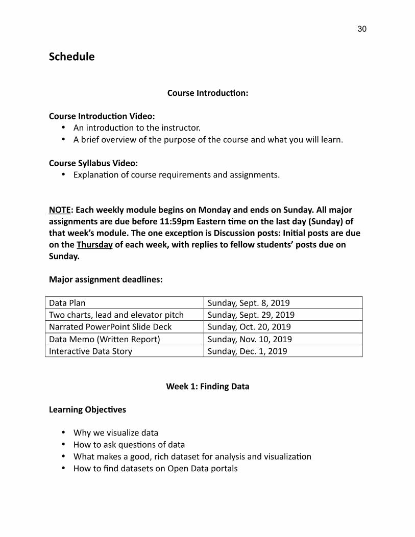
Schedule
Course Introduction:
Course Introduction Video: An introduction to the instructor. A brief overview of the purpose of the course and what you will learn.
Course Syllabus Video: Explanation of course requirements and assignments.
NOTE: Each weekly module begins on Monday and ends on Sunday. All major assignments are due before 11:59pm Eastern time on the last day (Sunday) of that week’s module. The one exception is Discussion posts: Initial posts are due on the Thursday of each week, with replies to fellow students’ posts due on Sunday.
Major assignment deadlines:
Data Plan Sunday, Sept. 8, 2019Two charts, lead and elevator pitch Sunday, Sept. 29, 2019Narrated PowerPoint Slide Deck Sunday, Oct. 20, 2019Data Memo (Written Report) Sunday, Nov. 10, 2019Interactive Data Story Sunday, Dec. 1, 2019
Week 1: Finding Data
Learning Objectives
Why we visualize data How to ask questions of data What makes a good, rich dataset for analysis and visualization How to find datasets on Open Data portals
30
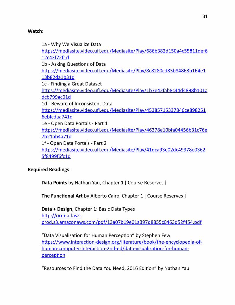
Watch:
1a - Why We Visualize Datahttps://mediasite.video.ufl.edu/Mediasite/Play/686b382d150a4c55811def612c43f72f1d1b - Asking Questions of Datahttps://mediasite.video.ufl.edu/Mediasite/Play/8c8280cd83b84863b164e113b82da1b31d1c - Finding a Great Datasethttps://mediasite.video.ufl.edu/Mediasite/Play/1b7e42fab8c44d4898b101adcb799ac01d1d - Beware of Inconsistent Datahttps://mediasite.video.ufl.edu/Mediasite/Play/45385715337846ce8982516ebfcdaa741d1e - Open Data Portals - Part 1https://mediasite.video.ufl.edu/Mediasite/Play/46378e10bfa04456b31c76e7b21ab4a71d1f - Open Data Portals - Part 2https://mediasite.video.ufl.edu/Mediasite/Play/41dca93e02dc49978e03625f8499f6fc1d
Required Readings:
Data Points by Nathan Yau, Chapter 1 [ Course Reserves ]
The Functional Art by Alberto Cairo, Chapter 1 [ Course Reserves ]
Data + Design, Chapter 1: Basic Data Typeshttp://orm-atlas2-prod.s3.amazonaws.com/pdf/13a07b19e01a397d8855c0463d52f454.pdf
“Data Visualization for Human Perception” by Stephen Fewhttps://www.interaction-design.org/literature/book/the-encyclopedia-of-human-computer-interaction-2nd-ed/data-visualization-for-human-perception
“Resources to Find the Data You Need, 2016 Edition” by Nathan Yau
31
http://flowingdata.com/2016/11/10/find-the-data-you-need-2016-edition/
Optional Readings/Videos:
“Making data mean more through storytelling” by Ben Wellington [14m]https://www.youtube.com/watch?v=6xsvGYIxJok
Week 2: Basic Data Analysis in Tableau
Learning Objectives
Knowing Your Data The “Data Visualization Process” Tableau Basics: Dimensions, Measures The Tableau Workspace How to analyze structured data using Tableau
Watch:
2a - Know Your Datahttps://mediasite.video.ufl.edu/Mediasite/Play/0aeb0ab6095d4c4ba0222ce5468f48bb1d2b - Data Visualization Processhttps://mediasite.video.ufl.edu/Mediasite/Play/d3c8255ff9fb4f72b429c7230bd94edf1d2c - Quick Tips for Hands-On Lectureshttps://mediasite.video.ufl.edu/Mediasite/Play/71cb4d8196354aa384113ba6580e4ce61d2d - The Tableau Workspacehttps://mediasite.video.ufl.edu/Mediasite/Play/207f4c5252074de59da2c11b71ad78ee1d2e - Your First Tableau Charthttps://mediasite.video.ufl.edu/Mediasite/Play/cb84d9bb429d400bb1bd05e372bea7fe1d
Required Readings:
32

Tableau Your Data!, Chapter 1
Data + Design, Chapter 2: About Data Aggregationhttp://orm-atlas2-prod.s3.amazonaws.com/pdf/13a07b19e01a397d8855c0463d52f454.pdf
“What I learned recreating one chart using 24 tools” by Lisa Charlotte Rosthttps://source.opennews.org/en-US/articles/what-i-learned-recreating-one-chart-using-24-tools/
“Find hidden insights in your data: Ask why and why again” by Andy Cotgreavehttp://www.tableau.com/about/blog/2016/11/find-hidden-insights-your-data-ask-why-and-why-62739
Optional Readings/Videos:
“The Visual Design Tricks Behind Great Dashboards” by Andy Cotgreave [56m]https://www.youtube.com/watch?v=4r1gr04UUJ8
Related chart:https://public.tableau.com/views/whichshouldiimplement/WhichdesignfeaturesshouldIimplement?:embed=y&:display_count=no&:showVizHome=no
“Boss, I Need a Bigger Screen. For Work Efficiency, of Course.” By Farhad Manjoo
http://www.nytimes.com/2009/01/15/technology/personaltech/15basics.html
“Discovering Two Screens Aren’t Better Than One.” By Farhad Manjoohttps://www.nytimes.com/2014/03/20/technology/personaltech/surviving-and-thriving-in-a-one-monitor-world.html
33

Week 3: Saving and Publishing in Tableau
Learning Objectives
How to create simple static charts in Tableau (bar charts, line charts) Visualizing locations and time How to save and publish your data in Tableau How to export charts from Tableau for use in PowerPoint and Word
Watch:
3a - Your Second Tableau Charthttps://mediasite.video.ufl.edu/Mediasite/Play/aa4e9c28a8c64a7ab16d71396616ba911d3b - More Tableau Chartshttps://mediasite.video.ufl.edu/Mediasite/Play/9b5f3f371e8c44e096e3298f3fcced161d3c - Visualizing Locationshttps://mediasite.video.ufl.edu/Mediasite/Play/ee282bfad9bf4fa8bd8c98fd6520894d1d3d - Visualizing Timehttps://mediasite.video.ufl.edu/Mediasite/Play/b411654657594b8e8516aa5cc1ea3ca81d3e - Saving and Publishing - Part 1https://mediasite.video.ufl.edu/Mediasite/Play/c8c46e4f992046029ebfc3621039381c1d3f - Saving and Publishing - Part 2https://mediasite.video.ufl.edu/Mediasite/Play/27ed288aabda4c0fa8baaed4bb8b01fe1d3g - Exporting Tableau Chartshttps://mediasite.video.ufl.edu/Mediasite/Play/364c37259893404c891a12a7f7d7c6aa1d
Required Readings:
Tableau Your Data!, Chapter 2
34
“Strong Titles Are The Biggest Bang for Your Buck” by Stephanie Evergreenhttp://stephanieevergreen.com/strong-titles/
“Using Data Visualization to Find Insights in Data” by Gregor Aischhttp://datadrivenjournalism.net/resources/using_data_visualization_to_find_insights_in_data
“Shorten the Visualization Path Back to Reality” by Nathan Yauhttp://flowingdata.com/2016/09/14/shorten-the-visualization-path-back-to-reality/
Assignments:
Data Plan is Due
Week 4: Finding the Most Important Thing
Learning Objectives
How to identify the “most important thing” in your data How to write about numbers How to prepare your elevator pitch
Watch:
4a - Finding The Most Important Thinghttps://mediasite.video.ufl.edu/Mediasite/Play/77cf3c253ff54db3b969debcdeab5bf91d4b - Writing About Numbershttps://mediasite.video.ufl.edu/Mediasite/Play/b479dbc2620540c5ae44d99644e20fee1d4c - Preparing Your Elevator Pitchhttps://mediasite.video.ufl.edu/Mediasite/Play/e22e91bead19473ba712271088a681b51d
35

“How to think like a data journalist” by Chad Skelton [30m]https://vimeo.com/180922380
First, load this chart, press play at the bottom left and watch the data change from 1962 to 2015:http://bit.ly/roslinggap
Then watch this TED Talk by Hans Rosling [20m]:https://www.ted.com/talks/hans_rosling_shows_the_best_stats_you_ve_ever_seen#t-144054
Required Readings:
Storytelling with Data, Chapter 1
Better Presentations by Jonathan Schwabish, Chapter 1 [ Course Reserves ]
Week 5: Choosing the Right Chart
Learning Objectives
Data Visualization Best Practices How to choose the right chart type for the job How to reshape data using Tableau Using “Measure Names” and “Measure Values” in Tableau
Watch:
5a - Data Visualization Best Practices - Part 1 https://mediasite.video.ufl.edu/Mediasite/Play/303f011a49e44f64b33fa22a08626d381d5b - Data Visualization Best Practices - Part 2https://mediasite.video.ufl.edu/Mediasite/Play/26bc404096184a3b86ea6f101b8df8f21d5c - Choosing the Right Chart
36

https://mediasite.video.ufl.edu/Mediasite/Play/70607662818e4547875d1cb5e34391131d5d - Reshaping Data - Part 1https://mediasite.video.ufl.edu/Mediasite/Play/5f976f83fdcd43e9887ed35f489c91db1d5e - Reshaping Data - Part 2https://mediasite.video.ufl.edu/Mediasite/Play/7296665ade5f4946939dd3b970a00d461d
Required Readings:
Storytelling with Data, Chapters 2 and 3
Data Points by Nathan Yau, Chapter 5 [ Course Reserves ]
“Chart Suggestions – A Thought-Starter” by Extreme Presentationshttp://extremepresentation.typepad.com/files/choosing-a-good-chart-09.pdf
“Data Visualization Checklist” by Stephanie Evergreen and Ann Emeryhttp://stephanieevergreen.com/wp-content/uploads/2016/10/DataVizChecklist_May2016.pdf
“Real Chart Rules to Follow” by Nathan Yauhttp://flowingdata.com/2015/08/11/real-chart-rules-to-follow/
“The self-sufficiency test” by Kaiser Funghttp://junkcharts.typepad.com/junk_charts/2005/10/the_selfsuffici.html
“Spreadsheet Thinking vs. Database Thinking” by Robert Kosarahttps://eagereyes.org/basics/spreadsheet-thinking-vs-database-thinking
Optional Readings/Videos:
“The Competent Critic” by Alan Smith [21m]https://www.youtube.com/watch?v=IB7crD_paKQ
37

“The Power of Drawing in Storytelling” by Catherine Madden [18m]https://www.youtube.com/watch?v=9ZDErtRixyc
The Financial Times “Visual Vocabulary” (Click on headers)http://ft-interactive.github.io/visual-vocabulary/
“Multiple views on how to choose a visualization” by Steven Franconerihttps://medium.com/multiple-views-visualization-research-explained/multiple-views-on-how-to-choose-a-visualization-b3ffc99fcddcDirect link to PDF guide: http://experception.net/
Week 6: Joining Datasets
Learning Objectives
How to join two datasets together in Tableau
Watch:
6a - Joining Datasetshttps://mediasite.video.ufl.edu/Mediasite/Play/7491a01937a64c0abe3a872cfa6e31121d6b - Blending Datasetshttps://mediasite.video.ufl.edu/Mediasite/Play/06e070503e2a45908a11a7cdb53f80e91d
Required Readings:
Storytelling with Data, Chapter 4
The Truthful Art by Alberto Cairo, Chapter 2 [ Course Reserves ]
Better Presentations by Jonathan Schwabish, Chapter 8 [ Course Reserves ]
“Putting Data Into Context” by Robert Kosarahttps://eagereyes.org/basics/putting-data-into-context
38

Optional Readings/Videos:
Data + Design, Chapter 14http://orm-atlas2-prod.s3.amazonaws.com/pdf/13a07b19e01a397d8855c0463d52f454.pdf
Data + Design, Chapter 17http://orm-atlas2-prod.s3.amazonaws.com/pdf/13a07b19e01a397d8855c0463d52f454.pdf
Assignments:
Two Charts, a “Lead” and an “Elevator Pitch” Due
Week 7: The Power of Annotation
Learning Objectives
The importance of annotation and highlighting in data visualization. Using the “Highlighter” feature in Tableau. Adding reference lines to a visualization
Watch:
7a - Annotation and Highlighting - Part 1https://mediasite.video.ufl.edu/Mediasite/Play/26378100b1094643a0db8b415f7bf9fd1d7b - Annotation and Highlighting - Part 2https://mediasite.video.ufl.edu/Mediasite/Play/f591aa10aacc4ad8ad302cde492c37ba1d7c - Annotation and Highlighting - Part 3https://mediasite.video.ufl.edu/Mediasite/Play/79ef28b62c0a4927bf35750bb89604321d7d - Reference Lines
39
https://mediasite.video.ufl.edu/Mediasite/Play/ca24fa0db1cb4bb1903465628489752d1d
“Potent Presentations: Design” (the second video on the page) [45m]:http://www.eval.org/p2i
Required Readings:
Storytelling with Data, Chapter 5
“Visual Analysis Best Practices” (Tableau Whitepaper)https://www.tableau.com/sites/default/files/media/whitepaper_visual-analysis-guidebook_0.pdf
“Slopegraphs for comparing gradients: Slopegraph theory and practice” by Edward Tufte (don’t need to read comments)https://www.edwardtufte.com/bboard/q-and-a-fetch-msg?msg_id=0003nk
Optional Readings/Videos:
The “Message” and “Delivery” videos on Potent Presentations:http://www.eval.org/p2i
Various handouts and resources on the Potent Presentations website:http://www.eval.org/page/p2i-tools
“Using Storytelling Patterns to Make Data Relatable” by Jessica Hullman [52m]https://www.youtube.com/watch?v=tjXsApA5Evs
Week 8: More Chart Types (Part 1)
Learning Objectives
40
More chart types and when to use them Treemaps vs. pie charts Stacked bar charts vs. area charts vs. grouped column charts How to design effective charts for presentations
Watch:
8a - Treemaps - Part 1https://mediasite.video.ufl.edu/Mediasite/Play/95e7b528b11d473d934e80fc3bebce921d8b - Treemaps - Part 2 https://mediasite.video.ufl.edu/Mediasite/Play/ebd0af2572934fc79b211ebd329260781d8c - Stacked Bar Chartshttps://mediasite.video.ufl.edu/Mediasite/Play/37edf7c567394fe5bff454d4e6b6ee8f1d
Andy Cotgreave – Clear and Presentation Danger [50m]https://www.youtube.com/watch?v=MpimmaHH9NI
Required Readings:
Storytelling with Data, Chapters 6
Tableau Your Data!, Chapter 3
Optional Readings/Videos:
Opening Keynote at OpenVis 2013 by Amanda Cox [43m]https://www.youtube.com/watch?v=ha9LA3rYD9g
Week 9: More Chart Types (Part 2)
Learning Objectives
41
How to make Bullet Charts and Histograms and when to use them
Watch:
9a - Bullet Chartshttps://mediasite.video.ufl.edu/Mediasite/Play/6b9610799abf4b488719f56fcbd4d5b91d9b - Histogramshttps://mediasite.video.ufl.edu/Mediasite/Play/e69ca03283a04a69b501f9b2024a0eeb1d
Required Readings:
Storytelling with Data, Chapter 7
The Functional Art, Chapter 3 [ Course Reserves ]
Assignments:
Narrated PowerPoint Slide Deck Due
Week 10: Writing Effective Business Reports
Learning Objectives
How to write effective business reports
Watch:
Part 1 of the Lynda.com course “Writing a Business Report” [25m]https://www.lynda.com/Business-Skills-tutorials/Welcome/157341/196688-4.html?org=ufl.edu
Part 2 of the Lynda.com course “Writing a Business Report” [35m]https://www.lynda.com/Business-Skills-tutorials/Welcome/157341/196688-4.html?org=ufl.edu
42

Part 3 of the Lynda.com course “Writing a Business Report” [50m]https://www.lynda.com/Business-Skills-tutorials/Welcome/157341/196688-4.html?org=ufl.edu
Required Readings:
Storytelling with Data, Chapter 8
Optional Readings/Videos:
“An Examination of U.S. Gun Murders” [2m]https://www.youtube.com/watch?v=8R8UOjMy-5k[ Interactive version: http://guns.periscopic.com/?year=2013 ]
“Emotional Data Visualization: Periscopic's ‘U.S. Gun Deaths’ and the Challenge of Uncertainty” by Alberto Cairohttp://www.peachpit.com/articles/article.aspx?p=2036558
Week 11: Calculations
Learning Objectives
Why a series of small charts (“small multiples”) is often more effective than one big chart.
How to use Table Calculations and Calculated Fields in Tableau to enrich your analysis.
Watch:
11a - Highlight Tableshttps://mediasite.video.ufl.edu/Mediasite/Play/3fb820294d7e4eafad6b6d3ec89d42a41d11b - Small Multipleshttps://mediasite.video.ufl.edu/Mediasite/Play/9a11565684b04a09ada7ff3b5628eca21d
43
11c - Table Calculations - Part 1https://mediasite.video.ufl.edu/Mediasite/Play/a7f7f5bf75c24ca7940d1bf8aba0c2771d11d - Table Calculations - Part 2https://mediasite.video.ufl.edu/Mediasite/Play/5bc75b832307432e80f1118630893c871d11e - Calculated Fields - Part 1https://mediasite.video.ufl.edu/Mediasite/Play/7e057cd04362431ba4970058ff2410a91d11f - Calculated Fields - Part 2https://mediasite.video.ufl.edu/Mediasite/Play/5e27936d4ac04bca959c003f3a392d581d
Required Readings:
Storytelling with Data, Chapter 9
Tableau Your Data!, Chapter 4
“Tableau Tip Tuesday: Table Calculations Overview” by Andy Kriebel (blog post and video)http://www.vizwiz.com/2017/02/table-calcs.html
Optional Readings/Videos:
“Storytelling and Data: Why? How? When?” by Robert Kosara [31m]https://www.youtube.com/watch?v=PMtWFjjVM5E
Week 12: Maps
Learning Objectives
The power of maps. The danger of maps (and why geographic data sometimes shouldn’t be
mapped).
44
How to create point maps in Tableau.
Watch:
12a - When Not to Make a Maphttps://mediasite.video.ufl.edu/Mediasite/Play/fb2dff476cf74fd89823c3d48b0efd891d12b - Point Mapshttps://mediasite.video.ufl.edu/Mediasite/Play/b758a8aa2f154dc2b2e64514587ef50a1d
Required Readings:
Tableau Your Data!, Chapter 5
“When Maps Shouldn’t Be Maps” by Matthew Ericsonhttp://www.ericson.net/content/2011/10/when-maps-shouldnt-be-maps/
“All Those Misleading Election Maps” by Robert Kosarahttps://eagereyes.org/blog/2016/all-those-misleading-election-maps
“There Are Many Ways to Map Election Results. We’ve Tried Most of Them”by The New York Timeshttp://www.nytimes.com/interactive/2016/11/01/upshot/many-ways-to-map-election-results.html
Optional Readings/Videos:
Tableau Your Data!, Chapter 7
Assignments:
Data Memo (Written Report) Due
Week 13: Dashboards
45
Learning Objectives
How to create shape maps in Tableau. How to create custom boundary maps in Tableau How to anticipate your user’s data questions. How to create interactive Dashboards in Tableau.
Watch:
13a - Shape Mapshttps://mediasite.video.ufl.edu/Mediasite/Play/06b2123e5c7a4ac4847f8db6cefc5b871d13b - Custom Boundary Mapshttps://mediasite.video.ufl.edu/Mediasite/Play/fe69ff1847764c98a66a08b05d3f90581d13c - Interactive Dashboards - Part 1https://mediasite.video.ufl.edu/Mediasite/Play/c185ac60001e45c99ad4e8473dac64f21d13d - Interactive Dashboards - Part 2https://mediasite.video.ufl.edu/Mediasite/Play/5b46565270594267a2f51c1d98ce63761d13e - Interactive Dashboards - Part 3https://mediasite.video.ufl.edu/Mediasite/Play/fae06d3e6a8341eda360c7b12f0c014d1d
Required Readings:
Storytelling with Data, Chapter 10
Tableau Your Data!, Chapter 8
Week 14: Data Stories
Learning Objectives
46

How to create “Data Stories” in Tableau
Watch:
14a - Interactive Dashboards - Part 4https://mediasite.video.ufl.edu/Mediasite/Play/f53fe3e9abdf4b9ca0c97e06a19251071d14b - Interactive Dashboards - Part 5https://mediasite.video.ufl.edu/Mediasite/Play/d79bc63ba68b45b588ef88945592c9ad1d14c - Data Stories - Part 1https://mediasite.video.ufl.edu/Mediasite/Play/2fab89fd7d6f4f7a9c2eaa59c8a80d381d14d - Data Stories - Part 2https://mediasite.video.ufl.edu/Mediasite/Play/0d75769f014348b3abe5f856842abf451d14e - Data Stories - Part 3https://mediasite.video.ufl.edu/Mediasite/Play/943c57ae4e0d4c30b42a2597bfd468101d
Required Readings:
“Data Storytelling” by Robert Kosara (Tableau Whitepaper)https://www.tableau.com/sites/default/files/media/whitepaper_datastorytelling.pdf
“A different way to think about ‘Data Storytelling’” by Chad Skeltonhttp://www.chadskelton.com/2017/03/a-different-way-to-think-about-data.html
Week 15: Formatting
Learning Objectives
How to use advanced formatting features in Tableau.
47
How to brand your Tableau charts to match your organization’s colors, fonts and logo.
Watch:
15a - Formatting and Branding - Part 1https://mediasite.video.ufl.edu/Mediasite/Play/3aa1c692d1a1472cab36450c12a01c141d15b - Formatting and Branding - Part 2https://mediasite.video.ufl.edu/Mediasite/Play/f49b4e55a5624c7cbe84cb2bb2e25e3f1d
Required Readings:
“Graphical Perception: Theory, Experimentation and Application to the Development of Graphical Methods” by William Cleveland and Robert McGillhttp://www.math.pku.edu.cn/teachers/xirb/Courses/biostatistics/Biostatistics2016/GraphicalPerception_Jasa1984.pdf
“An Empire Built on Sand” by Robert Kosarahttp://kosara.net/papers/2016/Kosara-BELIV-2016.pdf
Assignments:
Interactive Data Story Due
Week 16: Next Steps
Learning Objectives
How to get help when you run into a problem with Tableau How to learn more on your own about Tableau and Data Visualization. A review of online resources like blogs and online training videos. What do we really know about data visualization? The state of data
visualization research.
48
Watch:
16a - Getting Helphttps://mediasite.video.ufl.edu/Mediasite/Play/38c4b522fcb3469cb2de49e81c863afe1d
“Everything we know about how humans interpret graphics” by Kennedy Elliot [23m]https://www.youtube.com/watch?v=s0J6EDvlN30
Tableau Career Spotlight: Fiona Gordon and David Murphy [33m]https://www.brighttalk.com/webcast/15837/333510(You need to register for a free Bright Talk account to watch this video.)
Required readings:
“An Economist’s Guide to Visualizing Data” by Jon Schwabishhttp://pubs.aeaweb.org/doi/pdfplus/10.1257/jep.28.1.209
“Junk Charts Trifecta Checkup” by Kaiser Funghttp://junkcharts.typepad.com/junk_charts/junk-charts-trifecta-checkup-the-definitive-guide.html
“The Future of Data Visualization” by Drew Skauhttp://www.tableau.com/about/blog/2012/04/guest-post-future-data-visualization-16578
“So you want a job as a Tableau developer” by Eva Murrayhttps://trimydata.com/2017/02/26/your-tableau-dreamjob/
Optional Readings/Videos:
Other Tableau Career Spotlight talks (free Bright Talk registration required):https://www.brighttalk.com/webcast/15837/330916https://www.brighttalk.com/webcast/15837/333513
49
https://www.brighttalk.com/webcast/15837/333512https://www.brighttalk.com/webcast/15837/333509https://www.brighttalk.com/webcast/15837/333508
“50 Tips in 50 Minutes” by Andy Kriebel and Jeff Shaffer [52m]https://www.youtube.com/watch?v=boJcT-lerFQ
“Rapid Fire Tips & Tricks (and Bad Data Jokes)” by Daniel Hom and Dustin Smith [60m]https://www.youtube.com/watch?v=kEp8YeMdUX8
Some more helpful resources going forward
Makeover Monday (weekly data viz challenge):https://www.makeovermonday.co.uk/
Data Visualization Society (Slack channels have interesting conversations and resources about data viz):https://www.datavisualizationsociety.com/
Tableau bloggers worth following:
Andy Cotgreave: http://gravyanecdote.com/Andy Kriebel: http://www.vizwiz.com/Jeffrey Shafer: https://www.dataplusscience.com/Steve Wexler (survey data): http://www.datarevelations.com/
Data Visualization bloggers worth following:
Alberto Cairo: http://www.thefunctionalart.com/Ann Emery: http://annkemery.com/blog/Stephanie Evergreen: http://stephanieevergreen.com/category/blog/Andy Kirk: http://www.visualisingdata.com/blog/Robert Kosara: https://eagereyes.org/Nathan Yau: http://flowingdata.com/
50

Podcasts worth listening to:
Data Stories: http://datastori.es/PolicyViz: https://policyviz.com/podcast/the-policyviz-podcast/Tableau Wannabe: https://soundcloud.com/tableau-wannabe-podcast
A Twitter list of people who provide Tableau tips:
https://twitter.com/chadskelton/lists/dataviz-tips
Disclaimer:This syllabus represents my current plans and objectives. As we go through the semester, those plans may need to change to enhance the class learning opportunity. Such changes, communicated clearly, are not unusual and should be expected.
51