Data Glut: Big Data Visualization in Utilities -...
24
Data Glut: Big Data Visualization in Utilities Ram Ramalingam – Autodesk Inc. Serguei Sokolov – Autodesk Inc. GS2205 You have accumulated asset data in your enterprise—now what? This class shows how utilities can use Autodesk® visualization tools to integrate with their smart meter systems to effectively manage smart meters in their network. The integrated solution demonstrates how you can use the power of Autodesk® Infrastructure Map Server technology to visualize various meter events and empower operations personnel to resolve issues. Learning Objectives At the end of this class, you will be able to: • Analytics trend in Utilities • Identify opportunities and challenges for big data management in utilities • Use Autodesk solutions for smart grid visualization • Integrate Autodesk Infrastructure Modeler with your smart grid data • Use advanced features in Autodesk Infrastructure Map Server open layers About the Speaker Ram is a solutions architect for 20+ years with extensive consulting experience in geographic information systems (GIS) and related technologies; He has delivered successful projects in the utility industry and has the experience of the whole project life cycle. He is experienced in delivering projects for the telecom, utility, banking and airline industries. He has a strong database and enterprise GIS integration technology background, and has extensive background in integrating enterprise systems using open standards and middleware technology. He is currently responsible for providing solutions to integrate Autodesk® products into the utility customer's workflow. Co-Speaker Serguei Sokolov has over 25 years of experience in solutions design and implementation. As the Solution Architect in Autodesk Consulting, Serguei is responsible for the technical architecture and delivery of solutions utilizing Autodesk technologies (BIM, geo-geospatial), integration with enterprise systems, advising on the industry implementation best practices and Autodesk products direction to ensure sustainability and repeatability of the solution. In the past several years Serguei has been a regular Autodesk University speaker and has spoken at various industry conferences.
-
Upload
hoanghuong -
Category
Documents
-
view
238 -
download
1
Transcript of Data Glut: Big Data Visualization in Utilities -...
Data Glut: Big Data Visualization in Utilities Ram Ramalingam – Autodesk Inc. Serguei Sokolov – Autodesk Inc.
GS2205 You have accumulated asset data in your enterprise—now what? This class shows how utilities can use Autodesk® visualization tools to integrate with their smart meter systems to effectively manage smart meters in their network. The integrated solution demonstrates how you can use the power of Autodesk® Infrastructure Map Server technology to visualize various meter events and empower operations personnel to resolve issues.
Learning Objectives
At the end of this class, you will be able to:
• Analytics trend in Utilities • Identify opportunities and challenges for big data management in utilities • Use Autodesk solutions for smart grid visualization • Integrate Autodesk Infrastructure Modeler with your smart grid data • Use advanced features in Autodesk Infrastructure Map Server open layers
About the Speaker Ram is a solutions architect for 20+ years with extensive consulting experience in geographic information systems (GIS) and related technologies; He has delivered successful projects in the utility industry and has the experience of the whole project life cycle. He is experienced in delivering projects for the telecom, utility, banking and airline industries. He has a strong database and enterprise GIS integration technology background, and has extensive background in integrating enterprise systems using open standards and middleware technology. He is currently responsible for providing solutions to integrate Autodesk® products into the utility customer's workflow.
Co-Speaker Serguei Sokolov has over 25 years of experience in solutions design and implementation. As the Solution Architect in Autodesk Consulting, Serguei is responsible for the technical architecture and delivery of solutions utilizing Autodesk technologies (BIM, geo-geospatial), integration with enterprise systems, advising on the industry implementation best practices and Autodesk products direction to ensure sustainability and repeatability of the solution. In the past several years Serguei has been a regular Autodesk University speaker and has spoken at various industry conferences.
Data Glut: Big Data Visualization in Utilities
2
Analytics trend in Utilities
In today’s world, Utilities cannot ignore the amount of good information available for the customer on the web about controlling costs using innovative and energy efficient equipment and process. To provide intelligent real-time data about customer’s energy usage, Utilities need to harvest and organize information in efficient manner. There are 2 primary types of analytics in industry, Customer Analytics Customer analytics are the hardware, software, professional services, business processes and people that enable utilities to analyze data to better serve the utility and its customers. Customer analytics include two key areas: customer operations and customer engagement. Grid Analytics Grid analytics are the hardware, software, professional services, business processes and people that enable utilities to analyze data to ensure better planning, design, construction, operation and maintenance of utility transmission and distribution networks. Grid analytics include two key areas: asset optimization and grid optimization.
Traditionally, Utilities have resisted upgrading their network in the previous decade, but cannot ignore the innovations that has happened in power delivery and monitoring equipment’s (e.g: Smart Meters, ZigBee Devices etc.)

Data Glut: Big Data Visualization in Utilities
3
What do you need to implement analytics?
• Technology • People • Business Process • Strategy
Look for new skill sets – As the industry shifts from manual meter reading to advanced metering infrastructure, we see the convergence of metering metrology and communications. Utilities must prepare for the future by training and hiring employees who can meet the new demands of their meter and communications system. Just like computers, smart meters now need the latest version of firmware and updates to be delivered remotely. Meters also may need to be updated in the field, which requires knowledge of remote meter configuration, troubleshooting and other skill sets. Create a cross-functional team SCE established the Edison SmartConnect Operations Center to address the complexity of the future operations of its metering and communications system. The company has built and trained a team of experts in metering, telecommunications, customer billing, information technology and security. These employees understand the larger challenges involved in operating an intelligent network. The utility also has brought in vendor partners and meter providers to share knowledge and updates. Be prepared Utilities will face challenges as they go through a deployment, so it's critical to spend time on preparation. By being prepared, the company can resolve any issues quickly and run an effective and efficient operation. For example, SCE's
Data Glut: Big Data Visualization in Utilities
4
team members regularly participate in desktop and role play exercises, and they rigorously test their processes, such as firmware download and other scenarios. In addition, they work through troubleshooting and root-cause processes in their labs and meter farms. Evaluate data properly Intelligence is a key component of the new meters, so utilities have much more data at their disposal. With more than 5 million intelligent nodes on the network, this presents both challenges and opportunities. Understanding the information and knowing what to do with this data is critical to success. Utilities need to often rewrite or update their standard operating procedures and go through scenario planning and diagnostics to make sure the information they receive is accurate and that it is being interpreted correctly. Negotiate contracts with care A standard purchasing agreement is no longer adequate. It pays to take the time and attention to creating agreements that benefit both the utility and the vendor and that pave the way for a successful partnership down the road. Have quality-control methods in place When a company deploys millions of meters over a short period of time, it must perform rigorous testing. In addition, a utility must work closely with its partners to ensure supply-chain readiness as part of a continuous improvement process.
Data Glut: Big Data Visualization in Utilities
5
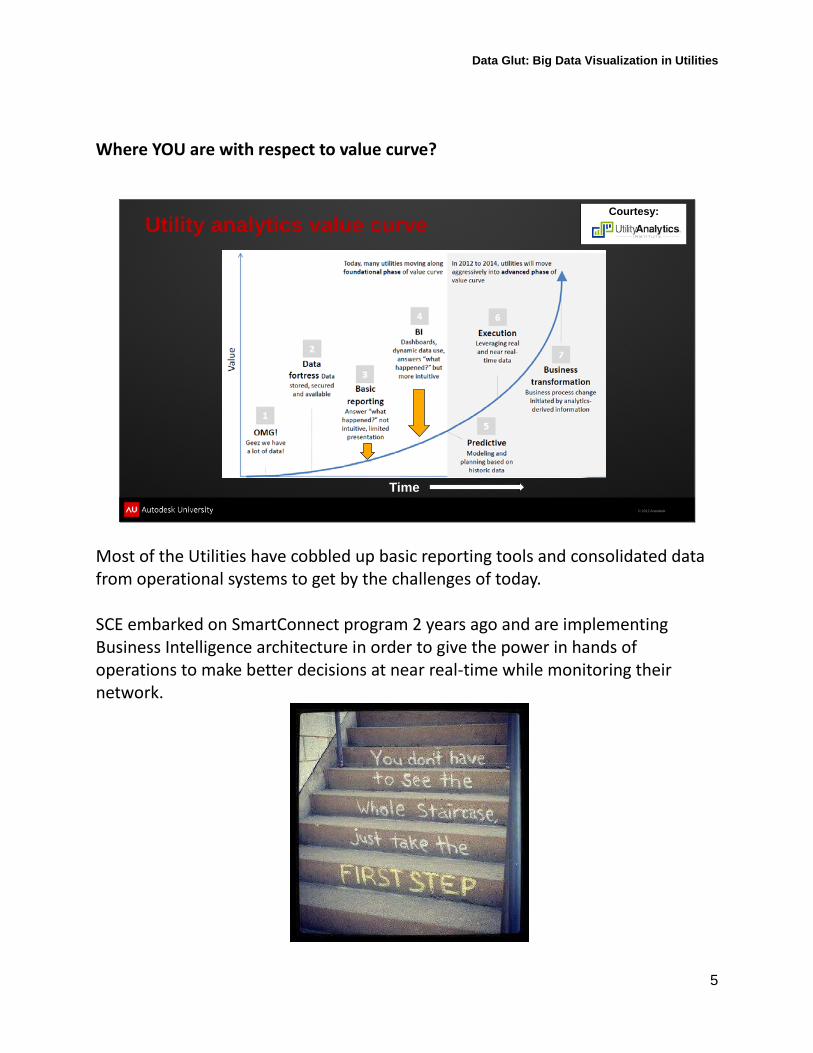
Where YOU are with respect to value curve?
© 2012 Autodesk
Utility analytics value curve
Time
Courtesy:
Most of the Utilities have cobbled up basic reporting tools and consolidated data from operational systems to get by the challenges of today. SCE embarked on SmartConnect program 2 years ago and are implementing Business Intelligence architecture in order to give the power in hands of operations to make better decisions at near real-time while monitoring their network.
Data Glut: Big Data Visualization in Utilities
6
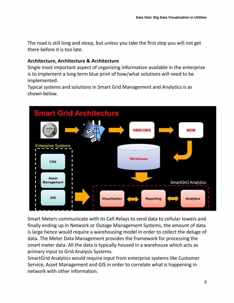
The road is still long and steep, but unless you take the first step you will not get there before it is too late. Architecture, Architecture & Architecture Single most important aspect of organizing information available in the enterprise is to implement a long term blue print of how/what solutions will need to be implemented. Typical systems and solutions in Smart Grid Management and Analytics is as shown below.
Smart Meters communicate with its Cell Relays to send data to cellular towers and finally ending up in Network or Outage Management Systems, the amount of data is large hence would require a warehousing model in order to collect the deluge of data. The Meter Data Management provides the framework for processing the smart meter data. All the data is typically housed in a warehouse which acts as primary input to Grid Analysis Systems. SmartGrid Analytics would require input from enterprise systems like Customer Service, Asset Management and GIS in order to correlate what is happening in network with other information.
Data Glut: Big Data Visualization in Utilities
7
Identify opportunities and challenges for big data management in utilities. What is Big Data? Wikipedia: Big data is the term for a collection of data sets so large and complex that it becomes difficult to process using on-hand database management tools or traditional data processing applications. In my mind, it is just simple unstructured data demanding large throughput for storage, processing and visualization. What are the common examples? Twitter feeds, Social networks, interactive feedbacks from audience/customer/ device sensors during an event/field situation. What can a utility do to take advantage of this?
• Be open to new way of communicating with customers.
• Enhance feedback from customers towards problem reporting/report back
• Smart devices can talk to you, Listen and learn.
How can that happen?
• People o Educate employees to respond in new ways with customers o Change the culture of enterprise to be more pro-active leveraging
new paradigm o Encourage innovation in these areas to find new ways.
• Process
Data Glut: Big Data Visualization in Utilities
8
• o Enhance the process to receive, handle and improve customer
experience using new information receive/delivery mechanism o Identify hook points to integrate new workflows due to big data. o Implement governance on new form of data.
• Technology
o Wrap legacy systems with integration points to take advantage of big data stores and big data handling systems.
o Evaluate and upgrade IT infrastructure to handle high speed and un-predictable surge in data communications.
o Implement specialized technology to store, process and deliver unstructured datasets. Hadoop, NoSQL etc
Data Glut: Big Data Visualization in Utilities
9
Autodesk solutions in Smart Grid Visualization
Being a leader in design tools we know Autodesk has best tools to design in any industry, what people don’t know is that Autodesk also has visualization tools for the design data in many industries. The relevant solutions for utilities are,
• Autodesk Infrastructure Map Server • Autodesk Infraworks • Navisworks • Autodesk 3DS Max Design
In this context, we will see how Autodesk Infrastructure Map Server can be used to visualize smart meters along with other enterprise data for effective management of Smart Grid Network. SCE Smart Grid Visualization tool is,
1. Built on top of Autodesk Infrastructure Map Server 2013 2. Shared environment with Other AIMS applications 3. Connects to Teradata warehouse 4. Features
o Visualization Template management o Visualization of Smart devices o Streaming Incidents o Device theming based on workgroup templates o Association of devices based on meter read data o Enable/Disable Streaming o Auto Streaming timer interval setup o Workgroup Creation from map o Device Property Reports o Saving current map for collaboration o Export/import device locations for overlays o Query
Data Glut: Big Data Visualization in Utilities
10
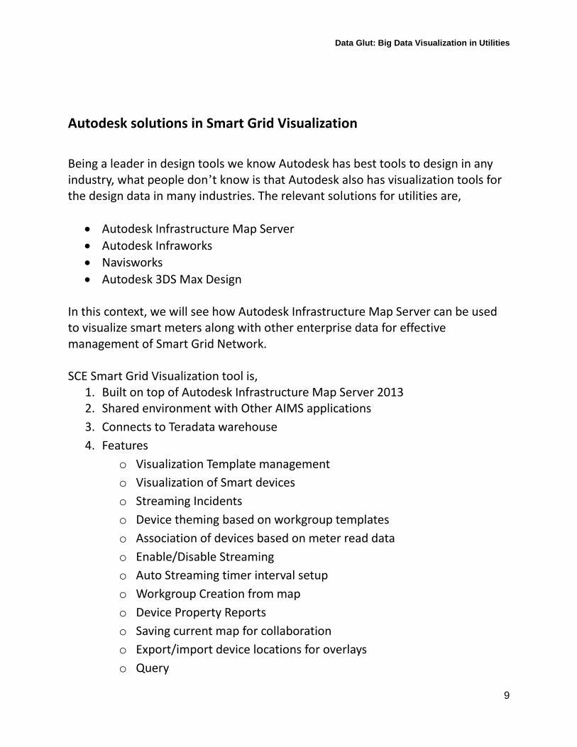
Figure 1 Daily Work Map
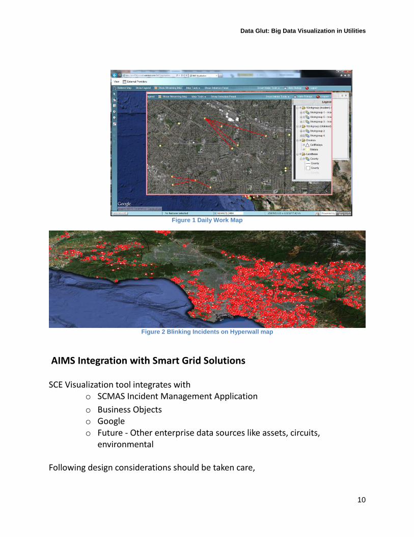
Figure 2 Blinking Incidents on Hyperwall map
AIMS Integration with Smart Grid Solutions SCE Visualization tool integrates with
o SCMAS Incident Management Application o Business Objects o Google o Future - Other enterprise data sources like assets, circuits,
environmental Following design considerations should be taken care,
Data Glut: Big Data Visualization in Utilities
11
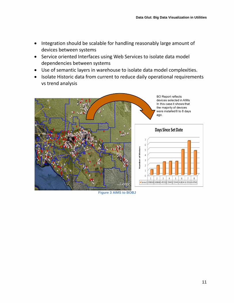
• Integration should be scalable for handling reasonably large amount of devices between systems
• Service oriented Interfaces using Web Services to isolate data model dependencies between systems
• Use of semantic layers in warehouse to isolate data model complexities. • Isolate Historic data from current to reduce daily operational requirements
vs trend analysis
Figure 3 AIMS to BOBJ
Data Glut: Big Data Visualization in Utilities
12
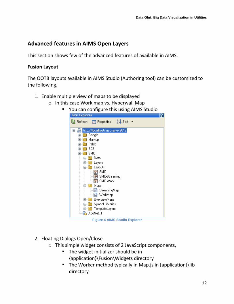
Advanced features in AIMS Open Layers This section shows few of the advanced features of available in AIMS. Fusion Layout The OOTB layouts available in AIMS Studio (Authoring tool) can be customized to the following,
1. Enable multiple view of maps to be displayed o In this case Work map vs. Hyperwall Map
You can configure this using AIMS Studio
Figure 4 AIMS Studio Explorer
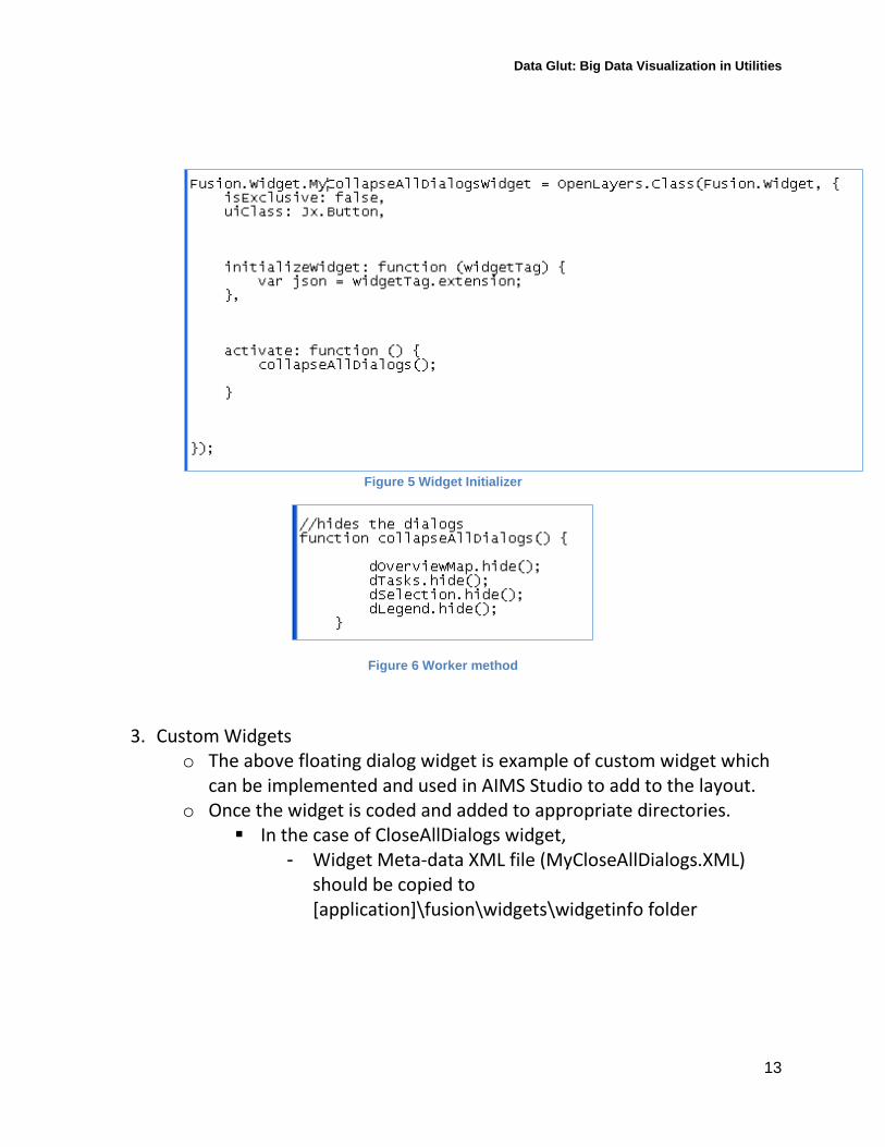
2. Floating Dialogs Open/Close o This simple widget consists of 2 JavaScript components,
The widget initializer should be in {application}\Fusion\Widgets directory
The Worker method typically in Map.js in [application]\lib directory
Data Glut: Big Data Visualization in Utilities
13
Figure 5 Widget Initializer
Figure 6 Worker method
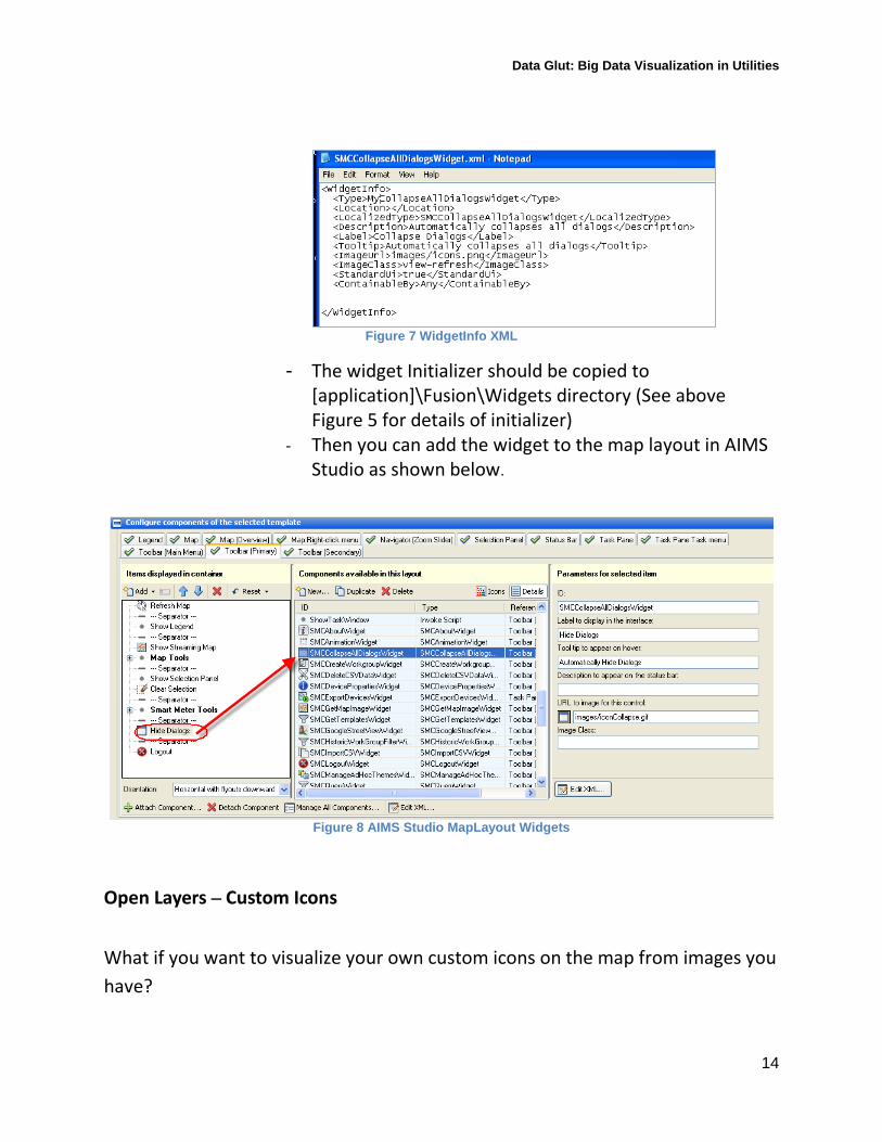
3. Custom Widgets o The above floating dialog widget is example of custom widget which
can be implemented and used in AIMS Studio to add to the layout. o Once the widget is coded and added to appropriate directories.
In the case of CloseAllDialogs widget, - Widget Meta-data XML file (MyCloseAllDialogs.XML)
should be copied to [application]\fusion\widgets\widgetinfo folder
Data Glut: Big Data Visualization in Utilities
14
Figure 7 WidgetInfo XML
- The widget Initializer should be copied to [application]\Fusion\Widgets directory (See above Figure 5 for details of initializer)
- Then you can add the widget to the map layout in AIMS Studio as shown below.
Figure 8 AIMS Studio MapLayout Widgets
Open Layers – Custom Icons
What if you want to visualize your own custom icons on the map from images you have?
Data Glut: Big Data Visualization in Utilities
15
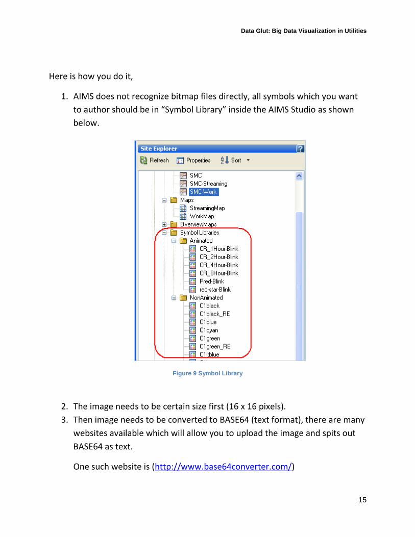
Here is how you do it,
1. AIMS does not recognize bitmap files directly, all symbols which you want to author should be in “Symbol Library” inside the AIMS Studio as shown below.
Figure 9 Symbol Library
2. The image needs to be certain size first (16 x 16 pixels). 3. Then image needs to be converted to BASE64 (text format), there are many
websites available which will allow you to upload the image and spits out BASE64 as text.
One such website is (http://www.base64converter.com/)
Data Glut: Big Data Visualization in Utilities
16
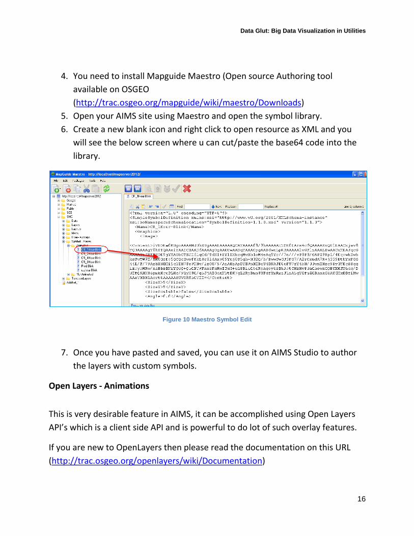
4. You need to install Mapguide Maestro (Open source Authoring tool available on OSGEO (http://trac.osgeo.org/mapguide/wiki/maestro/Downloads)
5. Open your AIMS site using Maestro and open the symbol library. 6. Create a new blank icon and right click to open resource as XML and you
will see the below screen where u can cut/paste the base64 code into the library.
Figure 10 Maestro Symbol Edit
7. Once you have pasted and saved, you can use it on AIMS Studio to author the layers with custom symbols.
Open Layers - Animations
This is very desirable feature in AIMS, it can be accomplished using Open Layers API’s which is a client side API and is powerful to do lot of such overlay features.
If you are new to OpenLayers then please read the documentation on this URL (http://trac.osgeo.org/openlayers/wiki/Documentation)
Data Glut: Big Data Visualization in Utilities
17
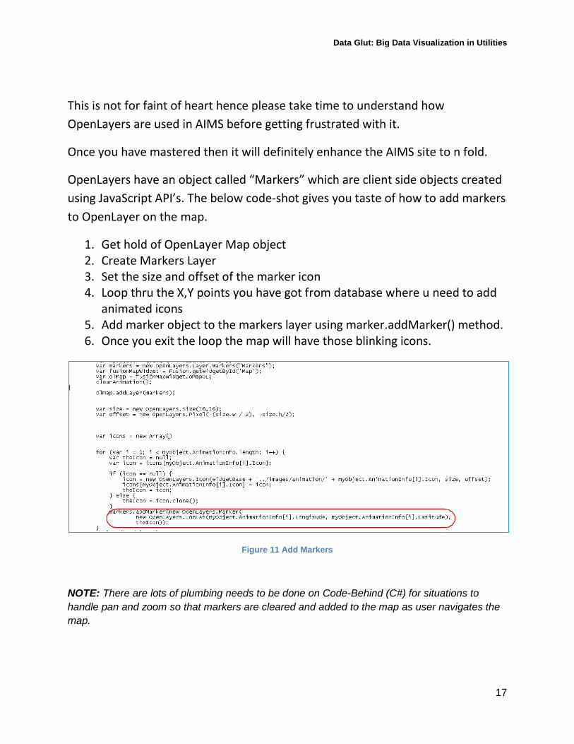
This is not for faint of heart hence please take time to understand how OpenLayers are used in AIMS before getting frustrated with it.
Once you have mastered then it will definitely enhance the AIMS site to n fold.
OpenLayers have an object called “Markers” which are client side objects created using JavaScript API’s. The below code-shot gives you taste of how to add markers to OpenLayer on the map.
1. Get hold of OpenLayer Map object 2. Create Markers Layer 3. Set the size and offset of the marker icon 4. Loop thru the X,Y points you have got from database where u need to add
animated icons 5. Add marker object to the markers layer using marker.addMarker() method. 6. Once you exit the loop the map will have those blinking icons.
Figure 11 Add Markers
NOTE: There are lots of plumbing needs to be done on Code-Behind (C#) for situations to handle pan and zoom so that markers are cleared and added to the map as user navigates the map.
Data Glut: Big Data Visualization in Utilities
18
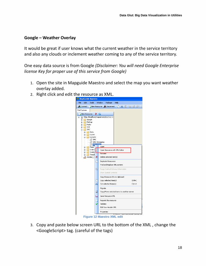
Google – Weather Overlay It would be great if user knows what the current weather in the service territory and also any clouds or inclement weather coming to any of the service territory. One easy data source is from Google (Disclaimer: You will need Google Enterprise license Key for proper use of this service from Google)
1. Open the site in Mapguide Maestro and select the map you want weather overlay added.
2. Right click and edit the resource as XML.
Figure 12 Maestro XML edit
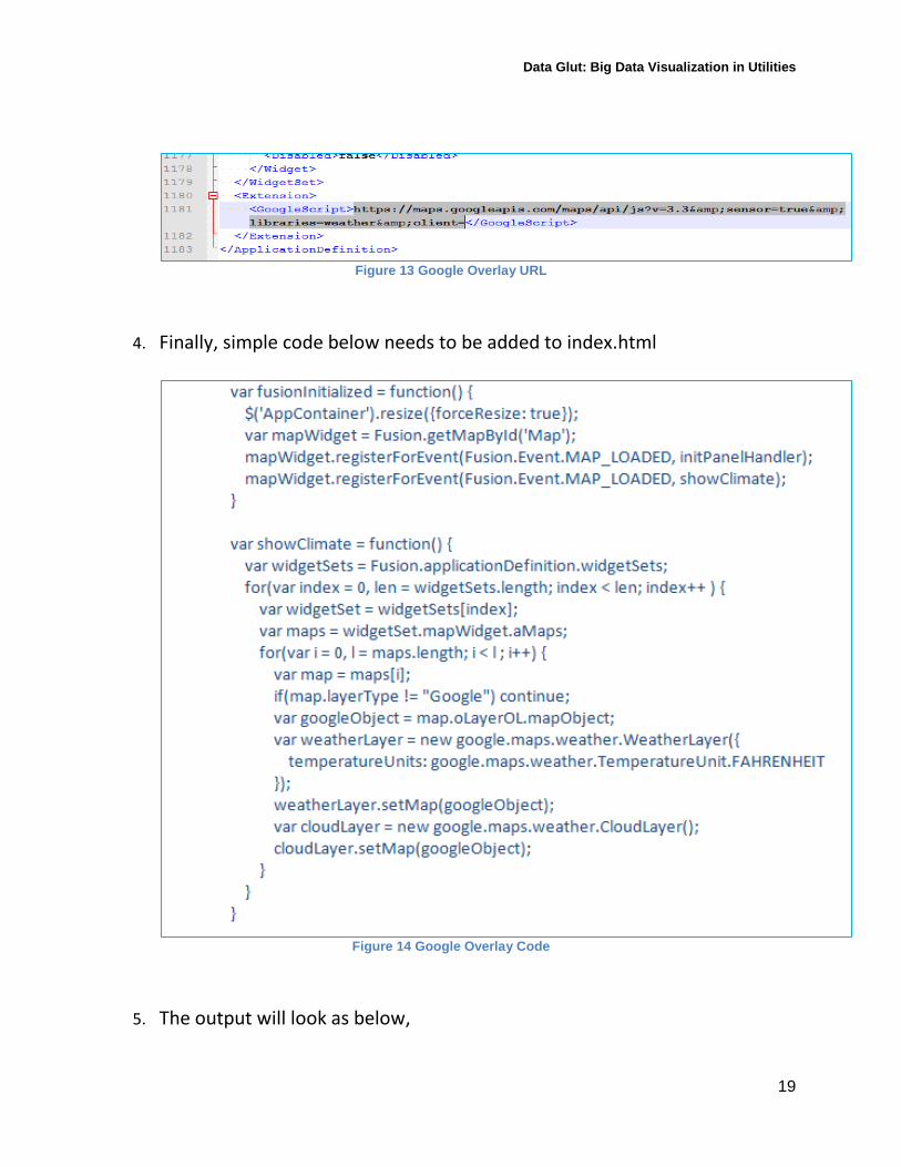
3. Copy and paste below screen URL to the bottom of the XML , change the <GoogleScript> tag. (careful of the tags)
Data Glut: Big Data Visualization in Utilities
19
Figure 13 Google Overlay URL
4. Finally, simple code below needs to be added to index.html
Figure 14 Google Overlay Code
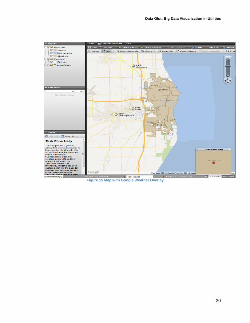
5. The output will look as below,
Data Glut: Big Data Visualization in Utilities
20
Figure 15 Map with Google Weather Overlay
Data Glut: Big Data Visualization in Utilities
21
Large data visualization techniques with AIMS
AIMS like any web application tool needs tuning at all tiers in order to be fast and efficient.
The tiers you need to be paying attention are,
o Database tier Collect and Warehouse data
- Grid Network data - As-built assets (non meter) - Customer Information - Other Enterprise data
Data Partitioning - Views in database specifically tuned to map layers - Control joins (no of multiple table) in database views - Historic data view vs. current data view
Model schema - Star schema vs. relational schema
o Application tier
Ensure the code-behind (C#) is not looping through and creating lot of objects which in turn bloats .NET framework memory space.
Multiple and frequent calls to Mapguide API’s Maps need to be authored carefully with objects appearing
only when needed.
o Client Side Visualization tier Do not have too many loops in JavaScript code which spins in
Browser memory.

Data Glut: Big Data Visualization in Utilities
22
Beware of Marker use in IE 8 as JavaScript engine in IE8 is memory hog.
Do not allow unlimited selection of objects on client side , keep a limit of may be 10-20K.

Data Glut: Big Data Visualization in Utilities
23
Data Glut: Big Data Visualization in Utilities
24
Useful links for reference Utility Analytics Institute – http://utilityanalytics.com/
Open Source Geospatial - http://osgeo.org/
Open Layers – http://openlayers.org/ Mapguide Demo site - http://enterprise.mapguide.com/
SCE Smart Grid Initiative -
http://www.sce.com/PowerandEnvironment/smartgrid/default.htm