Data Analytics Tutorial: Contribution Margin, CM …...Data Analytics Tutorial: Contribution Margin,...
79
Data Analytics Tutorial: Contribution Margin, CM Ratio, and Segment Margins Using Excel Pivot Tables and Charts Cabinet Accessories Company (CAC) dataset Welcome to this data analytics tutorial that covers sales, cost, and gross profit analysis using pivot tables and charts in Excel. 1
Transcript of Data Analytics Tutorial: Contribution Margin, CM …...Data Analytics Tutorial: Contribution Margin,...

Data Analytics Tutorial: Contribution Margin,
CM Ratio, and Segment Margins Using
Excel Pivot Tables and Charts
Cabinet Accessories Company (CAC) dataset
Welcome to this data analytics tutorial that covers sales, cost, and gross profit analysis using pivot tables and charts in Excel.
1

Cabinet Accessories Company (CAC)
• CAC is a fictitious company that sells cabinet hardware including knobs and pulls
• Data set contains sales and cost data for 2014 – 2018
• In this tutorial, we are using a small, 36‐record data set
• For the actual activity, you will be using the full data set so the answers will be different but the process will be similar
In this activity, we are using a sales and cost data set for a fictitious company, Cabinet Accessories Company (CAC.) The sales and cost data covers 2014 – 2018. For this tutorial only, we are using a small, 36‐record data set. For the actual activity, you will be using the full data set so the answers for the activity requirements will be different – but the process will be similar.
2
Pivot tables and pivot charts
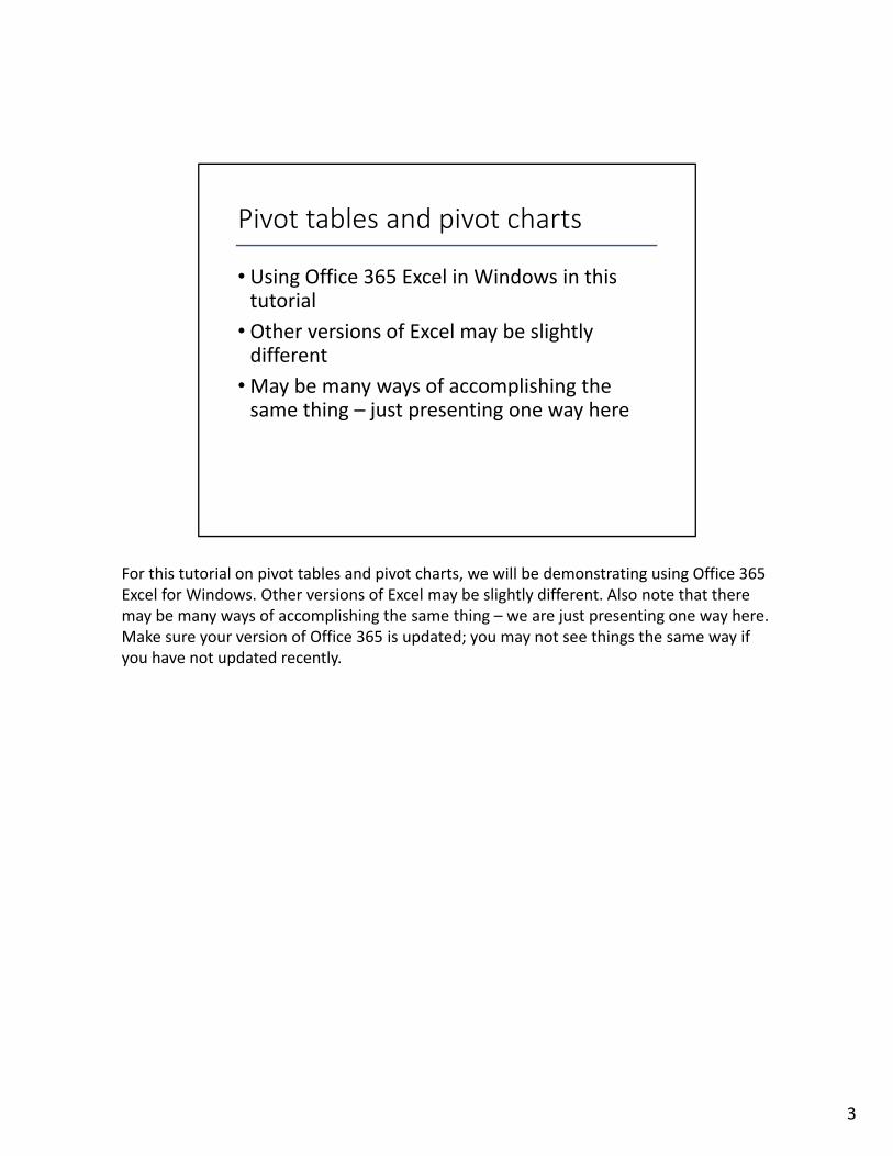
• Using Office 365 Excel in Windows in this tutorial
• Other versions of Excel may be slightly different
•May be many ways of accomplishing the same thing – just presenting one way here
For this tutorial on pivot tables and pivot charts, we will be demonstrating using Office 365 Excel for Windows. Other versions of Excel may be slightly different. Also note that there may be many ways of accomplishing the same thing – we are just presenting one way here. Make sure your version of Office 365 is updated; you may not see things the same way if you have not updated recently.
3

Update Office 365 (Excel 2016) before working on project
Again, please be sure to update your version of Excel before working on this project. Certain features will not work if you are not using the most current version of Excel.
4

Start by opening Excel workbook
Start this activity by opening the Excel workbook containing the data set.
5

General instructions
You will be using the Excel file provided to create pivot tables and other data. Step‐by‐step instructions using the tutorial data set follow for each of the requirements for the assignment.
You will be using the Excel file provided to create pivot tables and other data. Step‐by‐step instructions using the tutorial data set follow for each of the requirements for the assignment.
6

Requirement 1
Create three columns in the Data worksheet that calculate sales revenue, variable cost, and contribution margin for each sales record
Requirement 1 asks “Create three columns in the Data worksheet that calculate sales revenue, variable cost, and contribution margin for each sales record.”
7

Req 1: Create 3 columns
#1: Enter the formula for sales revenue, which is =h2*j2 (point to the cells rather than typing them in)
For the first step in the first requirement, to go Cell K2 in the Data worksheet, which is the cell under the column heading sales revenue. Enter the formula for sales revenue, which is =h2*j2. Point to the cells rather than typing them in.
8

Req 1: Create 3 columns
#2: Enter the formula for variable cost, which is =i2*j2
For the second step, click in Cell L2, which is right below the column heading variable cost. Enter the formula for variable cost, which is =i2*j2. Again, point to the cells rather than typing in the names.
9

Req 1: Create 3 columns
#3: Enter the formula for contribution margin, which is sales revenue minus variable cost or =K2−L2
For the third column, click in cell M2, which is the cell right below the column heading of contribution margin. Enter the formula for contribution margin, which is sales revenue
minus variable cost or=K2−L2 (again, point to the cells rather than typing them in – there is a lot less potential for error that way.)
10

Req 1: Create 3 columns
#4: To copy the three formulas down to the rest of the rows, select the three cells and then double‐click the small box in the lower right‐hand corner of cell M2
In the fourth step, copy the three formulas down to the rest of the rows by selecting the three cells and then double‐clicking the small box in the lower right‐hand corner of cell M2.
11

Req 1: Create 3 columns
#5: Format the three columns by selecting them and then clicking on Format, Accounting format with 2 decimal places.
For Step 5, format the three columns by selecting the columns and then clicking on Format, Accounting format with 2 decimal places.
12

Req 1: Create 3 columns
That’s it, you have added three formatted columns to the Data worksheet
That’s it, you have added three formatted columns to the Data worksheet.
13

Requirement 2
Create a pivot table that shows sales revenue by region for each year. Correct any errors in the data set. Insert a pivot chart to show sales trends.
Requirement 2 states “Create a pivot table that shows sales revenue by region for each year. Correct any errors in the data set. Insert a pivot chart to show sales trends.”
14
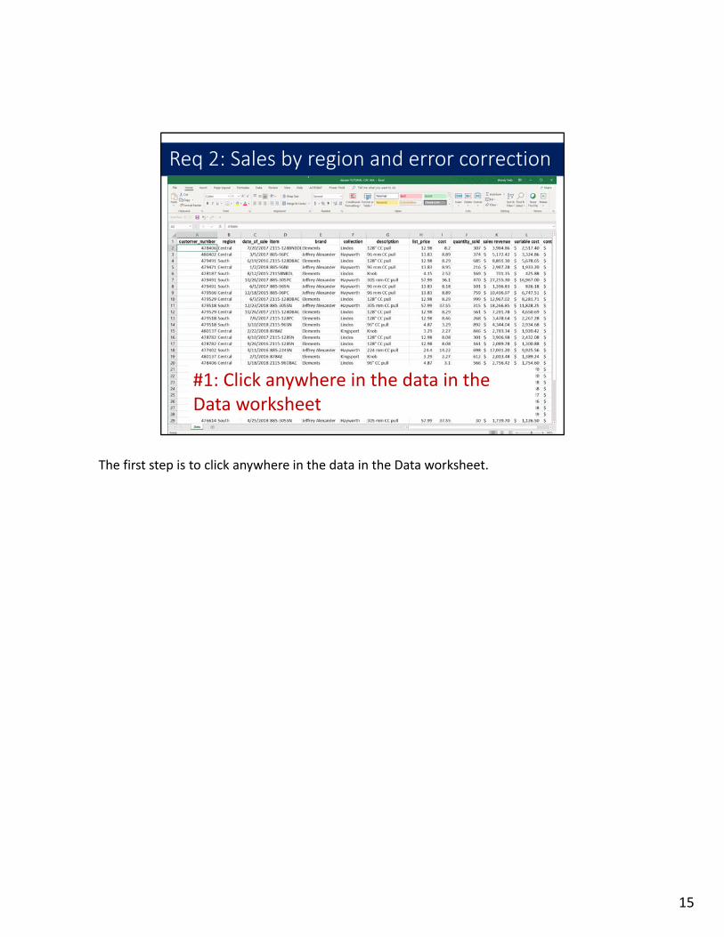
Req 2: Sales by region and error correction
#1: Click anywhere in the data in the Data worksheet
The first step is to click anywhere in the data in the Data worksheet.
15

Req 2: Sales by region and error correction
#2: On the ribbon, click Insert and then Pivot Table
Next, on the ribbon, click Insert and then Pivot Table.
16

Req 2: Sales by region and error correction
#3: Accept the defaults and click on OK
Next, accept the defaults and click on OK.
17

Req 2: Sales by region and error correction
#4: Right‐click the worksheet name to rename it as “Req 2”
Before we go any further, right‐click the worksheet name tab and rename it “Req 2.” That will help to keep track of the different pivot tables.
18

Req 2: Sales by region and error correction
By the way, if this panel ever disappears, you can bring it back by clicking anywhere in the pivot table you have created
By the way, if the PivotTable Fields panel ever disappears, you can bring it back by clicking anywhere in the pivot table you have created.
19

Req 2: Sales by region and error correction
#5: Drag “Region” in the PivotTable Fields panel down to the Rows box, “Sales revenue” down to the Values box, and “date_of_sale” down to the Columns box
The next step is to drag “Region” in the PivotTable Fields panel down to the Rows box, “Sales revenue” down to the Values box, and “date_of_sale” down to the Columns box.
20

Req 2: Sales by region and error correction
#6: Examine the pivot table now. Look for errors. Here we see that “Central” has been entered as “Centrals” at least once in the dataset.
The next step is examine the pivot table now. Look for errors. Here we see that “Central” has been entered as “Centrals” at least once in the dataset. When you work on the large assigned dataset, there may be different errors, but the same visual inspection technique will work to find any errors.
21

Req 2: Sales by region and error correction
#7: Now switch back to the Data worksheet and click on Find & Select in the Home ribbon. Select Find and Replace. Type in the error term you found in the pivot table and click Find Next.
Now switch back to the Data worksheet and click on Find & Select in the Home ribbon. Select Find and Replace. Type in the first error term you found in the pivot table and click Find Next. Replace with the corrected spelling. Do this process for each error you find in the pivot table. Here we had just one, Centrals instead of the correct Central.
22

Req 2: Sales by region and error correction
#8: Return to the Req 2 worksheet. Click in the data in the pivot table. Right‐click and select Refresh.
For the next step, return to the Req 2 worksheet. Click in the data in the pivot table. Right‐click and select Refresh. This process should update the pivot table so the errors you corrected are no longer in the pivot table.
23

Req 2: Sales by region and error correction
#9: Select the pivot table data and right‐click to select Value Field Settings
Next, we will format the data in the pivot table. Select the pivot table data and right‐click to select Value Field Settings. You will most likely have to format each year of data separately. Just repeat these instructions for each year of data chosen.
24

Req 2: Sales by region and error correction
#10: Select Number Format
Select Number Format.
25

Req 2: Sales by region and error correction
#11: Format the pivot table cells as Accounting with 2 decimal places
Format the pivot table cells as Accounting with 2 decimal places. Remember that you may need to select each year of data separately to format it – just repeat the steps we just went through.
26

Req 2: Sales by region and error correction
#12: Select the pivot table data. On the Insert ribbon, click on PivotChart
Now we are going to insert a PivotChart in this same worksheet. Select the pivot table data. On the Insert ribbon, click on PivotChart.
27

Req 2: Sales by region and error correction
#13: Next, select the Line type of chart
Next, select the Line type of chart and then click on OK.
28

Req 2: Sales by region and error correction
The pivot chart now appears in the worksheet
The pivot chart now appears in the worksheet. However, we need to switch the data rows and columns.
29

Req 2: Sales by region and error correction
#14: Right‐click the chart and click on Select Data
To switch the rows and columns, right‐click the chart and click on Select Data.
30

Req 2: Sales by region and error correction
#15: Click on the Switch Row/Column button at the top of the box
Next, click on the Switch Row/Column button at the top of the box.
31

Req 2: Sales by region and error correction
#16: Now click OK to finalize the switch of the rows and columns
Now click OK to finalize the switch of the rows and columns.
32

Req 2: Sales by region and error correction
The pivot table rows and columns now have been switched, as well as the pivot chart data
The pivot table rows and columns now have been switched, as well as the pivot chart data.
33

Requirement 3
Create a pivot table that shows sales revenue, variable costs, and contribution margin for each year for each region.
Requirement 3 reads “Create a pivot table that shows sales revenue, variable costs, and contribution margin for each year.”
34

Req 3: Sales, variable cost and CM by year
#1: Click anywhere in the data in the Data worksheet
The first step is to click anywhere in the data in the Data worksheet.
35

Req 3: Sales, variable cost and CM by year
#2: Click on the Insert tab and then click on Pivot Table
Click on the Insert tab and then click on Pivot Table.
36

Req 3: Sales, variable cost and CM by year
#3: Accept the defaults and click on OK
Next, accept the defaults and click on OK.
37

Req 3: Sales, variable cost and CM by year
#4: Right‐click the worksheet name to rename it as “Req 3”
Before we go any further, right‐click the worksheet name tab and rename it “Req 3.” That will just help to keep track of the various pivot tables.
38

Req 3: Sales, variable cost and CM by year
#5: Drag “Years” and “region” in the PivotTable Fields panel down to the Rows box. Drag “sales revenue”, “variable cost”, and “contribution margin” down to the Values box
In the next step, drag “Years” in the PivotTable Fields panel down to the Rows box. Drag “sales revenue”, “variable cost”, and “contribution margin” down to the Values box.
39

Req 3: Sales, variable cost and CM by year
#6: Select the pivot table data in Column B. Right‐click and select Value Field Settings
Next, select the pivot table data in Column B for sales revenue. Right‐click and select Value Field Settings.
40

Req 3: Sales, variable cost and CM by year
#7: Click on Number Format
Next, click on Number Format.
41

Req 3: Sales, variable cost and CM by year
#8: Select Accounting format with 2 decimal places
Select Accounting format with 2 decimal places.
42

Req 3: Sales, variable cost and CM by year
#9: Repeat formatting for variable cost data and for contribution margin data
Now repeat the formatting step for both the variable cost data and for the contribution margin data.
43

Req 3: Sales, variable cost and CM by year
This pivot table that shows sales revenue, total cost, and gross profit by year is finished
This pivot table that shows sales revenue, variable cost, and contribution margin by year is now finished.
44

Requirement 4
Create a pivot table that shows the most profitable brand in each year, as measured by contribution margin.
Requirement 4 reads “Create a pivot table that shows the most profitable brand in each year, as measured by gross profit.”
45

Req 4: Most profitable by CM
#1: Click anywhere in the data in the Data worksheet
The first step is to click anywhere in the data in the Data worksheet.
46

Req 4: Most profitable by CM
#2: Click on the Insert tab and then click on Pivot Table
Click on the Insert tab and then click on Pivot Table.
47

Req 4: Most profitable by CM
#3: Accept the defaults and click on OK
Accept the defaults and click on OK.
48

Req 4: Most profitable by CM
#4: Right‐click the worksheet name to rename it as “Req 4”
Before we go any further, right‐click the worksheet name tab and rename it “Req 4.” That will help to keep track of the pivot tables.
49

Req 4: Most profitable by CM
#5: Drag “Years” in the PivotTable Fields panel down to the Columns box. Drag “brand” and “collection” down to the Rows box. Drag“contribution margin” down to the Values box.
In the next step, drag “Years” in the PivotTable Fields panel down to the Columns box. Drag “brand” and “collection” down to the Rows box. Drag “contribution margin” down to the Values box.
50

Req 4: Most profitable by CM
#6: Select the pivot table data, right‐click, click Value Field Settings, Number Format, and format as Accounting with 2 decimal places
Next, select the pivot table data, right‐click, click Value Field Settings, Number Format, and format as Accounting with 2 decimal places. Remember that you may have to format the data in each column separately.
51

Req 4: Most profitable by CM
The pivot table is now done – it shows the most profitable brand each year.
The pivot table is now done – it shows the most profitable brand each year.
52

Requirement 5
Create a pivot table to answer the question “Within each brand, what was the most profitable brand in 2018, as measured by contribution margin ratio?”
Requirement 5 reads ““Within each brand, what was the most profitable brand in 2018, as measured by contribution margin ratio?” Use the field “years” to filter the data to include just the year of 2018. You will need to add a calculated field to the pivot table to calculate the contribution margin ratio. Within each brand, sort the collections by gross profit percentage, from the largest to the smallest.
53

Req 5: Most profitable brand by CM ratio
#1: Click anywhere in the data in the Data worksheet
The first step is to click anywhere in the data in the Data worksheet.
54

Req 5: Most profitable brand by CM ratio
#2: Click on Insert and then Pivot Table
Next, click on Insert and then Pivot Table.
55

Req 5: Most profitable brand by CM ratio
#3: Accept the defaults for the pivot table and click OK
Next, accept the defaults for the pivot table and click OK.
56

Req 5: Most profitable brand by CM ratio
#4: Right‐click the worksheet name to rename it as “Req 5”
Before we go any further, right‐click the worksheet name tab and rename it “Req 5.” Numbering the worksheets helps to keep track of the pivot tables.
57

Req 5: Most profitable brand by CM ratio
#5: Drag “Years” in the PivotTable Fields panel down to the Filters box. Drag “brand” and “collection” down to the Rows box. Finally, drag contribution margin down to the Values box.
Next, drag “Years” in the PivotTable Fields panel down to the Filters box. Drag “brand” and “collection” down to the Rows box. Finally, drag contribution margin down to the Values box.
58

Req 5: Most profitable brand by CM ratio
#6: In the Analyze ribbon, click on Fields, Items, & Sets to add a Calculated Field
Next, in the Analyze ribbon, click on Fields, Items, & Sets to add a Calculated Field.
59
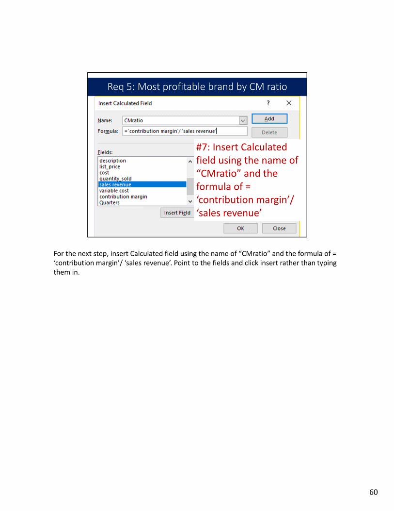
Req 5: Most profitable brand by CM ratio
#7: Insert Calculated field using the name of “CMratio” and the formula of = ‘contribution margin’/ ‘sales revenue’
For the next step, insert Calculated field using the name of “CMratio” and the formula of = ‘contribution margin’/ ‘sales revenue’. Point to the fields and click insert rather than typing them in.
60
Req 5: Most profitable brand by CM ratio
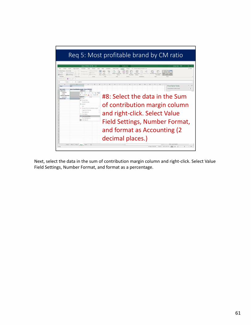
#8: Select the data in the Sum of contribution margin column and right‐click. Select Value Field Settings, Number Format, and format as Accounting (2 decimal places.)
Next, select the data in the sum of contribution margin column and right‐click. Select Value Field Settings, Number Format, and format as a percentage.
61

Req 5: Most profitable brand by CM ratio
#9: Select the data in the CMratiocolumn and right‐click. Select Value Field Settings, Number Format, and format as a percentage.
Next, select the data in the CMratio column and right‐click. Select Value Field Settings, Number Format, and format as a percentage.
62

Req 5: Most profitable brand by CM ratio
#10: In the Years filter box, select 2018 as the year to display only 2018 data
In the next step, in the Years filter box, select 2018 as the year to display only 2018 data.
63

Req 5: Most profitable brand by CM ratio
#10: Sort the pivot table by CM ratio, from largest to smallest.
Click on a cell in the pivot table at the collection level. Here we will click on Cell C5. Next, right‐click and select Sort, and then Sort Largest to Smallest.
64

Req 5: Most profitable brand by CM ratio
Pivot table is finished and shows the most profitable brands, as measured by contribution margin ratio
The pivot table is finished. We can see the most profitable and least profitable brands as measured by contribution margin ratio.
65

Requirement 6
Complete the worksheet named “segment margin” to calculate each region’s segment margin and operating income for 2018.
Requirement 6 reads “Complete the worksheet named “segment margin.” You will calculate each region’s segment margin and operating income for 2018.” You will link to the totals in the pivot table you created for Requirement 3. You will get the fixed costs for calculating the segment margins from the “fixed cost data” worksheet.
66

Req 6: Segment margin calculations
#1: Go to the “segment margin” worksheet
Go to the “segment margin” worksheet.
67

Req 6: Segment margin calculations
#2: Link to the Sales revenue total in the pivot table from Req 3 for the Central region in Cell B4 by typing = in the cell and then pointing to the relevant cell in Req 3
Next, link to the Sales revenue total in the pivot table from Requirement 3 for the Central region in Cell B4 by typing an equals sign in the cell and then pointing to the relevant cell in Requirement 3.
68

Req 6: Segment margin calculations
#3: Link to the Variable cost total in the pivot table from Req 3 for the Central region in Cell B5 by typing = in the cell and then pointing to the relevant cell in Req 3
Next, link to the Variable cost total in the pivot table from Requirement 3 for the Central region in Cell B5 by typing an equals sign in the cell and then pointing to the relevant cell in Requirement 3.
69

Req 6: Segment margin calculations
#4: Calculate Contribution margin by pointing to Sales revenue and subtracting variable expenses. Type “=B4‐B5”
Next, calculate Contribution margin by pointing to Sales revenue and subtracting variable expenses. Type equals sign B4 minus B5.
70

Req 6: Segment margin calculations
#5: Link to the Direct fixed expenses in the worksheet named “fixed cost data” for the Central region by typing = in Cell B7 and then pointing to the relevant cell in the “fixed cost data” worksheet
Now let’s link to the Direct fixed expenses in the worksheet named “fixed cost data” for the Central region by typing an equals sign in Cell B7 and then pointing to the relevant cell in the “fixed cost data” worksheet.
71

Req 6: Segment margin calculations
#6: Calculate Segment margin by pointing to Contribution margin and subtracting direct fixed expenses. Type “=B6‐B7”
Now calculate the Segment margin by pointing to Contribution margin and subtracting direct fixed expenses. Type equals sign B6 minus B7.
72

Req 6: Segment margin calculations
#7: Link to the Common allocated costs in the worksheet named “fixed cost data” for the Central region by typing = in Cell B9 and then pointing to the relevant cell in the “fixed cost data” worksheet
Now link to the Common allocated costs in the worksheet named “fixed cost data” for the Central region by typing an equals sign in Cell B9 and then pointing to the relevant cell in the “fixed cost data” worksheet.
73

Req 6: Segment margin calculations
#8: Calculate Operating income (loss) by pointing to Segment margin and subtracting fixed costs allocated to regions in Cell B10.
Calculate Operating income (or loss) by pointing to Segment margin and subtracting fixed costs allocated to regions in Cell B10.
74

Req 6: Segment margin calculations
#9: Repeat the steps for each of the remaining regions. You can copy most formulas, but you cannot copy cells that refer to pivot tables.
Repeat the previous steps for each of the remaining regions. You can copy most formulas, but remember that you cannot copy cells that refer to pivot tables. Any cells that point to the numbers in the pivot table in Requirement 3 will need to each be linked individually rather than copied from another cell in the worksheet.
75

Req 6: Segment margin calculations
NOTE: In this tutorial, we only have two regions in the mini data set, Central and South. When you use the full data set, you will have data in every column.
In this tutorial, we only have two regions in the mini data set, Central and South. When you use the full data set, you will have data in every column. There are eight regions in the full data set.
76

Req 6: Segment margin calculations
#10: Sum each of the rows in the “Total of all regions” column. Start each sum with “=sum” and then point to the cells you are adding
Now sum each of the rows in the “Total of all regions” column. Start each sum with an equal sign SUM and then point to the cells you are adding.
77

Req 6: Segment margin calculations
That’s it – we can see the segment margin and operating income for each of the eight regions.
Now we can see the segment margin and operating income for each of the eight regions. Remember – there are only two regions with data in this tutorial data set but you will have all eight regions in the full data set.
78

hor Contact Info
Prepared by:Wendy M. Tietz, PhD, CPA, CMA, CSCA
Copyright © 2018 Wendy M. Tietz, LLC
That concludes this data analytics tutorial covering contribution margins, contribution margin ratios, and segment margins using Excel pivot tables and charts. This video was created and narrated by Dr. Wendy Tietz. Thanks for watching!
79