Dashboard Razzle Dazzle
33
Dashboard Razzle Dazzle Marcy Miller Tait Wednesday, March 30, 2022 Copyright 2009, Information Builders. Slide 1
description
Dashboard Razzle Dazzle. Marcy Miller Tait Friday, August 1, 2014. Dashboard Razzle Dazzle Agenda. Agenda Colors White Space Content Examples. Dashboard Razzle Dazzle - Colors. - PowerPoint PPT Presentation
Transcript of Dashboard Razzle Dazzle
Dashboard Razzle Dazzle
Marcy Miller TaitSaturday, April 22, 2023
Copyright 2009, Information Builders. Slide 1
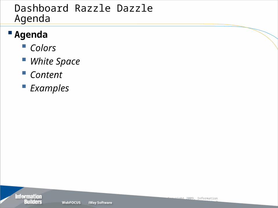
Dashboard Razzle DazzleAgenda
Agenda Colors White Space Content Examples
Copyright 2009, Information Builders. Slide 2

Color schemes chosen like this are much more likely to be successful than ones chosen arbitrarily from a palette in a computer
program
Dashboard Razzle Dazzle - Colors
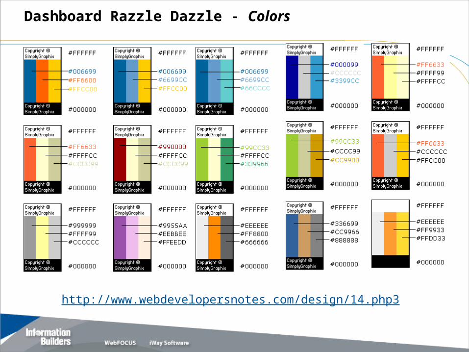
http://www.webdevelopersnotes.com/design/14.php3
Dashboard Razzle Dazzle - Colors

“Web Safe” Colors
Dashboard Razzle Dazzle - Colors

White Space
Dashboard Razzle DazzleWhite Space
What Is White Space? Put simply, white space is the space between different elements of a
design – the area between text, images, paragraphs, headers, footers, links, etc. It is the space between different elements on a page, the space between letters, and the space between lines in a paragraph.
White space allows for easier scanning of a website. It reduces the amount of text visitors see all at once and makes reading much easier. It allows for the visual separation of design elements without adding any new elements such as visible lines or boxes. It is clean, looks professional when used correctly, and gives a site an uncluttered and fresh feel.
White space is sadly one of the most underrated elements of a strong web design. Just because it isn’t shiny or glossy doesn’t mean it isn’t important or essential to a website.
Let’s take a look at a couple of websites that are using white space effectively in their design.
Dashboard Razzle DazzleWhite Space
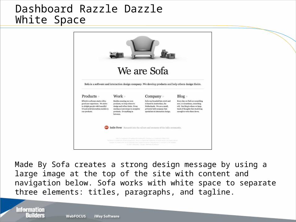
Made By Sofa creates a strong design message by using a large image at the top of the site with content and navigation below. Sofa works with white space to separate three elements: titles, paragraphs, and tagline.
Dashboard Razzle DazzleWhite Space
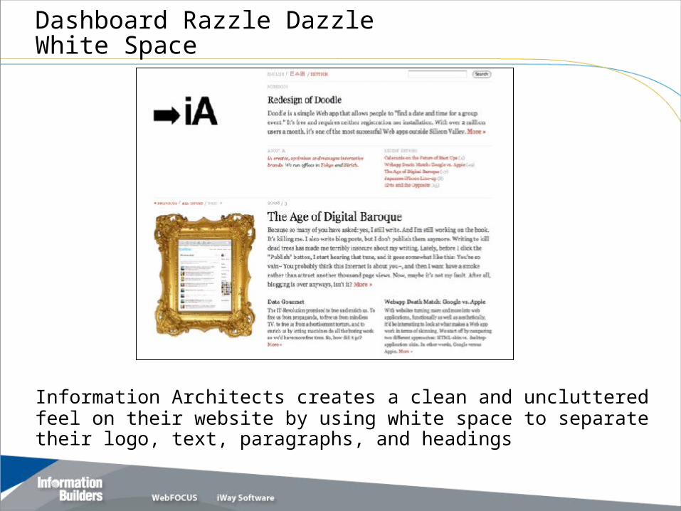
Information Architects creates a clean and uncluttered feel on their website by using white space to separate their logo, text, paragraphs, and headings
Content
Dashboard Razzle DazzleContent
Content should never be an afterthought - just something to fill in the white space between images and flashy multimedia presentations. Is the information accurate and on target to its purpose? First, identify for yourself what the purpose of your pages is. If you
don't have your purpose in mind, no one else will either. Think about where people may want to go from your pages, and
provide links or buttons or menus to those places. Make it as easy as possible to navigate. Not everyone has
mastered the Back function of their browser. Some people don't like to scroll pages, so keep your pages short. Be consistent in your buttons or links. Don't change them from
page to page without reason. It is much easier to use if it is consistent.
Dashboard Razzle DazzleContent
Avoid long lines of text as they create boring, hard to read Web sites. Visual boredom results when type extends in an unbroken
line from the left to the right margin of the screen. Long lines are tiring because your Web site reader's eyes
have to make numerous left-to-right shifts. It's also easy to get lost making the transition from the last
word of one line to the first word of the next. Short lines of type create white space to the left and right of
each paragraph. This white spaces frames your message and also provides space to place secondary text or visual information.
Dashboard Razzle DazzleContent
Avoid large, meaningless graphics. Large graphics take longer to download than small graphics. Long downloading times are only justified if the result is meaningful information.
Use Animation with purpose. Avoid multiple flashing images just for the purpose of having animation. Blinking text. One of the most annoying things you can put
on a page is blinking text. Sure, it attracts attention--at first! But after a few repetitions, it is an annoying distraction.
Overuse of animated GIFs. Animated GIFs are another "feature" that helps attract attention. Sometimes they are clever, but more often than not, they rapidly become annoying.
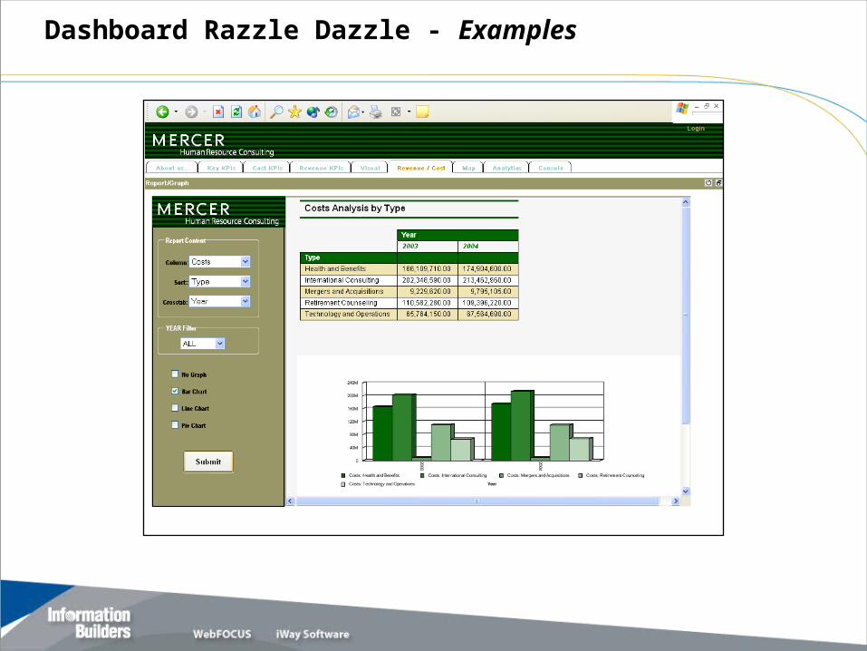
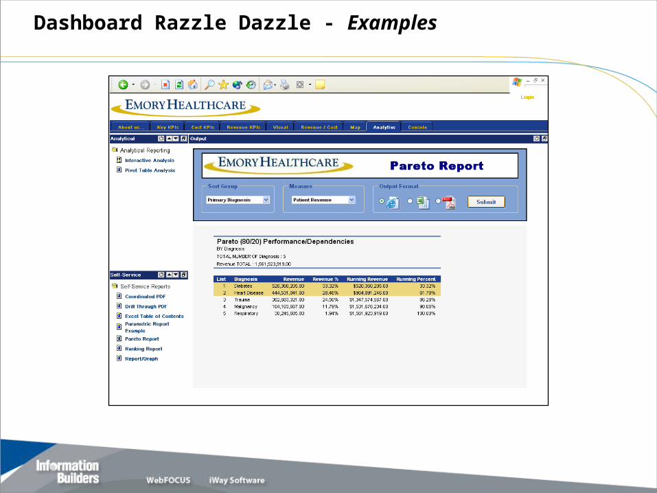
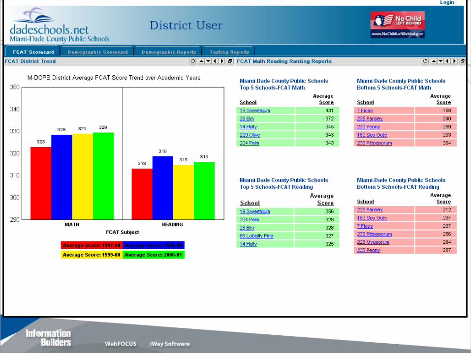
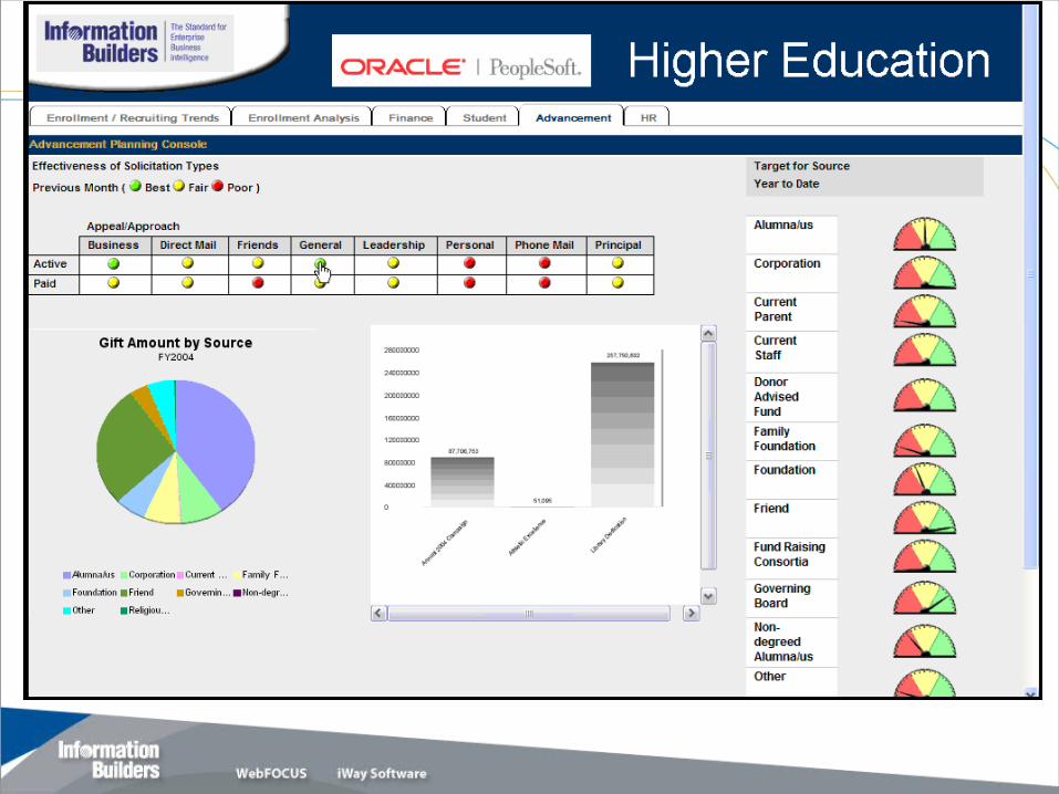
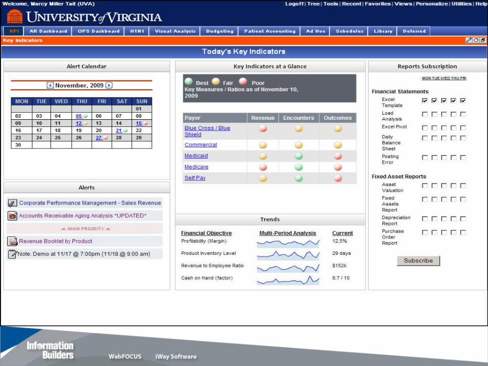
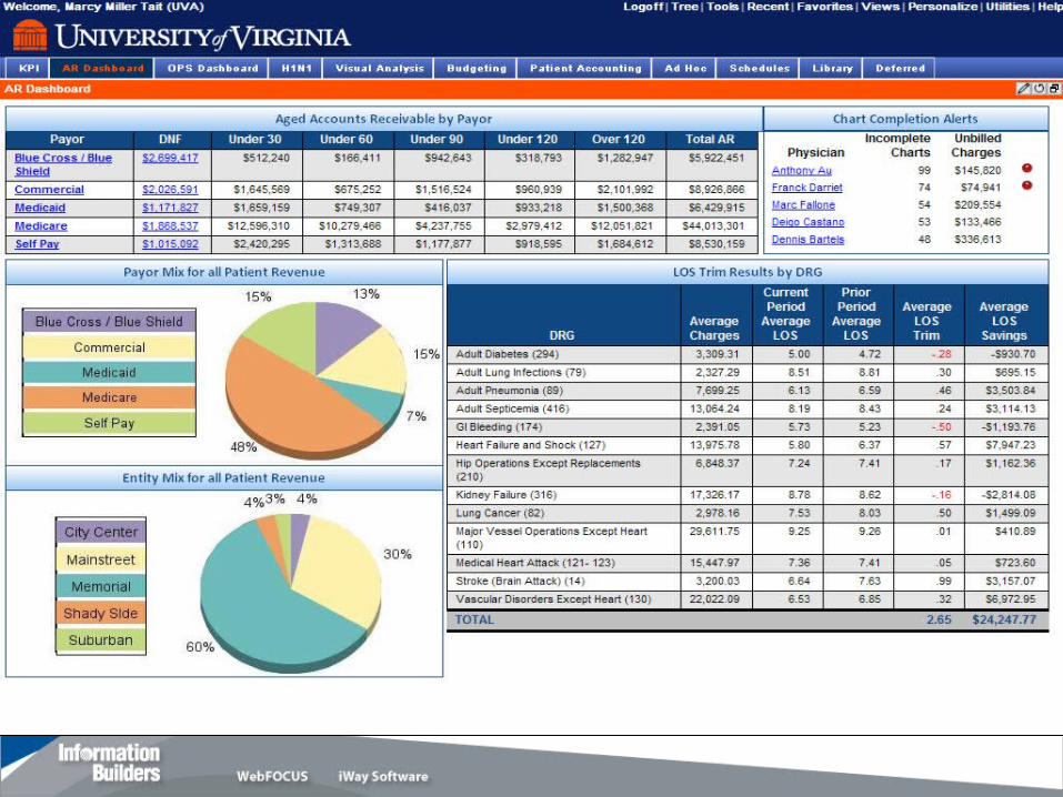
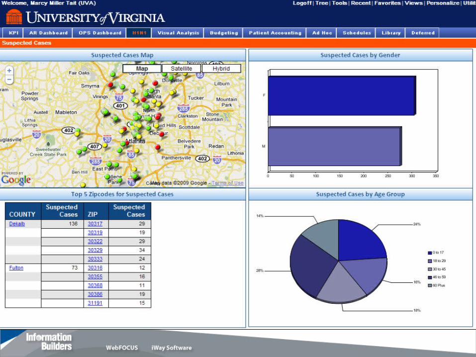
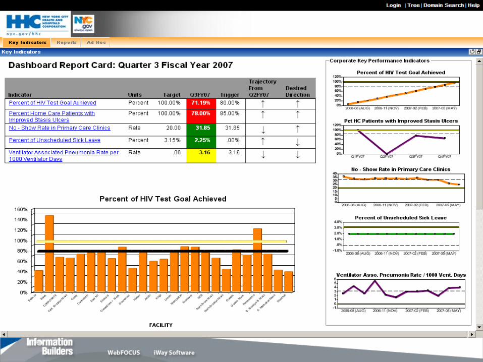
Examples
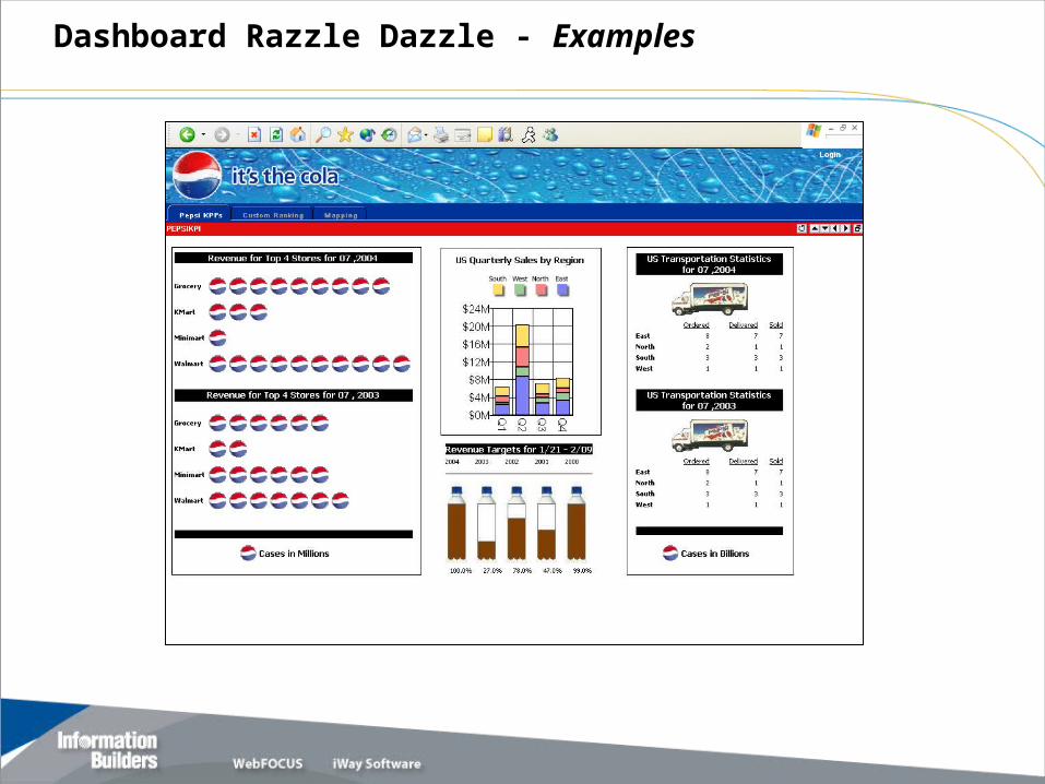
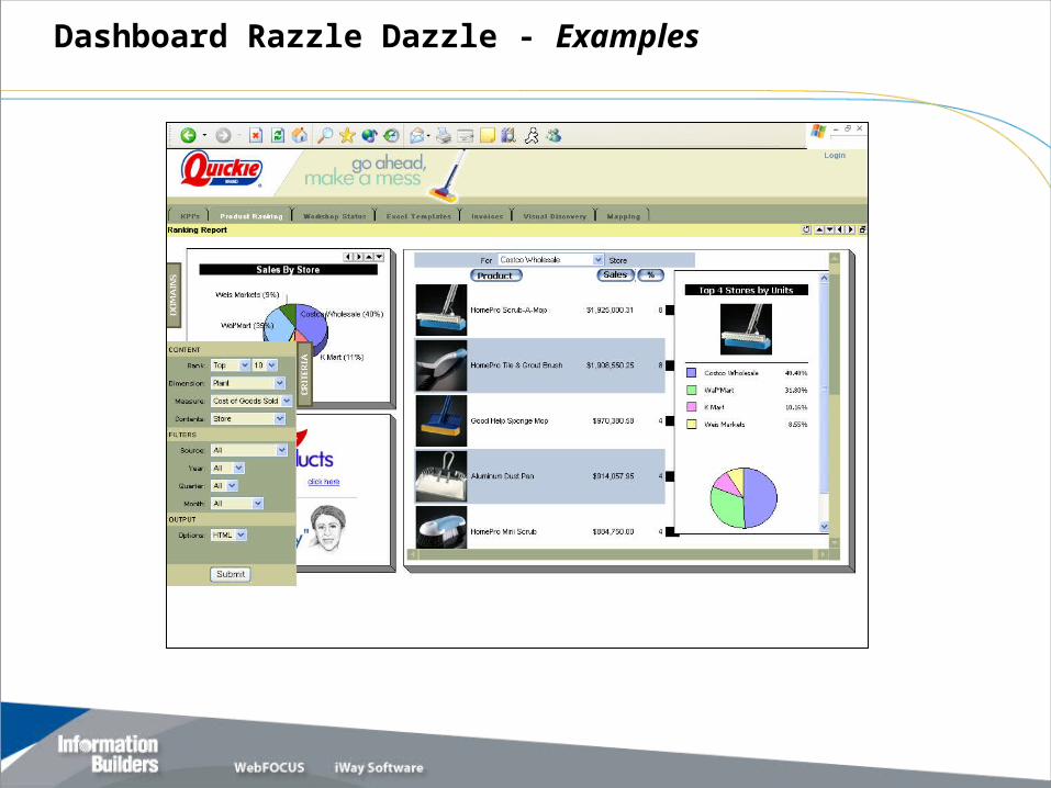
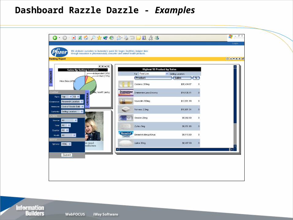
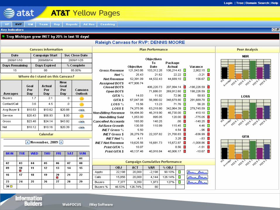
Dashboard Razzle Dazzle - Examples
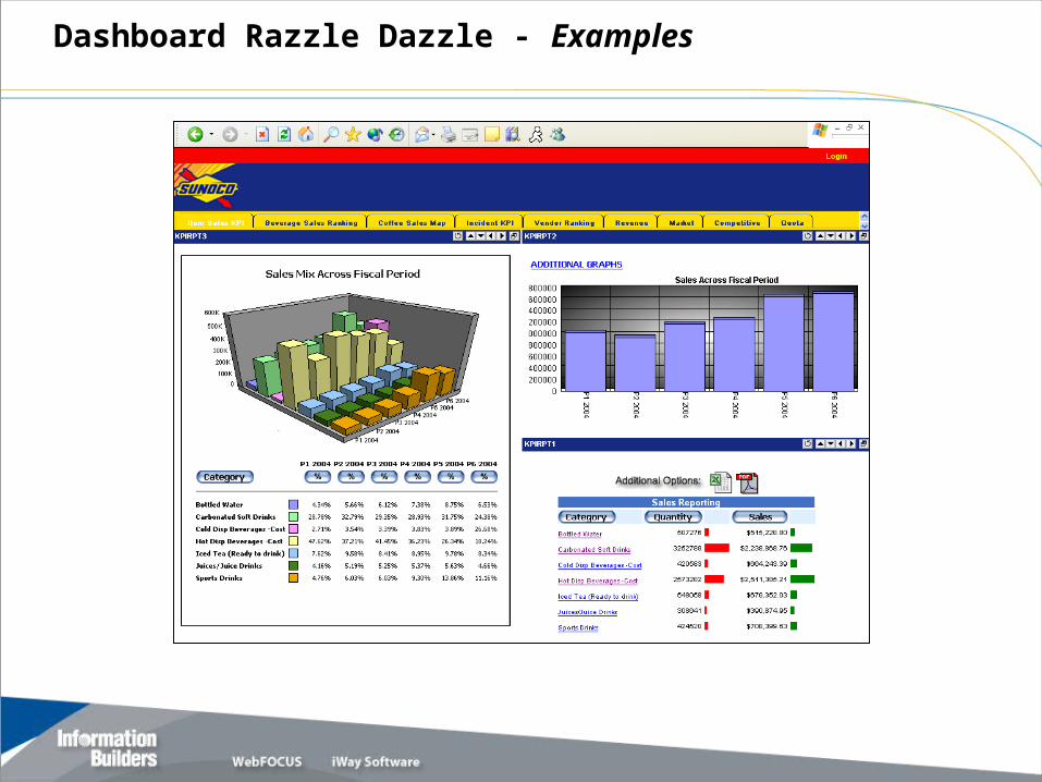
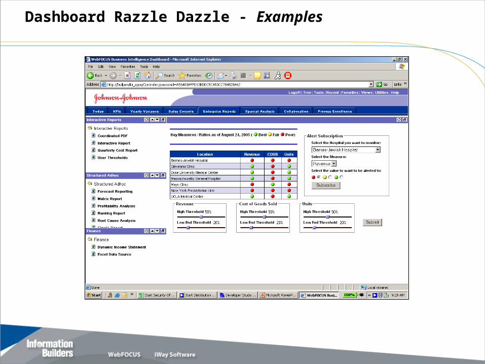
Dashboard Razzle Dazzle - Examples
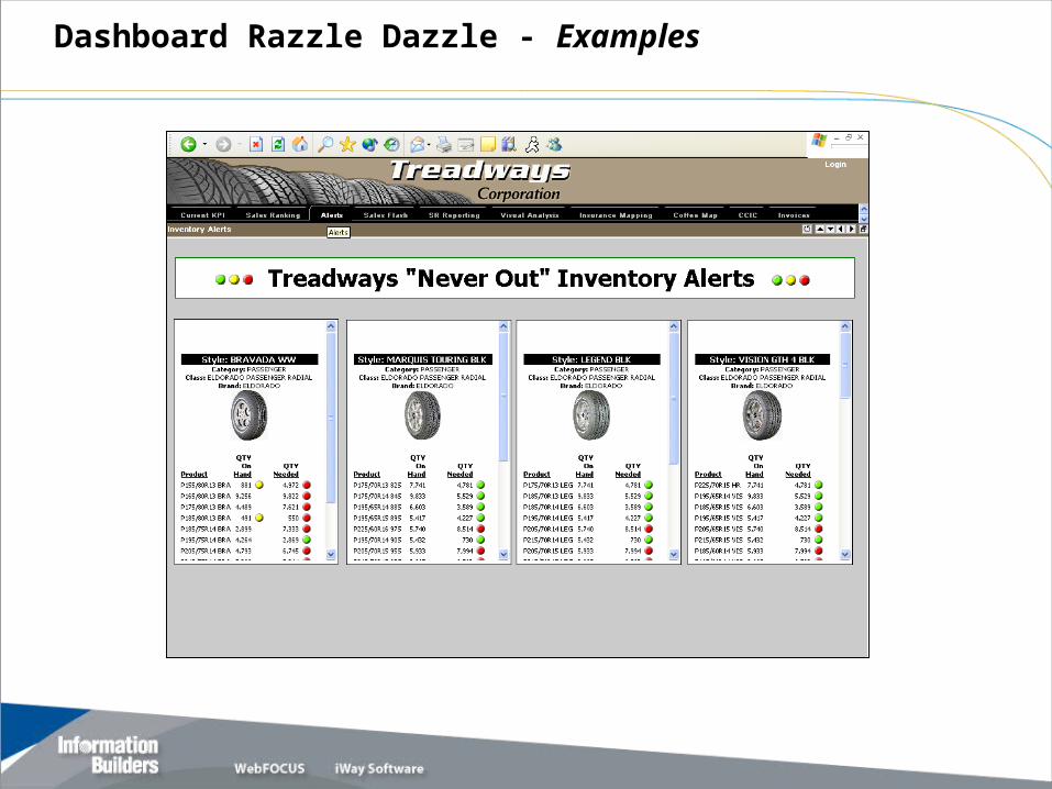
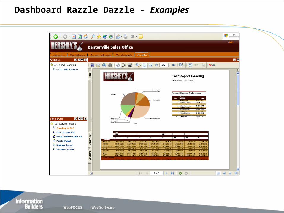
Dashboard Razzle Dazzle - Examples
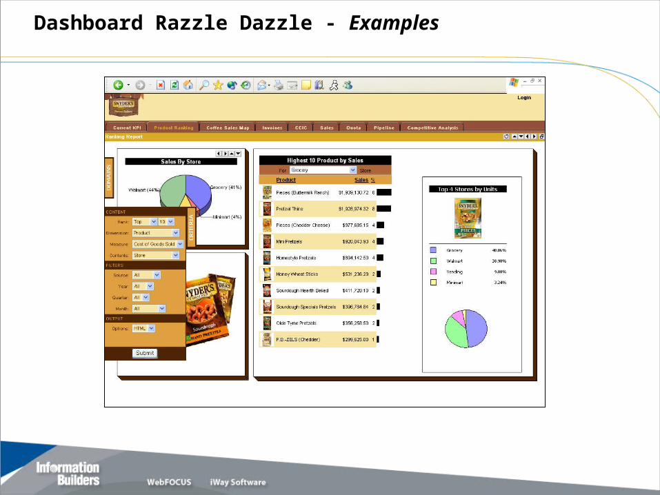
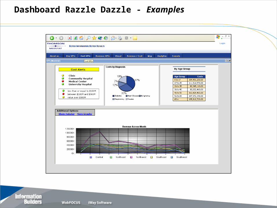
Dashboard Razzle Dazzle - Examples
Dashboard Razzle Dazzle - Examples
Dashboard Razzle Dazzle - Examples
Dashboard Razzle Dazzle - Examples
Dashboard Razzle Dazzle - Examples
Dashboard Razzle Dazzle - Examples
Dashboard Razzle Dazzle - Examples
Dashboard Razzle Dazzle - Examples
Questions?