CRISIS MANAGEMENT IN GREECE - Hans-Böckler-Stiftung · STUDY Nr. 58 • January 2018 •...
248
STUDY Nr. 58 • January 2018 • Hans-Böckler-Stiftung CRISIS MANAGEMENT IN GREECE The shaping of new economic and social balances Tassos Giannitsis 1 , Stavros Zografakis 2 Abstract The aim of this study is to explore the impact of the crisis and crisis-induced policies on incomes, inequality and poverty in Greece, to detect the types of adjustment and to show why prevailing perceptions and attitudes caused a heavy economic, social and political cost. Based on extensive income and tax data it investigates the changing relationship between labour, capital and pension income, changes in direct, indirect and property taxation, and their incidence on pre- and post-tax inequality and competitiveness between 2008 and 2012-13. It examines also the losers and the winners and the resulting social reclassifications within the Greek society, the multifaceted types of poverty and inequality and the changing relations between the haves and the haves-not. The analy- sis distinguishes property and income by main sources at the deciles level, and for the top 1% and 0.1% of the income distribution, at the household and individual level. It covers the period 2008- 2015, depending on the available data. It is shown that many economic and social outcomes were the result of deficient approaches and ideological inflexibilities coupled to established political inter- ests, making the exit from the crisis more complicated and painful. A first version of this study was published in March 2015 (Giannitsis and Zografakis 2015). The present edition comprises a deeper and more synthetic analysis and some completely new topics: privileged tax exemptions, structure and taxing of realestate, contribution of female employment on household’s income, changes in employment patterns, evolution of the top incomes, effects of low- cost loans before the crisis and their impact on incomes and the banking sector after 2010. 1 Kapodistrian University of Athens, email: [email protected] 2 Agriculture University of Athens, email: [email protected] —————————
Transcript of CRISIS MANAGEMENT IN GREECE - Hans-Böckler-Stiftung · STUDY Nr. 58 • January 2018 •...

STUDY
Nr. 58 • January 2018 • Hans-Böckler-Stiftung
CRISIS MANAGEMENT IN GREECE The shaping of new economic and social balances
Tassos Giannitsis1, Stavros Zografakis2
Abstract The aim of this study is to explore the impact of the crisis and crisis-induced policies on incomes, inequality and poverty in Greece, to detect the types of adjustment and to show why prevailing perceptions and attitudes caused a heavy economic, social and political cost. Based on extensive income and tax data it investigates the changing relationship between labour, capital and pension income, changes in direct, indirect and property taxation, and their incidence on pre- and post-tax inequality and competitiveness between 2008 and 2012-13. It examines also the losers and the winners and the resulting social reclassifications within the Greek society, the multifaceted types of poverty and inequality and the changing relations between the haves and the haves-not. The analy-sis distinguishes property and income by main sources at the deciles level, and for the top 1% and 0.1% of the income distribution, at the household and individual level. It covers the period 2008-2015, depending on the available data. It is shown that many economic and social outcomes were the result of deficient approaches and ideological inflexibilities coupled to established political inter-ests, making the exit from the crisis more complicated and painful. A first version of this study was published in March 2015 (Giannitsis and Zografakis 2015). The present edition comprises a deeper and more synthetic analysis and some completely new topics: privileged tax exemptions, structure and taxing of realestate, contribution of female employment on household’s income, changes in employment patterns, evolution of the top incomes, effects of low-cost loans before the crisis and their impact on incomes and the banking sector after 2010.
1 Kapodistrian University of Athens, email: [email protected] 2 Agriculture University of Athens, email: [email protected]
—————————

Tassos Giannitsis, Stavros Zografakis
Crisis management in Greece The shaping of new economic and social balances
October 2017

Page | 2
CONTENTS
INTRODUCTION ....................................................................................................................................... 5
CHAPTER 1
OBJECTIVES OF THE STUDY .................................................................................................................... 21
CHAPTER 2
DEFINITIONS AND METHODOLOGICAL ISSUES ....................................................................................... 24
2.1 CONCEPTUAL CLARIFICATIONS .................................................................................................................... 24 2.2 METHODOLOGY ...................................................................................................................................... 28 2.3 THE DATA .............................................................................................................................................. 32 2.4 TAX EVASION: THE CENTRAL PROBLEM OF THE COUNTRY AND ITS RELEVANCE FOR OUR FINDINGS ............................. 36
CHAPTER 3
ADJUSTMENT POLICIES TO TACKLE THE FISCAL AND COMPETITIVENESS CRISIS ..................................... 41
3.1 DILEMMAS AND CHOICES OF FISCAL CONSOLIDATION ...................................................................................... 41 3.1.1 The intensity of adjustment ........................................................................................................ 43 3.1.2 The contrasting impact of revenue- and expenditure-led fiscal policy and the management of
the fiscal crisis ...................................................................................................................................... 46 3.1.3 Salaries and pensions in the fiscal consolidation process ........................................................... 50
3.2 THE FISCAL CONSOLIDATION STRATEGY AS A FACTOR OF INEQUALITY .................................................................. 52 3.3 THE QUESTION OF FISCAL MULTIPLIERS ......................................................................................................... 54 3.4 THE POLICY MANAGEMENT OF THE COMPETITIVENESS CRISIS ............................................................................ 56
CHAPTER 4
THE IMPACT OF THE CRISIS ON INCOMES .............................................................................................. 61
4.1 THE GREAT UPHEAVAL OF INCOME HIERARCHY ............................................................................................... 67 4.1.1 Income from labour .................................................................................................................... 69 4.1.2 Income from capital .................................................................................................................... 73 4.1.3 Pension income ........................................................................................................................... 78
4.2 MAIN FINDINGS ...................................................................................................................................... 81
CHAPTER 5
DEPENDENT LABOUR INCOME DURING THE CRISIS ................................................................................ 87
5.1 HOUSEHOLDS WITH EMPLOYEES AND THEIR INCOME CHANGES ......................................................................... 87 5.2 THE UNEVEN EVOLUTION OF EMPLOYEE INCOMES .......................................................................................... 89 5.3 THE DIVERGING PATTERNS OF LABOUR AND PENSION INCOME .......................................................................... 96
CHAPTER 6
THE SIGNIFICANT CONTRIBUTION OF WOMEN TO HOUSEHOLD INCOME ............................................ 100
6.1 THE DATA ............................................................................................................................................ 100 6.2 INCOME LOSSES AT AN AGGREGATE LEVEL ................................................................................................... 101

Page | 3
6.3 WAGE AND SALARY INCOME LOSSES .......................................................................................................... 104 6.4 CONVERGENCE OR DIVERGENCE IN GENDER REMUNERATION .......................................................................... 107 6.5 FINDINGS AND CONCLUSION .................................................................................................................... 109
CHAPTER 7
THE REDISTRIBUTIVE IMPACT OF DIRECT AND INDIRECT TAXATION .................................................... 111
7.1 STATE INTERVENTION: DIRECT TAXES AND TAX INCIDENCE .............................................................................. 111 7.2 THE REDISTRIBUTIVE IMPACT OF THE INCREASES IN VAT AND EXCISE TAXES ....................................................... 116
7.2.1 The changes in indirect taxes .................................................................................................... 118 7.2.2 The impact of higher VAT and excise taxes on tax receipts ...................................................... 119 7.2.3 Changes in income inequality following the increases in VAT and excise tax rates .................. 121
CHAPTER 8
REAL ESTATE PROPERTY, ITS DISTRIBUTION AND TAXATION ............................................................... 127
8.1 REAL PROPERTY IN GREECE: A COMPARISON WITH OTHER COUNTRIES .............................................................. 128 8.2 BASIC DATA ON REAL ESTATE PROPERTY IN GREECE ....................................................................................... 129
8.2.1 Methodological remarks ........................................................................................................... 131 8.2.2 The distribution of real estate property .................................................................................... 131 8.2.3 A comparison between the distribution of real estate property and incomes .......................... 134
8.3 BANK CREDIT, REAL ESTATE MARKET AND NON-PERFORMING HOUSING LOANS ................................................... 137 8.4 REAL ESTATE, HOUSEHOLD DEBTS AND PROPERTY TAXATION ........................................................................... 145 8.5 CONCLUDING REMARKS .......................................................................................................................... 146
CHAPTER 9
AGRICULTURAL INCOME TAXATION AND INEQUALITY......................................................................... 149
9.1 PROBLEMS IN ESTIMATING AGRICULTURAL INCOME AND THE DEFINITION OF FARMER .......................................... 150 9.2 THE DISTRIBUTION OF AGRICULTURAL HOLDINGS .......................................................................................... 151 9.3 THE DISTRIBUTION OF HOUSEHOLD INCOME BY SIZE OF AGRICULTURAL HOLDING ................................................ 153 9.4 DISTRIBUTION OF AGRICULTURE INCOME DURING THE CRISIS YEARS ................................................................. 157 9.5 AGRICULTURAL ACCOUNTS AND BROADER MACROECONOMIC AGGREGATES ....................................................... 158 9.6 THE DISTRIBUTION OF SUBSIDIES ACROSS RECIPIENTS: A STORY WITH MANY INTERPRETATIONS .............................. 161 9.7 AGRICULTURE INCOME VS. OTHER INCOMES ................................................................................................ 165 9.8 AGRICULTURAL INCOME AS A FACTOR OF INEQUALITY ................................................................................... 168 9.9 FINDINGS AND CONCLUSIONS ................................................................................................................... 169
CHAPTER 10
SOCIAL PAUPERISATION, PRECARITY AND THE STRUCTURE OF POVERTY ............................................ 171
10.1 POVERTY: TYPOLOGY AND DEFINITIONS .................................................................................................... 171 10. 2 THE EVOLUTION OF “RELATIVE POVERTY” IN THE CRISIS .............................................................................. 175 10.3 CONCLUDING REMARKS ........................................................................................................................ 182
CHAPTER 11
THE QUESTION OF INEQUALITY............................................................................................................ 185
11.1 INEQUALITY AND SOCIAL DIVIDES: LOOKING BEYOND INDICES AND AGGREGATES ............................................... 185 11.1 INEQUALITY AND THE CRISIS IN GREECE .................................................................................................... 188 11.2 INTERGENERATIONAL EQUITY, A HIGHLY UNEQUAL PENSION SYSTEM AND THE CRISIS ......................................... 191 11.3 THE HAVES-MORE AND THE HAVES-NOT IN THE CRISIS ................................................................................. 193

Page | 4
11.4 INCOME INEQUALITY BEFORE AND AFTER TAXES ......................................................................................... 195 11.4.1 Trends in total inequality ........................................................................................................ 197 11.4.2 Changing inequality within incomes ....................................................................................... 201 11.4.3 Taxation and inequality .......................................................................................................... 206
CHAPTER 12
UNEMPLOYMENT, POVERTY AND THE NEW FACE OF “DESPAIR” ......................................................... 210
12.1 FROM THE “UNEMPLOYED PERSON” TO THE HOUSEHOLD WITH UNEMPLOYED MEMBERS ................................... 211 12.2 THE INDEX OF DESPAIR.......................................................................................................................... 213 12.3 THE “APARTMENT BUILDING” IN WHICH THE HOUSEHOLDS LIVE .................................................................... 216 12.4 HOUSEHOLDS LIVING ON UPPER FLOORS ................................................................................................... 219 12.5 HOUSEHOLDS LIVING ON LOWER FLOORS .................................................................................................. 222 12.6 HOUSEHOLDS LIVING ON THE GROUND FLOOR ........................................................................................... 224
CHAPTER 13
THE WINNERS AND THE LOSERS: THE OLD AND THE NEW ORDER ........................................................ 226
CHAPTER 14
CONCLUDING REMARKS ...................................................................................................................... 235
REFERENCES - BIBLIOGRAPHY .............................................................................................................. 242

Page | 5
INTRODUCTION
After falling into the crisis in 2009, Greece experienced fundamental changes not only in
its economic, social and political environment, but also and most importantly in the value
system of society. During these years, individuals, households and businesses saw their
situation unravel: their jobs, incomes, social status, their children’s future, their relations
with the State, their relationship with their property, their perspectives, their ideological
and conceptual value system, the country’s place within Europe, the Balkans and the
world, everything that previously seemed stable and granted, all were shaken in an
unprecedented way and at an unprecedented speed.
This near-decade was not only a period of deficits, over-indebtedness, economic collapse,
tensions with lenders, unraveling. It was also nearly ten years when Greek society and
policy, as well as European actors, were unable to fathom what had gone and was still
going wrong and how a society, its political system and international actors (the Troika,
the IMF, European institutions) had possibly for years –before and after 2009 – failed in
their policy choices.
Failure did not start in 2009. In 1999, Greece repaid the last instalment on its accumulated
foreign debt that had led to the International Financial Control of 1898. This makes one
hundred years of international control and supervision, one hundred years of redemption
for the mistakes of 19th-century governments. This seems to have not been registered in
individual or collective memory. The length of time until 2009, when the new debts
accumulated, mainly after 1974, and brought the country back to bankruptcy conditions,
was a few decades, of which the most critical period was less than five years (2006-2009).
It is because of this period and the choices then made that Greek society will again remain
under international supervision for an indefinite period. How can we account for the
debacle of these years in the context of the overall environment that Greece faced? Was
it a matter of historical government incompetence, collective missteps, or a combination
of national and wider decisions, where ‘wider’ refers to the lending practices of

Page | 6
international banks and the inefficient policy choices of European governments and
institutions?
While this book focuses on crisis-stricken Greece, its aim is also to explore how the crisis
management model worked in the case of Greece and what lessons can be drawn from a
wider perspective. Our findings describe the reality that emerged both from choices made
and from choices not made. We seek to identify the weaknesses, the strengths and other
relevant aspects of the crisis management model adopted, the mistakes made, the
vacuum of political and economic rationale concealed under ambiguous political rhetoric,
to examine the consequences of many of the policies implemented and to show why
several of these choices were as shortsighted as those that had led to the crisis in the first
place, which forms of adjustment have been successful and which not, and why a number
of perceptions and attitudes that prevailed caused a heavy cost for the country.
The difficulty of this endeavor arises from the fact that many changes are interconnected
in multiple ways, and ‘successes’ are the flipside of adverse developments. This is mostly
visible in the elimination of the fiscal and external imbalances on the one hand and
recession, unemployment, plunge in investment and incomes on the other. It is less visible
in the relationship linking fiscal consolidation and recession with the increases in non-
performing loans to about 45% of total bank lending outstanding or to about EUR 95
billion, in tax arrears, from about EUR 30 billion at the onset of the crisis to about EUR 98
billion by mid- 2017, or in social security contribution arrears to about EUR 25 billion in
the same period. These figures sum up to about EUR 250 billion, affect many other
economic and social variables and hinder the return to normality.
As mentioned, the policies conducted from 2009 onwards were not only the choices of
governments; to a crucial extent, they were imposed by Greece’s lenders, the “Troika”,
including one of the major international organisations, the IMF. Precisely for this reason,
a critical assessment would have more general relevance for the design and
implementation of policies to support the countries concerned in overcoming their
problems, with as less economic, social and political pain and destabilisation as possible.
Page | 7
In a few years, the combined impact of the crisis and of these policies overturned existing
dynamics and long-established practices, some of which should have been addressed by
national policies themselves years ago in order to avoid the severe disequilibria and
collapse that followed. Regardless of their intentions, some of these policies had a
stabilising effect on the economy, society and politics, while others had a destabilising
effect or, more precisely, often one policy was stabilising in one aspect and at the same
time destabilising in another aspect. In the end, they caused major complications, the
fallout of which is now visible in a country that still, after so many years of crisis, is
struggling to recover.
However, policies are not made in a social vacuum and it would be pointless to disregard
their links to the dynamics that built up in society and shaped developments during or
even before the crisis. In fact, how society perceived the crisis, which role was played by
which parts of society and political and social forces and what impacts and risks were
entailed, all have been closely interconnected with the policy responses and have
influenced developments.
A deeper investigation into the specific mechanisms and decisions that generated the
crisis and shaped the responses to it, as well as into the political and social forces driving
these processes, involves a tracing back to the various serious or less serious impasses
that together make up the long chain of the national failure. Few, if any, chronic and
structural weaknesses became the target of a strong national effort to tackle, let alone
reverse, in these years. For an important part of Greek society, the concepts of structural
transformation, evolution and adaptation to the reality of the actual world system, which
have long been central to Growth and Development Policies, took on negative
connotations or were distorted. Instead, they were replaced by inaction and insistence
on the same expectations and corrupt or dead-end practices, beliefs or values that led to
the crisis and continued to prevail, only disguised as something new and different, in the
years of crisis. Such fake transformation could not but lead to the same poor results, or
to even worse results, as each time the starting point was worse. In a rapidly changing
world, Greek political and social forces refused to make any significant change to address

Page | 8
a number of chronic problems such as the informal economy, tax evasion, corruption in
the public or private sector, central pathologies of governance, significant and persisting
inequalities or malfunctioning institutions. We refused to see that central policy choices
would sooner or later bring the society to a breaking point: the dam would fall apart, and
we would need far more changes, efforts and cost to compensate for our long inaction.
In most cases, the pressure to change the status quo came from outside or from the
reality itself, as in the case of the pension system. Every time the results were poor, either
due to bad design and failure to grasp the constraints and degrees of freedom and assess
social costs and benefits over time or due to rejection by governments and various
interest groups.
This picture reflects the essence of what happened in these years. It also reflects the
difficulties to an unambiguous strategy for overcoming low growth and stagnating
prospects in the foreseeable future. This is due to a systemic and collective failure to see
or accept the winning choices and opportunities in the contemporary world. Worse yet,
the history of these years shows that successive entrapments in illusory thinking led to a
point where it was hard to aspire to anything different from what was offered to Greece
as an option and where the possibility of collective action to achieve a fast turnaround
seemed to be undermined.
Our approach goes beyond economy and politics. It is also about the national situation,
the national interests and the most disappointing developments after the restoration of
Democracy in 1974; it is about our society and its weaker parts, the youth and the future
of the country, poverty and inequality, the relationship with Europe and its cultural and
broader values to which Greece has historically contributed, the many risks that have
been emerging at an alarming pace and, last but not least, Democracy itself. Nevertheless,
our analysis relies mostly on facts that document the major economic and social
problems, their political repercussions and policy implications. What we aim to provide is
a deeper insight into the link and causality between the short- and the long-term
dimension of policy making and social choices and into the nexus between the economic
crisis and the underlying social and political dynamics. Every now and then, on the path

Page | 9
followed by the country, new monster gates opened. In fact, we Greeks opened many of
them, they did not open by themselves. And whoever in a democratic society chooses the
role of spectator and shifts responsibility for what happens to others “above” or “outside”
– governments, parties in power and opposition forces, various other groups, Europe, IMF
– becomes an accomplice to this monster-generating process.
An important question that emerges from the above and many points examined in this
book refers to the relationship of domestic versus external factors with developments in
the economy, society and politics. The discussion regarding the driving forces behind the
course of a country is actually very old and recurring in different forms at different times.
The interplay between the two sets of factors is important, but in the case of Greece
domestic choices have been the most decisive, especially until the crisis, but also to a
significant degree after 2009. When governments and major social forces resort to
excessive debt ignoring basic choices that would shore up against adverse developments,
or, for the purpose of scoring a momentary and misleading political victory, choose the
path of conflict with Europe without knowing or caring for the chances of success amid
an unequal balance of powers, disregarding the long-term social and national cost of
these choices, the deadlock is inevitable. When overcoming this deadlock is attempted
through other deadlock options, the problem is only amplified. Before but especially
during the crisis, there have been many such policies which, without denying the adverse
impact of external factors, surely could have been avoided, thereby preventing the
extent, intensity and the most unfair aspects of the crisis in the country. When conflict
becomes a tool for legitimising power, the results for society are disastrous.
Finally, the matter is also about the responsibility of each player for the fate of this
country, not only in terms of what determined the past but also from a forward-looking
perspective, in terms of what can be done now. Certainly, this points in the direction of
governments, the entire political system of the country and those having the power to
influence developments. However, it also points in the direction of society as a whole and
its members, however small their share of responsibility may be. Otherwise, we would
accept that society and citizens are abstract and passive beings with no role, no influence,

Page | 10
and just follow and go along with what is done, said or decided by a system over and
above them. If this were true, it would be like blindly going along with any outcome and
giving up on our role as citizens. Such an attitude would have severe consequences for
those who adopt it or even for those who don’t, and serious implications for the quality
of Democracy in a country as well.
Has the crisis been a game changer? Clearly it has been and in many ways, some of which
we attempt to highlight in the following chapters. At a general level, it can be said that
the crisis tore the “veil of ignorance”1, awakening us to a reality which we can no longer
say that we did not know, did not understand, it was not our fault, we did not learn.
Besides, this game changing has had a very tangible dimension: locking Greek society in a
stagnating trajectory, which has lasted for eight years and could last for years to come.
The debate about the country’s prospects is often punctuated with occasional and short-
lived dashes of optimism about an actual or hypothetical small increase in GDP or
investment. These are useful insofar as they generate hope, and offer political gains to
those who invoke them, especially when they are real and not virtual. But they are not
sufficient to change the course of the country. What is needed is not a meager rise of
growth around a flat trend, but a fundamental change of path in the mid-term and the
capability to confront the new economic, social and environmental risks that accumulate
on the horizon amid a deteriorating global, European and regional geopolitical
environment. This requires tremendous effort, since the starting conditions today are
much more unfavourable than before the crisis, meaning that a far larger part of a
reduced GDP and personal income have now to be devoted in achieving the same societal
targets (growth, employment, poverty reduction).
The question that often arises is why other countries managed to escape relatively quickly
from the crisis or from the risk of successive failures; how they gradually reduced their
risks without severely harming their cohesion and stability; and how they prevented
Gramsci’s monsters from hijacking their history.
1 According to Rosanvallon (2014), p. 235.
Page | 11
This question cannot be answered by the argument that Greece entered the crisis with
much worse conditions. This is partly correct. Even this, however, shows however a gap
of economic and political capacity in the pre-crisis period. Thus, while several countries
suffered from the crisis, Greece’s suffering was manifold. So the question remains: “Why
this asymmetric pattern?” As always, there is no single explanation. What is for sure is
that at the core of the Greek failure lies a deeper, systemic disruption of the link between
political capacity, growth performance and structural change. This explains why in the
run-up to the crisis, Greek governments relied on increasingly higher borrowing, creating
a huge fiscal bubble, in their aim to demonstrate economic and, hence, “political success”.
This fiscal bubble was proved to be much more sizeable, complex, dangerous and painful
than the property or banking bubbles in Ireland, Spain or Cyprus.
Even today, there is a silent recourse to the palliative remedy of borrowing, driving us
deeper and deeper in debt, which at the same time is attacked as heinous and intolerable
while, on the other hand, the lenders are blamed for not lending the country more so that
the economy can recover! Between 2010 and 2016, public debt increased by more than
EUR 25 billion, despite the PSI of EUR 100 billion, the fact that debt servicing was financed
by the Memoranda and Agreements and that the banking sector fell under the control of
international actors. However, the role of international credit in the economy, in its pre-
crisis form, is over. The return of the country to international financial markets, when
achieved, will be associated with much less borrowing possibilities and higher capital cost
than in the past. This means that, unless endogenous mechanisms of growth and
production capacities are strengthened, the country faces a risk of remaining in low-flight
mode.
After the effects of the crisis have spread to every aspect of social reality, it is essential to
acknowledge faults, problems and risks, to break with mistakes and to build a collective
will to move from destructive to constructive paths. “Collective” refers to the existence
of a critical mass of society that is really willing to “do something”, in fact something than
can translate into reality in the foreseeable future and not remain in the realm of utopia.
This is not at all self-evident. As a society we are not famous for cherishing collective

Page | 12
values, European or national; we have no steady vision or even knowledge of how to build
a solid future; we reject essential ingredients of success, such as cooperation; we refuse
to learn from, let alone follow, successful paradigms. We reject any measures that seem
painful, discrediting them as anti-popular, immoral or destructive, and only after many
years and costs we come to realise how wrong we have been to reject them. And this
happens over and over again. Furthermore, after eight years, from an economic and
political point of view, the society is fragmented, with weak cohesion and sense of
collectivity. Α fractured society and a weak collective critical mass for change are not a
convincing recipe for success.
In this book we have included very extensive statistical material which, apart from serving
as necessary support to our analysis, can be useful for other researchers to mine in the
future, perhaps reaching different conclusions.
We are aware that some points of our analysis will be liked and some disliked by the same
parts of the political or ideological spectrum. The points to be liked are probably the
convenient ones, while the points to cause dislike or discomfort are those showing that
reality is far from one-sided and escapes the prefabricated dominant perceptions that
tend to pigeonhole it into futile black-and-white categorisations.
The problem is not so much ideological but rather a problem of interests and power
games. Delving into these years, one point is unequivocal: even amid the crisis, the
choices made by the forces in power, as well as by the forces with an influence on power,
most prominently including the media and influential individuals, have typically had one
main goal: to prevent, at any collective cost, a disturbance of established balances of
power, positions and benefits, and preserve political conditions that, despite any
differences, led the country and, hence, the collective interest to collapse. All these years
showed that such choices failed to pull society into a more promising future or support
the new, “weaker realities”, and that the economic, political, intellectual and social elites
were reluctant to accept that they had to confront their own mistakes. In this situation, a
society cannot compose itself, it can only decompose.

Page | 13
Very often it is argued that the country and its people must “touch bottom” before rising
again and that in the history of the country sharp ups were the outcome of sharp downs,
as if a cause-effect relationship exists. When bottom is touched, the upturn will start
quasi-automatically. This view is naïve, vindictive, unfair, unhistorical and extremely
dangerous. It is unfair because the mistakes and ill-advised decisions made before and
during the crisis were not predetermined – this would be a convenient excuse. It is
unhistorical, because there are innumerable examples of societies that understood their
weaknesses and reacted decisively to avoid further plunge and others that paid a price of
long years of backwardness for their inability to change course. Again, this price was not
a necessity. It reflected the combined costs of weak social and political capabilities and
self-interest, behind which there may be different reasons and explanations each time.
The above view is also extremely dangerous politically, because a dislocated society is
prone to the emergence of forces and situations that can not only erode Democracy,
human rights or the existing, however flawed, rule of law and hard-won rights, but also
prove destructive both for those who have put their hopes on them and those who
haven’t. Examples abound, within and outside the national context.
Unlike the above view, the problem is that the country has a long history of successive
collapses, which do not seem to have become part of our historical memory or to act as
a deterrent to similar situations in future. It appears that, once we manage as a nation to
move forward and aspire to a better future, then “something happens” and we tend to
forget the lessons learned by experience and lose any sense of moderation, risk
awareness, collective responsibility or sound judgment, thereby soon inviting our own
doom. How else can one explain the fact that in sixty-five years (1945-2009), in contrast
to any other country, Greece experienced four huge, internally generated, national
defeats: civil war (1946-1949), dictatorship (1967-1974), invasion to Cyprus (1974) and
economic collapse (after 2009)?
In many important issues, our approach allowed us to look into unknown aspects of how
policies worked and what impact they had on economic and political developments. A
number of these findings are in sharp contrast to many conventional stereotypes

Page | 14
constructed and prevailing in public opinion. Some of the most significant findings are the
following:
The Greek society today is very different than before the crisis, from both an economic
and a social point of view: unprecedented income cuts, more than 1.1 million
unemployed persons, migration outflows of working age population that seem to
have reached about 420,000 between 2008 and 2015, at least 800,000 new
pensioners in 2008-2015 (adding pension applications still pending), and a contraction
of over 60% in investment which bodes badly for growth in coming years.
Between 2008 and 2012, and even till today, income from dependent labour suffered
the largest reduction in absolute terms (EUR 12 billion or 27.4% of total 2008 labour
income), while income from other sources was subject to much larger reductions in
relative terms.
Labour income and capital income fell by 27.4% and 37.7%, respectively, income
transfers for pensions, which do not represent productive activity, increased (by EUR
3.3 billion or 13%) in the economy as a whole, although at household level they
recorded a decline. The ratio of national expenditure on pensions to labour income
(see Table 4.9) increased from 49.3% in 2008 to 76.7% in 2012. This change is
fundamental to the intrinsic balance of the economic, social and political environment
within which we are expected to get out of the crisis.
What worsened more than anything else as a result of the crisis was poverty, with a
broadly-based pauperisation of Greek society, in the sense of a collapse of incomes
across most income groups. Relative poverty, which is a common measure of poverty,
also increased, but due to the overall pauperisation the increase was smaller than
what would be expected. However, apart from the increase in poverty, the ‘intensity
of poverty’ also increased significantly, meaning that even in relative terms the poor
became poorer than the rest of society.
Poverty patterns have also changed, with a shift from older ages, especially
pensioners, to children, younger and middle ages, particularly the families with one,
two or more unemployed persons. Policy responses to poverty remained stuck to

Page | 15
obsolete, pre-crisis patterns and, lacking a solidarity dimension, have led to regressive
redistribution effects and larger inequality. The reason is that a retargeting of policy
towards the new categories of poor would jeopardise the clientele relationships of
the political system and would entail political cost of an uncertain size.
Inequality in society as a whole increased less than what is commonly believed and
argued, as has also been the case in other crisis countries of the euro area. In fact,
inequality had declined by 2010 and started to rise slightly in 2011. The factors behind
this limited increase in total inequality were, first, the fact that pension cuts were
much higher for medium-sized and especially for higher pensions, thereby
contributing to a significant reduction of inequality within the category of pensioners,
representing about 16% of GDP or 2.7 million people, and second, the significantly
larger income reduction for higher income groups.
However, the slight increase in inequality had only a limited impact, because it
occurred amid conditions of growing poverty and overall pauperisation of a large part
of Greek society, particularly in terms of absolute poverty, but also in terms of relative
poverty. We consider that in conditions of sharp income contraction, even an
unchanged inequality means essentially higher inequality. Moreover, aggregate or
average figures for society as a whole mask major changes (positive or negative) in
inequality within individual segments. The issue of inequality is very crucial from a
political and economic perspective, given that even before the crisis inequality in
Greece was much higher than in most other EU countries and played a significant role
in how society evolved in the run-up to and during the crisis.
Two new and acute forms of inequality are identified, which are not reflected in the
income-related indices and other figures examined:
o First, a growing inequality between Greece and European or other countries,
which over the same period showed improved performance and therefore
progressed at a time when Greece regressed. In terms of income alone,
although GDP in 2016 fell to the level of 2003 (back by 16 years), Greece’s
convergence to the EU-15 countries has retreated to pre-1970 levels (back by

Page | 16
more than 47 years). This development is not an abstract relationship. It has a
profound impact on the country’s weight in the international system, as well
as on the manner in which it can cope with the fundamental shifts in the global
economy and participate more actively in the development of key drivers of
growth (knowledge, technology, competitiveness, business and production
innovation, new forms of economic activity, a well-functioning state and
society). In a broader perspective, the crisis marked the interruption or even
reversal of a convergence that had been underway in terms of per capita GDP
between member countries of the EU and the beginning of a divergence
process, causing significant uncertainties, dissatisfaction and affecting the
stability of Europe itself.
o Second, a growing internal divide can be observed in terms of knowledge,
education, information about the contemporary world, the geopolitical
context of the country, capabilities to understand the new ways of dealing
with new and old problems and achieving growth under difficult conditions.
This internal social divide is deepening, trapping more and more human and
social forces within a dual structure that, regardless of income levels, is split
by dangerously diverging characteristics and abilities regarding expectations
and knowledge about the direction in which the country needs to move.
Indifference or inability to understand the new serious risks and threats
emerging on the horizon means that society’s preparedness to deal with such
threats is also minimal. In other words, deepening income and social divides
lead to divergent attitudes regarding efforts to overcome the crisis. Large parts
of society are interested only in redistributive policies, while others give
emphasis on a policy mix geared towards growth, transformation and social
policies as well.
The finding that is most contrary to popular wisdom is that the crisis hit all strata,
lower, middle and upper. Our investigation of many interactions and figures shows
that all saw their income decline sharply and their condition deteriorate or even

Page | 17
collapse. As an overall conclusion, reality appears to be very different from
stereotypical representations.
Considering the complexity of the problem, we tried to capture it in relatively simple
terms, centred around a key question: what were the aggregate income losses,
respectively, for the “bottom” (60% of the population), the “middle” (30% of the
population), the “top” (10% of the population) and the “very top” (1% and 0.1% of the
population) brackets of the household distribution between 2008 and 2012. A more
detailed investigation is contained in Chapter 13.
Aggregate income losses and gains during the crisis period
Total of households Total of the same households
Deciles Income losses (-)/gains (+)
between 2008 and 2012 (EUR billions)
% change Based on 2008
income (EUR billions)
Based on 2012 income
(EUR billions)
1st -6th (60%) -5.1 -18.1 0.3 -12.1
7th-9th (30%) -7.1 -16.1 -8.3 -6.6
10th (10%) -11.7 -26.9 -15.9 -5.2
Total (100%) -23.9 -20.6 -23.9 -23.9
Top 1% -5.5 -40.5 -7.8 -1.6
Top 0.1% -3.3 -58.1 -4.2 -0.7
Source: Calculations based on tax data.
The central finding is that income reductions were EUR 5.1 billion for the lower income
strata, EUR 7.1 billion for the middle and EUR 11.7 billion for the upper income strata.
These percentages correspond to 16%-18% of the 2008 income of the middle and lower
groups combined, 27% of the higher group and 40%-58% of the top decile or percentile.
In column 4 of the table, we refine this picture to identify the income losses for “the same
households”, comparing their position before the crisis (2008) to that at the end of the
reviewed period (2012)2. Using 2008 as a starting point, the conclusion is now somewhat
different: the lower 60% group of households does not seem to have suffered any losses
(+0.3%). Rather, the losses are mainly concentrated in the middle 30% (EUR 8.3 billion)
and the top 10% (EUR 15.9 billion). Finally, the figures in Column 5 of the table show the
2 On the methodology, see Chapter 2.

Page | 18
income losses of each group by 2012 versus its 2008 income. Once again, a different
pattern arises, showing the huge losses suffered by the new members of lower and
middle groups. Those households that in 2012 are classified in the lower group have lost
EUR 12.1 billion or 50% of the total income lost. Obviously, in 2008 these households
belonged to the middle or higher group. These figures refer to market incomes (before
taxation and transfers). Further reductions have been imposed to all strata by the
significant increase of all tax rates.
Our findings show that, from a social perspective, a major upheaval has taken place: an
explosive deterioration in the income and social position of a large number of households,
which from middle or higher income brackets plunged down to lower or even to the
lowest brackets. The collapse in middle incomes radically changed the status of the
middle strata, dismantling values and anchors. Moreover, the income losses faced by all
strata have caused a huge mistrust in politics and loss of confidence in the country’s
prospects.
These developments highlight a central problem of a macroeconomic nature that has
never been given serious consideration. The losses of middle and higher income groups
represent 79% of the total income losses. In this measure, they impact on the recession,
the fall of investment, unemployment and the overall negative economic environment in
the country. The impact of this macroeconomic effect is not limited to these groups only;
it involves an entrenchment or aggravation of major social problems, which ultimately
shape the economic and social reality of all strata and the country in general.
The data also show that there is not one, but many big problems, each of a different
nature but interacting with one another, and that these problems are not specific to
certain social groups but spread across all parts of society. On the one hand, the evolution
of low incomes raises serious social policy and solidarity concerns and issues; on the
other, the evolution of middle and higher incomes has severe macroeconomic
implications, related to saving, investment, growth prospects and exit from the crisis.
None of these issues can be tackled as long as the two sets of concerns are seen in
isolation from each other. Moreover, an asymmetric response would only affect further

Page | 19
the macroeconomy, as the recovery of confidence, investment, expectations,
competitiveness and growth feeds back to the social landscape and vice versa.
Apart from the domestic economic environment, it is also necessary to consider the
relevant international parameters. In the context of globalisation, the challenge for a
country like Greece is how to cope with realities outside the control of policy. This is
nothing new. Historically, all countries and not only the weaker ones have faced
constraints from the external environment. In such circumstances, what a country needs
to do is design policies that factor in these wider constraints. We find that the drivers of
growth are likely to change over time, and only societies that can in a timely manner work
out ways of adjusting have the collective ability to identify and exploit the emerging
opportunities, promote necessary change and move on an upward path. Those that
cannot will be bogged down to their problems and lag behind. The history of countries
and societies is full of examples of upward paths and reversals. Any society that has
overcome a major crisis has managed to do so by setting in motion policies that created
resilient and effective conditions for growth.
Today, in Europe and beyond, and of course in Greece, we can see a rise of social and
political forces that nurture fanaticism, authoritarianism, blind conflict, and irrationalism.
Ultimately, we find that the central problems are not only economic or social. They are
also political, because they pose serious risks to Democracy and, as developments have
shown, these risks emerge in several member countries of the EU. The political faults that
led to the crisis and prolonged its duration tend to evolve into incapacity of Democracy
to protect itself. Within five years, the political and social landscape in Europe, including
Greece, and elsewhere has changed dramatically. Against this backdrop, without a change
of policies and attitudes and a reorientation towards eradicating the root causes of the
current predicament, the ground will be fertile for confrontational politics or – which is
more dangerous – for political swings towards forces that only wait an indifferent,
exhausted and despaired society to fall as ripe fruit into their hands. In such
circumstances, authoritarianism surges, along with various situations that never in history
have done any good to the societies that fell under their spell. In the end, the cost of

Page | 20
destruction in passive societies has always been very heavy both for those who thought
to be unconcerned and for those who didn’t.
The issues discussed in the following sections of this book encompass so many aspects
that even an attempt to briefly mention them here would make this introduction too long
and tiresome. So let us just close by extending our warm thanks to Mr. Haris Theocharis,
former Secretary General of Public Revenue, who provided us access to a unique wealth
of raw and original tax data, without which a large part of this book could not have been
completed; Professor Panos Tsakloglou for his invaluable help; and all those who in one
way or another contributed to this endeavour. Special thanks are due to Professor Gustav
Horn, Director of the Macroeconomic Policy Institute (IMK) of the Hans-Böckler
Foundation, Berlin, and his associate Dr. Rudolf Zwiener, for their cooperation and
support, which led to a first version of this study published in English on the Institute’s
website. With their support that original version has been extensively revised, updated
and expanded into the present edition. It goes without saying that we, as authors, retain
all responsibility for the analysis that follows.

Page | 21
CHAPTER 1
OBJECTIVES OF THE STUDY
Τhe key focus of this book is on the policies by which the Greek governments and foreign lenders
have responded to the crisis since 2009 and their impact on the economic and political level, in
particular on inequality and poverty. The issue has been at the heart of political and social debate
all these years. However, the arguments and evidence put forth in the public debate were mostly
misguided and, in a number of respects, counterfactual.
By examining the main policies pursued during the crisis (fiscal consolidation, internal
devaluation, new direct and indirect taxes, property taxes, wage and pension cuts, institutional
changes), we have sought to investigate the redistributive effects on inequality at an aggregate,
but also at a detailed level (deciles, top 1% and 0.1%) in the aim to show which economic strata,
and to what extent, have been hit or favoured.
A significant and distinct feature of the following analysis is that it is based on actual and detailed
income data drawn from tax records for the period 2008-2012, broken down by source and level
of income. Hence, the results do not reflect subjective aspirations or generalisations. The data we
used enabled us to investigate the impact of the crisis and the crisis policies on the various sources
of income and the cost they entailed for each group, as well as their influence on inequality. In
essence, we examine the factors behind the marked shifts in the income structure of Greek
society, in particular the effects on the poorer, medium and richer strata. Further, we were able
to combine these income data with data on unemployment, tax measures, wage and pension
cuts and thus also calculate the impact of particular policy measures on the risk of poverty and
social exclusion.
Some further questions that this book aims to answer are the following:
In which ways have solidarity and equality considerations triggered policy intervention amid
a crisis affecting income and employment severely and across the board?
Which specific interventions could support solidarity and equality and for which social
groups?
Page | 22
Does it matter whether inequality is the outcome of market forces or of policy decisions?
Does growing inequality exert corrosive effects on other critical social, economic or political
variables?
What are the distributional consequences of fiscal austerity measures? Does the extent of
fiscal adjustment restrict the policy tools to be used?
How does the distribution of the adjustment burden impact on growth and the efforts to exit
the crisis?
After eight years of recession, Greece has remarkably succeeded in eliminating its two major
imbalances: external and fiscal. This was achieved through painful measures regarding wages and
pensions, labour relations, layoffs and weakening of social protection. Nevertheless, the country
is still in a very fragile and uncertain state: fiscal adjustment has as yet failed to drive the economy
into a growth trajectory, while the fallout of the crisis has spread from the economy to the social
and the political level with further important implications.
A more general question concerns the direction of the cause-effect relationship between the
crisis, inequalities, pauperisation and policy making. The question is whether policy making has
facilitated or impeded the adjustment process and the conditions for exiting the crisis. The
cumulative decline of GDP by 26% between 2009 and 2016 shows that adjustment policies have
not yet led to positive growth rates, which since 2014 have oscillated around zero.
The specific impact of austerity policy on growth is crucial, because growth is the second
important factor of a successful fiscal rebalancing. The answer is not easy. Success or failure in
addressing macroeconomic imbalances, growth and the crisis is associated not only with a wide
variety of economic factors, but also with governance efficiency, external interventions or the
social reactions and the perceptions which prevail or are generated by ideologies, political
rhetoric, knowledge, established social attitudes and stereotypes. It is also associated with the
capability of the political system, the society and in the case of Greece also the Troika to judge
and decide between two future, hypothetical, prospects and their hypothetical consequences:
one of ‘no change’ and one involving different types of policies and changes.
In many cases, reactions were, directly or indirectly, incited by the political forces themselves. As
it turned out, society and political forces had to choose between preserving the old balances of
interests and disregarding the systemic weaknesses inside the country and the major changes
shaping their external and internal environment. None of these options is static. Each has a

Page | 23
different impact, in fact entailing several and not easily distinguishable developments. The big
problem arises when expectations lead to choices which, prima facie, appear to be mild and
acceptable, but at a later stage prove to have painful results, create impasses and act as traps. In
the case of the crisis, the way in which each time this dilemma was answered had huge
repercussions on the dynamics of the crisis and on developments at the economic, social and
political level.
Finally, the findings of this analysis and our attempt at a synthetic presentation seek not only to
explain some of the most crucial social effects of the crisis and policy making in Greece, but also
to show the impact of these effects on policies which have been implemented during the crisis.

Page | 24
CHAPTER 2
DEFINITIONS AND
METHODOLOGICAL ISSUES
2.1 Conceptual clarifications
Inequality and solidarity are at the centre of this approach. The term “solidarity” is open to many
definitions and interpretations, economic, sociological and political ones. Beyond its economic
content, solidarity also encompasses broader aspects of life3 that are decisive for the status of a
citizen, even if they cannot always be quantified. From an economic viewpoint, in times of
expanding growth, solidarity is supposed to be associated with state interventions aimed to
change the functional distribution of income in favour of weaker income groups.
Against this background, we will focus on the impact of the crisis on income distribution,
inequalities and poverty and on the policies implemented which have altered the relative position
of various social groups during the crisis period. In practice, the distinction between policy- and
market-induced effects is difficult. The effects of the crisis are partly independent from the
implemented macro-economic or fiscal policies, but partly have been also shaped by government
policies. In many cases it is possible to identify the effects of policy on certain categories or income
(wages and salaries, pensions, unemployment benefits, etc.) or the effects of the crisis itself (e.g.
shrinking incomes from independent employment or business activities). However, it is practically
impossible, at least within the scope of this analysis, to distinguish the effects of the crisis into
those generated mainly by specific policy choices and those resulting from developments at the
level of the macroeconomy.
3 Deacon and Cohen (2011), Smith and Laitinen (2009), Sabbagh (2003).
Page | 25
Regarding the concepts of inequality and solidarity, the following remarks have to be made:
a) The relationship between solidarity and inequality is not unequivocal. What kind of changes
could justify the use of the term “solidarity”? Under typical assumptions, higher solidarity is
expected to lead to lower inequality and vice versa. Nevertheless, solidarity measures,
depending on their weight and the context within which they are taken, could be associated
with increasing, decreasing or stable inequality.
b) Stable inequality should not be seen as a linear, equal shift in the position of all sections of
society whereby all keep their relative position. In conditions of shrinking incomes, unchanged
indicators of inequality could mean a heavier relative burden on the lower income groups
compared with the higher ones and an exacerbation of social inequality. The interpretation
of an unchanged value of the inequality index is not the same when the cycle is upward, flat
or downward. Social groups that move lower down the distribution ladder or even approach
the poverty line as their incomes shrink e.g. by 10% are not in the same relative position as
before versus the upper groups, which (hypothetically) would also see their incomes fall by
10%.
In practice, the same proportional or disproportional change in the relative position (in terms
of income, tax burden, etc.) allows different interpretations of the evolution of inequality and
solidarity, depending on the groups affected by this change. The same relative or absolute
changes in income or property reflect different, not similar sacrifices. Moreover, inequality
measures indicate only the income-related aspects of the relative positions of individuals,
households and/or social groups. They underestimate or even disregard the non-monetary
and other effects of the policy measures, such as the impact of long-term youth
unemployment on the social and political inclusion and the value system of this age group, as
well as on brain drain.
c) The question of inequality and solidarity in Greece cannot be analysed overlooking the fact
that, even during the crisis, significant tax evasion practices or state-facilitated tax aversion
prevail across a large number of professions and income levels. A closely related phenomenon
concerns tax exemption or tax privileges of specific occupations. Moreover, a distinction has
to be made between tax evasion at the individual and the aggregate level. By definition, the
gain from tax evasion at the individual level or at the level of society as a whole is very
asymmetric across big and small tax evasion. Still, this does not mean that even medium or

Page | 26
small tax evasion cannot have a significant negative impact from a macro perspective. Section
2.4 presents data on tax evasion at various income levels, enabling to assess the
macroeconomic-fiscal impact of the widespread large, medium and small tax evasion.
d) Alongside tax evasion, there is also the phenomenon of occupation-specific tax exemptions
or tax privileges (e.g. for farmers). Given such phenomena, any results regarding the impact
of solidarity measures and government policy should be interpreted with great caution, and
this does not only hold for the findings of this study. For the same reason, Chapter 9 provides
an in-depth and multi-faceted discussion of agricultural income taxation and its impact on
inequality.
e) We argue that a distinction should be made between solidarity at the micro- and the macro-
level, respectively. A range of policies and measures, such as unemployment benefits, wage
and pension cuts, new taxes or abolition of tax reliefs, have a distinct impact on citizens or
households. In these cases, solidarity policies have a direct effect on the units concerned −
the “micro-level”. In contrast, other policies affect the macroeconomic and social structures
and directly or indirectly have also serious implications for solidarity and equity, which should
therefore be distinguished from those arising as a result of the policy measures at the “micro-
level”. Certainly, the many difficulties in identifying those macro-policies that are relevant for
solidarity and equity and analysing their impact on households or individuals increase the
complexity of the analysis.
f) The distinction between solidarity at the micro- and the macro-level raises further questions.
An important issue is not only what decisions have been taken, but also what could have been
done to avoid adverse effects. A case in point refers to policy mixes which affected
unemployment or poverty or caused a deeper recession with serious adverse repercussions
on incomes and living standards. For instance, a fiscal consolidation that is not accompanied
by an effort to enhance public investment may lead to lower deficits but at the same time
affects future growth, incomes, pensions and employment; hence, it has a significant long-
term impact on inequalities and solidarity, even if it is not possible to assess the extent and
direction of its influence. Equally, failure to increase the productivity of the public sector or
to initiate policies conducive to the transformation of the productive base has similar
implications. The sequencing of policies can also exert very different effects on solidarity,
inequality, fiscal consolidation and recession. Further, the continuous unsustainable deficits

Page | 27
in the pension system and the pension cuts have profound interrelations with solidarity
issues. Such questions are very significant, but are hard to answer accurately. Still, they are
worth raising, insofar as they help to highlight real social problems.
g) The analysis of the solidarity aspect of anti-crisis policies should take into account a time
dimension, referring to the duration of the policies or measures adopted. Political decisions,
once made, have occasionally a very contradictory fate. At some point in time, the
government introduced measures which at the time appeared to be fair for broader social
groups or at least more unfavourable for the economically stronger groups. At a later stage,
however, either on the government’s initiative or because the institutional underpinnings of
some policies were defective or even because the overall institutional framework was
misinterpreted or misused by legal institutions or court rulings, several measures were
overturned (see Chapter 5.3). In such cases, the solidarity expressed by the initial decision
was offset. In the presence of such conditions, it makes a big difference whether we look at
government policy measures over a narrow time horizon, or whether we expand the horizon
and the array of institutions and bodies involved in decision making or, perhaps more
crucially, unmaking.
h) An assessment regarding solidarity cannot ignore the past situation. If significant changes
before the crisis caused severe social or economic imbalances, which require re-balancing
policies, as in the case of pension policies, the implications on solidarity cannot be judged by
abstracting from past developments, especially if such developments contributed to the crisis.
Considering all these aspects, we argue that solidarity implies inclusiveness, choices leading
to more equal burden-sharing and support to the economically and socially weaker groups.
Crucially, in conditions of crisis, situations arise with asymmetric effects across different social
groups. Policy measures can introduce new elements of solidarity which mitigate, without
eliminating, the inequality impact of the crisis. Put to the test of social reality, the outcomes
of these policies can be found to be asymmetric, with some social groups having moved to a
worse position than before relative to other groups, although this position might have been
even worse without the policy intervention. Such conditions and comparisons create grey
areas where it is easy to slide one way or the other. They also raise questions which are
extremely hard to answer with any degree of certainty. The approach followed in this analysis
is to point out such situations, where detected, irrespective of the ability to provide a clear

Page | 28
answer as to whether solidarity exists or not. In short, solidarity has to be assessed on a
comprehensive and not a partial basis.
A more general conclusion from the above observations is that different policies and
measures can exert opposite effects on solidarity and inequality, and what matters is their
overall “net” impact. Albeit theoretically correct, the estimation of some type of “net impact”
of results is not feasible, given that changes vary in form or sign and do not have a common
measure of comparison. We only mention it here to warn against taking partial conclusions
as general and final, when the actual conditions are much more nuanced and complex from a
social, economic and political perspective.
2.2 Methodology
The methodology used in this study involves several steps.
First, we examine the fiscal consolidation strategy that has been followed in Greece, in particular
the extent to which the reduction of the high budget deficits has been based on expenditure- or
revenue-led adjustment policies and what the implications of this policy mix were for a number
of issues (period 2006-2016).
Second, we analyse the income changes during the period from 2008 to 2012 or, in some cases,
a couple of years later, as well as the particular role of female employment in supporting the
household income during the crisis.
Third, we examine the impact of State intervention through direct, property and indirect taxation
and the tax incidence on incomes and income distribution (period 2008-2012). A specific analysis
covers the taxation of agricultural income (2008, 2012, 2014) and of real estate property.
Fourth, our focus shifts to inequality and to how market changes and policy interventions
impacted on inequality at the general level but also at a more detailed level. We measure
inequality both before- and after-tax, as well as inequality in real estate property and the different
evolution at the bottom and the top of the income distribution (period 2008-2014/5).
Fifth, an ‘index of despair’ has been constructed, reflecting the degree of ‘despair’ felt by
households with employees and/or unemployed members, when their income declines or when
their members become jobless (period 2008-2014).

Page | 29
Finally, an attempt has been made to combine all our results and define which social groups were
ultimately the losers and the winners of the crisis. We identified low, medium and high incomes,
the changes that occurred within each group and the shifts across the economic stratification of
society (period 2008-2012).4
The data sources
Our analysis will mainly rely on a tax dataset described below, complemented by certain data
from the National Accounts, as well as from fiscal, employment, poverty and inequality statistics.
The tax dataset has the following structure:
As seen in the figure, each household POPj (j = 1, 2, ..., N) has one (F) or two members (F, S) which
earn income from various sources k (k = 1, 2, ..., R ). For each year (t = 2008, 2009, ..., 2012) we
4 The results refer to the total population of Greece. Immigrants are included to the extent they submit tax returns.

Page | 30
know the income of each member originating from each source: the income of the first member
is 𝐹𝑡,𝑗𝑘 , while 𝑆𝑡,𝑗
𝑘 is the income of the second member, if any.
The analysis will develop at three levels.
The first level refers to aggregate figures regarding the aggregate family income in the country as
a whole and investigates changes in total income, also broken down by source, i.e. total income
from wages/salaries, pensions, rents, etc.
Total annual (family) income,
nationwide, for each year ∑ ∑ 𝐹𝑡,𝑗
𝑘 + 𝑆𝑡,𝑗𝑘
𝑁
𝑗=1
𝑅
𝑘=1
Total (family) income by source of
income, nationwide, for each year ∑ 𝐹𝑡,𝑗
𝑘 + 𝑆𝑡,𝑗𝑘
𝑁
𝑗=1
The personal income of each
taxpayer, by source of income, for
each year
∑ 𝐹𝑡,𝑗𝑘
𝑁
𝑗=1
for the first member, ∑ 𝑆𝑡,𝑗𝑘
𝑁
𝑗=1
for the second member
At the second level, we shift from the notion of aggregate total income to the notion of average
income for all taxpayer households or individuals included in the year examined.
Average income, nationwide, for each year ∑ ∑ 𝐹𝑡,𝑗𝑘 + 𝑆𝑡,𝑗
𝑘
𝑁
𝑗=1
𝑅
𝑘=1
∑ 𝑃𝑂𝑃𝑗
𝑁
𝑗=1
⁄
Average family income, by income source, of all
taxpayers, for each year ∑ 𝐹𝑡,𝑗
𝑘 + 𝑆𝑡,𝑗𝑘
𝑁
𝑗=1
∑ 𝑃𝑂𝑃𝑗
𝑁
𝑗=1
⁄
Average family income of groups of households
on the basis of their main source of income for
each year (where N1 is a subset of N, e.g.
households of employees, households of
pensioners, etc.)
∑ 𝐹𝑡,𝑗𝑘 + 𝑆𝑡,𝑗
𝑘
𝑁1
𝑗=1
∑ 𝑃𝑂𝑃𝑗
𝑁1
𝑗=1
⁄

Page | 31
Average personal income, by income source, of
taxpayers who earn income from the respective
source, for each year (where N2 and N3 are
subsets of N, e.g. employees, pensioners, etc.)
∑ 𝐹𝑡,𝑗𝑘
𝑁2
𝑗=1
∑ 𝑃𝑂𝑃𝑗
𝑁2
𝑗=1
⁄ 𝑎𝑛𝑑 ∑ 𝑆𝑡,𝑗𝑘
𝑁3
𝑗=1
∑ 𝑃𝑂𝑃𝑗
𝑁3
𝑗=1
⁄
The third level focuses on the analysis of data exclusively for the same households or individuals
for the years examined, to identify the impact of the crisis on the same population of households
or individuals. The general evolution of incomes is one thing, but it is socially and politically very
different and important to examine the extent of changes that occurred for the same households
or persons.
The analysis of ‘all households’, in particular at a decile level, provides us with average income
figures, revealing the income structure within the society in the years under review. It indicates
the level of income, and its changes over time, of the households associated with each decile in
each reference year and shows the income disparity over time and across deciles. These average
figures only partly refer to the same household; for the most part they refer to very different
households or persons, which in other years were classified in a different decile. Consequently,
changes regarding average income at a decile level often mask considerably different
developments at the level of the same units of reference.
The difference between these two methodologies, i.e. examining the evolution of the income of
"all households" versus the income "the same households" over time, is of great interest. The
households/individuals that have income from a given source, e.g. from wages, pensions, self-
employment, dividends, rents, etc., are not the same across years. Thus, if the focus is on all who
have income from one source or even all sources together, each year comprises different
households. The magnitude derived in this case is useful because it shows the social and economic
stratification of society as a whole, e.g. what level of income from wages or self-employment
prevailed in the total of households with income from these two sources in each given year. Given
that the calculations are made at the level of deciles, one can see what income and from which
source corresponds to each such socio-economic group, compared with an earlier or subsequent
year. On the other hand, if one considers not the total of households each year, but only those
households/individuals that had income from a particular source in all years of the crisis, the
picture changes. In this case, we can see how income figures have evolved for exactly the same

Page | 32
households or individuals, and it is possible to assess the impact of the crisis or policy measures
on a more homogeneous basis. By this methodology, we can estimate with much more certainty
the size of the decrease (or increase) in the wage, pension, rent income, agricultural income,
pensions or total income for the same households. Purely for simplicity purposes, we chose to
present only the data for the ‘same households’ and, in some cases, for the ‘same individuals’.
2.3 The data
a) Tax data
The tax data used in this study have been derived from a very representative sample of personal
income tax records and refer to all the information (other than personal) reported by the
taxpayers in the relevant fields of their tax returns, including presumed or imputed income. To
ensure random sampling, we picked five random numbers from 00 to 99 and then from the
database of the General Secretariat of Information Systems we retrieved the personal income tax
returns of taxpayers whose Tax Identification Numbers (TINs) ended with these numbers, for the
fiscal year 20135. This made a total of 261,351 income tax returns, representing by definition 5%
of the total. The total comprised 5,227,020 taxpayers for the years 2008 to 2012, with 2,368,132
persons as second members and 2,414,200 children, suggesting an aggregate number of
10,009,352 individuals.
Subsequently, for the same (anonymised) households and individuals, we retrieved from the
database the tax returns of the four previous fiscal years (2009 to 2012) and the data concerning
the tax due and imputed income as determined by the tax authority after the processing of the
tax return.6
Finally, from a different database compiled for property taxation purposes we retrieved for these
TINs (and the TIN of the second member of the household, if applicable) information on the
5 Fiscal years refer to incomes and taxes of the previous year. 6 It should be noted that these data refer to the tax due. Whether these taxes are actually paid and generate tax revenue is uncertain. On the basis of rough estimates from the Ministry of Finance, there are serious delays with tax payments.

Page | 33
“objective” value7 of real property owned by the taxpayer and, separately, his/her spouse, and
the property tax corresponding to each taxpayer.
These data cover nearly the total population. The 2,480,600 households receiving wages-salaries
in 2008 comprise 2,993,100 individuals, which represent nearly 100% of the dependent
employment in the same year. The 2,023,360 households in 2012 comprise 2,444,200 individuals.
On the basis of this dataset, the following calculations have been made:
We have calculated the aggregate value of nine income sources plus total income: 1.
wage/salary; 2. pension; 3. business and commerce activities; 4. independent activities/self-
employment; 4. agriculture, 5. agricultural subsidies (often merged with agricultural income);
6. income from property (rental); 7. dividends and interest; 8. unemployment benefits and 9.
total income8.
Based on this taxonomy, we have calculated the changes in the mean annual value of the
household’s income by income source, during the years 2008-2012. Further, a calculation has
been made on the value and the changes in each of these variables by deciles, as well as for
the top 1% and 0.1%. In this context, we also estimated the weight of each income source in
total income for each decile. For practical reasons, in some cases, deciles have been merged
into groups (e.g. 1st-5th , 6th-7th , 8th-10th , or 1st-5th and 6th-10th and 1%, 0.1%.
Basically, the results refer to households. However, for specific purposes, we have made
additional calculations with regard to individual persons, in order to obtain a more precise
and detailed view on a range of issues (e.g. average wage/salary and pension, inequality
issues, etc.).
The tax burden (income and property taxes) on each of these income groups and each decile
has been estimated, both in absolute (amounts of taxes) and in relative terms (taxes relative
to income).
The results of this analysis have been used to estimate also the number of households under
the line of poverty and the changes during the crisis.
7 Zonal property values is the term used in the MoU. 8 Some of these incomes are very low and for practical reasons have not been presented, since their omission had no impact on the results (see Table 11.7).

Page | 34
Three inequality indices have been estimated (Gini index, Theil index, Mean Log Deviation)
for nine income sources for the five years examined. Each of them shows a different sensitivity
in respect of inequality changes. Therefore, the use of all of them covers a broader spectrum
of inequality movements. In addition, other inequality indices have been estimated (P90/P10,
S90/S10 and the relation of the top 1% and 10/00 to the lowest or the two lowest deciles).
We have arranged statistical data so as to show the income evolution over the period 2008-
2012 for exactly the same households with regard to wages/salaries and total earnings. In
particular, we have investigated the changes in the income position of each income decile for
these income sources from two different angles:
(a) how the household incomes of 2008 changed by 2012 for the same households, ranking
the deciles on the basis of 2008 incomes, in the aim to understand where these households
had been in 2008 and where they stand in 2012; and
(b) the opposite evolution, based on the household incomes of 2012 ranked by deciles,
and estimating the incomes of the same households during each of the previous years back
to 2008. This approach shows the significant shifts which took place within the groups of
wage/salary earners as well as the total population of taxpayers during the years of the
crisis.
All calculations have been made for all five years and for all deciles, enabling to identify the
broader changes within the various occupations, income sources and deciles and the differences
across the various groups. For reasons of simplicity, results are presented mainly for the first and
the last available year. Table 2.1 shows the number of households with income from each of seven
main income sources for 2008 and 2012 and the changes that have occurred between these years.
The table suggests that, in 2012 relative to 2008, 457,240 less households declared income from
wages/salaries, while significant declines can be observed in other sources of income, with the
exception of pensions: the number of households declaring pension income rose by 305,780.
An obvious conclusion from these data is the significant decline of nearly all activities, either
because of firm closures, increased unemployment or because of shifts from one activity to
another (e.g. from dependent to independent status or vice versa, from commercial to other form
of activity).

Page | 35
Table 2.1 Number of households by income source and changes 2008-2012
Income sources 2008 2012 Change 2012/2008
Wages/salaries 2,480,600 2,023,360 -457,240
Pensions 1,755,940 2,061,720 +305,780
Agriculture 1,078,880 1,000,420 -78,460
Independent activities 399,820 365,700 -34,120
Commercial activities 693,940 484,500 -209,440
Dividends-Interest 1,520,840 1,459,080 -61,760
Rental income 1,354,700 1,305,000 -49,700
Total 5,227,020 5,227,020 -
Total excluding households with zero income
5,010,680 4,868,780 -141,900
Source: Calculations based on tax data.
b) Employment and unemployment data
Based on employment and unemployment data, an “index of despair” has been constructed and
estimated, measuring the degree of exclusion or “degree of despair” of households. The criteria
used were the number of unemployed members of each household, the duration of
unemployment and the presence of employed household members. The results refer to the
period from 2008 to the second quarter of 2014. The index has been estimated for the total
population and for different groups of households according to the characteristics of the
household head (education, occupation, type of employment, sector of employment, etc.). We
visualised the results in the form of an apartment building with five floors, estimating the number
of households living on each floor and the risks faced by each type of household with a
deterioration of its position during the crisis. We also examined the position of households by
distinguishing the risks of members working in the public sector or having high education as
against the other ones.
c) Reports on Household Budget Surveys (HBS, 2009-2015) and Surveys on Income
and Living Conditions (EU-SILC, 2009-2016)
Based on data from the Greek Household Budget Survey and the EU Statistics of Income and Living
Conditions Survey for the years 2009 to 2015/16, we investigated changes in poverty and
inequality.

Page | 36
2.4 Tax evasion: the central problem of the country
and its relevance for our findings
The problem of tax evasion and the multifarious preferential tax treatment of broad segments of
the population has been a key factor behind the chronic fiscal deficits and the collapse of the
country’s fiscal and macroeconomic stability. The persistent historical gap of about six to eight
percentage points of GDP between budget revenues and expenditures, which has fuelled debt
and deficits, can to a large part be attributed to excessive public expenditure but also to tax
evasion, tax exemptions and tax privileges.
Tax evasion is prevalent across occupations and business activities (see Chapter 4), but also across
large income groups irrespective of occupation. A large number of employees, independent
professionals, pensioners and earners of dividends, interest, rents, etc. have more than one
source of income, some of which are subject to more and others to less stringent tax compliance
checks. Wage/salary and pension incomes shoulder a disproportionately large part of the tax
burden because of fewer tax evasion opportunities and higher tax rates. Practically, they are
paying taxes not only for their own income but also for the income of those who continue to
benefit from an unfair and economically and politically corrupt model of fiscal and economic
policy. Although efforts to tackle certain forms of tax evasion are likely to have had some success,
it seems that success in one area has been partly offset by increasing tax evasion in other areas
(e.g. increased tax evasion in regional Greece or in VAT). Indeed, the policy implemented was not
geared to fighting tax evasion but rather to extracting more and more taxes from existing, and
compliant, taxpayers.
The problem of tax evasion is compounded by the many preferential tax schemes applying to
various categories of income, which are lawfully tax-exempted or treated favourably. The impact
on the economy and inequality is the same in either case. Apart from the taxation of agricultural
income, which is specifically discussed in a later chapter, along with several other categories, the
level of the tax-exempt threshold is a major issue. In Greece, this threshold excludes 55% of all
households from the tax base, compared with less than 25% in other EU countries. The issue is
not just a matter of numbers; additional dimensions have also to be considered, e.g. what benefits
are derived by households in different strata from the spending side of the budget in exchange
for the taxes they pay.

Page | 37
The type of data we used here (tax data) are seen by well-known researchers9 as having distinct
advantages over other commonly used sources of expenditure or income data (e.g. Household
Budget Surveys), despite their known weaknesses mainly associated to tax evasion. Piketty, for
one, uses tax data in his analysis. It is well known that no source is without problems, so the
question is how the data are used and how the disadvantages of each source can be addressed
by comparisons with available alternative sources.
The advantages of tax data are significant:
a) One advantage is their vast scope: in the case of Greece, the sample of 5% is representative
for all 5.2 million tax records covering almost 10,000,000 people.
b) Only tax data include the very rich and the extremely rich (the top 1% and 0.1%), which are
underrepresented in other surveys.
c) Household responses to surveys are subjective, and there is a high potential of inaccurate
responses, intentional or not. Interviewees are often afraid to state their true incomes, for
obvious reasons, and probably are also reticent to state even their declared incomes.
d) Tax records on the other hand include a huge amount of data, which cannot be concealed
or, if they can, concealment is comparatively small (salaries, pensions, income for which
formal documents are issued, dividends, interest income, etc.). This is not a given with
survey-based sources. Consequently, these data provide at least a threshold of income as
derived from documents, that, beyond doubt, has been earned. We also know which
incomes are lawfully not declared (as was the case with agricultural and interest incomes
or as is still the case with incomes subject to special tax schemes). Given that a very large
number of households, apart from any income they may have from sources associated with
higher tax evasion, have also income from the above-mentioned low tax evasion sources, a
considerable part of the total income of households with income from self-employment
and professional activities is reflected quite realistically in the data.
That said, tax evasion and its potential impact on the findings and conclusions is a concern of such
analyses internationally. Yet, we believe that a nationwide income dataset for five consecutive
years, broken down into income deciles and types of activity, with additional data on the
9 Atkinson (2015), p. 51 ff., Piketty (2014), p. 347 ff.

Page | 38
distribution of real estate property, the tax burden across broad tax categories, tax exemptions
and plenty of other information, is a very strong starting point. Other subjective or impressionistic
perceptions of tax evasion can be considered, but when it comes to quantification and specific
estimates, are arbitrary without any practical value.
Keeping these considerations and caveats in mind, we believe that the data and calculations
presented here provide a safe minimum estimate of incomes, distributions and developments
over time. In addition, however, we have tried to determine the size and importance of tax
evasion drawing on a thorough investigation by other researchers10, who estimated tax evasion
and actual average income for the years 2006 and 2010 (EU-SILC data) for each decile of the
income distribution. We used these estimates for 2010 in order to compare the tax data we used
with the EU-SILC income data and assess the size of tax evasion in lower and higher income
groups.
In Table 2.2, in addition to the estimate of the discrepancy between declared income and
estimated actual income (12% overall, varying across deciles), we compared the tax data we used
with the EU-SILC income data and found that the declared income we used was about 21%-40%
higher than the estimations in the EU-SILC, with the exception of the lowest (1st) decile and the
top 0.1%. This finding could mean that the actual tax data used in this study contain a smaller
percentage of tax evasion than those estimated in the EU-SILC. However, we do not consider
these figures to be realistic either, as tax data include a high, albeit uncertain, percentage of tax
evasion as well. Besides, personal income taxation does not cover the significant areas of indirect
taxation and evasion of VAT, which however have an impact on corporate income and on personal
income from self-employment, independent or commercial activities.
Combining the estimates of tax evasion with the income figures in Table 2.2, a second important
finding is that the concealment of income in the top (10th) decile reaches EUR 9,023 per
household and, in aggregate, exceeds the income concealment for the first eight deciles (1st to
8th) taken together, which is EUR 8,767.
The estimates in the above study point to another very significant dimension of the problem: tax
evasion is, in percentage terms, clearly higher in the top decile and the top 1% and 0.1%; it is also
10 Matsaganis, Leventi and Flevotomou (2012). Bühn and Schneider (2012) provide estimations of tax evasion in Greece (among other countries), suggesting that tax evasion is 21.8% in indirect taxes, 37.6% in self-employment and 5.8% in personal income tax.

Page | 39
high in the lowest decile, and it is high also in absolute terms per household in these deciles, but
for the economy as a whole 81% of the income concealment is accounted for by deciles 1-9 and
only 19% stems from the 10th decile. Nevertheless, due to the higher tax rates on high incomes,
the tax loss from the 10th decile is much greater than 19%, and the same should hold for the
hidden incomes of the top 1% and 0.1%.
Table 2.2 Average undeclared income per household by decile for 2010 (in EUR)
Deciles Pre-tax income in this
research 2012
Income based on
EU-SILC 2010
Undeclared income per household
based on EU-SILC
Aggregate undeclared
income for all households
Tax data in this research as % of EU-
SILC income data
(1) (2) (3) (4) (5)
1st 1,171 2,277 523 523 117
2nd 4,546 4,416 491 1,014 136
3rd 6,701 6,402 752 1,766 155
4th 9,090 8,862 894 2,660 123
5th 11,710 10,689 865 3,525 134
6th 14,551 13,080 1,258 4,783 121
7th 17,974 16,389 1,791 6,574 135
8th 22,746 21,011 2,193 8,767 135
9th 30,691 27,649 2,506 11,273 140
10th 62,549 56,795 9,023 20,296 137
Top 1% 165,542 152,517 37,961 133
Top 0.1% 517,268 352,991 106,339 169
Total 18,173 16,739 2,016 136
Sources: Columns (1), (4) and (5): calculations based on tax data; columns (2) and (3): Matsaganis, Leventi and Flevotomou (2012).
Considering that the average burden of income tax and solidarity tax, based on 2012 tax data (see
Table 7.2), is 21.2% for the top (10th) decile and 8.6% for deciles 1-9 taken together, the average
tax evasion per household is EUR 970 for 90% of households and EUR 1,913 for the top 10% of
households. Therefore, for the economy as a whole, 33.6% of total tax evasion is accounted for
by the first nine deciles and 66.4% by the 10th decile. The above figures provide an order of
magnitude. They also suggest that, despite the widespread perception that all income strata have
gains from tax evasion, the latter works to a much greater benefit to the top income stratum and
to the detriment of the whole economy.
This finding shows also that, from a macroeconomic point of view, the problem of reduced fiscal
revenue, which is a source of key fiscal and other major imbalances, principally needs to be
addressed with a focus on higher incomes, but without ignoring that the contribution of other

Page | 40
strata to total tax evasion is about 33%. Under the prevailing historical legacy and cultural
perceptions in the country, the success of such a policy is politically extremely difficult, and a
fragmented, selective and accidental intervention will continue to face significant problems.

Page | 41
CHAPTER 3
ADJUSTMENT POLICIES TO TACKLE
THE FISCAL AND COMPETITIVENESS
CRISIS
The Greek economy entered a recession in 2008. However, it was only in 2009 when the macro-
indicators revealed the real extent of deep fiscal imbalances. By then, the general government
deficit had soared to 15.6% of GDP (adjusted to 15.2% with the National Accounts revision of
2014) and was found to be much higher than the figure previously notified (5.2%). In fact, Greece
was hit by two profound crises: a fiscal and a competitiveness crisis. The first action to address
the large fiscal deficit and the skyrocketing debt/GDP ratio was taken in spring 2010, initially with
national measures and some months later with the first Memorandum of Understanding (MoU)
between the Greek government and the Troika (ECB, IMF, European Commission), which was
followed by a second MoU in 2012 and additional Agreements in 2015 and 2017. The central
policy adopted in all these documents was that the fiscal and the competitiveness crisis had to be
tackled through a tough fiscal consolidation and an “internal devaluation” process, mainly
through drastic wage and salary cuts, liberalisation of the labour and the services market, in
particular in transport services, the opening up of closed professions, reforms in pricing practices,
licensing provisions, etc.11
3.1 Dilemmas and choices of fiscal consolidation
The fiscal derailment in 2009 was so dramatic that it would be unreal to even think that the
imbalances created could have been addressed without fiscal consolidation. The question is the
11 Zografakis and Spathis (2011).
Page | 42
type of consolidation and its effectiveness and impact on employment, growth, competitiveness,
income distribution, inequality and poverty. These impacts depend on a wide range of factors,
such as whether the fiscal consolidation is pursued by reducing expenditure or by increasing
revenue, the duration of the consolidation process, developments in growth rates and interest
rates, the characteristics of governments (newly elected or long-serving, closer to or farther from
the centre), their ideological background and cognitive capabilities, the level of debt relative to
GDP, etc12.
Among these factors, we considered it important to examine both the intensity of the
consolidation, i.e. the duration and size of the deficit reduction, and the role of spending and
revenue, not only during the consolidation period from 2010 onwards, but also during the period
2006-2009, when imbalances peaked and led to the 2009 crisis. In particular, it is necessary to
investigate whether the fiscal derailment in 2009 was due to the collapse of revenues or to soaring
expenditure, although either answer would not predetermine the appropriate policy response to
the problem. Faced with these imbalances, policy had to consider a number of tradeoffs, such as:
❖ A front-loaded versus a back-loaded consolidation, i.e. should the measures be taken upfront
or be sequenced over a longer period?
❖ Does the type of consolidation matter, and to what extent, for the effectiveness of the policy
itself, particularly in terms of its impact on GDP and its recessionary effects?
❖ In the context of a front-loaded or back-loaded strategy, what should be the optimal duration
of the consolidation in order to achieve the most satisfactory fiscal and growth outcomes? A
longer duration means protracted deficits, so the next question is how much additional borrowing
from lenders would be necessary and feasible (given the additional deficits that a longer
adjustment period would imply) and what the implications for debt and growth would be.
❖ Does it matter whether fiscal consolidation relies on expenditure reductions or tax increases
or a combination of the two? And which individual categories of expenditure or revenue have
actually been used for that purpose, given that each category has a different multiplier effect on
GDP change and all choices are not equivalent in terms of their impact on growth or other
relations.
12 Molnar (2012).

Page | 43
3.1.1 The intensity of adjustment
The fiscal consolidation imposed in Greece was front-loaded, although several studies show that
back-loaded fiscal consolidations are more likely to succeed and deliver sustainable outcomes
than front-loaded ones13. In fact, it was a “big bang” adjustment14, meaning that a large and rapid
reduction of the deficit was achieved within a very short time span. The deficit shrank by 4.1
percentage points of GDP in 2010 (from 15.2% to 11.1%). This compares with a deterioration of
5.7 percentage points between 2008 and 2009 (from 9.5% to 15.2%).
The adjustment effort of Greece was enormous, both in absolute terms and in comparison to the
other countries in crisis (see Chart 3.1). Greece’s nominal fiscal consolidation between 2009 and
2016 was equivalent to 15.8 p.p. of GDP, against 6.5 p.p. for Spain, 7.8 p.p. for Portugal and 13.2
p.p. for Ireland15. Due to the recession, the cyclically adjusted fiscal consolidation was significantly
higher: 21.1 p.p. in Greece, 5.6 p.p. in Spain, 7.1 p.p. in Portugal and 10.0 p.p. in Ireland.
Chart 3.1 Nominal and cyclically adjusted reduction of fiscal deficits in Greece and in other crisis
countries (as a percentage of GDP)
Source: European Commission, Cyclical Adjustment of Budget Balances, Spring 2017.
Greece recorded the single largest gap between nominal and cyclical adjustment (5.3 percentage
points of GDP as against 0.7 p.p. to 0.9 p.p.in Spain and Portugal and 3.2 p.p. in Ireland), implying
that, in the midst of a severe recession, it had to pursue an even tougher pro-cyclical
(recessionary) policy, leading to deeper recession, weakening the impact of consolidation on the
13 Baldacci at al (2004). 14 Ibid. 15 The divergences between the countries in Chart 3.1 are even more pronounced if the comparison remains focused on the period 2009-2012/2013.
-15,8
-6,5
-13,2
-7,8
-21,1
-5,6
-10,0-7,1
-25
-20
-15
-10
-5
0
Greece Spain Ireland Portugal
Nominal reduction in fiscal deficits as % of GDP (2009-2016)
Cyclically adjusted reduction in fiscal deficits as % of GDP (2009-2016)

Page | 44
deficit/GDP and debt/GDP ratios and undermining the fiscal consolidation effort. This makes the
fiscal outcome achieved within a period of five years even more remarkable and exceptional.
One could argue that eliminating deficits by nearly 16 percentage points of GDP within seven
years was a remarkable achievement. The conclusion is correct. However, it simplifies or even
ignores the overall cost to society and the additional negative effects of this achievement, which,
in addition to a contraction of GDP of around 26%, mainly took the form of a devastating increase
in unemployment due to the recession, a collapse of incomes and rising poverty and inequalities.
These impacts were mainly economic. To understand or evaluate the overall situation that has
emerged as a consequence of the big bang consolidation, it is necessary to relate such partial
aspects with the big picture. Beyond its economic impact, the strategy pursued co-influenced
subversive developments at the political level, with the emergence of far-right forces, political
instability, social tensions, political errors and other setbacks of all that period, implying much
more complex and higher costs.
The crucial question is whether a longer duration combined with a milder and more gradual
adjustment could have led to a weaker recession and thus have prevented such a violent and
sharp decline in living standards in Greece, without additional adverse effects on debt and deficits
in the medium and long term16.
We argue that, against the backdrop of the deep recession and strong imbalances which
characterised the Greek economy in 2009-2010, the significant deterioration and prolongation of
the recession, as well as its repercussions on other aggregates, could to some extent have been
avoided. A milder adjustment would have prevented this catastrophic course, and within a period
of, say, ten years, and provided that the policy mix would be effective, the outcome could have
been better, both for lenders and for the country itself: better debt servicing and much less
negative effects on the real economy and on social conditions. However, given the large volume
of the additional loans that would be needed and the low credibility of the Greek side’s
commitment to implement efficient policies, this choice was a non-starter to lenders. In practice,
the final outcome with the successive MoUs, Agreements and Programmes between 2010 and
16 The unrealistically short duration of the adjustment and the positive effect of a longer adjustment are highlighted by many researchers, e.g. Monokroussos and Thomakos (2013), Manessiotis (2013) and several analyses in international literature.
Page | 45
2017 took much more time than originally forecasted while these agreements were also some
form of a de facto gradual approach, but in a much less efficient way.
The severe deterioration of all economic and social indicators since the outbreak of the crisis, was
determined (a) by the type of fiscal consolidation strategy and (b) by failure to tackle structural
weaknesses and return to positive growth rates. This was decisive for the highly recessionary
impact of the consolidation process. It is well known that the success of a fiscal consolidation is
not only determined by the size of deficit reduction but also by satisfactory growth rates.
Rebalancing cannot be achieved by improving the numerator (fiscal deficit) or denominator (GDP)
only. Failure in either term of the fraction leads to a failure of the adjustment as a whole. Fiscal
improvement without growth, or vice versa, undermines the goal of adjustment itself.
In essence, the mere size of the fiscal consolidation could not but lead to recession. This is a given.
Nevertheless, a number of questions have to be answered: did the crisis management policy itself
aggravate the recession insofar as it neglected, opposed, or did not care to promote
complementary policies that would alleviate or improve the recessionary outcome of the fiscal
strategy? Was the type of adjustment effective for growth? What other changes were made to
improve the determinants of growth and were they made in a timely manner? Were the political
climate and confidence such as to enable a faster normalisation of the economy? Could the bank
holiday and the capital controls in 2015, the non-performing loans, the flight of deposits have
been avoided or contained? Could a more pragmatic stance at the political and social level have
made a positive difference in the environment that prevailed in the country? This is just an
indicative list of factors referring to key policy aspects, which may not be measurable, but have a
very strong impact on growth dynamics and on the response to the crisis.
Although the policy outcome depended on such a broad array of factors, the choices made during
the crisis were consistently one-sided: on the part of lenders, insistence on the reduction of
nominal government deficits; on the part of Greek governments and large swaths of society,
general opposition to any complementary policies that would help the country deal with the deep
recession. It would not be an exaggeration to say that in both the European and Greek approach
to the management of the Greek crisis, the goal of growth was totally absent.
The Greek side was dominated by a stubborn reluctance to cut through the numerous inefficient
and unjust relationships, inequalities or occupation-specific privileges of the pre-crisis period,
given the perceived political costs; it was thought possible to keep everything as it had been

Page | 46
before the crisis, although this situation was a cause of the crisis. Of course, the dramatic drop in
incomes, employment and living standards gave rise to a justified feeling that no more sacrifices
were possible. Still, a morbid attitude took hold, whereby any change was dubbed a "sacrifice" no
matter if this "sacrifice" could be also a necessary investment or a prerequisite for recovery. Such
attitudes made the adjustment more painful and longer and, together with other factors,
contributed to seven years of disappointing results. Ultimately, the inability to promote or support
changes that would be important for achieving growth and a faster exit from the crisis failed also
to preserve the status quo and led to a vicious circle of continued deterioration, successive further
cuts, growing opposition, renewed deterioration and so forth.
3.1.2 The contrasting impact of revenue- and expenditure-led fiscal policy and
the management of the fiscal crisis
The duration of a fiscal consolidation is influenced by many factors, such as the composition of
the adjustment, the country's initial conditions, attitudes or the economic and social impacts of
the various policies. We consider that in the case of Greece the revenue-expenditure composition
of the deficit reduction policy has been crucial for the effectiveness of the consolidation process.
For this reason, the relative weight of expenditure and revenue, respectively, as an adjustment
tool both before and during the crisis is examined below. Between 2006 and 2008, the fiscal deficit
ratio rose gradually by 3.3 percentage points of GDP; by 2009 this rise had come to 9.5 percentage
points (from 5.6% in 2006 to 15.1%, see Table 3.1). Concerning expenditure, a breakdown into
interest payments, investment expenditure and other primary expenditure is provided in Table
3.1.
Chart 3.2 illustrates the contribution of each of four factors (revenue, interest payments,
investment expenditure and other primary expenditure) to the soaring of fiscal deficits in 2006-
2009 and, correspondingly, to their reduction in the years 2009-2016. The data in Tables 3.1 and
Chart 3.2 reveal a deep asymmetry across the drivers of fiscal destabilisation in 2006-2009 and
those of the rebalancing until 2016. Among the former, the single most important is government
expenditure, with a contribution of 90.9%. This naked-eye observation would suggest the
appropriate consolidation path from 2009 onwards with a focus on the key drivers of
destabilisation, notably government consumption (“other expenditure”), unless for other reasons
this approach posed risks or was inappropriate. As will be shown, however, a very different

Page | 47
approach was followed instead. The policy choice, at least until 2013 and again from 2015
onwards, was in favour of a fiscal consolidation that maintained a high level of expenditure-to-
GDP ratio and relied on tax hikes as a means of reducing deficits.
Table 3.1 Key fiscal aggregates of general government
2006 2007 2008 2009 2010 2011 2012 2013 2014 2015 2016
General government deficit
EUR bn -13.0 -15.6 -24.6 -36.0 -25.3 -21.3 -17.0 -4.6 -6.5 -3.2 1.3
as % of GDP -5.9 -6.7 -10.2 -15.1 -11.2 -10.3 -8.9 -2.5 -3.7 -1.8 0.7
General government expenditure (total)
EUR bn 98.3 109.5 123.0 128.5 118.6 112.4 105.9 93.3 90.0 88.0 86.2
as % of GDP 45.1 47.1 50.8 54.1 52.5 54.3 55.4 51.7 50.6 50.1 49.0
General government revenue
EUR bn 85.3 93.9 98.4 92.5 93.3 91.1 88.9 88.7 83.5 84.8 87.5
as % of GDP 39.2 40.4 40.7 38.9 41.3 44.0 46.5 49.1 46.9 48.3 49.7
Interest payments
EUR bn 9.6 10.5 11.7 12.0 13.2 15.1 9.7 7.3 7.1 6.3 5.6
as % of GDP 4.4 4.5 4.8 5.0 5.9 7.3 5.1 4.0 4.0 3.6 3.2
Gross fixed public capital formation:
EUR bn 12.5 11.3 13.5 13.6 8.3 5.1 4.8 6.2 6.5 6.8 5.5
as % of GDP 5.7 4.9 5.6 5.7 3.7 2.5 2.5 3.4 3.7 3.9 3.1
Support to the financial sector (bank
recapitalisation)17
EUR bn -5.3 -19.2 -7.2
as % of GDP -2.8 -10.6 -4.1
Note: Interest payments and gross fixed public capital formation are included in general government expenditure. Expenditure for bank recapitalisation, on the other hand, is excluded from general government expenditure, hence from general government balance data.
Source: ELSTAT, Annual National Accounts and Main Aggregates of General Government.
Between 2009 and 2016, current primary expenditure18 declined significantly in absolute terms
(by around EUR 27.8 billion), but as a percentage of GDP the reduction was only 0.7 percentage
points of GDP. Thus, while - unlike the other factors which contributed to deficit reduction - the
expenditure/GDP ratio (current expenditure excluding investment expenditure and interest
payments) contributed 91.3% to destabilisation in 2006-2009, in the subsequent rebalancing
phase it continued to exert a negative impact till 2015. It was only in 2016 that this figure turned
17 This item concerns expenditure for the recapitalisation of financial institutions and their impact on the General Government balance. In accordance with the provisions of the MoU, it is not included in expenditure or government deficit figures, therefore it has been deducted from the respective data in Tables 3.1 and 3.2. 18 Total expenditure excluding investment expenditure and interest payments, which are presented separately in order to distinguish the impact of each of these categories to the fiscal outcome.

Page | 48
to be positive by just 0.7 percentage points. Hence, the contribution of expenditure cuts relative
to the GDP to rebalancing took the form of diminishing deficits till 2015 and was extremely limited
(Chart 3.2).
Table 3.2 Factors of fiscal destabilisation and consolidation
In percentage points of GDP
Fiscal destabilisation Fiscal consolidation
2009-2006 2015-2009 2016-2009 Fiscal expenditure (excluding interest payments and investment) -8.4 -3.4 0.7
Interest -0.6 1.4 1.8
Investment 0 1.8 2.6
Revenue -0.2 9.3 10.8
Deficit (-) / Surplus (+) -9.2 9.1 15.9
Source: See Table 3.1
Chart 3.2 Factors of fiscal destabilisation and consolidation
Note: Fiscal expenditure excluding interest payments and investment.
Source: See Table 3.1
In fact, taxpayers were sent the bill for the imbalance caused by the exorbitant rise in government
spending from 2006/7 to 2009. While the shortfall of revenue as a percentage of GDP had an only
marginal contribution (0.3 percentage points) to the fiscal derailment between 2006 and 2009,
-8,4-3,4 0,7
-0,6
1,4 1,81,82,6
-0,2
9,3
10,8
-15
-10
-5
0
5
10
15
20
2006-2009 2009-2015 2009-2016
In p
erce
nta
ge p
oin
ts o
f G
DP
Fiscal expenditure Interest Investment Revenue
def
icit
(-)
Surp
lus
(+)
Fiscal destabilisation
Fiscal consolidation

Page | 49
the 14.5 p.p. reduction of the deficit/GDP ratio between 2009 and 2016 was largely achieved
through a 10.8 p.p. increase in the revenue/GDP ratio, which represents 69.9% of the total
adjustment for 2009-2015 (Chart 3.2). If revenue as a percentage of GDP had remained
unchanged at its 2009 level (38.9%), as was the case with expenditure, it would have been EUR
19.1 billion lower in 2016 (EUR 68.4 billion instead of EUR 87.5 billion). This difference measures
the additional tax burden on society as a result of the consolidation policies chosen by
governments.
Lower interest payments, as a percentage of GDP, resulted from the facilities granted to Greece
by its lenders under the MoUs. These reduced the fiscal burden by 1.8 percentage points of GDP
relative to 2009 and 4.1 p.p relative to 2011 when these facilities started to be implemented and
contributed to fiscal consolidation by 20.6 p.p. (2009-2015 period). Cuts in public investment
expenditure contributed by 2.6 p.p. of GDP to consolidation (2009-2016 period). After the
increased taxes they were the factor with the second highest contribution to fiscal rebalancing.
Obviously, the continuous decrease in public investment (in absolute and relative terms) for so
many years has a very adverse impact on the growth performance of the economy.
The theoretical and empirical literature on the asymmetric impact of higher taxes and lower
expenditure on GDP provides mixed conclusions. Several analyses find that fiscal consolidations
that are based on expenditure cuts appear to be more effective and less costly in terms of GDP
contraction than revenue-based strategies, and the difference in effect between the two
strategies is often found to be very large19. A problem is that expenditure cuts are mainly focused
in social expenditure and compensation of public sector employees. The European Commission
finds that, in practice, expenditure cuts target grants and subsidies, investment, capital transfers
and intermediate consumption expenditure.
Other analyses20 argue that if there is scope for cutting expenditure and increasing taxes with a
less negative impact on growth (e.g. environmental taxes, property taxes, VAT or sales taxes),
effective consolidation is also possible. It should also be noted that the impact of each strategy
depends not only on the type of fiscal consolidation but also on many complementary policies or
other accompanying measures. Beyond that, the problem in the case of Greece is further
complicated by the fact that the shock of the crisis has been not only fiscal: either from the outset,
19 Alesina et al. (2015), Alesina and Ardagna (2009), von Hagen et al., (2002), Guichard et al. (2007). 20 Tsibouris et al. (2006).
Page | 50
or as the crisis unfolded, compounding factors were at play, such as the liquidity shock as a result
of the banking crisis, political uncertainty and social tensions, shrinking external trade, the impact
of the social security system on the deterioration of public finances and the economy21, etc., the
combination of which weighed heavily on the overall outcome.
In the analysis that follows, it was not possible to measure specifically the impact that the strategy
followed had on the path of GDP. However, the choice of a front-loaded strategy, centered on tax
increases, explains the evolution of tax burdens (which is discussed in detail in Chapters 7 to 9)
and to some extent the negative effects on growth, employment, income distribution and
poverty. The question whether a more balanced strategy would have had less adverse effects
cannot be answered without specific analysis and data.
Furthermore, tax hikes raise another issue: "fairness". Kaplanoglou et al.22 argue that "fairer"
taxation tends to have a more positive effect on GDP growth. In our analysis, based on tax data,
we find that in some areas the element of fairness was present, in many other areas not so. The
large extent of tax evasion or the preferential tax treatment of certain income categories acted
to widen the tax burden gap across Greek society. In an effort to reduce the deficits without caring
to implement an effective tax reform, taxation was increasingly heavier for lower incomes, which
suffered disproportionate disposable income losses than higher incomes.
More generally, the contrast between the high and increasing tax/GDP ratio and the unchanged
expenditure/GDP ratio reflects a fundamental asymmetry in the consolidation policy. It
represents a peculiar imbalance, whereby policy (governments and Troika), disregarding the
economic and social consequences, charges society with a significant price for its triple failure: to
reverse the fall of the economy, to cope with the structural phenomena of widespread tax evasion
and tax privileges and to restore the role of public expenditure for the production of collective
services rather than a mechanism for buying political votes.
3.1.3 Salaries and pensions in the fiscal consolidation process
The calculation of the contribution of the various expenditure categories to fiscal rebalancing
from 2010 onwards shows vividly the dead-end practice extensively used during those years: the
21 Giannitsis (2016). 22 Kaplanoglou, Rapanos and Bardakas (2013).

Page | 51
significant cuts in the central government wage bill (from EUR 18 billion in 2009 to EUR 12.5 billion
in 2016) helped to reduce the deficit ratio by just 0.5% between 2009 and 2016 (Table 3.2)23. On
the other hand, expenditure to cover pension expenses regarding public servants, in absolute
terms, far from being contained, actually increased by 33.3%, i.e. from EUR 2.7 billion to EUR 3.6
billion, and contributed by 0.87 percentage points to the worsening of the deficit ratio.
A more detailed breakdown of government expenditure (excluding interest payments and
spending under the Public Investment Programme) into salaries and pensions shows that
expenditure related to social security (pensions to public sector employees plus transfers to cover
the deficits of social security funds) was a significant factor in the emergence of the crisis. It had
a strong impact on the 2006-2009 deficit increases, representing almost half of the corresponding
contribution of primary expenditure. The respective contribution of the increase in expenditure
for government sector salaries was 9% (0.8 p.p./8.9 p.p. of GDP, see Table 3.3). Even in the
stabilisation phase (2009-2015), social security expenditure (public sector pensions and deficits of
the pension funds), in contrast to the positive contribution of the cut in the government wage bill
(-0.7 p.p. of GDP, see last column in Table 3.3), had an upward effect (+0.9 p.p of GDP or a
contribution of 8.2%) on deficits, thus more than offsetting the positive effect of all other
categories on fiscal consolidation.
Table 3.3 Contributions of revenue and expenditure to fiscal destabilisation and stabilisation
2006-2009 2009-2015
In percentage points of GDP
State Budget Balance on a cash basis -8.9 11.0
Total State Budget revenue -1.7 8.0
Total State Budget expenditure 7.2 -2.5
Primary expenditure of Ordinary Budget 6.1 -1.4
Wages General Government 0.8 -0.7
Pensions General Government 0.6 0.9
Social security and healthcare 3.7 0.2
Operating expenditure 0.5 -0.8
Other resources, Reserve 0.5 -1.1
Source: Introductory Reports on the State Budget (actual outcomes).
As a result, the reduction of the deficits necessitated more painful choices and, at the individual level, greater income losses than would have been required without such a policy. In other words, the State curtailed salaries to save expenditure, but at the same time forced - or generously
23 2015 was the last year with available data on fiscal expenditures for wages and pensions.

Page | 52
allowed - a large number of employees to retire, thus offsetting the impact of wage cuts and public employment reduction.
Chart 3.3 Contributions (as % of GDP) of revenue and expenditure to fiscal destabilization and stabilization
Source: Introductory Reports on the State Budget (actual outcomes).
3.2 The fiscal consolidation strategy as a factor of
inequality
Table 3.4 provides an overview of the impact of this strategy on various social groups24. The lower
social strata saw their tax burden rise by 337.7% between 2008 and 2012, while the corresponding
increase for the upper deciles was 9%. In absolute terms, both the higher and lower incomes paid
the same additional taxes (around EUR +1.1 billion) between 2008 and 2012. The average tax
24 Chapters 7 and 11 provide a very extensive analysis of the impact of taxation on income distribution.
-1,69
7,97
-0,78
0,74
-0,63
-0,88
-3,72
-0,18
-0,47
0,81
-0,53
1,13
1,07
-1,46
-10,00
-5,00
0,00
5,00
10,00
15,00
2006-2009 2009-2015
In p
erce
nta
ge p
oin
ts o
f G
DP
State Budget revenue Wages General GovernmentPensions General Government Social security and healthcareOperating expenditure Other resources, ReserveOther expenditure of ordinary budget
fiscal destabilisation
fiscal stabilisation

Page | 53
burden on low incomes rose from 2.5% to 9.4%, while the corresponding figure for higher incomes
fell from 97.5% to 90.6%.
Table 3.4 Tax burden on lower and higher income deciles
Source: Calculations based on tax data.
This pattern of adjustment had a number of consequences on equality and solidarity:
It shifted the burden of adjustment from the public sector to the private sector. It is clear
that the choice to increase revenues to finance the leap of public current expenditure
during the years of the crisis reflected a strategic choice: to preserve and protect an
oversized public sector at any cost. The result was a significant additional tax burden on
society coupled with massive unemployment in the private sector affecting both employees
and self-employed. In terms of solidarity, we are faced with a close entanglement between
the political system and public administration at the expense of significant collective
interests (causing instead poverty, unemployment, prolongation of the crisis, inequality).
This policy had much more destructive effects on the productive base of the economy than
a spending-led adjustment process or a more balanced mix between revenue and
expenditure. It left intact an inefficient public administration which had failed to build up
efficient social and/or development structures and to prevent a severe disruption of the
economic, social and finally also political structures.
Besides economic considerations and economic rationality issues, such an adjustment
approach was profoundly unfair from a social perspective. Chapter 7 of this study shows
Average tax burden per
household, in EUR
Total tax burden for each group of deciles,
in EUR millions % change
2008 2012 2008 2012 2012/2008
Direct taxes Lower income deciles (1-5) Higher income deciles (6-10)
103.3
4,722.0
233.2
4,298.5
269.9
12,341.1
609.6
11,234.1
125.9
-9.0
Property taxes Lower income deciles (1-5)
Higher income deciles (6-10)
20.2 80.1
307.1 937.9
52.8
209.3
802.6
2,451.1
1,420.1 1,071.1
Total Lower income deciles (1-5)
Higher income deciles (6-10)
123.5
4,802.1
540.3
5,236.3
322.6
12,550.4
1,412.1
13,685.2
337.7
9.0
Structure (%) Lower income deciles (1-5)
Higher income deciles (6-10)
2.5
97.5
9.4
90.6

Page | 54
the additional tax burden imposed on citizens as a result of the revenue-led adjustment
strategy and the particular social groups which have been hit, while Chapter 10 focuses on
the relationship between unemployment and poverty, which fundamentally transformed
basic social conditions for large parts of the Greek society.
3.3 The question of fiscal multipliers
The question of the success of the programme, when the Greek economy after a fall of 26% of
GDP continues to stagnate sounds ironic. Politically and economically, the question is about the
factors which determined this outcome. One of the major issues on which the debate has focused
are the "mistakes" on the part of creditors, in particular the IMF, in estimating the fiscal multipliers
for the reduction of the deficit.
Under conditions of fiscal consolidation, the question of the multiplier refers to the contractionary
effect on GDP (and the recession) from a reduction in the fiscal deficit by one percentage point of
GDP. The initial estimate of the International Monetary Fund, which was endorsed by the other
members of the Troika, was that a reduction in the deficit by one unit of GDP would result in a
smaller decline in GDP (about 0.5 unit)25. Consequently, the reduction of the deficit from a level
of around 15.6% in 2009 to zero was expected to cause a GDP decline of about 8%. As it turned
out, by 2015, the reduction of the deficit by about 12 percentage points of GDP was accompanied
by a decline in GDP of about 26%, i.e. more than double the expected outcome.
It had also been estimated that the fiscal consolidation policy and the gradual return of the
country to a balanced budget position, in contrast to the downward effect on GDP, would also
have an indirect upward impact by restoring a climate of confidence in the economy and
competitiveness and creating positive expectations which would feed into growth
(“expansionary” fiscal consolidation). This could lead to new investment initiatives, capital
inflows, higher exports and increased consumption. This was not the case, not only because this
expectation was rather unrealistic, but also because all that time the adjustment policy was
inconsistent, going back and forth, did not guarantee stability, not even in the medium term, did
not move in line with the targets set and was implemented in a domestic environment
25 Gechert, Horn and Paetz (2017) on the underestimation of the impact of fiscal multipliers on growth and fiscal consolidation in the European crisis countries.

Page | 55
characterised by increasing pauperisation, social tensions and strong political opposition to any
adjustment effort.
The question whether the reduction of fiscal deficits should best be pursued through tax increases
or expenditure cuts is closely related to the question of fiscal multipliers. Each expenditure or
revenue category is associated with a different multiplier and therefore has a different impact on
the size of the adjustment. In addition, the multiplier can vary depending on how the relevant
revenue or expenditure category is used and on the complementary conditions prevailing on the
economic and political scene. For instance, the multiplier is very different if a tax increase is
combined with a decline in investment by 10% or 30%.
Analyses focusing on Greece26 argue also that, in terms of the impact on GDP, fiscal consolidation
would have best been pursued through an increase in taxes/revenues rather than expenditure
cuts, as in the former case the negative result from an additional tax unit would be a one unit
decline in GDP, compared with 1.89 units in the case of expenditure cuts.
Such estimates, as noted by the authors themselves, present many problems, such as the fact that
fiscal consolidation takes place in an environment characterised by extremely strong fiscal
imbalances, doubts about the ability of governments to meet their commitments, credit crunch
conditions, a liquidity shock and high interest rates for those who have access to liquidity and a
huge increase in taxes (by about 90% relative to 2008/9). As a result, the tax burden rose sharply
in a very short time span, private investment shrank dramatically, public investment also declined,
all leading to a pauperisation of society. All this happened in conditions of inefficient management
of the crisis by the European as well as the Greek side. Therefore it is no surprise that the
aggregate effect of these factors on GDP seriously exacerbated the negative impact of the fiscal
consolidation.
Nevertheless, the question whether an expenditure-based adjustment or a more balanced
combination of expenditure cuts and tax increases would be preferable remains open. The fact
that due to many important additional parameters the actual multiplier of the tax increases is not
the same as the GDP decline initially estimated does not answer the question whether the
outcome would have been better with a different revenue-expenditure mix.
26 Monokroussos and Thomakos (2013).
Page | 56
Some further considerations in this regard are the following:
❖ Post-crisis governments chose to considerably reduce expenditure under the Public Investment
Programme (by about 60%, see Table 3.1). The negative impact on growth from this cut is
highlighted in both the general literature and analyses of fiscal consolidation in Greece27.
❖ The increase in the tax burden was extremely high and moreover, in relative terms, affected
significantly more the lower incomes (see Chapters 3.2 and 7), resulting in a general
destabilisation of expectations, certainties and prospects in a large part of society. On the other
hand, the incomes of medium and higher groups suffered large losses, in absolute terms. This
further aggravated the negative impact on household consumption and business investment.
❖ The underestimation of the negative impact of the banking crisis, in particular the liquidity
squeeze, the cost of capital and the overhanging threat of capital controls, which were ultimately
imposed in mid-2015, deepened the negative impact of fiscal tools. The aggregate effect of all
these factors was an unprecedented recession, which took a toll on the economy in many ways
(unemployment, poverty, etc.), causing the collapse of the adjustment process itself.
❖ For a number of years before the crisis, economic growth had been largely debt-driven, with
increasing fiscal deficits and more and more public and private borrowing. With the onset of the
crisis, this source of growth was hardly available. Tax increases were substituted instead as a
means to finance government expenditure, which as a percentage of GDP had reached an
unprecedented level in 2009. This was a desperate attempt to keep the fiscal bubble created by
pre-crisis borrowing, through increased taxes. However, this was not possible without serious
consequences for the recession, which became strongly felt.
3.4 The policy management of the competitiveness
crisis
The continuous deterioration of the trade balance and current account balance caused by weak
competitiveness was the second major dimension of the Greek crisis. At the core of the
competitiveness crisis was the continuous deterioration of the trade and current account
27 Manessiotis (2013), p. 60, Monokroussos and Thomakos (2013).

Page | 57
balances. The trade deficit was as high as 18.6% of GDP in 2000, 17.8% in 2007 and 12.7% in
200928. The factors underlying this development were several. Certainly, labour costs played a
significant role. According to estimates, unit labour cost growth in Greece was some 8 percentage
points higher than in the euro area in the period 2001-2007 and real average compensation per
employee was 14 percentage points higher, respectively29.
Table 3.5 Exports of goods in EUR billions and as a percentage of GDP
2008 2009 2013 2014 2015 2016
Exports of goods -excluding fuels and ships
- in EUR bn 14.9 13.4 17 17.1 17.9 18.2
- as % of GDP 6.2 5.6 9.4 9.6 10.2 10.3
Exports of goods including fuels
- in EUR bn 18.3 19.5 26.5 26.2 24.6 24.3
Source: Bank of Greece data on exports.
Restoring Greece’s external balance was necessary from a macroeconomic perspective. The wage
cuts became for the Troika a key policy tool for restoring competitiveness. The cuts were
implemented mainly from 201130 onwards, through several interventions, either directly in the
institutional framework of wage determination or indirectly through measures that dismantled
many provisions of labour protection. In the next chapter we will show that the average wage
reduction in the private sector, cumulatively for the years 2008-2015, reached 17.3%.
Despite the marked decline in labour costs in the years 2010-2012, the competitiveness of the
economy did not seem to have improved until 2015. In the following years, however, exports of
goods, excluding oil products because of their price volatility, were in 2016 about EUR 3.3 billion
or 22% higher than before the crisis31 (2008). Due to the large GDP contraction, these exports
represented a growing share of GDP (from 6.2% in 2008 to 10.3% in 2016). The market share of
28 For a detailed analysis on the pattern of specialisation of Greece and other South European countries, their competitiveness by product groups and the determinants of the competitiveness level, see Giannitsis et al. (2009). 29 Ibid, pp. 120-121. 30 Similar wage cuts have already been imposed for employees of general government and public utilities since 2010 as part of fiscal consolidation in order to reduce government expenditure and deficits. 31 Fluctuations do not allow safe conclusions to be drawn. In the first half of 2016, exports of goods were slightly lower than in the corresponding period of 2015, reversing the upward trend.
Page | 58
Greek products in international markets remained stable at 0.17%, unchanged from 200432. Also,
import penetration reached 24.5% of GDP in 2015, compared with 23.4% in 200933. Measured by
indicators that also take imports into account, competitiveness shows considerable statistical
improvement, due mainly to the recession and lower imports of investment equipment,
intermediate and consumer goods and much less to strong exports. This performance is
significant, although disproportionally weak compared with the labour cost reductions that have
been imposed34. During the period 2010-2016 wages fell by a cumulative EUR 26.1 billion,
contributing, together with other factors, to a decline in domestic consumption by EUR 58.6
billion. During the same period, the increase in exports of goods (excluding oil products and ships,
Table 3.5), as already noted, was EUR 3.3 billion.
A remarkable change concerns the composition of exports. While the overall world market share
remained stable, as indicated, there was a decline in the market share of labour-intensive
products (-0.5 percentage points between 2009 and 2014) and a slight rise in technology-intensive
products (+0.03 percentage points). This development is a paradox: wages were drastically
reduced, but exported labour-intensive products further lost competitiveness, while exports of
medium to medium-to-higher technology products, less dependent on labour cost and with a
weaker competitive base, improved their competitiveness. At the level of the global market, these
figures are of course insignificant, but they are interesting at the level of Greek exports and their
structure, as they show a positive small shift towards technology intensive exports, which rose
despite the wage cuts35.
The structural dimensions of the low export intensity was highlighted by us in a very detailed
study of the technology content of Greek exports36. Competitiveness on the basis of relative
labour costs in total economy (real effective exchange rate based on unit labour cost) evolved in
such a way that the losses of the period 2002-2010 had been recouped by 2013-2014, and there
32 Bank of Greece, Annual Report (2015), p. 122. 33 OECD (2015), p. 299. 34 Of course, one should take into account that, while labour costs fell, the cost of capital (interest) increased significantly, economies of scale were lost because of lower demand, bank liquidity shrank sharply, and the cost of political instability increasingly weighed on the economy. All these adverse factors are likely to have fully offset the benefits of improved cost competitiveness. 35 Bank of Greece, ibid. p. 122. 36 Giannitsis et. al. (2009).
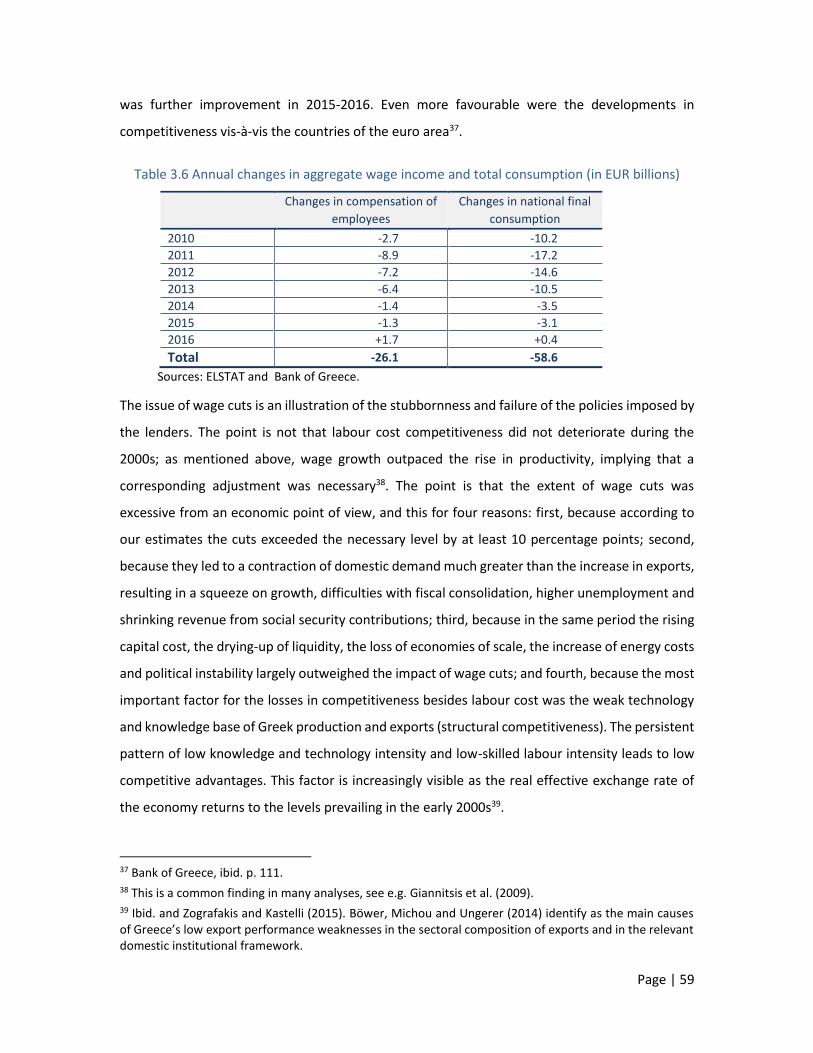
Page | 59
was further improvement in 2015-2016. Even more favourable were the developments in
competitiveness vis-à-vis the countries of the euro area37.
Table 3.6 Annual changes in aggregate wage income and total consumption (in EUR billions)
Changes in compensation of
employees
Changes in national final
consumption
2010 -2.7 -10.2 2011 -8.9 -17.2 2012 -7.2 -14.6 2013 -6.4 -10.5 2014 -1.4 -3.5 2015 -1.3 -3.1 2016 +1.7 +0.4 Total -26.1 -58.6
Sources: ELSTAT and Bank of Greece.
The issue of wage cuts is an illustration of the stubbornness and failure of the policies imposed by
the lenders. The point is not that labour cost competitiveness did not deteriorate during the
2000s; as mentioned above, wage growth outpaced the rise in productivity, implying that a
corresponding adjustment was necessary38. The point is that the extent of wage cuts was
excessive from an economic point of view, and this for four reasons: first, because according to
our estimates the cuts exceeded the necessary level by at least 10 percentage points; second,
because they led to a contraction of domestic demand much greater than the increase in exports,
resulting in a squeeze on growth, difficulties with fiscal consolidation, higher unemployment and
shrinking revenue from social security contributions; third, because in the same period the rising
capital cost, the drying-up of liquidity, the loss of economies of scale, the increase of energy costs
and political instability largely outweighed the impact of wage cuts; and fourth, because the most
important factor for the losses in competitiveness besides labour cost was the weak technology
and knowledge base of Greek production and exports (structural competitiveness). The persistent
pattern of low knowledge and technology intensity and low-skilled labour intensity leads to low
competitive advantages. This factor is increasingly visible as the real effective exchange rate of
the economy returns to the levels prevailing in the early 2000s39.
37 Bank of Greece, ibid. p. 111. 38 This is a common finding in many analyses, see e.g. Giannitsis et al. (2009). 39 Ibid. and Zografakis and Kastelli (2015). Böwer, Michou and Ungerer (2014) identify as the main causes of Greece’s low export performance weaknesses in the sectoral composition of exports and in the relevant domestic institutional framework.

Page | 60
In sum, the emphasis on excessive wage cuts as a tool to restore competitiveness, coupled with
total lack of action to strengthen the technological and productive base of the economy, fails to
improve "structural competitiveness", which is key to enhancing the export sector and its impact
on growth in conditions of stagnating domestic demand. On the contrary, this combination merely
prolongs the functioning of a low-growth, low-skill productive base and explains why, as is often
asked, Greece has not been able to achieve export-led growth.

Page | 61
CHAPTER 4
THE IMPACT OF THE CRISIS ON
INCOMES
Sharp income reductions and soaring unemployment rates have been the most severe economic
consequences of the crisis in Greece. At the macro-level, Gross Domestic Product contracted by
26% between 2009 and 201540. The collapse of incomes has not only been the result of the
recession, but also of three distinct compounding factors: (a) policy decisions by the government
and the Troika to cut wages and pensions and to impose a radical deregulation on the labour
market; (b) bold fiscal consolidation, which led to a deep recession affecting income levels,
demand and unemployment across the whole economy; and (c) broader political stances on
various issues, such as the protection of the public sector from the most adverse impact of the
crisis, reluctance to address inefficiencies as well as the political choice for revenue-led
adjustment policies, all of which had adverse effects on income levels and distribution.
The fall in GDP certainly masks different reductions across the income categories that make up
GDP, given the different impact of the recession on individual income groups (employees, self-
employed, business activities, rents, dividends, profits, agricultural activities, pensioners) as well
as the different elasticities of demand or labour intensity across economic activities. Equally, some
types of income, mainly salaries and pensions, have been subject to very strong government cuts,
while for the other income categories the effect was due to the impact of the crisis.
Household income declined during the crisis under the effect of a range of factors, such as:
Closures of small and medium-sized firms, unemployment and move from the status of self-
employed to unemployed. Between 2008 and 2013 the unemployment rate increased from
7.8% to 27.6%. The number of unemployed persons increased to 1.330 thousand, but
40 The tax dataset used in this study refers to the period 2008-2012, during which the GDP contracted by 21.3%.

Page | 62
declined slightly in the following years (1.131 thousand in 2016). About 648 thousand were
previously dependent employees and 352 thousand previously self-employed persons (in
commercial/business activities, independent activities, agriculture, tourism, construction,
SMEs, etc.) (2015 data). They represented, respectively, 24.5% and 22.1% of total dependent
employment and total self-employment in 2008. The largest losses of dependent employment
jobs are recorded in manufacturing (153 thousand), construction (193 thousand) and
commerce (57 thousand). Additionally, employment in the public sector decreased by 67
thousand.
Changing employment conditions and a shift from full employment to various part-time or
temporary employment forms. The number of underemployed persons (15-64 years old),
implying low-wage jobs and remuneration, increased by 169 thousand persons (from 99
thousand in 2008 to 268 thousand persons in 2015), representing, respectively, 2.1% and
7.3% of total employment. Briefly, during the crisis, besides unemployment, an extensive
shift from full employment to low-pay employment took place, affecting the relevant wage-
related income figures.
Cuts of wages as a result of policy decisions regarding public employees and institutional
changes in the labour market. The salaries of public employees have been cut by 7.7%
between 2008 and 2015. The respective figure for employees in the business sector was
17.3% for the non-banking sector and 21.3% for the banking sector.
Very limited access to the labour market by young people or inactive persons who started
searching for a job. The number of unemployed youths (15-29 years) increased between
2008 and 2015 from 170.5 to 333.7 thousand persons (an unemployment rate of the
respective population of 16.2% and 41.3%).
Besides its impact on incomes, the crisis led also to a substantial loss of capital values, in particular
with respect to real estate property, shares and bonds. The Bank of Greece estimated that the
nominal value of houses declined by about 41% between 2008 and 2015 (see Chart 8.1 in Chapter
8). Equally, the capitalisation of banking and non-banking companies listed in the Athens Stock
Exchange decreased from 59.4 billion euro (2008) to 22.0 billion euro (2011), increasing to 38.7
billion euro by end-2013, mainly as a result of the injection of about 39 billion euro into the
banking sector (recapitalisation of banks). Overall, a capital amount of at least 15 billion euro
regarding solely the listed companies has been lost. A new capitalisation of all four systemic banks

Page | 63
took place by end 2015, amounting to EUR 13.4 billion. The haircut on Greek government bonds
in 2012 led to significant capital losses for many individuals and in particular Pension Funds41 and,
hence, for larger parts of society. In addition, a large number of productive units closed down
during the crisis, implying the destruction of significant, even if not easily quantifiable, parts of
the production capital. Other capital-related incomes such as rental income, dividends and
interest experienced significant reductions as well.
Methodologically, however, the destruction of fixed capital assets or the diminution of capital
values should not be simply compared to the fall of employment-related incomes. The two figures
are complementary but distinct destructive outcomes of the crisis. They show that the impact of
the crisis has many parameters and complex aspects, which affect the questions of inequality and
solidarity. Any further analogy, however, between wage-related and capital-related income
would be methodologically questionable, for the additional reason that both real estate prices
and the Stock Exchange before the crisis gained from exceptionally high or speculative price
increases. Real estate prices jumped by 161% between 1997 and 200842, while also the index of
the Athens Stock Exchange rocketed before the crisis by 105% above its average level of 2003-4.
Our aim is to explore the extent of the change in each income category and the differences across
categories. In both of these cases, our primary focus is on the "functional distribution of income",
i.e. the income earned by households and individuals from their participation in the production
process plus the award of pensions. Wage-related income was hit by income cuts mainly till the
end of 2012 or 2013, depending on the activity. Even then it is not easy to distinguish the extent
to which income cuts were the result of market developments or of policy interventions in the
labour market. In the following years, income reduction was the result mainly of the expansion of
temporary or part-time employment or of unemployment and not of specific political decisions.
In a second step (Chapter 7), we examine how these incomes have changed as a result of tax
policy and to what extent disposable income differs from market income in comparison with the
pre-crisis period. As already mentioned, all these years, the imposition of higher and higher and
new types of taxation, in the form of direct, indirect or real estate taxes, has been a key policy
tool for fiscal consolidation. This tax intervention alters the "functional distribution of income"
and leads to the "personal distribution of income", which shows the "disposable income" that
41 In any case the government covered the deficits of the Funds. 42 Bank of Greece, Annual Reports.

Page | 64
ultimately remains in the hands of the individual or the household. Conversely, the disposable
income of specific population groups should be increased by any subsidies or social benefits in
cash paid by the State to citizens or households (e.g. unemployment benefit, agricultural
subsidies, other social benefits) so that the two magnitudes can be comparable. In practice it is
not feasible to calculate all these income support categories, but the most important among them
(agricultural subsidies, unemployment benefits, etc.) have been taken into account, and the
remaining gaps have a very limited impact on our results.
In any case, pre-crisis and pre-tax income relationships did not only reflect the market
performance of wage earners, self-employed, farmers, or individual groups or subgroups. They
were an extremely complex construction, which was also determined by countless state
interventions, regulations and clientele-type favourable income provisions for specific
professions, such as engineers, lawyers, archaeologists, road carriers, pharmacists, etc. When the
crisis hit incomes, the outcome was not only determined by the different manner in which each
occupational category was impacted by the crisis and Troika or government interventions. In
addition to these differences, there was also the unequal manner in which governments have
treated each larger or smaller group with new decisions from 2010 onwards. The new equilibrium
was characterised not only by an absolute fall in incomes but also by significant changes in the
relative positions of individuals and households across the income scale. Thus, cases of unjustified
or overly favourable treatment for special groups have emerged as a result of government and
Troika decisions or court rulings in a wide range of income relationships. A striking example was
the obligation of millions of home owners to obtain various certifications against the payment of
officially determined fees to engineers.
A significant methodological and substantive issue concerns the reference households or
individuals. Based on the data we have, it is possible to estimate income developments in two
ways: (a) for ‘all households’ or individuals that, for each year, have income from a given source;
and (b) for each income category for the ‘same households’ or individuals during the crisis,
starting from 2008 or another year (see Chapter 2.2 on Methodology).

Page | 65
The investigation was conducted for all the years from 2008 to 201243, but for the sake of
simplicity the findings only for the years 2008 and 2012 and occasionally 2010 are reported here.
2008 is a representative year for the pre-crisis income situation, without being the year with the
highest income before the cuts began, while 2012 is the last crisis for which detailed tax and
income data are available. 2010 was added because, although the recession began in 2008, many
incomes continued to rise until 2010. When the 2012 income is compared with that of 2008, the
change is typically smaller than when compared with 2010.
In exploring income developments by main income source, the following criteria are used:
first, developments in the main sources of income for the country as a whole;
second, developments in income by main source for the same households; and
third, examination at the level of individual deciles, total and top 1% and 0.1% of
households/individuals, thus enabling conclusions on inequality and income distribution.
Analyses at the level of deciles and top 1% and 0.1% are particularly important and original
elements of this study. Within each decile and major social category (dependent labour,
pensioners, self-employed, farmers, etc.) there are dramatic variations during the crisis.
Consequently, the decile approach provides detailed information regarding the income changes
in different strata.
It should be noted that the individual incomes from each source and in each decile do not add up
to the total income of households or individuals under consideration. As a rule, this total income
of households or individuals comprises income from more than one source. Thus, any change
identified in any single income category does not necessarily reflects the change of the
household’s total income position. The latter is shown in Table 4.1, which refers to the total
income of all households from all income sources. However, below we examine how the overall
income situation of households with employees or pensioners evolved compared with other
43 In 2017, some additional tax data were released referring to 2015. These data are not comprehensive, it is not clear whether they are final and do not have the same classification to enable comparisons. According to these data, total taxable income was EUR 73.9 billion, down by 38.8% from 2008 and 21% from 2012. Total (pre-tax) wage and salary income was EUR 32.1 billion, down by 32.8% from 2008 and 7.6% compared to 2012. Total income from pensions was EUR 24.5 billion, down by 4.9% from 2008 and 15.7% from 2012. These figures raise many questions. The fall in GDP between 2012 and 2014 was 8.5% and the reported decrease in total taxable income (21%) is disproportionately high. The income declines between 2008 and 2012 were consistent with the GDP contraction; this consistence seems to be temporarily reversed in 2014. Thus, for a number of reasons some piecemeal data for 2014 can only be used as complementary information and should be treated with caution.

Page | 66
households, even though these households may also have income from other sources. It is also
interesting to examine to what extent the reduction of income from one source is linked to an
increase of income from another source, e.g. a wage reduction but a pension increase, or a wage
reduction for one member, but a wage increase for another household member. Without taking
duly into account such data, it is easy to make wrong interpretations.
Another point to be made is that the lowest (1st) decile often shows significant or abnormal
increases or decreases, which give rise to questions. This may be due to different reasons each
time, such as:
It has been observed, not only in Greece but also internationally, that the lower and the
highest deciles include comparatively more significant tax evasion than intermediate
deciles. In the case of Greece, the introduction of income presumptions or “objective”
expenditure in 201044 resulted in 105,000 taxpayers being taxed for a higher income than
their declared income. These taxpayers had declared a total income of EUR 460,000,000;
after the introduction of imputed income, their income came to EUR 950,000,000.
A change in status (e.g. a farmer who declares zero or negligible income but retires and
cannot conceal pension income) can lead to a very significant increase in income. The
same may apply for self-employed persons as well as to other categories of workers who
conceal incomes.
There are often delays between retirement and the start of pension payments; in the
meantime, retirees declare zero income or lower than their accrued pension entitlements
(cases where pensioners receive 50% of their basic wage in the form of an advance
payment).
The lowest decile includes a large number of underage household members who submit
a separate tax return because they own some estate (e.g. acquired through parental
gifts). If in subsequent years they get a job, the increase in their income will be significant
given the low starting level, even if their earnings are not very high in absolute figures.
Finally, it is pointed out that a much more detailed presentation of statistical data, calculations
and clarifications, which for the sake of simplicity are not included here, can be found in our study:
44 With Law 4172/2013, both the income presumptions and the calculation of tax deductions have changed and become even stricter, compared with the milder criteria applicable under Law 3842/2010.

Page | 67
Greece: Solidarity and Adjustment in Times of Crisis (Hans Böckler Stiftung, IMK, Study 38, March
2015)45.
4.1 The great upheaval of income hierarchy
Table 4.1, below, shows the evolution of income for all households in the country with a
breakdown by decile but also for the total as well as for the top 1% and 0.1%, with three different
approaches:
Under the first approach (left-hand part of the table) we classify all households in deciles
based on their total income, from the poorest (1st decile) to the richest (10th decile) for
2008, 2010 and 2012. In 2008, for example, households classified in the first decile had
an average income of EUR 1,247, which rose to EUR 2,653 by 2010 and declined to EUR
1,150 by 2012. Households in each decile or in the top 1% or 0.1% in 2008 or 2010 or 2012
are not necessarily the same in the three years examined at the left-hand part of the
table. Some households have moved to upper and some to lower deviations.
Under the second approach (middle section of the table) we look at the evolution of
household income from 2008 to two subsequent years, 2010 and 2012. For example,
households of the 1st (poorest) decile in 2008 had, on average, an income of EUR 1,247.
Two years later, in 2010, these same households declared an average income of EUR
6,187 and then in 2012 EUR 5,575. It should be recalled that in the middle part of Table
4.1, households are classified on the basis of their 2008 income.
Under the third approach (right-hand part of the table), households are classified in
deciles on the basis of their income in 2012. In this case the evolution of household
income is shown, starting from 2012 and going back to 2008. For example, households in
the 1st decile in 2012 had an average total income of EUR 1,150. Two years earlier, these
same households declared an average income of EUR 7,827, while in 2008 their income
was EUR 8,462.
For households as a whole, under all three approaches, there is a decrease of 22.6%. This
decrease, however, varies widely across deciles, depending on the perspective adopted each
time.
45 http://www.boeckler.de/pdf/p_imk_study_38_2015.pdf.

Page | 68
The columns in the middle and right-hand sections of the table would have been identical with
the columns in the left-hand section, had the impact of the crisis on income been the same
across all households in the country. The significant discrepancies observed indicate the major
re-ranking among households that occurred during these years:
Households that are in the three lowest deciles in 2008 experienced an income
increase in the subsequent years 2010 and 2012 (middle section of Table 4.1). This
increase is due solely to the contribution of presumed incomes as calculated by tax
authorities for the years after 2008. However, most of the households that anyway
declare very low incomes, with or without presumed income, are below the poverty
line.
Table 4.1 Evolution of annual total income of households including imputed income (in EUR)
Dec
iles
Classification of all households in the country based on their income
in each year
Classification of all households in the country based on their 2008
income
Classification of all households in the country based on their 2012
income
2008 2010 2012 12/08
% 2008 2010 2012
12/08 %
2008 2010 2012 12/08
%
1st 1,247 2,653 1,150 -7.7 1.247 6.187 5.575 347.1 8.462 7.827 1.150 -86.4
2nd 5,423 5,999 4,503 -17.0 5.423 7.728 6.877 26.8 9.257 9.113 4.503 -51.4
3rd 8,294 8,665 6,653 -19.8 8.294 9.648 8.460 2.0 9.695 9.792 6.653 -31.4
4th 10,942 11,427 9,021 -17.6 10.942 11.881 9.915 -9.4 11.974 12.112 9.021 -24.7
5th 13,645 14,314 11,624 -14.8 13.645 14.647 12.105 -11.3 14.313 14.797 11.624 -18.8
6th 17,146 17,708 14,444 -15.8 17.146 18.086 14.736 -14.1 17.254 17.715 14.444 -16.3
7th 21,632 22,111 17,829 -17.6 21.632 22.132 17.686 -18.2 21.765 21.944 17.829 -18.1
8th 27,990 28,359 22,537 -19.5 27.990 28.061 21.855 -21.9 28.128 27.752 22.537 -19.9
9th 38,733 38,605 30,358 -21.6 38.733 38.004 29.037 -25.0 37.060 37.024 30.358 -18.1
10th 86,034 78,044 60,727 -29.4 86.034 71.512 52.598 -38.9 73.178 69.810 60.727 -17.0
Total 23,109 22,789 17,884 -22.6 23.109 22.789 17.884 -22.6 23.109 22.789 17.884 -22.6
Top 1% 265,855 203,091 155,286 -41.6 265.855 160.784 110.695 -58.4 189.385 160.270 155.286 -18.0
Top 0.1% 1,106,894 597,865 461,680 -58.3 1.106.894 417.960 295.115 -73.3 599.759 426.353 461.680 -23.0
Source: Calculations based on tax data.
In households that are in the three lowest deciles in 2012, income has contracted
significantly compared with earlier years (right-hand section of Table 4.1). The three
poorest deciles in 2012 have income below the poverty line, while in earlier years (as
we will see in other chapters) many of these households had significantly higher
incomes. The income loss would have been even greater if we had not taken into
account presumed incomes, which implied “increased” incomes for some of these
households from 2008 onwards, as mentioned above.
In intermediate deciles (5th to 8th) a decrease of about 15%-25% can be observed
under all three approaches.
Page | 69
Households classified in the top (10th) decile in 2008 or in the top 1% and 0.1%
suffered the largest income losses (38.9%, 58.4% and 73.3%, respectively), compared
with their peers in the left-hand section of the table. It would be very interesting to
see below what was the main source of income that collapsed in these households,
causing them significant income losses.
Households classified in the top (10th) decile or in the top 1% in 2012 suffered the
smallest income losses (17% and 18%) compared with lower income households or
their peers in the left-hand section of the table. This means that these categories
include newcomers that have moved up from lower 2008 deciles. These newcomers
of 2012 either have increased their income relative to 2008 or have experienced
smaller income losses than the wealthy households of 2008. In fact, a new group of
very wealthy households emerged, overtaking households that were previously at the
top of the income ranking.
The finding about the significant income loss recorded in the rich versus the poor deciles when
the onset of the crisis (2008) is used as a starting point, in contradiction to the finding of a
significant reduction in the incomes of poor deciles versus the richer ones when the starting
point is the end of the period under review (2012), will be a recurring motif in the next
sections. This apparent contradiction has a logical explanation, which varies across sources of
income. When we classify households in deciles in 2012, from the poorest to the richest, the
households who lost a significant part of their income (due to dismissal or large wage cuts or
loss of income from self-employment or from capital/business activity, etc.) will find
themselves in lower deciles. These households had much higher incomes in the past, so their
income reductions appear to be large. By contrast, the households whose income increased
or remained the same in the crisis period will be found in higher deciles, and the comparison
with their past incomes shows an improvement. As we will see in other chapters of this study,
each decile, apart from households that see their incomes fall, includes households with rising
incomes. When the starting point is 2008, the averages mask the size of the losses. But when
the starting point is 2012, the losers of the crisis are largely to be found in the new poor
deciles.
4.1.1 Income from labour
Income from labour is divided into income from wages and salaries and income from self-
employment.

Page | 70
(a) Income from wages and salaries
Average income from dependent labour per household shows an average decrease of 30.7%
in the period 2008-2012 (Table 4.2). This development concerns those specific households
that in 2008 had income from wages/salaries. In fact, this income reduction is not driven by
lower wages/salaries only: the 2008 population of households includes employees who by
2012 had shifted to unemployment or temporary or part-time employment, or even had to
work on a freelance basis (often spurious self-employment). The number of households with
employees fell by 457,000 between 2008 and 2012, but it is unclear to what extent this
reduction is due to the flexible forms of employment, to retirement or change of type of
employment.
Table 4.2 Evolution of annual wage income of households (in EUR)
Dec
iles
Classification of households based on their 2008 wages
Classification of households based on their 2012 wages
Average wage income Average wage income
2008 2010 2012 12/08
% 2008 2010 2012
12/08 %
1st 2,604 4,330 3,396 30.4 7,706 6,404 1,703 -77.9
2nd 5,849 6,010 4,556 -22.1 8,029 7,273 4,399 -45.2
3rd 8,782 7,786 5,864 -33.2 9,659 9,531 7,346 -24.0
4th 11,028 9,786 7,181 -34.9 11,061 11,765 10,301 -6.9
5th 13,226 12,212 9,340 -29.4 13,608 14,375 12,455 -8.5
6th 16,149 15,403 12,189 -24.5 16,549 16,921 14,581 -11.9
7th 19,588 18,377 14,272 -27.1 19,653 20,063 17,314 -11.9
8th 24,241 22,127 16,313 -32.7 23,535 24,283 21,539 -8.5
9th 32,838 29,965 22,150 -32.5 30,044 32,077 29,005 -3.5
10th 58,468 51,839 38,242 -34.6 50,674 55,709 53,037 4.7
Total 19,277 17,783 13,350 -30.7 19,052 19,840 17,168 -9.9
Top 1% 123,052 103,910 79,113 -35.7 100,581 113,734 117,110 16.4
Top 0.1% 299,720 231,497 172,917 -42.3 213,606 245,238 266,452 24.7
Number of households: 2,480,600 2,023,360 (-18.4% relative to 2008)
Source: Calculations based on tax data.
The reduction is not evenly distributed across income categories. In the lowest decile there is
actually an increase of 30.4% in total income, although if we compare the income of these
households with that of 2010 rather than 2008, we find a decrease of 21.6%46.The smallest
reduction is recorded in the 2nd decile, followed by the 6th and 7th deciles, and a larger one
46 It should be noted that, even amid the crisis, income increases are quite normal, as one can take up a first job, get a promotion, start another paid activity, achieve a higher-yield asset allocation, etc.

Page | 71
in the 10th decile, including the top 1% and 0.1%. However, the two lowest deciles whose
income seems to have performed better are also below the poverty line. Below the poverty
line is also the third decile, which records a higher-than-average fall in its income.
Table 4.2 can also be read from another perspective. With 2012 as a starting point, the right-
hand section of the Table shows the employment income earned by households in earlier
years. The average reduction for the total employee household sample is just 9.9%, much
lower than what we found when we examined the evolution of these incomes from 2008 to
2012. Why this big difference? The answer is because, in classifying households in 2012 using
as a criterion the existence of wage/salary income, we excluded all the households whose
members lost their jobs or retired. As a result, the vast majority of these households (2,023.4
thousand) appear to have retained their jobs throughout the crisis, and changes in incomes
reflect only wage/salary cuts and not total wage loss due to unemployment.
The differences between the deciles are substantial. The 10th decile includes households that
in 2012 have been found to maintain the highest wage/salary income; their average income
increased by 4.7%. Among them, the richer and the extremely rich (1% and 0.1%), saw their
income rise by 16.4% and 24.7%, respectively. The incomes of poor employee households
moved in the opposite direction; these households have lost 24% to 77.9% of their total
income by 2012 employees.
(b) Income from self-employment
The average income reduction in this category was 41% between 2008 and 2012, much larger
than in the case of dependent employment income (left-hand section of Table 4.3). In this
category too, the three lowest deciles see more favourable income developments (increase
or much smaller decrease), as in the case of wage/salary income. In the higher deciles, the
decrease is more homogeneous (40%-45%), peaking at 51.5%-56% for the top 1% and 0.1%.
This development shows how much the crisis has affected the wide array of industries and
professions included in this category (engineers, architects, lawyers, financial consultants,
realtors, but also various technicians and artisans such as carpenters, tilers, electricians,
painters or plumbers).
Households that had income from self-employment at the beginning of the crisis were about
399.8 thousand. Irrespective of how they weathered the crisis, retaining their jobs or not, their
income has fallen by 41%. Looking at the 2012 sample of self-employed households (right-
hand section of the table), their number has declined by about 24.3% (to 302.8 thousand) and
their income reduction compared with 2008 is only 1.7%. In fact, households in the 9th and

Page | 72
10th deciles declared higher incomes in 2012 (up by 8.8% and 21.7%, respectively) and the
top 1% and 0.1% even higher (41.8% and 33.4%, respectively).
Table 4.3 Evolution of household annual income from self-employment (in EUR)
Dec
iles
Classification of households based on their 2008 declared income from self-employment
Classification of households based on their 2012 declared income from self-employment
Average income from self-employment Average income from self-employment
2008 2010 2012 12/08% 2008 2010 2012 12/08%
1st 168 451 514 205.7 1,211 997 134 -88.9
2nd 494 591 486 -1.6 2,429 1,954 448 -81.5
3rd 1,073 1,311 840 -21.7 2,857 2,258 960 -66.4
4th 1,846 1,521 1,019 -44.8 3,768 3,608 1,846 -51.0
5th 3,108 2,663 1,984 -36.2 3,939 4,060 3,200 -18.8
6th 5,161 4,824 2,877 -44.2 5,660 6,429 4,800 -15.2
7th 8,438 7,947 4,727 -44.0 10,493 11,792 7,773 -25.9
8th 12,918 12,717 7,776 -39.8 14,322 16,980 12,629 -11.8
9th 20,882 20,034 12,621 -39.6 19,305 24,345 20,996 8.8
10th 56,558 51,889 32,414 -42.7 43,360 57,010 52,769 21.7
Total 11,064 10,394 6,526 -41.0 10,734 12,943 10,555 -1.7
Top 1% 148,560 118,410 72,016 -51.5 96,831 128,109 137,306 41.8
Top 0.1% 350,329 243,544 154,240 -56.0 239,996 271,981 320,093 33.4
Number of households: 399,820 302,800 (-24.3% relative to 2008)
Source: Calculations based on tax data.
In short, in the upper part of the income ladder, high incomes continue to improve. What has
changed is that some households have lost income and have moved to lower deciles, while
others have seen their incomes increasing and they have taken the places left by the former.
According to tax data, in 2012, one in five self-employed households declares a significant
increase in income (about 60,000 households, with incomes ranging from EUR 21,000 to EUR
320,000). On the other hand, a large majority of self-employed households (60% or 180,000)
declare income of below EUR 5,000. Half of these 180,000 households declared incomes of
below EUR 1,000.
We believe that the data of Table 4.3 reflect one of the crucial problems of Greek society:
significant tax evasion. In all deciles of self-employment income, even in the top 1% and 0.1%,
the absolute amounts of income declared are not just lower, but a mere fraction of the income
declared in the case of wages/salaries. Therefore, in addition to the true income loss caused
by the crisis, there is also extensive concealment of income. One could say many things about
the extent of tax evasion, but without hard evidence anything would be arbitrary and would
not lead to a reliable estimate. Of course, assuming that the size of tax evasion, as a

Page | 73
percentage of total true income, remains broadly stable over the period, the income loss is
still substantial, but probably less than 41%. However, the loss varies across types activity, as
other occupations have experienced a devastating loss of income and others a milder one. In
addition, we are not sure whether this assumption reflects appropriately the reality.
It is recalled that the incomes shown in the above tables are before tax. They reflect the
"functional distribution of income," as a result of the functioning of markets and the position
of each individual in the production process. Disposable income, i.e. the personal distribution
of income resulting from State interventions, is a different magnitude and is discussed in
Chapter 7 on taxation.
4.1.2 Income from capital
Income from capital comprises income from commercial/business activities and investment
(rents, dividends and interest). Agricultural (business) incomes are also deemed income from
capital47, but given the several specificities of their tax treatment are discussed separately and
more thoroughly in Chapter 9.
Income from capital, all individual sources combined, fell by 37.7% between 2008 and 2012
(with falls ranging from 20.3% for rents to 53.6% for dividends and interest). As the
corresponding decline in labour income was 27.4%, the ratio of labour income to capital
income improved (from 128% to 149%, see Table 4.9).
These figures refer to country-wide aggregates and do not show the evolution at household
level. Thus, for income from capital, we examined the changes in incomes between 2008 and
2012 using the same methodology as for income from employment (above) and income from
pensions (below).
Broken down by source, the changes were as follows (Tables 4.4-4.7):
Income from commercial/business activities: -58.8%
Rental income: -28.7%
Income from dividends and interest: -68.5%
Agricultural income: + 21.0%.
A more detailed discussion of the developments is provided below.
a) Income from commercial activities
47 The earnings of dependent agricultural workers are included in wages/salaries.

Page | 74
This category records one of the largest average income falls between 2008 and 2012. Already
by 2010, when the recession has well set in, about 15.5% of income has been lost relative to
2008. At the level of deciles, we can observe a strong correlation between the level of average
income and size of income decrease: the higher the income, the larger the decrease, which
reaches 73%-81% for the top 1% and 0.1%. The lowest decile once again records an increase
in average annual income, which however is just EUR 1,066 (in 2012) and in many cases may
simply indicate the application of income presumptions by the tax authority.
Table 4.4 Evolution of household annual income from business activities (in EUR)
Dec
iles
Classification of households based on their 2008 declared income from business activities
Classification of households based on their 2012 declared income from business activities
Average income from business activities Average income from business activities
2008 2010 2012 12/08
% 2008 2010 2012
12/08 %
1st 616 2,023 1,066 73.2 4,911 4,507 318 -93.5
2nd 1,962 3,176 1,513 -22.9 5,576 5,711 1,121 -79.9
3rd 3,513 4,191 1,993 -43.3 6,474 6,699 2,114 -67.3
4th 5,369 5,609 2,628 -51.1 7,693 8,154 3,355 -56.4
5th 7,465 7,725 3,465 -53.6 8,733 9,794 4,883 -44.1
6th 9,885 9,206 4,135 -58.2 10,373 11,761 6,764 -34.8
7th 12,787 11,072 5,160 -59.7 12,600 14,133 9,178 -27.2
8th 16,291 13,975 6,690 -58.9 13,989 16,567 12,568 -10.2
9th 22,981 18,614 9,175 -60.1 18,637 22,125 18,306 -1.8
10th 53,243 37,892 19,465 -63.4 32,823 41,022 42,590 29.8
Total 13,411 11,348 5,529 -58.8 12,181 14,047 10,119 -16.9
Top 1% 142,672 81,935 38,480 -73.0 65,016 82,682 108,008 66.1
Top 0.1% 330,830 103,496 62,004 -81.3 118,497 135,885 227,845 92.3
Number of households: 693,940 484,500 (-30% relative to 2008)
Source: Calculations based on tax data.
Within this group, the average annual income of the four to five lowest deciles is below or
slightly above the poverty line48. The average total income (EUR 5,529) appears to be 41.4%
of the average wage income, 40% of the average income from pensions and 85% of the
average income from self-employment49. This is indicative of a massive concealment of
income, as in the case of the self-employed, although in this case the crisis has truly led to
48 Of course we should note that the incomes considered here on the basis of their sources do not add up to the total incomes of households. This is why for the two major income categories, employees and pensioners, we also discuss their incomes other than from their main source. 49 Down from 70%, 91% and 121% respectively in 2008.

Page | 75
extensive income losses and business closures50. In both cases, the reduction appears to be
very significant, and is also evidenced by the widespread closedowns of mini-shops and
activities.
Table 4.4, with all of the above-mentioned problems, can be also read from another
perspective. Its right section shows the households that maintained their business activity
during the crisis. Their number has fallen by 30% (from 693,940 to 484,500), but households
with the highest incomes from this source in 2012 are considerably better off. As we move
towards higher deciles, the losses are smaller, and in the 10th decile there is actually an
increase in households’ declared incomes in 2012, up by 29.8%. This increase comes to 66.1%
and 92.3% for the top 1% and 0.1%, respectively.
The conclusion to be drawn is that many households which have remained in business (or
started a new business after 2008) saw their income rise or were forced to improve their tax
compliance. In any event, in this income source too, there have been significant rerankings,
at least at the upper parts of the income ladder. In 2008 there were 694 households (top 0.1%)
with an average income of EUR 330,830 from business activities. By 2012, their number has
fallen to 485 households (top 0.1%) and their average business income is EUR 227.8. From the
households classified in the top 0.1% in 2008, only one part coincides with the corresponding
2012 group.
b) Rental income
Rental income51 fell by 28.7% between 2008 and 2012 (Table 4.5). In this case, the most
significant income decreases are recorded in the 10th decile and in the top 1% and 0.1% (-34%
to -42.5%). In very low deciles there is an increase in household income from rents, which of
course involves very small amounts.
c) Income from dividends and interest
The volume of dividend and interest income fell by 53.6% between 2008 and 2012. This
category of income recorded the largest decrease for households that earned dividend and
50 The number of households with income from business declined from 693.9 thousand in 2008 to 484.5 thousand in 2012. This decline reflects closure of businesses, retirements, or change of employment status (e.g. transition to dependent employment). 51 Until 2012, rental income used to be added to other household income and taxed at the rates applicable from time to time, subject to tax-free thresholds. From 2013 onwards, it is taxed separately from the first euro, according to a two-tiered tax structure: income of up to EUR 12,000 is subject to a rate of 10%, while income of more than EUR 12,000 is subject to a rate of 33% (Articles 39 and 40, Law 4172/2013). In subsequent years the second tier was split into two, i.e. income of between EUR 12,001 and EUR 35,000 and of 35,000+, and the tax rates were specified at 35% and 45%, respectively.

Page | 76
interest income (-68.5%) in 2008, with the higher deciles facing very large income reductions
of 70% to 82%. This has been the result of the collapse of business profitability during the
crisis -and certainly until 2012- but also of the significant changes in deposits. Apart from a
collapse in deposit rates, there was also a flight of deposits that were either transferred
abroad or remained in cash in Greece resulting, in any event, in a significant loss of yields.
Table 4.5 Evolution of annual rental income of households (in EUR)
Dec
iles
Classification of households based on their 2008 declared rental income
Classification of households based on their 2012 declared rental income
Average rental income Average rental income
2008 2010 2012 12/08
% 2008 2010 2012
12/08 %
1st 192 376 351 82.7 584 496 180 -69.2
2nd 621 935 796 28.2 1,106 1,058 560 -49.4
3rd 1,276 1,638 1,296 1.6 1,804 1,831 1,107 -38.6
4th 2,115 2,341 1,832 -13.4 2,516 2,641 1,829 -27.3
5th 3,010 3,121 2,313 -23.2 3,039 3,295 2,650 -12.8
6th 3,916 3,843 2,818 -28.0 3,916 4,131 3,472 -11.3
7th 5,123 5,013 3,741 -27.0 4,725 5,165 4,444 -6.0
8th 7,065 6,893 5,075 -28.2 6,321 7,044 6,082 -3.8
9th 10,872 10,533 7,829 -28.0 9,777 10,798 9,219 -5.7
10th 31,231 28,707 20,606 -34.0 26,826 28,652 24,700 -7.9
Total 6,541 6,339 4,665 -28.7 6,051 6,501 5,415 -10.5
Top 1% 95,473 83,047 57,267 -40.0 78,946 82,264 70,772 -10.4
Top 0.1% 236,208 189,972 135,792 -42.5 204,427 205,886 172,052 -15.8
Number of households: 1,354,700 1,305,000 (-3.7% relative to 2008)
Source: Calculations based on tax data.
According to the data in Table 4.6, in 2008, about 70% of dividend and interest income is
concentrated in the 10th highest decile. These households declare an average income of EUR
75,562 from dividends and interest. Turning to the higher income brackets, the top 1% of
households with dividend and interest income (15,200 households country-wide) had an
average income of EUR 426,192 in 2008, accounting for 40% of total interest and dividend
income. Finally, in the top 0.1%, in which 1,520 households are classified, the declared income
averaged EUR 2,394,395, with a share of 22% in the country-wide total of EUR 3.6 billion in
2008. In 2012, both the number of households and the level of dividends and interest rates at
the top of the income ladder have fallen. In the 10th decile in 2012, on average, households
receive EUR 32,894, with a share of 63.6% in the country-wide total, while in the top 0.1%
income has declined to an average of EUR 162,177, corresponding to 31.3% of the total. In
both the top 1% and the top 0.1%, interest and dividend income has on average shrunk to one

Page | 77
third of 2008 income. It should be noted that the top (0.1%) interest and dividend earners of
2012 see smaller losses on their portfolio (-21.6%) compared with households with lower
value portfolios.
Table 4.6 Evolution of household annual income from dividends and interest (in EUR)
Dec
iles
Classification of households based on their 2008 declared dividend/interest income
Classification of households based on their 2012 declared dividend/interest income
Average income from dividends and interest Average income from dividends and interest
2008 2010 2012 12/08
% 2008 2010 2012
12/08 %
1st 108 658 994 818.5 2,005 1,028 52 -97.4
2nd 374 638 941 151.6 2,351 1,582 316 -86.6
3rd 848 1,179 1,112 31.2 2,419 1,414 613 -74.7
4th 1,288 1,523 1,042 -19.1 2,388 1,561 968 -59.5
5th 2,000 1,844 1,503 -24.8 2,795 1,744 1,328 -52.5
6th 3,064 2,365 1,662 -45.7 3,390 2,396 1,861 -45.1
7th 4,325 3,074 1,459 -66.3 4,186 2,635 2,747 -34.4
8th 6,976 4,832 2,929 -58.0 3,995 3,057 4,030 0.9
9th 12,289 6,525 3,724 -69.7 6,893 4,945 6,879 -0.2
10th 75,562 29,122 18,296 -75.8 46,706 28,411 32,894 -29.6
Total 10,685 5,179 3,363 -68.5 7,713 4,879 5,169 -33.0
Top 1% 426,192 146,859 92,546 -78.3 232,245 147,009 162,177 -30.2
Top 0.1%
2,394,395 574,496 428,358 -82.1 952,120 653,125 746,892 -21.6
Number of households: 1,520,840 1,459,080 (-4.1% relative to 2008)
Source: Calculations based on tax data.
Admittedly, this income category is likely to suffer from statistical weaknesses, as the
declaration of interest and dividend income in tax returns was not mandatory before the crisis,
and it is thus questionable to what extent data for pre-crisis years provide an accurate
comparison. Underreporting issues aside, the factors mentioned above remain valid and have
had a very negative impact on this income.
d) Agricultural income
The case of agricultural income is unique in that it is the only category to show an increase
between 2008 and 2012. This is mainly due to the fact that agricultural incomes include
agricultural subsidies, which are declared but are tax exempt under the Greek tax system. The
number of beneficiaries of agricultural subsidies in tax data has risen over time, mainly in the
context of the requirement to disclose the origin of funds before buying property, therefore
an unknown but large part of the increase in agricultural incomes is basically of a statistical

Page | 78
nature. In fact, introducing the year 2010 into the comparison, we find that also these incomes
decreased by 17.3% between 2010 and 2012.
Table 4.7 Evolution of household annual agricultural income and subsidies (in EUR) D
ecile
s
Classification of households based on their 2008 declared agricultural income and subsidies
Classification of households based on their 2012 declared agricultural income and subsidies
Average agricultural income and subsidies Average agricultural income and subsidies
2008 2010 2012 12/08
% 2008 2010 2012
12/08 %
1st 30 106 98 225.6 115 110 30 -73.8
2nd 78 213 203 161.5 230 180 82 -64.3
3rd 143 341 316 121.3 323 331 169 -47.6
4th 245 591 545 122.9 557 591 335 -39.9
5th 418 948 866 106.9 770 844 630 -18.1
6th 733 1,503 1,359 85.4 1,244 1,467 1,146 -7.9
7th 1,325 2,425 2,243 69.3 1,790 2,365 2,033 13.6
8th 2,531 4,379 3,825 51.1 3,146 4,354 3,738 18.8
9th 5,374 8,325 7,108 32.3 5,518 8,529 7,330 32.9
10th 17,315 22,423 17,559 1.4 14,565 25,512 22,874 57.0
Total 2,819 4,125 3,412 21.0 2,826 4,428 3,837 35.8
Top 1% 46,917 56,237 44,484 -5.2 34,191 64,516 62,974 84.2
Top 0.1% 101,248 107,857 94,752 -6.4 75,545 135,059 138,551 83.4
Number of households: 1,078,880 1,000,420 (-7.3% relative to 2008)
Source: Calculations based on tax data.
It should be noted that the households appearing to receive agricultural incomes in 2008 or
2012 are not the same as agricultural households or, more broadly, households for which
agriculture is their main source of livelihood. In general, agricultural incomes have increased
across all deciles, especially the lower ones. However, due to extensive tax evasion or
preferential tax treatment, declared incomes are probably far from reality. Compared with
other income categories, agricultural income appears to be the lowest of all, with the
exception of rental income, and broadly equal to dividend/interest income.
A more detailed approach to agricultural income is provided in chapter 9, examining all
relevant variables (subsidies, land ownership and rights, taxations).
4.1.3 Pension income
Pensions are income from transfers and, as such, are not classified as income from labour or
capital. Based on aggregate country-wide tax data, pension income increased by 12.8%
between 2008 and 2012, driven by several factors: (i) the number of pensioners increased
sharply between 2008 and 2012 (above 400,000 persons); (ii) the pension cuts at the personal
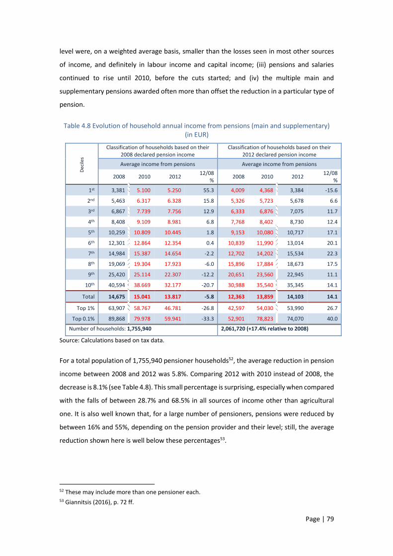
Page | 79
level were, on a weighted average basis, smaller than the losses seen in most other sources
of income, and definitely in labour income and capital income; (iii) pensions and salaries
continued to rise until 2010, before the cuts started; and (iv) the multiple main and
supplementary pensions awarded often more than offset the reduction in a particular type of
pension.
Table 4.8 Evolution of household annual income from pensions (main and supplementary) (in EUR)
Dec
iles
Classification of households based on their 2008 declared pension income
Classification of households based on their 2012 declared pension income
Average income from pensions Average income from pensions
2008 2010 2012 12/08
% 2008 2010 2012
12/08 %
1st 3,381 5.100 5.250 55.3 4,009 4,368 3,384 -15.6
2nd 5,463 6.317 6.328 15.8 5,326 5,723 5,678 6.6
3rd 6,867 7.739 7.756 12.9 6,333 6,876 7,075 11.7
4th 8,408 9.109 8.981 6.8 7,768 8,402 8,730 12.4
5th 10,259 10.809 10.445 1.8 9,153 10,080 10,717 17.1
6th 12,301 12.864 12.354 0.4 10,839 11,990 13,014 20.1
7th 14,984 15.387 14.654 -2.2 12,702 14,202 15,534 22.3
8th 19,069 19.304 17.923 -6.0 15,896 17,884 18,673 17.5
9th 25,420 25.114 22.307 -12.2 20,651 23,560 22,945 11.1
10th 40,594 38.669 32.177 -20.7 30,988 35,540 35,345 14.1
Total 14,675 15.041 13.817 -5.8 12,363 13,859 14,103 14.1
Top 1% 63,907 58.767 46.781 -26.8 42,597 54,030 53,990 26.7
Top 0.1% 89,868 79.978 59.941 -33.3 52,901 78,823 74,070 40.0
Number of households: 1,755,940 2,061,720 (+17.4% relative to 2008)
Source: Calculations based on tax data.
For a total population of 1,755,940 pensioner households52, the average reduction in pension
income between 2008 and 2012 was 5.8%. Comparing 2012 with 2010 instead of 2008, the
decrease is 8.1% (see Table 4.8). This small percentage is surprising, especially when compared
with the falls of between 28.7% and 68.5% in all sources of income other than agricultural
one. It is also well known that, for a large number of pensioners, pensions were reduced by
between 16% and 55%, depending on the pension provider and their level; still, the average
reduction shown here is well below these percentages53.
52 These may include more than one pensioner each. 53 Giannitsis (2016), p. 72 ff.

Page | 80
Taking a closer look at a decile breakdown, an increase in the six lowest deciles can be seen
(ranging from very small to 55.3% for the lowest decile), while a significant decrease is only
seen in the 9th decile and up. More specifically, as shown in Table 4.8, households receiving
pensions in 2008, without taking into account households with new pensioners thereafter,
suffer an average decrease of 5.8% in their pension income. This decrease is visible from the
7th decile up. In households receiving the highest pensions in the country in 2008 (the top
0.1%), the average annual pension income is reduced from EUR 89,900 to EUR 59,900. Four
years later, in 2012, the number of pensioner households has risen to 2,061,720. In these
households, on average, pension income appears to be higher by 14.1% than in 2008.
The explanation that can be given has many dimensions:
Perhaps a second member of the household retires, adding to the household income
from pensions increases, irrespective of whether the amount of each pension is
reduced.
When farmers (or other self-employed) start to receive pension from the Agriculture
Pension Organisation (or other pension funds), they also start to declare this income,
whereas previously the income they declared was zero or negligible.
Many pensioners are entitled to a second (primary or auxiliary) pension after their
main pension is approved54. In such cases, these pensions may have been curtailed,
but the total pension income increases when the auxiliary pension or a second main
pension is added. Thereby the reduction in overall pension income appears to be less
than in each individual pension.
Regardless, the evolution of pension income, in comparison with GDP and other incomes,
suggests significant changes in income distribution. Pensions corresponded to 10.7% of GDP
in 2008 and 15% in 2012, before falling to 13.8% in 2014 (according to the above data)55. In
fact, there is a very significant redistribution of income from work and capital to pensions,
which during the crisis increased their share in total GDP, at the expense of all other key
sources of income. Since pensions do not arise from work, business activity or previous
investment in capital but are the result of income subtracted from labour and capital income,
the above finding suggests that incomes from work and capital, in addition to the losses they
54 According to statistics released through the press, 955,000 persons receive two pensions, 336,800 three pensions and 60,600 four pensions (main and auxiliary). See Kathimerini, 7 February 2016. 55 The aggregate amount of pensions (not only as declared in tax returns) corresponded to 12.5% of GDP in 2008, 16% in 2012 and 16.4% in 2014. See Giannitsis (2016).

Page | 81
suffered as a result of the crisis, were further reduced through increased taxation because ot
the increased deficits of the social security system.
4.2 Main findings
The above findings describe a complex and differentiated reality with regard to the effects of
the crisis on incomes. The crisis has hit all income categories, with the exception of agricultural
income; however, the latter warrants careful investigation as to what is actually the case, due
to its special regime as well as to data imperfections. An approach to economic and social
costs exclusively centred on the extent of income reductions in the various income categories
would be inaccurate. Cost is a very important and complex concept involving many aspects
that need to be examined in order to avoid over-simplifying interpretations56.
Table 4.9 Total annual declared income from each source (in EUR millions)
2008 2012 % change 2008-2012
Change
1. Wages and Salaries 47,817.8 34,736.5 -27.4 -13,081.3
2. Pensions 25,767.6 29,077.3 +12.8 3,309.7
3. Income from business activities 9,306.1 4,902.8 -47.3 -4,403.3
4. Income from self-employment 4,423.7 3,196.2 -27.7 -1,227.5
5. Income from agricultural activities and subsidies 3,041.4 3,838.3 +26.2 796.9
6. Income from dividends, earnings 16,250.7 7,542.5 -53.6 -8,708.2
7. Rents 8,861.2 7,066.3 -20.3 -1,794.9
8. Other incomes 5,320.4 3,121.7 -41.3 -2,198.7
9. Total income (1-8) 120.788.9 93.481.6 -22.6 -27,307.3
10. Income from capital (3+5+6+7) 37,459.4 23,350.0 -37.7 -14,109.4
Ratio 2008 2012 Diff.
11. (1) / (10) 1.28 1.49 +0.21
12. (1) / (4) 10.81 10.87 +0.06
13. (1) / (4+10) 1.14 1.31 +0.16
Source: Calculations based on tax data.
Before we move on to these issues, we can sum up some findings:
❖ A highly asymmetrical evolution of taxable incomes from labour and capital.
Wages and salaries fell by 27.4% in the period 2008-2012, while the corresponding fall in
capital income was 37.7%. Thus, the ratio of wage/salary income to capital income increased
56 A wider assessment of what "lower or higher cost" means and by whom it was borne, is provided in Chapter 13.

Page | 82
from 1.28 in 2008 to 1.49 in 2012. For 2013 we do not have tax data. However, as dependent
employment income declined by 10.6% in 2013 relative to 2012 and GDP showed a smaller
decline (6.1%) in the same period, the above trend may have weakened.
❖ Asymmetrical developments across sources of income, with different effects on the total
family incomes of employees, pensioners, farmers, self-employed and entrepreneurs,
respectively.
Comparing the evolution of incomes of all households by source of income between 2008 and
2012, the impact of the crisis seems to have been very heterogeneous. If we distinguish the
sources of income into those that have recorded substantial or smaller reductions or
increases, the following picture arises:
Income sources that recorded substantial reductions:
1. Income from dividends and interest, down by 53.6% (from EUR 16.3 billion to EUR
7.5 billion);
2. Income from commercial/business activities, down by 47.3% (from EUR 9.3 billion
to EUR 4.9 billion);
3. Other income (including income from securities, income from abroad,
unemployment benefits and imputed income), down by 41.3% (from EUR 5.3
billion to EUR 3.1 billion).
Income sources that recorded relatively smaller reductions:
1. Income from independent activities, down by 27.7% (from EUR 4.4 billion to EUR
3.2 billion);
2. Wages, salaries and other compensation of employees, down by 27.4% (from EUR
47.8 billion to EUR 34.7 billion);
3. Income from property, down by 20.3% (from EUR 8.9 billion to 7.1 billion)
Income sources that recorded increases:
1. Agricultural income, including income support for farmers and compensation
payments, increased by 26.2% (from EUR 3.0 billion to EUR 3.8 billion);
2. Income from pensions increased by 12.8% (from EUR 25.8 billion to EUR 29.1
billion).

Page | 83
The comparison of household income from wages/salaries and other sources shows that in
2008, despite the cuts, the average income from wages was much higher than the average
income from any other source of income in all deciles, with the exception of pension income
(Table 4.3) and dividend income in the highest (10th) decile (average income EUR 75,562).
Limited changes were observed in respect of this leading position in 2012 relative to 2008,
with pension income exceeding the average income from wages in the two lowest deciles (1st
and 2nd). In 2012 the average income from wages was again higher than the average income
from any other source of income in all deciles, except the incomes of the richest 1%57 and
0.1% for some other income sources.
This finding touches on the core of many fundamental factors of imbalances in the Greek
economy, such as issues of unequal tax treatment, tax evasion, pauperisation and over-
taxation. Instead of cutting government expenditure, which had led to the fiscal crisis in the
first place and should participate in the fiscal consolidation effort, the adjustment increasingly
relied on additional taxation, without even taking serious steps to combat tax evasion and
address cases of tax privileges and preferential treatment. The finding that household income
from wages (and pensions) is in absolute terms higher than most other income sources, and
this is so both for the lower and for the upper income brackets is difficult to accept as
representing economic reality. We can only assume that this picture implies widespread tax
evasion and avoidance, even during the crisis58. Of course, tax evasion exists in respect of
wages too, but this happens to a comparatively lesser extent and mostly relates to income
from labour in the informal sector.
Moreover, it should be taken into account that there is a large number of taxpayers who
report themselves as independent (lawyers, engineers, etc.), but in fact are inactive, causing
therefore the average income to appear lower than it actually is. In contrast, there are workers
with depended employment who are forced by their employers to be paid as independent
service providers and thus declare income from self-employment, although they are actually
employees.
57 For each source of income, 1% and 0.1% of the distribution (the richest groups) comprise the highest-income 1% and 0.1% of households. Based on total income, these groups number 52,250 and 5,250 households, respectively, throughout the country. 58 One indication of this is that total declared income/GDP fell from 49.9% in 2008 to 48.2% in 2012, although the tax base was broadened.

Page | 84
❖ A fall in the number of households that earn income through the market and a
corresponding increase in the number of households with unemployed, non-economically
active or retired members.
Based on Table 2.1, households earning income from pensions (main and auxiliary) in 2012
rise by 17.4% in four years. In 2008, there are 1,755.9 thousand households with at least one
member declaring income from pension. In 2012 this number increases to 2,061.7 thousand.
On the other hand, the number of households that earn income through the market
decreases, with the numbers of households with at least one employee declined by 18.4%,
with at least one member having income from business or independent activities by 30.2%
and 24.3% respectively. As we will see below, many have moved to pensioner status. The less
lucky moved to unemployment status. This development foreshadows a dramatic
deterioration in Greece’s already adverse demographic ageing indicators and dependency
ratios.
The relative impact of the crisis on individual social groups can be estimated by calculating the
loss of income from each income source cumulatively for all years between 2008 and 2012.
Income from all sources declined between 2008 and 2012 by EUR 27.3 billion; nearly half of
this decline (48% or EUR 13.1 billion) involved wage and salary income.
The cumulative loss of wage and salary income was 70% higher than the combined losses of
income from business activities, self-employment and rental, which fell by a cumulative EUR
7.4 billion. The second largest loss (EUR 8.7 billion) concerned income taxed separately59
(dividends and interest). By contrast, increases were recorded in aggregate incomes from
pensions and agricultural activities. More detailed data on these developments are provided
in Table 4.9.
❖ Income changes and upheavals of the income hierarchy.
The changes that occurred in all income categories and in total income resulted in strong
upheavals in the households’ position in the income hierarchy, which are not readily visible
from the above tables. In any given decile, an average change may mask widely divergent
developments within this decile. Thus, e.g. in Table 4.1, the average change (-14.8%) in the
5th decile does not mean that all households in that decile have seen their income fall at that
59 It should be noted that in previous years taxpayers were not obliged to declare income from dividends and interest, given that such income was taxed at source. However, after the introduction of an extraordinary solidarity tax, calculated on the total income of taxpayers, the declaration of income from dividends and interest became mandatory.

Page | 85
rate; values close to average, far above average or even zero are quite possible within any
decile. The same applies to any other value in any table and for any decile. Of course, the
households that experienced strong negative or positive changes relative to the average for
the relevant household group, moved to lower or higher deciles over time.
Looking at the household income hierarchies not on the basis of 2008 incomes but those of
2012 in comparison with 2008, we can often find that, unlike many conclusions on the
evolution incomes from 2008 to 2012, the lower deciles of 2012 appear to have suffered a
very substantial loss of income, and the higher deciles the opposite. This development is due
to the fact that the low deciles of 2012 bring together households from all (low, medium and
high) deciles of 2008, whose income has decreased sharply. The opposite is the case with the
highest deciles of 2012.
Chart 4.1 reflects the income changes recorded in 2008-2012. On the horizontal axis,
households are classified in deciles on the basis of 2012 income, from the poorest (1st) to the
richest (10th), and the vertical axis shows the percentages of households that have moved or
stayed in the same decile in which they were classified in 2008. It should be noted that the
chart does not reflect changes within deciles (changes in income that do not entail cross-decile
movement). The changes shown in the chart refer to relative positions on the income ladder.
A household may be found in a higher position, although its income has declined (because the
income of some other households has fallen significantly).
Chart 4.1 Movements of households across deciles in 2012 relative to 2008
Source: Calculations based on tax data.
According to Chart 4.1:
0%
10%
20%
30%
40%
50%
60%
70%
80%
90%
100%
1st 2nd 3rd 4th 5th 6th 7th 8th 9th 10th
Households that remained in the same decile Households that fell down to a lower decile
Households that moved up to a higher decile

Page | 86
1. A number of households remained in 2012 in the same income position as in 2008. Probably
their incomes dropped considerably, however, due to general pauperization, they maintained
the same relative position. The first group retaining its relative position is the group of
households classified in the richest (10th) decile, with 68% of them retaining their position.
The second group concerns households of the poorest (1st) decile, of which 45% remained
trapped in poverty and deprivation.
2. The same chart shows households which in 2012 are worse off, having moved down the
income ladder. A large number of households fell to lower deciles in 2012. But the fall
pervades across all the low and middle income strata. On the other hand, as we move to
higher deciles, the number of households found to be worse off is decreasing.
3. Finally, a number of households climb the income ladder. These households are found in all
deciles, and some of them moved to the highest decile in 2012. As mentioned earlier, moving
to a higher decile does not always translate into higher incomes.
4. About 37% of households move up and 29% of households move down the income ladder.

Page | 87
CHAPTER 5
DEPENDENT LABOUR INCOME
DURING THE CRISIS
5.1 Households with employees and their income
changes
In most households, the total income comes from more than one source. As wages and wage
developments are a major driver of total income and dependent labour has been hit substantially
by unemployment, wage cuts and labour market deregulation, this chapter focuses on the
evolution of the total income of households with employees.
Table 5.1 Total income of all households with employees, by income source (in EUR millions), and percentage changes
Deciles Wages Pensions Agricultural income
2008 2012 % change 2008 2012 % change 2008 2012 % change
1st - 5th 10,290.7 7,325.5 -28.8 1,095.0 1,044.1 -4.6 417.6 442.3 5.9 6th - 7th 8,864.6 6,453.5 -27.2 511.7 412.3 -19.4 120.0 122.3 1.9 8th – 10th 28,662.6 20,957.5 -26.9 971.7 681.4 -29.9 115.5 109.8 -5.0
1% 3,051.7 2,368.0 -22.4 31.9 30.2 -5.3 1.2 2.1 73.9 0.1% 743.3 538.2 -27.6 4.1 4.3 5.4 0.1 0.0 -64.4
Total 47,817.8 34,736.5 -27.4 2,578.4 2,137.8 -17.1 653.1 674.4 3.3
Business activities Self-employment Rental income
2008 2012 % change 2008 2012 % change 2008 2012 % change
1st - 5th 1,440.0 765.2 -46.9 546.0 437.5 -19.9 866.2 714.3 -17.5 6th - 7th 642.3 300.1 -53.3 379.5 308.4 -18.7 523.9 381.1 -27.3 8th – 10th 664.1 319.1 -52.0 1,168.3 673.5 -42.3 1,306.0 895.1 -31.5
1% 12.1 10.4 -13.9 62.7 31.0 -50.5 95.1 68.8 -27.7 0.1% 0.9 0.9 1.3 4.3 3.1 -29.0 19.1 17.4 -8.7
Total 2,746.4 1,384.4 -49.6 2,093.8 1,419.4 -32.2 2,696.1 1,990.4 -26.2

Page | 88
Dividends – Interest Other income Total income
2008 2012 % change 2008 2012 2008 2012 % change
1st - 5th 1,896.4 983.9 -48.1 15.5 573.8 16,567.3 12,286.6 -25.8 6th - 7th 1,445.3 531.9 -63.2 2.9 82.4 12,490.2 8,591.9 -31.2 8th – 10th 3,613.5 1,625.0 -55.0 20.1 120.9 36,521.7 25,382.4 -30.5
1% 652.5 455.8 -30.1 3.5 12.7 3,910.6 2,979.1 -23.8 0.1% 357.4 321.1 -10.2 1.2 4.3 1,130.3 889.3 -21.3
Total 6,955.1 3,140.7 -54.8 38.5 777.1 65,579.3 46,260.8 -29.5
Source: Calculations based on tax data.
The term "households with employees" or “employee households” refers to households that in
2008 and 2012 had at least one member in a dependent employment relationship, irrespective of
whether they had income also from other sources or not.
Table 5.2 Structure and changes of incomes of employees
Breakdown of income in 2012
(in EUR billions)
% of total income of households
Contribution to the 2012/2008 reduction (%)
Wages 34.74 75.1 (72.9)* +67.7
Pensions 2.14 4.6 (3.9) +2.3
Agricultural income 0.67 1.5 (1.0) -0.1
Business activities 1.38 3.0 (4.2) +7.1
Self-employment 1.42 3.1 (3.2) +3.5
Rental income: 1.99 4.3 (4.1) +3.7
Dividends-Interest 3.14 6.8 (10.6) +19.7
Other income 0.78 1.7 (0.1) -3.8
Reduction from 2008 -19.32 100.0 (100.0) 100.0
*Within parentheses, the respective percentages for 2008.
From the data in Tables 5.1 and 5.2, some key findings can be derived:
The share of wage/salary income in total income of employee households is on average
72.9% in 2008, rising moderately to 75.1% in 2012.
The highest shares of wage/salary income in total income are observed for the upper
deciles (8th-10th), followed by the intermediate deciles (6th-7th). In both of these groups,
these shares increased during the crisis period, while those of the lower deciles declined.
After wages, the most important sources of income are interest-dividends, pensions and
income from commercial/business activities, followed by rental and self-employment
income and, for 2012, also unemployment benefits (classified in “other income”).
The fall in the aggregate income of these households stems, in order of importance, from
the decrease in income from wages, interest-dividends and commercial/business
activities. Pensions exert an upward effect on total income and so do unemployment
benefits. A smaller negative impact stems from “other sources” of income.
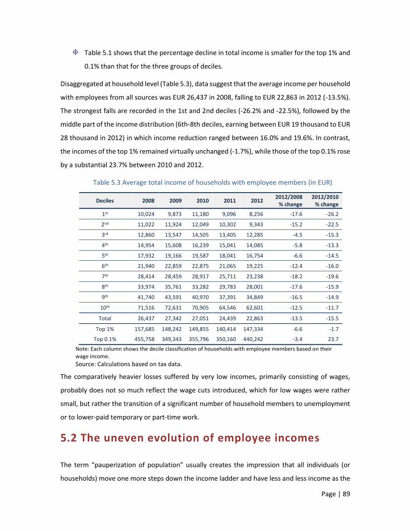
Page | 89
Table 5.1 shows that the percentage decline in total income is smaller for the top 1% and
0.1% than that for the three groups of deciles.
Disaggregated at household level (Table 5.3), data suggest that the average income per household
with employees from all sources was EUR 26,437 in 2008, falling to EUR 22,863 in 2012 (-13.5%).
The strongest falls are recorded in the 1st and 2nd deciles (-26.2% and -22.5%), followed by the
middle part of the income distribution (6th-8th deciles, earning between EUR 19 thousand to EUR
28 thousand in 2012) in which income reduction ranged between 16.0% and 19.6%. In contrast,
the incomes of the top 1% remained virtually unchanged (-1.7%), while those of the top 0.1% rose
by a substantial 23.7% between 2010 and 2012.
Table 5.3 Average total income of households with employee members (in EUR)
Deciles 2008 2009 2010 2011 2012 2012/2008
% change 2012/2010
% change
1st 10,024 9,873 11,180 9,096 8,256 -17.6 -26.2
2nd 11,022 11,924 12,049 10,302 9,343 -15.2 -22.5
3rd 12,860 13,547 14,505 13,405 12,285 -4.5 -15.3
4th 14,954 15,608 16,239 15,041 14,085 -5.8 -13.3
5th 17,932 19,166 19,587 18,041 16,754 -6.6 -14.5
6th 21,940 22,859 22,875 21,065 19,225 -12.4 -16.0
7th 28,414 28,459 28,917 25,711 23,238 -18.2 -19.6
8th 33,974 35,761 33,282 29,783 28,001 -17.6 -15.9
9th 41,740 43,591 40,970 37,391 34,849 -16.5 -14.9
10th 71,516 72,631 70,905 64,546 62,601 -12.5 -11.7
Total 26,437 27,342 27,051 24,439 22,863 -13.5 -15.5
Top 1% 157,685 148,242 149,855 140,414 147,334 -6.6 -1.7
Top 0.1% 455,758 349,343 355,796 350,160 440,242 -3.4 23.7
Note: Each column shows the decile classification of households with employee members based on their wage income.
Source: Calculations based on tax data.
The comparatively heavier losses suffered by very low incomes, primarily consisting of wages,
probably does not so much reflect the wage cuts introduced, which for low wages were rather
small, but rather the transition of a significant number of household members to unemployment
or to lower-paid temporary or part-time work.
5.2 The uneven evolution of employee incomes
The term “pauperization of population” usually creates the impression that all individuals (or
households) move one more steps down the income ladder and have less and less income as the

Page | 90
years go by. If this is true for all of them, then the relative position of each person or household
will remain exactly the same; the number of the poor will remain the same, and so will the size of
income inequality. The balance is not disturbed, with the poor remaining poor and the rich
remaining rich, while income distances remain unchanged. This is the case if the median individual
(the one in the middle of the income distribution) shifts downward, without overtaking or being
overtaken by another individual. This picture could be seen as a fair distribution of the cost of the
crisis. Theoretically, all households are in solidarity and share the cost in equal measure: an
individual at the top of the income ladder faces a wage/salary reduction of say 20%, which may
translate into a few thousand euro, and an individual in lower sections of the ladder will also face
a corresponding reduction of 20%, which may involve a few euros if that individual’s wage is low
or extremely low. Of course, for the very poor employee these few euros lost represent a heavier
sacrifice (loss of utility) than the much more euro for the very highly paid employee.
In the analysis that follows, the reference unit is the individual (the employee, in particular) rather
than the household as in other chapters of this book. Examining the wage/salary income at
household level, the large deviations may be mitigated when, for example, a household member
receives much higher wages than another wage earner in the household. In addition, a decline in
household wage/salary income may be due to a wage cut, job loss or retirement in respect of one
or more employee members of the household. On the other hand, an increase in household
wage/salary income may also be due to the fact that a previously unemployed member has found
a job. The analysis in this and other chapters of this book seem to confirm the important role of
family-pooled annual earnings in reducing inequalities at the individual level60.
It is therefore important to examine wage/salary income as it developed in the first five years of
the crisis for which statistical data are available. The changes to be observed will be solely due to
fluctuations in wages, since we have chosen to examine exclusively those who work as employees
employed in all five years (2008-2012). This excludes new hirings and firings, i.e. individuals who
in any intermediate year of that period found a job (thus likely to be less paid than older recruits)
or started the period as employees but became unemployed thereafter. Rather, the focus is on
the bulk of employees in the country who retained their jobs, despite the difficult and adverse
60 Vacas-Soriano and Fernandez-Macias (2017), p. 33 ff.

Page | 91
economic conditions. In households with two members who declare income from dependent
employment, each member is considered separately.
A potential criticism of this approach is that it does not capture cases of spurious self-employment
or bonuses to highly paid staff that do not appear as salary income. The inclusion of the former is
difficult, as the tax data do not allow to distinguish them from true self-employment.
On the basis of the tax data used, the individuals who are employees in all five years are 1,951,165.
These are classified from the lowest paid to the highest paid, according to the wages/salaries they
receive in 2008 and in 2012, respectively. These two classifications are nothing but two different
income ladders.
For simplification reasons, we have divided employees into three broad groups:
The first group comprises low-paid employees. This group occupies the lower 60% of the
ladder and is the larger in number, with a total of 1,170,700 employees.
The second group occupies the next 30% up the ladder, with a total of 585,360
employees. We could assume that this group is the middle class of employees, but such a
characterisation would probably be quite risky.
The third group, the highest paid 10% of employees, occupies the upper rungs of the
income ladder. Within this group, it is very interesting to look at the top-paid employees.
To this end, we can focus on the top 1% (19,500 employees) or, alternatively and more
precisely, on the top 0.1% (1,940 employees country-wide).
The different panels of Chart 5.1 reflect the evolution of the average wage/salary of the groups
mentioned above, each time identifying the employees who are winners or losers, depending on
whether their wage/salary have increased or decreased since 2008. According to these data, we
observe that, while every group includes winners and losers, the differences are considerably
smaller on aggregate for any given group or the population as a whole. More specifically:
In the low-paid group, the average wage/salary has not changed significantly, falling from
slightly above EUR 10,500 in 2008 to slightly below EUR 10,500 in 2012. In between
(2010), it had exceeded EUR 11,500 euro, before falling back to close to its 2008 level.
However, this development between 2008 and 2012 does not concern all the low-paid
employees. For 45.2% of them, wages/salaries increased on average from EUR 9,500 to
EUR 13,000, while 54.8% saw their wages/salaries decrease from EUR 11,500 to about

Page | 92
EUR 8,000. The pattern emerging from these data is that, within the low-paid group,
employees who started as lower paid were better off at the end of the period than those
who started as higher paid. For the group as a whole, however, these differences are less
pronounced.
Charts 5.1 The wage level in 2008 and the new wage level in 2012 for groups of employees (in EUR)
Source: Calculations based on tax data.
In the second group (7th to 9th deciles), the picture is totally different. Most importantly,
the losers are much more than the winners (80.8% and 19.2%, respectively). Both start
from the same average wage/salary (EUR 21,000), but the winners will end up with an
average wage/salary of more than EUR 26,000 in 2012, while the losers with an average
7.500
8.500
9.500
10.500
11.500
12.500
13.500
Winners45.2%
Losers54.8%
Total1,170,700 Employees
1st-6th deciles2008 2012
15.000
17.000
19.000
21.000
23.000
25.000
27.000
Winners19.2%
Losers80.8%
Total585,360 Employees
7th-9th deciles2008 2012
25.000
35.000
45.000
55.000
65.000
Winners31.5%
Losers68.5%
Total195,100 Employees
10th decile2008 2012
12.000
14.000
16.000
18.000
20.000
Winners36%
Losers64%
Total1,951,160Employees
Total Employees2008 2012
50.000
70.000
90.000
110.000
130.000
150.000
Winners32.9%
Losers67.1%
Total19,500 Employees
top 1%2008 2012
100.000
150.000
200.000
250.000
300.000
350.000
Winners25.8%
Losers74.2%
Total1,940 Employees
top 0.1%2008 2012

Page | 93
wage/salary of just below EUR 17,000. Due to the fact that the losers sub-group represent
a higher share, the average wage/salary for the “middle class” of employees as a whole
has fallen significantly in 2012 compared with 2008.
It could be expected that the higher-paid group would be the one to have been hit the
hardest by the economic crisis. This holds true, but only for 68.5% of this group, who saw
their average wage/salary fall by EUR 15,000 (from EUR 45,000 in 2008 to EUR 30,000 in
2012). By contrast, for 31.5% of high-paid employees, the average wage/salary increased
by an average of EUR 10,000 over the same period (from EUR 45,000 in 2008 to above
EUR 55,000 in 2012). The picture does not change significantly when examining the
highest paid: within this subgroup, for one in three in the top 1% and one in four in the
top 0.1%, the crisis did not slow down the continuous upward trend of their
wages/salaries.
In conclusion, the wage/salary cuts that began at the start of the crisis were indeed of a
redistributive character, as the largest cuts concerned high wages/salaries. But that does not
apply to all cases. For significant groups of employees, the opposite is the case. Some of them had
substantial wage/salary increases, at a time when unemployment rates in the country were over
27%. Chart 5.1 provides a snapshot of the income ladder in 2008: it depicts the position of
employees before the crisis and tells us that some have descended and some others have climbed
few or more rungs. Some of them have moved to another group. Some "middle-income"
employees have been delegated to the low-paid group and some, few in number, have been
elevated to the high-paid group. There is mobility everywhere. The new income ladder, based on
wages/salaries as they stood in 2012, is presented in the panels of Chart 5.2.
According to Chart 5.2, some key conclusions can be drawn:
- The low-income class of 2012 sees on average its wage/salary fall markedly, from about EUR
12,000 in 2008 to less than EUR 9,500 in 2012. The majority of this group (790,000 employees)
receive an average annual wage/salary of just over EUR 8,500 in 2012, down from EUR 14,000
in 2008; these are the losers of 2012 and have every reason to be exasperated. However,
included in the same group are also low-paid employees whose wages/salaries have
increased, resulting in a narrowing of intra-group pay gaps.

Page | 94
- In the new “middle class”, the average wage/salary is slightly above EUR 19,000 in 2012, down
by EUR 3,000 relative to 2008. The winners/losers ratio is the same (35%/65%) as for the low-
income employees.
- The picture changes when we turn to the high-paid employees. Here the winners/losers ratio
is much higher (59%/41%), driving the wage/salary increase between 2008 and 2012 observed
for this group as a whole. The higher we move up the income ladder, the winners are more
and more. In fact, the highest paid employees in Greece have an average salary of slightly less
than EUR 240,000 in 2012, up from about EUR 200,000 in 2008; of these, 76% saw their
wage/salary increase by EUR 100,000.
The results would at first glance seem surprising. In the top 1% and 0.1%, wages/salaries appear
to have increased. On average, the same employees with very high salaries/wages in 2012 had
very high salaries/wages in 2008 too, and employees with very high wages in 2008 have on
average high wages in 2012. However, major reclassifications have occurred, which are masked
by averages. There are employees who are found to receive extremely higher wages in 2012 than
in previous years, and vice versa. For some of them, for example highly paid public sector
employees, income policy imposed drastic pay cuts, which apart from monthly reductions also
entailed the abolition of the so-called 13th and 14th salaries (Christmas, Easter and holiday
bonuses). On the other hand, there were highly paid employees (either in the private or in the
broader public sector) who were not subject to a cut or abolition of these bonuses. The crisis,
therefore, changed even the relative position of employees within the same income group. Some
moved up and others down the income ladder, and certainly moving down to the low deciles has
been the most painful change.
An investigation of wage developments during the years of the crisis highlights certain forms of
discrimination, e.g. against private sector employees compared with those working in the public
sector. In other chapters of this book, we attempt to outline the profile of individuals who fall one
or several steps down the income ladder and those who move up.
Further, during the crisis period strong conflicts of interests and power struggles, led to divergent
and unfair developments not only across groups but also, and most importantly, within each
group, at the expense of the weaker social strata.

Page | 95
Charts 5.2 The wage level in 2012 and the pre-crisis wage level for groups of employees (in EUR).
Source: Calculations based on tax data.
7.500
8.500
9.500
10.500
11.500
12.500
13.500
14.500
Winners32.5%
Losers67.5%
Total1,170,700Employees
1st-6th deciles2008 2012
14.000
16.000
18.000
20.000
22.000
24.000
26.000
Winners35.4%
Losers64.5%
Total585,360
Employees
7th-9th deciles2008 2012
30.000
35.000
40.000
45.000
50.000
55.000
Winners58.8%
Losers41.2%
Total195,100
Employees
10th decile2008 2012
12.000
14.000
16.000
18.000
20.000
Winners36%
Losers64%
Total1,951,160Employees
Total Employees2008 2012
50.000
70.000
90.000
110.000
130.000
Winners71.5%
Losers28.5%
Total19,500
Employees
top 1%2008 2012
140.000
190.000
240.000
290.000
340.000
390.000
Winners76.3%
Losers23.7%
Total1,940 Employees
top 0.1%2008 2012

Page | 96
5.3 The diverging patterns of labour and pension
income
Looking at the evolution of wage and pension incomes at an aggregate level for the whole
economy in the period 2008-2012, the former decreased by 27.4% and the latter increased by
12.8% (Table 4.9). The juxtaposition of these two opposite trends highlights two types of
discrimination:
an asymmetrical treatment of employees in the private versus the public sector; and
the introduction or maintenance of incentives for a mass exodus of workforce to retirement.
Behind this policy was an effort to cushion the public sector from the most adverse effects of the
crisis, even if this implied that the private sector would be called on to bear the brunt of the fiscal
adjustment. Thus, the private sector shouldered a heavy burden as a result of several cumulative
and compounding predicaments: unemployment (dependent and independent jobs), wage cuts,
business closures, a collapse of all types of income, new forms of inequality, a plunge of thousands
of individuals and households into poverty or of poor households into deeper poverty, loss of job
security with an increasing use of part-time or temporary work arrangements, payroll and other
arrears outstanding for months and the dismantling of labour relations and labour protection.
In the public sector, the most important adverse measures were the successive cuts in the
earnings of employees, non-renewal of temporary employment contracts (e.g. internships),
several months’ delays in the award of pension to new retirees, a drastic curtailment of pensions
exceeding EUR 1,000-1,200. In terms of wages, cuts in the public sector were smaller than in the
non-banking private sector (a cumulative 13.2% vs. 23.3%, respectively, for the period 2009-
2013)61, except for employees in public utilities (-32.9%). Furthermore, employees in the public
sector did not experience layoffs or the devastating effects on the production system from the
closure of firms. As a supplement to that policy, especially in the context of the 2010 pension law,
thousands of employees (mostly, but not exclusively, civil servants) covered by public insurance
schemes continued to benefit or even were encouraged to take early retirement, having the right
61 Data from the Bank of Greece, Annual Report 2015. The figure for the public sector refers to outlays for wages and salaries per employee, while for the other sectors it refers to average gross nominal earnings. The corresponding decrease for salaries in the banking sector was 19.4%.

Page | 97
to pay for “notional” years, thus avoiding the painful experience of unemployment and income
collapse that hit about one million private sector employees between 2009 and 2013.
Effectively, pension income substituted, to a large extent, for labour income, with the result that
a much lower decline was seen in the sum of pension and labour income. The two combined fell
from EUR 73.6 billion in 2008 to EUR 58 billion in 201662, or by 21.1%, compared with declines of
27.4% in labour income for 2008-2012 only and of 38.6% in total declared income during the same
period.
Besides the very different wage cuts imposed on employees in the public and the private sector,
additional differences hit employees in the private sector based on age. According to data from
the new Pension Authority (Single Social Security Fund -EFKA)63, different age groups of
employees experienced different wage/salary reductions between 2009 and 2016, as follows:
ages 15-24: -42.5%;
ages 25-34: -34.0%;
ages 35-54: -25.0%;
ages 55 and over: -18.1%
Overall, these changes led to two interrelated effects:
a mass shift of employees in the public and private sectors out of the labour market into
retirement, often in the form of early retirement; and
a significant divergence between wages and pensions.
The unequal treatment of employees in the private versus those in the public sector is not only
manifest in the wide differences in the size of wage cuts imposed on each sector; it is also linked
with three additional elements: (a) the different starting levels of wages in each of the two sectors,
as public sector employees typically receive significantly higher wages/salaries; (b) the reversal of
wage cuts for large segments of public sector employees; and (c) court decisions that also
reversed salary cuts.
(a) The unequal starting levels for employees in the public and private sector
62 Tax data published in 2017. There is no distinction between pension and labour income, thus a more detailed comparison with our figures is not possible. 63 Published in the Athens daily Kathimerini, 30 June 2017.

Page | 98
The uneven salary cuts in the public and private sectors during the crisis were imposed on wages
that were already unequal across the two sectors. Research on the public and private sector pay
gap has shown that Greece has one of the largest pay gaps in favour of the public sector64, or even
the largest65, and the wage differential being estimated at above 35% or even higher, the largest
part of which cannot be explained by employees’ characteristics66. Given that in the 2009-2013
period the average reduction in wages was 19% in the business sector and 8% in the public sector,
the gap between the two widened from 35%67 to more than 55%.
(b) Non-implementation of wage cuts in the public sector
Although legislation on wage cuts was meant to apply to almost the entire public sector and public
enterprises, in practice different rules were applied in a number of public sector companies or
organisations, in which the legislated cuts were simply not implemented. In addition, within the
narrow public sector (central government), an estimated number of about 66 thousand ministry
employees were initially subject to cuts, which were later reversed by refunds of up to EUR 1,000
per month dubbed as “personal pay difference”. This amount represented a significant rise as a
percentage of their new, lower salaries. In addition, other measures were implemented which
increased the total salary of public sector employees.
(c) Court interventions and inequalities
An additional, equally important, disparity arises from the fact that Supreme Court rulings in 2014
or following years cancelled the wage cuts for large segments of public sector employees
(judiciary, military, law enforcement, university teachers, medical staff), restoring their salaries to
their previous levels. This further exacerbated the already existing inequality. Whereas a GDP
contraction of about 25% would necessitate a fair allocation of the costs among the citizens, these
court rulings defied this common sense rule and instead developed strong new inequalities. In
fact, given that they favour certain highly privileged groups of employees, they represent the
exact opposite of what solidarity and fair burden-sharing are all about. The effects of this reversal
64 De Castro, Salto and Steiner (2013), Depalo, Giordano and Papapetrou (2014), Christofides and Michael (2013), Christopoulou and Monastiriotis (2014). 65 Christofides and Michael (2013). 66 Depalo, Giordano and Papapetrou (2013). 67 Assuming this to be a reasonably accurate estimate.

Page | 99
is not reflected in the figures presented here, as they became visible starting from the incomes of
2013, but still cannot be ignored.

Page | 100
CHAPTER 6
The significant contribution of
women to household income
6.1 The data
The main question we are trying to answer in this chapter is whether women’s lower, on average,
wages, as well as their greater labour market flexibility in the past (e.g. higher incidence of part-
time work relative to men) have helped them to maintain their jobs to a greater extent than was
the case with their male counterparts.
From the tax data base, we have selected all the couples in which both members work in
depended employment. We follow them over time and see how their incomes evolve and how
their working lives change.
A methodological problem to be solved concerns the reference year for selecting the above
couples. If 2008 is chosen, couples both members of which were hired after 2008 would be
excluded. These couples should not be omitted from the scope of our analysis. If 2012 is chosen,
then couples both members of which became unemployed due to the crisis or retired would be
excluded. On the other hand, if we focus on those couples both members of which have
maintained their jobs throughout the period reviewed (2008-2012), we would exclude the
previous two categories.
Consequently, all three distinct groups of couples have to be monitored:
For the first group of couples, the reference year is 2008, i.e. both the husband and wife must
have received income from dependent employment in 2008. After 2008, in some couples, for
either of the spouses the sources of income have changed or wage/salary income is no longer
declared. In the latter case, we assume that the individuals in question have retired (as they

Page | 101
now declare pension income) or lost their jobs (as they cease to declare wage income) or are
in a transitional state (they retain their employment, possibly accepting informal pay).
For the second group of couples, the reference year is the final year (2012) of the period under
review. Again, we select all couples on the basis of the criterion that both members receive
wage income in 2012. We examine their working lives in previous years and their incomes
before the financial crisis broke out. This group of couples is different from the previous group
in that it comprises couples whose members may have no wage income in 2008, but found a
job thereafter. Moreover, couples whose members have become unemployed or pensioners
are excluded from the second group, as can also have happened with some couples in the
first group.
The third group comprises those couples where both members receive income from
independent employment in all the years of the period (2008-2012). Households in the third
group are included in the first or second groups.
6.2 Income losses at an aggregate level
As seen in Table 6.1, prior to the crisis (in 2008), households in which both members were
employees were 520.9 thousand in the country as a whole, with an average annual total income
of EUR 41.9 thousand. In the poorest couples (1st decile), the average annual income did not
exceed EUR 12.2 thousand, while in households with the highest total incomes (10th decile), the
average annual income was EUR 111.000, 9.1 times higher than for the first decile. In the 10th
decile, the dispersion of household incomes is very high, with strong differences observed within
the decile. For example, the households in the top 1% (5.2 thousand households) had an average
annual income of EUR 284.2 thousand in 2008. Further, even within this richest centile, income
dispersion remains high. Among these richest households, the top 0.1% (the richest 520
households) had an average annual total income of over EUR 980,000 in 2008.
Looking at these same couples four years later (i.e. in 2012), their average total income has fallen
by 22.4%, without any major differences across deciles, with the exception of the very rich
households (10th decile, top 1% and top 0.1%) where the income decrease is significantly higher
than for the total population (29.8%, 43.3% and 43.1%, respectively).

Page | 102
The reduction in total income is due to many factors. In most couples, wages were curtailed, with
some of them also being subject to the abolition of the 13th and 14th salaries. In some other
households, the husband or the wife or both moved to pensioner status, entailing lower income.
Finally, there are some households that have been hit by the crisis even worse. This refers to cases
where the husband, the wife or both have lost their jobs, with their wage income reduced to zero.
The conclusion to be drawn from the above analysis is that the economic crisis, in addition to its
impact on the income levels of employees, has also had a redistributive effect, since the
economically stronger couples were hit the hardest. However, the above picture changes
drastically if we use as reference year, instead of the first year (2008) of the period reviewed, the
final year (2012).
In the first section of Table 6.1 we started our analysis by selecting couples in which both members
work as employees in 2008. In the second section of the same table we select couples in which
both members work as employees in 2012. The couples are now 421.4 thousand, 100,000 less
than in 2008. This lower number of couples is explained by the fact that some households have
members that either lost their jobs or retired and are therefore by definition excluded from the
group of households with both members working as employees in 2012. These households are
again recorded on the basis of their 2012 incomes, and poor households in 2012 again occupy the
first decile, while the richest are found in the upper places.
We observe that the poor couples of 2012 have lost 28.7% of the total income they had in the
past (2008). By contrast, the richest households of 2012, i.e. those classified in the 10th decile,
see their incomes decrease by only 6.7%. In the total population of this group, the average income
drops by 7%. However, in rich and extremely rich households (top 1% and 0.1%), incomes have
decreased by 10.1% and 26.3%, respectively. Comparing the income losses across poor and rich
couples, significant differences can be observed. The poor couples of 2012 have suffered greater
losses than the poor couples of 2008, while the opposite is the case with the rich couples. In the
first section of the table, the income losses are due to wage cuts, layoffs and retirements. Within
each decile, some couples have faced large income reductions, but averages reduce the size of
the losses because there are couples whose incomes are rising over the same period. In the
second section of the table, the income losses are solely due to wage cuts, since, as mentioned
earlier, couples with unemployed members are excluded. But why do the losses now appear
larger in the poor and smaller in rich couples? The answer is that the new lower deciles now
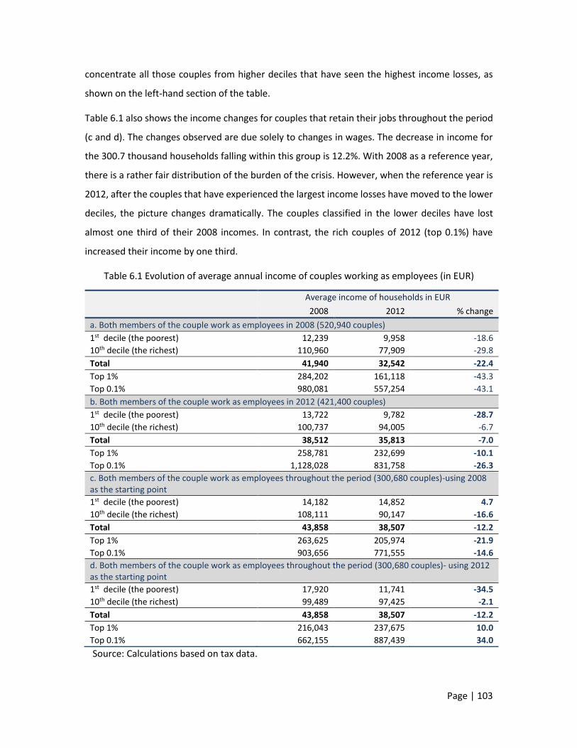
Page | 103
concentrate all those couples from higher deciles that have seen the highest income losses, as
shown on the left-hand section of the table.
Table 6.1 also shows the income changes for couples that retain their jobs throughout the period
(c and d). The changes observed are due solely to changes in wages. The decrease in income for
the 300.7 thousand households falling within this group is 12.2%. With 2008 as a reference year,
there is a rather fair distribution of the burden of the crisis. However, when the reference year is
2012, after the couples that have experienced the largest income losses have moved to the lower
deciles, the picture changes dramatically. The couples classified in the lower deciles have lost
almost one third of their 2008 incomes. In contrast, the rich couples of 2012 (top 0.1%) have
increased their income by one third.
Table 6.1 Evolution of average annual income of couples working as employees (in EUR)
Average income of households in EUR 2008 2012 % change
a. Both members of the couple work as employees in 2008 (520,940 couples)
1st decile (the poorest) 12,239 9,958 -18.6
10th decile (the richest) 110,960 77,909 -29.8
Total 41,940 32,542 -22.4
Top 1% 284,202 161,118 -43.3
Top 0.1% 980,081 557,254 -43.1
b. Both members of the couple work as employees in 2012 (421,400 couples)
1st decile (the poorest) 13,722 9,782 -28.7
10th decile (the richest) 100,737 94,005 -6.7
Total 38,512 35,813 -7.0
Top 1% 258,781 232,699 -10.1
Top 0.1% 1,128,028 831,758 -26.3
c. Both members of the couple work as employees throughout the period (300,680 couples)-using 2008 as the starting point
1st decile (the poorest) 14,182 14,852 4.7
10th decile (the richest) 108,111 90,147 -16.6
Total 43,858 38,507 -12.2
Top 1% 263,625 205,974 -21.9
Top 0.1% 903,656 771,555 -14.6
d. Both members of the couple work as employees throughout the period (300,680 couples)- using 2012 as the starting point
1st decile (the poorest) 17,920 11,741 -34.5
10th decile (the richest) 99,489 97,425 -2.1
Total 43,858 38,507 -12.2
Top 1% 216,043 237,675 10.0
Top 0.1% 662,155 887,439 34.0
Source: Calculations based on tax data.

Page | 104
Although in the above table, three fourths of the couples remain the same in the three different
versions, the results are significantly different. On average, in couples in which both spouses have
maintained their jobs, the income reduction is considerably smaller. The poor couples of 2008,
insofar as their members did not lose their jobs, also record the smaller losses. Some couples with
significant reductions in their income fell down to low deciles in 2012 (new poverty). The poor
employee couples of 2012 include couples previously belonging to the middle-income class.
There are also significant shifts within the subgroup of rich couples. Those in the top 1% move to
the top 0.1%, pushing the "old" rich couples in the opposite direction, lower down. In the turmoil
of the economic crisis, some of the "new" rich couples -but less rich relative to 2008- record
income gains of 34% when, on the other hand, some other couples (disproportionately more in
number) record losses of the order of 34.5% and are violently pushed below the poverty line.
In sum, we observe that:
Those couples that were not hit by unemployment during the crisis or did not retire, record
small average income losses (part b of Table 6.1).
In 2012, however, a new generation of poor couples emerges. These couples have suffered
considerable losses, with the result that in 2012 they have fallen down from the higher income
brackets of previous years to the bottom of the income distribution (part b of the table).
The couples classified in the pre-crisis period as rich and all the more so the extremely rich
have suffered large losses of their total income, compared with lower-income couples (part a
of the table).
A new group of couples is found at the top of the income scale in 2012, having increased their
incomes relative to the past. These very rich and extremely rich couples have overtaken the
"old" rich couples of the pre-crisis period (part d).
6.3 Wage and salary income losses
In this chapter, we decompose dependent employment income into the parts contributed by the
husband and the wife, respectively. Table 6.2 illustrates the contribution of male and female wage
income to the total income of the couple. In 2008, on average for all couples, the husband’s wage

Page | 105
represents half (50.2%) of the total income of the couple, and the wife’s 34.9%, while the
remaining 15% relates to income from other sources.
The wages of men in the 10th decile in 2008 are 7.5 times higher than the wages of men in the
1st decile. On the other hand, women in the 10th decile are paid 6.1 times more than women in
the 1st decile. The wage inequality recorded in 2008 is higher among men than among women.
Table 6.2 Evolution of wages for couple members and shares in total household income
De
cile
s
Wife’s wage [in EUR and as % of total household income]
2008 2012 % 2008 2012
EUR (1)
% (2)
EUR (3)
% (4)
(3)/(1)
% (4)-(2)
EUR (5)
% (6)
EUR (7)
% (8)
% (7)/(5)
% (8)-(6)
Part A. - Using 2008 as the starting point
1st 6,502 53.1 3,762 37.8 -42.1 -15.3 4,693 38.3 3,282 33.0 -30.1 -5.4
10th 48,498 43.7 32,669 41.9 -32.6 -1.8 28,494 25.7 19,338 24.8 -32.1 -0.9
Total 21,059 50.2 14,449 44.4 -31.4 -5.8 14,621 34.9 10,108 31.1 -30.9 -3.8
Top 1% 95,854 33.7 62,416 38.7 -34.9 5.0 40,688 14.3 24,823 15.4 -39.0 1.1
Top 0.1% 213,204 21.8 166,050 29.8 -22.1 8.0 63,090 6.4 38,450 6.9 -39.1 0.5
Part B. - Using 2012 as the starting point
1st 7,909 57.6 4,122 42.1 -47.9 -15.5 3,350 24.4 3,976 40.6 18.7 16.2
10th 43,346 43.0 44,706 47.6 3.1 4.5 24,552 24.4 27,322 29.1 11.3 4.7
Total 19,801 51.4 17,936 50.1 -9.4 -1.3 11,928 31.0 13,093 36.6 9.8 5.6
Top 1% 80,098 31.0 89,298 38.4 11.5 7.4 37,526 14.5 45,168 19.4 20.4 4.9
Top 0.1% 155,685 13.8 185,400 22.3 19.1 8.5 82,631 7.3 97,381 11.7 17.9 4.4
Part C. - Both members of the couple work as employees - using 2012 as the starting point
1st 9,482 52.9 4,873 41.5 -48.6 -11.4 6,871 38.3 4,905 41.8 -28.6 3.4
10th 48,204 48.5 48,498 49.8 0.6 1.3 29,469 29.6 28,816 29.6 -2.2 0.0
Total 22,331 50.9 19,424 50.4 -13.0 -0.5 16,096 36.7 14,457 37.5 -10.2 0.8
Top 1% 95,288 44.1 102,624 43.2 7.7 -0.9 47,798 22.1 50,259 21.1 5.1 -1.0
Top 0.1% 221,737 33.5 265,629 29.9 19.8 -3.6 117,362 17.7 130,571 14.7 11.3 -3.0
Source: Calculations based on tax data.
For couples classified in the lowest (1st) decile and the highest (10th) decile, wage income, as a
percentage of the total income of couples, is lower than average. That is, in the very poor as well
as in the very rich couples, the share of wages in total income is slightly smaller than in the other
couples. In very poor couples, this development stems exclusively from the husband’s wage, while
in the very rich couples it is attributed to both the husband and the wife.
In the couples considered above, both members are employees in 2008. However, due to the
crisis or the fact that some members may have become eligible for pension and retired, the losses
of wage shares are partly or fully offset by increases in pension shares for each member
Page | 106
individually. Apart from the replacement of wages by pensions, a large number of household
members lost their jobs, so their wage incomes have been reduced to zero. According to the table
below, wage income losses (31.4% for men, 30.9% for women) are much higher than the losses in
total income (22.4%). As will be shown, the picture changes when we exclude couples with two
employee members.
Section b of Table 6.2 shows the share of wages in the total income of the couple when couples
are classified on the basis of their 2012 income. In the poorer deciles, higher wages are recorded
for men, along with a rising contribution of women to wage income (from 31.0% in 2008 to 36.6%
in 2012 on average for the total population). The wages now earned by men in the 10th decile in
2012 are 10.8 times higher than those earned by men in the 1st decile; this implies a significant
increase in inequality among men employees (3.3 times higher). On the other hand, women in the
10th decile are paid 6.9 times more compared with women in the 1st decile, indicating an increase
of inequality by 0.8 percentage points compared with 2008. On the basis of the above, we
conclude that:
Within couples, men almost always receive higher wages than women.
In poor couples, men lose a significant part of their wage income, resulting in broadly similar
contributions of the two members to family income. In general, the lower the total income of
couples, the higher the share of wages in family income, which suggests that dependent
employment is closely linked to the income of the poorer couples, and a disruption of this link
puts the household at risk.
At the end of the reviewed period (2012), the wife’s wage income is 9.8% higher compared
with her pre-crisis income (2008) or average, while in low income groups this increase comes
to as much as 18.7%. By contrast, over the same period the husband's income is on average
lower by 9.4% and, in low incomes, by a massive 47.9% (see Table 6.2). In light of these
developments, and considering the changes mentioned above, it is clear that the wife is the
member of the couple who found a job to support family income. This support is sometimes
reflected in the smaller pay cuts she faces in comparison with the husband and some other
times in her - obviously successful - effort to find a job. In both cases, the pay gap closes in
low incomes. Although the wife’s wage is low and the percentage increases involve small
amounts, still this income keeps the household above the poverty line. Otherwise, if the wife's

Page | 107
wage had developed in line with that of her husband or the effort to find a job had not been
so successful, then certainly the couple would have fallen below the poverty line.
The increase of 9.8% of the wife's income (average for all households) corresponds to EUR
1,165 and offsets 62.5% of the husband's income loss (EUR 1,865). Moreover, women did not
face so large wage cuts as men did (9.4%). If they had, their income would have fallen by EUR
1,121. Therefore, the positive difference between women and men from changes in wage
income was a total of EUR 2,286, which means that household income, instead of dropping
by 8.1% compared with 2008, was only 2.8% lower.
In the richest decile, wage incomes increase for both men and women (3.1% for men and
11.3% for women). The increases are even larger in the very rich and extremely rich couples.
The economic crisis does not seem to have affected these couples, at least not in terms of
wage income.
How do wage levels turn out within couples when they retain their employment throughout the
period? Part c of Table 6.2 illustrates the changes. Specifically:
For the total of couples, in 2012, the wage shares of income are not significantly different
between men and women. The husband’s wage accounts for 50.4% of the couple's income,
and that of the wife 37.5%. Prior to the crisis, the shares were 50.9% and 36.7%, respectively.
Men's wages, when couples fall down to the lower income brackets, have suffered the largest
losses, compared with smaller losses for women's wages. It could be argued that wage cuts
in men were the main cause of the couple's downward course.
The couples found in the highest income brackets in 2012 (the richest 1% and 0.1%) that retained
their jobs throughout the period enjoy higher wages than they had in 2008. These are the most
favoured couples: not only they faced no job loss, but also their wages increased during the crisis.
6.4 Convergence or divergence in gender
remuneration
Table 6.3 reflects the gender pay gap at the beginning and the end of the period under review. In
2008, men’s wages were 44% higher than those of women, with some differentiation within

Page | 108
income brackets. Specifically, in the 1st decile the pay gap is significantly smaller than in the 10th
decile (39% and 70%, respectively). In the very rich and extremely rich households, the gender
gap is exceptionally high (136% and 238%, respectively, for the top 1% and the top 0.1%).
Some years later, in 2012, the gap appears to have narrowed by 7 percentage points on average
for the whole population (from 44% to 37%). We observe that the gap is eliminated in the poorest
decile and decreases considerably in the second decile, meaning that the husband and the wife
contribute equivalent wage income to the household (left-hand section of Table 6.3).
Based on the above analysis, it is evident that in lower incomes, when the needs are high, women
try to top up the household budget with their own wage income. The gap within the same couples
is smaller in very low income brackets. Once again it is clear that in the poor couples of 2008 (1st
decile) the pay gap has narrowed by 25 percentage points (middle section of Table 6.3).
On the other hand, in couples that in 2012 are found to be poor, the pay gap has narrowed by 39
percentage points. In these couples, women now contribute more than men, with men's wages
falling one percentage point short of women's wages (from 1.38 in 2008, the gap narrowed to
0.99 in 2012) (right-hand section of Table 6.3).
Table 6.3 Gender pay gap
Gender pay gap (Average ratio of male to female wages, %)
Different households Same households with
2008 classification Same households with 2012
classification 2008
(1)
2012
(2)
Change in the gap
(1)-(2)
2008
(3)
2012
(4)
Change in the gap
(3)-(4)
2008
(5)
2012
(6)
Change in the gap
(5)-(6)
1st 1.39 1.04 -0.35 1.40 1.15 -0.25 1.38 0.99 -0.39
2nd 1.44 1.36 -0.07 1.47 1.32 -0.15 1.45 1.28 -0.17
3rd 1.49 1.44 -0.05 1.45 1.34 -0.11 1.38 1.31 -0.07
4th 1.48 1.35 -0.13 1.40 1.32 -0.08 1.33 1.26 -0.07
5th 1.45 1.30 -0.14 1.29 1.27 -0.02 1.28 1.20 -0.08
6th 1.34 1.25 -0.10 1.25 1.22 -0.02 1.27 1.22 -0.05
7th 1.30 1.26 -0.04 1.23 1.22 -0.01 1.28 1.25 -0.03
8th 1.26 1.27 0.00 1.24 1.23 -0.01 1.30 1.27 -0.03
9th 1.41 1.35 -0.06 1.40 1.41 0.01 1.40 1.36 -0.04
10th 1.70 1.64 -0.07 1.65 1.60 -0.05 1.64 1.68 0.05
Total 1.44 1.37 -0.07 1.39 1.34 -0.04 1.39 1.34 -0.04
Top 1% 2.36 1.98 -0.38 2.08 1.94 -0.13 1.99 2.04 0.05
Top 0.1% 3.38 1.90 -1.48 2.60 2.67 0.07 1.89 2.03 0.15
Source: Calculations based on tax data.

Page | 109
Table 6.3 documents the effort made by women during the crisis to support the couple's incomes
when these fell or were at a risk of falling to a very low level.
6.5 Findings and conclusion
The analysis suggests that the rich, and especially the very rich, households, based on incomes
from dependent employment, have almost been left untouched by the crisis, recording either
very small losses or significantly higher incomes. By contrast, a large part of the households that
at the end of the crisis find themselves in the lower places of the income distribution are the
biggest losers. Their members, to a large extent, have lost their jobs or now earn significantly
reduced wages.
During the crisis, the pay gap between men and women living in the same households has
narrowed. The narrowing is shown to be highest in the households with the lowest incomes. The
significant income losses that couples faced during the crisis largely stem from the wages of men.
Women supported family income either because they found employment or because they faced
smaller losses in the level of their wages.
According to tax data, low-income couples have significantly higher numbers of men and women
who have lost their jobs. On the other hand, in high-income couples, a large proportion of men
and women retired. Thus, poor couples have shifted to unemployment, while rich couples of
employees have shifted to pensioner status.
During the crisis, whenever a member of the couple was looking for a job, the success rate was
higher among women than men. The poorer the couple, the higher the proportion of women
entering the labour market relative to men. In other words, in couples that have very low incomes
because of wage cuts or losses, the woman supports the family income by finding employment.
Table 6.4 Number of married men and women that found a job during the crisis
Men % Women % Total
2009 13,417 28.7 33,278 71.3 46,695
2010 22,185 38.6 35,339 61.4 57,524
2011 16,552 40.1 24,705 59.9 41,257
2012 17,796 46.4 20,553 53.6 38,349
2013 30,619 50.5 30,032 49.5 60,651
2014 38,988 48.4 41,638 51.6 80,626
Source: Calculations based on ELSTAT Labour Force Survey for the second quarter of each year.
Page | 110
The findings from the processing of tax data are in line with the findings of ELSTAT Labour Force
Surveys, suggesting that significantly more married women than married men have found
employment during the crisis, especially in its early years which coincide with the period covered
by the tax data used here (Table 6.4).

Page | 111
CHAPTER 7
THE REDISTRIBUTIVE IMPACT OF
DIRECT AND INDIRECT TAXATION
7.1 State intervention: Direct taxes and tax
incidence
Income redistribution and changes in the relative position of households were not only the
outcome of the recession. State interventions were the second more important factor affecting
inequality, poverty and the allocation of the cost of the crisis through new taxes, changes in tax
rates or in tax-exempt thresholds on household incomes. Table 7.1 provides an overview of direct
tax revenues in the period 2008-2016. The changes recorded are dramatic. In 2016, for income
which on average is one fourth lower than before the crisis, households pay taxes which, as an
absolute aggregate amount, are equal to the taxes before the crisis (2008). Inevitably, direct taxes
to GDP and to market household’s income rose significantly and continuously (by 3.2 p.p. of GDP
between 2008 and 2016.
Table 7.1 Direct tax revenue (in EUR millions)
2008 2009 2010 2011 2012 2013 2014 2015 2016
Ι. Direct taxes 20,863 21,431 20,224 20,318 21,096 20,058 20,465 19,936 20,711
A. Income tax 16,670 16,589 14,288 12,934 13,311 11,489 12,207 12,148 12,676 - personal income tax 10,816 10,841 9,398 8,285 9,970 7,971 7,849 7,872 8,011 - corporate income tax 4,211 3,813 3,167 2,760 1,715 1,681 2,655 2,895 3,478 - special categories 1,643 1,935 1,722 1,888 1,627 1,837 1,703 1,381 1,187
B. Property taxes 486 526 487 1,172 2,857 2,991 3,474 3,180 3,533
C. Direct taxes for past years 2,077 2,446 2,874 1,911 1,812 2,826 1,928 1,700 1,623 D. Other direct taxes 1,630 1,870 2,575 4,301 3,116 2,752 2,855 2,909 2,879
as % of GDP
Direct taxes 8.6 9.0 8.9 9.8 11.0 11.1 11.5 11.3 11.8
Income tax 6.9 7.0 6.3 6.2 7.0 6.4 6.9 6.9 7.2 - personal income tax 4.5 4.6 4.2 4.0 5.2 4.4 4.4 4.5 4.6 - corporate income tax 1.7 1.6 1.4 1.3 0.9 0.9 1.5 1.6 2.0 Property taxes 0.2 0.2 0.2 0.6 1.5 1.7 2.0 1.8 2.0
Note: The data for 2016 are provisional. Sources: Ministry of Finance, State Budget, various years, and Bank of Greece.
Page | 112
In order to investigate the impact of government tax policies on inequality, we have estimated
the following specific relationships:
the effect of income tax on the income of low, middle and upper income strata;
the effect of taxes on income taxed independently68,69;
the effect of the introduction of a new property tax in 2010;
the effect of the solidarity tax70 introduced in 2013 retroactively as from 2010 for incomes
above EUR 12,000;
the effect of the additional special levy on property (EETIDE) introduced in autumn 2011;
the effect of increased indirect tax rates introduced in 2010 and 2011 (VAT, special
consumption taxes on fuel, etc); and
the effect of the elimination of various tax exemptions/deductions as from 201171.
The level and incidence of individual taxes
In Tables 7.2 and 7.3 we show the mean value of each tax in absolute terms and as a percentage
of total income for 2008 and 2012 and for each decile. The following conclusions can be drawn:
a) Although the mean declared income declined by 23.1%, income tax as a percentage of
total income increased from 8% to 9.5% (up by 1.5 p.p.).
b) Following the additional tax measures (EETIDE and solidarity tax), the average total tax
burden, grew from 10.4% to 15.9% (i.e. by 5.5 percentage points72). This translates into a
very substantial increase in the tax burden. However, the increased tax incidence was
particularly painful for poor households, as well as for households with no income (e.g.
unemployed households) that were taxed for the first time as a result of EETIDE.
68 This concerns dividends and profits that are taxed at source. It was only in 2012 that it became mandatory to declare these incomes, as they are also subject to the solidarity tax. Taxes on these incomes are thus not included in the data set used here and have been estimated by the authors. Without such an estimation, taxes as a ratio of dividend income, especially for the upper decile, appear to be much lower than they actually are. Due to these imperfections, the results for 2012 are more realistic, but are not fully comparable with those of previous years, when declaration of some incomes had been optional. 69 Dividends and interest were taxed at a flat rate of 25% and 10%, respectively. Taxes on these incomes increased in 2013, but this does not affect our results, which focus on incomes and taxes until 2012. As the amount of dividends and interest cannot be estimated with certainty, and for many years their declaration to the tax office was not mandatory, we assumed an average tax rate of 25%. 70 The tax rate is increased from 1% to 4% (5% for persons holding political or public office), depending on the level of income. 71 The tax deductions concerned mainly health expenses, pension contributions, mortgage interest payments, private insurance premium payments, house rents and house rents for students. Many of these deductions have been reduced or abolished for incomes of 2013. 72 These percentages are very different if EETIDE is not included (see the table).

Page | 113
c) The tax burden increased significantly from 1.5% to 8.1% for incomes at the bottom
(deciles 1-5) and at the top (from 19.3% to 30.4% for the top 1% and from 17% to 30% for
the top 0.1%). In contrast, the change of the tax burden for all middle incomes was lower
than the average increase.
d) It is shown that tax exemptions represent a benefit of less than 1% of total taxable income.
However, the positive incidence on the two lower income groups is much more important
(5.4% and 1.4% respectively), meaning that the abolition of many tax exemptions in 2013
have had a marginal impact on the tax burden in general, but a much higher impact for
the below-the-poverty-line incomes.
e) The average tax/income rate for dividends and interest declined from 2.2% to 1.6%.
Higher than average reductions concerned the top decile as well as the top 1% and 0.1%
incomes.
f) To specify the incidence of property taxation on incomes, it is necessary to distinguish
between two different taxes:
the tax on large property, the incidence of which was marginal in both the years
examined (0.21% and 0.48% for 2008 and 2012, respectively, see Tables 7.2 and 7.3)
The increase was relatively higher for the top decile and the top 1% and 0.1%; and
the special levy on property73 imposed in autumn 2011, which had a much higher
incidence. The average incidence of this property tax on incomes was 2.95%, but
shows an inverse relation to the income level, as a result first of its linear character
and second, because lower deciles have a higher share in property than in income
(see Chapter 8).
g) The incidence of solidarity tax was about 1.4% of total taxable income and was paid by
the wealthier groups, for which the average burden was between 2.3% and 3.5%.
According to Table 7.2, the imposition of the solidarity tax generated additional tax
revenues which in 2012 were 2.8 times as high as the revenues from the large property
tax (EUR 245, on average per household, versus EUR 87 for the large property tax).
h) The comparison of after-tax income between 2008 and 2012 shows an average decrease
of 27.8% (last column, Table 7.2), with deciles 1-5 experiencing an income loss of 22.3%,
while the top 1% and 0.1% lost 50.8% and 65.3% respectively.
In sum, the pre-crisis before-tax average income decreased by 23.1% but the additional burden
(5.4 percentage points of GDP or an increase of taxation by 52.9%) caused a total income
73 The property tax and the special levy on property (EETIDE) were merged into one new property tax in 2014, which extended the tax base to additional types of property. However, our tax and income data do not allow a quantifiable assessment of its incidence. It can be assumed that the overall incidence has slightly increased, but the distribution among households has changed, because the tax base has been extended to land and other types of rural property.

Page | 114
reduction of 27.8%. However, in absolute terms, the bulk of the taxes are paid by the upper
income deciles (8-10), which contributed 79.3% of total taxes in 2012 and 88.3% in 2008. On the
other hand, 50% of households with the lower incomes contributed 9.4% to the total (direct) tax
burden, which is particularly high compared with the corresponding figure (2.5%) in 2008 (see
Table 7.10, at the end of the chapter).
Table 7.2 Key data on income and taxes (in EUR)
De
cile
s Average total pre-tax income
Average tax exemptions
Average income tax
Average tax on incomes taxed
separately
Average property tax
2008 2012 2008 2012 2008 2012 2008 2012 2008 2012
1st 1,276 1,171 43 63 8 78 15 18 20 22
2nd 5,484 4,546 65 62 9 65 45 41 17 17
3rd 8,366 6,701 87 59 10 80 62 47 19 15
4th 11,009 9,090 119 75 13 204 62 64 20 20
5th 13,763 11,710 146 84 191 455 102 84 25 23
6th 17,307 14,551 182 94 613 724 158 103 32 31
7th 21,860 17,974 223 113 1,189 1,207 226 143 42 38
8th 28,300 22,746 277 144 2,041 1,951 304 209 55 60
9th 39,194 30,691 362 197 3,675 3,126 458 330 76 102
10th 89,755 62,549 464 316 11,197 9,432 3,750 1,846 196 541
Average 23,631 18,173 197 121 1,895 1,732 518 287 50 87 1st-5th 7,980 6,644 92 69 46 176 57 51 20 19 6th-7th 19,584 16,263 202 104 901 965 192 123 37 35 8th-10th 52,416 38,662 368 219 5,638 4,837 1,504 795 109 234 top 1% 290,238 165,542 501 536 30,885 28,754 24,703 10,429 540 2,325 Top 0.1% 1,259,382 517,268 545 736 60,121 64,856 153,181 56,221 1,329 7,969
De
cile
s
Additional tax measures
Average burden
from EETIDE
Average solidarity
tax Total tax incidence
Mean after-tax income
% change of after-tax to before-tax
income
% change of after
tax income
2012 2012 2008 2012 2008 2012 2008 2012 2012/08
1st 280 0.0 43 398 1,233 773 -3.4 -34.0 -37.3
2nd 252 0.0 72 375 5,412 4,171 -1.3 -8.3 -22.9
3rd 263 0.0 91 405 8,275 6,297 -1.1 -6.0 -23.9
4th 305 0.0 94 594 10,915 8,496 -0.9 -6.5 -22.2
5th 338 30 318 930 13,446 10,780 -2.3 -7.9 -19.8
6th 389 99 803 1,346 16,504 13,205 -4.6 -9.3 -20.0
7th 496 133 1,457 2,017 20,403 15,957 -6.7 -11.2 -21.8
8th 621 305 2,400 3,147 25,900 19,599 -8.5 -13.8 -24.3
9th 813 445 4,209 4,816 34,985 25,875 -10.7 -15.7 -26.0
10th 1,599 1,437 15,143 14,855 74,612 47,694 -16.9 -23.7 -36.1
Average 536 245 2,463 2,888 21,169 15,285 -10.4 -15.9 -27.8
1st-5th 288 6 124 540 7,856 6,103 -1.5 -8.1 -22.3
6th-7th 442 117 1,130 1,682 18,454 14,581 -5.8 -10.3 -21.0
8th-10th 1,011 729 7,250 7,606 45,166 31,056 -13.8 -19.7 -31.2
Top 1% 3,448 5,331 56,128 50,288 234,111 115,255 -19.3 -30.4 -50.8
Top 0.1% 7,807 18,142 214,630 154,996 1,044,752 362,273 -17.0 -30.0 -65.3
Source: Calculations based on tax data.

Page | 115
Table 7.3 Tax exemptions and tax burden as % of pre-tax income
De
cile
s Τax exemptions Income tax
Tax on income taxed separately
Property tax
2008 2012 2008 2012 2008 2012 2008 2012
1st 3.3 5.4 0.6 6.6 1.16 1.56 1.56 1.87
2nd 1.2 1.4 0.2 1.4 0.83 0.91 0.31 0.37
3rd 1.0 0.9 0.1 1.2 0.74 0.70 0.23 0.22
4th 1.1 0.8 0.1 2.2 0.56 0.71 0.18 0.22
5th 1.1 0.7 1.4 3.9 0.74 0.72 0.18 0.20
6th 1.1 0.6 3.5 5.0 0.91 0.71 0.19 0.21
7th 1.0 0.6 5.4 6.7 1.03 0.79 0.19 0.21
8th 1.0 0.6 7.2 8.6 1.07 0.92 0.19 0.26
9th 0.9 0.6 9.4 10.2 1.17 1.08 0.19 0.33
10th 0.5 0.5 12.5 15.1 4.18 2.95 0.22 0.86
Average 0.8 0.7 8.0 9.5 2.19 1.59 0.21 0.48
1st-5th 1.2 1.0 0.6 2.7 0.72 0.77 0.25 0.29 6th-7th 1.0 0.6 4.6 5.9 0.98 0.76 0.19 0.21 8th-10th 0.7 0.6 10.8 12.5 2.87 2.06 0.21 0.61 Top 1% 0.2 0.3 10.6 17.4 8.51 6.30 0.19 1.40 Top 0.1% 0.0 0.1 4.8 12.5 12.2 10.9 0.11 1.54
De
cile
s
Additional tax measures
Average tax burden from
EETIDE
Average solidarity tax
Total tax incidence After tax income
2012 2012 2008 2012 2008 2012
1st 23.9 0.00 3.36 33.98 96.6 66.0
2nd 5.55 0.00 1.31 8.26 98.7 91.7
3rd 3.92 0.00 1.09 6.04 98.9 94.0
4th 3.36 0.00 0.85 6.54 99.1 93.5
5th 2.89 0.26 2.31 7.94 97.7 92.1
6th 2.68 0.68 4.64 9.25 95.4 90.7
7th 2.76 0.74 6.67 11.22 93.3 88.8
8th 2.73 1.34 8.48 13.83 91.5 86.2
9th 2.65 1.45 10.74 15.69 89.3 84.3
10th 2.56 2.30 16.87 23.75 83.1 76.3
Average 2.95 1.35 10.42 15.89 89.6 84.1
1st-5th 4.33 0.09 1.55 8.13 98.5 91.9
6th-7th 2.72 0.72 5.77 10.34 94.2 89.7
8th-10th 2.62 1.89 13.83 19.67 86.2 80.3
Top 1% 2.08 3.22 19.34 30.38 80.7 69.6
Top 0.1% 1.51 3.51 17.04 29.96 83.0 70.0
Source: Calculations based on tax data,
The tax burden imposed on the lowest-income groups was strongly asymmetric, at the
disadvantage of the low incomes and those who comply with their tax obligations. It can be argued
that the tax burden on the incomes and property of the richest strata or even the moderately rich
ones had been unduly low or absent before the crisis. However, the burden imposed during the
crisis on these two groups as well as on the lowest income groups was strongly asymmetric at the
disadvantage of the low incomes and those who comply with their tax obligations, irrespective of
their position in the income hierarchy. Of course, we know that both in Greece and elsewhere the

Page | 116
very low and the very high income deciles exhibit a high prevalence of tax evasion. The above
finding should therefore be viewed in this context. Furthermore, one should also consider
whether the pre-crisis tax burden (on income or property, e.g. inheritance/parental gift taxes) was
unreasonably low or non-existent. In many cases it was. But the onerous tax reforms implemented
during the crisis created many social, macroeconomic and political problems and occurred in an
extremely adverse economic environment and very abruptly. The combination of all these factors
made the adjustment particularly painful, long and even less effective, when economic criteria
are combined with social and political ones.
It is evident that different perspectives allow different conclusions on the relative impact of tax
policy on redistribution and inequality. Overall, as will be shown in Chapter 11, after-tax inequality
is lower than before taxation, but remains still high in absolute terms.
7.2 The redistributive impact of the increases in VAT
and excise taxes
The previous section discussed the additional impact of personal direct tax on market income. In
this section, we will examine the overall incidence of the increases in indirect taxes introduced as
part of increasing fiscal consolidation measures. The question is: How have the higher indirect
taxes weighed on the already squeezed household incomes? In which direction have the rates of
value added tax (VAT) and excise taxes affected income inequality during the current crisis? The
growing weight of tax revenue as a percentage of GDP, which we have mentioned, makes the
additional effects on which we are focusing in this chapter a significant part of the total fiscal
consolidation during the crisis.
According to the literature, the overall burden of indirect taxation in the case of Greece can be
represented by a curve that has an inverted U shape, where households in the middle of the
income distribution face relatively higher total tax rates. This is the combined effect of strongly
progressive and strongly regressive taxes rather than an addition of taxes with similar

Page | 117
redistributive features74. Taxes on food, tobacco, housing and health are regressive, while taxes
on clothing, household appliances, leisure and transport are strongly progressive.
Table 7.4 Indirect tax revenue (in EUR millions)
2008 2009 2010 2011 2012 2013 2014 2015 2016
Indirect taxes 30,222 28,293 31,042 28,632 26,083 24,556 23,776 23,781 25,108
Α. Transaction taxes 20,060 17,874 18,495 17,790 15,687 14,673 14,233 14,262 15,209 VAT 18,243 16,582 17,374 16,887 14,956 13,856 13,618 13,629 14,707 - on oil products 2,299 1,907 2,653 2,847 2,567 2,224 2,055 1,754 1,594 - on tobacco 657 681 779 844 729 682 632 662 644 - other 15,287 13,994 13,943 13,197 11,659 10,950 10,930 11,213 12,469
Other transaction taxes 1,817 1,292 1,121 903 731 817 615 633 502
Β. Consumption taxes 9,048 9,569 11,822 10,131 9,625 8,995 8,702 8,760 8,835 - on insurance premiums 345 358 404 379 352 316 305 313 393
- on passenger car registrations 842 473 249 100 52 56 86 110 172
- excise tax on energy 3,690 4,374 5,698 4,653 4,464 4,230 4,113 4,175 4,126
- other excise taxes 2,836 2,924 3,382 3,509 3,114 2,906 2,809 2,752 2,747
- road duties 997 1,046 1,591 1,117 1,305 1,183 1,119 1,123 1,092 - other consumption taxes 338 394 498 373 338 304 270 286 305 C. Other indirect taxes 1,114 850 725 712 770 888 850 760 1,064
Indirect/Direct tax ratio 1.45 1.32 1.53 1.41 1.24 1.22 1.16 1.19 1.21
As a % of GDP
Indirect taxes 12.5 11.9 13.7 13.8 13.6 13.6 13.4 13.5 14.4 - VAT 7.5 7.0 7.7 8.2 7.8 7.7 7.7 7.8 8.4 - Consumption taxes 3.7 4.0 5.2 4.9 5.0 5.0 4.9 5.0 5.1
Indirect taxes as a % of tax revenue
59.2 56.9 60.6 58.5 55.3 55.0 53.7 54.4 54.8
Note: The data for 2016 are provisional.
Sources: Ministry of Finance, State Budget, various years, and Bank of Greece.
With specific regard to excise taxes, their redistributive impact is less straightforward75, while
taxes on clothing, household equipment, recreation and transport are strongly progressive. Excise
taxes put a disproportionately heavy burden on medium-income groups, while the three lowest
deciles and the top decile are not affected so much. Overall, excise taxes are rather progressive,
but it makes more sense to look at individual excise taxes. Thus, the redistributive effect of excise
taxes on alcoholic beverages consumed at home is progressive, but quantitatively low. By
contrast, the effect of the excise tax on tobacco products is quantitatively significant and also
strongly regressive. Excise taxes on heating fuel are also regressive. The most progressive and
quantitatively significant among excise taxes is the one levied on private vehicle fuel. In contrast,
74 Kaplanoglou and Newbery (2003). 75 Mitrakos and Tsakloglou (1999), Tsakloglou and Mitrakos (1998).

Page | 118
higher prices on heating oil exert negative effects on social conditions and cause both the number
of poor households and total inequality to increase76.
Table 7.5 Evolution of VAT rates during the crisis
Effective from: VAT rates
Regular rate
Reduced rate
Super-reduced rate
Island regions
01.04.2005 (Law 3336/05) 19% 9% 4.5% 13%, 6%, 3% 15.03.2010 (Law 3833/10) 21% 10% 5% 15%, 7%, 4% Effective from 01.07.2010 (Law 3845/10) 23% 11% 5.5% 16%, 8%, 4% From 01.01.2011 (Law 3899/10) 23% 13% 6.5% 16%, 9%, 4% From 20.07.2015 (Law 4334/15) 23% 13% 6% 16%, 9%, 4% From 01.06.2016 (Law 4389/16) 24% 13% 6% 16%→24%, 9%→13%, 4%→6%
Table 7.5 shows the evolution of VAT rates in the period reviewed, during which VAT rates were
raised by four to six percentage points for the standard rate and the reduced rate and by two
percentage points for the super-reduced rate. Similar increases have been made in the more
favourable VAT rates that apply in island regions of the country. The upward adjustments of tax
rates were accompanied by transfers of products and services from the reduced VAT rate to the
standard rate77, as well as from the reduced rate to the super-reduced rate. During that period,
excise tax rates on alcohol, tobacco, energy and motor vehicles were increased too78.
7.2.1 The changes in indirect taxes
A broad picture of changes in excise taxes shows the following:
The situation until 2008:
In a typical alcoholic beverage, the share of excise tax in the final price was 29%, that of
VAT was 16% and the remaining 55% was the initial pre-tax price.
76 Aggelopoulou and Zografakis (2010). 77 The latest adjustment of rates by Law 4334/2015 is limited to goods and services subject to reduced VAT rates of 13% and 6%. Basic commodities, which continue to be subject to reduced VAT rates of 13% and 6%, are now only bread, milk, meat (excluding beef), fish, olive oil, cheese, pasta, flour, cereals, vegetables, medicines, books, electricity, water, articles for the disabled. By contrast, all the remaining items are transferred to the higher VAT rates. 78 For three groups of products, i.e. alcoholic beverages, tobacco products and energy products, respectively. They were: for alcoholic beverages, from EUR 1,135/100 lt to EUR 2,550/100 lt (+124.7%); for tobacco products, from 57.5% to 67.1% (up by 12.3 percentage points); for gasoline, from EUR 350/1,000 to EUR 670/1,000 lt (+91.4%); and for heating oil, from EUR 21/1,000 Lt to EUR 330/1,000 lt (+1,471.4%). This section does not deal with motor vehicle-related excise duties.

Page | 119
In tobacco, excise tax accounted for 73.5% of the final price.
In energy products, the shares of taxes in the final price were 60% for gasoline, 48.5% for
diesel and 21.2% for heating oil.
Changes in 2012:
In a typical alcoholic beverage, the share of excise tax in the final price has risen to as
much as 44%, while the share of VAT has reached 19%, implying that the initial pre-tax
price accounts for just 37% of the final price79.
In tobacco, excise tax accounts for 89.6% of the final price80.
In energy products, the shares of taxes in the final price are 64% for gasoline, 46.4% for
diesel and 43.1% for heating oil.
The sharp increase in the tax component of the final price of heating oil is due to the equalization
of its tax rate to the (higher) rate applicable to diesel oil with a view to discouraging the practice
of smuggling heating oil for diesel because of the tax rate differential. Through this equalization,
the excise tax on heating oil has increased by 15.7 times.
7.2.2 The impact of higher VAT and excise taxes on tax receipts
The VAT and excise tax hikes coincided with the marked decline in household incomes. As
household consumption expenditure fell, the higher indirect taxation failed to translate into a rise
in tax revenue. According to Table 7.4, indirect taxes yielded 59.2% of total tax revenue in 2008.
By 2016, this percentage had fallen to 54.8%, implying a cumulative decline of 4.4 percentage
points since 2008. The most important in terms of tax revenue is VAT, which yielded EUR 18.2
billion in 2008 (see Table 7.4), EUR 15 billion in 2012 (EUR 3.2 billion less than in 2008) and EUR
14.7 billion in 2016 (EUR 3.5 billion less than in 2008).
The excise tax hikes did not deliver the expected results either, although these taxes increased
their share in total tax revenue, from 17.7% in 2008 to 20.4% in 2012. Excise tax revenue was EUR
79 IOBE (2013). 80 IOBE (2014). Further increases in VAT and excise taxes were introduced in 2016, which could not be taken in account.

Page | 120
9 billion in 2008, EUR 9.6 billion in 2012 and EUR 8.8 billion in 2016 (EUR 800 million less than in
2008, despite the higher rates).
As seen in Table 7.4, although the ratio of indirect taxes to direct taxes rose in 2010 (1.53) due to
the sharp increases in VAT and excise tax rates that year, thereafter it fell significantly to 1.2 in
2015/16. This development is solely attributable to a decline in indirect tax revenue (21.4% in the
period 2008-2015 and 17% in 2008-2016, respectively) on the back of lower consumer spending
due to shrinking household incomes, as well as, to a very large extent, much larger tax evasion in
VAT and relevant income tax in Greece’s regional areas. During the same period, direct tax
revenue decreased overall by 24%, mainly due to reduced revenue from income taxes (EUR 12.7
billion in 2016, down from EUR 16.7 billion in 2008). By contrast, property taxes increased by 554%
and other direct taxes by 70.9%. These two tax categories almost offset the lower income tax
revenue (Table 7.1).
Table 7.6 Percentage contribution of individual taxes to total tax revenue
Change
2008 2009 2010 2011 2012 2013 2014 2015 2016
2012-08
2016-08
Direct taxes 40.8 43.1 39.4 41.5 44.7 45.0 46.3 45.6 45.2 3.9 4.4 Income tax: 32.6 33.4 27.9 26.4 28.2 25.8 27.6 27.8 27.7 -4.4 -4.9 - personal income tax 21.2 21.8 18.3 16.9 21.1 17.9 17.7 18.0 17.5 -0.1 -3.7 - corporate income tax 8.2 7.7 6.2 5.6 3.6 3.8 6.0 6.6 7.6 -4.6 -0.6 - special groups 3.2 3.9 3.4 3.9 3.4 4.1 3.8 3.2 2.6 0.2 -0.6 Property taxes 1.0 1.1 0.9 2.4 6.1 6.7 7.9 7.3 7.7 5.1 6.7 Other direct taxes 7.3 8.7 10.6 12.7 10.4 12.5 10.8 10.5 9.8 3.1 2.5 Indirect taxes: 59.2 56.9 60.6 58.5 55.3 55.0 53.7 54.4 54.8 -3.9 -4.4 Transaction taxes 39.3 35.9 36.1 36.3 33.2 32.9 32.2 32.6 33.2 -6.1 -6.1 - VAT 35.7 33.3 33.9 34.5 31.7 31.1 30.8 31.1 32.1 -4.0 -3.6 Consumption taxes 17.7 19.2 23.1 20.7 20.4 20.2 19.7 20.0 19.3 2.7 1.6 Other indirect taxes 2.2 1.7 1.4 1.5 1.6 2.0 1.9 1.7 2.3 -0.6 0.1
Total tax revenue 100 100 100 100 100 100 100 100 100
Sources: Ministry of Finance, State Budget, various years.
These developments give rise to the recurring question about the extent to which the significant
increase in taxes in such a short time span and amid recession has contributed to the worsening
of the recession, hence to a greater reduction in tax revenues, thereby undermining the fiscal
consolidation effort. The answer to this question is not straightforward. Moreover, any answer
should not ignore the widespread tax theft or tax evasion which, irrespective of whether it was
limited or expanded during the crisis, remains a fundamental economic and social reality,
impacting on policies, the functioning of the State and macroeconomic adjustment.

Page | 121
7.2.3 Changes in income inequality following the increases in VAT and excise
tax rates
For assessing the impact of changes in indirect taxation on income distribution, we classify
households on the basis of their consumption expenditure. Assuming that the marginal utility of
consumption is positive but diminishing, individuals save and dissave in different phases of their
life cycles, seeking to adjust their consumption to the changes of their income. Consequently,
current consumption can be considered as a reliable indicator of the long-term welfare of the
population. Moreover, household consumption expenditure forms the base of indirect taxes (VAT,
excise taxes), the redistributive impact of which we are trying to estimate. The general approach
adopted is as follows: We initially estimate total expenditure per household, as well as
expenditure on alcohol, tobacco, heating fuel and motor fuel. Then we calculate the distribution
of household expenditure following the increase in VAT and excise taxes.
We assume that the price elasticity of demand is -1, i.e. households maintain a constant level of
expenditure and adjust the quantities purchased81. Then, for each of the above categories of
expenditure, we calculate the share of excise taxes and VAT in the retail price. Households are
classified into deciles based on the distribution of equivalent consumption expenditure, using the
so-called “OECD-modified equivalence scales”.
To compare inequality in the distribution of equivalent consumption expenditure before and after
the increases in VAT and excise taxes, we use the Gini index (G), the Theil index (T) and mean log
variation (N). Subsequently, using the technique of inequality decomposition by expenditure
category, we estimate the contributions of the individual increases in VAT and excise taxes to total
inequality and the elasticity of total inequality to changes in individual indirect taxes. For
estimating the redistributive impact of indirect tax increases, we use micro-data from the
Household Budget Survey (HBS) conducted by the Hellenic Statistical Authority (ELSTAT) for the
years 2009-2013, referring to incomes earned in the years 2008 and 2012, respectively.
Before turning to the analysis of income inequality, it is worth pointing out that households’
consumption habits and behaviours changed significantly in the period reviewed. Faced with
shrinking incomes and higher indirect taxes, households, in particular low- and medium income
ones, either shifted to cheaper heating solutions or chose not to buy oil and partly or fully forego
81 Kaplanoglou and Newbery (2003).

Page | 122
heating in their homes. In particular in the years 2012-2014, in many apartment buildings, the
issue of central heating caused a lot of friction among tenants as some of them were unable to
pay the increased communal heating bills, and thus the central heating was not turned on
throughout the winter. Many households turned to electrical heating appliances or to solid fuels
(firewood, pellets, etc.), causing an acute smog phenomenon in large urban centres. In response
to this problem, given its serious implications for public health, the government introduced
heating oil subsidies for low-income households and also lower prices electricity during the
weekends when air pollution peaked. It could be said that smog was the ‘silent protest’ of
households that could not afford to buy heating oil. However, as in the case of social benefits,
many tax evaders who declare low income became eligible for these subsidies, while on the other
hand very poor households could not afford to pay for the unsubsidized part of the cost. Also,
many households avoided using their cars in order to save on fuel while a significant number,
faced with higher road duties and costs of private car transport, even had their cars deregistered.
Table 7.7 Deciles of annual expenditure (total and selected items)
De
cile
s
Average annual expenditure in
EUR
% change
Percentage share of expenditure
Alcoholic beverages
Wine Tobacco Motor fuels Heating oil Solid fuels
2008 2012 2012/ 2008
2008 2012 2008 2012 2008 2012 2008 2012 2008 2012 2008 2012
1st 4,262 3,218 -24.5 0.44 0.24 0.42 0.68 2.04 2.85 1.85 1.91 5.07 3.10 1.98 2.86
2nd 6,318 4,793 -24.1 0.52 0.53 0.36 0.64 3.30 2.52 3.65 3.05 4.19 2.81 1.26 2.12
3rd 7,864 5,904 -24.9 0.49 0.55 0.46 0.70 3.42 3.01 4.23 4.34 3.45 3.52 0.68 2.20
4th 9,404 6,861 -27.0 0.51 0.56 0.46 0.67 3.89 3.62 5.43 5.31 2.73 2.88 0.38 1.87
5th 10,909 7,921 -27.4 0.52 0.63 0.44 0.59 3.54 3.34 5.05 5.31 2.62 2.71 0.40 2.24
6th 12,544 9,198 -26.7 0.69 0.75 0.34 0.56 2.91 3.50 5.16 6.37 2.58 3.22 0.30 1.78
7th 14,456 10,565 -26.9 0.51 0.85 0.42 0.53 2.75 3.71 5.40 6.29 2.31 3.16 0.21 1.28
8th 17,043 12,504 -26.6 0.60 0.72 0.40 0.57 2.29 3.28 4.89 7.12 2.01 2.49 0.29 0.97
9th 21,311 15,872 -25.5 0.45 0.76 0.35 0.73 2.01 3.26 4.64 6.30 1.73 2.52 0.15 0.94
10th 36,161 29,647 -18.0 0.49 0.86 0.49 0.94 1.41 1.79 3.50 4.79 1.21 1.68 0.09 0.27
Average 14,027 10,648 -24.1 0.52 0.73 0.42 0.71 2.43 2.89 4.43 5.46 2.21 2.53 0.34 1.20
Source: Calculations based on ELSTAT’s Household Budget Survey data.
Looking at these changes, especially among poor households, the redistributive impact of the
increase in excise taxes appears less negative than what one would expect. However, it cannot be
overlooked that this not-so-gloomy picture masks adverse consumption choices on the part of
many households82. In fact, poor households seem to have been affected less severely, but this is
only because they significantly cut down on their expenditure or changed their consumption
82 See also Kaplanoglou and Rapanos (2014).
Page | 123
habits83, which reduced their standard of living in ways not captured by income distribution
indicators.
At the same time, there has been a surge in illicit tobacco and liquor trade84, resulting in a
significant loss of tax revenue. The higher the tax rates, the stronger the incentive for illicit trade,
as more gains are involved.
According to Table 7.7, average household expenditure fell by 24.1% between 2008 and 2012.
The largest falls are recorded in households between the 4th and 8th deciles (inverted U-shaped
curve, as mentioned above). It should be noted that in volume terms the actual decline in
household consumption expenditure is even higher, as prices rose by 11.2% in the 2008-2012
period.
These findings do not change with the fall in inflation (3.9%) between 2012 and 2015. For the
period as a whole, price developments remained unfavourable for households, especially for low-
income ones. Between 2008 and 2015, the consumer price index rose by 6.8%, with far stronger
increases recorded in beverages (40.7%), housing (17.9%) and transport (14.2%). By contrast,
price declines were seen in durable consumer goods (-4.6%), recreation (-6.4%) and education (-
6.1%). Food prices moved in line with the overall index (+6.8%). The large increases in the prices
of beverages, housing and transport were due to higher excise duty and VAT rates.
Table 7.8 shows the indirect tax burden on average household expenditure per decile. In the first
(poorest) decile, total expenditure is EUR 3,218 in 2012. Of this amount, EUR 435 are the indirect
taxes that would have been payable under the tax regime in place until 2008, while EUR 108 are
the additional indirect taxes following the increase in the rates of excise duties and VAT.
Prior to 2008, the tax burden on total household expenditure was 15.8% and came to 18.6% after
the indirect tax increases. For the population as a whole, therefore, the additional burden of
indirect taxes reaches 3.35 percentage points, again reflecting the inverted U shape, indicating
that households in the middle of the distribution face a heavier burden. The additional burden
from the increase in excise duty and VAT rates affects proportionately less households in the two
lowest deciles (1st and 2nd) but also in the highest (10th) decile compared with all other deciles
in between. Faced with this additional burden, poor households cut back on their spending, which
83 Santamouris et al. (2014). 84 Pavlou et al. (2013) and Denchev et al. (2014).

Page | 124
is another aspect of the phenomenon of pauperisation of new social strata. In the new landscape,
after-tax expenditure inequality deteriorates somewhat, rising from 5.6 to 5.7 based on the
S80/S20 index85.
Table 7.8 Deciles of annual equivalent expenditure for 2012 income and tax burden following
increases in excise taxes and VAT
De
cile
s
Average annual equivalent expenditure in EUR
Share of excise taxes and VAT in average annual expenditure based
on 2008 tax rates (in EUR)
Additional share of excise taxes and VAT after the tax rate increases (in
EUR)
After VAT & excise taxes
Before VAT & excise
taxes Excise taxes VAT (3)+(4)
Excise taxes 2013/08
VAT 2013/08
(6)+(7)
(1) (2) (3) (4) (5) (6) (7) (8)
1st 3,218 2,675 101 334 435 28 80 108
2nd 4,793 3,992 171 472 643 42 115 157
3rd 5,904 4,830 272 596 868 64 142 206
4th 6,861 5,574 365 688 1,053 72 163 235
5th 7,921 6,450 409 793 1,202 80 190 269
6th 9,198 7,385 543 940 1,483 107 222 329
7th 10,565 8,460 634 1,094 1,728 125 252 377
8th 12,504 10,043 754 1,280 2,034 131 297 428
9th 15,872 12,777 893 1,660 2,552 162 381 543
10th 29,647 24,482 1,168 3,077 4,245 217 703 920
Average 10,648 8,667 531 1,093 1,624 103 254 357
Total (EUR mn)
44,489 36,210 2,219 4,568 6,786 429 1,063 1,493
S80/S20 5.7 5.6 7.6 5.9 6.3 5.4 5.5 5.5
Percentage share
Dec
iles
After VAT & excise taxes
Before VAT & excise
taxes Excise taxes VAT (3) + (4)
Excise taxes 20’13 to
2008
VAT 2013 to
2008
Excise taxes +VAT
1st 100.0 83.13 3.14 10.38 13.51 0.86 2.49 3.36
2nd 100.0 83.30 3.57 9.86 13.42 0.87 2.40 3.27
3rd 100.0 81.80 4.61 10.09 14.70 1.09 2.41 3.49
4th 100.0 81.24 5.32 10.02 15.35 1.05 2.37 3.42
5th 100.0 81.43 5.17 10.01 15.17 1.01 2.39 3.40
6th 100.0 80.30 5.91 10.22 16.12 1.17 2.41 3.58
7th 100.0 80.08 6.00 10.35 16.35 1.18 2.39 3.57
8th 100.0 80.32 6.03 10.23 16.26 1.04 2.38 3.42
9th 100.0 80.50 5.62 10.46 16.08 1.02 2.40 3.42
10th 100.0 82.58 3.94 10.38 14.32 0.73 2.37 3.10
Average 100.0 81.39 4.99 10.27 15.25 0.97 2.39 3.35
Source: Calculations based on ELSTAT’s Household Budget Survey data.
85 The ratio of the income of the 9th and 10th deciles to that of the 1st and 2nd deciles.

Page | 125
Based on the above analysis, and taking into account the changes in income as well as changes in
property taxes, we could underline the following findings:
- Greek households, on average, suffered an income loss of 23.1% between 2008 and 2012
(Table 7.9). Moreover, with substantially lower incomes, they were required to pay almost
the same amount in income tax (2008: EUR 10.8 billion, 2012: EUR 10 billion), but also
significantly higher property taxes. To these changes we should add the impact of
increased indirect taxation on disposable income.
- Low-income households (i.e. on average the three lowest deciles) suffered a smaller loss
of income in the 2008-2012 period compared with the average household (-17.9%).
However, the part of their income loss as a result of taxes was higher (-11.5%) than for
the average household (-8.8%), which is solely attributable to the higher burden of
property taxes (6.5% compared with 3.2%). This burden caused the average income of
low-income households to shrink by 29.4%.
Table 7.9 Income reductions (%) as a result of the crisis and new tax burdens
‘Average’ Greek
household Low income
household
Reduction of pre-tax income: 2008-12
-23.1% -17.9%
Additional tax burden (2012/2008) from increases in:
- Indirect taxes 2.26% 1.66% - Property taxes 3.21% 6.46% - Indirect taxes 3.35% 3.37%
Total income reduction as a result of taxes -8.82% -11.49%
Total reduction in average income: 2008-12 -31.92% -29.39%
Source: Compilation of the findings of this research.
- These estimates do not include the negative impact of inflation on real income. Prices
increased by 11.2% in 2008-2012, suggesting a further decline in real income. Subtracting
the impact of indirect taxes on inflation (3.35%), to avoid double counting, the net
downward effect of inflation on pre-tax income is about 5%.

Page | 126
Table 7.10 Aggregate data on income and taxes for the total of households (in EUR millions)
Dec
iles
Total amounts in EUR millions
Total pre-tax income
Tax exemptions
Income tax Tax on income that are taxed
separately
Property tax
Additional tax measures
Total tax burden
Total income after taxes
EETIDE Solidarity
tax
2008 2012 2008 2012 2008 2012 2008 2012 2008 2012 2012 2012 2008 2012 2008 2012
1st 667 612 22.2 32.9 4.3 40.6 7.7 9.6 10.4 11.5 146.3 0.0 22.4 208.0 645 404
2nd 2,866 2,376 34.1 32.3 4.8 34.0 23.7 21.7 9.0 8.7 131.8 0.0 37.5 196.2 2,829 2,180
3rd 4,373 3,503 45.4 30.8 5.0 41.6 32.4 24.5 10.1 7.9 137.4 0.0 47.5 211.4 4,325 3,291
4th 5,755 4,752 62.1 39.0 6.7 106.7 32.2 33.6 10.3 10.5 159.8 0.0 49.2 310.6 5,706 4,441
5th 7,194 6,121 76.2 44.1 99.7 237.6 53.4 43.8 13.0 12.0 176.7 15.9 166.1 485.9 7,028 5,635
6th 9,047 7,606 95.2 49.2 320.2 378.3 82.6 54.0 16.8 16.2 203.5 51.8 419.6 703.7 8,627 6,902
7th 11,426 9,395 116.3 59.2 621.6 630.9 118.1 74.5 21.9 20.0 259.0 70.0 761.6 1,054.2 10,665 8,341
8th 14,792 11,889 144.8 75.,3 1,066.8 1,020.0 159.0 109.4 28.5 31.3 324.7 159.5 1,254.2 1,644.9 13,538 10,244
9th 20,487 16,042 189.4 102.9 1,920.7 1,634.2 239.4 172.6 39.8 53.0 424.8 232.8 2,199.9 2,517.5 18,287 13,525
10th 46,915 32,694 242.6 165.4 5,852.7 4,930.0 1,960.0 964.9 102.3 282.7 836.0 751.3 7,915.0 7,764.9 39,000 24,930
Total 123,521 94,991 1,028.3 631.2 9,902.5 9,053.8 2,708.5 1,508.5 262.0 453.6 2,800.0 1,281.3 12,873.0 15,097.3 110,648 79,893
1st-5th 20,855 17,364 240.0 179.2 120.5 460.6 149.4 133.1 52.8 50.5 752.0 15.9 322.6 1,412.1 20,532 15,951
6th-7th 20,473 17,001 211.5 108.4 941.8 1,009.1 200.7 128.5 38.7 36.1 462.5 121.8 1,181.2 1,758.0 19,291 15,243
8th-10th 82,194 60,626 576.8 343.6 8,840.2 7,584.2 2,358.4 1,246.9 170.6 367.0 1,585.5 1,143.7 11,369.2 11,927.2 70,825 48,699
1% 15,168 8,651 26.2 28.0 1,614.1 1,502.7 1,291.0 545.0 28.2 121.5 180.2 278.6 2,933.2 2,628.0 12,235 6,023
0.1% 6,574 2,700 2.8 3.8 313.8 338.5 799.6 293.5 6.9 41.6 40.8 94.7 1,120.4 809.1 5,454 1,891
Source: Calculations based on tax data.

Page | 127
CHAPTER 8
REAL ESTATE PROPERTY, ITS
DISTRIBUTION AND TAXATION
The present chapter deals with the changing tax burden on real estate property in Greece and
how this property is related to the distribution of income, in particular income from capital (rents,
interest and dividends). It also discusses the role of bank credit during the pre-crisis period, when
excessive growth of mortgage loans caused house prices to soar and triggered a process that had
all the characteristics of a bubble, resulting in recent years in household over-indebtedness and a
huge stock of non-performing loans, threatening private property ownership and the viability of
banks. If the sovereign debt crisis and the resulting haircut on Greek government bonds gave rise
to the first wave of banking shock that led to the first recapitalisation of banks, the second wave
was triggered by a private debt crisis, with non-performing loans rising to as much as 43% of total
private sector loans by 2015, from 15% in 2011.
A feature that differentiates real estate property in Greece versus many other developed
countries86 is the fact that real property ownership and owner occupation are broadly based
across the population. This can be historically explained by chronic instability and uncertainty –
as a result of ineffective policies – affecting especially the economically weaker households, which
saw precaution investment in a house as the only option for protecting their savings. Over a long
period of time, continuing to the present, economic policy was conducted in a way that in the
short term produced favourable outcomes but in the long run undermined income and currency
stability. The decline in the value of the national currency was the invisible cost paid by society
and the country for this type of policy. This cost kept accumulating for a long time and its most
obvious aspect was the weakening of the drachma through continuous depreciation and
86 See http://www.bankofgreece.gr/BogEkdoseis/2012 AGORA AKINHTON II.pdf and the individual contributions contained therein.

Page | 128
devaluations. Between 1975, when the Bretton Woods system of fixed exchange rates collapsed,
and early 1998, before the drachma joined the Exchange Rate Mechanism, the Greek currency
lost 88% and 92% of its value vis-à-vis the dollar and the German mark, respectively. In addition
to adverse exchange rate developments, real deposit rates were often negative during that
period, in particular until the late 1980s, leading to capital losses on savings placed in bank
deposits.
A second factor behind savers’ predilection for real estate was the widespread tax evasion
surrounding and preferential tax treatment of real property (illegal building, favourable parental
gift and inheritance taxation, absence of real property ownership taxation). The precariousness,
small size, low competitiveness and overall functioning of Greek businesses probably worked in
the same direction, in the sense that they did not offer to small and medium-sized savers a
trustworthy investment alternative, in the form of shares or other securities, unlike what is the
case in countries with strong, stable and expanding firms.
8.1 Real property in Greece: a comparison with
other countries
Research on the distribution of property within various countries87 focuses on total wealth,
including real assets, financial assets (deposits, stocks, bonds, etc.), cars and other durable
consumer goods. Also, where possible, a distinction is made between gross and net-of-debt
wealth. For Greece, detailed data are available for real property only, which is estimated to
account for about 88.3% of the total wealth of Greek households88. This compares with 75% for a
set of 18 OECD countries for which total wealth estimates are available. Obviously, real property
represents an overwhelming share of total wealth in Greece, much higher than in other countries
and can thus be used as a good proxy for the total wealth of Greek households.
The most salient features of the distribution of property in Greece are its comparatively little
concentration in the upper income deciles relative to other countries89 and a weak correlation
87 OECD (2015), Piketty (2014), Bank of Greece (2012). 88 Piketty (2014), p. 264. 89 See also Iara (2015), in particular pp. 3 and 27 ff.

Page | 129
between property and income. Households in the lowest 40% of the property distribution account
for 8.1% of total property and 27% of total income (Table 8.1). For the 18 OECD countries, the
respective figures are, on average, 3% of total property and 20% of total income90. On the other
hand, households in the highest 10% of the property distribution in Greece own 44.1% of
property, while the highest 10% of the income distribution accounts for 33.5% of total income
(2012), as against OECD-18 averages of 50% for property and about 25% for income, respectively.
From a different perspective households in the lowest 40% of the income distribution in Greece
own about 25% of total property (2012) and 11.6% of total income (Table 8.2).
The nominal value of property, in particular real property that has been acquired through
borrowing, greatly overestimates its true value. It is therefore necessary, where possible, to
measure net wealth, i.e. the nominal value less outstanding mortgage loans. In terms of average
net wealth per household, Greece ranks 16th among the 18 OECD countries. However, the two
lower deciles of the income distribution in Greece, i.e. the bottom 20% of income, appear again
to own a higher share of total household net wealth than their counterparts in Belgium, France,
Germany, Luxembourg, Norway, Portugal or the United States. Conversely, the two higher income
deciles (the top 20% of income) have a lower share than the corresponding households in the
above countries91. Data on net wealth disprove the notion that the average Greek household is
richer in real property than comparable households in other countries. It is true though that
households in the lower deciles have a higher share, in some cases even in absolute terms, of total
property in the country than the corresponding households in several other countries, while the
opposite is true for the higher deciles.
8.2 Basic data on real estate property in Greece
In several advanced countries, property, just like income, is seen as an asset that has to be subject
to the rules of tax progressiveness and contribute to the financing of public spending for the
production of collective goods and services and to preventing long-term overconcentration of
wealth and strong, structural and unfair inequalities.
90 Ibid., p. 34. 91 Ibid., pp. 243 and 248. These OECD data refer to net wealth and thus differ from those reported in the tables below, which refer to gross wealth.

Page | 130
In Greece instead, real property has hardly been treated by policy as an asset which, just like
income, should contribute its fair share in tax revenues towards mitigating income and property
inequalities. This favourable treatment is reflected, inter alia, in the very low parental gift and
inheritance taxes. Before the crisis, real property was burdened by levies payable to local
authorities and a tax on large real property corresponding to 0.2% of GDP. Greece had one of the
most lenient real property tax regimes in the OECD or the EU in 201092, and even this small tax
burden concerned, in a very fragmentary and selective way, the owners of large real estate.
Moreover, the inadequate control mechanisms and the extensive tax evasion or the numerous
lawful exemptions rendered this tax quite ineffective. After the crisis broke out, successive
increases in real property taxes brought their ratio to GDP to over 1.7%, which ranks Greece
among the five EU countries with the heaviest taxation of immovable property93. Following the
further increase in real property tax in 2016, Greece should now top the list, with the highest
average property tax burden as a percentage of GDP.
The issue of real property taxation has been hotly debated in Greece, especially since the start of
the crisis. The first comprehensive -in the sense that it had a much wider scope beyond large real
estate only- taxation of real property was introduced in 2010, when, under the pressure of fiscal
deficits, the unified property tax (ETAK) was replaced by a new Tax on Large Real Estate, applying
to properties of an aggregate value of EUR 200,000 or more per taxpayer. This tax was
supplemented in 2011 by a tax payable through electricity bills (EETIDE), which applied across the
board, with some specific exemptions, justifiable or not. Subsequently, in 2014, the two taxes
were merged into a unified tax on real property ownership (ENFIA).
The controversy regarding the taxation of real estate, its method, base and scope reflects clientele
politics on the part of successive governments. The criteria have changed again and again, since
property tax and the tax system in general have never been the subject of a coherent, efficient,
socially fair and growth-oriented policy approach.
Against this background, the following questions will be examined:
What is the distribution of real property in Greece?
How is the accumulation of real property associated with the income of its owners?
92 Norregaard (2013), Appendix/Table 3. 93 European Commission (2014), p. 87.

Page | 131
What has been the actual impact of real property taxation on disposable income during
the crisis, and what are its other characteristics?
8.2.1 Methodological remarks
The focus on real property means that other types of wealth (savings, investments, stocks, cars,
leisure craft, etc.) remain outside measurement. Although cars, leisure craft and aircraft are
declared for tax purposes and used as income presumptions, their monetary valuation is not
feasible. Regarding real estate, the most comprehensive source of information are the personal
and corporate property tax returns (Form E9). These returns cover all real properties, residential
or other. Their shortcomings are that the data refer to gross values and that the objective values
used during the crisis are typically significantly higher than market values.
On the other hand, a significant advantage of these data is that they reflect largely the relative
distribution of real estate property across the society and can be associated with the income of
the households owning the property. Furthermore, they can be associated with income from
property (rents) or income from capital (dividends and interest), in order to compare with income
from labour or other sources (i.e. pensions) and allow a rough estimation of the structure of other
property excluding real estate (i.e. households’ financial assets), as derived indirectly from
interest income and dividend yields. Consequently, the results should be treated with some
caution.
8.2.2 The distribution of real estate property
The distribution of real estate property was calculated on the basis of the tax returns submitted
by a very large proportion of natural persons - in theory, all owners of real estate property. As a
first step, households were classified into deciles, according to the nominal value of their total
property. The columns of group (1) of Table 8.1 provide the sum total of the value of real property
for each decile. These figures add up to a country-wide total of EUR 460.8 billion in 2008 and EUR
472 billion in 201294.
94 Given that objective values remained unchanged between these two years and building activity has collapsed since 2009, the small size of this change can be easily explained.

Page | 132
Table 8.1 Decile classification of households based on their real estate property, and incomes corresponding to these deciles (in EUR)
Total value of real estate property (in
EUR millions)
Average value of real estate property (in EUR)
Average rental income (in EUR)
Average income from dividends and
interest (in EUR)
Average income (in EUR)
Total income (in EUR millions)
(1) (2) (3) (4) (5) (6)
Deciles 2008 2012 2008 2012 2008 2012 2008 2012 2008 2012 2008 2012
1st 2,247 2,524 6,021 6,539 306 269 1,093 584 13,298 11,830 4,963 4,567 2nd 6,396 7,098 17,137 18,386 436 381 1,218 625 14,622 12,863 5,458 4,966 3rd 10,867 11,824 29,114 30,628 554 453 1,403 709 16,320 14,093 6,091 5,441 4th 15,744 16,846 42,181 43,639 726 576 1,684 765 18,043 15,094 6,735 5,827 5th 21,351 22,599 57,205 58,538 856 682 1,740 886 19,983 16,468 7,458 6,357 6th 28,245 29,621 75,671 76,727 1,076 873 2,520 982 22,631 17,761 8,447 6,857 7th 37,580 39,173 100,679 101,474 1,471 1,135 2,680 1,269 25,279 20,000 9,436 7,721 8th 51,733 53,665 138,606 139,008 2,041 1,659 3,581 1,671 29,398 22,867 10,972 8,828 9th 78,564 80,681 210,482 208,986 3,550 2,824 5,678 2,332 35,598 26,753 13,287 10,328
10th 208,112 207,918 557,582 538,592 11,855 8,820 17,561 7,848 61,414 41,894 22,922 16,173 Total 460,840 471,951 123,467 122,251 2,287 1,767 3,916 1,767 25,658 19,962 95,770 77,065
Top 1% 58,812 57,391 1,575,878 1,486,810 37,306 26,240 77,963 32,136 155,437 89,121 5,801 3,440 Top 0.1% 14,589 13,849 3,921,849 3,587,801 82,706 54,462 201,878 132,967 347,016 231,707 1,291 894
Share of top 1% in total 12.8 12.2 16.3 14.9 19.9 18.2 6.1 4.5 Share of top 0.1% in total 31.8 29.3 36.2 30.8 51.6 75.3 13.5 11.6
Percentage structure
of total property Percentage structure
of total income Percentage share of
rental income in total income
Percentage share of dividend/interest
income in total income
Rental income as a percentage of property
value
Deciles 2008 2012 2008 2012 2008 2012 2008 2012 2008 2012
1st 0.49 0.53 5.2 5.9 2.3 2.3 8.2 4.9 5.1 4.1 2nd 1.39 1.50 5.7 6.4 3.0 3.0 8.3 4.9 2.5 2.1 3rd 2.36 2.51 6.4 7.1 3.4 3.2 8.6 5.0 1.9 1.5 4th 3.42 3.57 7.0 7.6 4.0 3.8 9.3 5.1 1.7 1.3
5th 4.63 4.79 7.8 8.2 4.3 4.1 8.7 5.4 1.5 1.2 6th 6.13 6.28 8.8 8.9 4.8 4.9 11.1 5.5 1.4 1.1 7th 8.15 8.30 9.9 10.0 5.8 5.7 10.6 6.3 1.5 1.1 8th 11.23 11.37 11.5 11.5 6.9 7.3 12.2 7.3 1.5 1.2 9th 17.05 17.10 13.9 13.4 10.0 10.6 15.9 8.7 1.7 1.4
10th 45.16 44.06 23.9 21.0 19.3 21.1 28.6 18.7 2.1 1.6 Total 100.00 100.00 100.0 100.0 8.9 8.9 15.3 8.9 1.9 1.4
Top 1% 12.76 12.16 6.1 4.5 24.0 29.4 50.2 36.1 2.4 1.8 Top 0.1% 3.17 2.93 1.3 1.2 23.8 23.5 58.2 57.4 2.1 1.5
Source: Calculations based on tax data.
The columns of group (2) in Table 8.1 show the average value of real property per household in
each decile. For the country as a whole, the average property value per household is EUR 122.3
thousand (2012). For the lowest decile of the property distribution, the average is EUR 6,500,
while for the highest (10th) decile it is EUR 538,6 thousand. Much larger figures correspond to the
top 1% and 0.1% of the distribution.

Page | 133
The above data broadly coincide with data published in the press95, presumably referring to 2014,
and suggesting that the aggregate “objective” value96 of real estate property of 5.6 million
taxpayers was EUR 530.5 billion. Also, according to the same source, 45.8% of this total was held
by the top 10% of taxpayers with the highest value of property, and 14% was held by the top 1%.
The figures in Table 8.1 show that the top 10% owned 44.1% of total real property and 21% of
total income, while the top 1% owned 4.5% of total declared income in 2012, compared with 6.1%
in 2008.
Using income rather than property as a criterion for classifying households into deciles, the top
10% of households in 2012 account for 25.7% of total property and 33.5% of total income. Some
further important findings arising from these data are the following:
The six lower deciles of the real property distribution (60% of households) account for
19.2% of total real property (2012). In particular, households in deciles 1-2 account for
2.6% of total income, but 12.5% of total property. From the 6th to the 10th decile, the
income share exceeds the property share, with the exception of the top 1%, which
accounts for 12.2% of total property, but only 4.5% of total income. This pattern is more
manifest in the top 0.1%. Based on the income classification, the five lower deciles (50%
of households) have therefore a significantly higher share in total property than based on
the real property classification in Table 8.1 (35.2% of total income, compared with 12.9%
of total property).
The two highest deciles (9th and 10th) (i.e. 20% of the population) account for 17.1% and
44.1%, respectively, of total real estate, and the top 1% accounts for 12.2%.
Still, property inequality in Greece is well below that observed in various advanced
economies (France, Germany, United Kingdom, Italy, United States)97, where the lower
50% of households own less than 5% of total property and the top 10% has a share of
between 60% and 70%98. In one of the next sections, an attempt is made to indirectly
measure wealth other than real estate, i.e. financial wealth, which shows a significantly
higher degree of inequality than immovable property. Factoring in this consideration,
95 Athens newspaper Imerisia, 9-10 May 2015. 96 The formal term is ‘zonal property values’. 97 Piketty (2014), p. 318. However, it should be recalled that Piketty’s estimates refer to total wealth, which in theory includes several types of assets other than real property. 98 Ibid., p. 420-432.
Page | 134
inequality of total wealth, comprising real estate, deposits and securities, is higher than
what we found for real estate.
According to the data of Table 8.3 and Piketty’s classification99, Greece seems to exhibit a
weak or medium degree of property inequality. Of course, there is always the problem of
comparability of real property statistics across countries. Nevertheless, the above
observations remain valid and relevant, even if caution is warranted for the reasons
already mentioned.
Between 2008 and 2012, the distribution remains fairly stable, except for a slight decrease
in concentration in the highest 10th decile and in the top 1% and 0.1%, which likely
reflects a downward trend of households to dispose of assets in view of the significant
increase in property taxes.
Despite their comparatively high share in property, lower deciles (1-3) have comparatively
very low average total income, which is below or around the poverty line. However, as
will be shown in a following section, high mortgage borrowing capacity may be associated
with concealment of income.
As a result of this peculiar distribution, the three “poorer” deciles have a very high proportion of
income from capital (rents, dividends and interest) compared with the middle or even the higher
deciles, except the very high. However, in absolute amounts, these rent and dividend-interest
incomes are very low (EUR 84 to 420, for deciles 1-3 in 2012) and, moreover, as a percentage of
the value of real property (return on capital), represent very low yields. Does this indicate a
concealment of income by strata that have accumulated significant wealth? Or rather does it
indicate the existence of real property that is simply owner-occupied? Without detailed data, this
peculiar situation can only be identified, but not interpreted.
8.2.3 A comparison between the distribution of real estate property and
incomes
Table 8.2 shows the structure of household income and real property for 2008 and 2012. Unlike
Table 8.1, the classification criterion is the level of the average income, rather than the average
value of real estate, for each decile. Thus we can see the average income that corresponds to each
decile and the corresponding value of real property. This comparison is based only on households
99 Ibid., p. 308.

Page | 135
that have real estate. For practical reasons, data on all households, whether they own real estate
on not, are not provided.
Table 8.2 Decile classification of households based on their incomes, and property values corresponding to these deciles
Average value of property (in EUR)
Total value of property
(in EUR millions)
Total rental income
(in EUR millions)
Total dividend/interest
income (in EUR millions)
Total income from rents, dividends and
interest (in EUR millions)
Total income (in EUR millions)
Deciles 2008 2012 2008 2012 2008 2012 2008 2012 2008 2012 2008 2012
1st 70,120 76,366 26,164 29,480 175 58 47 26 222 84 549 208 2nd 60,404 75,818 22,553 29,270 266 316 118 121 385 437 2,243 1,748
3rd 69,577 70,178 25,969 27,093 345 280 172 140 516 420 3,427 2,913 4th 75,018 81,194 28,001 31,344 394 352 256 188 650 540 4,573 4,042 5th 85,407 85,943 31,877 33,179 503 381 353 225 856 606 5,808 5,192 6th 100,831 97,787 37,636 37,752 624 459 494 276 1,118 735 7,268 6,398 7th 116,679 113,718 43,552 43,900 774 578 598 352 1,372 930 9,074 7,850 8th 139,316 136,113 51,998 52,548 990 785 820 511 1,810 1,296 11,605 9,809 9th 177,582 171,730 66,284 66,298 1,269 1,087 1,210 771 2,478 1,857 15,769 13,067
10th 339,743 313,665 126,806 121,087 3,196 2,528 10,547 4,212 13,744 6,739 35,454 25,837 Total 123,467 122,251 460,840 471,951 8,537 6,822 14,615 6,822 23,152 13,644 95,770 77,065
Top 1% 1,575,878 1,486,810 58,812 57,391 1,392 1,013 2,910 1,240 4,302 2,253 5,801 3,440 Top 0.1% 3,921,849 3,587,801 14,589 13,849 308 210 751 513 1,059 723 1,291 894
Percentage structure of property
Percentage structure of income
Percentage structure of rental
income
Percentage structure of
dividend/interest income
Percentage structure of income
from rents, dividends and
interest
Deciles 2008 2012 2008 2012 2008 2012 2008 2012 2008 2012
1st 5.68 6.25 0.6 0.3 2.1 0.8 0.3 0.4 1.0 0.6 2nd 4.89 6.20 2.3 2.3 3.1 4.6 0.8 1.8 1.7 3.2 3rd 5.64 5.74 3.6 3.8 4.0 4.1 1.2 2.1 2.2 3.1 4th 6.08 6.64 4.8 5.2 4.6 5.2 1.8 2.8 2.8 4.0 5th 6.92 7.03 6.1 6.7 5.9 5.6 2.4 3.3 3.7 4.4 6th 8.17 8.00 7.6 8.3 7.3 6.7 3.4 4.0 4.8 5.4
7th 9.45 9.30 9.5 10.2 9.1 8.5 4.1 5.2 5.9 6.8 8th 11.28 11.13 12.1 12.7 11.6 11.5 5.6 7.5 7.8 9.5 9th 14.38 14.05 16.5 17.0 14.9 15.9 8.3 11.3 10.7 13.6
10th 27.52 25.66 37.0 33.5 37.4 37.1 72.2 61.7 59.4 49.4 Total 100.00 100.00 100.0 100.0 100.0 100.0 100.0 100.0 100.0 100.0
Top 1% 12.76 12.16 6.1 4.5 16.3 14.8 19.9 18.2 18.6 16.5 Top 0.1% 3.17 2.93 1.3 1.2 3.6 3.1 5.1 7.5 4.6 5.3
Source: Calculations based on tax data.
The existence of real property is often associated with the existence of other capital assets held
in the form of deposits and securities (stocks, bonds, etc.). In such cases, the real property or the
property income are supplemented by financial holdings and returns. Data on the absolute
amount of deposits are available only for the whole economy and the entire population. However,
we investigated this relationship using as a proxy for the value of deposits and securities the level
of rental income and income from interest/dividends in individual deciles (Table 8.1). The average
income from each of these two sources was, for the entire population, exactly the same in 2012
(EUR 1,767 annually). However, a comparison with the figures for 2008 shows that

Page | 136
interest/dividend income was, in that year, significantly higher than rental income (EUR 3,916
annually, compared with EUR 2,287, respectively). As a percentage of total income, rental income,
remained stable (8.9%) between 2008 and 2012, but income from dividends/interest almost
halved (from 15.3% to 8.9%), reflecting a fall in corporate profitability, the collapse of the
government bond market, and possibly a tapping into accumulated savings or a shift away from
bank deposits towards liquid assets that do not yield interest income.
Overall, in the richest (10th) decile of the real property distribution, as well as in the top 1% and
0.1%, we observe large amounts of annual income from rents and interest/dividends (EUR 29,400
for the 10th decile, up to EUR 284.6 thousand for the top 0.1% in 2008), which moreover represent
a very high percentage of the total income of these groups (between 47.9% for the 10th decile
and 82% for the top 0.1% in 2008).
This picture probably reflects the moderate degree of inequality of property distribution across
the population. Piketty classifies a value of 0.58 in property inequality as “medium inequality” –
noting also that “low inequality” has never been observed100.
Having in mind that the structure of dividend/interest income is only an approximation of the
structure of assets held in the form of shares and deposits, in Table 8.2 we can see the structure
of real property, total income and dividend/interest income per decile. By comparing the shares
of these variables, the following remarks can be made:
- The two upper deciles (9th and 10th) of the real property distribution concentrate 61.2%
of real estate.
- The top 1% and 0.1% of the real property distribution clearly have a larger share in total
securities and deposits than the country average: with a real property that is 12.2 times
higher than the country average, the top 1% has 18.2 times more income from securities
and deposits. The respective factors for the top 0.1% are 29.3 and 75.3.
- In the very low deciles (mainly 1-3), the concentration of real property (4.5% of the total)
is significantly lower than the concentration of income from securities and deposits. On
average, the dividend/interest income of these households corresponds to 36.2% of the
country average, while their real property corresponds to only 15.1% of the country
average.
100 Ibid.

Page | 137
Chart 11.8 (Chapter 11.5) shows the values of the Gini inequality index for real property, income
and specific sources of income. A key finding is that property inequality is much higher than
income inequality. Inequality in income from real and financial property (rents, interest,
dividends) as a sum is clearly higher than in total income, although within this aggregate value
interest and dividend income reveal much lower inequality, obviously due to the dramatic fall in
deposit and share yields during the crisis. Also in the same period, the distribution of real property
across ‘households with real property’ showed an only slight downward change, while the change
was stronger among ‘all households’, probably because a number of households had to sell their
real property in order to meet urgent needs, or to avoid the burden of real property taxation.
8.3 Bank credit, real estate market and non-
performing housing loans
This section examines the relationship between bank credit and real property formation in the
period after 2003 till the crisis, and the way in which bank loans contributed to increasing the real
property and the liabilities of households. This approach allows us to obtain a view on a key
mechanism which triggered the growing stock of non-performing loans (“red loans”, as they are
commonly called in Greece), which, during the crisis, impaired banks’ viability and capacity to
finance surviving businesses and the recovery of the economy.
With euro area participation, two new factors emerged that made investment in real property
even more attractive:
First, households’ access to housing (and other) loans at historically low interest rates for Greece,
coupled with the ample liquidity that Greek banks could obtain from the international market and
the lack of effective control on mortgage (or other) credit expansion. Having abundant liquidity,
banks offered a profusion of consumer, housing and business loans. The cost of borrowing
(interest rates) declined significantly, encouraging a large number of households to take out
mortgage or consumer bank loans. At the time, there seemed to be a kind of political will to satisfy
the housing needs of the economically weaker as well as of better-off strata via the banking
system, ignoring the risks lurking in the long term.
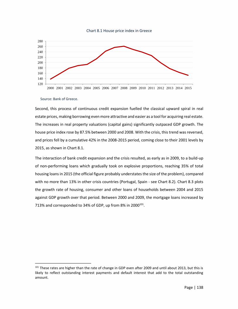
Page | 138
Chart 8.1 House price index in Greece
Source: Bank of Greece.
Second, this process of continuous credit expansion fuelled the classical upward spiral in real
estate prices, making borrowing even more attractive and easier as a tool for acquiring real estate.
The increases in real property valuations (capital gains) significantly outpaced GDP growth. The
house price index rose by 87.5% between 2000 and 2008. With the crisis, this trend was reversed,
and prices fell by a cumulative 42% in the 2008-2015 period, coming close to their 2001 levels by
2015, as shown in Chart 8.1.
The interaction of bank credit expansion and the crisis resulted, as early as in 2009, to a build-up
of non-performing loans which gradually took on explosive proportions, reaching 35% of total
housing loans in 2015 (the official figure probably understates the size of the problem), compared
with no more than 13% in other crisis countries (Portugal, Spain - see Chart 8.2). Chart 8.3 plots
the growth rate of housing, consumer and other loans of households between 2004 and 2015
against GDP growth over that period. Between 2000 and 2009, the mortgage loans increased by
713% and corresponded to 34% of GDP, up from 8% in 2000101.
101 These rates are higher than the rate of change in GDP even after 2009 and until about 2013, but this is likely to reflect outstanding interest payments and default interest that add to the total outstanding amount.
120
140
160
180
200
220
240
260
280
2000 2001 2002 2003 2004 2005 2006 2007 2008 2009 2010 2011 2012 2013 2014 2015

Page | 139
Chart 8.2 Non-performing loans as a percentage of total loans
Source: World Bank.
Chart 8.3 Changes (%) in housing, consumer and other credit to households (end-of-period) and changes in GDP at current prices
Sources: Bank of Greece and European Economy, Autumn 2015, Statistical Annex,
Chart 8.4 shows the substantial expansion of all types of credit that took place in the pre-crisis
years. Credit expansion was much stronger in housing loans compared with consumer, business
or other loans.
0,0
5,0
10,0
15,0
20,0
25,0
30,0
35,0
2000 2001 2002 2003 2004 2005 2006 2007 2008 2009 2010 2011 2012 2013 2014 2015
Euro Area Spain Greece Portugal
-40,0
-30,0
-20,0
-10,0
0,0
10,0
20,0
30,0
40,0
2004 2005 2006 2007 2008 2009 2010 2011 2012 2013 2014 2015
Housing credit to households Consumer credit to households
Other credit to households changes in GDP at current prices
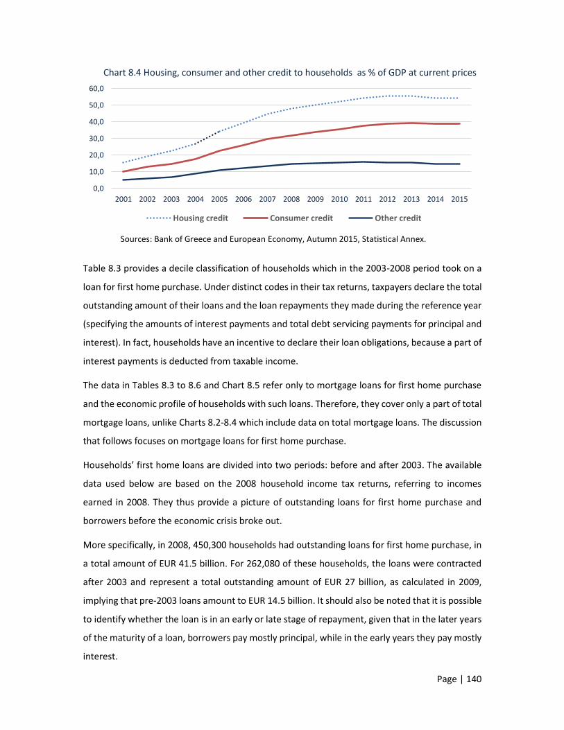
Page | 140
Chart 8.4 Housing, consumer and other credit to households as % of GDP at current prices
Sources: Bank of Greece and European Economy, Autumn 2015, Statistical Annex.
Table 8.3 provides a decile classification of households which in the 2003-2008 period took on a
loan for first home purchase. Under distinct codes in their tax returns, taxpayers declare the total
outstanding amount of their loans and the loan repayments they made during the reference year
(specifying the amounts of interest payments and total debt servicing payments for principal and
interest). In fact, households have an incentive to declare their loan obligations, because a part of
interest payments is deducted from taxable income.
The data in Tables 8.3 to 8.6 and Chart 8.5 refer only to mortgage loans for first home purchase
and the economic profile of households with such loans. Therefore, they cover only a part of total
mortgage loans, unlike Charts 8.2-8.4 which include data on total mortgage loans. The discussion
that follows focuses on mortgage loans for first home purchase.
Households’ first home loans are divided into two periods: before and after 2003. The available
data used below are based on the 2008 household income tax returns, referring to incomes
earned in 2008. They thus provide a picture of outstanding loans for first home purchase and
borrowers before the economic crisis broke out.
More specifically, in 2008, 450,300 households had outstanding loans for first home purchase, in
a total amount of EUR 41.5 billion. For 262,080 of these households, the loans were contracted
after 2003 and represent a total outstanding amount of EUR 27 billion, as calculated in 2009,
implying that pre-2003 loans amount to EUR 14.5 billion. It should also be noted that it is possible
to identify whether the loan is in an early or late stage of repayment, given that in the later years
of the maturity of a loan, borrowers pay mostly principal, while in the early years they pay mostly
interest.
0,0
10,0
20,0
30,0
40,0
50,0
60,0
2001 2002 2003 2004 2005 2006 2007 2008 2009 2010 2011 2012 2013 2014 2015
Housing credit Consumer credit Other credit

Page | 141
The decile classification of households in Tables 8.3 and 8.5 is based on the income level or the
outstanding amount of the loan, examining the same households in both cases.
Starting with post-2003 loans, households are classified into deciles based on their 2008 income.
As shown in Table 8.3, the average income of households that had borrowed to purchase a first
home was EUR 34,398 in 2008. The average amount of these loans was EUR 102,789 and the
average objective value of total property was EUR 99,436. These households paid, on average,
EUR 3,645 for interest and EUR 2,649 for principal in 2008102.
In the 1st decile, where the poorest households with a first home loan are classified, the average
income is about EUR 6,000, the value of property is EUR 67,000 and the outstanding amount of
loans is EUR 79,000. In all deciles from the 1st to the 8th, the amount of the loans is higher than
the objective value of the property. Only in the 9th and 10th deciles is the amount of the loans
less than the value of the property.
Table 8.3 Decile classification of households that obtained a first home loan in 2003-2008, based on 2008 income (in EUR)
Deciles Average income
2008
Average value of
property 2008
Average value of
property 2012
Average value of
loans 2003-08
Interest payments
2008
Principal payments
2008
Loans /Income
2008
Loans/ Property
2008
Principal and interest
payments /Income
2008
1st 6,071 67,217 70,633 79,121 2,625 1,822 13.03 1.18 0.73 2nd 13,173 69,033 73,729 81,271 2,755 1,489 6.17 1.18 0.32 3rd 17,651 71,709 75,212 87,793 3,070 2,169 4.97 1.22 0.30 4th 21,396 76,441 78,310 88,955 3,242 1,967 4.16 1.16 0.24 5th 25,225 77,024 80,656 93,137 3,354 1,419 3.69 1.21 0.19
6th 29,716 93,364 97,023 100,410 3,622 2,670 3.38 1.08 0.21 7th 35,034 96,715 100,933 106,760 3,788 2,536 3.05 1.10 0.18 8th 41,684 107,750 110,925 112,297 4,094 3,131 2.69 1.04 0.17 9th 51,956 135,184 141,572 119,585 4,230 2,984 2.30 0.88 0.14
10th 102,083 199,938 208,457 158,561 5,668 6,309 1.55 0.79 0.12 Total 34,398 99,436 103,744 102,789 3,645 2,649 2.99 1.03 0.18
Source: Calculations based on tax data.
This could be explained by the fact that the market value taken into account by the bank was well
above the objective value; consequently, the loan-to-value ratio appears to be far above par. In
addition, it is likely that borrowers were able to demonstrate income in excess of what they
disclosed in their tax returns, thereby making up for the adverse loan-to-value ratio. Of course,
102 The last official list with the objective values of real estate was published in 2008 and remained unchanged throughout the whole period till 2006, despite the increasing gap versus the market values. Even this revision in 2006 did not bridge the existing gap.

Page | 142
when both real estate market valuations and incomes collapsed with the crisis, banks faced a
problem of under collateralisation, leading to a rising stock of non-performing loans.
Looking at the data of Table 8.3, one can be puzzled at how, before the start of the crisis, a number
of these loans could possibly be serviced with the declared incomes of the respective borrowers.
Households with an average annual income of EUR 6,000 would have to pay EUR 4,447 annually,
accounting for 73% of their income. On the other hand, the average loan obtained per household
is hardly different from the value of its property. Most households at the time could and did
borrow from banks for a first home purchase up to an average amount of EUR 80,000-93,000 in
the case of lower 50% of the income distribution and of up to EUR 100,000-158,000 in the case of
the upper 50% (deciles 6-10). A huge difference between the amount of loans and income can be
seen in the lowest decile (13 times higher) and partly in the 2nd to 4th deciles (4 to 6.2 times
higher). These figures make it reasonable to assume that the actual incomes of these groups
exceeded their declared taxable incomes, enabling banks to extend disproportionately high
amounts of loans.
In Table 8.4 the decile classification of households is based on the amount of mortgage loans
instead of the income criterion used in Table 8.3. The households with the lowest amounts of
loans are classified in the 1st decile and those with the highest amounts are classified in the 10th
decile. While in individual deciles the figures differ from those shown in Tables 8.3 and 8.4, they
remain the same for the total of households, since, as mentioned, they refer to the same
households.
According to Table 8.4 and Table 8.3, some key findings can be derived:
In the case of households with high mortgage loans for home purchase (over EUR 80,000),
the loans were potentially (in the event of negative developments such as those that
emerged) under-collateralised. This applies to 50% of households. The size of under-
collateralisation is determined by the difference between the actual values of real
property before and during the crisis. It should be noted that in the upper income deciles
the loan-to-income and loan-to-value ratios were significantly higher, therefore riskier, in
cases of high amounts of loans (7th to 10th deciles) than in lower loans (Table 8.4).

Page | 143
Table 8.4 Decile classification of households based on the amount of first home loans obtained in 2003-2008 (in EUR)
Deciles Amount of loans
Average annual income Change 2012/2008
Value of property
Loans /Income
Loans/ Property
2003-08 2008 2012 % 2008 2008 2008
1st 27,494 31,812 20,557 -35.4 83,209 0.86 0.33
2nd 46,683 26,773 21,215 -20.8 84,317 1.74 0.55 3rd 59,378 23,942 18,685 -22.0 73,814 2.48 0.80 4th 69,935 29,064 22,646 -22.1 84,279 2.41 0.83 5th 81,943 29,708 23,228 -21.8 84,390 2.76 0.97 6th 96,184 32,882 26,212 -20.3 94,822 2.93 1.01 7th 109,814 33,429 25,993 -22.2 90,020 3.29 1.22 8th 128,059 36,179 27,609 -23.7 105,585 3.54 1.21 9th 156,242 40,586 30,985 -23.7 115,999 3.85 1.35
10th 251,710 60,101 41,975 -30.2 177,349 4.19 1.42 Total 102,789 34,398 25,907 -24.7 99,436 2.99 1.03
Source: Calculations based on tax data.
On average, all households that took out a loan for first home purchase saw their income
shrink by 24.7% between 2008 and 2012 (Table 8.4). In this context, debt servicing
became increasingly difficult. Many households stopped debt repayments to banks. The
decline in incomes continues in the next years, and the problem is growing.
Chart 8.5 First home loans and value of property of borrower households, per decile of loan amount (in EUR)
Source: Calculations based on tax data.
With loans in arrears, borrowers face the additional cost of default interest and also the
general increase in interest rates during the crisis. Banks on the other hand face higher
credit risks amid falling housing market valuations that deteriorate under-
0
50.000
100.000
150.000
200.000
250.000
300.000
1st 2nd 3rd 4th 5th 6th 7th 8th 9th 10th
First home loans 2003-08
Income 2008
Income 2012
Value of property of borrower households 2008

Page | 144
collateralisation. As shown in Chart 8.5, the loan-to-value gap is already high for
households with large amounts of loans. After 2008, this gap widens further.
Neither the level of income nor the amount of the objective value of the property appears
to be a crucial criterion for banks to determine the amount of the loan to be granted.
Rather, the primary criterion appears to have been the collateral value, with banks
assuming that the market value of the property was significantly higher than its current
objective value and this adequately secured their claim, without wondering if there was
an overvaluation or a “real property bubble” in the market. For as long as the country’s
fiscal problems were “swept under the carpet", credit to households for home purchase
continued to flow uninterrupted. The problems started with the onset of the crisis, when
real property values began to fall.
Table 8.5 includes all loans obtained by households for first home purchase, according to their tax
returns of 2013 (referring to 2012 incomes). The average area of this first home is about 89 square
meters. According to the data in the table, interest payments are now less than principal
payments, since this table includes outstanding amounts of older loans, as opposed to Table 8.4,
which shows recent loans for which interest payments were higher.
Table 8.5 Decile classification of households with a first home loan, based on 2012 income (in EUR)
Average annual income
Value of property
Amount of loans
Interest payments
Principal payments
Loans/ Income
Loans /Property
Principal and
interest payments /Income
Surface area of house
(square metres)
2012 2008 2012/08 %
2012 2012 2012 2012 2012 2012 2012 2012
1st 4,095 15,246 -73.1 74,724 78,462 1,492 3,741 19.16 1.05 1.28 78.6
2nd 11,315 18,256 -38.0 74,287 72,716 1,497 3,245 6.43 0.98 0.42 78.9 3rd 15,418 21,547 -28.4 84,800 75,465 1,667 3,697 4.89 0.89 0.35 80.9 4th 18,877 25,026 -24.6 86,670 78,424 1,765 4,180 4.15 0.90 0.31 82.0 5th 22,427 29,583 -24.2 93,294 78,657 1,830 4,039 3.51 0.84 0.26 84.4 6th 26,378 32,412 -18.6 99,037 84,342 1,883 4,715 3.20 0.85 0.25 87.1 7th 31,093 37,221 -16.5 105,086 142,762 2,049 5,055 4.59 1.36 0.23 88.6
8th 36,769 43,840 -16.1 122,438 91,939 2,111 5,592 2.50 0.75 0.21 93.4 9th 44,887 52,819 -15.0 158,864 90,597 2,041 6,086 2.02 0.57 0.18 97.5 10th 77,204 80,223 -3.8 216,532 127,974 2,537 9,620 1.66 0.59 0.16 115.0 Total 28,846 35,617 -19.0 111,572 92,134 1,887 4,997 3.19 0.83 0.24 88.6
Source: Calculations based on tax data.
The decile classification of households is based on 2012 incomes. We can observe that the
incomes of the poorest households (1st decile) are down by 73.1% in 2012. These households
have an average annual income of EUR 4,095, while the cost of servicing their loans is EUR 5,233;

Page | 145
the total outstanding amount of their loan is 19 times higher than their annual income and 105%
of the value of their property. In addition to households in the 1st decile, those in the 2nd decile
also face a significant debt servicing burden, which represents 31% to 42% of their reduced
income -to the extent that there is no undeclared income. For all households, the average debt
servicing cost as a ratio of income increased by 6 percentage points from 18% in 2008 to 24% in
2012.
8.4 Real estate, household debts and property
taxation
In the previous section (see Table 8.5), we showed that household mortgage loans accounted for
approximately 83% of the value of their total real property in 2012. For low-income households
(the lower 40% of the total), this percentage was between 89% and 105%. If this percentage was
seemingly high before the crisis, because the objective values were significantly lower than
market values, this relationship was reversed after the crisis. Loans represent a significantly higher
percentage of the objective value of the property, which has declined considerably in market
terms. In addition, for this group of poorer households, loan repayments in 2012 represent a very
high percentage of pre-tax income (128% for the lowest decile and 31%-42% for the 2nd to 4th
deciles), which in fact has fallen by 25%-73% since 2008. Overall, the indebtedness of these strata
is a factor that must be taken into account in interpreting the more general social and political
problems that have arisen in the country after the crisis. Exacerbating this unfavourable
relationship, real property tax (EETIDE, ENFIA) was introduced, applying to the gross value of
property. This tax is levied on total gross property, while the net value is, on average, only 17% of
the nominal value. It is reasonable to assume that due to the phenomenon of tax evasion, income
is underestimated. Assuming that the size of this underestimation remains stable throughout the
period, the burden revealed by the combination of the data provided above is significant, both
for households and the banking system. The landscape of household borrowing was drastically
changed by the crisis. A significant number of households faced not only lower salaries or
unemployment for one or more of their members, but also high real estate taxes and debts to
banks, which in the context of a frozen real estate market were extremely difficult or impossible
to service.

Page | 146
Against this background, one could reasonably argue that it would be fairer to tax the value of
real estate net of debt. Taxation of gross value has a very negative impact on middle and low
income deciles, in which the value of loans as a ratio of the value of real property (see Table 8.5)
is markedly higher than for high deciles.
However, this option also has a serious disadvantage: it involves unfavourable treatment of those
households which have prudently managed their income and wealth, did not borrow to acquire a
durable consumer asset such as a dwelling or, if they did, they did so by reducing consumption
and increasing their savings. Putting an asymmetric burden on them relative to indebted property
owners would be discriminatory, would reward excessive and wasteful consumption versus
savings and would encourage behaviours that are detrimental to the functioning of the economy
and society. Also, as mentioned, the taxation of real estate, excluding financial assets that are
predominantly held by high income deciles, risks deteriorating rather than reducing, wealth
inequality.
8.5 Concluding remarks
The distribution of real property in Greece, and the relationships that have been indentified,
throw into sharp relief the dilemmas and contradictions that have arisen in the implementation
of higher real property taxation in the years of the crisis (EETIDE, ENFIA). Those with the lower
incomes (e.g. the lower 50%) have a disproportionately higher share in property (31.9% of the
total), but their income status (18.3% of the total) is hindering a proper fulfillment of their
property tax obligations. In addition, these lower income strata saw their incomes fall dramatically
during the crisis, while their share in deposits (10.4%) also appears to be lower than their share in
total income (18.3%, see Table 8.2). For these strata, the exorbitant taxation of real property does
not only mean a substantial increase in their tax burden; it also means that they lack income or
sufficient savings to pay for this tax.
In upper income strata, the reverse pattern can be observed. Their share in total real property is
proportionately smaller than their share in total income. These strata are already significantly
burdened by real property tax, in relative and absolute terms. The transfer of a significant part of
the additional tax burden to the middle and high income strata, which have a comparatively
smaller share in real estate, would raise concerns on tax efficiency or even tax justice.

Page | 147
From another point of view, it has been found that ownership of real estate, in particular owner-
occupied real estate, is typical of middle income strata – in the case of Greece, of lower strata too
– while richer strata are characterised by property diversification, also investing in financial assets.
The heavy tax burden on real property and the zero burden on financial assets is a discrimination
that deteriorates the relative position of the middle strata, generating higher inequality in
society103.
More generally, irrespective of their decile classification, a significant but uncertain number of
households face excessive tax burdens on real property and fail to pay their taxes, accumulating
tax arrears and thereby jeopardising their assets and income in the future. However, a generalised
real property tax is essential in a modern and fair tax system. In Greece, all income groups were
accustomed to not having to pay any such tax. So, today, this tax seems too much to them and
there is a general negative reaction, which is to a great extent also due to the great exaggerations
or injustices in its implementation. A well-thought rationalisation of such a sensitive tool of
economic policy and social balance could eliminate many of the problems that we mentioned
above.
In conclusion, the picture emerging from the above shows a society in which real property has a
much smaller degree of inequality than in other European countries. Low and middle income
strata have an asset basket, which mitigates the asymmetry, relative to the top of the distribution,
that characterizes the corresponding strata in other countries. But this also shows the limits of
the effectiveness of real property taxation. Excessive taxation, which does not take into account
all the economic and social parameters, cannot but have adverse consequences for the social
structure of the country, with far-reaching implications. Is such an effect politically desirable? The
“right” answer is probably negative, with the qualification that we ignore the extent of tax
evasion.
More generally, the conclusion goes beyond strictly fiscal questions. Real property tax (and not
just local authority levies), in the countries where it is imposed, has a generalised, “fair” and
redistributive character. That said, the size of the burden cannot ignore the income situation and
the crisis conditions in the real estate market, which are prohibitive for the liquidation of assets.
On the other hand, the tax cannot be limited, as has been the case for many years, to some “large
103 Iara (2015), pp. 12-13.

Page | 148
real estate”, because this narrows the base of the tax. In the conduct of policy, striking a balance
between tax justice, the income and financial situation of taxpayers and the need to not disturb
fundamental relationships that crucially hold society together is a key condition for success.

Page | 149
CHAPTER 9
AGRICULTURAL INCOME TAXATION
AND INEQUALITY
In our analysis of income developments, we divided households into employee households,
pensioner households, self-employed households, etc. and similarly categorised individuals as
employees, pensioners, self-employed, rentiers, unemployed, etc., according to their main
source of income. Agricultural income is another such source, and its evolution, in aggregate
terms and based on tax data, was discussed in Chapter 4. However, a more nuanced approach
is warranted, trying to identify sectoral/occupational characteristics which, as we will explain,
are of particular importance as far as agricultural income is concerned.
This chapter focuses on farmers, who make up an occupational group with peculiar
characteristics, unclearly self-reported occupational identity and privileged relationships with
the political system. This focus is not easy to achieve: as we will see below, the notion of
farmer is not clearly defined. Things are further complicated when, after the "farmer", we go
on to examine the income derived from this sector, i.e. agricultural income. The difficulty
arises from the fact that agricultural income is not earned by farmers solely, but by wider
social groups. When, for example, we examined wages or pensions, incomes uniquely
corresponded with employees or pensioners, respectively. In the case of agricultural income,
the income earner, i.e. the producer of agricultural products (or the owner or right-holder of
agricultural land), does not always coincide with what is commonly understood and referred
to as "farmer".
An additional feature of agricultural income, which complicates the problem even further, is
its composition. Agricultural income comprises two main components: (i) income from the
sale of agricultural products; and (ii) subsidies received from the state, acting as an
intermediary between the recipients and the EU funds. Each of these components has been
subject to a different tax treatment in the past and will most likely continue to be so in the
future. Income from the sale of agricultural products is imputed or determined on the basis
Page | 150
of receipts and expenses books kept by farmers (accounting determination). Subsidies, on the
other hand, have been and will in the future remain tax-exempt for a large proportion of
recipients, while for some other recipients they are expected to be taxed beyond a certain
threshold.
The following analysis starts with the problems surrounding the taxation of agricultural
incomes, including the identity of farmer. The ambiguity of the definition of farmer enables
other groups, some of which are not directly related to agriculture, to benefit from favourable
tax treatment. The analysis then turns to the distribution of agricultural land. This distribution
largely determines the income accruing to land right holders. The high inequality of the
distribution of agricultural land is expected to be consistent with high inequality of agricultural
income distribution. But how can we measure agricultural income? The study compares the
calculation of income, based on the standard production value, with the respective income
declared for tax purposes during the period under review. Using these two separate statistical
sources, we estimate the evolution of agricultural incomes over time, either by size of
agricultural holding (farm) or by source of income. Apart from these two statistical data
sources, we examine the macroeconomic aggregates of the sector based on national accounts
data. Finally, using raw data, we specifically discuss the distribution of subsidies, which reflects
the (very unequal) distribution of land. The investigation could not have been complete
without comparing with the level and sources of any additional, non-agricultural income
received by households.
9.1 Problems in estimating agricultural income
and the definition of farmer
In an effort to tax agricultural income, an imputation system was introduced in recent years,
using specific coefficients that vary across regions, products and type of farming. This method
of calculation entailed a significant underestimation of agricultural income, hence
undertaxation of producers (whether professional farmers or not).
As we will see below, this system of determining agricultural income favours farmers who
have high and very high agricultural incomes. Moreover, it also favours taxpayers whose main
incomes arise from other sources, supplemented by agricultural income.
A second problem is the definition of professional farmer. To this day, the criteria for defining
professional farmer have been an issue of political controversy. Why distinguish someone who

Page | 151
is predominantly a farmer (“professional farmer”) from other workers who also maintain
cultivated land and produce agricultural products but are not primarily farmers? Professional
farmers used to enjoy favourable tax treatment. They used to claim the exclusive allocation
of Common Agricultural Policy (CAP) direct support, although they were a minority of the total
of recipients of subsidies, which also includes self-employed persons and pensioners who are
engaged in farming as a secondary activity. Limiting the scope of subsidies to professional
farmers only would significantly increase the subsidy allocations to individual recipients.
However, such a policy option is not available under the EU rules governing the guarantee
function of the CAP (Pillar I – direct payments to farmers), which allocates most of the total
available resources. Regarding rural development policy (Pillar II), Member States have wider
discretion and may exclude persons whose farming is not their primary occupation.
Turning back to the criteria, under the latest legislative amendment of 2014, a professional
farmer is one who qualifies for registration in the Register of Farmers and Farm Business, i.e.
owns an agricultural holding; is professionally engaged in agricultural activity; devotes at least
30% of his/her total annual working time and derives at least 35% of his/her total annual
income; and is insured with the Farmers’ Insurance Organisation (OGA). A professional farmer
may thus have significant income from other sources. Conversely, a large number of workers
or pensioners from other sectors of the economy may supplement their total income with
income from crop and livestock production without qualifying as farmers.
According to this definition, the category of professional farmers includes a sizeable group of
citizens who, while not meeting the minimum conditions, benefit from a favourable
agricultural income tax regime. The actual number of these citizens who, without being
farmers, have income that enjoys privileged tax treatment, is unknown. This category includes
many people who have leased agricultural land to farmers or even have some undeclared
employment. Some of them may no longer live in rural areas and have moved to urban
centres, retaining however the status of farmer and the accompanying tax privileges if at some
time in their lives they qualified as such104.
9.2 The distribution of agricultural holdings
Agricultural income is related to the distribution of agricultural holdings (farms), while the
unequal distribution of cultivated land across producers also leads to an unequal distribution
104 Damianos (2015).

Page | 152
of the part of total income that is derived from agricultural activity. Of course, in many cases,
a given area of farm land may have different yields and productivity according to the type of
farming and location. For example, one acre of a greenhouse cultivation of vegetables in
southern Crete yields a multiple value in products than one acre of grain farm in the Thessalian
Plain; similarly, a one-acre pasture has lower yields than a one-acre olive tree farm.
Figure 9.1 illustrates the Lorenz curves showing inequality of the ownership of farm land
(including pastures) and the inequality of gross imputed agricultural income. Statistical
information is derived from the processing of primary country-wide data, suggesting that the
total number of agricultural holdings in Greece exceeded 800,000 in 2011 (OPEKEPE105
database).
The farther away the curve is from the diagonal, the higher the level of inequality Conversely,
if the curve coincides with the diagonal, we would recognize this as perfect equality of
distribution (either in the possession of land or in the value of the products that is distributed
to producers). The horizontal axis of the chart shows the cumulative shares in the country’s
active farm land, as classified by size from the smallest to the largest. Each farmer/producer
is deemed to have one holding. The vertical axis shows the cumulative shares in terms of the
number of holdings. For example, 40% of holdings (i.e. 40% of farmers/producers) own about
5% of the total area cultivated in the country. In the absence of farm land size inequality, 40%
of the farmers/producers would have owned 40% of the country’s total farm land.
According to the chart, 90% of farmers hold 40% of active farms, while the remaining 10%
own 60%. This inequality is expected to be slightly less if we exclude pastures, which are
typically larger than crop farms.
The high inequality of the distribution of agricultural holdings leads to high inequality of the
income derived from their exploitation. As this income is determined indirectly, using certain
indicators, we call it calculated "gross imputed income". As seen from the chart, the inequality
of such calculated imputed income is lower than that of farm land. This is due to the different
yields, as mentioned above. Still, it remains significant, since 90% of farmers receive only half
of the total imputed income, with 10% of farmers receiving the other half. For comparison
purposes, it is noted that 90% of taxpayers receive 79% of total income, based on country-
wide tax data.
105 Payment and Control Agency for Guidance and Guarantee Community Aid.

Page | 153
Chart 9.1 Inequality curves of agricultural land ownership and gross calculated agricultural
income
Source: Calculations based on primary data from the Integrated Administration and Control System
(IACS), OPEKEPE (Payment and Control Agency for Guidance and Guarantee Community Aid).
Given the high inequality in the distribution of agricultural land and income, we cannot
consider that there is such thing as “representative" farmer. Neither the "statistical mean"
nor the "median farmer" can be taken as representative of all farmers in the country. On the
basis of the above chart, there is a large number of "farmers" who possess a small piece of
land and, at the same time, a small number of farmers (10% of all farmers) who hold large
agricultural land and receive high income. This high inequality will emerge again, in other
versions, in the next sections.
9.3 The distribution of household income by size
of agricultural holding
The high inequality of the distribution of the gross imputed family agricultural income gives
us a hint about the distribution inequality of net family agricultural income, i.e. income net of
operating costs (other than the earnings of family members working in the farm) and
0
10
20
30
40
50
60
70
80
90
100
0 20 40 60 80 100
Cu
mu
lati
ve s
har
e o
f fa
rm la
nd
an
d g
ross
agr
icu
ltu
ral i
nco
me
Cumulative share of farm land

Page | 154
depreciation of fixed assets. To estimate this net family income, we use data from the Eurostat
Farm Accountancy Data Network (EU-FADN). Statistical information is collected through a
survey in a representative sample of all agricultural holdings conducted every year in all
Member States.
According to Table 9.1, the average net family agricultural income was EUR 11,518 in 2012.
More than half (52%) of this is accounted for by EU subsidies, highlighting the importance of
the support provided to family agricultural income through subsidies.
Farmers are the occupational group that has benefited the most from EU participation. In
addition, Greek farmers are among the most favoured in the EU in terms of the size of support
they receive.
Classifying farms by economic size based on the standard production value of each farm, we
can observe that 83.1% of farms have a standard production value of between EUR 2,000-
25,000106. For these farms, the average net family income in 2012 is EUR 8,907 annually, 53.6%
of which corresponds to subsidies. The remaining 16.9%, with a standard production value of
over EUR 25,000, have an average net household income of EUR 24,301, 49.3% of which is
accounted for by subsidies.
Table 9.1 Net family agricultural income and subsidies by economic size of farm in 2012 (in EUR)
Farm size bands (standard production value, in EUR)
Population of farms
Structure %
Family agricultural
income
Subsidies Subsidies as % of agricultural income
2,000 - 8,000 125,780 38.5 6,015 3,233 53.7
8,000 - 25,000 145,780 44.6 11,403 6,105 53.5
2,000 - 25,000 271,560 83.1 8,907 4,775 53.6
25,000 - 50,000 38,700 11.8 21,231 10,692 50.4
50,000 - 100,000 13,550 4.1 27,587 13,471 48.8
100,000 - 500,000 2,950 0.9 49,488 22,061 44.6
500,000+ 70 - ΜΔ ΜΔ -
25,000 - 500,000 55,270 16.9 24,301 11,982 49.3
Total 326,820 100.0 11,518 5,991 52.0
n.a.: not available.
Source: European Commission, Farm Accountancy Data Network (FADN - RICA).
106 The sample excludes holdings with a standard production value of below EUR 2,000. This implies that, also including small holdings, the average family income should be less than EUR 11,518.
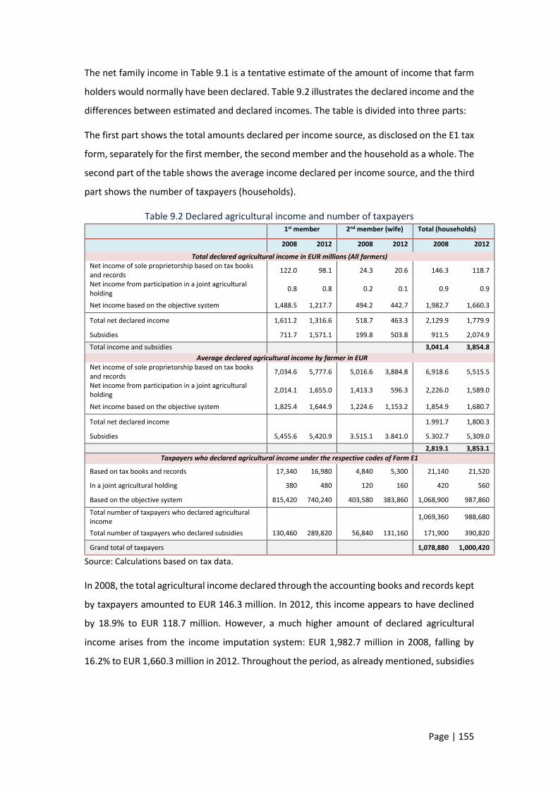
Page | 155
The net family income in Table 9.1 is a tentative estimate of the amount of income that farm
holders would normally have been declared. Table 9.2 illustrates the declared income and the
differences between estimated and declared incomes. The table is divided into three parts:
The first part shows the total amounts declared per income source, as disclosed on the E1 tax
form, separately for the first member, the second member and the household as a whole. The
second part of the table shows the average income declared per income source, and the third
part shows the number of taxpayers (households).
Table 9.2 Declared agricultural income and number of taxpayers
1st member 2nd member (wife) Total (households)
2008 2012 2008 2012 2008 2012
Total declared agricultural income in EUR millions (All farmers) Net income of sole proprietorship based on tax books and records
122.0 98.1 24.3 20.6 146.3 118.7
Net income from participation in a joint agricultural holding
0.8 0.8 0.2 0.1 0.9 0.9
Net income based on the objective system 1,488.5 1,217.7 494.2 442.7 1,982.7 1,660.3
Total net declared income 1,611.2 1,316.6 518.7 463.3 2,129.9 1,779.9
Subsidies 711.7 1,571.1 199.8 503.8 911.5 2,074.9
Total income and subsidies 3,041.4 3,854.8
Average declared agricultural income by farmer in EUR Net income of sole proprietorship based on tax books and records
7,034.6 5,777.6 5,016.6 3,884.8 6,918.6 5,515.5
Net income from participation in a joint agricultural holding
2,014.1 1,655.0 1,413.3 596.3 2,226.0 1,589.0
Net income based on the objective system 1,825.4 1,644.9 1,224.6 1,153.2 1,854.9 1,680.7
Total net declared income 1.991.7 1,800.3
Subsidies 5,455.6 5,420.9 3.515.1 3.841.0 5.302.7 5,309.0
2,819.1 3,853.1
Taxpayers who declared agricultural income under the respective codes of Form Ε1
Based on tax books and records 17,340 16,980 4,840 5,300 21,140 21,520
In a joint agricultural holding 380 480 120 160 420 560
Based on the objective system 815,420 740,240 403,580 383,860 1,068,900 987,860
Total number of taxpayers who declared agricultural income
1,069,360 988,680
Total number of taxpayers who declared subsidies 130,460 289,820 56,840 131,160 171,900 390,820
Grand total of taxpayers 1,078,880 1,000,420
Source: Calculations based on tax data.
In 2008, the total agricultural income declared through the accounting books and records kept
by taxpayers amounted to EUR 146.3 million. In 2012, this income appears to have declined
by 18.9% to EUR 118.7 million. However, a much higher amount of declared agricultural
income arises from the income imputation system: EUR 1,982.7 million in 2008, falling by
16.2% to EUR 1,660.3 million in 2012. Throughout the period, as already mentioned, subsidies

Page | 156
are not taxed107 and are not subject to the solidarity tax. The recipients of subsidies and
compensation have no other incentive to declare such amounts on their income tax returns
(Form E1) except as additional information to justify the origin of funds for an actual or
potential purchase of property assets.
Including subsidies, the declared net agricultural income amounted to EUR 3 billion in 2008,
rising 26.7% to EUR 3.9 billion in 2012 (upper part of the table). This increase is solely
attributable to the subsidies declared by recipients after 2008. However, it should be pointed
out that it does not reflect an actual increase in the subsidies received, but rather in the
subsidies declared. Taxpayers keeping accounting books and records were 21,140 in 2008 and
21,520 in 2015, declaring an average amount of subsidies of EUR 6,919 in 2008 and EUR 5,516
in 2012 (middle part of the table). Farmers who declare their income through accounting
books and records and who would, in theory, be expected to be the largest farm holders
represent 2.2% of all taxpayers who declared agricultural incomes in 2012.
Most taxpayers with agricultural incomes opt for the imputed income system. This was the
case with 1,068.9 thousand households in 2008, falling to 987.9 thousand in 2012. These
households declared an average income of less than EUR 2,000 in 2008 and 2012 (EUR 1,855
in 2008 and EUR 1,681 in 2012, see the middle part of the table). What changes over time,
and influences (as reflected in the tax data) average total agricultural income, is the more than
double number of taxpayers declaring the subsidies received (171,900 taxpayers in 2008,
390,800 in 2012). Juxtaposing the two tables, it appears that the agricultural income declared
for tax purposes is a fraction of the actual income.108 The income declared by the
overwhelming majority of farmers is lower than that of very small farms.
Failure to capture actual incomes favours large farms. If e.g. for a small farm the gain from
income concealment ranges from a few euro to EUR 5,000 annually, for a large farm it can be
close to or even higher than EUR 30,000. In the former case, the undeclared income is below
the tax-exempt threshold, so the small farm would not pay tax anyway. In the case of a large
107 Under a law adopted in 2015, all subsidies and aid are excluded from net income if they do not exceed EUR 12,000, and any part in excess of that threshold is added to the income of subsidy recipients. 108 Under an agreement in 2013, the Troika imposed on Greece an agricultural tax reform, envisaged to be implemented as from financial year 2014, which did not happen, not even in 2015, as Greece refused to implement the reform. It was agreed that the net income from agricultural activity, including support and subsidies, was not different from that arising from any other business activity on the basis of an accounting determination of receipts and expenses. In practice, a tax rate of 13% was introduced on incomes earned in 2015, based on receipts/expenses accounting, but even today taxable agricultural income is underreported for various reasons. Damianos (2015).

Page | 157
farm, on the other hand, the concealment of income results in a high loss of tax revenue (tax
evasion).
9.4 Distribution of agriculture income during the
crisis years
How have net family agricultural incomes evolve during the crisis? Table 9.3 shows
developments between 2008 and 2012, when the income per farm fell, on average, by 15.3%,
with the highest losses being recorded in medium-sized farms (EUR 8,000-100,000).
Table 9.3 Evolution of family agricultural income by farm size
% change
Farm size bands (standard production value, in EUR)
2009/ 2008
2010/ 2009
2011/ 2010
2012/ 2011
2012/ 2008
2,000 - 8,000 -12.6 9.8 -8.1 3.5 -8.7
8,000 - 25,000 -14.5 9.0 -9.8 -7.3 -22.1
25,000 - 50,000 0.7 3.5 -10.7 -9.0 -15.3
50,000 - 100,000 4.8 -1.8 -20.9 -14.6 -30.4
100,000 - 500,000 32.1 -8.7 -41.0 23.3 -12.2
500,000+ - - - - -
Total -3.7 5.7 -11.7 -5.8 -15.3
Source: European Commission, Farm Accountancy Data Network (FADN - RICA).
Based on the accounting determination of income, small farms face the lowest losses (-8.7%).
2011 seems to have been the worst year for agricultural income, which fell by 11.7% on
average and by 41% for very large farms. These losses are partly due to the reduction of
agricultural subsidies (Chart 9.2).
Chart 9.2 shows the two components of family agricultural income and their contributions
over time. According to the chart, in the first three years of the crisis (2008-2010) the losses
are small, but they become larger from 2011 onwards.
More importantly, after 2008, subsidies account for the bulk of agricultural income,
outweighing receipts from the sale of products. The opposite was the case before the
economic crisis. This change in the pattern can to a large extent be attributed to the impact
of the economic crisis (e.g. higher taxes on production, liquidity constraints that have led
producers to cut down production, weaker competitiveness, etc.).

Page | 158
Thus, despite their reduction, subsidies are a major component of agricultural income. In
2004, the ratio of agricultural sales income to subsidies was 1.5; in 2013, it is 0.8, with
subsidies being now much higher than the income from sales.
Chart 9.2 Evolution of family agricultural income (2004-2013) in EUR
Source: European Commission, Farm Accountancy Data Network (FADN - RICA).
In coming years, the reduction of agricultural income support, coupled with declining
agricultural incomes, is likely to lead to controversy over who should be entitled to subsidies.
9.5 Agricultural accounts and broader
macroeconomic aggregates
Based on the aggregates of the agricultural sector, as compiled by the Hellenic Statistical
Authority (ELSTAT) through the Economic Accounts for Agriculture (EAA), the Gross Value of
Production at basic (current) prices has changed only slightly overall during the crisis period,
with small fluctuations across years. Consequently, it is important to identify the changes in
the various components of the economic accounts, in order to calculate the net
entrepreneurial income.
According to Table 9.4:
The net value added at basic prices is down by 5.2% in 2012 relative to 2008 and by
only 3.4% for the entire period (2008-2014).
Taxes on production have more than doubled (from EUR 206,000,000 in 2008 to EUR
485,000,000 in 2014).
7.355
8.761
7.313
8.211
6.4836.080
6.751
5.6155.527
4.6404.854
5.315
6.752 6.515
7.118 7.0187.100
6.6135.991
5.847
4.000
4.500
5.000
5.500
6.000
6.500
7.000
7.500
8.000
8.500
9.000
2004 2005 2006 2007 2008 2009 2010 2011 2012 2013
Family agricultural income without subsidies Subsidies

Page | 159
Compensation of employees, a large part of which concerns wages of immigrant
workers, has fallen considerably from EUR 905,000,000 in 2008 to EUR 597,000,000
in 2014, reflecting lower labour costs. An ad hoc survey on the labour market position
of immigrants and their children, conducted by ELSTAT in 2014 among people aged
15-64, suggests that 34,638 workers with a migrant background are employed in crop
farming, livestock and fishing activities. These immigrant primary-sector workers
account for 9.6% of all immigrant workers in the country.
The total amount of subsidies has gradually decreased, from EUR 2.9 billion in 2008
to EUR 2.5 billion in 2014 (row 6).
Interest expenses have decreased. Probably, some agricultural households have
stopped repaying the loans they obtained in the past, while their debts continue to
exist.
Table 9.4. Economic accounts for agriculture, at current prices (in EUR millions)
2008 2009 2010 2011 2012 2013 2014
(1) Output of the agricultural industry at basic prices
10,745 10,388 10,567 10,431 10,587 10,515 10,583
(2) Intermediate consumption 5,277 4,744 4,951 5,315 5,305 5,442 5,410
(3) Gross value added at basic prices: (1)-(2) 5,468 5,644 5,617 5,116 5,282 5,073 5,173
(4) Consumption of fixed capital 1,459 1,529 1,522 1,477 1,483 1,390 1,302
(5) Net value added at basic prices: (3)-(4) 4,009 4,115 4,095 3,639 3,799 3,684 3,871
(6) Other subsidies on production 2,906 2,859 2,793 2,697 2,644 2,495 2,506
(7) Taxes on production 206 141 140 288 292 490 485
(8) Income of factors of production: (5)+(6)-(7) 6,709 6,833 6,748 6,047 6,151 5,689 5,891
(9) Compensation of employees 905 803 764 721 664 627 597
(10) Net operating surplus (8)-(9) 5,804 6,030 5,984 5,327 5,487 5,062 5,295
(11) Rent payments 523 500 496 492 497 489 485
(12) Interest payments 175 179 162 160 130 141 138
(13) Net entrepreneurial income: (10)-(11)-(12) 5,107 5,350 5,326 4,675 4,861 4,432 4,671
Annual nominal changes 08/07 09/08 10/09 11/10 12/11 13/12 14/13 Output of the agricultural industry at basic prices
-1.69 -3.32 1.72 -1.29 1.49 -0.68 0.64
Gross value added at basic prices -9.89 3.23 -0.49 -8.92 3.25 -3.96 1.97
Net value added at basic prices -15.26 2.65 -0.50 -11.13 4.40 -3.04 5.09
Income of factors of production -9.30 1.84 -1.25 -10.38 1.71 -7.50 3.55
Compensation of employees -11.79 -11.28 -4.89 -5.60 -7.94 -5.45 -4.89
Net operating surplus -8.90 3.88 -0.76 -10.98 3.02 -7.75 4.60
Net entrepreneurial income -9.77 4.76 -0.46 -12.21 3.96 -8.82 5.41
Source: ELSTAT, Economic Accounts for Agriculture.
The above changes suggest a fall of 4.8% in net entrepreneurial income (from EUR 5.1 billion
in 2008 to EUR 4.9 billion in 2012). This fall is smaller at farm level, given that the number of
farms has declined – and so has headcount employment in the primary sector, as we will see

Page | 160
below – reflecting the fact that some farms are abandoned and others are consolidated into
larger holdings.
In both versions of the evolution of agricultural income (either at farm level or at
macroeconomic level based on national accounts), the losses during the period under review
are less than 15%. That said, we point out that the decrease in the net entrepreneurial income
in Table 9.4 is roughly equal to the decrease in subsidies.
According to Labour Force Survey data, persons employed in the primary sector were 513.8
thousand in 2008; four years later, they are 33.3 thousand less. The largest decrease is
recorded for family business assistants, while on the other hand there is a rise in employee
jobs, most of which, as already mentioned, are taken by immigrants109.
This pattern is likely to be explained by the fact that, in view of declining household incomes,
household members look for jobs outside the farm and are replaced by low-pay immigrants
(Table 9.5).
Table 9.5 Number of workers in crop farming, livestock production and fishing, broken down
by employment status (in thousands)
2008 2009 2010 2011 2012 2013 2014 2015 2012-2018
Self-employed with staff 40.3 45.9 46.6 41.7 32.8 22.4 23.8 29.9 -18.7
Self-employed without staff 320.0 333.3 343.4 318.5 316.4 334.1 329.3 315.4 -1.1
Employees 38.5 48.2 52.7 47.7 45.9 44.5 45.2 46.1 19.2 Contributing family members 115.1 105.5 101.6 92.7 85.4 80.1 81.6 74.4 -25.8
Total 513.8 532.9 544.2 500.7 480.5 481.0 479.9 465.7 -6.5 Percentage share in total economy 11.1 11.7 12.4 12.3 13.0 13.7 13.6 12.9 16.7
Source: ELSTAT, Labour Force Survey.
As a result of the crisis, the job losses in other sectors of the economy are proportionally
higher than in the primary sector, leading to an increased share of agriculture over time. The
comparatively limited size of these job losses, which are mainly due to inherent
characteristics110 of the primary sector rather than to the impact of the crisis, has signalled
and raised hopes that the agricultural sector could become one of the most dynamic in the
economy, with the agri-food industry acting as the engine driving the Greek economy to a
growth path. Indeed, to some extent, the prospects of Greek agriculture are more favourable
than those of other sectors. The primary sector, for example, is set to receive increased flows
109 Kasimis and Zografakis (2014). 110 As is the case in all EU Member States, the primary sector is characterised by an ageing population and an unfavourable exit-to-entry ratio, resulting in a gradual decline in total employment in the sector (Damianos and Vlachos, 2014).

Page | 161
from the EU's Structural and Investment Funds. These funds will make a significant
contribution to economic recovery and job creation, especially in the current context of
squeezed liquidity111.
Chart 9.3 Inequality curve of subsidies
Source: Own calculations based on primary data from the Integrated Administration and Control
System (IACS), OPEKEPE (Payment and Control Agency for Guidance and Guarantee Community
Aid).
9.6 The distribution of subsidies across recipients:
a story with many interpretations
The next question we will try to answer is how subsidies are distributed across recipients. The
amount of subsidy entitlement depends on the size of the farm and the type of farming.
According to Chart 9.3, 50% of all direct support is absorbed by the largest 10% of farms. This
picture of unequal distribution remains unchanged throughout the period under review. The
vast majority of farmers received support of less than EUR 5,000 annually each, with half of
111 Kasimis et al. (2015).
0
10
20
30
40
50
60
70
80
90
100
0 10 20 30 40 50 60 70 80 90 100
Cum
ula
tive
shar
e o
f su
bsi
die
s
Cumulative share of farms

Page | 162
them receiving up to EUR 1,000. On the other hand, fewer than 8,000 farmers received more
than EUR 20,000.
Chart 9.4 Distribution of subsidies to recipient deciles based on the level of subsidy (2011)
Source: Calculations based on primary data from the Integrated Administration and Control System
(IACS), OPEKEPE (Payment and Control Agency for Guidance and Guarantee Community Aid).
In the left chart we have placed 90% of the beneficiaries of subsidies. The scale has a maximum
range of EUR 8,000, with the 9th-decade beneficiaries receiving an average of EUR 5,584 (with
a minimum price of EUR 4,000 and a maximum of EUR 7,366). In the right chart we have placed
the 9th decade beneficiaries as well as the 10th decade beneficiaries for comparability
purposes to highlight the extent of the overall disparity. The scales in the two charts vary
considerably and this is perceived by looking at the 9th decade beneficiaries depicted on both
charts.
As shown in Chart 9.4, each decile comprises 80,342 recipients. 80% of them received
subsidies ranging from EUR 30 to EUR 4,190 (on average); of these, 40% received up to EUR
750. Farmers classified in the 9th decile received subsidies ranging from EUR 4,190 to EUR
7,366, making an average of EUR 5,584. The differences between the recipients of the 10th
decile and the other recipients are large. The subsidies to the recipients in the 10th decile
range from EUR 7,366 to EUR 227,244 and average EUR 14,271, which is nearly three times
the respective average for the 9th decile.
0242
407617
916
1.347
2.042
3.270
5.584
30324
500749
1.104
1.636
2.534
4.190
7.366
0
1.000
2.000
3.000
4.000
5.000
6.000
7.000
8.000
1st 2nd 3rd 4th 5th 6th 7th 8th 9th
Leve
l of
sub
sid
y
Deciles of beneficiaries
5.584
14.2717.366
227.244
0
50.000
100.000
150.000
200.000
250.000
9th 10th
Leve
l of
sub
sid
y
Deciles of beneficiaries

Page | 163
Table 9.6 Decile distribution of agricultural subsidies (2011)
Deciles Number of
recipients
Average subsidy
(in EUR)
Minimum amount of
subsidy (in EUR)
Maximum amount of
subsidy (in EUR)
Median Total amounts of
subsidies (in EUR millions)
Structure %
1st 80,332 0 0 30 0 0.01 0.0 2nd 80,375 242 30 324 251 19.5 0.8 3rd 80,321 407 324 500 405 32.7 1.4 4th 80,345 617 500 749 613 49.6 2.2 5th 80,345 916 749 1,104 911 73.6 3.2 6th 80,341 1,347 1,104 1,636 1,333 108.2 4.7 7th 80,344 2,042 1,636 2,534 2,022 164.0 7.1 8th 80,344 3,270 2,534 4,190 3,226 262.7 11.4 9th 80,342 5,584 4,190 7,366 5,486 448.6 19.5 10th 80,343 14,271 7,366 227,244 11,026 1.146.6 49.7
Total 803,432 2,870 0 227,244 1,104 2.305.5 100.0 Top 1% 8,034 36,427 24,348 227,244 32,086 292.7 12.7 Top 0.1% 803 68,211 52,915 227,244 62,467 54.8 2.4
Source: Calculations based on primary data from the Integrated Administration and Control System (IACS), OPEKEPE
(Payment and Control Agency for Guidance and Guarantee Community Aid).
Table 9.6 provides a detailed picture of the decile distribution of subsidies.
According to the table, the top 1% of recipients (the richest centile, 8,034 recipients)
receive, on average, EUR 36.427 and, overall, account for 12.7% of total subsidies.
Looking at the 0.1% of recipients (the richest thousandth), we observe that for 803
recipients the average subsidy is EUR 68,211.
The subsidies received by 250,000 recipients are equal to those received by the 803
largest recipients. Until 2014, the subsidies were fully tax-exempt. During the crisis,
the EU paid every year to Greece, in the form of income support, amounts totaling
EUR 2.5-2.9 billion.
While a large part of agricultural households face a survival problem, either
temporarily or permanently, due to their low incomes, the bulk of public support –
whether national, in the form of tax reliefs or fuel subsidies, or from the EU such as
direct support – is not channeled towards smaller farms, but towards the larger ones.
The CAP is implemented in a way that favours high-income farmers, since it is based
on the “historical model” that mainly supports larger farms located in the
“productive” regions of the country112.
112 Damianos (2015).

Page | 164
Before concluding the analysis of the distribution of subsidies across recipients, we should
note that subsidies are also unequally distributed across types of farming. Table 9.7 shows the
shares of each type of farming in the high subsidies of the 9th and 10th deciles.
We observe that, while ‘other arable crops’ account for 8.1% of the country’s total farms, they
receive 12.1% of the 9th-decile subsidies and 17% of the 10th-decile subsidies. Cotton and
mixed ruminant farms are also among the most favoured. By contrast, olive-growing farms,
representing 44.1% of all farms, have a share of only 7.2% in the 10th decile of subsidies.
Table 9.7 Breakdown of high subsidies by type of farming
Share in 9th decile
Share in 10th decile
% share in total subsidies
Other arable crops 12.1 17.0 8.1 Cotton 7.6 16.8 3.8
Mixed grazing livestock 9.4 10.6 3.4
Cereals 11.7 9.7 10.1 Olive trees 18.2 7.2 44.1 Mixed cropping 6.6 6.6 4.2
Cattle 2.1 6.2 1.3 Sheep 6.1 5.5 2.4 Other permanent crops 8.7 5.4 9.6 Mixed livestock 4.2 3.9 1.8 Mixed crops-livestock 2.5 3.5 1.4 Goats 4.1 3.5 1.4 Other vineyards 2.3 2.0 1.3 Tobacco 1.6 0.6 1.0 Citrus fruit 1.1 0.6 1.9 Vegetables & Flowers 0.6 0.3 1.1
Wine 0.5 0.2 1.2
Unclassified 0.4 0.2 1.8
Granivores (Pigs - Poultry) 0.0 0.0 0.1 100.0 100.0 100.0
Source: Calculations based on primary data from the Integrated Administration and Control System
(IACS), OPEKEPE (Payment and Control Agency for Guidance and Guarantee Community Aid).
Finally, significant differences are also seen in terms of the regional distribution of subsidies.
For example, while the farms in the Thessaly region account for 9.5% of the country's farms,
their shares in the 9th and 10th deciles of subsidies are markedly higher (12.7% and 20.8%,
respectively). For more than one-fifth of the subsidies paid to the richest (10th) decile, the
recipients are located in Thessaly. Also favoured, although to a lesser extent, are the regions
of Central and Eastern Macedonia. At the other end of the spectrum, the recipients whose
farms are located in the Peloponnese are the least favoured (Table 9.8).

Page | 165
Table 9.8 Regional breakdown of high subsidies
Administrative region Share in 9th decile
Share in 10th decile
% share in total subsidies
Eastern Macedonia and Thrace 10.5 11.7 7.7
Central Macedonia 19.0 22.2 14.8
Western Macedonia 3.7 4.1 3.0
Thessaly 12.7 20.8 9.5
Epirus 3.0 2.1 3.3
Ionian Islands 1.9 0.9 3.1
Western Greece 11.5 9.1 11.6 Central Greece 7.8 9.2 8.1
Attica 0.4 0.3 1.1
Peloponnese 11.2 6.3 14.2
North Aegean 2.3 1.8 4.4
South Aegean 1.2 0.7 2.7
Crete 14.8 10.9 16.5 100.0 100.0 100.0
Source: Own calculations based on primary data from the Integrated Administration and
Control System (IACS), OPEKEPE (Payment and Control Agency for Guidance and Guarantee
Community Aid).
9.7 Agriculture income vs. other incomes
Based on the processing of tax data, it appears that a large proportion of all farms in Greece
declare very low incomes from agricultural activity. In fact however, the average total income
of these households, adding non-farm income and agricultural subsidies, is often substantially
higher than their farm income. In Table 9.9, the households that declare agricultural income
are classified according to the level of such income. These are the same households as in Table
9.2, except that here we add their declared incomes from other sources.
Up to the 7th decile, 755.2 thousand households declare an average annual agricultural
income of EUR 389. The average subsidies they receive are just EUR 36. We recall that, as
already noted in Table 9.2, this figure is underestimated, since only a small number of
households declared the subsidies received in 2008.
What is more important, however, is that agricultural income represents a very small part of
the total income of these households. These are mainly households of employees and
pensioners that also have income from the primary sector.
The incentive for not declaring their true primary-sector incomes is high, because these
incomes would be taxed at higher tax rates in line with the level of total incomes, which
averaged EUR 22,550 in 2008 (see Table 9.9).

Page | 166
Table 9.9 Income sources of households declaring agricultural income and subsidies in 2008
(in EUR) D
eci
les
Ho
use
ho
lds
in
tho
usa
nd
s
Income from: Total income
Agr
icu
ltu
re
Sub
sid
ies
Wag
es
Pen
sio
ns
Bu
sin
ess
acti
viti
es
Self
-
emp
loym
ent
Ren
ts
Div
ide
nd
s,
inte
rest
, etc
.
2008
2012
1st-7th 755.2 389 36 7,531 7,161 2,114 710 1,865 2,740 22,550 18,305
8th 107.9 2,143 388 4,203 4,463 1,485 294 1,368 2,882 17,226 15,299
9th 107.9 4,270 1,105 3,221 3,076 1,330 198 924 3,454 17,578 16,076
10th 107.9 10,608 6,707 2,105 1,669 1,020 159 787 4,964 28,017 24,331
Total 1,079.9 1,974 845 6,224 5,934 1,863 562 1,613 3,053 22,067 18,384
Top 1% 10.8 21,947 24,970 2,292 1,388 985 249 1,016 9,748 62,595 52,254
Top 0.1% 1.1 47,615 53,633 1,377 1,094 2,670 221 1,656 25,813 134,079 103,879
% structure Change in income 2012/2008 (%)
1st-7th 70% 1.7 0.2 33.4 31.8 9.4 3.1 8.3 12.2 -18.8
8th 10% 12.4 2.3 24.4 25.9 8.6 1.7 7.9 16.7 -11.2
9th 10% 24.3 6.3 18.3 17.5 7.6 1.1 5.3 19.7 -8.5
10th 10% 37.9 23.9 7.5 6.0 3.6 0.6 2.8 17.7 -13.2
Total 100% 8.9 3.8 28.2 26.9 8.4 2.5 7.3 13.9 -16.7
Top 1% 1% 35.1 39.9 3.7 2.2 1.6 0.4 1.6 15.6 -16.5
Top 0.1% 0.1% 35.5 40.0 1.0 0.8 2.0 0.2 1.2 19.3 -22.5
Source: Calculations based on tax data.
The same can be assumed to be true of households classified in the 8th decile. The difference
from the past is that now their average agricultural income is higher and reaches EUR 2,143.
For the 9th and mainly the 10th decile, agricultural income is the main income of households.
Actually, if we look at the richest of them, i.e. households classified in the top 1% of subsidies,
we can see that their average declared agricultural income reaches EUR 21,947 in 2008, while
their subsidies are, on average, EUR 24,970 (see Table 9.9).
Multiple employment is therefore found in households with small-sized farms, as suggested
by their agricultural income data.
Table 9.10 shows the respective incomes in 2012. The number of taxpayers declaring subsidies
has more than doubled in 2012; accordingly, subsidies appear higher than in 2008. Households
classified in the 10th decile declare, on average, an agricultural income of EUR 8,949 and
subsidies of EUR 13,926. Their total income is 9.3% higher in 2012 relative to 2008, but this
increase may reflect a base effect associated with the under-declaration of subsidies in past
years.
On the other hand, households classified in the top 1% and 0.1% record significant increases
in 2012 compared with 2008, which are also partly due to agricultural income other than

Page | 167
subsidies. However, the subsidies declared in the high deciles are disproportionately higher
than the corresponding agricultural incomes. This disproportion may suggest that a significant
part of agricultural income is concealed.
It should be noted that, based on the data in Table 9.10, the income from agricultural activity
is more unequally distributed than the total income of households.
It is also worth noting that income from pensions is the most important income source of
households that declare also agricultural income. Thus, in 2012, the share of pensions has
increased (to 34.4%, from 26.9% in 2008) and the share of the second most important source,
i.e. wages, has declined (from 28.2% in 2008 to 22.6% in 2012). The third most important
source of income is commercial/business other than agricultural activity. Finally, in all deciles,
income from property (rents) and interest/dividends is a significant component of total
income.
Table 9.10 Income sources of households declaring agricultural income and subsidies in 2012
(in EUR)
De
cile
s
Ho
use
ho
lds
in
tho
usa
nd
s
Income from: Total income
Agr
icu
ltu
re
Sub
sid
ies
Wag
es
Pen
sio
ns
Bu
sin
ess
acti
viti
es
Self
-
emp
loym
ent
Ren
ts
Div
ide
nd
s,
inte
rest
, etc
.
2008
2012
1st-7th 700.3 428 205 5,053 7,478 1,058 490 1,569 1,639 22,623 17,919
8th 100.0 2,068 1,670 2,801 5,303 665 128 916 1,009 17,357 14,560
9th 100.0 3,619 3,712 2,227 3,903 758 157 780 1,110 17,891 16,266
10th 100.0 8,949 13,926 1,617 2,450 732 166 725 1,232 27,264 29,797
Total 1,000.4 1,763 2,074 4,202 6,400 956 388 1,341 1,383 22,088 18,606
Top 1% 10.0 23,017 39,957 2,006 1,377 1,136 424 849 1,646 54,798 70,412
Top 0.1% 1.0 48,611 89,940 1,192 1,527 1,830 132 1,524 1,591 111,554 146,347
% structure Change in income 2012/2008 (%)
1st-7th 70% 2.4 1.1 28.2 41.7 5.9 2.7 8.8 8.0 -20.8
8th 10% 14.2 11.5 19.2 36.4 4.6 0.9 6.3 5.8 -16.1
9th 10% 22.2 22.8 13.7 24.0 4.7 1.0 4.8 6.0 -9.1
10th 10% 30.0 46.7 5.4 8.2 2.5 0.6 2.4 3.9 9.3
Total 100% 9.5 11.1 22.6 34.4 5.1 2.1 7.2 7.0 -15.8
Top 1% 1% 32.7 56.7 2.8 2.0 1.6 0.6 1.2 2.3 28.5
Top 0.1% 0.1% 33.2 61.5 0.8 1.0 1.3 0.1 1.0 1.1 31.2
Source: Calculations based on tax data.

Page | 168
Chart 9.5 Total declared incomes of households declaring agricultural income (2012) in EUR
millions
Source: Calculations based on tax data.
Chart 9.5 illustrates the total income received by households declaring also agricultural
income. In 2012, for example, the total income of all households in the country that declared
agricultural income came to EUR 18.6 billion. Of this amount, the contribution of agricultural
income, including subsidies, is only 20%. The remaining 80% relates to income from other
sources.
9.8 Agricultural income as a factor of inequality
If agricultural subsidies were to be added to total household income, the tax revenue that
could potentially be collected by the State would be close to EUR 500,000,000 annually. Of
this amount, EUR 375,000,000 (82% of revenue) would be payable by the richest 10th decile.
At household level, the additional tax burden would be very little for the lower deciles, while
for the first seven deciles as a whole (70% of households) would be EUR 45 on average. For
the remaining 30% of households, the average additional burden would range between EUR
350 for households in the 8th decile and EUR 3,500 for the richest 10th decile. For the top
0.1%, the burden would be EUR 18,000. The gain, therefore, from the non-taxation of
subsidies is very unequally distributed across the households. It should be noted that if the
taxation of subsidies were subject to the threshold of EUR 12,000, which was introduced
during the period under review (i.e. taxing only subsidies that are higher than EUR 12,000),
households in the richest 10th decile would again be the ones to gain. The gains for other
1.763
2.076
4.203
6.403
956
388
1.341
1.297
186
0 1.000 2.000 3.000 4.000 5.000 6.000 7.000
Agriculture
Subsidies
Wages
Pensions
Business activities
Self-employment
Rents
Dividends, interest, etc.
Other incomes

Page | 169
agricultural households would be low and the tax revenues, in this case, probably insignificant.
In fact, over the period 2009-2014, some EUR 3 billion could have flowed into public coffers
(about EUR 500 million annually), rather than benefiting a small group of agricultural
households and having the other taxpayers cover this amount.
9.9 Findings and conclusions
Unlike other employment categories, it seems that there is no such thing as “representative
farmer”. More precisely, we could talk about the representative small farmer and the
representative large one.
The former, with low income (either agricultural or from multiple employment), is very close
to the poverty line113. The income support he/she receives is very low, unlike the other
representative farmer. Tax revenues are expected to increase only slightly by the declaration
of the true agricultural incomes of this large group of farmers. By contrast, the declaration of
the true agricultural income by the small group of farmers with large incomes is expected to
generate more tax revenue.
The gains from the non-declaration of true incomes are distributed across farmers in the same
unequal manner as income support.
Crop land and pastures, agricultural producers, farmers, agricultural incomes and income
support are concepts that, although closely related, are not identical. Those referred to as
primarily farmers or professional farmers, or crop growers and livestock breeders, are only a
part of agricultural producers, which means that only a part of the agricultural income and
income support is received by them. The other agricultural producers, multi-employed
farmers or multi-active farm households, are another group.
Drawing a dividing line between those who are primarily farmers and those who are less so is
a difficult and complicated task, since the differences are not clear-cut. In recent years,
especially during the crisis, these issues often feature on the political debate agenda. The
dividing line would help towards a favourable tax regime to counterbalance low agricultural
incomes, reduced income support, as expected in the future, and increased production costs.
The distribution of the possession of land, in particular crop land and pastures, is characterised
by high inequality, mirrored by inequality in the distribution of income support in the form of
113 Zografakis and Karanikolas (2012), Karanikolas and Zografakis (2008).

Page | 170
subsidies, which have increasingly become the major and safest part of agricultural income.
This inequality is also linked to inequality in the regional distribution of income support, with
some regions in the country favoured more than others as a result of the size of farms and
number of recipients they comprise.
It would not be too risky to assume that the fall in the total income of farmers (whether
farming is their main activity or not) is due to the fall in their incomes from other sources
rather than in their agricultural incomes.
Looking at Eurostat farm accountancy data (EU-FADN) at farm-level or, alternatively,
macroeconomic data from ELSTAT’s Economic Accounts for Agriculture, we can see that
agricultural income has at times risen or fallen considerably. Based on both different
measurements, we conclude that, cumulatively over the period under review, agricultural
income must have dropped by less than 15%.
Nevertheless, the very rich agricultural households (the top 1% or 0.1%) declare increased
agricultural incomes in 2012 relative to 2008. In addition, they declare increased income
support, thus their overall income appear significantly higher in 2012.
If we select from our tax data base those households114 whose declared income from
agricultural activity (without subsidies) is 35% or more of their total declared income, we
observe that only 178.3 thousand households fell into this category in 2008, compared with
167.5 in 2012. In 2008, the average agricultural income of the above “purely agricultural
households” was EUR 6,409, while in 2012 it fell by 21.8% (to EUR 5,010 on average). These
households declared subsidies that, on average, were EUR 946 in 2008 and EUR 2,144 in 2012.
These households receive 47.6% of the total declared agricultural income in 2012, and only
17.1% of total subsidies.
114 In fact this criterion refers to individuals and not to households.

Page | 171
CHAPTER 10
SOCIAL PAUPERISATION, PRECARITY
AND THE STRUCTURE OF POVERTY
Recession, unemployment, precarity, shrinking incomes and increased taxes raise the question as
to the impact of the crisis on poverty and inequality. Poverty and inequality are different notions:
a given level of poverty may be associated with different levels of inequality. Chapters 10 and 11
deal with these two aspects, the specific forms they take and their interrelationship. The severity
of the crisis led however to a much broader phenomenon: pauperisation. Large sections of society
nearly all social groups lost significant part of their income. The new social landscape has to be
differentiated from the typical changes in poverty under normal conditions. Moreover, given the
crisis dynamics we could reverse the question about the causality between crisis and poverty or
inequality and ask how poverty and inequalities, as developed during the crisis, affected the
dynamics of the crisis itself, economically, socially and politically.
10.1 Poverty: typology and definitions
The contraction of GDP by 26% and of average disposable income by nearly 40%, coupled with
high unemployment and expansion of precarious forms of employment signaled, by definition, a
marked "pauperisation" of Greek society. The concept of pauperisation differs from the concept
of "poverty". Poverty refers to the difference between the average income in a society and the
low income received by the weaker part of that society. It shows what part of society, and to what
extent, falls short of the "average" level of income prosperity. If income in a society declines
significantly across the entire population, as is the case with Greece, we are faced with
pauperisation. In this case relative poverty, in the narrow sense of the term, does not necessarily
rise: it may increase, decrease or remain unchanged.
The following concepts of poverty definition have to be distinguished:

Page | 172
❖ “Relative poverty” (poor relative to others) is defined as the share of people below the poverty
line. The concept of relative poverty is the most commonly used in the various social statistics and
analyses. The poverty line, also referred to as the ‘at-risk-of-poverty’ threshold, is set at 60% of
the national median equivalised disposable income. The “median" is somewhat different from the
"mean", as it refers to a household that is precisely in the middle of the distribution of households
according to their total income on a scale from the poorest to the richest. The number of
households with lower income than that of this median household is exactly the same as the
number of households with above-median income. Researchers who attach more weight to
outliers (extremely high or extremely low income values) prefer to use the mean equivalised
income instead, which takes into account all the incomes of the sample. The median income, on
the other hand, does not take into account extreme values, as it is based solely on the income of
the median household.
Relative poverty can be estimated also on the basis of total household expenditure instead of the
income of its members. Based on Household Budget Survey data, ELSTAT estimates relative
poverty rates taking into account imputed income and/or expenses (e.g. imputed rents, own
consumption, etc.).
❖ The concept of "equivalised” income has to do with how the household income is attributed
to its members. The income earned and expenditure made by the head of household are
considered to ensure a part of the standard of living of the other members (e.g. housing, housing
costs, transport). According to the prevailing methodology, each household member owns the
same income, corresponding to the equivalised income. That is, each member of the household
is assumed to enjoy the same standard of living as the other members of the household. Thus,
the income that corresponds to each person is an indicator of its standard of living. The
equivalised income is commonly determined using the modified OECD scale, which gives a weight
of 1 to the head of household (first adult), 0.5 to each of the other adult members (aged 14 and
over) and 0.3 to each child aged under 14. To determine the equivalised income for a household
with two children aged under 14, we divide the total household income by 2.1 (1 + 0.5 + 0.3 + 0.3).
We can see that the equivalised income differs from per capita income: to derive the per capita
income we should divide by 4, i.e. the number of household members.
❖ The "total disposable income" is calculated by adding the net incomes (from all sources of
income) earned by all members of the household, after deducting taxes and adding transfers.

Page | 173
❖ "Absolute poverty" is defined as the share of people whose income is deemed to correspond
to conditions of severe deprivation of basic goods and services. Before the recent crisis, the
concept of absolute poverty has been eliminated from the social policy vocabularies of the
developed countries of the world, as it was thought that, since the late 20th century, there are no
more people living in absolute poverty in advanced economies. Unlike relative poverty, there is
no established or objective definition of absolute poverty, which is defined each time on the basis
of subjective perceptions related to the national economic and social conditions. Some define
absolute poverty as the lack of essential means of subsistence, such as nutrition (a minimum
amount of calories), clothing, shelter, education, etc. The World Bank adopts an alternative
definition, whereby absolute poverty refers to the proportion of the population living on less than
a specified amount of dollars a day. The OECD115 sets this amount at USD 1.25 a day, calculating
the proportion of the population of the developing economies of the world below this poverty
line. Obviously, absolute poverty is much below the relative poverty line.
❖“Anchored poverty rates” calculate the extent to which the actual income of individuals or
households is below the poverty line of a past year, e.g. 2008. This measure provides an indication
of whether the living standard of lower income groups improves over time or not. Put otherwise,
it measures the share of the population that would now be more/less exposed to the risk of
poverty if the comparison is based on past conditions (standard of living). This comparison is
aimed to capture changes over time in the risk of poverty, in absolute rather than relative terms,
keeping the poverty line in terms of real purchasing power constant over time. This approach
shows how the current group of the poor compares to those who were classified as poor at a
given point in the past. In this case, the comparison is not made with the rest of society (the non-
poor) or with the past income situation of the actual poor themselves. Rather, their current
standard of living is compared with that enjoyed by the group of the poor in the past.
Under conditions of deep pauperisation of a society such a comparison by definition gives very
significant anchored poverty rates, which are much higher than the relative poverty rates.
However, the analysis of poverty beyond its descriptive dimension has mainly a normative one: it
is instrumental for designing anti-poverty policies, restoring, at least partly, the income lost by
the most disadvantaged strata and reducing the social gap between the haves and the haves-not.
115 OECD (2013).

Page | 174
Such policies entail solidarity and support from the rest of society, who however in conditions of
pauperisation have also experienced substantial income losses over the same period and are also
much poorer now than before the crisis. The use of anchored poverty rates can complement the
analysis of pauperisation, but under the specific conditions can hardly be used for policy purposes.
In this case, policy making is faced with a complex dilemma, as the mitigation of anchored instead
of relative poverty while benefiting the lower income groups would also shift large parts of the
low to middle classes into poverty.
❖ A different form of poverty is based on the proportion of people with material deprivation
and low work intensity subject to three conditions: a) the at-risk-of-poverty rate, b) the
proportion of people facing severe material deprivation116 and c) the proportion of the population
living in households with very low work intensity117. The composite indicator, which measures the
percentage of the population at risk of poverty or social exclusion, is defined as the percentage of
the population that are in at least one of the above three conditions. This indicator has become a
key benchmark for the assessment of progress against the poverty target of the Europe 2020
strategy, i.e. to reduce the number of Europeans living below national poverty lines by 25%, lifting
20 million people out of poverty.
The share of the population at risk of poverty or social exclusion is significantly higher in Greece
during the crisis than in other countries due to the significant increase in the proportion of the
population that face material deprivation or low (and often zero) work intensity.
❖ The “poverty gap”: In addition to dividing people into poor and non-poor, it is also important
to investigate the "poverty gap" or the relative depth of poverty. The poverty gap refers to the
income situation of people below the poverty line and is defined as the distance of their real
income from the poverty line118. In other words, the poverty gap indicates how poor is a poor
116 The indicator measures the proportion of people living in households that cannot afford at least four of the following nine items: (1) mortgage or rent payments, utility bills, hire purchase instalments or other loan payments; (2) one week’s holiday away from home; (3) a meal with meat, chicken, fish or vegetarian equivalent every second day; (4) unexpected financial expenses of EUR 540; (5) a telephone (including mobile); (6) a colour TV; (7) a washing machine; (8) a car; and (9) heating to keep the home adequately warm. 117 The indicator measures the share of the population aged 18-59 living in households where the members of working age worked less than 20% of their total potential during the previous 12 months. For further analysis, see ELSTAT, Statistical Bulletin, Poverty risk (SILC), various years. 118 The at-risk-of-poverty rate gap refers to the income situation of people found below the poverty line or at-risk-of-poverty threshold and is calculated as the difference between the median equivalised disposable

Page | 175
person, which is measured by how much income would need to be transferred in order for such
person to reach the poverty line. Speaking of the poor person, we choose to take as such the
person who is in the middle of the distribution of the poor (the median poor person).
A key question is whether, and to what extent, the poor of the past coincide with the current
poor. If the profiles of the two differ, poverty reduction policies should, accordingly, be retargeted
to different social segments. For example, the policies to reduce poverty which were
implemented in the past sought to increase the income of low pensioners, by introducing a social
solidarity allowance (EKAS), given that this group constituted the hard core of poverty at that
time. Today's policies to reduce poverty should instead focus on other social groups, such as
younger unemployed persons who, as we will see later, now form the hard core of poverty in the
years of the crisis.
10.2 The evolution of “relative poverty” in the crisis
Despite the substantial contraction of GDP and of many income types, relative poverty in Greece,
based on EU-SILC data, rose by about three percentage points (from 20.1% in 2008 to 23.1% in
2012-13) and declined to 21.2% in 2016. Given that the population groups that are presumed to
be poor or live in extreme poverty, such as the homeless, people in institutions, illegal immigrants,
nomadic Roma populations, are underestimated or not included in the sample surveys (EU-SILC
and HBS), we can confer that the poverty rates are underestimated. The problem of measuring
the true rate of poverty is further complicated if these vulnerable groups, along with some new
ones, have expanded during the crisis. On the basis of fragmentary statistics or anecdotal
evidence of these recent years, such as the numbers of homeless people and people receiving
food and medicines from social grocery stores and pharmacies or free meals offered by the Church
or the municipalities, as well as ELSTAT’s estimates of high rates of unemployment among
immigrants, it can be assumed that the population of the above groups has increased significantly.
To these vulnerable groups we should add a new group of households that emerged out of the
current economic crisis: the households that abruptly fell into conditions of extreme poverty,
from a medium- or high-income status they had in the past. These households, for psychological
income of people below the at-risk-of-poverty threshold and the at-risk-of-poverty threshold. It is expressed as a percentage of the at-risk-of-poverty threshold.

Page | 176
reasons or for reasons of social stigma, often tend to hide their current dire economic position,
keeping their doors closed to statistical services. In view of all the above factors, we believe that
the degree of underestimation of the poverty rate must have increased during the crisis compared
with pre-crisis years, implying that the share of the population at risk of poverty is even higher
than what is reflected in the relevant indicators.
Chart 10.1 Relative poverty rate in Greece on the basis of EU- SILC, Household Budget Surveys and tax data
Sources: ELSTAT, Household Budget Survey and EU-SILC data; and calculations based on tax data (Ministry of Finance database).
Chart 10.1 shows the relative poverty rates on the basis of statistical data from three different
sources: (i) the EU-SILC, which is the main source of reference for comparative statistics on income
distribution and social exclusion across EU Member States; (ii) the Household Budget Survey
(HBS), where the relative poverty rate is calculated on the basis of household expenditure rather
than income, and in two versions, with and without imputed expenditure; and (iii) tax data. In the
latter case, due to the nature of tax data, income equivalisation is not applied; also, the reference
unit is the household and not the individual, resulting in a higher median income. It is worth noting
that the change in relative poverty as calculated on the basis on tax data differs to derived from
EU-SILC data (+3.2 percentage points versus +1.1 percentage points, respectively).
According to Chart 10.1, during the 2008-2016 period, the relative poverty rate:
19,0 19,6 20,0 20,6 21,2 21,020,0
18,3 18,2
16,015,3 15,6 15,0 15,3 14,7
13,9 13,4 11,3
20,1 19,7 20,121,4
23,1 23,122,1
21,4 21,2
27,9 27,728,6
29,931,1
10,0
15,0
20,0
25,0
30,0
35,0
2008 2009 2010 2011 2012 2013 2014 2015 2016
Expenditure (purchases) – HBS Expenditure (purchases + presumed) – HBS
Income (EU-SILC) Income (tax data)

Page | 177
• rises by 3 percentage points between 2008 and 2012 (from 20.1% to 23.1%), but then falls to
21.2% (2016) when measured by the income-based indicator (EU-SILC, tax data);
• rises (more moderately) by 2.0 percentage points between 2008 and 2013 when measured by
the expenditure-based index using HBS data, but declines by 0.8 p.p. between 2013 and 2016;
and
• falls by 4.7 percentage points, when imputed income is added to expenditure.
The question is: how can we explain the statistical change in poverty by only 3 p.p. and even more
by 1.1 p.p. during the crisis? A first explanation is that, as large parts of society have suffered
significant income losses, the relative poverty line has shifted downwards. A second explanation
is that persons who were poor in 2008 fell to even more intense poverty in the following years.
Further, the poor households of the pre-crisis period, which may have suffered smaller income
losses relative to households with medium and higher incomes, were found marginally above the
poverty line in 2012. Finally, statistical errors are always an explanation not to be excluded.
Chart 10.2 Poverty line (for one individual on the basis of income, expenditure for purchases and
total expenditure including presumed expenditure (in EUR).
Source: ELSTAT.
This is illustrated in Chart 10.2, showing at-risk-of-poverty thresholds. E.g. an individual with an
annual income of EUR 6,200 in 2008 is classified as poor in that year. His/her income is below the
at-risk-of-poverty threshold, which is EUR 6,480 according to EU-SILC data. Four years later, in
2012, the individual’s income has fallen to EUR 5,800. Nevertheless, he/she is now classified as
7.170
7.1256.686
6.176
5.5245.254
4.913 4.816 4.792
8.820 8.644
8.0757.612
6.8236.493 6.303 6.313 6.207
4.000
5.000
6.000
7.000
8.000
9.000
10.000
2008 2009 2010 2011 2012 2013 2014 2015 2016
Expenditure (purchases) – HBS Expenditure (purchases + imputed) – HBS Income (EU-SILC)

Page | 178
non-poor, as his/her income is above the at-risk-of-poverty threshold, which is now EUR 5,708.
We thus see that, despite a decline in the income of a poor person in the past, the same person
four years later, with a lower income, is nevertheless classified as non-poor.
Given the surprisingly small increase in the poverty rate, the media, social networks, political
forces and others often prefer to use either the at risk of relative poverty concept and social
exclusion or the anchored relative poverty rate as calculated in comparison with the poverty line
before the crisis. Both of these indicators show a different pattern regarding the share of the
population at risk of poverty (Chart 10.3).
Adding the two conditions of poverty risk (material deprivation and low work intensity), the share
of the population at risk of poverty or social exclusion increases significantly after 2010. This
increase is close to 8 percentage points (from 28.1% to 36% or 3.9 million people), compared with
only 2 percentage points without the two additional risk conditions. However, this figure does not
mean that 36% of the population in 2014 is below the poverty line or represents poor households.
Rather, and most importantly, it suggests that there has been a rise in the risk of falling below the
poverty line, as low work intensity is likely to lead to low or zero income in the near future. The
risk of poverty is associated also with the increase in the share of the population facing e.g. debt
servicing problems, which means increasing risks lying ahead.
Chart 10.3 Percentage of population at risk under three alternative definitions
Source: Eurostat.
28,1 27,6 27,731,0
34,6 35,7 36,0 35,7 35,6
20,1 19,7
20,1
21,423,1 23,1 22,1 21,4 21,2
20,118,9
18,0
24,9
35,8
44,348,0 48,0 48,9
15,0
20,0
25,0
30,0
35,0
40,0
45,0
50,0
2008 2009 2010 2011 2012 2013 2014 2015 2016
Percentage of population at risk of poverty or social exclusion
Percentage of population at risk of poverty
Percentage of population at risk of poverty based on the poverty line of 2008

Page | 179
The indicator referring to the share of the population at risk of poverty based on an anchored
poverty line referring to 2008 in Chart 10.3 shows an increased poverty by about 28 percentage
points. Its level suggests that 48% of the country’s population in 2014 would be exposed to a risk
of poverty, based on the living standards of 2008. The question is whether it would be possible to
restore the standard of living of 2008 for such a large part of the population after such a fall of
GDP caused by the crisis, how and to what extent.
The change of 28 percentage points in anchored poverty is significantly higher than in other crisis
countries, notably Spain, Portugal and Italy119. Moreover, unlike Greece, these three countries
have managed to keep poverty stable or even to reduce it until 2012, but thereafter it has risen
in these countries too120.
Table 10.1 shows data on the "at-risk-of-poverty threshold", the poverty rate and the number of
poor households for the years 2008 to 2012. We have pointed out elsewhere that some sources
of income seem to be associated with extensive tax evasion. Assuming, however, that tax evasion
as a percentage of the total remains stable over the period, the change in the risk of poverty
reflects reality rather closely.
Table 10.1 Poverty line and at-risk-of poverty rate for the years 2008-12
2008 2009 2010 2011 2012 12/08
%
Poverty line (in EUR) 8,766.9 9,062.4 9,159.3 8,371.0 7,756.1 -11.5
At-risk-of poverty rate 27.9 27.7 28.6 29.9 31.1
Number of poor households
(in thousands) 1,460.4 1,450.4 1,494.1 1,563.9 1,627.8 +11.5
Source: Calculations based on tax data.
Τhe tax data we use allow us to examine who were the poor of 2008 and who are the poor of
2012. For the pre-crisis poor, we record how their incomes develop in the next years, during the
crisis; for the poor of 2012, we historically trace back the incomes they used to earn before they
were found in a difficult position.
It follows (Table 10.2) that, in 2008, the median poor household had an income of EUR 4,856.1.
This means that approximately 730,000 (half the population of poor households, Table 10.1) had
119 Gutierrez (2014), pp. 6 and 34. 120 Ibid., p. 13.

Page | 180
less income than that, while the remaining population of poor households (about 730,000) had a
higher income than that and up to the at-risk-of-poverty threshold (EUR 8,766.9 in 2008, Table
10.2). The poverty gap is determined at 44.6%. This means that if we transfer income
corresponding to 44.6% of the poverty threshold income, the median poor household will reach
the threshold and will no longer be poor (44.6% x 8,766.9 = 3,910, therefore 3,910 + 4,856 =
8,766).
Table 10.2 Poverty line, average income of the poor of 2008 and poverty gap
2008 2009 2010 2011 2012 2012/08
% change
Poverty line (in EUR) 8,766.9 9,062.4 9,159.3 8,371.0 7,756.1 -11.5
Median income of the poor of 2008 4,856.1 5,754.8 6,008.6 5,797.5 5,427.0 +11.8
Average income of the poor of 2008 5,144.4 6,700.9 7,280.5 6,825.0 6,557.2 +27.5
Poverty gap of the poor of 2008 44.6 36.5 34.4 30.7 30.0
Source: Calculations based on tax data.
The average income of all poor households in 2008 has increased by 27.5% in 2012. The poverty
gap has narrowed to 30%, which means that if we transfer an income of EUR 2,326 (30% x 7,756),
the average poor could reach the poverty line of 2012, which was EUR 7,756.1. Table 10.2, in line
with the evolution of the average income of the poor of 2008, suggests that part of the poor were
found above the poverty line in 2012.
According to Table 10.3, in 2012 the median poor household had an income of EUR 3,600, i.e. less
than the corresponding income of the poor household of 2008. Although the poverty threshold
has shifted downwards by 11.5%, the poverty gap (and the corresponding intensity of poverty)
has increased significantly and stands at 53.6%. This means that, under the new conditions, to
pull the poor person out of poverty, a transfer of an income equivalent to 53.6% of the poverty
threshold (i.e. an income of EUR 4,156) will be needed (instead of 44.6% in the previous case).
This means that the intensity of poverty in 2012 and onwards has increased not only in absolute
terms, but also in relative terms as compared to 2008.
The picture becomes clearer if we look at the historical evolution of the incomes of the poor of
2012. We observe that in 2008 their average income reached EUR 9,069.9, which is above the
poverty threshold of 2008. A part of the 2012 poor were not poor in 2008.

Page | 181
Table 10.3 Poverty line, average income of the poor of 2012 and poverty gap
2008 2009 2010 2011 2012 2012/08
% change
Poverty line (in EUR) 8,766.9 9,062.4 9,159.3 8,371.0 7,756.1 -11.5
Median income of the poor of 2012 6,575.0 6,629.6 6,145.0 5,052.2 3,600.0 -45.2
Average income of the poor of 2012 9,069.9 8,961.8 8,486.7 6,365.9 4,342.3 -52.1
Poverty gap of the poor of 2012 25.0 26.8 32.9 39.6 53.6
Source: Calculations based on tax data.
To what extent do the poor households 2012 coincide with those of 2008? In 2008, the number
of poor households was 1,460 thousand (poverty rate: 27.9%), while in 2012 it rose to 1,628
thousand (poverty rate: 31.1%). Of these poor households, 1,047 thousand remain poor in both
periods (Table 10.4). In 2012, another 581 thousand are added, while 414,000 households that
were poor in 2008 moved above the poverty line in 2012. More generally, during the crisis, not
only the poverty rate has increased. For those who are poor in 2012, the intensity of poverty is
higher than for the poor of 2008, meaning that more of them fall short of 60% of the median
income of the poor.
Table 10.4 Classification of the poor households of 2008 and 2012
Poor in 2012
Poor in 2008
YES NO Total YES NO Total
In thousands % structure
YES 1,047 414 1,460 20.0 7.9 27.9
NO 581 3,185 3,767 11.1 60.9 72.1
Total 1,628 3,599 5,227 31.1 68.9 100.0
Source: Calculations based on tax data.
The fall of households into conditions of poverty is related to serious changes in the components
of their incomes. We examined which sources of income contributed the most to the decline of
family incomes and to the poverty of 2012. The most important sources behind the income losses
of the poor of 2012 compared with the poor of 2008 were wages, income from commercial
activities and dividend/interest income. In Table 10.5 we can see how much the shares of these
incomes in the total income of 2012 declined and how much weight they had in the incomes of
2008.

Page | 182
Table 10.5 Average income of the poor households of 2008 and 2012, broken down by source
The poor of 2008 The poor of 2012 Difference in
percentage points
Income from: in EUR % structure in EUR % structure
- wages 1,581.3 30.7 973.3 22.4 -8.3
- pensions 1,935.5 37.6 1,670.0 38.5 0.8
- agriculture 278.2 5.4 294.5 6.8 1.4
- business activities 371.8 7.2 273.8 6.3 -0.9
- self-employment 142.8 2.8 101.8 2.3 -0.4
- real estate property 491.5 9.6 442.9 10.2 0.6
- dividends / interest 318.9 6.2 249.2 5.7 -0.5
- other 24.3 0.5 336.8 7.8 7.3
Total income 5,144.4 100.0 4,342.3 100.0
Source: Calculations based on tax data.
10.3 Concluding remarks
Looking at the findings on income changes (Chapters 4 and 5), tax incidence (Chapters 7 to 9),
unemployment trends, mortgage indebtedness of many households (section 8.3) and poverty, it
is realistic to argue that about one third of the poor in 2012 comes mainly from social strata which
before the crisis were classified in deciles 3 to 8, without excluding individual cases from higher
strata. The majority of the pre-crisis poor apparently fell into more intense poverty conditions,
while a large part of the low-to-middle or middle classes changed status.
In the years of the crisis, poverty not only became deeper, but changed characteristics:
❖ Poverty has affected mostly the age group 18-25 (highest poverty rate: 21.5%), children (age
group under 18: poverty rate 18.7%), age group 25-65 (15.4%) and more than the 65+ persons
(8.6%)121. Poverty in these older age groups declined between 2008 and 2012 from 22.3% to
15.1%. Hence, the poor of the crisis differ from the poor in the past. The latter belonged mainly
to the groups of farmers, low income pensioners, unemployed, single parent families. The new
poor can be found in young people and families with one, two or more unemployed members,
irrespective of age.
121 ΟECD (2016), Table 1.

Page | 183
❖ The relationship between poverty, employment situation and age suggests that the key
determinant of poverty is unemployment. The group of pensioners recorded a significant decline
in poverty122. This finding emerges clearly from all relevant analyses, and is also reflected in the
evolution of incomes as discussed in other parts of this study.
❖ The drastic fall in the wages of the younger generation, in conjunction with the upheaval of the
pension system, triggered a strong tendency on their part towards undeclared employment.
Wages in the range of EUR 300 to 600 subject to increased taxes (VAT, direct taxation, etc), social
contributions up to 38%, without any certainty for the future pension status of the employee,
linked to precarity, and the need to cover other unemployed members of the household lead
young people to ask for undeclared employment in the aim to secure a higher take-home wage.
The adverse impact of such a widespread behaviour is not limited to the employee, but affects
also social security and fiscal figures.
❖ Poverty did not increase only because of income changes. It was affected also by the
curtailment of social public expenditure, e.g. for health (from 9.8% of GDP in 2009 to 8.2% in
2015). This is a significant adverse change on top of the decrease of disposable incomes by about
40% on average. The reduction of social expenditure, to the extent that it is unrelated to the fight
of corruption or inefficiencies, affects mostly the weaker strata, exerting negative effects on their
health state.
❖ In the years of the crisis, there has been not just a reduction in income and an increase in the
poverty of wider social segments. Equally important, but of a different order, has been the
extensive economic and social upheavals for a large number of households that shifted to
different income and social levels within a very short time. The crisis has created new social
hierarchies in a very short span of time. In a previous chapter, we identified the huge income
losses suffered by those who in 2012 were found in the lower deciles (-86.4% in the 1st, -51.4%
in the 2nd, and -31.4% in the 3rd decile, Table 4.1).
❖ Finally, both poverty and the social upheavals mentioned above, in conjunction with specific
forms of inequality that pre-existed under conditions of prosperity and new ones that emerged,
have had a very negative effect on political stability: they have led to fundamental changes in the
122 Data from ELSTAT.
Page | 184
architecture of the political system and the emergence of extreme political affiliations123. In turn,
these developments have raised new obstacles to an exit from the crisis, deepened income
reductions, brought about a squeezing of more and more taxes out of compliant taxpayers
through direct taxation, as well as out of all taxpayers through indirect taxation.
123 For the impact of inequality on political stability from a more general perspective, see Alesina and Rodrik (1994), Thorbecke and Charumilind (2002).
Page | 185
CHAPTER 11
THE QUESTION OF INEQUALITY
11.1 Inequality and social divides: looking beyond
indices and aggregates
Inequality in a country can be examined from three different angles: the endogenous driving
forces and the level of inequality in that country; the impact of globalisation on inequality;
and in the case of Greece, also the interactive relation between inequality and the crisis. Even
before the crisis, inequality was often a significant issue of political debate and academic
research at a broader scale, including international organisations. The increased attention that
inequality has received during the crisis can be explained not only by its social impact but
mainly by its recognised importance as macroeconomic and systemic factor that affects
growth, demand and investment, macroeconomic imbalances and as a source of divides
within and between societies and of social and political turmoil in various countries.
Greece ranks high in terms of income inequality, even before the crisis. It held the 9th place
among OECD countries both in 2007 and 2014 (Gini coefficient of equivalised household
disposable income ). However, unlike the global trend towards greater inequality, inequality
in the country decreased slightly between the mid 1990s and 2008.
Between 2009 and 2012/3, with the GDP contraction, the rise in unemployment and wage
and income cuts, income inequality began to rise slightly in 2012, stabilizing in subsequent
years (see Table 11.1). The Gini coefficient, from its pre-crisis levels of between 0.331 and
0.343 prior to the crisis (2007-2009), reached 0.345 in 2014, before falling back to 0.342/3 in
2015-16.
This finding is in contrast to the prevailing perception. However, similar trends are also
observed in other crisis countries, such as Italy and Ireland, while inequality in Portugal was
lower in 2015 than in 2007-2009. Spain was the only of these countries to experience a marked
increase in inequality (from 0.324 in 2008 to 0.345 in 2016). How can the slight increase in
inequality in Greece be explained? A broadly unchanged degree of inequality amid conditions

Page | 186
of strong economic and social turmoil, such as in the years of the crisis, when millions of
households and individuals change position on the income scale –and often social status, too-
is very puzzling.
The picture is statistically correct but economically distorted. The distortion arises from the
fact that inequality indices (Gini or others) measure total inequality, disregarding partial
relationships. However, an overall indicator is a statistical picture that cannot reflect the
significant upheaval experienced by those whose position has worsened dramatically or those
whose position has improved. This has led us to look for more convincing interpretations
regarding the factors that keep the overall inequality stable. Examining more specific
indicators of inequality, e.g. in respect of wages, pensions, other sources of income, income
for men and women, etc., we have found that in many cases the overall result is substantially
different from more specific aspects of reality.
In our Introduction and in Chapter 13 we examine the different ways in which low, middle and
high income strata shared the income losses or gains from the crisis. As we note in the analysis
of income changes (Chapters 4 and 5), reference to aggregates or averages conceals
significant differences in the reality experienced by large sections of society and leads to
incorrect policy conclusions. Let us consider an extreme hypothetical example: if a major part
of society or a large part of the upper or the middle strata fall down to lower income levels
but at the same time their place is taken by other households that were previously at the
bottom of the income pyramid, the inequality index would remain stable. One will think that
nothing has changed. In reality, however, the balances in the economy and society will have
been fundamentally shaken. Significant sections of society will have seen their world upset,
for the better or for the worse. In this case, even if we statistically find stability, this is not
truly a world of stable inequality.
In addition to the observed slight deterioration in income inequality, significant old or new
divides were reinforced or emerged during the crisis, between:
those who have income and those who have not any, mostly due to their exclusion from
the labour market;
those who fully declare their income for tax purposes and those who, even during the
crisis, can hide income;
those who can use their institutional power to recoup a significant part of their income
losses and those who have no such chance;

Page | 187
those who still enjoy preferential tax exemptions or state-facilitated tax avoidance,
although some groups among them have remarkably improved their economic position
during the crisis, and the remaining taxpayers;
those who, thanks to political interventions, have only mildly been affected by the crisis
and those who continue to struggle, lagging behind;
those who have been pauperized and those who are now better off than before;
those who have been less affected by the crisis and could improve their incomes either
because of successful choices or because they entered the labour market for the first time
and those who fell into poverty or unemployment;
the older cohorts of workers and pensioners (especially after the pension reform of 2016),
the wages and pensions of which were reduced much less than for younger cohorts.
In the years of the crisis a further factor emerged which may statistically have a downward
effect on overall inequality, but actually represents a new strong and growing type of
inequality: brain drain of educated people aged mostly between 18 and 50. The extent of the
phenomenon is significant, and estimates are for 430 thousand people for 2008-2014, i.e.
about 7% of the population aged 20-60 (2011 population data). These people leave the
country to avoid the effects of poverty, inequality, unemployment, lack of meritocracy and
corruption in employment mechanisms. The combination of a very low level of domestic
wages, very high social security contributions (between 25% and 38%), increased income and
property taxes and indirect taxes, the low level of collective services in the areas of health,
education and security, and the strong likelihood that the pension system will have collapsed
by the time when they need it, are important push factors. On the other hand, the possibility
of access to labour markets within the EU promises a better future for young people.
Statistically, by reducing the number of unemployed people with zero labour income or of
those with low income, emigration leads to an improvement of the inequality index. Brain
drain is, however, itself a result of major inequalities in Greek society today and a source of
future long-term inequalities both within the country and between Greece and other
countries, as the decline in skilled human resources undermines the growth potential.
Moreover, compared with the emigration flows of the first post-war decades, there is a
significant difference: today, more and more young people, even at the young age of 16 or 17,
plan to leave the country as soon as they complete their secondary education.
Consequently, an analysis of the impact of the crisis on inequality (or vice versa) needs to go
far beyond inequality indices, given that the level and trends of inequality are not only
determined by developments in market or disposable income; to a substantial degree they

Page | 188
are also determined by many other fundamental qualitative factors, such as the rule of law,
government effectiveness, the functioning of the judiciary, meritocracy, the control of
corruption, the creation of opportunities, fairness and trust in the social and political
environment. Such factors can be much more important in reducing or increasing inequality
and its impact on economic growth or the macro economy in general.
11.1 Inequality and the crisis in Greece
Inequalities have been a crucial factor behind the fiscal derailment and the fall of the Greek
economy into crisis. Their origin is to be found in deep-rooted power relations within the
society, established ideologies, perceptions and interests or wider heterogeneous alliances
which influenced the public administration, the media or the political institutions including
the judiciary.
The crucial interconnection between inequality and crisis is associated with the following
consequences:
First, a huge and systematic long-term gap between tax revenues and public expenditure,
which ranged between six and eight percentage points of GDP annually, leading to an
exponential increase in public debt. A gap of such size could not but mathematically lead to a
build-up of debt to about 120% of GDP in two decades. Indeed, the systematic and extensive
tax evasion or avoidance by many large groups, the legally enshrined preferential tax
treatment of several occupational categories, as well as contribution evasion, have all been
factors behind the accumulation of high fiscal deficits over a longer period and, by extension,
higher government borrowing and over-indebtedness. As already mentioned, the direct or
indirect involvement of public administration and political forces in arrangements that
overlooked, amnestied, tolerated or even actively supported the phenomena described above
has by itself exacerbated the consequences of this situation. One can also identify countless
legislative interventions that establish preferential income or property tax treatment,
generating new inequalities, e.g. the extremely favourable tax treatment of parental gifts,
inheritances, farmer income or other categories. Both of these factors have nurtured
significant inequalities within society, playing a crucial role in both the accumulation of the
imbalances that led to the 2009 crisis and in the country’s impasse and inability to overcome
the crisis after 2009.
Second, the high and growing weight of government expenditure on pensions in the years
from the early 2000s to the present. The pension system itself is characterised by very strong

Page | 189
inequalities124, generating deficits that are covered by the budget (16%-18% of GDP between
2008 and 2015). Thus, the growing deficits of social security were also associated with growing
inequalities, which besides income favored also other types of inequality: partial and
preferential access to subsidised income, low age-related eligibility requirements, access to
pensions with asymmetrically low contributions, and other similar phenomena.
Third, a bias of excessive government expenditure in favour of areas that are typically
associated with corruption or inefficiency (health system, public sector procurement and
recruitment, etc.). Such expenditures, financed through government borrowing or taxation,
were dictated by sheer political expediency, lacked any meaningful collective goal and created
conditions of over-indebtedness, thus being a source of additional strong inequality within
society.
Inequality was determined also by a range of other factors regarding the structure of the
productive base, public administration and political system, among which the following should
be highlighted:
The structure of market incomes as well as the differences between salaries in the
public and the private sector (Chapter 5), between the top and the bottom (section
11.3) and across sectors or types of firms (e.g. the financial sector, manufacturing,
services, large and small to medium-sized firms, etc.).
The oligopolistic structure or imperfect competition in several markets of the Greek
economy, along with discretionary government interventions that ensure economic
rents for specific, organised occupational groups. The great importance of different
implicit protectionist regimes regarding a number of goods and services industries,
including the agricultural sector, manufacturing, energy, transport and construction,
specific groups of public employees (e.g. archaeologists) is reflected in the stubborn
resistance from all governments and self-interested social groups to the introduction
of more competitive conditions in these areas.
The high share of non-tradables in the Greek economy, which by definition are
sheltered from international competition. The weak export orientation strongly
differentiates the case of Greece from other EU countries and suggests that for a large
number of small and medium-sized businesses inward rather than outward
orientation is much more profitable.
124 Tinios (2010), in particular Chapter 8, and Giannitsis (2016).

Page | 190
Austerity and income policy during the crisis which led to significant discrimination
between young and older employees, in particular considering that an increasing part
of new employment is low-paid part-time or temporary employment. Changes in
wages by age between 2009 and 2016 were as follows (source: data from the Pension
Authority as published in the press):
ages 15-24 : -42%
ages 25-29 : -36.5%
ages 30-24 : -31.0%
ages 35-39 : -26.1%
ages 40-45 : - 7.1%
The broad social tolerance to inequality, related to the underground economy and tax
evasion thanks to which numerous small and/or medium-sized activities manage to
survive. The lax social attitude is easy to explain: almost all activities and incomes,
with the exception of pensions, take advantage from tax evasion or avoidance. Even
dependent employment in the underground economy has a significant share, in
particular regarding small and medium-sized firms and activities or specific industries
(tourism, construction, etc.).
The economic and social structure that emerges out of such conditions is based on countless
small inefficiencies and unequal compliance with the official rules of the game, which favour
a productive base with weak competitive and growth capabilities. In contrast, a large part of
the growth impetus of a modern economy is related to the capabilities of businesses, research
centres and other institutions to create technological, organisational or marketing
differences, which can trigger complex chain reactions in industries or business clusters,
fostering growth, employment, competitiveness and cumulative benefits to the economy.
Firms or persons enjoying moderate or small institutionally awarded privileges and
advantages try to preserve them, resisting and obstructing changes that could transform
production and employment patterns. By so doing, they reinforce conditions of unequal
distribution of income, opportunities and prospects, with an adverse impact on growth and
competitiveness. Ultimately, the institutional and regulatory framework is the result of low
quality and high self-interestedness in the country’s governance structures, greatly affecting
the degree of inequality in the economy and society and, ultimately, the quality of democracy
and the rule of law.
Page | 191
11.2 Intergenerational equity, a highly unequal
pension system and the crisis
Perhaps the greatest inequality, which is at the center of Greek society and has played a
decisive role in both the emergence and the long duration of the crisis, is intergenerational
inequality. Its most important manifestations are the accumulation of a huge external debt
until 2009, but also after 2009, and the deficitary social security system. Both have evolved at
the expense of younger generations, affecting them for long years to come. However, the
intergenerational inequality of the social security system in particular, through the deficits and
debts, which feed into budget deficits and public debt, has been a decisive factor behind the
crisis.
After 2000, public expenditure for the pension system125 deteriorated sharply, both in
absolute figures and as a percentage of GDP, rising from EUR 7.4 billion or 5.2% of GDP in 2000
to EUR 31.2 billion or 10.4% of GDP in 2012. Cumulatively, between 2001 and 2009, this
expenditure came to EUR 133 billion and from 2010 to 2014 EUR 96.4 billion, accounting for
83.6% and 405% of the respective increases in public debt over these periods. In essence, the
refusal to accept even limited forms of rationalisation in the social security system before and
during the crisis was one reason why the social security system evolved into a key driver of
fiscal destabilisation.
An analysis of the more specific inequalities associated with the social security system and
how they led to its collapse is not possible in the context of this book.126 Nevertheless, we will
briefly focus on two key issues of inequality related to the latest pension reform (2016):
(a) The unequal distribution of the Group Funding Ratio (GFR) among insured persons.
This ratio expresses the relationship between the present value of the average
pension to be paid to a group of insured persons and the present value of the
contributions they have paid in the past. A ratio value of above 100 suggests
subsidisation of this group of insured by society through taxes, while a value of below
100 implies actuarial unfairness and a burden on that group to the benefit of other
pensioners. For near all groups, the GFR was in 2011 near or above 100% (average
125 Coverage of the deficits of social security funds and public expenditure for public sector pensioners. 126 A detailed analysis is provided in Giannitsis (2016).
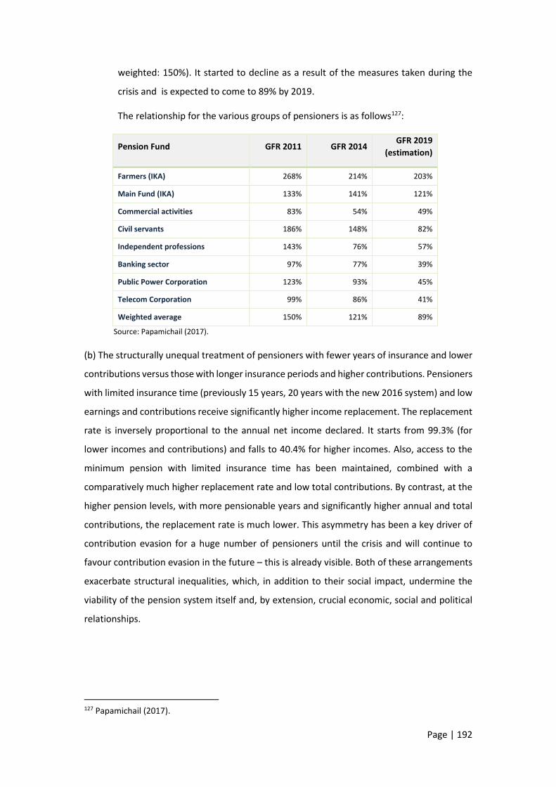
Page | 192
weighted: 150%). It started to decline as a result of the measures taken during the
crisis and is expected to come to 89% by 2019.
The relationship for the various groups of pensioners is as follows127:
Pension Fund GFR 2011 GFR 2014 GFR 2019
(estimation)
Farmers (IKA) 268% 214% 203%
Main Fund (IKA) 133% 141% 121%
Commercial activities 83% 54% 49%
Civil servants 186% 148% 82%
Independent professions 143% 76% 57%
Banking sector 97% 77% 39%
Public Power Corporation 123% 93% 45%
Telecom Corporation 99% 86% 41%
Weighted average 150% 121% 89%
Source: Papamichail (2017).
(b) The structurally unequal treatment of pensioners with fewer years of insurance and lower
contributions versus those with longer insurance periods and higher contributions. Pensioners
with limited insurance time (previously 15 years, 20 years with the new 2016 system) and low
earnings and contributions receive significantly higher income replacement. The replacement
rate is inversely proportional to the annual net income declared. It starts from 99.3% (for
lower incomes and contributions) and falls to 40.4% for higher incomes. Also, access to the
minimum pension with limited insurance time has been maintained, combined with a
comparatively much higher replacement rate and low total contributions. By contrast, at the
higher pension levels, with more pensionable years and significantly higher annual and total
contributions, the replacement rate is much lower. This asymmetry has been a key driver of
contribution evasion for a huge number of pensioners until the crisis and will continue to
favour contribution evasion in the future – this is already visible. Both of these arrangements
exacerbate structural inequalities, which, in addition to their social impact, undermine the
viability of the pension system itself and, by extension, crucial economic, social and political
relationships.
127 Papamichail (2017).

Page | 193
11.3 The haves-more and the haves-not in the
crisis
Market income distribution represents the central driver of inequality in a market economy.
In Chapter 4 we investigated how the different incomes changed during the crisis. The data
shown reflect also the inequality in earned income across different social segments. In this
section we investigate the relationship between the top and the bottom incomes and their
evolution during the years of the crisis. Based on the available data, the group of the ‘bottoms’
can be determined by reference to the lowest decile or the two lowest decimals. The two
lowest deciles provide a better basis for assessment than the lowest decile that is
characterised by several shortcomings: it includes an uncertain but not insignificant number
of highly tax evading households, which declare extremely low incomes, to which presumed
income is added on the basis of living standards (houses, cars, etc.). It also includes under-age
children with very low incomes, etc. The group of the ‘tops’ can be defined as households
belonging to the highest (10th) decile and the top 1% of the population with the highest
income. The latter is of course included in the 10th decile, but if one compares the income of
the 10th decile with those of the 9th or 8th decile, the large income differentiation is found
to occur mainly in the top 1% of households.
Below we examine the income changes experienced by these income groups and compare
them with the average for the total population and with each other. This approach enables us
to see how the crisis has affected the very rich and the weaker income groups and whether,
and how, the inequality relationship between the two groups has changed.
Tables 11.1 and 11.2 show:
the relationship between average total income per household for the same income
groups (the lowest 20%, top 10% and the top 0.1%) for 2008, 2010 and 2012; and
the same relationships for individual incomes (wages, pensions, independent
employment, commercial activities).
We find that:
The inequality between the top 10% or the top 0.1% and the lowest 20% is extremely
high (25.8 to 21.5 times higher average income in the top 10% and 79.7 to 54.9 times
in the top 0.1%, respectively for the three years examined).
The three ratios we calculated (top 10%/lowest 20%, top 1%/lowest 20% and 1%/10th
decile, respectively) show lower inequality in 2012 compared with 2008. The ratio of
the average household income in all these groups to the average income of all

Page | 194
households also shows a decrease between 2008 and 2012, suggesting that the above
three income categories lost more than the middle strata (3rd to 9th decile) taken
together.
Table 11.1 Average total income per household (in Euro)
2008 2010 2012 Change 2012
to 2008 in (%)
(a) Lowest 20% 3,335 4,326 2,827 -15.2
(b) Highest 10% 86,034 78,044 60,727 -29.4
(c) Top 1% 265,885 203,091 155,286 -22.6
(d) Average total income, all households
23,109 22,789 17,884 -41.6
Ratio (b) / (a) 25.8 18.0 21.5
Ratio (c) / (a) 79.7 47.0 54.9
Ratio (c) / (b) 3.1 2.6 2.6
(a) to (d) in % 0.14 0.19 0.16
(b) to (d) in % 3.7 3.4 3.4
(c) to (d) in % 11.5 8.9 8.7
Source: Calculations based on tax data.
Moving from total income to individual sources of income, we find that households
which in 2008 were classified in the ‘bottoms’ have suffered much more significant
income losses regarding wages and income from commercial/business or
independent activities, in comparison with both the top 10% and the top 1%. As a
result, the ratio of the average income from wages, independent activities and
commercial activities of the richest 10% and the richest 1% to the corresponding
average income of the lowest 20% increases for all categories of income, implying
higher inequality. The only category where this does not happen is pensions, given
that the imposed pension cuts affected these higher income brackets much more
strongly than the lower ones.
A very important finding is the strong inequality within the non-employee income
category (independent and commercial activities) in which the top 10% earns income
that is 41% to 181% higher than the corresponding income of the lowest 20%128, while
the ratio between the top 1% and the lowest 20% is exorbitant (150.7% to 471.8%
times higher). Within wages, the high wages (the top 10% and 1%) are 13.8 to 38.4
times than those of the lower deciles, once again suggesting significant inequality
128 A similar high inequality would also be found in the case of dividend-interest income, which is not shown in Table 4.

Page | 195
between the top 1% ratio and the lowest decile, but much lower than for other
income categories with the exception of pensions which show much lower inequality.
Table 11.2 Ratio between income of the top and the bottom in specific income sources
Ratio of: Wages Pensions
2008 2012 2008 2012
(a) Top 10% to lowest 20% 13.8 17.4 9.2 7.8
(b) Top 1% to lowest 20% 29.1 38.4 14.5 11.9
(c) Top 1% to highest 10% 2.1 2.2 1.6 1.5
Ratio of the average wage or pension in the lowest 20% to the average total wage or pension
0.2 0.2 0.3 0.3
Ratio of the average wage or pension in the highest 10% to the average total wage or pension
3.0 3.1 2.8 2.5
Ratio of the average wage or pension in the top 1% to the average total wage or pension
6.4 6.8 4.4 3.8
Ratio of:
Independent activities
Commercial activities
2008 2012 2008 2012
(a) Top 10% to lowest 20% 170.9 181.3 41.3 59.2
(b) Top 1% to lowest 20% 448.8 471.8 110.7 150.0
(c) Top 1% to highest 10% 2.6 2.6 2.7 2.5
Ratio of the average wage or pension in the lowest 20% to the average total wage or pension
0.0 0.0 0.1 0.1
Ratio of the average wage or pension in the highest 10% to the average total wage or pension
5.1 5.0 4.0 4.2
Ratio of the average wage or pension in the top 1% to the average total wage or pension
13.4 13.0 10.6 10.7
Source: Calculations based on tax data.
11.4 Income inequality before and after taxes
The magnitude and timing of the changes in incomes, employment, recession, taxes and other
policy interventions were very heterogeneous across and within income and social groups.
Consequently, total inequality is the result of divergent trends at different levels and types of
income and mask serious and conflicting differences across income and occupational groups.
Therefore, we have broadened the scope of inequality assessment to include more
relationships, based on different criteria and indicators:
First, we focused on inequality and its changes within the various types of income
(wages, pensions, commercial activities, independent employment, agriculture, etc.).

Page | 196
Second, we calculated income inequality before and after personal direct taxes
(income tax and real estate tax129, see Table 11.3). Primary incomes before direct
taxation are found to have been strongly affected by the crisis although in very
different manners, with some incomes mainly affected by recession or
unemployment and others by both the macro-economy and certain policy decisions
(notably through wage and pension cuts). Market income was then affected by tax
and transfer policy. As noted in Chapter 3, additional taxation has been the main
policy tool for fiscal consolidation. Tax changes took the form of successive waves of
tax hikes that knocked individuals and businesses, workers, the unemployed, the
youth and the elderly off their footing.
Third, we analysed inequality focusing on specific population or occupational groups,
such as: (a) those who retained their depended employment throughout the 2008-
2012 period; (b) the population who had income in all the years of the period
reviewed (2008-2012), excluding individuals or households declaring zero income in
any of these years; and (c) wages of men and women and their evolution during the
crisis. These distinctions have enabled us to see how inequality has changed for
population subsets that have been able to maintain certain characteristics, such as
income from work or pensions or have lost their income. Each of these distinctions
leads to a different result, helping to understand how inequality or other
characteristics evolved in different segments of the population.
Fourth, we measured inequality on the basis of the Gini and Theil indices and on mean
log deviation130. We also used the indicators regarding the shares of the top 10%, 1%
and 0.1% to the total. As Piketty notes, “the concepts of deciles and centiles are rather
abstract […] But the beauty of deciles and centiles is precisely that they enable us to
compare inequalities that would otherwise be incomparable, using a common
129 Separately for income tax and property tax, in the latter case also separately for the period before the introduction of EETIDE in 2011 and thereafter. 130 Each inequality indicator corresponds to a different Social Welfare Function and is thus more or less sensitive to different types of transfers. For this reason, we deemed it appropriate to measure and analyse the inequality of a distribution using three indicators, namely the Gini coefficient, the Theil index and Mean Log Deviation (MLD), also known as second Theil index. These indicators have been selected to satisfy all the axioms or properties that are seen as most desirable according to the literature and which cover various types of sensitivity to changes in overall inequality. Specifically, MLD is relatively more sensitive to changes near the bottom of the distribution, the Theil index is sensitive to changes near the top of the distribution, and the Gini coefficient is relatively more sensitive to changes around the median of the distribution. Thus, the combined use of these indicators satisfies a wide range of preferences regarding the responsiveness of an indicator to different types of transfers. For more detailed data on inequality indicators, see the earlier version of the present study at http://www.boeckler.de/pdf/p_imk_study_38_2015.pdf.

Page | 197
language that should in principle be acceptable to everyone”. More specifically, the
highest (10th) decile is a world of its own. It comprises people whose income (or
property) is two to three times higher than the average, but also dozens of times
higher. For this reason it is enlightening to divide this highest decile into subgroups. A
very interesting subgroup is the highest centile (top 1%), comprising the best paid and
the highest 0.1%, with households or individuals earning tens of thousands of euro a
month. It should be noted that the individuals earning the highest 10% (or 1% or 0.1%)
of wage income are not the same as those owning the highest 10% (or 1% or 0.1%) of
property (see Chapter 8). In addition, it is important to note that these individuals
change year after year during the crisis. New individuals take the positions of others
on the income or the property distribution scale.
11.4.1 Trends in total inequality
Total inequality is examined from a dual perspective: (i) comparing Greece’s inequality index
with inequality in other countries; and (ii) looking at the changes of inequality in the country
at different points in time.
In Chart 11.1 we have included the four crisis countries for 2008-2014. For all these countries,
we can see that the downward trend is reversed and inequality started to rise again, in a
different year in each country, from 2011 onwards.
Chart 11.1 Evolution of the Gini coefficient in Greece and comparable countries131
Source: Eurostat.
131 For Ireland the value of the index for 2016 refers to the year 2015.
29,9
33,4
32,4
35,8
28,0
29,0
30,0
31,0
32,0
33,0
34,0
35,0
36,0
37,0
2008 2010 2012 2014 2016
Ireland Greece Spain Portugal

Page | 198
Table 11.3 Inequality indices (Gini and S80/S20) for Greece based on various sources
Gini coefficient S80/S20
EU-SILC OECD Greek
Ministry of Finance
Household Budget Survey
EU-SILC OECD
Disposable income
Pre-tax income and subsidies
Tax data Purchases Disposable
income Disposable
income
2007 34.3 49.9 … … 6.0 5.6
2008 33.4 50.0 48.7 5.5 5.9 5.6
2009 33.1 50.3 46.8 5.4 5.8 5.6
2010 32.9 52.2 46.5 5.5 5.6 5.9
2011 33.6 54.9 45.6 5.5 6.0 6.2
2012 34.3 56.4 46.4 5.9 6.6 6.2
2013 34.4 56.5 … 5.7 6.6 6.3
2014 34.5 56.0 … 5.7 6.5 6.4
2015 34.2 … … 5.6 6.5 …
2016 34.3 … … … 6.6 …
Sources: ELSTAT and OECD.
The results regarding total inequality in Greece are reported in Table 11.3, and the following
key findings arise:
Total inequality decreased slightly till 2011 and recorded a slight increase if comparison is
made between 2008 and 2013. EU-SILC suggests that inequality in Greece, measured by
the Gini index, increased by just one percentage point (from 0.334 to 0.343) between 2008
and 2016 and, despite the large income fluctuations until about 2011-2012, has remained
remarkably stable over time.
A comparison with other crisis countries shows that the share of the highest decile in total
income remains stable in Greece, has visibly decreased in Portugal and increased slightly
in Ireland and Spain (Chart 11.2). By contrast, the income share of the poorest decile
declined between 2008 and 2014 (Chart 11.3) in all countries. However, these findings
differ from those based on the tax data we used in our analysis, which indicate that the
share of the richest decile decreased from 38% in 2008 to 34.4% in 2012, while the share
of the poorest decile also fell, but its levels are anyway so low (0.54% and 0.64%,
respectively) that the notion of increase or decrease makes little sense. It should also be
noted that the very small income shares of the sections of the population that are not
captured by tax data (Roma, homeless, etc.) cannot possibly justify this large divergence.

Page | 199
Chart 11.2 Share of the richest (10th) decile in total income
Note: For Ireland the value of the index for 2016 refers to the year 2015. Source: Eurostat.
Chart 11.3 Share of the poorest (1st) decile in total income
Note: For Ireland the value of the index for 2016 refers to the year 2015. Source: Eurostat
Based on the EU-SILC, the S80/S20 index, i.e. the income share of the richest 20% as a
ratio to the share of poorest 20%, rose from 5.9 to 6.6, obviously because the incomes of
the two lowest deciles recorded a larger decline compared with the two highest deciles,
and in contrast with the remaining deciles. This picture regarding total income and total
21,5
22,5
23,5
24,5
25,5
26,5
27,5
28,5
2008 2010 2012 2014 2016
Ireland Greece Spain Portugal
1,5
2,0
2,5
3,0
3,5
4,0
Ireland Greece Spain Portugal

Page | 200
population remains the same if tax data are used instead132. Table 11.3, for comparison
purposes, summarises the values of the Gini and the S80/ S20 indices from a variety of
sources and/or analyses. The trend towards lower inequality until 2010 is confirmed by
all estimates of the Gini index.
The slight increase of inequality after 2011 is in contradiction with the general perception
that inequality increased significantly during the crisis. Of course, a much greater
reduction in the pre-tax income of the richest compared to the poorest or middle-sized
households should logically lead to lower rather than stable, or even slightly higher,
inequality. The above counterintuitive finding needs interpretation. As we discussed in
Chapter 7 on taxation, the reduction in inequality that would have been expected to result
from the asymmetric reduction of low, middle and high incomes seems to be offset by a
comparatively much higher tax burden on lower incomes. For the lowest 50% of taxpayers
the tax burden increased from 1.6% to 8.1% (+6.5 percentage points), while the
corresponding increase in middle and high incomes was 4.5 and 5.9 percentage points,
respectively (See Table 11.4). In absolute terms, the lowest 50% was charged in 2012 with
EUR 1,090 million more taxes than in 2008, for an income that was 17.5% lower. Middle
incomes were charged with EUR 575 million. If all incomes had been burdened as before
the crisis, the financial result would have been EUR 5.2 billion less in tax revenue. In
essence, those pre-tax incomes which experienced the smallest reductions were subject
to a higher tax burden, with the result that inequality (after taxation) remained stable or
even increased.
Table 11.4 Income reduction and changes in taxes and the tax burden for low, middle and high incomes (2008 and 2012, all households)
Deciles
Income reduction (%)
Change in taxes (in EUR millions)
Tax burden as % of total income
2012/2008 2012-2008 2008 2012
1st - 5th -17.5 + 1,090 1.6 8.1
6th- 7th -17.0 + 575 5.8 10.3
8th- 10th -26.2 + 558 13.8 19.7
Source: Calculations based on tax data.
132 These findings differ to some extent from other measures of overall inequality, all based on EU-SILC or Household Budget Survey (HBS) data. Indicators based on tax data fail to capture various grants and subsidies, income transfers or social benefits to weaker groups, all of which contribute to lower inequality. However, these items not only represent tiny fractions of incomes but have also shrunk in recent years as a result of the crisis.

Page | 201
11.4.2 Changing inequality within incomes
Looking beyond the total inequality index, we investigated the changes in inequality within
and across income categories. To this end, we calculated inequality indicators on the basis of
the income declared between 2008 and 2012 for each source of income separately (wages,
pensions, self-employment, business activities, etc.), for each year and, in addition, separately
for the first and the second member of the household. This shows how inequality within each
income source evolved over time, within the household (male and female), but also how it
compares with other income sources. The main findings are the following:
(a) Wages: Wage distribution inequality increased by 2-3 percentage points between 2008
and 2012, based on the Gini index. The same finding emerges from the Theil and MLD
indicators, which however record a stronger increase in inequality over the same period (3-6
percentage points), suggesting that wages were pressed down to lower levels or, more likely,
more employees were found with lower wages (Chart 11.4).
Chart 11.4 Wage inequality indices for the total of employees in the country
Source: Calculations based on tax data.
The factors that caused wage income of different households to shrink or to be reduced to
zero or to rise significantly have been discussed extensively in previous sections. Our findings
show a decline in inequality for the “all households” aggregate, a significant increase in
inequality when calculated on the basis of wages at individual level and a considerable decline
in inequality within the group of pensioners, especially at the individual level and to a lesser
extent at the household level.
Wage inequality is significantly higher for males than for females, while during the crisis this
gap increased by about half percentage point (Chart 11.5). As we saw in Chapter 6, women
are, on average, lower-paid than men. The gender pay gap declined however by 4 to 7
percentage points between 2008 and 2012.
0,381 0,3800,399
0,268 0,268
0,2990,292 0,300
0,352
0,200
0,250
0,300
0,350
0,400
0,450
2008 2010 2012Gini Index Theil Index (T ) MLD (Mean Log Deviation)

Page | 202
Chart 11.5 Gini coefficients for the wages of the 1st and 2nd household members
Source: Calculations based on tax data.
The changes in wage inequality, either for the household as a whole or separately for its first
and second members, refer to a changing population. The number of employees has declined
over time 133 due to the fact that a part of them retired and another part fell into
unemployment. Meanwhile, some unemployed persons who found a job are added as new
employees. The job losses during the crisis are more severe for men than for women. The jobs
of the first household members (mostly males) fell by 21.6%, compared with only 9.4% for the
second members, exclusively females. This is attributable to the higher labour market
flexibility exhibited by women during the crisis (see Chapter 6) and suggests a narrowing of
the gender employment gap in the crisis period.
(b) Pensions: Inequality indicators were also calculated for a changing number of pensioners.
From 2,155.5 thousand in 2008, the number of pensioners came to 2,521.5 thousand in 2012,
up by 406 thousand. Pension inequality moved in the opposite direction compared with
wages. For the total pensioner population, pension inequality declined significantly: the
relevant Gini index fell from 0.382 in 2008 to 0.335 in 2012. The cuts made, especially in high
pensions, significantly reduced inequality. It is also clear that the attribution of pensions was
an important factor that helped to mitigate the negative impact of the crisis on incomes and
to reduce inequality, even if this exerted a critical destabilising effect on the social security
system (Chart 11.6).
133 Falling by 75.3 thousand in the first year, by 86 thousand in the second (2010), by 208.7 thousand in the third (2011) and by 178.9 thousand in the fourth (2012), to stand at 2,444.2 thousand at the end of 2012, i.e. 548.9 thousand less employees than in 2008.
0,386 0,386
0,405
0,360 0,360
0,375
0,340
0,360
0,380
0,400
0,420
2008 2010 2012
First member (typically male) Second member (typically female)

Page | 203
Chart 11.6 Pension inequality indices for the total of pensioners in the country
Source: Calculations based on tax data.
(c) In the “other” family income sources: income inequality is significantly high. The most
unequally distributed are dividend-interest income, income from agriculture and income from
self-employment. In some of these sources, inequality remains unchanged throughout the
period (0.73 for family agricultural income, 0.68 for income from independent activities, 0.60
for income from real estate), in others inequality increases (in income from commercial
activity: from 0.54 in 2008 to 0.58 in 2012), and finally in some other sources there is a decline
(income from dividends-interest: from 0.80 in 2008 to 0.74 in 2012). At the ends of the
distribution there are strong changes in dividend-interest income and agricultural income.
According to Chart 11.7, only the pension inequality index is lower than the overall income
inequality index. By contrast, inequality is significantly higher in all other income sources with
the exception of wages, where inequality is over 3 percentage points in 2012.
Chart 11.7 Gini coefficient per income source of households
Source: Calculations based on tax data.
0,382 0,3680,335
0,2420,225
0,182
0,2490,233
0,200
0,150
0,200
0,250
0,300
0,350
0,400
2008 2010 2012
Gini Index Theil Index (T ) MLD (Mean Log Deviation)
0,49
0,42
0,39
0,74
0,54
0,68
0,62
0,80
0,63
0,46
0,43
0,35
0,73
0,58
0,68
0,60
0,74
0,61
0,00 0,10 0,20 0,30 0,40 0,50 0,60 0,70 0,80 0,90
Total Income
Income from wages
Income from pensions
Income from agriculture
Income from business activities
Income from self-employment
Income from real estate property
Income from dividends-interest
Income from agriculture subsidies
2012 2008

Page | 204
It can be noted that wage and pension inequality (Chart 11.7) appears to be higher within
households than across employees and pensioners as individuals (Charts 11.4 and 11.6). The
reason is that when both members of the household have high earnings, either wages or
pensions, the disparities between rich and poor households become stronger and inequalities
appear higher.
(d) Wage and pension inequality from two different perspectives: The previous estimates
were made taking into account the total income of all households or individuals from each
source of income in the years 2008-2012. In addition, we examined developments regarding
only employees and pensioners that retained their wage or pension incomes throughout
these five years. The group of employees who retained their employment comprises 1,951.2
thousand employees and the group of pensioners, respectively, 2,008.3 thousand.
According to Chart 11.8, the group of steady employees has a Gini index of 0.328 in 2012,
while the total population of employees has a much higher inequality index (0.399) in the
same year. This large difference in equality indicators across the “steady employees”
subsample and the “all employees” sample is due to the fact that the distribution of the “all
employees” sample includes, at its bottom end, the new employees who find low-paid
employment (entry-level wage) and, at its top end, employees who will soon retire and, in the
last year of their career, have higher pay than other employees. As a result the inequality of
the distribution is higher than for the “steady employees” subsample.
The same trend and conclusions regarding inequality emerge from the use of the Theil index
and Mean Log Deviation. Using Mean Log Deviation, which is sensitive to changes at the
bottom end of the distribution, both groups reveal significant increases in inequality (from
0.185 in 2008 to 0.273 in 2012 for the “steady employees” subsample and from 0.292 in 2008
to 0.352 in 2012 for the “all employees” sample). This suggests strong pressures at the lower
end of the distribution in both groups. Many employees, in order to keep their jobs, accept
lower wages than in previous years. The differences are more pronounced in men than
women.
Unlike the number of employees, the number of pensioners has risen year after year. In 2008,
according to tax data, 2,155.5 thousand people receive pensions, while five years later, in
2012, their number increases to 2,511.5 thousand.

Page | 205
Chart 11.8 Wage inequality indices for a stable sample of employees and for the total
Source: Calculations based on tax data.
For pensioners receiving pension all five years as well as for the total of pensioners the picture
is different. Both groups of pensioners show a decline in inequality, and the gap between the
two are very small (less than one percentage point). The large inequality gap in wages seems
to be closing in retirement. Whether this involves forms of unequal treatment due to higher
contributions by high-paid employees during their employment is a question that can be asked
but not answered in the context of this analysis.
Chart 11.10 Pension inequality indices for a stable sample of pensioners and for the total
Source: Calculations based on tax data.
0,300 0,2940,328
0,381 0,3800,399
2008 2010 2012
Gini Index
0,167 0,162
0,203
0,268 0,2680,299
2008 2010 2012
Theil Index
0,185 0,178
0,2730,292 0,300
0,352
2008 2010 2012
MLD (Mean Log Deviation)
Employees that retain their jobs in all 5 years Total Employees
0,380
0,361
0,330
0,382
0,368
0,335
0,300
0,320
0,340
0,360
0,380
0,400
2008 2010 2012
Pensioners receiving a pension in all 5 years Total Pensioners
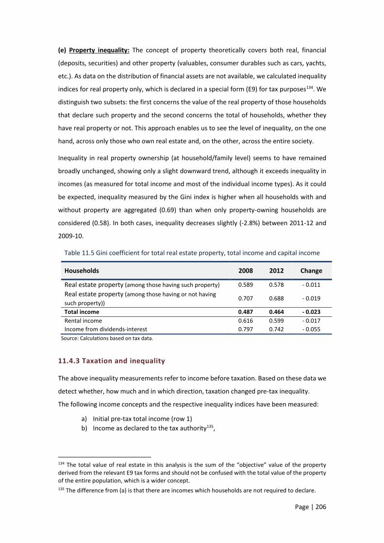
Page | 206
(e) Property inequality: The concept of property theoretically covers both real, financial
(deposits, securities) and other property (valuables, consumer durables such as cars, yachts,
etc.). As data on the distribution of financial assets are not available, we calculated inequality
indices for real property only, which is declared in a special form (E9) for tax purposes134. We
distinguish two subsets: the first concerns the value of the real property of those households
that declare such property and the second concerns the total of households, whether they
have real property or not. This approach enables us to see the level of inequality, on the one
hand, across only those who own real estate and, on the other, across the entire society.
Inequality in real property ownership (at household/family level) seems to have remained
broadly unchanged, showing only a slight downward trend, although it exceeds inequality in
incomes (as measured for total income and most of the individual income types). As it could
be expected, inequality measured by the Gini index is higher when all households with and
without property are aggregated (0.69) than when only property-owning households are
considered (0.58). In both cases, inequality decreases slightly (-2.8%) between 2011-12 and
2009-10.
Table 11.5 Gini coefficient for total real estate property, total income and capital income
Households 2008 2012 Change
Real estate property (among those having such property) 0.589 0.578 - 0.011
Real estate property (among those having or not having
such property)) 0.707 0.688 - 0.019
Total income 0.487 0.464 - 0.023
Rental income 0.616 0.599 - 0.017
Income from dividends-interest 0.797 0.742 - 0.055
Source: Calculations based on tax data.
11.4.3 Taxation and inequality
The above inequality measurements refer to income before taxation. Based on these data we
detect whether, how much and in which direction, taxation changed pre-tax inequality.
The following income concepts and the respective inequality indices have been measured:
a) Initial pre-tax total income (row 1)
b) Income as declared to the tax authority135,
134 The total value of real estate in this analysis is the sum of the “objective” value of the property derived from the relevant E9 tax forms and should not be confused with the total value of the property of the entire population, which is a wider concept. 135 The difference from (a) is that there are incomes which households are not required to declare.

Page | 207
c) Taxable income (row 3)136,
d) After-tax income (row 4),
e) After-tax income minus tax deductions (row 5),
f) Net income 1 (after tax income excluding the effect of property tax for 2012 row
6),
g) Net income 2 (net income 1 including the effect of the special property levy
(EETIDE) introduced in 2011, row 7)137.
Measuring inequality indices for all these specific income types depicts the specific effect of
each particular tax factor on inequality. Τable 11.6 shows the different inequality indices and
their change between 2008 and 2012. The following conclusions are drawn:
Τaxable income as a percentage of the total declared income increased significantly from
75.8% (2008) to 91.6% (2012) (row 3 divided by row 1), probably due to the abolition of
tax-exempt thresholds.
Between 2008 and 2012, the income tax incidence increased from 9.9% to 15.1% (rows 8
and 9). As a result, pre-tax income declined by 23.1% (row 1), while after-tax income [net
income 2] decreased by 27.5% (row 7).
Table 11.6 Income inequality index before taxes and after indirect taxes
Country total (in EUR millions)
Average household
income in EUR
Gini coefficient
2008 2012 % diffe-rence
2008 2012 2008 2012 Diffe-rence
Initial pre-tax income (1) 123,521 94,990 -23.1 23,631 18,173 0.451 0.437 -0.015
Declared in tax returns (Form Ε1) (2) 98,029 80,243 -18.1 18,754 15,352 0.481 0.499 0.018
Taxed income (3) 93,574 86,993 -7.0 17,902 16,643 0.479 0.413 -0.066
(3) minus income tax (4) 83,671 77,939 -6.9 16,007 14,911 0.442 0.377 -0.065
(4) plus tax exemptions (5) 84,352 78,450 -7.0 16,138 15,009 0.443 0.377 -0.066
Income net of direct tax and property tax
(6) 111,329 83,205 -25.3 21,299 15,918 0.424 0.401 -0.023
Income net of direct tax, property tax and, for 2012, EETIDE
(7) 111,329 80,658 -27.5 21,299 15,431 0.424 0.405 -0.019
% change (6)/(1) (8) -9.9 -12.4 -0.027* -0.036*
% change (7)/(1) (9) -15.1 -0.032*
(*) These figures refer to the absolute difference of the value of the Gini coefficient before and after taxes in 2008 and 2012.
Source: Calculations based on tax data.
136 The difference from (b) is that there are special arrangements whereby not all declared income is taxable. 137Net income 1 and 2 are intended to identify the impact of property tax on income inequality.

Page | 208
Inequality, measured by the Gini index, decreased for all types of incomes between 2008
and 2012. The value of the index after income and property taxes (excluding EETIDE,
which did not exist in 2008) fell by 0.027 points in 2008 and by 0.036 points in 2012 (row
8). An important role in this fall was played by the solidarity tax imposed on higher
incomes.
Property taxation, which was increased significantly in 2011, had an unexpected effect on
inequality: it led to a slight increase of inequality because the share of the lower income
deciles in property is higher than their share in total income. The tax was presented as a
progressive tax, because it was imposed also on property which was exempted from the
existing property tax, but, as it turned out, it affects disproportionately the lower income
groups. In Table 11.6 it can be observed that, while the inequality before the special
property levy (EETIDE) declines by 0.036 percentage points in 2012 compared with the
pre-tax inequality and also compared with 2008, this change is limited to 0.032
percentage points following the imposition of EETIDE138.
The increase of indirect taxes had only a marginal negative impact on inequality and
redistributive effect. That said, the indirect tax hikes did have a negative impact, mostly
on low incomes. However, this effect is not reflected in changes in income inequality, as
poor households were forced to reduce their spending on goods the prices of which rose
significantly due to higher excise taxes and adjust their consumption pattern, to some
extent compromising their life quality (in terms of heating, transport, environmental
pollution).
Irrespective of the changes in inequality resulting from the tax system, it is shown that
after-tax inequality is still very high by industrialised world standards. The Gini index takes
values of 0.481-0.499 for pre-tax income and remains above 0.40 for net after-tax
incomes. Such values are indicative of deep inequalities within the Greek society, despite
the decrease observed between 2008 and 2012139.
The discussion of after-tax inequality should be complemented by an uncommon factor: tax
arrears. In the years after 2010, tax arrears grew significantly. By 2012, they had climbed to
EUR 55 billion and further to EUR 94.5 billion by mid-2017 (an average annual increase of
138 Given that ENFIA, which replaced the previous property tax system, has in fact incorporated the characteristics of the previous taxes, the picture can be considered to be representative also for the years after 2012 till 2015. 139 See Cingano (2014).

Page | 209
about EUR 8 billion). The distribution of these tax arrears is significantly unequal, as shown in
the following data:
Table 11.7 Tax arrears: Amount and number of tax debtors
Level of arrears (Individual level)
Number of debtors
Total amount (billion EUR)
% of total
Over EUR 1.0 million 7,296 74.0 79.7
EUR 50 thousand to 1.0 million 60,662 10.5 11.3
Less than EUR 50 thousand 4,244,323 8.4 9.0
TOTAL 4,312,287 92.9 100.0
Source: Independent Authority for Public Revenue (as published in the press on 24 March 2017).
These figures show that, irrespective of the formal tax obligations at the individual or total
level, large parts of the taxes are not paid. A very limited number of persons (1.6% of the total)
owe, on average, very high or moderately high tax arrears, which cumulatively represent 91%
of the total. These tax debtors are either unable or unwilling to comply with their tax
obligations. In any case, these numbers show that had these arrears been lower, the tax
burden, its distribution, inequality relations, the fiscal adjustment and the macroeconomic or
other imbalances in general could have been in a much different shape than they actually are.

Page | 210
CHAPTER 12
Unemployment, poverty and the
new face of “despair”
The analysis of income figures has highlighted the inequalities developed during the crisis and
their distribution across individual income groups and sources. This approach, however, still
leaves a gap: it ignores a number of households and people who have no income to declare
and are therefore not included in the statistical data base used. Therefore, it cannot provide
information on a number of qualitative elements regarding solidarity and inequality.
This chapter aims to partly address this weakness using a different source of data and a
different methodology. A central tool of the analysis carried out in this chapter is what we
have termed “index of despair”. The index reflects the degree of pressure felt by households
with employed and unemployed members when their income from dependent employment
declines or when their members lose their jobs. The index places greater emphasis on the
changes in low pay and takes into account unemployment benefits. Most importantly,
however, the index of despair focuses on family wage income, to which all his employed
members contribute with their wages. We expect that this family income provides some
degree of protection to unemployed or non-economically active household members. It
should be noted that the index does not capture other circumstances (e.g. presence of
children and/or non-economically active adults) that might create additional problems to
already distressed households.
The index of despair enables to answer questions such as the following:
How can we measure the “despair” of households during the crisis, when they suffer
income losses and face the risk of unemployment?
Who are the most affected by “despair”?
How has despair evolved during the crisis? Is it distributed in a socially fair manner or
do some groups shoulder a heavier burden? In particular, how are the layoff notices
distributed?
What kind of protection and solidarity is offered to those who are hit the most?

Page | 211
Is solidarity associated with the welfare state? Is it citizen solidarity or family
solidarity?
12.1 From the “unemployed person” to the
household with unemployed members
To answer the above questions, it is appropriate from a methodological point of view to shift
the focus of analysis from the concept of the “unemployed person” to the concept of
“household with unemployed members”. The consequences of unemployment, income cuts
or switches to a new job are different when viewed from the different perspectives of an
individual person or of the household in which such person lives, especially if he/she is the
“head of the household”. Participation in the labour market is a key factor in preventing
situations of poverty, deprivation and social exclusion, as social inclusion mechanisms
incorporate both the employment status and the level of pay, i.e. wages.
Chart 12.1 shows the number of households with one, two, three or more unemployed
members for the 2007-2014 period. Data from the Labour Force Survey indicate the following:
In 2008, 286 thousand households reported at least one unemployed member,
increasing to 788 thousand in 2014. 2013 is the peak year during the crisis, with
increases recorded for all sub-categories of households with unemployed members.
A small improvement can be seen in 2014. Among these households, 31 thousand
reported having two unemployed members in 2008. In 2014, this number has reached
179 thousand.
In addition, in 2008, there were 3 thousand households with more than two
unemployed members. In 2014, this number has reached 40.2 thousand.
The largest increase in this number is recorded in 2013 and is broadly based across all
sub-categories of households, followed by a small improvement in 2014.
If one unemployed member in a household is causing a problem, this problem becomes
much bigger when the unemployed members increase to two or more especially if the
head of the household is unemployed. In this case we are at the hard core of
unemployment.

Page | 212
Chart 12.1 Number of households (in thousands) with unemployed members: 2007-2014
Source: Calculations based on ELSTAT’s Labour Force Survey data.
The share of household heads who are unemployed during the crisis in the total number of
unemployed persons rises from 19.8% in the second quarter of 2008 to 31.3% in the fourth
quarter of 2014, peaking at 33.6% in the first quarter of 2013. This development is another
indication of the adverse impact of the current crisis on the profile of unemployment, which
seems to have hit the hard core of the Greek family (heads of households).
According to Chart 12.2, in the fourth quarter of 2014, there were 292,000 unemployed male
heads of households (245.8 thousand more than in the second quarter of 2008) and 98.1
thousand unemployed female heads of households (73.5 thousand more than in the second
quarter of 2008).
Chart 12.2 Number of unemployed members by category: 2007-2014
Source: Calculations based on ELSTAT’s Labour Force Survey data.
315 286 359457
585719 802 788
35 3147
69
110
171192 168
4 36
12
24
3440 36
0,0
200,0
400,0
600,0
800,0
1.000,0
1.200,0
2007 ΙΙ 2008 ΙΙ 2009 2010 2011 2012 2013 2014
Households with three or more unemployed members
Households with two unemployed members
Households with one unemployed member
0
200.000
400.000
600.000
800.000
1.000.000
1.200.000
1.400.000
20
07 II
20
88 II
20
09 I
20
09 II
20
09 II
I
20
09 IV
20
10 I
20
10 II
20
10 II
I
20
10 IV
20
11 I
20
11 II
20
11 II
I
20
11 IV
20
12 I
20
12 II
20
12 II
I
20
12 IV
20
13 I
20
13 II
20
13 II
I
20
13 IV
20
14 I
20
14 II
20
14 II
I
20
14 IV
male head female head male 2nd member
female 2nd member other household members

Page | 213
As far as unemployment is concerned, the continuing significant increase in the number of
unemployed persons in Greece over the last six years is accompanied by other worrying
aspects. Prior to the crisis, unemployment was mostly concentrated in women and younger
household members. This gradually changed, and the absolute number of unemployed males
rose sharply and reached the number of unemployed female that increased at a slower pace.
Against this background, the degree of anxiety/despair in households should probably vary: it
is likely to be lower when the household includes other members who have a job and can
support with their income the unemployed members of the household, or dramatically high
(total despair) when all members of the household, including the head, are unemployed and
none of them receives an unemployment benefit.
12.2 The index of despair
The index of despair reflects the intensity of despair among the households of the employed
and the unemployed. In essence, the index reflects the effect of fiscal adjustment, recession
and labour market policies, which have led to wage cuts and job losses140.
Methodology for the construction of the index of despair The reference population comprises households of employees or unemployed persons. That is, it
excludes households of non-employees or pensioners. The reason for this exclusion is the fact that the
Labour Force Survey (LFS) does not provide information on the level of income of such members, which
thus cannot be classified. The households that were selected earn their income solely from
wages/salaries, unemployment benefits, or both.
The index is based on primary data from ELSTAT’s quarterly Labour Force Surveys, conducted on an
annual sample of 120,000 households. The reference period runs from the first quarter of 2009 to the
first quarter of 2014.
The index ranges between extreme values of zero and one. A value of zero is assigned to households
reporting that none of their members is unemployed and that the monthly wage of each employed
member is more than EUR 1,000. A value of one is assigned to households reporting that all their active
members are unemployed and none of them receives any unemployment benefit. The latter
households are identified as being in a state of absolute despair.
The score of each household depends on the individual scores of all its active members. Specifically,
each active member scores the maximum value of one if he/she is unemployed and does not receive
any unemployment benefit. Otherwise, the score is gradually lower if this member at least receives an
unemployment benefit or has a low-paid job, and drops further in inverse proportion to the level of
his/her labour income. A member scores the minimum value of zero if his/her monthly wage exceeds
the EUR 1,000 threshold.
Accordingly, each economically active member of the household is assigned one of the following values:
1 if unemployed and not receiving any unemployment benefit
0.8 if unemployed and receiving an unemployment benefit
0.6 if employed and receiving a monthly wage of less than EUR 499
140 Zografakis and Mitrakos (2012), Zografakis (2014).

Page | 214
0.4 if employed and receiving a monthly wage of between EUR 500 and EUR 699
0.2 if employed and receiving a monthly wage of between EUR 700 and EUR 999
0 if employed and receiving a monthly wage of EUR 1,000 or higher
The total score of each household is the average of the individual scores of its active members. Children
and non-economically active members in the household (students at all levels of education, soldiers,
persons incapable of work, housewives, etc.) are not taken into account in the calculation of the index.
The index is calculated for different groups of households according to the characteristics of the
household head (e.g. level of education, age, region of residence, skills, occupation, sector or activity,
years of service, nationality, type of employment, etc.).
Looking at the evolution of the index (Chart 8.4), we can make two important observations.
Between the second quarter of 2009 and the first quarter of 2013, the index of despair
was on a constant upward trend, rising from 0.186 to 0.423, i.e. by 121%. The value of
0.423 for 2014 (first quarter) suggests a very high level of despair. Of course, as shown in
another part of this analysis, many households (with employed and unemployed
members) earn incomes from various sources other than wages and unemployment
benefits, which are not recorded by the Labour Force Survey. Notwithstanding this caveat,
the findings reported below remain valid, suggesting that the conclusions should be seen
in combination with each other.
Three distinct periods can be identified in the evolution of the index. In the first period,
up to the third quarter of 2010, the index increased on average by 2% quarter-on-quarter.
It seems that in its initial phase the economic crisis did not affect so much the index of
despair.
Chart 12.3. Evolution of the index of despair (average for the total of households of employees)
Source: Calculations based on ELSTAT’s Labour Force Survey data
0,186 0,218
0,272
0,4100,423
0,399
0,18
0,22
0,26
0,30
0,34
0,38
0,42
20
09
I
20
09
II
20
09
III
20
09
IV
20
10
I
20
10
II
20
10
III
20
10
IV
20
11
I
20
11
II
20
11
ΙΙΙ
20
11
IV
20
12
I
20
12
II
20
12
III
20
12
IV
20
13
I
20
13
II
20
13
III
20
13
IV
20
14
I
20
14
II
20
14
III
20
14
IV

Page | 215
In the second period, up to the first quarter of 2013, developments were dramatic, with the
index rising quarter-on-quarter by 7% on average. It is worth noting that in just three months,
between the third and the fourth quarter of 2011, the index increased by as much as during
the entire first period. Finally, in the third period (second quarter 2013 to fourth quarter
2014), the index showed for the first time some stabilisation or a slight improvement141.
Although the index still remained at high levels (0.405-0.404) in the first quarter of 2014, it
began to decline thereafter and reached 0.399 in the fourth quarter of 2014.
An examination of the index of despair, combined with demographic and other characteristics
of the head of household, leads to four main conclusions:
The index of despair in 2014 is higher than the average in those households whose head
has one of the following characteristics (Table 12.1):
is aged up to 34 years or over 55 years;
has a low educational level (up to secondary education);
works part-time;
is an immigrant;
is unemployed or non-economically active.
During the economic crisis the index of despair increased significantly more, relative to
the overall index, for those households whose head has one of the following
characteristics (Table 12.1):
is aged 25 to 44 years;
has a low educational level;
is an immigrant;
is non-economically active.
When the head of household is employed, the index of despair is low. The years of
experience, skills, private/public sector of employment, type of employment and sector
of employment are associated with a higher likelihood that the head has a job.
When the head of the household is unemployed, the degree of despair is overwhelmingly
higher, verging on absolute despair (index 0.86).
141 The implementation of a social employment programme for the unemployed in 2013 (prioritising households with more unemployed members), together with the introduction of an unemployment benefit for long-term unemployed subject to eligibility requirements, led to a slight improvement in the index of despair.
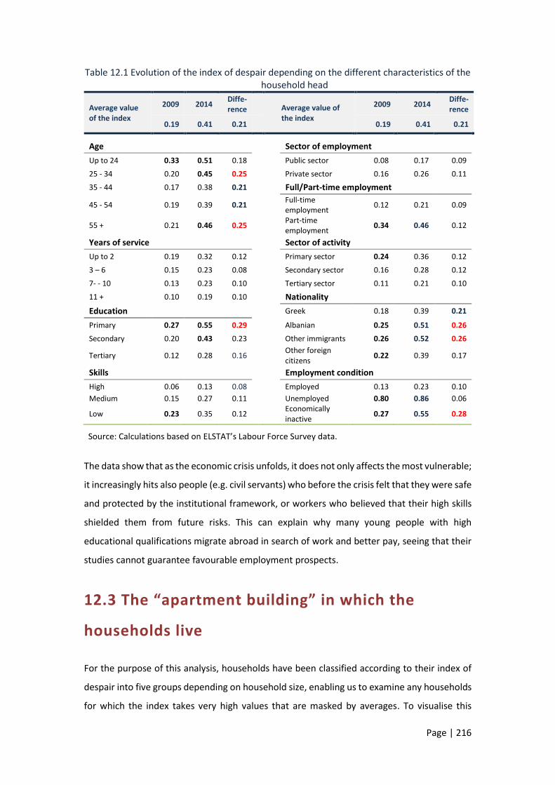
Page | 216
Table 12.1 Evolution of the index of despair depending on the different characteristics of the household head
Average value of the index
2009 2014 Diffe-rence
Average value of the index
2009 2014 Diffe-rence
0.19 0.41 0.21 0.19 0.41 0.21
Age Sector of employment
Up to 24 0.33 0.51 0.18 Public sector 0.08 0.17 0.09
25 - 34 0.20 0.45 0.25 Private sector 0.16 0.26 0.11
35 - 44 0.17 0.38 0.21 Full/Part-time employment
45 - 54 0.19 0.39 0.21 Full-time employment
0.12 0.21 0.09
55 + 0.21 0.46 0.25 Part-time employment
0.34 0.46 0.12
Years of service Sector of activity
Up to 2 0.19 0.32 0.12 Primary sector 0.24 0.36 0.12
3 – 6 0.15 0.23 0.08 Secondary sector 0.16 0.28 0.12
7- - 10 0.13 0.23 0.10 Tertiary sector 0.11 0.21 0.10
11 + 0.10 0.19 0.10 Nationality
Education Greek 0.18 0.39 0.21
Primary 0.27 0.55 0.29 Albanian 0.25 0.51 0.26
Secondary 0.20 0.43 0.23 Other immigrants 0.26 0.52 0.26
Tertiary 0.12 0.28 0.16 Other foreign citizens
0.22 0.39 0.17
Skills Employment condition
High 0.06 0.13 0.08 Employed 0.13 0.23 0.10
Medium 0.15 0.27 0.11 Unemployed 0.80 0.86 0.06
Low 0.23 0.35 0.12 Economically inactive
0.27 0.55 0.28
Source: Calculations based on ELSTAT’s Labour Force Survey data.
The data show that as the economic crisis unfolds, it does not only affects the most vulnerable;
it increasingly hits also people (e.g. civil servants) who before the crisis felt that they were safe
and protected by the institutional framework, or workers who believed that their high skills
shielded them from future risks. This can explain why many young people with high
educational qualifications migrate abroad in search of work and better pay, seeing that their
studies cannot guarantee favourable employment prospects.
12.3 The “apartment building” in which the
households live
For the purpose of this analysis, households have been classified according to their index of
despair into five groups depending on household size, enabling us to examine any households
for which the index takes very high values that are masked by averages. To visualise this

Page | 217
classification, we use the metaphor of an apartment building, the structure of which has the
following characteristics:
The building has five floors (ground floor and four upper floors) and a penthouse (Figure
12.1).
The tenants of the ground floor are the households with an index of despair higher
than 0.8, meaning that most of the economically active members of the household
are unemployed. Moreover, few of these unemployed persons receive
unemployment benefits.
On the first floor we find households with index values between 0.8 and 0.6, i.e.
households consisting of some employed members that earn wages around the
minimum pay and more unemployed persons, receiving unemployment benefits.
As we climb to higher floors, the index decreases, and finally, in the penthouse we
find households having no unemployed members and earning wages higher than EUR
1,000.
In the penthouse, the index takes the value of zero. Nevertheless, as we will see
below, even the residents of the penthouse are not untouched by the economic crisis.
The building also has a basement. There we can find people who sleep on sidewalks,
households of illegal immigrants, socially excluded persons and, generally, parts of the
population that are not recorded by surveys or captured by statistics.
With time, we can observe two types of movements:
The first type of movement is horizontal. This is the case when a household moves into or
out of the building. Households leave the building if their members who are employees
retire, or if unemployed members find non-salaried jobs, e.g. as self-employed.
Households move into the building, if their members lose their non-salaried jobs
(employers, traders, self-employed, etc.) and become unemployed. Households move
into the building if any of their members lose their (non-employee) jobs and are now
unemployed (former employers, merchants, self-employed, independent professionals,
etc.). In 2014, the people who live in the building are 4,100,000, up by 100,000 from
4,000,000 before the start of the economic crisis.
The second, and most important, type of movement is vertical, when households move
from upper floors and the penthouse to lower floors down to the ground floor. When a
household member loses his/her job, when his/her wage is reduced and gradually falls
below EUR 1,000, below EUR 700 or below EUR 500, when the duration of unemployment
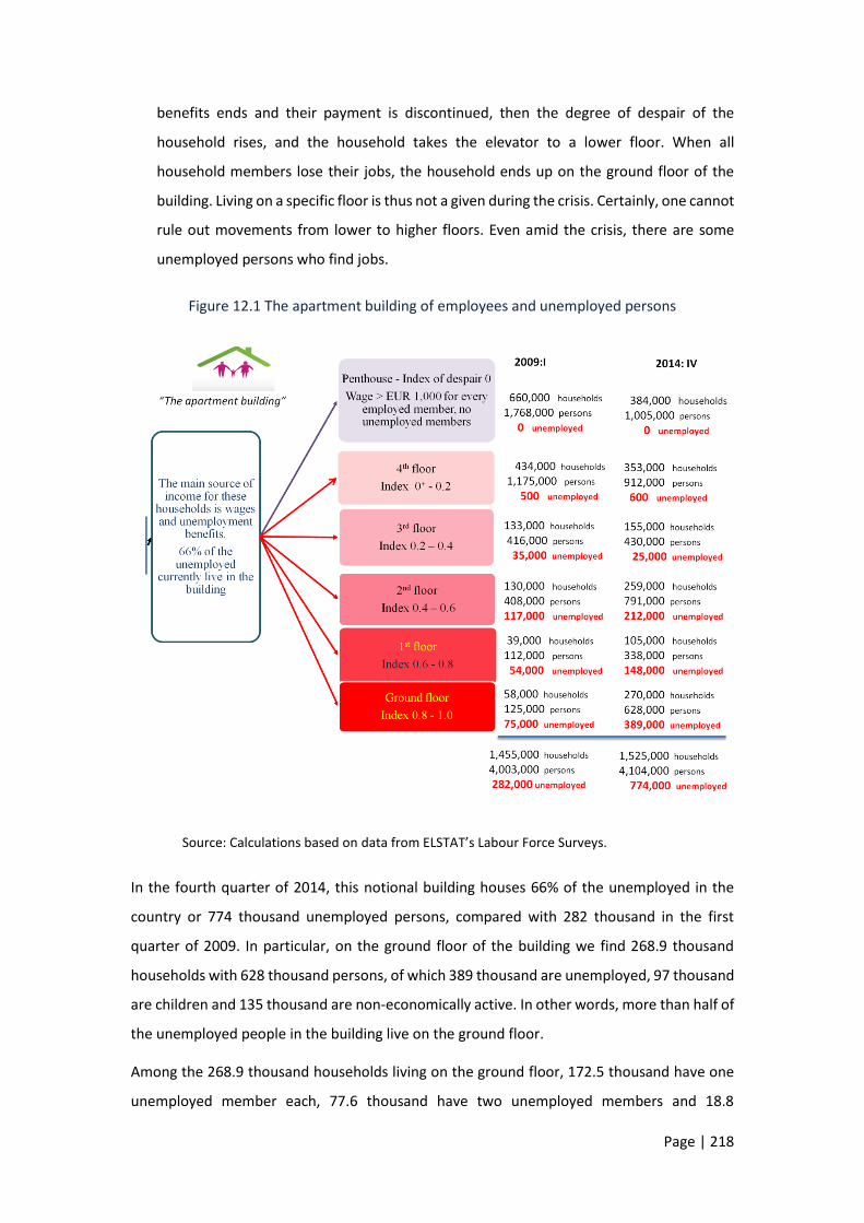
Page | 218
benefits ends and their payment is discontinued, then the degree of despair of the
household rises, and the household takes the elevator to a lower floor. When all
household members lose their jobs, the household ends up on the ground floor of the
building. Living on a specific floor is thus not a given during the crisis. Certainly, one cannot
rule out movements from lower to higher floors. Even amid the crisis, there are some
unemployed persons who find jobs.
Figure 12.1 The apartment building of employees and unemployed persons
Source: Calculations based on data from ELSTAT’s Labour Force Surveys.
In the fourth quarter of 2014, this notional building houses 66% of the unemployed in the
country or 774 thousand unemployed persons, compared with 282 thousand in the first
quarter of 2009. In particular, on the ground floor of the building we find 268.9 thousand
households with 628 thousand persons, of which 389 thousand are unemployed, 97 thousand
are children and 135 thousand are non-economically active. In other words, more than half of
the unemployed people in the building live on the ground floor.
Among the 268.9 thousand households living on the ground floor, 172.5 thousand have one
unemployed member each, 77.6 thousand have two unemployed members and 18.8

Page | 219
thousand have more than three. Within five years, these figures have increased by more than
five times.
The remaining unemployed people of the country (34%) live in households outside the
building. They live with members that are self-employed or receive a pension and therefore
are better-off than the unemployed who live on the ground floor of the building.
As the economic crisis lasts longer, the indices deteriorate: in the building there is an increase
in the number of tenants on the lower floors; on the other hand, upper floors are home to
less and less households (gradual pauperisation). For example, the number of tenants in the
penthouse has shrunk by 763 thousand (or 276 thousand households). These households
moved to lower floors during the crisis or, if they were extremely unlucky, went right down to
the ground floor.
An additional question concerns the immigrants in Greece, who as a group are faced with even
more difficulties than the Greek households. The index of despair of these households was in
2014 (1st quarter) 0.55, against 0.40 of the Greek ones. Equally, in 2014, 16.6% of immigrant
households lived in the ground floor of the building, against 10.1% in 2009 (1st quarter). A
similar aggravation occurred in the first floor (an increase from 19.3% to 23.8%
correspondingly). The immigrant households’ share in the upper three floors is equally
reduced by about 10 p.p.). Lastly, about 6.2% of those living in the penthouse (2014) were
immigrant households, against 8.1% in 2009.
The aggravated index of despair in immigrant households can be better understood by
examining also the corresponding unemployment rates. Unemployment of immigrants who
remained in the country increased significantly more than that of Greek nationals. In 2014 it
was 36.7% (26.4 p.p. higher than in 2009) against 27% (+17.8 p.p.) respectively.
12.4 Households living on upper floors
As can be seen in Table 12.2, the building houses 1,042 thousand people employed in the
private sector and 605.2 thousand employed in the public sector. 43.8% of public sector
employees (265 thousand people) live in the penthouse of the building, compared with 23.6%
of private sector employees (245.9 thousand people).
A significant proportion of public sector employees (30.9%) live on the fourth floor, mainly
due to the reduction in their salaries to below EUR 1,000. These households do not face
unemployment problems. By contrast, those public sector employees who, in smaller

Page | 220
numbers, live on lower floors (8.7% on the third floor, 13.7% on the second and 2.7% on the
first floor) have an actual problem of unemployment in respect of some members of their
households.
Overall, 76.7% of households in which the head of household is a public sector employee live
on the two upper floors, whereas the corresponding figure for heads who work in the private
sector is 58.4%. This percentage increases to 87% if there are two public sector employees in
the household.
Table 12.2 An overview of the apartment building in the first quarter of 2014 (in thousands)
Employees Heads of household
Private Public Total Private Public Unemplo- Inacti- Total
sector sector sector sector yed ve
Ground floor
5.9 0.8 6.6 1.6 0 257.1 41.9 300.6
1st floor 76.7 16.5 93.2 30.1 9.1 79.6 7.8 126.5
2nd floor 225.5 83 308.5 133.1 51.5 64.5 14.9 264
3rd floor 187.2 52.6 239.8 101.4 30.1 6.2 15.7 153.4
4th floor 300.9 187.3 488.2 200 119.7 0 16.9 336.6
Penthouse 245.9 265 510.9 173.2 178.3 0 18.8 370.3
Total 1,042.0 605.2 1,647.2 639.4 388.7 407.3 116.0 1,551.4
Households with two public sector
employees
Unemployed persons
% of unemployed persons receiving unemployment
benefit
Ground floor 0 438.0 6.0
1st floor 0.3 168.4 30.4
2nd floor 5.1 218.2 9.1
3rd floor 9.5 29.5 52.3
4th floor 41.2 0.1 0.0
Penthouse 59.0 0
Total 115.1 854.2 13.2
Source: Calculations based on ELSTAT’s Labour Force Survey data.
The data shown in Table 12.2 suggest that indeed public sector employees enjoy a double
protection, compared with other workers, in terms of both their permanence in the labour
market and the social system and the evolution of their earnings.
Of course, also households living in the penthouse have probably seen significant reductions
in their earnings (such as the abolition of Christmas and other bonuses and allowances,
abolition of tax breaks, cuts in salaries, imposition of special contributions, etc.). As long as

Page | 221
their earnings remain above EUR 1,000 per employee, these changes do not affect their index
of despair and the floor on which they live.
Table 12.3 depicts the changes in jobs on the basis of primary insurance provider. The upper
panel of the table shows that out of the 1,098 thousand jobs lost, only 8.2% (90 thousand)
were jobs in the narrowly defined public sector (central government). On the other hand, the
jobs lost for employees insured by non-public funds, reached 1,008 thousand. On the second
panel of the table, we can see how many of these employees flowed into unemployment or
retirement.
Based on the self-reported employment status of respondents in the Labour Force Surveys,
the number of pensioners increased by 338 thousand in the same period. Of these, 116
thousand (34.4%) have health insurance provided by government, while 222 thousand
(65.6%) are insured by other funds. Pensioners of the civil servants’ pension scheme seem to
have increased by 48.5%, while for pensioners of other funds the increase was significantly
less (14.1%).
Based on the two panels of Table 12.3, the jobs lost in central government do not translate
into more unemployment, but rather more pensioners. Conversely, of the jobs lost outside
the central government only two represent flows into retirement and the remaining eight
represent flows into unemployment.
Table 12.3 Change in the number of employees and pensioners
Change in the number of jobs: 2014-2008 % shares of employees
In thousands % change % share 2008 2014
Central Government
-90 -14.7 8.2 12.7 14.1
Other funds -1,008 -23.9 91.8 87.3 85.9
Total -1,098 -22.8 100.0 100.0 100.0
Change in the number of pensioners: 2014-2008 % shares of pensioners
In thousands % change % share 2008 2014
Central Government
116 48.5 34.4 13.2 16.5
Other funds 222 14.1 65.6 86.8 83.5
Total 338 18.6 100.0 100.0 100.0
Source: Calculations based on data from ELSTAT's Labour Force Surveys.
The changes and movements in the building during the period 2008-2014 are shown in Table
12.4. The number of employees fell by 403 thousand and the number of unemployed persons
increased by 573 thousand, of which 299 thousand are heads of household. The jobs lost in

Page | 222
the private and public sectors were 293 thousand and 110 thousand, respectively. On the two
upper floors the changes have been negative, signaling the declining numbers of tenant
households and their members. In contrast, on lower floors, the sign is positive. Quarter-on-
quarter, households move downward when one of their members remains jobless or a new
jobless person is added or the wages of their employed members are reduced, or all of these
circumstances occur.
12.5 Households living on lower floors
Households living on the ground floor of the building are at a high risk of despair, as their vast
majority is unemployed. Within these households there are no retired or self-employed
persons, but only few employees, many more unemployed, children and non-economically
active members (Table 12.4).
The responses to the question of the Labour Force Surveys (LFS) for the first quarter of 2014
“what were your income sources of income during the previous quarter?” are shown in Table
12.5. Respondents may indicate more than one source of income. In 2009, the number of
individuals on the ground floor was 141,000; in 2013, it peaked at 729,000, before falling to
649,000 in 2014.
Table 12.4 Evolution of the composition of households living on the ground floor of the building (in thousands)
Employees
Unemployed persons (without unemployment
benefit)
Unemployed persons (with
unemployment benefit)
Children (aged 0-14)
Economically inactive Total
2009 0.5 77.6 4.5 25.1 33.1 140.9
2010 0.8 115.0 8.8 37.6 54.2 216.5
2011 2.3 193.5 18.7 63.9 84.7 363.2
2012 7.0 324.1 28.3 106.6 116.9 582.9
2013 7.7 416.7 26.0 129.3 148.9 728.6
2014 6.0 379.1 19.1 103.0 141.6 648.8
Source: Calculations based on ELSTAT’s Labour Force Survey data.
Financial support “from persons which are not household members” is reported as the
primary source of income by 54.2% of heads of households on the ground floor of the building.
Importantly, 94% of these households reports this support as their only source of income.

Page | 223
For 8.2% of respondents, support “from other household members” was reported as their
primary income source (and as the only source for 84% of them), while for 4.9% of
respondents the primary income source was “income from property”.
Only 19.3% reported “benefits or allowances” from the state as their primary income. Most
of the respondents who did not indicate support “from persons which are not household
members” as their primary source of income cited that source as their secondary source. As
already mentioned, the ground floor of the building is home to about one third of the
unemployed in the country.
Turning to the secondary source of income, 49.2% of respondents reports that a significant
part of their needs are met with help from persons which are not household members”.
The answers are different upstairs, as there are some employees and more unemployed
persons receiving unemployment benefits. Thus, among the heads of households living on the
first floor, 36.3% report as their primary income source support from other household
members, 35.7% unemployment benefits and 12.3% support from persons which are not
household members. On the second floor, the labour income of other household members is
crucial, being reported by 63.5% as the primary income source.
Table 12.5 Income sources of households with an unemployed head which live on the lower
floors of the building (reported primary source, first quarter 2014)
Ground floor 1st floor 2nd floor
– From work 0.9 0.2 1.2
– From old age pension 2.1 0.7 0.6
– From survivor’s pension 7.8 0.2 0.5
– From disability pension 1.4 0.0 0.0
– From property 4.9 6.9 6.3
– From other members of the household 8.2 36.3 63.5 – From persons which are not members of the
household 54.2 12.3 4.8
– From state benefits/allowances 9.5 35.7 14.4
– Do not know/Do not answer 11.1 7.7 8.7
Total 100.0 100.0 100.0
Source: Calculations based on data from ELSTAT's Labour Force Surveys.
The above data suggest that inter-household solidarity remains a relatively strong institution
and, along with informal family networks, continues to play a significant role in protecting the
unemployed in Greece. The extremely limited scope of the social safety net becomes evident

Page | 224
from the fact that only a very small percentage of households meet their needs using income
support from the welfare state.
12.6 Households living on the ground floor
The question that arises next is whether the above findings are in line with that of other, more
poverty-focused, social surveys (SILC, HBS). The results of these surveys, due to their nature,
become available with a lag of almost one year relative to the data underlying the indices of
despair. To what extent do the SILC and HBS surveys confirm this picture? What are the
incomes of households with unemployed members, in particular households with an
unemployed head? Is there a connection between the unemployment situation of the head
and/or other members with poverty? Have the poverty rates of households with an
unemployed head increased during the crisis? To what extent does the unemployment benefit
really support these households?
In Table 12.6, based on data from income tax returns submitted in fiscal years 2011-13
(referring to income earned in the years 2010-2012), we consider only those income tax
returns in which taxpayers state that they receive unemployment benefits (228.8 thousand,
303.0 thousand and 343.1 thousand tax returns, referring to incomes earned in 2009, 2010
and 2011, respectively). It is worth noting that in 53.4 thousand tax returns taxpayers declare
income from unemployment benefits for all three of the above years.142
Table 12.6 Distribution of unemployment benefits across income deciles of households in
2012
Total expenditure for unemployment
benefits
Total income of households receiving unemployment
benefits
Average unemployment
benefit
Average income
Unemployment benefit/ income
Deciles in EUR millions in EUR millions % share in
total income in EUR in EUR
1st-5th 475.3 902.0 21.2 2,770 5,257 53%
6th-10th 513.3 3,360.2 78.8 2,992 19,584 15%
Total 988.6 4,262.1 100.0 2,881 12,421 23%
Source: Calculations based on tax data (Ministry of Finance database).
As a next step, on the basis of their total income, households were classified into deciles of
income distribution and ranked from the poorest to the richest. In the year 2012, EUR 988.6
million were given to the unemployed (column a) and the average annual level of the
142 These are mostly cases of workers in the tourism industry employed in the summer season and receiving unemployment benefits during the other months of the year.

Page | 225
unemployment benefit was about EUR 2,881 per entitled person (column e). In the lower five
deciles, corresponding to the lowest incomes, unemployment benefits account for a large
share of total income (53%). As we move towards middle-income and richer households, the
share of unemployment benefits in total income declines to 15%.
Table 12.6 shows that a large proportion of total expenditure on unemployment benefits
ultimately goes to households having income above the country’s average. Of a total amount
of EUR 988.6 million spent on unemployment benefits in 2012, only EUR 475.3 million was
received by unemployed persons living in low-income households (deciles 1-5), while EUR
513.3 million went to unemployed persons classified in higher-income deciles (6-10).
According to Table 12.2, only 6% of the unemployed on the ground floor of the building
receive an unemployment benefit. For this reason, only 9.5% of households on the ground
floor cite unemployment benefits, including some other types of financial support, as their
most important source of income in their responses to the surveys (Table 12.5).
The above picture is confirmed for poor households with an unemployed head, based on data
from the HBS and EU-SILC surveys. In three years, the number of these households increased
by 177.5 thousand. Before the crisis, in 2009, households with an unemployed head faced an
additional poverty risk of 6.4 percentage points relative to the total population of households.
Three years later, this additional risk rose by 16.7 percentage points. While in the country as
a whole the poverty rate did not change significantly, the population of households with an
unemployed head rose dramatically.
The link between unemployment and the poverty conditions of a household becomes patently
clear when we also include the employment situation of all the economically active members
of the household. According to EU-SILC data, the poverty rate of a household is closely related
to the work intensity of its members. When work intensity is very high in the household, the
poverty rate is particularly low (e.g. 7.8% in 2008 or 4.1% in 2014). On the other hand, when
work is very low, the poverty rate is exceptionally high (38.3% in 2008, 41.9% in 2014).

Page | 226
CHAPTER 13
THE WINNERS AND THE LOSERS:
THE OLD AND THE NEW ORDER
A key finding throughout our analysis is that the collapse of the Greek economy was followed
not only by severe income losses, unemployment and poverty, but also by extensive internal
shifts across and within low, middle and high income groups. As a clear-cut line separating
one group from the other is lacking, we will follow a division used in the literature, with a
slight variation. This will ensure comparable results to those for other countries or other time
periods. Following Piketty, households are divided into three classes, the lower, the middle
and the upper class (including the top 1% and 0.1%). The first five deciles with the lowest
incomes comprise the lower class, the next four deciles (6-9) the middle class and, finally, the
richest (tenth) decile the upper class. According to Piketty143, Europe (as an aggregate of
countries) in 2010 exhibited medium inequality, where the top 10% (the upper class) received
35% of total income (from labour and capital), the middle 40% (the middle class) received 40%
of total income and, finally, the bottom 50% (the lower class) received the remaining 25% of
total income. Our approach follows this distinction, but is different in that for the lower class
we take the first six deciles, therefore the middle class comprises only the next three deciles
(7-9) instead of the next four in Piketty. Specifically:
The lower class comprises 60% of households in the country (the six deciles with the
lowest incomes). We assumed that no household in this class has an income higher
than the mean income in the country. That is, the highest income of “the lower class”
should be less than the mean income in the country. The average income of the lower
class corresponds to about 40% of the mean income in the country. This class includes
all the poor households (the first 2-2.5 deciles with the lowest income) as well as
households that are above the poverty line (from the 3rd to the 6th decile).
143 Piketty (2014), Chapter 7, Table 7.3.

Page | 227
The middle class comprises the next 30% of households (from the 7th to the 9th
decile), and its population is half the population of the lower class. The households of
the middle class have incomes that are three times higher than the incomes of the
lower class, while the high incomes are up to twice the average. The threshold for
classifying a household in the middle class is 2008 income of more than EUR 18,204.
The upper class, which is the top 10% of the population, has an income threshold of
EUR 44,891 for 2008. The average income of the upper class is three times higher than
that of the middle class and nine times higher than that of the lower class.
Table 13.1 provides an overview of the three classes before the onset of the crisis (2008) till
2012. The average income of the lower class increased by 1% in 2012 relative to 2008, that of
the middle class declined by 18.9%, while that of the upper class fell even more strongly (-
36.6%). A first reading suggests that income reductions, resulting either from policy or from
market developments, are in line with a sense of social justice, as higher incomes seem to
have suffered heavier losses. This finding has as a starting point a conventional assumption,
which is not self-evident: that the income distribution existing before the crisis is fairer and
therefore its deterioration is unfair. The validity of this assumption depends on several factors
that are often ignored or overlooked, such as the existing preferential tax treatment, tax
evasion, rent awards, etc.
In a second reading, we can discern that each class is divided into households that saw their
incomes increase during the crisis (the winners) and those that saw their incomes decline (the
losers). In the lower class, 44.2% of households had an income increase (+61.9%), while 52%
had a reduction (-37.8%). In the middle class, 21.6% of households had an increase (+30%)
and 78.4% had a reduction (-31.6%). A more uneven picture emerges for the upper class,
where 14.8% of households had an increase of 33.5% in their income, whereas 85.2% had a
decrease of 47.2%. The conclusion is that averages obscure both large reductions and large
increases, creating winners and losers within each class even during the crisis.
As the losers and the winners had a different composition of their incomes, the contribution
of each income source to this outcome was investigated. The weight of labour income is found
to be broadly the same across all three groups (ranging from 41% to 46%). The losers in the
lower class have a high weight of wages and a lower weight of pensions compared with the
winners. In the middle class the opposite is the case: it is the winners that have a higher weight
of wages and a lower weight of pensions. The remaining sources of income provide a mixed
picture, playing a complementary role for both employees and pensioners. In the upper class,

Page | 228
the winners partly rely on income from wages and less on income from pensions. In this class,
income from capital has a much higher weight than in the other two, although in the low and
middle classes income from capital (rents, interest, dividends) accounts for 13%-16% of total
income. The losers of the upper class had income mainly from capital, as well as from labour.
Table 13.1 The winners and the losers: the pre-crisis income classes (2008)
in %
Average income
2008
Difference of income 2012/2008
Wages Pensions
Income from business
activities and self-
employment
Income from
capital
Other income
in EUR in EUR % change Shares in the total income of2008
The bottom 60% of households
Winners 44.2 7,950 4,924 61.9 38.5 36.1 12.0 12.5 1.0
Losers 52.0 10,578 -4,002 -37.8 42.4 30.0 13.8 13.5 0.3
Total* 100.0 9,030 93 1.0 40.9 32.4 13.1 13.1 0.5
The next 30% of households ----------- income threshold: 18,294
Winners 21.6 26,791 8,043 30.0 51.7 18.9 12.6 16.2 0.5
Losers 78.4 28,431 -8,978 -31.6 44.2 27.8 12.5 15.3 0.1
Total 100.0 28,077 -5,300 -18.9 45.8 26.0 12.5 15.5 0.2
The top 10% of households ----------income threshold: 44,891
Winners 14.8 74,060 24,777 33.5 50.1 6.8 17.3 25.6 0.1
Losers 85.2 84,636 -39,931 -47.2 35.1 12.7 15.0 37.2 0.1
Total 100.0 83,070 -30,352 -36.6 37.0 11.9 15.3 35.7 0.1
Total of households
Winners 34.5 14,339 6,363 44.4 45.7 23.6 13.4 16.7 0.6
Losers 63.3 27,189 -10,691 -39.3 40.0 21.9 13.8 24.1 0.1
Total 100.0 22,148 -4,569 -20.6 41.3 22.3 13.7 22.5 0.2
* Excluding a small number of households with very low incomes that have remained unchanged throughout the period, which therefore cannot be classified as winners or losers.
Source: Calculations based on tax data.
The upper class is totally heterogeneous. The general picture presented in Table 13.1 for the
top decile conceals marked differences. For this reason, in Table 13.2 we further divided the
households of the top decile into four fractiles. The first fractile comprises the lowest 50%
(P90-95), the second the next 40% (P95-99), the third the next 9% (P99-99.9) and, finally, the
fourth fractile comprises the wealthiest 1% (P99.9-100). The threshold income of the top 0.1%
is EUR 351,437 for 2008, that is 7.8 times higher than the income of those in the lowest 5% of
the same top decile. This figure is 15.9 times higher than the mean income of all households
in the country and 39 times higher than the mean income of the group of households holding
the lower 60% of total income.
As we climb these four income fractiles within the top decile, income from wages/salaries and
pensions declines, whereas income from capital increases. The top 0.1% has no resemblance
to the remaining three fractiles of the top decile; it mostly includes rentiers and some highly
paid executives. In the other fractiles we can also find business executives with quite high pay

Page | 229
levels or combinations of highly paid employees and pensioners who also receive income from
capital. Finally, in the 0.9% fractile, but also in other fractiles, we can find households receiving
high incomes from both business and independent activities (doctors, lawyers, etc.). A high
relation seems to exist between income from wages and total income. Basically, the winners
have a high income share of wages in all fractiles. Even in the wealthiest 0.1% the salaries of
the winners represent 25.4% in their total income, compared with a mere 6.7% for the losers
of the same group. Increased wages/salaries offset declining income from capital. In high
incomes not only did wages/salaries not decline as for the vast majority of employees, but
they also increased.
Table 13.2 Income composition of the pre-crisis upper income class (2008): winners and losers
in %
Average income
2008
Difference of income 2012/2008
Wages Pensions
Income from business
activities and self-
employment
Income from
capital
Other income
in EUR in EUR % change Shares in the total income of2008
The bottom 5% of the upper income class (P90-95) ---------- income threshold: 44,891
Winners 15.0 51,265 14,420 28.13 54.7 11.5 14.6 19.1 0.1
Losers 85.0 51,415 -16,460 -32.02 48.9 21.9 11.9 17.3 0.0
Total 100.0 51,392 -11,831 -23.02 49.7 20.4 12.3 17.5 0.0
The next 4% of the upper income class (P95-99) ----------income threshold: 60,060
Winners 15.4 78,118 23,825 30.50 52.5 5.4 19.0 23.1 0.1
Losers 84.6 78,214 -32,017 -40.94 40.7 13.9 17.4 27.9 0.1
Total 100.0 78,199 -23,428 -29.96 42.5 12.6 17.7 27.2 0.1
The next 0.9% of the upper income class (P99.0-99.9) ----------income threshold: 116,238
Winners 11.9 160,877 56,746 35.27 41.7 2.2 22.2 33.9 0.0
Losers 88.1 168,619 -96,175 -57.04 23.5 4.6 22.9 48.8 0.3
Total 100.0 167,694 -77,905 -46.46 25.6 4.4 22.8 47.1 0.2
The top 0.1% of the upper income class (P99.9-100) ---------- income threshold: 351,437
Winners 8.0 728,097 636,020 87.35 25.4 0.8 7.8 65.4 0.6
Losers 92.0 1,134,257 -932,639 -82.22 6.7 0.4 4.9 87.7 0.3
Total 100.0 1,101,577 -806,425 -73.21 7.7 0.4 5.0 86.5 0.3
Source: Calculations based on tax data.
Tables 13.1 and 13.2 show the income groups and the composition of their incomes before
the crisis. At the same time, they record income changes during the crisis for each group. If
the range of average changes in individual income sources was wide, it is even wider for
changes at household level. In 2012 the picture of the groups is completely different from that
in 2008. Households whose incomes increased probably crossed the income thresholds and

Page | 230
joined higher income groups, and vice versa. Moreover, there are significant shifts also within
income groups.
Table 13.3 The income classes of 2012
in %
Average income
2012
Difference of income 2012/2008
Wages Pensions
Income from business
activities and self-
employment
Income from capital
Other income
in EUR in EUR % change Shares in the total income of 2012
The bottom 60% of households
Winners 32,3 9,100 2,718 42.6 36.6 40.0 8.1 14.0 1.3
Losers 63.9 6,962 -7,383 -51.5 37.1 39.0 10.4 13.2 0.3
Total 100.0 7,397 -3,840 -34.2 36.9 39.3 9.5 13.5 0.7
The next 30% of households ----------- income threshold: 15,951
Winners 36.7 23,472 6,685 39.8 43.8 25.6 11.5 18.0 1.2
Losers 63.3 23,611 -10,548 -30.9 36.2 44.9 6.6 12.2 0.1
Total 100.0 23,559 -4,220 -15.2 39.0 37.8 8.4 14.4 0.5
The top 10% of households ----------income threshold: 36,502
Winners 40.7 68,461 22,851 50.1 41.7 9.0 19.0 29.8 0.6
Losers 59.3 55,406 -32,547 -37.0 39.0 27.2 10.5 23.1 0.2
Total 100.0 60,722 -9,991 -14.1 40.2 18.8 14.4 26.2 0.4
Total of households
Winners 34.5 20,702 6,363 44.4 41.2 22.6 13.6 21.6 1.0
Losers 63.3 16,498 -10,691 -39.3 37.3 37.8 8.8 15.9 0.2
Total 100.0 17,578 -4,569 -20.6 38.9 31.6 10.7 18.2 0.5
Source: Calculations based on tax data.
Obviously, during the crisis a significant transformation of the “old” income groups occurred.
The “new” income groups are different relative to 2008, while the thresholds have shifted
downward. Tables 13.3 and 13.4 reflect the new situation. Similarly as Tables 13.1 and 13.2
did for 2008 and developments in the years that followed, Tables 13.3 and 13.4 depict the
situation in 2012 and trace developments back to 2008.
The income of the “new” households of the lower class of 2012 has decreased by 34.2%. The
corresponding income for the new middle and upper classes has fallen by 15.2% and 14.1%,
respectively. The winners within the lower class have simply improved their incomes in 2012
without moving up to another class. Instead, part of the losers of the lower class, whose
incomes on average halved (-51.5%), have fallen down from the middle class and in 2012 find
themselves in the lower class.
In the middle class, an only small part of the winners come from the lower class, having an
income gain of 39.8% on average. These households crossed the threshold and joined the
middle class. Also, a part of the losers in the middle class come from the upper class. The
upper class also includes households formerly belonging to the middle class. This is due both
to increased incomes (by 50.1% on average) and the lower threshold (EUR 36,502, down from

Page | 231
EUR 44,891). Most households in the lower class of 2012 are now at a disadvantage, as they
have lost quite a lot of what they used to have in the past and also have lost more than the
other classes. The same picture holds for the middle class, where some households (a
minority) have gained, while the majority (63.3%) have suffered major adverse shocks.
Generally, six tenths of those included in each class have experienced a severe deterioration
of their position.
Table 13.4 Income composition of the upper income class in 2012: winners and losers
in %
Average income
2012
Difference of income 2012/2008
Wages Pensions
Income from business
activities and self-
employment
Income from
capital
Other income
in EUR in EUR % change Shares in the total income of 2012
The bottom 5% of the upper income class(P90-95) ----------income threshold: 36,502
Winners 33.3 41,641 11,862 39.8 46.9 15.5 15.4 21.9 0.3
Losers 66.7 41,582 -17,094 -29.1 41.4 37.2 7.2 14.2 0.1
Total 100.0 41,601 -7,459 -15.2 43.2 30.0 9.9 16.7 0.2
The next 4% of the upper income class(P95-99) ----------income threshold: 48,048
Winners 45.1 62,431 18,693 42.7 45.2 10.2 19.5 24.7 0.4
Losers 54.9 59,800 -30,151 -33.5 40.6 26.1 11.8 21.5 0.1
Total 100.0 60,987 -8,119 -11.7 42.7 18.8 15.3 23.0 0.2
The next 0.9% of the upper income class(P99.0-99.9) ----------income threshold: 88,504
Winners 60.1 122,467 42,348 52.9 40.2 3.9 24.7 30.8 0.4
Losers 39.9 119,483 -110,523 -48.1 35.1 7.7 17.9 39.0 0.3
Total 100.0 121,276 -18,683 -13.3 38.2 5.4 22.0 34.0 0.4
The top 0.1% of the upper income class(P99.9-100) ---------- income threshold: 225,666
Winners 62.8 487,607 265,797 119.8 20.3 0.9 12.5 64.3 2.1
Losers 37.2 417,835 -808,487 -65.9 14.6 1.6 9.3 72.6 1.9
Total 100.0 461,677 -133,458 -22.4 18.4 1.1 11.4 67.1 2.0
Source: Calculations based on tax data.
Turning to income composition, the main differences between 2008 and 2012 are summarised
as follows:
The share of wages/salaries fell in 2012, both in the lower and the middle classes (by
4 and 7 percentage points, respectively, Tables 13.2 and 13.4). Instead, the share of
pensions increased. Also, the shares of income from independent activities and
commercial activities declined.
The wage share increased in the upper class of 2012 and so did the pension share,
while the share of investment income shrank. The upper class, from a class of rentiers,
has become a class of highly paid employees and pensioners, who also receive income
from capital. However, significant changes are also noticed among the households of
the wealthiest decile. As seen in Table 13.4, in P90-95, i.e. in the lowest 50% of the
top decile, the share of wages declines, while the shares of pensions and capital rise.

Page | 232
In the next 40% (P95-99) the share of pensions mostly increases, with a corresponding
decline in income from capital. The increase in the wage share observed when
examining the wealthiest decile as a whole applies for the top 9% (P99-99.9) and
especially the top 1% (P99.9-100). In the top 0.1%, the picture is broadly the same:
the share of wages rises (from 8% to 18%) and the share of income from capital
declines (from 87% to 67%).
The very uneven distribution of income across the three broad income classes is illustrated in
Table 13.5. In 2008 the lower class received one quarter of total income in the country, the
middle class (30% of the population) received 38%, while the upper class (10% of the
population) received 37.5% of total income. Within the upper class, 99% of households
received 25.7% of total income and the remaining 1% received 11.8% of total income, split
out by 6.8% and 5% respectively between the top 0.9% and the top 0.1% of the population.
In 2012, the lower class has increased its share in total income by 0.7 percentage points. This
increase stems mainly from investment income. In the middle class, the share in total income
has increased by 2.2 percentage points due to the increase in the shares in pension income
and in income from capital. Besides, the middle class accounts for approximately half of all
pensions.
Table 13.5 Income distribution across income classes (2008 and 2012) in %
Total
income Wages Pensions
Income from business activities and self-
employment
Income from
capital
Lower class P0-60
2008 24.5 24.2 35.6 23.4 14.3
2012 25.2 24.0 31.4 22.4 18.8
Difference 0.8 -0.2 -4.2 -1.0 4.5
Μiddle class P60-90
2008 38.0 42.1 44.4 34.8 26.2
2012 40.2 40.3 48.0 31.3 31.7
Difference 2.2 -1.9 3.6 -3.5 5.4
Upper class P90-100
2008 37.5 33.6 20.0 41.8 59.5
2012 34.5 35.7 20.6 46.3 49.6
Difference -3.0 2.1 0.5 4.5 -9.9
P90-95
2008 11.6 14.0 10.6 10.4 9.0
2012 11.8 13.2 11.2 10.9 10.9
Difference 0.2 -0.8 0.6 0.5 1.8
P95-99
2008 14.1 14.5 8.0 18.2 17.1
2012 13.9 15.3 8.2 19.8 17.5
Difference -0.2 0.7 0.2 1.6 0.4
P99-99.9
2008 6.8 4.2 1.3 11.3 14.3
2012 6.2 6.1 1.1 12.7 11.6
Difference -0.6 1.9 -0.3 1.4 -2.7
P99.9-100
2008 5.0 0.9 0.1 1.8 19.1
2012 2.6 1.2 0.1 2.8 9.6
Difference -2.3 0.3 0.0 1.0 -9.5
Source: Calculations based on tax data.

Page | 233
The upper class has increased its shares in income from wages, independent activities and
commercial activities. Overall, in 2012, 10% of the population receives about one third of total
income, one third of wages, one fifth of pensions, half of income from commercial activities
and independent activities and five tenths of income from capital. The data show that in 2012
there is a very slight improvement in inequality. The degree of inequality, according to Piketty,
would rank Greece among “high inequality” countries and has remained high also during the
crisis. Moreover, it should be pointed out that in the wealthiest decile the most severe shocks
affect the top 0.1%, as these households were the main recipients of capital income. By
contrast, the first fractile of the top 10% (P90-95) has maintained a constant share (up by 0.2
percentage points) in total income.
Table 13.6 shows the changes in the “average income” of each class between 2008 and 2012.
Unlike Tables 13.1-13.10, the criterion here is not the evolution of the income of the same
household in the bottom, middle or top class between 2008 and 2012, but the change in the
average income received by the “old” and the “new” income classes. The data show the
differences which we discussed. The “bottoms” had two percentage points higher losses than
the middle (18.1% versus 16.1%) and as we move to higher deciles, the losses are greater,
reaching 58.1% in the top 0.1%.
Table 13.6 Income changes in the “new” classes versus the “old” classes
Lower class Middle class Higher class: the top 10% of households
Total of households
The bottom 60% of the
income distribution of
households
The next 30% of
households
The next 5% of
households
The next 4% of
households
The next 0.9% of
households
The next 0.1% of
households
Total of upper-class households
P0-60 P60-90 P90-95 P95-99 P99-99.9 P99.9-100 P90-100
Total -18.1 -16.1 -19.1 -22.0 -27.7 -58.1 -26.9 -20.6
Source: Calculations based on tax data.
The conclusions from the detailed examination of trends of inequality and from the
comparison of the tops and bottoms clash with a number of standard perceptions. The most
important of these conclusions are the following:
First, regardless of its different measurements in the various analyses and
calculations, inequality remains a serious factor in Greek society, although a number
of individual policy measures, particularly in the area of pensions, represented an
attempt to protect the most vulnerable social groups.

Page | 234
Second, gains and losses are recorded in all three broad social groups (lower, middle
and upper classes). The economically stronger groups suffered much more significant
losses, both in absolute and in relative terms, while the losses of the bottoms were of
a lesser size, but more painful because they affected either low income or involved
large falls down mainly from the middle class to the lower one. The finding that gains
and losses co-exist in each and every class is very important, as it is at odds with the
dichotomous perception that either gains or losses affected one or the other group.
Third, the apparently limited change in overall inequality during the crisis masks
several countervailing forces. In particular, severe income reductions could be seen
both in lower and in higher incomes but also within these classes. Therefore, a
relatively small change in total inequality indices conceals significant divergent
developments in different population groups.
Fourth, redistribution or compensation policies or policies to address the social
impact of the crisis have to fight new realities and new forms of poverty and
inequality. The old realities have been overthrown. Therefore, policies geared
towards older patterns of poverty or inequality risk intensifying inequalities or leaving
difficult realities unaddressed.
The above conclusions and the strong differentiations they bring into light are, in our view,
one of the most important contributions of this study. Highlighting the changes in the very
low and the very high income brackets, which are not captured by the usual analyses of survey
results, is very crucial for any attempt to understand the multiple and complex shifts that
occurred in the country’s economic and social fabric during the crisis.

Page | 235
CHAPTER 14
CONCLUDING REMARKS
The analysis of economic dynamics and policy choices over the period of the crisis showed a
significant impact on incomes, employment and inequality. During these years, new
inequalities, divides and balances emerged in Greek society. The policies followed helped to
eliminate Greece’s fiscal and current account imbalances, but at the same time led to a severe
deterioration in crucial economic and social parameters. Thus, the success on the one front
has to be judged against the significant cost regarding employment, poverty, inequality,
efficient governance and, foremost, many years of recession and stagnation. The question is
why this poor result? What was done wrong or was not done at all?
In various sections of our analysis, we attempted to give answers, even if for only some parts
of this complex reality. The impacts are too many and too diverse to funnel into a
straightforward conclusion. Yet, our analysis, apart from the specific findings reported in the
individual sections, allows a number of overarching conclusions to be drawn:
One main conclusion is that the high level of inequality in Greece before the crisis remained
stable and even worsened slightly during the crisis. Regarding specific income categories
inequality increased in wages/salaries and income from commercial/business activities. The
limited change in overall inequality during the crisis is the net result of divergent
developments in various categories of incomes and in taxation. Besides, in conditions of
strong pauperisation across society, this statistical stability of inequality has effectively tipped
the balance for the worse, given that high inequality has persisted amid growing poverty and
total pauperisation of a substantial part of Greek society, mainly in terms of “absolute
poverty”, but also partly in terms of “relative poverty”. By this down-spiralling, the “bottoms”
drifted much farther apart from the “tops”, even if they had suffered relatively lesser income
losses.
Our findings suggest also that during the crisis deep divides have been created in Greece
between different categories of employment, professions, pensioners and socio-economic
strata, and that additional forms of inequality continued to exist or emerged, such as:
- Inequality in the applicable tax regime.

Page | 236
- Inequality in the applicable social security regime, given the existence of contribution
exemptions and a disproportionate contributions/earnings relationship for several
categories of employees or because of interventions which affected seriously the
viability of the pension system itself.
- Inequality in the evolution of wages/salaries and pensions; inequality is much lower
among older cohorts of workers and becomes much higher when more recent cohorts
are included.
- Inequalities in access to a number of professions, due to long-established barriers to
entry or government-awarded rents or privileges, statutory fees and protected
activities (mainly but not exclusively engineering activities). As a result of many such
distortions, production costs increase, leading, in the case of tradables, to lower
competitiveness and a squeeze on wages in order to offset these higher non-labour
costs and the concomitant competitiveness losses.
It was found (Table 6.3), that inequality after taxes compared with pre-tax inequality was
limited by 6.0% in 2008 and by 7.1% in 2012, showing that government intervention did
mitigate inequality. However, given the profound upheavals that occurred during this period,
the fact that the government’s inequality-reducing contribution increased by merely one
percentage point between 2008 and 2012 is a very poor performance. It is an indication that
the additional tax burden was imposed on the same population of taxpayers, failing to expand
the tax base and reduce tax evasion. If amid conditions of drastic reductions in low and higher
incomes, the tax burden mainly affects the same population of taxpayers and hardly those
people who in one way or another evade, or affects evenly the tops and the bottoms, it is
ultimately regressive and leads to more inequality, with socially adverse results. And if, as we
saw, low incomes face a significantly heavier tax burden, then the regressive character
becomes even more pronounced.
Taxation, as shown in our analysis, has been the predominant tool of fiscal adjustment. The
dimensions described above would have not been so large if the burden of taxation had been
shared by all. This has not been the case, either because tax evasion is still extremely high or
because large swaths of Greek society, especially in regional areas, are self-exempted with
impunity or enjoy statutory exemptions from old and new tax burdens. In essence, a
significant number of households and individuals refuse to comply to any change to the rules
of the game that applied in the past and played a major role in the emergence of the crisis;
governments, on the other hand, tacitly go along with this refusal. All these phenomena make
any adjustment and especially growth-oriented policies extremely difficult. Unless the higher

Page | 237
inequality in the country is addressed and the burden of coping with the crisis is distributed in
an equal, fair and effective manner across the high and the middle strata – or even the low
ones where reasonable and especially if these are only statistically and not truly “low” – the
problem will persist.
Unlike taxation, the evolution of government spending seems to have had an upward effect
on inequality. Government expenditures on health, disability, child and family,
unemployment, social exclusion, all declined between 2008 and 2014, from a total of EUR 28.7
billion to EUR 20.4 billion (-29%). With particular regard to unemployment, which by 2014 and
2015 had risen to a multiple of the 2008 figure, expenditure fell from EUR 2.8 billion to EUR
1.8 billion. These changes did not affect everyone the same.
Real estate property, a likely source of strong inequalities, seems to be distributed unevenly,
but less so than in other countries. Property inequality indices are higher than those of income
inequality, but have remained stable or declined over time. Furthermore, unlike many other
European countries, Greece is characterised by a significant share of low and middle income
strata in total real estate property. However, real property, which had for decades been used
also by medium and low income groups as a primary tool for protecting savings from political
or economic disarrays, has become a trap for these same groups, which in the crisis period
faced a heavy property tax burden.
Our analysis focused on changes in incomes and the impact on inequality and poverty.
However, we could detect additional factors, which also affected significantly incomes,
poverty and inequality, such as the mortgage loans contracted by households at a time when
their income levels and prospects were very different. During the crisis, a significant number
of households have been affected by unemployment or income cuts, while they were faced
with a high debt to banks, which was very difficult or impossible to service.
These findings are different and complex aspects of one and the same reality and highlight an
urgent need for a broad range of political choices, of which we will focus on the following
three:
(a) Designing and implementing policies to stimulate growth. This choice is urgently necessary
for a number of reasons: first, growth will enable a gradual exit from poverty; second, it will
lead to an improvement of macroeconomic aggregates linked to the level of GDP (government
deficit and debt ratios, new investment); and third, it will allow a return to conditions of higher
and better paid employment and more social convergence.

Page | 238
Growth is a complex economic and political process in which capital and other inputs (labour,
knowledge, technology, innovation, natural resources) are mobilised at a given time in order
to promote investment, employment and output. To these factors are added the degree of
inequality, the level of corruption, the effectiveness of the State and government policies -
along with the Troika’s policies - the ability to design strategies and set objectives, the ability
to understand the multiple interactions between relationships, developments and problems.
Inequality and these ‘other’ factors jointly affect the typical independent variables of the
growth function (labour, entrepreneurship, investment, innovation, etc.), thus determining
not only directly but also indirectly and significantly the growth capabilities and the overall
performance of a country.
In the context of this reasoning, it is very important to mention also a further driver of growth:
the liquidity of the economy, given that liquidity constraints were one major factor behind the
collapse of many firms, production activities, exports and employment. The contraction of
GDP and the crisis definitely played an important role. However, a critical role was also played
by the government’s insistence on maintaining a high level of public expenditure which had
soared in the years before the crisis. Unable to finance public spending with the Troika loans,
the government raised significant amounts from banks, squeezing domestic liquidity. This was
not a necessary consequence of the crisis. A different adjustment strategy would not have had
such a strong negative impact on growth, employment and incomes and would have made
possible a milder tax burden. Hence, it is the political choices that led to this result and
exacerbated the adverse economic and social impacts.
(b) Effectively tackling tax evasion, contribution evasion, preferential tax exemptions or
tolerance on the part of the government towards these phenomena, which remain a major
factor behind inequality and the crisis in Greece. Several years into the crisis, the already high
tax evasion seems to have become even higher, as whole categories of incomes, mainly in
regional Greece and in tourist areas, continue to tax evade as if there is no crisis and as if
solidarity in the sharing of tax burdens means, for some, significant income losses and, for
others, an opportunity to increase their income and evade taxes and social security
contributions.
(c) Focus on raising the productivity and efficiency of the State, eliminating political corruption
and the costs associated with an invisible corruption tax that these conditions impose on the
economy and society. The combination of excessive taxation, extensive tax evasion and high
expenditure-to-GDP ratio is not sustainable and is a major factor behind many of the problems
and challenges mentioned above. Unless the state is re-organised so that a part of the fiscal

Page | 239
rebalancing can be shifted to the expenditure side and away from taxes, which during the
crisis bore the brunt of fiscal consolidation, the country will remain trapped in a quagmire,
just nudging a little up or down.
In our approach, we left out a key element: the relationship between macroeconomic
developments and the country’s system of production. In another analysis, we have argued
that the crisis in Greece was largely determined by the weaknesses of its productive base and
its policies in the areas of growth and competitiveness144. A detailed investigation of this link
is beyond the scope of this book. Nevertheless, just like anything that remains outside the
frame, its absence does not mean an absence of a strong causal relationship. The weak base
in terms of knowledge, education, technology, modern forms of production, adaptability,
production structures and job-creation capacity, entrepreneurship, as well as the failure to
pursue an efficient growth policy are key to understanding how the crisis emerged and
developed, why Greece is still in the current situation and why it is still facing high risks and
uncertain prospects. For decades, growth policy was consistently synonymous with a policy
attitude that downplayed the importance of the real economy and focused on monetary and
financial games and clientele-oriented policies. However, in conditions of meltdown without
emphasis on the production base, redistribution means that everyone, the weak and the less
weak, become even weaker.
These problems were not central elements of policy during the crisis. But the relationship
between inequality, growth and an efficient State is important, as growth is a crucial factor in
the success of fiscal adjustment and stabilisation. Fiscal consolidation without growth is
doomed to fail and vice versa.
In the preceding analysis, income changes have been detected mainly for the period 2008-
2012 and other topics for the period 2008-2015/6, depending on data availability. Regardless
of dates, we believe that the central conclusions do not change. Probably, with the tax and
pension reforms of 2016, the capital controls and the political instability and uncertainty that
prevailed, there has been a deterioration and certainly not an improvement. More recent data
(till 2016) from the EU-SILC Survey on inequality and income distribution show that not only
the Gini index remained stable between 2012 and 2016 but also the share of each decile in
total income remained nearly unchanged. Hence, the above position seems to be largely
confirmed.
144 Giannitsis (2013).

Page | 240
Last but not least, the outcome of the crisis is directly linked with national or European policy
inefficiencies. Inefficient or bad policies can lead to a deepening and prolongation of the crisis,
a multiplication of the cost to the citizens, creation of new obstacles, a wider diffusion of the
consequences at the social and political level. In other words, they can lead to “inverse
solidarity”, insofar as “inefficiency” is not accidental but is the result of policies that exhaust
themselves in managing political balances and power interests.
These developments raise the question whether the severity of the crisis could have been
mitigated. Could the government’s or the Troika’s policy limit the depth of the recession and
the pauperisation of wider social strata? A contraction of GDP by one percentage point would
mean a gain of EUR 2 billion. The gap between the actual fall of 26 percentage points and any
better alternative would have significant social and economic benefits.
This in turn raises another important question: what happens when inequalities and “inverse
solidarity” deepen not so much as a result of the crisis, but rather as a result of the choices
and omissions of policy intervention? What happens when the new “normal” becomes worse
and worse through the fault of policy which, in the face of this deterioration, invoke a need
for additional “solidarity” among social groups but do everything to undermine such
solidarity? The answer is: greater and deeper fragmentation and division of society, blocking
the way out of the crisis and back to a more positive trajectory. Ultimately, the problem is not
only whether the State in Greece can cope with the consequences of the crisis. The problem
is “what State”, what governance, what political forces and balances, what policies? This
question brings us to the heart of the impasse: Many important and necessary changes in the
country entail significant changes in the conduct of policy itself and the functioning of public
administration at all levels. Indeed, at the point where we are now, the changes required are
so many that they necessitate not just piecemeal or random interventions in some area or
other, but a far-reaching "paradigm shift" both in the way of governance and in the
functioning of other poles of power in the economy. What are the chances that the power
system that is itself a central part and the root cause of the crisis will want to act against the
interests, practices, obsessions, micro- and macro-equilibria it represents in order to
overcome the problem?
There is a factor which can partly explain, but not justify, some of the important developments
that have taken place: the concept of path dependency. Path dependency, determined by the
past behaviours and outcomes (in the economy, politics, business, technological change, etc.)
often locks a country in a certain path, increasing the cost of changing course. This relationship
creates inherent limitations to the possibility of major changes, reforms and reversals across

Page | 241
a wide range of factors, such as technological change, political relations, social attitudes,
growth-related actions. This gives a sense of a pessimistic determinism. However, several
examples from history have also shown that path dependency is not deterministic and that
turnarounds can and do happen, when attitudes and aspirations change. The timing of such
exceptional path-breaking changes is unpredictable, but whenever they occur, they create
real chances to “turn an impasse into an opportunity”. The process is not exogenous, nor does
it come from nowhere. It is mainly determined by the ability of a society, its economic, social
and political forces to understand developments, steer them in the right direction, and work
collectively to overcome the obstacles along the way. When such conditions are in place, the
adverse impact of path dependency can be overcome. After all and despite all structural
weaknesses and the present situation, Greece achieved a high position in the global hierarchy
of development precisely because it proved to be equipped with important growth-generating
capabilities. The issue is a fundamental question of what type of governance can allow a
country to successfully navigate through the risks and challenges and shape its future in a
rapidly changing world.

Page | 242
References - Bibliography
Aggelopoulou D. and Zografakis, S. (2010), “Inequality and Poverty in Greece Before and After the Crisis in Energy Prices”, Social Cohesion and Development, Vol. 5 (1), pp. 5-25.
Alesina A. and Ardagna S. (2009), “Large Changes in Fiscal Policy: Taxes versus Spending”, NBER, WP No.15438.
Alesina A., Barbiero O., Favero C., Giavazzi Fr. and Paradisi M. (2015), “Austerity in 2009-2013”, NBER, WP No.20827.
Alesina A. and Rodrik D. (1994), “Distributive Politics and Economic Growth”, Quarterly Journal of Economics, pp. 465-490.
Andriopoulou E., Papadopoulos F. and Tsakloglou P. (2013), “Poverty and Social Exclusion in Greece”, INE/GSEE, Studies Nr. 25, (in Greek).
Atkinson A. B. (2015), “Inequality. What can be Done?” (Harvard University Press).
Bakker B. and Felman J. (2014), “The Rich and the Great Recession” (IMF, WP/14/225).
Baldacci E., Clemens B., Gupta S. and Mulas-Granados C. (2004), “Front-Loaded or Back-Loaded fiscal Adjustments: What Works in Emerging Market Economies”, IMF, WP/04/157.
Bonesmo Fredriksen Κ. (2012), “Inequalities in the European Union”, OECD, Economic Department, WP 952.
Böwer U., Michou V. and Ungerer Chr. (2014), “The Puzzle of the Missing Greek Exports” European Economy, Economic Papers 518.
Bühn A. and Schneider Fr. (2012), “Size and Development of Tax Evasion in 38 OECD Countries: What do we (not) Know?”, CESifo Paper No. 4004.
Castro F. de, Salto M. and Steiner H. (2013), “The Gap Between Public and Private Wages: New Evidence for the EU”, European Economy, Economic Papers 508.
Chandly L. and Seidel B. (2017), “How much do we really know about inequality within countries around the world? Adjusting Gini Coefficients for missing top incomers”, Brookings.
Cholezas I. and Tsakloglou P. (2009), “Earnings Inequality in Europe: Structure and Patterns of Inter-Temporal Changes”, in: P. Dolton, R. Asplund and E. Barth (eds), Education and Inequality across Europe, pp. 122-146, Edward Elgar, Cheltenham.
Christofides L. and Michael M. (2013), “Exploring the Public-Private Sector Wage Gap in European countries”, IZA, Journal of Labour Studies, 2:15.
Christopoulou R. and Monastiriotis V. (2014), “The Public-Private Duality in Wage Reforms & Adjustment During the Greek Crisis” (Eliamep, Crisis Observatory, Research Paper No 9).
Cingano F. (2014), “Trends in Income Inequality and its Impact on Economic Growth”, OECD, Social, Employment and Migration Working Papers No 163.
Damianos D. (2015), "The Issue of Taxation of Farmers", "International and European Politics, Quarterly Political and Economic Review”, Issue 34-35, Papazissis, (in Greek).
Damianos D. and Vlachos G. (2014), "Towards a National Strategy for Agriculture and Food", in: Competitiveness for Development: Policy Suggestions, Massourakis, M. and Chr. Gortsos (eds), pp. 179-190, Hellenic Bank Association, (in Greek).

Page | 243
Danchev, S., Maniatis Y. and Touriki K. (2014), “An Assessment of the Existing Framework of Tobacco Taxation in Greece”, IOBE (in Greek).
Dauderstädt M. and Keltek C. (2017), “Inequality in Europe. Relatively Stable, Absolutely Alarming”, Politik für Europa, F.E.S.
Deacon B. and Cohen S. (2011), “From the Global Politics of Poverty Alleviation to the Global Politics of Social Solidarity”, Global Social Policy, pp. 233-249.
Depalo D., Giordano R. and Papapetrou E. (2013), “Public-Private Wage Differentials and the Distribution of Skills Across Sectors”, European Commission, DG Economic and Financial Affairs, 11 December 2013 (Workshop document).
European Commission (2012), “Possible Reforms of Real Estate Taxation: Criteria for Successful Policies”, European Economy, Occasional Papers 119.
European Commission (2014), “Cross-country Review of Taxes on Wealth and Transfers of Wealth”.
Francese M. and Malas-Granados C. (2015), “Functional Income Distribution and its Role in Explaining Inequality”, IMF, WP/15/244.
Galasso V.N. (2014), “The Drivers of Economic Inequality. A Backgrounder for Oxfam’s Inequality Campaign”, Oxfam.
Gechert S., Horn G. and Paetz Chr. (2017), “Long-term effects of fiscal stimulus and austerity in Europe”, IMK, Hans Böckler Stiftung, WP 179.
Giannitsis T. (2013), Greece in the Crisis, Polis (in Greek).
Giannitsis T. (2015), “Die Griechische Staatsverschuldung und die Krise“, in: U.-D. Klemm, W. Schultheiß (eds), Die Krise in Griechenland, Campus Verlag.
Giannitsis T., Kastelli I., Mavri D. and Zografakis St. (2009), Technology and Competitiveness in Greece, Papazissis, (in Greek).
Giannitsis T. and Zografakis St. (2015), “Greece: Solidarity and Adjustment in Times of Crisis”, http://www.boeckler.de/pdf/p_imk_study_38_2015.pdf, Hans Böckler Stiftung, Macroeconomic Policy Institute, Study No 38.
Guichard S., Kennedy M., Wurzel E. and Andre C. (2007), “What Promotes Fiscal Consolidation: OECD Country Experiences”, OECD, Economic Department WP No. 553.
Gupta S., Davoodi H. and Alonso-Terme R. (1998), “Does Corruption Affect Income Inequality and Poverty?”, IMF WP 98/76.
Gutierrez R. (2014), “Welfare Performance in Southern Europe: Employment Crisis and Poverty Risk”, South European Society and Politics, vol. 19, No 3.
Hagen von J., Hughes Hallett A. and Strauch R.R. (2002), “Budgetary Consolidation in Europe: Quality, Economic Conditions and Persistence”, Journal of the Japanese and International Economies, vol. 16.
Hills J., Paulus A., Sutherland H. and Tasseva I. (2014), “A Lost Decade? Decomposing the Effect of 2001-11 Tax-Benefit Policy Changes on the Income Distribution in EU Countries”, ImPRovE, Discussion Paper No 14/03.
Horn G., Lindner F., Niechoj T., Truger A. and Will H. (2011), “Voraussetzungen einer erfolgreichen Konsolidierung Griechenlands”, IMK Report Nr. 66.
Iara A. (2015), “Wealth Distribution and Taxation in EU Members”, European Commission, Taxation Papers No 60.
IMF (2014), “Fiscal Policy and Income Inequality”.

Page | 244
Kaplanoglou G. and Newbery, D.M. (2003), “The distributional impact of indirect taxation in Greece”, Bank of Greece, Economic Bulletin, No 21, July, pp. 7-31.
Kaplanoglou G. and Rapanos V. (2014), “Who Pays the Indirect Taxes in Greece? First Insights for the Period of Crisis”, Fiscal adjustment: How fair is the distribution of burdens?, (Hellenic Parliament, State Budget Office, pp. 11-33 (in Greek).
Kaplanoglou G., Rapanos V. and Bardakas I. (2013), “Does Fairness Matter for the Success of Fiscal Consolidation?”, Economic Discussion Reports, University of Athens, Department of Economics.
Karanikolas P. and Zografakis St. (2008), “Greek Farm Households: Income inequality, poverty and distributional impact of farm income”, Social Cohesion and Development, Vol. 3 (1), pp. 27-42.
Karavitis N., Maniatis Y. and Danchev, S.,(2012), “The Alignment of the Special Consumption Tax on Heating and Fuel Oil”, IOBE (in Greek).
Κasimis, Ch, Papadopoulos, A. and Zografakis, S. (2015), “The Precarious Status of Migrant Labour in Greece: Evidence from Rural Areas”, in: D. Della Porta, S. Hänninen, M. Siisiäinen, T. Silvasti (eds), The New Social Division: Making and Unmaking Precariousness, Palgrave Studies in European Political Sociology.
Kasimis Ch. and Zografakis St. (2014), "Crisis and Return to Agriculture", in: Social Aspects of the Crisis in Greece, in: Zambarloukou St. and M. Koussi (eds), Pedio, (in Greek).
Keeley Br. (2015), “Income Inequality. The Gap Between Rich and Poor”, OECD.
Manessiotis V. (2013), “Is the Fiscal Multiplier to Blame? The Fiscal Adjustment Programme and the Economic Recession”, Kerkyra Publications (in Greek).
Matsaganis M. (2011), “Social Policy in Difficult Times”, Kritiki, (in Greek).
Matsaganis M. (2013), “The Greek Crisis: Social Impact and Policy Responses”, F.E.S.
Matsaganis M. (2014), “Poverty and Public Policy in Greece During the Crisis”, in: Fiscal adjustment: how fair is the distribution of burdens?, Hellenic Parliament, State Budget Office, pp.49-57 (in Greek).
Matsaganis M. and Flevotomou M. (2010), “Distributional Implications of Tax Evasion in Greece”, Hellenic Observatory Papers on Greece and Southeast Europe, GREEse Paper No. 31.
Matsaganis M. and Leventi Chr. (2014), “Distributive Effects of the Crisis and Austerity in Seven EU countries”, Working Paper 14/04, Poverty Reduction in Europe: Social Policy and Innovation (http://improve-research.eu).
Mitrakos Th. (2013), “Inequality, Poverty and Living Conditions in Greece: Recent Developments and Prospects”, Social Cohesion and Development, 8 (1), pp. 37-58.
Mitrakos Th. and Tsakloglou P., (1999), “The distributional impact of excise duties”, Bank of Greece, Economic Bulletin, No. 13, July, pp. 43-63.
Mitrakos Th., Tsakloglou P. and Cholezas I. (2010), “Determinants of youth unemployment in Greece, with an emphasis on tertiary education graduates”, Bank of Greece, Economic Bulletin, No 33, pp. 21-62.
Molnar M. (2012), “What Factors Determine the Success of Consolidation Efforts?”, Economic Studies, Vol. 1, (OECD).
Monokroussos P. and Thomakos D. (2013), “Greek Fiscal Multipliers Revisited. Government Spending Cuts vs. Tax Hikes and the Role of Public Investment Expenditure”, Economy & Markets, Eurobank Research, March 2013.
Norregaard J. (2013), “Taxing Immovable Property”, IMF, WP/13/129.

Page | 245
OECD (2013) “Perspectives on Global Development”.
OECD (2015), “In It Together: Why Less Inequality Benefits all”.
OECD (Nov 2015), Economic Outlook.
OECD (2016), “Income Inequality Update”.
Ostry J., Berg A. and Tsangarides Ch. (2014), “Redistribution, Inequality and Growth”, IMF, Staff Discussion Note.
Papamichail M. (2017), “An Insight into the Social Security Reforms based on the Group Funding Index”, (in Greek).
Paskow M. and Dewilde C. (2012), “Income Inequality and Solidarity in Europe”, GINI Discussion Paper 33.
Paulus A., Sutherland, H. and Tsakloglou, P. (2010), “The distributional impact of in kind public benefits in European countries”, Journal of Policy Analysis and Management, 29, pp. 243-266.
Pavlou G., Danchev S. and Maniatis Y. (2013), “The Industry of Alcoholic Beverages in Greece ”, IOBE, (in Greek).
Piketty Th. (2014), “Le Capital au XXIe siècle”, Polis, (Greek translation).
Pyatt G., Chen C., and Fei J., (1980) “The Distribution of Income by Factor Components”, Quarterly Journal of Economics, vol. 94, pp. 451-474.
Rosanvallon P. (2014), “The Society of Equals”, Polis, (Greek translation).
Sabbagh C. (2003), “The Dimension of Social Solidarity in Distributive Justice”, Social Science Information, 42 (2), pp. 255-276.
Santamouris M. et al. (2014), “Freezing the Poor. Indoor Environmental Quality in Low and Very Low Income Households During the Winter Period in Athens”, Elsevier.
Schmid K.D. and Stein U. (2013), “Explaining Rising Income Inequality in Germany”, Institut für Makroökonomie und Konjunkturforschung.
Shorrocks A. (1982), “Inequality Decomposition by Factor Components”, Econometrica, vol. 50, pp. 193-211.
Smith N. and Laitinen A. (2009), “Taylor on Solidarity”, Thesis Eleven, Nr 99, pp. 48-70.
Sotiropoulos D. (2015), “The Double Mismatch: Anti-Poverty Policies and Discourses on Poverty and Social Exclusion in Greece under the Economic Crisis”, ELIAMEP, Policy Paper No. 27.
Subasic E., Reynolds K. and Turner J. (2008), “The Political Solidarity Model of Social Change: Dynamics of Self-Categorisation in Intergroup Power Relations”, Personality and Social Psychology Review, pp. 329-352.
Tatsos N. (2015), “Tax Policy in Greece During the Economic Crisis”, Scientific Society for Social Cohesion and Development, Athens.
Thorbecke E. and Charumilind Ch. (2002), “Economic Inequality and it Socioeconomic Impact”, World Development, vol. 30, No.9, 1477-1495.
Tinios P. (2010), “The Pension System”, Kritiki, (in Greek).
Tsakloglou P. and Mitrakos Th. (1998), “On the Distributional Impact of Excise Duties: Evidence from Greece”, Public Finance, vol. 53, pp. 78-101.

Page | 246
Tsakloglou, P. and Mitrakos Th. (2006), “Inequality and Poverty in Greece in the Last Quarter of the Twentieth Century”, in: E. Mossialos and M. Petmesidou (eds), Social Policy in Greece, pp. 126-143, (Ashgate, Aldershot).
Tsamourgelis I. (2016), “The Accomplices. The Role of Banks and the Euro in the European and Greek Crisis”, Papazisis, (in Greek).
Tsibouris G., Horton M.A., Flanagan M.J. and Maliszewski W.S. (2006), “Experience with Large Fiscal Adjustments”, IMF, Occasional Paper No 246.
Vacas-Soriano C. and Fernandez-Macias E. (2017), “Income Inequalities and Employment Patterns in Europe Before and After the Great Recession”, Eurofound.
Zografakis Sτ. (2014), “The Apartment Building and the Index of Despair”, in: “Fiscal adjustment: how fair is the distribution of burdens?”, (Hellenic Parliament, State Budget Office), pp. 1-8 (in Greek).
Zografakis S. and Mitrakos Th. (2012), “The Risk of Low Income in Households of Employees and Unemployed During the Current Crisis”, in: Social Policy and social cohesion in Greece under the current the economic crisis, Bank of Greece, pp. 173-215.
Zografakis St. and Karanikolas P. (2012), “Tracing the consequences of economic crisis in rural areas: evidence from Greece”, in: Adisa, R. (Ed.): Rural Development - Contemporary Issues and Practices, pp. 311-336 (Tech Publications).
Zografakis St. and Spathis P. (2010), “Economic Crisis in Greece: The End of Fiscal Slippages and its Implications”, in: The Greek Labour Market: Characteristics, Developments and Challenges, Bank of Greece, pp.13-43.
Zografakis S. and Spathis P. (2011), “The Economic Crisis and Labour Market”, in: Essays in Economics, Applied Studies on the Greek Economy, Centre of Planning and Economic Research, pp. 227-259.

Impressum
Publisher: Hans-Böckler-Stiftung, Hans-Böckler-Str. 39, 40476 Düsseldorf, Germany Phone: +49-211-7778-331, [email protected], http://www.imk-boeckler.de
IMK Study is an online publication series available at:
http://www.boeckler.de/imk_5023.htm
ISSN: 1861-2180
The views expressed in this paper do not necessarily reflect those of the IMK or the Hans-Böckler-Foundation. All rights reserved. Reproduction for educational and non-commercial purposes is permitted provided that the source is acknowledged.