Creativity booklet page
9
Program booklet pages Technical skills and creativity
Transcript of Creativity booklet page
Program booklet pagesTechnical skills and creativity
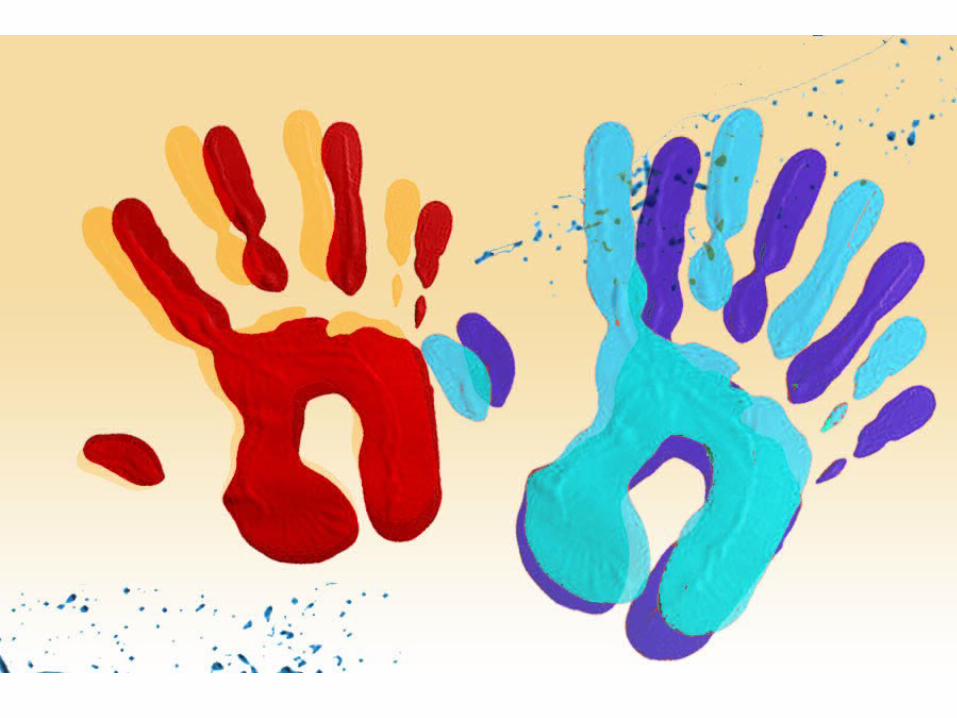
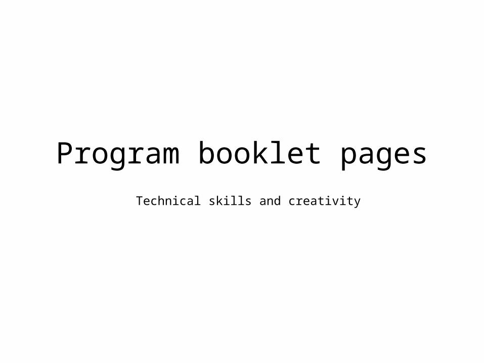
We made a gradient fill for the background using the gradient tool. We chose this colour because it is the main colour of Pitter Painter and the exhibit. We decided to use a gradient because we found that it looked more artistic and suited the program booklet better as there is a wider range of colours here.
Next, we added a handprint because handprints and paint is often associated with Pitter Painter. Furthermore it is creative and children often finger paint and it is quite childlike, reflecting the demands of our client. We also faded the image a little so any text added onto the page can be read more easily.
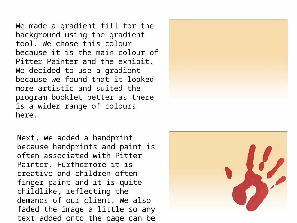
We then duplicated the handprint and rotated it slightly to make it look like a shadow. We faded the shadow even more than the main handprint. We did this because we thought that it would add more colour and innovation to the page.
We then adjusted the saturation and hue of two handprints to suit the colour scheme of the Pitter Painter exhibit, which was set by our client. We chose these two colours out of the rest because we thought that it looked more appealing and the two colours also complimented each other.
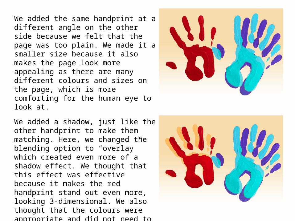
We added the same handprint at a different angle on the other side because we felt that the page was too plain. We made it a smaller size because it also makes the page look more appealing as there are many different colours and sizes on the page, which is more comforting for the human eye to look at.
We added a shadow, just like the other handprint to make them matching. Here, we changed the blending option to “overlay” which created even more of a shadow effect. We thought that this effect was effective because it makes the red handprint stand out even more, looking 3-dimensional. We also thought that the colours were appropriate and did not need to be changed because they fitted the colour scheme.
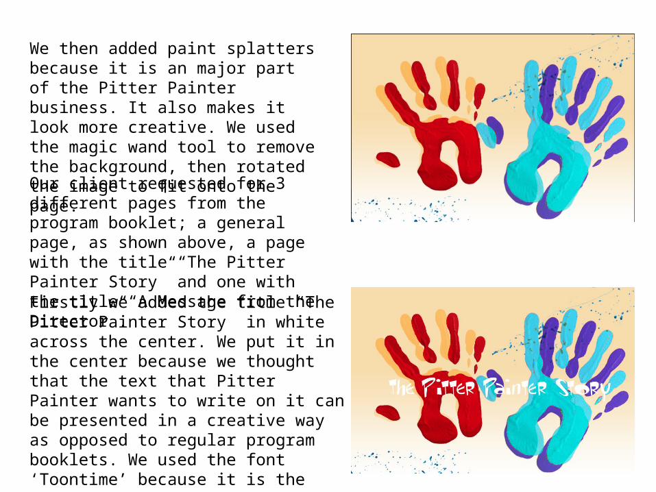
We then added paint splatters because it is an major part of the Pitter Painter business. It also makes it look more creative. We used the magic wand tool to remove the background, then rotated the image to fit onto the page.
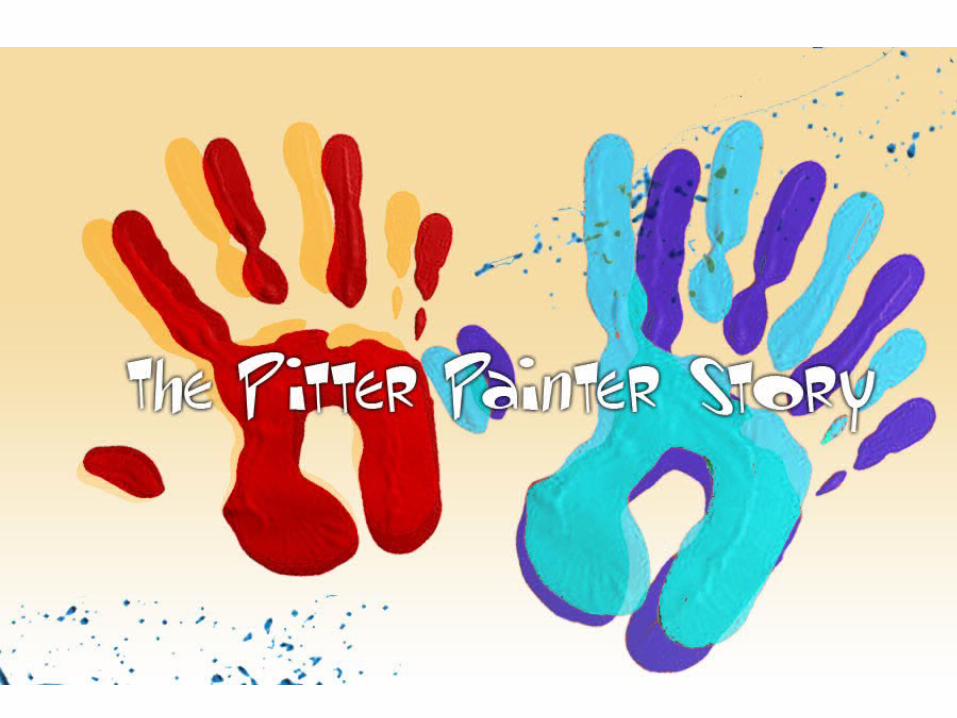
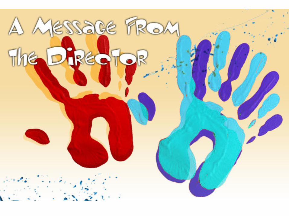
Our client requested for 3 different pages from the program booklet; a general page, as shown above, a page with the title “The Pitter Painter Story” and one with the title “A Message from the Director”.
Firstly we added the title “The Pitter Painter Story” in white across the center. We put it in the center because we thought that the text that Pitter Painter wants to write on it can be presented in a creative way as opposed to regular program booklets. We used the font ‘Toontime’ because it is the main font for the Pitter Painter business and also promotes childhood creativity as it looks child friendly
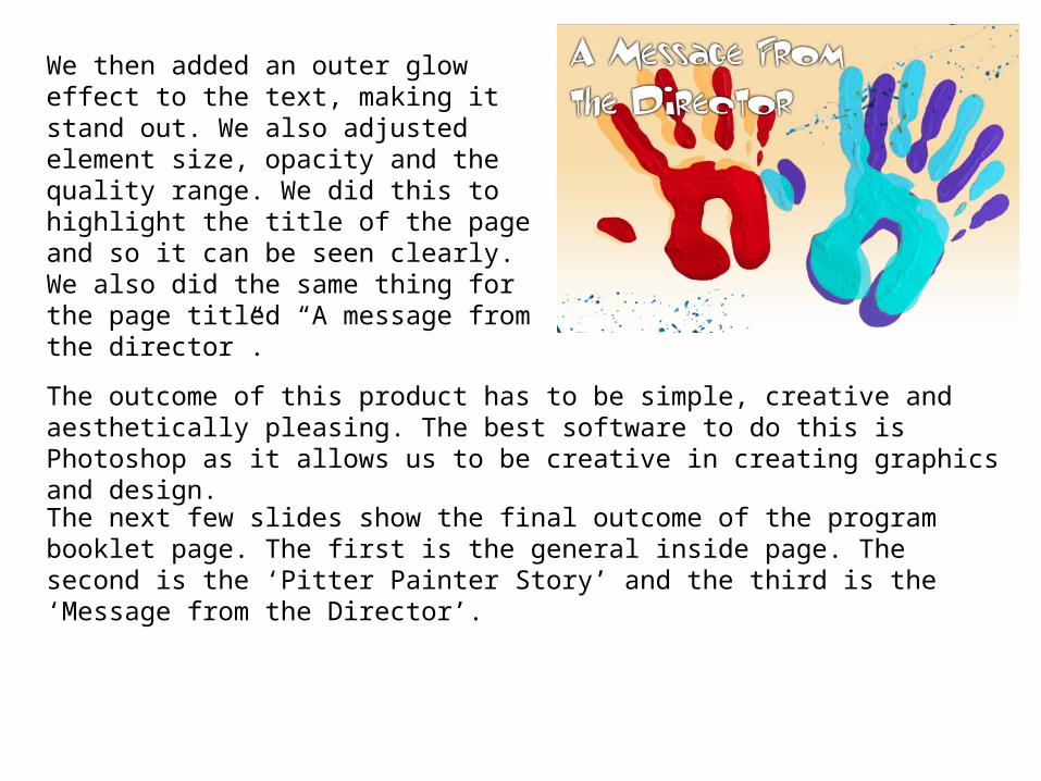
We then added an outer glow effect to the text, making it stand out. We also adjusted element size, opacity and the quality range. We did this to highlight the title of the page and so it can be seen clearly. We also did the same thing for the page titled “A message from the director”.
The outcome of this product has to be simple, creative and aesthetically pleasing. The best software to do this is Photoshop as it allows us to be creative in creating graphics and design.
The next few slides show the final outcome of the program booklet page. The first is the general inside page. The second is the ‘Pitter Painter Story’ and the third is the ‘Message from the Director’.