Creating Pharmacokinetic Graphs using SAS/GRAPH · IntroductIon: Pharmacokinetics (PK) may be...
1
INTRODUCTION: Pharmacokinetics (PK) may be defined as the absorption, distribution, metabolism, and excretion of an investigational drug. In a new drug development process, pharmacokinetic types of studies are conducted to examine what is happening to the drug within the body. Graphs play an important role in interpreting drug concentration-time data as they provide a quick view of the general trend of the drug concentrations over time. A simple illustration of a concentration-time graph is presented below. In general, this graph is very effective to show the mean concentration-time curves for a dataset with enough quantifiable concentrations over time; however not all cases of data received by programmers, biostatisticians and scientists fit into this picture. Every dataset is different, thus, requiring close attention given to the best way of presenting the information, in order that the data may be correctly interpreted. ILLUSTRATION: Case 1: Some clinical trials are designed to collect data over several periods of time, such as in the case of multiple-dose studies. One example of this study design is when subjects are dosed for series of days and blood samples are drawn at the particular time points. The graph below is one example of this study design. Subjects were dosed for series of days with trough (predose) and serial plasma samples were drawn on different study days. Partial SAS code: PROC GPLOT DATA=ALLGRAPH GOUT=GRPH2 annotate=legend1; PLOT c1*hour=1 / overlay HAXIS=AXIS1 VAXIS=AXIS2 nolegend noframe des=” “ skipmiss; run; Case 2: Another way of presenting multiple-dose studies is to have multiple graphs in one page. An advantage of this type of presentation is, it provides graphical comparisons of concentration profiles over different time points. The graph below compares the relationship of two plasma samples on different study days. Partial SAS code: PROC GREPLAY NOFS; TC=TEMPL1; TDEF TEMPL1 des=” “ 1/ llx=0 lly=0 ulx=0 uly=100 urx=33.3 ury=100 lrx=33.3 lry=0 color=white 2/ llx=33.3 lly=0 ulx=33.3 uly=100 urx=66.6 ury=100 lrx=66.6 lry=0 color=white 3/ llx=66.6 lly=0 ulx=66.6 uly=100 urx=100 ury=100 lrx=100 lry=0 color=white 4/ llx=0 lly=0 ulx=0 uly=100 urx=100 ury=100 lrx=100 lry=0; TEMPLATE TEMPL1; IGOUT=GRPH1; list igout; list template; TREPLAY 1:1 2:2 3:3 4:4 RUN; quit; Creating Pharmacokinetic Graphs using SAS/GRAPH ® Katrina E. Canonizado, Matthew Murphy Celerion Case 3: Pharmacokinetic data can be visualized by subjects, and scatter plots are commonly used to display pharmacokinetic data by subject on a single graph. Scatter plots are particularly useful for interpreting PK data when there are a significant number of concentrations that are not quantifiable or missing, in which case mean concentration-time data may be misleading. Partial SAS code: AXIS2 length=%eval(&vl.+0) cm label=(h=0.45 cm font=”&font.” angle=90 “&name. (&un.)”) value=(height=&h_v. cm) reflabel=(position=bottom j = r h=&h. cm font=”&font.” “LLOQ = 0.2 &un.” “ULOQ=1.5 &un.”) order=(0 to 1.8 by 0.1) offset=(0.25 cm); proc gplot data=all; plot conc*day1 = ptno / haxis=axis1 vaxis=axis2 vref=0.2 1.5 lvref=4 annotate=legend1 nolegend noframe; Case 4: Another option for presenting individual concentration-time data is a spaghetti plot. Spaghetti plots show variability between individual concentration data at a given time. Moreover, there are cases where there is a need to overlay the mean (+/- standard deviation [SD]) concentration profile to have an overall clear understanding of the concentration-time data. Partial SAS code: %let num=1; %let stat=std; %macro build; if group=2 then do; color=’red’; line=1; end; else if group=3 then do; color=’black’; line=1; end; %mend build; data anno2 (drop=conc mean std); length color function style $8.; retain xsys ysys ‘2’ when ‘a’; set b; if std ne .; /* Lower tick */ function=’move’; xsys=’2’; x=hour; y=mean-(&num.*&stat.); output; function=’draw’; xsys=’9’; x=-2; y=mean-(&num.*&stat.); %build; output; function=’draw’; xsys=’9’; x=+4; y=mean-(&num.*&stat.); %build; output; /* Upper tick */ function=’move’; xsys=’2’; x=hour; y=mean+(&num.*&stat.); output; function=’draw’; xsys=’9’; x=-2; y=mean+(&num.*&stat.); %build; output; function=’draw’; xsys=’9’; x=+4; y=mean+(&num.*&stat.); %build; output; /* Join upper and lower*/ function=’move’; xsys=’2’; x=hour; y=mean-(&num.*&stat.); output; function=’draw’; xsys=’2’; x=hour; y=mean+(&num.*&stat.); %build; output; run; Case 5: In addition to graph drug concentrations-time data, graphs that show relationships of pharmacokinetic parameters are often done as part of the analysis. Common pharmacokinetic endpoints are presented below: As per FDA guidelines, bioequivalence criteria are met if the 90% confidence intervals of the ratios of the mean fell within the range of 80% to 125% for logarithmically transformed Cmax, AUC0-t and AUC0-∞. The graph below shows an effective way of visualizing whether bioequivalence criteria are met, per this guidance. Partial SAS code: data anno2; length color function style $8.; retain xsys ysys ‘2’ when ‘a’; set ratio; function=’label’; x=point + 0.3; y=ratio; position=’6’; text=’ ‘ || trim(left(cratio)); size=1.3; output; function=’label’; x=point +0.3 ; y=LL; position=’6’; text=’ ‘ || trim(left(cratiol)); size=1.3; output; function=’label’; x=point + 0.3; y=UL; position=’6’; text=’ ‘ || trim(left(cratiou)); size=1.3; output; run; Case 6: It can be useful to plot clinical data such as vital signs and electrocardiogram (ECG) data against pharmacokinetic concentration data in order to spot existing relationships between the two parameters. Below is an example of a graph that shows ECG data (Change from Baseline QT measurement) plotted against the time-matched plasma concentration for each subject by treatment. Regression lines can then be added to display predicted values and confidence limits. Partial SAS code: symbol1 i=none v=dot h=0.4 cm c=red; symbol2 i=none v=dot h=0.4 cm c=red; symbol3 i=none v=dot h=0.4 cm c=red; symbol4 i=rlclm95 c=black; /*mean predicted values*/ /*symbol4 i=rlcli95 c=black;*/ /*individual predicted values*/ proc gplot data=final; plot chga*conc=1 chgb*conc=2 chgc*conc=3 chgall*conc=4 / vaxis=axis1 haxis=axis2 legend=legend2 noframe overlay regeqn; CONCLUSION: Datasets that are not presented well can lead to misinterpretation of the data which may lead to an erroneous decision. This paper demonstrated some helpful ways to visualize pharmacokinetic data effectively. As seen in this paper, creating graphs using SAS ® procedures such as PROC GPLOT and PROC GREPLAY, together with the available plotting options, keeps the programming from becoming more complicated than it needs to be. The ultimate goal is to visually communicate the data at hand that scientists can use to interpret and draw conclusions. AUC0 -t AUC0-inf Cmax * Red colored symbols are for Analyte 1, Black colored symbols are for Analyte 2 Ratio of Geometric Means (%) 60 90 120 150 180 B vs A (92.84) (85.14) (111.20) (115.75) (107.41) (138.70) (92.03) (83.95) (110.85) (112.17) (103.98) (134.96) (91.44) (75.33) (120.79) (120.47) (105.17) (151.86) Note: Treat B and Treat C are shifted to the right for ease of reading LLOQ = 0.2 ng/mL ULOQ=1.5 ng/mL Plasma Concentration (ng / mL) 0.0 0.1 0.2 0.3 0.4 0.5 0.6 0.7 0.8 0.9 1.0 1.1 1.2 1.3 1.4 1.5 1.6 1.7 1.8 Day of Collection -1 0 1 2 3 4 5 6 7 8 9 10 11 12 13 14 15 16 17 P a r ameter Definition Cmax Maximum plasma concentration A UC0-t Area under the plasma concentration-time curve from zero to time t, where t is the time of the last measurable concentration A UC0- Area under the plasma concentration-time curve from zero to extrapolated infinity
-
Upload
nguyenkhanh -
Category
Documents
-
view
230 -
download
2
Transcript of Creating Pharmacokinetic Graphs using SAS/GRAPH · IntroductIon: Pharmacokinetics (PK) may be...
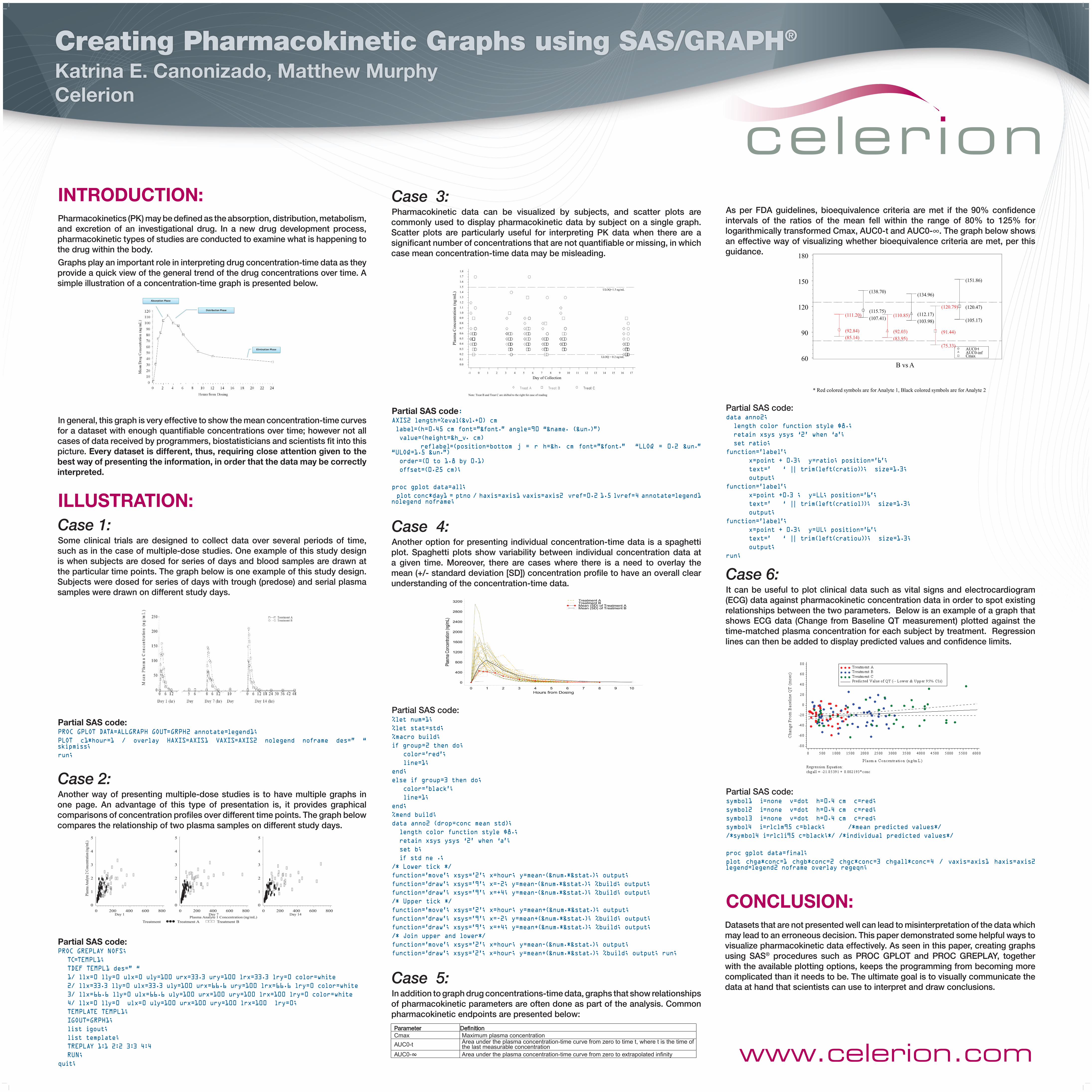
IntroductIon:Pharmacokinetics (PK) may be defined as the absorption, distribution, metabolism, and excretion of an investigational drug. In a new drug development process, pharmacokinetic types of studies are conducted to examine what is happening to the drug within the body.
Graphs play an important role in interpreting drug concentration-time data as they provide a quick view of the general trend of the drug concentrations over time. A simple illustration of a concentration-time graph is presented below.
In general, this graph is very effective to show the mean concentration-time curves for a dataset with enough quantifiable concentrations over time; however not all cases of data received by programmers, biostatisticians and scientists fit into this picture. Every dataset is different, thus, requiring close attention given to the best way of presenting the information, in order that the data may be correctly interpreted.
ILLuStrAtIon:Case 1: Some clinical trials are designed to collect data over several periods of time, such as in the case of multiple-dose studies. One example of this study design is when subjects are dosed for series of days and blood samples are drawn at the particular time points. The graph below is one example of this study design. Subjects were dosed for series of days with trough (predose) and serial plasma samples were drawn on different study days.
Partial SAS code:PROC GPLOT DATA=ALLGRAPH GOUT=GRPH2 annotate=legend1;
PLOT c1*hour=1 / overlay HAXIS=AXIS1 VAXIS=AXIS2 nolegend noframe des=” “ skipmiss;
run;
Case 2: Another way of presenting multiple-dose studies is to have multiple graphs in one page. An advantage of this type of presentation is, it provides graphical comparisons of concentration profiles over different time points. The graph below compares the relationship of two plasma samples on different study days.
Partial SAS code:PROC GREPLAY NOFS;
TC=TEMPL1;
TDEF TEMPL1 des=” “
1/ llx=0 lly=0 ulx=0 uly=100 urx=33.3 ury=100 lrx=33.3 lry=0 color=white
2/ llx=33.3 lly=0 ulx=33.3 uly=100 urx=66.6 ury=100 lrx=66.6 lry=0 color=white
3/ llx=66.6 lly=0 ulx=66.6 uly=100 urx=100 ury=100 lrx=100 lry=0 color=white
4/ llx=0 lly=0 ulx=0 uly=100 urx=100 ury=100 lrx=100 lry=0;
TEMPLATE TEMPL1;
IGOUT=GRPH1;
list igout;
list template;
TREPLAY 1:1 2:2 3:3 4:4
RUN;
quit;
Creating Pharmacokinetic Graphs using SAS/GRAPH®
Katrina E. canonizado, Matthew Murphycelerion
Case 3: Pharmacokinetic data can be visualized by subjects, and scatter plots are commonly used to display pharmacokinetic data by subject on a single graph. Scatter plots are particularly useful for interpreting PK data when there are a significant number of concentrations that are not quantifiable or missing, in which case mean concentration-time data may be misleading.
Partial SAS code:AXIS2 length=%eval(&vl.+0) cm
label=(h=0.45 cm font=”&font.” angle=90 “&name. (&un.)”)
value=(height=&h_v. cm)
reflabel=(position=bottom j = r h=&h. cm font=”&font.” “LLOQ = 0.2 &un.” “ULOQ=1.5 &un.”)
order=(0 to 1.8 by 0.1)
offset=(0.25 cm);
proc gplot data=all;
plot conc*day1 = ptno / haxis=axis1 vaxis=axis2 vref=0.2 1.5 lvref=4 annotate=legend1 nolegend noframe;
Case 4: Another option for presenting individual concentration-time data is a spaghetti plot. Spaghetti plots show variability between individual concentration data at a given time. Moreover, there are cases where there is a need to overlay the mean (+/- standard deviation [SD]) concentration profile to have an overall clear understanding of the concentration-time data.
Partial SAS code:%let num=1;
%let stat=std;
%macro build;
if group=2 then do;
color=’red’;
line=1;
end;
else if group=3 then do;
color=’black’;
line=1;
end;
%mend build;
data anno2 (drop=conc mean std);
length color function style $8.;
retain xsys ysys ‘2’ when ‘a’;
set b;
if std ne .;
/* Lower tick */
function=’move’; xsys=’2’; x=hour; y=mean-(&num.*&stat.); output;
function=’draw’; xsys=’9’; x=-2; y=mean-(&num.*&stat.); %build; output;
function=’draw’; xsys=’9’; x=+4; y=mean-(&num.*&stat.); %build; output;
/* Upper tick */
function=’move’; xsys=’2’; x=hour; y=mean+(&num.*&stat.); output;
function=’draw’; xsys=’9’; x=-2; y=mean+(&num.*&stat.); %build; output;
function=’draw’; xsys=’9’; x=+4; y=mean+(&num.*&stat.); %build; output;
/* Join upper and lower*/
function=’move’; xsys=’2’; x=hour; y=mean-(&num.*&stat.); output;
function=’draw’; xsys=’2’; x=hour; y=mean+(&num.*&stat.); %build; output; run;
Case 5: In addition to graph drug concentrations-time data, graphs that show relationships of pharmacokinetic parameters are often done as part of the analysis. Common pharmacokinetic endpoints are presented below:
As per FDA guidelines, bioequivalence criteria are met if the 90% confidence intervals of the ratios of the mean fell within the range of 80% to 125% for logarithmically transformed Cmax, AUC0-t and AUC0-∞. The graph below shows an effective way of visualizing whether bioequivalence criteria are met, per this guidance.
Partial SAS code:data anno2;
length color function style $8.;
retain xsys ysys ‘2’ when ‘a’;
set ratio;
function=’label’;
x=point + 0.3; y=ratio; position=’6’;
text=’ ‘ || trim(left(cratio)); size=1.3;
output;
function=’label’;
x=point +0.3 ; y=LL; position=’6’;
text=’ ‘ || trim(left(cratiol)); size=1.3;
output;
function=’label’;
x=point + 0.3; y=UL; position=’6’;
text=’ ‘ || trim(left(cratiou)); size=1.3;
output;
run;
Case 6: It can be useful to plot clinical data such as vital signs and electrocardiogram (ECG) data against pharmacokinetic concentration data in order to spot existing relationships between the two parameters. Below is an example of a graph that shows ECG data (Change from Baseline QT measurement) plotted against the time-matched plasma concentration for each subject by treatment. Regression lines can then be added to display predicted values and confidence limits.
Partial SAS code:symbol1 i=none v=dot h=0.4 cm c=red;
symbol2 i=none v=dot h=0.4 cm c=red;
symbol3 i=none v=dot h=0.4 cm c=red;
symbol4 i=rlclm95 c=black; /*mean predicted values*/
/*symbol4 i=rlcli95 c=black;*/ /*individual predicted values*/
proc gplot data=final;
plot chga*conc=1 chgb*conc=2 chgc*conc=3 chgall*conc=4 / vaxis=axis1 haxis=axis2 legend=legend2 noframe overlay regeqn;
concLuSIon:Datasets that are not presented well can lead to misinterpretation of the data which may lead to an erroneous decision. This paper demonstrated some helpful ways to visualize pharmacokinetic data effectively. As seen in this paper, creating graphs using SAS® procedures such as PROC GPLOT and PROC GREPLAY, together with the available plotting options, keeps the programming from becoming more complicated than it needs to be. The ultimate goal is to visually communicate the data at hand that scientists can use to interpret and draw conclusions.
AUC0-tAUC0-infCmax
* Red colored symbols are for Analyte 1, Black colored symbols are for Analyte 2
Rat
io o
f Geo
met
ric M
eans
(%)
60
90
120
150
180
B vs A
(92.84)(85.14)
(111.20)(115.75)(107.41)
(138.70)
(92.03)(83.95)
(110.85) (112.17)(103.98)
(134.96)
(91.44)
(75.33)
(120.79) (120.47)
(105.17)
(151.86)
Note: Treat B and Treat C are shifted to the right for ease of reading
LLOQ = 0.2 ng/mL
ULOQ=1.5 ng/mL
Plas
ma
Con
cent
ratio
n (n
g
/ mL)
0.0
0.1
0.2
0.3
0.4
0.5
0.6
0.7
0.8
0.9
1.0
1.1
1.2
1.3
1.4
1.5
1.6
1.7
1.8
Day of Collection-1 0 1 2 3 4 5 6 7 8 9 10 11 12 13 14 15 16 17
Parameter DefinitionCmax Maximum plasma concentration
AUC0-t Area under the plasma concentration-time curve from zero to time t, where t is the time of the last measurable concentration
AUC0- Area under the plasma concentration-time curve from zero to extrapolated infinity