Coursework eval
6
In what ways does your media product use, develop or challenge forms and conventions of real media products? Question 1
-
Upload
jameshooper1998 -
Category
Education
-
view
53 -
download
0
Transcript of Coursework eval
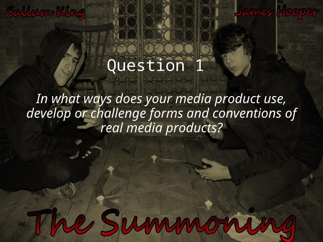
In what ways does your media product use, develop or challenge forms and conventions of
real media products?
Question 1
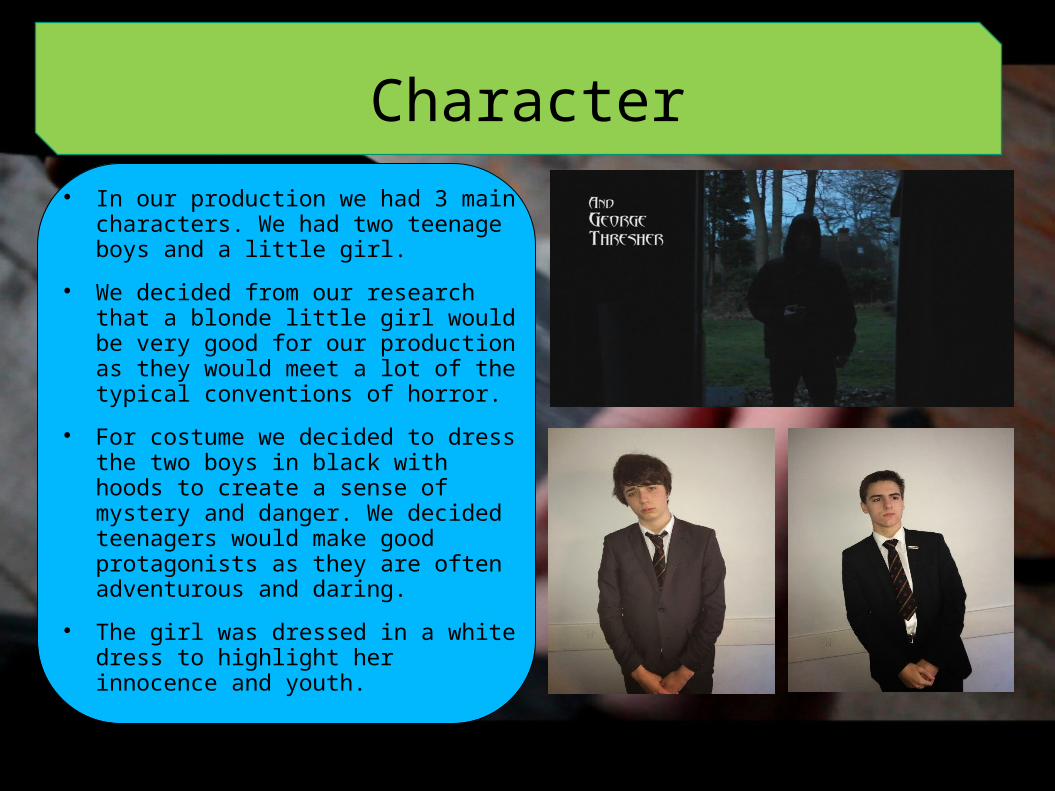
Character In our production we had 3 main
characters. We had two teenage boys and a little girl.
We decided from our research that a blonde little girl would be very good for our production as they would meet a lot of the typical conventions of horror.
For costume we decided to dress the two boys in black with hoods to create a sense of mystery and danger. We decided teenagers would make good protagonists as they are often adventurous and daring.
The girl was dressed in a white dress to highlight her innocence and youth.
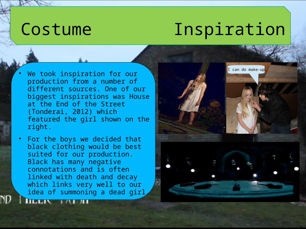
Costume Inspiration
We took inspiration for our production from a number of different sources. One of our biggest inspirations was House at the End of the Street (Tonderai, 2012) which featured the girl shown on the right.
For the boys we decided that black clothing would be best suited for our production. Black has many negative connotations and is often linked with death and decay which links very well to our idea of summoning a dead girl.
I can do make-up
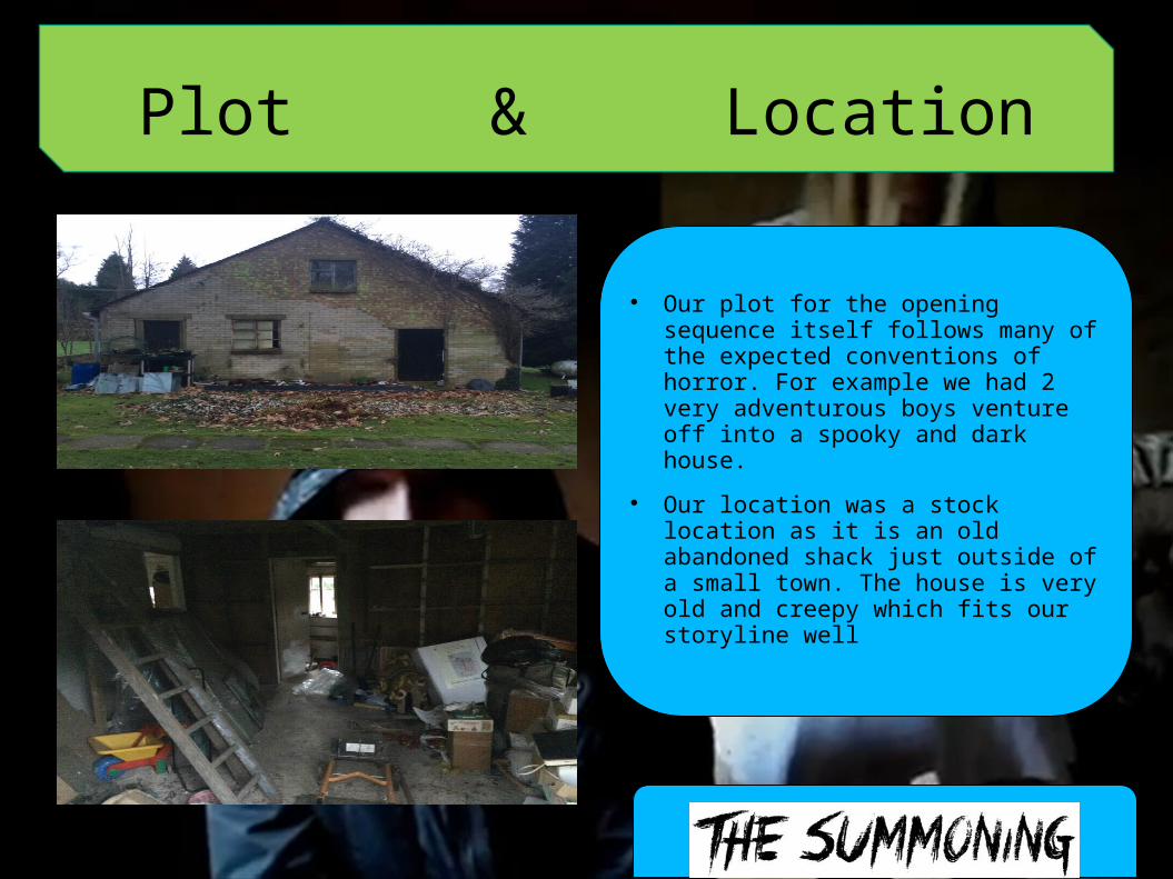
Plot & Location
Our plot for the opening sequence itself follows many of the expected conventions of horror. For example we had 2 very adventurous boys venture off into a spooky and dark house.
Our location was a stock location as it is an old abandoned shack just outside of a small town. The house is very old and creepy which fits our storyline well
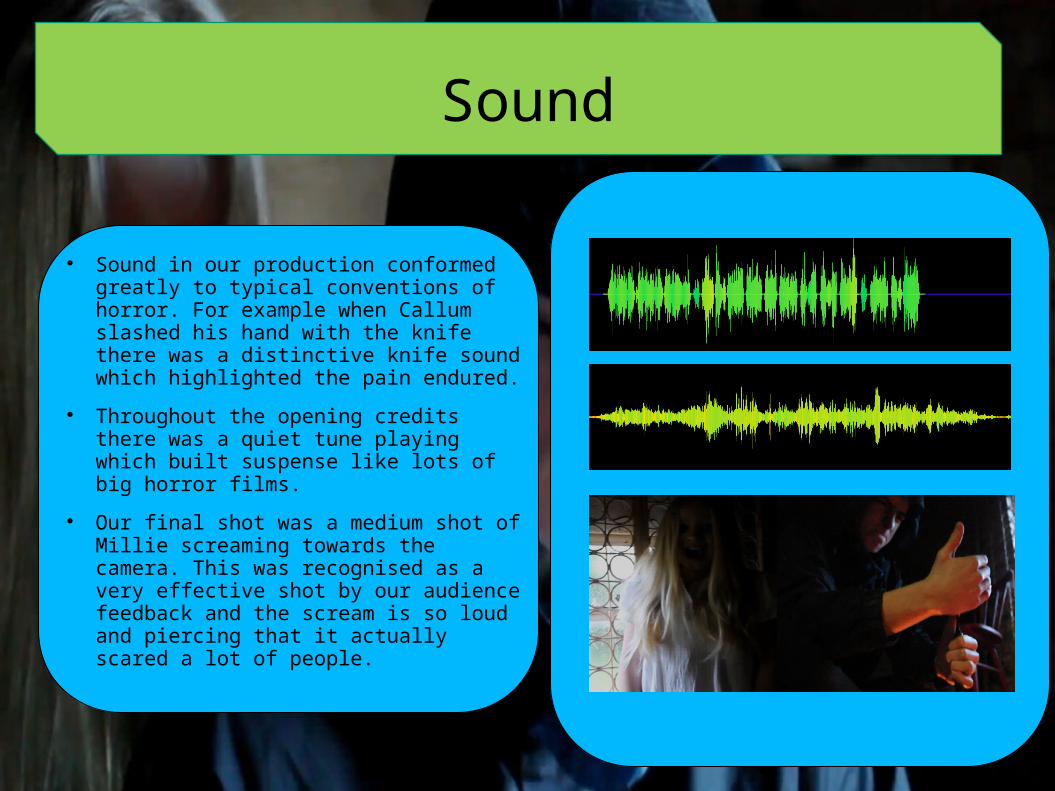
Sound
Sound in our production conformed greatly to typical conventions of horror. For example when Callum slashed his hand with the knife there was a distinctive knife sound which highlighted the pain endured.
Throughout the opening credits there was a quiet tune playing which built suspense like lots of big horror films.
Our final shot was a medium shot of Millie screaming towards the camera. This was recognised as a very effective shot by our audience feedback and the scream is so loud and piercing that it actually scared a lot of people.
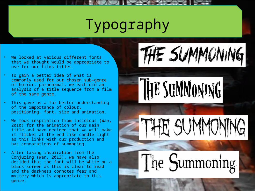
Typography
We looked at various different fonts that we thought would be appropriate to use for our films titles.
To gain a better idea of what is commonly used for our chosen sub-genre of horror, paranormal, we each did an analysis of a title sequence from a film of the same genre.
This gave us a far better understanding of the importance of colour, positioning, font, size and animation.
We took inspiration from Insidious (Wan, 2010) for the animation of our main title and have decided that we will make it flicker at the end like candle light as this links with our production and has connotations of summoning.
After taking inspiration from The Conjuring (Wan, 2013), we have also decided that the font will be white on a black screen as this is clear to read and the darkness connotes fear and mystery which is appropriate to this genre.