Corporate Style Manual - WhatDoTheyKnow
59
Corporate Style Manual A descriptive guide to the use of Calderdale Council’s corporate identity Third edition, revised December 2004 www.calderdale.gov.uk
Transcript of Corporate Style Manual - WhatDoTheyKnow

Corporate StyleManualA descriptive guide to the use ofCalderdale Council’s corporate identity
Third edition, revised December 2004
www.calderdale.gov.uk

ForewordA message from the Chief Executive 1
Following detailed research and consultation with the public,elected Members and staff, the new logo design for CalderdaleCouncil was approved by Cabinet on 27th August 2003. Thiswas a very important step in updating and improving our visualand corporate identity.
In all our communications, whether they be through stationery,signage, clothing and vehicle livery, as well as service information,recruitment and publicity materials, we project an image ofCalderdale Council and the services we provide. It is crucial thatthe Council’s image is professional and of the highest quality. The presence of the Council logo helps customers recognise thewide range of services we provide and so it is necessary toensure the logo is used in a clear and consistent way.
This corporate identity manual will be developed in phases overthe coming months, building a reference guide not only on howto use the logo, but also how to ensure our communications arecustomer focussed, accessible and understandable.
The corporate identity of the Council is not exclusively for thebenefit of our customers. It is also important that we demonstratea sense of belonging to one organisation that values anddepends on the individual and collective contributions they maketo the people of Calderdale.
Every one of us has a responsibility to ensure that any written orgraphic communication representing the Council meets theguidelines set out in this corporate identity manual.
Paul SheehanChief Executive

Index
Page No. Section
3 The Logo7 Award Logos8 Typefaces9 Stationery15 ID Badges16 Corporate Publications29 Signage32 Vehicle Livery33 Staff Uniforms34 Producing Public Information35 Getting Started36 Writing Information41 Designing Information52 Distribution of Information53 Legislation54 Feedback & Acknowledgements55 Appendix 1
Information Checklist
56 Appendix 2Photographic Consent Forms
2

The LogoUse of the Calderdale Council logo
Where possible, the Calderdale Council logo should appear inthe two corporate colours. Where this is not possible (forexample, where the logo appears over a background colouror image, or where only black is printed), one of the alternativeversions shown below should be used.
4 Colour CMYK2 Spot Colour (p361, p445)2 Spot Colour (p361, 70% Black)
Solid White
Solid Black
Exclusion Zones
The logo should always have an ‘exclusion zone’that is kept free of all other graphics/text. Thezones above, below, to left and right of the logoare equal to the width of the ‘Ca’ part ofCalderdale. The text part of the logo, and not thebottom of the ‘swoosh’ should be used to measure the ‘exclusion zone’. The logo shouldnever be placed nearer to the edge of a pagethan the ‘exclusion zone’ allows.
p361 p445
3

The LogoWhat not to do when using the Calderdale Council logo
Shown below is a list of ways that the logo must not beused under any circumstances. Only approved copies of thelogo should be used. These can be obtained by contactingThirza Hyde on 01422 393 520, requested by email [email protected], or downloaded from the intranet.
Logo ColourColours other than those approved must not be used inthe logo. See page 3 for approved colours.
Approved CopiesOnly use an approved copy of the logo. Please do not attempt to re-create the logo using different typefaces or re-drawing the ‘swoosh’.
DistortionThe logo must not be distorted / shortened / stretched in any way in order to fit the logo into an available space.Please also see ‘exclusion zones’ on page 3.
Background ColourPlease ensure that the logo is placed over an area of colour or background image which allows it to be seen without difficulty. For example, do not use light backgrounds when using the white logo.
CalderdaleCouncil
4

The LogoMinimum sizes
The Calderdale Council logo should be used at a size appropriateto the overall dimensions of the material it is being used on.
Listed below are some typical document sizes and the minimumsize at which the logo should be used.
5
Logo width: 45mmStandard minimum size for use on:> A5 Leaflets / Brochures
Logo width: 30mmStandard minimum size for use on:> Business Cards> Identity Cards> Other small, non-standard size documents
45mm Width
13mm Height
8.5mmHeight
30mm Width
Logo width: 40mmStandard minimum size for use on:> 1/3 A4 or DL Leaflets / Brochures
40mm Width
12mm Height

The LogoMinimum sizes
For advice on all other applications, such as larger posters, signage and vehicles, please contact Nicola Futtit, PrincipalCommunications Officer on 01422 393 116.
6
Logo width: 85mmStandard minimum size for use on:> A3 Posters
85mm Width
24.5mm Height
Logo width: 55mmStandard minimum size for use on:> A4 Leaflets / Brochures / Posters
55mm Width
16mm Height

Award LogosUse of additional award logos
In addition to the Council’s logo, corporate documents shouldalso show the range of awards we have received as a wholeauthority. The awarding organisations have strict rules regardingthe minimum size these logos should be used. The logosshould be included at the size shown below.
Copies of these logos are available on the intranet.
2001-2002Local Health Strategies2003-2004Transforming Secondary Education
7
Beacon Council LogoWhere used, this logo (including text)must be a minimum of 12.75mm in height, 46mm in width. Colour: Black/P445For more information, go towww.odpm.gov.uk
IIP LogoWhere used, this logo must be at least 16mm in width, 14mm in height. Colour: Black/P445For more information, go to www.iipuk.co.uk
PADP LogoWhere used, this logo must be at least 17mm in width, 14mm in height. Colour: Black/P445For more information, go towww.jobcentreplus.gov.uk
46mm Minimum Width
14mm Minimum Height
14mm Minimum Height
12.75mm Minimum Height
16mmMinimum
Width
17mmMinimum
Width

Typefaces
For all documents produced by staff on their PCs, the Arial font family shouldbe used. A minimum size of 12 point must be used on all letters and memosto meet the requirements of the DDA (Disability Discrimination Act).
For documents produced by designers and printers, the Helvetica Neuefont family should be used. This comes in many weights, but for mostapplications, the following two weights should be used.
Arial
Arial Bold
Use for all main text/body copy (minimum 12pt)
ABCDEFGHIJKLMNOPQRSTUVWXYZ011234556789abcdefghijklmnopqrstuvwxyz
Use for headings/highlighted text
ABCDEFGHIJKLMNOPQRSTUVWXYZ011234556789abcdefghijklmnopqrstuvwxyz
Helvetica Neue 45 Light
Helvetica Neue 65 Heavy
Use for all main text/body copy
ABCDEFGHIJKLMNOPQRSTUVWXYZ011234556789abcdefghijklmnopqrstuvwxyz
Use for headings/highlighted text
ABCDEFGHIJKLMNOPQRSTUVWXYZ011234556789abcdefghijklmnopqrstuvwxyz
8

StationeryUse of the corporate letterhead 9
For individual letters, staff should use full colour, corporate letterhead paper.
Black and white letterhead paper is available to order for use when standardletters are being produced in high volume. Black and white letterhead papershould only be used if there is a valid business case to do so.
Service areas that generate automated correspondence from database systems should ensure that systems are updated to use the new Council logo.
Please note the instructions for use of the logo on pages 3-6.

StationeryLayout of the full colour corporate letterheadRevised guidelines as of 29th October 2003
Our Ref: 0000Your Ref: 0000Please contact: Mrs JonesTelephone: 01422 391111Fax: 01422 392222Email: [email protected]: 25th November 2004
Dear Mr Bloggs
Subject Matter:
Si meliora dies, ut vina, poemata reddit, scire velim, chartis pretium quotus arroget annus.scriptor ab hinc annos cen tum qui dec idit, inter perfe ctos vete resque ref erri debet an intervilis at que no vos. Exclu dat iurgia finis, est vetus atque probus, centum qui perficit annos.Quid, qui dep eriit minor uno mense vel anno, inter quos erit. Veteresne poetas, an quos etpraesens et postera respuat aetas.
Iste quidem veteres inter ponetur honeste, qui vel mense brevi vel toto est iunior anno. Utorpermisso, caudaeque pilos ut equinae paulatim vello unum, demo etiam unum, dum cadatelusus ratione ruentis acervi, qui redit in fastos et virtutem aestimat annis miraturque nihil nisiquod Libitina sacravit.
Yours sincerely
NameJob TitleService Area
Mr Bloggs1 High StreetNew TownAA1 1AA
Chief Officer / Head of ServiceJob Title
www.calderdale.gov.uk
Chief Executive’s Office
Town HallHalifax
HX1 1UJ
2001-2002Local Health Strategies2003-2004Transforming Secondary Education
15mmMargin
15mmMargin
20mm Margin
Tab set at 32mm
Font: ArialSize: 12ptpositioned to fitwindow envelope
Font: Arial BoldSize: 12pt
Font: Arial BoldSize: 12pt
main body text left justified
Font: ArialSize: 12pt
7mm margin
Font: Arial Size: 12pt
Font: Arial BoldSize: 12pt
Name of Directorateomit word “Directorate” eg. “Health and Social Care”
10

StationeryLayout of black and white corporate letterheadRevised guidelines as of 29th October 2003
Our Ref: 0000Your Ref: 0000Please contact: Mrs JonesTelephone: 01422 391111Fax: 01422 392222Email: [email protected]: 25th November 2004
Mr Bloggs1 High StreetNew TownAA1 1AA
Chief Officer / Head of ServiceJob Title
www.calderdale.gov.uk
Chief Executive’s Office
Town HallHalifax
HX1 1UJ
2001-2002Local Health Strategies2003-2004Transforming Secondary Education
15mmMargin
15mmMargin Tab set at 32mm
7mm margin
Wherever possible, letters from the Council should be issuedon pre-printed, full colour letterhead.
Letters should only be issued on black and white letterhead ifyou have a reasonable business case for doing so.
Black and white letterhead is available to order from Thirza Hyde on 01422 393 520 or requested by email from [email protected].
High volume letters produced by automated systems shouldincorporate the Council logo, and adhere to the guidelines oncolour, exclusion zones etc as detailed on page 3.
11

StationeryLayout of Corporate Compliment Slips
Internal Compliment Slips
With Compliments
Chief Officer / Head of ServiceJob Title
15mmMargin
15mmMargin
7mm margin
www.calderdale.gov.uk
Chief Executive’s OfficeService Area Details (if applicable)
Town HallHalifax
HX1 1UJTel: 01422 391111
Name of Directorateomit word “Directorate” eg. “Health and Social Care”
Font: Arial BoldSize: 12pt
Font: ArialSize: 12pt
With Compliments
Chief Officer / Head of ServiceJob Title
15mmMargin
15mmMargin
7mm margin
www.calderdale.gov.uk
Chief Executive’s OfficeService Area Details (if applicable)
Town HallHalifax
HX1 1UJTel: 01422 391111
For Information
Please let me have comments
Please complete and return to meName of Directorateomit word “Directorate” eg. “Health and Social Care”
Font: Arial BoldSize: 12pt
Font: ArialSize: 12pt
12

StationeryLayout of Corporate Business Cards
6.5mm margin
Corporate Services
Service Area details (if applicable)
Town Hall
Halifax
HX1 1UJ
Tel: 01422 000000 or Mobile: 07770 000000
Email: [email protected]
www.calderdale.gov.uk
Jo JonesJob Title
6.5mm margin
Name of Directorateomit word “Directorate” eg. “Health and Social Care”
13
5mm margin
Double-sided business cards are also available for those services whohave an additional logo or award they wish to show. For further details,please contact Thirza Hyde in Central Print on 01422 393 520 or [email protected]

StationerySupporting Partners letterheads
www.calderdale.gov.uk
15mmMargin
15mmMargin
7mm margin
Development of joint letterhead with partners should be done in consultation with Thirza Hyde on 01422 393 520 or [email protected]
Where possible, partner logos should be positioned in the area shown above.
For further information or advice on partner stationery and publications, please contact Nicola Futtit, PrincipalCommunications Officer, Chief Executive’s Office, on 01422 393 116 or email [email protected]
Area for Partner Logo
14

ID BadgesLayout of Corporate Identification Badges
All staff should have a corporate identity badge showing theirname, job title, directorate name and service area. These areproduced for the Council by Corporate Services, and are asshown below.
Staff in frontline services may also wear a 'name badge' toimprove customer service.
3mm margin
Your Job Title
(2 lines if necessary)
Your Directorate
Service Area/Team
Your Name
Your Photo Here
Your name centred in this area
3mm margin
Your Job Title
(2 lines if necessary)
Your Name Your name centred in this area
15

Corporate PublicationsIntroduction
Documents and leaflets designed to promote individual events andservices should adhere to the logo instructions contained on pages3-6 of this manual. Further guidance on the development of public information can be found on pages 34-53.
It is not intended that all council material should look the same, but it is important we have a recognisable ‘brand’ so the public caninstantly recognise the Council’s involvement.
The following pages give you the detailed information you will needwhen ordering corporate style documents from professional designers and/or printers.
Three versions are shown to suit your needs; basic two colour documents, standard four colour documents and high quality four colour documents using large size photographs.
You may chose which of these is most suitable, taking into accountavailability of images, and, of course, your budget.
Photographs should only be used with the express consent of boththe photographer, and where applicable, the people in the picture.Copyright-free images are available from designers/printers, butplease ensure any images you use are representative of Calderdaleand its citizens. For more information on photographs and images,please turn to page 49.
A template is available if you wish to produce Corporate style documents in Microsoft Word. This can be installed on your system. Please contact Jenny Eaglestone, ICT Support Officer on01422 393129 or email [email protected] for guidance.
16

Corporate PublicationsColours
Primary Colours
When producing any document for Calderdale Council,the two primary colours should be used where possible.When printing in two colours, and use of black is required,P445 may be represented as a 70% black screen (seeuse of logo section).
Secondary Colours
These colours may be used in conjunction with the primarycolours for highlighting purposes only and should not beused as the dominant colour in any document. Examplesof secondary colour use are shown below.
p361 p445
p357
p144 p1815
p275p272
17

Corporate PublicationsFront Covers 18
Your document does not necessarily need to be produced in full colour to have an impact.
The version on the next page shows the corporatestyle using two colours, which will reduce the cost ofprinting.

Corporate PublicationsFront Covers
Font: Helvetica 65 Size: 9pt
For positioning of photographs, use 20mm grid, starting at left edge.Photographs can be 20mm or 40mmsquare with 1pt white borders
19
www.calderdale.gov.uk
Corporate Plan2004 - 2005
Main TitleFont: Helvetica 45Size: 30pt/32pt
SubtitleFont: Helvetica 65
Size: 16pt/24pt
Logo 55mm Width
16mm Height
8mm
100mm
76mm
20mm
Bottom bandColour: Pantone 361
White Base Lines1pt in width40mm from left edge and100mm from top edge
Green Wavesbackground pictureavailable on the Intranetunder ‘logo library’.
Black & white photographs of your choice

Corporate PublicationsFront Covers 20
If you wish to use full colour printing, but are unableto source a good quality photograph that will lookeffective when used at this scale, please use the following version of the corporate style cover.

Corporate PublicationsFront Covers 21
www.calderdale.gov.uk
Corporate Plan2004 - 2005
4 colour photographs ofyour choice
Bottom bandColour: Pantone 361
Dark Green Waves Background

Corporate PublicationsFront Covers 22
The following version of the corporate style covershould only be used if full colour is required, and ifyou have been able to source a relevant photograph.
The top photograph must have significant visualimpact and be provided at 300dpi (actual size).
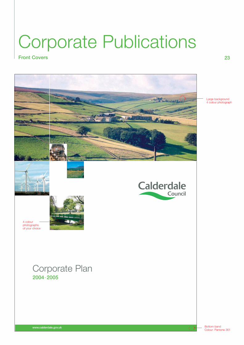
Corporate PublicationsFront Covers 23
www.calderdale.gov.uk
Corporate Plan2004 - 2005
4 colour photographs of your choice
Large background 4 colour photograph
Bottom bandColour: Pantone 361

Corporate PublicationsBack Covers 24
The following back cover is suitable for use with all threeversions of the front cover.
The corporate statement regarding the availability of information in different formats should also be shown onthe back cover. Please see pages 25 & 51.

Corporate PublicationsBack Covers 25
www.calderdale.gov.uk Bottom bandColour: Pantone 357
Top panel =Pantone 361
Town HallHalifaxHX1 1UJTelephone: 01422 391111Fax: 01422 392222Email: [email protected]
100mm
45mm Width
13mm Height
88m
m
20mm
20mm
Awards logos (see page 8)
Add own address details:12pt/15ptHelvetica 45
2001-2002Local Health Strategies2003-2004Transforming Secondary Education
If you would like this information inanother format or language, please contact: (Add own details here).
(Add own details here).
(Add own details here).

Introduction
2
This Corporate Plan sets out the future direction for Calderdale Council. It builds uponthe Council’s vision for the future and its seven corporate priorities for achieving thatvision. It does not contain everything that the Council is working on, or plans for thefuture, but sets out key action and targets. It is a central part of our performance management process.
We have recently made changes to our vision and corporate priorities for the followingreasons:
• the draft community strategy for the district – the Calderdale Futures Plan – was published in November 2001, and we have started to analyse community views and feedback and anticipate the final Calderdale Futures Plan (to be published early in 2003); and
• we have identified the need to update and refine these key statements in order to focus on driving improvements in selected areas, and to underpin this three year Corporate Plan.
Our vision and corporate priorities are:
Calderdale Council – Vision 2002 and beyond
To make Calderdale a clean, safe, attractive and thriving area for individuals and families to enjoy as residents, workers or visitors.
Calderdale’s Corporate Priorities – 2002 and beyond
1. To improve the educational achievement of all young people and promote widespread participation in learning.
2. To support and protect vulnerable children, young people and adults and promote independent and healthy living.
3. To create safer communities with lower crime levels, less fear of crime and safer roads.
4. To promote sustainable economic growth, respect local heritage and improveour towns, villages and neighbourhoods.
5. To secure a clean and attractive built and natural environment.6. To continually improve customer service.7. To support our diverse communities, building dialogue, understanding and a
capacity to work and live together.
Corporate PublicationsInside pages - plain text 26
20mmmargin
20mmmargin
Main TitleFont: Helvetica 45Size: 30pt/32ptColor: Pantone 445
Body CopyFont: Helvetica 45Size: 12pt/15ptColour: Black
Section HeadingsFont: Helvetica 65Size: 12pt/15ptBox colour: Pantone 361
8mm
8mm 8mm
Bottom lineWeight: 0.25pt
Colour: Pantone 361FoliosFont: Helvetica 65Size: 10ptPosition: To outer edge of page
47mm

www.calderdale.gov.uk
Underpinning our vision and corporate priorities are two policies, which deserve specialmention – equality and sustainability.
Our Equality policy, which was updated and adopted in 2001, aims to ensure that all sections of the community have fair and equal access to Council services and employmentopportunities. In order to achieve progress on more detailed objectives, all Directorates arerequired to produce and monitor equality action plans which will now be linked to serviceaction plans as part of our new planning process. The Council’s race equality scheme,published in May 2002, and its community cohesion plan (in preparation) will also beused in an integrated way to ensure progress in meeting these objectives. Our priorityabout supporting diverse communities (above) provides both greater recognition and aclearer framework for addressing equalities and diversity issues across all our activities.
Sustainability principles, enshrined in both the Council’s local Agenda 21 strategy (21 for21) and our draft community strategy (the Futures Plan) are recognised as pivotal inaddressing the district’s future needs. The 21 for 21 targets and actions are now beingassessed alongside those set out in the Futures Plan in order to achieve both an integratedapproach and more robust action along the lines set out in the Local Government WhitePaper (Strong Local Leadership – Quality Public Services).
The fit between the themes within the Futures Plan and the Council’s corporate prioritiesis shown in the table below.
3
Futures Plan Corporate Plan Priorities
Cross-cutting Priorities
SustainableDevelopment
Access and Inclusion
Children and Young people
Theme Priorities
Lifelong Learning
Healthy Communities
Safe communities
Sustainable economy
Good environment
Community engagement
To improve the educational achievement of all young peopleand promote widespread participation in learning
To support and protect vulnerable children, young people andadults and promote independent and healthy living
To create safer communities with lower crime levels, less fear of crime and safer roads
To promote sustainable economic growth, respect local heritage and improve our towns, villages and neighbourhoods
To secure a clean and attractive built and natural environment
To continually improve customer service. To support ourdiverse communities, building dialogue, understanding and acapacity to work and live together
Corporate PublicationsInside pages - use of tables 27
20mmmargin
Body CopyFont: Helvetica 45Size: 12pt/15ptColour: Black
Section HeadingsFont: Helvetica 65Size: 12pt/15ptBox colour: Pantone 361
Text within tablesFont: Helvetica 45/65Size: 10pt/14pt
Dividing RulesWidth: 0.25ptColour: P361 or Black
Sub-divided headerUse white ruleWidth 0.25pt
FoliosFont: Helvetica 65Size: 10ptPosition: To outer edge of page
47mm

www.calderdale.gov.uk 3
CP
1.4
- Im
pro
ving
acc
ess
to a
nd in
clus
ion
in h
igh
qua
lity
educ
atio
n fo
r al
l.D
irect
orat
e re
spon
sibl
e: S
choo
ls a
nd C
hild
ren’
s S
ervi
ces
CP
1.4/
BV
159d
The
perc
enta
ge o
f prm
anen
tly e
xclu
ded
pupi
ls p
rovi
ded
with
alte
rnat
ive
of 2
0ho
urs
or m
ore.
Suc
cess
Crit
eria
:Ta
rget
s
2002
/200
3 re
sult
2003
/420
04/5
2005
/6
Sup
por
t sc
hool
s an
d a
par
ents
/car
ers
to m
anag
e p
upils
with
beh
avio
ural
diff
icul
ties.
Sep
tem
ber
200
2 on
goin
g.
Est
ablis
h fu
ll tim
e al
tern
ativ
e p
rovi
sion
for
pup
ils w
hod
o no
t ha
ve a
sch
ool p
lace
, fro
m S
epte
mb
er 2
002.
CP
1.4/
L1Th
e pe
rcen
tage
of p
upils
with
new
st
atem
ents
in th
e cu
rrent
fina
ncia
l yea
rw
ho a
re e
duca
ted
in m
ains
tream
sch
ools
.
89.7
4%95
%95
%95
%S
upp
ort
scho
ols
to c
ontin
ue t
o p
rovi
de
an a
pp
rop
riate
educ
atio
n fo
r al
l pup
ils w
ith s
pec
ial e
duc
atio
nal n
eed
s(S
EN
). S
epte
mb
er 2
002
ongo
ing.
CP
1.4/
L2Th
e pe
rcen
tage
of p
upils
with
new
st
atem
ents
in th
e cu
rrent
fina
ncia
l yea
r who
are
educ
ated
in s
peci
al s
choo
ls o
utsi
deC
alde
rdal
e.
3.42
%3.
75%
3.13
%2.
5%W
orki
ng w
ith p
artn
ers
acro
ss t
he C
ounc
il an
d o
ther
agen
cies
to
min
imis
e th
e nu
mb
er o
f S
EN
pup
ils w
hoca
nnot
be
educ
ated
in C
ald
erd
ale.
CP
1.4/
L3O
peni
ng o
f new
/refu
rbis
hed
scho
ols
CP
1.4/
L4Th
e nu
mbe
r of a
dditi
onal
pla
ces
crea
ted
thro
ugh
the
exte
nsio
n of
an
exis
ting
seco
ndar
y sc
hool
00
9015
0
00
35
Com
ple
te t
he s
choo
ls P
FI p
roje
ct t
o re
bui
ld/r
efur
bis
h 5
new
sch
ools
by
Sep
tem
ber
200
54 t
o im
pro
ve
stan
dar
ds
of a
chie
vem
ent
by
pup
ils t
hrou
gh im
pro
ved
scho
ol b
uild
ings
and
fac
ilitie
s.
Bui
ld a
dd
ition
al s
econ
dar
y sc
hool
pro
visi
on in
Eas
tC
ald
erd
ale
by
Sep
tem
ber
200
4 to
incr
ease
the
num
ber
of p
upil
pla
ces
avai
lab
le lo
cally
.
Mea
sure
Act
ion
10%
55%
100%
100%
Corporate PublicationsInside pages - full page table 28
20mmmargin
20mmmargin
Text within tablesFont: Helvetica 45/65Size: 10pt/14pt
Dividing RulesWidth: 0.25ptColour: P361 or Black
Main TitleFont: Helvetica 6515/18ptColour: P361
Sub Heading:Font: Helvetica 45 15/18ptColour: P445
Base of Table no closerthan 10mm to Bottom Line
Right edge of Table no closerthan 30mm to to top of page

SignageUse of the corporate identity on signs 29
Northgate House
Informationi
To produce corporate signage for Calderdale Council,please follow the guidance below.
Colours used for signs are always P361/P445/Black unless requested otherwise.
Details of signage suppliers and fitters are available fromBuilding Consultancy on 01422 392050.
MessageFont: Helvetica 45Size: approx 1/3 largerthan Building/Dept. (Auto leading)Colour: BlackUse 2 lines if necessary
Spacing betweenBuilding/Dept. andMessage equal to Capheight of Building/Dept.
Symbol in whiteHeight: Same as cap height of Message
P361 panel down left edgeWidth: 3 times cap height ofBuilding/Dept.
Space between panel &text same as cap height ofBuilding/Dept.
Top of logo level withtop of Building/Dept.
Building/Dept.Font: Helvetica 65Size: approx 2/3 size of MessageColour: P361
Top of ‘Council’level with bottomof Building/Dept.

Northgate House
Reception
Northgate House
Customer ServicesAdult ServicesCouncil Chamber
Reception
Health & Social Care
Adult Services
SignageUse of the corporate identity on signs 30
Below are a few examples of corporate signage, using theinstructions provided.

HouseholdWasteDisposalSiteHGVs please report to weighbridge
Station Road
CommunityCentre
SignageUse of the corporate identity on signs 31
Sub-text:Font: Helvetica 45Size: 1/2 point size of Main Message (Auto leading)Colour: Black

Vehicle LiveryUse of the corporate identity on vehicles 32
The majority of vehicles should carry the full colour CalderdaleCouncil logo on both front doors and, where possible, on theright-hand side of the rear of the vehicle – please see below.
The website address should be added beneath the logo, payingdue attention to the ‘Exclusion Zones’ shown on page 6.
If you are adding a Council logo to a vehicle owned by a partnerorganisation and need advice, please contact Nicola Futtit,Principal Communications Officer on 01422 393116 or [email protected]
www.calderdale.gov.uk
www.calderdale.gov.uk
www.calderdale.gov.ukwww.calderdale.gov.uk

Staff UniformsCalderdale corporate clothing 33
Staff uniforms can carry the Calderdale Council logo in full colour,black or white, depending on the background colour of the uniform.
In general, the logo should be placed on the breast pocket area of auniform and/or across the back (of jackets etc). Uniform suppliersshould be happy to provide you with a proof of the clothing design,with the logo shown in the proposed position.

Producing PublicInformationIntroduction
34
The earlier sections of this manual deal with the mechanics ofusing the Council’s corporate identity; using the logo at the correct size on a range of materials and giving corporate documents a unified look.
Every one of us will produce information for our customers insome form or another. Whether it be writing to a resident, providing a report to a manager, or producing a leaflet to promotea service, the same basic rules of good communication apply.
In this section, you will find advice and support about how tomake your written and printed information easily recognised, andto make it accessible to your internal and external customers. A quick reference checklist is included in Appendix 1.
These guidelines are founded in good communications practice, developed by organisations like the Royal National Institute for theBlind and the Plain English Campaign. Some guidelines have beentaken further and are now legal requirements within legislation likethe Disability Discrimination Act.
These guidelines are not intended to stifle creativity, nor to makeall Council information look the same. The guidelines will help youto ensure your information meets a range of standards, making it customer focussed, accessible and understandable.

Getting Started35
Before you begin to put together information, it is important tostop and think carefully about who your intended audience is, howyou will distribute your information, and what budget you have.These will dictate the look, content, tone and even what type ofinformation you produce.
Try to put yourself in the position of your audience or customer.What do you want and need to know?
Another important question to ask at this early stage is ‘How willmy customers get this information?’ Producing a leaflet is not a‘catch-all’ that will get your message to everyone. Should you
• write a letter• arrange face-to-face meetings• place an advert• produce a newsletter, CD or video• design a poster, booklet or web-page?
You need to consider what types of information will get your message across successfully, depending on the needs of youraudience.
All too often, information is produced in an alternative format (on tape, Braille, or as a written translation) as an afterthought.Thinking about this at the beginning of the process will save youtime and money, and will ensure your information is accessible toas many people as possible.
More information about different formats can be found on page 51.

Writing InformationContent 36
So, you have identified your audience. This may be a broad rangeof the general public, or may be targeted specifically at colleaguesinterested in a single element of your work or existing users of aparticular service. Either way, you need to think carefully aboutwhat it is you want to say to that audience.
Identifying your audience will help you sort out what information isrelevant to them. The chances are, as an expert in your servicearea, you will have a lot more to say than your audience needs (orwants) to know. Overloading people with too much informationcan often lead to all your information being ignored. Informationshould therefore be clear and meaningful for the people who wantand need it.
The information you provide must also be accurate and up-to-date. What services we provide, how we provide them and who tocontact about them are all subject to change. Try to avoid including information which is likely to change very quickly - thismay make your information out of date as soon as it is printed. If you are the author or publisher of information, it is your responsibility to ensure that information is correct.
You must also ensure that for ease of reference you include boththe date of publication and contact details so customers may easily request additional copies or further information. It is alsoeasier to make sure the most up to date version is on display orgiven to customers.

Writing InformationTone 37
The tone of your information will be dictated by both your subjectmatter and your audience. Thinking carefully about these elementscan help to ensure your information is as accessible as possible.
Are you trying to• inform• encourage• explain• give instructions• apologise?
Also think about using a different tone if you are writing informationfor children or young people.
The individual words you use have an enormous impact on thetone of your information. Think about the words you would use ifyou delivered the information face-to-face.
In a conversation, you wouldn’t say to a person "the applicantneeds to fill in this form" but you would say "you need to fill in thisform". You wouldn’t say "The Council will deal with your complaint" but you would say "we will deal with your complaint".
Try to personalise your written information in the same way.

Writing InformationStructure 38
Organising your information well, and giving it a clear structure will help people understand what you are saying, and help themfind specific details within more detailed documents or publications.
The majority of written information can be broken down into threebasic parts - a beginning, a middle and an end.
The beginning of your information is your opportunity to attractyour audience’s interest. If you don’t do that at the beginning ofyour information, it is unlikely they will go on to take in the rest.You should give a clear outline of what information is to follow,and give people enough background so that they feel confidentand keen to continue.
The middle of your information is likely to be the majority of whatyou want to say. This section is the detail about your service,event or work. Think about giving it a logical order, and splitting itup into sub-sections to make it more understandable to youraudience. Using headings and sub-headings will help guide people through the detail, and enable people to find any specificdetails they want or need. Think about using bullet points, listsand tables to show complicated information. Illustrations and pictures can also help – see page 49 for details.
The end of your information should briefly sum up what’s beencovered, and reassure your audience that the information theywere promised at the outset has been delivered. This is also theplace to tell people how to get further information if they wouldlike it and to give up-to-date contact details for relevant peopleand organisations.

Writing InformationPlain Language 39
Producing information in plain language can be more difficult than it sounds. We make toomany assumptions about what people already know. We use unfamiliar professional terms,jargon and abbreviations that mean nothing to our customers or audience. Just becausewe know what we mean, it doesn’t mean everybody else does!
Use words and phrases your audience will understand. For example:
Don’t use Do useModification ChangeImplemented Carried outRemittance PaymentAt the earliest opportunity As soon as we can
Further examples, advice and guidance can be found on the Plain English Campaign’swebsite at www.plainenglish.co.uk. This highlights some examples from local governmentcommunications, and how much easier and clearer the phrases could be. For example:
Before AfterIt is important that you shall read the Please read the notes opposite before you notes, advice and information detailed fill in the form. Then send it back to us as opposite then complete the form overleaf soon as possible in the envelope provided.(all sections) prior to its immediate return to the Council by way of the envelope provided.
© Plain English Campaign
Before AfterYour enquiry about the use of the entrance Thank you for your letter asking permission area at the library for the purpose of to put up posters in the entrance area of displaying posters and leaflets about the library. Before we can give you an Welfare and Supplementary Benefit rights, answer we will need to see a copy of the gives rise to the question of the provenance posters to make sure they won't offend and authoritativeness of the material to be anyone.displayed. Posters and leaflets issued by the Central Office of Information, the Department of Health and Social Security and other authoritative bodies are usually displayed in libraries, but items of a disputatious or polemic kind, whilst not necessarily excluded, are considered individually.

Writing InformationPlain Language 40
Try to avoid using jargon. These may be words and phrases that you use every day in your work, but your audience will be confused and frustrated by them. Use alternative, everyday language where you can, and include clear, user-friendly explanations of technical or professional terms.
Abbreviations can also make your writing impossible for your customers to understand. You may use PAS, OIP, DDA, or FOI all the time, but these will meannothing to many people if you don’t include an explanation. Wherever possible, usethe term in full. As a minimum, include the term in full the first time you use it, and be consistent in the way you abbreviate it.
Keep your sentences short. Sentences containing too many ideas become overlycomplicated. Split them down into more manageable ones.
Try to make your writing ‘active’ not ‘passive’. This helps to make your writing morepersonal, and easier to understand. For example writing "We will do it" is clearer andmore personal than writing "It will be done by us".
Writing in plain language does not need to be patronising. It is not about changing the meaning of your message, and is not about banning long words. But it is aboutmaking sure you produce clear, concise information that is written with the reader inmind. Plain language is faster to write, faster to read, and will get your messageacross more easily and more often. Ultimately, this reduces misunderstandings andcomplaints, and improves customer service.
And finally…
When you have written your information, it is important to do some final checks.
• Read your information out loud. Does it sound like everyday speech?
• Check for spelling mistakes. These will make your information look unprofessional, and undermine the confidence people have in what you are saying.
• Check that what you are saying is still accurate. Have figures, names, or contact details changed since you started writing?
• Make sure you saying what you set out to say to your audience, in a way that they will understand. The best way to check this is to ask members of your audience to look at a draft for you. Listen carefully to their comments and suggestions. It will save you lots of time and effort in the long run.

Designing InformationSecondary Logos 41
Individual service areas may have a desire to develop their own logo. They might be operating in a commercial environment, where they are competing forcustomers with private sector rivals or launching a new service. But this can beconfusing for people. So much of a publication or document is taken up with logos,there is no room for the information!
It is important that all information produced by the Council is easily identifiable. It can give people confidence, help to demonstrate the range of services providedto the public and offer people support when they need it.
Council ‘branding’ also helps to give our staff a sense of belonging to one organisation, which is important for both internal and external customers.
Using our corporate logo, style, fonts and colours all help people associate material with the Council. See pages 3-8 and 17 for details. If your service areawants a secondary logo, it is important that these are used in conjunction with the‘whole-council’ approach. We are one organisation. Secondary logos should:
• not be developed without a valid business case to do so• never appear with more prominence than the Council logo• never be used instead of the Council logo.
If you believe you meet the criteria set out for developing a secondary logo, please speak to the Corporate Communications Team on 01422 393116 before implementation.

Designing InformationLayout 42
Space in publications is often limited. You will have lots to say but often the cost ofprinting will tempt you to say it in as few pages as possible.
But your time, effort and budget will be wasted if the result is difficult to read. Keeping some areas of your page, leaflet or poster clear, with no writing, no pictures and no illustrations can make your information much easier to read andunderstand.
Customer-friendly layouts are generally simple and un-cluttered.
Cluttered single page Un-cluttered double page spread
Your information also needs to be laid out in a consistent way to make it easy to read. Keep your margins the same on each page, and lay out paragraphs, headings and sub-headings in the same way throughout.
Main Heading
2
Si meliora dies, ut vina, poemata reddit, scire velim, chartis pretium quotus arroget annus.scriptor abhinc annos centum qui decidit, inter perfectos veteresque referri debet an inter vilisatque novos. Excludat iurgia finis, est vetus atque probus, cen-tum qui perficit annos. Quid, qui deperiit minor uno mense velanno, inter quos referendus erit. Veteresne poetas, an quos etpraesens et postera respuat aetas.
Iste quidem veteres inter ponetur honeste, qui vel mense brevi veltoto est iunior anno. Utor permisso, caudaeque pilos ut equinaepaulatim vello unum, demo etiam unum, dum cadat elususratione ruentis acervi, qui redit in fastos et virtutem aestimat annismiraturque nihil nisi quod Libitina sacravit. Ennius et sapines etfortis et alter Homerus, ut critici dicunt, leviter curare videtur, quopromissa cadant et somnia Pythagorea. Naevius in manibus nonest et mentibus haeret paene recens. Adeo sanctum est vetus omne poema. ambigitur quo-tiens, uter utro sit prior, aufert Pacuvius docti famam senis Accius alti, dicitur Afrani toga con-
venisse Menandro, Plautus ad exemplar Siculi proper-are Epicharmi, vincere Caecilius gravitate, Terentiusarte. Hos ediscit et hos arto stipata theatro spectatRoma potens, habet hos numeratque poetas ad nos-trum tempus Livi scriptoris ab aevo. Hos ediscit et hosarto stipata theatro spectat Roma potens, habet hosnumeratque poetas ad nostrum tempus Livi scriptorisab aevo.
Naevius in manibus non est et mentibus haeret paene recens. Adeosanctum est vetus omne poema. ambigitur quotiens, uter utro sitprior, aufert Pacuvius docti famam senis Accius alti, dicitur Afranitoga convenisse Menandro, Plautus ad exemplar Siculi properareEpicharmi, vincere Caecilius gravitate, Terentius arte. Hos ediscit ethos arto stipata theatro spectat Roma potens, habet hos numer-atque poetas ad nostrum tempus Livi scriptoris ab aevo. Afrani togaconvenisse Menandro, Plautus ad exemplar Siculi properareEpicharmi, vincere Caecilius gravitate, Terentius arte. Hos ediscit ethos arto stipata theatro spectat Roma potens, habet hos numer-
Futures Plan Corporate PlanPriorities
Cross-cutting Priorities
SustainableDevelopment
Access and Inclusion
Children and Young people
Theme Priorities
Lifelong Learning
Healthy Communities
Safe communities
Sustainable economy
Good environment
Community engagement
To improve the educational achievement of all young people and promotewidespread participation in learningTo support and protect vulnerable children, young people and adults andpromote independent and healthy living
To create safer communities with lower crime levels, less fear of crime and safer roads
To promote sustainable economic growth, respect local heritage and improve our towns, villages and neighbourhoods
To secure a clean and attractive built and natural environment
To continually improve customer service. To support our diverse commu-nities, building dialogue, understanding and a capacity to work and livetogether
Main Heading
Subheading 1
Si meliora dies, ut vina, poemata reddit, scire velim, chartis pretium quotus arroget annus.scriptor abhinc annos centum qui decidit, inter perfectos veteresque referri debet an inter vilisatque novos. Excludat iurgia finis, est vetus atque probus, centum qui perficit annos. Quid,qui deperiit minor uno mense vel anno, inter quos referendus erit. Veteresne poetas, an quoset praesens et postera respuat aetas.
Iste quidem veteres inter ponetur honeste, qui vel mense brevi vel toto est iunior anno. Utorpermisso, caudaeque pilos ut equinae paulatim vello unum, demo etiam unum, dum cadatelusus ratione ruentis acervi, qui redit in fastos et virtutem aestimat annis miraturque nihil nisiquod Libitina sacravit. Ennius et sapines et fortis et alter Homerus, ut critici dicunt, levitercurare videtur, quo promissa cadant et somnia
Subheading 2
Pythagorea. Naevius in manibus non est et mentibushaeret paene recens. Adeo sanctum est vetus omnepoema. ambigitur quotiens, uter utro sit prior, aufertPacuvius docti famam senis Accius alti, dicitur Afranitoga convenisse Menandro, Plautus ad exemplar Siculiproperare Epicharmi, vincere Caecilius gravitate,Terentius arte.
Naevius in manibus non est et mentibus haeret paenerecens. Adeo sanctum est vetus omne poema.ambigitur quotiens, uter utro sit prior, aufert Pacuviusdocti famam senis Accius alti, dicitur Afrani toga con-venisse Menandro, Plautus ad exemplar Siculi proper-are Epicharmi, vincere Caecilius gravitate, Terentiusarte.
Hos ediscit et hos arto stipata theatro spectat Romapotens, habet hos numeratque poetas ad nostrumtempus Livi scriptoris ab aevo. Afrani toga convenisseMenandro, Plautus ad exemplar Siculi properare Epicharmi, vincere Caecilius gravitate,Terentius arte.
Subheading 3
Hos ediscit et hos arto stipata theatro spectat Roma potens, habet hos numeratque poetasad nostrum tempus Livi scriptoris ab aevo. Hos ediscit et hos arto stipata theatro spectatRoma potens, habet hos numeratque poetas ad nostrum tempus Homerus, ut critici dicunt,leviter curare videtur, quo promissa cadant et somnia
Futures Plan Corporate PlanPriorities
Cross-cutting
Priorities
Sustainable
Development
Access and
Inclusion
Children and
Young people
Theme Priorities
Lifelong Learning
Healthy
Communities
Safe communities
Sustainable
economy
Good environment
Community
engagement
To improve the educational achievement of all young people and promote
widespread participation in learning
To support and protect vulnerable children, young people and adults and
promote independent and healthy living
To create safer communities with lower crime levels, less fear
of crime and safer roads
To promote sustainable economic growth, respect local
heritage and improve our towns, villages and neighbourhoods
To secure a clean and attractive built and natural environment
To continually improve customer service. To support our diverse commu-
nities, building dialogue, understanding and a capacity to work and live
together
2 2

Designing InformationPrint Size and Typeface 43
The Disability Discrimination Act requires that all information is produced using afont size of 12 point or more.
If you wish to produce information in ‘large print’, the Royal National Institute for theBlind (RNIB) states that this should be a minimum of 16 point. More informationabout the RNIB can be found at www.rnib.org.uk
The corporate fonts are shown on page 10. These fonts have been adopted as theyare clear, ‘sans serif’ fonts. ‘Sans serif’ means the letters do not have little ‘caps’ atthe top or ‘feet’ at the bottom. This makes them much easier for people to read.
Helvetica Times New Roman
The Disability Discrimination Actrequires that all information isproduced using a font size of 12 point or more.
The Disability Discrimination Actrequires that all information is produced using a font size of 12 point or more.✓ ✗

Designing InformationPrint Size and Typeface 44
These fonts are also available in a wide range of weights, giving you flexibility whendesigning information. Using fonts from the same family produces much moreaccessible information than using many different fonts to highlight your headings,key points or messages.
Correct use of fonts Incorrect use of many font families
Main Heading
Subheading 1
Si meliora dies, ut vina, poemata reddit, scire velim,chartis pretium quotus arroget annus. scriptor abhincannos centum qui decidit, inter perfectos veteresquereferri debet an inter vilis atque novos. Excludat iurgiafinis, est vetus atque probus, centum qui perficit annos.Quid, qui deperiit minor uno mense vel anno, inter quosreferendus erit. Veteresne poetas, an quos et praesenset postera respuat aetas.
Iste quidem veteres inter ponetur honeste, qui velmense brevi vel toto est iunior anno. Utor permisso, caudaeque pilos ut equinae paulatimvello unum, demo etiam unum, dum cadat elusus ratione ruentis acervi, qui redit in fastos etvirtutem aestimat annis miraturque nihil nisi quod Libitina sacravit. Ennius et sapines et fortiset alter Homerus, ut critici dicunt, leviter curare videtur, quo promissa cadant et somnia
Subheading 2
Pythagorea. Naevius in manibus non est et mentibus haeret paene recens. Adeo sanctum estvetus omne poema. ambigitur quotiens, uter utro sit prior, aufert Pacuvius docti famam senisAccius alti, dicitur Afrani toga convenisse Menandro, Plautus ad exemplar Siculi properareEpicharmi, vincere Caecilius gravitate, Terentius arte.
Si meliora dies, ut vina, poemata reddit, scire velim, chartis pretium quotus arroget annus.scriptor abhinc annos centum qui decidit, inter perfectos veteresque referri debet an inter vilisatque novos. Excludat iurgia finis, est vetus atque probus, centum qui perficit annos. Quid,qui deperiit minor uno mense vel anno, inter quos referendus erit. Veteresne poetas, an quoset praesens et postera respuat aetas.
Subheading 3
Iste quidem veteres inter ponetur honeste, qui vel mense brevi vel toto est iunior anno. Utorpermisso, caudaeque pilos ut equinae paulatim vello unum, demo etiam unum, dum cadatelusus ratione ruentis acervi, qui redit in fastos et virtutem aestimat annis miraturque nihil nisiquod Libitina sacravit. Ennius et sapines et fortis et alter Homerus, ut critici dicunt, levitercurare videtur, quo promissa cadant et somnia
2
Main HeadingSubheading 1Si meliora dies, ut vina, poemata reddit, scire velim,chartis pretium quotus arroget annus. scriptor abhincannos centum qui decidit, inter perfectos veteresquereferri debet an inter vilis atque novos. Excludat iurgiafinis, est vetus atque probus, centum qui perficitannos. Quid, qui deperiit minor uno mense vel anno,inter quos referendus erit. Veteresne poetas, an quos etpraesens et postera respuat aetas.
Iste quidem veteres inter ponetur honeste, qui vel mensebrevi vel toto est iunior anno. Utor permisso, caudaeque pilos ut equinae paulatim vello unum,demo etiam unum, dum cadat elusus ratione ruentis acervi, qui redit in fastos et virtutem aestimatannis miraturque nihil nisi quod Libitina sacravit. Ennius et sapines et fortis et alter Homerus, utcritici dicunt, leviter curare videtur, quo promissa cadant et somnia
Subheading 2Pythagorea. Naevius in manibus non est et mentibus haeret paene recens.Adeo sanctum est vetus omne poema. ambigitur quotiens, uter utro sitprior, aufert Pacuvius docti famam senis Accius alti, dicitur Afrani togaconvenisse Menandro, Plautus ad exemplar Siculi properare Epicharmi, vin-cere Caecilius gravitate, Terentius arte.
Si meliora dies, ut vina, poemata reddit, scire velim, chartis pretium quotusarroget annus. scriptor abhinc annos centum qui decidit, inter perfectos vet-eresque referri debet an inter vilis atque novos. Excludat iurgia finis, estvetus atque probus, centum qui perficit annos. Quid, qui deperiit minor unomense vel anno, inter quos referendus erit. Veteresne poetas, an quos etpraesens et postera respuat aetas.
Subheading 3Iste quidem veteres inter ponetur honeste, qui vel mense brevi vel toto est iunior anno. Utor permisso, cau-daeque pilos ut equinae paulatim vello unum, demo etiam unum, dum cadat elusus ratione ruentis acervi, quiredit in fastos et virtutem aestimat annis miraturque nihil nisi quod Libitina sacravit. Ennius et sapines et fortiset alter Homerus, ut critici dicunt, leviter curare videtur, quo promissa cadant et somnia
2

Designing InformationPrint Size and Typeface 45
People read by recognising the shapes of words, rather than individual letters. It ismore difficult to recognise word shapes if letters are at an angle, the same height,or underlined. Using italics, capital letters and underlining for whole sentences canmake information much harder to read.
You also need to think about the amount of space between letters and lines of text.This is called ‘leading’. If the leading is too narrow, letters and lines are less clearlyseparated, and the eye struggles to find new words and sentences.
Using italics, capital letters andunderlining for whole sentencescan make information muchharder to read.
If the leading is too narrow, letters and lines are less clearlyseparated, and the eye struggles to find new words and sentences.
If the leading is too narrow,
letters and lines are less clearly
separated, and the eye
struggles to find new words
and sentences.
If the leading is too narrow, letters and lines are less clearlyseparated, and the eye struggles to find new words and sentences.
USING ITALICS, CAPITAL LETTERS AND UNDERLINING FOR WHOLE SENTENCES CAN MAKE INFORMATIONMUCH HARDER TO READ.
Using italics, capital letters andunderlining for whole sentencescan make information muchharder to read.
Using italics, capital letters andunderlining for whole sentencescan make information muchharder to read.
✓ ✗
✗
✓
✗
✗
✗

Designing InformationPrint Size and Typeface 46
Adding shadows to text can also make it harder for people to distinguish wordsand letters. If you want more impact, think about using a larger font size instead ofadding a shadow.
For ease of reading, text should be justified to the left. This means your text willhave a smooth left edge, and a ragged right edge.
Text should be kept horizontal. Vertical or curved words and phrases on postersmay seem eye-catching, but are actually very difficult to read, and therefore off-putting to your audience.
If you want more impact, thinkabout using a larger font sizeinstead of adding a shadow.
Text should bekept horizontal.
Text
sho
uld
be
kep
t ho
rizon
tal.
If you want morIf you want more impact, thinke impact, thinkabout using a larabout using a larger font sizeger font sizeinstead of adding a shadowinstead of adding a shadow..
For ease of reading, text should bejustified to the left. This means yourtext will have a smooth left edge,and a ragged right edge.
For ease of reading, text should bejustified to the left. This means your
text will have a smooth left edge,and a ragged right edge.
For ease of reading, text shouldbe justified to the left. This meansyour text will have a smooth leftedge, and a ragged right edge.
Text shouldbe
kept horiz
onta
l.
✓
✓
✓
✗
✗
✗
✗ ✗

Designing InformationPrint Size and Typeface 47
Words that are printed over a photograph, pattern or illustration are particularly hardto read. Only use text over images if the image is an even colour/tone. For example,text printed across a background picture of a clear, pale blue sky would be readable. Text written across a picture of a cloudy sky may cause great difficulties.
Words that are printed over aphotograph, pattern or illustrationare particularly hard to read.
Words that are printed over a photograph, pattern or illustrationare particularly hard to read.
Words that are printed over aphotograph, pattern or illustrationare particularly hard to read.
Words that are printed over a photograph, pattern or illustrationare particularly hard to read.
✓ ✗
✗✗
Designing InformationColours 48
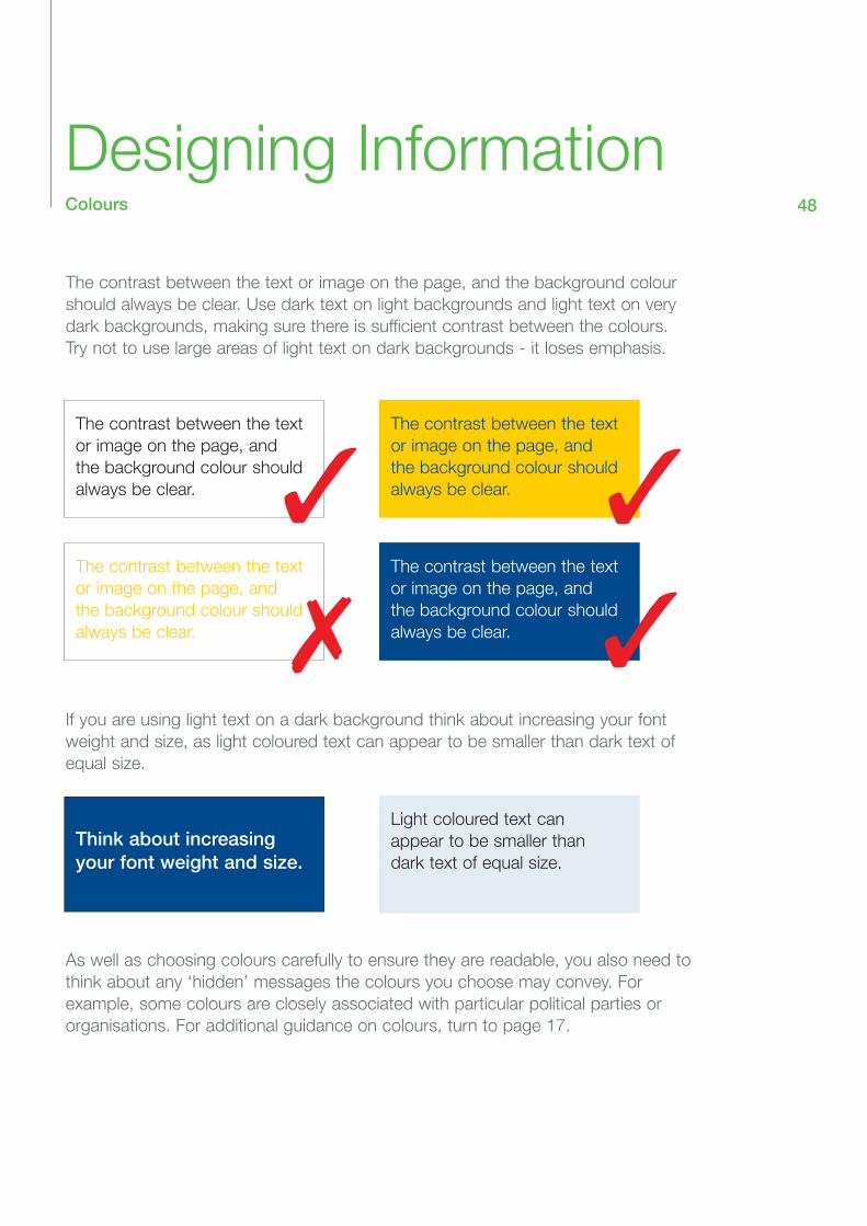
The contrast between the text or image on the page, and the background colourshould always be clear. Use dark text on light backgrounds and light text on verydark backgrounds, making sure there is sufficient contrast between the colours.Try not to use large areas of light text on dark backgrounds - it loses emphasis.
If you are using light text on a dark background think about increasing your fontweight and size, as light coloured text can appear to be smaller than dark text ofequal size.
.
As well as choosing colours carefully to ensure they are readable, you also need tothink about any ‘hidden’ messages the colours you choose may convey. For example, some colours are closely associated with particular political parties ororganisations. For additional guidance on colours, turn to page 17.
The contrast between the textor image on the page, andthe background colour shouldalways be clear.
The contrast between the textor image on the page, andthe background colour shouldalways be clear.
The contrast between the textor image on the page, andthe background colour shouldalways be clear.
Think about increasingyour font weight and size.
The contrast between the textor image on the page, andthe background colour shouldalways be clear.
Light coloured text canappear to be smaller thandark text of equal size.
✓ ✓
✓✗

Designing InformationImages 49
Using photographs, diagrams and illustrations can make your information easier to understand.
The images you use should:
• be representative of Calderdale’s community• add meaning to the text, not detract from it• be good quality, so they do not appear grainy or fuzzy when printed.
The images you use should not:
• reinforce stereotypes• be offensive or inappropriate• be used without the permission of the photographer/subject/artist (see below)• be montages or collections of images with the edges blurred together.
Also, think carefully before adding copyright-free ‘clip art’ to your information. It canlook unprofessional, and undermine the confidence people have in what you are trying to say.
If you are taking photographs for use on your information, please ensure you haveclear permission from the people appearing in your pictures. Particular care should be taken if you wish to use/take photographs of children, young people or vulnerableadults. For advice, please speak to Kate Wilson, Information and CommunicationsManager in Health and Social Care. Tel 01422 393812 or email [email protected]
Calderdale schools have an 'Opt Out' policy in operation, which means pictures canbe taken of pupils unless their parents or carers have specifically asked that the childnot be photographed. Please always seek the permission of the Headteacher beforetaking or using any photographs of Calderdale pupils.
Taking photographs of children and young people in Calderdale's leisure facilities isnot allowed. For more information, please contact Gwyn Hughes, Community ServicesMarketing Manager on 01422 393217 or email [email protected]
A Photograph Consent Form is included in Appendix 2 of the Corporate Style Manual.Please turn to page 56. The Consent Forms should be completed before photographsare taken, and filed carefully to ensure the photos are used in the appropriate way.

Designing InformationPaper 50
If you are producing printed information, it is important to think carefully about thetype of paper you use.
Glossy paper will reflect light and make your information difficult to read. Instead,use paper with a matt or silk finish.
Paper comes in an enormous variety of thickness or weights. Standard photocopying paper is usually classified as ‘80 gsm’ (grams per square metre),while letterhead paper is ‘90 gsm’.
If you use a paper that is too light-weight, the ink from the reverse side may showthrough, making both sides hard to read. Using paper that is too heavy can makethe document difficult to fold and handle, and will also waste money (heavier paperis generally more expensive).
Also think about the ‘shelf-life’ of you information. A booklet designed to last anumber of years will need to be on heavier paper than a leaflet announcing a forthcoming event.

Designing InformationFormats 51
The majority of information in the Corporate Style Manual relates to the production ofwritten and printed information, but you should also think carefully about other formats.
You may have customers who would find it helpful to have information provided inalternative formats including:
• large print • British Sign Language on DVD or video• Braille • written translation• audio CD or cassette • audio translation.• PC file
Obviously, it is not practical or cost effective to produce all your information in amultitude of different formats, but if you know you have customers with particularpreferences or needs, think about those when you begin to plan your information. If you cannot anticipate the needs of your customers, then you should be preparedto respond to requests for alternative formats.
Calderdale Council has adopted the following statement, which should be shown,wherever possible, on your printed information so customers are aware we willmake every effort to meet their needs.
If you would like this information in another format or language, please contact: (Add own name and number here).
See page 25 for more information on how/where to show the statement. The translated versions are available to download from the Intranet, but don’t forget toadd your own contact details at the end of the statement.
If you receive a request to produce your information in an alternative format, advicecan be obtained from Geraldine Rushton, Disability Liaison Officer on 01422393099 or email to [email protected]
Bengali Urdu
(Add own name and number here). (Add own name and number here).

Distribution of Information 52
Your information will only be of value and use if it reaches your customers.
You may be sending your information directly to homes or businesses, or you maybe trying to catch the attention of browsers who may pick up your information in apublic place.
Think about where your information should be in order to be seen by those peopleyou want to see it. Where does your target audience go? Where do they spend theirtime? Useful outlets include:
• Council Offices• Libraries and community buildings/centres• Post Offices• Hospital, doctor and dentist waiting rooms• Places of worship• Charity shops
Always seek the permission of the building manager/administrator before displayingyour information.
Community Services have a number of buildings and facilities which you could useto distribute your information. For advice, please contact Gwyn Hughes, Community Services Marketing Manager on 01422 393217 or [email protected]
Thinking about your method of distribution carefully will save you time and money;you will have the right amount of information printed and ensure the right people getthe right information.

Legislation53
The guidance in this section contains a number of suggestions that are good practice, and good customer care. Some have been adopted as Corporate standards, while others are supported by legislation. The key Acts that relate to theprovision of information are:
Disability Discrimination Act 1995
The Disability Discrimination Act (DDA) makes it unlawful to discriminate against disabled people in the provision of goods and services. If we did not produce accessible information about the availability of services and how to apply for them,the Council would be guilty of discrimination under the DDA.
Race Relations Act 1976 / Race Relations (Amendment) Act 2000
These acts provide protection from race discrimination in provision of goods, facilities or services. As with the DDA, the Council has a duty to provide accessibleinformation for all customers.
Data Protection Act 1998
The Data Protection Act relates to the personal information we hold about the people who use our services. Personal information must not be used to producepublic information without the express permission of the ‘Subject’ or person thisinformation is about. Detailed guidance about the Data Protection Act can be foundon the Intranet under ‘Reference Section/Information Management/Data Protection’.
Freedom of Information Act 2000
The Freedom of Information Act gives citizens a general right of access to all types of information held by public authorities, including the Council. The Act makes it arequirement of public authorities to disclose the information requested within 20working days of receiving the request, subject to certain strict exemptions.
Any public information you produce should be submitted for inclusion on theCouncil’s Freedom of Information Act Publications Scheme. This is a list and database of information to which people can be directed if they request informationunder the Act. For more information, please contact Steven Elliott, Information Management Co-ordinator on 01422 393084 or [email protected]

Feedback &AcknowledgementsWe welcome your feedback. Any comments or suggestionsshould be sent to:
Nicola Futtit, Principal Communications OfficerChief Executive’s OfficeTown HallHalifax HX1 1UJ
Tel: 01422 393116 Fax: 01422 393136or email [email protected]
The Corporate Style Manual incorporates guidance developedby the Royal National Institute for the Blind (www.rnib.org.uk),The Local Authorities Research and Intelligence Association(www.laria.gov.uk), The National Information Forum(www.nif.org.uk) and The Plain English Campaign(www.plainenglish.co.uk).
We are also grateful to the Calderdale Disability ConsultationGroup for its support and advice.
54

Appendix 1Information Checklist 55
Have I identified my audience and checked their information preferences?Is content relevant, timely and accurate?Is the tone appropriate? (Read out loud to be sure!)Do I have a clear beginning, middle and end?Have I used any jargon or abbreviations?Have I written in plain language?Have I checked the spelling?Can I check the wording with customers to see if it meets their needs?
Have I used the Council’s logo properly, and met other Corporate standards?Is the design clear and helpful?Have I used accessible fonts and colours?Do I have permission to use my photos?Are the images helpful?Am I using the right sort of paper?
Have I included:> my contact details?> the publication date?> the statement about other formats?
Can I consult customers about the final proof, before having it printed?How will I distribute my information?Can my information be included in the Council’s Publications scheme?

Appendix 2Photography Consent Forms 56

Photography Consent FormAdult (age 18+)
Your name:
Address:
Tel No:
We would like to take photographs which include you for our promotional purposes.
The photographs will go on our leaflets, booklets and display panels; all these may also beplaced on our web site on the Internet. Please be aware that our website can be seen throughout the world, and not just in the United Kingdom where UK law applies.
To comply with the Data Protection Act 1998 we need your permission before we take any photographs which include you.
May we take photographs which include you for our promotional purposes? Yes NoMay we use these in our leaflets, booklets and on display panels? Yes NoMay we use these on our web site? Yes NoMay we include your name and some details with your photograph? Yes No
We will not include any details such as your e-mail address, postal address, telephone or fax number with the photograph.
By signing this form you allow us to use these photographs on new leaflets, booklets and display panels for two years from the date on the form. Note that leaflets, booklets and display panels may stay in use longer than this.
I have read and understand this form.
Your signature: Date:
This section for Council use only
Telephone:
Fax:
Email:
Name of commissioning officer:
Name of photographer:
Location where photographs are to be taken:

Photography Consent FormChild/Young Person (age under 18)
Child’s Name:
Your name:
Address:
Tel No:
We would like to take photographs which include your child for our promotional purposes.
The photographs will go on our leaflets, booklets and display panels; all these may also beplaced on our web site on the Internet. Please be aware that our website can be seen throughout the world, and not just in the United Kingdom where UK law applies.
To comply with the Data Protection Act 1998 we need your permission before we take anyphotographs which include your child.
May we take photographs which include your child for our promotional purposes? Yes NoMay we use these in our leaflets, booklets and on display panels? Yes NoMay we use these on our web site? Yes NoMay we include your child’s name and some details with your photograph? Yes No
We will not include any details such as your e-mail address, postal address, telephone or fax number with the photograph.
By signing this form you allow us to use these photographs on new leaflets, booklets and display panels for two years from the date on the form. Note that leaflets, booklets and display panels may stay in use longer than this.
I have read and understand this form.
Your signature: Date:
This section for Council use only
Telephone:
Fax:
Email:
Name of commissioning officer:
Name of photographer:
Location where photographs are to be taken: