Copyright © 2010, 2007, 2004 Pearson Education, Inc. Chapter 11 Understanding Randomness.
Upload
brenda-jeffersonCategory
view
229download
0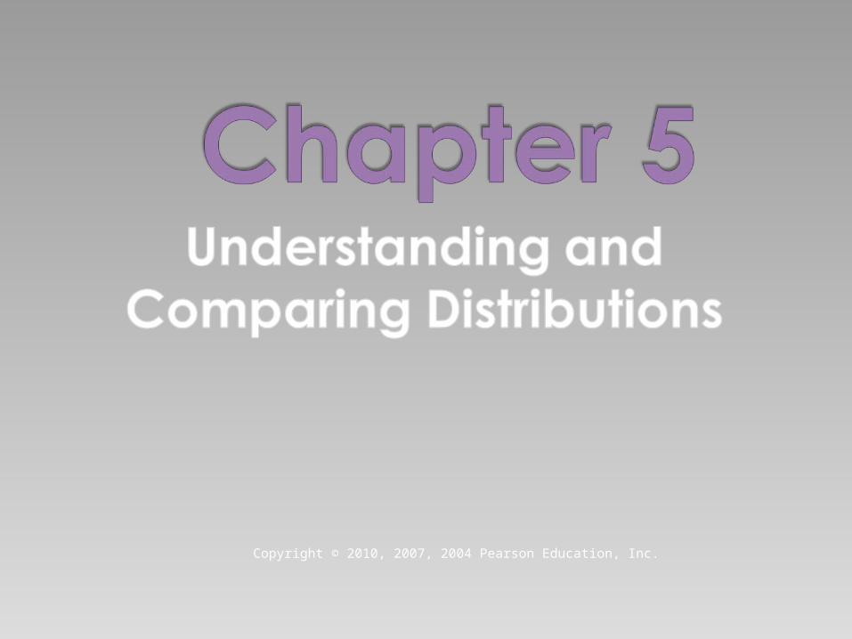
Copyright © 2010, 2007, 2004 Pearson Education, Inc.

We can answer much more interesting questions about variables when we compare distributions for different groups.
Below is a histogram of the Average Wind Speed for every day in 1989.
Slide 5 -
2
The distribution is unimodal and skewed to the right.
The high value may be an outlier
Slide 5 -
3
Median daily wind speed is about 1.90 mph and the IQR is reported to be 1.78 mph.
Can we say more?
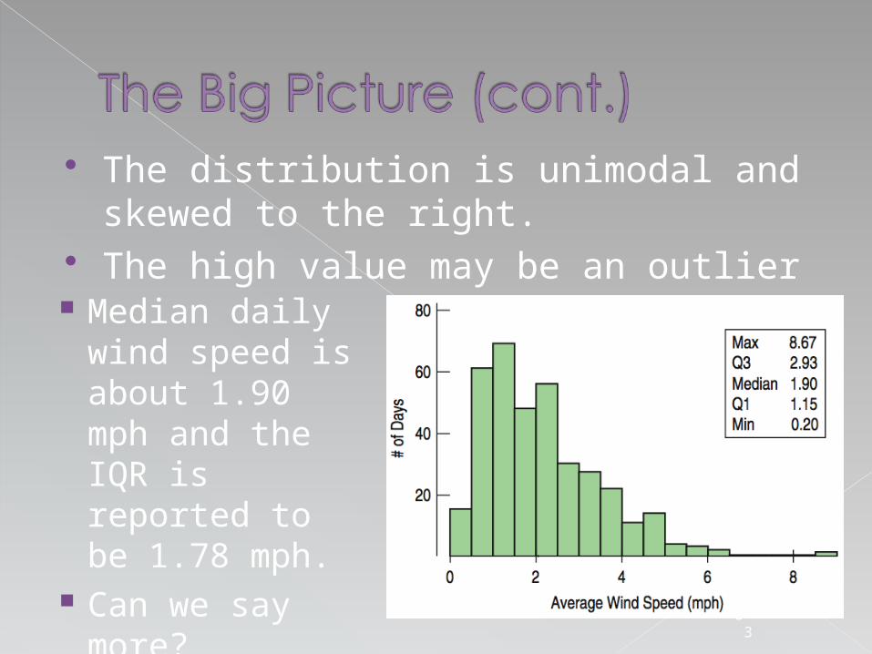
The five-number summary of a distribution reports its median, quartiles, and extremes (maximum and minimum).› Example: The
five-number summary for for the daily wind speed is:
Slide 5 -
4
Max 8.67
Q3 2.93
Median 1.90
Q1 1.15
Min 0.20
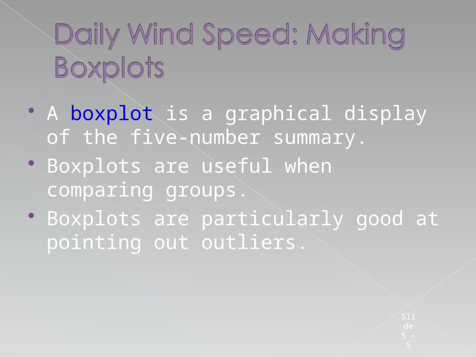
A boxplot is a graphical display of the five-number summary.
Boxplots are useful when comparing groups.
Boxplots are particularly good at pointing out outliers.
Slide 5 -
5
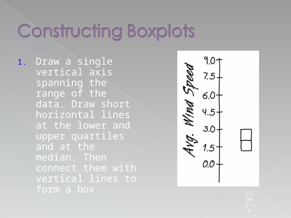
1. Draw a single vertical axis spanning the range of the data. Draw short horizontal lines at the lower and upper quartiles and at the median. Then connect them with vertical lines to form a box.
Slide 5 -
6
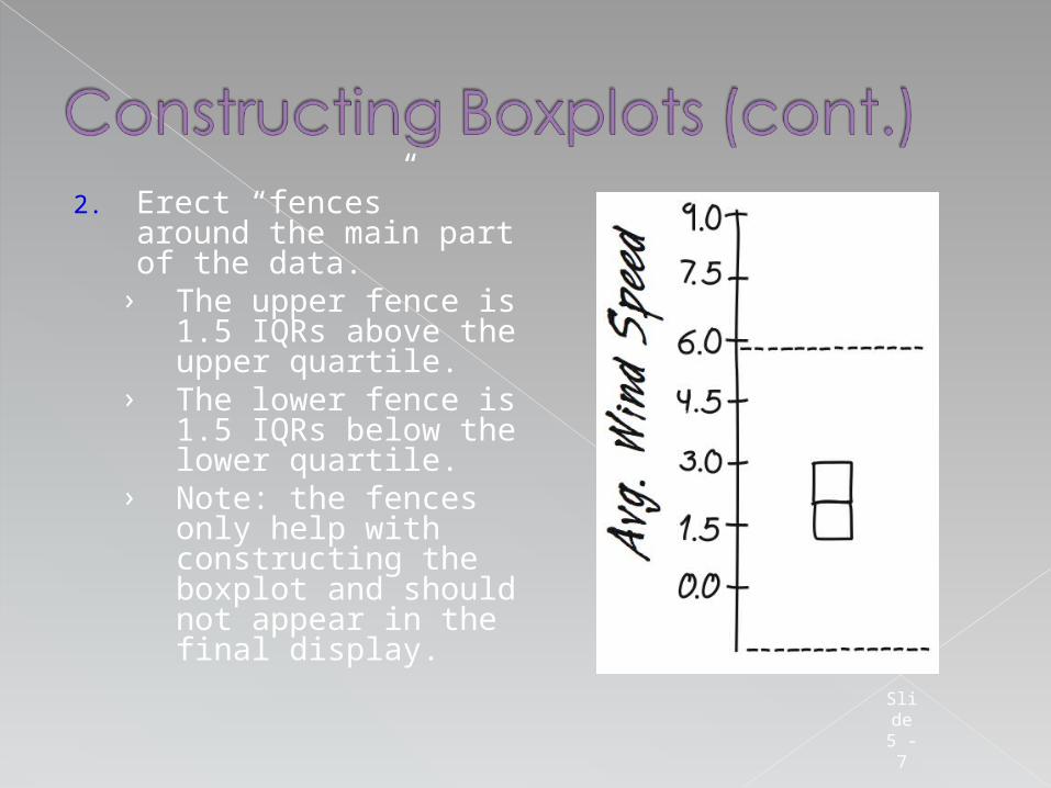
2. Erect “fences” around the main part of the data.
› The upper fence is 1.5 IQRs above the upper quartile.
› The lower fence is 1.5 IQRs below the lower quartile.
› Note: the fences only help with constructing the boxplot and should not appear in the final display.
Slide 5 -
7
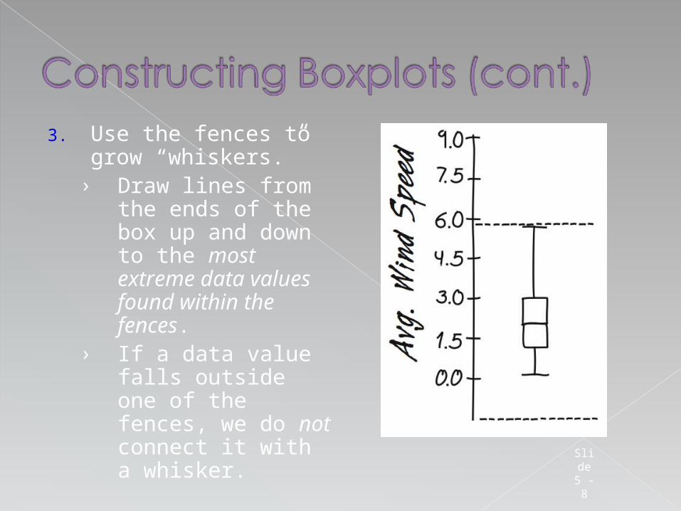
3. Use the fences to grow “whiskers.”
› Draw lines from the ends of the box up and down to the most extreme data values found within the fences.
› If a data value falls outside one of the fences, we do not connect it with a whisker.
Slide 5 -
8

4. Add the outliers by displaying any data values beyond the fences with special symbols.› We often use a
different symbol for “far outliers” that are farther than 3 IQRs from the quartiles.
Slide 5 -
9
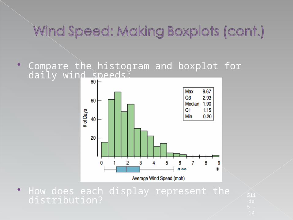
Compare the histogram and boxplot for daily wind speeds:
How does each display represent the distribution?Slide 5 - 10
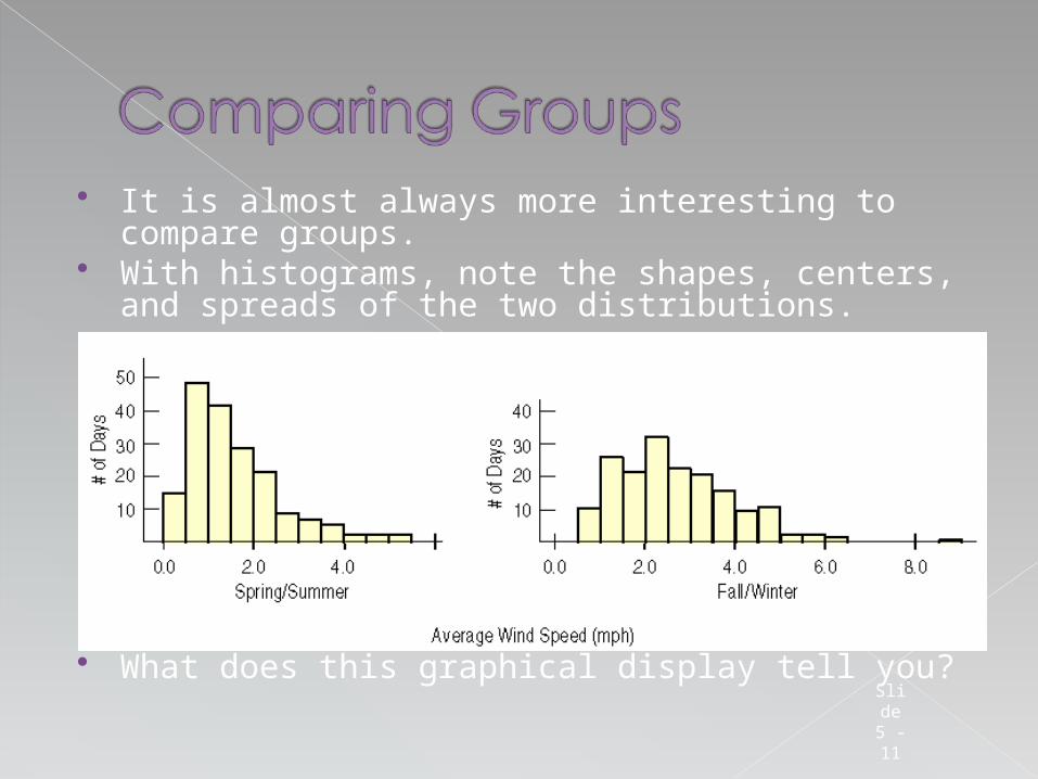
It is almost always more interesting to compare groups.
With histograms, note the shapes, centers, and spreads of the two distributions.
What does this graphical display tell you?Slide 5 - 11
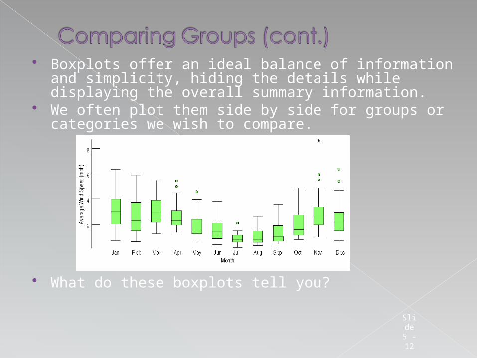
Boxplots offer an ideal balance of information and simplicity, hiding the details while displaying the overall summary information.
We often plot them side by side for groups or categories we wish to compare.
What do these boxplots tell you?
Slide 5 - 12
If there are any clear outliers and you are reporting the mean and standard deviation, report them with the outliers present and with the outliers removed. The differences may be quite revealing.
Note: The median and IQR are not likely to be affected by the outliers.
Slide 5 - 13
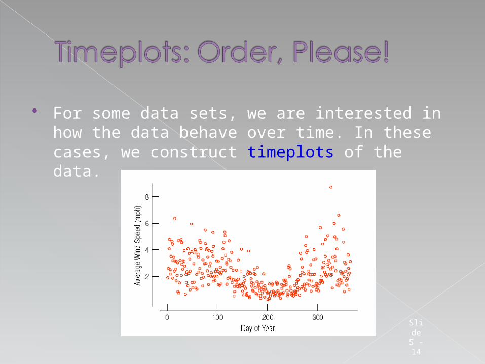
For some data sets, we are interested in how the data behave over time. In these cases, we construct timeplots of the data.
Slide 5 - 14
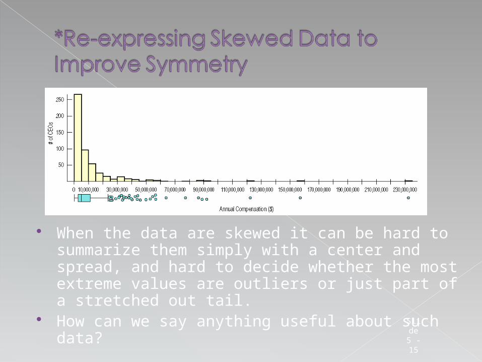
When the data are skewed it can be hard to summarize them simply with a center and spread, and hard to decide whether the most extreme values are outliers or just part of a stretched out tail.
How can we say anything useful about such data?
Slide 5 - 15
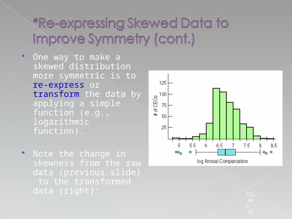
One way to make a skewed distribution more symmetric is to re-express or transform the data by applying a simple function (e.g., logarithmic function).
Note the change in skewness from the raw data (previous slide) to the transformed data (right):
Slide 5 - 16
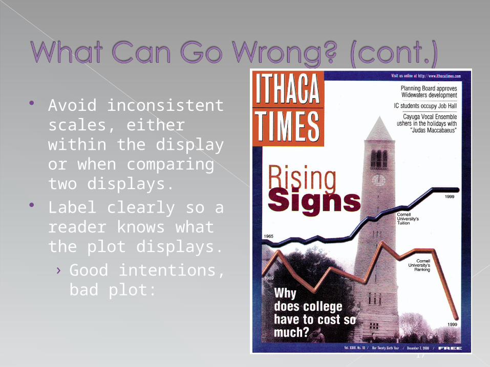
Avoid inconsistent scales, either within the display or when comparing two displays.
Label clearly so a reader knows what the plot displays.› Good intentions,
bad plot:
Slide 5 - 17
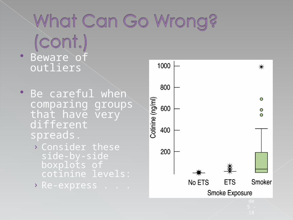
Beware of outliers
Be careful when comparing groups that have very different spreads.› Consider these
side-by-side boxplots of cotinine levels:
› Re-express . . . Slide 5 - 18
We’ve learned the value of comparing data groups and looking for patterns among groups and over time.
We’ve seen that boxplots are very effective for comparing groups graphically.
We’ve experienced the value of identifying and investigating outliers.
We’ve graphed data that has been measured over time against a time axis and looked for long-term trends both by eye and with a data smoother. Slid
e 5 - 19


