Construction of my media magazine – front cover
7
CONSTRUCTION OF MY MEDIA MAGAZINE – FRONT COVER I used the program Adobe Fireworks to create my magazine.
-
Upload
clairesmith -
Category
Technology
-
view
97 -
download
1
Transcript of Construction of my media magazine – front cover

CONSTRUCTION OF MY MEDIA MAGAZINE – FRONT COVER
I used the program Adobe Fireworks to create my magazine.

This is the 1st stages of the front cover of my magazine. As I have now chosen the colour scheme and the title of my magazine, all is left is to put everything onto the magazine. This is the main layout of my design.
For the top section, I used a brush tool with the 3 different colours. I simply drew a line with the colour then smudged it with the ‘smudge tool’ to get the, what looks like, a fire effect.

The next stage was to add my image. I used the image which I had previously edited and now I feel looks very effective on the front cover.
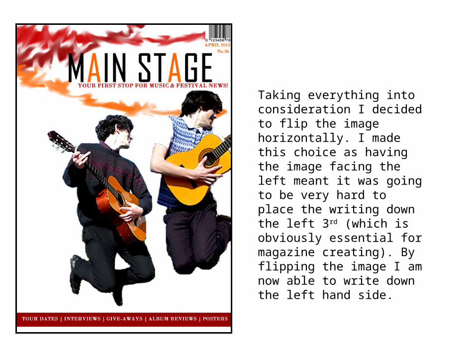
Taking everything into consideration I decided to flip the image horizontally. I made this choice as having the image facing the left meant it was going to be very hard to place the writing down the left 3rd (which is obviously essential for magazine creating). By flipping the image I am now able to write down the left hand side.

FINALLY, it’s beginning to look like a magazine. I have now added in the head line story, with other main stories down the right hand side.

I have now changed the colour of the main head line story, I have done this as I feel it did not stand out enough. I think it is much better now as it does not take over the page but it stands out enough for the audience to be intrigued by it.
I have also made the ‘WIN RIZZLE KICKS TICKETS’ much clearer by placing it in its own box so that it can catch the readers eye immediately. It is also placed on the left hand side therefore will be shown when stacked on the shelves at shops.
Finally I have made the colours of the text on the left hand side alternate after each story. I feel this does help the audience read the magazine much clearer.

FINAL DESIGN
The final changes I made to my magazine was firstly to put a ‘drop shadow’ on both of the guitarists, I think although only a slight change
helps to give depth to the two images.
Secondly I added in the price to the top right hand corner and changed the colour of the text to black so that it can
stand out more so.
The final, most obvious change is the fact I changed the background. I felt having a plain white background looked very bare and needed some slight colour. I tried a few colours but a block colour didn’t look effective. I used a gradient effect to give the background a slight hint of red which takes the whiteness off. I think it works well as the left hand side has been left white therefore makes the text much clearer.