
Construction journal
5
Abigail Gumery Construction Journal For my front cover, I began by setting the layout out. This entailed placing boxes at the top and bottom to be straplines. I also added a box in which my masthead was going to be placed. As well as this, I added the main image I planned to use for my magazine. This took quite a while as I had to erase the background be selecting very carefully around the image and deleting it. I then had to decide the perfect place to put it so it looks appealing. After this, I decided to add some text to make it look more like a magazine. I added the text to the masthead to make my logo. I decided to use bright pink font as it will then be attractive to my target audience. It took me quite a while to choose the right font to use for the different sections of my magazine. In the end, I decided on fonts that I believe looked quite feminine and girly to appeal to my mainly female target audience. The colours I have decided to use also portray who the magazine is aimed at as they are all in a pink shade – which is the colour that is stereotypically associated with those of the female gender. Next, I added even more text to the front cover of my magazine. I added some cover lines on the right hand side of my magazine including recent pop artists and other people related to the pop genre. I placed these in purple speech bubbles in a column to make them more appealing to my target audience by making it look more fun and interesting. I also added a main cover line – ‘JAMIE ARMFIELD’ - which is in bright turquoise which sticks to my colour scheme and will catch people’s attention as it stands out. It was
Transcript of Construction journal

Abigail Gumery
Construction Journal For my front cover, I began by setting the layout out. This entailed placing boxes at the top and bottom to be straplines. I also added a box in which my masthead was going to be placed. As well as this, I added the main image I planned to use for my magazine. This took quite a while as I had to erase the background be selecting very carefully around the image and deleting it. I then had to decide the perfect place to put it so it looks appealing.
After this, I decided to add some text to make it look more like a magazine. I
added the text to the masthead to make my logo. I decided to use bright pink font as it will then be attractive to my target audience. It took me quite a while to choose the right font to use for the different sections of my magazine. In the end, I decided on fonts that I believe looked quite feminine and girly to appeal to my mainly female target audience. The colours I have decided to use also portray who the magazine is aimed at as they are all in a pink shade – which is the colour that is stereotypically
associated with those of the female gender.
Next, I added even more text to the front cover of my magazine. I added some cover lines on the right hand side of my magazine including recent pop artists and other people related to the pop genre. I placed these in purple speech bubbles in a column to make them more appealing to my target audience by making it look more fun and interesting. I also added a main cover line – ‘JAMIE ARMFIELD’ - which is in bright turquoise which sticks to my colour scheme and will catch people’s attention as it stands out. It was
between this colour and the pink colour, but I chose this one as it is brighter, and my masthead was pink.
For my final front cover, I just needed to add some small details. These included the price and barcode so the reader knows the prices of the magazine. I also added a star like shape to make a puff in the top right hand corner to make it look more exciting and enjoyable to read. As well as this, I added some pink boxes behind the cover lines I had already added making them easier to read and stand out to my target audience. I feel this makes my magazine look a lot more professional.
Abigail Gumery
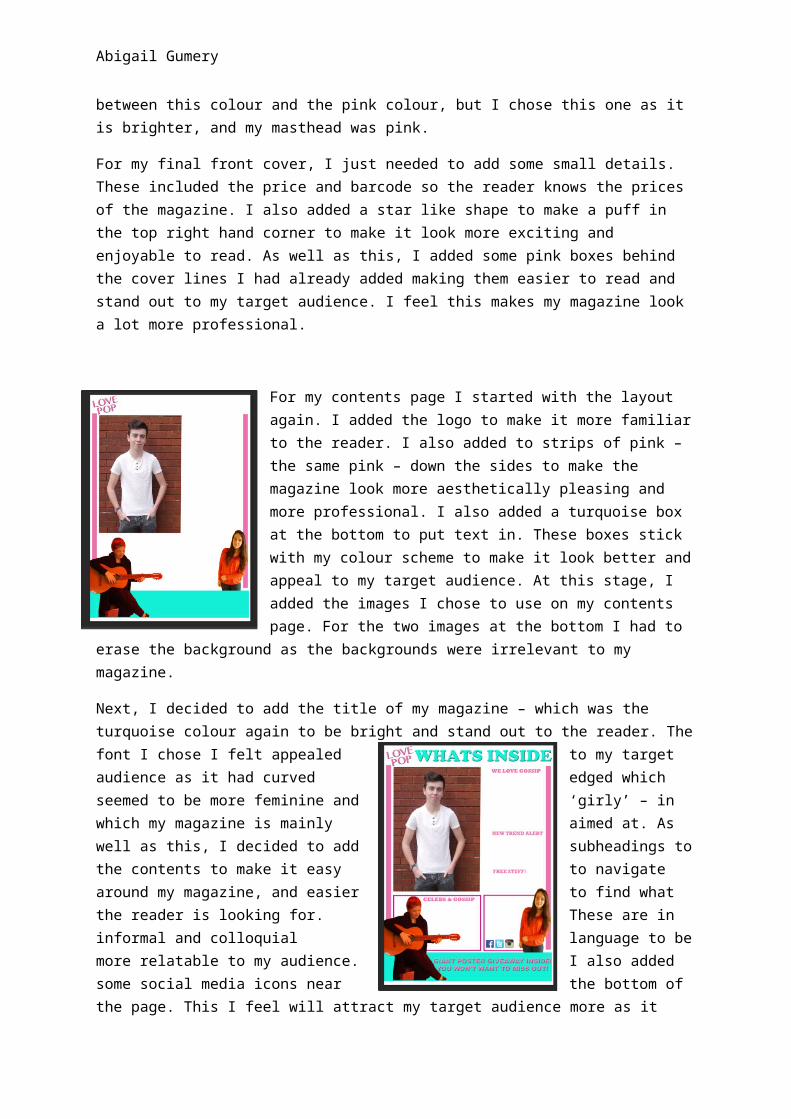
For my contents page I started with the layout again. I added the logo to make it more familiar to the reader. I also added to strips of pink – the same pink – down the sides to make the magazine look more aesthetically pleasing and more professional. I also added a turquoise box at the bottom to put text in. These boxes stick with my colour scheme to make it look better and appeal to my target audience. At this stage, I added the images I chose to use on my contents page. For the two images at the bottom I had to erase the background as the backgrounds were irrelevant to my magazine.
Next, I decided to add the title of my magazine – which was the turquoise colour again to be bright and stand out to the reader. The font I chose I felt appealed to my target audience as it had curved edged which seemed to be more feminine and ‘girly’ – in which my magazine is mainly aimed at. As well as this, I decided to add subheadings to the contents to make it easy to navigate around my magazine, and easier to find what the reader is looking for. These are in informal and colloquial language to be more relatable to my audience. I also added some social media icons near the bottom of the page. This I feel will attract my target audience more as it means I can advertise on social networking sites – in which my target audience use daily. At this point, I also added some small pink boxes to frame the text I will be putting at the bottom. I feel this adds to the structure of my magazine to make it look better.
After this, I added the main body of the contents – the page titles. These included many different topics that proved popular in the questionnaire I made previously – topics such as boys, fashion and gossip. As well as this, I added a little footnote on the magazine to sign off from me – the writer. I feel this helped make my magazine more personal and friendly towards the reader – building a relationship between us.
Finally, to complete my contents page, I added page numbers to help with the navigation around my magazine. I placed these in pink font – to fit with the colour
scheme – and in a small purple circle. This, I felt, made the magazine look more informal and fun looking. Both

Abigail Gumery
colours used are associated with females so will help attract them and appeal to them, therefore making them want to read.
My double page spread was completed in InDesign instead of Photoshop like my front cover and contents page. To begin my double page spread I wanted to set out where everything was going to be. I decided that my main image was going to be on the A4 page on the left. This is because my image was taken so it was facing this way meaning it fit to my page well. To make this image look professional I decided to take the background out and make it
white. This, I feel, made my double page spread look more pleasing to the eye. I also added the page number here to make navigation easy from page to page. It is set in the same position each page so the reader will know where to look to find each page easily. The text is turquoise and the background box is pink to fit with the colour scheme and the pink box fits with the background of the cover lines on the front pages.
I next added the title of the page, which again was in a turquoise font placed at the top of the page. The font I have used also seemed quite feminine to me as it didn’t have sharp edges and flowed quite nicely. Through this, it helped make my masthead stand out and look appealing to the reader. It will draw people’s attention into reading the article. As well as this, the language of this title will be enticing for the reader as they have the chance to really get to know what this artist – Jamie Armfield – is like, and find out the recent gossip and information.
For the completed double page spread, I had to add the article. This I already had written up so I already made it appeal to my target audience using the informal language. I had to add a drop cap in this to follow the common codes and conventions of magazines. As well as this, I had to use a tool to make the text go around the edge of the guitar so there was no

Abigail Gumery
overlapping occurring. For the speech of the interviewer, I made the font bold so it is easily distinguishable between who is speaking. Overall, the construction of my magazine was quite enjoyable with some challenges that I managed to overcome.


