EMCDDA national focal points’ activities during the COVID ...

Composition - Focal Points
Focal Points?
Knowing how to create strong focal points in art is a skill every artist should understand and be able
to execute. Focal points refer to the areas of the artwork that demand the viewer's attention.
Intelligent placement of focal points can positively affect the overall composition of the artwork.
Creating good artistic composition takes knowledge of how your artwork will be viewed.
Understanding how your audience will view your artwork will help you to communicate more
effectively through your artwork.
Creating focal points in your artwork is one method of controlling of how your artwork is viewed.
There are several methods that artists can use to ensure that subjects are seen in an artwork.
These subjects become the focal point in the painting .
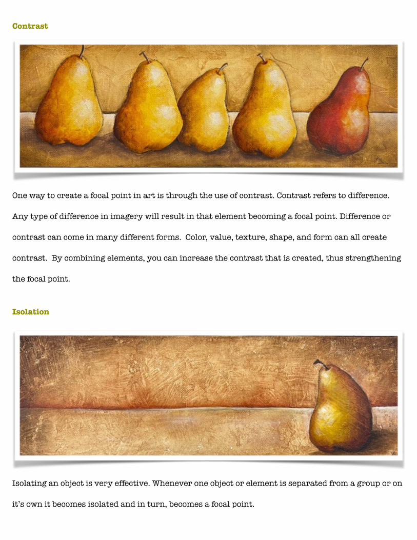
Contrast
One way to create a focal point in art is through the use of contrast. Contrast refers to difference.
Any type of difference in imagery will result in that element becoming a focal point. Difference or
contrast can come in many different forms. Color, value, texture, shape, and form can all create
contrast. By combining elements, you can increase the contrast that is created, thus strengthening
the focal point.
Isolation
Isolating an object is very effective. Whenever one object or element is separated from a group or on
it’s own it becomes isolated and in turn, becomes a focal point.

Convergence
Another way to create a focal point in artwork is to use implied lines to direct a viewer's eye to an
object or element. This technique is known as convergence.
The Unusual
Using something unusual or out of the ordinary to create a focal point in your artwork is a dynamic
method of creating a focal point. This object will stand out and demand attention thus creating a
focal point.
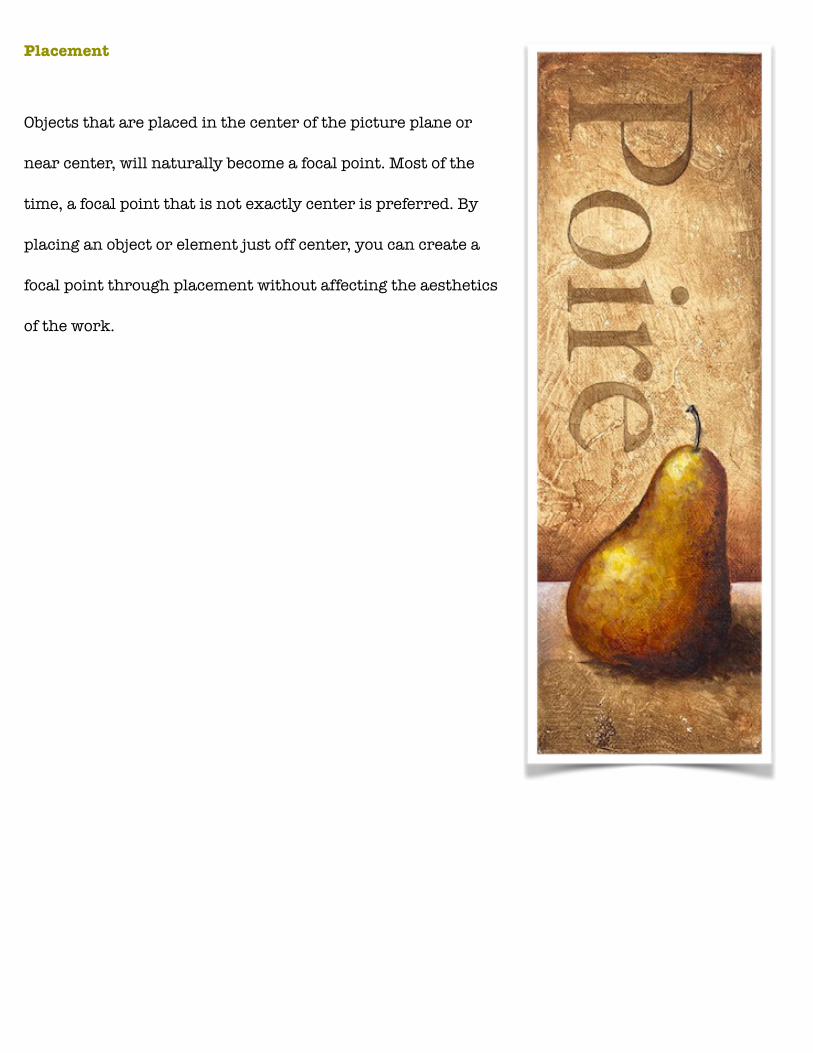
Placement
Objects that are placed in the center of the picture plane or
near center, will naturally become a focal point. Most of the
time, a focal point that is not exactly center is preferred. By
placing an object or element just off center, you can create a
focal point through placement without affecting the aesthetics
of the work.
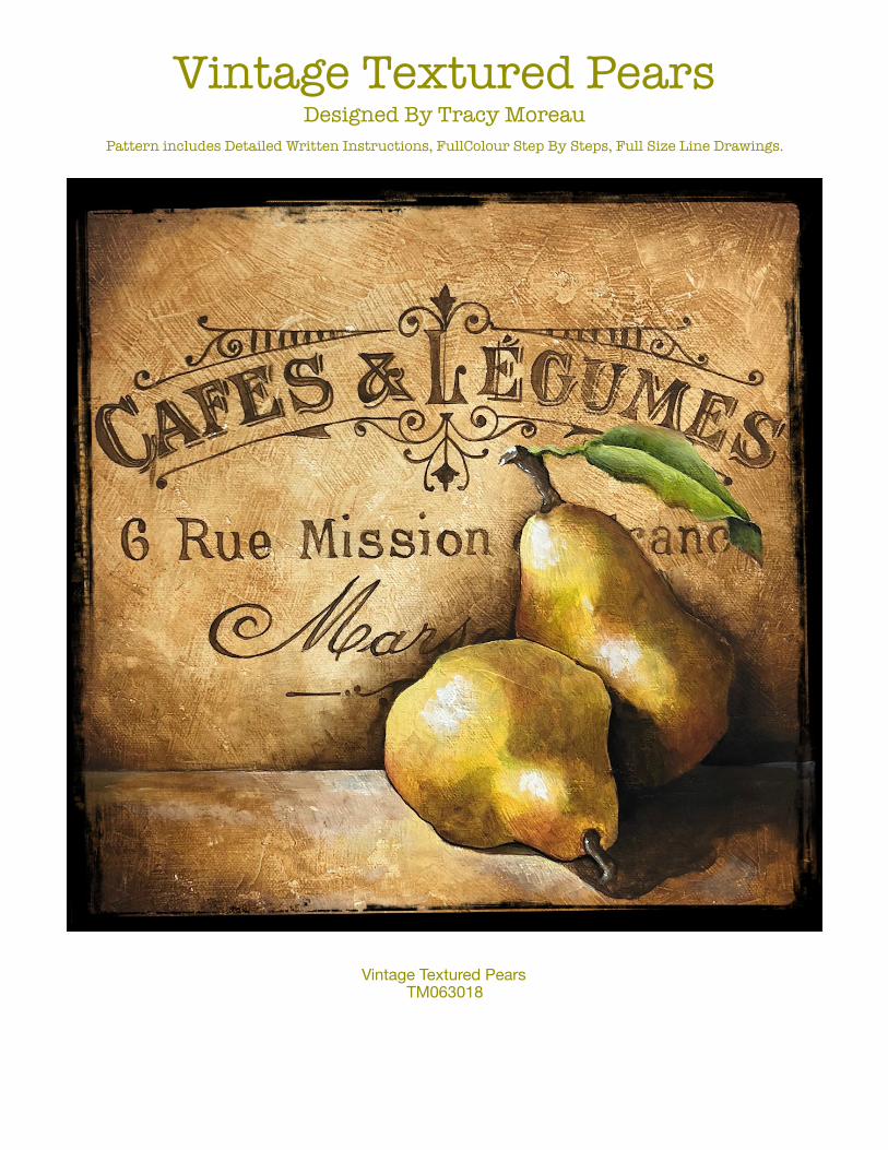
Vintage Textured Pears Designed By Tracy Moreau
Pattern includes Detailed Written Instructions, FullColour Step By Steps, Full Size Line Drawings.
Vintage Textured Pears TM063018


Vintage Textured Pears Designed By Tracy Moreau
There is something about painting pears that is cathartic… it’s like hitting the reset button on your painting skills. When I was at school, we began with basic shapes.. learning to see them, see the texture, see the way the light fell on the shape and then seeing the shadows cast by it. Pears were always more interesting than a plain sphere.. or an apple. So from time to time I return to painting this fruit… if for no other reason that to refresh my brain and my skills. I hope that this simple piece offers you a little bit of a challenge but also that it offers you the same catharsis that I feel when painting them.
You Need: Micheals Craft 12 x 12 artists panel of Gallery Profile Stretched Canvas.
www.decoart.com DecoArt Media: Green Gold, Carbon Black, Quinacridone Gold, Raw Sienna, Sap Green Gesso, Modelling Paste, Texture Sand.
www.decoart.com DecoArt Americana: Aloe, Soft Black, Asphaltum, Warm White, Mustard Seed, Light Buttermilk, Summer Squash.
www.thebrushguys.com Dynasty Black Gold Brushes. #6 and #8 filbert, 10/0 Liner, 1/2 Angled Shader, 3/4 Angled Shader. Dynasty Faux Squirrel 1827 #2 Rigger
Misc: Grey Graphite Paper, Tracing paper, Palette paper, Graphite pencil, Shop Towels.
To Begin:
Mix Modelling Paste and Texture Sand 1:1 , this will make a slightly gritty texture medium, apply it to the canvas or panel in small, thin, over lapping patches using a wide blade palette knife or taping knife. Let it dry then repeat for a little more texture ( the second time around produces some interesting textures and smaller pockets for colour to catch onto.) Let it dry well. Apply one light coat of Light Buttermilk to the surface and allow it to dry well. ( this coat simply creates a uniform surface for the next step)
NOTE: When I say thin overlapping patches.. I mean THIN. It should be almost transparent. Just barely enough to bury the texture of the canvas. If the texture is too coarse or too thick.. it makes it harder to get the effect we are aiming for.
Moisten a small piece of shop towel with water. Pick up some Raw Sienna and rub this colour into the texture. It should become very transparent. Allow the colour to be weak in some areas and stronger in others. Keep the shop towel moist as the water allows the colour to move easily into the texture. Enhance the texture with Asphaltum applied sparingly and in the same manner as the Raw

Sienna. Apply a heavy shadow on the edges of the canvas with a nice wide float of Asphaltum. Let
dry. Repeat with a float of Thinned Soft Black. Let it dry then trace and transfer the Lettering to the surface. .
The Lettering:
The lettering is painted entirely with thinned Asphaltum and the #2 rigger. The paint should be thinned to ink like consistency or thinner. Use the same Thinned colour for the line work, just switch to the 10/0 liner for the details. Perfection is NOT what we are looking for here, it is fine if the lettering is somewhat irregular in colour. the only real requirement here is to keep the lettering straight and even. Variations in the lightness and darkness of the colour is irrelevant. ( you can distress the lettering at some point if you find them too dark. light sanding will do the trick.) Let it dry well then erase any graphite lines that remain. ( some will stay, but it doesn’t matter)
Values:
I have provided you with a laminated Value Scale. You will note that there are holes in it. These holes allow you to gauge the value in a given location on the Colour photo. You can then check your shading on your painted piece, to see if you have achieved that value or if you need to deepen them further.
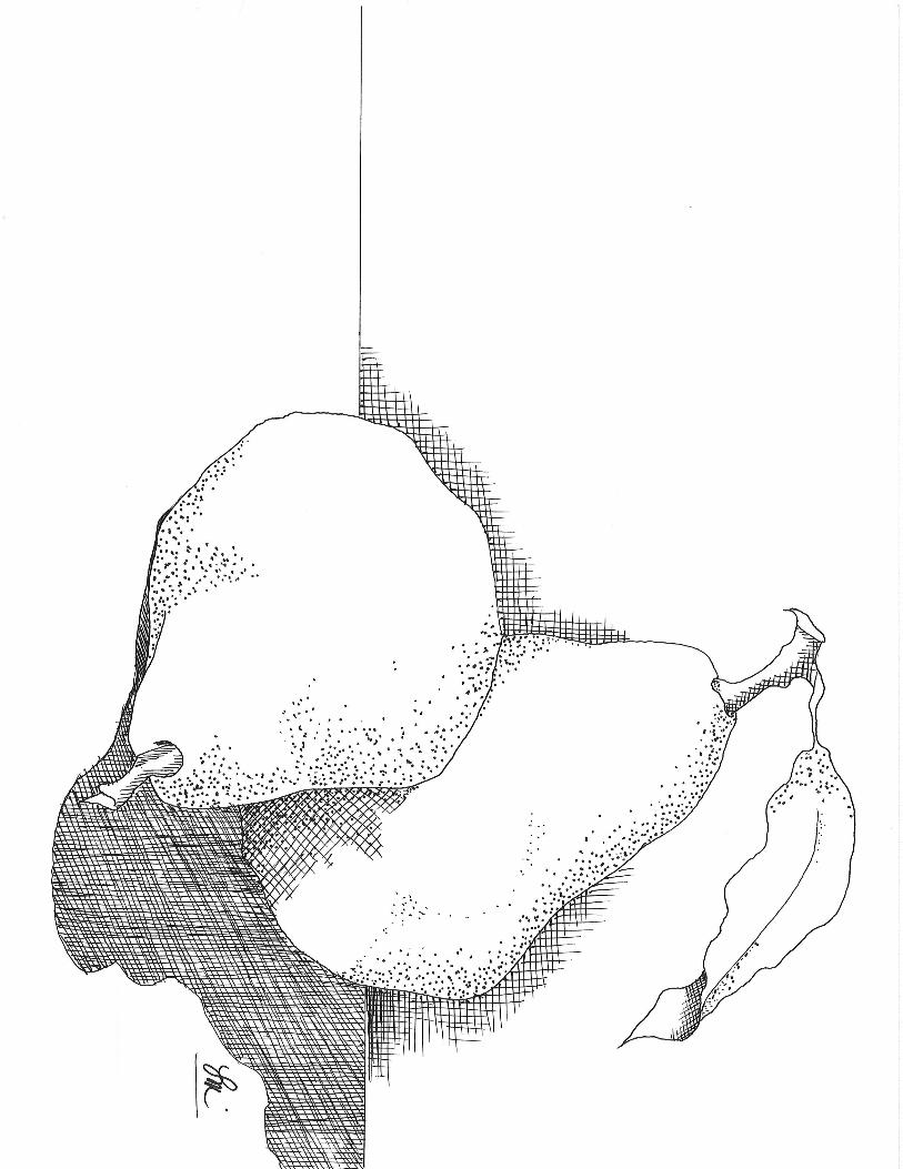
The Pears:
Trace and transfer the Line drawing to the canvas/panel, using grey graphite paper.
Refer to the Photos for colour placement, and shade above the table top line with multiple floats of Thinned Asphaltum. Shade around the Pears as indicated in the photos, using thinned Asphaltum. Refer to the line drawing and shading guide for shadow placement.
Base the pears, stems and leaf with one coat of Gesso and let it dry well. Apply a coat of Mustard Seed to each of the pears, A coat of Asphaltum to the stems and the leaf is based with Green Gold.
Colour Mix #1: Aloe and Green Gold 1:1
Thin this mixture to Ink Like consistency, and apply a wash to the Pears as indicated in the Photos and the Shading guide. When Dry, Apply a wash of thinned Apshaltum over the green. Re apply to deepen as needed.
Colour Mix #2: Quinacridone Gold and Asphaltum 2:1
This is your shading colour for the pears. This is the shading on the lower left side of the front pear and the space between the two , on the rear pear. This is applied in very thin layers of colour. better to build up to the colour required. It gives you better control.

Deepen the shading with floats of thinned Asphaltum and then finally with a float of thinned Soft Black. You can clean up edges and add thin fine shadows using a rigger and thinned Soft black or Carbon Black.
Apply a float /wash of Quinacridone Gold to the Belly of the pears, keeping the darkest value to the edge of the pear. This will give the Pears that rose blush. as indicated in the photo On the bottom left of the forward pear and the upper left and bottom right of the Back Pear.
Highlighting the pear is done using a wash of Summer Squash to the highlight area in the centre of the belly and neck of the pears. Refer to the Photo for placement. A small amount of White is added

to the Summer Squash. Add a smaller highlight to the centre of the first application to brighten the highlight. Create another value of the yellow by adding a bit more white. and apply yet another smaller highlight to the same area. Complete the highlight with a small application of white, On the light impact point.
The Leaf and Stem:
Shade the stem with a float of thinned Soft Black. Add a small highlight to the stem with fine lines of thinned White. Add a brighter highlight to the top left side of the stem.
Base the Leaf with the Aloe and Green Gold Mixture. Shade the centre vein with a float of the Sap Green. ( deepen it with a float of thinned Asphaltum. Shade under the flip with this as well. Highlight the leaf with Green Gold. And brighten it with a small float of Summer Squash.
Add a small float of thinned Quinacridone Gold to the forward and top edge of the leaf.
Highlighting and Shading the foreground:
The Shadows on the foreground are deepened with floats of Thinned Soft Black. and the darkest areas closest to the Pear are floated with thinned Carbon Black. I like to use the Carbon black for the fines and smallest shadows. Like the fine line on the bottom and under the neck of the forward pear. Deepen all of the shadows closest to the body of the pears with a float of thinned Carbon Black until the value reaches 10. these are the narrowest shadows. Take care to keep them tight to the pear.
The highlight to the foreground on the left of the pear is done using Light buttermilk, keeping the brightest value to the edge of the value 10 Shadow. walk the float out horizontally. In the centre of the highlight ( at the belly of the forward pear) Apply a float of thinned Summer squash over the light buttermilk, and again walk it out horizontally. This helps reflect the colour of the pear to the surface it is sitting on.
Finishing:
Adjust and deepen shadows and highlights as needed. Let the Surface dry well before applying one or two light coats of DecoArt Ultra Matt Varnish.