
Codes and conventions of a contents page
11
Codes and Conventions of a Contents Page By Niamh Doherty
-
Upload
niamhydohertyx -
Category
Education
-
view
67 -
download
1
Transcript of Codes and conventions of a contents page

Codes and Conventions of a Contents Page
By Niamh Doherty

The main image is normally the largest picture on the page and reflects an article that is in the magazine. Also, the people in the image are usually having direct eye contact with the reader which is welcoming and creates a bond between the magazine and the audience. Furthermore, the main image on a contents page also suggests what type of magazine it is.
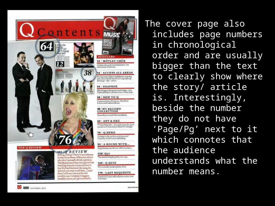
The cover page also includes page numbers in chronological order and are usually bigger than the text to clearly show where the story/ article is. Interestingly, beside the number they do not have ‘Page/Pg’ next to it which connotes that the audience understands what the number means.
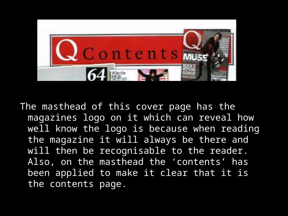
The masthead of this cover page has the magazines logo on it which can reveal how well know the logo is because when reading the magazine it will always be there and will then be recognisable to the reader. Also, on the masthead the ‘contents’ has been applied to make it clear that it is the contents page.

The cover page also has a website on the bottom to make sure the reader knows where to find out more about the magazine and be able to go and buy monthly subscriptions. Furthermore, the magazine also has the date/ month it came out along the bottom so that the readers know that a month later the next issue will be released.

The magazine also includes a colour scheme of black, white and red. They have only used three colours to make sure that it looks sophisticated and less cluttered. Also, the magazine may have used these colours to represent the genre of music the magazine talks about, which in this case could be indie/rock.
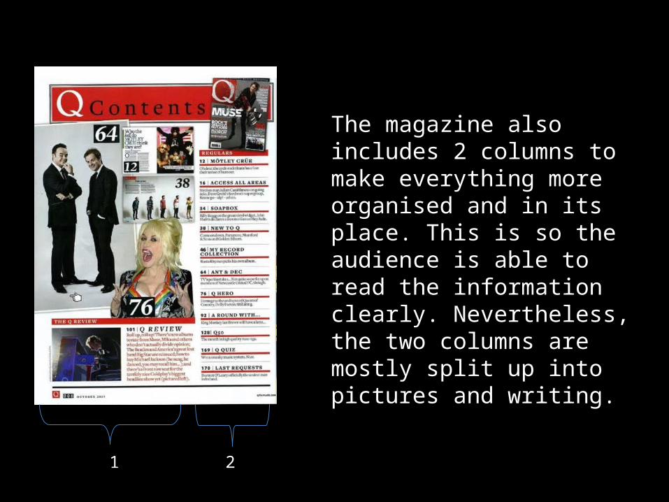
The magazine also includes 2 columns to make everything more organised and in its place. This is so the audience is able to read the information clearly. Nevertheless, the two columns are mostly split up into pictures and writing.
1 2
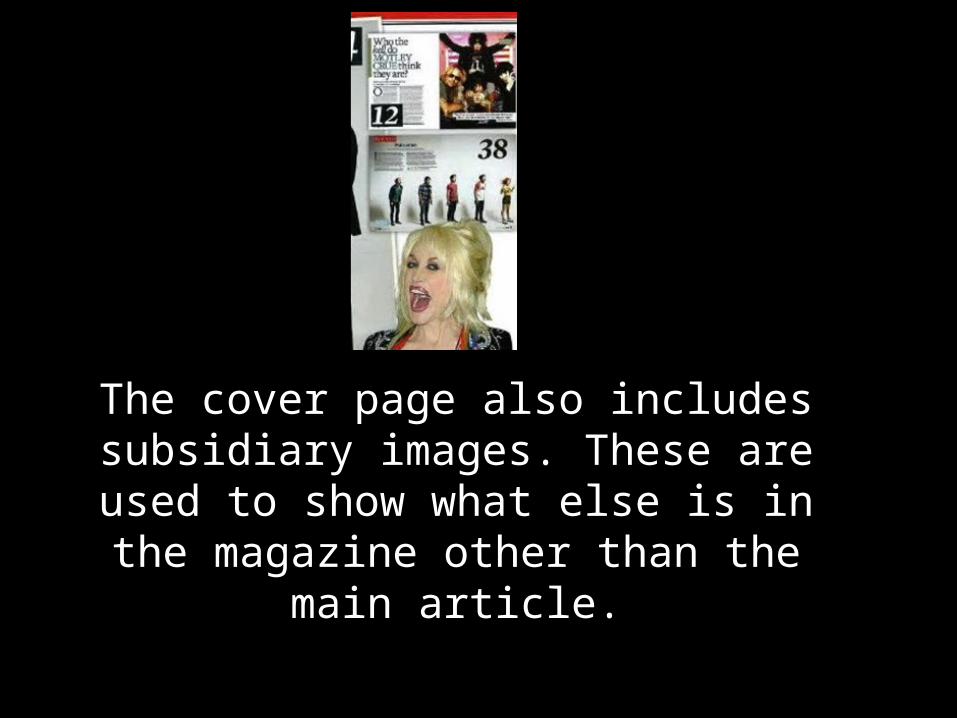
The cover page also includes subsidiary images. These are used to show what else
is in the magazine other than the main article.
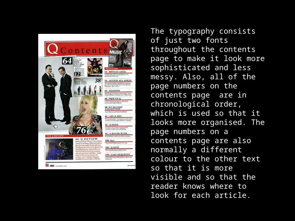
The typography consists of just two fonts throughout the contents page to make it look more sophisticated and less messy. Also, all of the page numbers on the contents page are in chronological order, which is used so that it looks more organised. The page numbers on a contents page are also normally a different colour to the other text so that it is more visible and so that the reader knows where to look for each article.
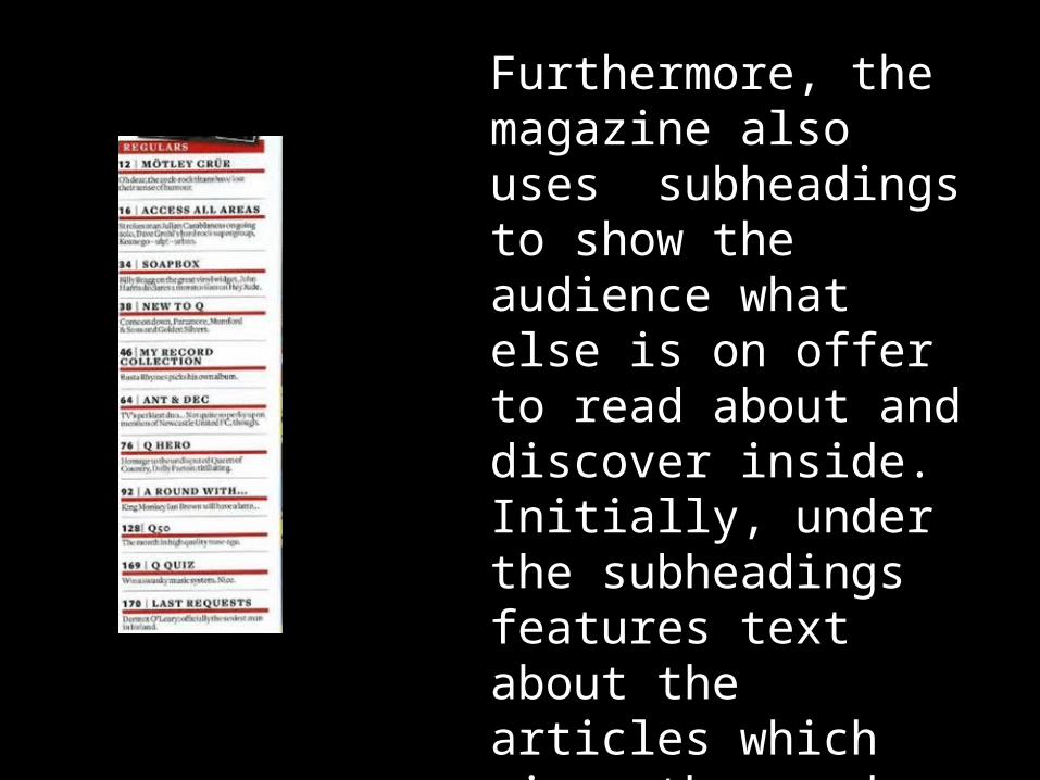
Furthermore, the magazine also uses subheadings to show the audience what else is on offer to read about and discover inside. Initially, under the subheadings features text about the articles which gives the reader even more insight.
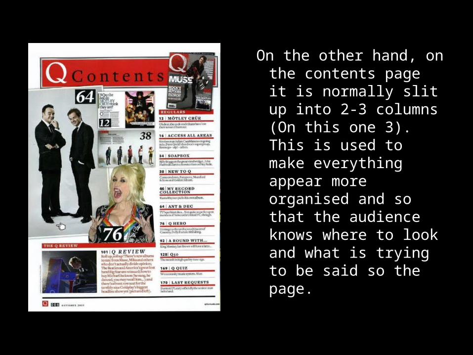
On the other hand, on the contents page it is normally slit up into 2-3 columns (On this one 3). This is used to make everything appear more organised and so that the audience knows where to look and what is trying to be said so the page.


