CMYK… · Short for Making Upward Dance, M.U.D Centro Danza is a dance school in Italy. ......
19
CMYK & PMS
Transcript of CMYK… · Short for Making Upward Dance, M.U.D Centro Danza is a dance school in Italy. ......
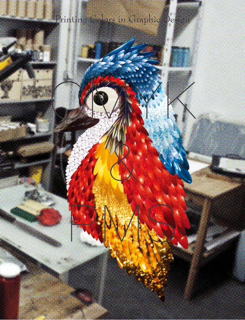
CMYK&
PMS

Based on the science of color, black color absorbs all wavelengths while white color reflects them in theory. When an object is illuminated, it absorbs parts of the spectrums and reflects some. The part of the visible spectrum that is not absorbed and therefore remains visible is the object’s color that we perceive. This is a color subtracting process. Such a phenomenon appearing in the way we perceive colors is applied to the printing industry and developed into a CMYK color model (process color or four color) which can greatly reproduce the colors in our world.
Visible Spectrum Increasing Wavelength→
Increasing Frequency→
400 500 600 700 (mm)
Prisma
WHATIS
CMYK2410
-1610
2210
-1410
2010
-1210
1810
-1010
1610
-810
1410
-610
1210
-410
8101010
010-210
610
210
Y rays X rays UV IR FM AMMicrowave Long radio wavesRadio waves
410
410
210
610
010
810
(Hz)
(m)
→→
White Light
005Page:004
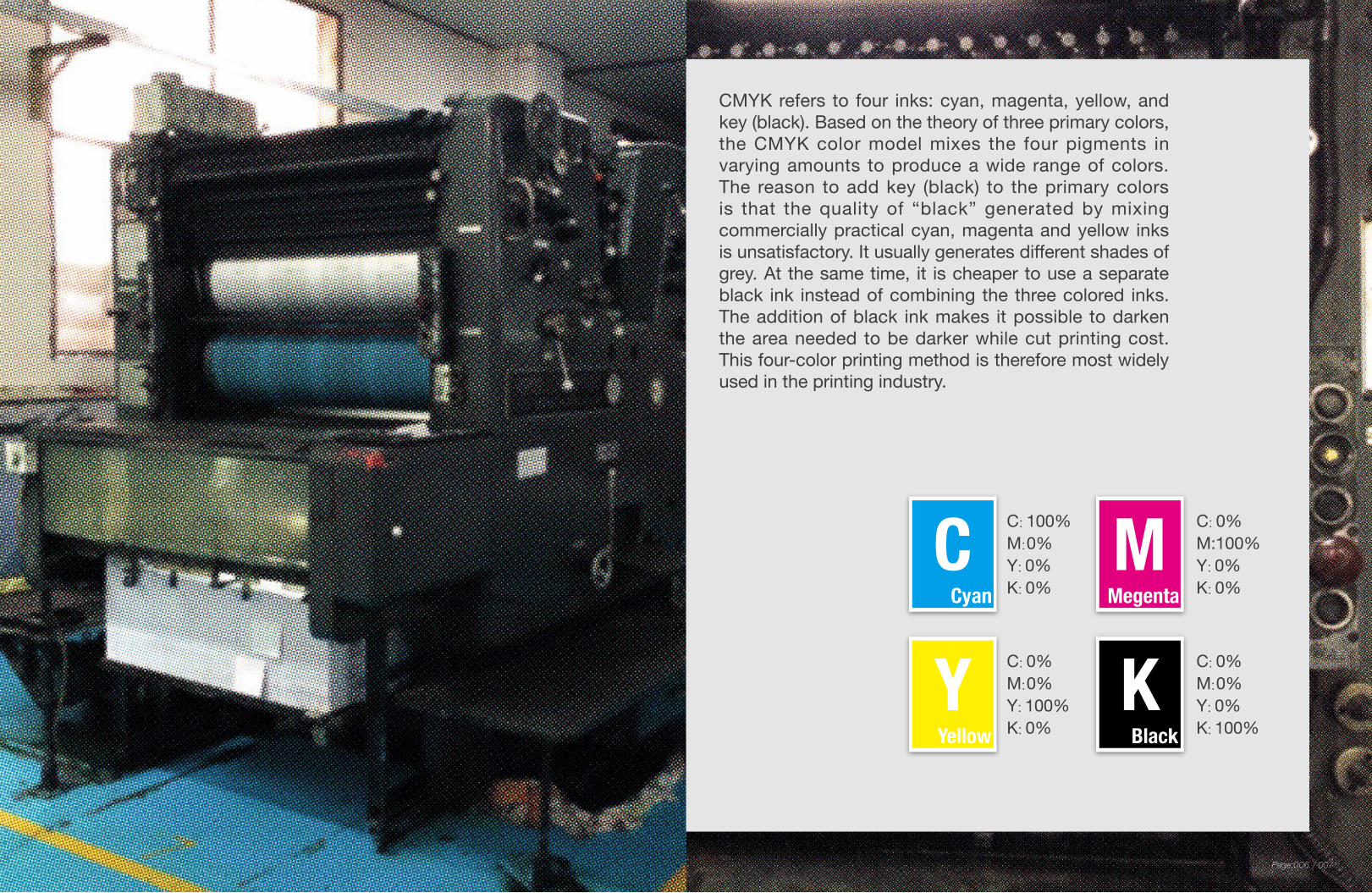
CMYK refers to four inks: cyan, magenta, yellow, and key (black). Based on the theory of three primary colors, the CMYK color model mixes the four pigments in varying amounts to produce a wide range of colors. The reason to add key (black) to the primary colors is that the quality of “black” generated by mixing commercially practical cyan, magenta and yellow inks is unsatisfactory. It usually generates different shades of grey. At the same time, it is cheaper to use a separate black ink instead of combining the three colored inks. The addition of black ink makes it possible to darken the area needed to be darker while cut printing cost. This four-color printing method is therefore most widely used in the printing industry.
C: 100%M: 0%Y: 0%K: 0%Cyan
C C: 0%M:100%Y: 0%K: 0%
MMegenta
C: 0%M: 0%Y: 100%K: 0%
YYellow
C: 0%M: 0%Y: 0%K: 100%
KBlack
007Page:006

Four-color presses are the most extensively used presses in the printing industry today. Each four-color press is equipped with four channels containing cyan, magenta, yellow, and black inks respectively that are mixed to reproduce the desired colors.
THEREPRODUCTION
OFCOLORS
009Page:008

Packaging design for tre•tea, a tea brand.“Tre” means three in Italian. The tea box therefore was designed to be a triangular prism. Three illustrated birds on the sides depict a figurative representation of each flavor. The color of each bird corresponds to the favor it represents. The white bird represents white tea, black bird black tea and colorful bird tropical tea.
Bacon is perfect to pair with Vi Novell (new wine). To transfer this message, the bottle and the “N” on the brochure copy the natural color of bacon, red and white.
Design: Natalia Bivo Design: ATIPUS
tre•tea Vi Novell 2012CMYK
CMYK
031Page:030
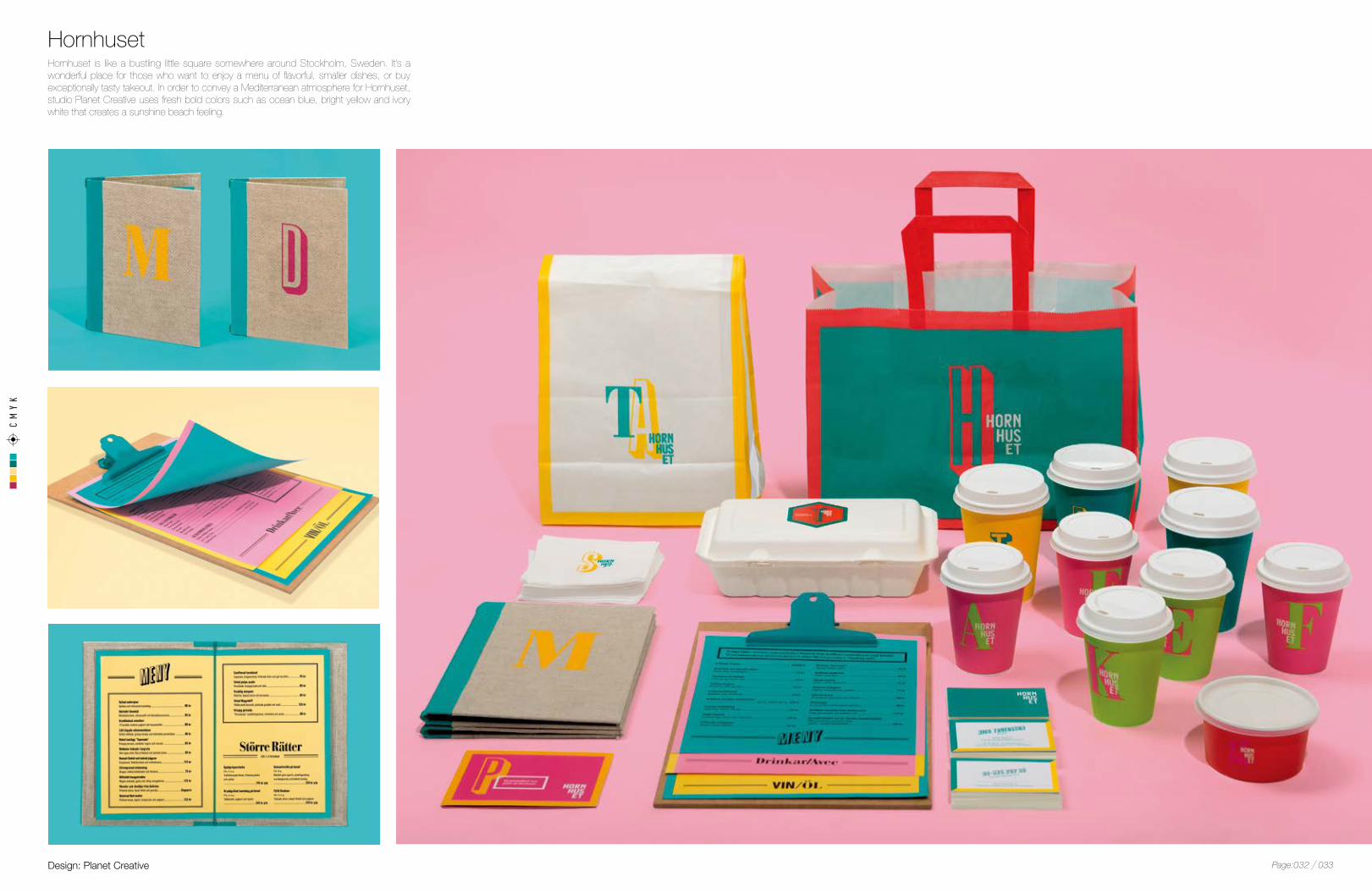
Hornhuset is like a bustling little square somewhere around Stockholm, Sweden. It’s a wonderful place for those who want to enjoy a menu of flavorful, smaller dishes, or buy exceptionally tasty takeout. In order to convey a Mediterranean atmosphere for Hornhuset, studio Planet Creative uses fresh bold colors such as ocean blue, bright yellow and ivory white that creates a sunshine beach feeling.
Design: Planet Creative
HornhusetCMYK
033Page:032

CMYK
035Page:034

Masquespacio designed the identity and the interior for 2Day Languages, a new Spanish school in Valencia. The overall design was based on a three-tone color palette, which presents the three levels A, B and C established by the Common European Framework of Reference for Languages, here seen as the colors blue, yellow and pink. On the other hand, the fading color symbolized the process in language learning.
Design: Ana Milena Hernández Palacios /Masquespacio
2Day LanguagesCMYK
037Page:036

This project intended to support the declining match industry by means of package redesign. The octagonal box and the gradients make contribute to artistic matchbox.
Design:OIMU
OIMU Octagonal MatchboxCMYK
039Page:038

Business Card for Matheus Dacosta, an artist and designer. The artistic card series unify his work in visual arts and design. Each one is unique with special pattern and color design.
Design: Matheus Dacosta
Handmade Business CardCMYK
041Page:040
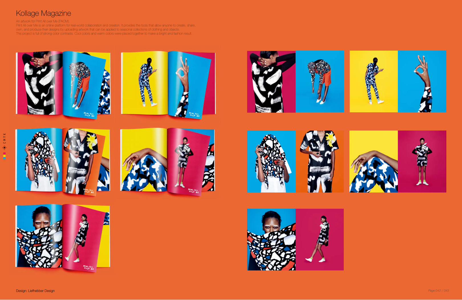
An artwork for Print All over Me (PAOM).Print All over Me is an online platform for real-world collaboration and creation. It provides the tools that allow anyone to create, share, own, and produce their designs by uploading artwork that can be applied to seasonal collections of clothing and objects. This project is full of strong color contrasts. Cool colors and warm colors were placed together to make a bright and fashion result.
Design: Liefhebber Design
Kollage MagazineCMYK
043Page:042

This print is inspired by the patterns, rhythms, and textures found everywhere, from art and history to nature. Persian rugs, East African textile prints and symbols from ancient Egypt can be found in it, which creates a psychedelic world. The multicolor enhances a mysterious impression.
Design: Liefhebber Design
Kollage MagazineCMYK
045Page:044
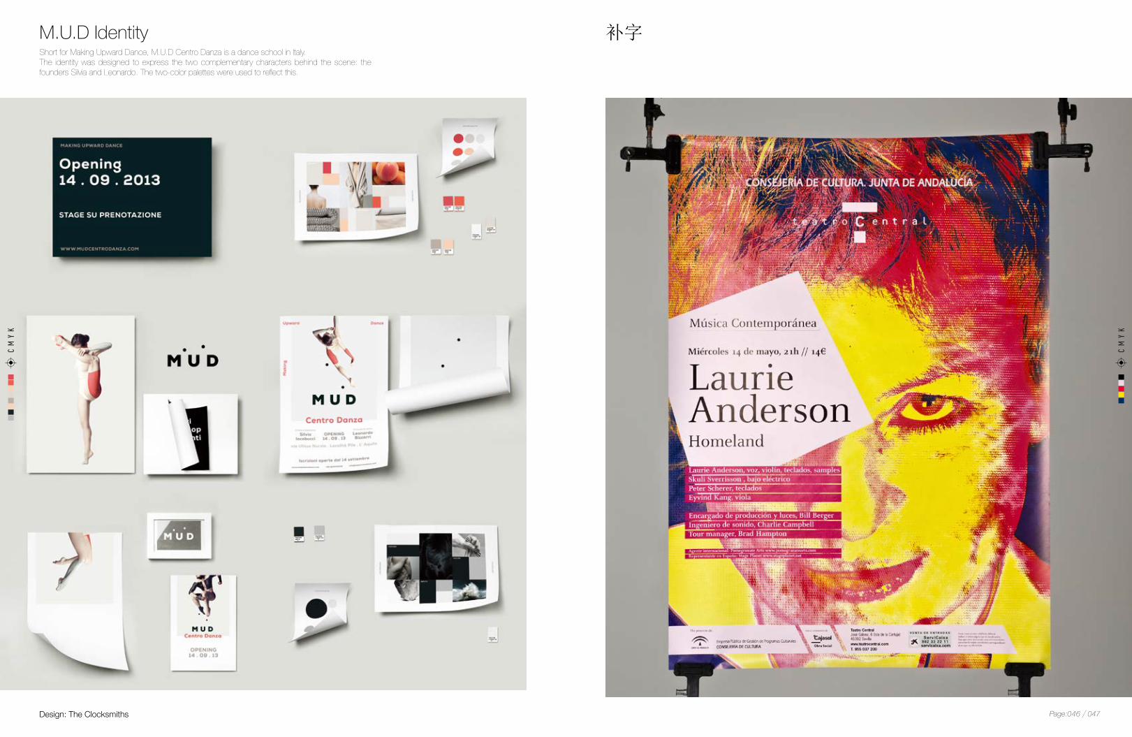
Short for Making Upward Dance, M.U.D Centro Danza is a dance school in Italy.The identity was designed to express the two complementary characters behind the scene: the founders Silvia and Leonardo. The two-color palettes were used to reflect this.
M.U.D Identity 补字
Design: The Clocksmiths
CMYK
CMYK
047Page:046

Queen Muar is a home based festival cookies bakery in southern Malaysia.This series of money packets were designed for Queen Muar to capture their customers’ attention with new style and color combinations that rarely can be found from traditional money packets. The bold colors, flower patterns and golden “ 福 ”( A Chinese character meaning good fortune) creates a strong Asian-style new year atmosphere.
Design: At Home Creative
Queen Muar’s Money PacketCMYK
051Page:050
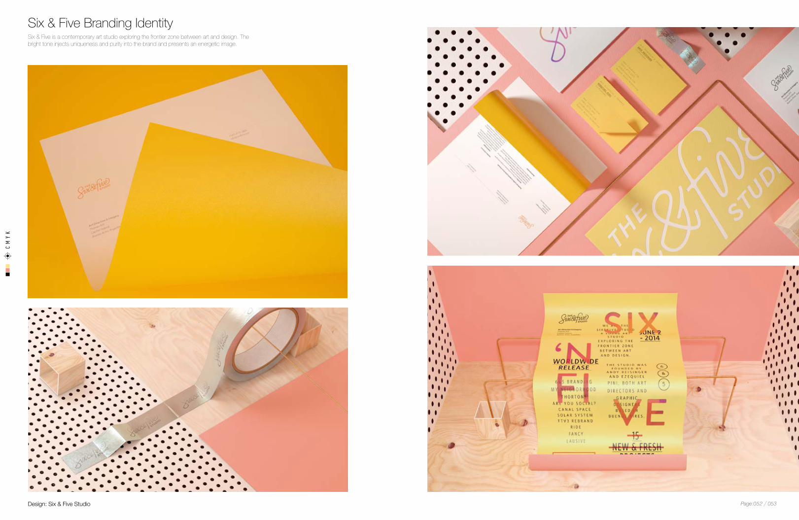
Six & Five is a contemporary art studio exploring the frontier zone between art and design. The bright tone injects uniqueness and purity into the brand and presents an energetic image.
Design: Six & Five Studio
Six & Five Branding IdentityCMYK
053Page:052
CMYK
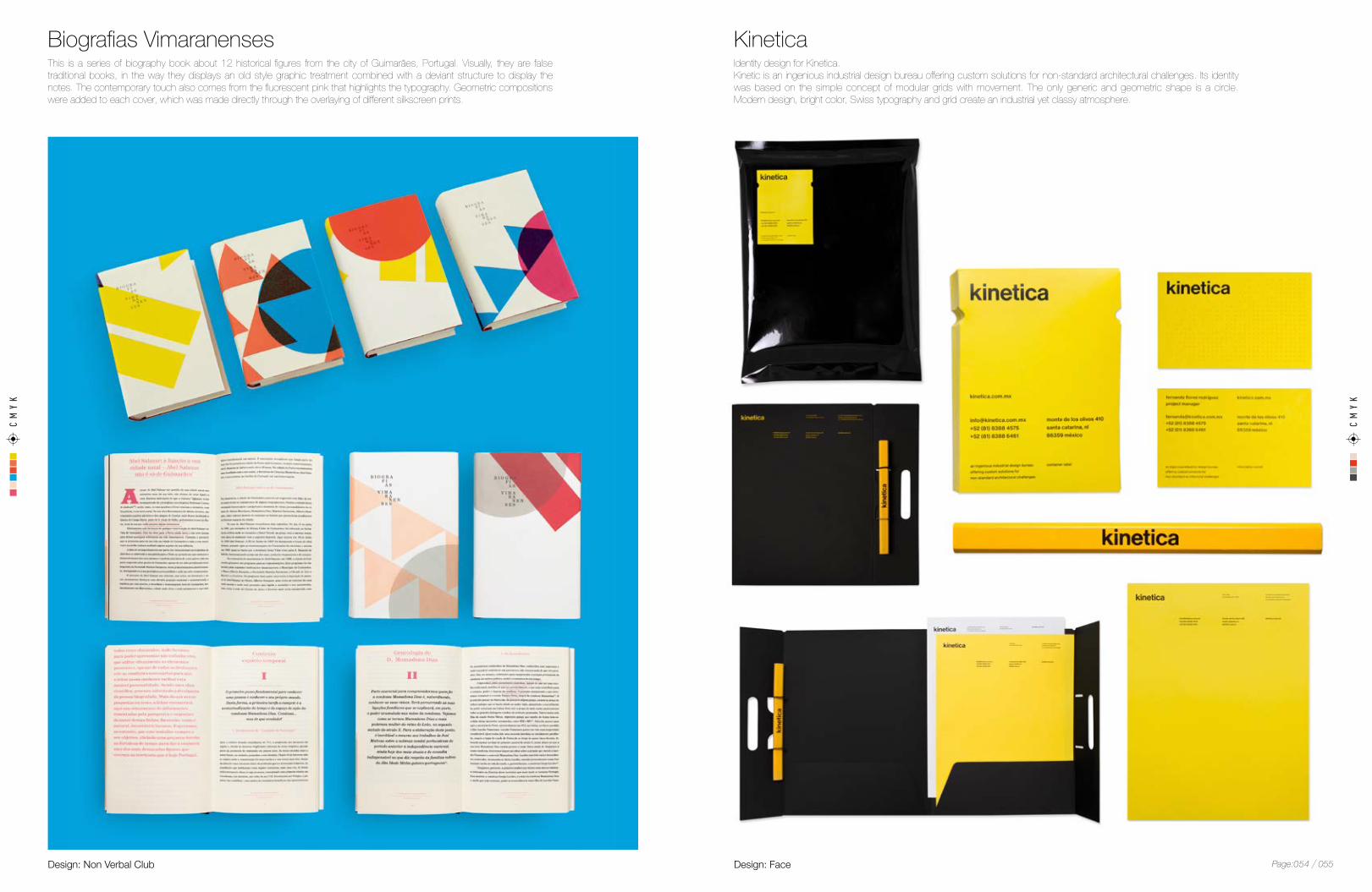
Identity design for Kinetica.Kinetic is an ingenious industrial design bureau offering custom solutions for non-standard architectural challenges. Its identity was based on the simple concept of modular grids with movement. The only generic and geometric shape is a circle. Modern design, bright color, Swiss typography and grid create an industrial yet classy atmosphere.
This is a series of biography book about 12 historical figures from the city of Guimarães, Portugal. Visually, they are false traditional books, in the way they displays an old style graphic treatment combined with a deviant structure to display the notes. The contemporary touch also comes from the fluorescent pink that highlights the typography. Geometric compositions were added to each cover, which was made directly through the overlaying of different silkscreen prints.
KineticaBiografias Vimaranenses
CMYK
Design: FaceDesign: Non Verbal Club 055Page:054
CMYK
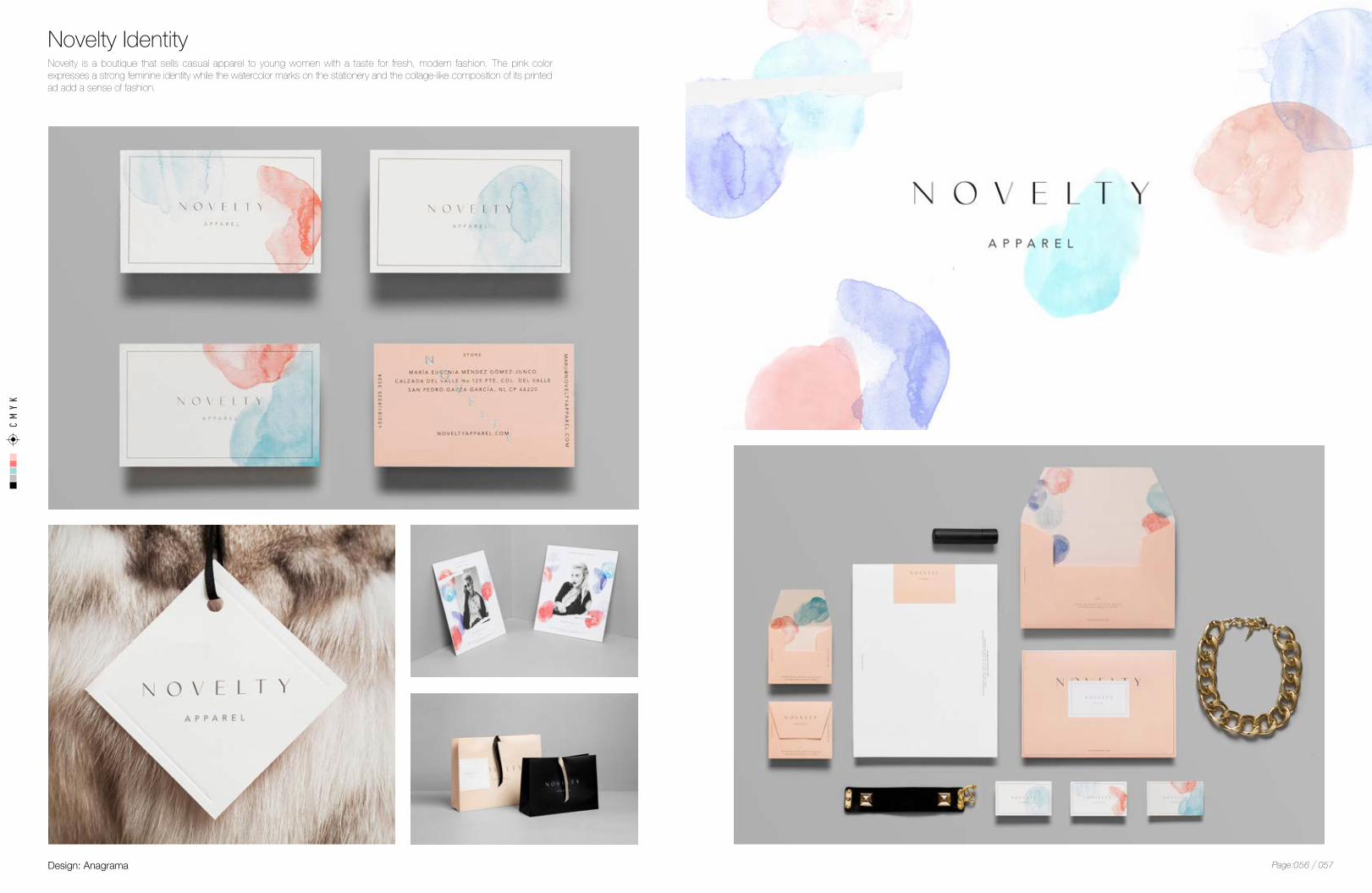
Novelty is a boutique that sells casual apparel to young women with a taste for fresh, modern fashion. The pink color expresses a strong feminine identity while the watercolor marks on the stationery and the collage-like composition of its printed ad add a sense of fashion.
Novelty Identity
Design: Anagrama 057Page:056

Branding identity for QI, a Mexican eyewear company.When deciding the color palette for this work, the designers used spot colors to achieve a pure extraction of the colors of the “zarape”, a Mexican fabric full of tradition and culture. Two Pantone neon colors were picked to create a strong contrast with the pastel tones.
Partners for Mental Health is an organization dedicated to transforming mental health in Canada. The designer used analogous colors to add emotion and a feeling of connectedness to its identity—one can find oneself on the spectrum of mental health issues at any point.
Design: Karla Heredia MartínezDesign: Blok Design
QI EyewearPartners for Mental Health
CMYK
CMYK
059Page:058
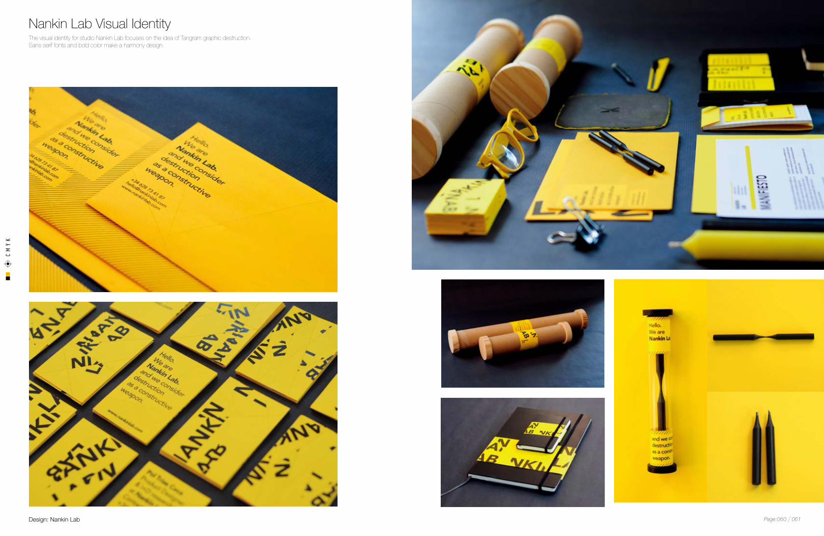
The visual identity for studio Nankin Lab focuses on the idea of Tangram graphic destruction. Sans serif fonts and bold color make a harmony design.
Design: Nankin Lab
Nankin Lab Visual IdentityCMYK
061Page:060