Climate4you update October 2011 - Klimarealistene file1 Climate4you update October 2011 October 2011...
26
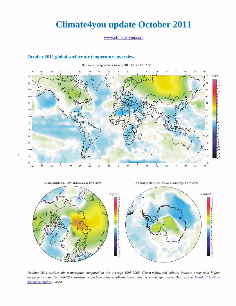
1 Climate4you update October 2011 www.climate4you.com October 2011 global surface air temperature overview October 2011 surface air temperature compared to the average 1998-2006. Green-yellow-red colours indicate areas with higher temperature than the 1998-2006 average, while blue colours indicate lower than average temperatures. Data source: Goddard Institute for Space Studies (GISS)
Transcript of Climate4you update October 2011 - Klimarealistene file1 Climate4you update October 2011 October 2011...
1
Climate4you update October 2011
www.climate4you.com
October 2011 global surface air temperature overview
October 2011 surface air temperature compared to the average 1998-2006. Green-yellow-red colours indicate areas with higher
temperature than the 1998-2006 average, while blue colours indicate lower than average temperatures. Data source: Goddard Institute
for Space Studies (GISS)
2
Comments to the October 2011 global surface air temperature overview
General: This newsletter contains graphs showing a
selection of key meteorological variables for the
past month. All temperatures are given in degrees
Celsius.
In the above maps showing the geographical pattern
of surface air temperatures, the period 1998-2006 is
used as reference period. The reason for comparing
with this recent period instead of the official WMO
‘normal’ period 1961-1990, is that the latter period
is affected by the relatively cold period 1945-1980.
Almost any comparison with such a low average
value will therefore appear as high or warm, and it
will be difficult to decide if and where modern
surface air temperatures are increasing or decreasing
at the moment. Comparing with a more recent
period overcomes this problem. In addition to this
consideration, the recent temperature development
suggests that the time window 1998-2006 may
roughly represent a global temperature peak. If so,
negative temperature anomalies will gradually
become more and more widespread as time goes on.
However, if positive anomalies instead gradually
become more widespread, this reference period only
represented a temperature plateau.
In the other diagrams in this newsletter the thin line
represents the monthly global average value, and
the thick line indicate a simple running average, in
most cases a simple moving 37-month average,
nearly corresponding to a three year average. The
37-month average is calculated from values
covering a range from 18 month before to
18 months after, with equal weight for every month.
The year 1979 has been chosen as starting point in
many diagrams, as this roughly corresponds to both
the beginning of satellite observations and the onset
of the late 20th century warming period. However,
several of the records have a much longer record
length, which may be inspected in grater detail on
www.Climate4you.com.
The average global surface air temperatures October
2011:
The Northern Hemisphere was characterised by
high regional variability. Warmer than 1998-2006
average temperatures extended across most of
northern Russia, most of Siberia and Canada. A
prominent hotspot existed over northern Siberia and
adjoining parts of the Arctic Ocean.
The Southern Hemisphere in general was close to or
slightly below average 1998-2006 conditions. Most
of South America, southern Africa and Indonesia
had below average temperatures. Australia in
general was to average.
Near Equator temperatures conditions were in
general below average 1998-2006 conditions.
The Arctic was characterized by a high variability of
average surface air temperatures. Most of Siberia
and Russia had above average temperatures, and
only eastern Siberia saw below average
temperature. Also most of Alaska and the Canadian
Arctic sector had above average temperature. Only
Greenland had below average temperature in
October. The marked thermal contrast near the
North Pole is a mathematical artefact, derived from
the GISS interpolation procedure, and should be
ignored.
Most of the Antarctic continent experienced below
average temperatures. Only the central part of the
continent experienced above average temperatures.
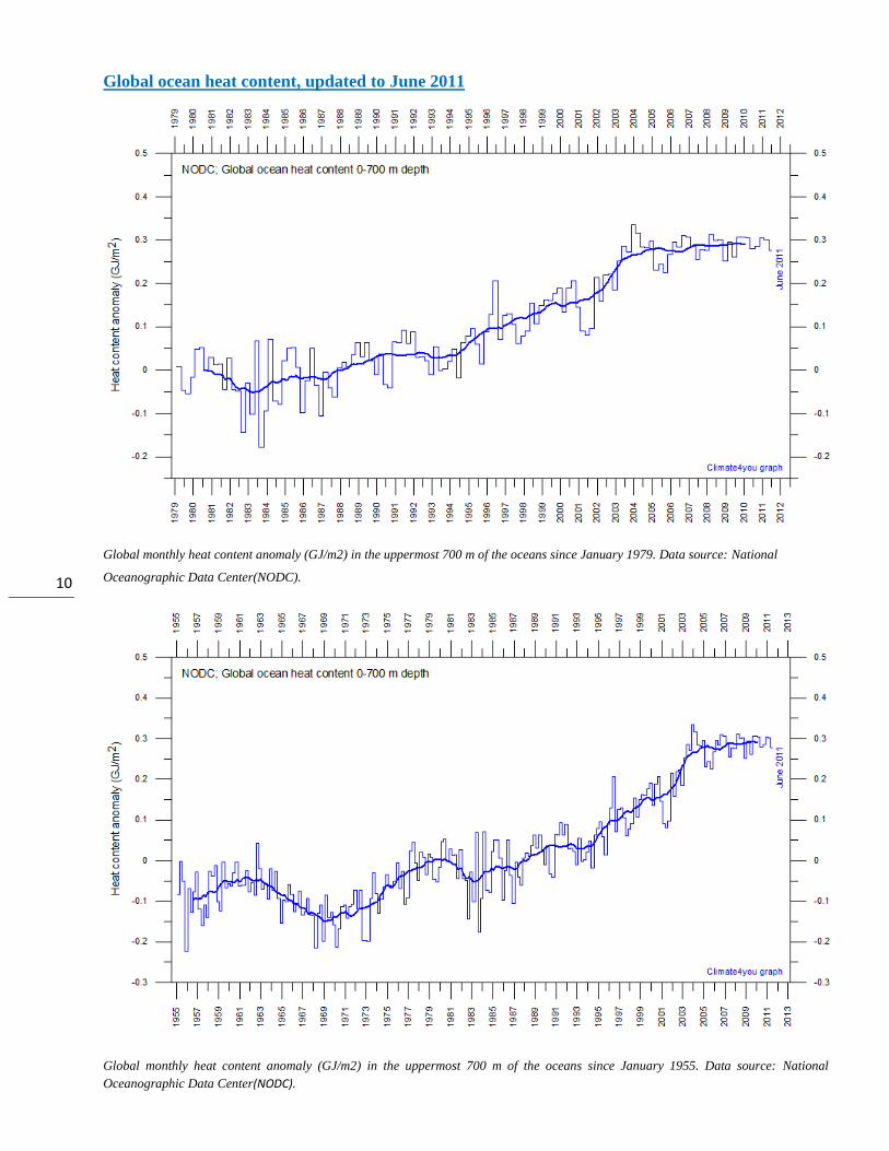
The global oceanic heat content has now for several
years been almost stable, at least since 2003/2004
(page 10).
The global sea level is not doing very much, either,
since 2009 (page 17).
Most diagrams shown in this newsletter are also available for download on www.climate4you.com

3
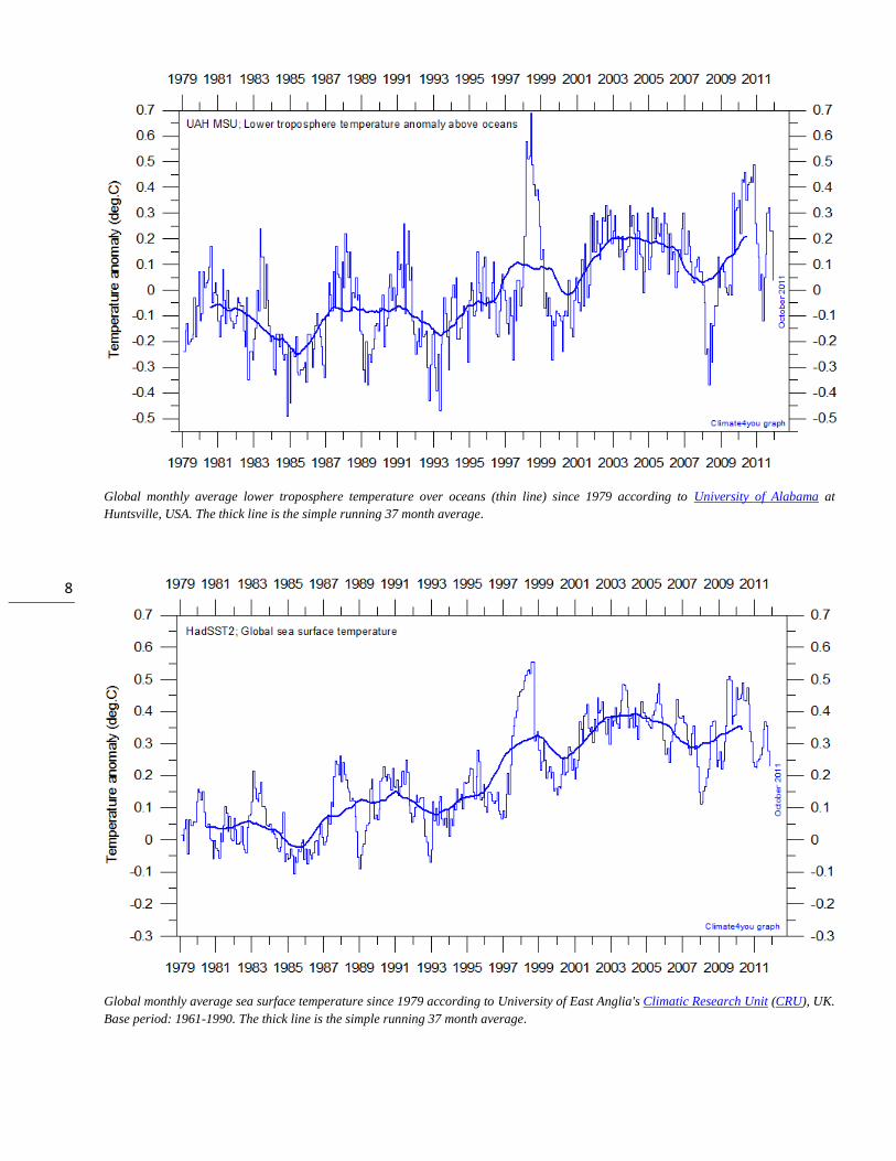
Lower troposphere temperature from satellites, updated to October 2011
Global monthly average lower troposphere temperature (thin line) since 1979 according to University of Alabama at Huntsville, USA.
The thick line is the simple running 37 month average.
Global monthly average lower troposphere temperature (thin line) since 1979 according to according to Remote Sensing Systems (RSS),
USA. The thick line is the simple running 37 month average.
4
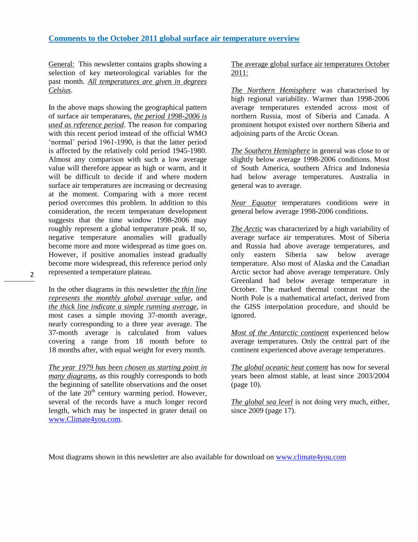
Global surface air temperature, updated to October 2011
Global monthly average surface air temperature (thin line) since 1979 according to according to the Hadley Centre for Climate
Prediction and Research and the University of East Anglia's Climatic Research Unit (CRU), UK. The thick line is the simple running 37
month average. Please note that the HadCRUT3 record is only updated to September 2011.
Global monthly average surface air temperature (thin line) since 1979 according to according to the Goddard Institute for Space Studies
(GISS), at Columbia University, New York City, USA. The thick line is the simple running 37 month average.
5
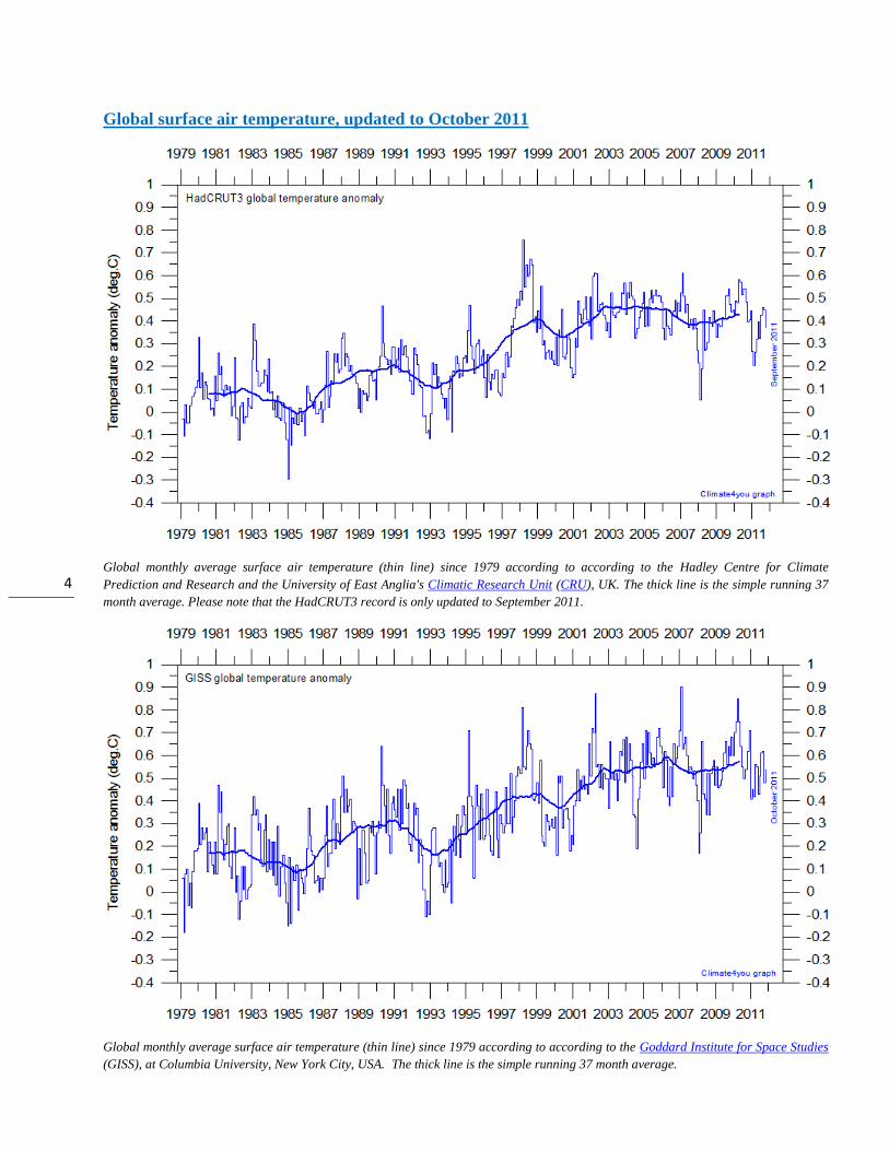
Global monthly average surface air temperature since 1979 according to according to the National Climatic Data Center (NCDC), USA.
The thick line is the simple running 37 month average.
A note on data record stability:
All the above temperature estimates display changes
when one compare with previous monthly data sets,
not only for the most recent months as a result of
additional data being added, but actually for all
months back to the very beginning of the records.
Presumably this reflects recognition of errors and
changes in the averaging procedure followed.
The most stable temperature record over time of the
five global records shown above is the HadCRUT3
series.
The interested reader may find more on the issue of
temporal stability (or lack of this) on
www.climate4you (go to: Global Temperature,
followed by Temporal Stability).
6
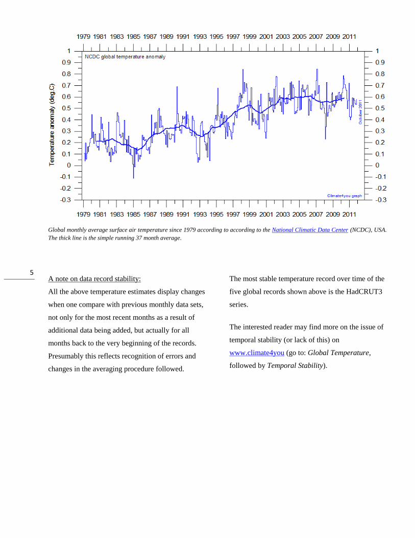
All in one, updated to September 2011
Superimposed plot of all five global monthly temperature estimates shown above. As the base period differs for
the different temperature estimates, they have all been normalised by comparing to the average value of their
initial 120 months (10 years) from January 1979 to December 1988. The heavy black line represents the simple
running 37 month (c. 3 year) mean of the average of all five temperature records. The numbers shown in the
lower right corner represent the temperature anomaly relative to the 1979-1988 average.
It should be kept in mind that satellite- and surface-
based temperature estimates are derived from
different types of measurements, and that
comparing them directly as done in the diagram
above therefore in principle may be problematical.
However, as both types of estimate often are
discussed together, the above diagram may
nevertheless be of some interest. In fact, the
different types of temperature estimates appear to
agree quite well as to the overall temperature
variations on a 2-3 year scale, although on a shorter
time scale there may be considerable differences
between the individual records.
All five global temperature estimates presently
show stagnation, at least since 2002. There has been
no increase in global air temperature since 1998,
which however was affected by the oceanographic
El Niño event. This stagnation does not exclude the
possibility that global temperatures will begin to
increase again later. On the other hand, it also
remain a possibility that Earth just now is passing a
temperature peak, and that global temperatures will
begin to decrease within the coming years. Time
will show which of these two possibilities is correct.
7
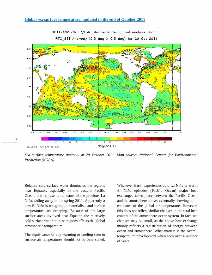
Global sea surface temperature, updated to the end of October 2011
Sea surface temperature anomaly at 29 October 2011. Map source: National Centers for Environmental
Prediction (NOAA).
Relative cold surface water dominates the regions
near Equator, especially in the eastern Pacific
Ocean, and represents remnants of the previous La
Niña, fading away in the spring 2011. Apparently a
new El Niño is not going to materialise, and surface
temperatures are dropping. Because of the large
surface areas involved near Equator, the relatively
cold surface water in these regions affects the global
atmospheric temperature.
The significance of any warming or cooling seen in
surface air temperatures should not be over stated.
Whenever Earth experiences cold La Niña or warm
El Niño episodes (Pacific Ocean) major heat
exchanges takes place between the Pacific Ocean
and the atmosphere above, eventually showing up in
estimates of the global air temperature. However,
this does not reflect similar changes in the total heat
content of the atmosphere-ocean system. In fact, net
changes may be small, as the above heat exchange
mainly reflects a redistribution of energy between
ocean and atmosphere. What matters is the overall
temperature development when seen over a number
of years.
8
Global monthly average lower troposphere temperature over oceans (thin line) since 1979 according to University of Alabama at
Huntsville, USA. The thick line is the simple running 37 month average.
Global monthly average sea surface temperature since 1979 according to University of East Anglia's Climatic Research Unit (CRU), UK.
Base period: 1961-1990. The thick line is the simple running 37 month average.
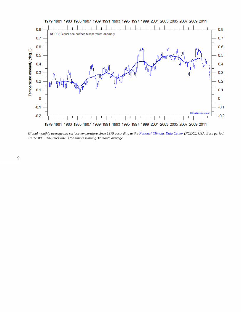
9
Global monthly average sea surface temperature since 1979 according to the National Climatic Data Center (NCDC), USA. Base period:
1901-2000. The thick line is the simple running 37 month average.
10
Global ocean heat content, updated to June 2011
Global monthly heat content anomaly (GJ/m2) in the uppermost 700 m of the oceans since January 1979. Data source: National
Oceanographic Data Center(NODC).
Global monthly heat content anomaly (GJ/m2) in the uppermost 700 m of the oceans since January 1955. Data source: National
Oceanographic Data Center(NODC).
11
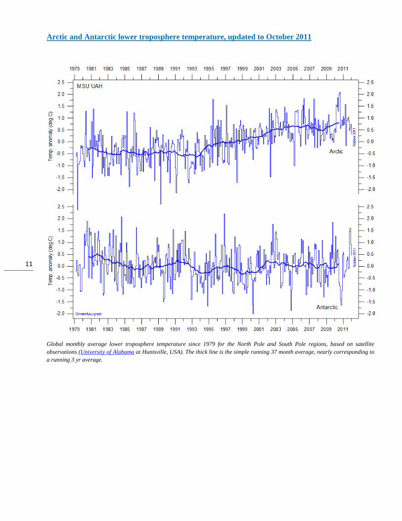
Arctic and Antarctic lower troposphere temperature, updated to October 2011
Global monthly average lower troposphere temperature since 1979 for the North Pole and South Pole regions, based on satellite
observations (University of Alabama at Huntsville, USA). The thick line is the simple running 37 month average, nearly corresponding to
a running 3 yr average.
12
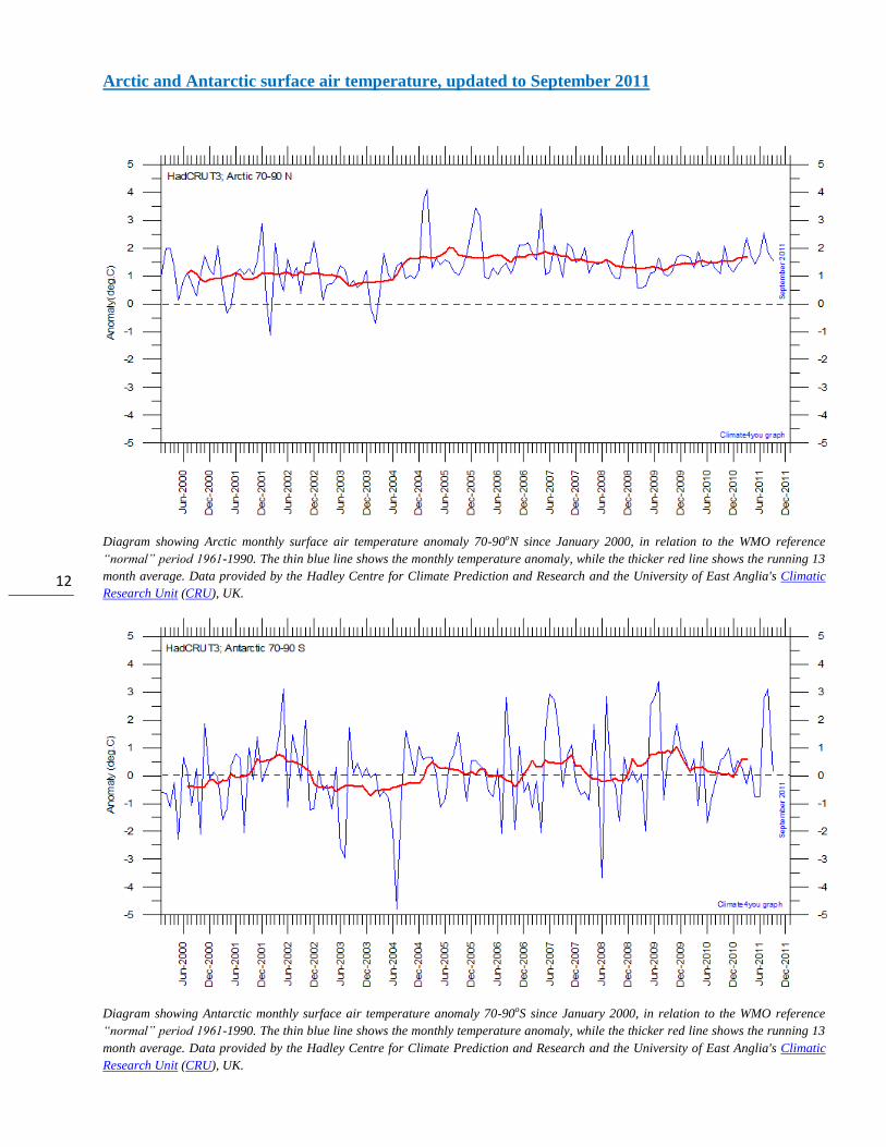
Arctic and Antarctic surface air temperature, updated to September 2011
Diagram showing Arctic monthly surface air temperature anomaly 70-90oN since January 2000, in relation to the WMO reference
“normal” period 1961-1990. The thin blue line shows the monthly temperature anomaly, while the thicker red line shows the running 13
month average. Data provided by the Hadley Centre for Climate Prediction and Research and the University of East Anglia's Climatic
Research Unit (CRU), UK.
Diagram showing Antarctic monthly surface air temperature anomaly 70-90oS since January 2000, in relation to the WMO reference
“normal” period 1961-1990. The thin blue line shows the monthly temperature anomaly, while the thicker red line shows the running 13
month average. Data provided by the Hadley Centre for Climate Prediction and Research and the University of East Anglia's Climatic
Research Unit (CRU), UK.
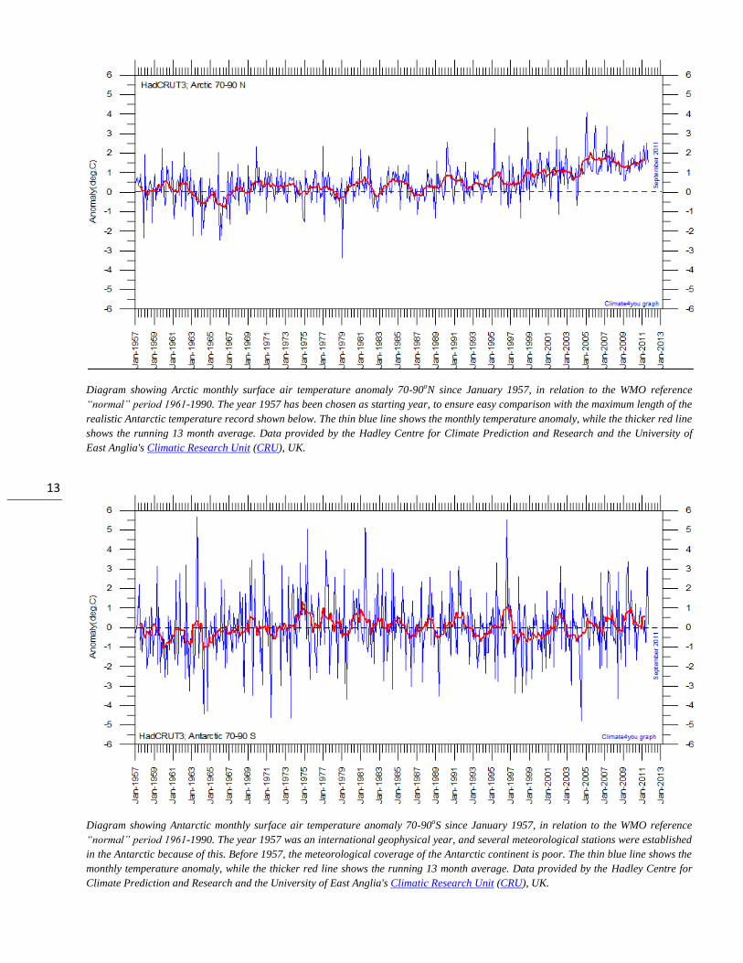
13
Diagram showing Arctic monthly surface air temperature anomaly 70-90oN since January 1957, in relation to the WMO reference
“normal” period 1961-1990. The year 1957 has been chosen as starting year, to ensure easy comparison with the maximum length of the
realistic Antarctic temperature record shown below. The thin blue line shows the monthly temperature anomaly, while the thicker red line
shows the running 13 month average. Data provided by the Hadley Centre for Climate Prediction and Research and the University of
East Anglia's Climatic Research Unit (CRU), UK.
Diagram showing Antarctic monthly surface air temperature anomaly 70-90oS since January 1957, in relation to the WMO reference
“normal” period 1961-1990. The year 1957 was an international geophysical year, and several meteorological stations were established
in the Antarctic because of this. Before 1957, the meteorological coverage of the Antarctic continent is poor. The thin blue line shows the
monthly temperature anomaly, while the thicker red line shows the running 13 month average. Data provided by the Hadley Centre for
Climate Prediction and Research and the University of East Anglia's Climatic Research Unit (CRU), UK.
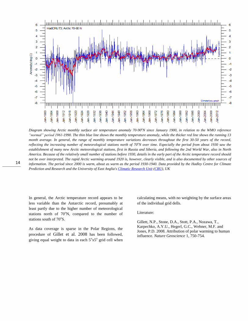
14
Diagram showing Arctic monthly surface air temperature anomaly 70-90oN since January 1900, in relation to the WMO reference
“normal” period 1961-1990. The thin blue line shows the monthly temperature anomaly, while the thicker red line shows the running 13
month average. In general, the range of monthly temperature variations decreases throughout the first 30-50 years of the record,
reflecting the increasing number of meteorological stations north of 70oN over time. Especially the period from about 1930 saw the
establishment of many new Arctic meteorological stations, first in Russia and Siberia, and following the 2nd World War, also in North
America. Because of the relatively small number of stations before 1930, details in the early part of the Arctic temperature record should
not be over interpreted. The rapid Arctic warming around 1920 is, however, clearly visible, and is also documented by other sources of
information. The period since 2000 is warm, about as warm as the period 1930-1940. Data provided by the Hadley Centre for Climate
Prediction and Research and the University of East Anglia's Climatic Research Unit (CRU), UK
In general, the Arctic temperature record appears to be
less variable than the Antarctic record, presumably at
least partly due to the higher number of meteorological
stations north of 70oN, compared to the number of
stations south of 70oS.
As data coverage is sparse in the Polar Regions, the
procedure of Gillet et al. 2008 has been followed,
giving equal weight to data in each 5ox5
o grid cell when
calculating means, with no weighting by the surface areas
of the individual grid dells.
Literature:
Gillett, N.P., Stone, D.A., Stott, P.A., Nozawa, T.,
Karpechko, A.Y.U., Hegerl, G.C., Wehner, M.F. and
Jones, P.D. 2008. Attribution of polar warming to human
influence. Nature Geoscience 1, 750-754.
15
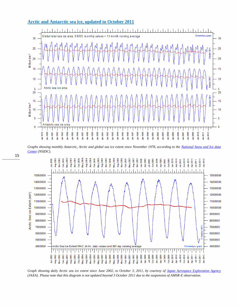
Arctic and Antarctic sea ice, updated to October 2011
Graphs showing monthly Antarctic, Arctic and global sea ice extent since November 1978, according to the National Snow and Ice data
Center (NSIDC).
Graph showing daily Arctic sea ice extent since June 2002, to October 3, 2011, by courtesy of Japan Aerospace Exploration Agency
(JAXA). Please note that this diagram is not updated beyond 3 October 2011 due to the suspension of AMSR-E observation.
16
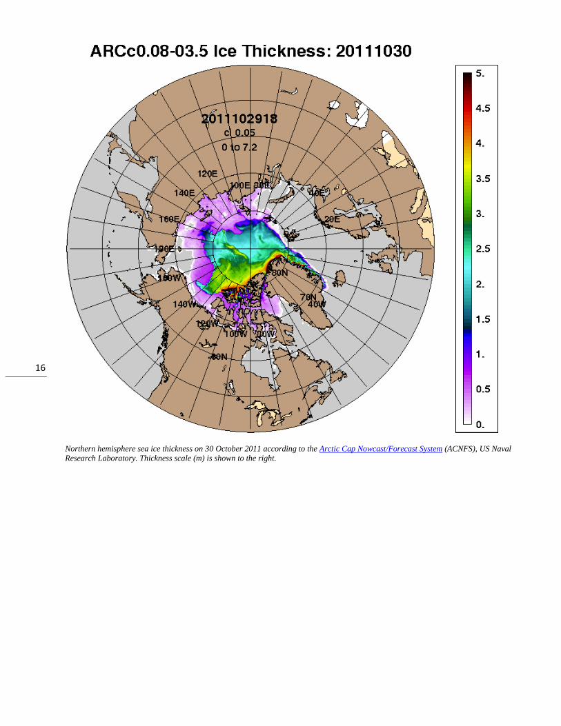
Northern hemisphere sea ice thickness on 30 October 2011 according to the Arctic Cap Nowcast/Forecast System (ACNFS), US Naval
Research Laboratory. Thickness scale (m) is shown to the right.

17
Global sea level, updated to September 2011
Globa lmonthly sea level since late 1992 according to the Colorado Center for Astrodynamics Research at University of Colorado at
Boulder, USA. The thick line is the simple running 37 observation average, nearly corresponding to a running 3 yr average.
Forecasted change of global sea level until year 2100, based on simple extrapolation of measurements done by the Colorado Center for
Astrodynamics Research at University of Colorado at Boulder, USA. The thick line is the simple running 3 yr average forecast for sea
level change until year 2100. Based on this (thick line), the present empirical forecast of sea level change until 2100 is about +20 cm.
18
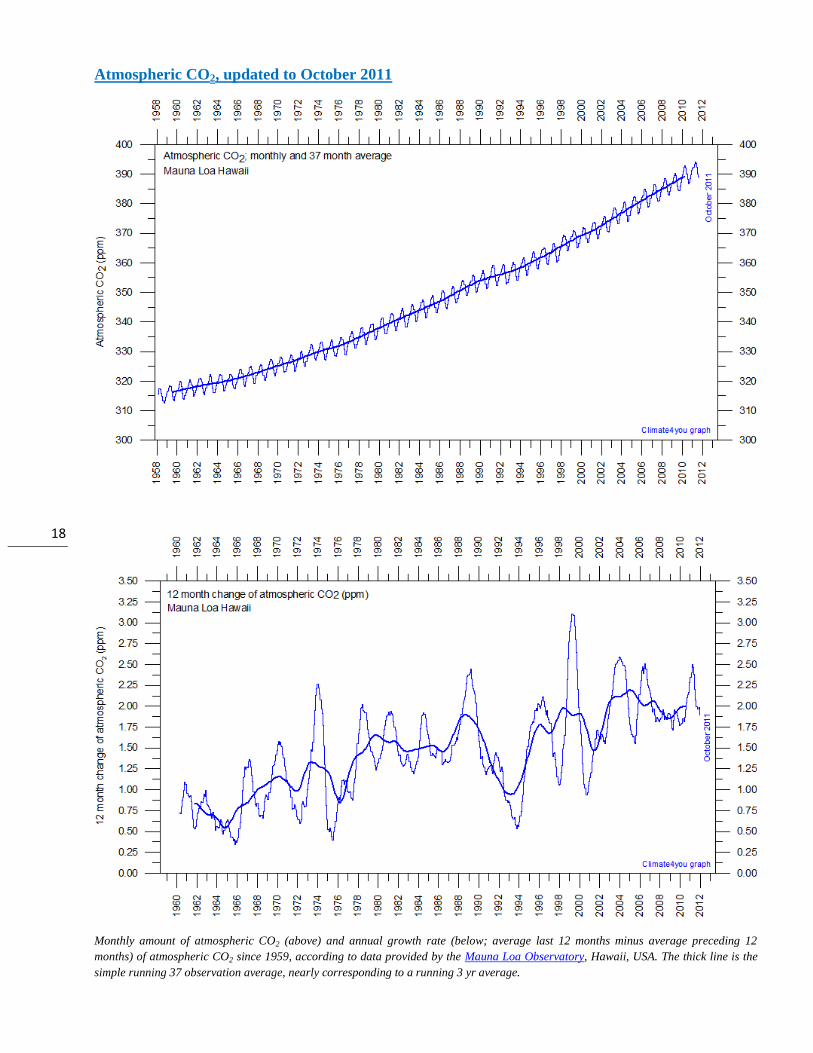
Atmospheric CO2, updated to October 2011
Monthly amount of atmospheric CO2 (above) and annual growth rate (below; average last 12 months minus average preceding 12
months) of atmospheric CO2 since 1959, according to data provided by the Mauna Loa Observatory, Hawaii, USA. The thick line is the
simple running 37 observation average, nearly corresponding to a running 3 yr average.
19
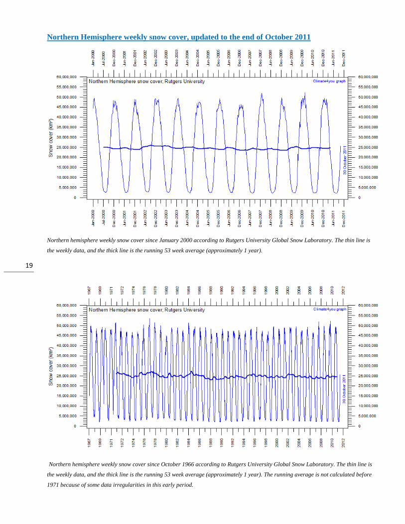
Northern Hemisphere weekly snow cover, updated to the end of October 2011
Northern hemisphere weekly snow cover since January 2000 according to Rutgers University Global Snow Laboratory. The thin line is
the weekly data, and the thick line is the running 53 week average (approximately 1 year).
Northern hemisphere weekly snow cover since October 1966 according to Rutgers University Global Snow Laboratory. The thin line is
the weekly data, and the thick line is the running 53 week average (approximately 1 year). The running average is not calculated before
1971 because of some data irregularities in this early period.
20
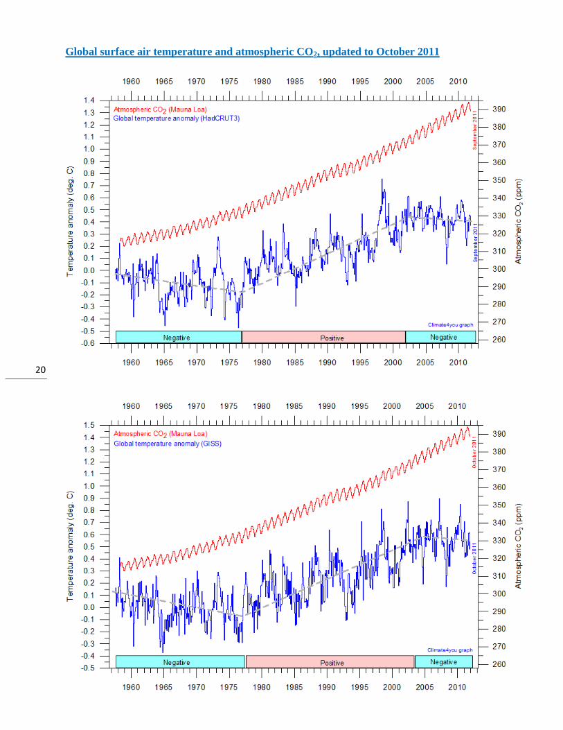
Global surface air temperature and atmospheric CO2, updated to October 2011

21
Diagrams showing HadCRUT3, GISS, and NCDC monthly global surface air temperature estimates (blue) and the monthly
atmospheric CO2 content (red) according to the Mauna Loa Observatory, Hawaii. The Mauna Loa data series begins in
March 1958, and 1958 has therefore been chosen as starting year for the diagrams. Reconstructions of past atmospheric
CO2 concentrations (before 1958) are not incorporated in this diagram, as such past CO2 values are derived by other
means (ice cores, stomata, or older measurements using different methodology, and therefore are not directly comparable
with modern atmospheric measurements. The dotted grey line indicates the approximate linear temperature trend, and the
boxes in the lower part of the diagram indicate the relation between atmospheric CO2 and global surface air temperature,
negative or positive. Please note that the HadCRUT3 record is only updated to September 2011.
Most climate models assume the greenhouse gas
carbon dioxide CO2 to influence significantly upon
global temperature. Thus, it is relevant to compare
the different global temperature records with
measurements of atmospheric CO2, as shown in the
diagrams above. Any comparison, however, should
not be made on a monthly or annual basis, but for a
longer time period, as other effects (oceanographic,
clouds, volcanic, etc.) may well override the
potential influence of CO2 on short time scales such
as just a few years.
It is of cause equally inappropriate to present new
meteorological record values, whether daily,
monthly or annual, as support for the hypothesis
ascribing high importance of atmospheric CO2 for
global temperatures. Any such short-period
meteorological record value may well be the result
of other phenomena than atmospheric CO2.
What exactly defines the critical length of a relevant
time period to consider for evaluating the alleged
high importance of CO2 remains elusive. However,
the length of the critical period must be inversely
proportional to the importance of CO2 on the global
temperature, including possible feedback effects. So
if the net effect of CO2 is strong, the length of the
critical period is short, and vice versa.
22
After about 10 years of global temperature increase
following global cooling 1940-1978, IPCC was
established in 1988. Presumably, several scientists
interested in climate in 1988 felt intuitively that
their empirical and theoretical understanding of
climate dynamics was sufficient to conclude about
the high importance of CO2 for global temperature.
However, for obtaining public and political support
for the CO2-hyphotesis the 10 year warming period
leading up to 1988 in all likelihood was important.
Had the global temperature instead been decreasing,
political and public support for the CO2-hypothesis
would have been difficult to obtain. Adopting this
approach as to critical time length, the varying
relation (positive or negative) between global
temperature and atmospheric CO2 has been
indicated in the lower panels of the three diagrams
above.
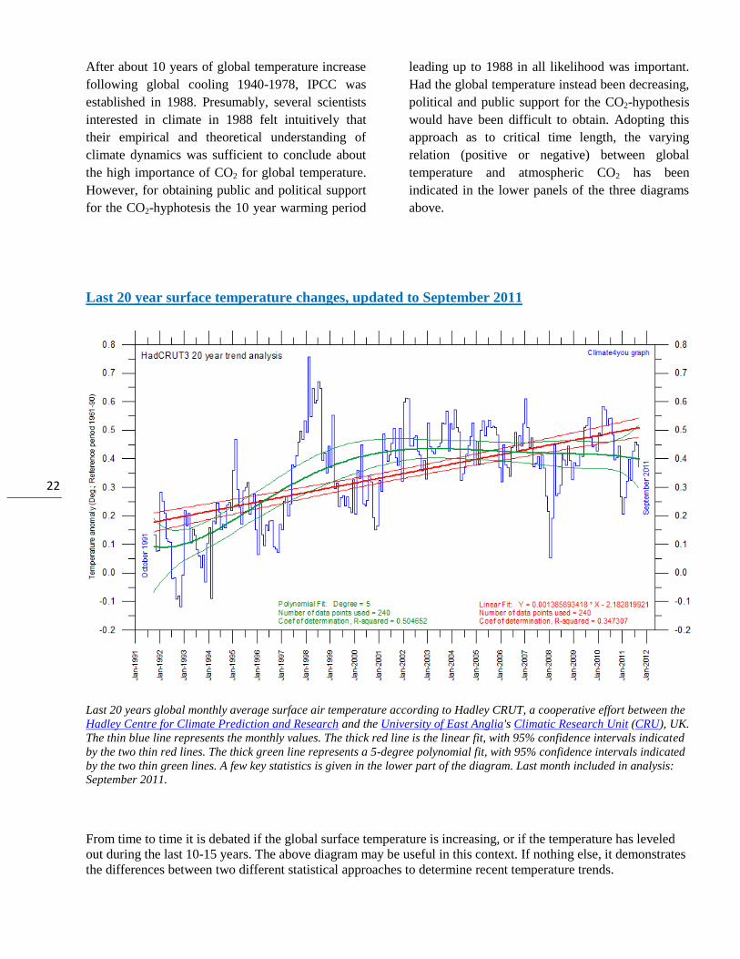
Last 20 year surface temperature changes, updated to September 2011
Last 20 years global monthly average surface air temperature according to Hadley CRUT, a cooperative effort between the
Hadley Centre for Climate Prediction and Research and the University of East Anglia's Climatic Research Unit (CRU), UK.
The thin blue line represents the monthly values. The thick red line is the linear fit, with 95% confidence intervals indicated
by the two thin red lines. The thick green line represents a 5-degree polynomial fit, with 95% confidence intervals indicated
by the two thin green lines. A few key statistics is given in the lower part of the diagram. Last month included in analysis:
September 2011.
From time to time it is debated if the global surface temperature is increasing, or if the temperature has leveled
out during the last 10-15 years. The above diagram may be useful in this context. If nothing else, it demonstrates
the differences between two different statistical approaches to determine recent temperature trends.
23
Climate and history; one example among many
384-322 BC; Aristotle's views on weather and climate
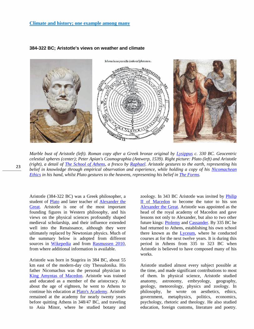
Marble bust of Aristotle (left). Roman copy after a Greek bronze original by Lysippus c. 330 BC. Geocentric
celestial spheres (center); Peter Apian's Cosmographia (Antwerp, 1539). Right picture: Plato (left) and Aristotle
(right), a detail of The School of Athens, a fresco by Raphael. Aristotle gestures to the earth, representing his
belief in knowledge through empirical observation and experience, while holding a copy of his Nicomachean
Ethics in his hand, whilst Plato gestures to the heavens, representing his belief in The Forms.
Aristotle (384-322 BC) was a Greek philosopher, a
student of Plato and later teacher of Alexander the
Great. Aristotle is one of the most important
founding figures in Western philosophy, and his
views on the physical sciences profoundly shaped
medieval scholarship, and their influence extended
well into the Renaissance, although they were
ultimately replaced by Newtonian physics. Much of
the summary below is adopted from different
sources in Wikepedia and from Rasmussen 2010,
from where additional information is available.
Aristotle was born in Stageira in 384 BC, about 55
km east of the modern-day city Thessalonika. His
father Nicomachus was the personal physician to
King Amyntas of Macedon. Aristotle was trained
and educated as a member of the aristocracy. At
about the age of eighteen, he went to Athens to
continue his education at Plato's Academy. Aristotle
remained at the academy for nearly twenty years
before quitting Athens in 348/47 BC, and traveling
to Asia Minor, where he studied botany and
zoology. In 343 BC Aristotle was invited by Philip
II of Macedon to become the tutor to his son
Alexander the Great. Aristotle was appointed as the
head of the royal academy of Macedon and gave
lessons not only to Alexander, but also to two other
future kings: Ptolemy and Cassander. By 335 BC he
had returned to Athens, establishing his own school
there known as the Lyceum, where he conducted
courses at for the next twelve years. It is during this
period in Athens from 335 to 323 BC when
Aristotle is believed to have composed many of his
works.
Aristotle studied almost every subject possible at
the time, and made significant contributions to most
of them. In physical science, Aristotle studied
anatomy, astronomy, embryology, geography,
geology, meteorology, physics and zoology. In
philosophy, he wrote on aesthetics, ethics,
government, metaphysics, politics, economics,
psychology, rhetoric and theology. He also studied
education, foreign customs, literature and poetry.
24
His combined works constitute a virtual
encyclopedia of Greek knowledge. It has been
suggested that Aristotle was probably the last
person to know everything there was to be known in
his own time. Like his teacher Plato, Aristotle's
philosophy was aiming at the universal. Aristotle,
however, found the universal in particular things,
which he called the essence of things. Aristotle's
method is both inductive and deductive, while
Plato's is essentially deductive from a priori
principles.
In 350 BC Aristotle wrote a treatise entitled
'Meteorologica', which probably is the first attempt
ever to make a comprehensive about the earth
sciences, including meteorology. 'Meteorologica'
consists of four books, including early accounts of
water evaporation, weather phenomena, and
earthquakes, and was considered a benchmark
publication for more than 2000 years. Interesting
enough, Aristotle expected clouds to consist of
water. In chapter (part) nine in his first book, he
directly states that 'air condensing into water is
cloud'.
In 'Meteorologica' Aristotle presents a number of
interesting interpretations concerning different
phenomena related to the Earth, atmosphere, clouds
weather, climate and climate change effects:
Earth, Sun and atmosphere
The earth is surrounded by water, just as that is by the sphere of air, and that again by the sphere called that of fire.
...four bodies are fire, air, water, earth. Fire occupies the highest place among
them all, earth the lowest, and two elements correspond to these in their relation to one another, air being nearest to fire, water to earth.
...the motion of these latter bodies [of four] being of two kinds: either from the centre or to the centre.
Fire, air, water, earth, we assert, originate from one another, and each of them exists potentially in each, as all things do that can be resolved into a common and ultimate substrate.
The efficient and chief and first cause is the circle in which the sun moves. For the sun as it approaches or recedes, obviously causes dissipation and condensation and so gives rise to generation and destruction.
Clouds and rain
Now the earth remains but the moisture surrounding it is made to evaporate by the sun's rays and the other heat from above, and rises. But when the heat which was raising it leaves it, in part dispersing to the higher region, in part quenched through rising so far into the upper air, then the vapour cools because its heat is gone and because the place is cold, and condenses again and turns from air into water. And after the water has formed it falls down again to the earth.
Since water is generated from air, and air from water, why are clouds not formed in the upper air? They ought to form there the more, the further from the earth and the colder that region is. For it is neither appreciably near to the heat of the stars, nor to the rays reflected from the earth. It is these that dissolve any formation by their heat and so prevent clouds from forming near the earth. For clouds gather at the point where the reflected rays disperse in the infinity of space and are lost. To explain this we must suppose either that it is not all air which water is generated, or, if it is produced from all air alike, that what immediately surrounds the earth is not mere air, but a sort of vapour, and that its vaporous nature is the reason why it condenses back to water again.
However, it may well be that the formation of clouds in that upper region is also prevented by the circular motion. For the air round the earth is necessarily all of it in motion, except that which is cut off inside the circumference which makes the earth a complete sphere. In the case of winds it is actually observable that they originate in marshy districts of the earth; and they do not seem to blow above the level of the highest mountains. It is the revolution of the heaven which carries the air with it and causes its circular motion, fire being continuous with the upper element and air with fire. Thus its motion is a second reason why that air is not condensed into water.
The exhalation of water is vapour: air condensing into water is cloud. Mist is what is left over when a cloud condenses into water, and is therefore rather a sign of fine weather than of rain; for mist might be called a barren cloud. So we get a circular process that follows the course of the sun. For according as the sun moves to this side or that, the moisture in this process rises or falls. We must think of it as a river flowing up and down in a circle and made up partly
25
of air, partly of water. When the sun is near, the stream of vapour flows upwards; when it recedes, the stream of water flows down: and the order of sequence, at all events, in this process always remains the same. So if 'Oceanus' had some secret meaning in early writers, perhaps they may have meant this river that flows in a circle about the earth.
So the moisture is always raised by the heat and descends to the earth again when it gets cold. These processes and, in some cases, their varieties are distinguished by special names. When the water falls in small drops it is called a drizzle; when the drops are larger it is rain.
Water vapour, dew and hoar-frost
Some of the vapour that is formed by day does not rise high because the ratio of the fire that is raising it to the water that is being raised is small
Both dew and hoar-frost are found when the sky is clear and there is no wind. For the vapour could not be raised unless the sky were clear, and if a wind were blowing it could not condense.
...hoar-frost is not found on mountains contributes to prove that these phenomena occur because the vapour does not rise high. One reason for this is that it rises from hollow and watery places, so that the heat that is raising it, bearing as it were too heavy a burden cannot lift it to a great height but soon lets it fall again.
Weather
When there is a great quantity of exhalation and it is rare and is squeezed out in the cloud itself we get a thunderbolt.
So the whirlwind originates in the failure of an incipient hurricane to escape from its cloud: it is due to the resistance which generates the eddy, and it consists in the spiral which descends to the earth and drags with it the cloud which it cannot shake off. It moves things by its wind in the direction in which it is blowing in a straight line, and whirls round by its circular motion and forcibly snatches up whatever it meets.
Climate change effects:
So it is clear, since there will be no end to time and the world is eternal, that neither the Tanais nor the Nile has always been flowing, but that the region whence they flow was once dry: for their effect may be fulfilled, but time cannot. And this will be equally true of all other rivers. But if rivers come into existence and perish and the same parts of the earth were not always moist, the sea must needs change correspondingly. And if the sea is always advancing in one place and receding in another it is clear that the same parts of the whole earth are not always either sea or land, but that all this changes in course of time.
Aristotle's writings were never to influence directly
on practical meteorology. For many centuries
people relied instead on a number of weather rules
of thumb, sometimes blended with the assumption
of a certain degree of divine interference. One of
Aristotle's students, Theophrastus (371-287 BC)
succeeded him as a director of the Lyceum in
Athens. He took over the philosophy of Aristotle in
parts reshaping, commenting, and developing it in
an original way. His thinking leads to empirism by
means of observation, collection, and classification.
Theophrastus was years the director of the Lyceum
around 35 years and he was a teacher of up to 2000
students. Today he is often considered the "father of
botany". In addition, he probably was the first in
Europe to discover Sunspots (although observed
also independently and much earlier in China).
However, he also continued Aristotle's work on
meteorology, formulating about 80 weather rules,
based entirely on observations. This indicates that
empirical meteorology already at this time had
reached an advanced stage in Greek science
(Rasmussen 2010).
Later, much of the scientific knowledge acquired
and formulated by Aristotle and his students was
sadly ignored and forgotten in Europe, and it was
not before 1000-1100 AD that it was rediscovered
by European scientist, after surviving among
Arabian scientists. By this, with a delay of at least
1300 years, the theories and explanations set forth
by Aristotle were to gain huge impact on the later
European scientific development.
26
References:
Rasmussen, E.A. 2010. Vejret gennem 5000 år (Weather through 5000 years). Meteorologiens historie. Aarhus
Universitetsforlag, Århus, Denmark, 367 pp, ISBN 978 87 7934 300 9.
*****
All the above diagrams with supplementary information, including links to data sources and previous
issues of this newsletter, are available on www.climate4you.com
Yours sincerely, Ole Humlum ([email protected])
19 November 2011.