
Charting Progress with a Spreadsheet - I · Charting Progress - 1 Charting Progress with a...
14
Charting Progress - 1 Charting Progress with a Spreadsheet - I We shall use Microsoft Excel to demonstrate how to chart using a spreadsheet. Other spreadsheet programs (e.g., Quattro Pro, Lotus) are similarly organized. Single Phase Charts It should take about five minutes to set up a chart showing a week’s worth of daily scores. Once the spreadsheet is set up, it takes about a minute to add subsequent weekly sets of scores. The following procedure is not the only way you can use Excel to create a chart. I do it this way because it is similar to the way many graphics and statistical programs organize their data sets. You may be more comfortable organizing the data in another way. If so, do so. We shall use the data set in Table 1 as our working example. For purposes of this example, these scores represent the number of new cases at a walk-in neighborhood service center per day. Table 1: Data Set Date Cases 27-Sep-2004 32 28-Sep-2004 34 29-Sep-2004 34 30-Sep-2004 33 1-Oct-2004 34 2-Oct-2004 28 3-Oct-2004 26 1. The first step is to open the Excel application by clicking on the Excel icon on the desktop or selecting Excel from the Start menu. The program opens with the data sheet window (Figure 1). Data sheet columns are labeled A, B, C, etc., and the rows labeled 1, 2, 3, etc. In column B and row 2 (cell B2) the word Date. Beneath this type in the consecutive dates covering the range in which data were collected. 2. In cell C2, type the word Cases. Beneath this, type in each score next to the date on which it was collected. Your data should be in the range from B3 in the upper left cell to C9 in the lower right cell. The data do not include the column heads which are in cells B2 and C2. Later we shall see that Excel defines this as Sheet1!$B$2:$C$9 which means “the data on sheet 1 in the cells from B3 in the upper left to C9 in the lower right.” 3. To create a chart, click on the Chart Wizard icon in the Excel toolbar (Figure 2). 4. The first of four dialog boxes will appear – Chart Wizard – Step 1 of 4 – Chart Type (Figure 3). Choose Line in the C hart type: box and the first option in the Chart sub-t ype: box (Line. Displays trend over time of categories.). Click the N ext> button after you have done this.
Transcript of Charting Progress with a Spreadsheet - I · Charting Progress - 1 Charting Progress with a...
Charting Progress - 1
Charting Progress with a Spreadsheet - I We shall use Microsoft Excel to demonstrate how to chart using a spreadsheet. Other
spreadsheet programs (e.g., Quattro Pro, Lotus) are similarly organized.
Single Phase Charts It should take about five minutes to set up a chart showing a week’s worth of daily
scores. Once the spreadsheet is set up, it takes about a minute to add subsequent weekly sets of scores.
The following procedure is not the only way you can use Excel to create a chart. I do it this way because it is similar to the way many graphics and statistical programs organize their data sets. You may be more comfortable organizing the data in another way. If so, do so.
We shall use the data set in Table 1 as our working example. For purposes of this example, these scores represent the number of new cases at a walk-in neighborhood service center per day.
Table 1: Data Set
Date Cases
27-Sep-2004 32 28-Sep-2004 34 29-Sep-2004 34 30-Sep-2004 33 1-Oct-2004 34 2-Oct-2004 28 3-Oct-2004 26
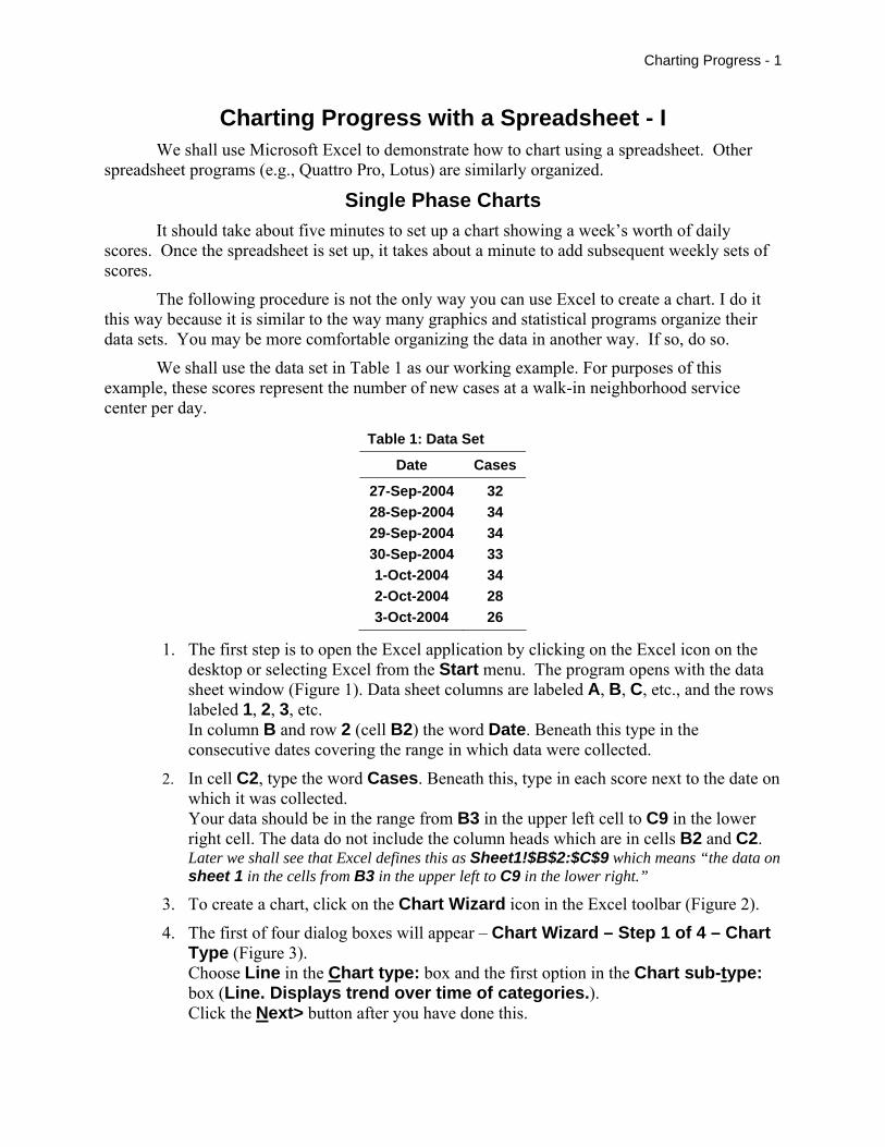
1. The first step is to open the Excel application by clicking on the Excel icon on the desktop or selecting Excel from the Start menu. The program opens with the data sheet window (Figure 1). Data sheet columns are labeled A, B, C, etc., and the rows labeled 1, 2, 3, etc. In column B and row 2 (cell B2) the word Date. Beneath this type in the consecutive dates covering the range in which data were collected.
2. In cell C2, type the word Cases. Beneath this, type in each score next to the date on which it was collected. Your data should be in the range from B3 in the upper left cell to C9 in the lower right cell. The data do not include the column heads which are in cells B2 and C2. Later we shall see that Excel defines this as Sheet1!$B$2:$C$9 which means “the data on sheet 1 in the cells from B3 in the upper left to C9 in the lower right.”
3. To create a chart, click on the Chart Wizard icon in the Excel toolbar (Figure 2).
4. The first of four dialog boxes will appear – Chart Wizard – Step 1 of 4 – Chart Type (Figure 3). Choose Line in the Chart type: box and the first option in the Chart sub-type: box (Line. Displays trend over time of categories.). Click the Next> button after you have done this.
Charting Progress - 2
Figure 1: Data Sheet
Figure 2: Toolbar Figure 3: Chart Type
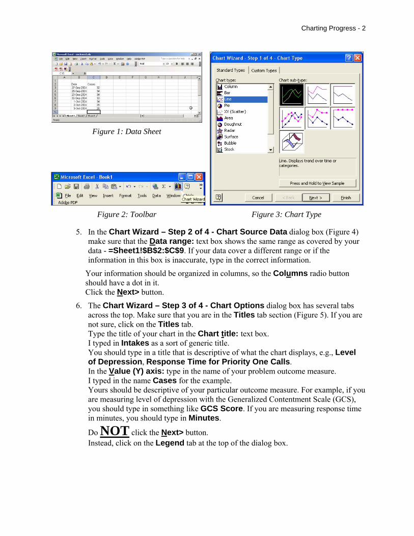
5. In the Chart Wizard – Step 2 of 4 - Chart Source Data dialog box (Figure 4) make sure that the Data range: text box shows the same range as covered by your data - =Sheet1!$B$2:$C$9. If your data cover a different range or if the information in this box is inaccurate, type in the correct information.
Your information should be organized in columns, so the Columns radio button should have a dot in it. Click the Next> button.
6. The Chart Wizard – Step 3 of 4 - Chart Options dialog box has several tabs across the top. Make sure that you are in the Titles tab section (Figure 5). If you are not sure, click on the Titles tab. Type the title of your chart in the Chart title: text box. I typed in Intakes as a sort of generic title. You should type in a title that is descriptive of what the chart displays, e.g., Level of Depression, Response Time for Priority One Calls. In the Value (Y) axis: type in the name of your problem outcome measure. I typed in the name Cases for the example. Yours should be descriptive of your particular outcome measure. For example, if you are measuring level of depression with the Generalized Contentment Scale (GCS), you should type in something like GCS Score. If you are measuring response time in minutes, you should type in Minutes.
Do NOT click the Next> button. Instead, click on the Legend tab at the top of the dialog box.
Charting Progress - 3
Figure 4: Chart Source Data Figure 5: Chart Options – “Titles” Tab
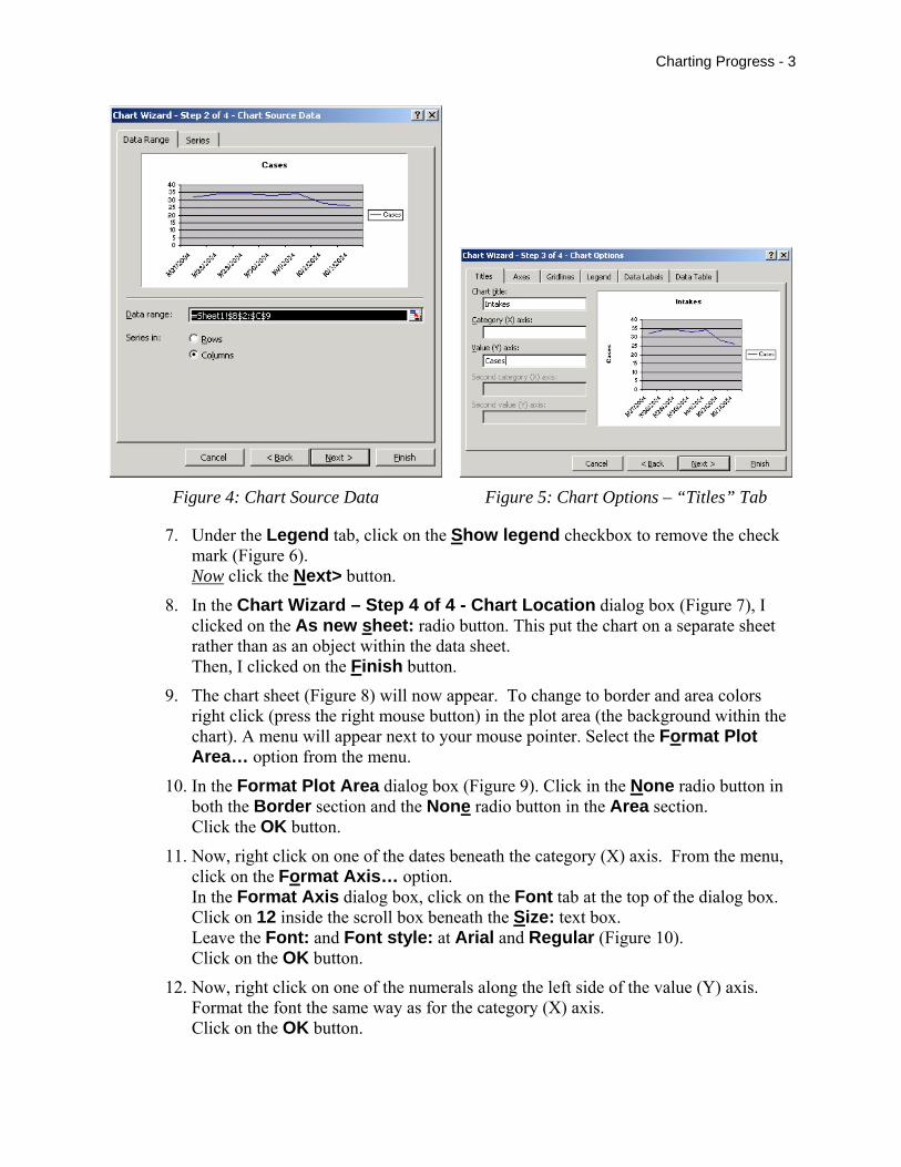
7. Under the Legend tab, click on the Show legend checkbox to remove the check mark (Figure 6). Now click the Next> button.
8. In the Chart Wizard – Step 4 of 4 - Chart Location dialog box (Figure 7), I clicked on the As new sheet: radio button. This put the chart on a separate sheet rather than as an object within the data sheet. Then, I clicked on the Finish button.
9. The chart sheet (Figure 8) will now appear. To change to border and area colors right click (press the right mouse button) in the plot area (the background within the chart). A menu will appear next to your mouse pointer. Select the Format Plot Area… option from the menu.
10. In the Format Plot Area dialog box (Figure 9). Click in the None radio button in both the Border section and the None radio button in the Area section. Click the OK button.
11. Now, right click on one of the dates beneath the category (X) axis. From the menu, click on the Format Axis… option. In the Format Axis dialog box, click on the Font tab at the top of the dialog box. Click on 12 inside the scroll box beneath the Size: text box. Leave the Font: and Font style: at Arial and Regular (Figure 10). Click on the OK button.
12. Now, right click on one of the numerals along the left side of the value (Y) axis. Format the font the same way as for the category (X) axis. Click on the OK button.
Charting Progress - 4
Figure 6: Chart Options – “Legend” Tab
Figure 7: Chart Location Figure 8: Chart Sheet
Figure 9: Format Plot Area Figure 10: Format Axis - Font
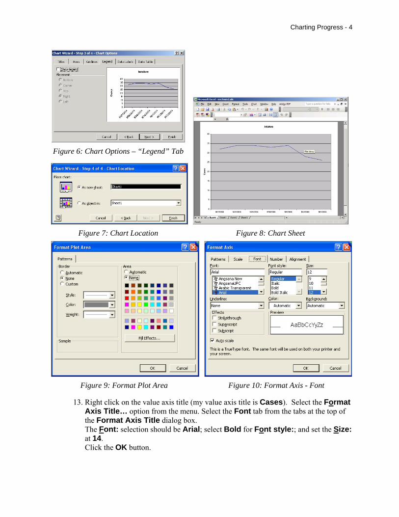
13. Right click on the value axis title (my value axis title is Cases). Select the Format Axis Title… option from the menu. Select the Font tab from the tabs at the top of the Format Axis Title dialog box. The Font: selection should be Arial; select Bold for Font style:; and set the Size: at 14. Click the OK button.
Charting Progress - 5
14. Right click on the chart title (mine is Intakes). From the menu, click on the Format Chart Title… option. Within the Font tab area, format the chart title as follows: Font: = Arial; Font style: = Bold; and Size: = 16.
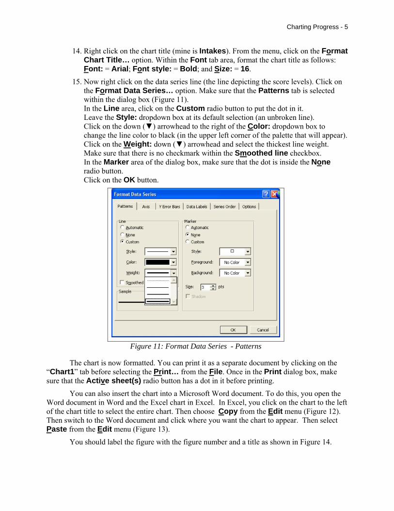
15. Now right click on the data series line (the line depicting the score levels). Click on the Format Data Series… option. Make sure that the Patterns tab is selected within the dialog box (Figure 11). In the Line area, click on the Custom radio button to put the dot in it. Leave the Style: dropdown box at its default selection (an unbroken line). Click on the down (▼) arrowhead to the right of the Color: dropdown box to change the line color to black (in the upper left corner of the palette that will appear). Click on the Weight: down (▼) arrowhead and select the thickest line weight. Make sure that there is no checkmark within the Smoothed line checkbox. In the Marker area of the dialog box, make sure that the dot is inside the None radio button. Click on the OK button.
Figure 11: Format Data Series - Patterns
The chart is now formatted. You can print it as a separate document by clicking on the “Chart1” tab before selecting the Print… from the File. Once in the Print dialog box, make sure that the Active sheet(s) radio button has a dot in it before printing.
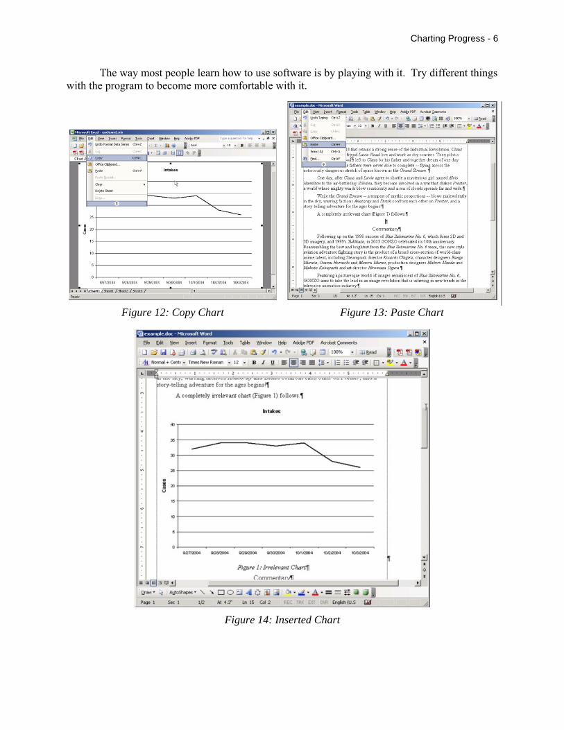
You can also insert the chart into a Microsoft Word document. To do this, you open the Word document in Word and the Excel chart in Excel. In Excel, you click on the chart to the left of the chart title to select the entire chart. Then choose Copy from the Edit menu (Figure 12). Then switch to the Word document and click where you want the chart to appear. Then select Paste from the Edit menu (Figure 13).
You should label the figure with the figure number and a title as shown in Figure 14.
Charting Progress - 6
The way most people learn how to use software is by playing with it. Try different things with the program to become more comfortable with it.
Figure 12: Copy Chart Figure 13: Paste Chart
Figure 14: Inserted Chart
Charting Progress - 7
.
Calculating a Trend Line A trend line depicts an estimate of the direction of the data over time (increasing or
decreasing). Procedures for constructing trend lines include semi-average celebration lines, split-middle celebration lines, and least squares regression lines. Spreadsheet programs use least squares regression techniques to construct trend lines.
To carry out a regression analysis the values on both axes must be numeric. Since the X-axis values for our example are dates (i.e., 27-Sep-2004, 28-Sep-2004, 29-Sep-2004, 30-Sep-2004, 1-Oct-2004, 2-Oct-2004, 3-Oct-2004), we must change them to numerals (i.e., 1, 2, 3, 4, 5, 6, 7).
Creating Numerical X Values The following outline shows the procedure to create a numerical set of X values.
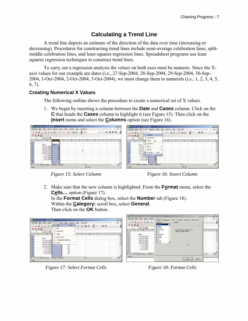
1. We begin by inserting a column between the Date and Cases column. Click on the C that heads the Cases column to highlight it (see Figure 15). Then click on the Insert menu and select the Columns option (see Figure 16).
Figure 15: Select Column Figure 16: Insert Column
2. Make sure that the new column is highlighted. From the Format menu, select the Cells… option (Figure 17). In the Format Cells dialog box, select the Number tab (Figure 18). Within the Category: scroll box, select General. Then click on the OK button.
Figure 17: Select Format Cells Figure 18: Format Cells
Charting Progress - 8
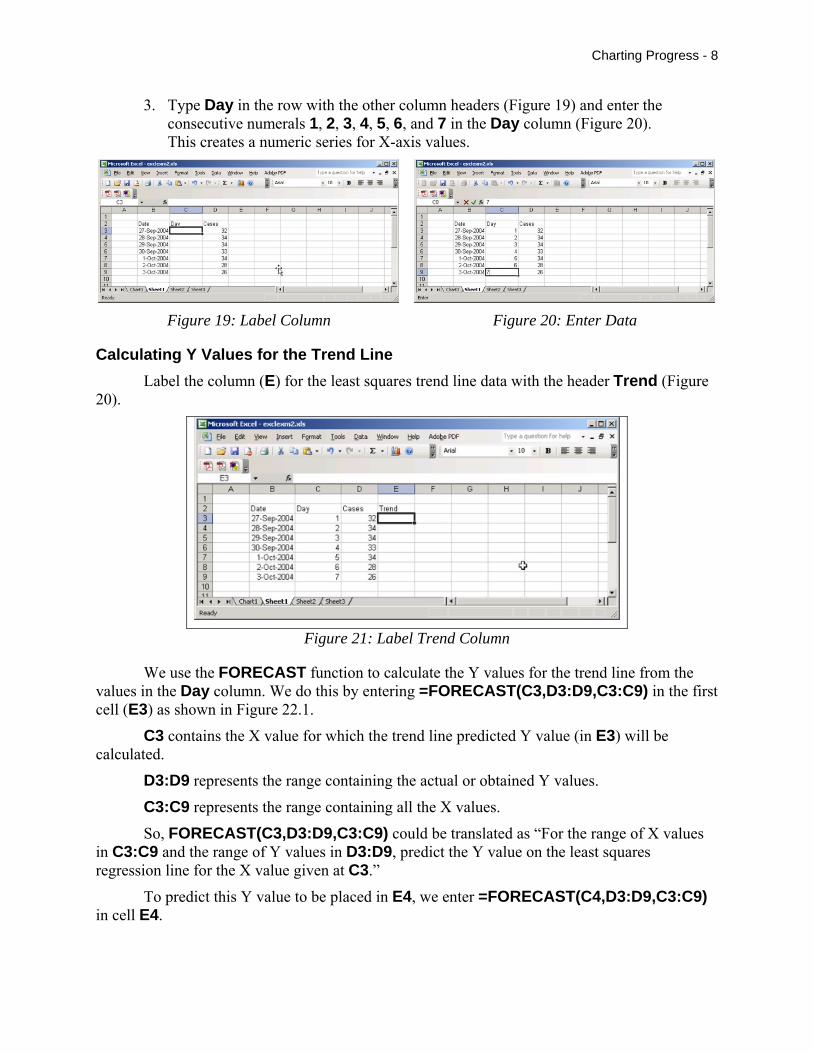
3. Type Day in the row with the other column headers (Figure 19) and enter the consecutive numerals 1, 2, 3, 4, 5, 6, and 7 in the Day column (Figure 20). This creates a numeric series for X-axis values.
Figure 19: Label Column Figure 20: Enter Data
Calculating Y Values for the Trend Line Label the column (E) for the least squares trend line data with the header Trend (Figure
20).
Figure 21: Label Trend Column
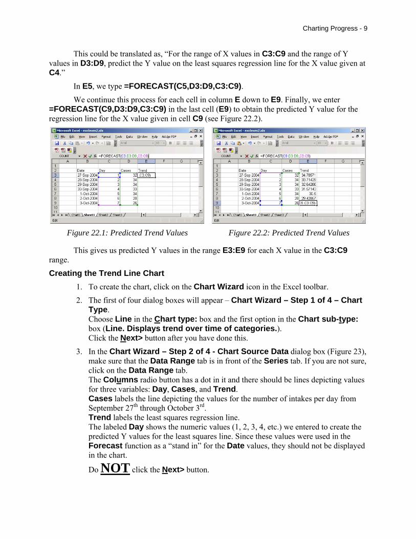
We use the FORECAST function to calculate the Y values for the trend line from the values in the Day column. We do this by entering =FORECAST(C3,D3:D9,C3:C9) in the first cell (E3) as shown in Figure 22.1.
C3 contains the X value for which the trend line predicted Y value (in E3) will be calculated.
D3:D9 represents the range containing the actual or obtained Y values.
C3:C9 represents the range containing all the X values.
So, FORECAST(C3,D3:D9,C3:C9) could be translated as “For the range of X values in C3:C9 and the range of Y values in D3:D9, predict the Y value on the least squares regression line for the X value given at C3.”
To predict this Y value to be placed in E4, we enter =FORECAST(C4,D3:D9,C3:C9) in cell E4.
Charting Progress - 9
This could be translated as, “For the range of X values in C3:C9 and the range of Y values in D3:D9, predict the Y value on the least squares regression line for the X value given at C4.”
In E5, we type =FORECAST(C5,D3:D9,C3:C9). We continue this process for each cell in column E down to E9. Finally, we enter
=FORECAST(C9,D3:D9,C3:C9) in the last cell (E9) to obtain the predicted Y value for the regression line for the X value given in cell C9 (see Figure 22.2).
Figure 22.1: Predicted Trend Values Figure 22.2: Predicted Trend Values
This gives us predicted Y values in the range E3:E9 for each X value in the C3:C9 range.
Creating the Trend Line Chart 1. To create the chart, click on the Chart Wizard icon in the Excel toolbar.
2. The first of four dialog boxes will appear – Chart Wizard – Step 1 of 4 – Chart Type. Choose Line in the Chart type: box and the first option in the Chart sub-type: box (Line. Displays trend over time of categories.). Click the Next> button after you have done this.
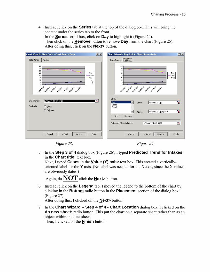
3. In the Chart Wizard – Step 2 of 4 - Chart Source Data dialog box (Figure 23), make sure that the Data Range tab is in front of the Series tab. If you are not sure, click on the Data Range tab. The Columns radio button has a dot in it and there should be lines depicting values for three variables: Day, Cases, and Trend. Cases labels the line depicting the values for the number of intakes per day from September 27th through October 3rd. Trend labels the least squares regression line. The labeled Day shows the numeric values (1, 2, 3, 4, etc.) we entered to create the predicted Y values for the least squares line. Since these values were used in the Forecast function as a “stand in” for the Date values, they should not be displayed in the chart.
Do NOT click the Next> button.
Charting Progress - 10
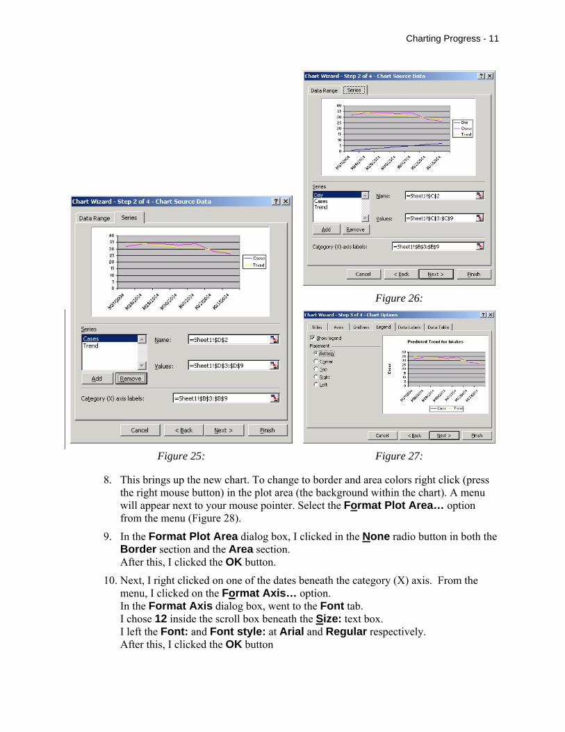
4. Instead, click on the Series tab at the top of the dialog box. This will bring the content under the series tab to the front. In the Series scroll box, click on Day to highlight it (Figure 24). Then click on the Remove button to remove Day from the chart (Figure 25). After doing this, click on the Next> button.
Figure 23: Figure 24:
5. In the Step 3 of 4 dialog box (Figure 26), I typed Predicted Trend for Intakes in the Chart title: text box. Next, I typed Cases in the Value (Y) axis: text box. This created a vertically-oriented label for the Y axis. (No label was needed for the X axis, since the X values are obviously dates.)
Again, do NOT click the Next> button.
6. Instead, click on the Legend tab. I moved the legend to the bottom of the chart by clicking in the Bottom radio button in the Placement section of the dialog box (Figure 27). After doing this, I clicked on the Next> button.
7. In the Chart Wizard – Step 4 of 4 - Chart Location dialog box, I clicked on the As new sheet: radio button. This put the chart on a separate sheet rather than as an object within the data sheet. Then, I clicked on the Finish button.
Charting Progress - 11
Figure 26:
Figure 25: Figure 27:
8. This brings up the new chart. To change to border and area colors right click (press the right mouse button) in the plot area (the background within the chart). A menu will appear next to your mouse pointer. Select the Format Plot Area… option from the menu (Figure 28).
9. In the Format Plot Area dialog box, I clicked in the None radio button in both the Border section and the Area section. After this, I clicked the OK button.
10. Next, I right clicked on one of the dates beneath the category (X) axis. From the menu, I clicked on the Format Axis… option. In the Format Axis dialog box, went to the Font tab. I chose 12 inside the scroll box beneath the Size: text box. I left the Font: and Font style: at Arial and Regular respectively. After this, I clicked the OK button
Charting Progress - 12
11. Then, I right clicked on one of the numerals along the left side of the value (Y) axis. I used the same font format as for the category (X) axis. Again, I clicked on the OK button.
Figure 28:
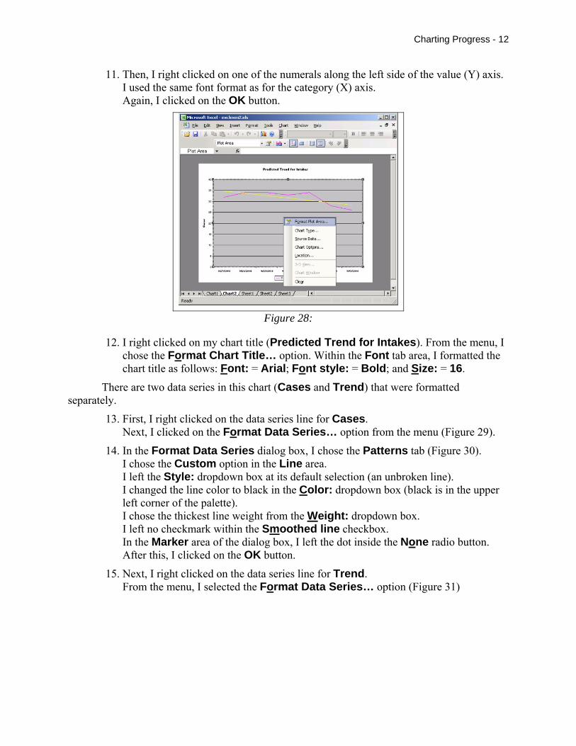
12. I right clicked on my chart title (Predicted Trend for Intakes). From the menu, I chose the Format Chart Title… option. Within the Font tab area, I formatted the chart title as follows: Font: = Arial; Font style: = Bold; and Size: = 16.
There are two data series in this chart (Cases and Trend) that were formatted separately.
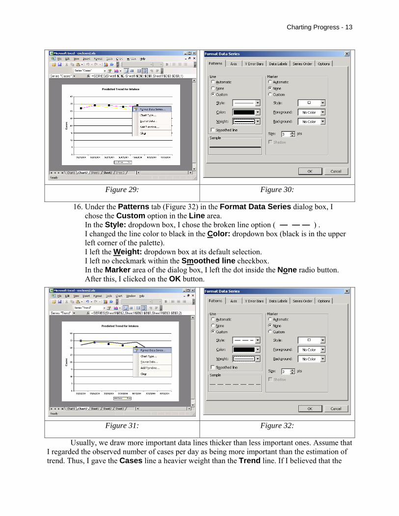
13. First, I right clicked on the data series line for Cases. Next, I clicked on the Format Data Series… option from the menu (Figure 29).
14. In the Format Data Series dialog box, I chose the Patterns tab (Figure 30). I chose the Custom option in the Line area. I left the Style: dropdown box at its default selection (an unbroken line). I changed the line color to black in the Color: dropdown box (black is in the upper left corner of the palette). I chose the thickest line weight from the Weight: dropdown box. I left no checkmark within the Smoothed line checkbox. In the Marker area of the dialog box, I left the dot inside the None radio button. After this, I clicked on the OK button.
15. Next, I right clicked on the data series line for Trend. From the menu, I selected the Format Data Series… option (Figure 31)
Charting Progress - 13
Figure 29: Figure 30:
16. Under the Patterns tab (Figure 32) in the Format Data Series dialog box, I chose the Custom option in the Line area. In the Style: dropdown box, I chose the broken line option ( — — — ) . I changed the line color to black in the Color: dropdown box (black is in the upper left corner of the palette). I left the Weight: dropdown box at its default selection. I left no checkmark within the Smoothed line checkbox. In the Marker area of the dialog box, I left the dot inside the None radio button. After this, I clicked on the OK button.
Figure 31: Figure 32:
Usually, we draw more important data lines thicker than less important ones. Assume that I regarded the observed number of cases per day as being more important than the estimation of trend. Thus, I gave the Cases line a heavier weight than the Trend line. If I believed that the
Charting Progress - 14
estimation of trend was more important than the number of observed cases, I would give the Trend line a heavier weight than the Cases line.
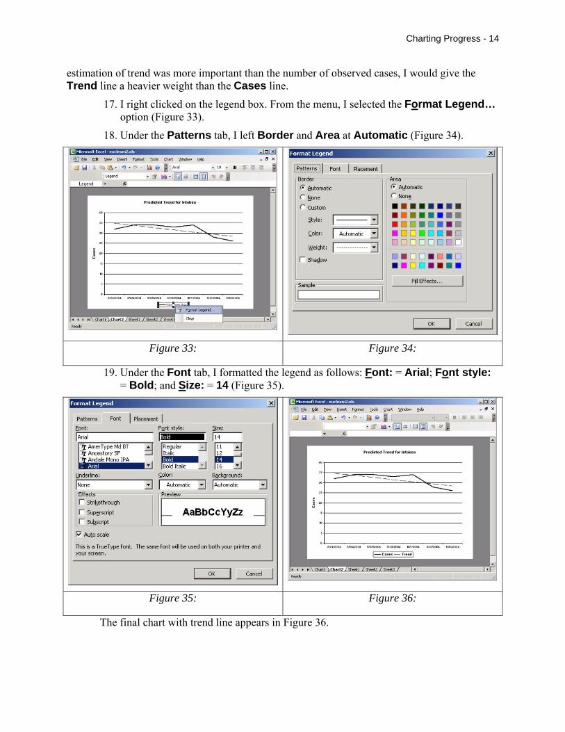
17. I right clicked on the legend box. From the menu, I selected the Format Legend… option (Figure 33).
18. Under the Patterns tab, I left Border and Area at Automatic (Figure 34).
Figure 33: Figure 34:
19. Under the Font tab, I formatted the legend as follows: Font: = Arial; Font style: = Bold; and Size: = 14 (Figure 35).
Figure 35: Figure 36:
The final chart with trend line appears in Figure 36.


