
Chapter6: Bootstrap 3 - 161.246.38.75161.246.38.75/download/wc/chap06bootstrap.pdf · Topics...
46
Chapter6: Bootstrap 3 Asst.Prof.Dr. Supakit Nootyaskool Information Technology, KMITL
Transcript of Chapter6: Bootstrap 3 - 161.246.38.75161.246.38.75/download/wc/chap06bootstrap.pdf · Topics...

Chapter6: Bootstrap 3
Asst.Prof.Dr. Supakit Nootyaskool
Information Technology, KMITL

Objective
• To apply Bootstrap to a web site
• To know how to build various bootstrap commands to be a content

Topics
• Bootstrap Installation
• Typography
• Grid system
• Tables
• Thumbnails
• Jumbotron
• Badges
• Dropdown menus
• Input
• Carousel

What is Bootstrap
• Bootstrap is a group of design template for webpage creation.
• Easily manipulate display contents on different devices (tablet, mobile, desktop)
• Bootstrap consists modified CSS, JavaScript and HTML.
• Bootstrap introduce by Mark Otto and Jacob Thornto at Twitter.
• Open-source
• www.getbootstrap.com


Installation
• Download bootstrap from getbootstrap.com

Installation: extraction file
• After file is extracted, we have get three folders in bootstrap-3.3.5-dist

Installation: call Bootstrap
<!DOCTYPE html> <html lang="en"> <head> <meta charset="utf-8"> <title>Bootstrap 101 Template</title> <link href= “css/bootstrap.min.css" rel="stylesheet"> </head> <body> <h1>Hello, world!</h1> … <script src="jquery/jquery-1.11.3.min.js"></script> <script src=“js/bootstrap.min.js"></script> </body> </html>

Installation: request jQuery
What is jQuery?
• Client-side JavaScript library
• jQuery uses for navigate document, DOM, event handling, and AJAX
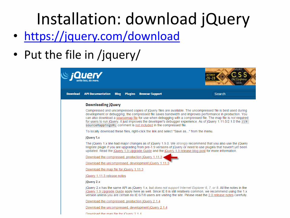
Installation: download jQuery • https://jquery.com/download
• Put the file in /jquery/

Typography
• Header <h1> … <h6>
• Small by header <small>
• Highlight <mark>
• Quote message <blockquote>
• Keyboard shortcut <kbd>
• Text color class=“text-info”
.text-muted .text-primary .text-success .text-info
.text-warning .text-danger

Example <h1>สวสัดี <small> สวสัดี </small> </h1>
<h3 class="text-danger">Sawadee<small> sawadee </small> </h3> <p> ทดสอบ<mark>ภาษาไทย </mark> </p>
<blockquote> Thailand is a country on Southeast Asia’s Indochina peninsula known for tropical beaches, opulent royal palaces, ancient ruins and ornate temples displaying figures of Buddha, a revered symbol. In Bangkok, the capital, an ultramodern cityscape rises next to quiet canal and riverside communities. Commercial hubs such as Chinatown consist of labyrinthine alleys crammed with shop houses, markets and diners. <footer> from www.google.com </footer> </blockquote> <p> Copy texts presses <kbd> CTRL+C </kbd> </p>


Grid System
• Display web page on different devices has a problem, using grid class being answer.
• Grid class sets for four kinds of display
xs for phone
xm for tables
md for desktop
lg for large desktop

Grid System: row & column column
row
<div class=“row”> <div class=“col-md-1”> aa </div> <div class=“col-md-1”> bb </div> </div>

Example
<div class="row">
<div class="col-md-1" style="background-color:lavender;"> aa </div>
<div class="col-md-1" style="background-color:pink;"> bb </div>
<div class="col-md-4" style="background-color:lavender;"> cc </div>
<div class="col-md-4" style="background-color:green;"> dd </div>
</div>

Tablet
Mobile

Example: mobile display
<div class="row">
<div class="col-xs-1" style="background-color:lavender;"> aa </div>
<div class="col-xs-1" style="background-color:pink;"> bb </div>
<div class="col-xs-4" style="background-color:lavender;"> cc </div>
<div class="col-xs-4" style="background-color:green;"> dd </div>
</div>

Tablet
Mobile

Tables
Table style
• .table
• .table-striped
• .table-bordered
• .table-hover
• .table-condensed
Row colors <tr class=“ “>
• success
• info
• warning
• danger

Example <table class="table">
<thead>
<th> Id </th>
<th> Email </th>
</thead>
<tbody>
<tr>
<td> 12345</td>
<td> [email protected]</td>
</tr>
</tbody>
</table>


Thumbnails
Image shapes
• .img-rounded
• .img-circle
• .img-thumbnail

Example
<img src="picture.jpg" class="img-circle" width="200">
<img src="picture.jpg" class="img-rounded" width="200">

Example <table class="table">
<thead>
<th> image </th>
<th> Email </th>
</thead>
<tbody>
<tr>
<td> <img src="picture.jpg" class="img-circle" width="200"> </td>
<td> [email protected]</td>
</tr>
<tr>
<td> <img src="picture.jpg" class="img-circle" width="200"> </td>
<td> [email protected]</td>
</tr>
</tbody>
</table>


Jumbotron
Jabotron is information banner presenting on a gray box with rounded corners.
Example:
<div class=container> <div class="jumbotron"> <h1>สวสัดี</h1> <p> ขอตอนรับเข้าสูว่ิชานี<้/p> </div>
</div>

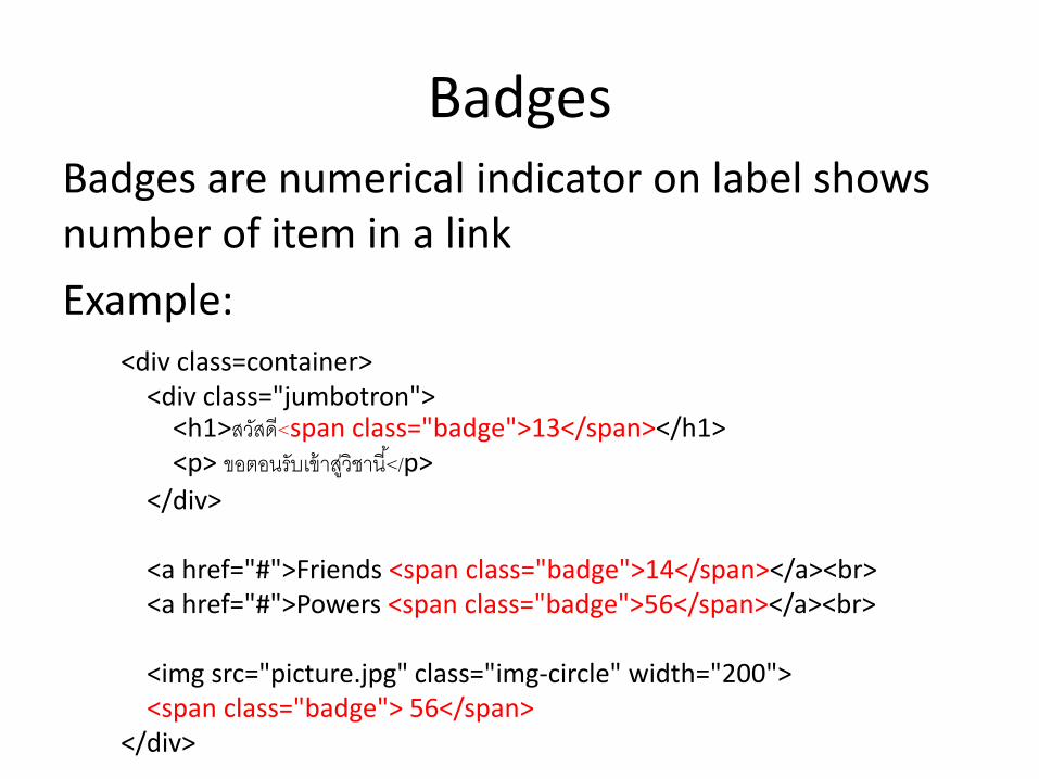
Badges Badges are numerical indicator on label shows number of item in a link
Example: <div class=container> <div class="jumbotron"> <h1>สวสัดี<span class="badge">13</span></h1> <p> ขอตอนรับเข้าสูว่ิชานี<้/p>
</div> <a href="#">Friends <span class="badge">14</span></a><br> <a href="#">Powers <span class="badge">56</span></a><br> <img src="picture.jpg" class="img-circle" width="200"> <span class="badge"> 56</span> </div>


Dropdown menu
Class in dropdown • .dropdown • .dropdown-header • .dropdown-toggle • .caret

Example <div class="dropdown">
<button class="btn btn-primary dropdown-toggle"
type="button" data-toggle="dropdown"> Thai University
<span class="badge">3</span>
<span class="caret"></span>
</button>
<ul class="dropdown-menu">
<li><a href="http://www.swu.ac.th">SWU</a></li>
<li><a href="http://www.kmitl.ac.th">KMITL</a></li>
<li><a href="http://www.msu.ac.th">MSU</a></li>
</ul>
</div>

Input
Bootstrap apply five inputs • .form-group
– Input <input type = “text”, “password”> – .formcontrol
• Textarea <textarea class=“form-control”> • Select list <select> .. <option> xx </option> </select>
• .checkbox – Checkbox <input type=“checkbok”> – Checkbox inline .checkbox-inline
• .radio – .radio – .radio disable

<div class="form-group"> <label>Name:</label> <input type="text" class="form-control" id="usr"> <label>Password:</label> <input type="password" class="form-control" id="pwd"> <label>Message:</label> <textarea class="form-control" rows="5" id="comment"></textarea> <label>Select:</label> <div class="checkbox"> <label><input type="checkbox" value="">Option 1</label> <label><input type="checkbox" value="">Option 2</label> </div> </div>
Example


<br/> <div class="row"> <div class="col-md-1"> </div> <div class="col-md-4"> <div class="form-group"> <label>Name:</label> <input type="text" class="form-control" id="usr"> <label>Password:</label> <input type="password" class="form-control" id="pwd"> <label>Message:</label> <textarea class="form-control" rows="5" id="comment"></textarea> <label>Select:</label> <div class="checkbox"> <label><input type="checkbox" value="">Option 1</label> <label><input type="checkbox" value="">Option 2</label> </div> </div> </div> </div>
Example
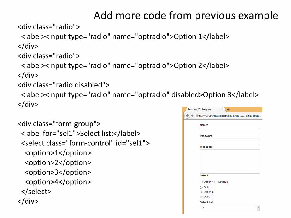
<div class="radio"> <label><input type="radio" name="optradio">Option 1</label> </div> <div class="radio"> <label><input type="radio" name="optradio">Option 2</label> </div> <div class="radio disabled"> <label><input type="radio" name="optradio" disabled>Option 3</label> </div> <div class="form-group"> <label for="sel1">Select list:</label> <select class="form-control" id="sel1"> <option>1</option> <option>2</option> <option>3</option> <option>4</option> </select> </div>
Add more code from previous example

Carousel
• Carousal is slideshow creation from JavaScript

<div class="container">
<div id="myCarousel" class="carousel slide" data-ride="carousel">
<ol class="carousel-indicators">
<li data-target="#myCarousel" data-slide-to="0" class="active"></li>
<li data-target="#myCarousel" data-slide-to="1"></li>
</ol>
<div class="carousel-inner" role="listbox">
<div class="item active">
<img src="picture.jpg" width="400">
<div class="carousel-caption">
<h3>htext</h3>
<p>description</p>
</div>
</div>
<div class="item">
<img src="picture2.jpg" width="400">
<div class="carousel-caption">
<h3>htext</h3>
<p>description</p>
</div>
</div>
</div>
</div></div>

Add more style
<style>
.carousel-inner > .item > img,
.carousel-inner > .item > a > img {
width: 40%;
margin: auto;
}
</style>


Reference
• http://www.w3schools.com/bootstrap/
• http://getbootstrap.com/


![[BOOK] [Bootstrap] [Awesome] Bootstrap-Programming-Cookbook](https://static.fdocuments.net/doc/165x107/577ca6bf1a28abea748c023f/book-bootstrap-awesome-bootstrap-programming-cookbook.jpg)