Chapter 6: Model Assessment
59
1 Chapter 6: Model Assessment 6.1 Model Fit Statistics 6.2 Statistical Graphics 6.3 Adjusting for Separate Sampling 6.4 Profit Matrices
-
Upload
martena-barker -
Category
Documents
-
view
80 -
download
6
description
Chapter 6: Model Assessment. Chapter 6: Model Assessment. Summary Statistics Summary. Prediction Type. Statistic. Decisions. Accuracy/Misclassification Profit/Loss Inverse prior threshold. ROC Index (concordance) Gini coefficient. Rankings. Average squared error SBC/Likelihood. - PowerPoint PPT Presentation
Transcript of Chapter 6: Model Assessment

1
Chapter 6: Model Assessment
6.1 Model Fit Statistics
6.2 Statistical Graphics
6.3 Adjusting for Separate Sampling
6.4 Profit Matrices

2
Chapter 6: Model Assessment
6.1 Model Fit Statistics6.1 Model Fit Statistics
6.2 Statistical Graphics
6.3 Adjusting for Separate Sampling
6.4 Profit Matrices

3
Summary Statistics SummaryStatisticPrediction Type
Decisions
Rankings
Estimates
ROC Index (concordance)Gini coefficient
Average squared errorSBC/Likelihood
...

4
Summary Statistics SummaryStatisticPrediction Type
Decisions
Rankings
Estimates Average squared errorSBC/Likelihood
Accuracy/MisclassificationProfit/Loss
Inverse prior threshold
...
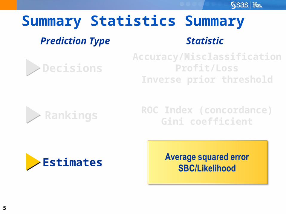
5
Summary Statistics SummaryStatisticPrediction Type
Decisions
Rankings
Estimates
Accuracy/MisclassificationProfit/Loss
Inverse prior threshold
ROC Index (concordance)Gini coefficient

6
Comparing Models with Summary Statistics
This demonstration illustrates the use of the Model Comparison tool, which collects assessment information from attached modeling nodes and enables you to easily compare model performance measures.

7
Chapter 6: Model Assessment
6.1 Model Fit Statistics
6.2 Statistical Graphics6.2 Statistical Graphics
6.3 Adjusting for Separate Sampling
6.4 Profit Matrices

8
Statistical Graphics – ROC Chart
captured response fraction(sensitivity)
false positive fraction(1-specificity)
...
The ROC chart illustrates a tradeoffbetween a captured response fraction
and a false positive fraction.
0.0
1.0
0.0 1.0

9
Statistical Graphics – ROC Chart
captured response fraction(sensitivity)
false positive fraction(1-specificity)
...
The ROC chart illustrates a tradeoffbetween a captured response fraction
and a false positive fraction.
0.0
1.0
0.0 1.0

10
Statistical Graphics – ROC Chart
...
0.0
1.0
0.0 1.0
Each point on the ROC chart corresponds to a specific fraction of cases, ordered by their predicted value.

11
Statistical Graphics – ROC Chart
...
0.0
1.0
0.0 1.0
Each point on the ROC chart corresponds to a specific fraction of cases, ordered by their predicted value.

12
Statistical Graphics – ROC Chart
...
0.0
1.0
0.0 1.0
top 40%
For example, this point on the ROC chart corresponds to the 40% of cases with the highest predicted values.

13
Statistical Graphics – ROC Chart
...
0.0
1.0
0.0 1.0
top 40%
For example, this point on the ROC chart corresponds to the 40% of cases with the highest predicted values.

14
Statistical Graphics – ROC Chart
...
0.0
1.0
0.0 1.0
top 40%
The y-coordinate shows the fraction of primary outcomecases captured in the top 40% of all cases.

15
Statistical Graphics – ROC Chart
...
0.0
1.0
0.0 1.0
top 40%
The y-coordinate shows the fraction of primary outcomecases captured in the top 40% of all cases.

16
Statistical Graphics – ROC Chart
...
0.0
1.0
0.0 1.0
top 40%
The x-coordinate shows the fraction of secondary outcome cases captured in the top 40% of all cases.
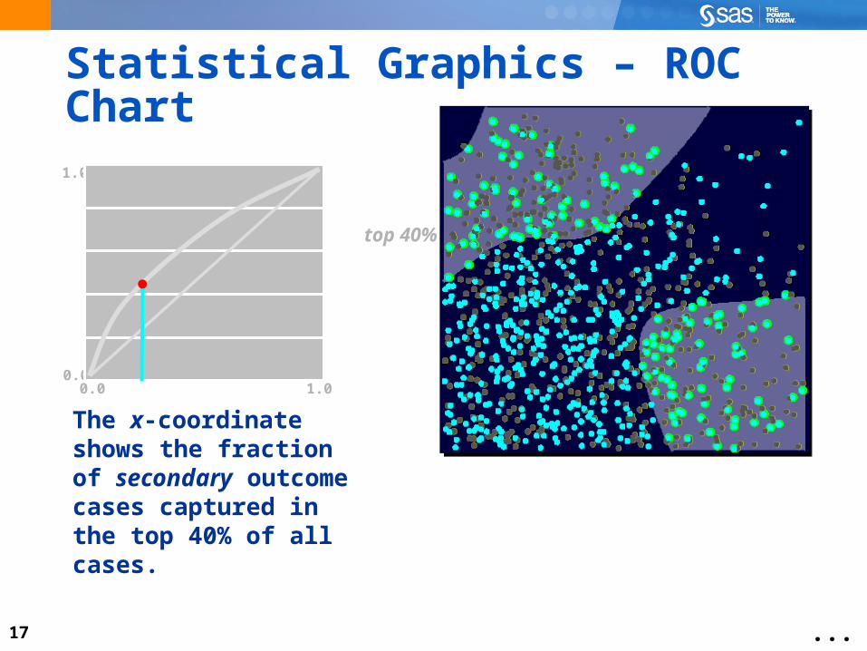
17
Statistical Graphics – ROC Chart
...
0.0
1.0
0.0 1.0
top 40%
The x-coordinate shows the fraction of secondary outcome cases captured in the top 40% of all cases.
18
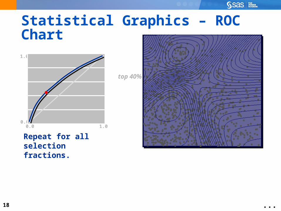
Statistical Graphics – ROC Chart
...
0.0
1.0
0.0 1.0
top 40%
Repeat for all selection fractions.

19
Statistical Graphics – ROC Chart
...
top 40%
0.0
1.0
0.0 1.0
Repeat for all selection fractions.

20
Statistical Graphics – ROC Chart
...
0.0
1.0
0.0 1.0
weak model strong model

21
Statistical Graphics – ROC Index
...
0.0
1.0
0.0 1.0
weak modelROC Index < 0.6
strong modelROC Index > 0.7

22
Comparing Modelswith ROC Charts
This demonstration illustrates the use of ROC charts to compare models.

23
Statistical Graphics – Response Chart
cumulative percent response
percent selected
...
The response chart shows the expectedresponse rate for various selection percentages.
50%
100%
0% 100%

24
Statistical Graphics – Response Chart
cumulative percent response
percent selected
...
The response chart shows the expectedresponse rate for various selection percentages.
50%
100%
0% 100%

25
Statistical Graphics – Response Chart
...
50%
100%
0% 100%
Each point on the response chart corresponds to a specific fraction of cases, ordered by their predicted values.

26
Statistical Graphics – Response Chart
...
50%
100%
0% 100%
Each point on the response chart corresponds to a specific fraction of cases, ordered by their predicted values.

27
Statistical Graphics – Response Chart
...
top 40%
For example, this point on the response chart corresponds to the 40% of cases with the highest predicted values.
50%
100%
0% 100%

28
Statistical Graphics – Response Chart
...
top 40%
For example, this point on the response chart corresponds to the 40% of cases with the highest predicted values.
50%
100%
0% 100%

29
Statistical Graphics – Response Chart
...
top 40%
50%
100%
0% 100%
The x-coordinate shows the percentage of selected cases.
40%

30
Statistical Graphics – Response Chart
...
top 40%
50%
100%
0% 100%
The x-coordinate shows the percentage of selected cases.
40%

31
Statistical Graphics – Response Chart
...
top 40%
50%
100%
0% 100%40%
The y-coordinate shows the percentage of primary outcome cases found in the top 40%.

32
Statistical Graphics – Response Chart
...
top 40%
50%
100%
0% 100%40%
The y-coordinate shows the percentage of primary outcome cases found in the top 40%.

33
Statistical Graphics – Response Chart
...
50%
100%
0% 100%40%
top 40%
Repeat for all selection fractions.

34

35
6.01 PollIn practice, modelers often use several tools, sometimes both graphical and numerical, to choose a best model.
True
False

36
6.01 Poll – Correct AnswerIn practice, modelers often use several tools, sometimes both graphical and numerical, to choose a best model.
True
False

37
Comparing Modelswith Score Rankings Plots
This demonstration illustrates comparing models with Score Rankings plots.

38
Adjusting for Separate Sampling
This demonstration illustrates how to adjust for separate sampling in SAS Enterprise Miner.

39
Chapter 6: Model Assessment
6.1 Model Fit Statistics
6.2 Statistical Graphics
6.3 Adjusting for Separate Sampling6.3 Adjusting for Separate Sampling
6.4 Profit Matrices
40
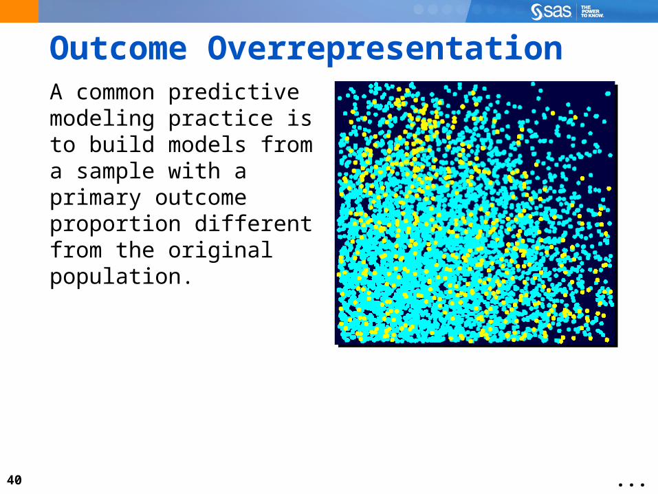
Outcome OverrepresentationA common predictive modeling practice is to build models from a sample with a primary outcome proportion different from the original population.
...

41
Outcome OverrepresentationA common predictive modeling practice is to build models from a sample with a primary outcome proportion different from the original population.
...

42
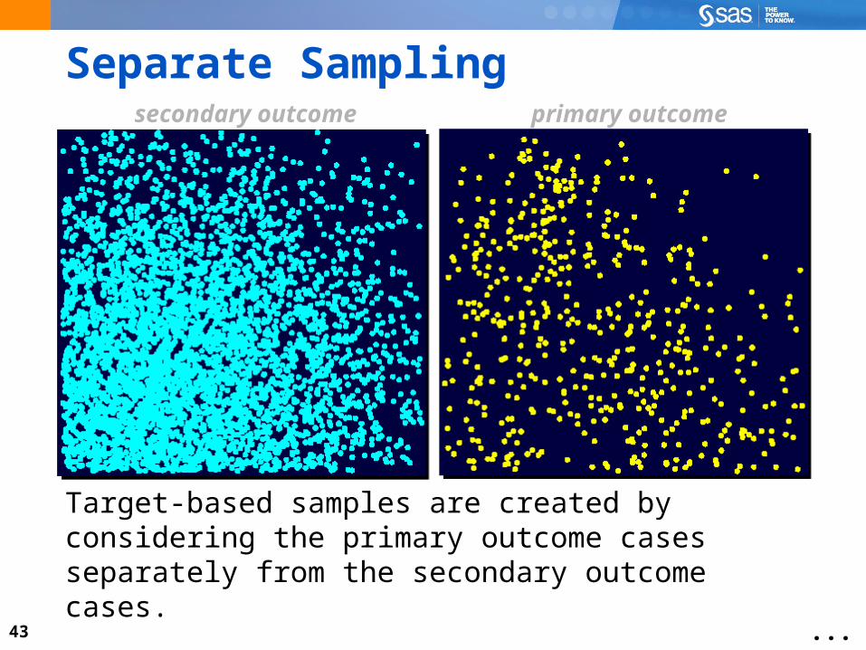
Separate Sampling
...
Target-based samples are created by considering the primary outcome cases separately from the secondary outcome cases.
primary outcomesecondary outcome
43
Separate Sampling
...
Target-based samples are created by considering the primary outcome cases separately from the secondary outcome cases.
primary outcomesecondary outcome

44
Separate Sampling
...
Select all cases.Select some cases.
primary outcomesecondary outcome

45
Separate Sampling
...
Select all cases.Select some cases.
primary outcomesecondary outcome

46
The Modeling Sample
...
+ Similar predictive powerwith smaller case count
− Must adjust assessmentstatistics and graphics
− Must adjust predictionestimates for bias

47
Adjusting for Separate Sampling (continued)
This demonstration illustrates how to adjust for separate sampling in SAS Enterprise Miner.

48
Creating a Profit Matrix
This demonstration illustrates how to create a profit matrix.

49
Chapter 6: Model Assessment
6.1 Model Fit Statistics
6.2 Statistical Graphics
6.3 Adjusting for Separate Sampling
6.4 Profit Matrices6.4 Profit Matrices

50
0
0
Profit Matrices
0profit distribution
for solicit decision
-0.68
solicit ignore
primaryoutcome
secondaryoutcome

51
Profit Matrices
profit distributionfor solicit decision
0
0
0
solicit ignore
primaryoutcome
secondaryoutcome
15.14

52
Expected Profit Solicit = 15.14 p1 – 0.68 p0
Expected Profit Ignore = 0
Choose the larger.
^ ^
Decision Expected Profits
0
...
solicit ignore
primaryoutcome
secondaryoutcome

53
decision threshold
Decision Threshold
^
^p1 ≥ 0.68 / 15.82 Solicit
p1 < 0.68 / 15.82 Ignore
0
solicit ignore
primaryoutcome
secondaryoutcome

54
Average Profit
average profit
Average profit = (15.14NPS – 0.68 NSS ) / N
NPS = # solicited primary outcome cases
NSS = # solicited secondary outcome cases
N = total number of assessment cases
0
solicit ignore
primaryoutcome
secondaryoutcome

55
Evaluating Model Profit
This demonstration illustrates viewing the consequences of incorporating a profit matrix.

56
Viewing Additional Assessments
This demonstration illustrates several other assessments of possible interest.

57
Optimizing with Profit (Self-Study)
This demonstration illustrates optimizing your model strictly on profit.

58
Exercises
This exercise reinforces the concepts discussed previously.

59
Assessment Tools Review
Compare model summary statistics and statistical graphics.
Create decision data; add prior probabilities and profit matrices.
Tune models with average squared error or appropriate profit matrix.
Obtain means and other statistics on data source variables.