Chapter 2 Displaying and Describing Categorical Data · 8 Part I Exploring and Understanding...
19
Chapter 2 Displaying and Describing Categorical Data 5 5 Part I Exploring and Understanding Data Macroeconomics 6th Edition Williamson SOLUTIONS MANUAL Full clear download (no formatting errors) at: https://testbankreal.com/download/macroeconomics-6th-edition-williamson- solutions-manual/ Macroeconomics 6th Edition Williamson TEST BANK Full clear download (no formatting errors) at: https://testbankreal.com/download/macroeconomics-6th-edition-williamson- test-bank-2/ Chapter 2 – Displaying and Describing Categorical Data 1. Graphs in the news. Answers will vary. 2. Graphs in the news II. Answers will vary. 3. Tables in the news. Answers will vary. 4. Tables in the news II. Answers will vary. 5. Movie genres. a) A pie chart seems appropriate from the movie genre data. Each movie has only one genre, and the 728 movies constitute a “whole”. Some of the regions are very close in size, making the number of movies in several genres difficult to compare. b) Horror is the least common genre. It has the smallest region in the chart. 6. Movie ratings. a) A pie chart seems appropriate for the movie rating data. Each movie has only one rating, and the 728 movies constitute a “whole”. The percentages of each rating are different enough that the pie chart is easy to read. b) The most common rating is “not rated”. It has the largest region on the chart. 7. Genres again. a) Comedy has the second highest bar, so it is the second most common genre. b) This is easier to see on the bar chart. The percentages are so close that the difference is nearly indistinguishable in the pie chart. 8. Ratings again. a) The least common rating was NC-17. It has the shortest bar. b) The bar chart does not support this claim. These data are for a single year only.
Transcript of Chapter 2 Displaying and Describing Categorical Data · 8 Part I Exploring and Understanding...

Chapter 2 Displaying and Describing Categorical Data 5 5 Part I Exploring and Understanding Data
Macroeconomics 6th Edition Williamson SOLUTIONS MANUAL
Full clear download (no formatting errors) at:
https://testbankreal.com/download/macroeconomics-6th-edition-williamson-
solutions-manual/
Macroeconomics 6th Edition Williamson TEST BANK
Full clear download (no formatting errors) at:
https://testbankreal.com/download/macroeconomics-6th-edition-williamson-
test-bank-2/
Chapter 2 – Displaying and Describing Categorical Data
1. Graphs in the news. Answers will vary.
2. Graphs in the news II. Answers will vary.
3. Tables in the news. Answers will vary.
4. Tables in the news II. Answers will vary.
5. Movie genres.
a) A pie chart seems appropriate from the movie genre data. Each movie has only
one genre, and the 728 movies constitute a “whole”. Some of the regions are
very close in size, making the number of movies in several genres difficult to
compare.
b) Horror is the least common genre. It has the smallest region in the chart.
6. Movie ratings.
a) A pie chart seems appropriate for the movie rating data. Each movie has only
one rating, and the 728 movies constitute a “whole”. The percentages of each
rating are different enough that the pie chart is easy to read.
b) The most common rating is “not rated”. It has the largest region on the chart.
7. Genres again.
a) Comedy has the second highest bar, so it is the second most common genre.
b) This is easier to see on the bar chart. The percentages are so close that the
difference is nearly indistinguishable in the pie chart.
8. Ratings again.
a) The least common rating was NC-17. It has the shortest bar.
b) The bar chart does not support this claim. These data are for a single year only.

Chapter 2 Displaying and Describing Categorical Data 6 6 Part I Exploring and Understanding Data
We have no idea if the percentages of G and PG-13 movies changed from year to
year.
9. Yearly ratings.
i. D ii. A iii. C iv. B
10. Marriage in decline.
i. A ii. C iii. D iv. B
11. Magnet Schools.
There were 1,755 qualified applicants for the Houston Independent School
District’s magnet schools program. 53% were accepted, 17% were wait-listed,
and the other 30% were turned away for lack of space.
Chapter 2 Displaying and Describing Categorical Data 7 7 Part I Exploring and Understanding Data
Percen
t
35
20
5
12. Magnet schools, again.
There were 1,755 qualified applicants for the Houston Independent School
District’s magnet schools program. 29.5% were Black or Hispanic, 16.6% were
Asian, and 53.9% were white.
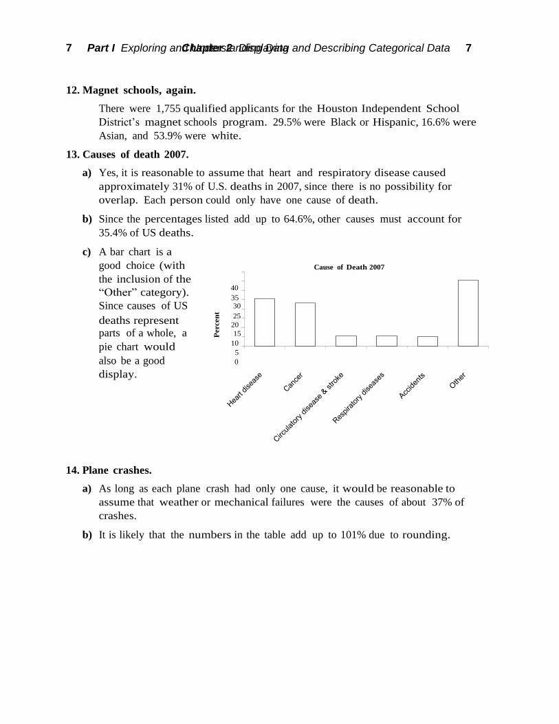
13. Causes of death 2007.
a) Yes, it is reasonable to assume that heart and respiratory disease caused
approximately 31% of U.S. deaths in 2007, since there is no possibility for
overlap. Each person could only have one cause of death.
b) Since the percentages listed add up to 64.6%, other causes must account for
35.4% of US deaths.
c) A bar chart is a
good choice (with
the inclusion of the
“Other” category). 40
Since causes of US 30
deaths represent 25
parts of a whole, a 15
pie chart would 10
also be a good 0
display.
Cause of Death 2007
14. Plane crashes.
a) As long as each plane crash had only one cause, it would be reasonable to
assume that weather or mechanical failures were the causes of about 37% of
crashes.
b) It is likely that the numbers in the table add up to 101% due to rounding.

Chapter 2 Displaying and Describing Categorical Data 8 8 Part I Exploring and Understanding Data
Perc
ent
c) A relative frequency bar chart is a good choice. A pie chart would also be a good
display, as long as each plane crash has only one cause.
Causes of Fatal Plane Accidents
30
25
20
15
10
5
0
15. Oil spills as of 2010.
a) Grounding, accounting for 160 spills, is the most frequent cause of oil spillage for
these 460 spills. A substantial number of spills, 132, were caused by collision.
Less prevalent causes of oil spillage in descending order of frequency were
loading/discharging, other/unknown causes, fire/explosions, and hull failures.
b) If being able to differentiate between these close counts is required, use the bar
chart. Since each spill only has one cause, the pie chart is also acceptable as a
display, but it’s difficult to tell whether, for example, there is a greater
percentage of spills caused by fire/explosions or hull failure. If you want to
showcase the causes of oil spills as a fraction of all 460 spills, use the pie chart.
16. Winter Olympics 2010.
a) There are too many categories to construct an appropriate display. In a bar chart,
there are too many bars. In a pie chart, there are too many slices. In each case,
we run into difficulty trying to display those countries that didn’t win many
medals.
b) Perhaps we are primarily interested in countries that won many medals. We
might choose to combine all countries that won fewer than 6 medals into a single
category. This will make our chart easier to read. We are probably interested in
number of medals won, rather than percentage of total medals won, so we’ll use
a bar chart. A bar chart is also better for comparisons.

8 Part I Exploring and Understanding Data Chapter 2 Displaying and Describing Categorical Data 8
17. Global warming.
Perhaps the most obvious error is that the percentages in the pie chart only add
up to 92%, when they should, of course, add up to 100%. Furthermore, the three-
dimensional perspective view distorts the regions in the graph, violating the area
principle. The regions corresponding to No Solid Evidence and Due to Natural
Patterns should be roughly the same size, at 20% and 21% of respondents,
respectively. However, the angle for the 21% region looks much bigger. Always
use simple, two-dimensional graphs.
18. Death 2010.
The bars have false depth, which can be misleading. This is a bar chart, so the
bars should have space between them. From a design standpoint, it probably
makes more sense to start with the #1 cause of death, Heart Disease, at the top,
list the next 3 in order of importance, and put “Other” at the bottom.
19. Teen smokers.
According to the Monitoring the Future study, teen smoking brand preferences
differ somewhat by region. Although Marlboro is the most popular brand in
each region, with about 58% of teen smokers preferring this brand in each region,
teen smokers from the South prefer Newports at a higher percentage than teen
smokers from the West, 22.5% to approximately 10%, respectively. Camels are
more popular in the West, with 9.5% of teen smokers preferring this brand,
compared to only 3.3% in the South. Teen smokers in the West are also more
likely to have to particular brand than teen smokers in the South. 12.9% of teen
smokers in the West have no particular brand, compared to only 6.7% in the
South. Both regions have 9% of teen smokers that prefer one of over 20 other
brands.
20. Handguns.
76% of handguns involved in Milwaukee buyback programs are small caliber,
while only 20.3% of homicides are committed with small caliber handguns.
Along the same lines, only 19.3% of buyback handguns are of medium caliber,
while 54.7% of homicides involve medium caliber handguns. A similar disparity
is seen in large caliber handguns. Only 2.1% of buyback handguns are large
caliber, but this caliber is used in 10.8% of homicides. Finally, 2.2% of buyback
handguns are of other calibers, while 14.2% of homicides are committed with
handguns of other calibers. Generally, the handguns that are involved in
buyback programs are not the same caliber as handguns used in homicides in
Milwaukee.
21. Movies by genre and rating.
a) The table uses column percents, since each column adds to 100%, while the rows
do not.

9 Part I Exploring and Understanding Data Chapter 2 Displaying and Describing Categorical Data 9
Plans White Minority TOTAL
4-year college 198 44 242
2-year college 36 6 42
Military 4 1 5
Employment 14 3 17
Other 16 3 19
TOTAL 268 57 325
b) 19.5% of these movies are comedies.
c) 19.2% of the PG-rated movies were comedies.
d) i) 21.7% of the PG-13 movies were comedies.
ii) You cannot determine this from the table.
iii) None (0%) of the horror movies were G-rated.
iv) You cannot determine this from the table.
22. The last picture show.
a) Since neither the columns nor the rows total 100%, but the table itself totals 100%,
these are table percentages.
b) The most common genre/rating combination was the unrated drama. 13.19% of
the 728 movies had this combination.
c) 1.92% of the 728 movies, or 14 movies, were PG-rated comedies.
d) A total of 2.47% of the 728 movies, or 18 movies, were rated G.
e) Generally, the table does not support the assertion. 0.27 + 19.64 + 28.85 = 48.76%
of the movies are rated PG-13, NC-17, or R. However, if the Not rated movies are
omitted entirely, then (0.27 + 19.64 + 28.85)/(100 – 38.74) = 79.6%. The statement
is true regarding movies that have been rated.
23. Seniors.
a) A table with
marginal totals
is to the right.
There are 268
White
graduates and
325 total
graduates.
268/325 ≈ 82.5% of the graduates are White.
b) There are 42 graduates planning to attend 2-year colleges. 42/325 ≈ 12.9%
c) 36 white graduates are planning to attend 2-year colleges. 36/325 ≈ 11.1%
d) 36 white graduates are planning to attend 2-year colleges and there are 268
whites graduates. 36/268 ≈ 13.4%
e) There are 42 graduates planning to attend 2-year colleges. 36/42 ≈ 85.7%
24. Politics.
a) There are 192 students taking Intro Stats. Of those, 115, or about 59.9%, are male.

10 Part I Exploring and Understanding Data Chapter 2 Displaying and Describing Categorical Data 10
b) There are 192 students taking Intro Stats. Of those, 27, or about 14.1%, consider
themselves to be “Conservative”.
c) There are 115 males taking Intro Stats. Of those, 21, or about 18.3%, consider
themselves to be “Conservative”.
d) There are 192 students taking Intro Stats. Of those, 21, or about 10.9%, are males
who consider themselves to be “Conservative”.
25. More about seniors.
a) For white students, 73.9% plan to attend a 4-year college, 13.4% plan to attend a
2-year college, 1.5% plan on the military, 5.2% plan to be employed, and 6.0%
have other plans.
b) For minority students, 77.2% plan to attend a 4-year college, 10.5% plan to attend
a 2-year college, 1.8% plan on the military, 5.3% plan to be employed, and 5.3%
have other plans.
c) A segmented bar
chart is a good
display of these
data:
100%
90%
80%
70%
60%
50%
40%
30%
20%
10%
0%
Post High School Plans
Other Other
Employment Employment Military
2-year college 2-year college
4-year college 4-year college
White Minority
d) The conditional distributions of plans for Whites and Minorities are similar:
White – 74% 4-year college, 13% 2-year college, 2% military, 5% employment, 6%
other.
Minority – 77% 4-year college, 11% 2-year college, 2% military, 5% employment,
5% other.
Caution should be used with the percentages for Minority graduates, because the
total is so small. Each graduate is almost 2%. Still, the conditional distributions
of plans are essentially the same for the two groups. There is little evidence of an
association between race and plans for after graduation.
11 Part I Exploring and Understanding Data Chapter 2 Displaying and Describing Categorical Data 11
Conservative Conservative
Moderate
Moderate
Liberal
Liberal
M
M
M
F
F
F
Per
cen
t
Perc
en
t
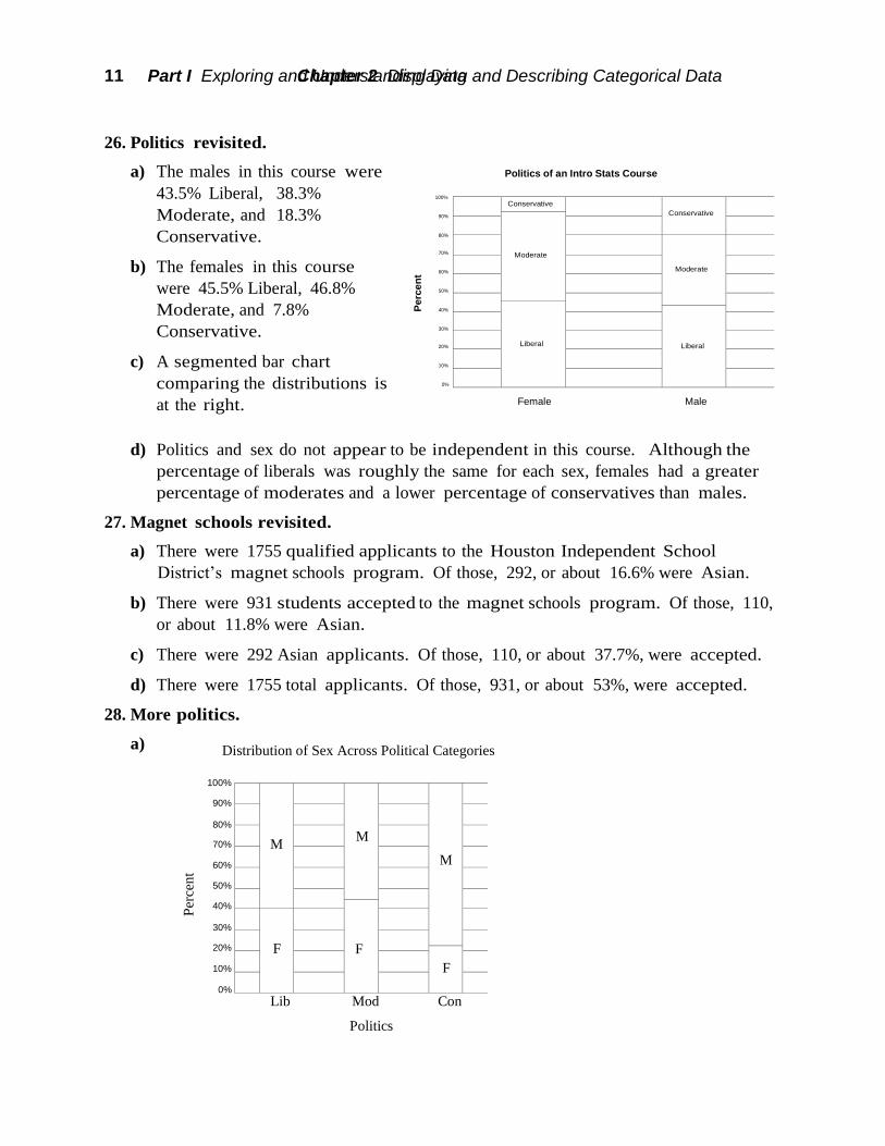
26. Politics revisited.
a) The males in this course were
43.5% Liberal, 38.3%
Moderate, and 18.3%
Conservative.
b) The females in this course
were 45.5% Liberal, 46.8%
Moderate, and 7.8%
Conservative.
c) A segmented bar chart
comparing the distributions is
at the right.
100%
90%
80%
70%
60%
50%
40%
30%
20%
10%
0%
Politics of an Intro Stats Course
Female Male
d) Politics and sex do not appear to be independent in this course. Although the
percentage of liberals was roughly the same for each sex, females had a greater
percentage of moderates and a lower percentage of conservatives than males.
27. Magnet schools revisited.
a) There were 1755 qualified applicants to the Houston Independent School
District’s magnet schools program. Of those, 292, or about 16.6% were Asian.
b) There were 931 students accepted to the magnet schools program. Of those, 110,
or about 11.8% were Asian.
c) There were 292 Asian applicants. Of those, 110, or about 37.7%, were accepted.
d) There were 1755 total applicants. Of those, 931, or about 53%, were accepted.
28. More politics.
a) Distribution of Sex Across Political Categories
100%
90%
80%
70%
60%
50%
40%
30%
20%
10%
0%
Lib Mod Con
Politics

12 Part I Exploring and Understanding Data Chapter 2 Displaying and Describing Categorical Data 12
Driver
Origin Student Staff Total
American 107 105 212
European 33 12 45
Asian 55 47 102
Total 195 164 359
Origin Totals
American 212 (59%)
European 45 (13%)
Asian 102 (28%)
Total 359
b) The percentage of males and females varies across political categories. The
percentage of self-identified Liberals and Moderates who are female is about
twice the percentage of Conservatives who are female. This suggests that sex and
politics are not independent.
29. Back to school.
There were 1,755 qualified applicants for admission to the magnet schools
program. 53% were accepted, 17% were wait-listed, and the other 30% were
turned away. While the overall acceptance rate was 53%, 93.8% of Blacks and
Hispanics were accepted, compared to only 37.7% of Asians, and 35.5% of
whites. Overall, 29.5% of applicants were Black or Hispanics, but only 6% of
those turned away were Black or Hispanic. Asians accounted for 16.6% of
applicants, but 25.3% of those turned away. It appears that the admissions
decisions were not independent of the applicant’s ethnicity.
30. Cars.
a) In order to get percentages, first we need
totals. Here is the same table, with row
and column totals. Foreign cars are
defined as non-American. There are
45+102=147 non-American cars or
147/359 ≈ 40.95%.
b) There are 212 American cars of which 107 or 107/212 ≈ 50.47% were owned by
students.
c) There are 195 students of whom 107 or 107/195 ≈ 54.87% owned American cars.
d) The marginal distribution of Origin is displayed in
the third column of the table at the right: 59%
American, 13% European, and 28% Asian.
e) The conditional distribution of Origin for Students
is: 55% (107 of 195) American, 17% (33 of 195) European, and 28% (55 of 195)
Asian.
The conditional distribution of Origin for Staff is:
64% (105 of 164) American, 7% (12 of 164) European, and 29% (47 of 164) Asian.
13 Part I Exploring and Understanding Data Chapter 2 Displaying and Describing Categorical Data 13
Asian
Asian
European European
American
American
Actual Weather Total
Fore
cast
Rain No Rain
Rain 27 63 90
No Rain 7 268 275
Total 34 331 365
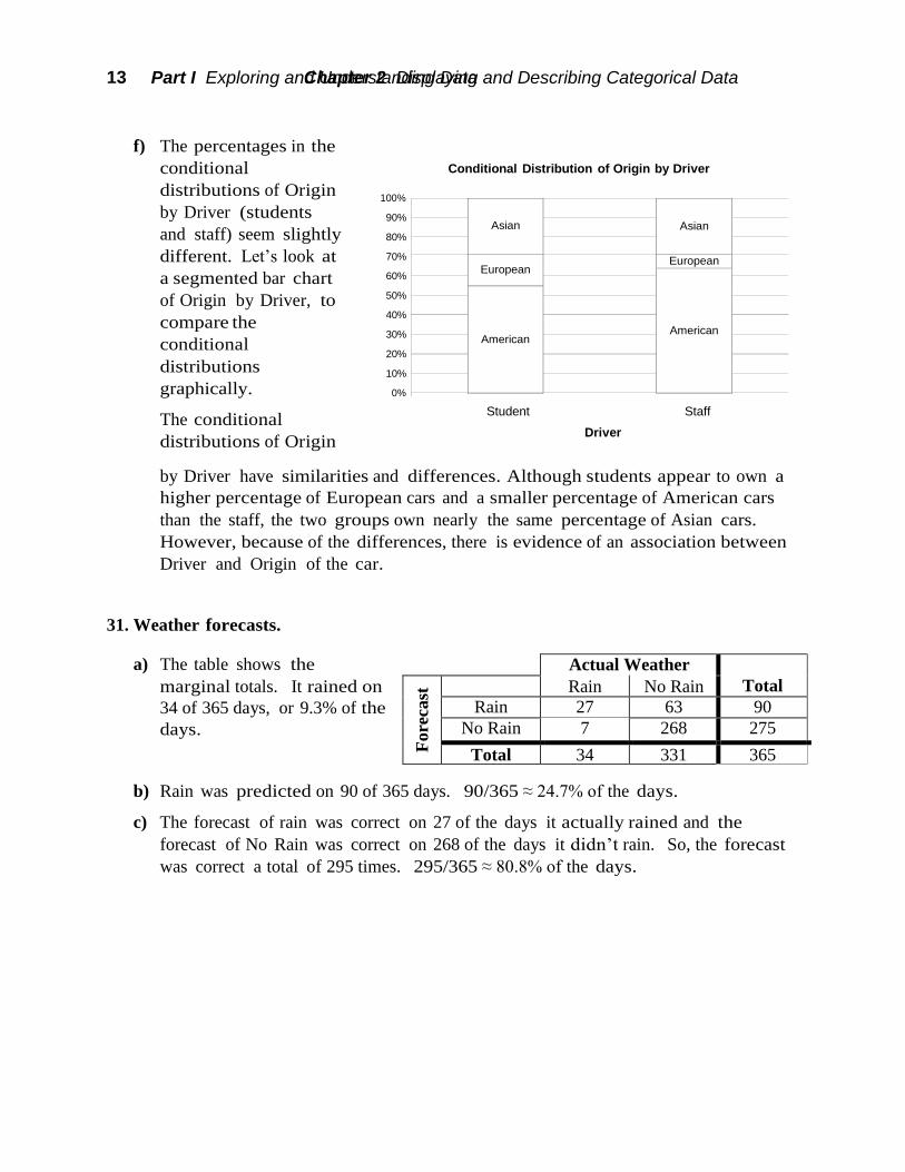
f) The percentages in the
conditional
distributions of Origin
by Driver (students
and staff) seem slightly
different. Let’s look at
a segmented bar chart
of Origin by Driver, to
compare the
conditional
distributions
graphically.
The conditional
distributions of Origin
100%
90%
80%
70%
60%
50%
40%
30%
20%
10%
0%
Conditional Distribution of Origin by Driver
Student Staff
Driver
by Driver have similarities and differences. Although students appear to own a
higher percentage of European cars and a smaller percentage of American cars
than the staff, the two groups own nearly the same percentage of Asian cars.
However, because of the differences, there is evidence of an association between
Driver and Origin of the car.
31. Weather forecasts.
a) The table shows the
marginal totals. It rained on
34 of 365 days, or 9.3% of the
days.
b) Rain was predicted on 90 of 365 days. 90/365 ≈ 24.7% of the days.
c) The forecast of rain was correct on 27 of the days it actually rained and the
forecast of No Rain was correct on 268 of the days it didn’t rain. So, the forecast
was correct a total of 295 times. 295/365 ≈ 80.8% of the days.

14 Part I Exploring and Understanding Data Chapter 2 Displaying and Describing Categorical Data 14
Wrong
Wrong
Correct
Correct
Twin Births 1995-97 (in thousands)
Level of
Prenatal Care
Preterm
(Induced or
Caesarean)
Preterm
(without
procedures)
Term or
Postterm
Total
Intensive 18 15 28 61
Adequate 46 43 65 154
Inadequate 12 13 38 63
Total 76 71 131 278
d) On rainy days, rain had been predicted 27 out of 34 times (79.4%). On days when
it did not rain, forecasters were correct in their predictions 268 out of 331 times
(81.0%). These two percentages are very close. There is no evidence of an
association between the type of weather and the ability of the forecasters to make
an accurate prediction.
Weather Forecast Accuracy
32. Twins.
100%
90%
80%
70%
60%
50%
40%
30%
20%
10%
0%
Rain No Rain
Actual Weather
a) Of the 278,000
mothers who had
twins in 1995-1997,
63,000 had
inadequate health
care during their
pregnancies.
63,000/278,000 = 22.7%
b) There were 76,000 induced or Caesarean births and 71,000 preterm births
without these procedures. (76,000 + 71,000)/278,000 = 52.9%
c) Among the mothers who did not receive adequate medical care, there were
12,000 induced or Caesarean births and 13,000 preterm births without these
procedures. 63,000 mothers of twins did not receive adequate medical care.
(12,000 + 13,000)/63,000 = 39.7%

15 Part I Exploring and Understanding Data Chapter 2 Displaying and Describing Categorical Data 15
Term or
Postterm
Term or
Postterm
Term or
Postterm
Preterm
(no proc.)
Preterm
(no proc.)
Preterm
(no proc.)
Preterm
(Induced
or
C-section)
Preterm
(Induced
or
C-section)
(Induced
or
C-section)
Blood pressure under 30 30 - 49 over 50 Total
low 27 37 31 95
normal 48 91 93 232
high 23 51 73 147
Total 98 179 197 474
d)
Twin Birth Outcome 1995-1997
100%
90%
80%
70%
60%
50%
40%
30%
20%
10%
0%
Intensive Adequate Inadequate
Level of Prenatal Care
e) 52.9% of all twin births were preterm, while only 39.7% of births in which
inadequate medical care was received were preterm. This is evidence of an
association between level of prenatal care and twin birth outcome. If these
variables were independent, we would expect the percentages to be roughly the
same. Generally, those mothers who received adequate medical care were more
likely to have preterm births than mothers who received intensive medical care,
who were in turn more likely to have preterm births than mothers who received
inadequate health care. This does not imply that mothers should receive
inadequate health care do decrease their chances of having a preterm birth, since
it is likely that women that have some complication during their pregnancy (that
might lead to a preterm birth), would seek intensive or adequate prenatal care.
33. Blood pressure.
a) The marginal distribution
of blood pressure for the
employees of the
company is the total
column of the table,
converted to percentages. 20% low, 49% normal and 31% high blood pressure.
b) The conditional distribution of blood pressure within each age category is:
Under 30 : 28% low, 49% normal, 23% high
30 – 49 : 21% low, 51% normal, 28% high
Over 50 : 16% low, 47% normal, 37% high

16 Part I Exploring and Understanding Data Chapter 2 Displaying and Describing Categorical Data 16
high
high
high
normal
normal
normal
low low
low
c) A segmented bar chart of the conditional distributions of blood pressure by age
category is below.
Blood Pressure of Employees 100%
90%
80%
70%
60%
50%
40%
30%
20%
10%
0%
under 30 30 - 49 over 50
Age in Years
d) In this company, as age increases, the percentage of employees with low blood
pressure decreases, and the percentage of employees with high blood pressure
increases.
e) No, this does not prove that people’s blood pressure increases as they age.
Generally, an association between two variables does not imply a cause-and-
effect relationship. Specifically, these data come from only one company and
cannot be applied to all people. Furthermore, there may be some other variable
that is linked to both age and blood pressure. Only a controlled experiment can
isolate the relationship between age and blood pressure.
34. Obesity and exercise.
a) Participants were categorized as Normal, Overweight or Obese, according to
their Body Mass Index. Within each classification of BMI (column), participants
self reported exercise levels. Therefore, these are column percentages. The
percentages sum to 100% in each column, not across each row.

17 Part I Exploring and Understanding Data Chapter 2 Displaying and Describing Categorical Data 17
Intense Intense Intense
Regular,
not
intense
Regular,
not
intense
Regular,
not
intense
Irreg.
active
Irreg.
active
Irreg.
active
Inactive
Inactive
Inactive
b) A segmented bar
chart of the
conditional
distributions of
level of physical
activity by Body
Mass Index
category is at the
right.
c) No, even though
the graphical
displays provide
strong evidence
that lack of
exercise and BMI
100%
90%
80%
70%
60%
50%
40%
30%
20%
10%
0%
Body Mass Index and Level of Physical Activity
Normal Overweight Obese
Body Mass Index
are not independent. All three BMI categories have nearly the same percentage
of subjects who report “Regular, not intense” or “Irregularly active”, but as we
move from Normal to Overweight to Obese we see a decrease in the percentage
of subjects who report “Regular, intense” physical activity (16.8% to 14.2% to
9.1%), while the percentage of subjects who report themselves as “Inactive”
increases. While it may seem logical that lack of exercise causes obesity,
association between variables does not imply a cause-and-effect relationship. A
lurking variable (for example, overall health) might influence both BMI and level
of physical activity, or perhaps lack of exercise is caused by obesity. Only a
controlled experiment could isolate the relationship between BMI and level of
physically activity.
35. Anorexia.
These data provide no evidence that Prozac might be helpful in treating
anorexia. About 71% of the patients who took Prozac were diagnosed as
“Healthy”, while about 73% of the patients who took a placebo were diagnosed
as “Healthy”. Even though the percentage was higher for the placebo patients,
this does not mean that Prozac is hurting patients. The difference between 71%
and 73% is not likely to be statistically significant.
36. Antidepressants and bone fractures.
These data provide evidence that taking a certain class of antidepressants (SSRI)
might be associated with a greater risk of bone fractures. Approximately 10% of
the patients taking this class of antidepressants experience bone fractures. This is
compared to only approximately 5% in the group that were not taking the
antidepressants.
18 Part I Exploring and Understanding Data Chapter 2 Displaying and Describing Categorical Data 18
19 a
nd
under
20
-24
25
-29
30
-34
35
-39
40
-44
45
-49
50
-54
55
-59
60
-64
65
-69
70
-74
75
-79
80
-84
85 a
nd
o
ver
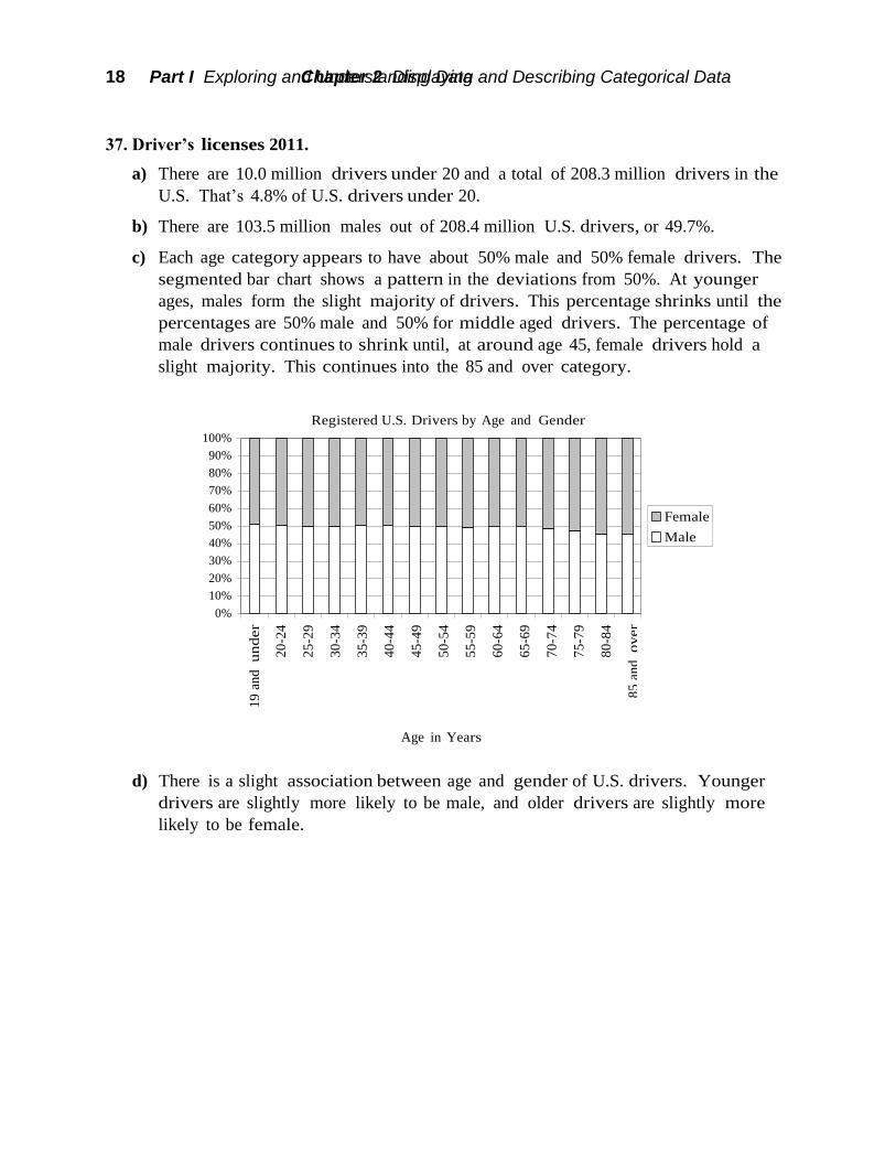
37. Driver’s licenses 2011.
a) There are 10.0 million drivers under 20 and a total of 208.3 million drivers in the
U.S. That’s 4.8% of U.S. drivers under 20.
b) There are 103.5 million males out of 208.4 million U.S. drivers, or 49.7%.
c) Each age category appears to have about 50% male and 50% female drivers. The
segmented bar chart shows a pattern in the deviations from 50%. At younger
ages, males form the slight majority of drivers. This percentage shrinks until the
percentages are 50% male and 50% for middle aged drivers. The percentage of
male drivers continues to shrink until, at around age 45, female drivers hold a
slight majority. This continues into the 85 and over category.
Registered U.S. Drivers by Age and Gender
100%
90%
80%
70%
60%
50%
40%
30%
20%
10%
0%
Female
Male
Age in Years
d) There is a slight association between age and gender of U.S. drivers. Younger
drivers are slightly more likely to be male, and older drivers are slightly more
likely to be female.

19 Part I Exploring and Understanding Data Chapter 2 Displaying and Describing Categorical Data 19
No Hep-C
No Hep-C
No Hep-C
Has Hep-C
Has Hep-C
38. Tattoos.
The study by the University of Texas Southwestern Medical Center provides
evidence of an association between having a tattoo and contracting hepatitis C.
Around 33% of the subjects who were tattooed in a commercial parlor had
hepatitis C, compared with 13% of those tattooed elsewhere, and only 3.5% of
those with no tattoo. If having a tattoo and having hepatitis C were
independent, we would have expected these percentages to be roughly the same.
Tattoos and Hepatitis C
100%
90%
80%
70%
60%
50%
40%
30%
20%
10%
0%
Tattoo - Parlor Tattoo - Elsewhere No Tattoo
39. Hospitals.
a) The marginal totals have been added to the table:
Discharge delayed
Pro
ced
ure Large Hospital Small Hospital Total
Major surgery 120 of 800 10 of 50 130 of 850
Minor surgery 10 of 200 20 of 250 30 of 450
Total 130 of 1000 30 of 300 160 of 1300
160 of 1300, or about 12.3% of the patients had a delayed discharge.
b) Yes. Major surgery patients were delayed 130 of 850 times, or about 15.3% of the
time.
Minor Surgery patients were delayed 30 of 450 times, or about 6.7% of the time.
c) Large Hospital had a delay rate of 130 of 1000, or 13%.
Small Hospital had a delay rate of 30 of 300, or 10%.
The small hospital has the lower overall rate of delayed discharge.

20 Part I Exploring and Understanding Data Chapter 2 Displaying and Describing Categorical Data 20
d) Large Hospital: Major Surgery 15% delayed and Minor Surgery 5% delayed.
Small Hospital: Major Surgery 20% delayed and Minor Surgery 8% delayed.
Even though small hospital had the lower overall rate of delayed discharge, the
large hospital had a lower rate of delayed discharge for each type of surgery.
e) No. While the overall rate of delayed discharge is lower for the small hospital,
the large hospital did better with both major surgery and minor surgery.
f) The small hospital performs a higher percentage of minor surgeries than major
surgeries. 250 of 300 surgeries at the small hospital were minor (83%). Only 200
of the large hospital’s 1000 surgeries were minor (20%). Minor surgery had a
lower delay rate than major surgery (6.7% to 15.3%), so the small hospital’s
overall rate was artificially inflated. Simply put, it is a mistake to look at the
overall percentages. The real truth is found by looking at the rates after the
information is broken down by type of surgery, since the delay rates for each
type of surgery are so different. The larger hospital is the better hospital when
comparing discharge delay rates.
40. Delivery service.
a) Pack Rats has delivered a total of 28 late packages (12 Regular + 16 Overnight),
out of a total of 500 deliveries (400 Regular + 100 Overnight). 28/500 = 5.6% of
the packages are late. Boxes R Us has delivered a total of 30 late packages (2
Regular + 28 Overnight) out of a total of 500 deliveries (100 Regular + 400
Overnight). 30/500 = 6% of the packages are late.
b) The company should have hired Boxes R Us instead of Pack Rats. Boxes R Us
only delivers 2% (2 out of 100) of its Regular packages late, compared to Pack
Rats, who deliver 3% (12 out of 400) of its Regular packages late. Additionally,
Boxes R Us only delivers 7% (28 out of 400) of its Overnight packages late,
compared to Pack Rats, who delivers 16% of its Overnight packages late. Boxes
R Us is better at delivering Regular and Overnight packages.
c) This is an instance of Simpson’s Paradox, because the overall late delivery rates
are unfair averages. Boxes R Us delivers a greater percentage of its packages
Overnight, where it is comparatively harder to deliver on time. Pack Rats
delivers many Regular packages, where it is easier to make an on-time delivery.

Chapter 2 Displaying and Describing Categorical Data 21
Program Males Females
1 61.9% 82.4%
2 62.9% 68.0%
3 33.7% 35.2%
4 5.9% 7%
41. Graduate admissions.
a) 1284 applicants were admitted out of a total of 3014 applicants. 1284/3014 =
42.6%
Program
Males Accepted
(of applicants)
Females Accepted
(of applicants)
Total
1 511 of 825 89 of 108 600 of 933
2 352 of 560 17 of 25 369 of 585
3 137 of 407 132 of 375 269 of 782
4 22 of 373 24 of 341 46 of 714
Total 1022 of 2165 262 of 849 1284 of 3014
b) 1022 of 2165 (47.2%) of males were admitted. 262 of 849 (30.9%) of females were
admitted.
c) Since there are four comparisons to make, the
table at the right organizes the percentages of
males and females accepted in each program.
Females are accepted at a higher rate in every
program.
d) The comparison of acceptance rate within each program is most valid. The
overall percentage is an unfair average. It fails to take the different numbers of
applicants and different acceptance rates of each program. Women tended to
apply to the programs in which gaining acceptance was difficult for everyone.
This is an example of Simpson’s Paradox.
42. Be a Simpson!
Answers will vary. The three-way table below shows one possibility. The
number of local hires out of new hires is shown in each cell.
Company A Company B
Full-time New
Employees
40 of 100 = 40% 90 of 200 = 45%
Part-time New
Employees
170 of 200 = 85% 90 of 100 = 90%
Total 210 of 300 = 70% 180 of 300 = 60%
Macroeconomics 6th Edition Williamson SOLUTIONS MANUAL
Full clear download (no formatting errors) at:
https://testbankreal.com/download/macroeconomics-6th-edition-williamson-
solutions-manual/

Chapter 2 Displaying and Describing Categorical Data 22
Macroeconomics 6th Edition Williamson TEST BANK
Full clear download (no formatting errors) at:
https://testbankreal.com/download/macroeconomics-6th-edition-williamson-
test-bank-2/
macroeconomics williamson 6th edition pdf
macroeconomics williamson 6th edition solutions
macroeconomics 6th edition pdf
macroeconomics williamson 5th edition
chegg
chegg study