Solution Manual - Probability and Statistics 6th Ed. by J. L. Devore Chapter 8

1 - 1 © 2017 Cengage Learning. All Rights Reserved.
May not be scanned, copied or duplicated, or posted to a publicly accessible website, in whole or in part.
Chapter 1 Data and Statistics Learning Objectives 1. Obtain an appreciation for the breadth of statistical applications in business and economics. 2. Understand the meaning of the terms elements, variables, and observations as they are used in
statistics. 3. Obtain an understanding of the difference between categorical, quantitative, crossectional and time
series data. 4. Learn about the sources of data for statistical analysis, both internal and external, to the firm. 5. Be aware of how errors can arise in data. 6. Know the meaning of descriptive statistics and statistical inference. 7. Be able to distinguish between a population and a sample. 8. Understand the role a sample plays in making statistical inferences about the population. 9. Know the meaning of the term data mining. 10. Be aware of ethical guidelines for statistical practice.

Chapter 1
1 - 2 © 2017 Cengage Learning. All Rights Reserved.
May not be scanned, copied or duplicated, or posted to a publicly accessible website, in whole or in part.
Solutions: 1. Statistics can be referred to as numerical facts. In a broader sense, statistics is the field of study
dealing with the collection, analysis, presentation and interpretation of data. 2. a. The ten elements are the ten tablet computers b. 5 variables: Cost ($), Operating System, Display Size (inches), Battery Life (hours), CPU
Manufacturer c. Categorical variables: Operating System and CPU Manufacturer
Quantitative variables: Cost ($), Display Size (inches), and Battery Life (hours)
d. Variable Measurement Scale Cost ($) Ratio Operating System Nominal Display Size (inches) Ratio Battery Life (hours) Ratio CPU Manufacturer Nominal
3. a. Average cost = 5829/10 = $582.90 b. Average cost with a Windows operating system = 3616/5 = $723.20 Average cost with an Android operating system = 1714/4 = $428.5 The average cost with a Windows operating system is much higher. c. 2 of 10 or 20% use a CPU manufactured by TI OMAP d. 4 of 10 or 40% use an Android operating system
4. a. There are eight elements in this data set; each element corresponds to one of the eight models of
cordless telephones b. Categorical variables: Voice Quality and Handset on Base Quantitative variables: Price, Overall Score, and Talk Time c. Price – ratio measurement Overall Score – interval measurement Voice Quality – ordinal measurement Handset on Base – nominal measurement Talk Time – ratio measurement 5. a. Average Price = 545/8 = $68.13 b. Average Talk Time = 71/8 = 8.875 hours
c. Percentage rated Excellent: 2 of 8 2/8 = .25, or 25%
d. Percentage with Handset on Base: 4 of 8 4/8 = .50, or 50%

Data and Statistics
1 - 3 © 2017 Cengage Learning. All Rights Reserved.
May not be scanned, copied or duplicated, or posted to a publicly accessible website, in whole or in part.
6. a. Categorical b. Quantitative c. Categorical
d. Quantitative e. Quantitative 7. a. Each question has a yes or no categorical response. b. Yes and no are the labels for the customer responses. A nominal scale is being used. 8. a. 762 b. Categorical c. Percentages
d. .67(762) = 510.54 510 or 511 respondents said they want the amendment to pass.
9. a. Categorical b. 30 of 71; 42.3% 10. a. Categorical b. Percentages c. 44 of 1080 respondents or approximately 4% strongly agree with allowing drivers of motor vehicles
to talk on a hand-held cell phone while driving. d. 165 of the 1080 respondents or 15% of said they somewhat disagree and 741 or 69% said they
strongly disagree. Thus, there does not appear to be general support for allowing drivers of motor vehicles to talk on a hand-held cell phone while driving.
11. a. Categorical
b. 295 + 672 + 51 = 1018
c. (295/1018)100 = 29% d. Support against; (672/1018)100 = 66% said they would vote against the law. 12. a. The population is all visitors coming to the state of Hawaii. b. Since airline flights carry the vast majority of visitors to the state, the use of questionnaires for
passengers during incoming flights is a good way to reach this population. The questionnaire actually appears on the back of a mandatory plants and animals declaration form that passengers must complete during the incoming flight. A large percentage of passengers complete the visitor information questionnaire.
Chapter 1
1 - 4 © 2017 Cengage Learning. All Rights Reserved.
May not be scanned, copied or duplicated, or posted to a publicly accessible website, in whole or in part.
c. Questions 1 and 4 provide quantitative data indicating the number of visits and the number of days in Hawaii. Questions 2 and 3 provide categorical data indicating the categories of reason for the trip and where the visitor plans to stay.
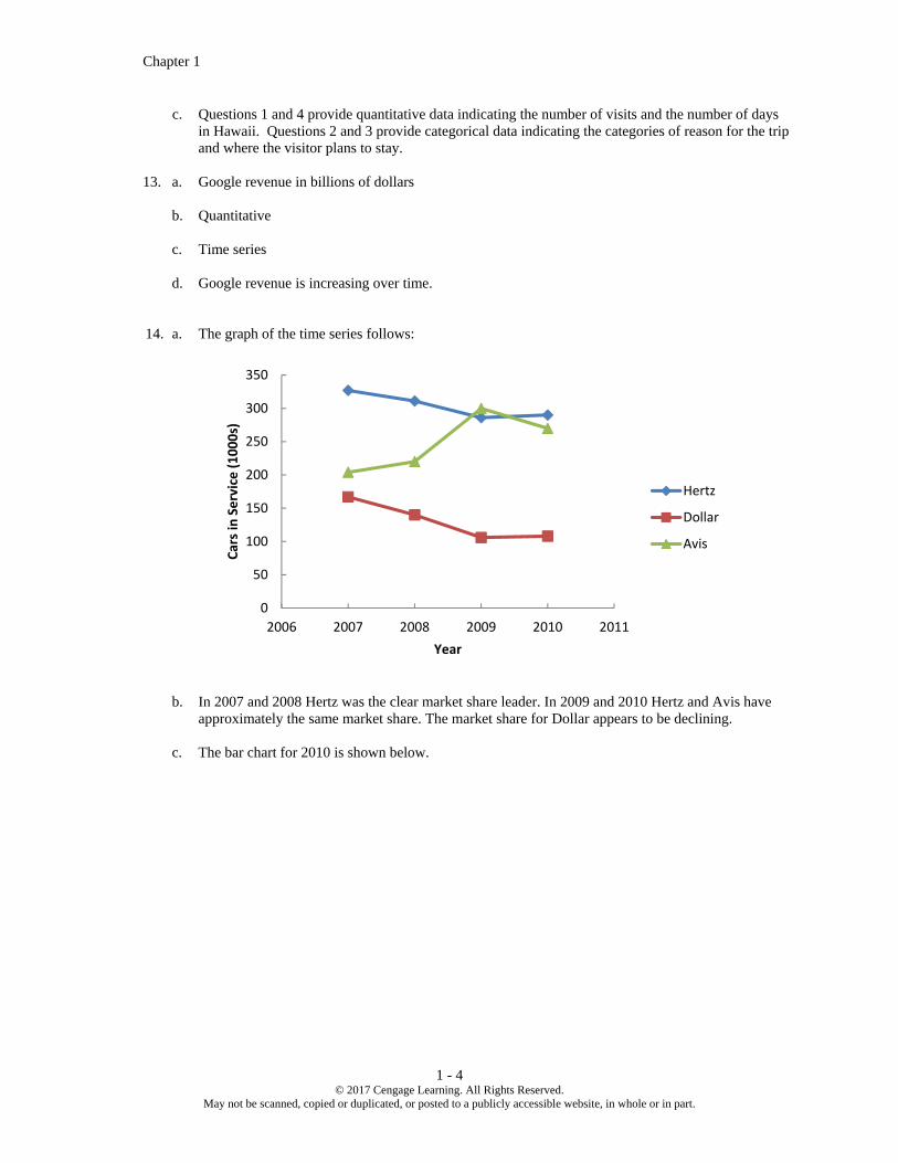
13. a. Google revenue in billions of dollars
b. Quantitative c. Time series d. Google revenue is increasing over time. 14. a. The graph of the time series follows:
b. In 2007 and 2008 Hertz was the clear market share leader. In 2009 and 2010 Hertz and Avis have
approximately the same market share. The market share for Dollar appears to be declining. c. The bar chart for 2010 is shown below.
0
50
100
150
200
250
300
350
2006 2007 2008 2009 2010 2011
Cars in Service (1000s)
Year
Hertz
Dollar
Avis

Data and Statistics
1 - 5 © 2017 Cengage Learning. All Rights Reserved.
May not be scanned, copied or duplicated, or posted to a publicly accessible website, in whole or in part.
This chart is based on cross-sectional data. 15. a. Quantitative – number of recreational boating accidents b. Time series c. July; 1100 d. 2.9%; Yes, because most recreational boating takes place during the summer months. e. The bar graph follows the shape of a bell curve. 16. The answers to this exercise depend on updating the time series of the average price per gallon of
conventional regular gasoline as shown in Figure 1.1. Contact the website www.eia.doe.gov to obtain the most recent time series data. The answers should focus on the most recent changes or trend in the average price per gallon.
17. Internal data on salaries of other employees can be obtained from the personnel department.
External data might be obtained from the Department of Labor or industry associations.
18. a. 684/1021; or approximately 67% b. 612 c. Categorical 19. a. All subscribers of Business Week in North America at the time the survey was conducted. b. Quantitative c. Categorical (yes or no) d. Crossectional - all the data relate to the same time. e. Using the sample results, we could infer or estimate 59% of the population of subscribers have an
annual income of $75,000 or more and 50% of the population of subscribers have an American Express credit card.
0
50
100
150
200
250
300
350
Hertz Dollar Avis
Cars in Service (1000s)
Company

Chapter 1
1 - 6 © 2017 Cengage Learning. All Rights Reserved.
May not be scanned, copied or duplicated, or posted to a publicly accessible website, in whole or in part.
20. a. 43% of managers were bullish or very bullish. 21% of managers expected health care to be the leading industry over the next 12 months. b. We estimate the average 12-month return estimate for the population of investment managers to be
11.2%. c. We estimate the average over the population of investment managers to be 2.5 years. 21. a. The two populations are the population of women whose mothers took the drug DES during
pregnancy and the population of women whose mothers did not take the drug DES during pregnancy.
b. It was a survey. c. 63 / 3.980 = 15.8 women out of each 1000 developed tissue abnormalities. d. The article reported “twice” as many abnormalities in the women whose mothers had taken DES
during pregnancy. Thus, a rough estimate would be 15.8/2 = 7.9 abnormalities per 1000 women whose mothers had not taken DES during pregnancy.
e. In many situations, disease occurrences are rare and affect only a small portion of the population.
Large samples are needed to collect data on a reasonable number of cases where the disease exists. 22. a. The population consists of all clients that currently have a home listed for sale with the agency or
have hired the agency to help them locate a new home. b. Some of the ways that could be used to collect the data are as follows:
A survey could be mailed to each of the agency’s clients.
Each client could be sent an email with a survey attached.
The next time one of the firm’s agents meets with a client they could conduct a personal interview to obtain the data.
23. a. This finding is applicable to the population of all American adults. b. This finding is applicable to the population of American adults that own a cellphone and/or a tablet
computer. c. They conducted a sample survey. It would be way too costly to survey all American adults or all
American adults who own cellphones and/or tablet computers. As we will see later in the text, very good results can be obtained using a sample survey.
d. These results should be quite interesting to restaurant owners. It suggests that it would be
worthwhile for them to have a website and to consider advertising through an internet search company, such as Google.
24. a. This is a statistically correct descriptive statistic for the sample. b. An incorrect generalization since the data was not collected for the entire population. c. An acceptable statistical inference based on the use of the word “estimate.”
Data and Statistics
1 - 7 © 2017 Cengage Learning. All Rights Reserved.
May not be scanned, copied or duplicated, or posted to a publicly accessible website, in whole or in part.
d. While this statement is true for the sample, it is not a justifiable conclusion for the entire population. e. This statement is not statistically supportable. It is entirely possible and even very likely that at least
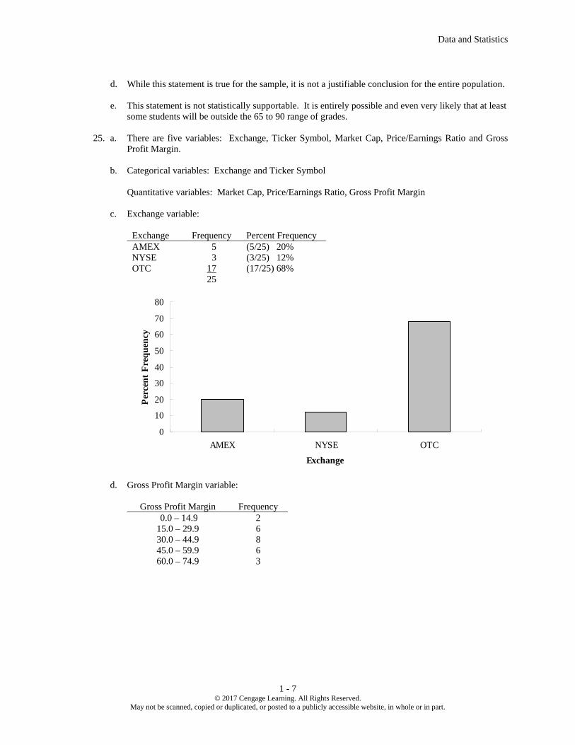
some students will be outside the 65 to 90 range of grades. 25. a. There are five variables: Exchange, Ticker Symbol, Market Cap, Price/Earnings Ratio and Gross
Profit Margin. b. Categorical variables: Exchange and Ticker Symbol Quantitative variables: Market Cap, Price/Earnings Ratio, Gross Profit Margin c. Exchange variable:
Exchange Frequency Percent Frequency AMEX 5 (5/25) 20% NYSE 3 (3/25) 12% OTC 17 (17/25) 68% 25
d. Gross Profit Margin variable:
Gross Profit Margin Frequency 0.0 – 14.9 2 15.0 – 29.9 6 30.0 – 44.9 8 45.0 – 59.9 6 60.0 – 74.9 3
0
10
20
30
40
50
60
70
80
AMEX NYSE OTC
Exchange
Per
cen
t F
req
uen
cy

Chapter 1
1 - 8 © 2017 Cengage Learning. All Rights Reserved.
May not be scanned, copied or duplicated, or posted to a publicly accessible website, in whole or in part.
e. Sum the Price/Earnings Ratio data for all 25 companies. Sum = 505.4 Average Price/Earnings Ratio = Sum/25 = 505.4/25 = 20.2
0
1
2
3
4
5
6
7
8
9
0.0-14.9 15.0-29.9 30.0-44.9 45.0-59.9 60.0-74.9
Gross Profit Margin
Fre
qu
ency

CP - 1 © 2013 Cengage Learning. All Rights Reserved.
May not be scanned, copied or duplicated, or posted to a publicly accessible website, in whole or in part.
Solutions to
Case Problems
Chapter 2
Descriptive Statistics: Tabular and Graphical Presentations
Case Problem 1: Pelican Stores
1. There were 70 Promotional customers and 30 Regular customers. Because there are 100
observations in the sample, the frequency and percent frequency distribution are the same. Percent
frequency distributions for many of the variables are given.
No. of Items Percent Frequency
1 29
2 27
3 10
4 10
5 9
6 7
7 or more 8
Total: 100
Net Sales Percent Frequency
0.00 - 24.99 9
25.00 - 49.99 30
50.00 - 74.99 25
75.00 - 99.99 10
100.00 - 124.99 12
125.00 - 149.99 4
150.00 - 174.99 3
175.00 - 199.99 3
200 or more 4
Total: 100
Method of Payment Percent Frequency
American Express 2
Discover 4
MasterCard 14
Proprietary Card 70
Visa 10
Total: 100
Gender Percent Frequency
Female 93
Male 7
Total: 100

Chapter 2 Descriptive Statistics: Tabular and Graphical Presentations
CP - 2 © 2013 Cengage Learning. All Rights Reserved.
May not be scanned, copied or duplicated, or posted to a publicly accessible website, in whole or in part.
Martial Status Percent Frequency
Married 84
Single 16
Total: 100
Age Percent Frequency
20 - 29 10
30 - 39 30
40 - 49 33
50 - 59 16
60 - 69 7
70 - 79 4
Total: 100
These percent frequency distributions provide a profile of Pelican's customers. Many observations
are possible, including:
A large majority of the customers use National Clothing’s proprietary credit card.
Over half of the customers purchase 1 or 2 items, but a few make numerous purchases.
The percent frequency distribution of net sales shows that 61% of the customers spent $50 or
more.
Customers are distributed across all adult age groups.
The overwhelming majority of customers are female.
Most of the customers are married.
2.
3. A crosstabulation of type of customer versus net sales is shown.
Net Sales
Customer
0-
25
25-
50
50-
75
75-
100
100-
125
125-
175
175-
200
200-
225
225-
250
250-
275
275-
300
Total
Promotional 7 17 17 8 9 3 2 3 1 2 1 70
Regular 2 13 8 2 3 1 1 30
Total 9 30 25 10 12 4 3 3 1 2 1 100
From the crosstabulation it appears that net sales are larger for promotional customers.

Chapter 2 Descriptive Statistics: Tabular and Graphical Presentations
CP - 3 © 2013 Cengage Learning. All Rights Reserved.
May not be scanned, copied or duplicated, or posted to a publicly accessible website, in whole or in part.
4. A scatter diagram of net Sales vs. age is shown below. A trendline has been fitted to the data. From
this, it appears that there is no relationship between net sales and age.
Age is not a factor in determining net sales.
Case Problem 2: The Motion Picture Industry
This case provides the student with the opportunity to use tabular and graphical presentations to analyze
data from the motion picture industry. Developing and interpreting frequency distributions, percent
frequency distributions and scatter diagrams are emphasized. The interpretations and insights can be quite
varied. We illustrate some below.
Frequency Distribution and Percent Frequency Distribution
The choice of the classes for frequency distributions or percent frequency distributions can be expected to
vary. The frequency distributions we developed are as follows:
Opening Gross Sales
(Millions)
Frequency
(or Percentage)
$0 – 9.99 70
10 – 19.99 15
20 – 29.99 8
30 – 39.99 2
40 – 49.99 1
50 – 59.99 1
60 – 69.99 0
70 – 79.99 1
80 – 89.99 0
90 – 99.99 0
100 – 109.99 2
Total 100
0.00
50.00
100.00
150.00
200.00
250.00
300.00
350.00
0 10 20 30 40 50 60 70 80 90
Net
Sa
les
Age

Chapter 2 Descriptive Statistics: Tabular and Graphical Presentations
CP - 4 © 2013 Cengage Learning. All Rights Reserved.
May not be scanned, copied or duplicated, or posted to a publicly accessible website, in whole or in part.
Total Gross Sales
(Millions)
Frequency
(or Percentage)
$0 – 49.99 77
50 – 99.99 16
100 – 149.99 1
150 – 199.99 1
200 – 249.99 3
250 – 299.99 1
300 – 349.99 0
350 – 399.99 1
Total 100
Number
of Theaters
Frequency
(or Percentage)
0 – 499 51
500 – 999 3
1000 – 1499 6
1500 – 1999 7
2000 – 2499 5
2500 – 2999 6
3000 – 3499 17
3500 – 3999 5
Total 100
Number of
Weeks
in Top 60
Frequency
(or Percentage)
0 – 4 33
5 – 9 28
10 – 14 18
15 – 19 15
20 – 24 5
25 – 29 1
Total 100

Chapter 2 Descriptive Statistics: Tabular and Graphical Presentations
CP - 5 © 2013 Cengage Learning. All Rights Reserved.
May not be scanned, copied or duplicated, or posted to a publicly accessible website, in whole or in part.
Histograms
The following histograms are based on the frequency distributions shown above.
0
10
20
30
40
50
60
70
80
Fre
qu
ency
Opening Weekend Gross Sales (millions)
0
10
20
30
40
50
60
70
80
90
Fre
qu
ency
Total Gross Sales (millions)

Chapter 2 Descriptive Statistics: Tabular and Graphical Presentations
CP - 6 © 2013 Cengage Learning. All Rights Reserved.
May not be scanned, copied or duplicated, or posted to a publicly accessible website, in whole or in part.
Interpretation
Opening Weekend Gross Sales. The distribution is skewed to the right. Numerous motion pictures have
somewhat low opening weekend gross sales, while a relatively few (7%) have an opening weekend gross
sales of $30 million or more. Only 2% had opening weekend gross sales of $100 million or more. 70% of
the motion pictures had opening weekend gross sales less than $10 million and 85% of the motion pictures
had opening weekend gross sales less than $20 million. Unless there is something unusually attractive
about the motion picture, an opening weekend gross sales less than $10 million appears typical.
Total Gross Sales. This distribution is also skewed to the right. Again, the majority of the motion pictures
have relatively low total gross sales with 77% less than $50 million and 93% less than $100 million.
Highly successful blockbuster motion pictures are rare. Total gross sales over $200 million occurred only
5% of the time and over $300 million occurred only 1% of the time. No motion picture reported $400
million in total gross sales. Unless there is something unusually attractive about the motion picture, a total
gross sales less than $50 million appears typical.
0
10
20
30
40
50
60
Fre
qu
ency
Number of Theaters
0
5
10
15
20
25
30
35
0-4 5–9 10–14 15–19 20–24 25–29
Fre
qu
ency
Number of Weeks in the Top 60

Chapter 2 Descriptive Statistics: Tabular and Graphical Presentations
CP - 7 © 2013 Cengage Learning. All Rights Reserved.
May not be scanned, copied or duplicated, or posted to a publicly accessible website, in whole or in part.
Number of Theaters. This distribution is skewed to the right, but not so much as sales data distributions.
The number of theaters range from less than 500 to almost 4000. 51% of the motion pictures had the
smaller market exposure with the number of theaters less than 500. Interestingly enough, 22% of the
motion pictures had the widest market exposure, appearing in over 3000 theaters. 3000 to 4000 theaters is
typical for a highly promoted motion picture.
Number of Weeks in Top 60. This distribution is skewed to the right, but not as much as the other
distributions. In appears that almost all newly released movies initially make it into the top 60, with 67%
staying in the top 60 for 5 or more weeks. Even motion pictures with relative low gross sales can appear in
the top 60 motion pictures for a month or more. Almost 40% of the motion pictures are in the top 60 for 10
or more weeks, with 6% of the motion pictures in the top 60 for 20 or more weeks.
General Observations. The data show that there are relative few high-end, highly successful motion
pictures. The financial rewards are there for the pictures that make the blockbuster level. But the majority
of motion pictures will have low opening weekend gross sales and low total gross sales. Motion pictures
being shown in less than 1500 theaters and motion pictures less than 10 weeks in the top 60 are common.
Scatter Diagrams
Three scatter diagrams are suggested to show how Total Gross Sales is related to each of the other three
variables.
0.00
50.00
100.00
150.00
200.00
250.00
300.00
350.00
400.00
0.00 20.00 40.00 60.00 80.00 100.00 120.00
Opening Weekend Gross Sales
Tota
l G
ross
Sale
s
0.00
50.00
100.00
150.00
200.00
250.00
300.00
350.00
400.00
0 500 1,000 1,500 2,000 2,500 3,000 3,500 4,000 4,500
Number of Theaters
To
tal G
ross
Sa
les

Chapter 2 Descriptive Statistics: Tabular and Graphical Presentations
CP - 8 © 2013 Cengage Learning. All Rights Reserved.
May not be scanned, copied or duplicated, or posted to a publicly accessible website, in whole or in part.
Interpretation
Opening Weekend Gross Sales. The scatter plot of total gross sales and opening weekend gross sales
shows a strong positive relationship. Motion pictures with the highest total gross sales were the motion
pictures with the highest opening weekend gross sales. How the motion picture does during its opening
weekend should be a very good predictor of how the motion picture will do in terms of total gross sales.
Note in the scatter diagram that the majority of the motion pictures show a low opening weekend gross
sales and a low total gross sales.
Number of Theaters. The scatter plot of the total gross sales and number of theaters also shows a positive
relationship. For motion pictures playing in less than 3000 theaters, the total gross sales has a positive
relationship with the number of theaters. If the motion picture is shown in more theaters, higher total gross
sales are anticipated. For motion pictures playing in more than 3000 theaters, the relationship is not as
strong. 3000 to 4000 represents the maximum number of theaters possible. If a motion picture is shown in
this many theaters, 15 motion pictures did slightly better in terms of total gross sales. However, the
blockbuster motion pictures in this category showed extremely high total gross sales for the number of
theaters where the motion picture was shown.
Number of Weeks in Top 60. The scatter plot of the total gross sales and number of weeks in the top 60
shows a positive relationship, but this relationship appears to be the weakest of the three relationships
studied. Generally, the more successful, higher gross sales motion pictures are in the top 60 for more
weeks. However, this is not always the case. Four of the six motion pictures with the highest total gross
sales appeared in the top 60 less than 20 weeks. At the same time, four motion pictures with 20 or more
weeks in the top 60 did not have unusually high total gross sales. This suggests that in some cases
blockbuster movies with high gross sales may run their course quickly and not have an excessively long run
on the top 60 motion picture list. At the same time, perhaps quality motion pictures with a limited audience
may not generate the high total gross sales but may still show a run of 20 or more weeks on the top 60
motion picture list. The number of weeks in the top 60 does not appear to the best predictor of total gross
sales.
0.00
50.00
100.00
150.00
200.00
250.00
300.00
350.00
400.00
0 5 10 15 20 25 30
Number of Weeks in the Top 60
To
tal G
ross
Sa
les

Chapter 2 Descriptive Statistics: Tabular and Graphical Presentations
CP - 9 © 2013 Cengage Learning. All Rights Reserved.
May not be scanned, copied or duplicated, or posted to a publicly accessible website, in whole or in part.
Case Problem 3: Queen City
This case provides the student with the opportunity to use basic tabular and graphical presentations to
describe data from the annual expenditures for the city of Cincinnati, Ohio. The data set is large relative to
others in the text. It contains 5,427 records of expenditures. As such, one point of this case is to expose
students to a larger data set and help them understand that the pivot tables and charts can be used on a
larger data set. In some cases, the student will have to copy, paste, and aggregate data to create the desired
tables and charts. Style of presentation may vary by student (for example, vertical versus horizontal bar
charts may be used). We illustrate with results and comments below.
Expenditures by Category
The pivot table shows expenditures and percentage of total expenditures by category. The bar chart shows
percentage of total expenditures by category (both the table and the bar chart are sorted in descending
order). Capital expenditures and payroll account for over 50% of all expenditures. Total expenditures are
over $660 million. Debt Service seems somewhat high, as it is over 10% of total expenditures.
Category Total Expenditures % of Total Expenditures
Capital $198,365,854 29.98%
Payroll $145,017,555 21.92%
Debt Service $86,913,978 13.14%
Contractual Services $85,043,249 12.85%
Fringe Benefits $66,053,340 9.98%
Fixed Costs $53,732,177 8.12%
Materials and Supplies $19,934,710 3.01%
Inventory $6,393,394 0.97%
Payables $180,435 0.03%
Grand Total $661,634,693 100.0%
0.00% 5.00% 10.00% 15.00% 20.00% 25.00% 30.00%
Payables
Inventory
Materials and Supplies
Fixed Costs
Fringe Benefits
Contractual Services
Debt Service
Payroll
Capital
% of Total Expenditures
Category

Chapter 2 Descriptive Statistics: Tabular and Graphical Presentations
CP - 10 © 2013 Cengage Learning. All Rights Reserved.
May not be scanned, copied or duplicated, or posted to a publicly accessible website, in whole or in part.
Expenditures by Department
The following table and bar chart show the percentages of total expenditures incurred by department. Note
that we have combined all departments that individually incurred less than 1% of the total expenditures.
There are 119 departments, and 96 each account for less than 1% of the total expenditures. As shown
below, only six individual departments incur 5% or more of the total expenditures. These include, Police,
Sewers, Transportation Engineering (Engineering). Fire, Sewer Debt Service and Finance/Risk
Management. Debt service on sewers as a percentage of total expenditures appears to be very high.
Department
% of Total
Expenditures
Department of Police 9.7%
Department of Sewers 8.8%
Transportation and Engineering, (Engineering) 8.7%
Department of Fire 7.2%
Sewers, Debt Service 6.6%
Finance, Risk Management 5.4%
SORTA Operations 3.6%
Water Works, Debt Service 3.2%
Department of water Works 3.1%
Finance, Treasury 2.8%
Economic Development 2.1%
Division of Parking Services 1.9%
Community Development, Housing 1.7%
Enterprise Technology Solutions 1.7%
Public Services, Fleet Services 1.7%
Finance, Accounts & Audits 1.7%
Transportation and Engineering, Planning 1.6%
Public Services, Neighborhood Operations 1.4%
Sewers, Millcreek 1.3%
Health, Primary Health Care Centers 1.2%
Water Works, Water Supply 1.2%
Public Services, Facilities Management 1.1%
Sewers, Wastewater Administration 1.0%
Other Depts. (< 1% each) 21.2%
Total 100.0%

Chapter 2 Descriptive Statistics: Tabular and Graphical Presentations
CP - 11 © 2013 Cengage Learning. All Rights Reserved.
May not be scanned, copied or duplicated, or posted to a publicly accessible website, in whole or in part.
Expenditures by Fund
The following bar table and bar chart show the percentages of total expenditures charged by fund used to
pay. Note that we have combined those funds that each cover less than 1% of the total expenditures. There
are 129 funds in the data base, and 117 of these funds each account for less than 1% of total expenditures.
Fund % of Total Expenditures
Covered
050 - GENERAL FUND 25.5%
980 - CAPITAL PROJECTS 16.0%
701 - METROPOLITAN SEWER DISTRICT OF GREATER CINCINNATI 12.7%
704 - METROPOLITAN SEWER DISTRICT CAPITAL IMPROVEMENTS 8.8%
101 - WATER WORKS 7.9%
711 - RISK MANAGEMENT 4.9%
759 - INCOME TAX – TRANSIT 3.7%
151 - BOND RETIREMENT – CITY 2.4%
202 - FLEET SERVICES 1.7%
898 - WATER WORKS IMPROVEMENT 12 1.3%
897 - WATER WORKS IMPROVEMENT 11 1.3%
302 - INCOME TAX – INFRASTRUCTURE 1.1%
Other (< 1 % each). 12.9%
Total 100.0%
0% 5% 10% 15% 20% 25%
Sewers, Wastewater Administration
Public Services, Facilities Management
Water Works, Water Supply
Health, Primary Health Care Centers
Sewers, Millcreek
Public Services, Neighborhood Operations
Transportation and Engineering, Planning
Finance, Accounts & Audits
Public Services, Fleet Services
Enterprise Technology Solutions
Community Development, Housing
Division of Parking Services
Economic Development
Finance, Treasury
Department of water Works
Water Works, Debt Service
SORTA Operaitions
Finance, Risk Management
Sewers, Debt Service
Department of Fire
Transportation and Engineering, Engineering
Department of Sewers
Department of Police
Other Depts (< 1% each)
Percentage of Total Expenditures
Department

Chapter 2 Descriptive Statistics: Tabular and Graphical Presentations
CP - 12 © 2013 Cengage Learning. All Rights Reserved.
May not be scanned, copied or duplicated, or posted to a publicly accessible website, in whole or in part.
Other Points: There are 5,427 records of expenditures in the data base, of which 235 (4.3%) are negative.
0.00% 5.00% 10.00% 15.00% 20.00% 25.00% 30.00%
302 - INCOME TAX - INFRASTRUCTURE
897 - WATER WORKS IMPROVEMENT 11
898 - WATER WORKS IMPROVEMENT 12
202 - FLEET SERVICES
151 - BOND RETIREMENT - CITY
759 - INCOME TAX - TRANSIT
711 - RISK MANAGEMENT
101 - WATER WORKS
704 - METROPOLITAN SEWER DISTRICT …
701 - METROPOLITAN SEWER DISTRICT OF …
Other (< 1 % each)
980 - CAPITAL PROJECTS
050 - GENERAL FUND
% of Total Spending
Fund