Channel 4 On air style guide Promo packagingstyleguides.channel4.com/C4_Style Guide_On...
86
Channel 4 On air style guide Promo packaging 14.03.2016 Version 4
Transcript of Channel 4 On air style guide Promo packagingstyleguides.channel4.com/C4_Style Guide_On...
Channel 4On air style guidePromo packaging
14.03.2016Version 4
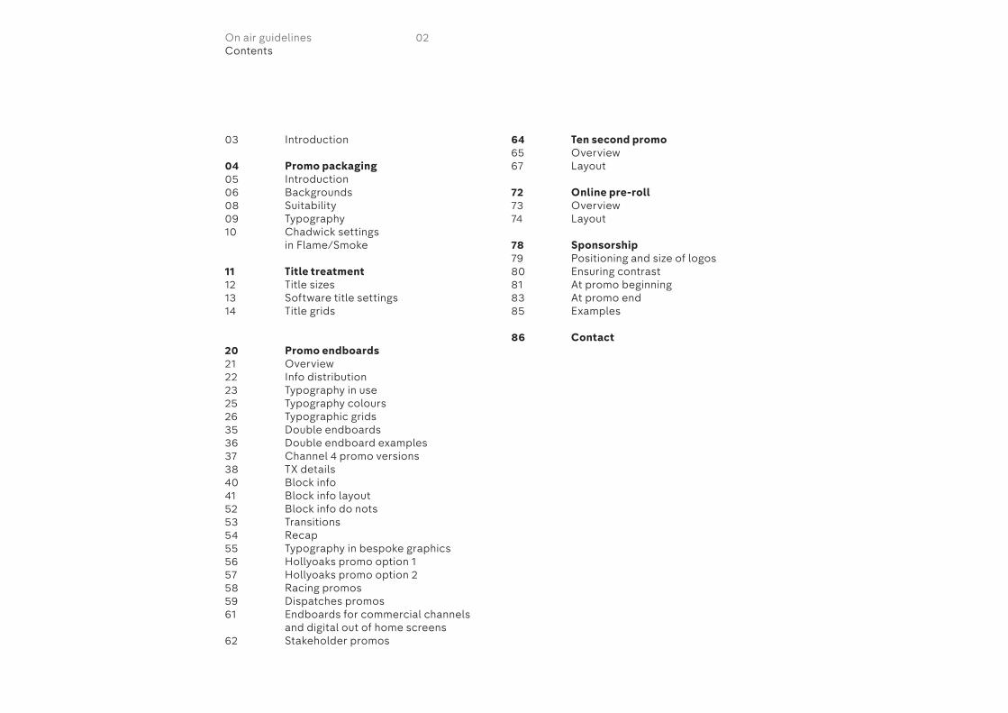
03 Introduction
04 Promo packaging05 Introduction06 Backgrounds08 Suitability09 Typography10 Chadwick settings
in Flame/Smoke
11 Title treatment12 Title sizes13 Software title settings14 Title grids
20 Promo endboards21 Overview22 Info distribution23 Typography in use25 Typography colours26 Typographic grids35 Double endboards36 Double endboard examples37 Channel 4 promo versions38 TX details40 Block info41 Block info layout52 Block info do nots53 Transitions54 Recap55 Typography in bespoke graphics56 Hollyoaks promo option 157 Hollyoaks promo option 258 Racing promos59 Dispatches promos61 Endboards for commercial channels
and digital out of home screens62 Stakeholder promos
64 Ten second promo65 Overview67 Layout
72 Online pre-roll73 Overview74 Layout
78 Sponsorship79 Positioning and size of logos80 Ensuring contrast81 At promo beginning83 At promo end85 Examples
86 Contact
02On air guidelinesContents
These guidelines outline the elements of the Channel 4 brand and include the rules you will need to create promos.
This guide should be used alongside the promo toolkit supplied.
03On air guidelinesIntroduction
Promo packaging General overview. Blocks, backgrounds & typefaces
04On air guidelines
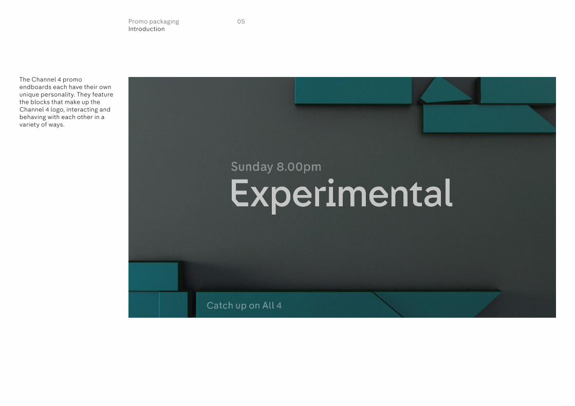
The Channel 4 promo endboards each have their own unique personality. They feature the blocks that make up the Channel 4 logo, interacting and behaving with each other in a variety of ways.
05Promo packagingIntroduction

There are ten backgrounds that should be used to create promo endboards. Each background has a different colour combination and the behaviour and amount of blocks vary throughout.
The numbers on this page correspond with each endboard in the tool kit.
1
4
7
10
8 9
5 6
2 3
06Promo packagingBackgrounds

The colour of the typography depends on whether the endboard has a dark or light background.
Light background endboards
Dark backgroundendboards
07Promo packagingBackgrounds
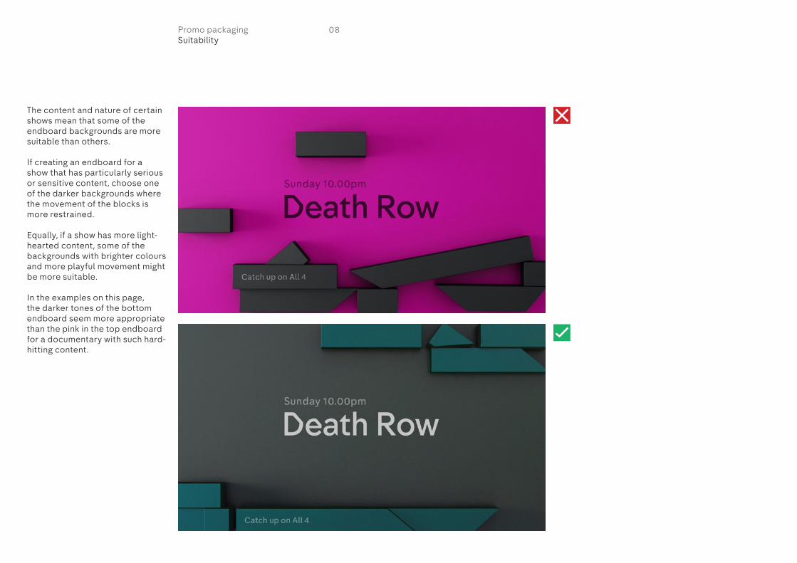
The content and nature of certain shows mean that some of the endboard backgrounds are more suitable than others.
If creating an endboard for a show that has particularly serious or sensitive content, choose one of the darker backgrounds where the movement of the blocks is more restrained.
Equally, if a show has more light-hearted content, some of the backgrounds with brighter colours and more playful movement might be more suitable.
In the examples on this page, the darker tones of the bottom endboard seem more appropriate than the pink in the top endboard for a documentary with such hard-hitting content.
08Promo packagingSuitability

The Channel 4 identity has two bespoke typefaces which should be used to create promos.
Do not manipulate the typefaces in any way. Do not stretch it, condense it or add drop shadows.
Do not use all caps at any point.
HorseferryHorseferry is used for programme titles. It should be used in the Medium weight.
KerningThe kerning for Horseferry varies depending on the size of the typography. Please refer to each promo grid page in this document for more information.
ChadwickChadwick is used for all other information such as TX details, sponsorship and other tags. It should be used in the Medium weight.
KerningThe kerning for Chadwick should not be adjusted unless otherwise specified in this guide.
09Promo packagingTypography
Horseferry Medium abcdefghijklmnopqrstuvwxyz01234567890!@£$%^&*()
Chadwick Medium abcdefghijklmnopqrstuvwxyz01234567890!@£$%^&*()
FIRST DATESFirst Dates

In order to ensure the Chadwick typeface renders correctly on screen, the rendering settings to the right should be used in Flame/Smoke.
This setting should be applied to Chadwick only, not Horseferry.
10Promo packagingChadwick settings in Flame/Smoke
Chadwick Medium abcdefghijklmnopqrstuvwxyzABCDEFGHIJKLMNOPQRSTUVWXYZ01234567890!@£$%^&*()
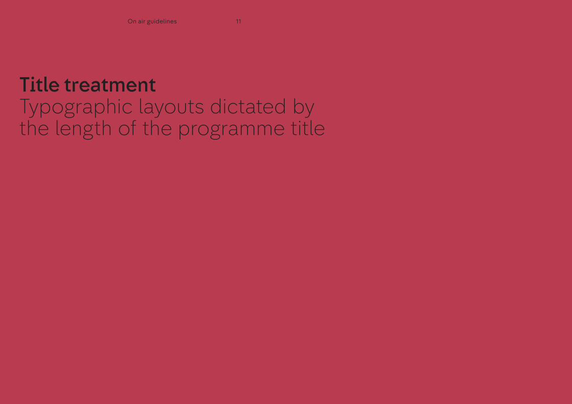
Title treatment Typographic layouts dictated by the length of the programme title
11On air guidelines

FontAll programme titles are set in Horseferry Medium.
Typography sizeThere are four different sizes of typography for programme titles, each one having its own corresponding grid(s) for layout. Generally speaking, the shorter the programme title, the bigger the typography.
KerningThe kerning varies for each typographic size.
Refer to the next page for typographic settings for each of the type sizes in various software.
Short titlesThis type size is used for short programme titles such as ‘Derek’ and ‘Frasier’. The cap height of the type should be equivalent to 160px.
Medium titlesThis type size is used for medium titles such as ‘Will & Grace’ and ‘Countdown’. The cap height of the type should be equivalent to 120px.
Long titlesThis type size is used for long length titles such as ‘The Big Bang Theory’ and ‘Come Dine With Me’. The cap height of the type should be equivalent to 80px.
Very long titlesThis type size is used for very long titles. The cap height of the type should be equivalent to 60px.
160px
120px
80px
60px
12Title treatmentTitle sizes
ShortXMediumXLongX
Very LongX
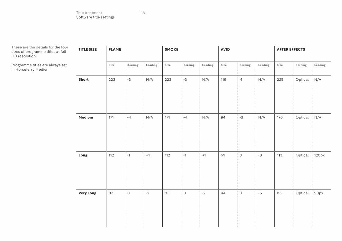
These are the details for the four sizes of programme titles at full HD resolution.
Programme titles are always set in Horseferry Medium.
13Title treatmentSoftware title settings
TITLE SIZE FLAME SMOKE AVID AFTER EFFECTS
Size Kerning Leading Size Kerning Leading Size Kerning Leading Size Kerning Leading
Short 223 -3 N/A 223 -3 N/A 119 -1 N/A 225 Optical N/A
Medium 171 -4 N/A 171 -4 N/A 94 -3 N/A 170 Optical N/A
Long 112 -1 +1 112 -1 +1 59 0 -8 113 Optical 120px
Very Long 83 0 -2 83 0 -2 44 0 -6 85 Optical 90px
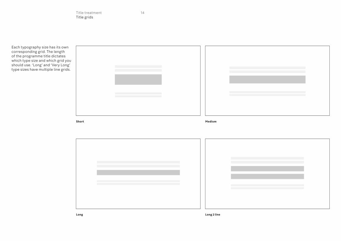
Each typography size has its own corresponding grid. The length of the programme title dictates which type size and which grid you should use. ‘Long’ and ‘Very Long’ type sizes have multiple line grids.
Short
Long Long 2 line
Medium
14Title treatmentTitle grids

Long 3 line
Very long 4 line
Very long 3 line
15Title treatmentTitle grids
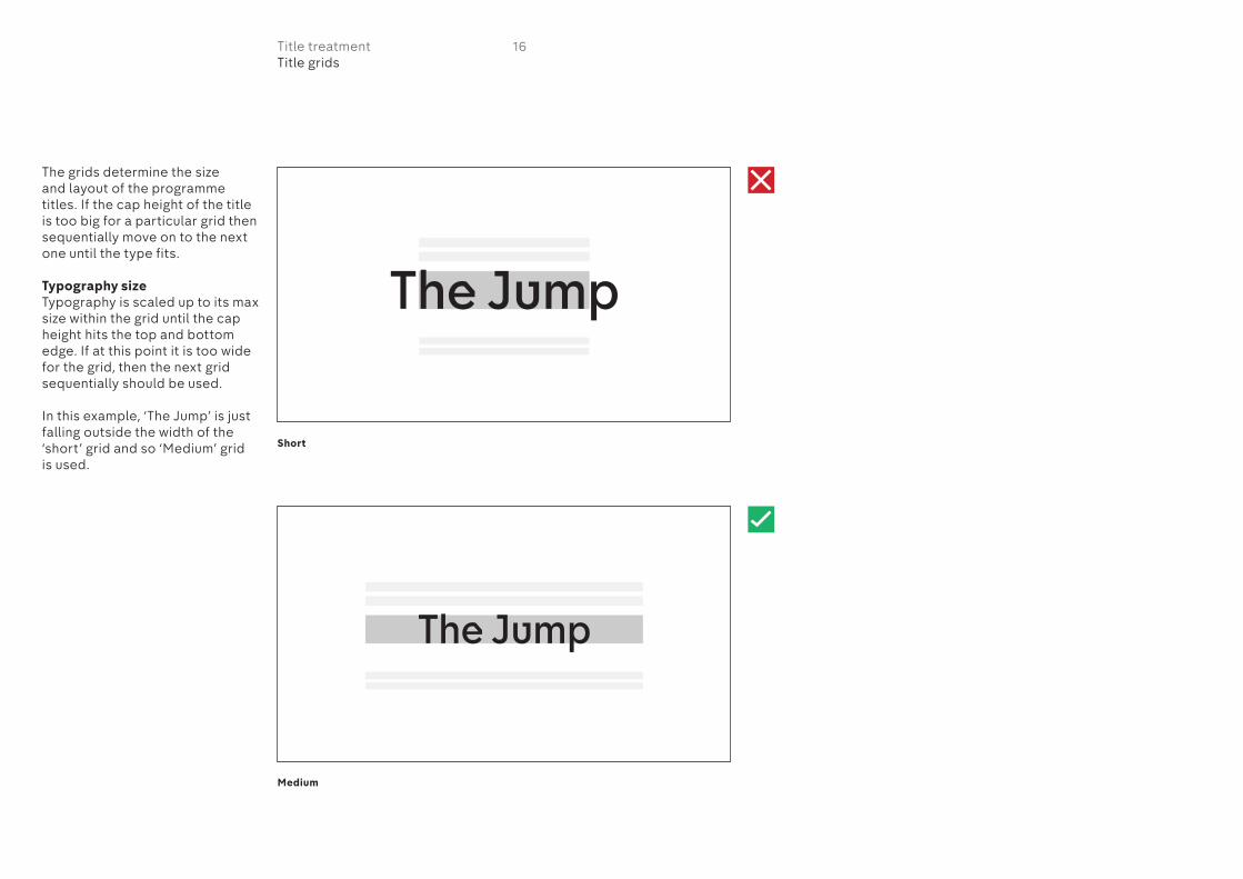
The grids determine the size and layout of the programme titles. If the cap height of the title is too big for a particular grid then sequentially move on to the next one until the type fits.
Typography sizeTypography is scaled up to its max size within the grid until the cap height hits the top and bottom edge. If at this point it is too wide for the grid, then the next grid sequentially should be used.
In this example, ‘The Jump’ is just falling outside the width of the ‘short’ grid and so ‘Medium’ grid is used.
Short
Medium
16Title treatmentTitle grids

In this example, ‘Jamie’s Super Food’ is falling outside the width of the ‘Medium’ grid and so the ‘long’ grid is used.
Medium
Long
17Title treatmentTitle grids
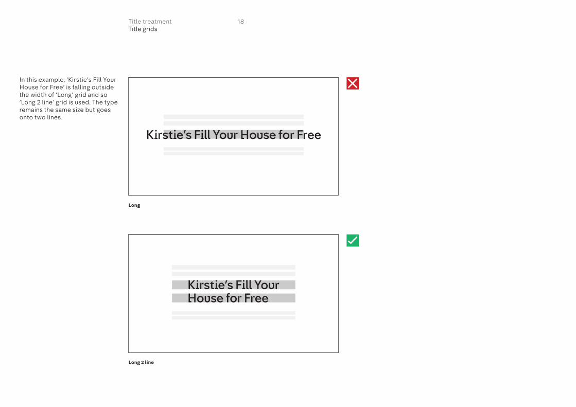
In this example, ‘Kirstie’s Fill Your House for Free’ is falling outside the width of ‘Long’ grid and so ‘Long 2 line’ grid is used. The type remains the same size but goes onto two lines.
18Title treatmentTitle grids
Long
Long 2 line
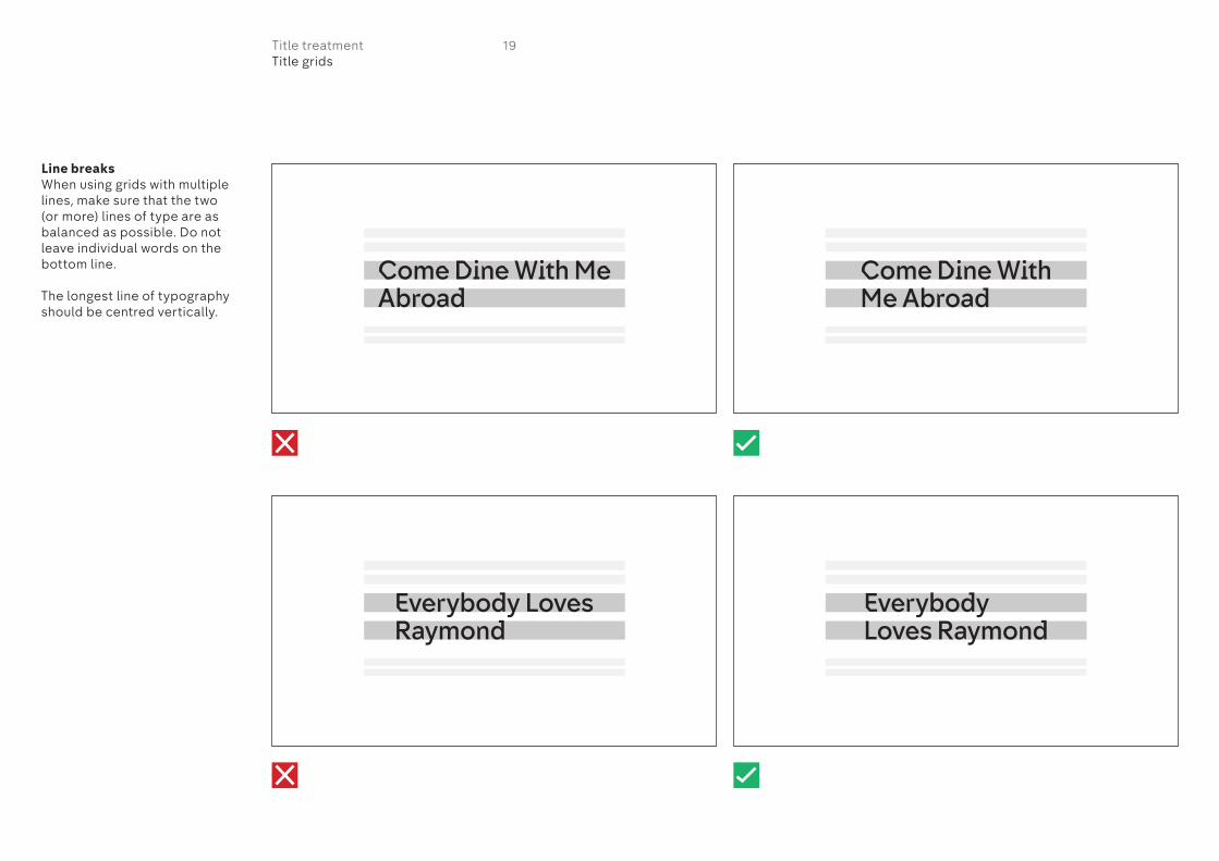
Line breaksWhen using grids with multiple lines, make sure that the two (or more) lines of type are as balanced as possible. Do not leave individual words on the bottom line.
The longest line of typography should be centred vertically.
19Title treatmentTitle grids

Promo endboards Combining backgrounds, typography and grids to create endboards
20On air guidelines
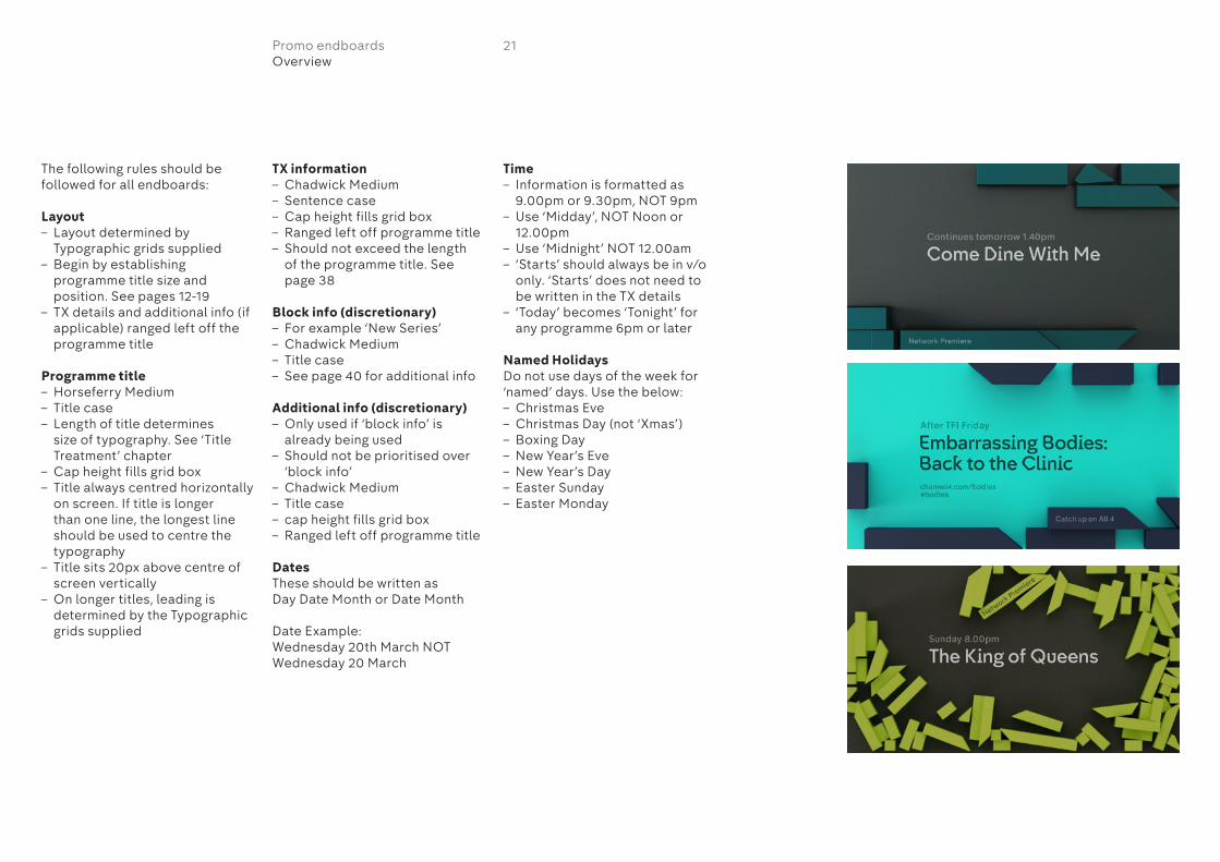
The following rules should be followed for all endboards:
Layout– Layout determined by
Typographic grids supplied– Begin by establishing
programme title size and position. See pages 12-19
– TX details and additional info (if applicable) ranged left off the programme title
Programme title– Horseferry Medium– Title case– Length of title determines
size of typography. See ‘Title Treatment’ chapter
– Cap height fills grid box– Title always centred horizontally
on screen. If title is longer than one line, the longest line should be used to centre the typography
– Title sits 20px above centre of screen vertically
– On longer titles, leading is determined by the Typographic grids supplied
TX information– Chadwick Medium– Sentence case– Cap height fills grid box– Ranged left off programme title– Should not exceed the length
of the programme title. See page 38
Block info (discretionary)– For example ‘New Series’– Chadwick Medium– Title case– See page 40 for additional info
Additional info (discretionary)– Only used if ‘block info’ is
already being used– Should not be prioritised over
‘block info’ – Chadwick Medium– Title case– cap height fills grid box– Ranged left off programme title
DatesThese should be written asDay Date Month or Date Month
Date Example:Wednesday 20th March NOTWednesday 20 March
Time– Information is formatted as
9.00pm or 9.30pm, NOT 9pm– Use ‘Midday’, NOT Noon or
12.00pm– Use ‘Midnight’ NOT 12.00am– ‘Starts’ should always be in v/o
only. ‘Starts’ does not need to be written in the TX details
– ‘Today’ becomes ‘Tonight’ for any programme 6pm or later
Named HolidaysDo not use days of the week for ‘named’ days. Use the below:– Christmas Eve– Christmas Day (not ‘Xmas’)– Boxing Day– New Year’s Eve– New Year’s Day– Easter Sunday– Easter Monday
21Promo endboardsOverview

The typographic grids for the promo endboards have specific areas for each type of information that should be used in the following order of priority.
Programme titleThis is used on every promo endboard.
TX details 1This is used on every promo endboard.
TX details 2 (discretionary)This is only used if the TX details are wider than the programme title. See page 38.
Block info (discretionary)This is used for further programme information such as ‘Catch up on All 4’, ‘Exclusive’ or ‘New Series’.
Each endboard has a predetermined block that the text should appear on. Do not use any other blocks for typography.
Additional info 1 (discretionary)This is only used if ‘block info’ is already being occupied.
Additional info 2 (discretionary)This is only used if ‘additional info 1’ is already being occupied.
22Promo endboardsInfo distribution

1
2
4
3
This is an example of a promo endboard with the typography in use.
1 Programme title Horseferry Medium
2 TX details Chadwick Medium
3 Block info Chadwick Medium
4 Additional info Chadwick Medium
Except for ‘block info’, the endboards have been designed so that the typography disappears under the blocks as they move around. It’s perfectly acceptable for the blocks to fleetingly overlap the typography as in the example below.
Care should be taken that not too much typography is obstructed by the blocks across the overall duration of the promo. More information can be found on the next page.
23Promo endboardsTypography in use

The typographic grids have been designed to accommodate all ranges of title lengths on each of the various endboards. However, there may be some extreme examples involving very long show titles where some of the typography becomes too obscured by the blocks.
If this is the case, use an alternative endboard where the movement of the blocks is more sympathetic to the typographic layout.
In these examples, both ‘additional info’ lines are being used but are too obscured by the blocks.
24Promo endboardsTypography in use
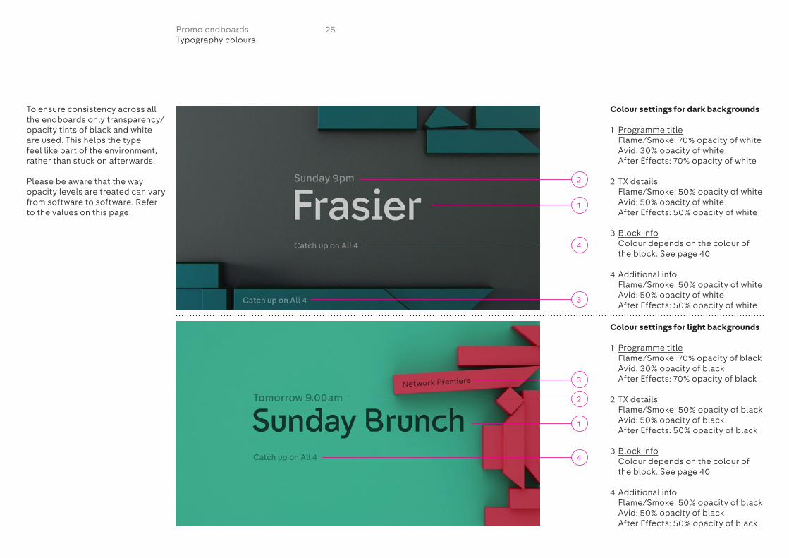
To ensure consistency across all the endboards only transparency/opacity tints of black and white are used. This helps the type feel like part of the environment, rather than stuck on afterwards.
Please be aware that the way opacity levels are treated can vary from software to software. Refer to the values on this page.
Colour settings for dark backgrounds
1 Programme title Flame/Smoke: 70% opacity of white Avid: 30% opacity of white After Effects: 70% opacity of white
2 TX details Flame/Smoke: 50% opacity of white Avid: 50% opacity of white After Effects: 50% opacity of white
3 Block info Colour depends on the colour of
the block. See page 40
4 Additional info Flame/Smoke: 50% opacity of white Avid: 50% opacity of white After Effects: 50% opacity of white
Colour settings for light backgrounds
1 Programme title Flame/Smoke: 70% opacity of black Avid: 30% opacity of black After Effects: 70% opacity of black
2 TX details Flame/Smoke: 50% opacity of black Avid: 50% opacity of black After Effects: 50% opacity of black
3 Block info Colour depends on the colour of
the block. See page 40
4 Additional info Flame/Smoke: 50% opacity of black Avid: 50% opacity of black After Effects: 50% opacity of black
1
4
1
2
3
4
2
3
25Promo endboardsTypography colours
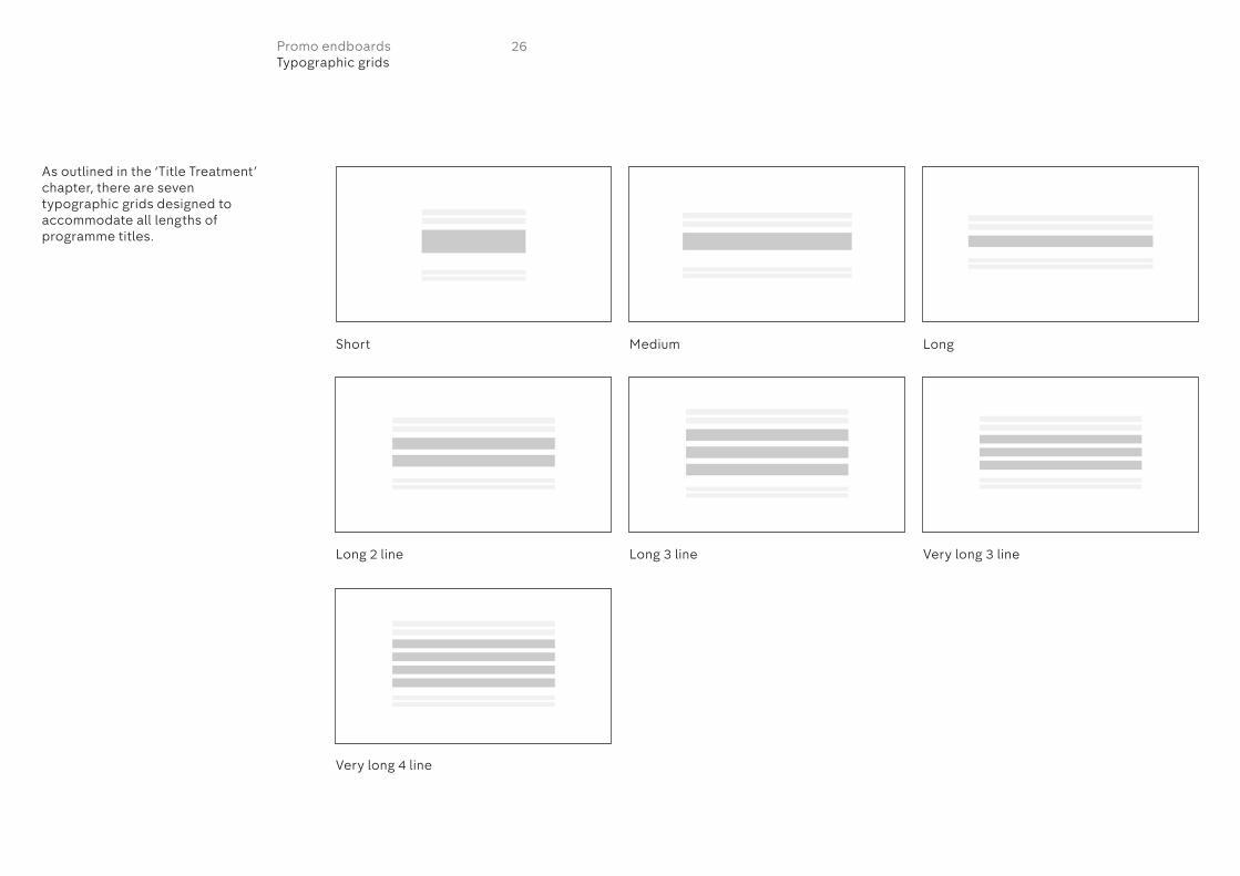
As outlined in the ‘Title Treatment’ chapter, there are seven typographic grids designed to accommodate all lengths of programme titles.
Short
Long 2 line
Very long 4 line
Long 3 line Very long 3 line
Medium Long
26Promo endboardsTypographic grids

Short
Long 2 line
Very long 4 line
Long 3 line Very long 3 line
Medium Long
This page shows all the grids in action.
27Promo endboardsTypographic grids

‘Short’ gridThis page shows the short grid in more detail.
– Programme titles are always centred horizontally within the frame.
– Programme titles are 20px above centre vertically.
– All other information such as the TX details are ranged left off the programme title.
– The cap height of all typography should fill its corresponding grid box.
– Block info positioning varies depending on the endboard. Refer to pages 41-52 for how to position the block typography.
All pixel dimensions are based on a 1920x1080 layout.
Always use tool kit supplied to create promo endboards.
Typography details in Flame/Smoke
TX detailsSize: 55Kerning: 0
Programme titleSize: 223Kerning: -3
Additional infoSize: 41Kerning: 0
Typography details in Avid
TX detailsSize: 30Kerning: 0
Programme titleSize: 119Kerning: -1
Additional infoSize: 22Kerning: 3
Typography details in After Effects
TX detailsSize: 55Kerning: 0
Programme titleSize: 225Kerning: ‘Optical’
Additional infoSize: 41Kerning: 0
28Promo endboardsTypographic grids

‘Medium’ gridThis page shows the medium grid in more detail.
– Programme titles are always centred horizontally within the frame.
– Programme titles are 20px above centre vertically.
– All other information such as the TX details are ranged left off the programme title.
– The cap height of all typography should fill its corresponding grid box.
– Block info positioning varies depending on the endboard. Refer to pages 41-52 for how to position the block typography.
All pixel dimensions are based on a 1920x1080 layout.
Always use tool kit supplied to create promo endboards.
Typography details in Flame/Smoke
TX detailsSize: 55Kerning: 0
Programme titleSize: 171Kerning: -4
Additional infoSize: 41Kerning: 0
Typography details in Avid
TX detailsSize: 30Kerning: 0
Programme titleSize: 94Kerning: -3
Additional infoSize: 22Kerning: 3
Typography details in After Effects
TX detailsSize: 55Kerning: 0
Programme titleSize: 170Kerning: ‘Optical’
Additional infoSize: 41Kerning: 0
29Promo endboardsTypographic grids

‘Long’ gridThis page shows the long grid in more detail.
– Programme titles are always centred horizontally within the frame.
– Programme titles are 20px above centre vertically.
– All other information such as the TX details are ranged left off the programme title.
– The cap height of all typography should fill its corresponding grid box.
– Block info positioning varies depending on the endboard. Refer to pages 41-52 for how to position the block typography.
All pixel dimensions are based on a 1920x1080 layout.
Always use tool kit supplied to create promo endboards.
Typography details in Flame/Smoke
TX detailsSize: 55Kerning: 0
Programme titleSize: 112Kerning: -1
Additional infoSize: 41Kerning: 0
Typography details in Avid
TX detailsSize: 30Kerning: 0
Programme titleSize: 59Kerning: 0
Additional infoSize: 22Kerning: 3
Typography details in After Effects
TX detailsSize: 55Kerning: 0
Programme titleSize: 113Kerning: ‘Optical’
Additional infoSize: 41Kerning: 0
30Promo endboardsTypographic grids
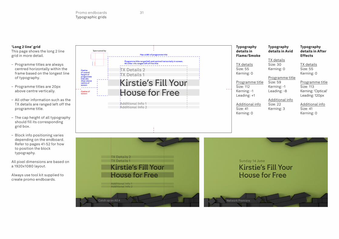
‘Long 2 line’ gridThis page shows the long 2 line grid in more detail.
– Programme titles are always centred horizontally within the frame based on the longest line of typography.
– Programme titles are 20px above centre vertically.
– All other information such as the TX details are ranged left off the programme title.
– The cap height of all typography should fill its corresponding grid box.
– Block info positioning varies depending on the endboard. Refer to pages 41-52 for how to position the block typography.
All pixel dimensions are based on a 1920x1080 layout.
Always use tool kit supplied to create promo endboards.
Typography details in Flame/Smoke
TX detailsSize: 55Kerning: 0
Programme titleSize: 112Kerning: -1Leading: +1
Additional infoSize: 41Kerning: 0
Typography details in Avid
TX detailsSize: 30Kerning: 0
Programme titleSize: 59Kerning: -1Leading: -8
Additional infoSize: 22Kerning: 3
Typography details in After Effects
TX detailsSize: 55Kerning: 0
Programme titleSize: 113Kerning: ‘Optical’Leading: 120px
Additional infoSize: 41Kerning: 0
31Promo endboardsTypographic grids
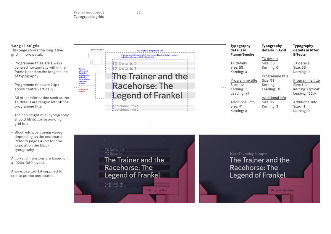
‘Long 3 line’ gridThis page shows the long 3 line grid in more detail.
– Programme titles are always centred horizontally within the frame based on the longest line of typography.
– Programme titles are 20px above centre vertically.
– All other information such as the TX details are ranged left off the programme title.
– The cap height of all typography should fill its corresponding grid box.
– Block info positioning varies depending on the endboard. Refer to pages 41-52 for how to position the block typography.
All pixel dimensions are based on a 1920x1080 layout.
Always use tool kit supplied to create promo endboards.
Typography details in Flame/Smoke
TX detailsSize: 55Kerning: 0
Programme titleSize: 112Kerning: -1Leading: +1
Additional infoSize: 41Kerning: 0
Typography details in Avid
TX detailsSize: 30Kerning: 0
Programme titleSize: 59Kerning: -1Leading: -8
Additional infoSize: 22Kerning: 3
Typography details in After Effects
TX detailsSize: 55Kerning: 0
Programme titleSize: 113Kerning: ‘Optical’Leading: 120px
Additional infoSize: 41Kerning: 0
32Promo endboardsTypographic grids
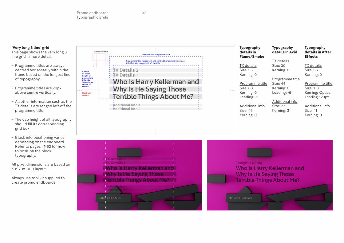
‘Very long 3 line’ gridThis page shows the very long 3 line grid in more detail.
– Programme titles are always centred horizontally within the frame based on the longest line of typography.
– Programme titles are 20px above centre vertically.
– All other information such as the TX details are ranged left off the programme title.
– The cap height of all typography should fill its corresponding grid box.
– Block info positioning varies depending on the endboard. Refer to pages 41-52 for how to position the block typography.
All pixel dimensions are based on a 1920x1080 layout.
Always use tool kit supplied to create promo endboards.
Typography details in Flame/Smoke
TX detailsSize: 55Kerning: 0
Programme titleSize: 83Kerning: 0Leading: -2
Additional infoSize: 41Kerning: 0
Typography details in Avid
TX detailsSize: 30Kerning: 0
Programme titleSize: 44Kerning: 0Leading: -6
Additional infoSize: 22Kerning: 3
Typography details in After Effects
TX detailsSize: 55Kerning: 0
Programme titleSize: 113Kerning: ‘Optical’Leading: 120px
Additional infoSize: 41Kerning: 0
33Promo endboardsTypographic grids

‘Very long 4 line’ gridThis page shows the very long 4 line grid in more detail.
– Programme titles are always centred horizontally within the frame based on the longest line of typography.
– Programme titles are 20px above centre vertically.
– All other information such as the TX details are ranged left off the programme title.
– The cap height of all typography should fill its corresponding grid box.
– Block info positioning varies depending on the endboard. Refer to pages 41-52 for how to position the block typography.
All pixel dimensions are based on a 1920x1080 layout.
Always use tool kit supplied to create promo endboards.
Typography details in Flame/Smoke
TX detailsSize: 55Kerning: 0
Programme titleSize: 83Kerning: 0Leading: -2
Additional infoSize: 41Kerning: 0
Typography details in Avid
TX detailsSize: 30Kerning: 0
Programme titleSize: 44Kerning: 0Leading: -6
Additional infoSize: 22Kerning: 3
Typography details in After Effects
TX detailsSize: 55Kerning: 0
Programme titleSize: 85Kerning: ‘Optical’Leading: 90px
Additional infoSize: 41Kerning: 0
34Promo endboardsTypographic grids
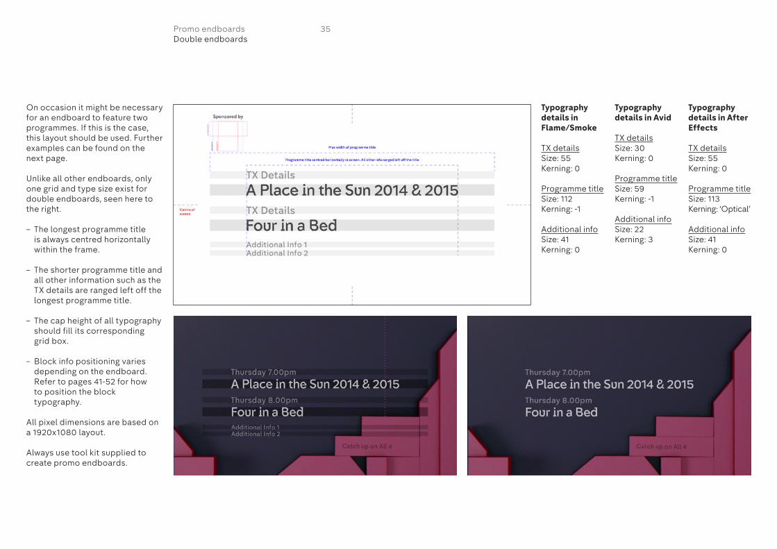
On occasion it might be necessary for an endboard to feature two programmes. If this is the case, this layout should be used. Further examples can be found on the next page.
Unlike all other endboards, only one grid and type size exist for double endboards, seen here to the right.
– The longest programme title is always centred horizontally within the frame.
– The shorter programme title and all other information such as the TX details are ranged left off the longest programme title.
– The cap height of all typography should fill its corresponding grid box.
– Block info positioning varies depending on the endboard. Refer to pages 41-52 for how to position the block typography.
All pixel dimensions are based on a 1920x1080 layout.
Always use tool kit supplied to create promo endboards.
Typography details in Flame/Smoke
TX detailsSize: 55Kerning: 0
Programme titleSize: 112Kerning: -1
Additional infoSize: 41Kerning: 0
Typography details in Avid
TX detailsSize: 30Kerning: 0
Programme titleSize: 59Kerning: -1
Additional infoSize: 22Kerning: 3
Typography details in After Effects
TX detailsSize: 55Kerning: 0
Programme titleSize: 113Kerning: ‘Optical’
Additional infoSize: 41Kerning: 0
35Promo endboardsDouble endboards

This page shows further examples of double endboards.
36Promo endboardsDouble endboard examples

There are various types of information that can appear in the ‘TX details’ section of the promo endboards. These are known as ‘versions’ and are categorised as follows:
A Day e.g Saturday at 9.00pmB Tomorrow e.g Tomorrow at
9.00pmC Tonight e.g Tonight at 9.00pmD Next e.g Next Saturday at
9.00pmE Date e.g Saturday 26th
SeptemberF After the Break e.g After the
BreakI Generic e.g All This Week/
WeekdaysJ After e.g. After Grand DesignsM Coming Soon e.g Coming Soon
DatesThese should be written asDay Date Month or Date Month
Date Example:Wednesday 20th March NOTWednesday 20 March
Time– Information is formatted as
9.00pm or 9.30pm, NOT 9pm– Use ‘Midday’, NOT Noon or
12.00pm– Use ‘Midnight’ NOT 12.00am– ‘Starts’ should always be in v/o
only. ‘Starts’ does not need to be written in the TX details
– ‘Today’ becomes ‘Tonight’ for any programme 6pm or later
A
D
I J M
E F
B C
37Promo endboardsChannel 4 promo versions
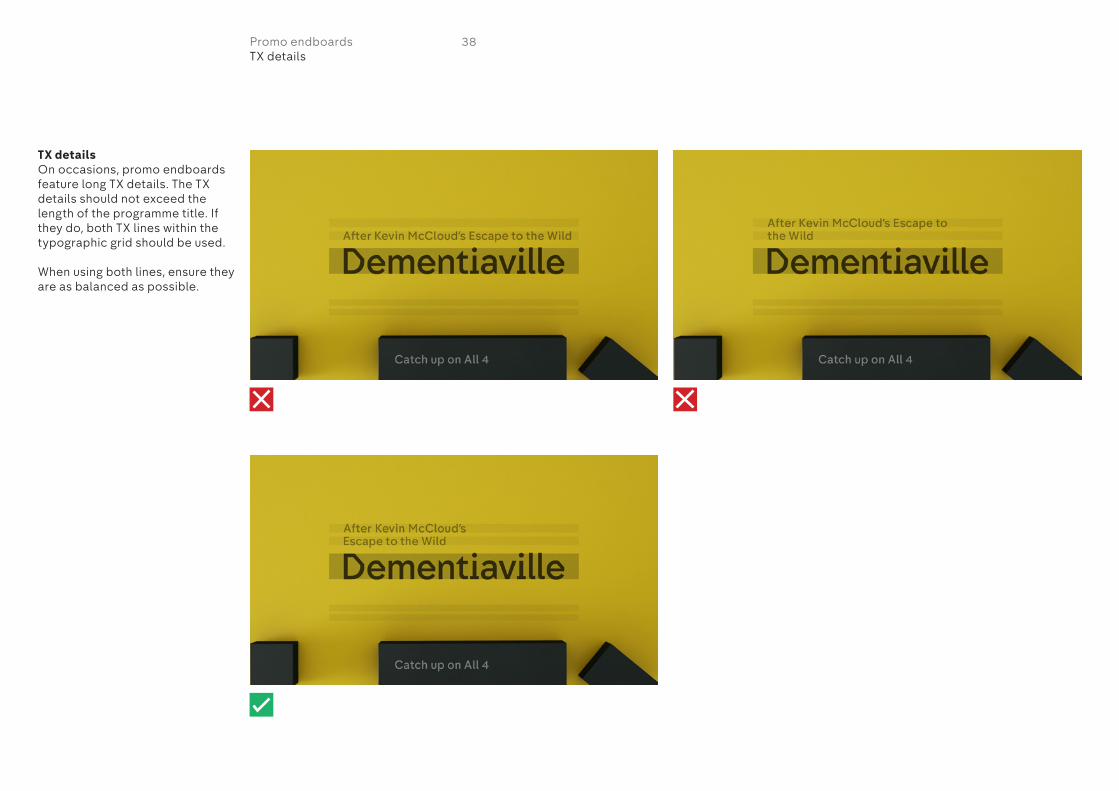
TX detailsOn occasions, promo endboards feature long TX details. The TX details should not exceed the length of the programme title. If they do, both TX lines within the typographic grid should be used.
When using both lines, ensure they are as balanced as possible.
38Promo endboardsTX details
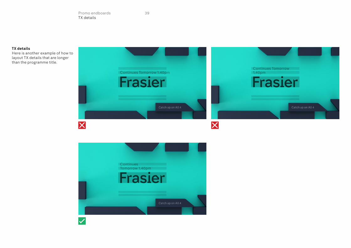
TX detailsHere is another example of how to layout TX details that are longer than the programme title.
39Promo endboardsTX details

Block infoEach promo endboard has been designed to carry information in one of the moving blocks.
These specific blocks are pre-determined and should not be changed however the information contained within them can change.
The blocks should contain the third tier of information after the programme title and TX details.
The exception to this rule is hashtags. They should always be placed in the ‘additional info’ area. See page 22. Also, the use of URLs need to be approved.
The following messages can be used for ‘block info’:– Catch up on All 4– Network Premiere– News Series– New Drama– First Look on E4 at 7pm– Exclusive– Live Event– Premiere– Seasons e.g Prison Season
TypefaceChadwick Medium, title case
Colour The colour of the block info changes depending on the block it appears on.
The below are the settings in Flame/Smoke:
1 70% transparency of white2 60% transparency of white3 70% transparency of white4 60% transparency of white5 45% transparency of black6 40% transparency of black7 50% transparency of black8 40% transparency of black9 70% transparency of white10 50% transparency of black
The below are the settings in After Effects:
1 30% transparency of white2 40% transparency of white3 30% transparency of white4 40% transparency of white5 55% transparency of black6 60% transparency of black7 50% transparency of black8 60% transparency of black9 30% transparency of white10 50% transparency of black
The ‘block info’ is pre-rendered for Avid.
1
4
7
10
2
5
8
3
6
9
40Promo endboardsBlock info

Block info layout 1Always use tool kit supplied to create promo endboards.
TypefaceChadwick Medium, title case
ColourFlame/Smoke: 70% transparency of whiteAfter Effects: 30% transparency of white
Layout – Cap height fills grid box– Typography ranged left in grid
box– Gap around cap height equal all
the way around (A)– Typography should not exceed
length of grid box– Do not alter the size of the
typography. Typography should remain the specified size no matter what the message
All pixel dimensions are based on a 1920x1080 layout.
41Promo endboardsBlock info layout
40pxA
A
A

Block info layout 2Always use tool kit supplied to create promo endboards.
TypefaceChadwick Medium, title case
Colour Flame/Smoke: 60% transparency of whiteAfter Effects: 40% transparency of white
Layout – Cap height fills grid box– Typography ranged left in grid
box– Gap around cap height equal all
the way around (A)– Typography should not exceed
length of grid box– Do not alter the size of the
typography. Typography should remain the specified size no matter what the message
All pixel dimensions are based on a 1920x1080 layout.
42Promo endboardsBlock info layout
A
AA
30px
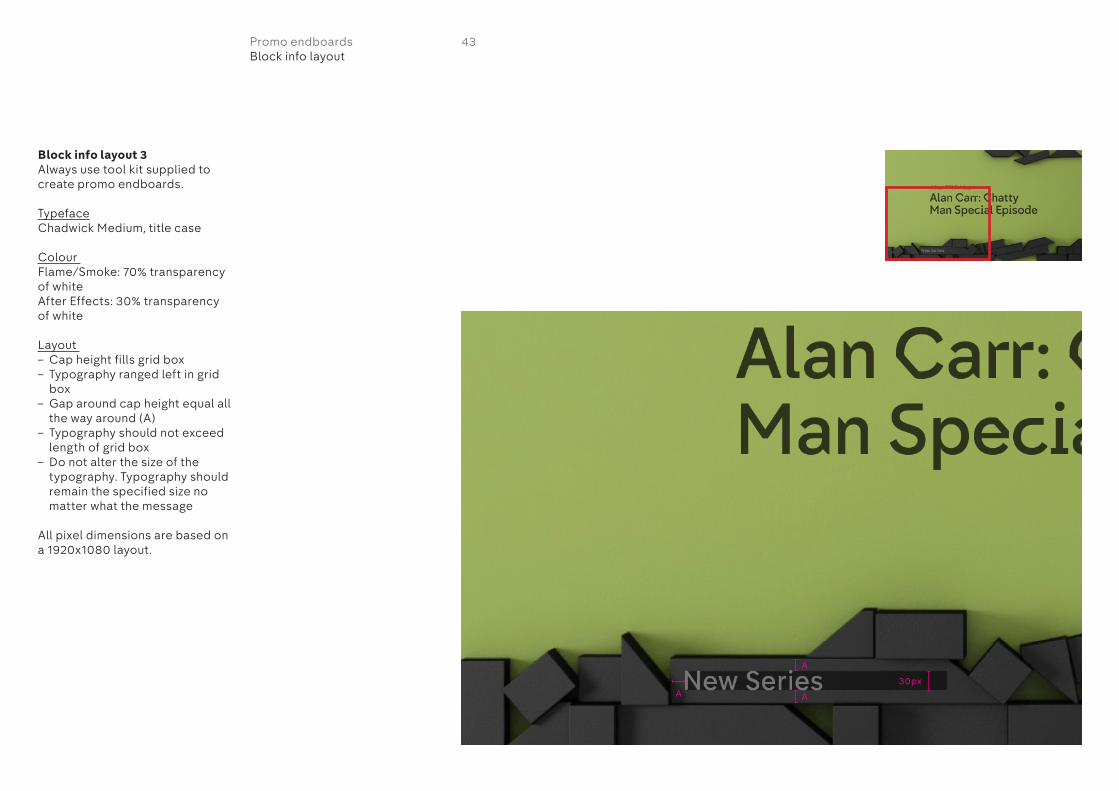
Block info layout 3Always use tool kit supplied to create promo endboards.
TypefaceChadwick Medium, title case
Colour Flame/Smoke: 70% transparency of whiteAfter Effects: 30% transparency of white
Layout – Cap height fills grid box– Typography ranged left in grid
box– Gap around cap height equal all
the way around (A)– Typography should not exceed
length of grid box– Do not alter the size of the
typography. Typography should remain the specified size no matter what the message
All pixel dimensions are based on a 1920x1080 layout.
A
AA30px
43Promo endboardsBlock info layout
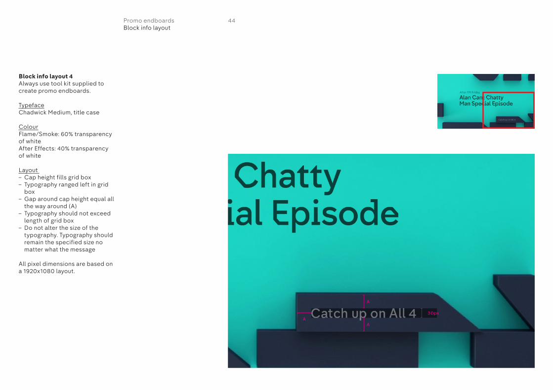
Block info layout 4Always use tool kit supplied to create promo endboards.
TypefaceChadwick Medium, title case
ColourFlame/Smoke: 60% transparency of whiteAfter Effects: 40% transparency of white
Layout – Cap height fills grid box– Typography ranged left in grid
box– Gap around cap height equal all
the way around (A)– Typography should not exceed
length of grid box– Do not alter the size of the
typography. Typography should remain the specified size no matter what the message
All pixel dimensions are based on a 1920x1080 layout.
A
A
30pxA
44Promo endboardsBlock info layout
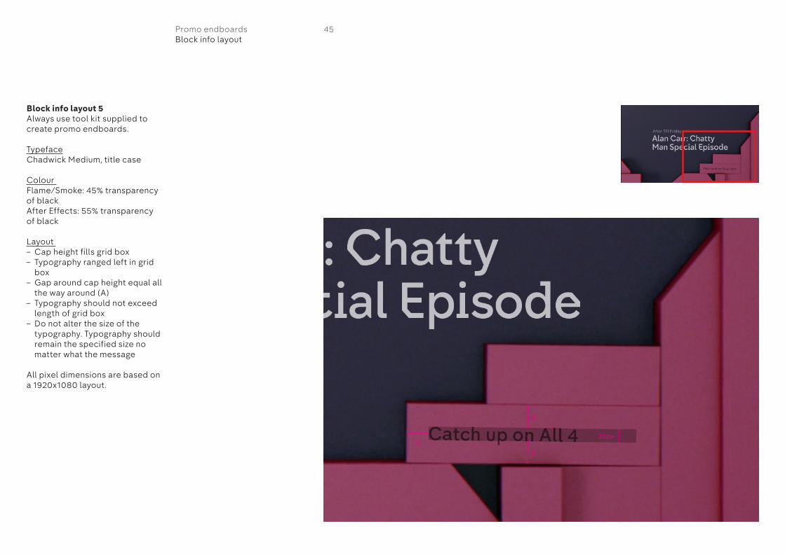
Block info layout 5Always use tool kit supplied to create promo endboards.
TypefaceChadwick Medium, title case
Colour Flame/Smoke: 45% transparency of blackAfter Effects: 55% transparency of black
Layout – Cap height fills grid box– Typography ranged left in grid
box– Gap around cap height equal all
the way around (A)– Typography should not exceed
length of grid box– Do not alter the size of the
typography. Typography should remain the specified size no matter what the message
All pixel dimensions are based on a 1920x1080 layout.
45Promo endboardsBlock info layout
A
A
A30px
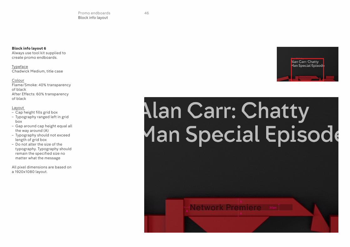
Block info layout 6Always use tool kit supplied to create promo endboards.
TypefaceChadwick Medium, title case
ColourFlame/Smoke: 40% transparency of blackAfter Effects: 60% transparency of black
Layout – Cap height fills grid box– Typography ranged left in grid
box– Gap around cap height equal all
the way around (A)– Typography should not exceed
length of grid box– Do not alter the size of the
typography. Typography should remain the specified size no matter what the message
All pixel dimensions are based on a 1920x1080 layout.
46Promo endboardsBlock info layout
30pxA
A
A
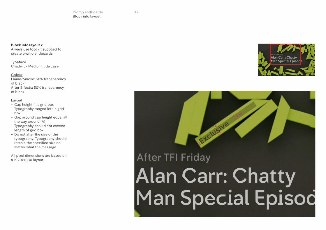
Block info layout 7Always use tool kit supplied to create promo endboards.
TypefaceChadwick Medium, title case
ColourFlame/Smoke: 50% transparency of blackAfter Effects: 50% transparency of black
Layout – Cap height fills grid box– Typography ranged left in grid
box– Gap around cap height equal all
the way around (A)– Typography should not exceed
length of grid box– Do not alter the size of the
typography. Typography should remain the specified size no matter what the message
All pixel dimensions are based on a 1920x1080 layout.
A
A
A
30px
47Promo endboardsBlock info layout
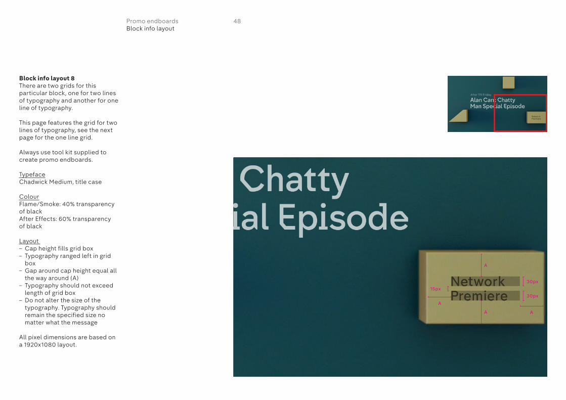
Block info layout 8There are two grids for this particular block, one for two lines of typography and another for one line of typography.
This page features the grid for two lines of typography, see the next page for the one line grid.
Always use tool kit supplied to create promo endboards.
TypefaceChadwick Medium, title case
ColourFlame/Smoke: 40% transparency of blackAfter Effects: 60% transparency of black
Layout – Cap height fills grid box– Typography ranged left in grid
box– Gap around cap height equal all
the way around (A)– Typography should not exceed
length of grid box– Do not alter the size of the
typography. Typography should remain the specified size no matter what the message
All pixel dimensions are based on a 1920x1080 layout.
A
A
A
A
30px
30px
15px
48Promo endboardsBlock info layout
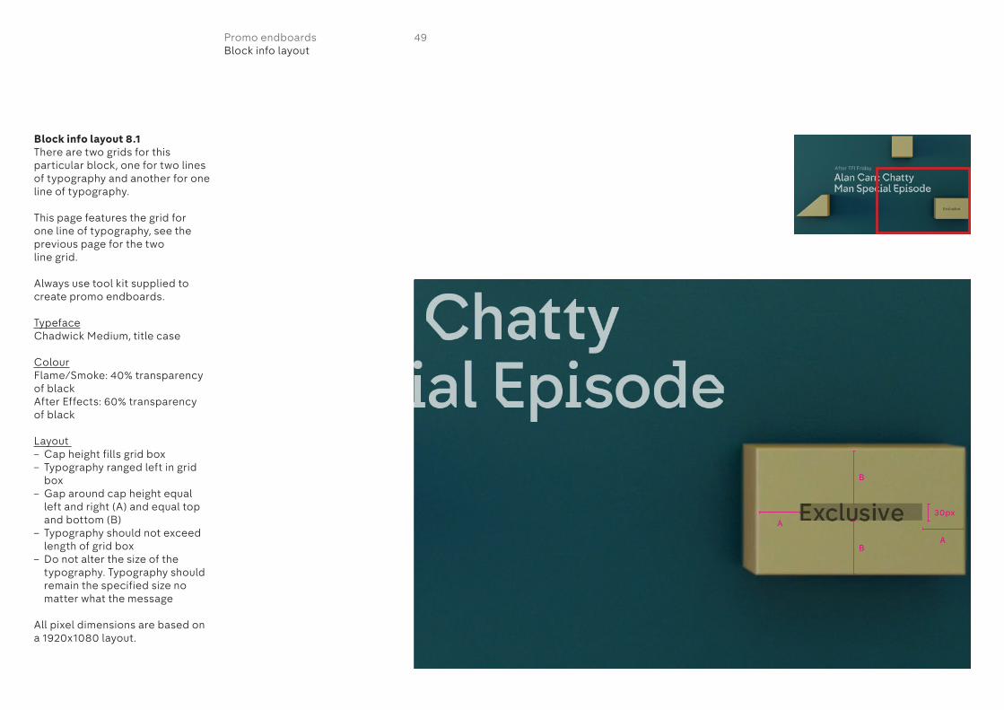
Block info layout 8.1There are two grids for this particular block, one for two lines of typography and another for one line of typography.
This page features the grid for one line of typography, see the previous page for the two line grid.
Always use tool kit supplied to create promo endboards.
TypefaceChadwick Medium, title case
ColourFlame/Smoke: 40% transparency of blackAfter Effects: 60% transparency of black
Layout – Cap height fills grid box– Typography ranged left in grid
box– Gap around cap height equal
left and right (A) and equal top and bottom (B)
– Typography should not exceed length of grid box
– Do not alter the size of the typography. Typography should remain the specified size no matter what the message
All pixel dimensions are based on a 1920x1080 layout.
B
B
A
A
30px
49Promo endboardsBlock info layout
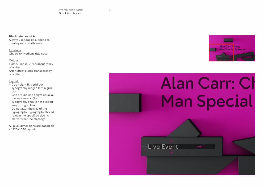
Block info layout 9Always use tool kit supplied to create promo endboards.
TypefaceChadwick Medium, title case
ColourFlame/Smoke: 70% transparency of whiteAfter Effects: 30% transparency of white
Layout – Cap height fills grid box– Typography ranged left in grid
box– Gap around cap height equal all
the way around (A)– Typography should not exceed
length of grid box– Do not alter the size of the
typography. Typography should remain the specified size no matter what the message
All pixel dimensions are based on a 1920x1080 layout.
50Promo endboardsBlock info layout
A
A
A30px
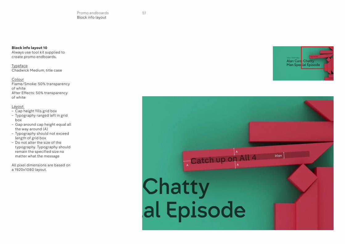
Block info layout 10Always use tool kit supplied to create promo endboards.
TypefaceChadwick Medium, title case
ColourFlame/Smoke: 50% transparency of whiteAfter Effects: 50% transparency of white
Layout – Cap height fills grid box– Typography ranged left in grid
box– Gap around cap height equal all
the way around (A)– Typography should not exceed
length of grid box– Do not alter the size of the
typography. Typography should remain the specified size no matter what the message
All pixel dimensions are based on a 1920x1080 layout.
51Promo endboardsBlock info layout
A
AA
30px
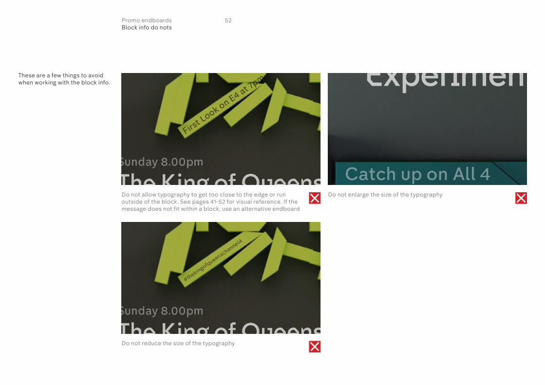
These are a few things to avoid when working with the block info.
Do not allow typography to get too close to the edge or run outside of the block. See pages 41-52 for visual reference. If the message does not fit within a block, use an alternative endboard
Do not reduce the size of the typography
Do not enlarge the size of the typography
52Promo endboardsBlock info do nots
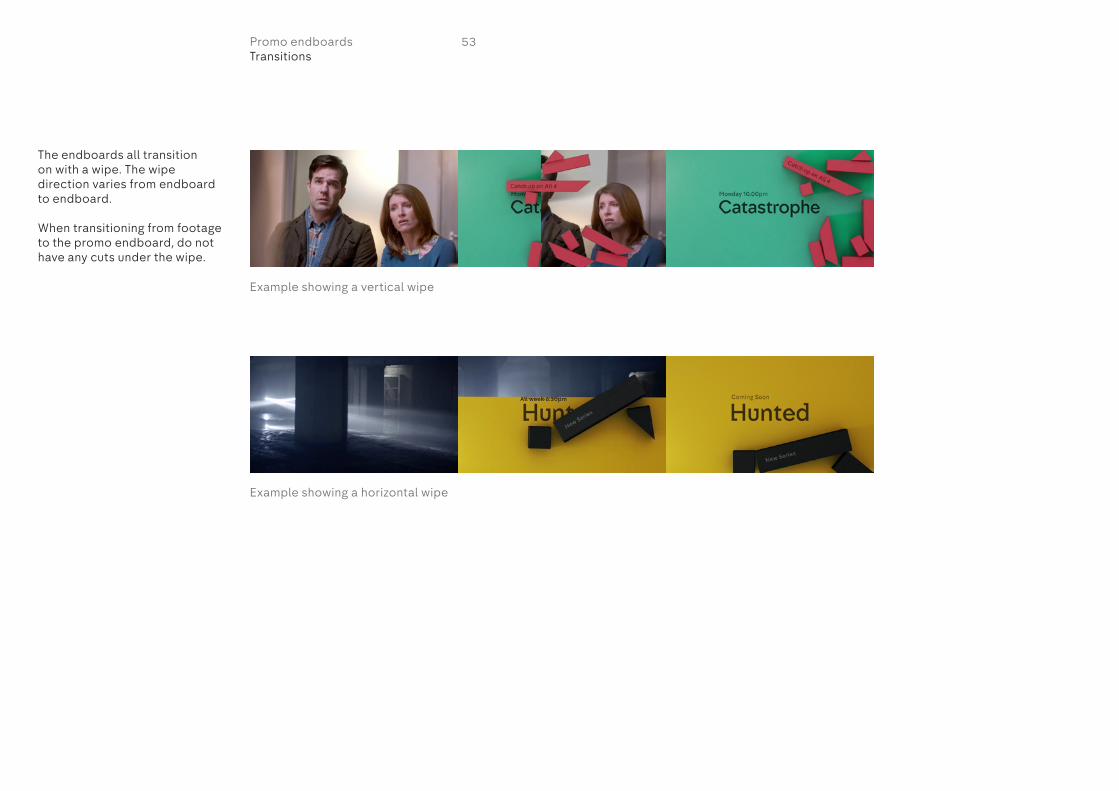
The endboards all transition on with a wipe. The wipe direction varies from endboard to endboard.
When transitioning from footage to the promo endboard, do not have any cuts under the wipe.
All week 6.30pm
Example showing a vertical wipe
Example showing a horizontal wipe
53Promo endboardsTransitions
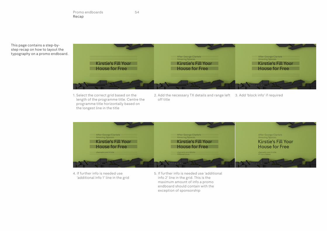
This page contains a step-by-step recap on how to layout the typography on a promo endboard.
1. Select the correct grid based on the length of the programme title. Centre the programme title horizontally based on the longest line in the title
4. If further info is needed use ‘additional info 1’ line in the grid
5. If further info is needed use ‘additional info 2’ line in the grid. This is the maximum amount of info a promo endboard should contain with the exception of sponsorship
2. Add the necessary TX details and range left off title
3. Add ‘block info’ if required
54Promo endboardsRecap

If creating some bespoke graphics within a promo, do not manipulate the typefaces in any way. Do not stretch it, condense it or add drop shadows.
Do not use use all caps at any point.
Do not set typography in upper case
Do not squeeze, stretch or manipulate the typography in any way
Do not add any effects to the typography
55Promo endboardsTypography in bespoke graphics
FIRST DATES First Dates

There are two options for the hollyoaks promo. Either of which can be used depending on the footage used and nature of the edit.
This page shows option 1.
‘Hollyoaks’ is placed over the footage in solid white typography. The layout for this is dictated by the endboard grids.
The endboard pictured (10) should be used for all Hollyoaks promos. The typographic principles should be the same as all other promo endboards.
Promo begins with ‘Hollyoaks’ placed over the footage
Typography cuts away with the first cut in the footage
Footage continues Promo ends in the usual fashion with blocks appearing over footage
Endboard appears via a wipe Typography should follow the endboard principles
All week 6.30pm
This week
56Promo endboardsHollyoaks promo option 1

This week
Promo begins with a variant of one of the endboards. Typography should follow the endboard principles
Footage is revealed by an upwards wipe
Footage continues Footage continues
Promo ends in the usual fashion with blocks appearing over footage
Endboard appears via a wipe Typography should follow the endboard principles
All week 6.30pm
There are two options for the hollyoaks promo. Either of which can be used depending on the footage used and nature of the edit.
This page shows option 2.
The promo opens with a variant of one of the endboards. The layout for this is dictated by the endboard grids.
The endboard pictured (10) should be used for all Hollyoaks promos. The typographic principles should be the same as all other promo endboards.
57Promo endboardsHollyoaks promo option 2
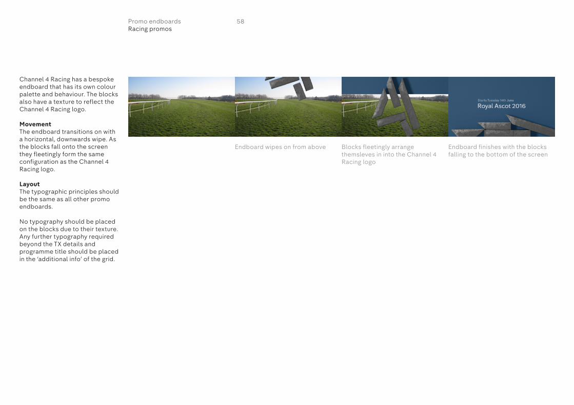
This week
Endboard wipes on from above Blocks fleetingly arrange themsleves in into the Channel 4 Racing logo
Endboard finishes with the blocks falling to the bottom of the screen
Channel 4 Racing has a bespoke endboard that has its own colour palette and behaviour. The blocks also have a texture to reflect the Channel 4 Racing logo.
MovementThe endboard transitions on with a horizontal, downwards wipe. As the blocks fall onto the screen they fleetingly form the same configuration as the Channel 4 Racing logo.
LayoutThe typographic principles should be the same as all other promo endboards.
No typography should be placed on the blocks due to their texture. Any further typography required beyond the TX details and programme title should be placed in the ‘additional info’ of the grid.
58Promo endboardsRacing promos

Dispatches has a bespoke endboard that has its own colour palette and behaviour. There are two blocks that slide onto the screen that come together to form the Dispatches logo.
59Promo endboardsDispatches promos

The layout and typographic principles for Dispatches promos should be the same as all other promo endboards. Refer to the guidance set out within this document.
The exception to this rule is that due to the blocks carrying the Dispatches logo, they should not be used to carry typography in the way other endboards do. Any other information such as URLs or hashtags should be places in the ‘additional info’ area of the grids.
For Dispatches programme packaging please refer to the Channel 4 Dispatches on air style guide.
MovementOnly two blocks are used each one carrying half of the Dispatches logo. The blocks appear on screen from the left closely followed by the endboard background which wipes on from the left. The blocks slowly come to rest, forming the Dispatches logo.
Blocks appear on screen Endboard wipes on from left to right
Blocks slowly come to rest forming the Disptaches logo
60Promo endboardsDispatches promos

When creating a promo endboard for a commercial channel or digital out of home screen, the words ‘On Channel 4’ need to feature.
There are two options for layouts as seen on the right. ‘On Channel 4’ can either go in ‘block info’ or ‘additional info 1’. All the same endboard layout and typographic principles apply.
Option 1
Option 2
61Promo endboardsEndboards for commercial channels and digital out of home screens
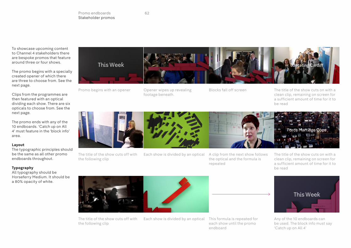
To showcase upcoming content to Channel 4 stakeholders there are bespoke promos that feature around three or four shows.
The promo begins with a specially created opener of which there are three to choose from. See the next page.
Clips from the programmes are then featured with an optical dividing each show. There are six opticals to choose from. See the next page.
The promo ends with any of the 10 endboards. ‘Catch up on All 4’ must feature in the ‘block info’ area.
LayoutThe typographic principles should be the same as all other promo endboards throughout.
TypographyAll typography should be Horseferry Medium. It should be a 80% opacity of white.
Opener wipes up revealing footage beneath.
Promo begins with an opener Blocks fall off screen The title of the show cuts on with a clean clip, remaining on screen for a sufficient amount of time for it to be read
The title of the show cuts on with a clean clip, remaining on screen for a sufficient amount of time for it to be read
Each show is divided by an optical
Each show is divided by an optical This formula is repeated for each show until the promo endboard
Any of the 10 endboards can be used. The block info must say ‘Catch up on All 4’
The title of the show cuts off with the following clip
The title of the show cuts off with the following clip
A clip from the next show follows the optical and the formula is repeated
62Promo endboardsStakeholder promos

This page shows the variants of openers for the stakeholder promos as well as the six opticals that can be used to divide shows.
Promo openers
Opticals
63Promo endboardsStakeholder promos

Ten second promo
64On air guidelines

The ten second promo has a different execution to the promo endboards.
MovementWhite blocks fall on to the screen carrying the programme title and TX details. This can come on at any time, but no later than 6 seconds.
As an option the promo can open with a programme title which cuts off with a clip change after a minimum of three seconds.
LayoutBeginningRefer to pages 11-19 for how to lay out the typography at the beginning of the promo.
The typography should either be solid black or white depending on what gives the best contrast to the footage.
EndRefer to the following pages in this chapter for how the typography works on the blocks.
Promo begins with optional programme title placed over the footage
Programme title stays on screen for a minimum of three seconds and cuts off with a clip change
Footage continues Promo ends with white blocks falling onto the screen
Blocks carry programme title and TX details
65Ten second promoOverview
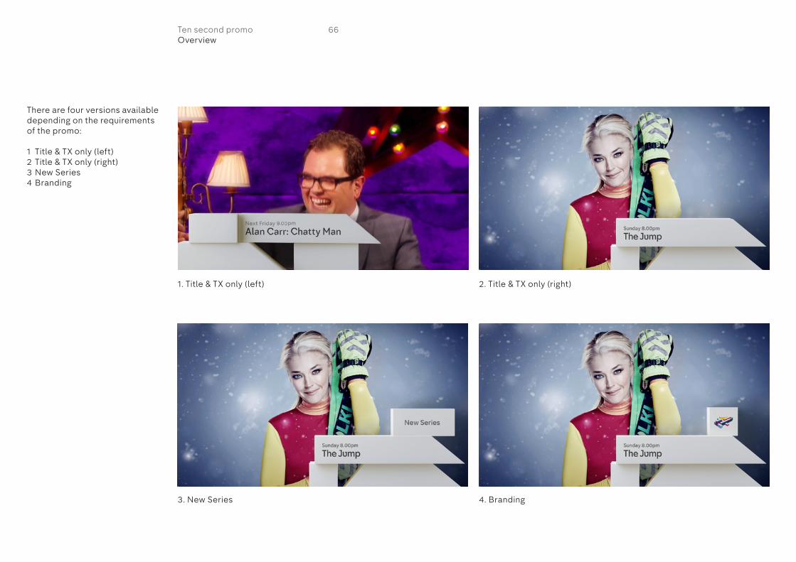
There are four versions available depending on the requirements of the promo:
1 Title & TX only (left)2 Title & TX only (right)3 New Series4 Branding
1. Title & TX only (left)
3. New Series
2. Title & TX only (right)
4. Branding
66Ten second promoOverview
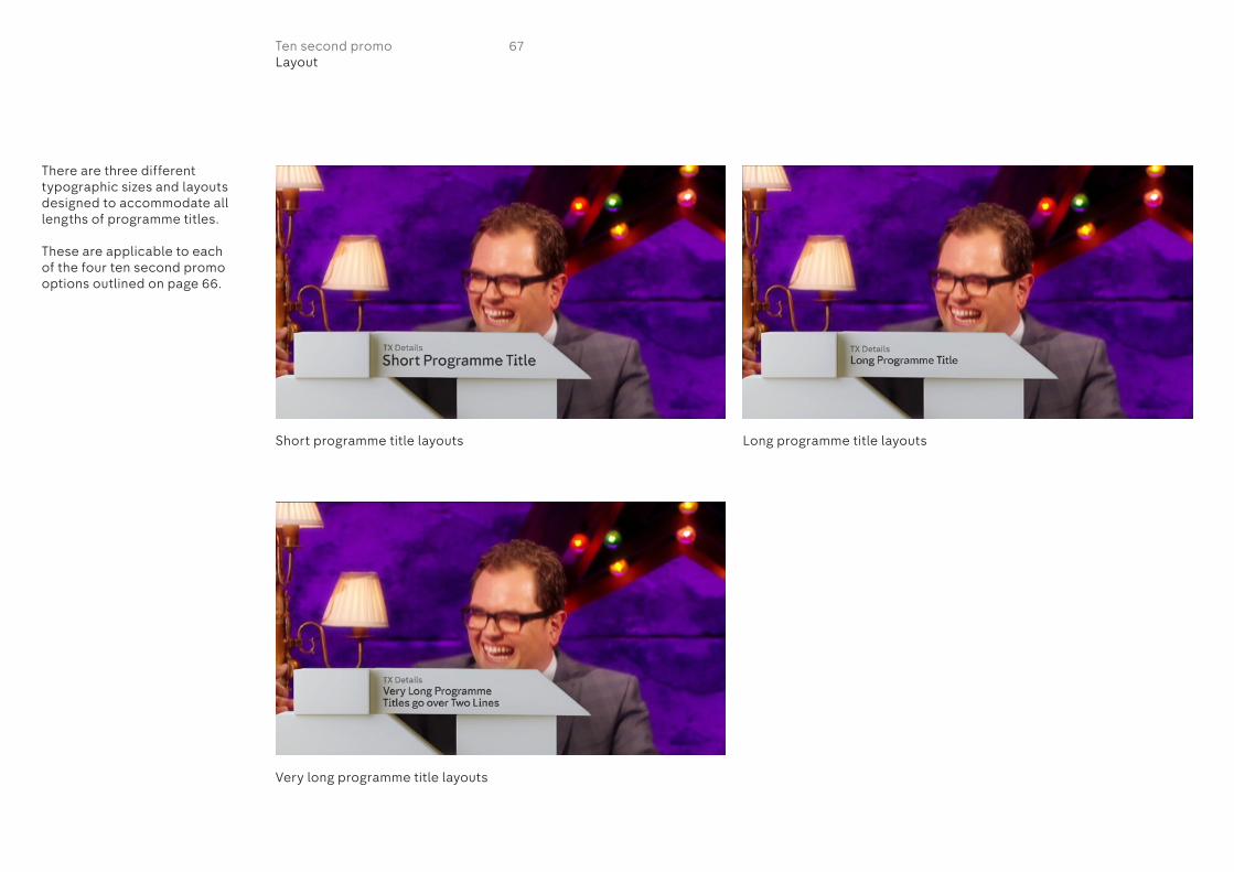
There are three different typographic sizes and layouts designed to accommodate all lengths of programme titles.
These are applicable to each of the four ten second promo options outlined on page 66.
Short programme title layouts
Very long programme title layouts
Long programme title layouts
67Ten second promoLayout

Short programme titleThis layout should be used for short programme titles. If the title is too long, use the ‘Long programme title’ layout.
Typography– Title: Horseferry Medium– TX details: Chadwick Medium
Colour– Title: 75% transparency
of black– TX details: 55% transparency
of black
LayoutThe typography has tracking data applied to it and so move with the block. As it is in a 3D space, it isn’t possible to specify an exact text size but the following pixel dimensions should be followed.
TX details: 26px cap heightTitle: 45px cap height
– All typography is ranged left and placed 50px from the left hand edge of the block
– All typography is centred vertically within the block so the gaps above and below are equal
– The gap between the two lines of typography is 17px
68Ten second promoLayout
Typography is ranged left and placed 50px from the left hand edge of the block
Typography is ranged left and placed 50px from the left hand
edge of the block
Typography is centred vertically within the block so the gaps above and below are equal
Typography is centred vertically within the block so the gaps above and below are equal
Programme title should not go beyond this point
Programme title should not go beyond this point
TX details should not go beyond this point
TX details should not go beyond this point

Long programme titleThis layout should be used for long programme titles. If the title is too long, use the ‘very long programme title’ layout.
Typography– Title: Horseferry Medium– TX details: Chadwick Medium
Colour– Title: 75% transparency
of black– TX details: 55% transparency
of black
LayoutThe typography has tracking data applied to it and so move with the block. As it is in a 3D space, it isn’t possible to specify an exact text size but the following pixel dimensions should be followed.
TX details: 26px cap heightTitle: 33px cap height
– All typography is ranged left and placed 50px from the left hand edge of the block
– All typography is centred vertically within the block so the gaps above and below are equal
– The gap between the two lines of typography is 17px
69Ten second promoLayout
Typography is centred vertically within the block so the gaps above and below are equal
Programme title should not go beyond this point
TX details should not go beyond this point
Typography is ranged left and placed 50px from the left hand edge of the block
Typography is ranged left and placed 50px from the left hand
edge of the block
Typography is centred vertically within the block so the gaps above and below are equal
Programme title should not go beyond this point
TX details should not go beyond this point

Very long programme titleThis layout should be used for very long programme titles.
Typography– Title: Horseferry Medium– TX details: Chadwick Medium
Colour– Title: 75% transparency
of black– TX details: 55% transparency
of black
LayoutThe typography has tracking data applied to it and so move with the block. As it is in a 3D space, it isn’t possible to specify an exact text size but the following pixel dimensions should be followed.
TX details: 26px cap heightTitle: 33px cap height
– All typography is ranged left and placed 50px from the left hand edge of the block
– All typography is centred vertically within the block so the gaps above and below are equal
– The gap between each line of typography is 17px
– The two lines of typography used for the programme title should be as balanced in length as possible
Typography is ranged left and placed 50px from the left hand edge of the block
Typography is ranged left and placed 50px from the left hand
edge of the block
Typography is centred vertically within the block so the gaps above and below are equal
Typography is centred vertically within the block so the gaps above and below are equal
Programme title should not go beyond this point
Programme title should not go beyond this point
TX details should not go beyond this point
TX details should not go beyond this point
70Ten second promoLayout
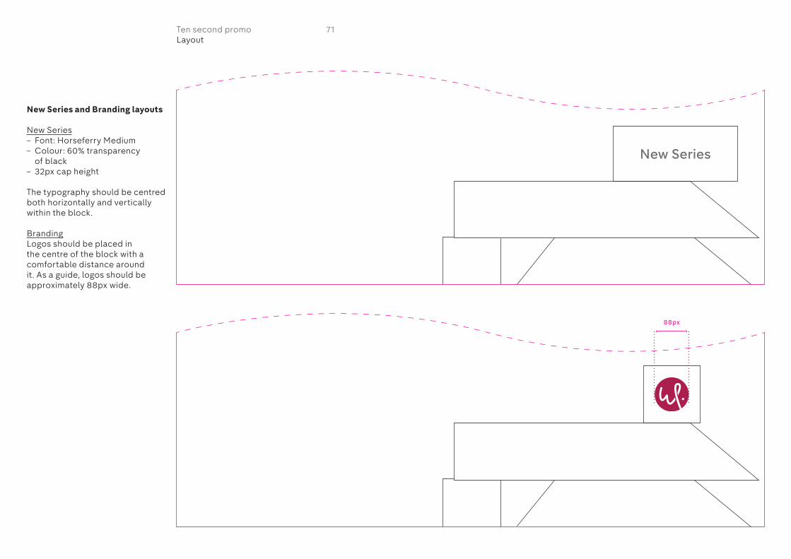
New Series and Branding layouts
New Series– Font: Horseferry Medium– Colour: 60% transparency
of black– 32px cap height
The typography should be centred both horizontally and vertically within the block.
BrandingLogos should be placed in the centre of the block with a comfortable distance around it. As a guide, logos should be approximately 88px wide.
New Series
88px
71Ten second promoLayout
Online pre-roll/skippable
72On air guidelines

73Online pre-rollOverview
The online pre-roll has a different execution to the promo endboards.
MovementThe promo opens with footage. White blocks containing the programme title and TX details fall onto the screen immediately and remain on screen for 6 seconds before falling off screen.
The promo opens with footage. White blocks containing the programme title and TX details fall onto the screen immediately
The blocks come to rest at the bottom of the screen and remain there for six seconds before falling off screen

There are three different typographic layouts designed to accommodate all lengths of programme titles.
1. Short programme title layouts
3. Very long programme title layouts
2. Long programme title layouts
74Online pre-rollLayout
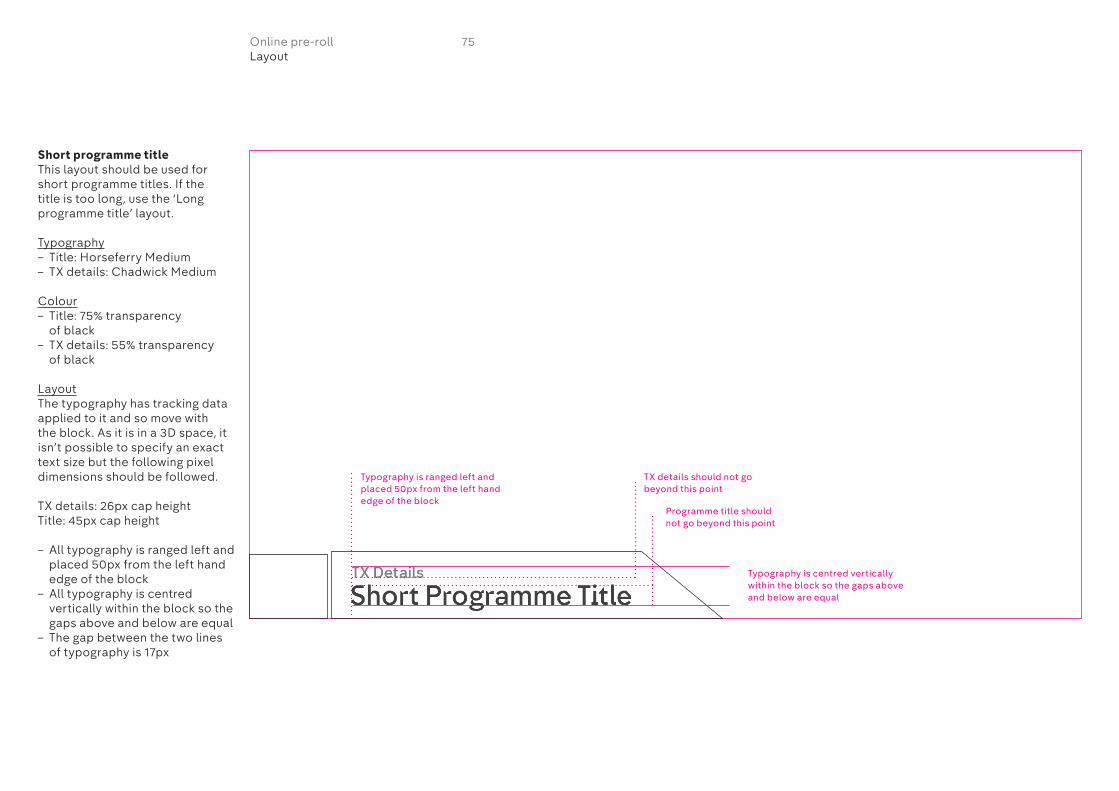
Short programme titleThis layout should be used for short programme titles. If the title is too long, use the ‘Long programme title’ layout.
Typography– Title: Horseferry Medium– TX details: Chadwick Medium
Colour– Title: 75% transparency
of black– TX details: 55% transparency
of black
LayoutThe typography has tracking data applied to it and so move with the block. As it is in a 3D space, it isn’t possible to specify an exact text size but the following pixel dimensions should be followed.
TX details: 26px cap heightTitle: 45px cap height
– All typography is ranged left and placed 50px from the left hand edge of the block
– All typography is centred vertically within the block so the gaps above and below are equal
– The gap between the two lines of typography is 17px
75Online pre-rollLayout
Typography is ranged left and placed 50px from the left hand edge of the block
Typography is centred vertically within the block so the gaps above and below are equal
Programme title should not go beyond this point
TX details should not go beyond this point

Long programme titleThis layout should be used for long programme titles. If the title is too long, use the ‘very long programme title’ layout.
Typography– Title: Horseferry Medium– TX details: Chadwick Medium
Colour– Title: 75% transparency
of black– TX details: 55% transparency
of black
LayoutThe typography has tracking data applied to it and so move with the block. As it is in a 3D space, it isn’t possible to specify an exact text size but the following pixel dimensions should be followed.
TX details: 26px cap heightTitle: 33px cap height
– All typography is ranged left and placed 50px from the left hand edge of the block
– All typography is centred vertically within the block so the gaps above and below are equal
– The gap between the two lines of typography is 17px
Typography is ranged left and placed 50px from the left hand edge of the block
Typography is centred vertically within the block so the gaps above and below are equal
Programme title should not go beyond this point
TX details should not go beyond this point
76Online pre-rollLayout
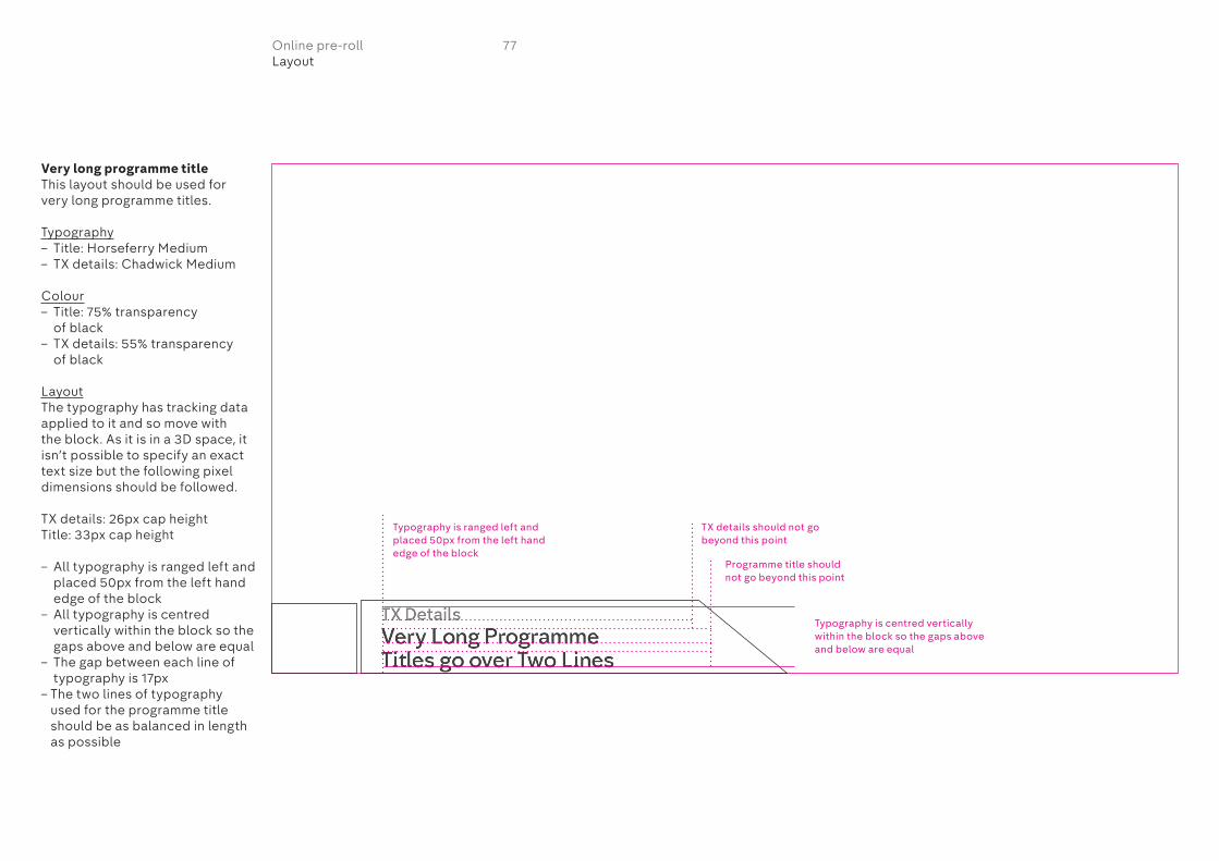
Very long programme titleThis layout should be used for very long programme titles.
Typography– Title: Horseferry Medium– TX details: Chadwick Medium
Colour– Title: 75% transparency
of black– TX details: 55% transparency
of black
LayoutThe typography has tracking data applied to it and so move with the block. As it is in a 3D space, it isn’t possible to specify an exact text size but the following pixel dimensions should be followed.
TX details: 26px cap heightTitle: 33px cap height
– All typography is ranged left and placed 50px from the left hand edge of the block
– All typography is centred vertically within the block so the gaps above and below are equal
– The gap between each line of typography is 17px
– The two lines of typography used for the programme title should be as balanced in length as possible
77Online pre-rollLayout
Typography is ranged left and placed 50px from the left hand edge of the block
Typography is centred vertically within the block so the gaps above and below are equal
Programme title should not go beyond this point
TX details should not go beyond this point
Sponsorship Positioning, timing and sizes of sponsorship on promos
78On air guidelines

To maintain some consistency across various logo shapes and sizes, there are three different maximum sizes dependent on whether a logo is portrait, landscape or square.
Position of logoThe distance between the logo and ‘Sponsored by’ typography is a cap height of the typography. The logo should be centred horizontally to the ‘Sponsored by’ typography.
‘Sponsored by’ typographyFontChadwick Medium
ColourShould match the colour of the TX details.
SizeFlame/Smoke: 25Avid: 14After Effects: 24
KerningFlame/Smoke: 0Avid: 1After Effects: 36
If additional typography is required such as ‘Drama on 4’ then it should be centred above ‘Sponsored by’ with half a cap height gap between the two lines of typography.
Portrait logos Landscape logos Square logos
Sponsored by Sponsored byDrama on 4
Sponsored by
Sponsored bySponsored by
X X XX X X
MAX SIZE OF PORTRAIT
LOGO
MAX SIZE OF LANDSCAPE
LOGOS MAX SIZE OF SQUARE
LOGOS
MAX SIZE OF SQUARE
LOGOS
18px 18px 18px
105px
200px
160px
Sponsored by
0.5 cap height
79SponsorshipPositioning and size of logos
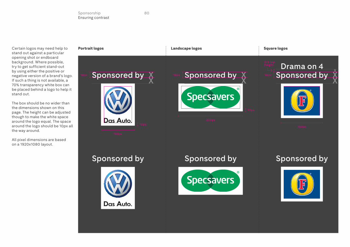
Certain logos may need help to stand out against a particular opening shot or endboard background. Where possible, try to get sufficient stand-out by using either the positive or negative version of a brand’s logo. If such a thing is not available, a 70% transparency white box can be placed behind a logo to help it stand out.
The box should be no wider than the dimensions shown on this page. The height can be adjusted though to make the white space around the logo equal. The space around the logo should be 10px all the way around.
All pixel dimensions are based on a 1920x1080 layout.
Portrait logos Landscape logos Square logos
Sponsored by
Sponsored by Sponsored by
X X XX X X
MAX SIZE OF LANDSCAPE
LOGOS
MAX SIZE OF LANDSCAPE
LOGOS
MAX SIZE OF SQUARE
LOGOS
MAX SIZE OF SQUARE
LOGOS
18px
10px
10px
18px 18px
105px
200px
160px
Sponsored by
MAX SIZE OF PORTRAIT
LOGO
Sponsored by
MAX SIZE OF PORTRAIT
LOGO
Drama on 4Sponsored by
0.5 cap height
80SponsorshipEnsuring contrast

Sponsorship can be placed either at the beginning or the end of a promo.
TimingSponsorship is on from the beginning of the promo and should be displayed for a minimum of 3 seconds. Either fade off over 10 frames or cut off with next cut in edit after 3 seconds.
‘Sponsored by’ typography– Chadwick Medium– Centred to the logo– Either solid black or white
depending on what has better contrast to the footage
– Logo sits a cap height distance below ‘Sponsored by’
81SponsorshipAt promo beginning

Sponsorship at the beginning of a promo should be placed within the 16x9 caption safe area. It can be on either the bottom left or bottom right of the screen.
The bottom of the logo should sit on the 16x9 caption safe area. The ‘Sponsored by’ typography is then placed 215px from the left edge of the screen, a cap height’s distance from the top of the logo. The logo is centred horizontally with the typography.
Promos for commercial airtime and cinema may work to a different caption safe area. Please adjust the positioning of the sponsorship accordingly.
‘Sponsored by’ typographyFontChadwick Medium
ColourSolid black or white depending on the footage.
SizeFlame/Smoke: 25Avid: 14After Effects: 24
KerningFlame/Smoke: 0Avid: 1After Effects: 0
If additional typography is required such as ‘Drama on 4’ then it should be centred above ‘Sponsored by’ with half a cap height gap between the two lines of typography.
16x9
ca
pti
on
sa
fe a
rea
16x9
ca
pti
on
sa
fe a
rea
16x9
ca
pti
on
sa
fe a
rea
16x9
ca
pti
on
sa
fe a
rea
Sponsored by
Sponsored byDrama on 4
Sponsored by
Sponsored by
215px
54px 54px
54px 54px
215px
215px 215px0.5 cap height
82SponsorshipAt promo beginning

PositionSponsorship at the end of a promo is placed over the endboard. It must always be placed top left of the screen within the 16x9 caption safe area. All the endboards have been specifically designed to accommodate sponsorship in this position.
The typography is on an additional text layer in Flame/Smoke that can turned on or off.
TimingSponsorship should be revealed by the wipe of the promo endboard in the same way as the typography is revealed. It should remain on the endboard for the full duration of the remainder of the promo.
‘Sponsored by’ typography– Chadwick Medium– Logo centred to typography– Colour should be the same as
the TX details– Logo sits a cap height distance
below ‘Sponsored by’
Promo endboard begins with blocks falling over footage
As endboard background wipes on to screen it reveals the sponsorship
Sponsorship remains on screen until the promo has finished
83SponsorshipAt promo end
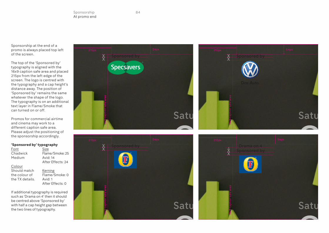
Sponsorship at the end of a promo is always placed top left of the screen.
The top of the ‘Sponsored by’ typography is aligned with the 16x9 caption safe area and placed 215px from the left edge of the screen. The logo is centred with the typography and a cap height’s distance away. The position of ‘Sponsored by’ remains the same whatever the shape of the logo. The typography is on an additional text layer in Flame/Smoke that can turned on or off.
Promos for commercial airtime and cinema may work to a different caption safe area. Please adjust the positioning of the sponsorship accordingly.
‘Sponsored by’ typographyFontChadwick Medium
ColourShould match the colour of the TX details.
SizeFlame/Smoke: 25Avid: 14After Effects: 24
KerningFlame/Smoke: 0Avid: 1After Effects: 0
If additional typography is required such as ‘Drama on 4’ then it should be centred above ‘Sponsored by’ with half a cap height gap between the two lines of typography.
16x9
ca
pti
on
sa
fe a
rea
16x9
ca
pti
on
sa
fe a
rea
16x9
ca
pti
on
sa
fe a
rea
16x9
ca
pti
on
sa
fe a
rea
Sponsored by
Sponsored by
Sponsored by
54px 54px
54px 54px
Drama on 4Sponsored by
84SponsorshipAt promo end
215px
215px 215px
215px
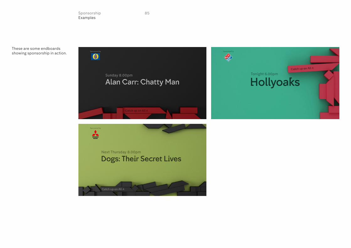
These are some endboards showing sponsorship in action.
85SponsorshipExamples
Channel 4©2015
Design: DBLG
For more information please contact:
4creative+44 (0)207 396 [email protected]