Challenges Set 5 final
14
# M I S A D D R E S S E D 69 # Answer: The probability is 1/6. Figure This! While watching television, Tessellation placed three checks in three separate addressed envelopes. If she had paid no attention to which check went in which envelope, what is the chance that each check was in the correct envelope? Probability is the mathematics of chance. Estimating the chance of rain, the effectiveness of a treatment, and whether a person will have an accident are important to weather forecasters, doctors in diagnosing illnesses, and insurance companies. How could I send the check and not pay the bill? Hint: Make a list of all the possible outcomes.
Transcript of Challenges Set 5 final
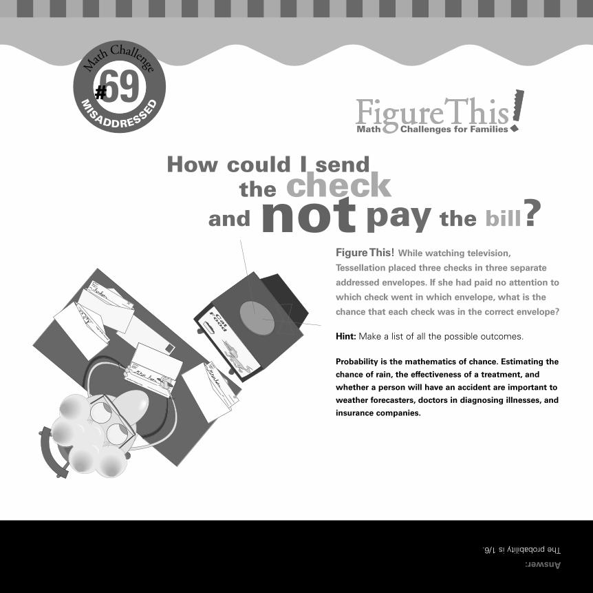
#MISADDRESSED
69#
Answer:
The probability is 1/6.
Figure This! While watching television,
Tessellation placed three checks in three separate
addressed envelopes. If she had paid no attention to
which check went in which envelope, what is the
chance that each check was in the correct envelope?
Probability is the mathematics of chance. Estimating the
chance of rain, the effectiveness of a treatment, and
whether a person will have an accident are important to
weather forecasters, doctors in diagnosing illnesses, and
insurance companies.
How could I send the check
and not pay the bill?
Hint: Make a list of all the possible outcomes.
Challenges_Set 5_final.qxd 10/2/01 4:30 PM Page 19
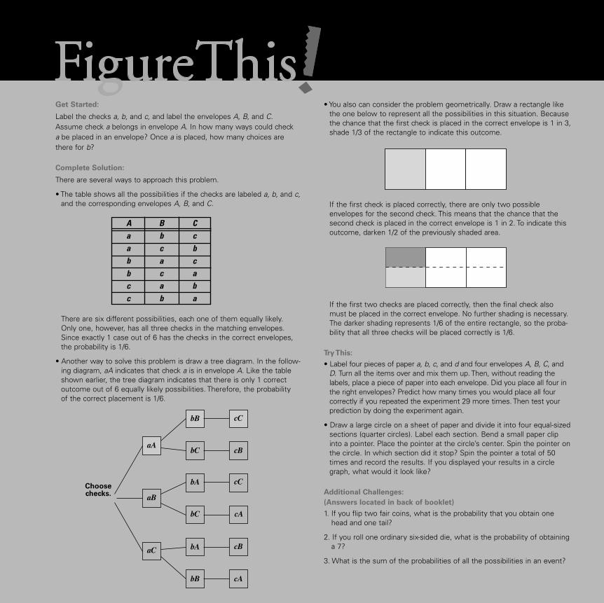
Get Started:
Label the checks a, b, and c, and label the envelopes A, B, and C. Assume check a belongs in envelope A. In how many ways could check a be placed in an envelope? Once a is placed, how many choices arethere for b?
Complete Solution:
There are several ways to approach this problem.
• The table shows all the possibilities if the checks are labeled a, b, and c,and the corresponding envelopes A, B, and C.
There are six different possibilities, each one of them equally likely. Only one, however, has all three checks in the matching envelopes.Since exactly 1 case out of 6 has the checks in the correct envelopes,the probability is 1/6.
• Another way to solve this problem is draw a tree diagram. In the follow-ing diagram, aA indicates that check a is in envelope A. Like the tableshown earlier, the tree diagram indicates that there is only 1 correct outcome out of 6 equally likely possibilities. Therefore, the probability of the correct placement is 1/6.
• You also can consider the problem geometrically. Draw a rectangle likethe one below to represent all the possibilities in this situation. Becausethe chance that the first check is placed in the correct envelope is 1 in 3,shade 1/3 of the rectangle to indicate this outcome.
If the first check is placed correctly, there are only two possibleenvelopes for the second check. This means that the chance that thesecond check is placed in the correct envelope is 1 in 2. To indicate thisoutcome, darken 1/2 of the previously shaded area.
If the first two checks are placed correctly, then the final check alsomust be placed in the correct envelope. No further shading is necessary.The darker shading represents 1/6 of the entire rectangle, so the proba-bility that all three checks will be placed correctly is 1/6.
Try This:
• Label four pieces of paper a, b, c, and d and four envelopes A, B, C, andD. Turn all the items over and mix them up. Then, without reading thelabels, place a piece of paper into each envelope. Did you place all four inthe right envelopes? Predict how many times you would place all four correctly if you repeated the experiment 29 more times. Then test your prediction by doing the experiment again.
• Draw a large circle on a sheet of paper and divide it into four equal-sized sections (quarter circles). Label each section. Bend a small paper clipinto a pointer. Place the pointer at the circle’s center. Spin the pointer onthe circle. In which section did it stop? Spin the pointer a total of 50times and record the results. If you displayed your results in a circlegraph, what would it look like?
Additional Challenges:
(Answers located in back of booklet)
1. If you flip two fair coins, what is the probability that you obtain onehead and one tail?
2. If you roll one ordinary six-sided die, what is the probability of obtaininga 7?
3. What is the sum of the probabilities of all the possibilities in an event?
Choosechecks.
a
A B Ca b ca c bb a cb c ac ac b
b
Challenges_Set 5_final.qxd 10/2/01 4:30 PM Page 20
4. Is the probability of getting a passing grade (at least 60%) by guessingon a 20-question true-false test greater than, less than, or equal to theprobability of getting at least 60% correct by guessing on a 10-questiontrue-false test?
5. In the challenge, what is the probability of getting at least one check inthe correct envelope?
Things to Think About:
• What is the probability that it will rain in your hometown for seven consecutive days?
• If the probability of an outcome is 0.35, would you expect it to occurexactly 35 times out of 100?
• Does a batting average describe the probability of getting a hit?
Did You Know That?
• Mathematician Abraham de Moivre (1667–1754) was a pioneer in thefield of probability. According to legend, the aging de Moivre observedthat he needed an extra quarter hour of sleep each day. When he needed 24 hours of sleep, he died.
• Antoine-Nicolas Caritat, Marquis de Condorcet (1743–1794), used probability to argue that capital punishment should be abolished. He reasoned that, however great the probability that each guilty verdictwas correct, there remained a small chance of error. As the number ofguilty verdicts increased, so would the probability that an innocentperson would be executed. Condorcet himself was condemned to death during the French revolution.
• The word probability appears to receive its first mention in a 1477 commentary on Dante’s Divine Comedy.
Resources:
Book:
• Billstein, R., and J. Williamson. Middle Grades Math Thematics, Book 3.Evanston, IL: McDougal Littell, 1999.
• Eves, H. An Introduction to the History of Mathematics. Philadelphia,PA: Saunders Publishing Co., 1983.
Notes:
Challenges_Set 5_final.qxd 10/2/01 4:30 PM Page 21
#
SODA
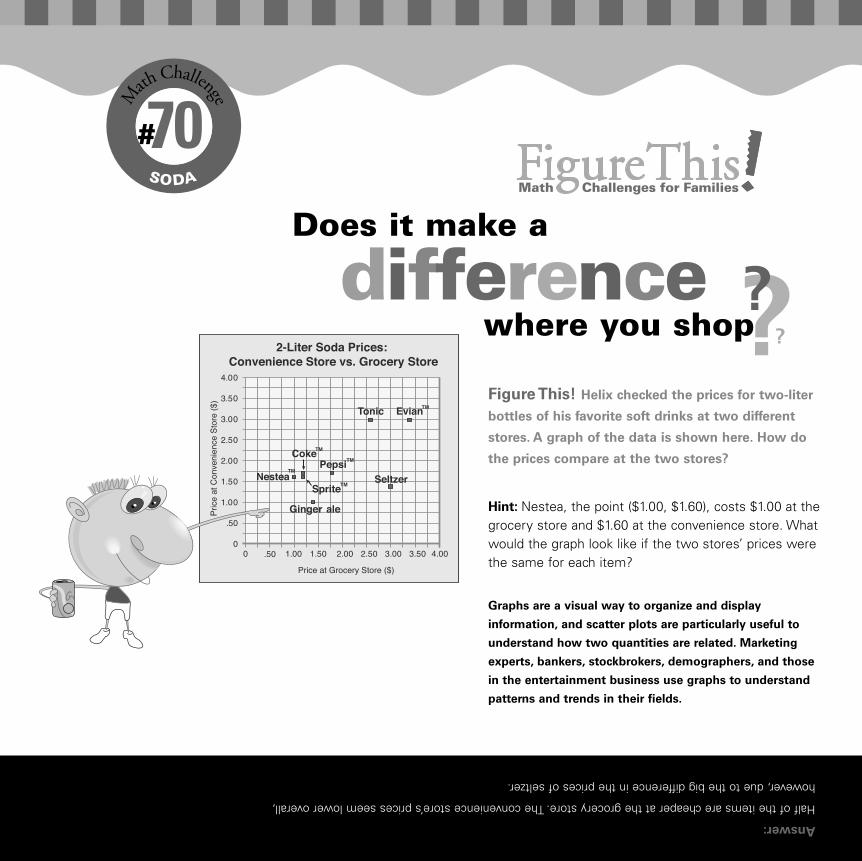
70#
Answer:
Half of the items are cheaper at the grocery store. The convenience store’s prices seem lower overall,
however, due to the big difference in the prices of seltzer.
Figure This! Helix checked the prices for two-liter
bottles of his favorite soft drinks at two different
stores. A graph of the data is shown here. How do
the prices compare at the two stores?
Graphs are a visual way to organize and display
information, and scatter plots are particularly useful to
understand how two quantities are related. Marketing
experts, bankers, stockbrokers, demographers, and those
in the entertainment business use graphs to understand
patterns and trends in their fields.
Hint: Nestea, the point ($1.00, $1.60), costs $1.00 at thegrocery store and $1.60 at the convenience store. Whatwould the graph look like if the two stores’ prices werethe same for each item?
?
Does it make a
differencewhere you shop??
Challenges_Set 5_final.qxd 10/2/01 4:30 PM Page 23
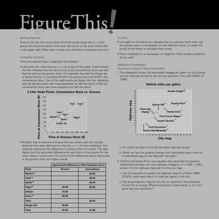
Getting Started:
Draw in the line that would show all of the prices equal, the y = x linegoing from the point (0,0) in the lower left corner to the point (4.00,4.00)in the upper right. What does it mean for a soft drink to be below the line?
Complete solution:
There are several ways to approach this problem.
• Using the hint, draw the line y = x on a copy of the graph. A point belowthe line indicates that the item’s price at the convenience store was lessthan its price at the grocery store. For example, the point for Ginger aleis below the line. It cost about $1.40 in the grocery but only $1.00 in theconvenience store. Four of the eight points are below the line, indicatingthat the grocery store was more expensive for half the items, while theconvenience store was more expensive for half the items.
• Another way to examine pricing at the two stores uses the vertical distance from each data point to the line y = x. On the scatterplot, thisdistance represents the difference in prices at the two stores. The tablebelow lists the estimated difference for each item in the column for thestore where it costs more. The sums of the differences show that pricesin the grocery store are higher overall.
Try This:
• List eight or nine items you regularly buy in a grocery store; then usethe grocery ads in a newspaper for two different stores, or check theprices at the stores to compare their prices.
• Find a scatterplot in a newspaper or magazine. What trends or patternsdo you see?
Additional Challenges:
(Answers located in back of booklet)
1. The scatterplot shows the estimated mileage per gallon for city drivingand for highway driving for the cars as reported in the USA TODAY on2/9/01.
a. For which car does it look like the data might be wrong?
b. Which car has the greatest change from estimated mpg in the city to estimated mpg on the highway? the least?
2. Without the Toyota Prius, one equation that describes the general relationship between city and highway mileage is: H = 5.89 + 1.30C,where H is the highway mpg and C is the city mpg.
a. Use this equation to predict the highway mpg for a Ferrari 456MGT/GTA, which gets about 10 miles per gallon in the city.
b. The actual highway mpg for this car, as reported in the American Council for an Energy Efficient Economy’s Green Book, is 15. How good was your prediction?
ConvenienceGrocerySoda
$0.60Nestea™
$0.50Coke™
$0.40Sprite™
$0.00$0.00Pepsi™
$1.60Seltzer
$0.40Evian™
$0.40Tonic
$0.40Ginger Ale
$1.90$2.40Total
Approximate Difference at Most Expensive Store
2-Liter Soda Prices: Convenience Store vs. Grocery
Pri
ce a
t C
on
ven
ien
ce S
tore
($)
Price at Grocery Store ($)
Vehicle miles per gallon
Hig
hw
ay m
pg
City mpg
Challenges_Set 5_final.qxd 10/2/01 4:30 PM Page 24

3. The scatterplot below shows some statistics from the 2000 season forseven NBA all-star centers: Antonio Davis, Alonzo Mourning, TheoRatliff, Shaquille O’Neal, Vlade Divac, David Robinson, and DikembeMutombo. Use the information given to rank the players’ performances.
Things to Think About:
• What would the scatterplot in the challenge look like if the two storeshad very similar prices?
• What is the leading soft drink, in terms of sales?
• How could your local television station use scatterplots and othergraphs?
• How does what you can learn from a table of information compare towhat you can learn from a scatterplot?
• Why is the point (0,0) not necessarily a useful place to begin the axesfor some graphs?
• Do you think you could tell the difference between two brands of cola in a blind taste test?
Did You Know That?
• Some companies use a loss leader—an item advertised at a very lowprice—to entice consumers into their stores. They hope to make up the loss by selling other goods for higher profits.
• Many of the soft drinks sold in the United States are in liter bottlesrather than quarts.
• Several years ago, Coca-Cola™ tried to market their soda in a brown bot-tle, but consumers did not like it.
Resources:
Books:
• American Council for an Energy Efficient Economy. Green Book: TheEnvironmental Guide to Cars & Trucks, Model Year 2001. [This book isavailable online at www.greenercars.org.]
• The World Almanac and Book of Facts 2001. Mahwah, NJ: WorldAlmanac Books, 2001.
Website:
• www.greenercars.org
Notes:
2000 Offense and Defense for All-Star Centers
Reb
ou
nd
s
Field Goal %
Challenges_Set 5_final.qxd 10/2/01 4:30 PM Page 25

?
#
A
RCHEOLOGY
71#
Answer:
Sites C and E have the most similar percentages.
Figure This! Archeologists noticed differences
in the types of evidence found at five dig sites.The
table shows the percentages of material found at
each site. Using this information, which two sites
seem to be most alike?
Numerical criteria can be used to compare objects.
Determining likenesses or differences between two sets of
information is important for geologists searching for oil,
doctors deciding different treatments’ effects, and market-
ing experts deciding on comparable advertising strategies.
Hint: What is the difference in the percentages of pottery found at sites A and B? What about the percentages of bones?
Site A! Site B!How alike are we? ?
Challenges_Set 5_final.qxd 10/2/01 4:30 PM Page 27

Get Started:
Pair the sites and then make a table of the differences found by subtractingthe smaller percentage from the larger for each category. For example,using sites A and B, the differences are (30% – 10%), (20% – 5%), (10%– 0%), (40% – 10%), and (45% – 30%). The total of these differences is20% + 15% + 10% + 30% + 15%, or 90%.
Find the total difference for each pair of sites.
Complete Solution:
Using the hint, find the difference in the percentages of each material ateach pair of sites and sum these differences. The resulting informationcan be arranged in a table as shown. In this table, the cell in row A,column B, corresponds to the sum of the differences for sites A and B,or 90%. (Since there is no difference between a site and itself, the corresponding cells have 0% as entries.)
The pair of sites with the smallest sum (36%) is C and E. This indicatesthat the percentages of materials at the two sites are the most similar.
Try This:
• Look at the shoes in your house. Identify at least four characteristicsthat can be used to describe shoes. Categorize the shoes according to these characteristics. Using these criteria, which pairs of shoes aremost alike?
• Which of the cereals in your cupboard are most alike in terms of nutritional value?
• Use the web to find other examples of mathematics in the work of archeologists.
Additional Challenges:
(Answers located in back of booklet)
1. Look at the table given in the complete solution to the challenge. If you draw a line from the upper left-hand corner of the table to thelower right-hand corner, the entries in the part above the line matchthose below the line. Why is this true?
2. Using data collected from about 20 sites, archeologist T. Patrick Culbert of the University of Arizona estimated that in the past, therewere approximately 200 people per square kilometer in the southern lowlands of Central America. How does this figure compare to the most recent population density of Minnesota. (In 2000, the state had a population of 4,775,508 and an area of 79,617 square miles. Note: 1 square kilometer equals 0.386102 square miles.)
3. The table below shows the prices for bread, milk, eggs, coffee, andorange juice at five neighborhood markets. Which two stores seem tohave the most similar prices? Which stores seem to differ the most?
Things to Think About:
• How can archeologists tell the age of a bone or piece of pottery?
• What do you think the archeologists of the future will find when theyexcavate your hometown 1000 years from now?
• What causes ancient cities to be destroyed and become buried underland or water?
• How would you compare the climates of several different cities?
Did You Know That?
• Archeologists also explore under water to find buildings and relics fromearlier cultures.
• In ancient Rome, it was a mark of status to be buried by a busy road,where passers-by could stop and read the tomb’s inscription. This wasthought to give the dead person a certain measure of immortality.
• The coins found at archeological sites help historians understand thetrade and economic patterns of ancient cultures.
Pair of Sites Pottery Ceramic
FiguresBones Coins
Copper/
Bronze
Tools
Sum of
Differences
A and B 20% 15% 10% 30% 15% 90%
124%
E 64% 84% 36% 104% 0%
A B C D E
A 0% 90% 100% 100% 64%
B 90% 0% 110% 84% 84%
C 100% 110% 0% 124% 36%
D 100% 84% 0% 104%
E
Store Bread Milk Eggs CoffeeOrangeJuice
A $0.89 $1.90 $1.79 $5.99 $2.39
B $1.19 $1.65 $1.75 $6.24 $2.49
C $1.09 $1.99 $1.65 $5.33 $3.24
D $1.49 $1.75 $2.05 $5.88 $2.75
$0.99 $1.89 $2.13 $6.12 $2.33
Challenges_Set 5_final.qxd 10/2/01 4:30 PM Page 28
• Archeologists often use dental picks and cotton swabs to scrape awaydirt and clay from coins, bones, pottery, and other finds.
• By analyzing differences in embroidery, color, and design, archeologistscan sometimes identify the village in which an item of clothing was made.
• Evidence about grid plans for cities, ceremonial avenues, apartmentcompounds, and plaza structures has led archeologists to think that theseveral early cities from the Basin of Mexico resemble the ancient Azteccity of Teotihuacan.
Resources:
Books:
• Gardner, M. Time Travel and Other Mathematical Bewilderments. NewYork: W. H. Freeman and Co., 1988.
• Smith, M. The Mesoamerican Urban Landscape from Teotihuacan to theAztecs. Paper presented at the conference, “Archeology of ComplexSocieties: Centripetal and Centrifugal Forces,” October 21, 1995,California State University, San Bernardino.
• Purdy, J. “Ancient Voices Speak Again in Carthage.“ Research Reporter.Vol. 25, No. 2 (Winter 1995). University of Georgia.
Website:
• www.ovpr.uga.edu/rcd/95w/carthage.html
Notes:
Challenges_Set 5_final.qxd 10/2/01 4:30 PM Page 29

??
#
TVRATINGS
72#
Answer:
Sunday night.
Figure This! On which night of the week did the
greatest number of US households watch the most
popular television shows at 10:00 P.M.?
Making comparisons involves careful definitions and use
of mathematics. Actuaries use comparisons to create
insurance rates, biologists use this type of mathematics
to compare different species in different eras, as do
archaeologists for carbon dating artifacts.
Hint: x100 = percent of TV owning householdswith TVs on watching a particular show at that time.How can you use the Nielsen data to determine thepercentage of households watching television on agiven night?
RatingShare
When DO most peoplewatchtelevision?
Challenges_Set 5_final.qxd 10/2/01 4:30 PM Page 31

Get Started:
In the Nielsen Company’s rankings, share describes the percentage of activetelevision sets on, and tuned to a particular program, out of all TV owninghouseholds, while rating describes the percentage of households who owntelevisions that are tuned to a particular show. A 15.2 rating means 15.2% ofall households owning televisions were tuned to ER. A 27.0 share meansthat 27.0% of all those households with a television on at the time weretuned to ER. For ER,
Thus, about 56% of the TV owning households had their TVs tuned to ER.What were the percentages for the other shows?
Complete Solution:
Using the relationship between the Nielsen rating and share in GettingStarted, calculate the percentages for shows.
The highest percentage occurred on Sunday night.
Try This:
• Using a website, TV rating, or a newspaper, find the rating and share of your favorite TV show.
• Look on the web or in the library to determine how the Nielsen ratingsare done.
• Check with your friends and neighbors to see if they have been surveyed for TV ratings.
Additional Challenges:
(Answers located in back of booklet)
1. For Thursday November 25, 2000, at 8:00 PM EST, Friends had a 9.6rating and a 15.0 share. There were approximately 102.2 million TV owning households in the US at that time.
a. What percent of the households had their TV on during Friends?
b. Approximately how many households were watching Friends?
2. Companies that advertise on television are usually interested in thenumber of viewers of a certain age or gender. For example, adults from18 to 49 are popular with many advertisers. In the United States, thisgroup includes about 129 million people. On November 29, 2000, aDavid Blaine Special received a 7.3 rating and a 10.1 share among thisgroup. If 1 rating point represents 1% of the target group, how manyadults ages 18–49 watched this special? What percentage of the groupwere watching television at the time?
3. To compare the cost of advertising on two or more programs, advertisers use an index called the CPM (cost to reach 1000 households). The CPM is calculated as shown here:
In 2000, the cost of 30-second ad on ER was $600,000; its rating was15.2. The cost of a 30-second ad on Diagnosis: Murder was $51,000; itsrating was 6.3. Compare the CPM for these two shows. (Each ratingpoint represents 1,022,000 households.)
Things to Think About:
• What other types of entertainment are rated?
• Why are both rating and share important in the television industry?
• How is a song’s popularity determined?
• Why do advertisers and networks care about the age and gender ofviewers?
• How would you collect information on television-viewing habits?
Did You Know That?
• Nielsen Media Research measures audience levels using both electronicmeters and diaries. The national sample is a combined sample of the“Nielsen families” using meters and diaries. It consists of about 5000homes in 210 different television markets. The national Nielsen ratingsalso include key demographic information such as the number of adultsages 25–54 watching a particular show.
• The highest-rated TV show as of March 2001 was the final episode ofM*A*S*H, which received a rating of 60.2 and a share of 77 onFebruary 28, 1983.
• As of March 2001, 12 of the 25 highest-rated shows were Super Bowlbroadcasts.
• In January 2001, the average number of televisions per US householdwas 2.4.
• About 60% of US teens have a television in their bedroom.
• In 1999, the automotive industry outspent all other industries for television advertising.
Program Day Rating Share
% of TVowning
HouseholdsWith TV on
The District Saturday 9.8 17.0 57.6%
ER Thursday 15.2 27.0 56.3%
The Practice
Monday Night Football
Judging Amy
Law and Order
Sunday 13.3 20.0 66.5%
Monday 13.9 23.0 60.4%
Tuesday 11.6 19.0 61.1%
Wednesday 12.2 21.0 58.1%
Law and Order: SVU Friday 9.8 18.0 54.4%
= x100 ≈ 56Rating
Share15.227.0
CPM =Cost per 30 second advertisement
thousands of households watching the show
Challenges_Set 5_final.qxd 10/2/01 4:31 PM Page 32
Resources:
Books:
• Hall, Robert W. Media Math. Chicago, IL: NTC Business Books, 1991.
• Consumer Reports, January 2001.
Websites:
• www.nielsenmedia.com/whatratingsmean
• tv.yahoo.com/nielsen
• faculty.washington.edu/baldasty/Feb3.htm
• www.infoplease.com/ipsa/A0110473.html
Notes:
Tangent
Challenges_Set 5_final.qxd 10/2/01 4:31 PM Page 33

#ANSWERS
Looking for answers?
Here are the answers for the
Additional Challenges section of each Challenge.
Challenges_Set 5_final.qxd 10/2/01 4:31 PM Page 55
Challenge 65
1. The answer may vary. The pattern shows that the factors to go fromone complexion type to another are 3, 2.5, and 2. With this pattern, thenext factor is 1.5 giving 45 as the recommended SPF.
2. The potato will be done in about 24 more minutes.
3. About 17 minutes.
Challenge 66
1. The ends of one runway should be labeled 26 and 8; the others shouldbe 35 and 17.
2. The ends of one runway should be labeled 13 and 31; the ends of the other should be 4 and 22. The ends of the north-south runway are 18 and 36.
3. 190˚.
Challenge 67
1. Probably, since 10˚ C is 50˚ F.
2. 30˚ C.
3. About 67˚ F.
4. – 40˚.
5. No.
Challenge 68
1. Graph a.
2a.
2b. For the people in this study, there does not seem to be a strong association between liking one movie and liking the other. About58%—a little more than half (70/120)—of those who liked Titanicalso liked Star Wars, Part IV.
3. The graph reveals little connection between exercise and computer use. Most people in the study frequently use computers, whether they exercise or not.
Challenge 69
1. 1/2.
2. 0.
3. 100% or 1.
4. less than.
5. 4/6 or 2/3
Challenge 70
1a. Toyota Prius; it looks like city mpg and highway mpg were reversed.
1b. Greatest change is either the Chevrolet Impala or the Saturn SW at 11 mpg, least is Toyota Tacoma at 3 mpg.
2a. The equation predicts a highway mpg of about 18.89 or about 19.
2b. The prediction is not far off from the actual mileage.
3. Answers may vary, depending on the relative value assigned to field-goal percentage and rebounds. One approach identifies the highest displayed value in each category and uses it as an “ideal.” In this case, the ideal point would be (0.574, 1157). If players are ranked according to this ideal, they fall in the following order: O’Neal,Mutombo, Mourning, Robinson, Divac, Davis, and Ratliff.
Challenge 71
1. The parts are symmetric because the sum of the differences betweentwo sites is the same whether you compare A to B or B to A.
2. The population density of Minnesota is about 60 people per squaremile, or about 23 people per square kilometer. This means that the population density in the study area was about 9 times as great.
3. The prices at stores A and E are the most similar, as their sum of differences is only $0.64. The prices at stores C and E are the most different, with a sum of $2.38.
Challenge 72
1a. 64%
1b. 9.8 million
2. About 9.42 million adults ages 18 – 49 watched the show. Of the targetgroup, 72.3% were watching television.
3. The CPM for ER was $38.62; the CPM for Diagnosis: Murder was $7.92.
Disliked TitanicLiked Titanic
Liked Star Wars
Disliked Star Wars
70
50
43
37
113
87
Totals 120 80 200
Totals
Challenges_Set 5_final.qxd 10/2/01 4:31 PM Page 56